The Weeping Woman

I draw you in with suggestions of Picasso, but I’m afraid it’s me, again.

I’ve always known that art can move, but reduce one to tears? Someone once told me that they couldn’t stand in front of a Rothko without crying – ‘Get a grip’ is how I responded, in my head.

Then I stood in front of Van Gogh’s ‘A Wheatfield, with Cypresses’ in the National Gallery. Why can’t I see it clearly anymore? Why do I have tears running down my cheeks? Why hadn’t I put any tissues in my bag? Why is the guard coming towards me with a strange expression on his face?

Was it because I had recently watched ‘Loving Vincent’ and a documentary about this tortured and anguished soul? That he had died without knowing of the fame and recognition which was to come? Or was it something else – the way he applied paint perhaps? Does it actually matter?

For me, I can’t separate the artist from his work – his mental and emotional fragility is embedded in his work and I find it both beautiful and overwhelmingly sad. So sad, that just someone talking about it can make me well up.

So, after spending one and a half hours in a virtual queue on the National Gallery website I have managed to secure two very precious tickets to ‘Poets and Lovers’, except that for one time only, on the morning of 9th December, there will be a lone Picasso amongst all the Van Goghs.

Less

I haven’t posted for a while – I’ve been busy sorting things out before going off to Marrakech for a four day trip with my book club.

Marrakech was amazing. Colour. Noise. Smells. People. Heat. Contrast that with this morning when I had to defrost the car before heading off to my weekly art class. I love this drive, along an old Roman road – straight and undulating through the Hampshire countryside to Stockbridge, a small town in the Test Valley. The sun came out and the trees came to life – burning oranges, golds and yellows. It was beautiful, and by the time I arrived at my class, late because I couldn’t find anywhere to park, I was still feeling its effects.

I can’t deal with too much choice – it paralyses me and then I can’t make a choice. Needless to say, I didn’t buy anything in the souks in Marrakech – the choice was overwhelming, so I resolved not to buy anything at all, and was then able just to wander and enjoy the atmosphere and culture.

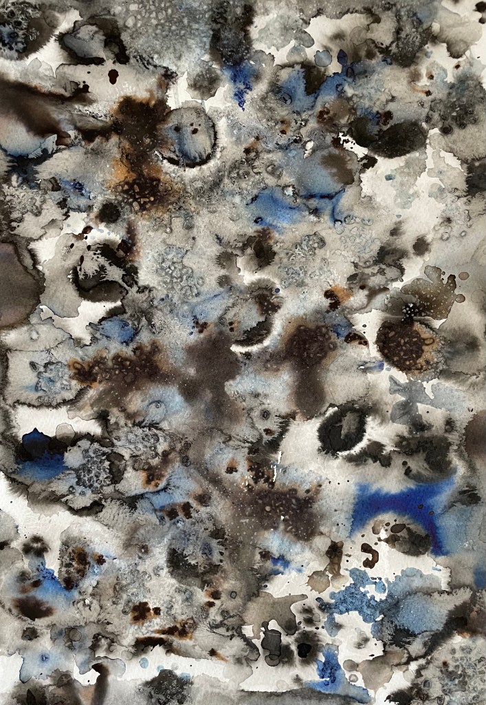
So today’s task was perfect for how I was feeling. A landscape using a limited palette of burnt sienna, burnt umber, ultramarine, pale cadmium yellow, white and cadmium red. We took a board, roughly primed – in my case it was an old piece of MDF which I had previously coated with professional Dulux oil-based primer, which can make it a bit like an ice rink – and put down a loose ground of burnt sienna with a bit of sansador which ended up not drying for some reason. Then we put in some outlines using burnt umber following with thick patches of colour keeping it very general, but the wet burnt sienna contaminated some areas and lifted off the board in others. We experimented with dragging a dry brush across the paint and I also did a bit of sgraffito which I can’t help doing when using thicker paint.
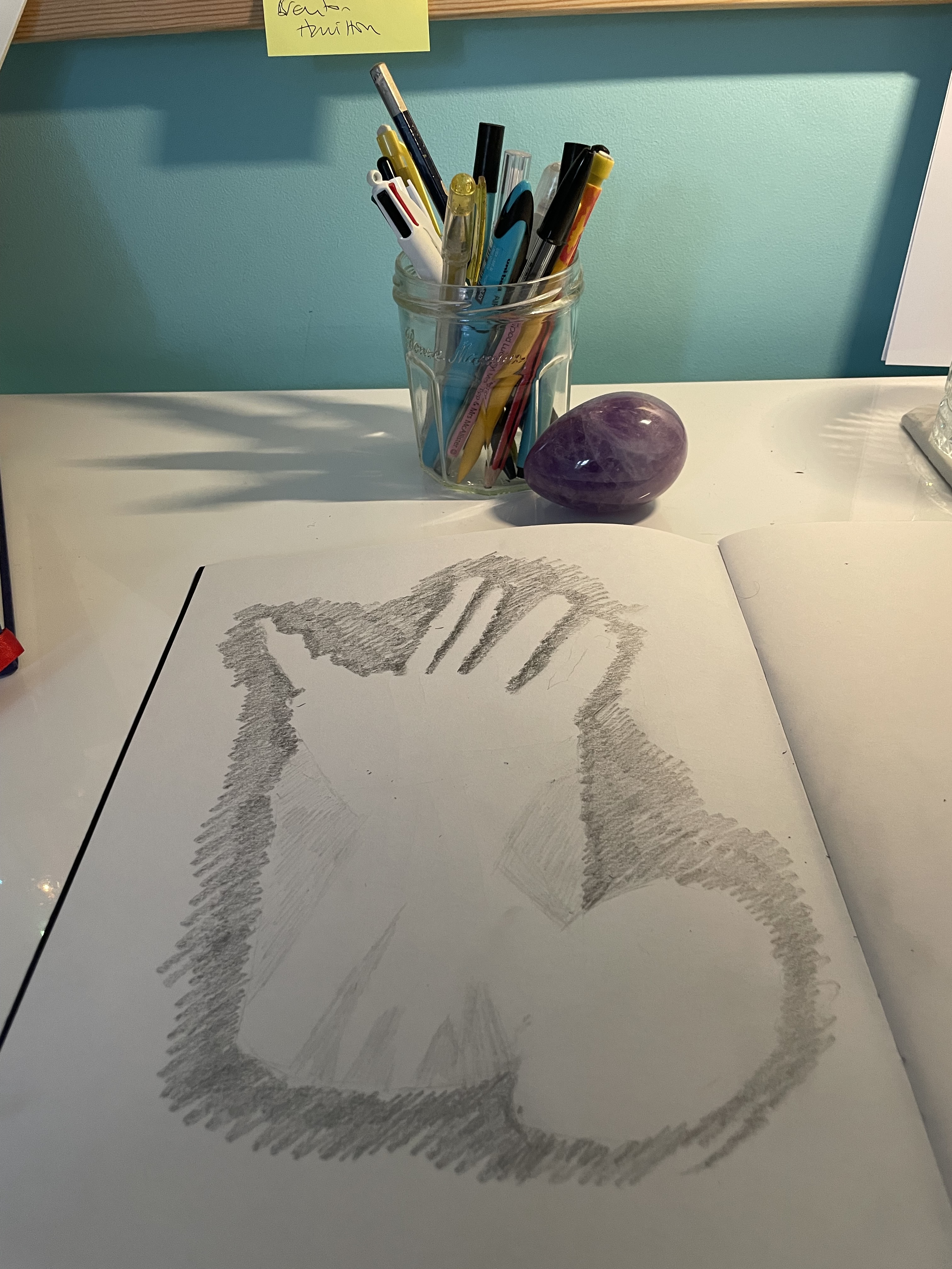
This is the result:

I haven’t painted for ages – not since beginning this course – I don’t know why. Perhaps it’s because I’ve been doing a lot of thinking and experimenting with other media. At first, it felt a bit strange coming back to it, almost awkward, like I’d been unfaithful in some way.

It’s not my best by far, but it’s ok for an hour and a half. I am leaving it. The ‘me’ I’m trying to change would say that it is not finished by a long way. There’s lots I don’t like and would love to change – I’m itching to tinker – but I’m exercising some will power and calling it a day. Just like I’ve been trying to change my mindset about having an expectation as to how a piece will turn out, I am also trying to train myself to walk away.

Jonathan told me that the job of mark-making is to tell us what to do next. These marks are telling me to leave it alone and to be happy with what bits of it appeal to me – I like the lack of clarity and blurriness caused by the dry brush; the light coming through the burnt sienna ground in the foreground; the energy in the marks, which I would absolutely kill if I allowed myself to do more; the lack of definition which gives a sense of a fleeting moment; and the recreation of the feeling I had whilst driving to class.

Will I do this again? Yes, I always like going back to basics and using a limited palette – I’ll use a different image and next time I will definitely make sure that the ground is dry before carrying on so that the colours aren’t so muddy in places.

Blot II

I’m really enjoying experimenting with ink.

There’s no expectation. It feels free. I like that you have to wait until they are dry to see the full effect. I feel like I have made them, which is an important step for me as I have struggled to accept the concept of randomness in art making; but I applied the water, the ink, chose the brush and I dropped and flicked the ink where I did, and just because I didn’t control what happened next doesn’t mean I didn’t in some way influence it. I like the combination of the different inks. The black Indian ink did not reveal as many tones as I was expecting, so I also used black writing ink which revealed tones of brown. I enjoy looking at them and identifying areas of interest as well as random shapes of faces, flowers, and cuddly toys! I have an idea as to how I might incorporate them into future work.

Responsibility

I watched an old documentary on Tracey Emin last night – Mad Tracey From Margate.

It referred to a piece of work which included a letter Tracey had written about her twin brother, Paul, and the work’s subsequent appearance on a TV show which then led to her brother losing a job. She expressed regret and acknowledged that her work would have to change or she risked being censored by her family.

It’s a stark reminder that when producing deeply personal work, there is a responsibility to protect others who have not signed up to having their personal lives made public.

The Power of Ugly Art

I was watching a YouTube video yesterday morning and happened to look at the list of related videos on the right hand side: The Power of Ugly Art – Creativity Exercise for Dealing with your Inner Critic In Your Sketchbook, Marie-Noëlle Wurm, caught my eye.

During our critique session on Tuesday afternoon, whilst talking about my experimental digital collage, I mentioned that I feel particularly drawn to the process and that I have some ideas as to how I can use it to express my feelings on motherhood, in particular, in relation to the quote in Hearts and Lino about the heart walking around outside the body. I commented that it might be a bit gruesome, reflecting that actually that didn’t matter as sometimes art has to be ugly to convey what it needs to; it doesn’t always have to be aesthetically pleasing.

I mentioned N’s reference, in her introduction to her artistic practice, to Louise Fletcher’s course in which she actively encourages the creation of ugly art, which I have also watched. This is what Wurm encourages – an artist’s fear is creating ugly art, so lean into the fear instead of running way from it. Creating beautiful art is an expectation and she suggests detailing the expectations we may have as artists, and then expressing them in our sketchbooks. By letting our expectations exist, instead of pushing them away, we give them space to exist within our art practice, which will lead to more powerful art, growth and compassion for ourselves.

I’m going to give her exercises a go in my sketchbook, ordinarily a safe place for no one’s eyes but my own.

Blot

Messing with ink.

There’s not a lot to say about these images. Apart from the middle one, which was influenced by thoughts on cells and became all too contrived, there’s something very liberating about putting water on paper and watching the ink do its thing.

I’m beginning to think that maybe I should be getting on and producing some actual work.

Hearts and Lino

”Making the decision to have a child – it is momentous. It is to decide forever to have your heart go walking around outside your body.”

This quote from Elizabeth Stone (I’m yet to fathom out who she is!) is apparently well-known, but I only heard it recently when someone, I think it was an actor, was being interviewed about becoming a parent.

I think it sums up brilliantly the utter overwhelming sense of vulnerability and responsibility that I felt on becoming a mother. With this in mind, I attended a workshop on Saturday and Sunday on linocut led by Lisa Takahashi. Whilst everyone else started working on their images of sea urchins, birds, landscapes and flowers, I sat there, initially reluctant to reveal my chosen image of an anatomical diagram of a heart – it seemed particularly grisly and gruesome in this environment of natural loveliness. I suspect a few eyebrows were raised, on the side!

The workshop was on multiple-block linocut, a process in which you use separate blocks of lino to print individual colours, as opposed to reductive linocut where the colours are printed from the same block. I’ve only ever done a basic linocut with a single colour, so the process of working out what areas to cut for each colour meddled with my head a bit. Also, because you use separate blocks you can reprint in different colourways, although there is more room for error in terms of cutting and registration when printing, which can lead to unintended gaps and overlaps which add to the feeling of it being handmade, apparently! Also, as with all linocuts, you can sometimes get marks from ridges of lino which have inadvertently picked up the ink, particularly in large areas which have been cleared out, and this is called “chatter”, which is a lovely term.

We were limited to two colours, which effectively means that there can be up to four colours in the print: the two chosen colours, their resultant mix, and the white of the paper. I chose red and blue as they were the colours on the diagram.

Well, the prints are a bit rough and ready. I’m not keen on the white area around the heart – originally the background was also red and so I wanted some differentiation between the two, but later on I decided that I preferred the darker background. Having said that, I think it does give the image some dynamism, as if the heart is beating and pulsating.

Background Effects

I’m starting to feel excited about a trip I’ve booked to Vienna in December. I’m planning to binge on Schiele and Klimt, as well as Sachertorte (if I can find one that is definitely nut free)!

I love Klimt, in particular the way in which his figures disappear into, or emerge out of, his highly patterned and decorative backgrounds.

Portrait of Adele Bloch-Bauer I, 1907

I’ve only recently discovered a Berlin collage artist, Kathrin Kuhn, who produced a series called Housewives.

” The Housewives project began as an experiment. In the Natural Science Museum I started thinking about animals tricks to make themselves invisible, a camouflage strategy called somatolysis. Butterflies for example use confusing patterns to melt into their environment to disappear from enemies eyes.

I started to apply that effect to my images, melting peoples clothes with the wallpaper patterns, mixing them up in the most bewildering way. I called the project Housewives because I found it a good metaphor for the way women were living in the past decades as housewives; being one with their homes, being connected with their domestic tasks so closely that it becomes an identity, even having a decorative function. The women in the pictures could use their patterns to disappear in their established setting, or leave it, to stand out in the most striking way in another environment.”

Housewives VII, Kathrin Kuhn

Am I a part of my background, or is it part of me?

“Oh Betty!”

Sometimes it’s good to go back to basics, so I signed up for Chris Koning’s online workshops on drawing – admittedly today’s on negative space was the first one I’ve been able to attend as I’ve had all sorts of IT issues.

They are based on Betty Edward’s tome – Drawing on the Right Side of the Brain.

A friend bought me this book many years ago, so today’s workshop has motivated me to get on and finish reading it (I’ve suddenly got so much reading to do!). The book’s message is that if we understand how to perceive something, we’ll be able to draw it and, in this respect, there are five perceptual skills of drawing:

  • The perception of edges
  • The perception of spaces
  • The perception of relationships
  • The perception of light and shadow
  • The perception of the whole

It’s all about how we see, and it’s always good to review how we perceive things, as we might end up noticing something different.