I tried slowing down the playback speed to 0.1 which gives it a stop animation feel. It has the effect of mark-making which I find really interesting and perhaps something to bear in mind. Unfortunately the audio became rather unattractive so I removed it.
I need a space of my own, a place where it takes positive effort to find me. I have such a space and at the beginning of the course I said that I would sort it out, in the third post on this blog, embarrassing, but not surprising – That Sunday Feeling…
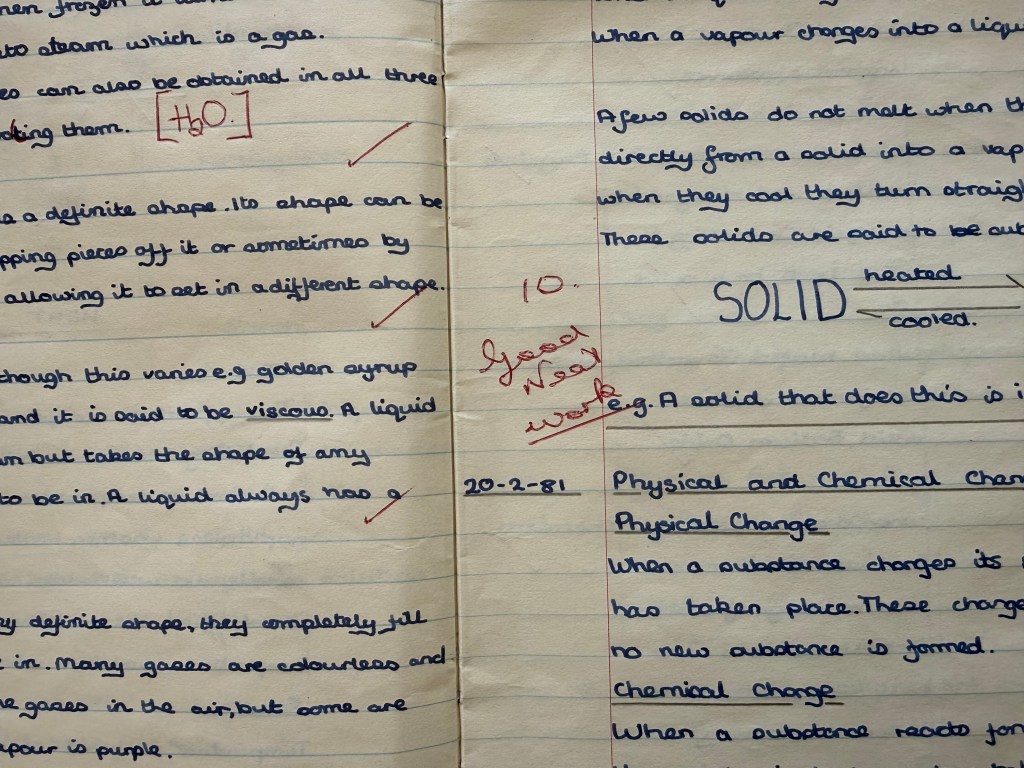
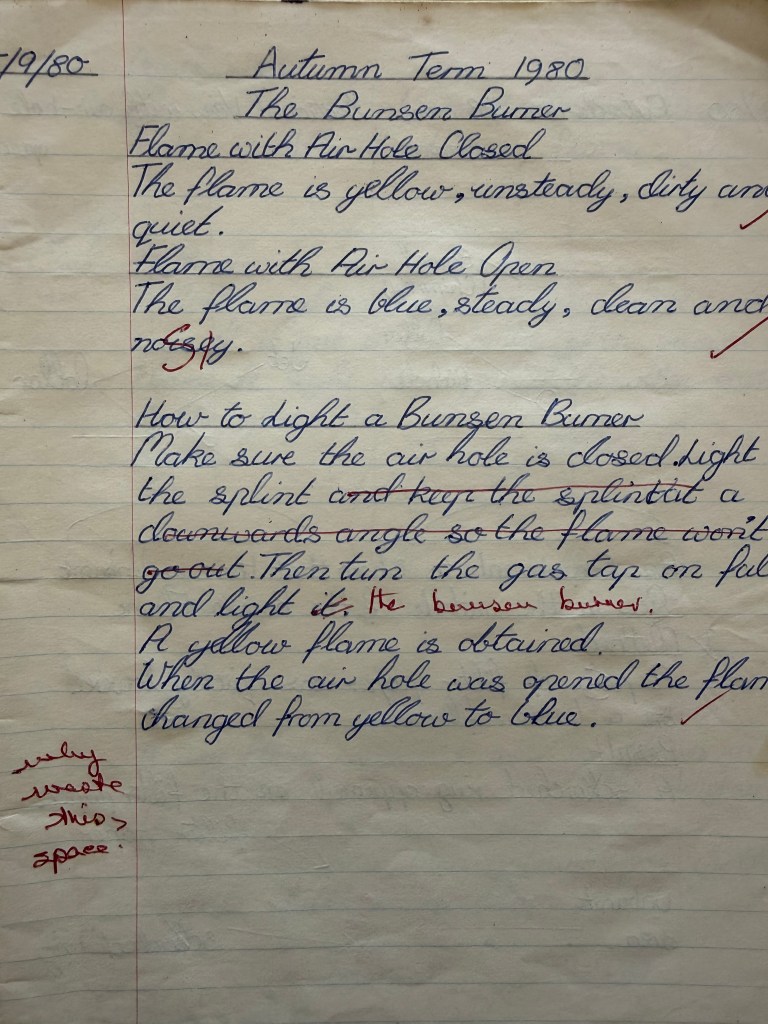
That is what I will do. In fact, I have recently started trying to sort out the stuff which currently inhabits the space – a collection of this and that from our past and our parents’ past. I came across some of my old exercise books from school, covered in pages from Smash Hits magazine, which my mother would buy me on Fridays, which was shopping day, together with a yoghurt and a chocolate bar. I also had several pieces of fruit that were to last me the week, and which sat in the fruit bowl on the dining table, slowly decomposing.
My daughter couldn’t get over how neat my handwriting was. My handwriting is a standing joke in our family – I should have been a doctor, apparently. What I noticed was the frequency with which it changed – experiments in mark-making.
Neatness was something which was commented on and leaving space for your work to breathe wasn’t encouraged.
My sister had obviously got her hands on them when she was a child living out her dreams of becoming a teacher. She even gave me a lower mark than the teacher. But I’m glad to see that I had my priorities right at that age: I liked drawing, pop music, going to parties and discos, and also boys.
I suspect that I will discover a wealth of material to prompt further work.
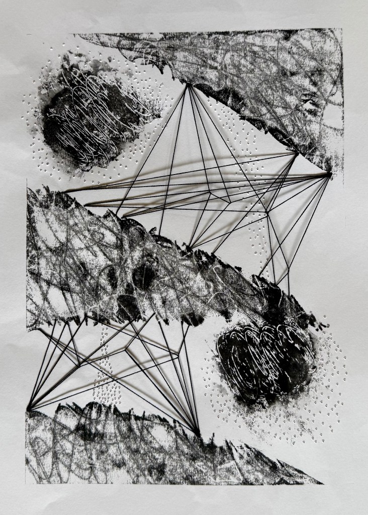
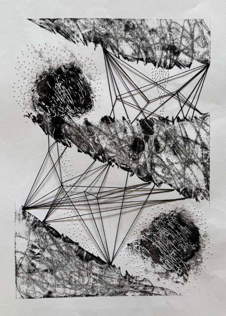
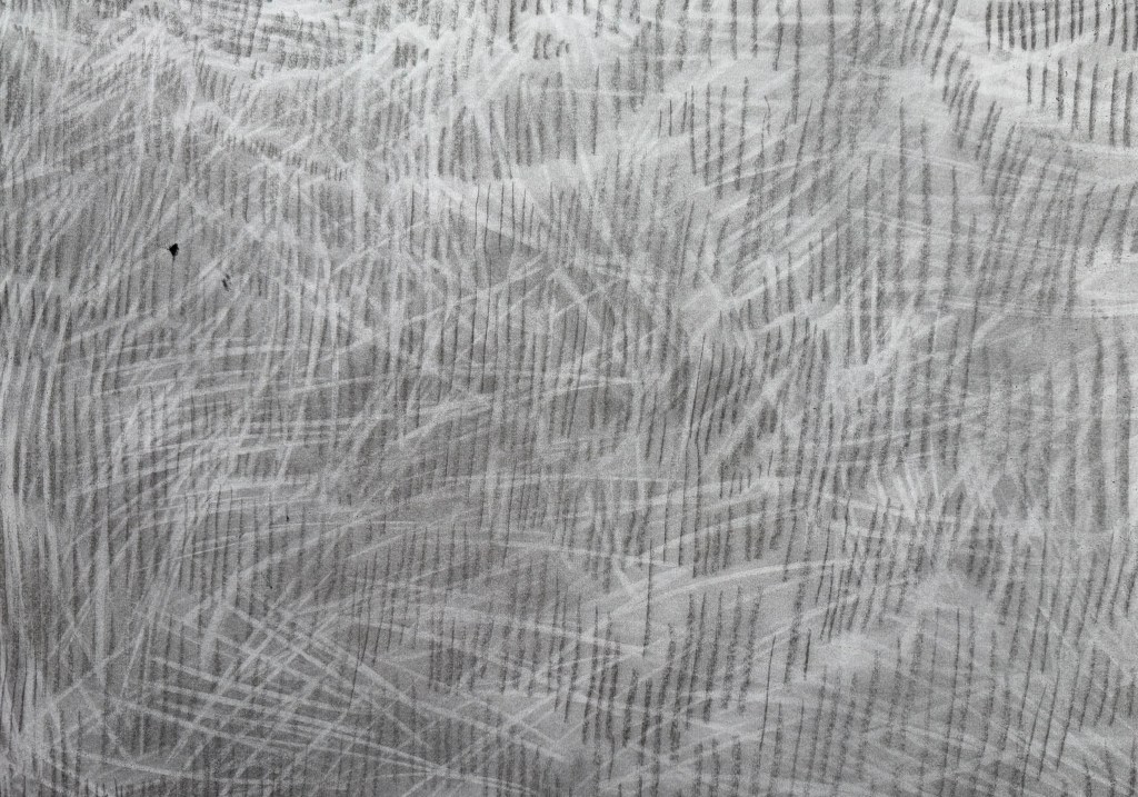
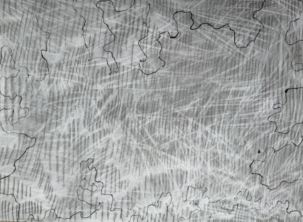
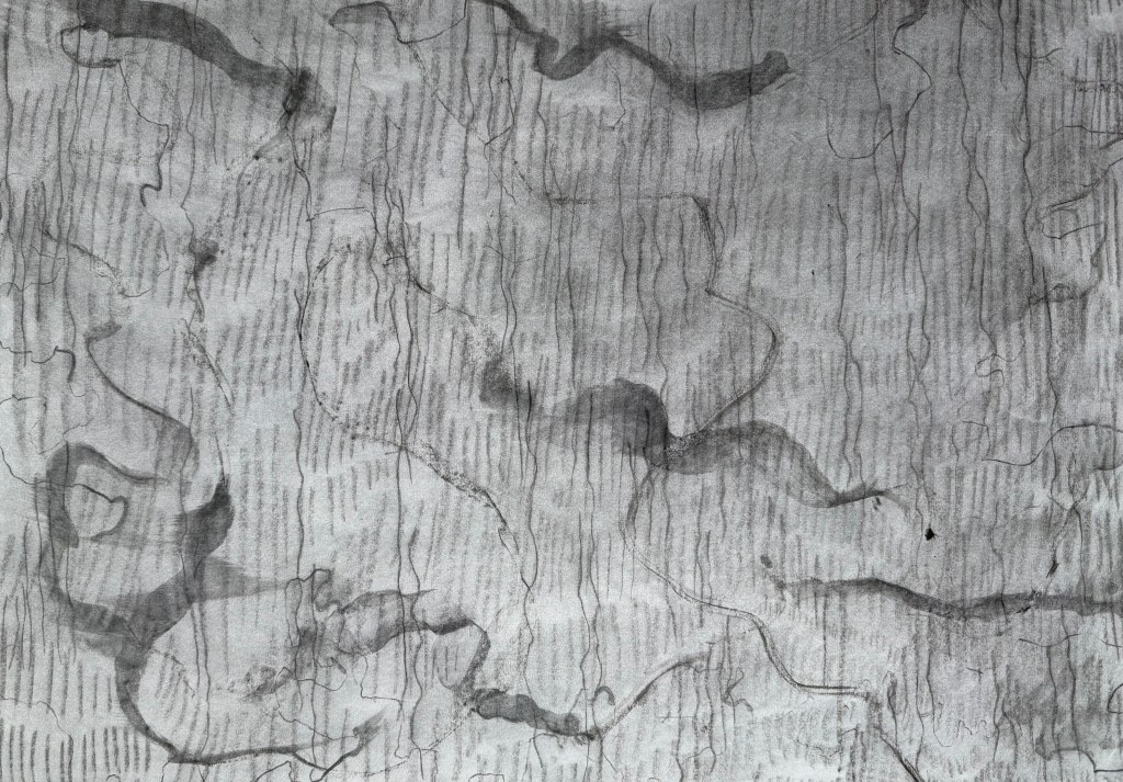
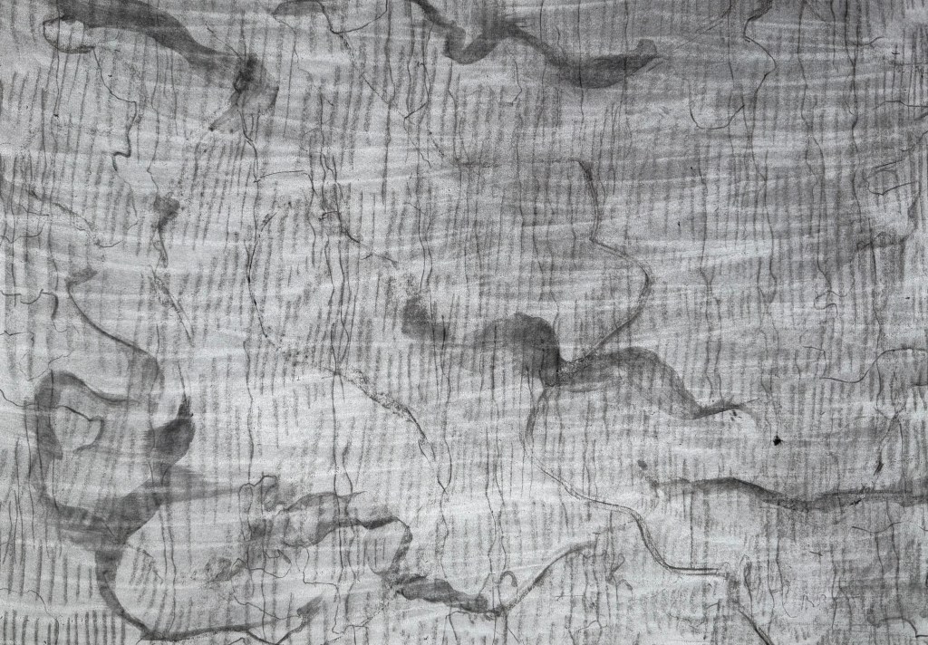
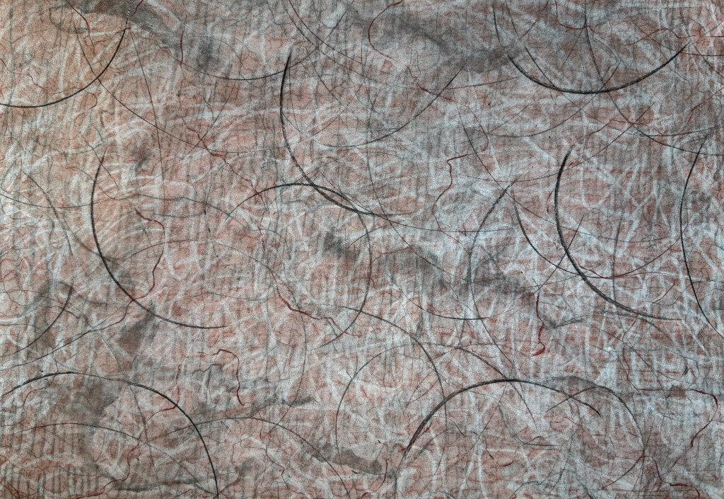
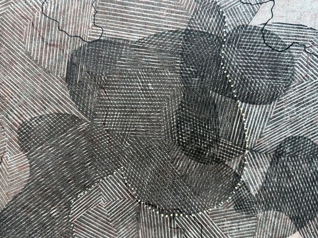
I wanted to make some marks – layers of marks – and so I took some A2 paper and used charcoal, pastel, an eraser and a pen.
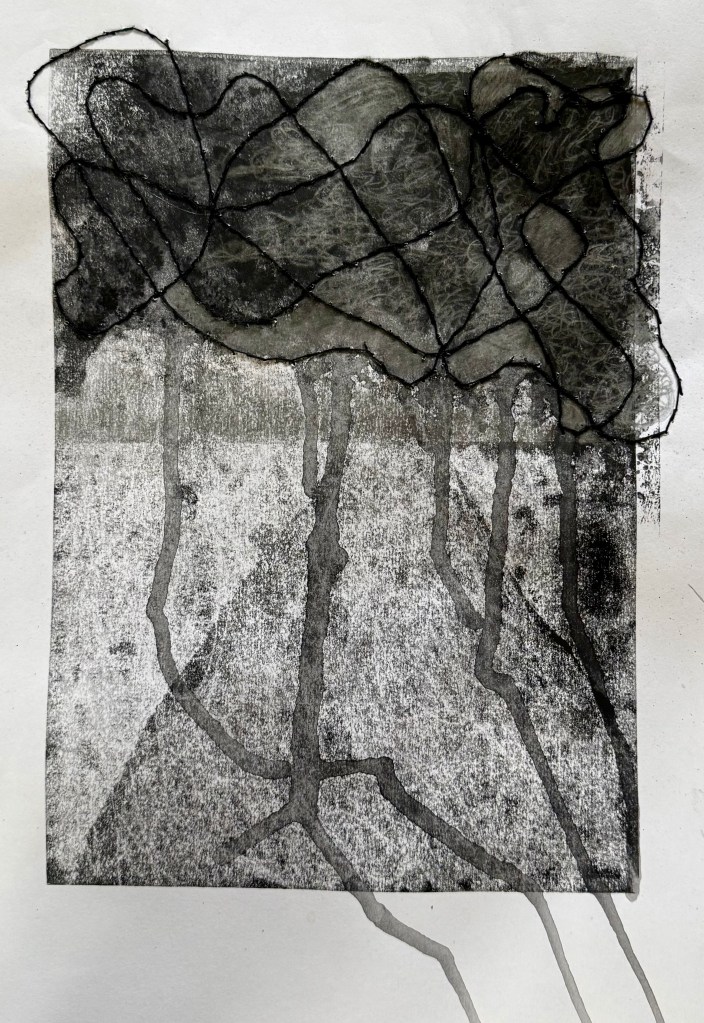
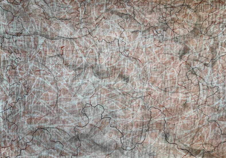
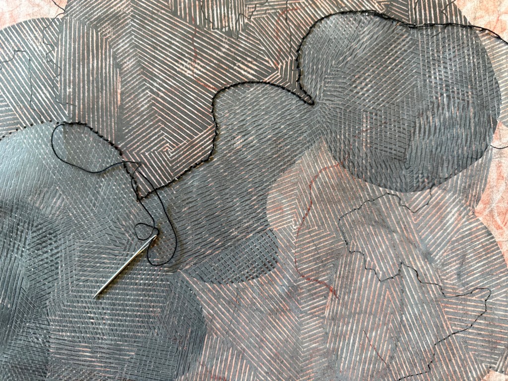
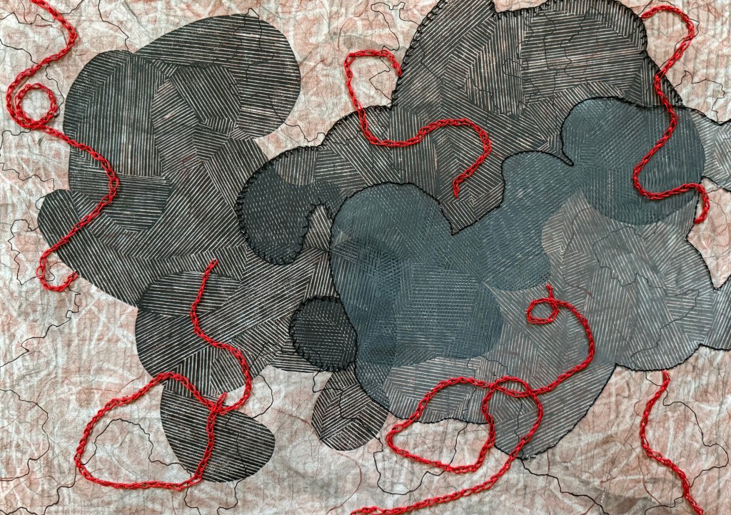
It wasn’t meant to be anything. I thought that I might use it as a base for something else. I had been wanting to have another go at overprinting the linocut image from Never Say Never. In that post I comment that the shapes look like crouching figures – in retrospect they are foetal-like. The subject of microchimerism has come back to my mind recently and I thought that the idea of making the ink more transparent with each print could touch on that. Also, the marks underneath would also become increasingly visible. I gave it a go but I made a hash of the ratio of ink to extender, and I couldn’t find the new tube of extender so I just added some white which, of course, made the print totally opaque, which wasn’t the original intention.
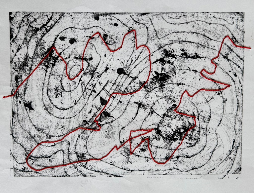
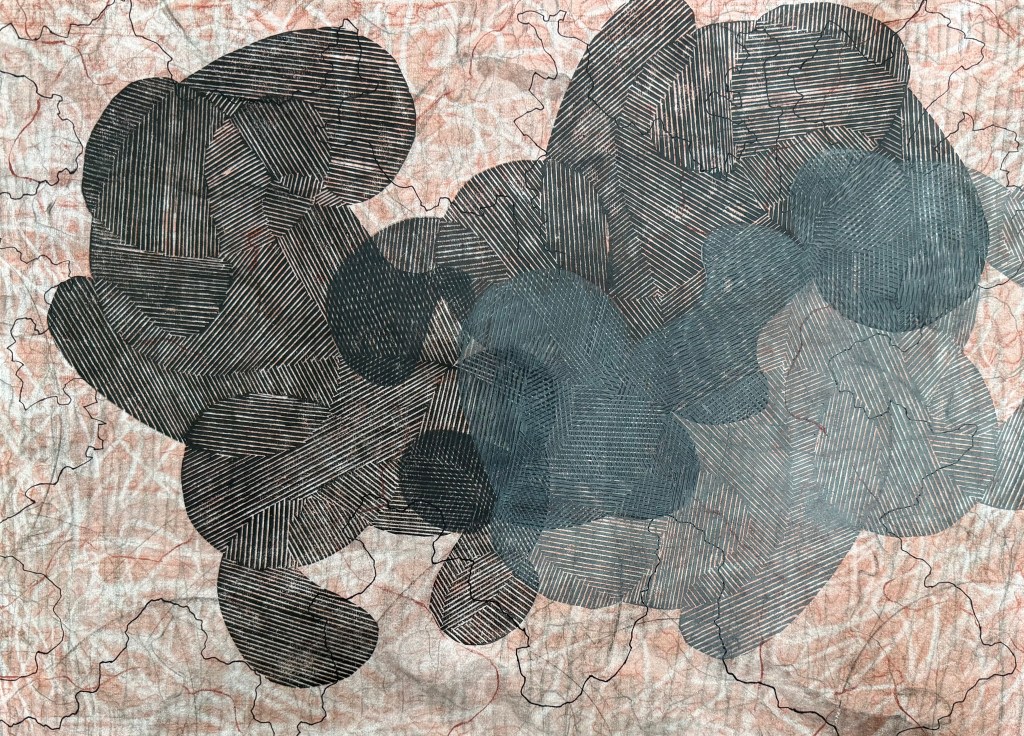
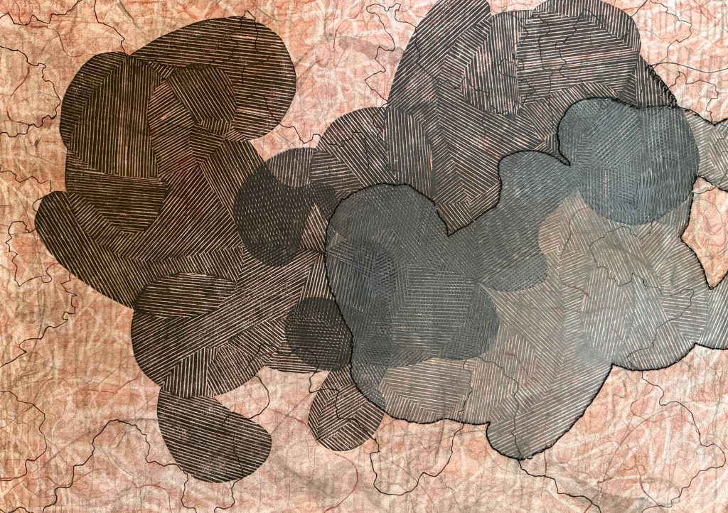
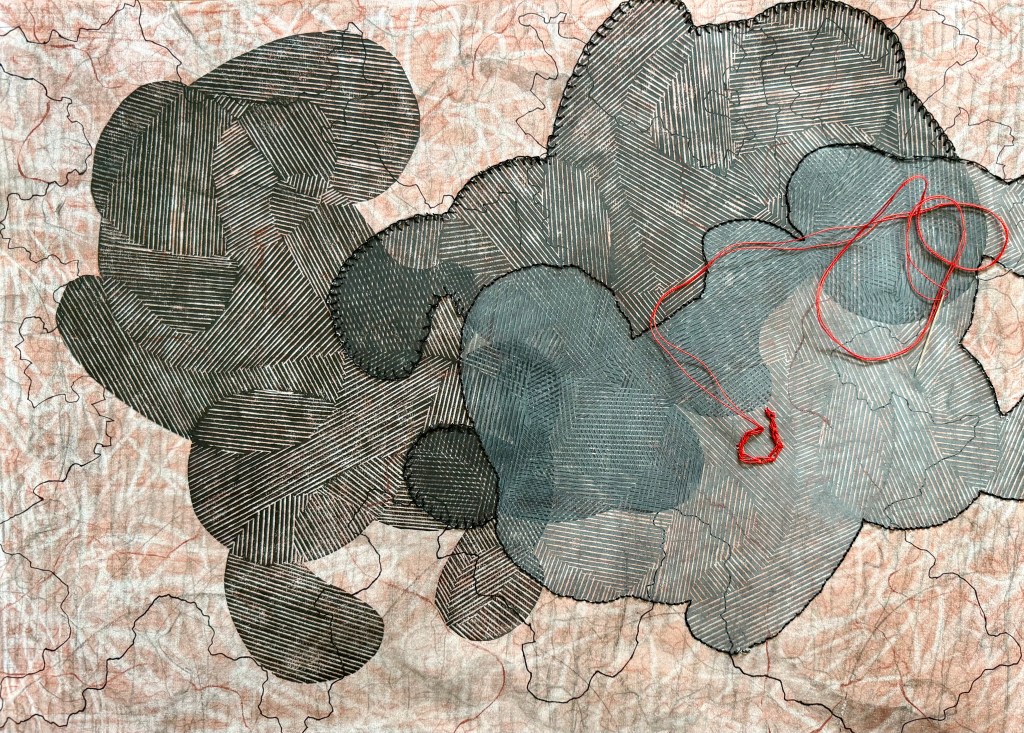
I left it for a while and got on with other tasks relating to the book and when I revisited it I thought about umbilical cords (something I have referenced previously in Sisters). I thought I might use some of the red thread that I had for my paper experiments to sew some kind of twisting cords which then made me think of using black stitching to delineate between the three shapes. I used a blanket stitch on the second shape as I’d seen at her Tate Modern exhibition that Tracey Emin had used it on her blankets to give a less defined line.
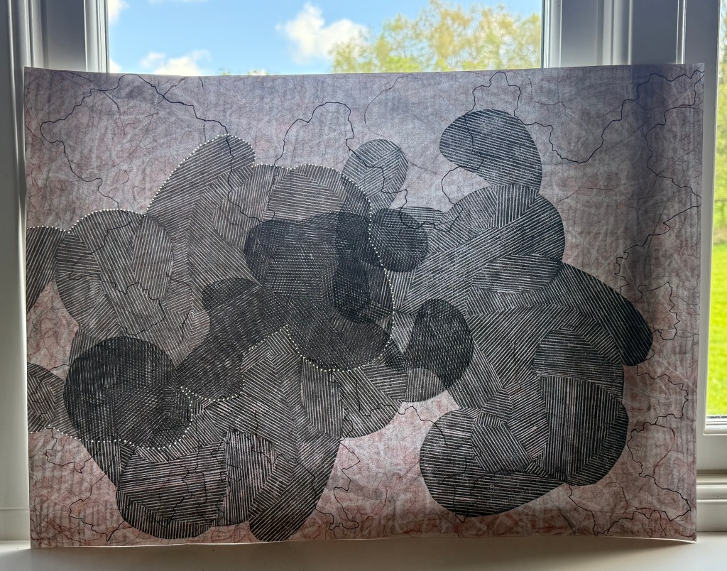
I’m really chuffed. I was thinking as I was sewing that maybe I should have planned where I was going to go, but then decided that, no, I liked the spontaneity of it all. Would I have done anything differently? No. How did I feel as I was making it? I felt pleasure, at all stages. I enjoyed the making of it and I like how it turned out. In fact, over the last few months (Summer Exhibition aside) I have really enjoyed making. That’s not to say that I haven’t enjoyed the process of making before then – I have, particularly the experimenting and and the wandering, it’s just that recently I have felt contented, as if some things have fallen into place. I particularly enjoyed the experiments with lino cuttings and packaging, and I’m really happy with the video that I made.
I think that it comes down to the accidental and the incidental; the unexpected that happens in the process and the small things I notice within the process which then lead to something else.
I had an urge to make some marks with charcoal before I went to bed last night. It started off as a wild grassy landscape then I wiped it and used some Conté pastel to draw various figures, crouched, swimming, running etc. They were quite comical. I sometimes wonder whether I have to look at something to be able to draw it. Anyway, I wiped that off and it left some lovely outlines. I kept using the pastel, closed my eyes and drew two heads using a continuous line, looking from time to time. I then traced the lines with some charcoal, cut a wedge of eraser using the fine edge backwards and forwards over the line. I wiped it all back and then did several layers of pastel then charcoal using the eraser in brisk strokes all over the paper. I think it turned out surprisingly well, and I’m pleased that the heads are only just visible when you stand back – close up it’s just a lot of mark-making. And the weirdest thing, I can see a third head in between the two which doesn’t stand out so well in the photo.
I’m now playing catch up, tying up all the loose ends from the summer, which now seems an age away.
Once I’d seen Bourgeois’ ‘Maman’ I had a wander around the rest of Tate Modern.
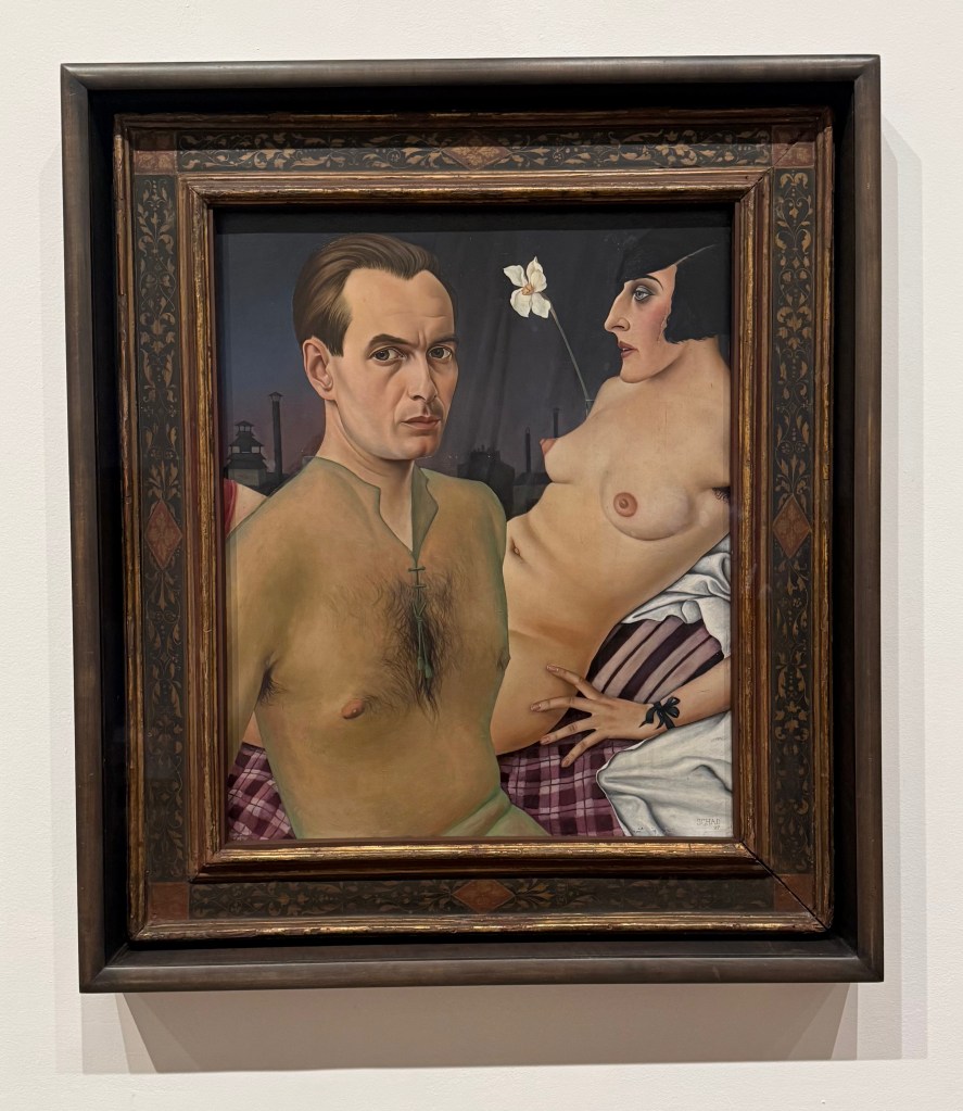
I don’t know what it is about this painting, but I always find myself standing in front of it. It’s a self-portrait by German artist, Christian Schad, in 1927. Having previously been influenced by Dadaism, after returning from Naples he started painting in a smooth, realistic style as part of the New Objectivity, a reaction against Expressionism. He also created Schadographs, which I may have to have a look at. Maybe I’m drawn to it because it was painted at a time of decadence in Berlin and Vienna, or because of the narcissistic symbolism, or maybe it’s just the way he’s painted that really sheer shirt.
This is by British modernist, John Tunnard in 1942. It is an abstract landscape painting of Tol Pedn near the Lizard Peninsular, where Tunnard served as a coastguard during the war. The two small chesslike objects represent the two artificial landmarks on the coast warning ships to keep away from the Runnel Stone, a dangerous reef. I like the areas of texture which contrast with the flatter paint, and the overall balance of the composition.
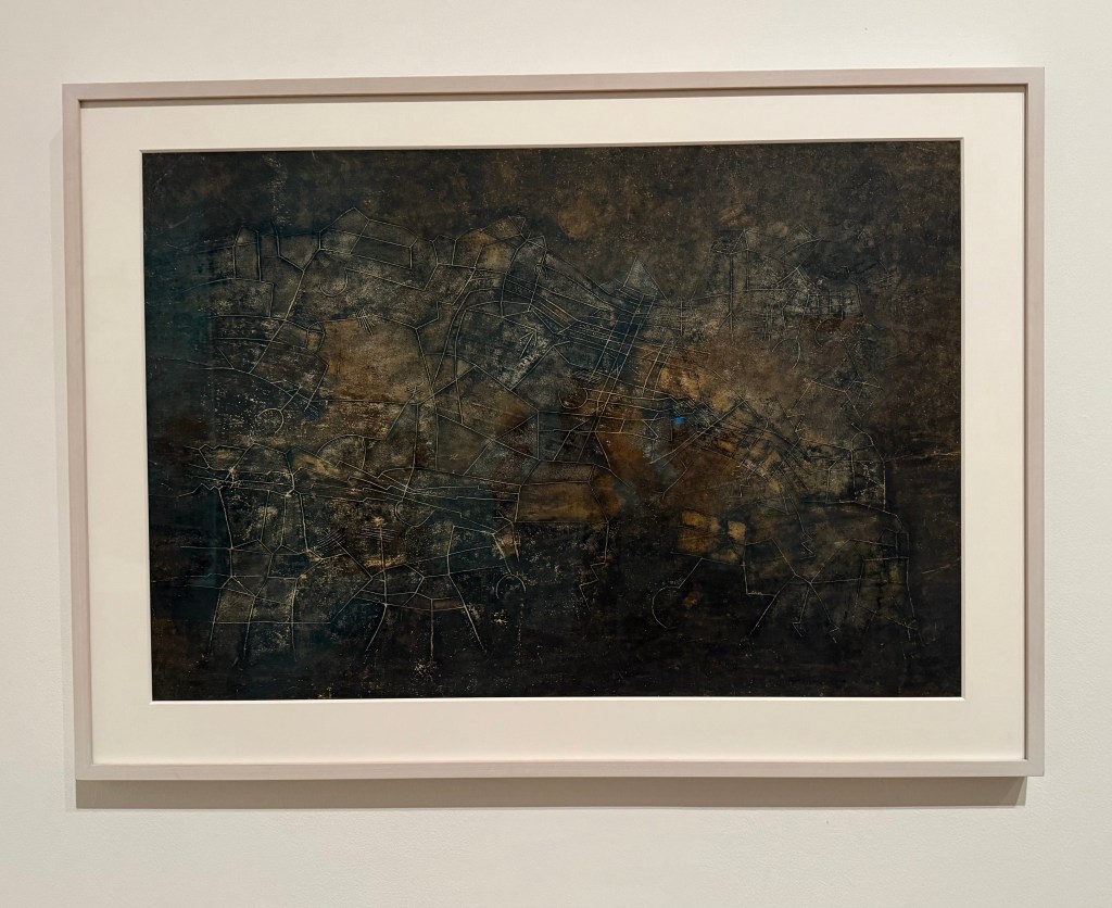
I particularly like the aerial view feel of this work. It is Nocturnal City, by Maliheh Afnan made in 1987 – wax, crayon, oil pastel and ink on paper. She is influenced by the written form, in particular, Persian manuscript paintings. She ‘writes’ her paintings layering materials in which she explores, memory and places. Text has appeared in some of my work, and I like the effect of scraping into the surface to make marks, something that I do a lot of instinctively.
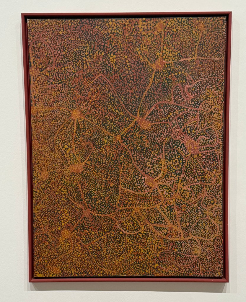
I had a look around the Emily Kam Kngwarray exhibition: she started painting in old age and made a mind-blowing 3,000 odd works in just a few years. I enjoyed looking at the mark-making and the colours, some reminiscent of mapping.
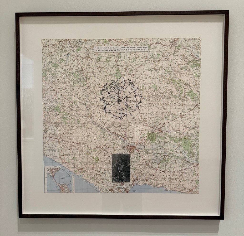
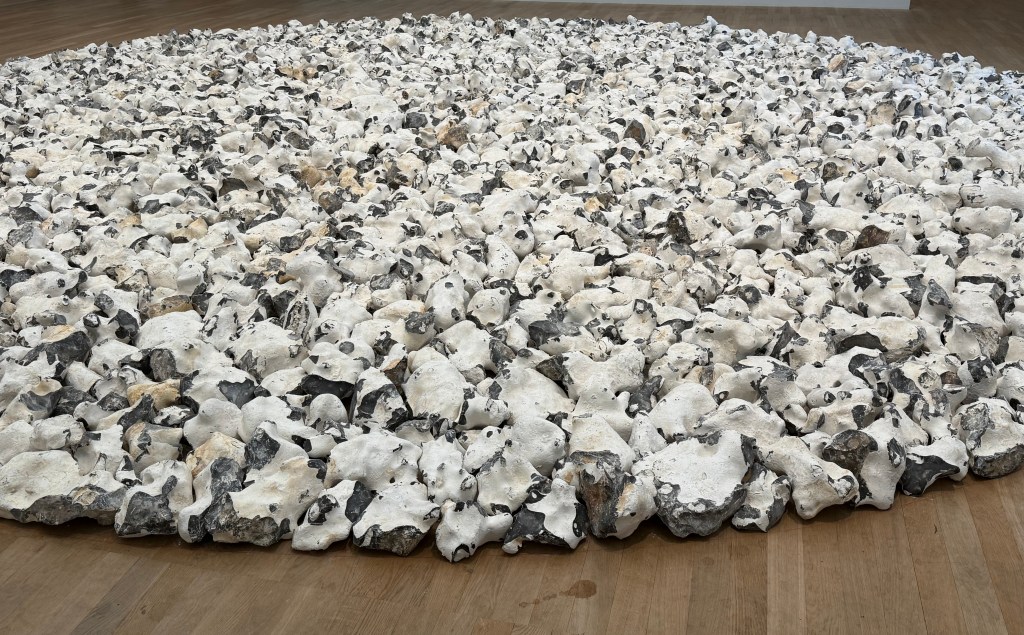
And then I saw an actual map in Richard Long’s Cerne Abbas Walk (1975) in which the sculptor/ land artist documents a six-day walk at a well known Dorset landmark, detailing his physical interaction with the landscape. I couldn’t help but stop and spend quite a long time just looking at his 8 metre wide Norfolk Flint Circle (1990) which creates its own extraordinary landscape.
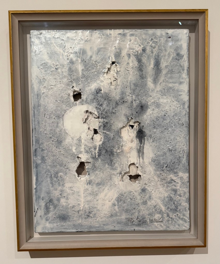
I didn’t make a note of this next work which is frustrating as I was intrigued by the holes and layers beneath.
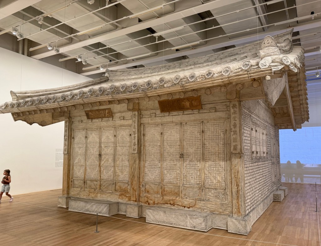
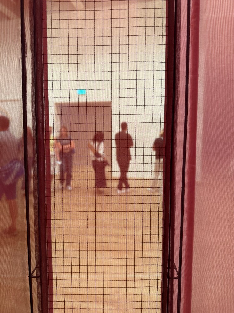
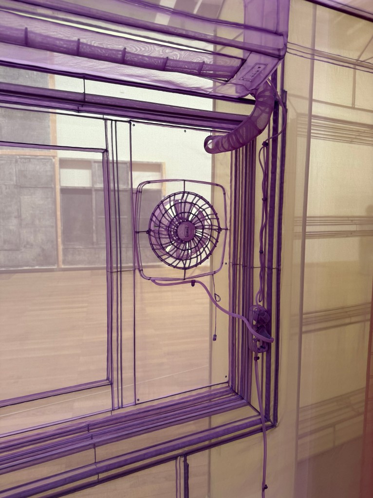
Then it was on to Do Ho Suh’s Genesis exhibition. Lots of transparent layers, grids and threads, all of which appealed to me.
Some wonderful Giacometti’s in the Tanks, emerging from the darkness and given form by the wonderful lighting.
An accidental slip of the phone, but an interesting image.
In the words of Vinnie Jones: it’s been emotional.
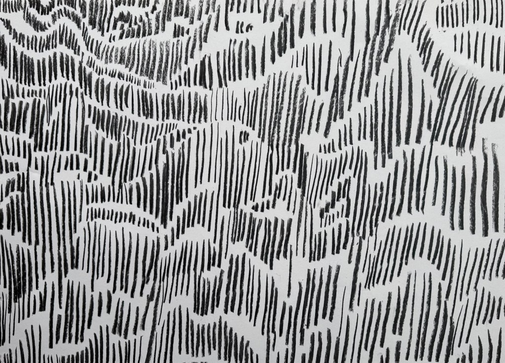
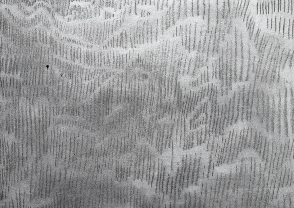
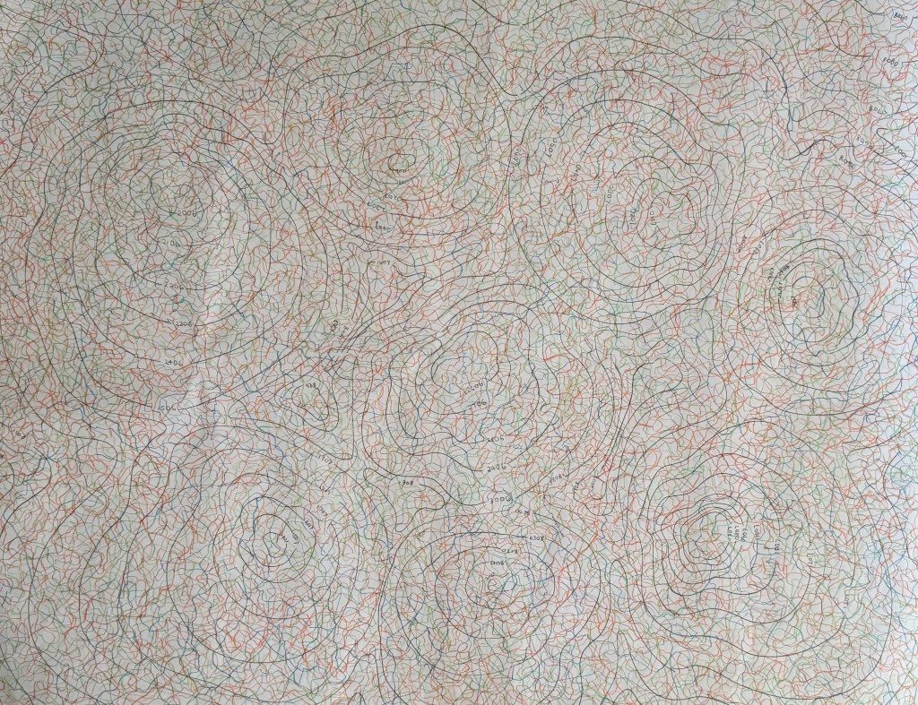
Over the last 54 days I have been mapping my emotions each day, using orange for positive, green for neutral and blue for negative. At the beginning, I was going to use different shades of each colour but I soon realised that this would over-complicate things. I also realised that I needed to put some rules into place: I started each line from the dated contour line, drew for two minutes, trying to explore as much of the sheet as possible to achieve an even distribution of mark-making, and finished the line off the page. I wanted to make it so that theoretically I can pick any day and trace the line which represents it. I drew each line at the end of the day, and took a photo. Unfortunately, sometimes it wasn’t light enough and so I had to take photos including a number of days’ worth of lines, so instead of having 54 photos, I’ve only got 46 which has resulted in a sudden surge in orange lines towards the end – maybe I was enjoying the positive. They are not the best photos – the lighting is all over the place. Next time I do something like this I will try and make them consistent, although I do quite like the movement it creates.
What have I learnt from this exercise? Had I not done it and you had asked me what the last 2 months have been like for me, I would have said that they have been difficult, and that for the most part I have felt negative emotions such as sadness, grief, stress, frustration and anxiety. However, looking at the end result I can see that this isn’t actually the case; I can see that there are more orange lines than green, which in turn outnumber the blue. This must mean that I feel negative emotions more strongly than positive ones, and this results in my perception of life being somewhat skewed. The map reflects this, in that, whilst they are few in number, the blue lines jump out at me from the rest. I think the technical term is the negativity bias. I don’t think that I would have had the same result had I represented my daily emotions diagrammatically in a chart – it matters that each day is individually represented. Maybe there is another way of doing it – I’m just not a mathematician!
I found the exercise to be a positive one; the act of drawing a line each day not only meant that I was making, but it also allowed me to reflect on the day as I drew – a form of visual journaling. I enjoyed the process of it and whilst it can be said that the resultant map is interesting, what it reveals also became apparent during the process itself; as the map was becoming each time I engaged with it, so I was becoming.
As ever, I’m not sure how I can develop this, if at all. Or maybe, there’s no need. Today was the last day. I think I will miss doing it, so I might just continue.
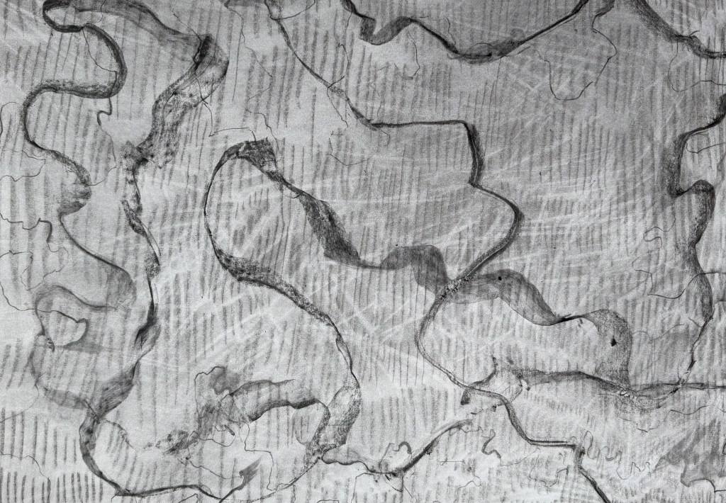
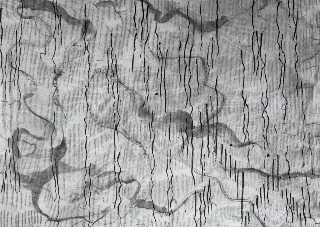
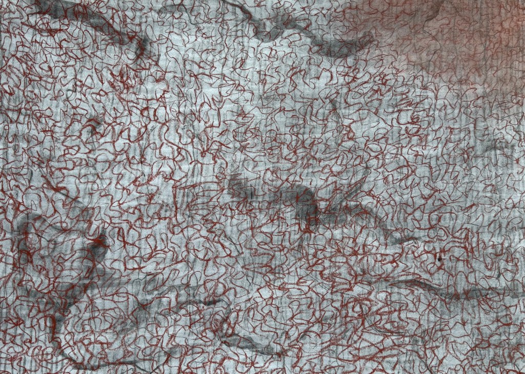
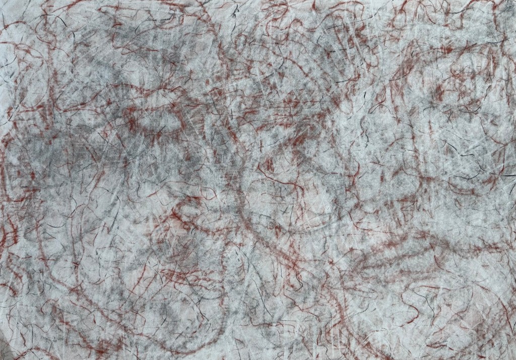
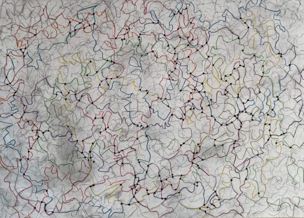
I decided to try and progress the idea of automatic map-like drawing by experimenting with charcoal. I drew a single line and then rubbed it out and repeated the process numerous times, building up layers of mark-making. I then took some coloured pencils and traced a path randomly following the marks.
I’m not sure that it takes me much further forward in developing this line of enquiry. However, I enjoyed the process and I like the different nature of the coloured lines which I made consciously by making decisions as to which of the paths of faded charcoal to follow, almost like a dérive – they have a different character to the ones I make when I draw automatically.
I’ve been thinking a lot recently about the course, about being half-way through and what I would like to have achieved by the time it finishes – what work I might produce by the end of it. At the moment, the concept of mapping is at the centre of it. I want to produce something which reflects all that I have learnt during the course, about myself and how I relate to the world around me. It will inevitably be an artifact, a map, of some shape or form, but I want it to reflect a process which is ongoing, that will never be complete, a piece of work in a state of flux, constantly subject to change, so there has to be some sense of impermanence, of it being unfinished. I also want to encompass the idea that memory plays a large part in the process and much like maps which are constantly being made and remade, so are the memories on which the map is based. The idea of layers and distorted imagery seem to be relevant in this respect.
I’ve thought about paper and canvas, maps being folded and rolled , but I don’t think that these offer the ability to create layers in the way that I want. I’m currently thinking that I may make a number of squares which together make up the grids of a map.
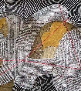
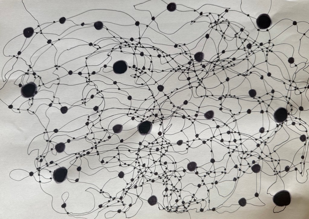
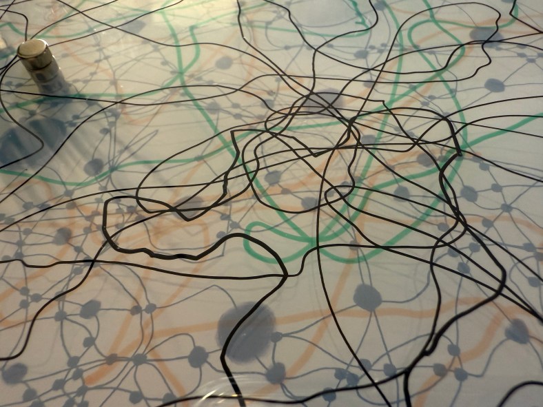
I used a pen to try and keep a marble on the paper. I like the lines which were made as a result – they have a sense of fluidity about them, much more than the lines that I have been making up until now. I’ve been meaning to experiment with the size of the dots at the intersections, to see if different sizes create a sense of perspective and three dimensionality. I don’t think that I have managed to achieve enough diversity in the sizes – it was very much an afterthought – I’ll try again another time. The image makes me think of something neural, cognitive mapping?
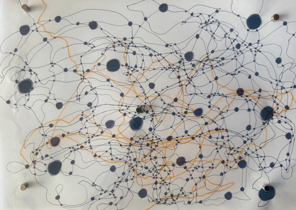
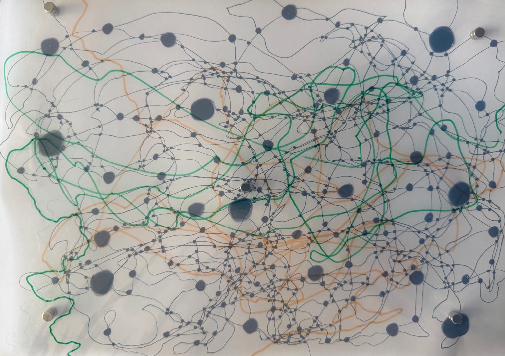
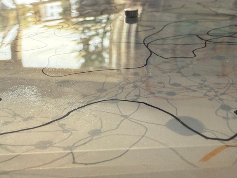
I took some inkjet compatible transparencies and drew some lines to see if I could create layers. Unfortunately, they are not totally clear – they have a milky appearance, probably because of the coating which allows them to be used in inkjet printers. I need to do some research to see if this is the case or whether I can source some others. Having said that, the milky film does cloud what’s underneath, making it hazy, almost like a memory that’s not quite there. Ultimately, I’m thinking that I could use layers of acrylic sheets over a background image, possibly together with milky transparencies, some can be drawn, painted and printed on, and I can also include some cyanotype images as well a negatives. I could cut holes in some layers to allow direct access to layers below. The use of reflective surfaces would also add depth.
I layered up the sheets using small magnets which not only hold them stacked together but also act as spacers between the layers. I had to add one in the middle because otherwise the sheets would sag – this won’t be a problem with rigid acrylic sheets. The magnets themselves suggest impermanence, the ability to be easily changed.
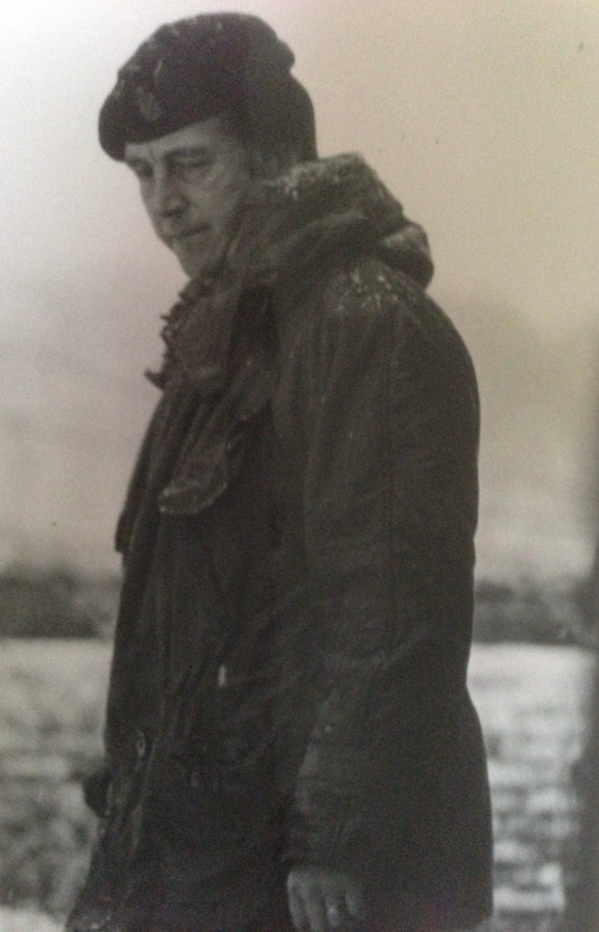
I feel particularly drawn to this photograph of my father. It’s solitary and contemplative, evoking a sense of vulnerability – a side which was never apparent whilst I was growing up. It makes me want to go and give him a hug. He was the world’s best hugger. Either that, or he’s watching someone doing something and he’s not that impressed – a more familiar experience.
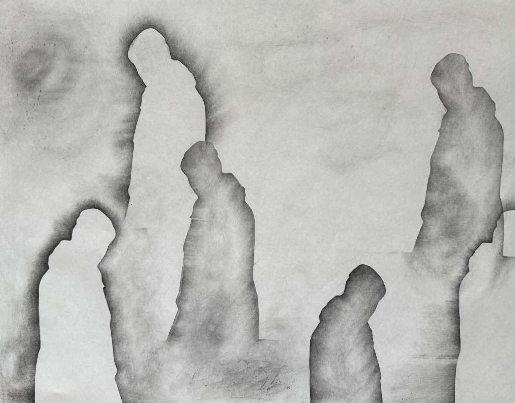
Having missed out on visiting a couple of exhibitions on Sunday, I decided to experiment. I took a piece of A1 flipchart paper, a graphite stick and a 5B pencil and got to work. First I created multiple silhouettes of the image using the graphite stick.
I was inspired by the Richter drawings (The Rich Are Getting Richter) and used the tiles on the kitchen floor to create texture with some frottaging.
Having really liked the effect of some of the lines and marks made in my automatic drawings, I used the 5B pencil to create a wandering line, holding it at the top and twisting it from side to side in the process and then holding it on its side to create a second softer line. I like the idea of tree roots and mycorrhizas connecting and creating a support network for trees, a concept we touched on in last week’s session. The lines are connecting each figure so it’s no longer alone. They are also reminiscent of a map or a mapping out. Not sure which, but I like the effect. I like the delicacy of the lines. They also remind me of the lines in skulls at the points where the plates have fused or cracks in a surface, fault lines. I wasn’t keen on the overlap on the two figures on the right which created a hard box-like edge, so I cropped it out on the last image.
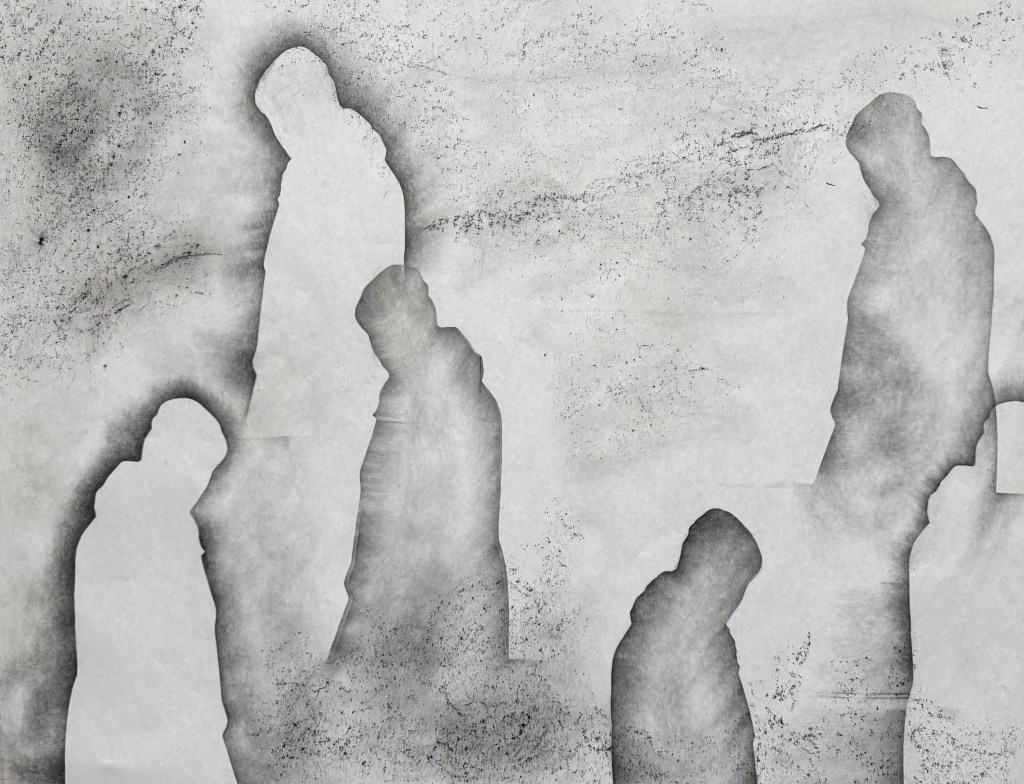
I really enjoyed doing this, particularly the lack of control of the line making and the unpredictability of the frottaging, and despite that, it does bear a resemblance to the vague image I had in my head. It ties in with the idea of shadow selves (Sniper’s Alley) and the idea of inheritance and being made up of multitudes (Bus Replacement Service). It’s definitely an approach I will develop further, but I’ll use better quality paper next time.
We had a friend to stay at the weekend, so we took her to Jane Austen’s House which is less than half an hour away from where we live. It’s the 250th anniversary of her birth this year, and so there are lots of Austen celebrations happening to mark the occasion. She, together with her sister, Cassandra, and her mother lived in the village of Chawton, in one of the houses on the Chawton Estate, which was owned by one of her six brothers as his country residence. He had been adopted by a wealthy couple who were very distant relations, and who didn’t have a male heir.
My husband, who had been a bit reluctant to go as he hadn’t read any Austen and thought her writing a bit girlie, enjoyed himself. She’s far from girlie, I told him: she had an ascerbic wit and was a keen observer of human nature. I picked up a fancy edition of ‘Pride & Prejudice’ in the obligatory gift shop, and told him to read the first few lines; he laughed, I laughed, Alexa laughed, Siri laughed.
I discovered two interesting facts. Firstly, that many wealthy families were heirless, and so hunted around on the peripheries of their family trees for a suitable candidate who would inherit, but on the condition that he changed his family name to that of the bequeathing couple. Sometimes there were no suitable candidates and a daughter would inherit as in the case of Elizabeth Knight who inherited her parents’ estate at Chawton and Godmersham in Kent in 1702. Because of the size of her estates she had a raft of voting rights in Parliament, but was unable to exercise them, because she was a woman. A formidable woman at that, and thought to be the inspiration for Lady Catherine de Bourgh in Pride & Prejudice.
The second fact was that markings were often made next to vulnerable areas of a house, where evil spirits could enter e.g. doorways, chimneys, windows etc. They were called witches’ marks and ranged from daisy wheels to the letters V and M, possibly signifying the Virgin Mary. There was one such mark by a fireplace at Chawton.
Talking to Cat in yesterday’s session about her recent performance, and the drawing of a pentagram, reminded me of the rich tradition of mark-making as a form of protection.