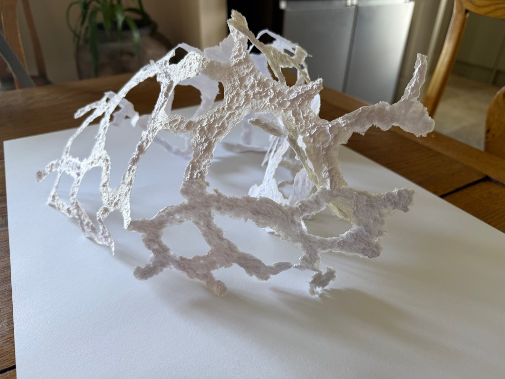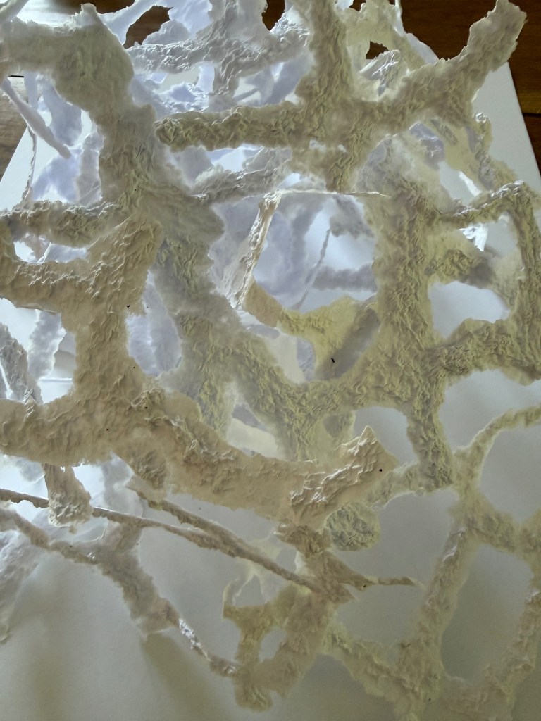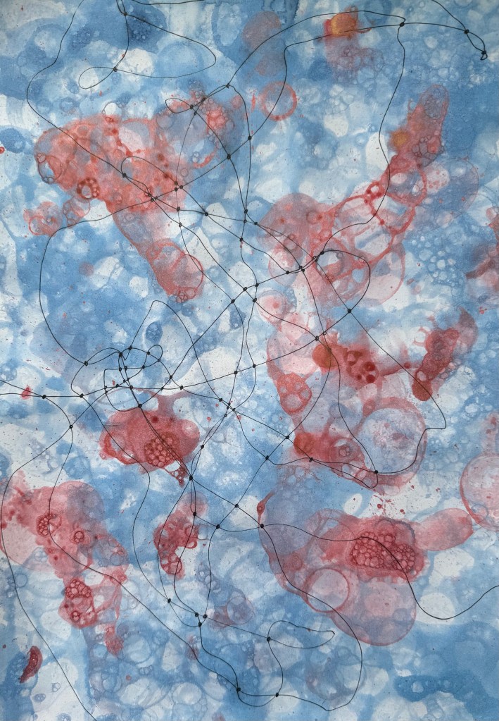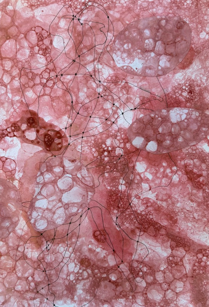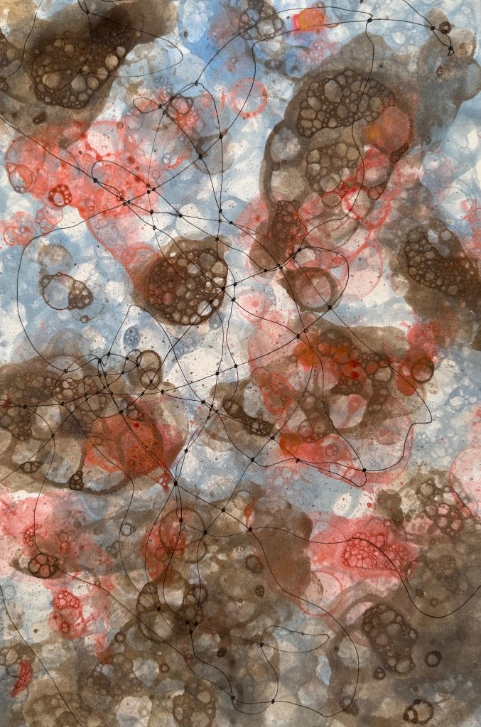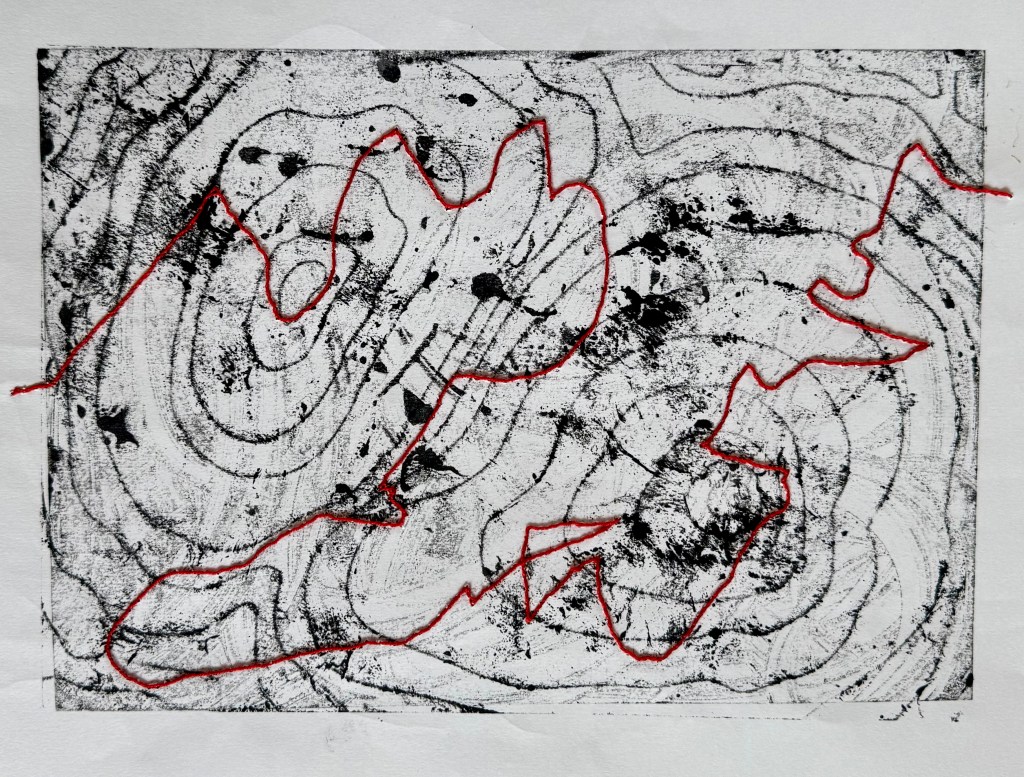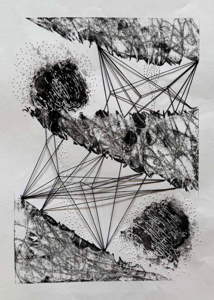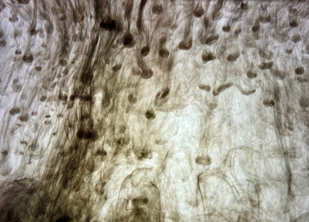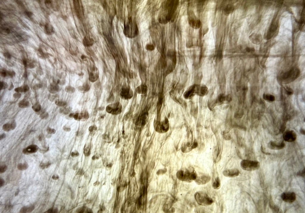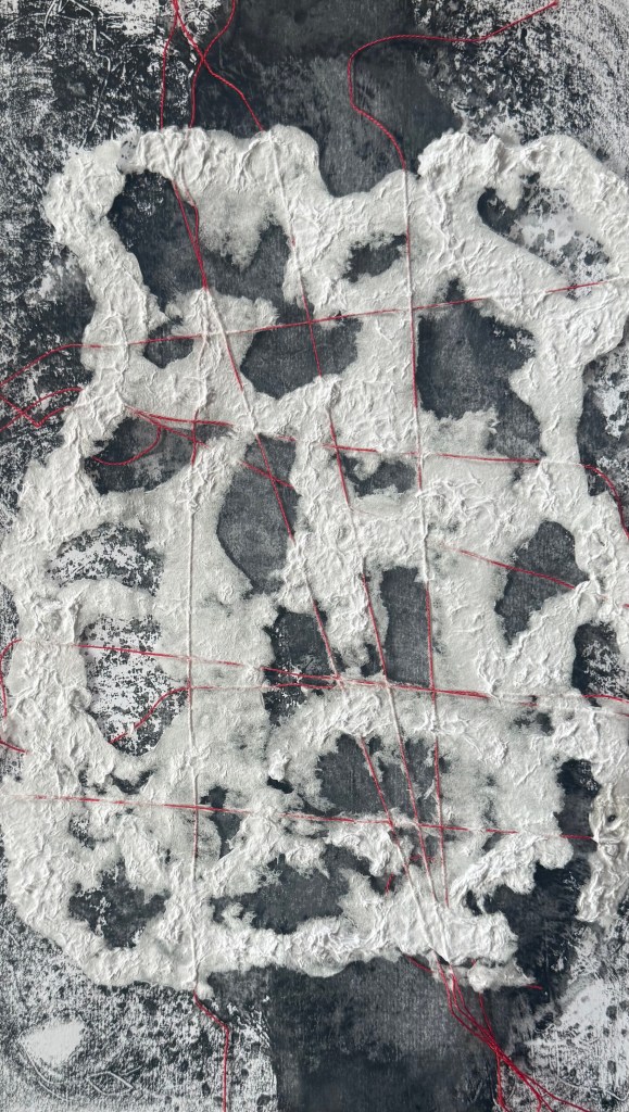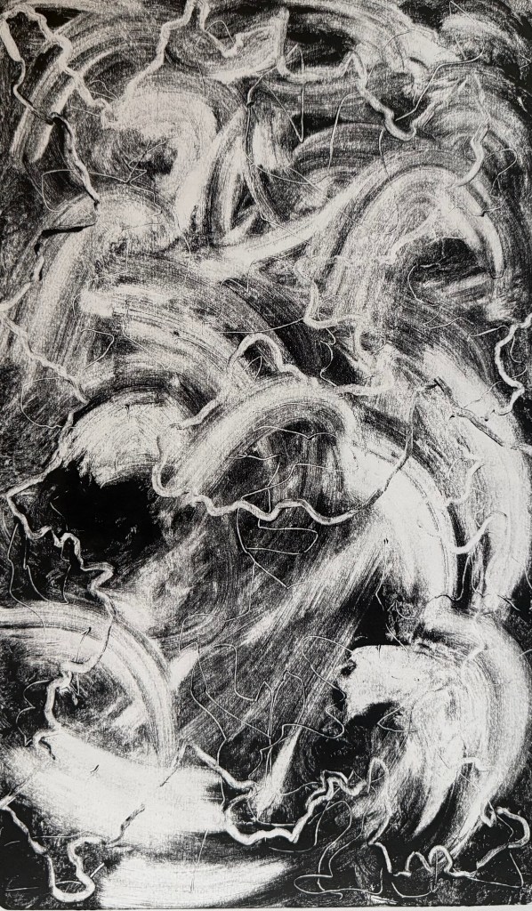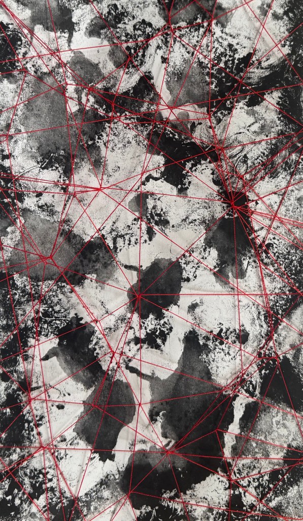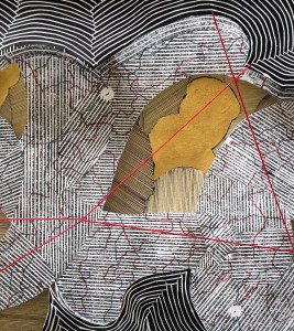
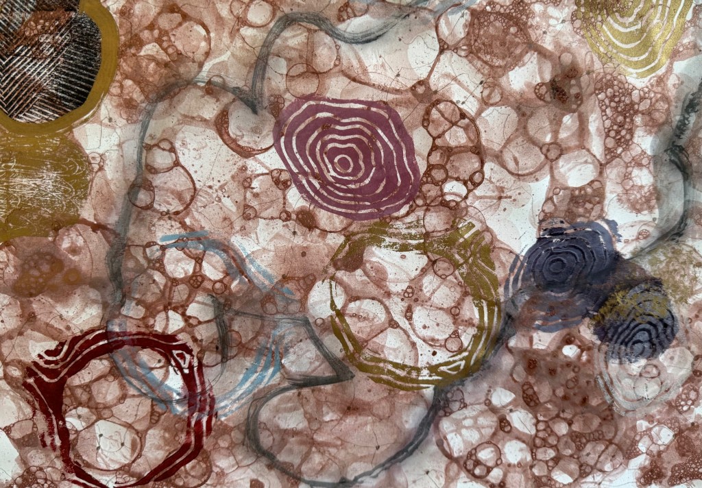
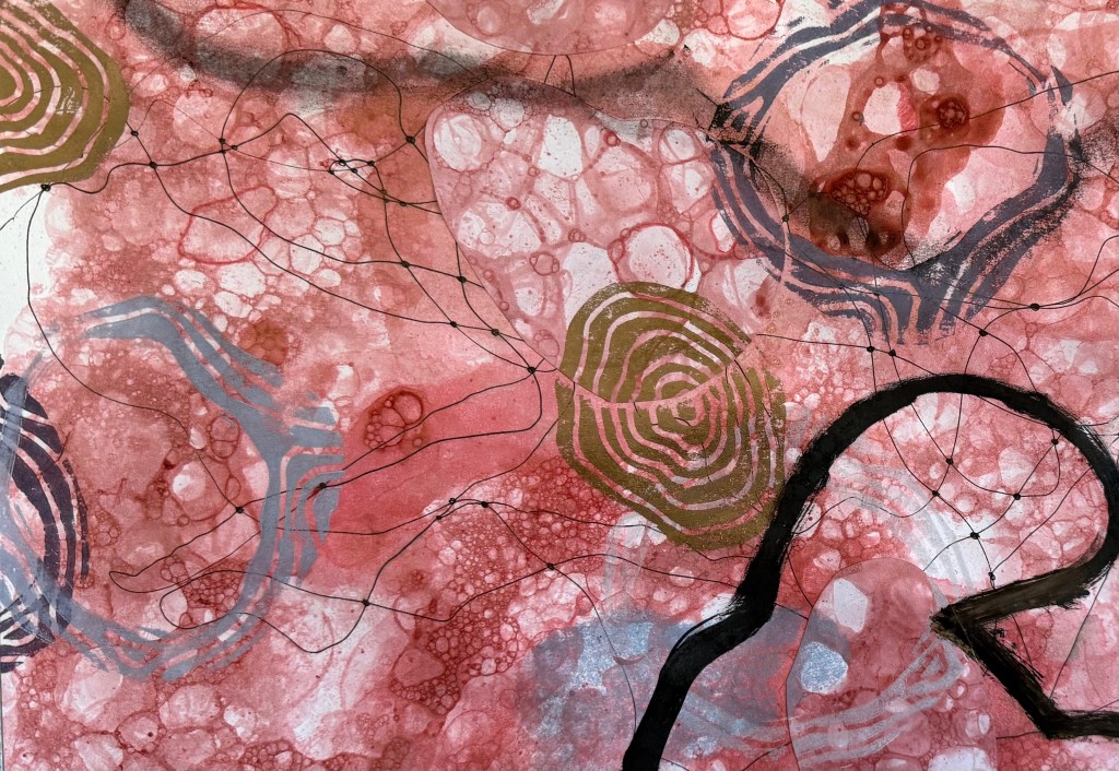
So, having taped all of the test sheets togther into what I called my ‘play sheet’, I let rip with the small pieces of linocut I had found. I also used the lino of the shape that I’m not intending to use, although I still really like the shape of it. The full print of it doesn’t fit with the background, although I do like the way the background disrupts it. I experimented with just using the outline which I think is effective, experimenting with the quality of the outline by using a bold line painted on with printing ink, some thinned down ink and some charcoal. I also added to some other areas with a brush as well as coloured pencils. I think that I need to sit with it for a while to identify those elements that work – it’s got everything but the kitchin sink in it. Hopefully, some clarity will emerge from the chaos.
I have some initial thoughts.
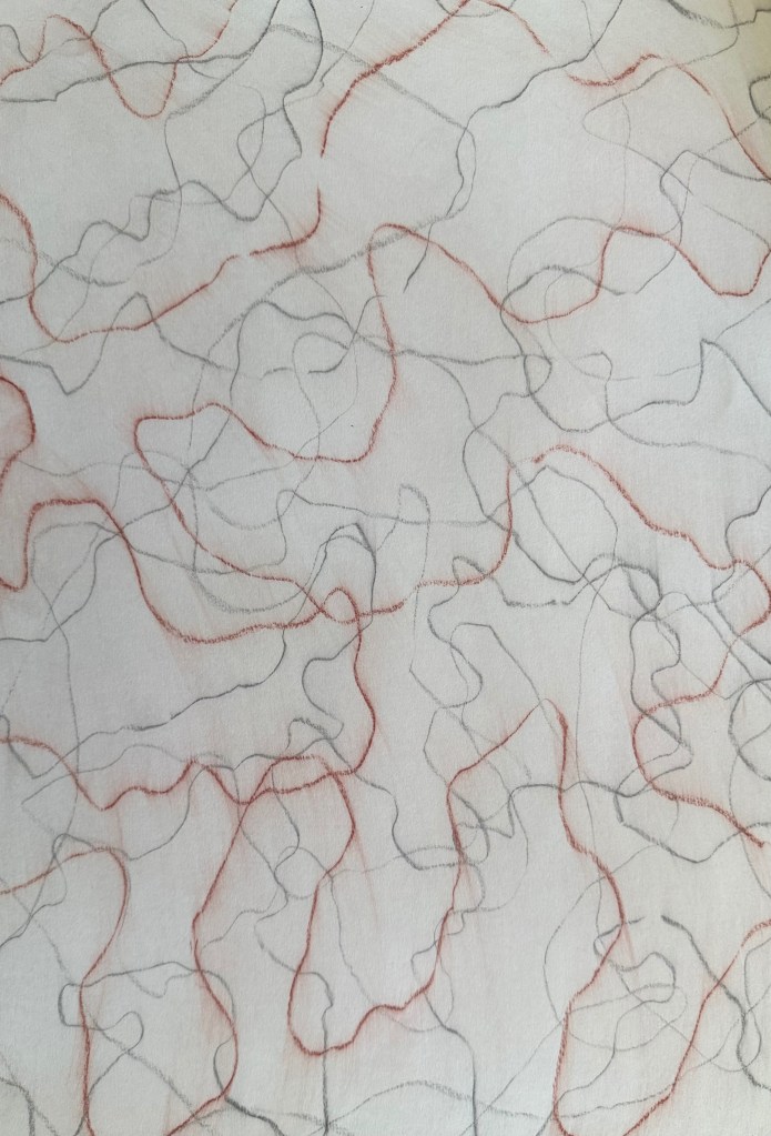
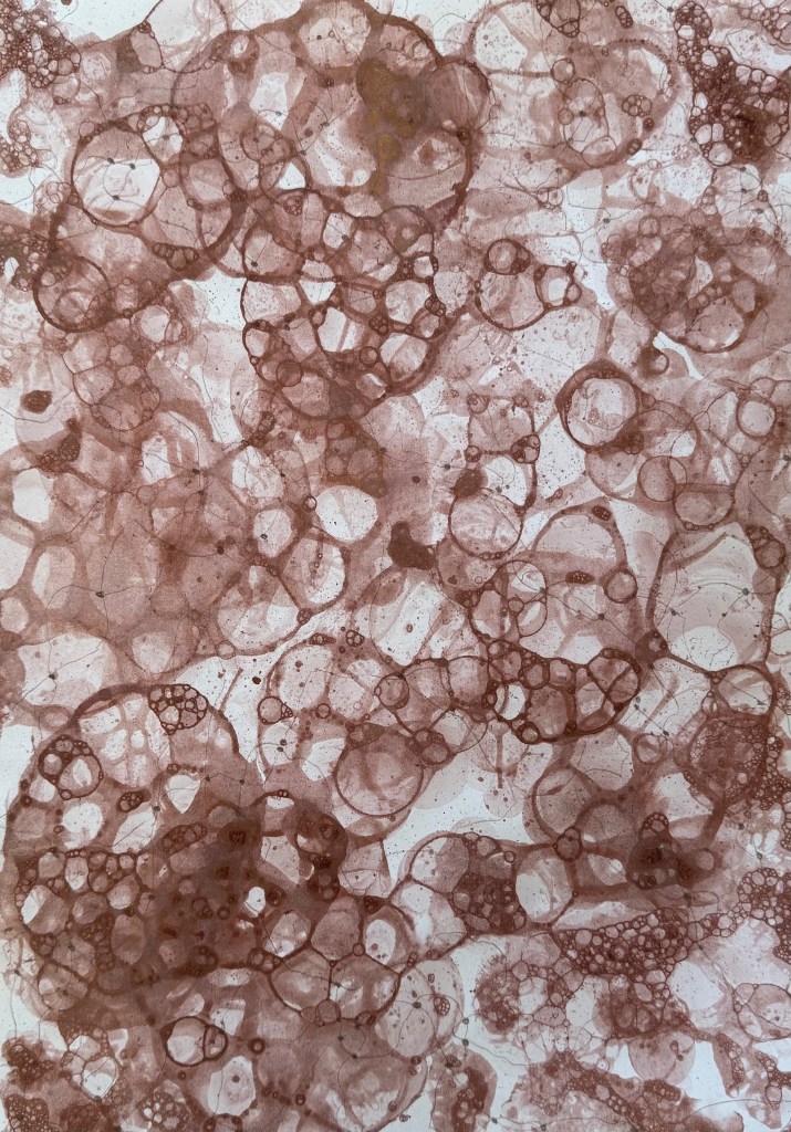
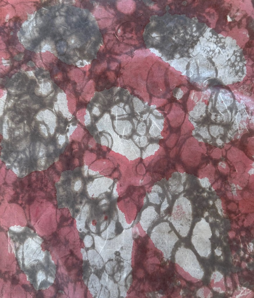
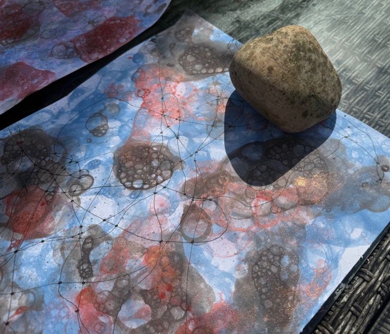
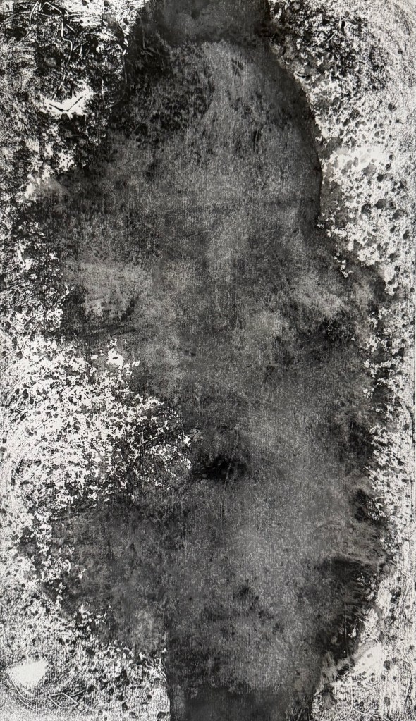
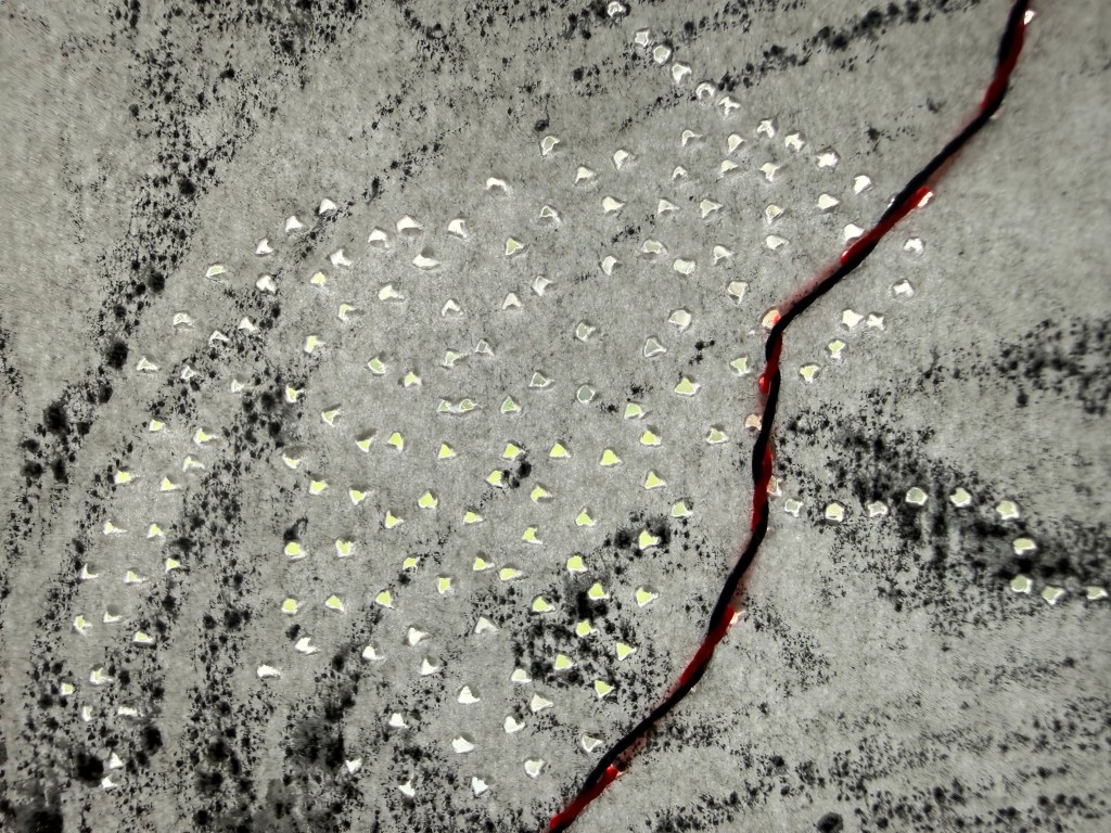
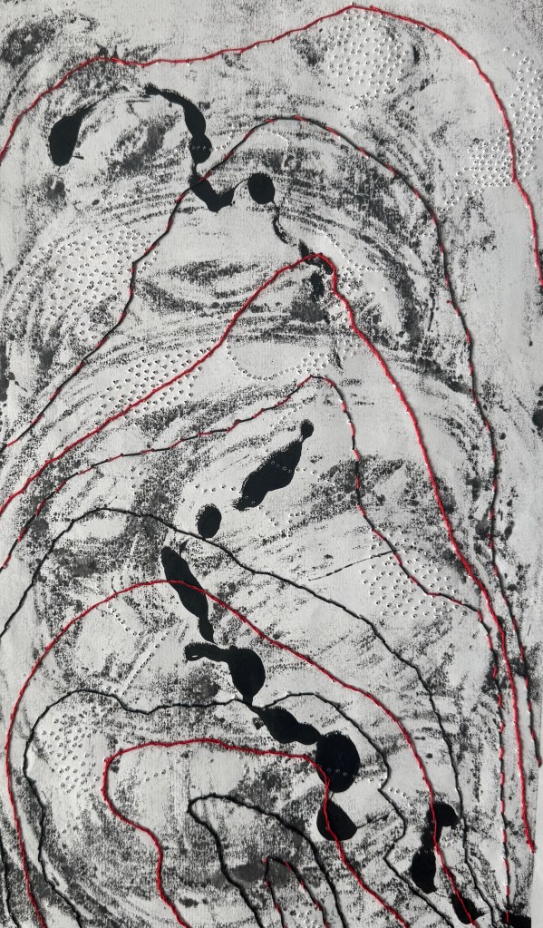
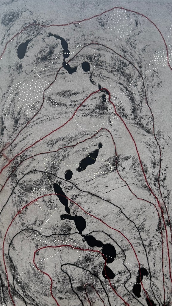
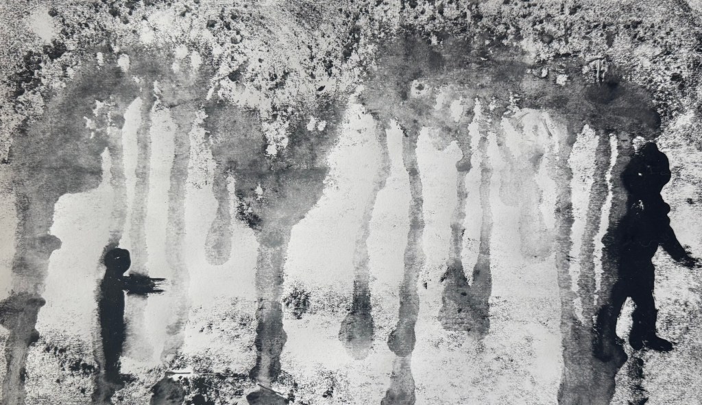
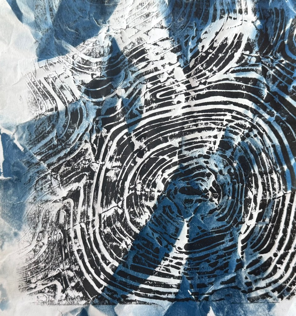
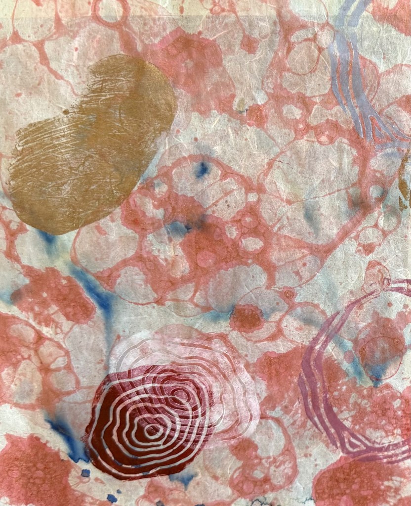
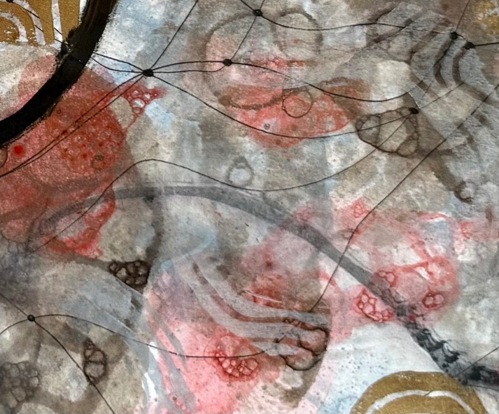
Printing the solid shapes of lino wasn’t very effective but I do like those bits where I scratched away some of ink from the surface before printing. I also like the muted contour lines in a light grey. The darker colours definitely need greater transparency (I was thinking about the shadow cast by the stone).
It’s a starting point and the next step is to work on a slightly larger piece of paper trying to get the transparency of ink right, adding in some masked areas, and to work out a colour palette. I’ll keep using the lino offcuts for now.
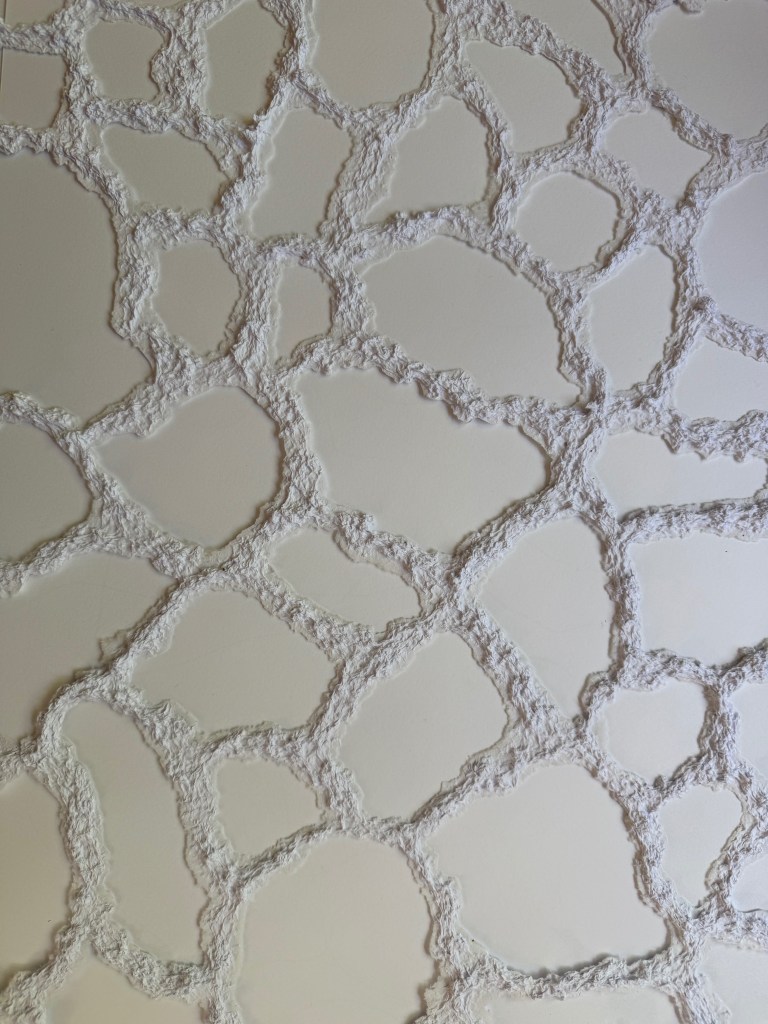
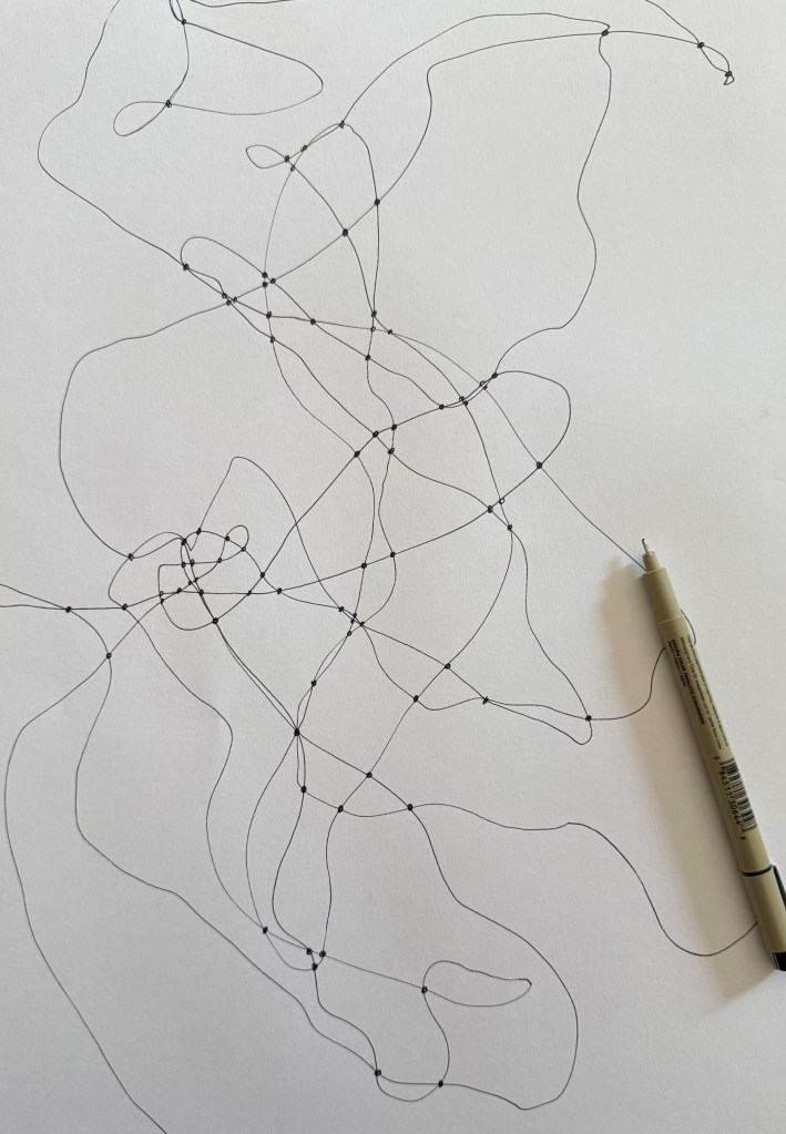
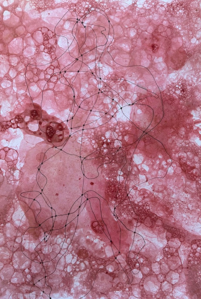
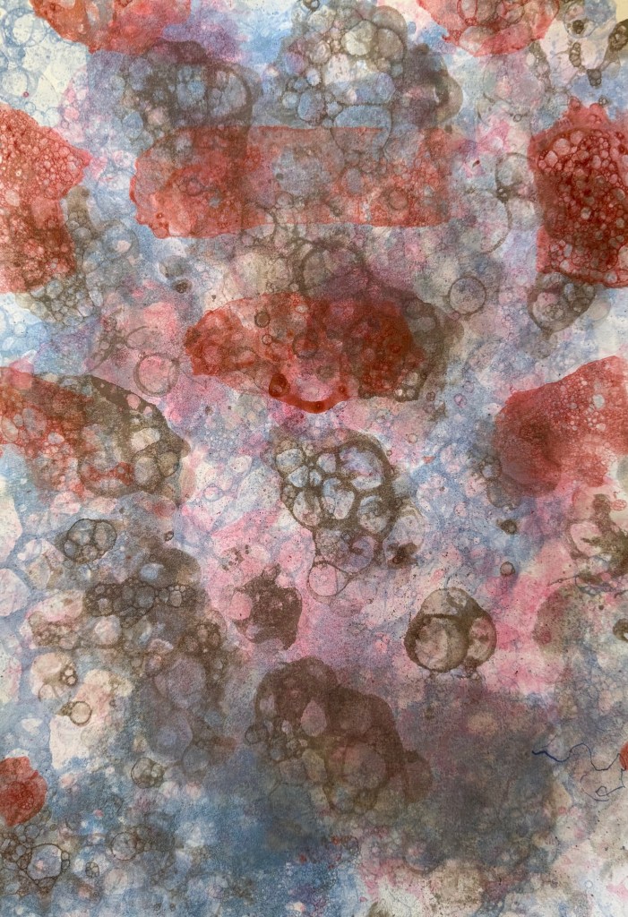
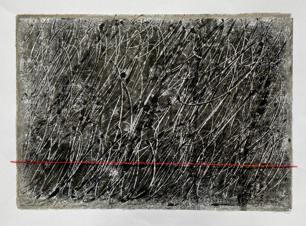
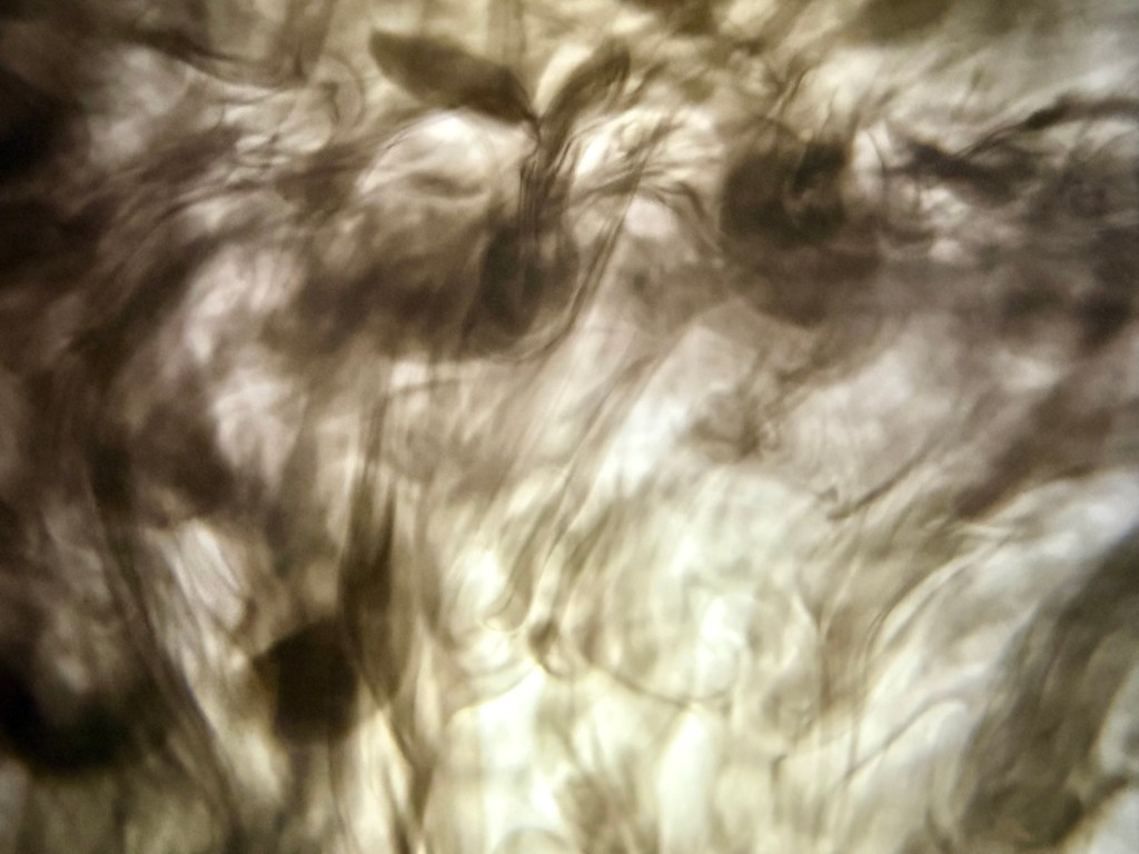
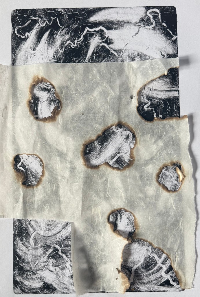
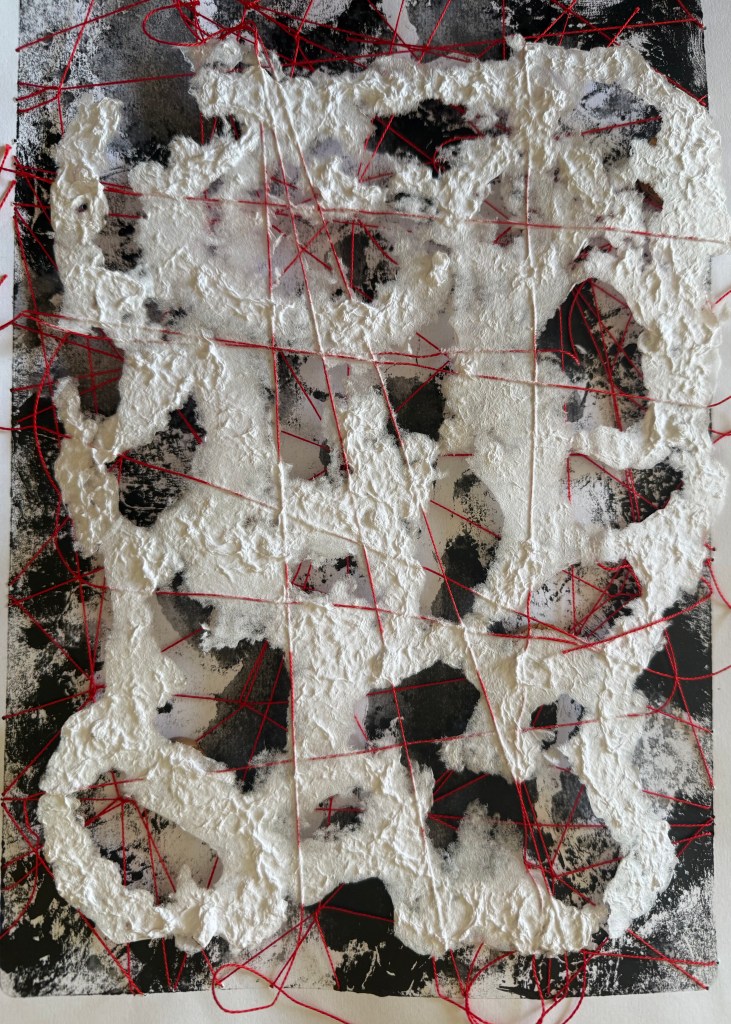
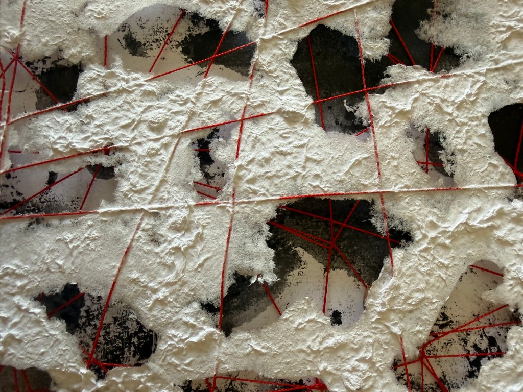
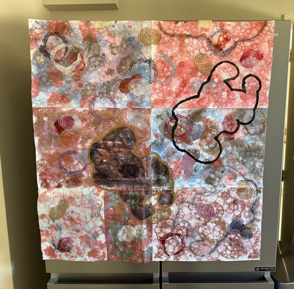
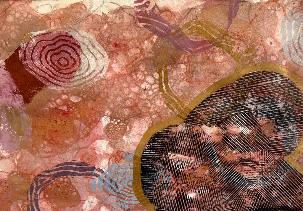
I was a bit disappointed about the lined shape – I really love the effect you get when they overlap and the lines distort. Maybe I need to try something separately but incorporating elements of today’s experimenting, perhaps even including elements of collage. Maybe I could try using mulberry paper, or try sticking with monochrome – it felt a bit strange using so much colour, but I think that I was feeling in a celebratory mood.
That said, there are some areas that I like.
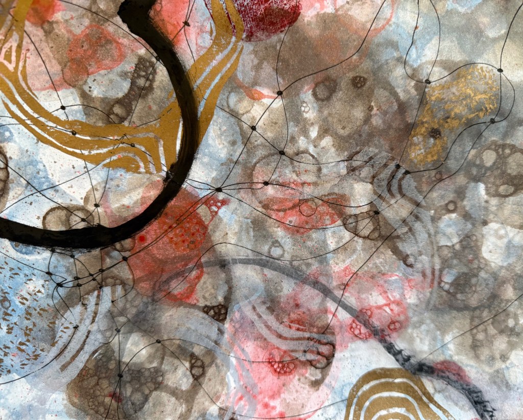
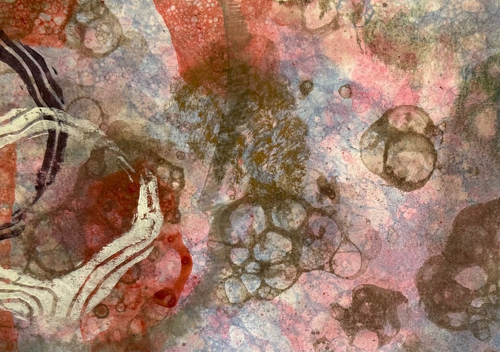
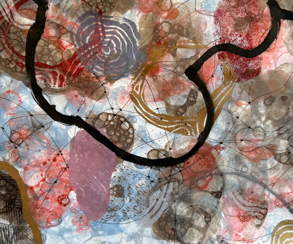
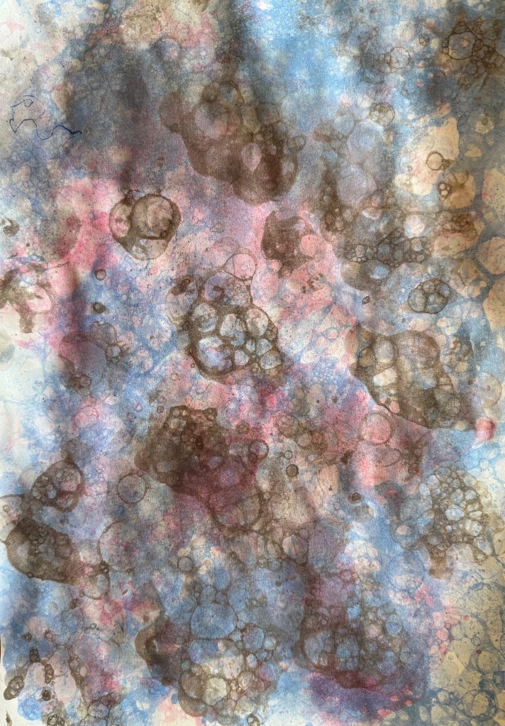
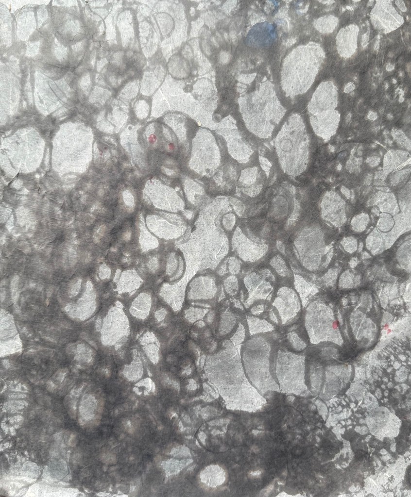
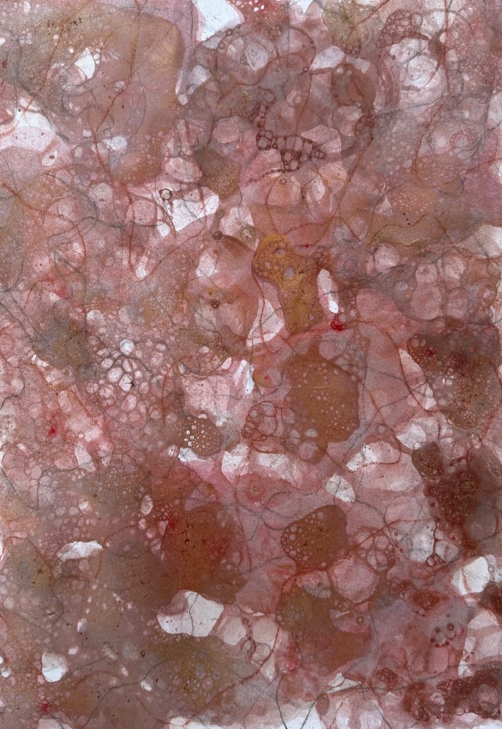
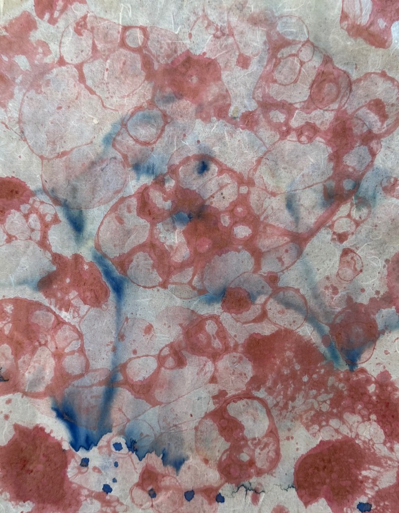
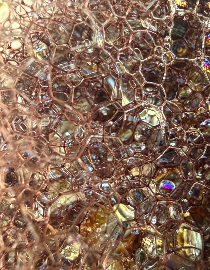
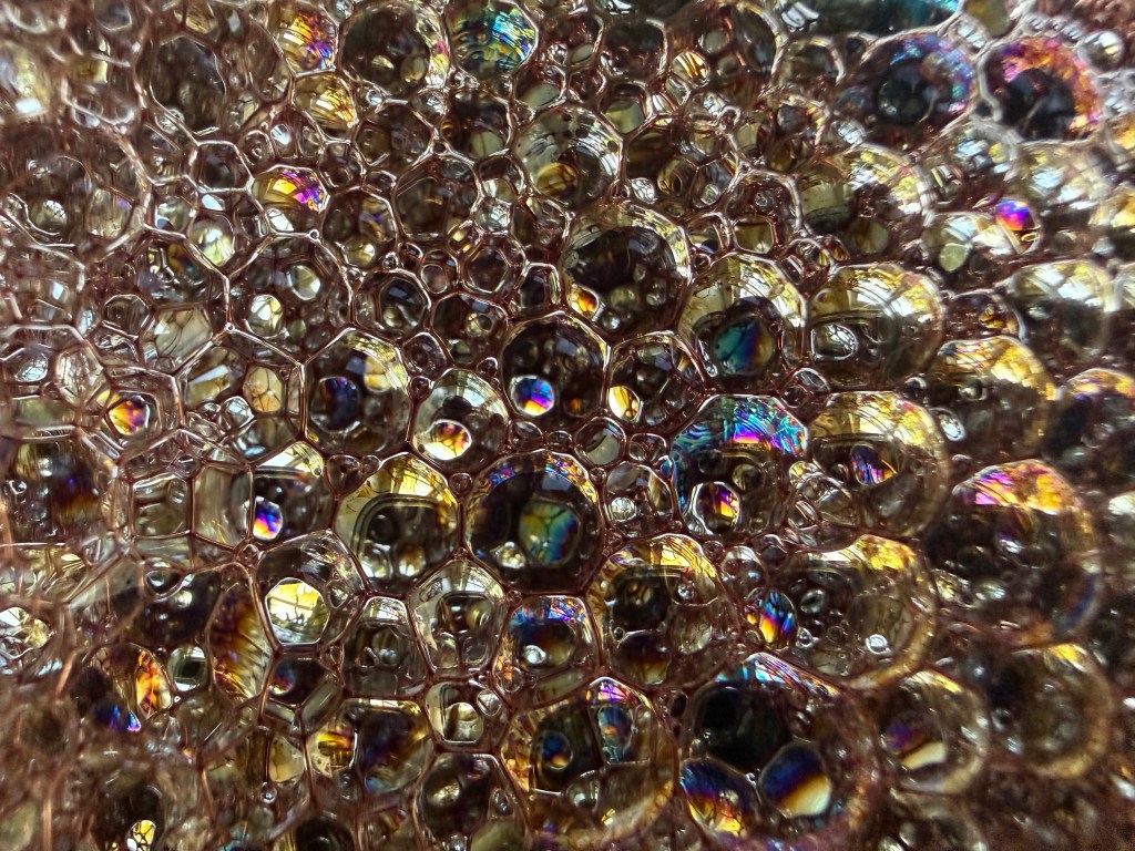
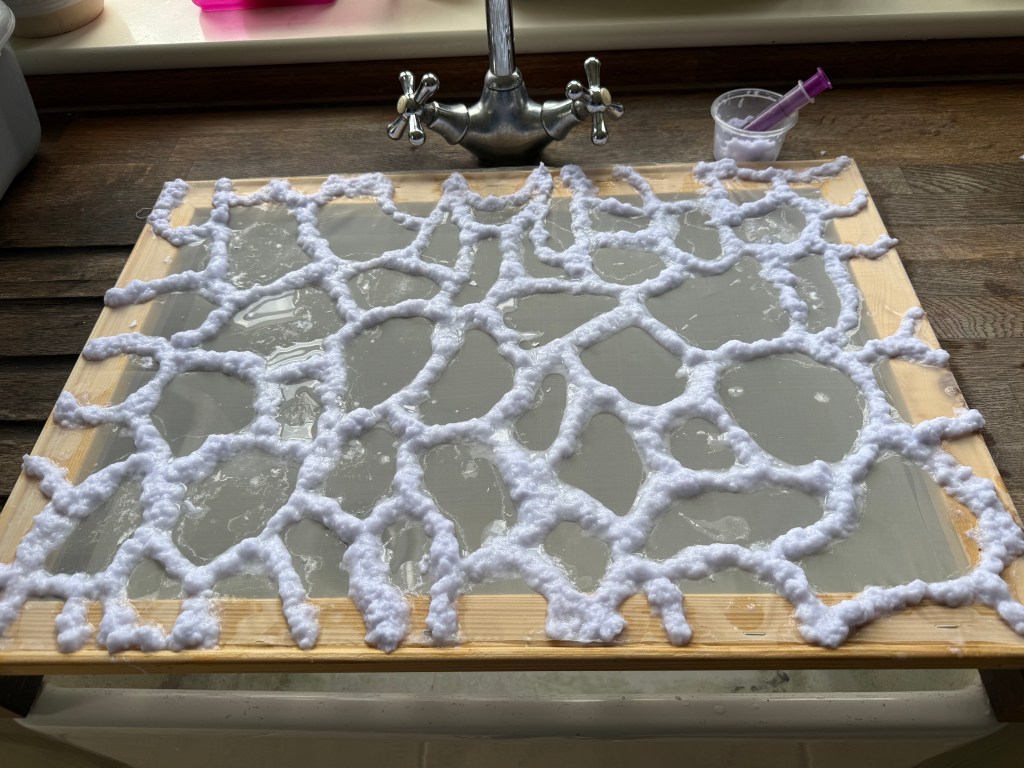
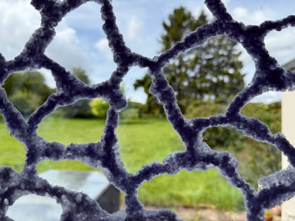
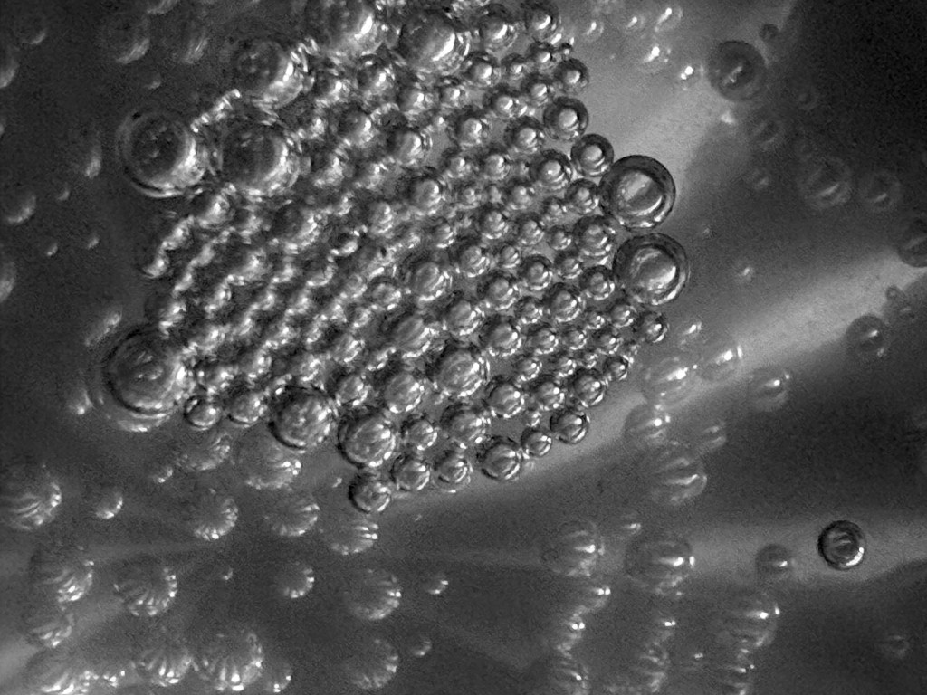
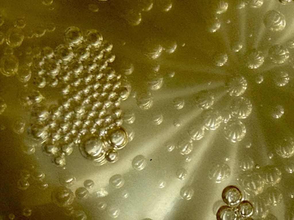
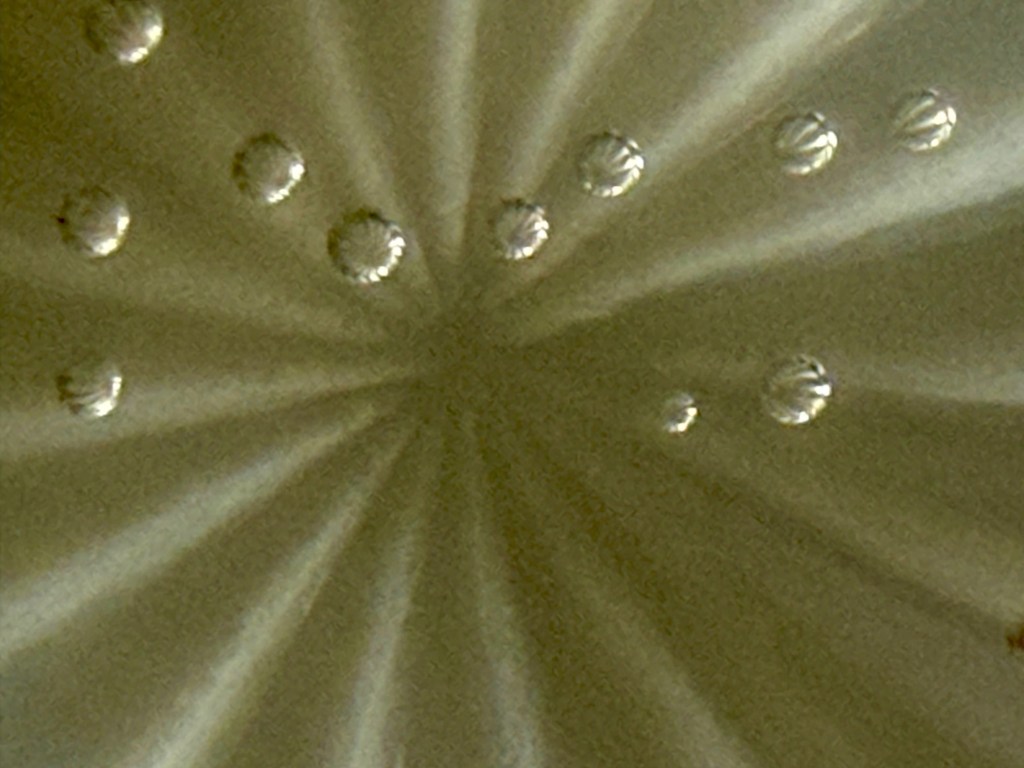
As I was experimenting I thought that what I really want is to achieve some thin veils of colour between the bubble layer and the print – like the effect you get when you glaze in oil painting. I’ve questioned recently whether I should try oil painting again. I haven’t done any for so long as I haven’t been going to my classes. It would be like meeting up with an old friend who I haven’t seen for a long time and during which time I have changed considerably. Would I get sucked into being my old self, or would they be happy to accept me as I am now?