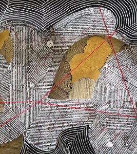
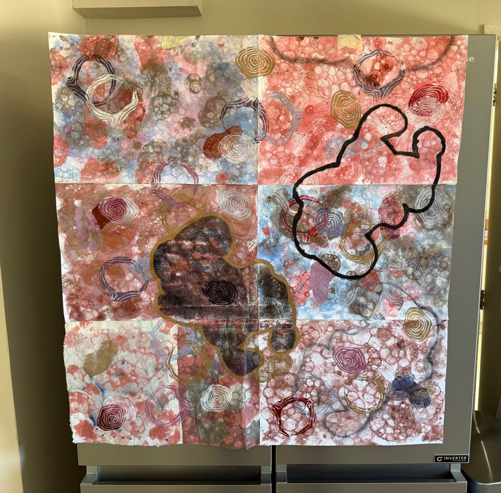
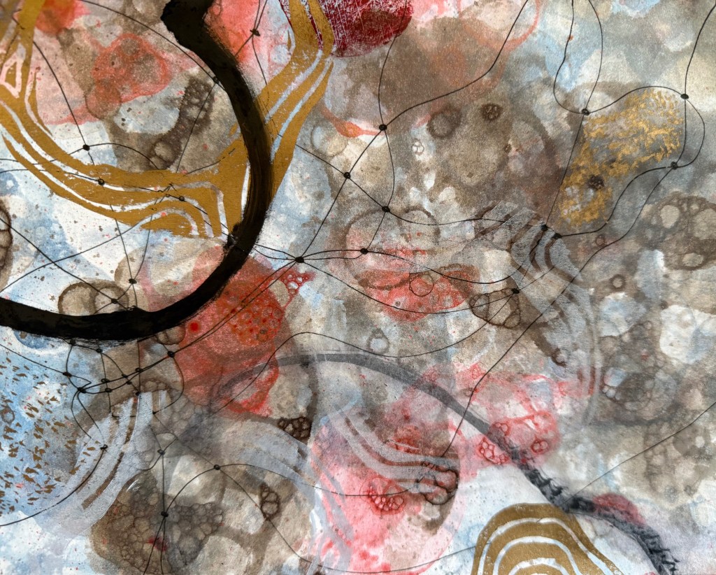
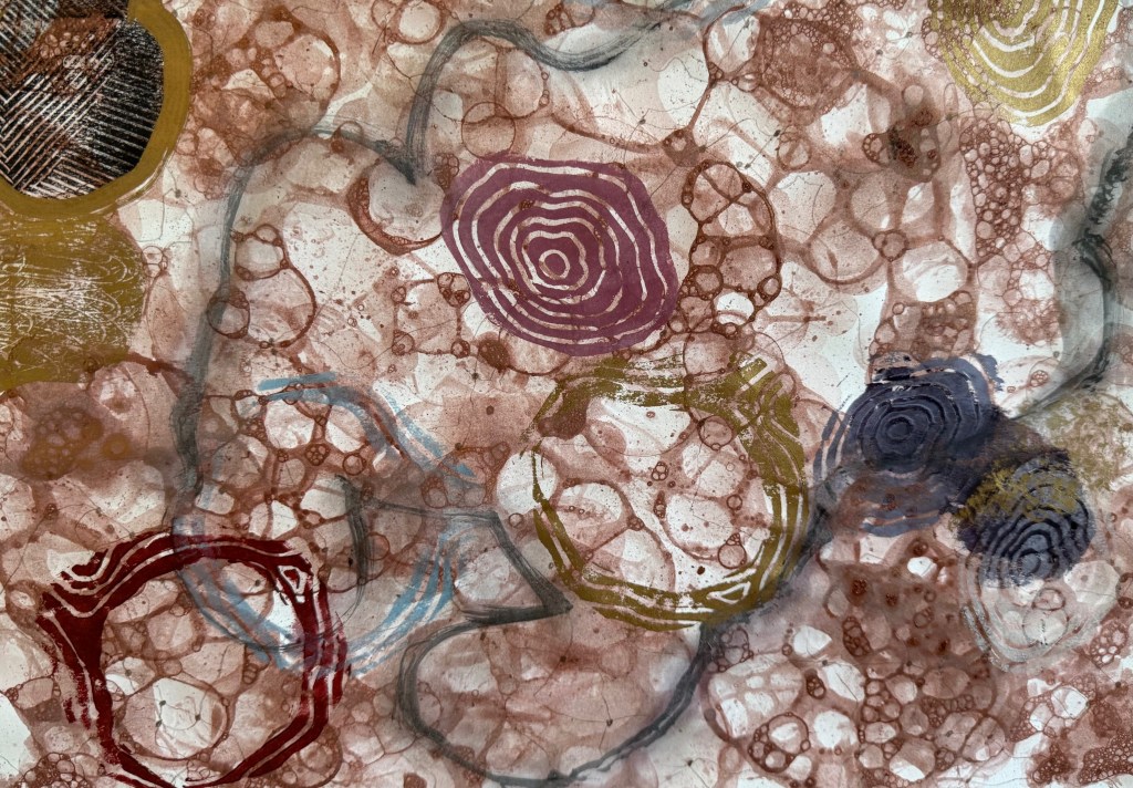
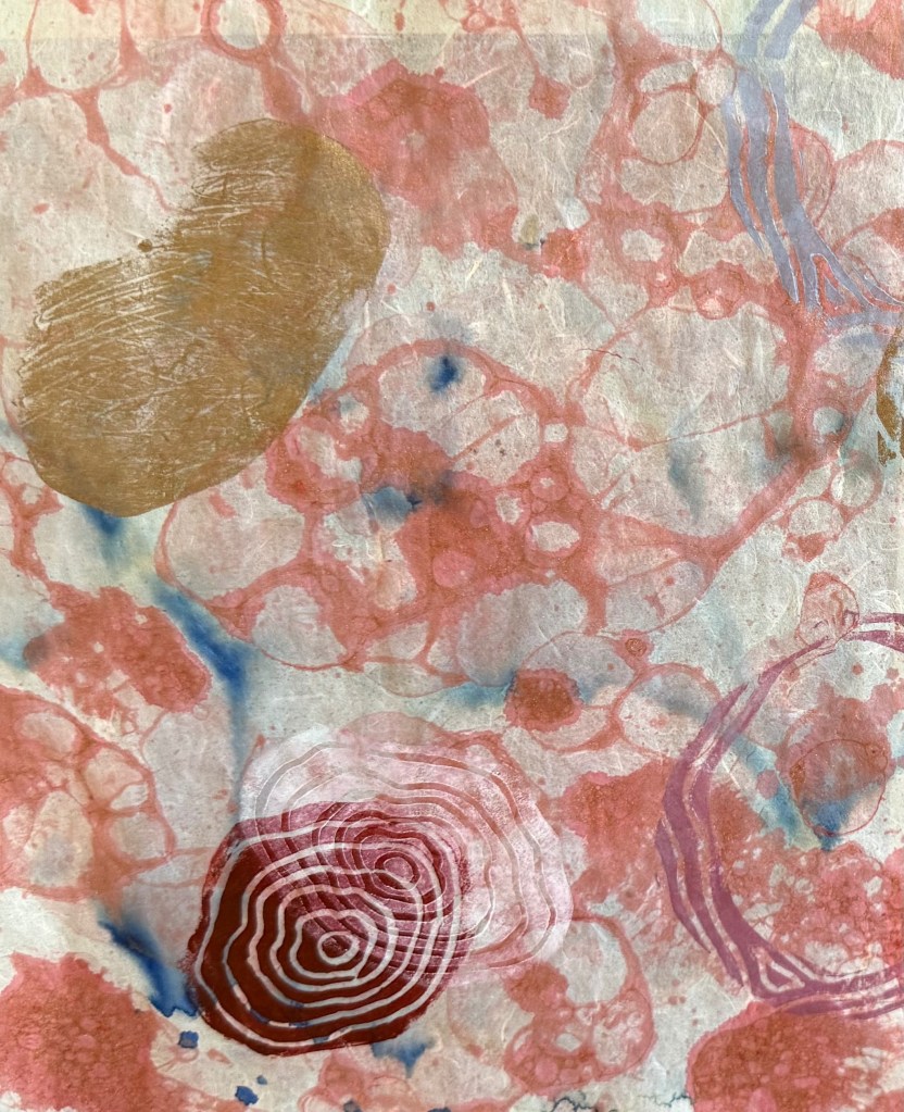
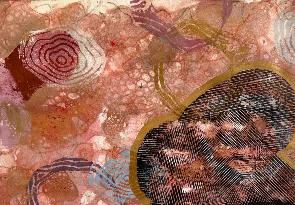
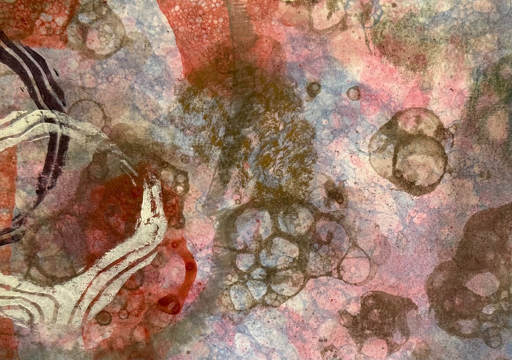
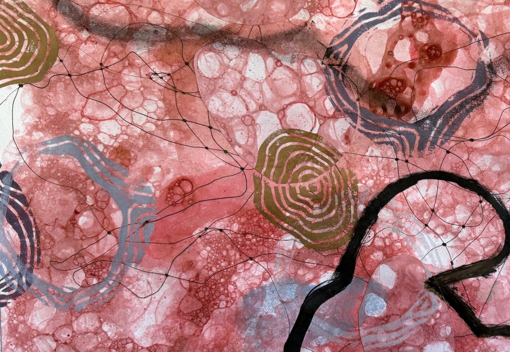
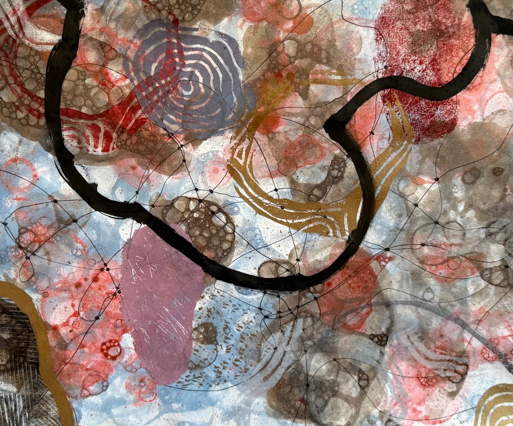
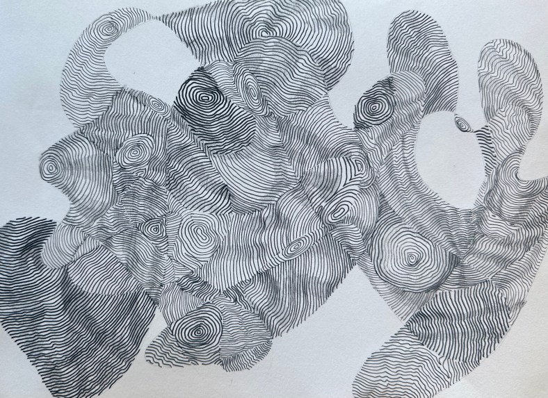
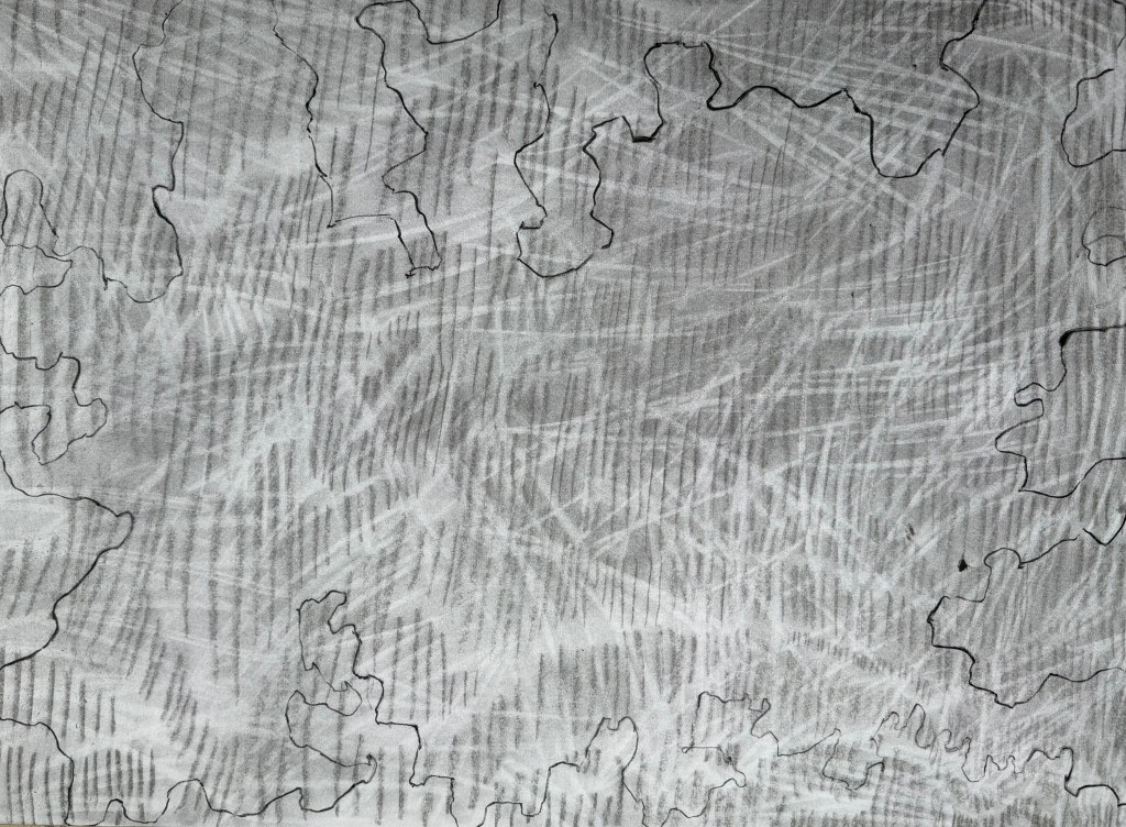
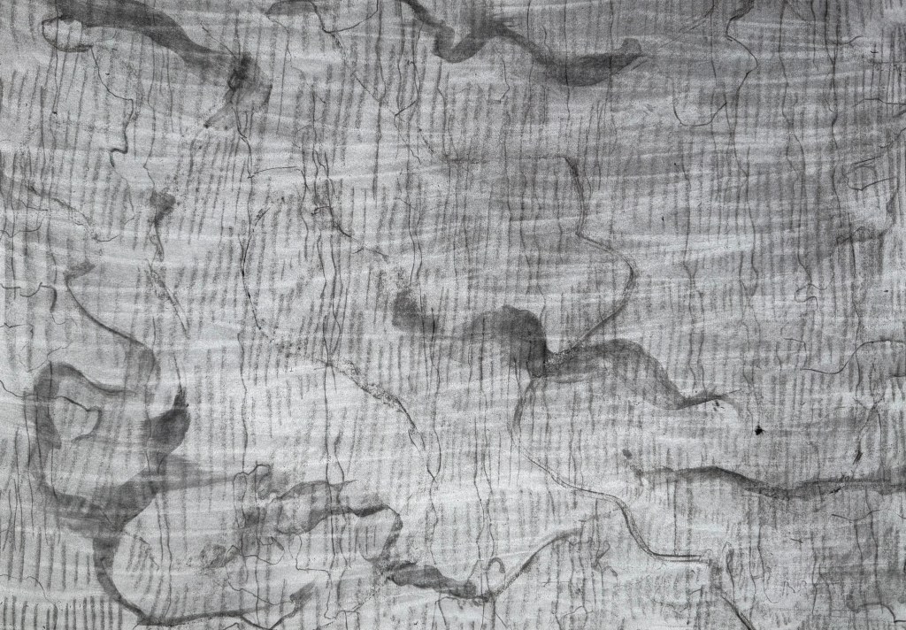
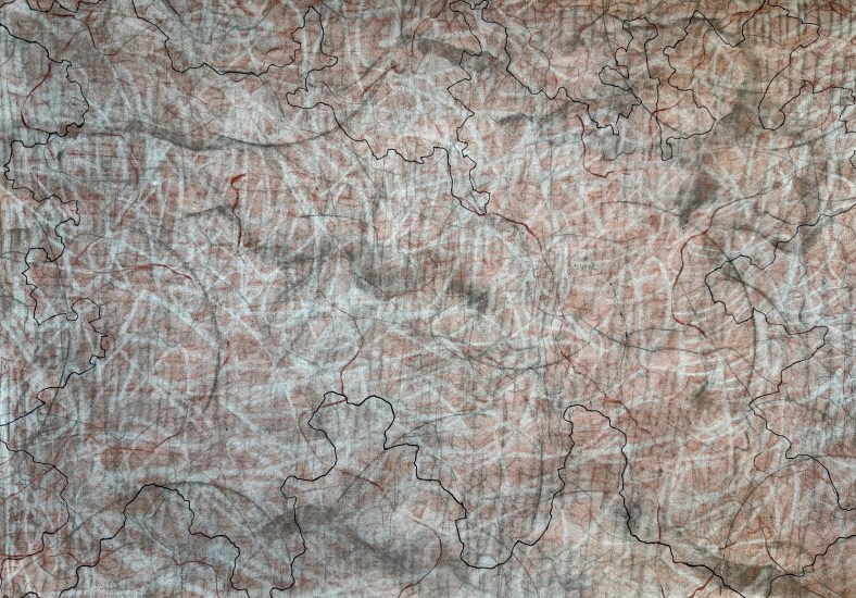
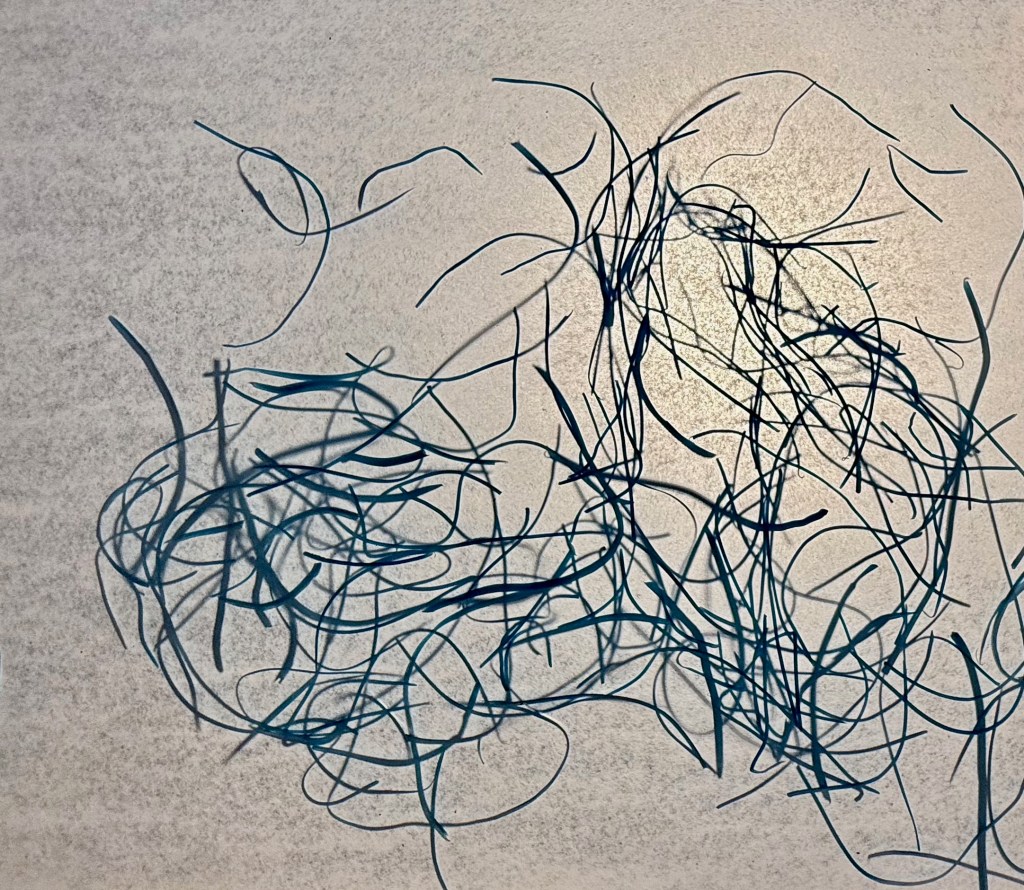
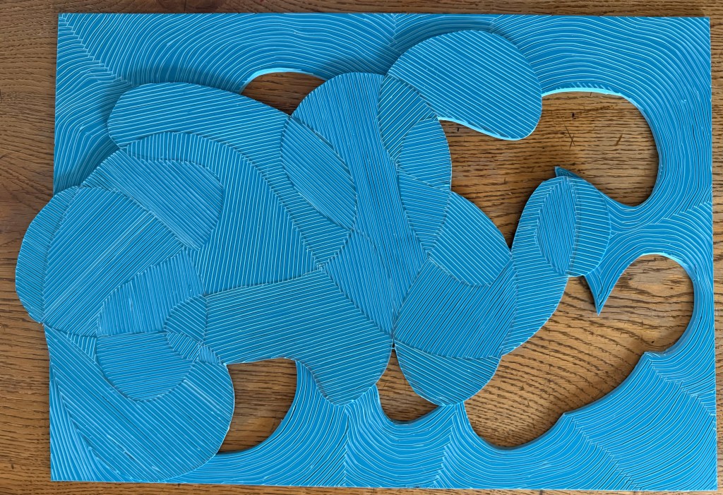
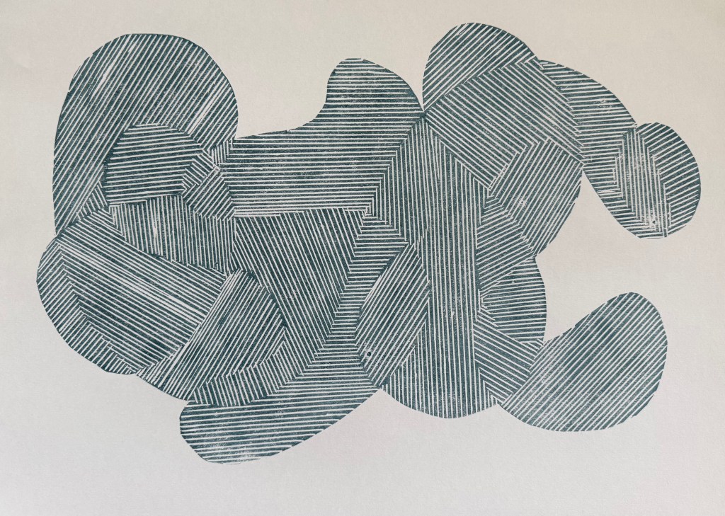
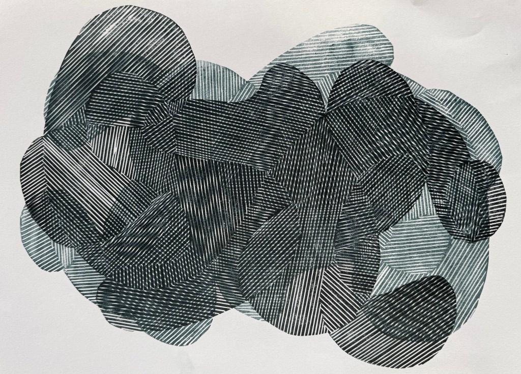
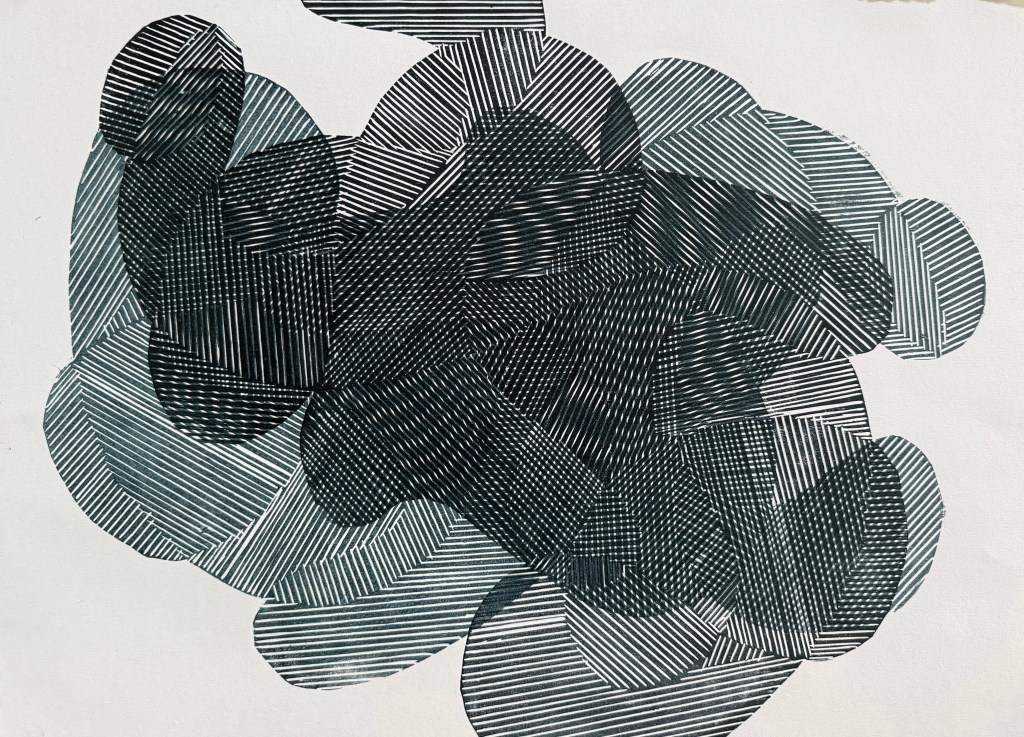
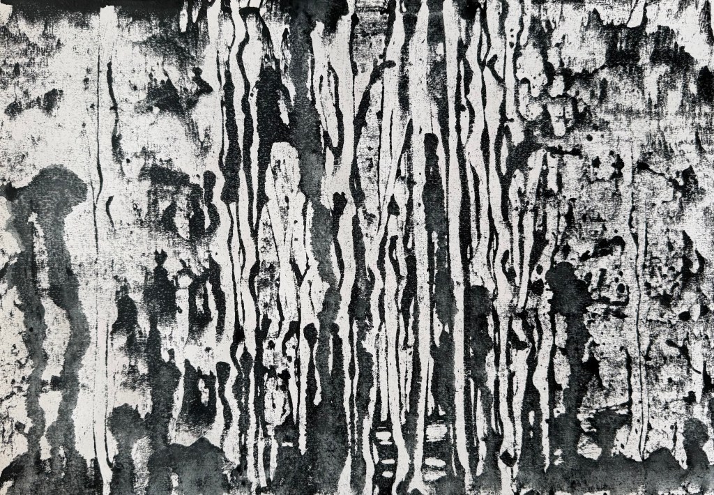
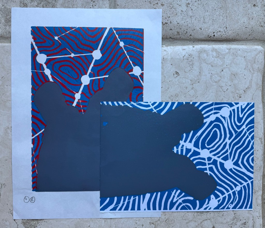
So, having taped all of the test sheets togther into what I called my ‘play sheet’, I let rip with the small pieces of linocut I had found. I also used the lino of the shape that I’m not intending to use, although I still really like the shape of it. The full print of it doesn’t fit with the background, although I do like the way the background disrupts it. I experimented with just using the outline which I think is effective, experimenting with the quality of the outline by using a bold line painted on with printing ink, some thinned down ink and some charcoal. I also added to some other areas with a brush as well as coloured pencils. I think that I need to sit with it for a while to identify those elements that work – it’s got everything but the kitchin sink in it. Hopefully, some clarity will emerge from the chaos.
I have some initial thoughts.
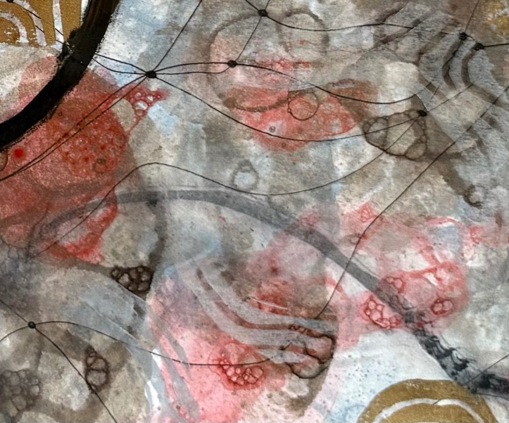
Printing the solid shapes of lino wasn’t very effective but I do like those bits where I scratched away some of ink from the surface before printing. I also like the muted contour lines in a light grey. The darker colours definitely need greater transparency (I was thinking about the shadow cast by the stone).
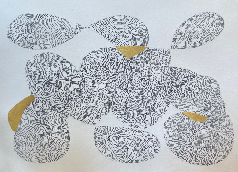
It’s a starting point and the next step is to work on a slightly larger piece of paper trying to get the transparency of ink right, adding in some masked areas, and to work out a colour palette. I’ll keep using the lino offcuts for now.
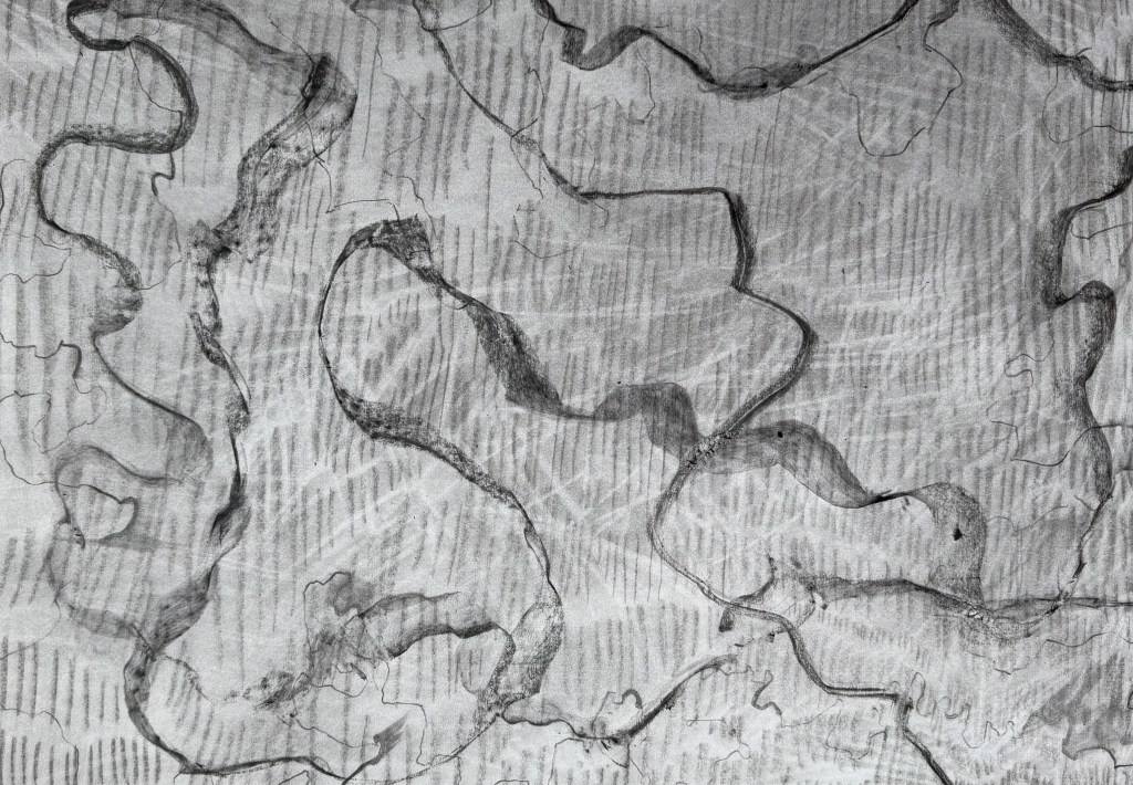
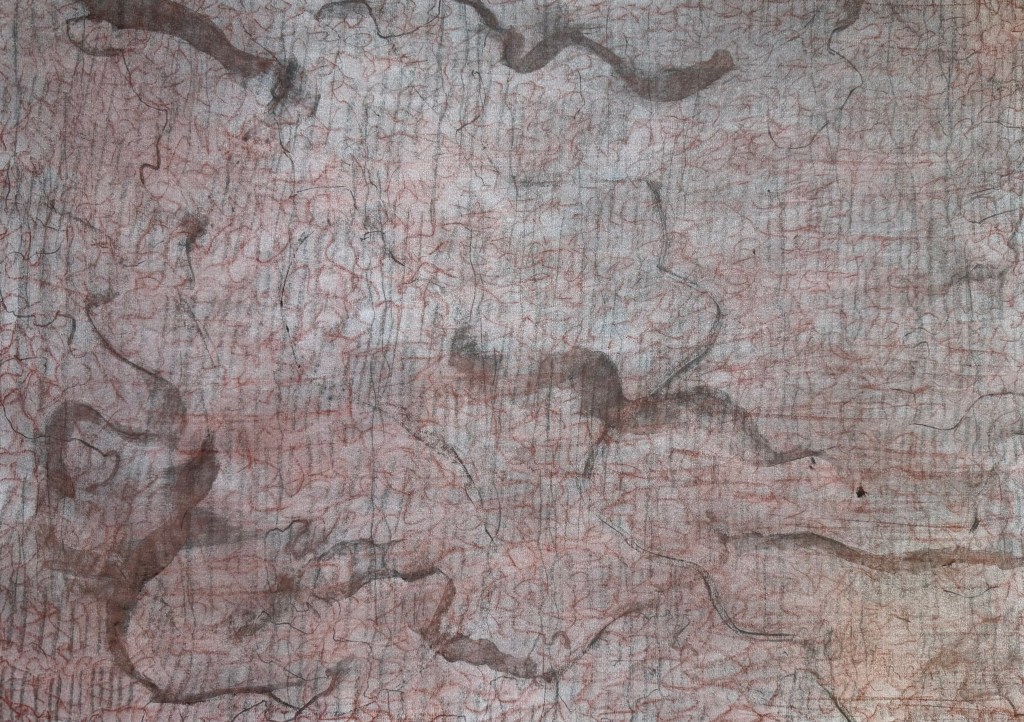
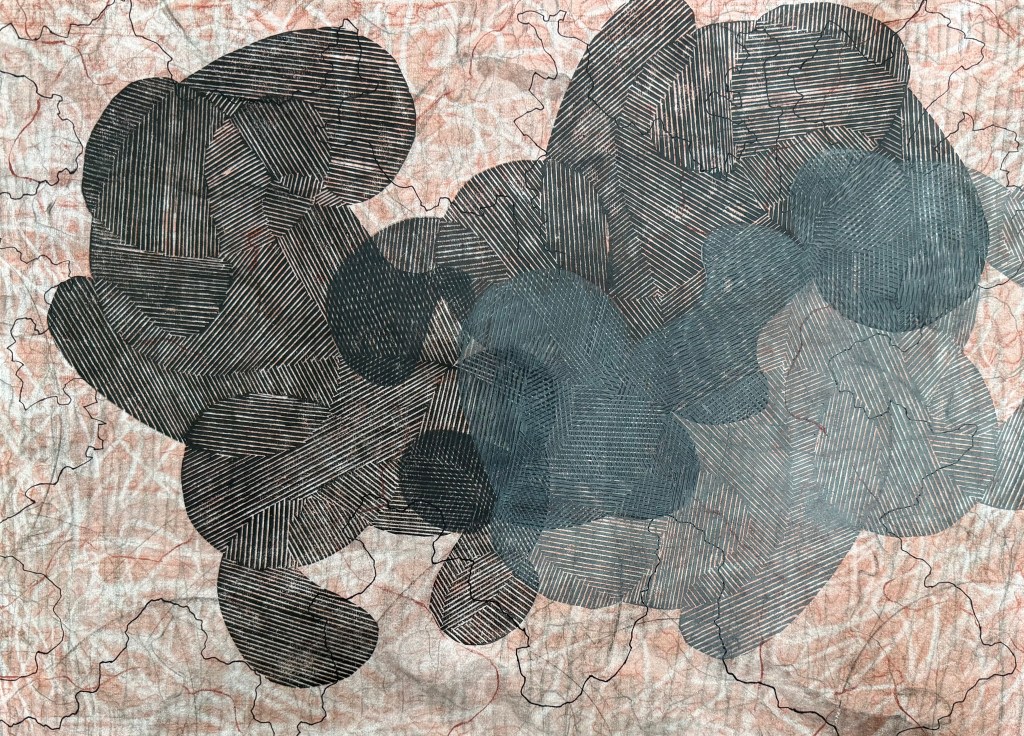
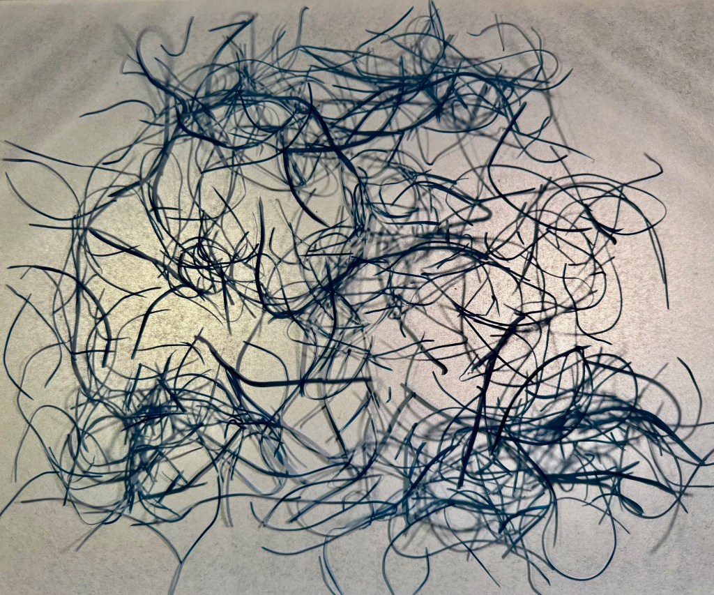
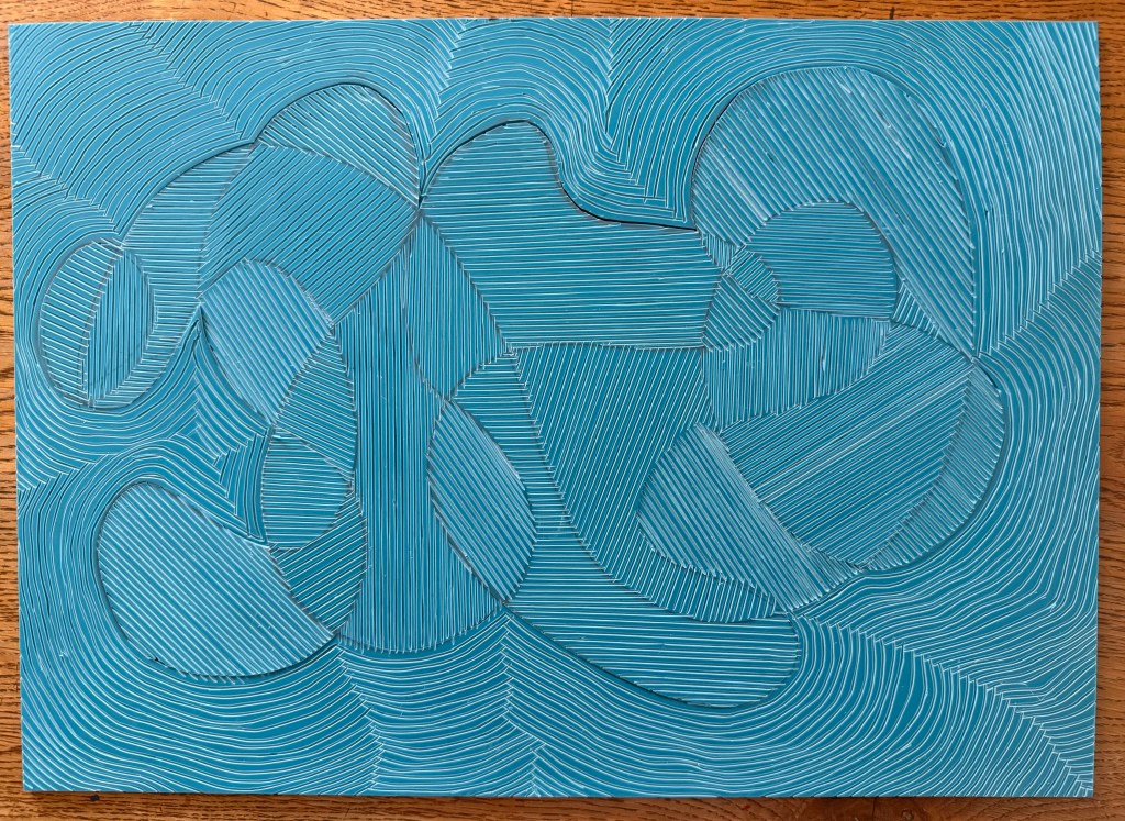
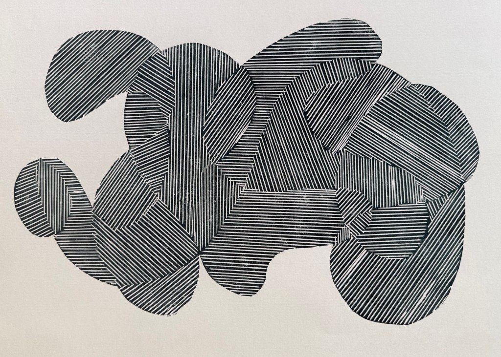
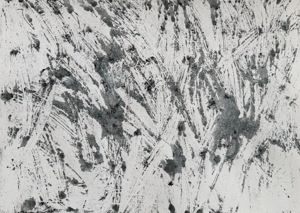
I was a bit disappointed about the lined shape – I really love the effect you get when they overlap and the lines distort. Maybe I need to try something separately but incorporating elements of today’s experimenting, perhaps even including elements of collage. Maybe I could try using mulberry paper, or try sticking with monochrome – it felt a bit strange using so much colour, but I think that I was feeling in a celebratory mood.
That said, there are some areas that I like.
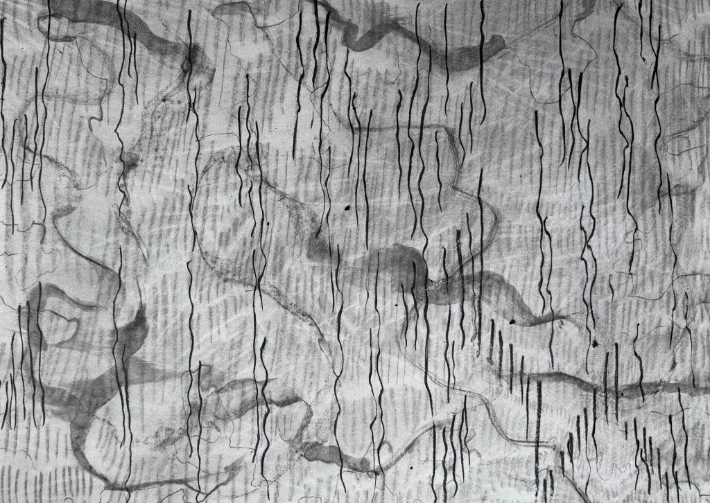
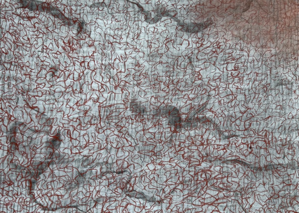
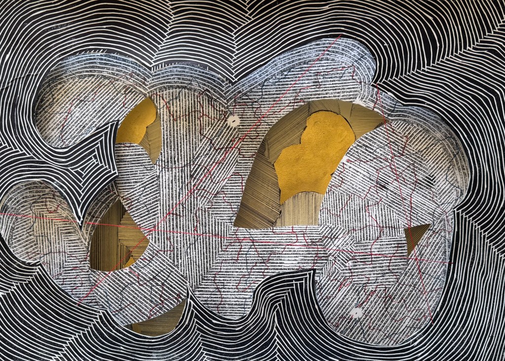
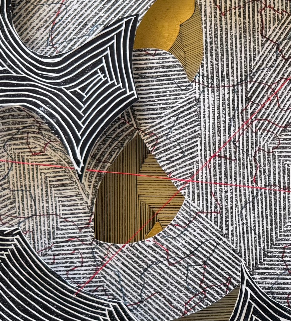
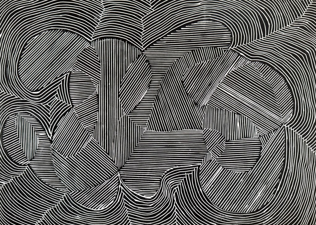
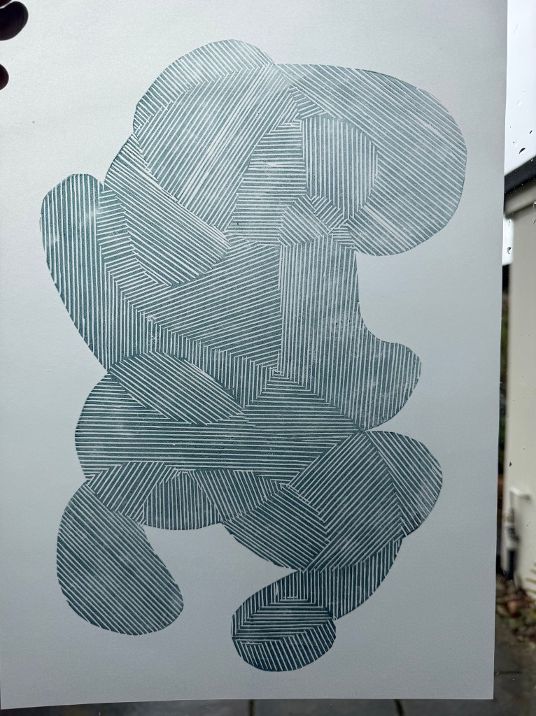
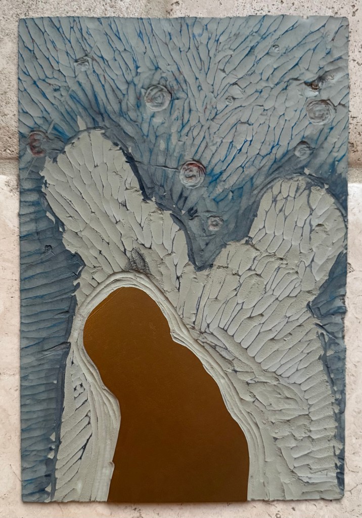
the visible lines the clarity of the bubble layerthe scratched gold shape and the bubbles on the mulberry paperthe effect of the background on the dark shapethe colours in the base layer and the gold shape added on with a brushthe disruption caused by the edge of the collaged piecehas a bit of everything in itthe pale grey contours
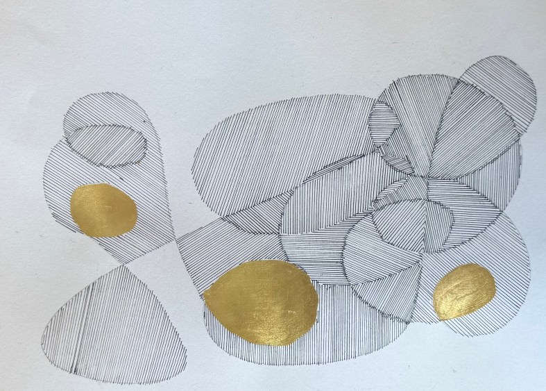
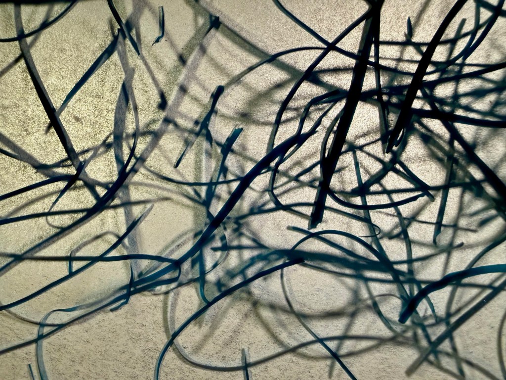
As I was experimenting I thought that what I really want is to achieve some thin veils of colour between the bubble layer and the print – like the effect you get when you glaze in oil painting. I’ve questioned recently whether I should try oil painting again. I haven’t done any for so long as I haven’t been going to my classes. It would be like meeting up with an old friend who I haven’t seen for a long time and during which time I have changed considerably. Would I get sucked into being my old self, or would they be happy to accept me as I am now?
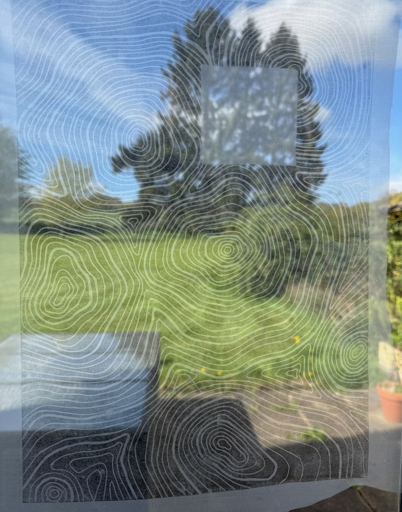
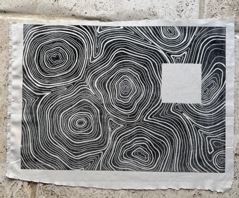
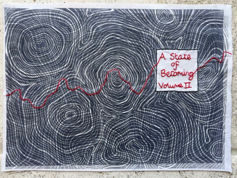
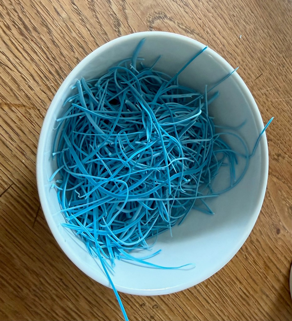
I’ve been making the book cloth for the second book. This time I lino printed onto a sheer fabric and a plain cotton.
I need to sharpen my cutting tools – there was slip on the left side. I’ll be able to cover it up with the mask for the title block.
Overprinting on paper
Print on sheer fabric
Print on cotton fabric
Fabrics bonded together and backed with mulberry paper and addition of title.
For the end papers I asked my husband and daughter to draw some more outlines for me to fill. I’d been experimenting with not using straight lines.
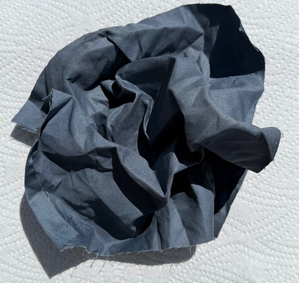
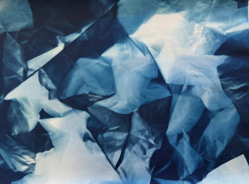
I then redid the cyantotype for the remake of Volume I. Whilst I was waiting for it to develop, I scrunched a piece of fabric up and left it outside. I was pleasantly surprised by the result.
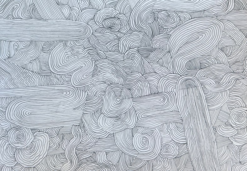
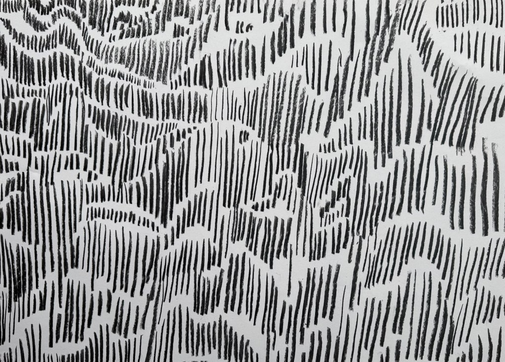
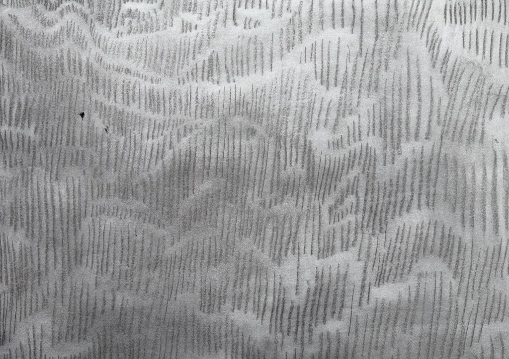
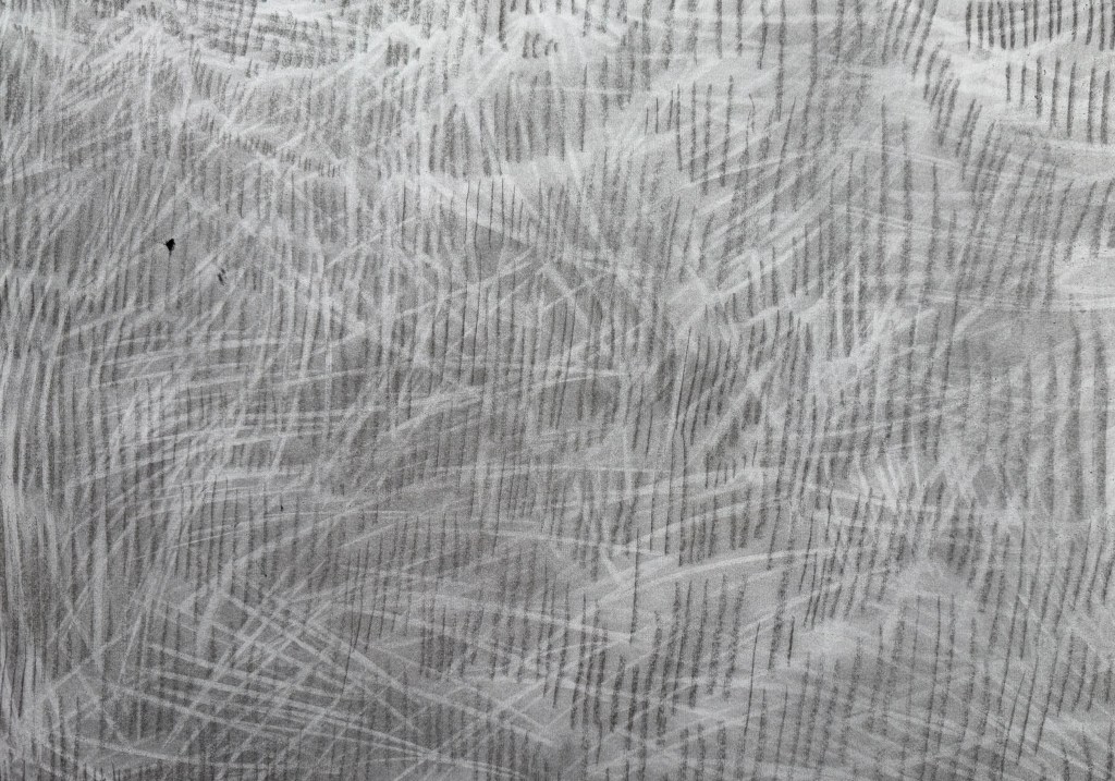
I wanted to make some marks – layers of marks – and so I took some A2 paper and used charcoal, pastel, an eraser and a pen.
It wasn’t meant to be anything. I thought that I might use it as a base for something else. I had been wanting to have another go at overprinting the linocut image from Never Say Never. In that post I comment that the shapes look like crouching figures – in retrospect they are foetal-like. The subject of microchimerism has come back to my mind recently and I thought that the idea of making the ink more transparent with each print could touch on that. Also, the marks underneath would also become increasingly visible. I gave it a go but I made a hash of the ratio of ink to extender, and I couldn’t find the new tube of extender so I just added some white which, of course, made the print totally opaque, which wasn’t the original intention.
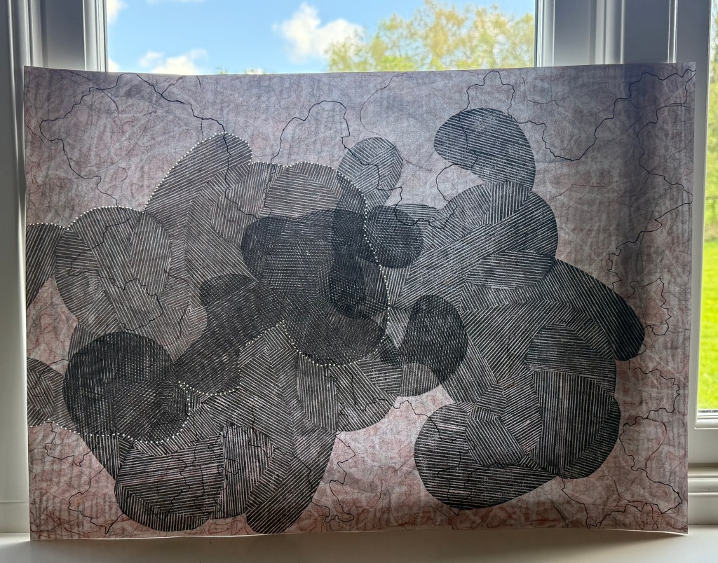
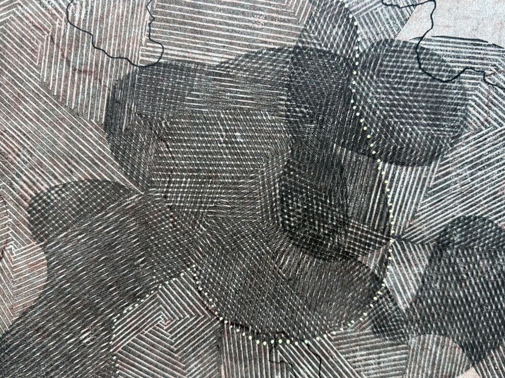
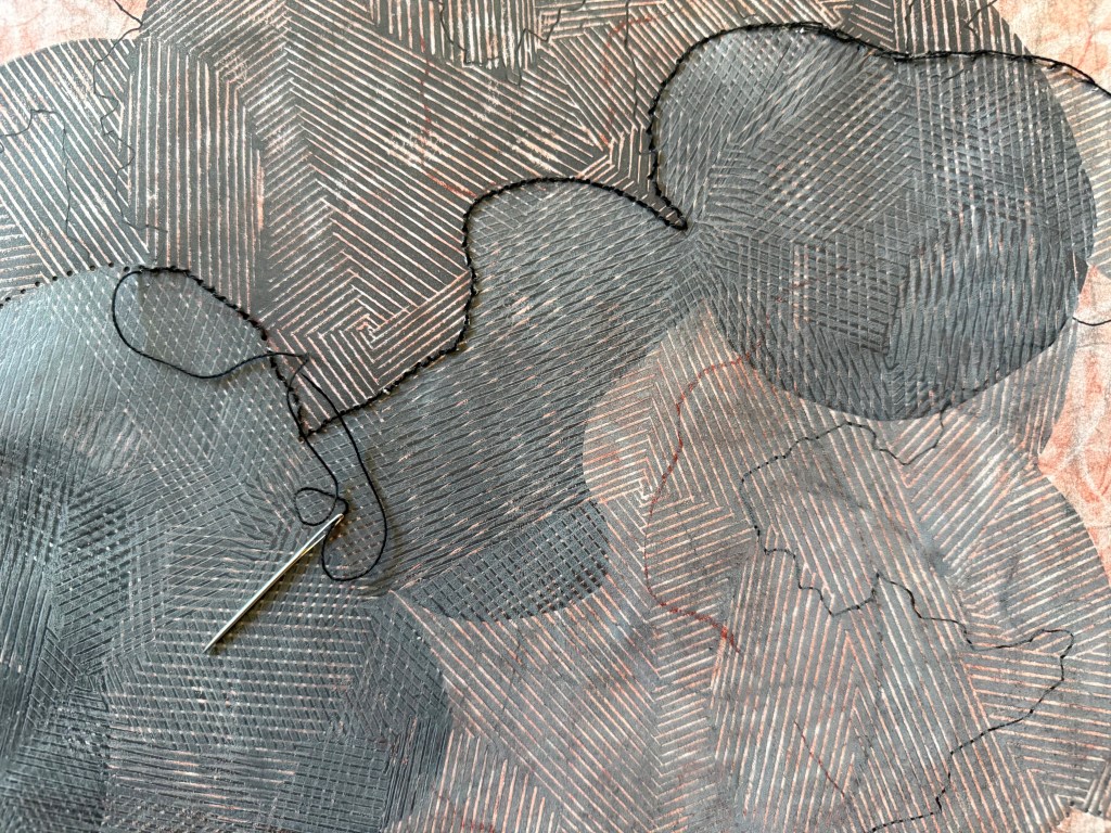
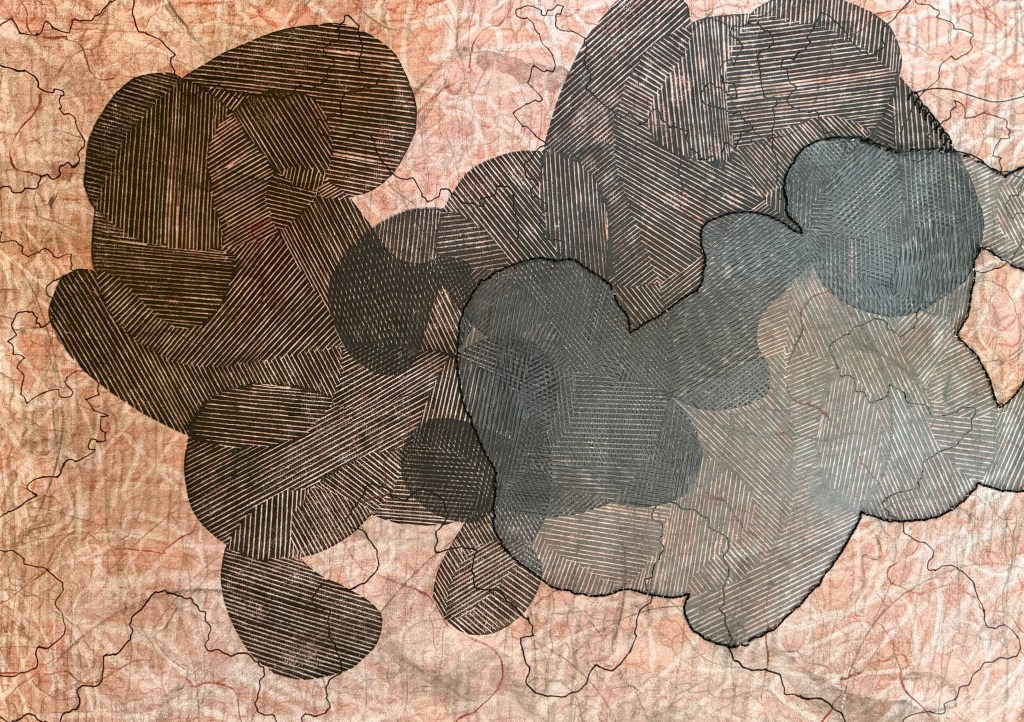
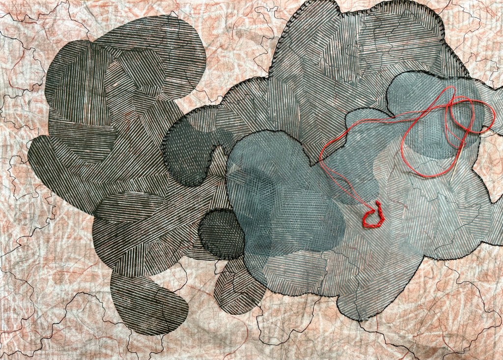
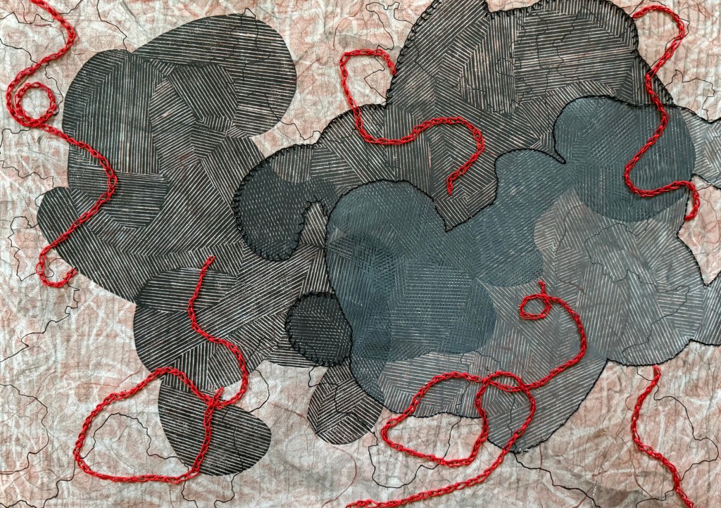
I left it for a while and got on with other tasks relating to the book and when I revisited it I thought about umbilical cords (something I have referenced previously in Sisters). I thought I might use some of the red thread that I had for my paper experiments to sew some kind of twisting cords which then made me think of using black stitching to delineate between the three shapes. I used a blanket stitch on the second shape as I’d seen at her Tate Modern exhibition that Tracey Emin had used it on her blankets to give a less defined line.
I’m really chuffed. I was thinking as I was sewing that maybe I should have planned where I was going to go, but then decided that, no, I liked the spontaneity of it all. Would I have done anything differently? No. How did I feel as I was making it? I felt pleasure, at all stages. I enjoyed the making of it and I like how it turned out. In fact, over the last few months (Summer Exhibition aside) I have really enjoyed making. That’s not to say that I haven’t enjoyed the process of making before then – I have, particularly the experimenting and and the wandering, it’s just that recently I have felt contented, as if some things have fallen into place. I particularly enjoyed the experiments with lino cuttings and packaging, and I’m really happy with the video that I made.
I think that it comes down to the accidental and the incidental; the unexpected that happens in the process and the small things I notice within the process which then lead to something else.
I often become distracted; I’ll put a pan of water on to boil and then get distracted by something and go wandering off, only remembering that I was meant to be boiling some eggs when the pan has boiled dry.
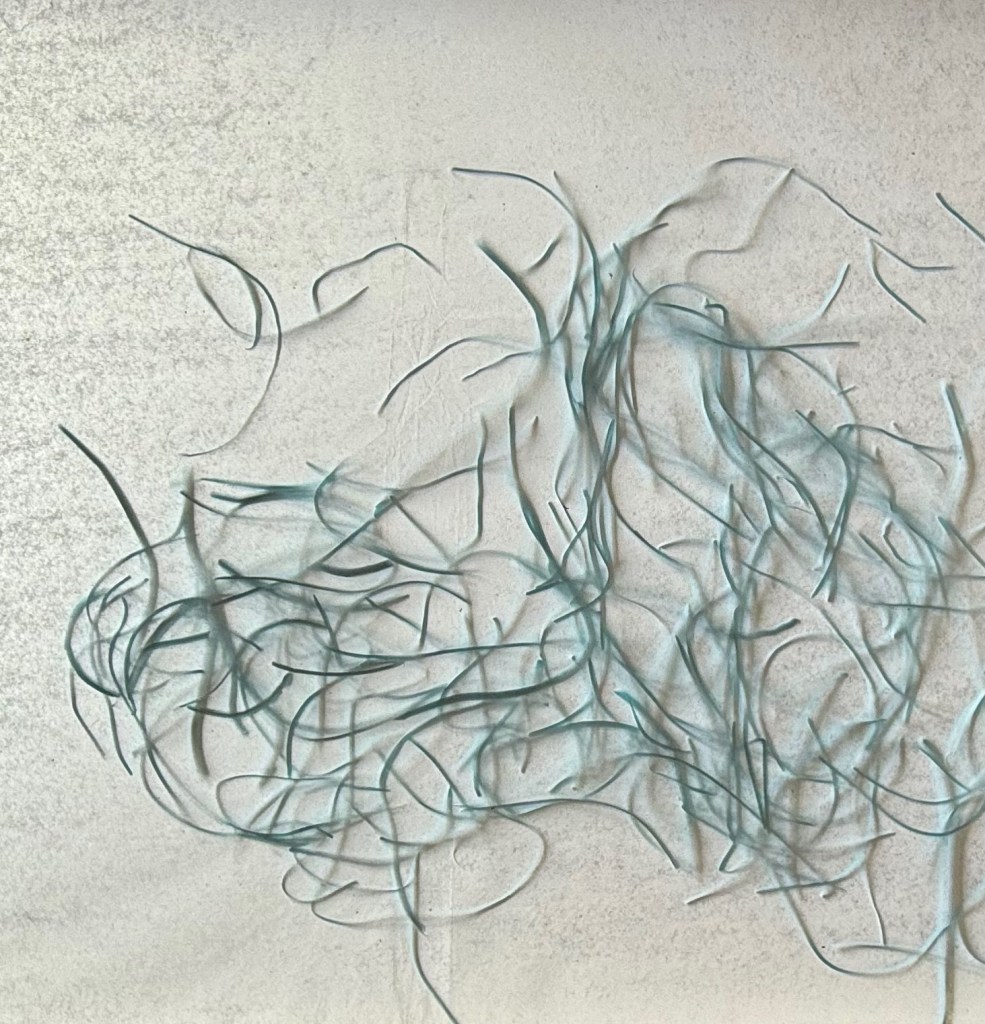
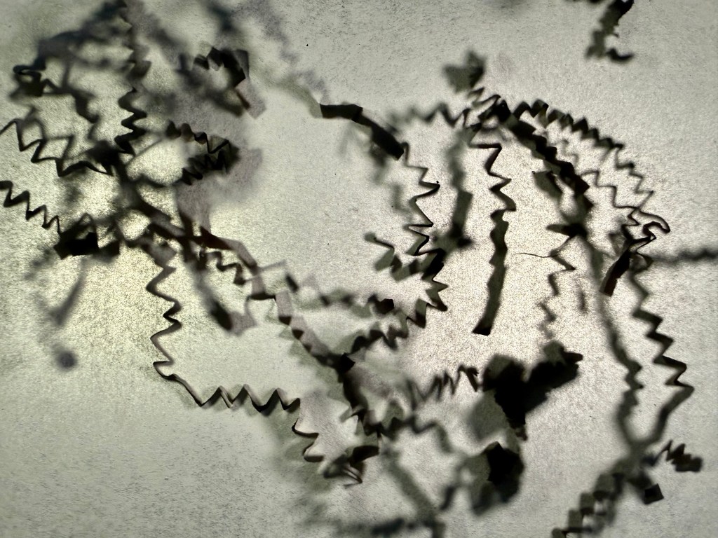
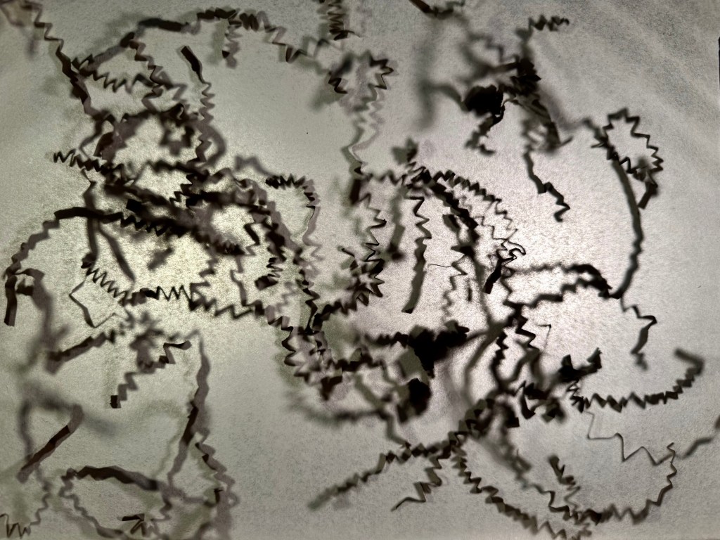
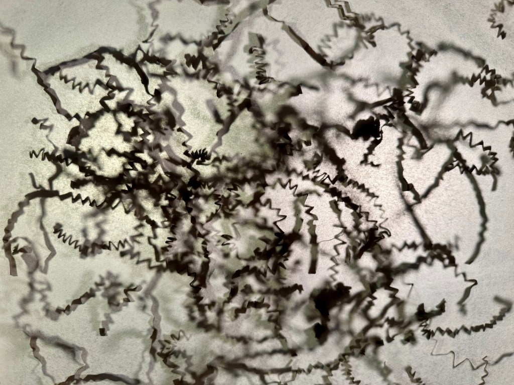
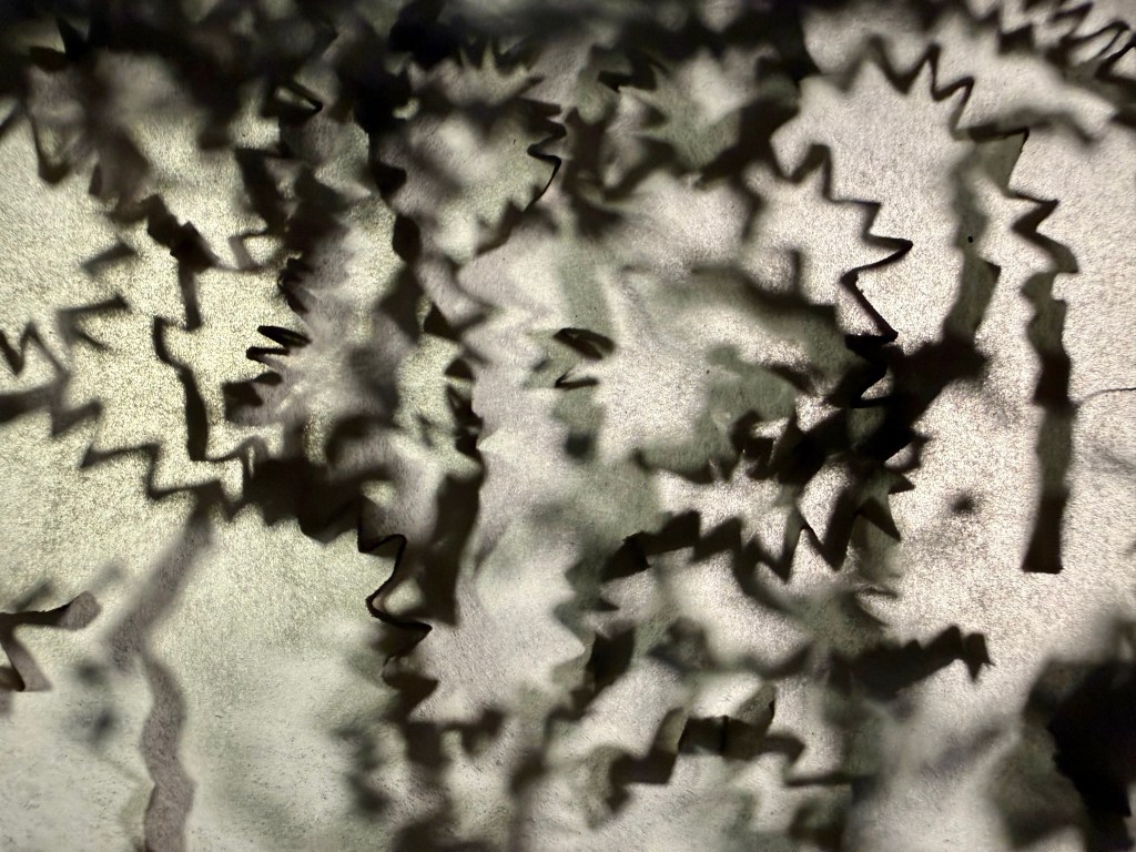
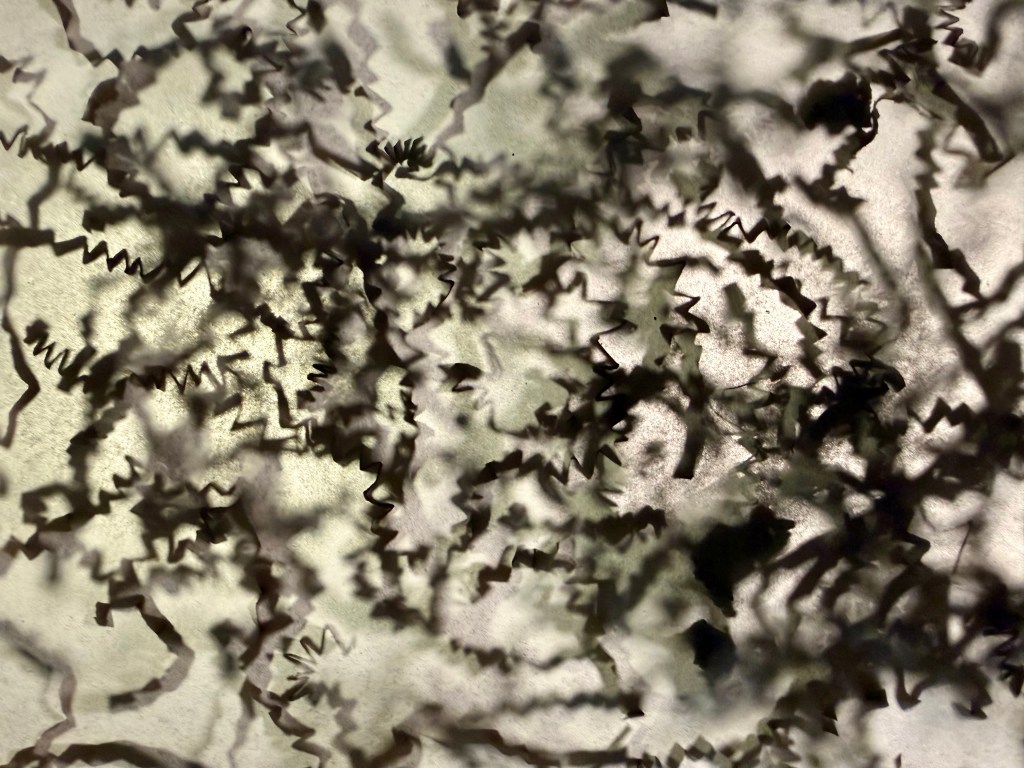
I was cutting some lino yesterday and I collected the bits of lino on a piece of tissue paper. As I was lifting it up to dispose of them I thought, ‘oh that looks interesting’. And off I went. I wrapped some tissue paper around an old photo frame. I couldn’t be botherered to go off and find clamps etc so I balanced the frame on some books on two chairs. I then set up a couple of anglepoise lamps. Lying flat on my back on the kitchen floor allowed me to photograph the tissue paper from underneath. I experimented with the lino bits as well as some packaging which I had saved, just in case it might come in useful.
To save me from getting up and down, I enlisted some help with the sprinkling. These are the results:
I really like the effect of the lino bits – they are dynamic and have the sense of someone having just made some quick gestural marks. I like the added depth provided by the bits that are further away from the surface of the tissue paper.
I really like the effect in the photos. The first one in both sets is without any backlight and it almost looks like something trying to break through the tissue paper – like something crawling under the skin. It would have been good to try with just a few bits, but by the time I had the thought, I had put everything away, but something for the future.
I also made a video of the ‘sprinkling’. Otto, the dog, was in the kitchen at the time and decided to have a bark and come close to my head grunting like a pig. I was in the process of cleaning up the audio – I was even going to try out Garage Band – but then decided not to – I liked it how it is. I used some audio effects in Capcut – Deep 2, Echo and Super Reverb. I wanted to make the audio unexpected – the sprinkling of something light has been distorted so that it sounds unusually heavy and the background noises are unexpected when heard with the visual which I think makes it more interesting and unexpected.
I quite like the idea of revelation, and layering seems to facilitate this.
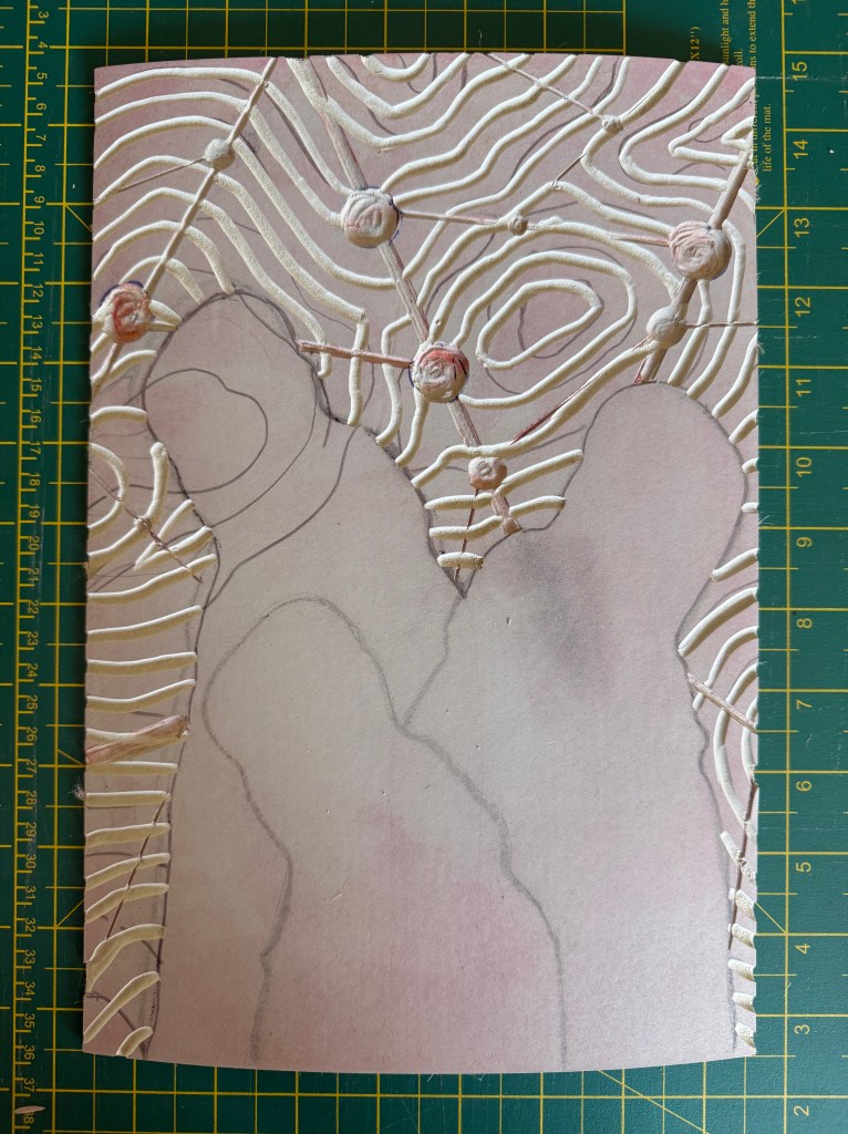
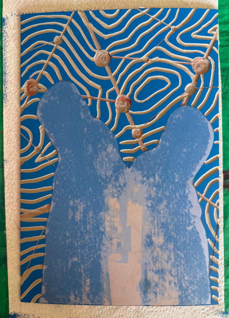
Drawing lines on the first print I made of the linocut – there must have been some loose bits because it left small circular areas of white which reminded me of places or points of interest on a map. I then cut out some areas and laid it on top of a section of the figures line drawing using some cut up old corks as makeshift spacers. I then stuck the print with the large white space onto some watercolour paper and cut out the centre. I sewed some threads across the centre – thicker embroidery silk would have been better but I had to make do with what I had to hand. I laid it on top, slightly off from the print below.
And I was right. And I wish that I had thought about doing this sooner.
I dusted off my printing box and experimented with printing a line drawing. I used an A3 piece of soft cut Lino as I didn’t want to be shooting off all over the place, and have bits crumbling away. I used my smallest tool. The good thing about soft cut is that you can easily use a craft knife to cut out sections.
I started by tinting black with some blue, and printing the whole block:
I like.
Then the two separate sections:
I also like. This way around, it reminds me of a figure, curled up, cowering, face protected by hands.
Then I added in some extender to make a lighter, more transparent colour:
Nice.
Printing on tracing paper:
Interesting. Possibilities.
I then experimented with overprinting:
Absolutely love.
I’ve noticed that I’ve been using that word a lot more recently.
It’s fascinating that by overlapping the prints I’ve recreated some of the mark-making I was experimenting with using the Micron pens (Pushing Paper III) and also the strange effects created when I photographed the pen drawings. It was almost as if the camera couldn’t quite work out what was going on. For example, when the image is displayed on my phone normally it looks like the first image below. It is only when I zoom in, that I can see that the lines look as they do in the second image.
Anyway, I think that it was a very productive session and has given me lots to thinks about. I’ve decided that I’m warming to linocut. It used to bug me before, because it can be quite patchy in places (probably my ineptitude), but since using the fineliners to make line drawings, and noticing the texture created when the ink dried up a bit and the effect of mistakes, I’ve noticed that Lino has the same qualities. They both evidence the process of making which I’ve recently been embracing, rather than a perfect print.
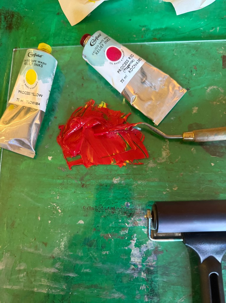
I used up the leftover ink to make some mono prints. The inks are safe wash – they are oil-based but soluble in water. I like the effect of spraying the ink with water, and running the brayer over it. These could maybe form the basis of something else.
The self is in a constant state of becoming, and each time we reflect, we create iterations of ourselves, crystallised in time; shadow selves. ‘Wayfinding’ – my first reduction linocut – evidences the processual nature of its making, with each layer being a trace of what was once, but is no longer, fixed in time and unalterable. It embodies how the act of making and the evolving self are intertwined, the self being both mapped and remade.
It’s been a steep learning curve, with highs and plummeting lows. I have learnt a lot from the experience – the physical process of the making of the prints, with its inherent breaks from activity, and the potential and restrictions of the materials themselves which have challenged me, requiring me to find solutions to the problems I have encountered along the way.
I liked the contemplative feeling of cutting the lino and the nature of rolling out the ink, observing its texture on the brayer akin to suede, listening to the sound of the brayer and ink sizzling, and the relief (or crushing disappointment) when pulling the print. I feel that the experience has enriched me and that hopefully I will continue to become a better printmaker – I don’t say that I have become a better printmaker because aside from possibly being factually incorrect, that indicates that my becoming has stopped – I want to be in the process of continuing transformation. The prints themselves evidence my learning and development in all their imperfection.
In his paper Making Hands and Tools – Steps to a Process Archaeology of the Mind (2021), Malafouris argues that ‘thinking is thinging’, in that we think with and through things, not simply about them, and that human becoming refers to the process of ongoing transformation that characterizes the human condition as indeterminate and incomplete, or else always about to become. As we engage creatively with the world, the new things we make shape our developmental pathways and our ways of being in the world and, as such, human intelligence is handmade.
’Hands and tools can be moved but they are not moving; it is the brain that moves the hand to move the tool. Taken together hands and tools can be seen as interactive processes. They co-constitute each other’s life by means of thinging. It is now the tool that moves the hand to move the brain because the brain is already attuned to the hand and the hand is aware and responsive to the tool. In one sense, the hand acts as for the tool, in another sense the tool acts on behalf of the hand or other tools…The agency of the hand derives from the tool and the agency of the tool derives from the hand.’
He asserts that hands and tools are made for action, in action. So my hand is made for action and without that action it is not a hand. I pick up the carving tool which is made for action and without my hand it is not a tool. My hand moves the tool to carve the lino and the tool responds to my hand at the same time as my hand responds to the tool. The lino responds to the tool as well as my hand, and in turn my hand and the tool respond to the lino. The lino is not lino without the tool and my hand to carve into it. My hand and the tool are not a hand and a tool without the lino to carve into, and so on. As my brain is in tune with my hand, then so is the carving tool, the lino, the brayer, the ink, and the paper, and, as such, they all influence my developmental pathways and my way of being (or should it be becoming?) in the world.
On reflection, I’m not sure that I enjoyed the process that much. The restrictions of a deadline, the specifics of size and number, the fact that it was being made with a view to being sold, all contributed to a feeling of unease and pressure. I much prefer experimenting with no expectation, focussing on the process, and not the product.
I thought about what size to do the print. If anyone buys it, I would like them to be able to frame it at home with a shop bought frame. So I needed to leave enough of a border so that it could go into an A3 frame without a mount, but not too much so that there is a lot of white space if they choose an A2 frame with an A3 mount. I decided to leave a 2cm border on the top and sides, and 4cm at the bottom.
I decided at the outset that I would not aim for perfection, that there are bound to be mistakes and that it should just be good enough.
It started off well. I made 12 prints
When I came to print the next layer of dark grey the registration of the print went awry. I went from feeling quite happy about the process to feeling despondent and frustrated. I made a few adjustments but it still didn’t work. So I stopped myself from ploughing on in the vain hope that doing the same thing again and again would somehow miraculously give a different result.
After some time away, it became obvious that the lino block, which had been washed and left to dry, was not sitting totally flat, which may have been the cause of the issue. So, I warmed it up and put it under a pile of heavy books whilst it cooled down. I came back to it a while later and tried making another print, which worked much better. Feeling a bit happier about things I went on and finished the rest of the prints. I must have inadvertently caught some of the cut out areas whilst inking up which caused some chatter on the base red layer (I clearly hadn’t taken on board the lessons from the first session) and on a couple of prints there was too much give in the blanket allowing the paper to be pushed down onto the cut out areas which caused marks on the red ink. This was resolved by adding in some folded newsprint which created some rigidity over those areas.
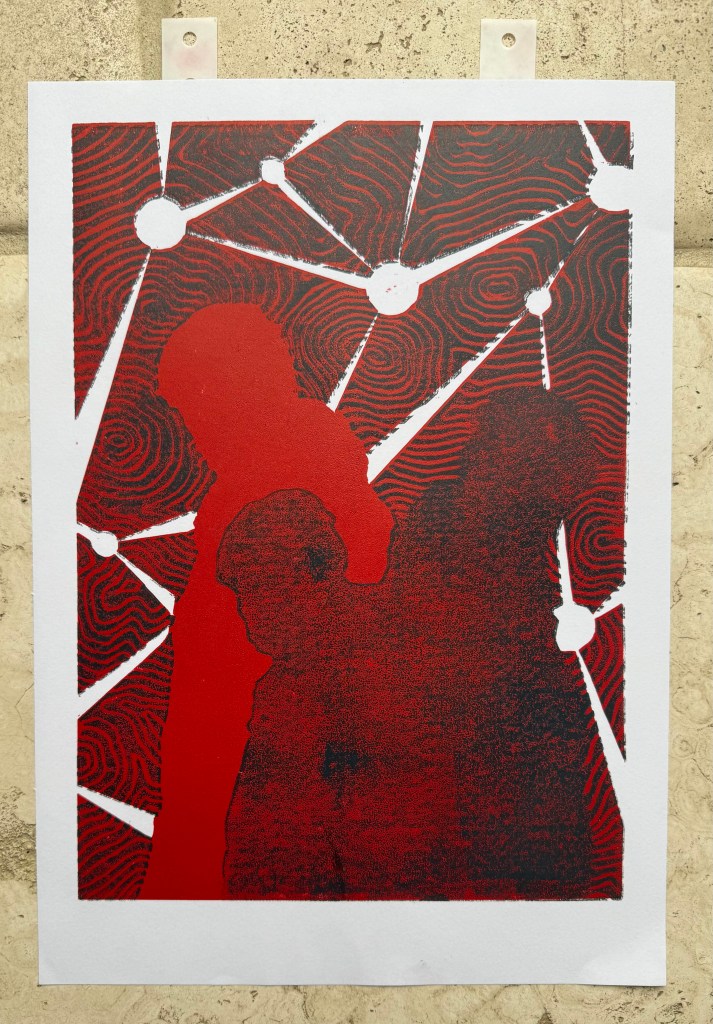
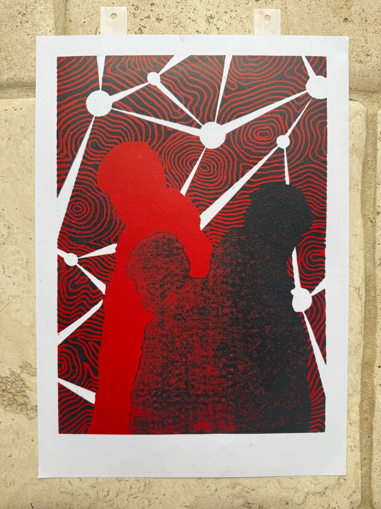
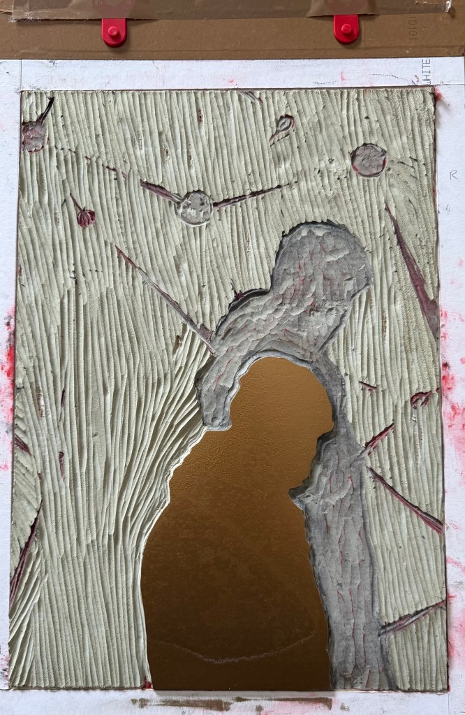
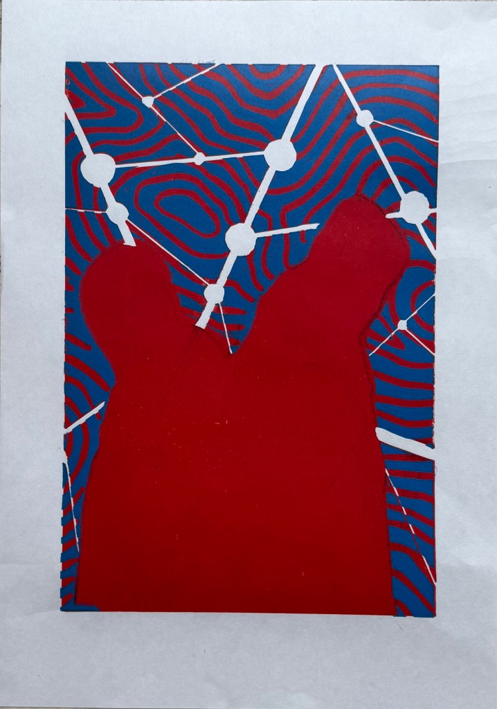
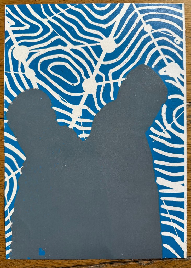
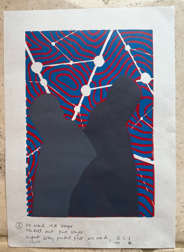
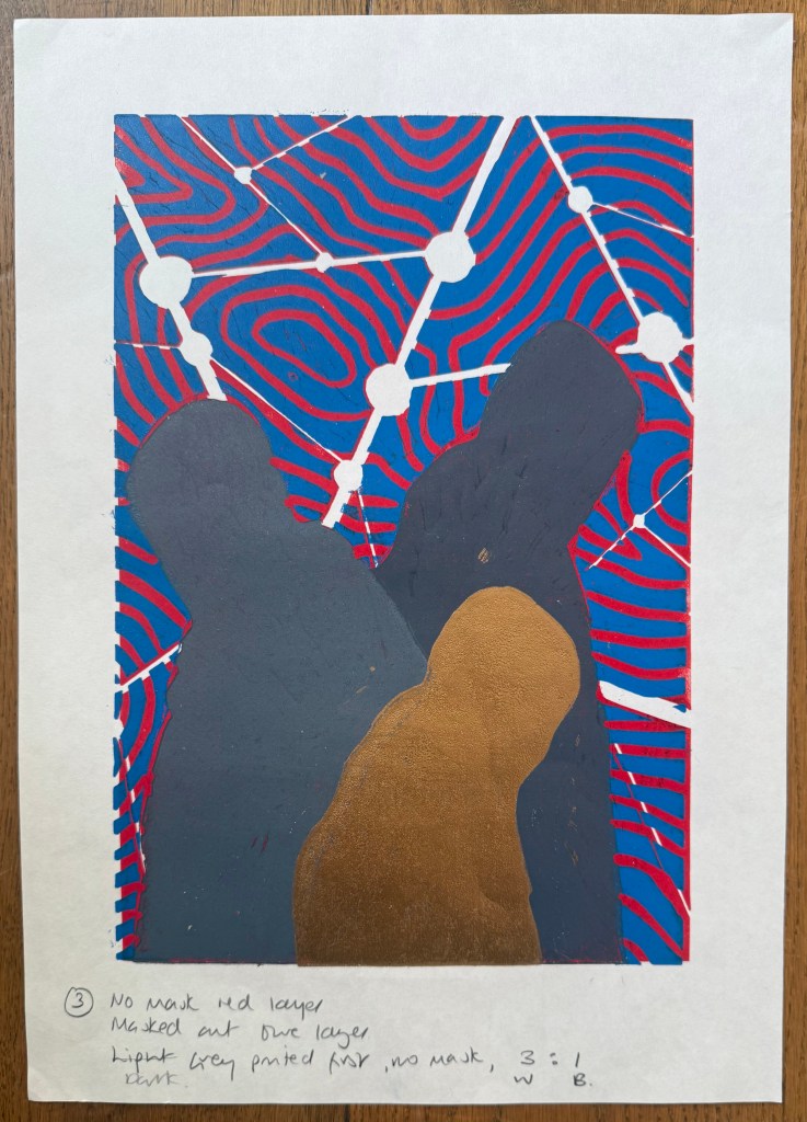
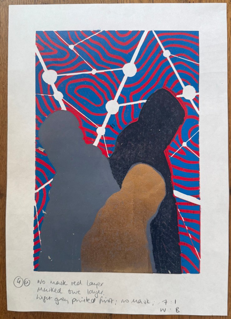
I liked the slightly mottled effect of the grey on the figures – it gave the sense of light falling on the figures or a lack of solidity. I wanted the head silhouette to be stronger so I burnished the head and the front side of the figure with a spoon to get a darker print. I liked the prints at this stage, but I felt that the two grey figures didn’t have enough definition between them, so I went on with the final gold layer.
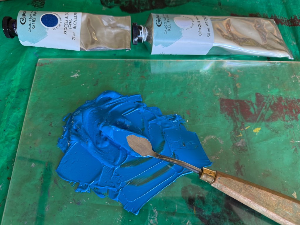
So, Plan A was dependent on me being able to overprint the red with blue. I did a quick test print. The process blue ink I was using must have some transparency as it turned into a very dark purple, so I made it more opaque by adding opaque white which resulted in a kind of cerulean blue which I liked against the red, although the photos don’t do it justice.
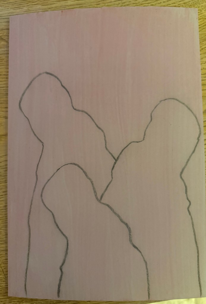
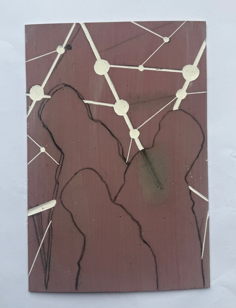
I then prepped a sheet of A4 lino by lightly sanding and wiping with white spirit before staining it with an acrylic ink and drawing on the figures and the white lines. I went over the pencil marks with a chinagraph pencil to make them stand out more. As usual I had launched in without giving it enough thought and ended up having to reposition some lines although I couldn’t erase the chinagraph marks, which becomes relevant later on in the test printing. I used a metal ruler to cut out the white areas and filled them with cornflour to see how they looked, neatening up where necessary – the circles are bit all over the place, so I resolved to use a template when making the actual prints.
I created a registration board for the lino, drew lines where the paper was to go, and printed the first layer using equal parts process red and process yellow. Initially, I thought that I could mask out the figures using some tracing paper. Reduction linocuts work from light to dark ordinarily, but my image doesn’t really conform to that process. I knew one, if not two, of the figures would be a med/light grey and I wasn’t sure how that would sit on top of a bright red. I tried inking up whilst the mask was on the block and then removing it, but it was difficult to do because the mask kept on sticking to the brayer and the result wasn’t great. I decided to ink up the entire block for the rest of the prints. I also noticed that some of the chinagraph was coming off the block onto the prints.
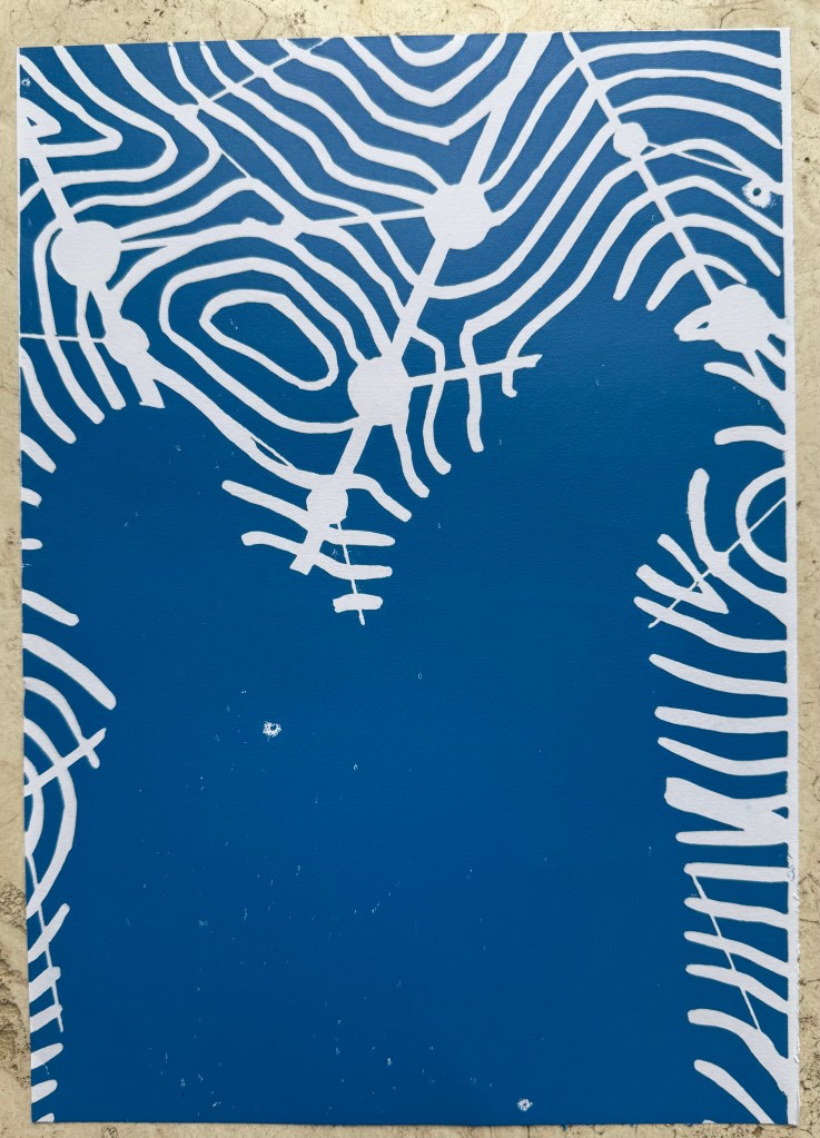
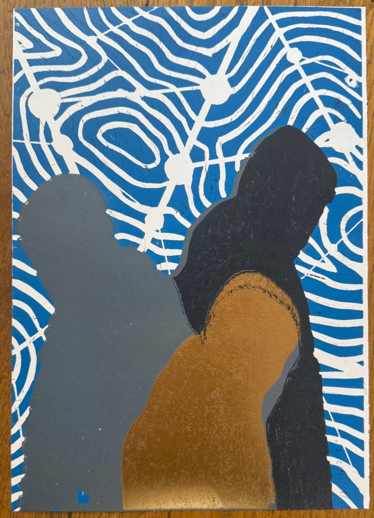
Next, I cut out the contour lines and printed with blue ink. By this stage I had realised my previous error and masked the figures after inking the block, but before printing – a much better result, and I can’t work out why I hadn’t realised this to start with. However, after the first print it was obvious that the registration was off. I had thought that I had lined up the paper the same each time when I was printing the red layer, but I clearly hadn’t. I created a raised edge against which to place the paper on subsequent prints, but I had to accept that the blue and red layers wouldn’t line up on all of the test prints, which would cause problems in relation to the white areas.
There was also misalignment around the edges of the figures which could have been caused by poor registration on the first layer, but could also have been caused by a lack of accuracy in creating the mask, or even applying too much ink.
To complicate matters further, the paper I used was Japanese HoSho paper which being lightweight (90gsm) and strong makes it ideal for printing linocuts. However, it turns out that it is slightly smaller than A3. I already had some Snowdon 130gsm paper, so I thought that I would give that a go, to see if it would be a suitable alternative, even though it is heavier than the HoSho.
Other than a few areas where some bits had managed to get stuck onto the block, it seemed to print quite well.
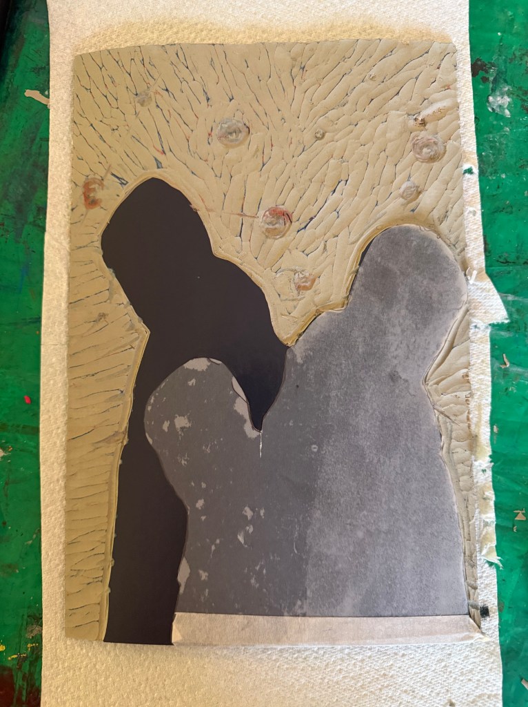
I then cut away the rest of the block leaving just the figures. I wanted to experiment with both masking areas and inking up the whole block to see how the subsequent layers printed so I could decide on a final approach ie whether to use a mask or to layer the ink. I would have preferred not to mask any areas as it seemed to increase the risk of mis-registration of the print. But before I decided I needed to find out how the final metallic gold layer would sit on top of all the other layers. I noticed that there were some indentations in the outlines of the figures from where I had cut out the contour lines.
I also wanted to see how the grey would print on top of the blue as well as the red, and it seemed to fare quite well, although it definitely has a cooler undertone to it than when printed over the red.
The blue and grey layers seemed to dry slower than the red and, as a result, the dark grey/black ink didn’t print well, and also the cut away areas picked up some of some of the blue and transferred it to the prints. I had the same issue with the gold ink, but by that stage I had become a bit frustrated and impatient, and just wanted to see what the colours looked like together. There are agents which can be added to the ink to speed up the drying process but you have to be careful as to the amount used, as they can alter the colours. I could have swapped from oil based to water based inks, which I didn’t have. So I decided to make the best of what I had.
I know that I make things more complicated for myself than they need to be. I could have watched videos on how to make reduction linocuts before starting, but there is a part of me that thinks that learning on the job is a more valuable, if not more frustrating, experience, and that the lessons learnt are more likely to be remembered (and possibly put me off linocuts for good).
So, what did I learn?
Preparation is key
Registration is everything – I watched a couple of videos after the event and invested in some Ternes Burton registration pins and tabs
It’s preferable not to mask areas if possible but to cut away the lino on each layer
Don’t use chinagraph or anything else which could transfer from the block to the paper
Accuracy is important
I should have had a resolved image before I started, rather than winging it in the process
When cutting out the first and second layers I needed to ensure a clean edge with the figures by using a craft knife
I needed to check that there isn’t any ink on the cut out areas of lino before printing
The ink needed to be dry before printing the next layer
But, the most important lesson is that because of the number of layers and the time needed for drying, it would not have been possible to complete the print before the end of the month. I needed to go back to the drawing board and have less colours so that it reduced the amount of drying time etc. So I amended the image to just white, red, grey and gold.
I’ve decided that I would like to make physical prints for the Editions Sale, if possible, and I have resolved to do a linocut, on the basis that I don’t have an etching press at home, and I probably won’t be able to make it in to CSM this month. I also want it to be something which is relevant to, and an extension of, my recent work.
I’ve not much experience of linocutting, but this is a good opportunity to try and improve my skills. I’ve been experimenting with some of the mapping imagery that I’ve been exploring over the last few months.
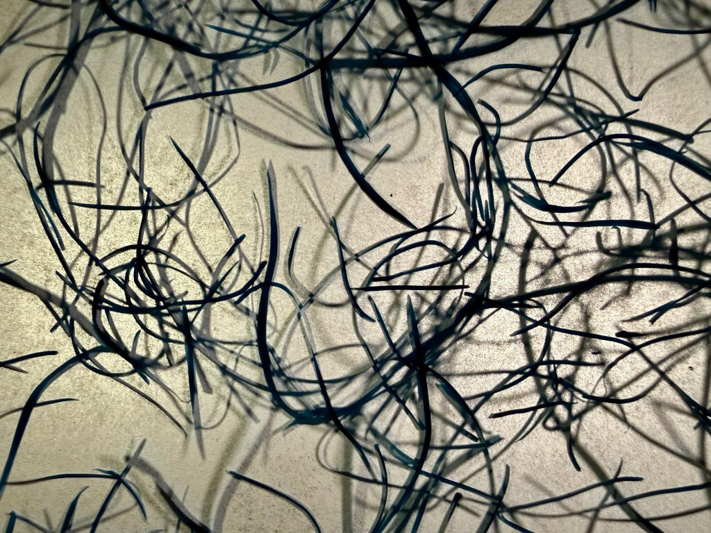
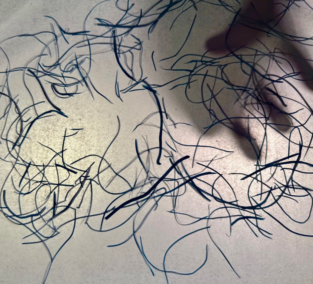
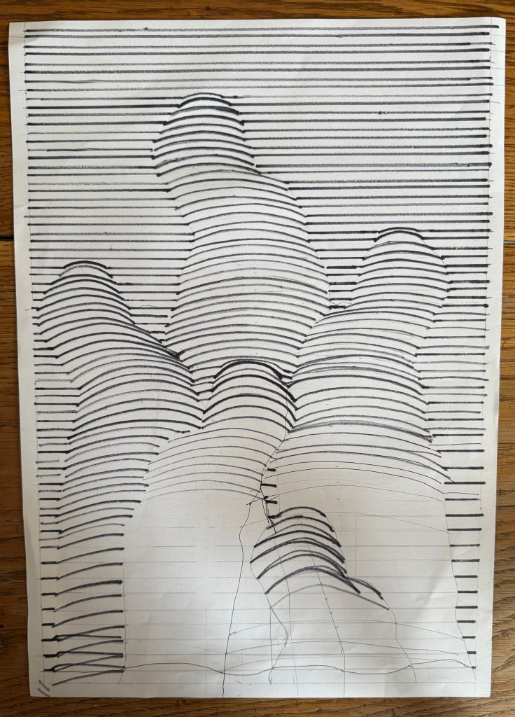
Originally I thought about the line drawing I did and how form can emerge from lines. I used my father’s silhouette from Solitude to experiment.
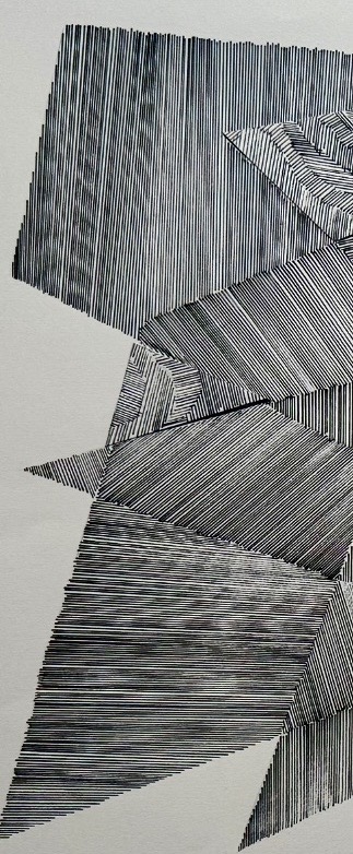
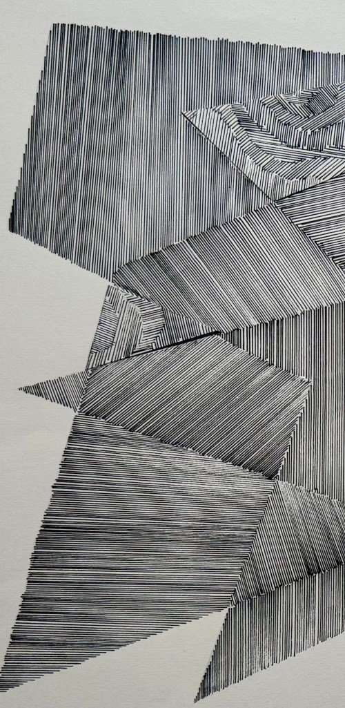
The lines are all over the place as I did them freehand (how does Bridget Riley manage?) and there were a few errors. In the top half I experimented with rounded curves, whilst in the bottom half the lines are flatter.
I tried drawing out how it might work but in the end I decided that it would just be too difficult, and gave up.
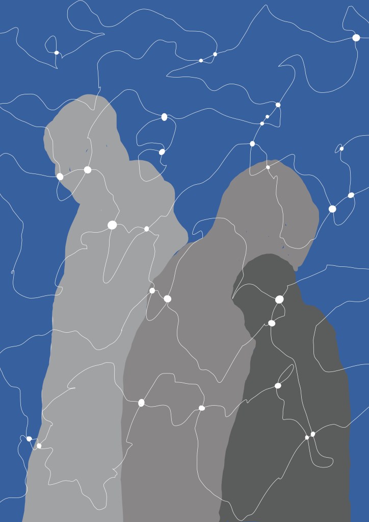
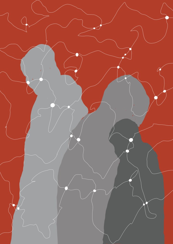
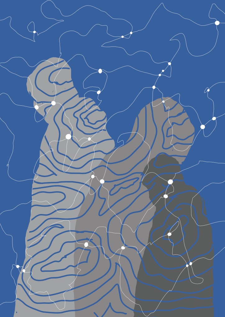
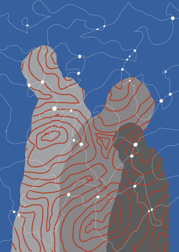
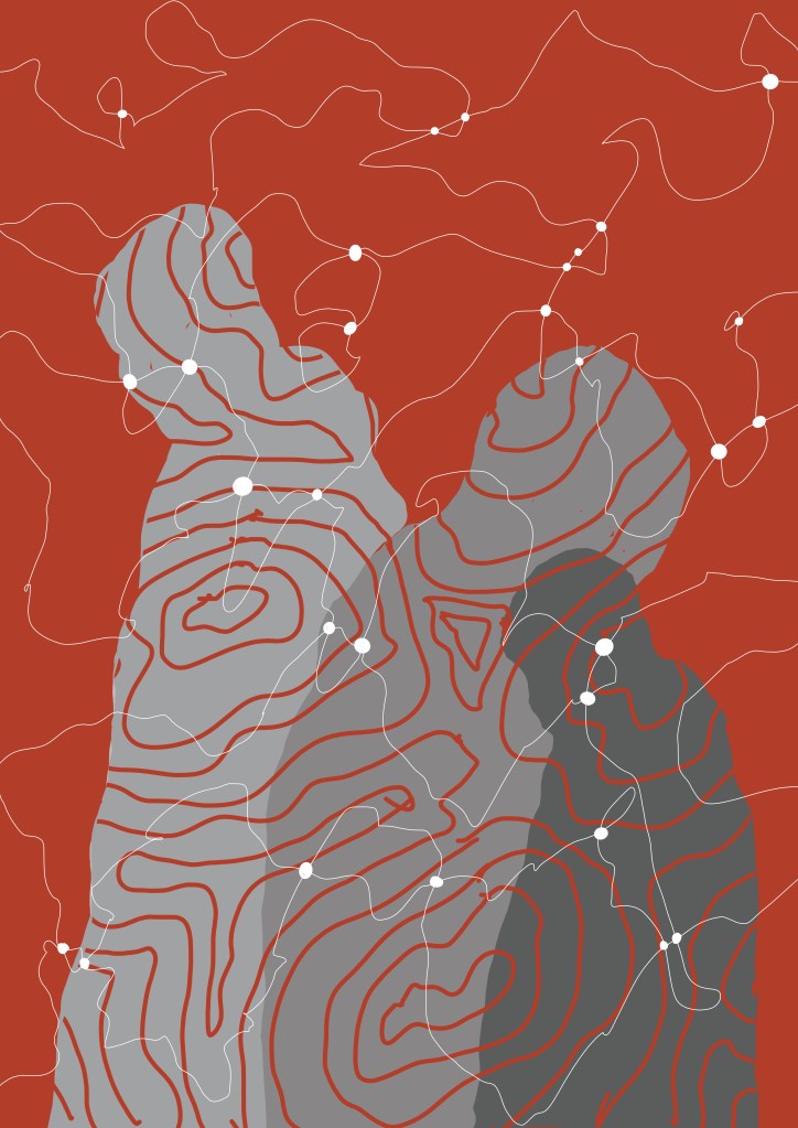
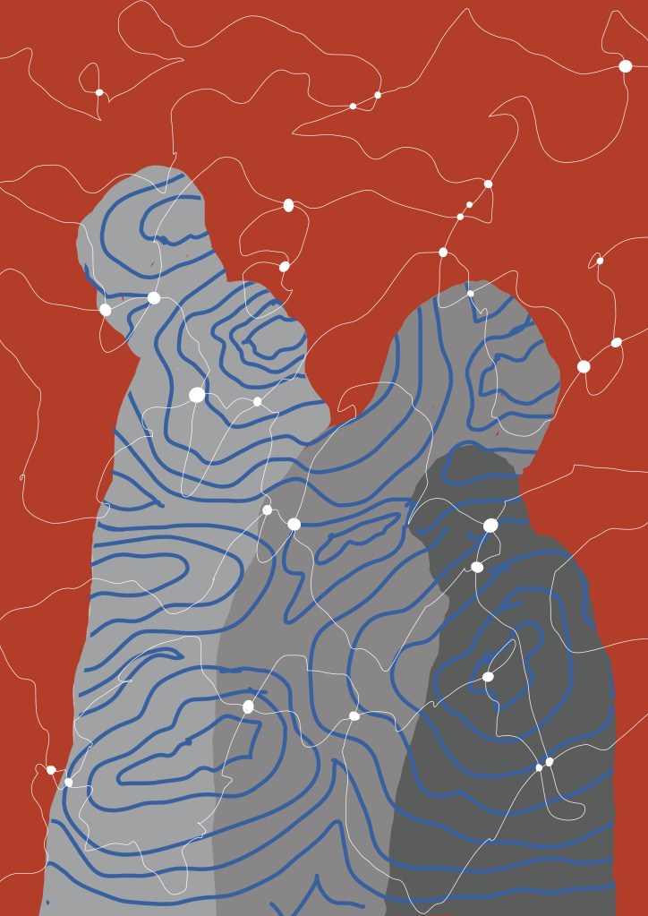
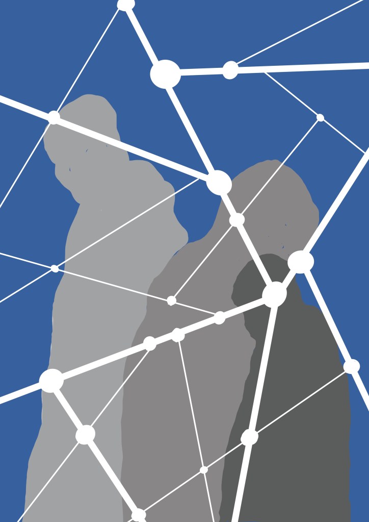
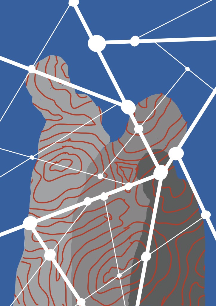
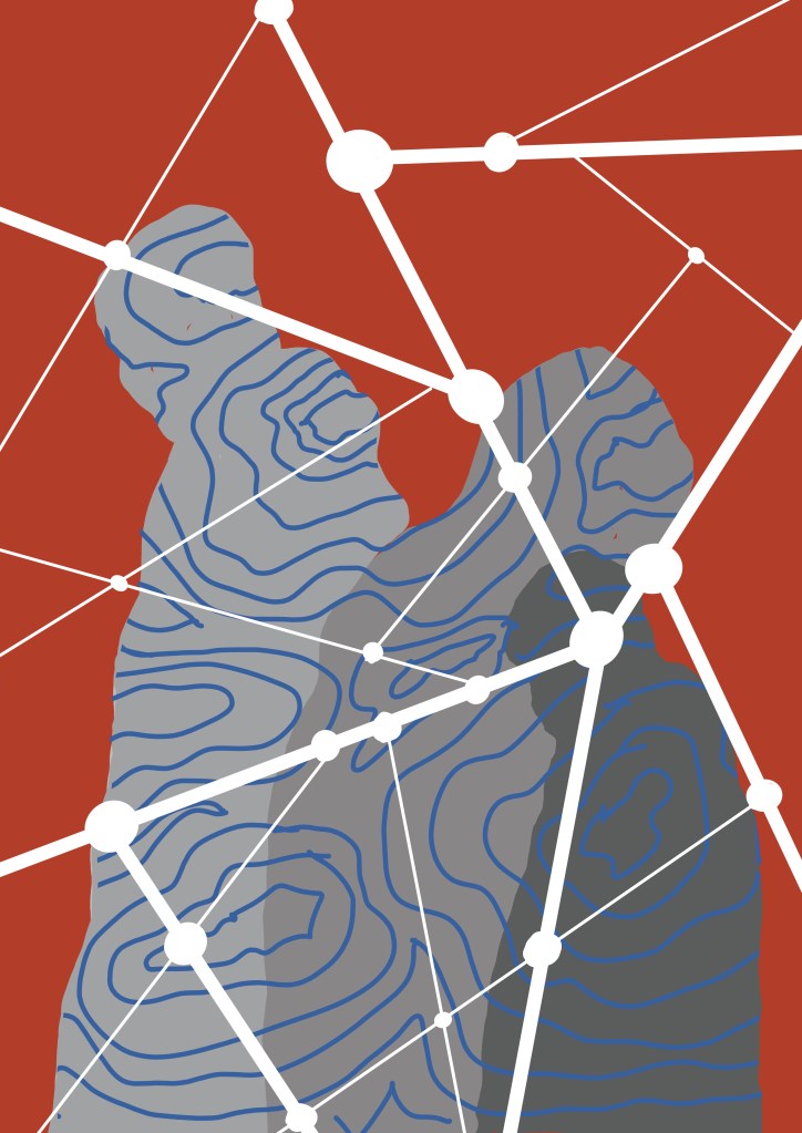
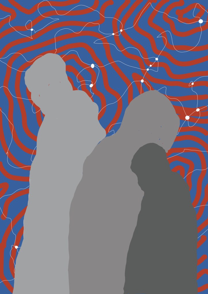
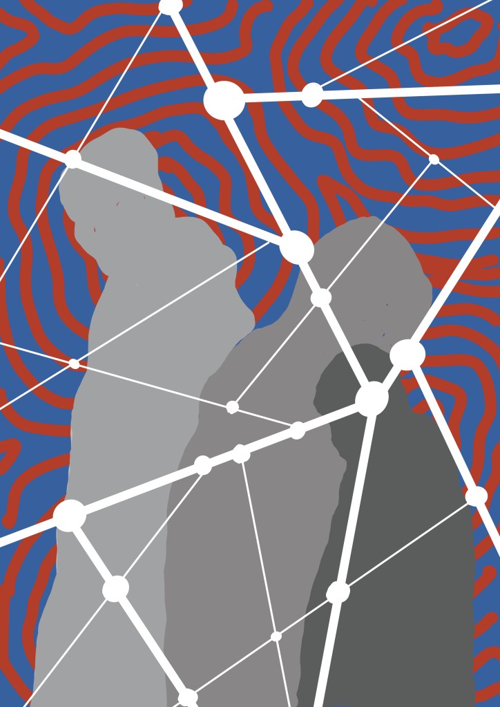
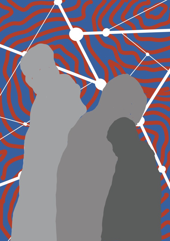
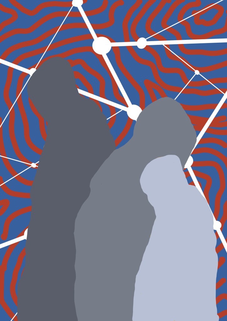
I then looked at the contouring and the automatic drawing that I have incorporated into some of my recent work. I used a group of three figures, composition yet to be decided, and red and blue as the colour choice for the time being. I created multiple layers in Procreate which then allowed me to play around with possible combinations.
I like the red and blue contoured background with the figures standing in front of the straight white lines (last two images), maybe using gold leaf or even metallic ink (which would be cheaper) to add some additional interest. I’ve also put the darker figure in the background so that it gives the feeling of being in the shadows, even though, technically, lighter figures are supposed to recede, which in this case they don’t seem to because of the background.
So I’m sorted, apart from the fact that it will need to be a reduction linocut, something which I haven’t done before, put off by the suspicion that my brain doesn’t work in a reductive way, but there’s nothing like a challenge. Maybe I need a Plan B, just in case.