I’d be lying if I said that I don’t get moments of anxiety about the End of Year Show and what I will be showing. After all, the plan is not to have a plan, as I’m treating it as a snapshot and the continuation of my becoming, as opposed to the big finale, the culmination of something. But it’s very difficult when all around me are so far advanced in their own work and I also need to give an idea of what I will be showing from a space planning and curation perspective.
At the very least I will have the book – it was ok to have that as a plan as it seems the most natural thing for me to do, it is something that can continue to develop because it is made up of volumes and also the process of making it has been one of learning and development. After my trial run I decided that I need to have some sense of progress and that I would crack on with the second volume before returning to remake the first. So, I’ve made the book cloth that will be used for the cover and the end papers. I’m currently halfway through formatting the blog – the resizing of all the images to a higher resolution suitable for printing and the creation of QR codes for the videos takes up a lot of time. Hopefully I will have finished it sometime this week and so can get on with making both volumes.
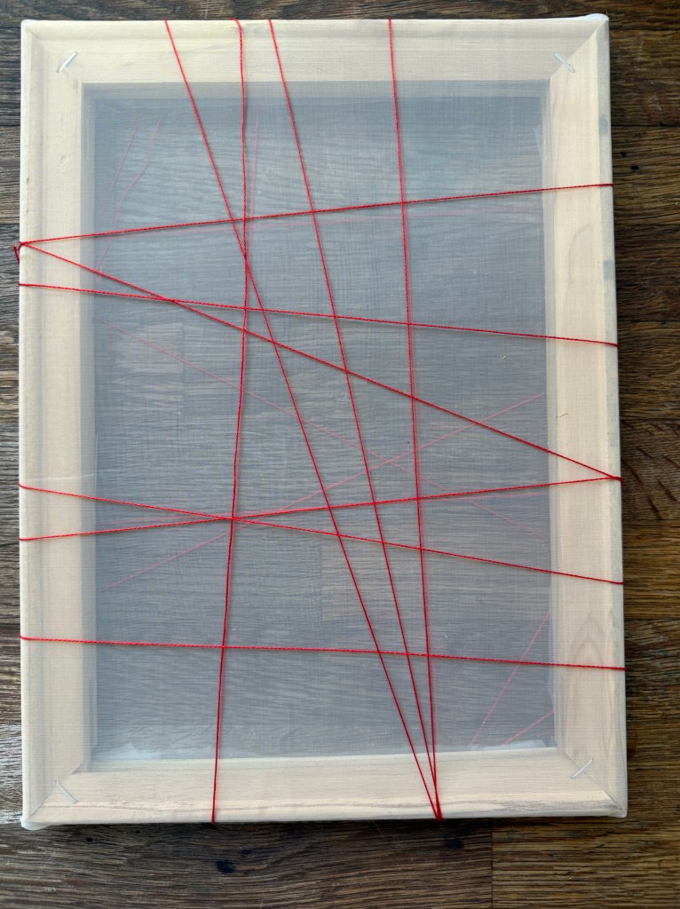
I’ve been thinking about my conversation with Jonathan as to how to display it. I want people to pick it up and have a read of it but at the same time treat it with care. Placing a pair of white gloves like those used by archivists next to the books would indicate that care should be taken – I don’t necessarily intend for people to actually use them and I’m sure that there will be some who would be reluctant to anyway. Hopefully, there will be three volumes, so the idea of two being arranged on a shelf and the third being placed on a separate surface, open and an invitation to be read is a good one, but it is also open to being seen as being on display, something to be looked at, not touched and read. So, I’ve gone with Jonathan’s idea of a student table chair/ conference chair as a possible option. I’ve sourced one – it has a fixed writing tablet so nothing has to be moved or flipped up for the reader to be able to sit down.
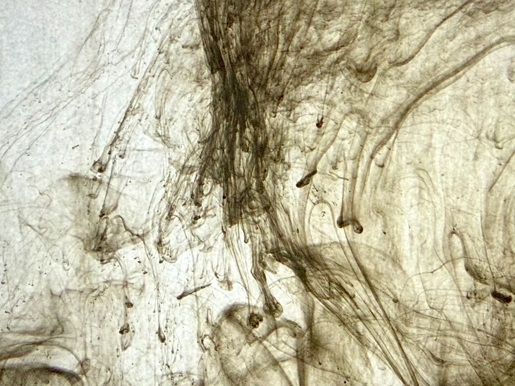
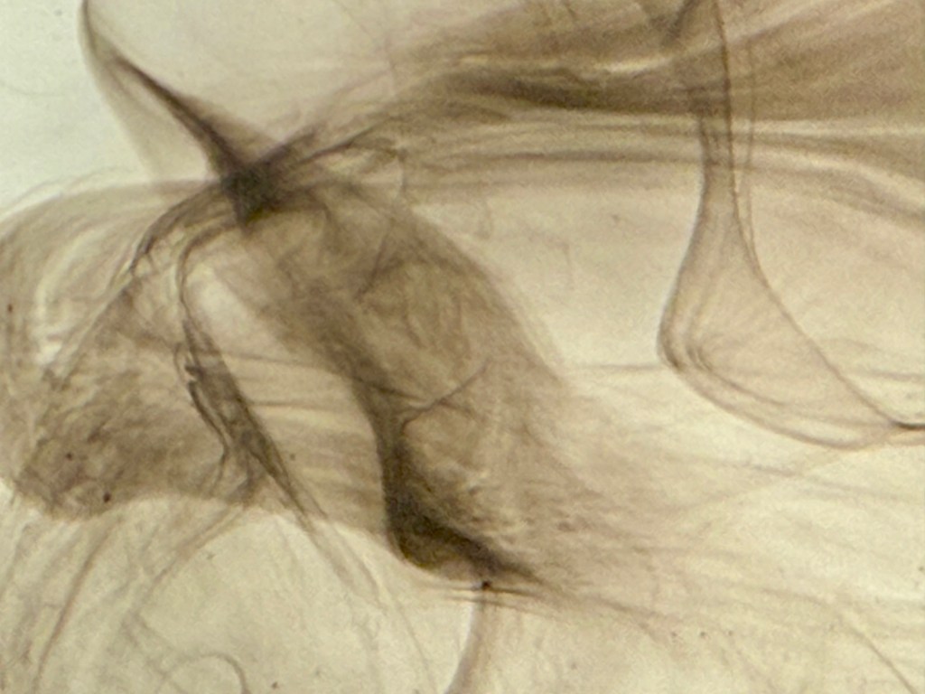
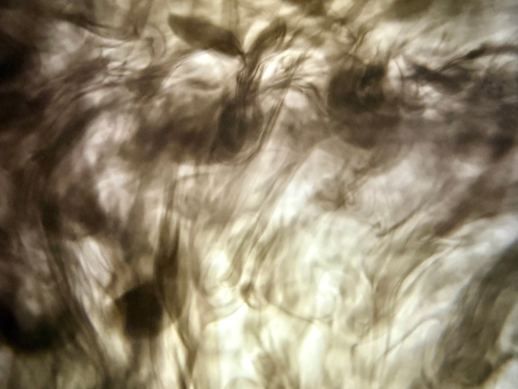
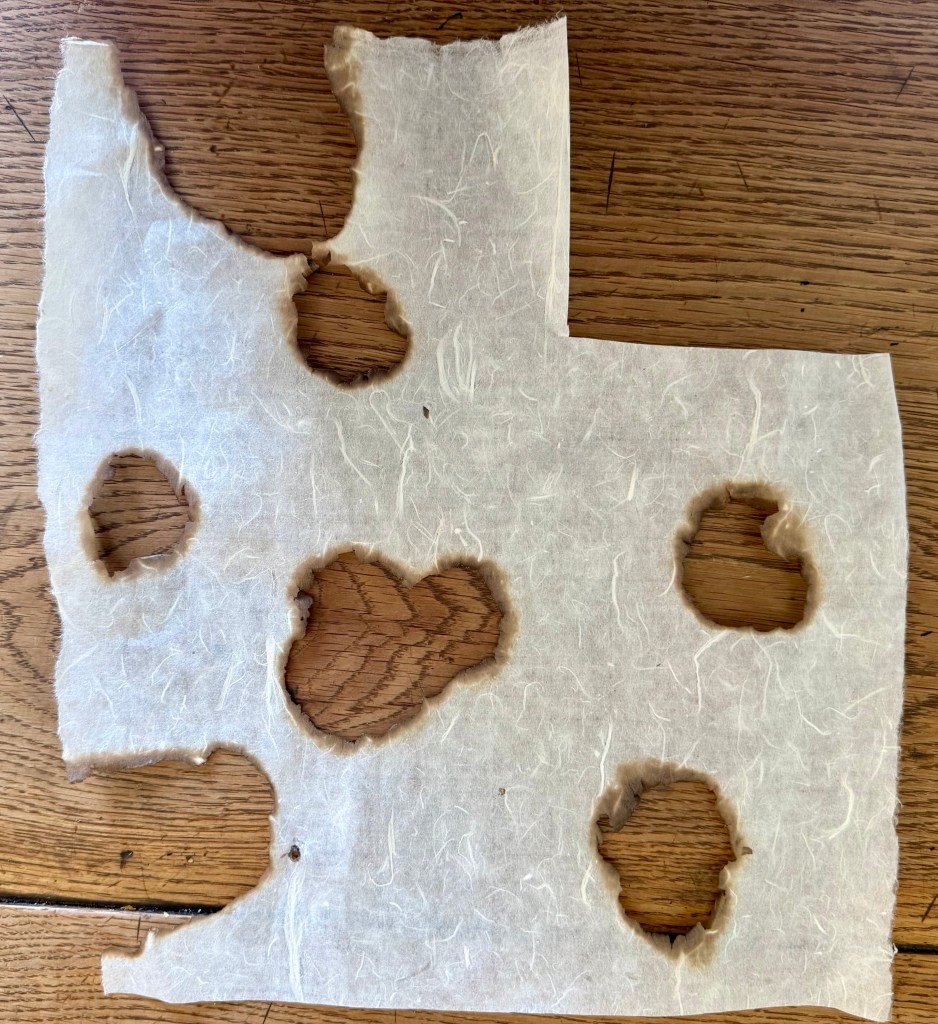
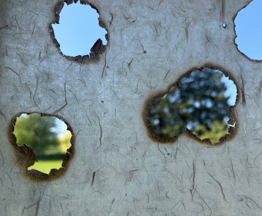
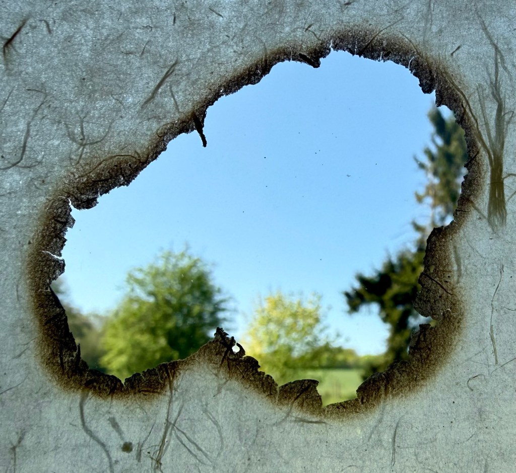
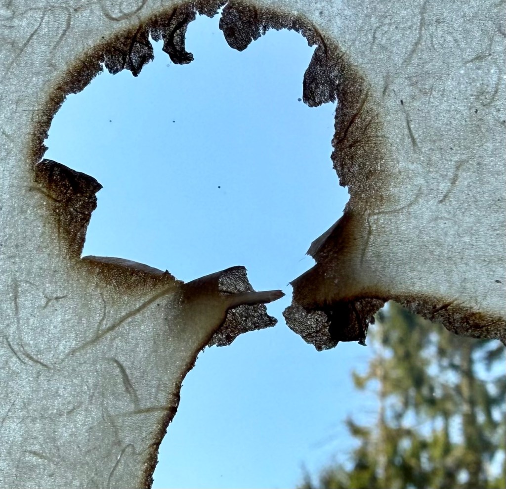
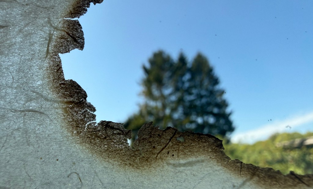
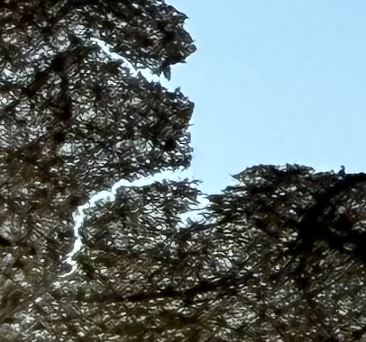
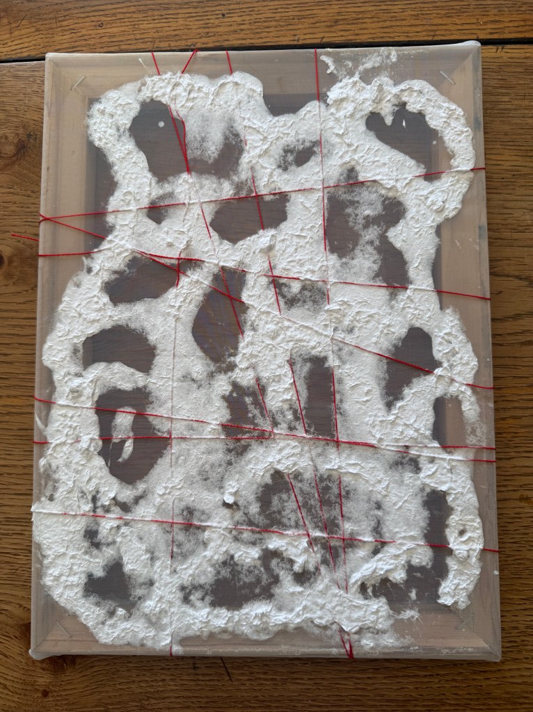
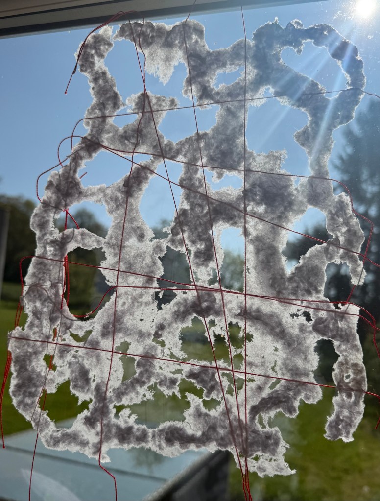
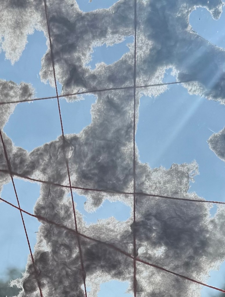
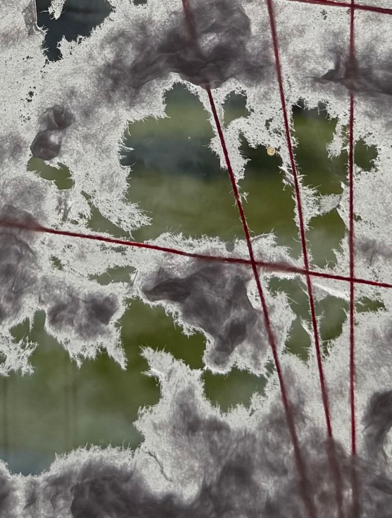
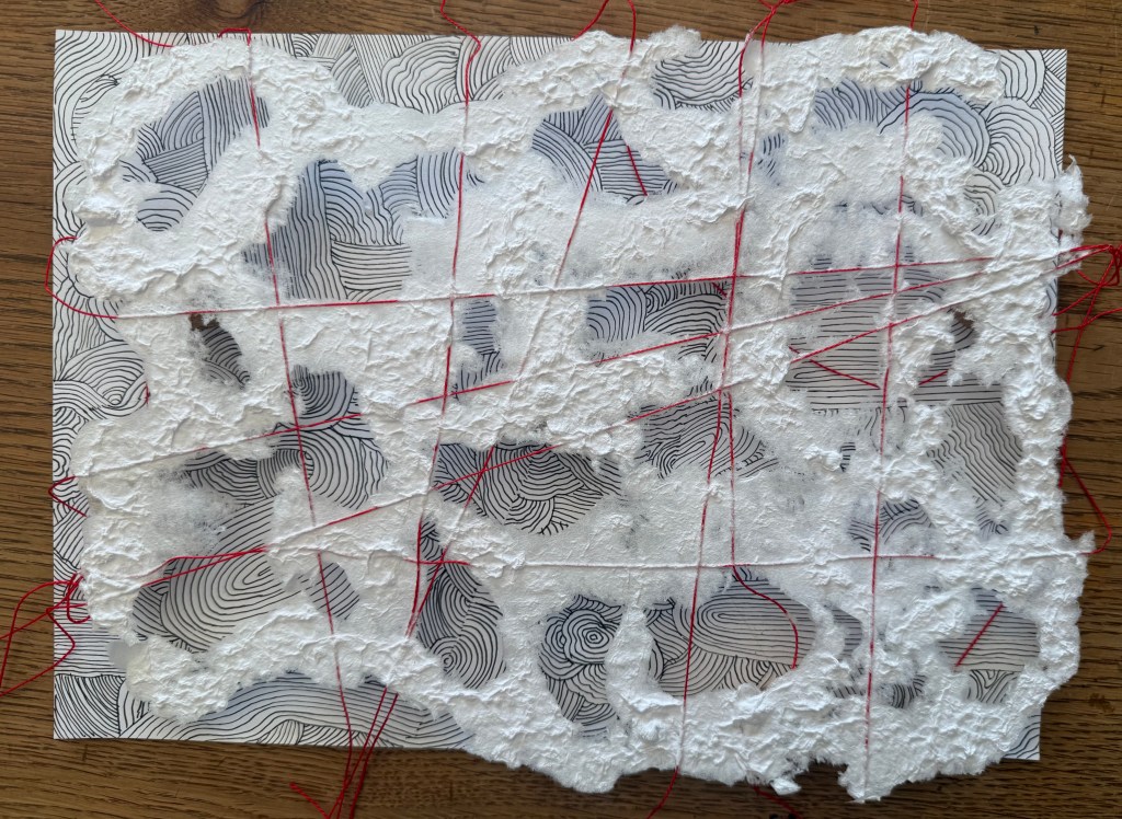
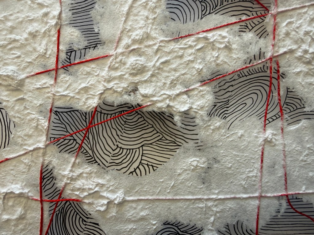
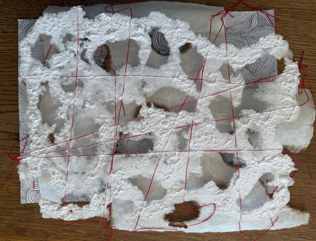
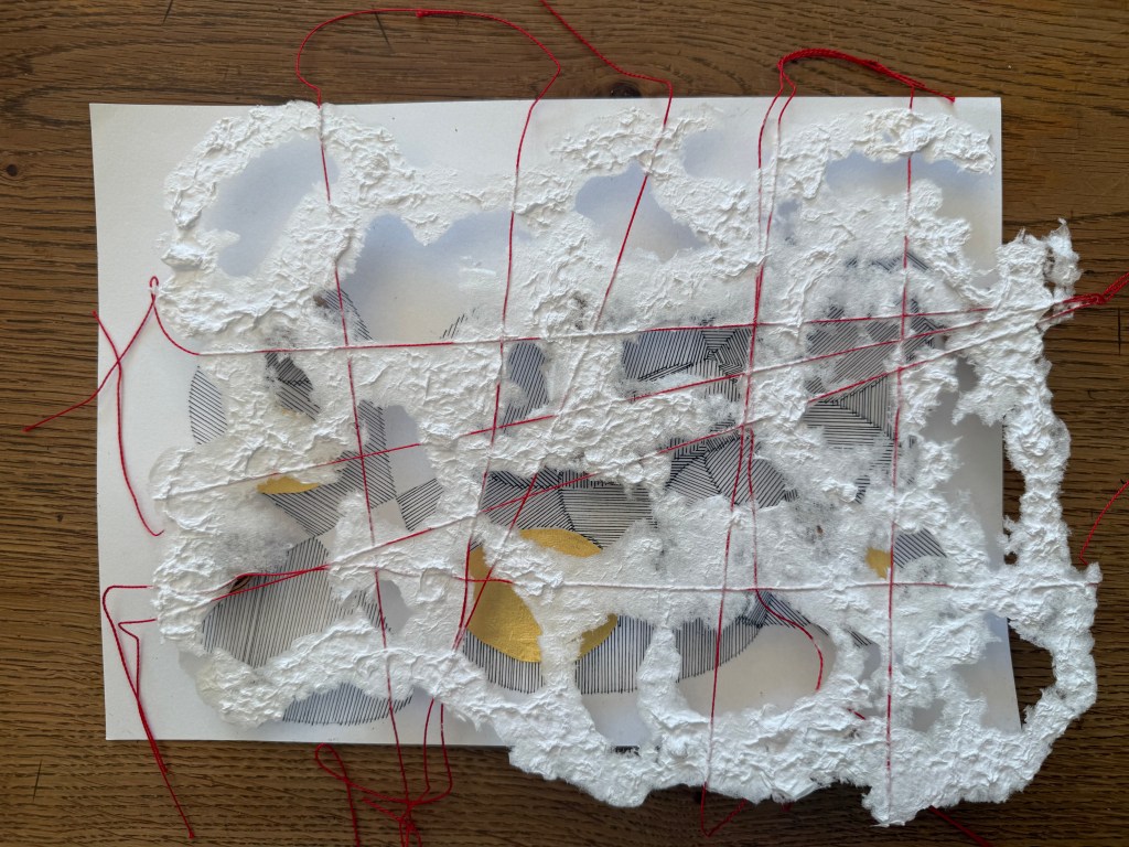
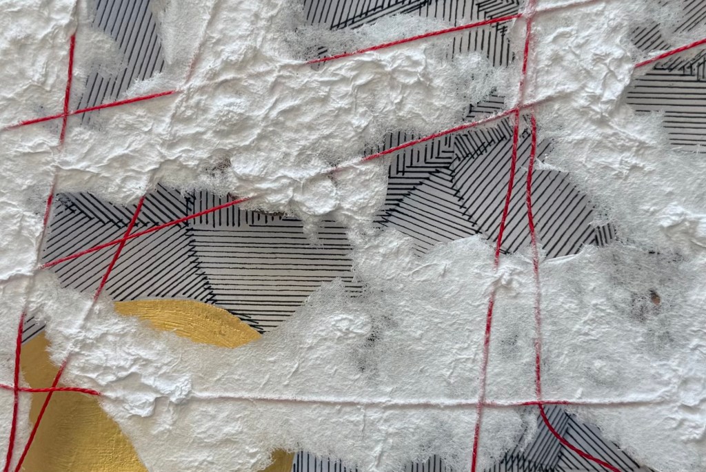
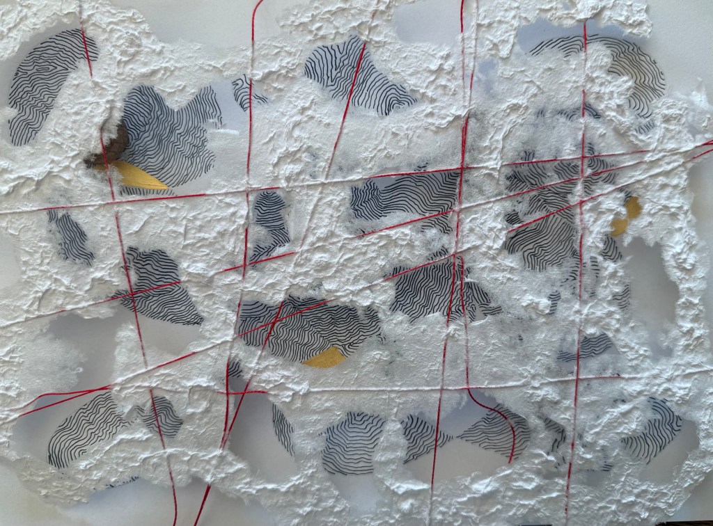
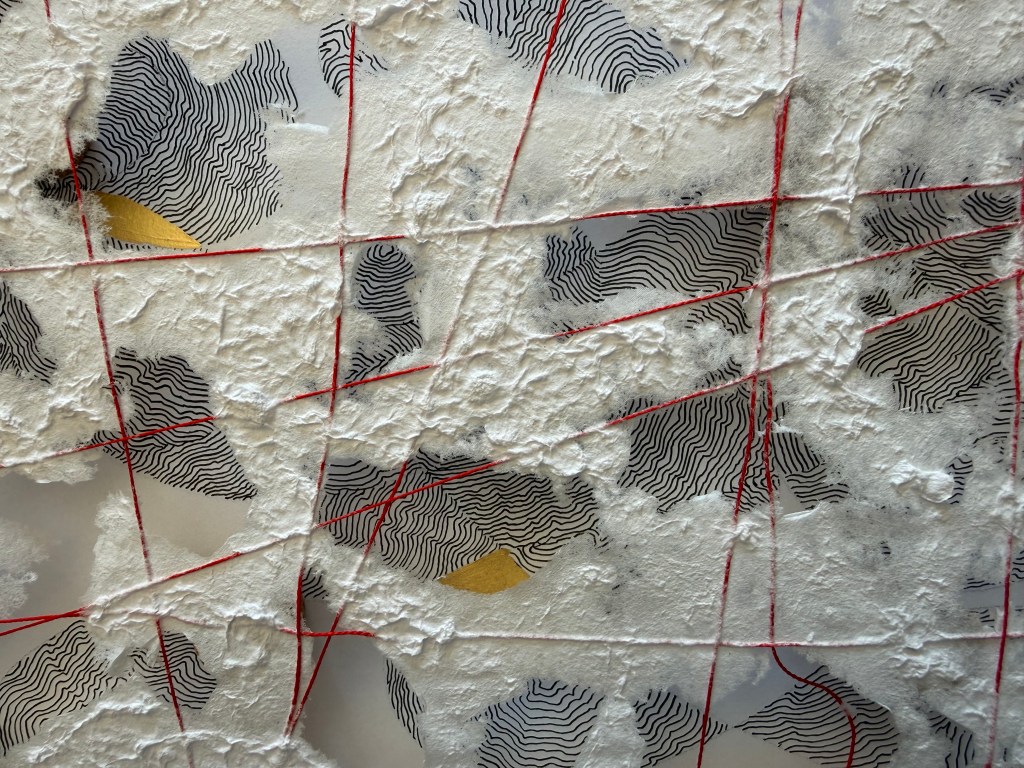
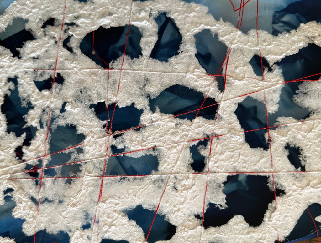
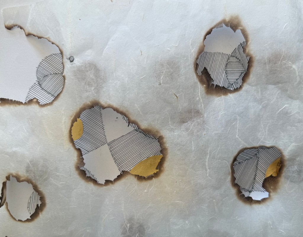
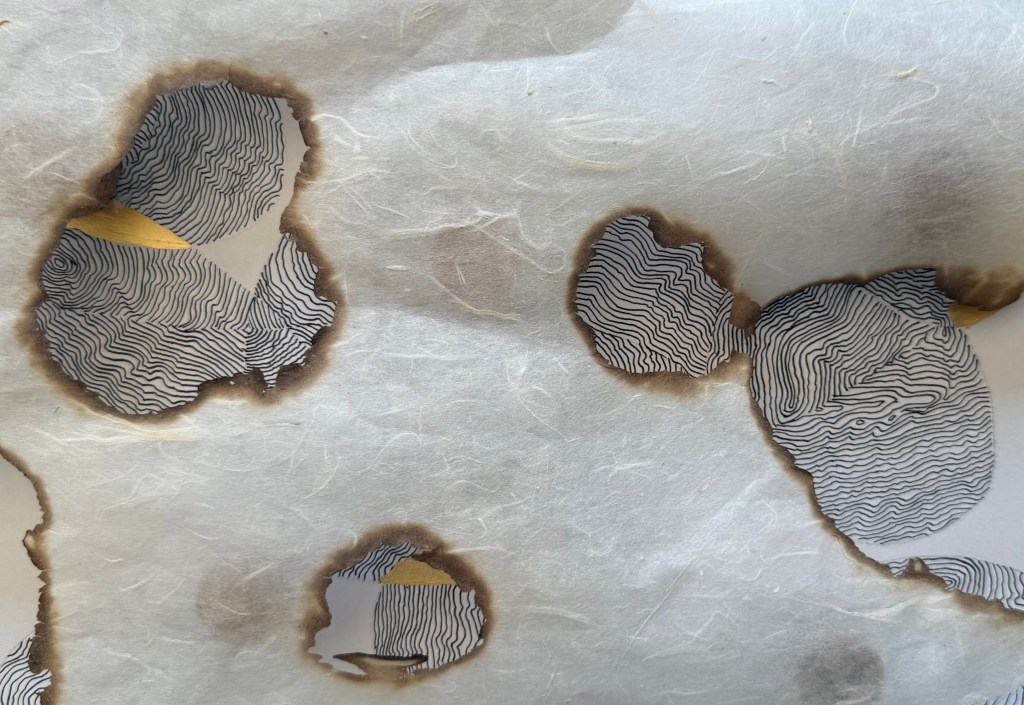
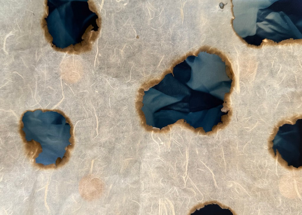
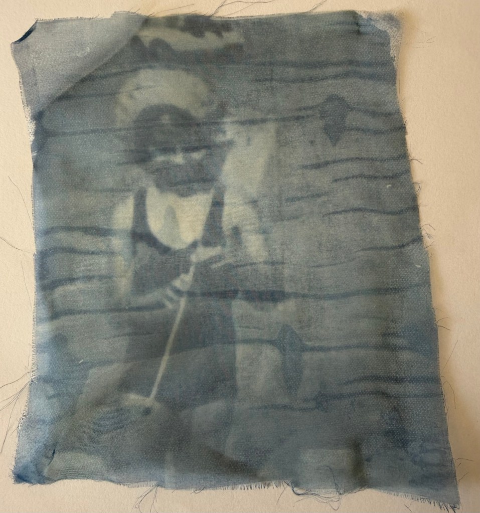
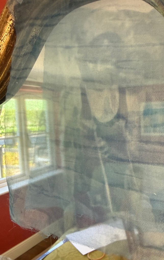
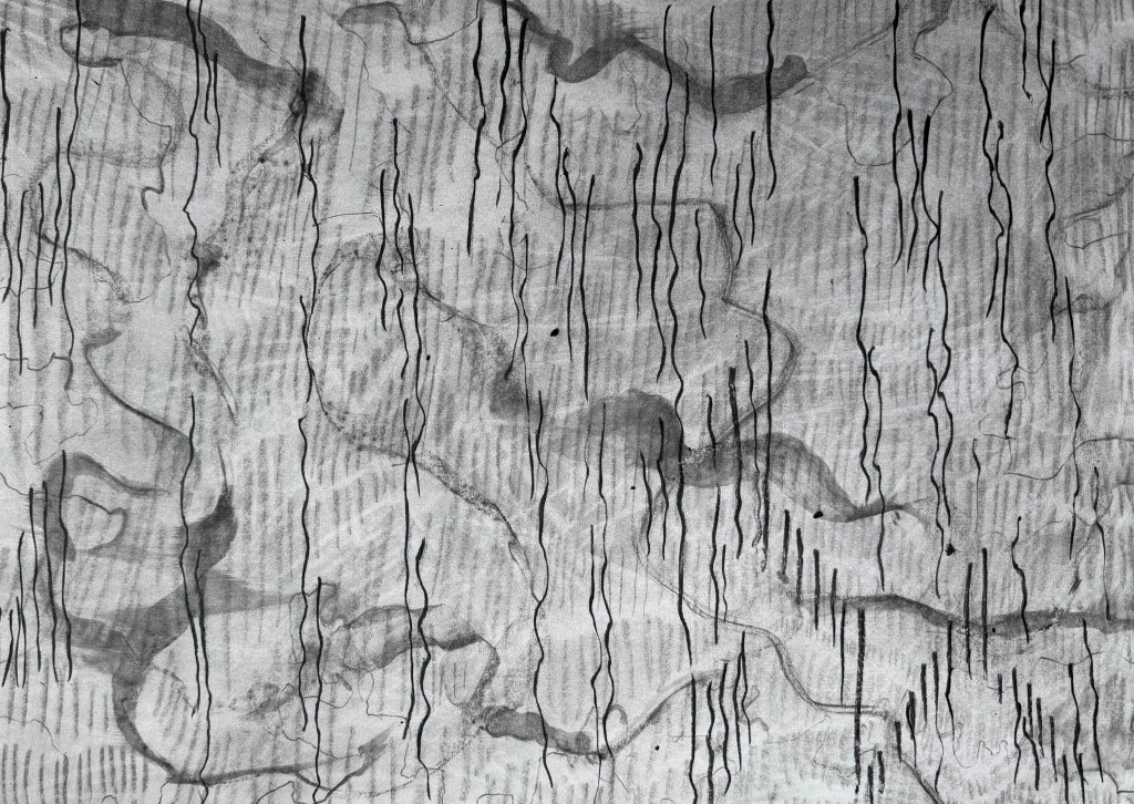
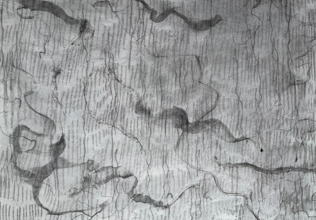
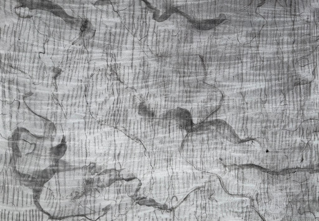
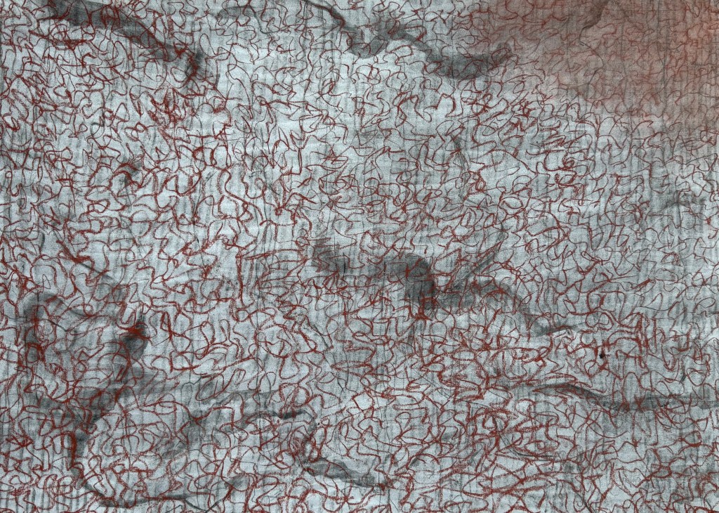
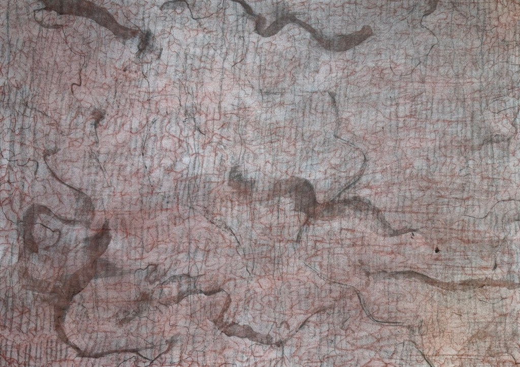
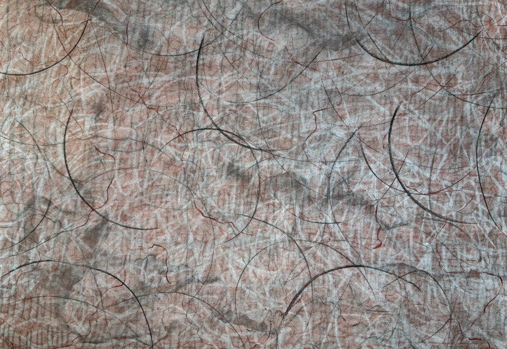
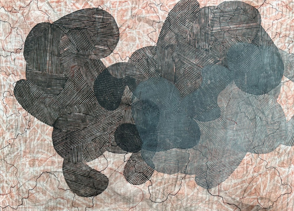
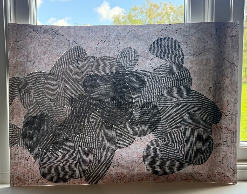
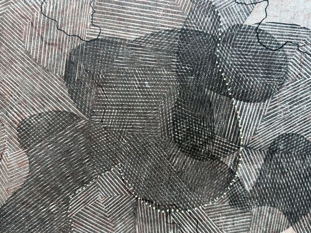
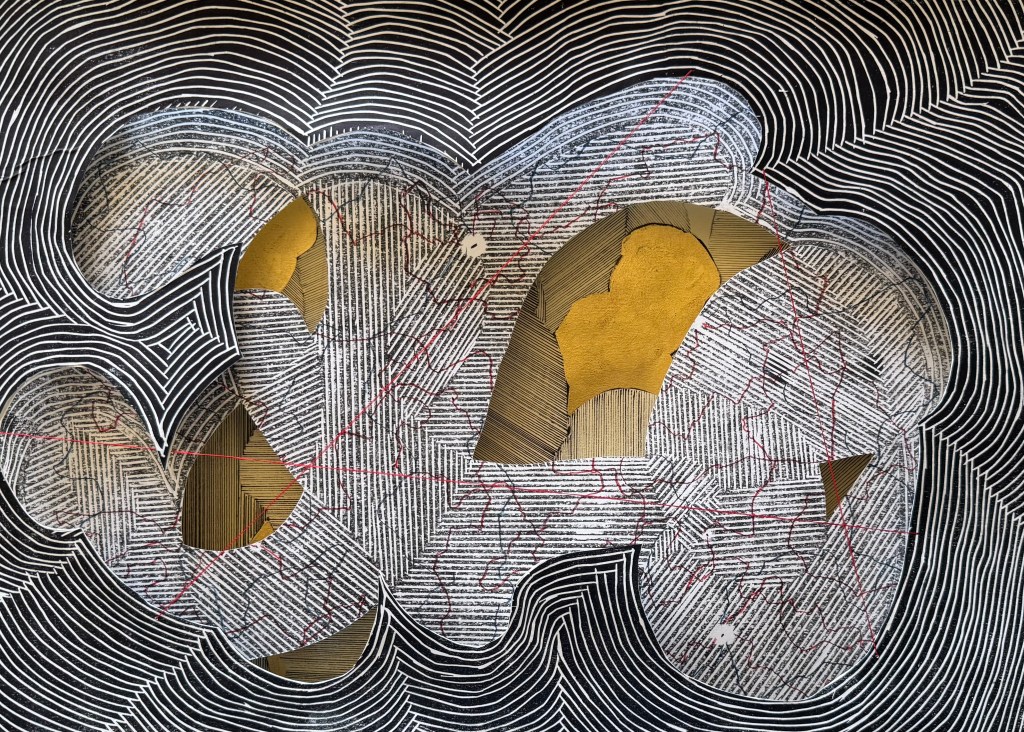
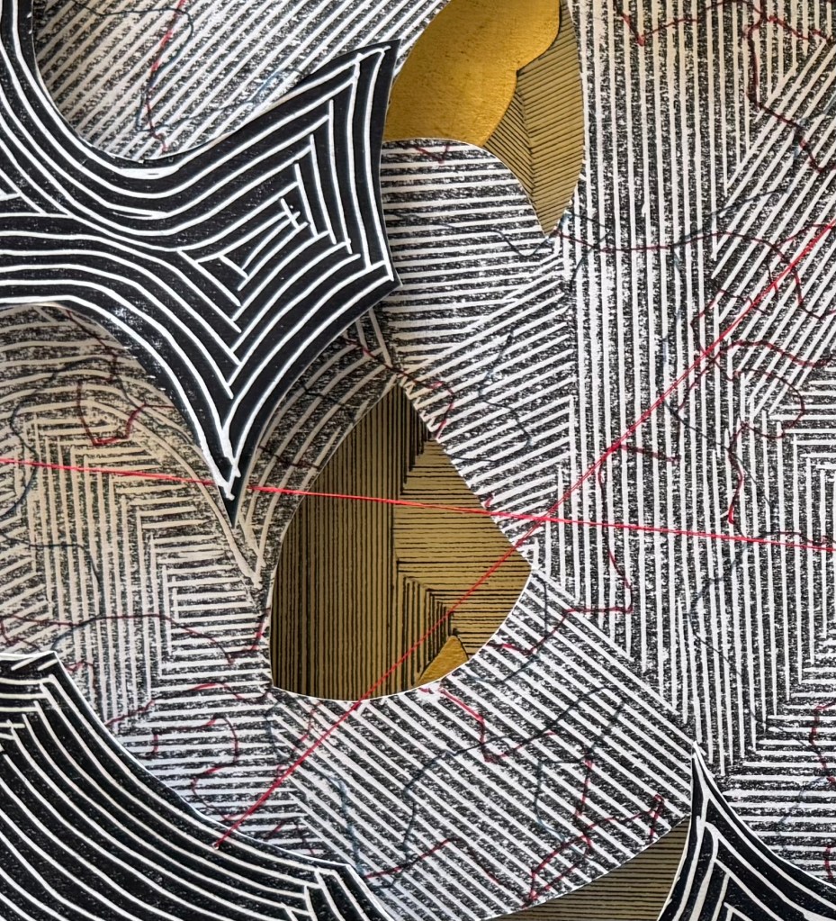
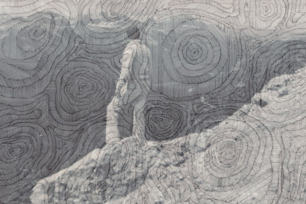
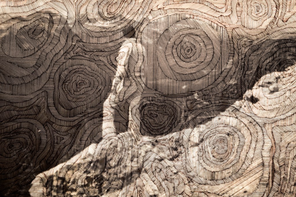
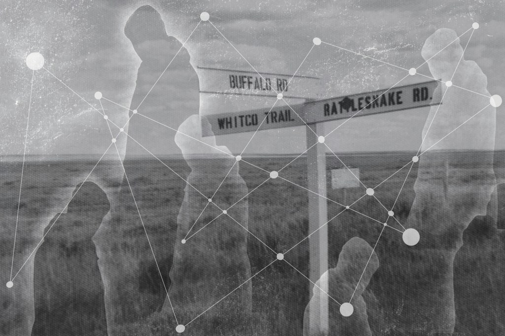
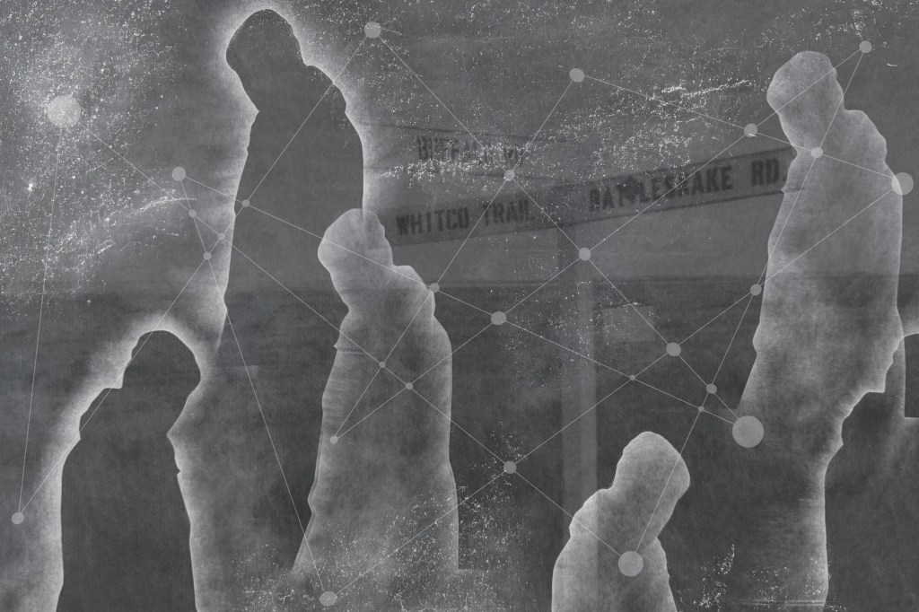
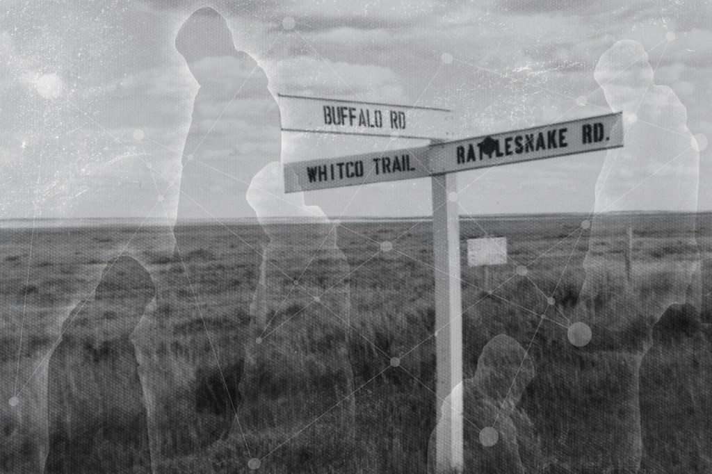
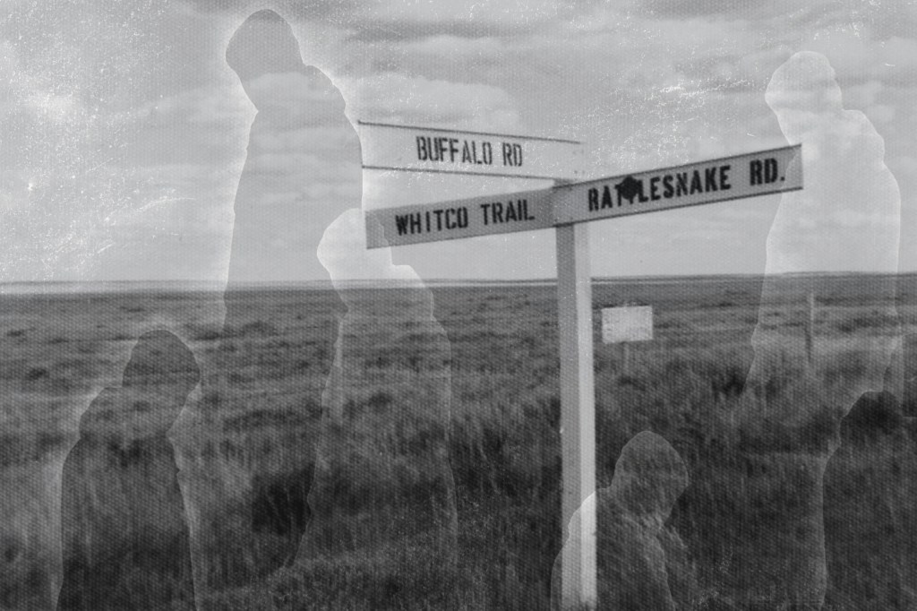
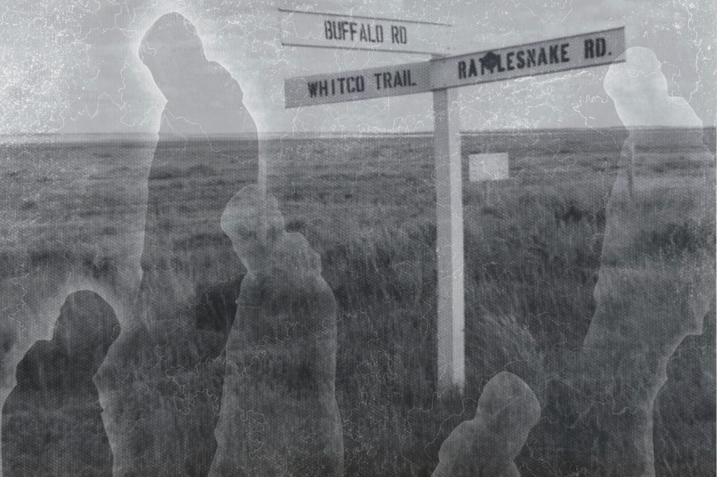
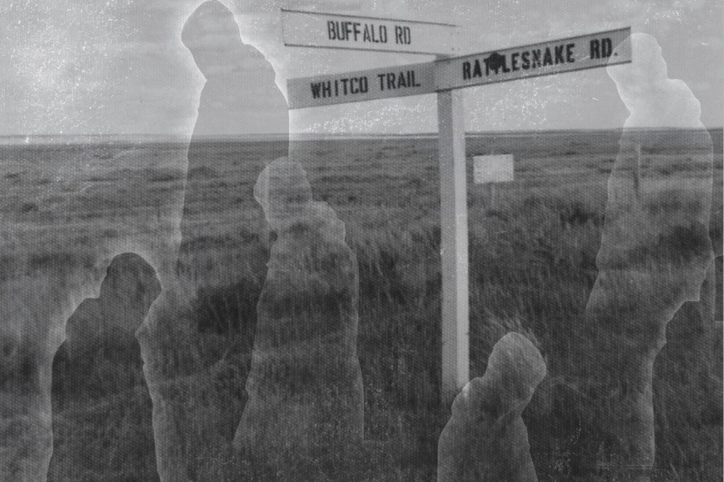
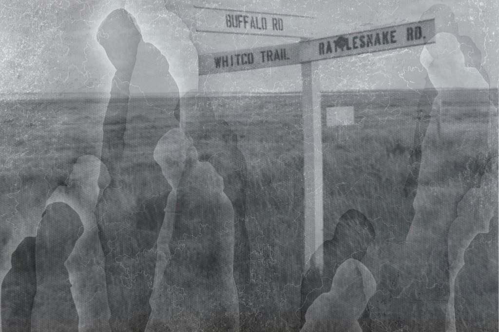
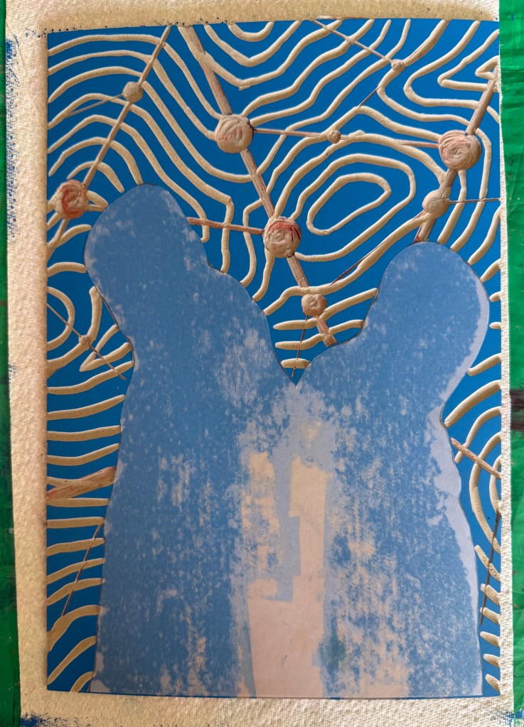
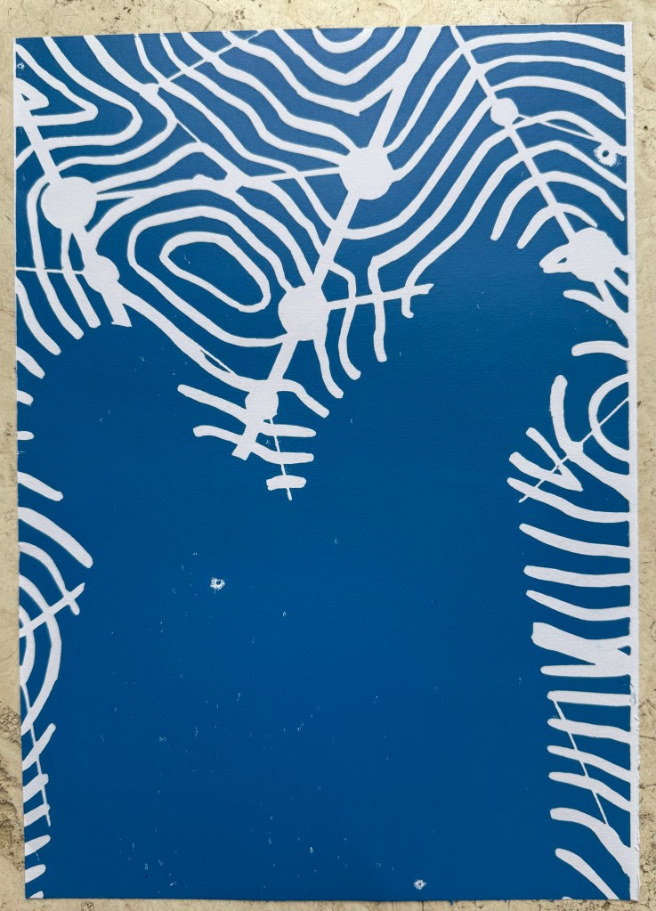
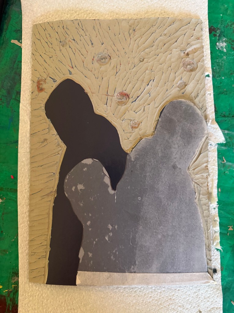
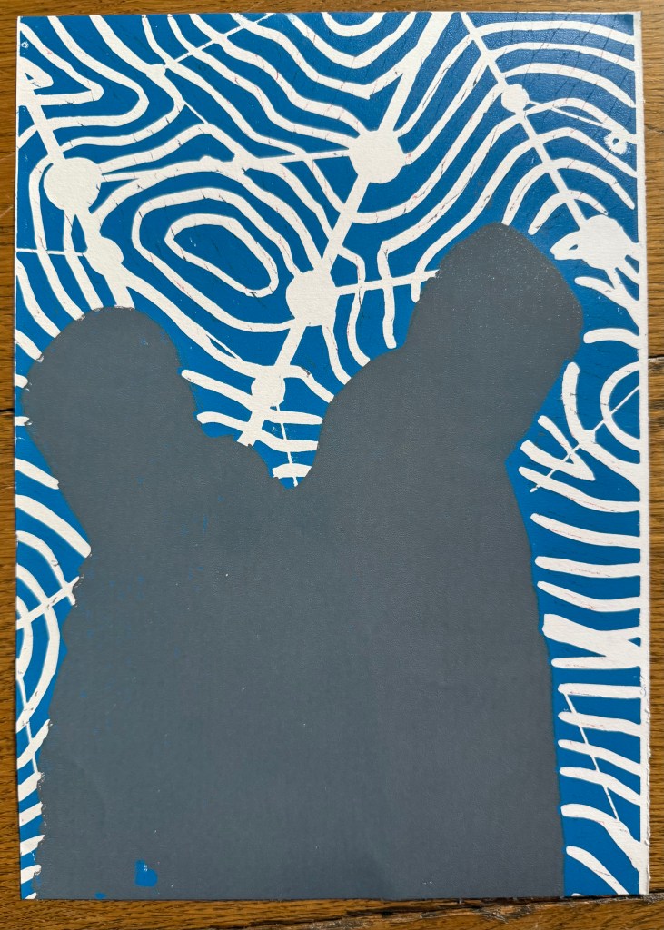
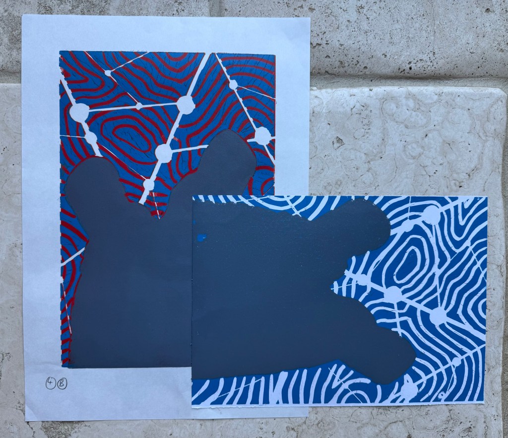
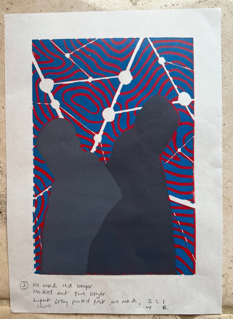
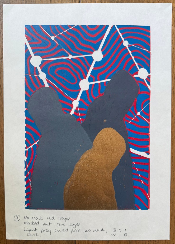
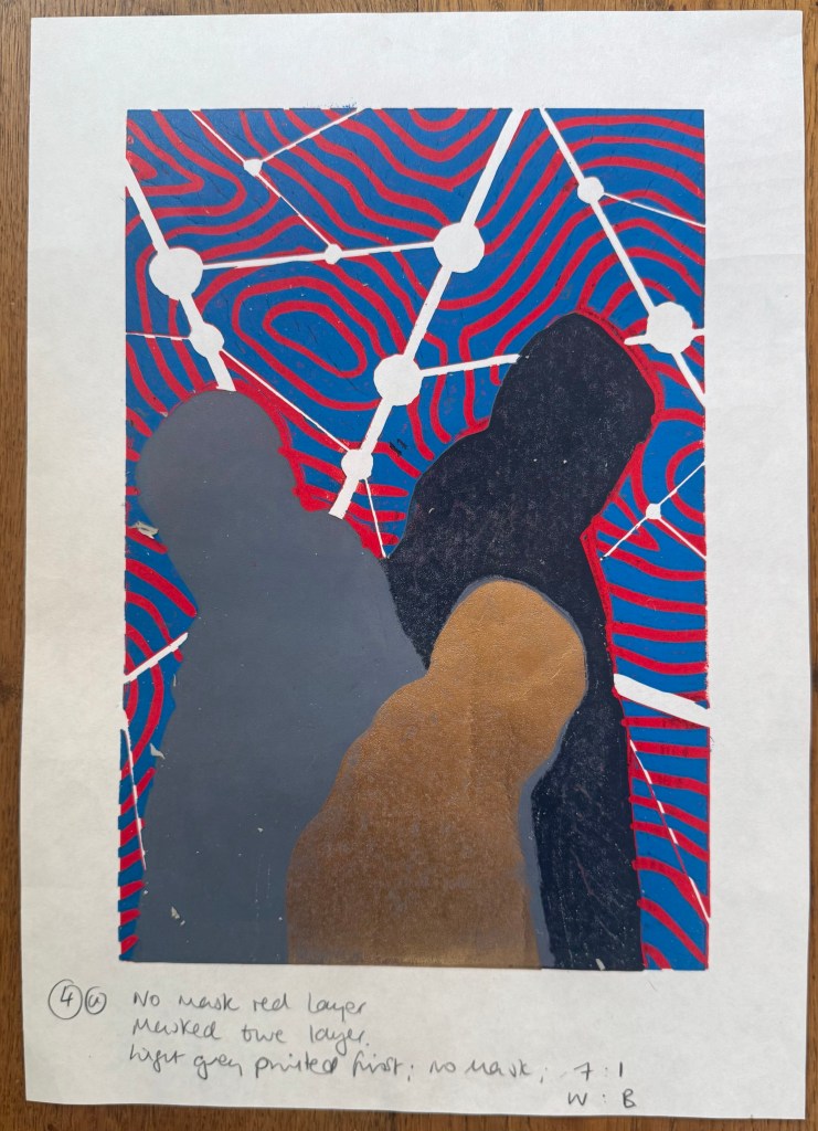
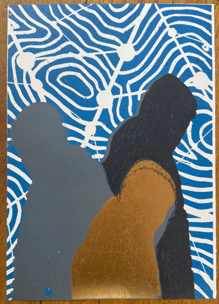
I’m also intrigued by Jonathan’s idea of using a video screen as a table and placing the book on that, as well as his comment about watching videos through layers. I had in the back of my mind that I would probably make a layered piece rather like the one in Layering. I tried experimenting with the burnt mulberry paper just to get a feel. I also used some mulberry paper that I had cyanotyped on and decided to burn holes in that to see how a patterned layer would work – a health and safety risk assessment beforehand probably would have alerted me to the risk that paper that had been chemically treated would probably burn quite enthusiastically – let’s just say that it was a bit quicker and harder to blow out than the plain paper. I put the paper on top of an acrylic sheet for the purposes of this exercise and so at times you can see my reflection.
I’m going to have a look at making some new videos and perhaps re-editing some of the existing ones, taking on board all the really helpful suggestions Jonathan made in my tutorial. I’ll keep playing around with layers and see where it takes me.
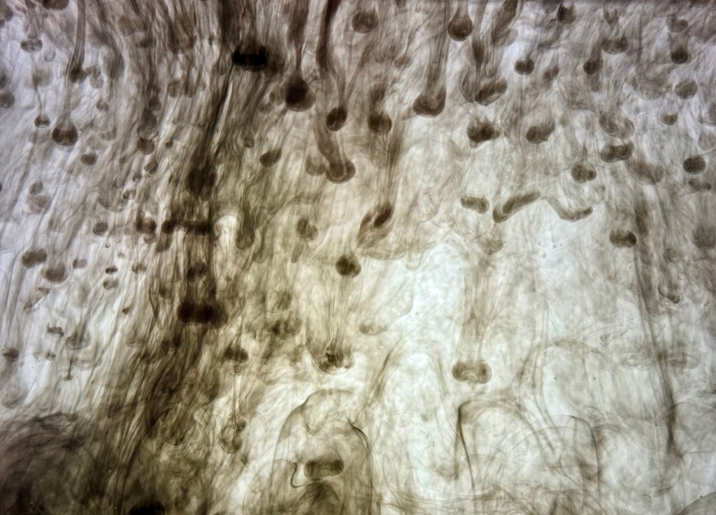
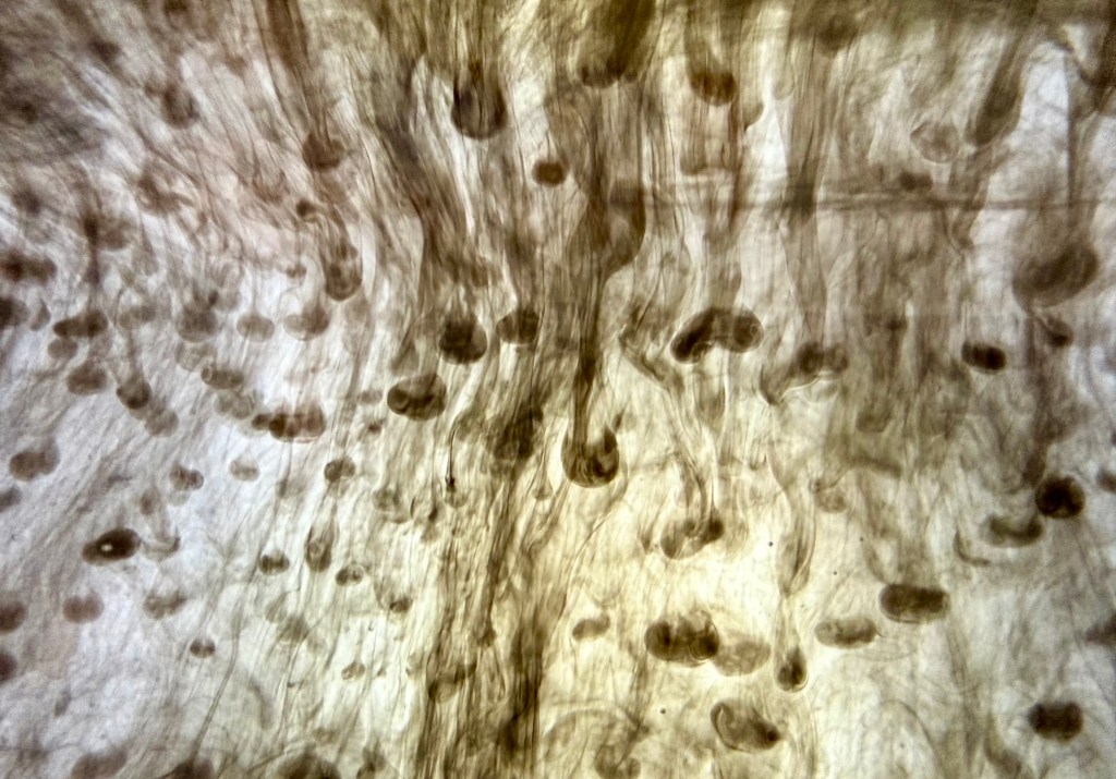
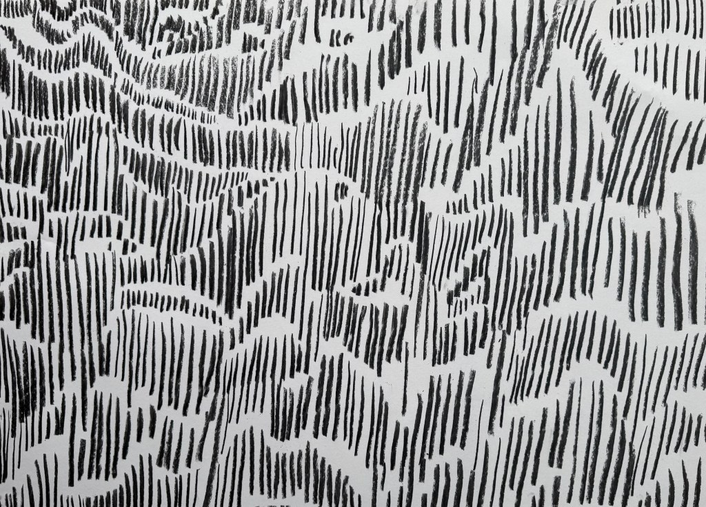
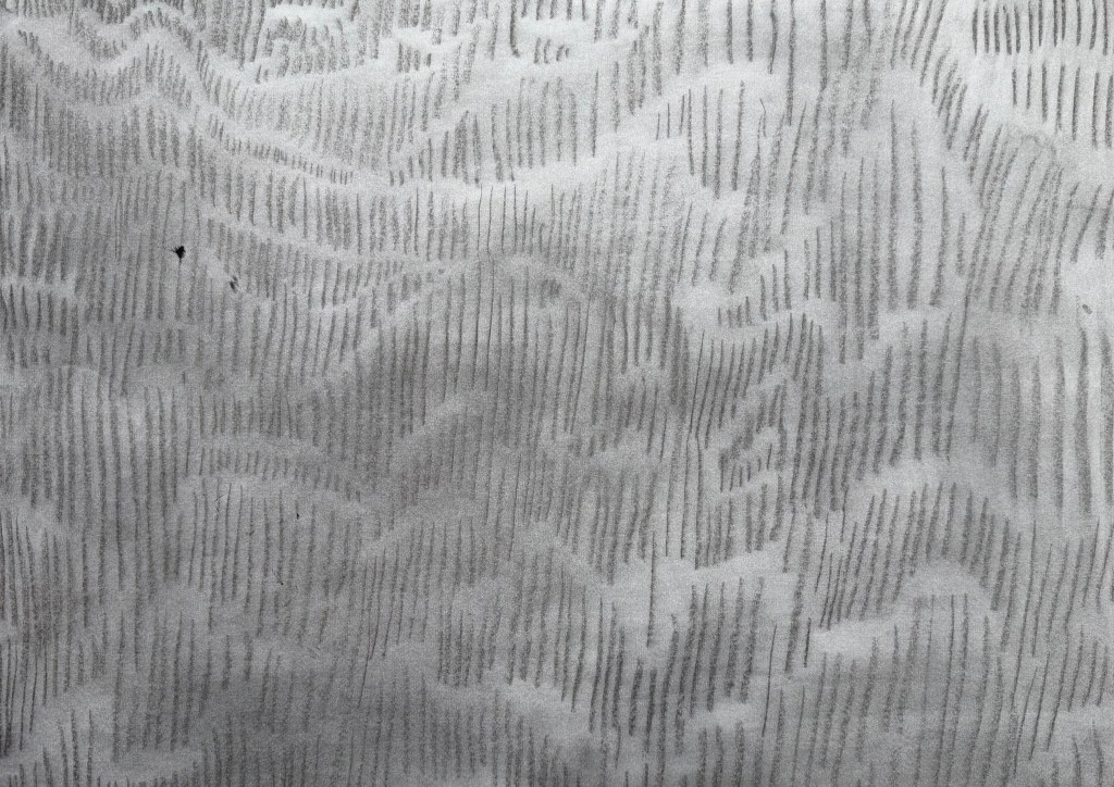
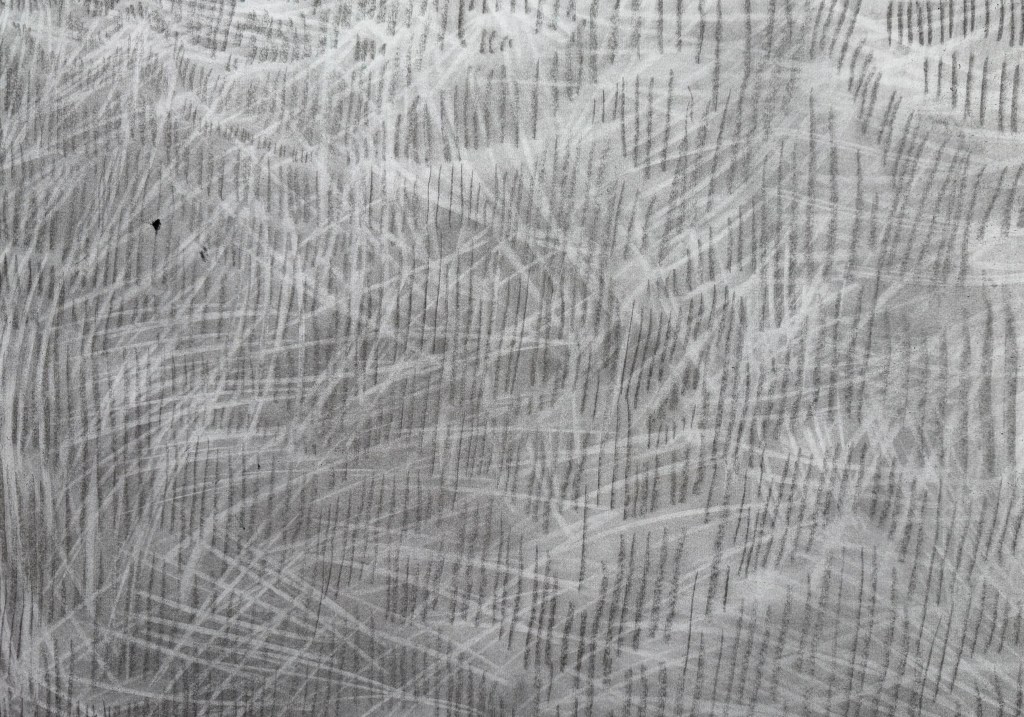
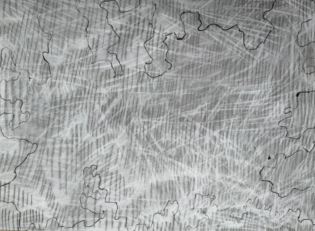
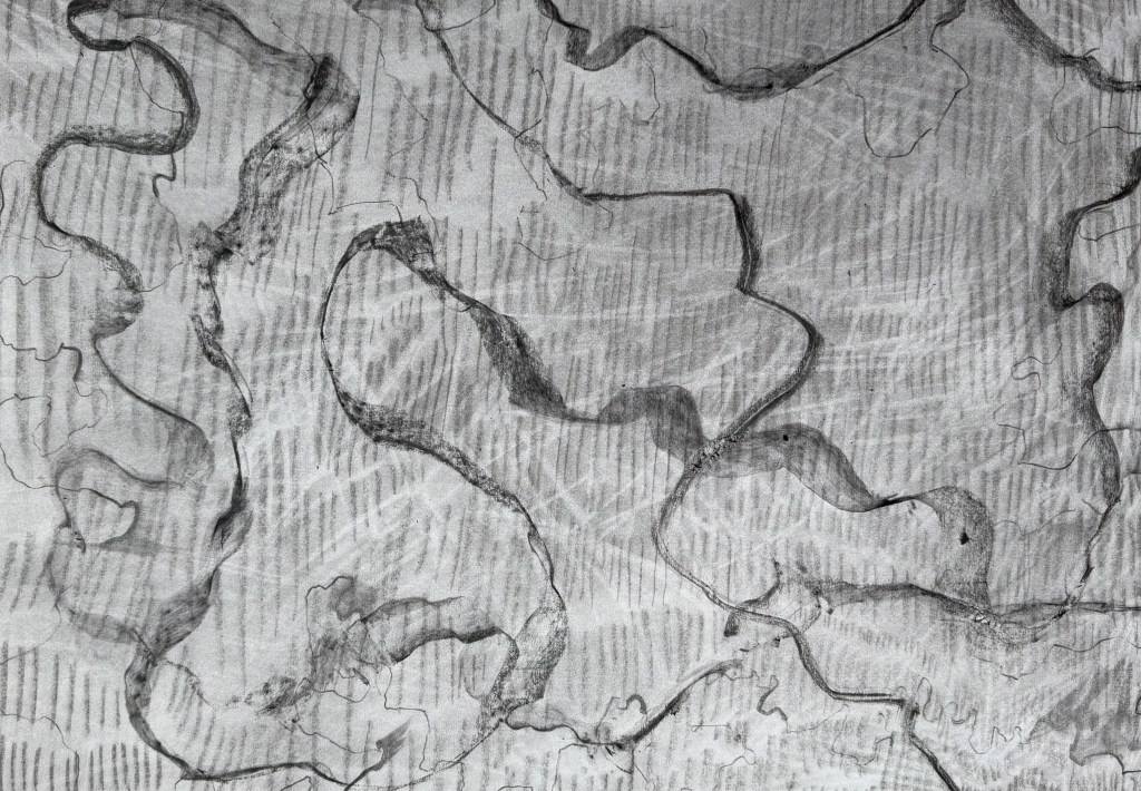
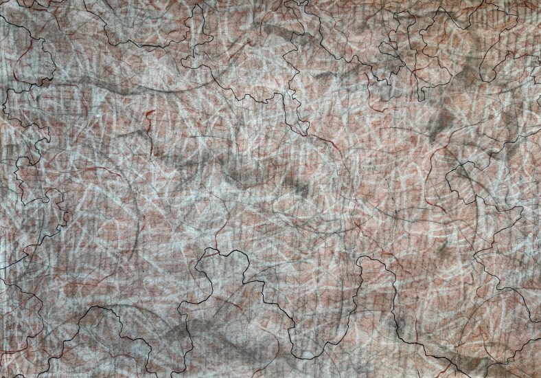
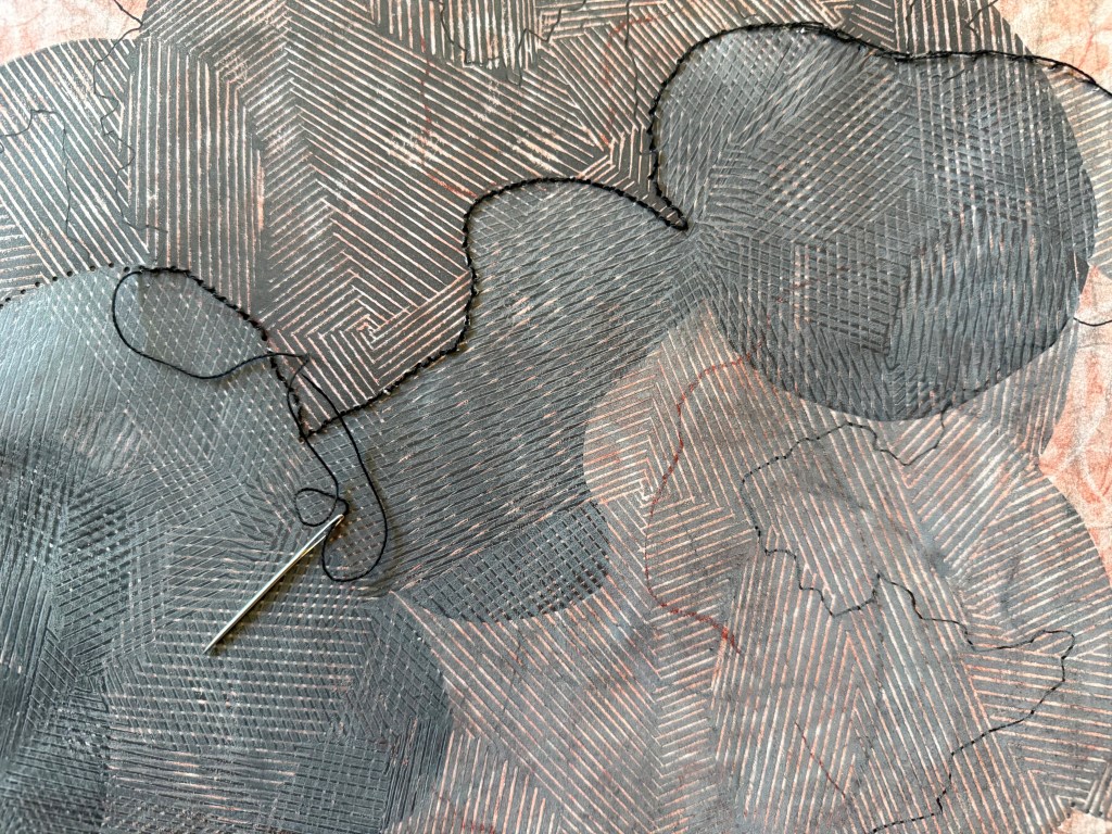
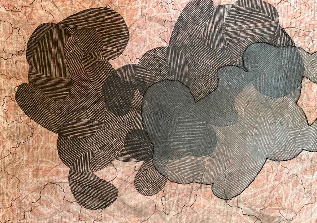
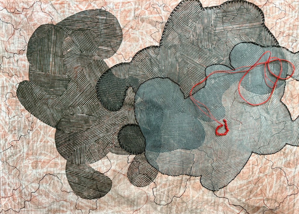
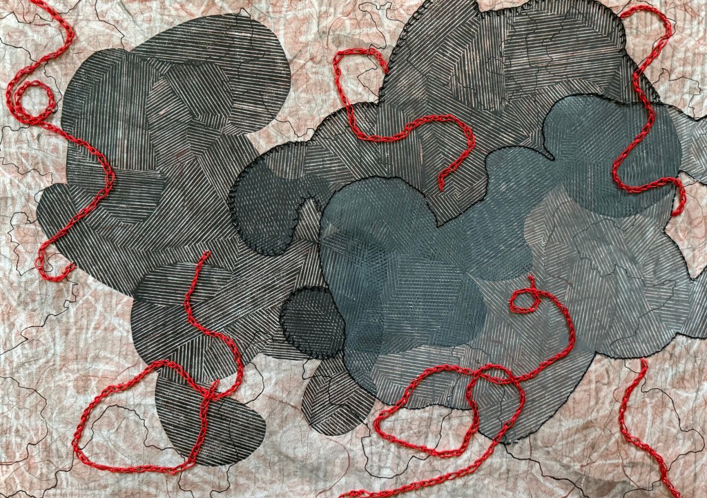
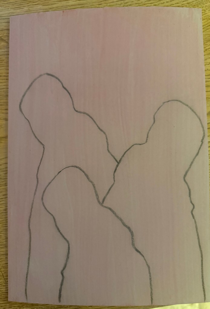
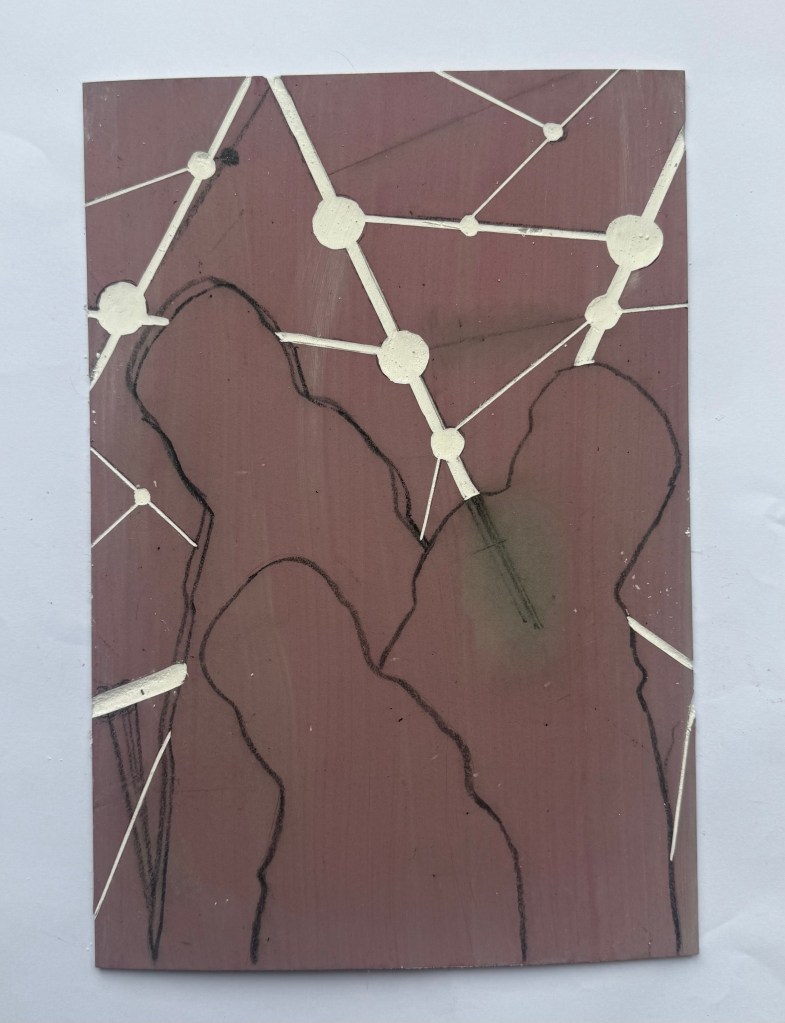
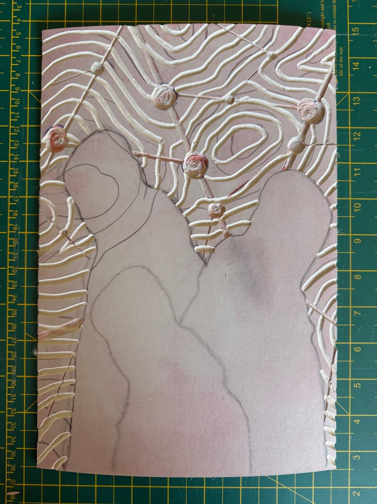
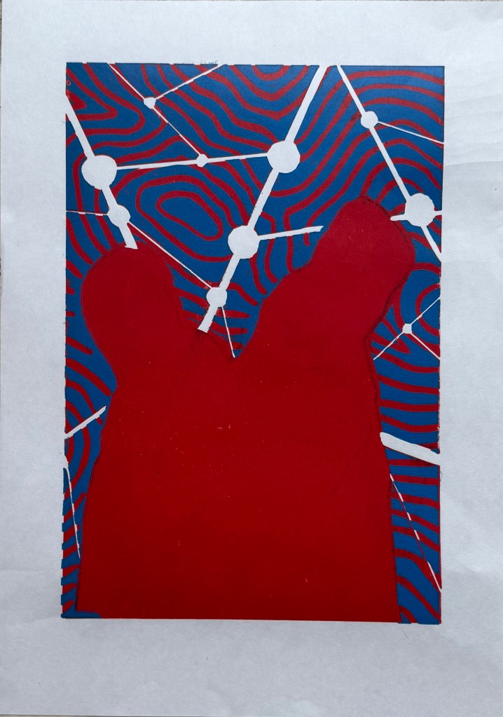
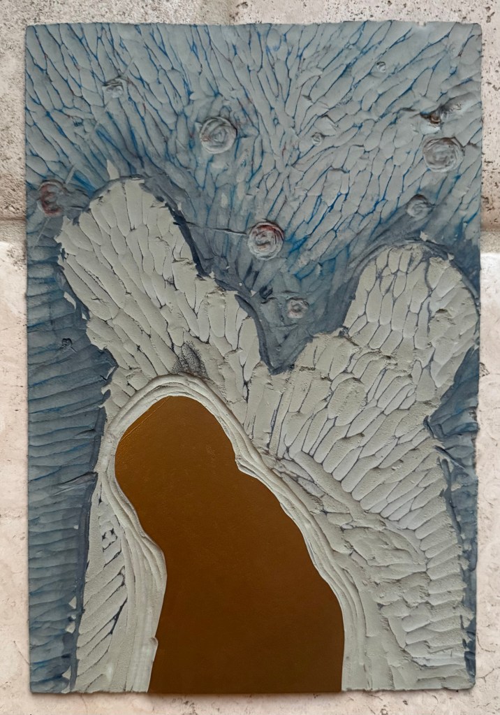
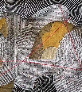
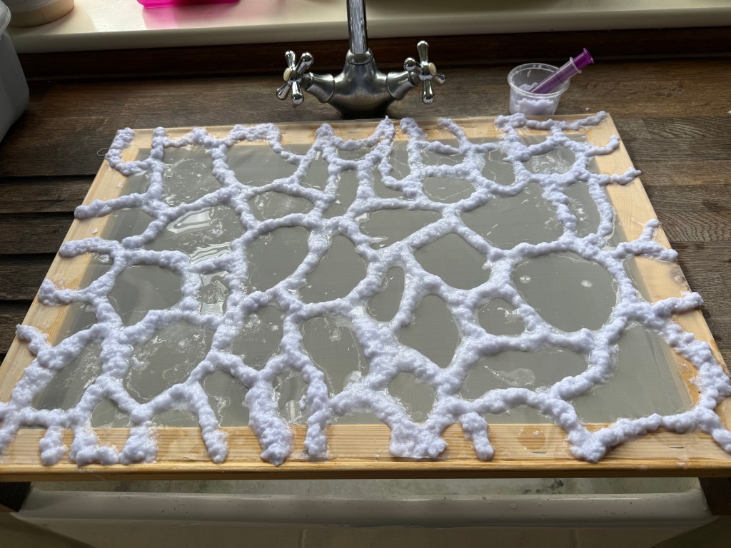
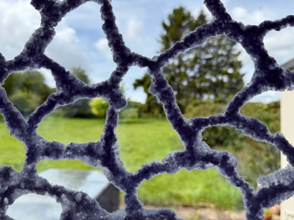
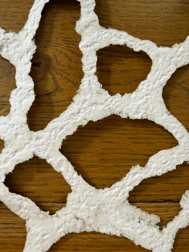
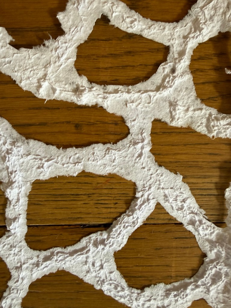
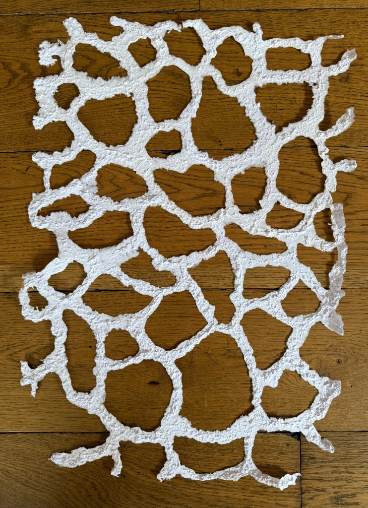
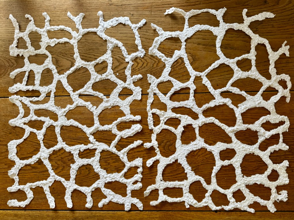
I also want to try working at a larger scale. I’m still thinking about microchimerism and the piece with the three foetal forms (The Accidental and the Incidental). I still can’t believe how randomly drawing a shape resulted in a form which I now see as having such a strong identity. I could use some of the processes that I have been experimenting with, such as bubbles and ink. I really enjoyed making the paper using the syringe ( Layers) – it feels organic and biological and maybe I could incorporate it in some way into a larger piece or even a layered piece. I can only make it in A2 but I think that I could easily attach sheets together to make a larger sheet. The only question is how I would transport it, but I think that once it’s dry it is quite flexible and more robust than it looks although it would probably be better to take in sheets and then join it together in situ using paper pulp which would have enough time to try over the install period. Failing that there’s always PVA glue.
I’m feeling positive and excited that I have a loose idea – some soft structure – let’s see where it takes me.