Yet More Play

The sun was out today so I thought that I would take advantage and engage in some more playful experimenting.

I’ve been lining up my paper pulp lacey membrane sheets by eye – that’s not working and so I’ve marked the edge of the frame so that each sheet is a repetition around the edges which will then line up. I gathered the ones that I’ve made already together in a pile intending to reprocess them in the blender. They took on a 3D form which caught my eye – maybe something for later. I also quite like how they look when laid on white paper.

Then it was onto experimenting with bubbles using a mixture of inks and acrylic paints. I want to create a base layer onto which I will print, draw, paint, whatever takes my fancy. I like the idea of it being biological and cell like, hence the bubbles. I tried cartridge paper and the mulberry paper that I’m using for the book. The mulberry paper gives a much less defined edge which I really like. I tried masking with bits of paper – if I ultimately go down this route I’ll use something more robust and less inclined to buckle when wet, although it did provide some pieces to collage. I wanted to see if I could get a layer of lines below, so tried using a fine liner, a pencil and a combination of charcoal and pastel before applying the bubbles.

My first thoughts are to go with something that’s indicative of inside of the body and so I think that for now I’m tending towards reddish tones.

I liked the effect of the shadow cast by the stone.

I became distracted by the bubbles.

I’ve taped all my test sheets together ready for a layer of printing – I just need to get an idea of size and context for the printed elements. I’ve got together some off cuts of lino and made some shapes out of them ready to experiment with tomorrow morning. I’ve given the main shapes some further thought and decided that having said that they have an identity in my mind, I will not use them again. I might try using their outline, but I will probably cut a new shape most likely using loose lines rather than the straight ones I used previously, to give it a more organic feel. That’s the idea for now, but it could well change!

Four Little Words

I’d be lying if I said that I don’t get moments of anxiety about the End of Year Show and what I will be showing. After all, the plan is not to have a plan, as I’m treating it as a snapshot and the continuation of my becoming, as opposed to the big finale, the culmination of something. But it’s very difficult when all around me are so far advanced in their own work and I also need to give an idea of what I will be showing from a space planning and curation perspective.

At the very least I will have the book – it was ok to have that as a plan as it seems the most natural thing for me to do, it is something that can continue to develop because it is made up of volumes and also the process of making it has been one of learning and development. After my trial run I decided that I need to have some sense of progress and that I would crack on with the second volume before returning to remake the first. So, I’ve made the book cloth that will be used for the cover and the end papers. I’m currently halfway through formatting the blog – the resizing of all the images to a higher resolution suitable for printing and the creation of QR codes for the videos takes up a lot of time. Hopefully I will have finished it sometime this week and so can get on with making both volumes.

I’ve been thinking about my conversation with Jonathan as to how to display it. I want people to pick it up and have a read of it but at the same time treat it with care. Placing a pair of white gloves like those used by archivists next to the books would indicate that care should be taken – I don’t necessarily intend for people to actually use them and I’m sure that there will be some who would be reluctant to anyway. Hopefully, there will be three volumes, so the idea of two being arranged on a shelf and the third being placed on a separate surface, open and an invitation to be read is a good one, but it is also open to being seen as being on display, something to be looked at, not touched and read. So, I’ve gone with Jonathan’s idea of a student table chair/ conference chair as a possible option. I’ve sourced one – it has a fixed writing tablet so nothing has to be moved or flipped up for the reader to be able to sit down.

I’m also intrigued by Jonathan’s idea of using a video screen as a table and placing the book on that, as well as his comment about watching videos through layers. I had in the back of my mind that I would probably make a layered piece rather like the one in Layering. I tried experimenting with the burnt mulberry paper just to get a feel. I also used some mulberry paper that I had cyanotyped on and decided to burn holes in that to see how a patterned layer would work – a health and safety risk assessment beforehand probably would have alerted me to the risk that paper that had been chemically treated would probably burn quite enthusiastically – let’s just say that it was a bit quicker and harder to blow out than the plain paper. I put the paper on top of an acrylic sheet for the purposes of this exercise and so at times you can see my reflection.

Link to Video 1

Link to Video 2

I’m going to have a look at making some new videos and perhaps re-editing some of the existing ones, taking on board all the really helpful suggestions Jonathan made in my tutorial. I’ll keep playing around with layers and see where it takes me.

I also want to try working at a larger scale. I’m still thinking about microchimerism and the piece with the three foetal forms (The Accidental and the Incidental). I still can’t believe how randomly drawing a shape resulted in a form which I now see as having such a strong identity. I could use some of the processes that I have been experimenting with, such as bubbles and ink. I really enjoyed making the paper using the syringe ( Layers) – it feels organic and biological and maybe I could incorporate it in some way into a larger piece or even a layered piece. I can only make it in A2 but I think that I could easily attach sheets together to make a larger sheet. The only question is how I would transport it, but I think that once it’s dry it is quite flexible and more robust than it looks although it would probably be better to take in sheets and then join it together in situ using paper pulp which would have enough time to try over the install period. Failing that there’s always PVA glue.

I’m feeling positive and excited that I have a loose idea – some soft structure – let’s see where it takes me.

A Line Made by Threading

I had some leftover ink and made some monotypes with it – just swirls and wipes. The ink is oil based Cranfield Safe Wash and so I also employed a spray bottle of water.

After they had dried, I decided to add another layer, another process – I used thread. I played around with the burnt paper and threaded paper I made the other day.

My daughter walked in while I was doing the next one – oh, do different stitches she said. I’m not making an embroidery sampler I replied, but then I did end up experimenting with different stitches and combinations of colour. I much prefer the lines in which the stitches aren’t apparent – where it looks like a line made by thread.

I punctured the paper from the reverse to make raised bits to add texture – nothing new, I’ve seen a lot of it on Instagram.

And held up against the window:

I’m still thinking about Shiota’s threads.

And threads on top of threads.

Originally in this post, I wrote about an incident in my childhood in which my mother intentionally tried to disassociate herself from me by walking away when I was not feeling very well. I published the post but then deleted the passage. It felt unnecessary because this image is enough.

I’m interested in trying combinations of processes, like print over cyanotype. I used a piece of scrap cyanotype for this one and I like the effect – I’ll experiment some more.

Layers

I’ve been thinking about layers again. I want to make a layered piece but I need to experiment with combinations. I’ve been meaning to have a go at making paper by squirting paper pulp. I used an old Nurofen syringe, but had to make the hole a bit bigger because the pulp kept on clogging it. I used a hot skewer to make it bigger, but while I had the lighter I decided to burn some holes in some of the mulberry paper I’ve been using to make book cloth.

I like the effect of the burnt edges. In the last two images they resemble coastlines, the last one similar to the Thames Estuary.

I made a mould out of some stretcher bars and some mesh, wrapped some thread around it and then squirted on the paper pulp. Removing it from the mould when it was dry was satisfying.

Video removing paper from mould

I took whatever images were close to hand to see how layering might look using some bits of cork as temporary spacers.

It was a really interesting exercise. I find myself drawn more towards the burnt paper than the thread and paper pulp. Maybe I need to try the paper pulp on different images, but my initial thought is that I don’t like the combination with the thread, although the thread does allow it to be suspended, rather than lying flat. I think that I much prefer it when I made the paper with the thread embroidery in a whole sheet. The paper pulp might look better without the thread, with the thread incorporated into a different layer.

I think that I’ll just start making the piece and experiment and make decisions in the moment.

Paper

I was really intrigued by Do Ho Suh’s thread drawings at Tate Modern last summer (Summer II). After some research I discovered that his method was developed during a residency at the Singapore Tyler Print Institute. He had been spending a lot of time drawing in his sketchbook when it was suggested to him that he might try drawing with thread. Applying thread to wet paper proved unsuccessful as the thread was difficult to control and so he tried sewing on tissue paper but it proved too difficult. It was an intern at the institute, who had experience of textiles, who suggested that he might try gelatine tissue paper which is used in embroidery. So he sews his drawings on gelatine paper and then applies it to wet handmade paper and the gelatine paper dissolves leaving the thread bound into the paper.

This has got experiment written all over it.

I couldn’t find gelatine tissue paper as such, but I managed to source some water soluble embroidery stabiliser. I haven’t attempted to make paper before but I did a bit of research online and gave it a go. The results are not great, mainly because I’m so impatient and kept on touching it etc and so there are lots of overlaps and tears – but then that is me in the process, so actually it’s all good.

I borrowed my daughter’s sewing machine, sewed on a couple of test pieces and applied to the wet paper and these are the results:

The thread has, for the most part, bound to the paper, so it’s been a success. You can still see where the embroidery stabiliser was, and when it is lying flat there is a slight sheen to the paper. I’m not sure what can be done about that and I probably need to experiment more. The stitching doesn’t have the same effect as Do Ho Suh’s, and he has commented that he likes the unpredictability of how the bobbin thread appears. I think it would be worth using a larger stitch which might create a more interesting effect.

I double dunked this one in the paper pulp and water solution (there’s probably a technical term for it) to see if I could get rid of more of the stabiliser. The effect was quite interesting as in some areas the paper folded over itself trapping in some of the thread and in others the pulp settled on top of the thread, partly obscuring it.

I need to do some more research and experimentation and think about how I might incorporate this approach into my work.

In the meantime, I decided to do some more lines.

Because the stabiliser doesn’t dissolve very well when placing it on top of the wet paper, it’s necessary to help it along using a spray bottle. I think the spray combined with the excess water and movement in the stabiliser as it dissolved, caused some of the threads to distort. Initially, I was a bit disappointed, but I actually quite like the movement it creates and also the loopiness of the stiching on the right. It has the feeling of a continuous line drawing.

There was some pulp leftover so I played with some colour and some graphite powder. The graphite powder didn’t really do anything interesting, and still remains quite loose on the surface of the paper. I like the mottled effect of the colour as well as the impression from the kitchen paper it had been sitting on.

Testing Plan A

So, Plan A was dependent on me being able to overprint the red with blue. I did a quick test print. The process blue ink I was using must have some transparency as it turned into a very dark purple, so I made it more opaque by adding opaque white which resulted in a kind of cerulean blue which I liked against the red, although the photos don’t do it justice.

I then prepped a sheet of A4 lino by lightly sanding and wiping with white spirit before staining it with an acrylic ink and drawing on the figures and the white lines. I went over the pencil marks with a chinagraph pencil to make them stand out more. As usual I had launched in without giving it enough thought and ended up having to reposition some lines although I couldn’t erase the chinagraph marks, which becomes relevant later on in the test printing. I used a metal ruler to cut out the white areas and filled them with cornflour to see how they looked, neatening up where necessary – the circles are bit all over the place, so I resolved to use a template when making the actual prints.

I created a registration board for the lino, drew lines where the paper was to go, and printed the first layer using equal parts process red and process yellow. Initially, I thought that I could mask out the figures using some tracing paper. Reduction linocuts work from light to dark ordinarily, but my image doesn’t really conform to that process. I knew one, if not two, of the figures would be a med/light grey and I wasn’t sure how that would sit on top of a bright red. I tried inking up whilst the mask was on the block and then removing it, but it was difficult to do because the mask kept on sticking to the brayer and the result wasn’t great. I decided to ink up the entire block for the rest of the prints. I also noticed that some of the chinagraph was coming off the block onto the prints.

Next, I cut out the contour lines and printed with blue ink. By this stage I had realised my previous error and masked the figures after inking the block, but before printing – a much better result, and I can’t work out why I hadn’t realised this to start with. However, after the first print it was obvious that the registration was off. I had thought that I had lined up the paper the same each time when I was printing the red layer, but I clearly hadn’t. I created a raised edge against which to place the paper on subsequent prints, but I had to accept that the blue and red layers wouldn’t line up on all of the test prints, which would cause problems in relation to the white areas.

There was also misalignment around the edges of the figures which could have been caused by poor registration on the first layer, but could also have been caused by a lack of accuracy in creating the mask, or even applying too much ink.

To complicate matters further, the paper I used was Japanese HoSho paper which being lightweight (90gsm) and strong makes it ideal for printing linocuts. However, it turns out that it is slightly smaller than A3. I already had some Snowdon 130gsm paper, so I thought that I would give that a go, to see if it would be a suitable alternative, even though it is heavier than the HoSho.

Other than a few areas where some bits had managed to get stuck onto the block, it seemed to print quite well.

I then cut away the rest of the block leaving just the figures. I wanted to experiment with both masking areas and inking up the whole block to see how the subsequent layers printed so I could decide on a final approach ie whether to use a mask or to layer the ink. I would have preferred not to mask any areas as it seemed to increase the risk of mis-registration of the print. But before I decided I needed to find out how the final metallic gold layer would sit on top of all the other layers. I noticed that there were some indentations in the outlines of the figures from where I had cut out the contour lines.

I also wanted to see how the grey would print on top of the blue as well as the red, and it seemed to fare quite well, although it definitely has a cooler undertone to it than when printed over the red.

The blue and grey layers seemed to dry slower than the red and, as a result, the dark grey/black ink didn’t print well, and also the cut away areas picked up some of some of the blue and transferred it to the prints. I had the same issue with the gold ink, but by that stage I had become a bit frustrated and impatient, and just wanted to see what the colours looked like together. There are agents which can be added to the ink to speed up the drying process but you have to be careful as to the amount used, as they can alter the colours. I could have swapped from oil based to water based inks, which I didn’t have. So I decided to make the best of what I had.

I know that I make things more complicated for myself than they need to be. I could have watched videos on how to make reduction linocuts before starting, but there is a part of me that thinks that learning on the job is a more valuable, if not more frustrating, experience, and that the lessons learnt are more likely to be remembered (and possibly put me off linocuts for good).

So, what did I learn?

  • Preparation is key
  • Registration is everything – I watched a couple of videos after the event and invested in some Ternes Burton registration pins and tabs
  • It’s preferable not to mask areas if possible but to cut away the lino on each layer
  • Don’t use chinagraph or anything else which could transfer from the block to the paper
  • Accuracy is important
  • I should have had a resolved image before I started, rather than winging it in the process
  • When cutting out the first and second layers I needed to ensure a clean edge with the figures by using a craft knife
  • I needed to check that there isn’t any ink on the cut out areas of lino before printing
  • The ink needed to be dry before printing the next layer

But, the most important lesson is that because of the number of layers and the time needed for drying, it would not have been possible to complete the print before the end of the month. I needed to go back to the drawing board and have less colours so that it reduced the amount of drying time etc. So I amended the image to just white, red, grey and gold.

Trying to Move Forward

I decided to try and progress the idea of automatic map-like drawing by experimenting with charcoal. I drew a single line and then rubbed it out and repeated the process numerous times, building up layers of mark-making. I then took some coloured pencils and traced a path randomly following the marks.

Video

I’m not sure that it takes me much further forward in developing this line of enquiry. However, I enjoyed the process and I like the different nature of the coloured lines which I made consciously by making decisions as to which of the paths of faded charcoal to follow, almost like a dérive – they have a different character to the ones I make when I draw automatically.

I’ve been thinking a lot recently about the course, about being half-way through and what I would like to have achieved by the time it finishes – what work I might produce by the end of it. At the moment, the concept of mapping is at the centre of it. I want to produce something which reflects all that I have learnt during the course, about myself and how I relate to the world around me. It will inevitably be an artifact, a map, of some shape or form, but I want it to reflect a process which is ongoing, that will never be complete, a piece of work in a state of flux, constantly subject to change, so there has to be some sense of impermanence, of it being unfinished. I also want to encompass the idea that memory plays a large part in the process and much like maps which are constantly being made and remade, so are the memories on which the map is based. The idea of layers and distorted imagery seem to be relevant in this respect.

I’ve thought about paper and canvas, maps being folded and rolled , but I don’t think that these offer the ability to create layers in the way that I want. I’m currently thinking that I may make a number of squares which together make up the grids of a map.

I used a pen to try and keep a marble on the paper. I like the lines which were made as a result – they have a sense of fluidity about them, much more than the lines that I have been making up until now. I’ve been meaning to experiment with the size of the dots at the intersections, to see if different sizes create a sense of perspective and three dimensionality. I don’t think that I have managed to achieve enough diversity in the sizes – it was very much an afterthought – I’ll try again another time. The image makes me think of something neural, cognitive mapping?

I took some inkjet compatible transparencies and drew some lines to see if I could create layers. Unfortunately, they are not totally clear – they have a milky appearance, probably because of the coating which allows them to be used in inkjet printers. I need to do some research to see if this is the case or whether I can source some others. Having said that, the milky film does cloud what’s underneath, making it hazy, almost like a memory that’s not quite there. Ultimately, I’m thinking that I could use layers of acrylic sheets over a background image, possibly together with milky transparencies, some can be drawn, painted and printed on, and I can also include some cyanotype images as well a negatives. I could cut holes in some layers to allow direct access to layers below. The use of reflective surfaces would also add depth.

I layered up the sheets using small magnets which not only hold them stacked together but also act as spacers between the layers. I had to add one in the middle because otherwise the sheets would sag – this won’t be a problem with rigid acrylic sheets. The magnets themselves suggest impermanence, the ability to be easily changed.

Wondering About Wandering

It’s been almost 3 weeks since my tutorial with Jonathan, and even longer since my last blog post. I’m usually very good at writing tutorials up immediately afterwards, whilst I can still remember what we discussed. I don’t usually take notes – it’s too distracting.

Oh, how I wish I had taken notes, but I think that I can still remember the gist of it.

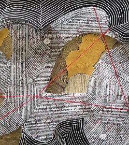
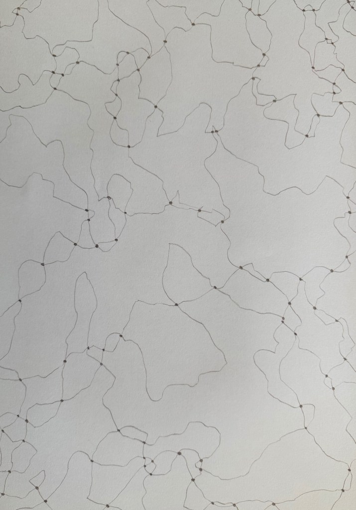
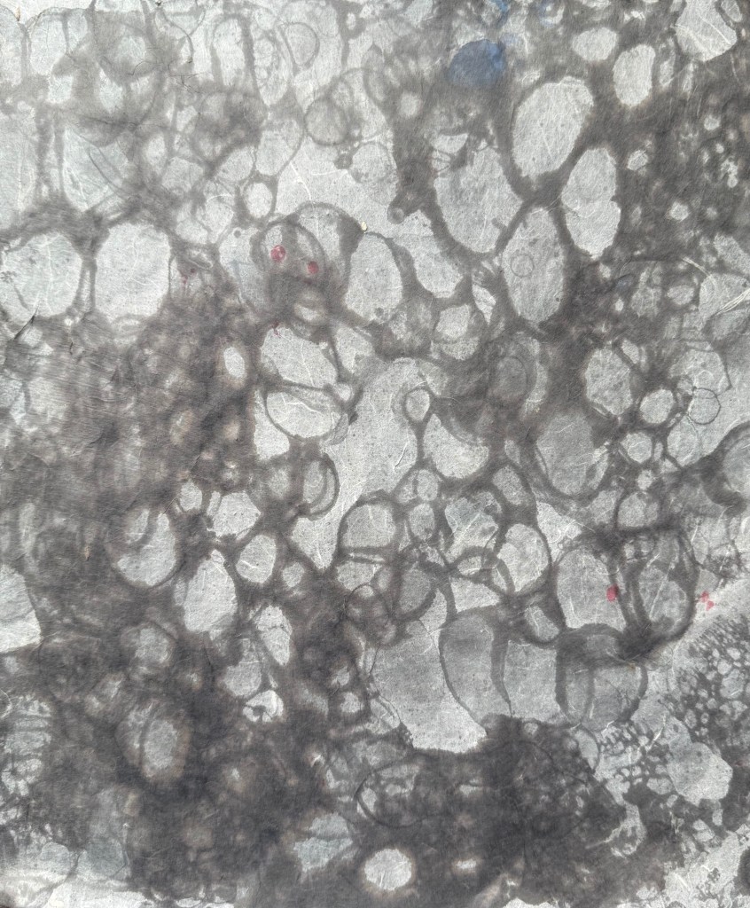
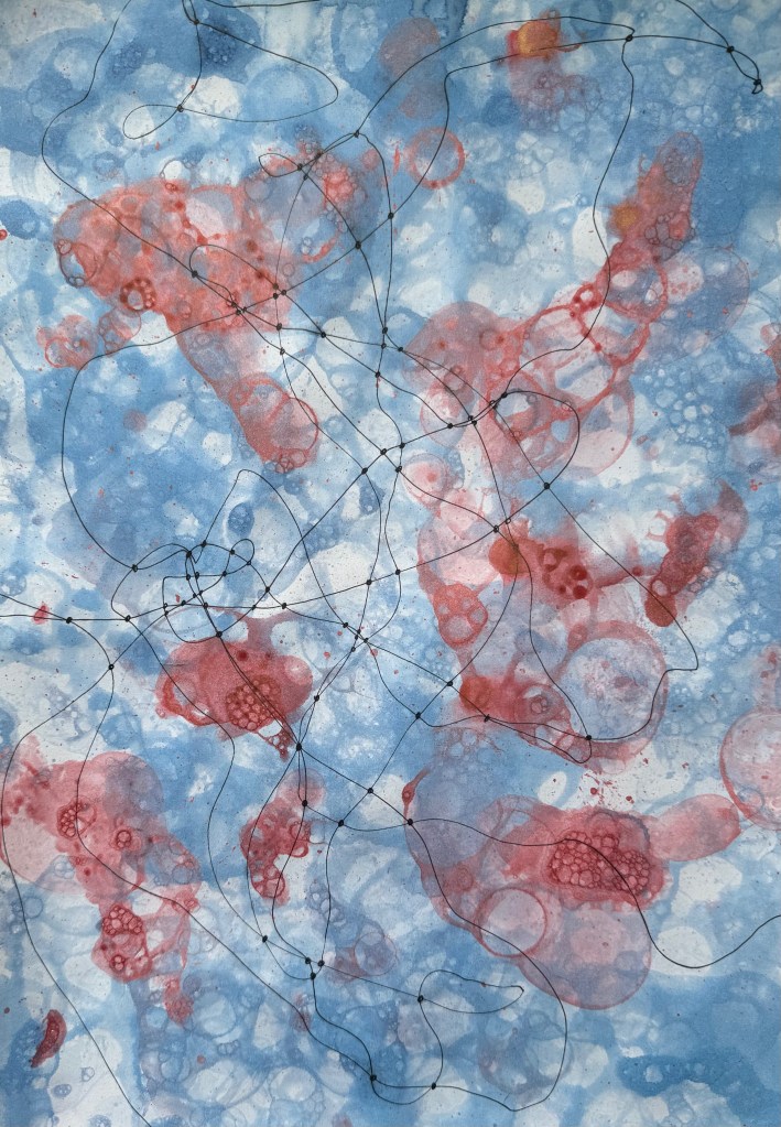
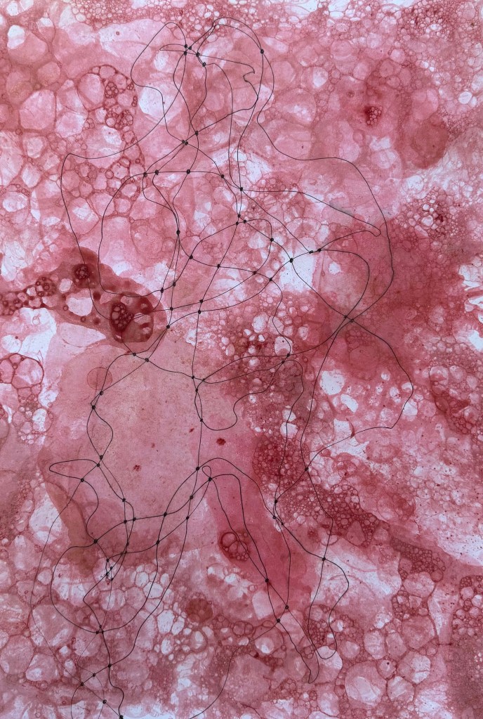
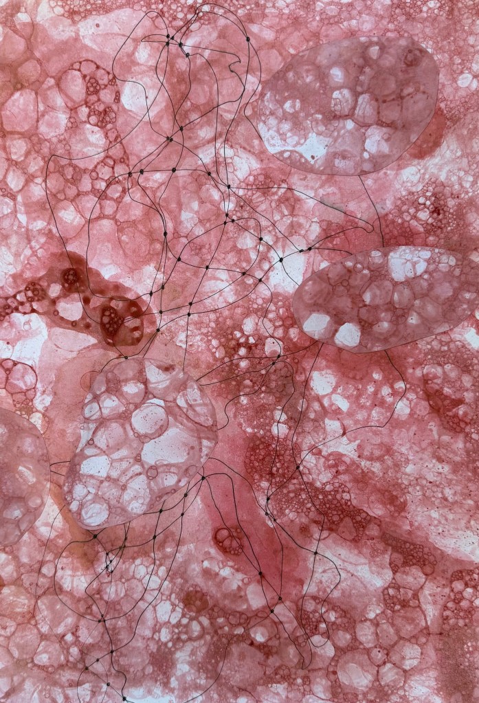
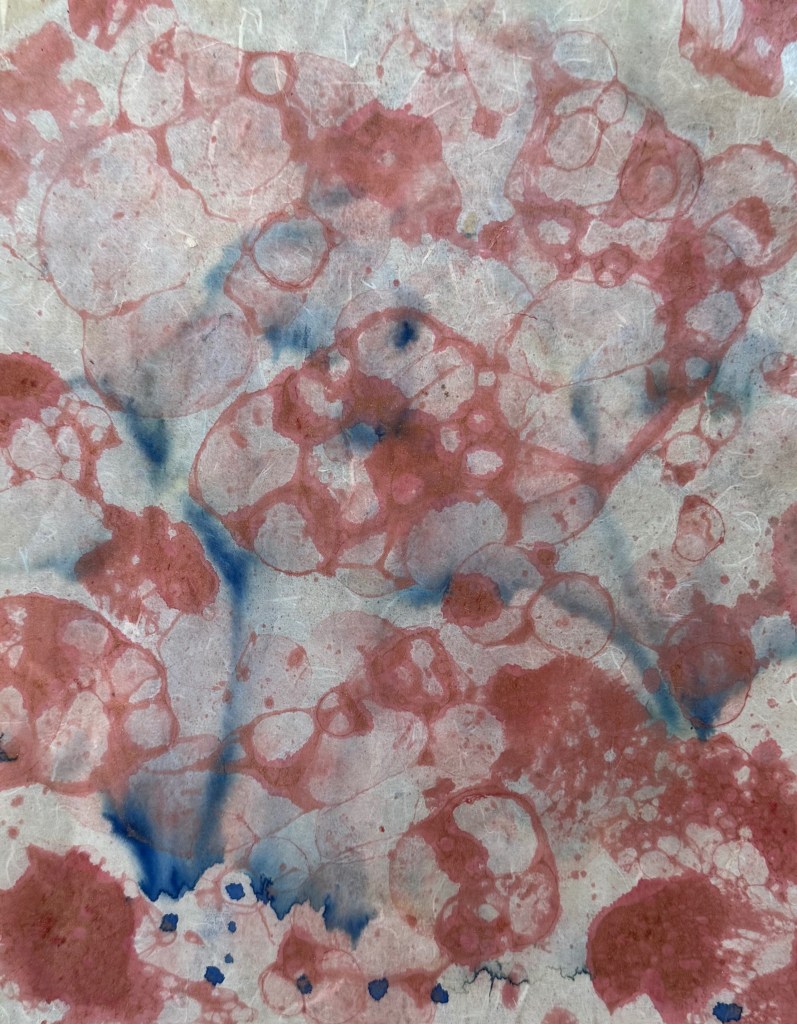
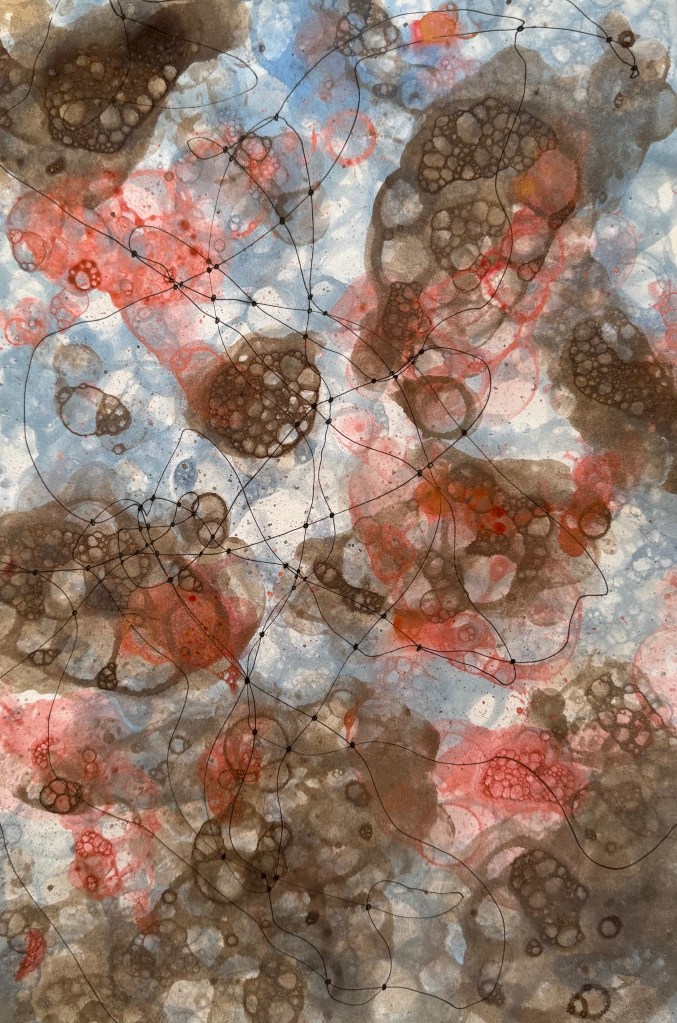
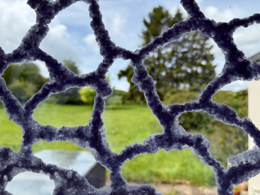
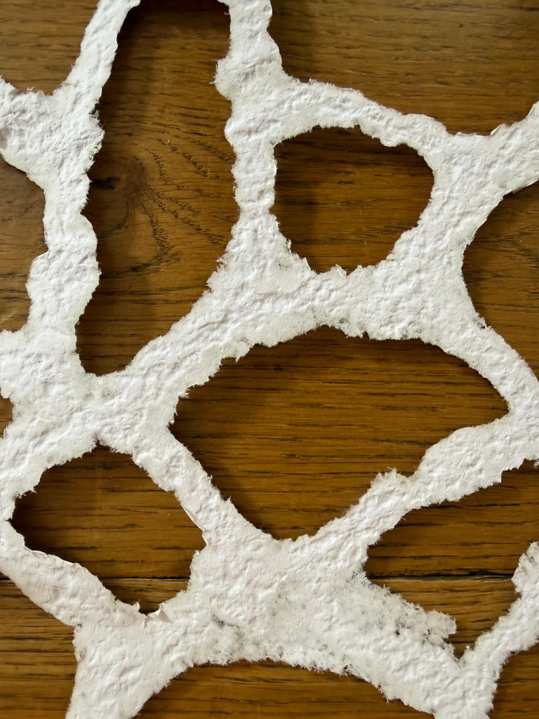
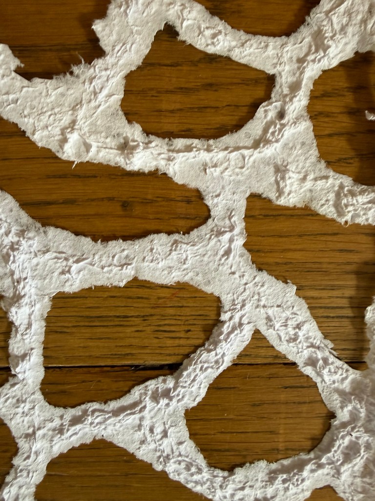
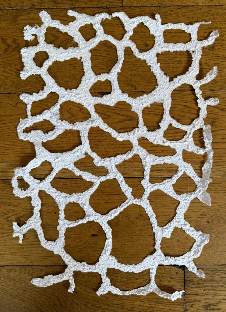
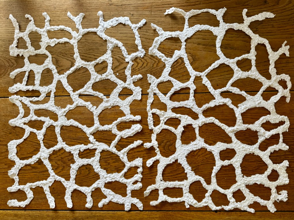
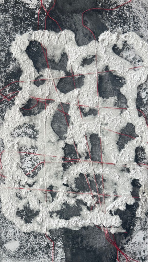
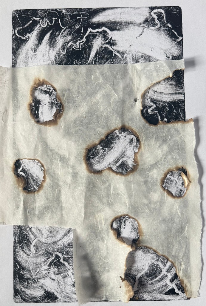
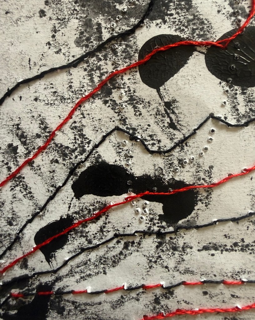
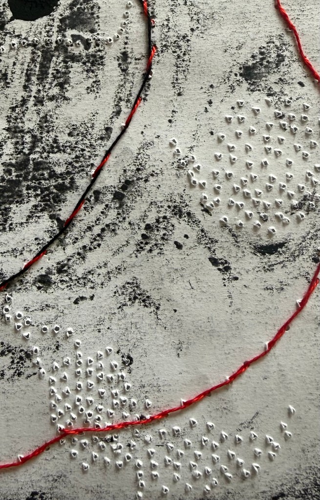
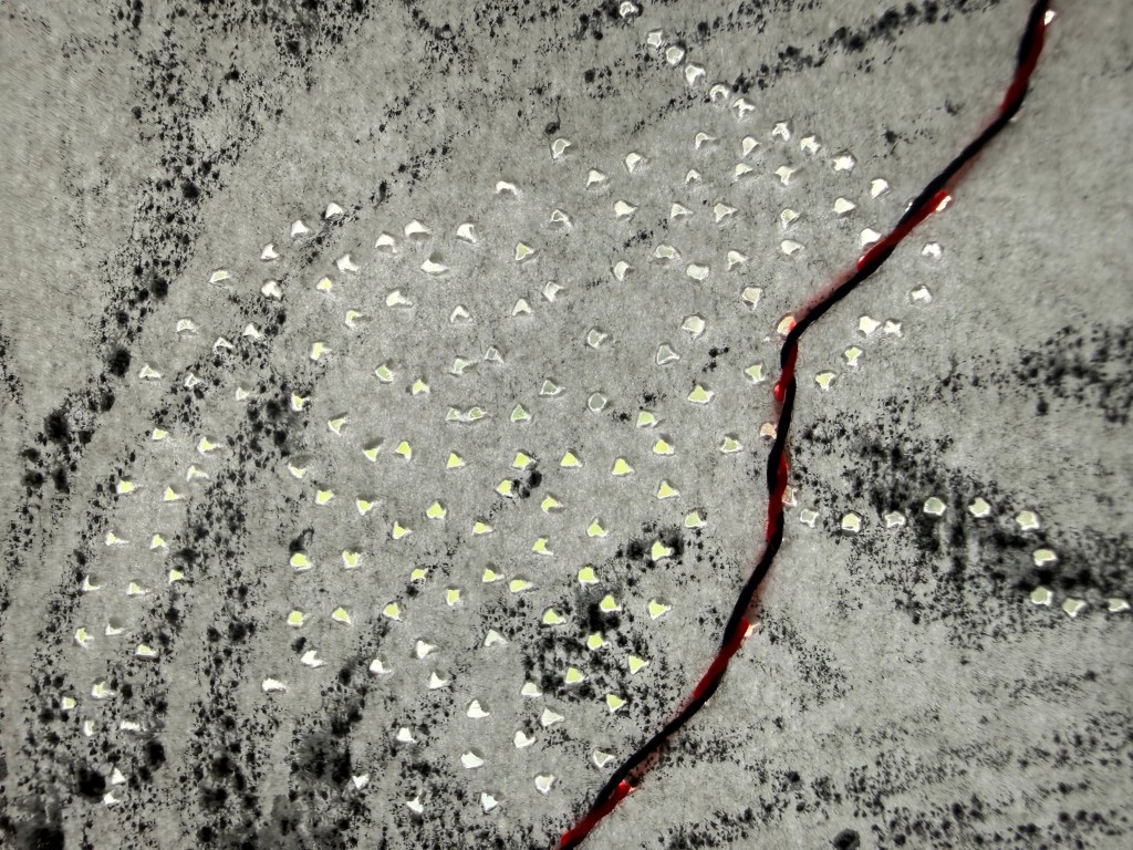
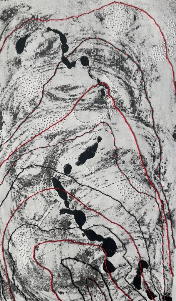
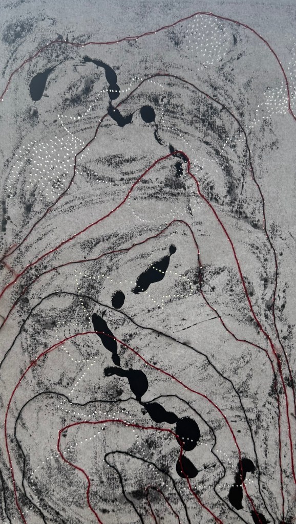
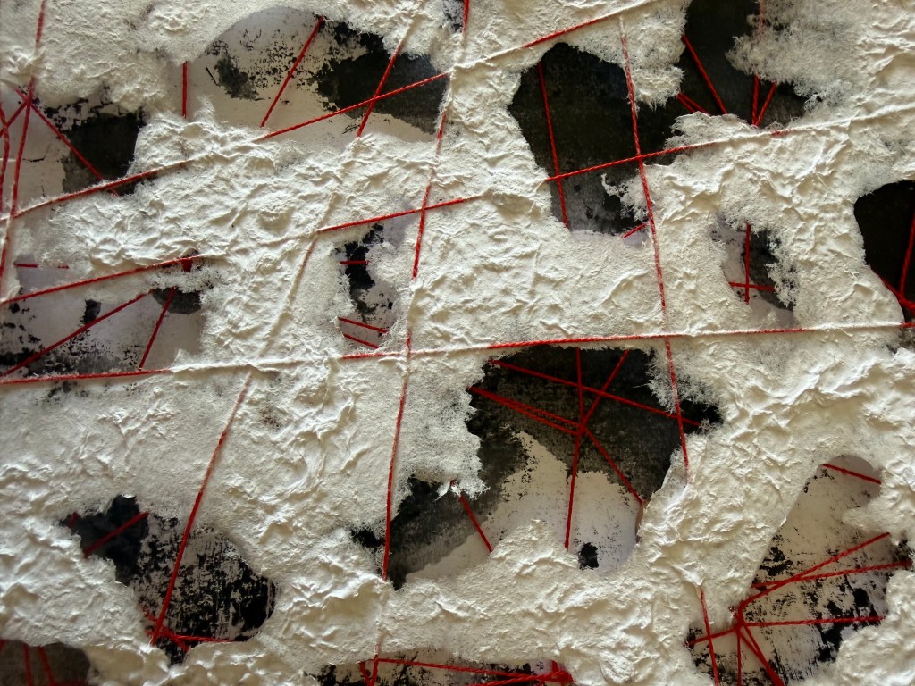
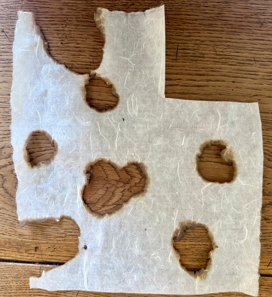
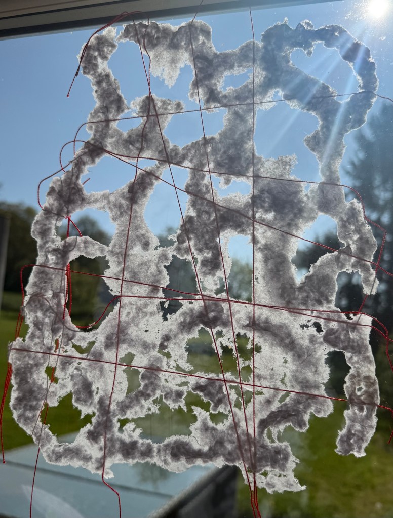
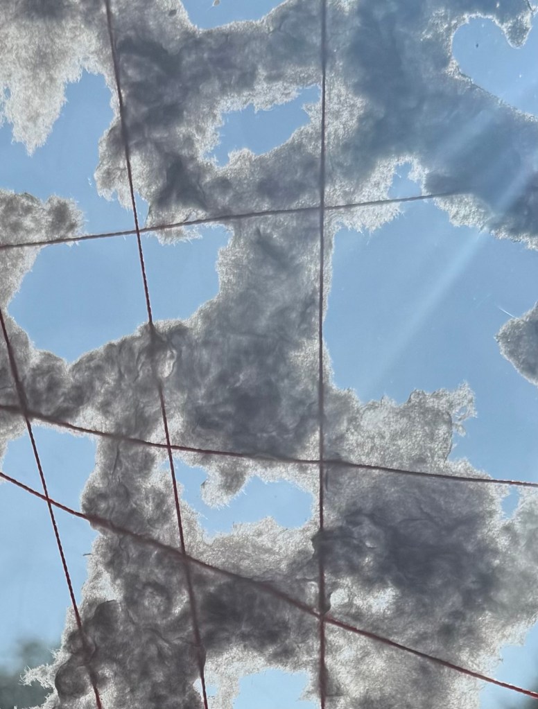
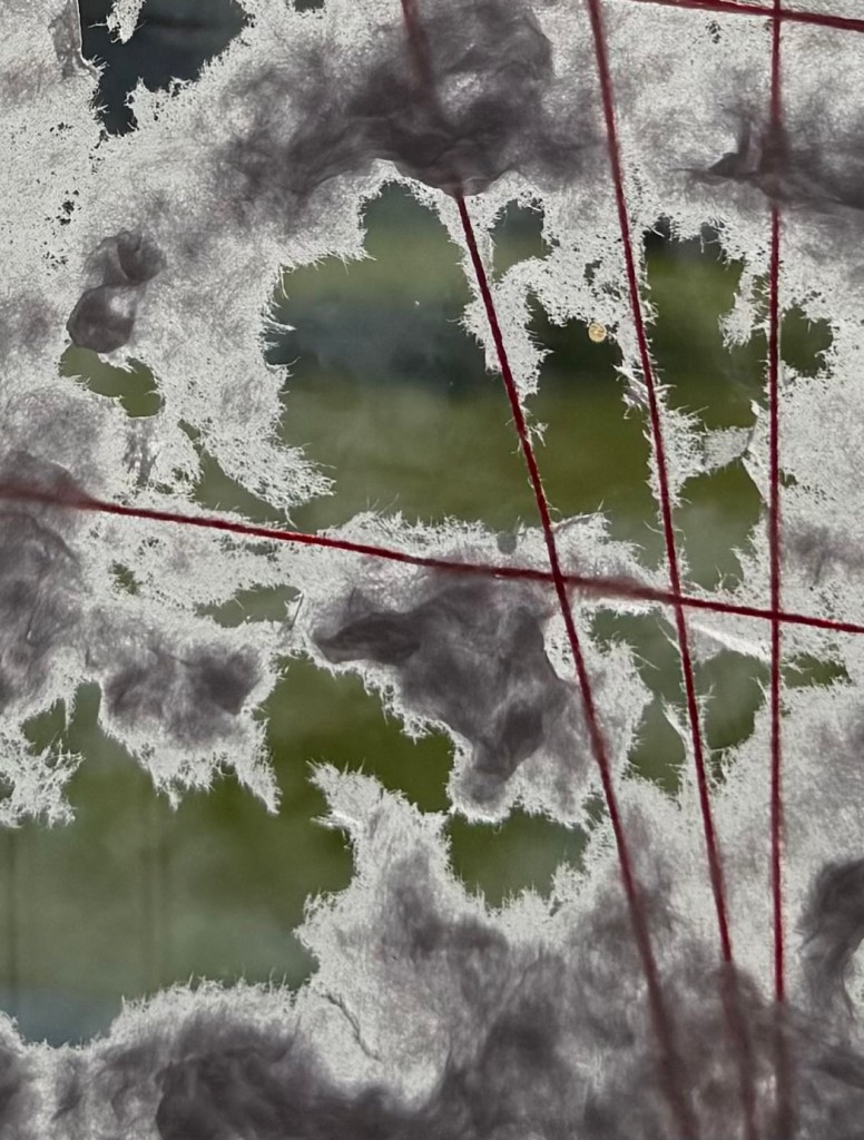
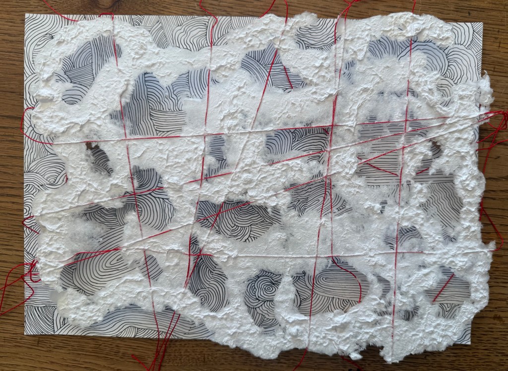
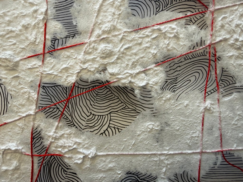
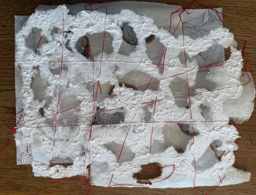
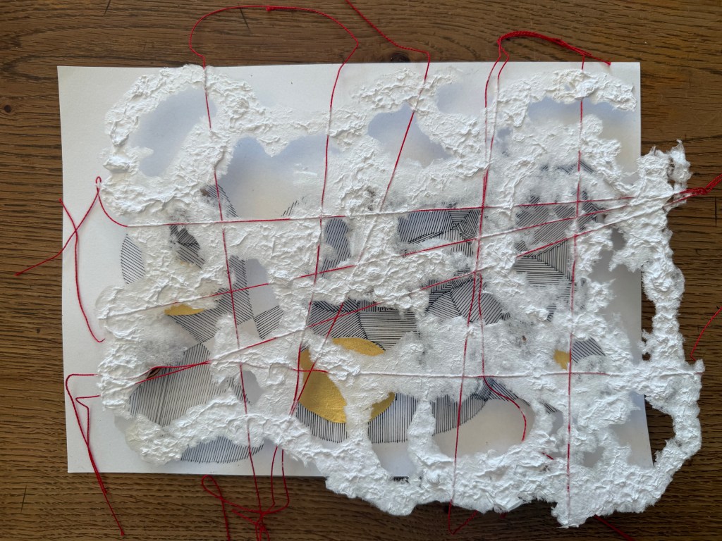
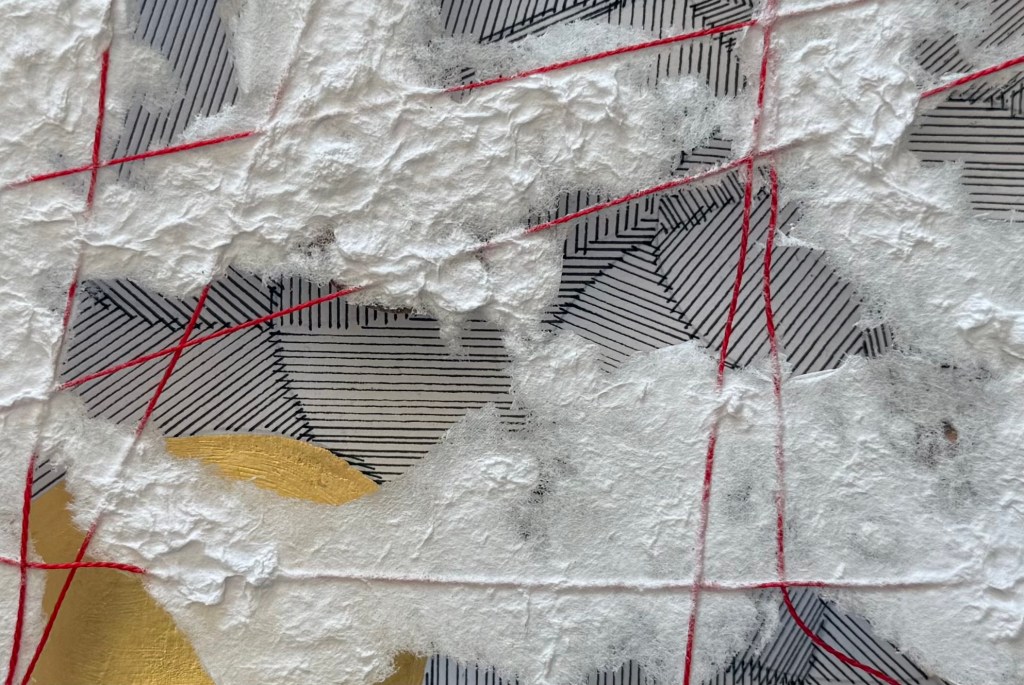
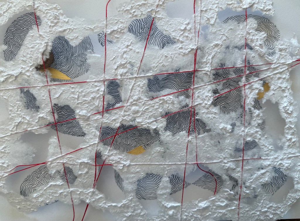
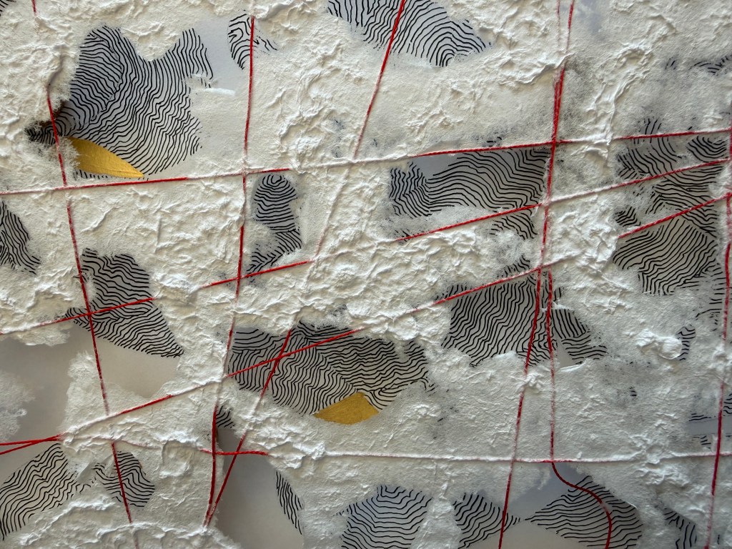
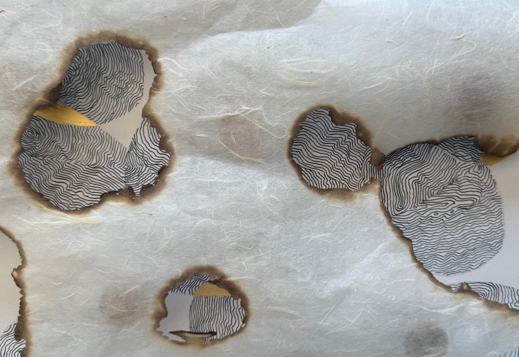
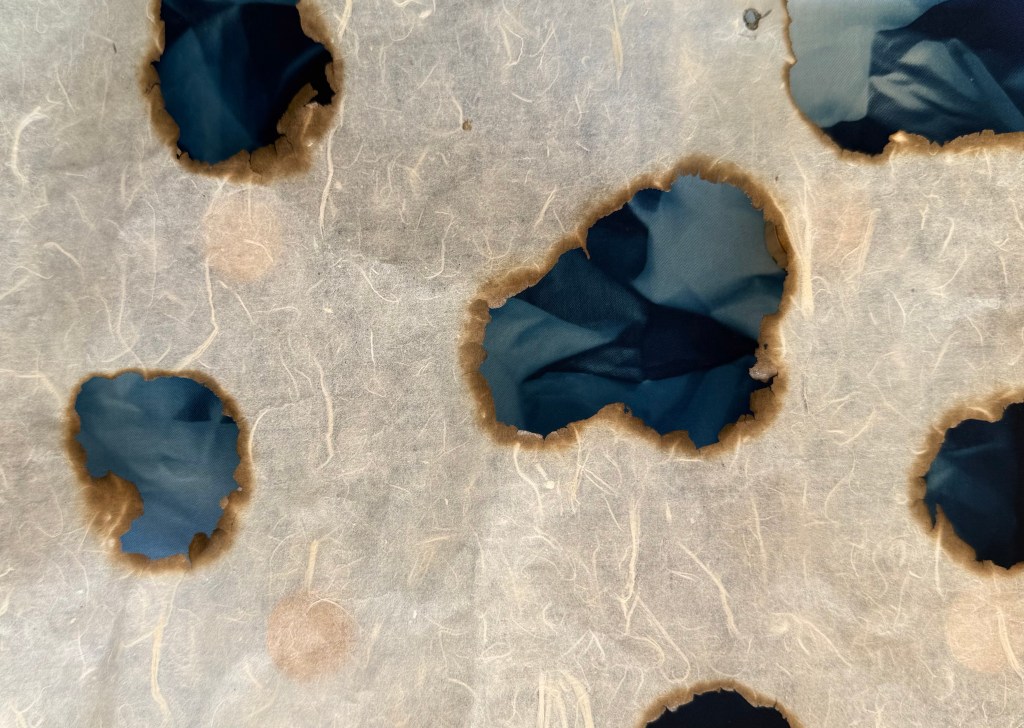
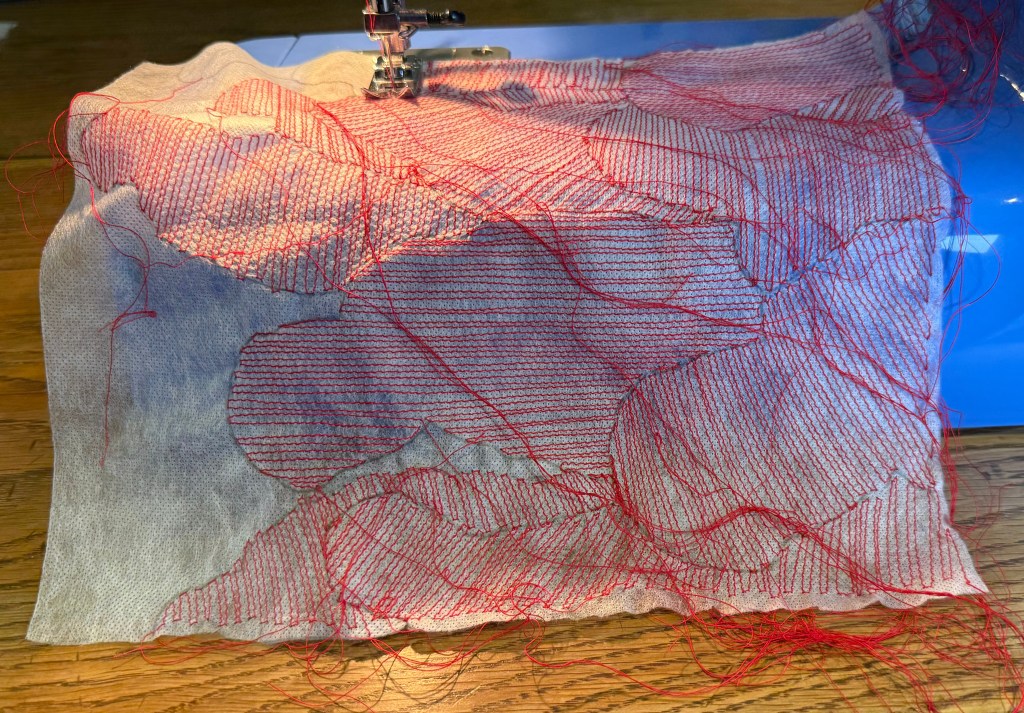
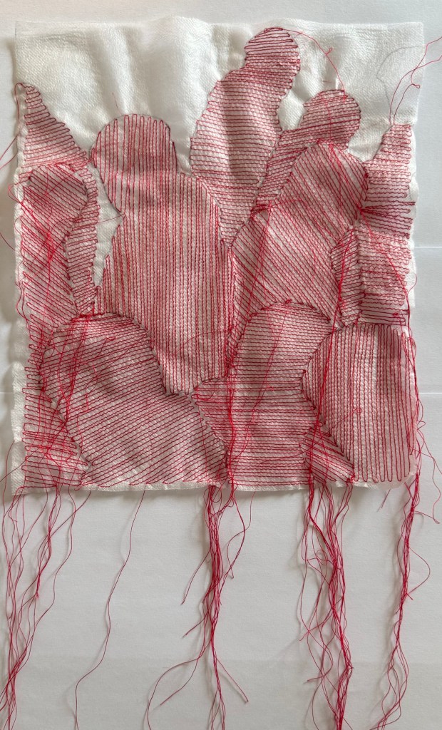
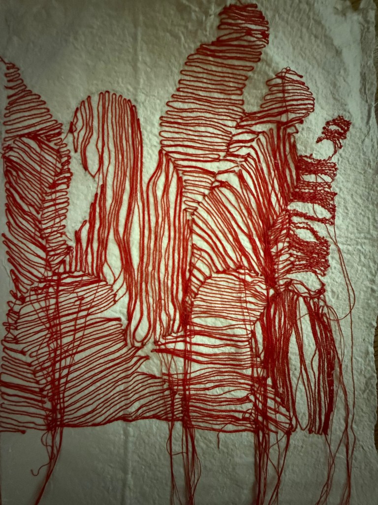
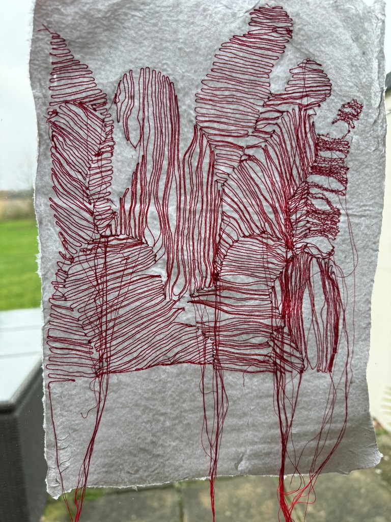
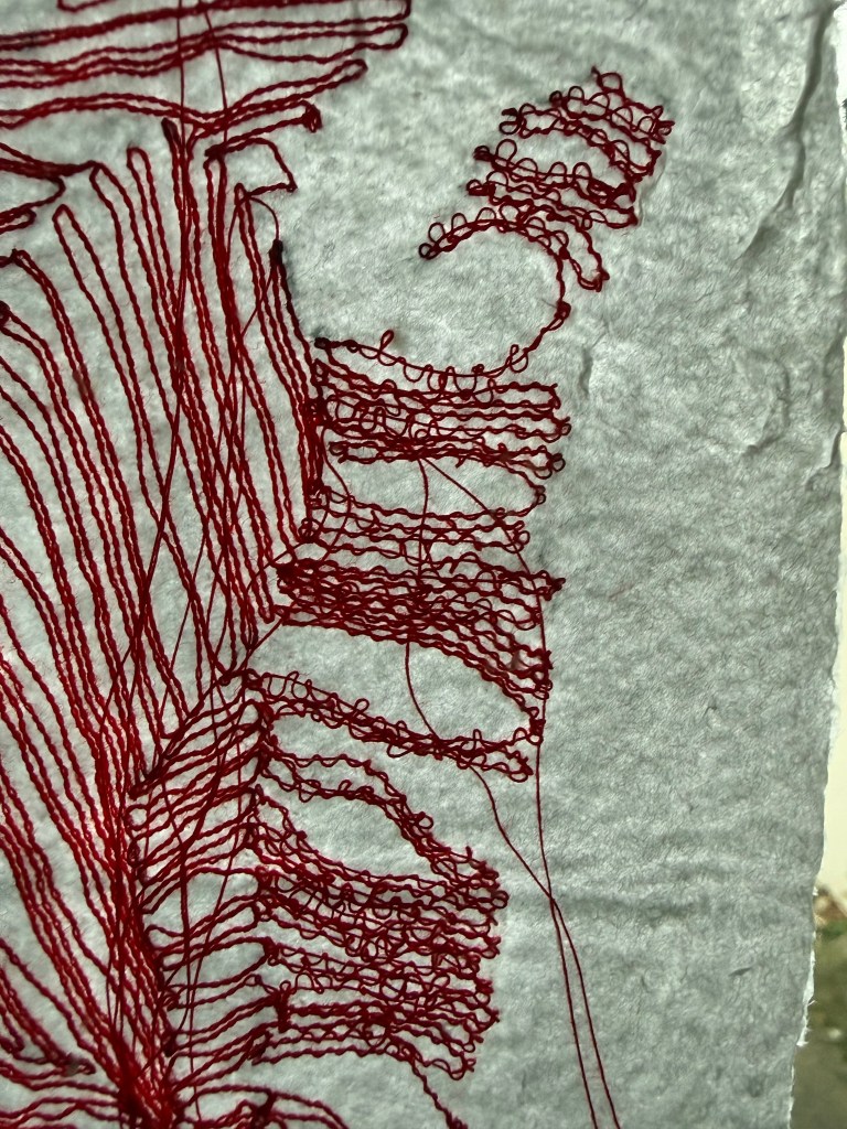
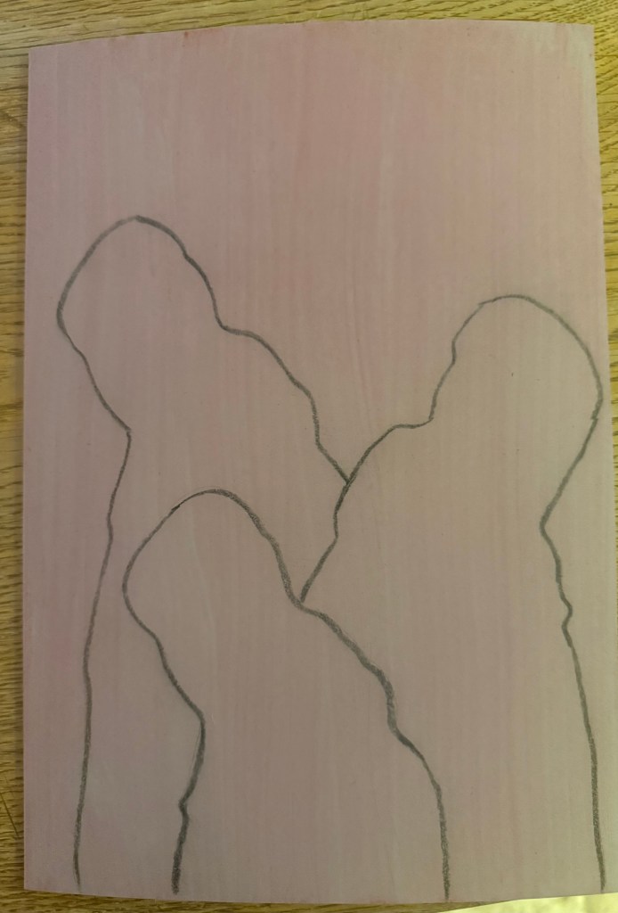
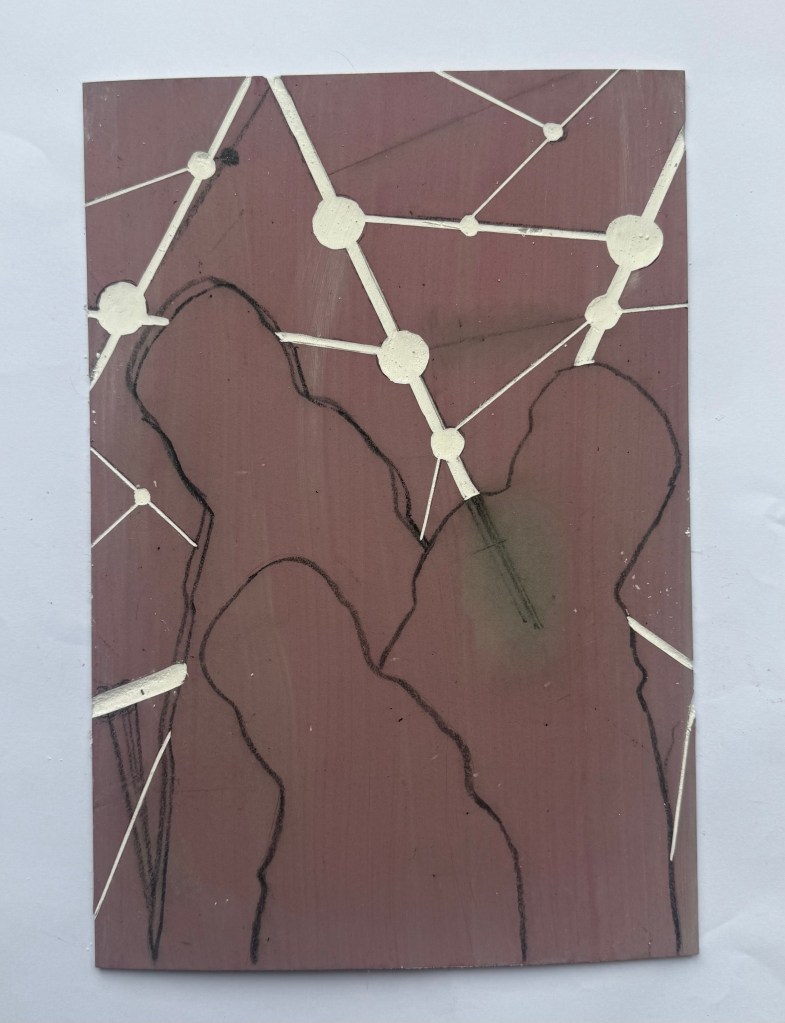
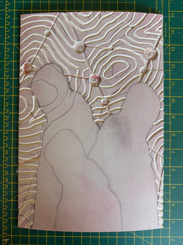
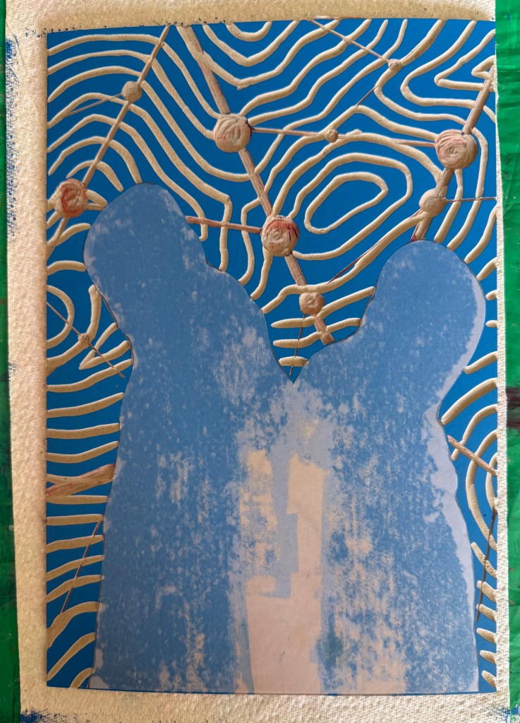
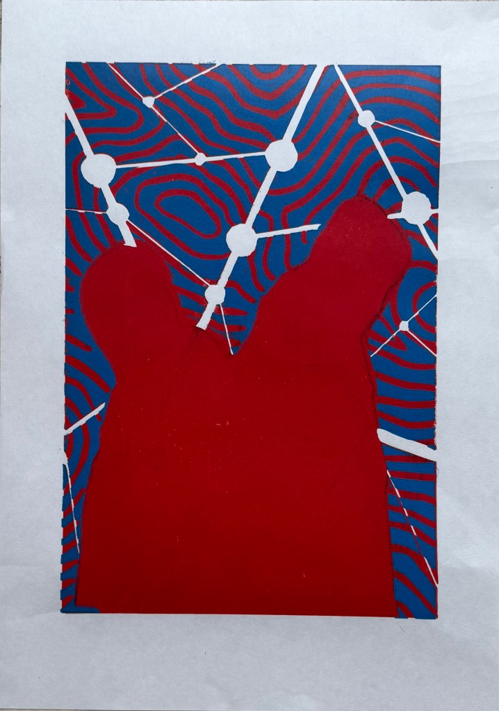
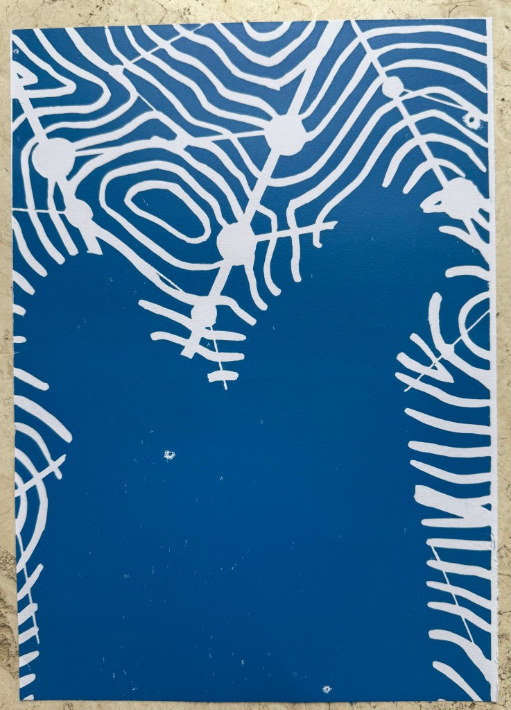
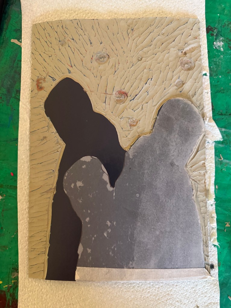
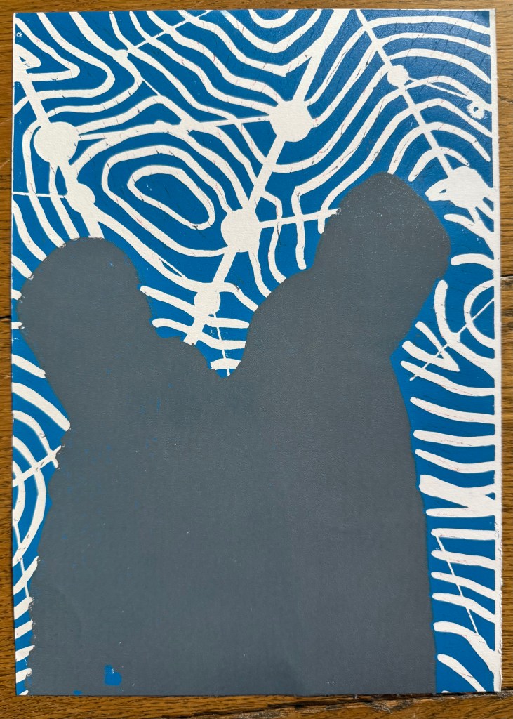
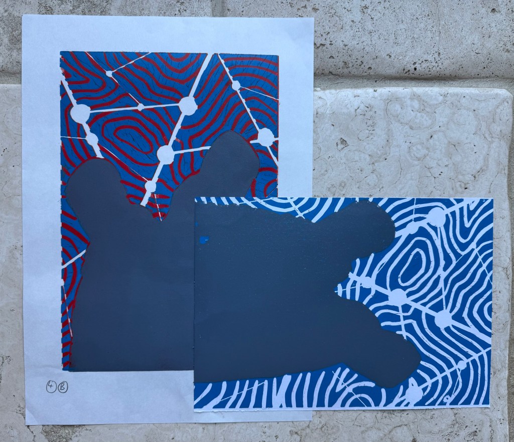
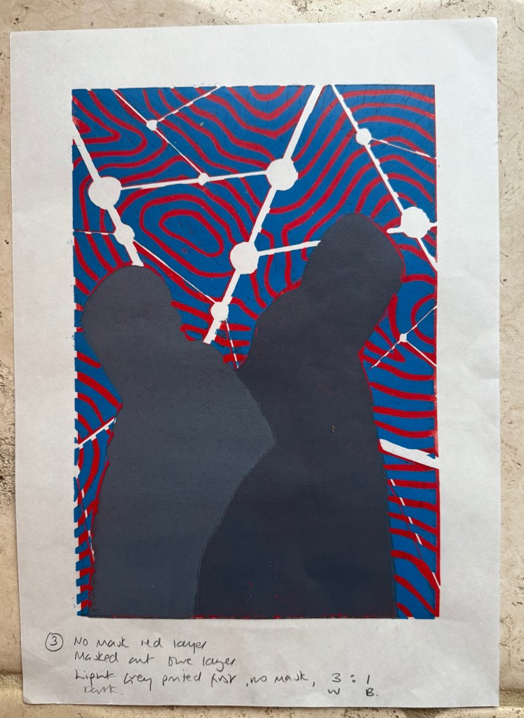
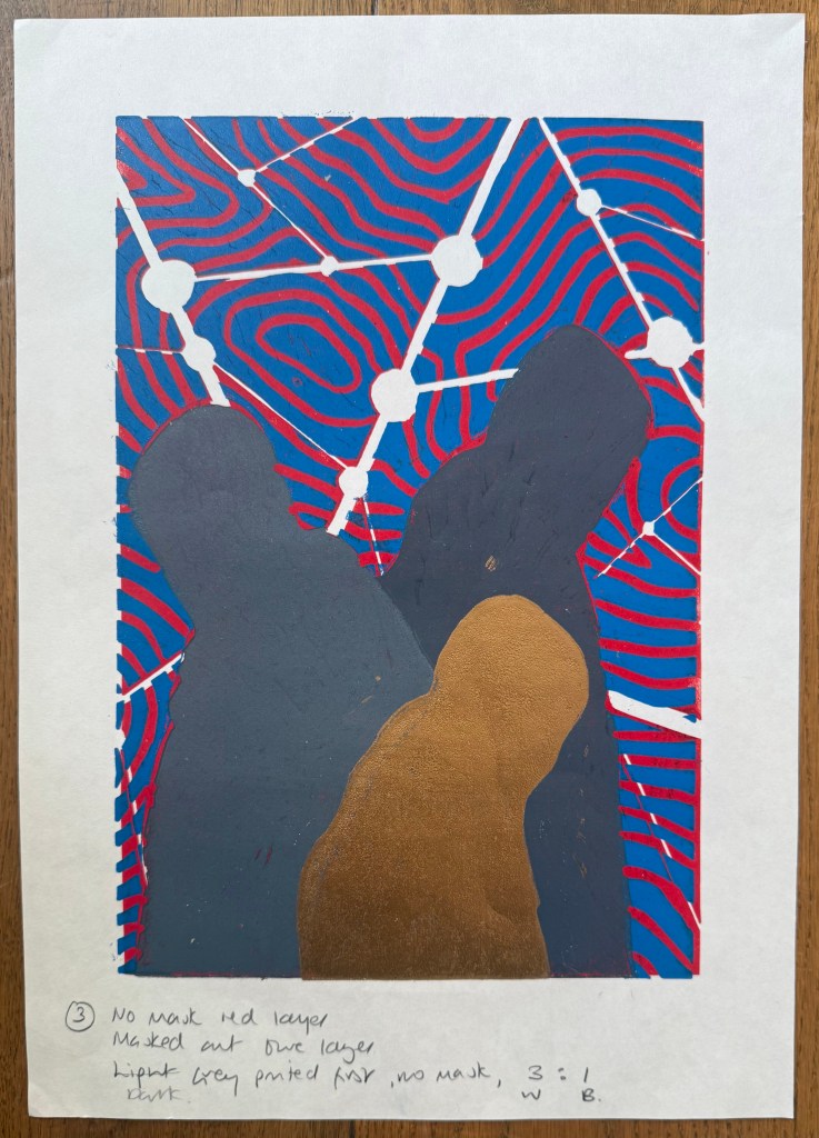
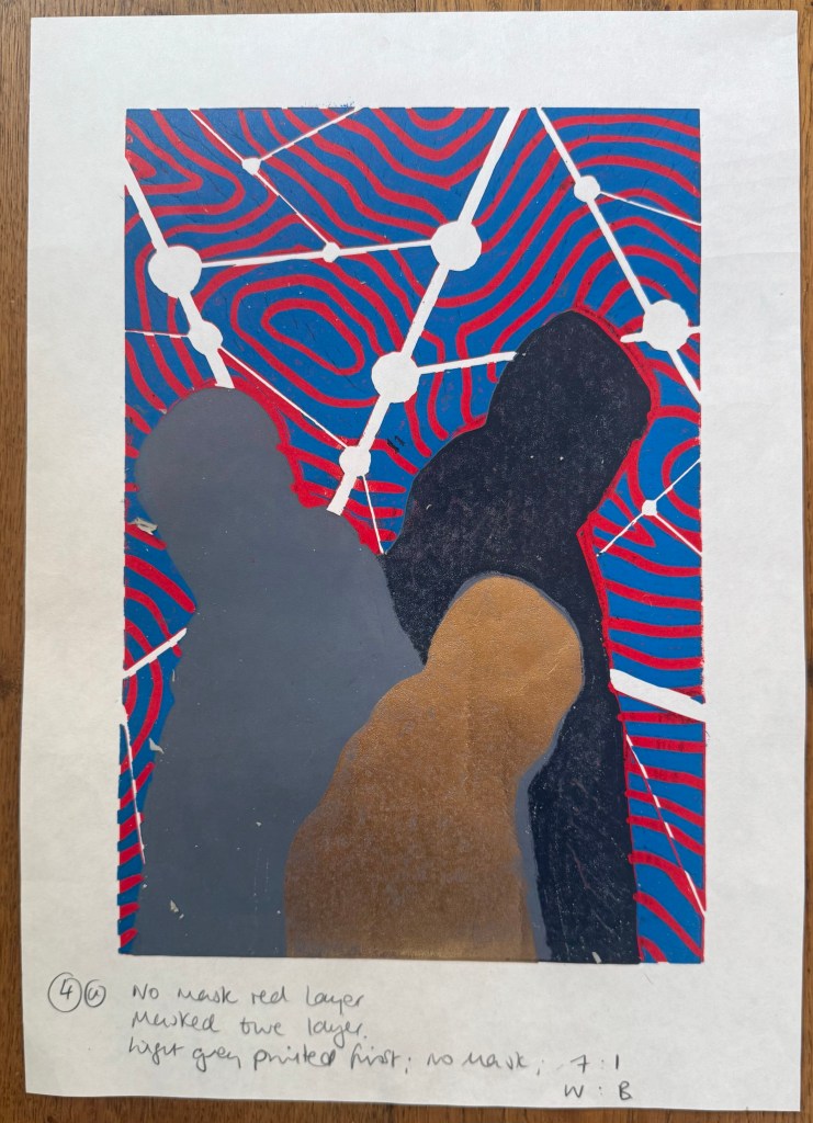
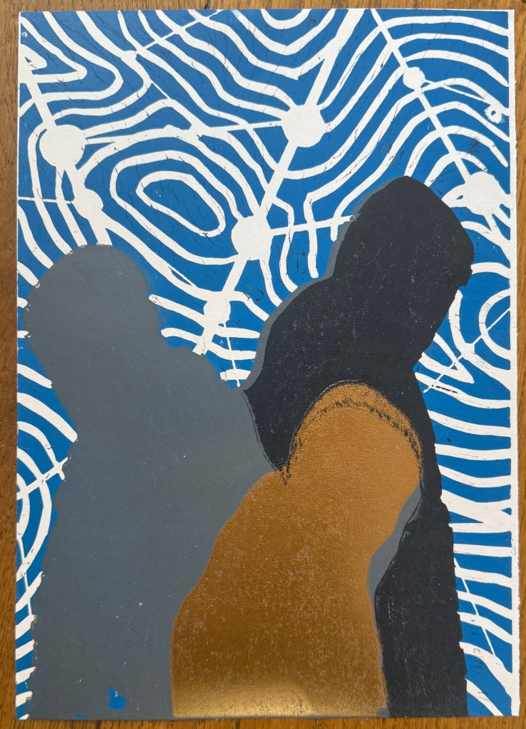
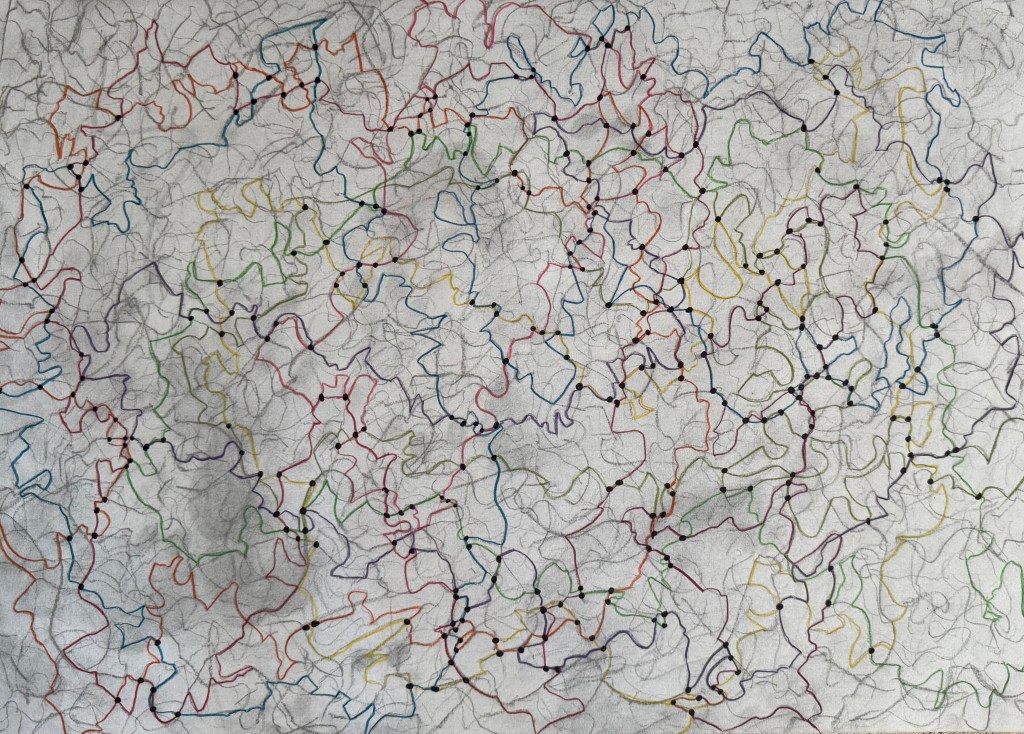
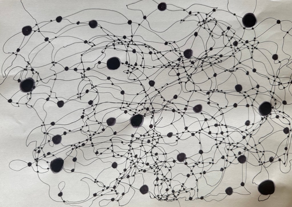
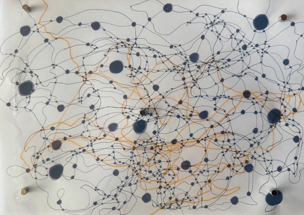
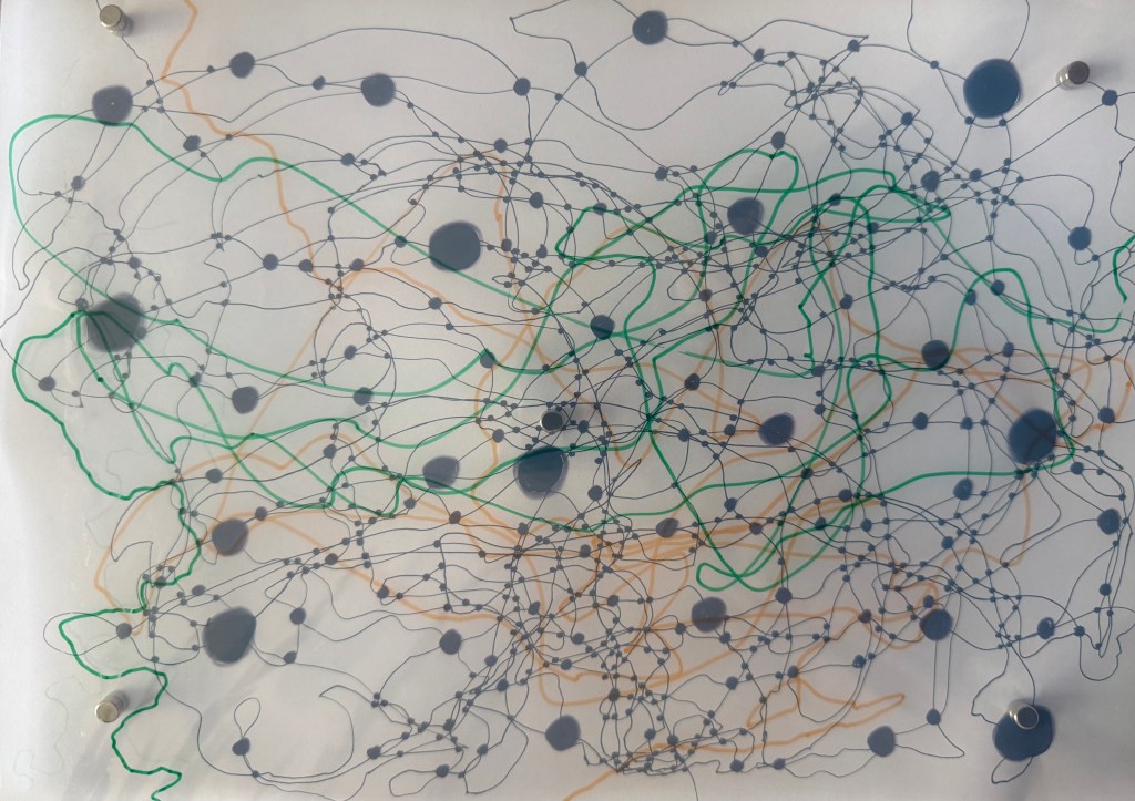
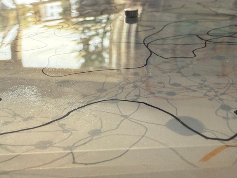
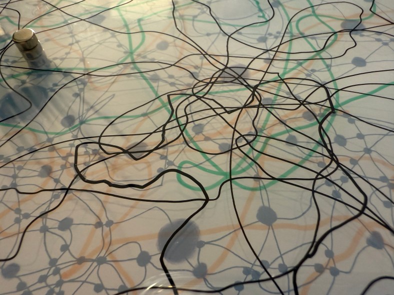
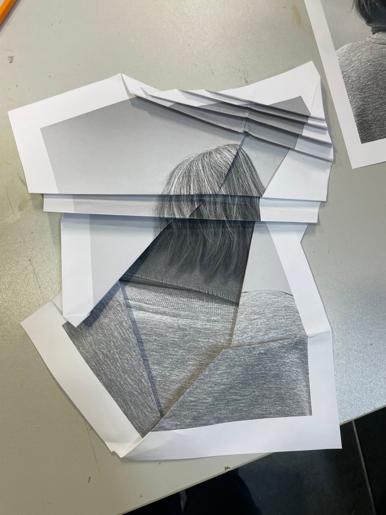
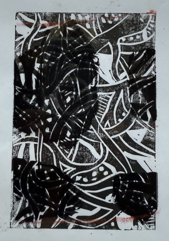
My clearest recollection is just how good it was to have a chat about something other than accidents, operations, hospitals and pain relief. On this subject Jonathan mentioned Late Night Ramblings, how at first glance it looks like a map but then when you look closer you realise that it doesn’t relate to anywhere. We talked about the methodology – what came first? I explained that I started off with the coloured lines, placed the dots at the intersections and then decided to add the contours and finally the grid – in retrospect I probably should have reversed the order as it was particularly difficult putting in the contour lines after the event – I couldn’t see the lines for the lines. We discussed the previous experiments which led to this point in particular the use of the photo of my father to create the outline of the figure, how the pose still retains its meaning, the angle of the shoulders and the head looking down, and how, because he reads my blog backwards from top to bottom, it only became apparent that the photo was the source of the outline once he had worked his way down. He also referred to What Was I Thinking? and my openness as to how I viewed my actions.

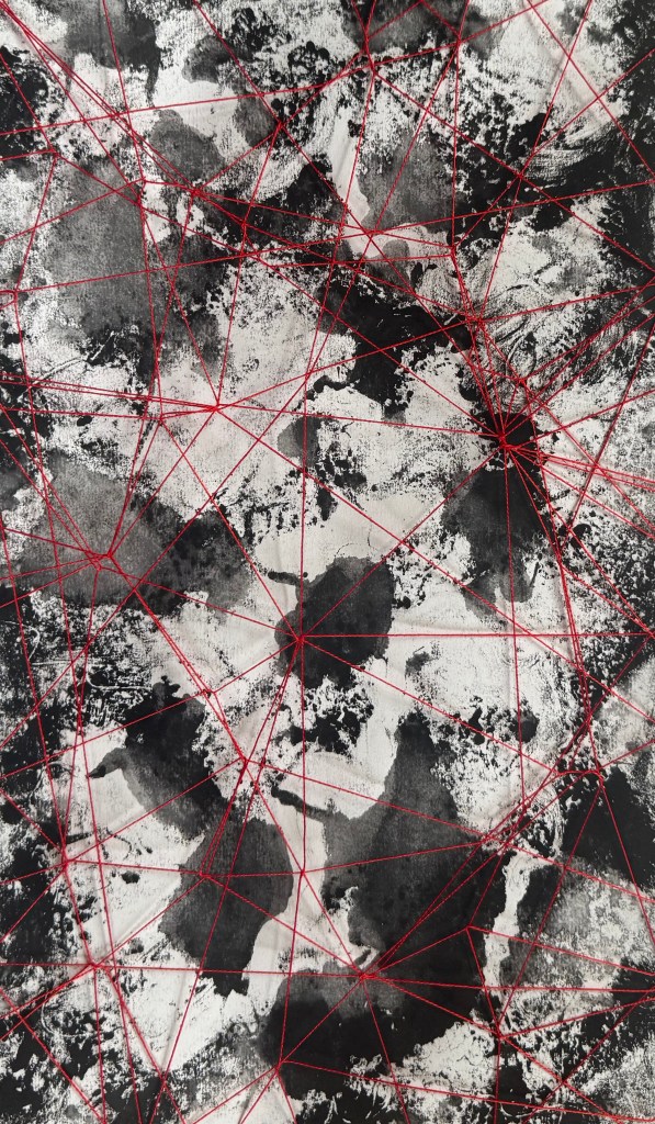
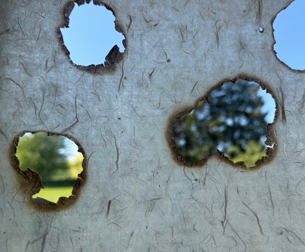
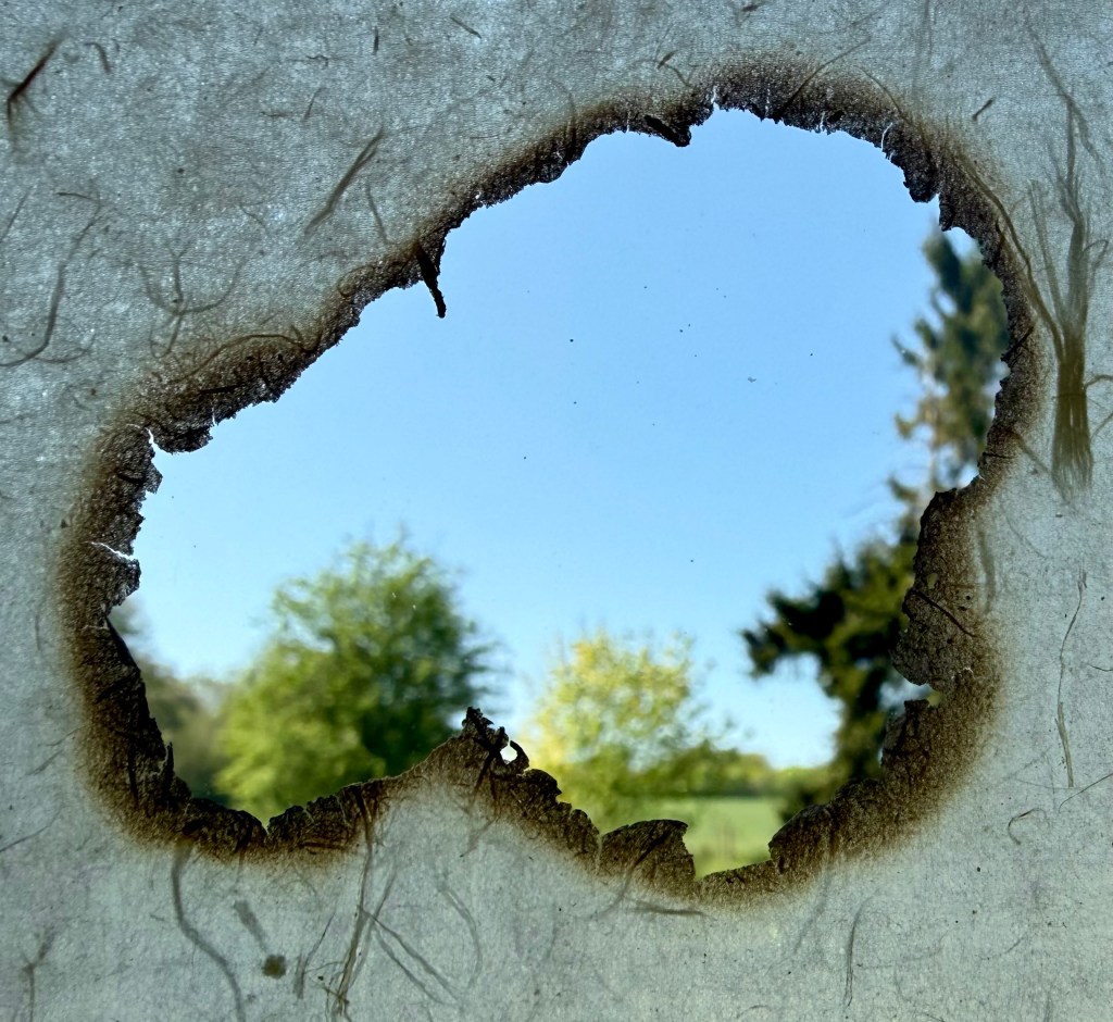
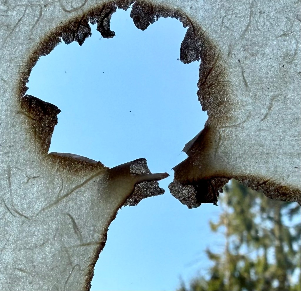
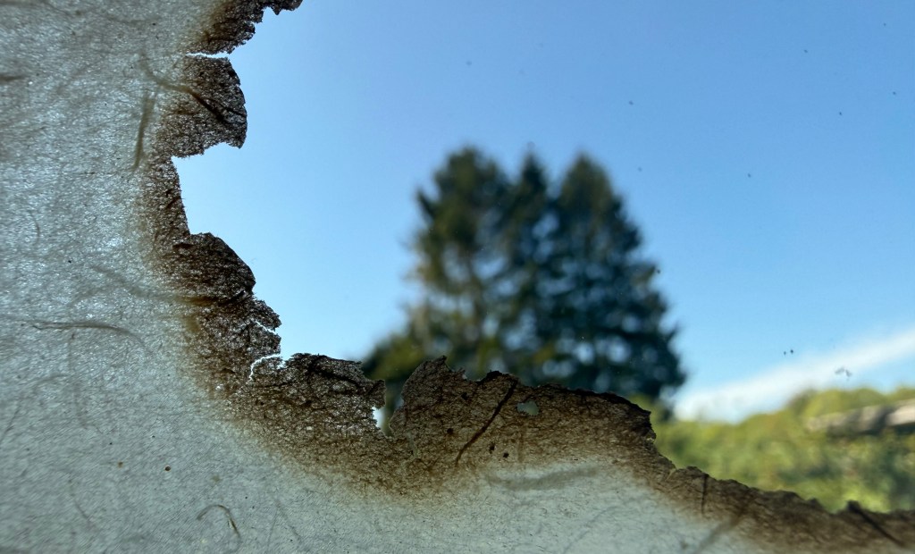
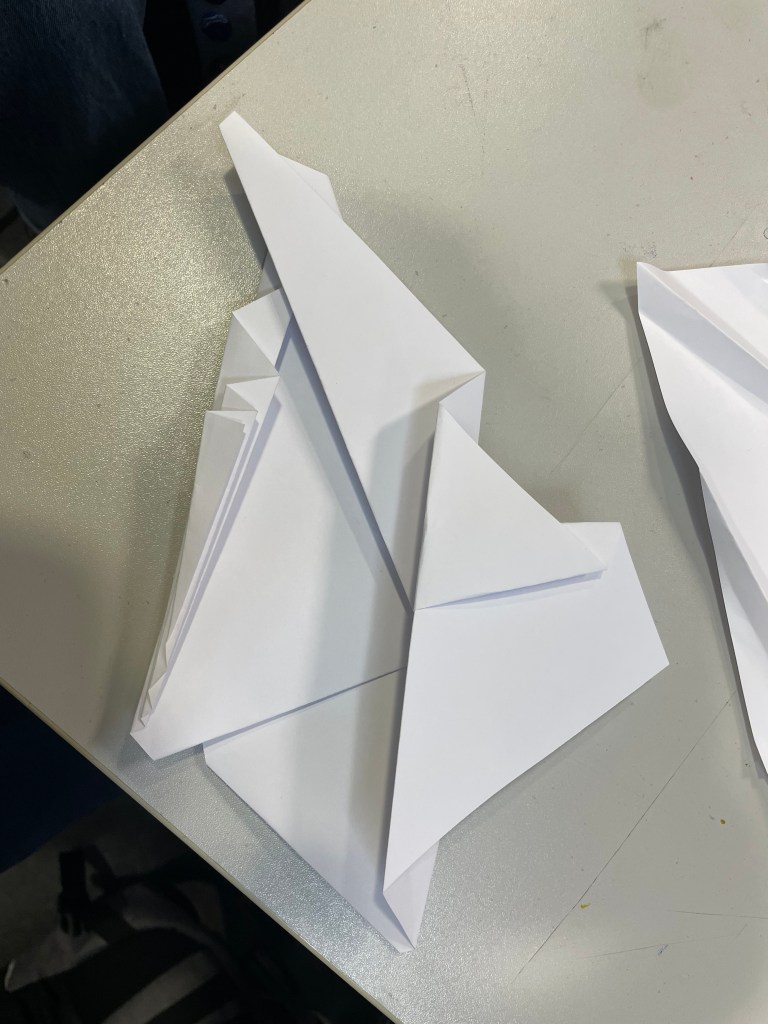
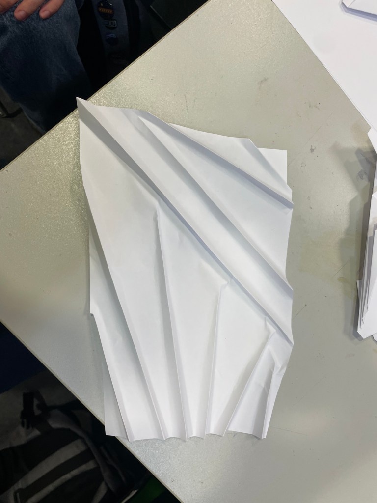
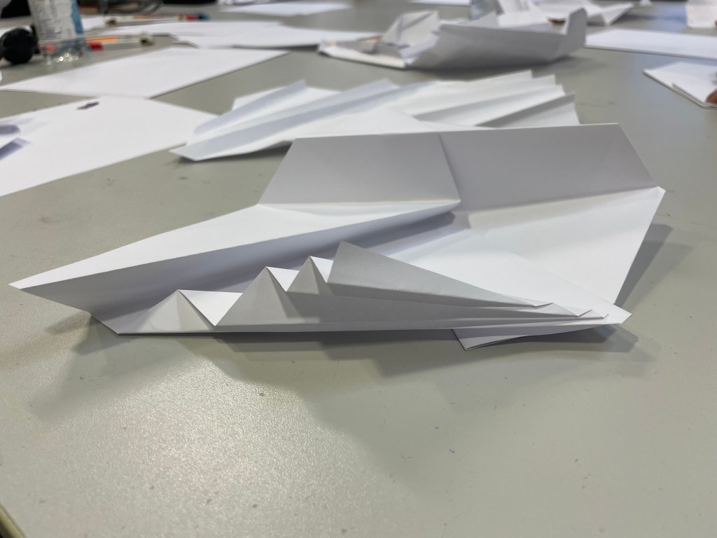
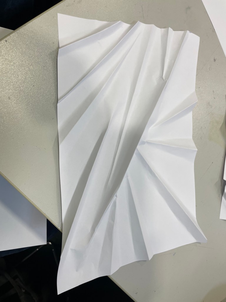
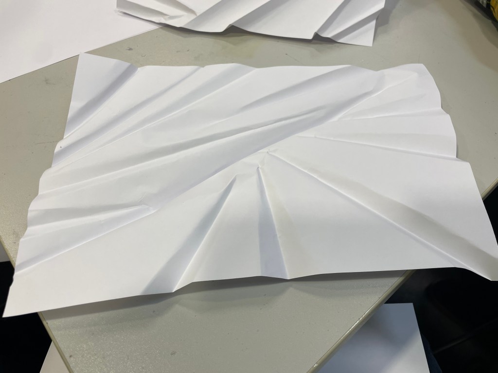
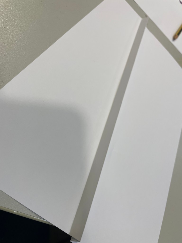
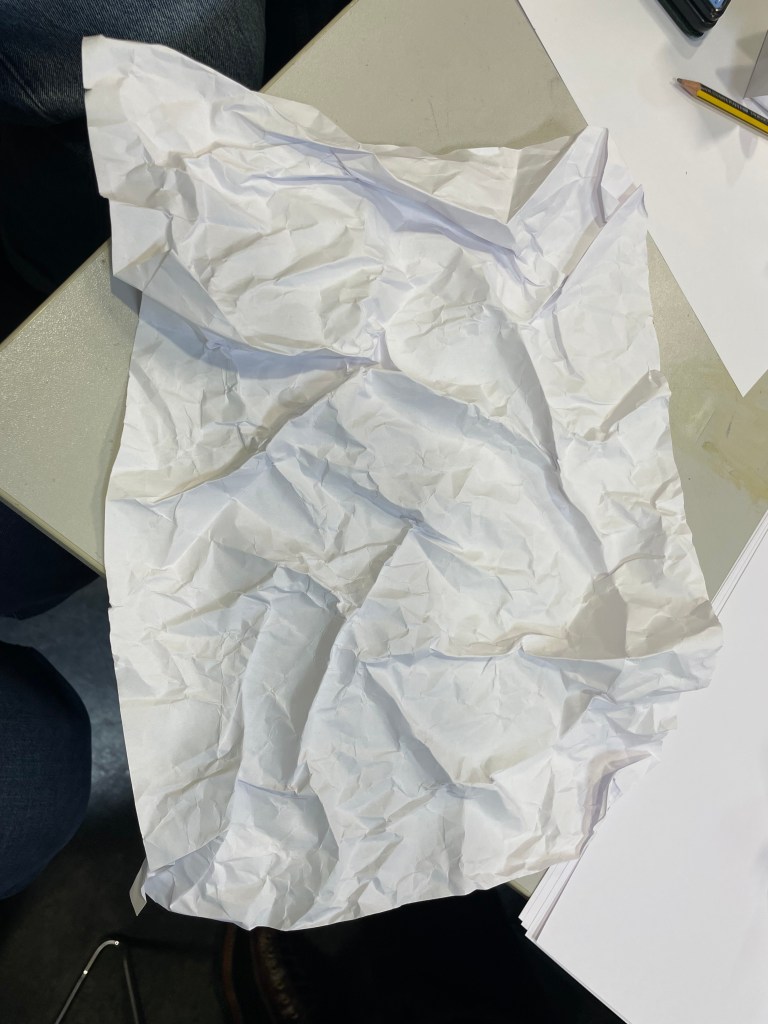
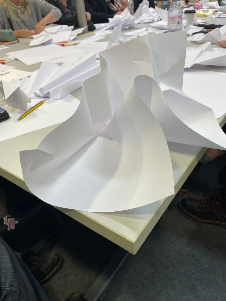
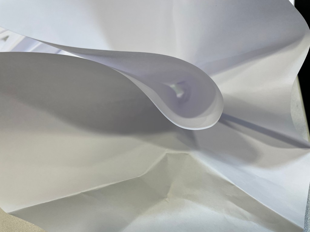
We talked about whether I would experiment with other media – I explained that I liked the flimsiness of the flip chart paper as it reminds me of the paper on which maps are produced and how I am interested in the idea of folding. Jonathan referenced how maps are folded, in a concertina, and how a piece of paper no matter what size it is can only be folded in half 7 times. Intrigued, I looked into this further after the tutorial finished. Generally, this is the case although in 2002, Britney Gallivan, a high school student in California, set a new world record by folding a piece of tissue paper 12 times, but it was 1.219km long. Funnily enough, whilst driving to Exeter yesterday morning to start and finish what my daughter was en route to do when she had her accident, clear out her room at uni, we had the pleasure of listening to Radio 2 when the Paddy McGuiness show came on, and listeners were invited to message in to explain how it can be true that if you fold a piece of paper 42 times it could reach the Moon? Did you know that you can only fold a piece of paper 7 times I asked my husband. Yes, you’ve already told me that, he replied. It’s a matter of exponential growth – if you assume that the thickness of a piece of paper is, say, 0.1mm, then when you fold it in half 42 times it will theoretically be 439,804km thick, approximately 55,000km in excess of the distance between the Earth and the Moon, the same kind of principle as in A Bird In The Hand.

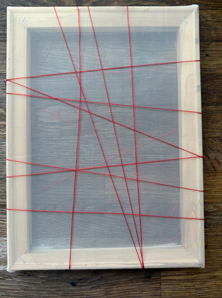
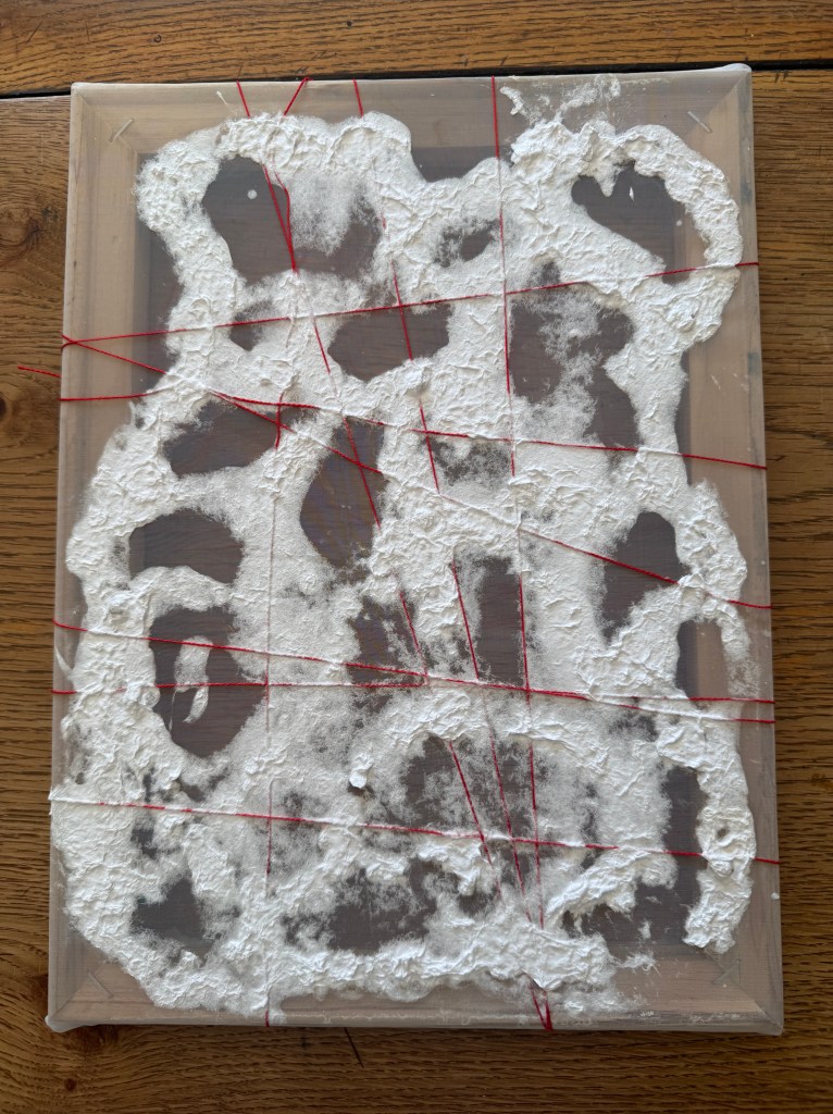
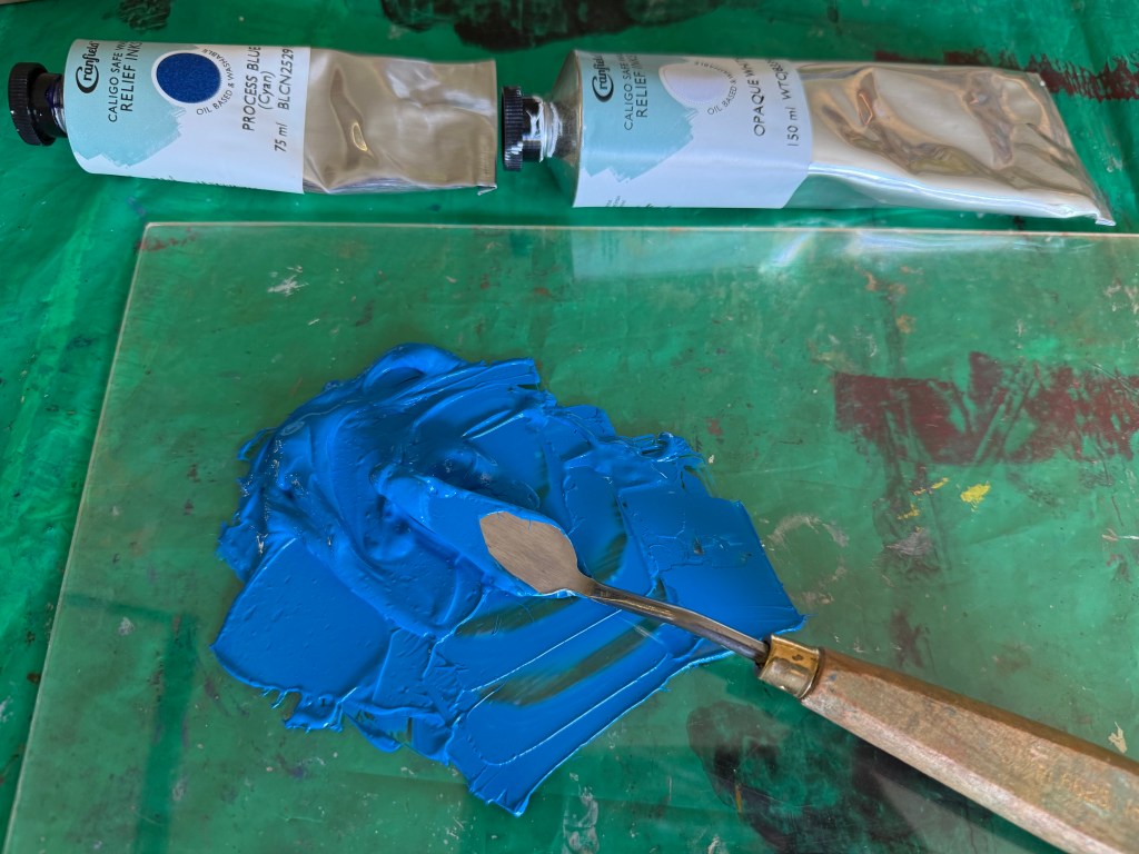
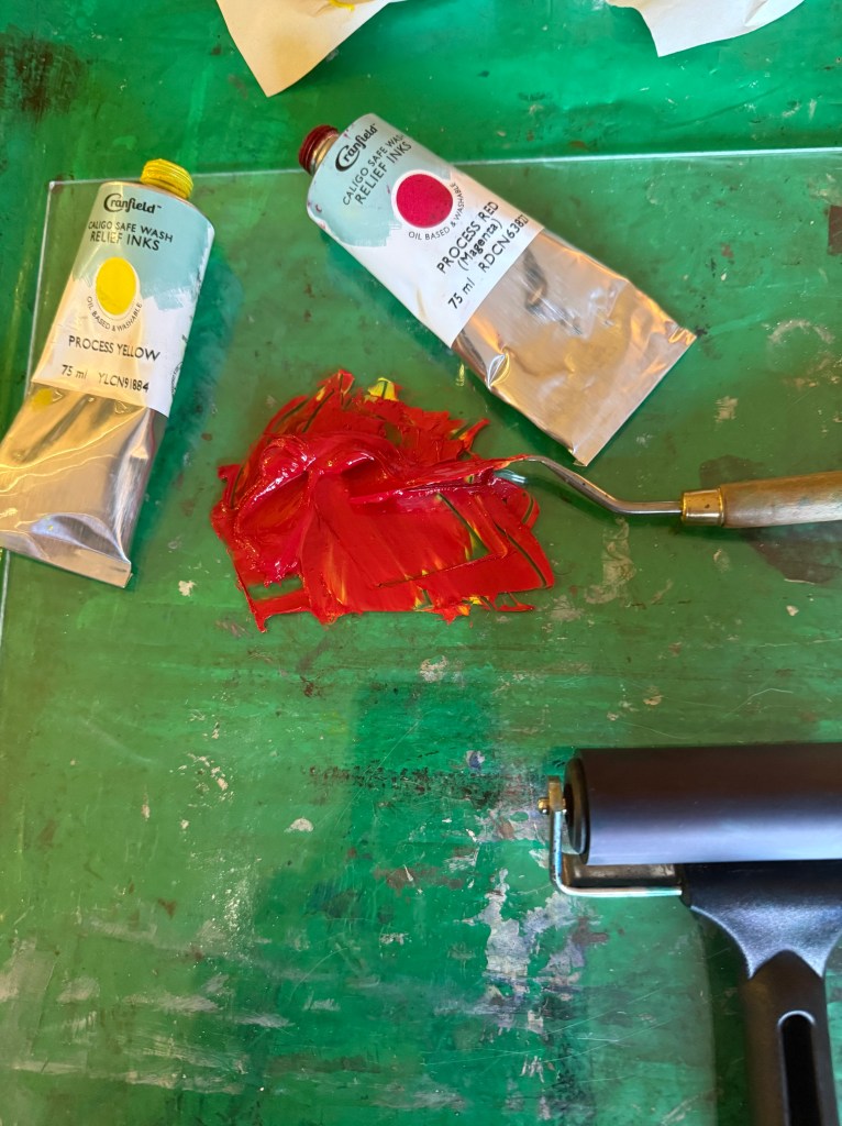
I mentioned that I was thinking of creating a ‘map’ which would embody all that I have learnt over the course, and have been toying with experimenting with canvas, how I would need to think about image transfer etc. Jonathan mentioned Citrasolv which works really well on laser print, especially high quality print such as National Geographic. After the tutorial I watched a few YouTube videos, ordered some and have had to wait a couple of weeks for its arrival, this Thursday.

We then discussed Raita Bitless, and how Jonathan felt that there are some very important elements which are emerging and this is one of them. It feels like these are important memories which need to be explored further, and I agreed, explaining that sometime over the next couple of months I want to go back up to the Midlands and spend some time just wandering and reliving.

I’m sure that some of these discussions were prompted by a question, but the only one I can vaguely remember is when Jonathan asked me whether I was missing anything or needed anything more. I said that I didn’t think so, that I am quite happy just doing what I am doing. I have realised a lot about myself and the way I work (or not) – I had been attempting to squeeze the round me into a square hole. As such, I have effectively torn up my work plan, as it’s just not who I am, and have decided just to wander; to go on a dérive, and to wonder. Jonathan liked the idea of wondering whilst wandering – there’s a name for it, he said. I thought of it afterwards – a homophone – although apparently wonder and wander are not actually homophones because of a very subtle difference in pronunciation of the first syllable – what killjoys! I like it anyway, and there is a lovely interplay between the two.

We then got onto the subject of the research paper and he referred to The Paradox Of Choice. I told him that I felt as if I had been told to go out and buy something, anything; that I had decided that I wanted to buy a cake but that I couldn’t specify which cake I wanted until I had visited all the cake shops and seen all that was on offer. I would have responded much better to having been given a choice of topic out of a small selection, akin to an exam paper; that I felt overwhelmed by choice and asking me what intrigues me doesn’t really narrow it down at all. Anyway, because of where my current experiments have taken me, I have decided to think about maps particularly in an autobiographical sense. We then went on to discuss maps and the issues with them in terms of distortion both physically in respect of projections and political motivations, perspective etc. Jonathan also mentioned Professor Steve Peters – Jonathan had been to a talk and had been given a copy of The Chimp Paradox – I had started reading it a while ago but didn’t finish it as I was probably distracted by something else. He referred specifically to the idea of the helicopter view. It’s a technique to gain perspective on something by imagining hovering over the issue in a helicopter which enables detachment and a more rational and objective view.

Does the need to do the research paper risk having a negative impact on my current wandering? This was a difficult question to answer, but on the whole I don’t think so – I’ve already recognised that I am a person of extremes, either really tidy or messy, focussed or distracted, honed in on the detail or preferring the bigger picture – each will appeal to my polar opposite needs and I am optimistic that what I discover whilst writing the research paper will have significant impact on my current practice.

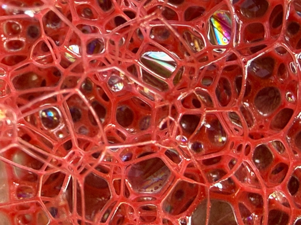
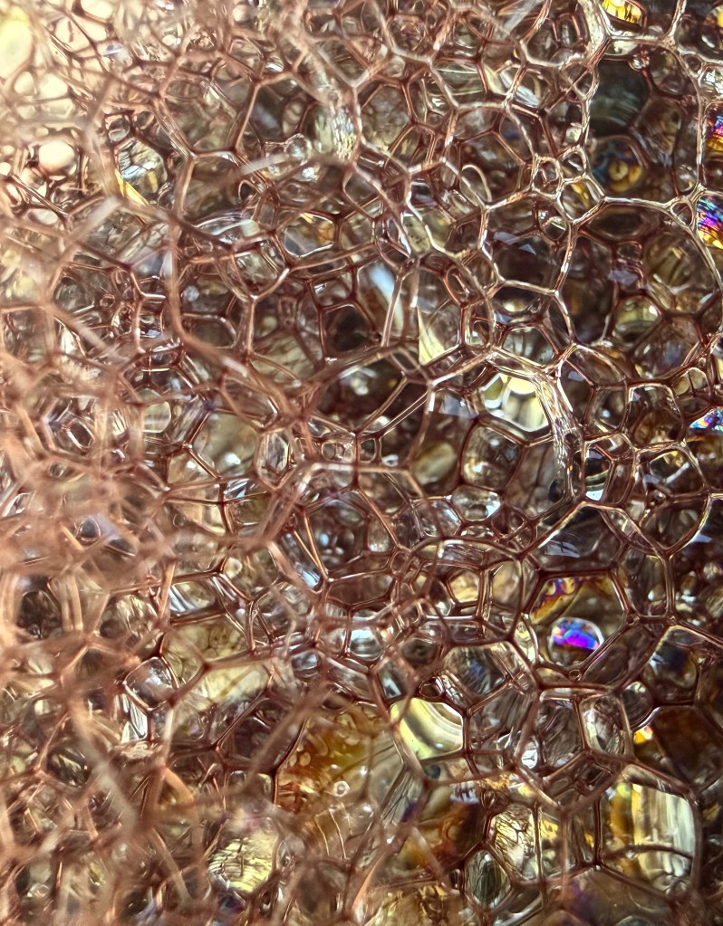
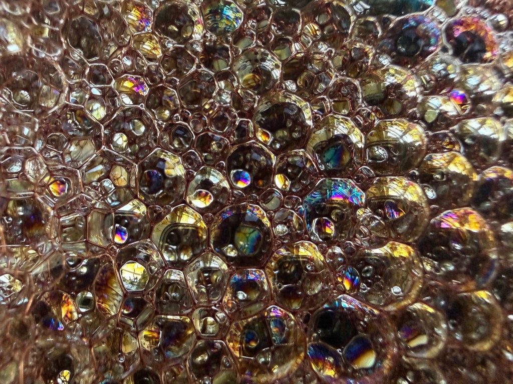
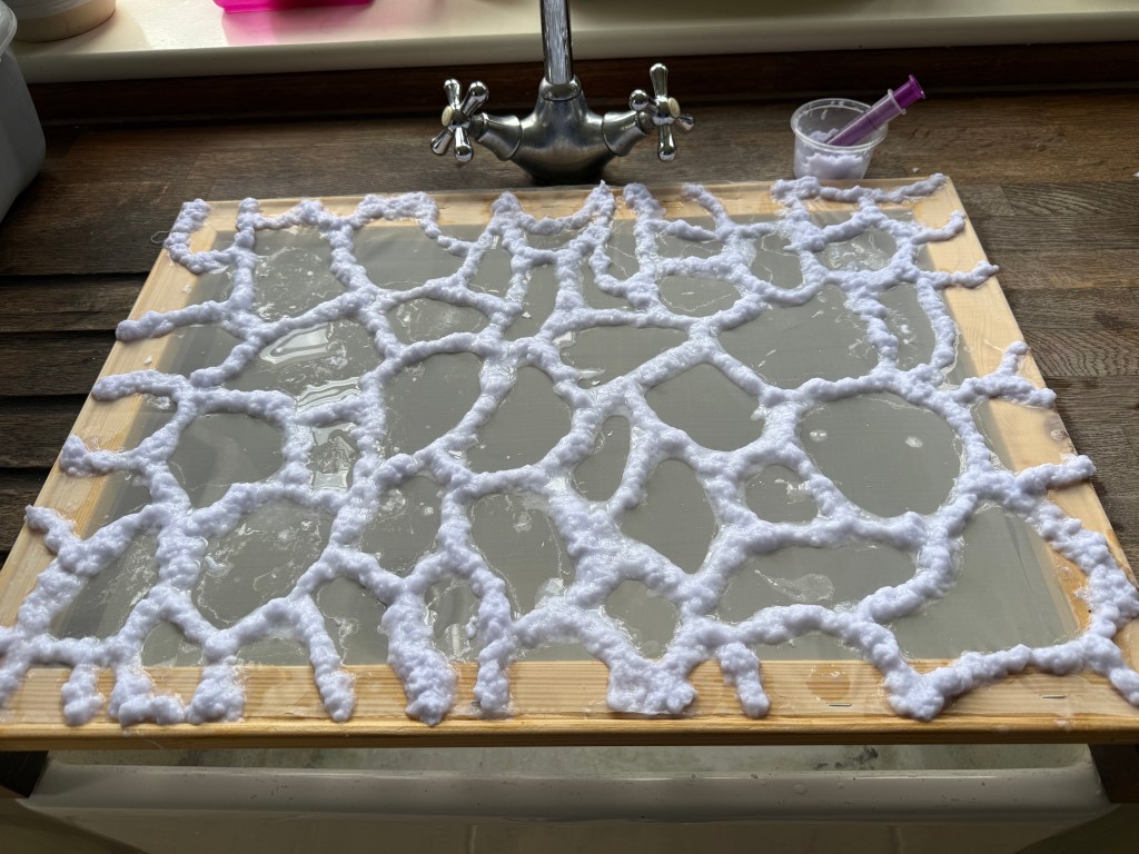
I hope that I have covered everything we discussed although we must have talked about carbon paper at some point because I have used it recently. I have done a few things recently – I need to include them in a post but, frankly, all I have wanted to do is to make and not necessarily reflect on and write about it.

Sorry, Are You Talking To Me?

I’ve decided that I’m probably learning far more about myself by simply being in this process than I am by looking back on my life.

I need to retrain my brain. My legal training has made me focus on detail, anticipate every possible eventuality, dot every ‘i’ and cross every ‘t’ all within a rigid framework of rules and regulations. That way of thinking served its purpose then, but it now stultifies creativity.

When I’m in a scenario which is unfamiliar, I like to know the parameters within which I’m expected to navigate; quite often I feel discombobulated when things don’t go the way I am expecting, the paper workshop with Christian Azolan being a case in point. We were instructed to fold the paper. To my pedantic mind, folding involves a deliberate act of bending something over on itself to create a clearly defined edge. It doesn’t include scrunching. But once I had overcome my initial confusion and accepted this unexpected variation of the parameters, I enjoyed myself.

I definitely preferred using the blank paper – I don’t know what brand it was, but it felt really good. It led me to confess my fetish for pristine white paper to some of my fellow students. I think it stems from being at primary school when the teacher would write my name on the front of a new exercise book with a marker pen and I would go back to my desk and give it a good sniff. I now appear to associate blank paper with a solvent high. I don’t think that my school ever had a pupil who was so keen to man the stationery cupboard at break time. In fact, I used to get palpitations and a bit of a sweat on just walking into WH Smith (R.I.P).

Working with the blank paper seemed to allow more freedom and I liked that the results took on a sculptural quality. The effect of the folding on the reverse of the paper was equally, if not more, interesting at times than the right side; areas which were peaks on one side became troughs on the other and vice versa.

I felt inhibited using the print of the back of my head; I became too concerned with the resultant image which seemed to impose restrictions on how I folded, so maybe I like clear parameters, but not too many of them? Also, the effect is less sculptural than when using the blank paper; the areas of shadow are less apparent and the focus shifts to the distortion and concealment of parts of the image rather than the creation of form.

We then went on to do some linocutting – it seemed a bit incongruous with the folding activity, but nevertheless we all launched into it with equal enthusiasm.

I prepared two linocuts; one inspired by tree roots and the other a reduction linocut of an abstract shape – I printed it using yellow ink first, then cut away more lino and printed using red ink.

I also printed the tree roots image on a transparency, having torn up bits of paper to create a random mask. It is interesting to see the effect of overlaying it with the two prints; how it creates a sense of discord on the prints where it’s not in sync with the image below, and how it creates areas of intensity on the print over which it lines up.

As I was taking my lino into the next door room to print it, Christian heard me reminding myself as to what I was planning to do. Sorry, are you talking to me? No, just myself. Doesn’t everyone do that? Yes, of course. When I went back in to print my second lino, I asked him how long we had left. Sorry, are you talking to me?…

Figuring It Out

I’ve started back at my weekly art class after the Christmas break, and over the last two sessions we have been looking at figures, in particular, figures in an environment. I’m not very good at depicting humans (or any animate subject for that matter), so this was a bit of a challenge.

We had to work from images which we had sourced: I took my nieces ice-skating at Christmas, which was really entertaining to watch. There were the confident, well-practised skaters who came equipped with their own boots; the ‘I’m-competent-but every-now-and-then-lose-my-balance-and-windmill-my-arms-brigade; and then the rest – hopelessly clutching the side, or each other, for dear life, inching their way round. There was a whole range of shapes, gestures and weights, in the sense of where in the body the weight is being distributed, and there was a lot of tension.

We started by sketching out the composition.

I used a combination of photos and video stills from my phone – I could have been more organised because I lost track of which figure was on which photo, which wasted quite a bit of time. Next time I work from numerous image sources I will organise them so that they are more accessible and easier to switch between.

I then applied a ground to the support (I used oil paper as opposed to a canvas, as I wasn’t sure how it was going to go). As it was a painting of ice-skaters, I chose burnt umber thinned down with Sansador as my ground, as it’s the blue equivalent of the earth colours. I then drew in the figures using a rigger brush and thinned paint – I found the techniques covered by Chris Koning’s workshop of gestural drawing (‘Perception of the Whole’) to be really helpful in trying to get some dynamism in the portrayal of the figures. I also changed the composition from the pencil sketch to bring forward the pair of skaters on the left and to give the skater next to the pair some extra space into which he could move. I also packed some more figures in, including my favourites, the couple in the centre – the man skating alongside and watching his partner who is leaning forward – and the girl behind them.

The next step was to block in the background. I decided that I didn’t want to put the figures in the specific setting of an ice rink, so I left out the details of the roof and sides which were included in the original sketch. This gives a feeling of more space.

I used a thinned down mixture of titanium white, ultramarine blue and burnt umber to create a grey/blue and then scratched into it with the end of the paintbrush to create skate marks.

I then started blocking in some colour using thinned paint. I liked the fact that the burnt umber drawing was still visible and decided to try and retain as much of it as possible. This meant that I would not be able to use much thick paint in subsequent layers, and so the painting will retain a sketch-like quality. The purpose of the exercise was to capture the essence of the figures, so there will be very little detail in the figures and their faces, other than those in the foreground, and even then I will keep these limited.

I regretted having the large figure in the foreground, but he felt necessary to add variation to the height of the figures, and his static quality should hopefully contrast with the sense of movement in some of the other figures.

I carried on adding some more colour and changed the colour of the skater’s hoodie to differentiate him from the figure in the foreground.

I really enjoyed the process of being looser: the multiple visible alterations and the pared back application of paint. I’m not sure that I like the finished piece, probably because of its subject matter – it’s all a bit twee. But that’s my own fault – I hadn’t adequately prepared for the class and so made a rushed decision. Next time we have to work from a preselected source, I will make sure that I prepare properly, so that the subject matter appeals to me as much as possible.

There are areas which really appeal to me; I like the way I have treated the ice and I think that I have managed to capture the sense of movement, the hesitancy and tension in the figures, and the atmosphere. I don’t like the way I’ve painted the faces in the foreground. Whilst the exercise was all about the figures, I don’t think I’ve managed to find a method to render faces in a non-detailed way which does not look childish. I need to work on this.

I was thinking about this painting whilst I was out on a dog walk yesterday. I enjoyed making it, but I’m not that enamoured with the overall result, which made me ask myself whether I need to like the work I make or whether enjoying the process is enough. Also, I like and am attracted to a wide variety of artists working in very different ways. I suspect that I have previously thought that I need to make myself like them and make the sort of work they make because it is something that I like and am drawn to. I’m starting to realise that this isn’t necessarily the case – I just need to be ‘me’.

Generally, the work which I produce at my art class is not something that I would ordinarily choose to do, (which is a good thing) and won’t necessarily be relevant to my field of study in terms of subject matter, but it will provide a useful source of exploration in terms of technique and approach in my art practice. As such it is a valuable resource and a good use of time as well as a commitment which ensures that I create work on a regular basis.