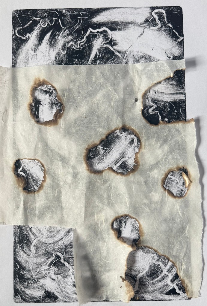
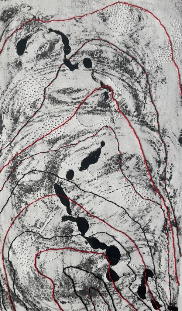
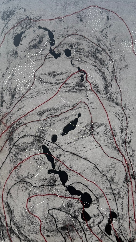
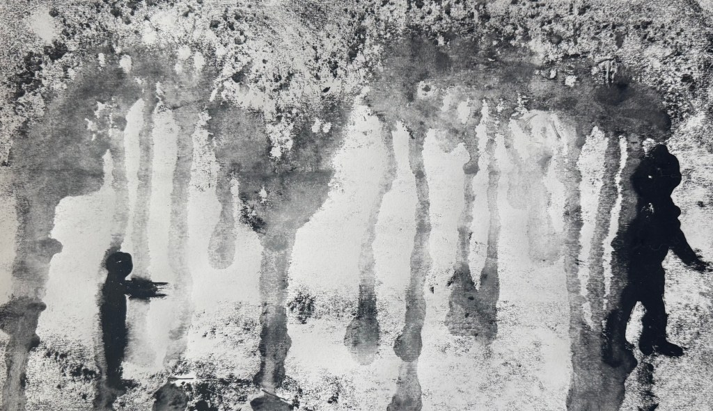
I had some leftover ink and made some monotypes with it – just swirls and wipes. The ink is oil based Cranfield Safe Wash and so I also employed a spray bottle of water.
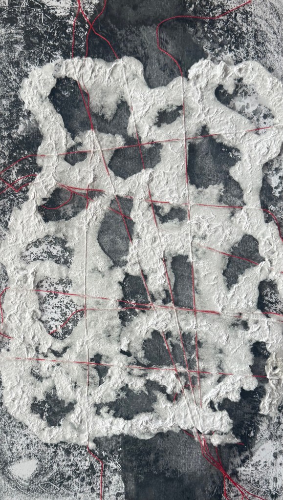
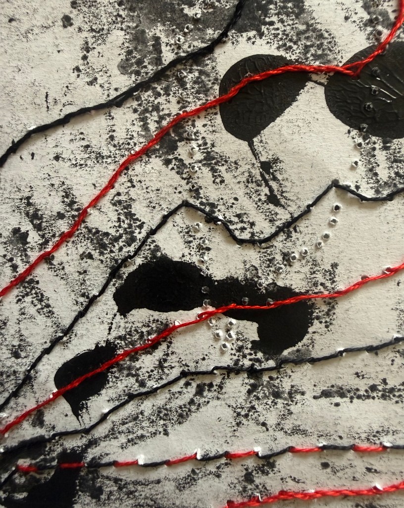
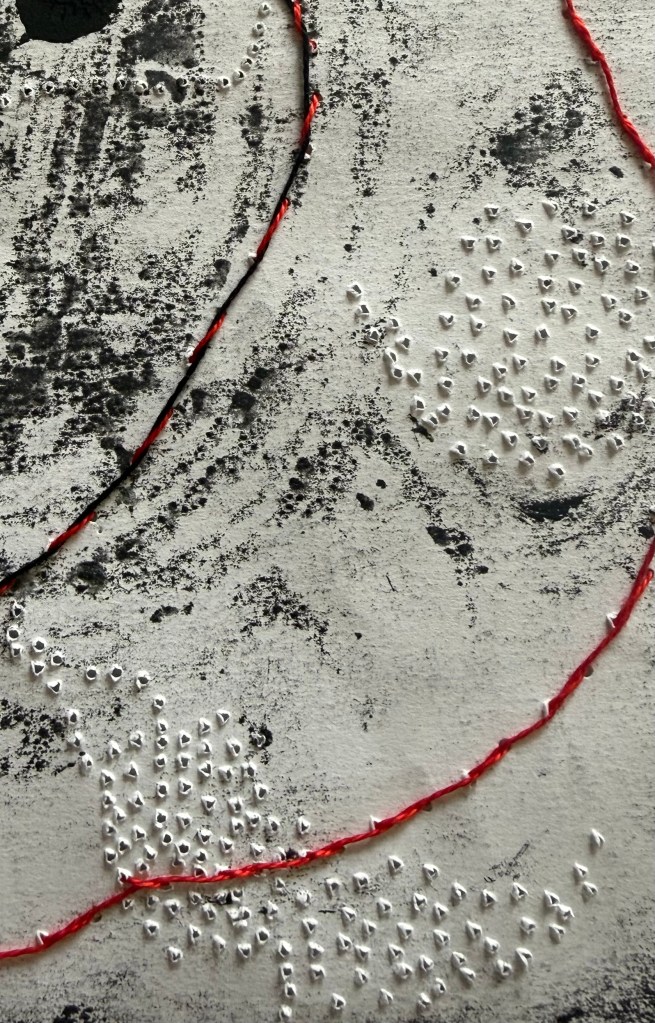
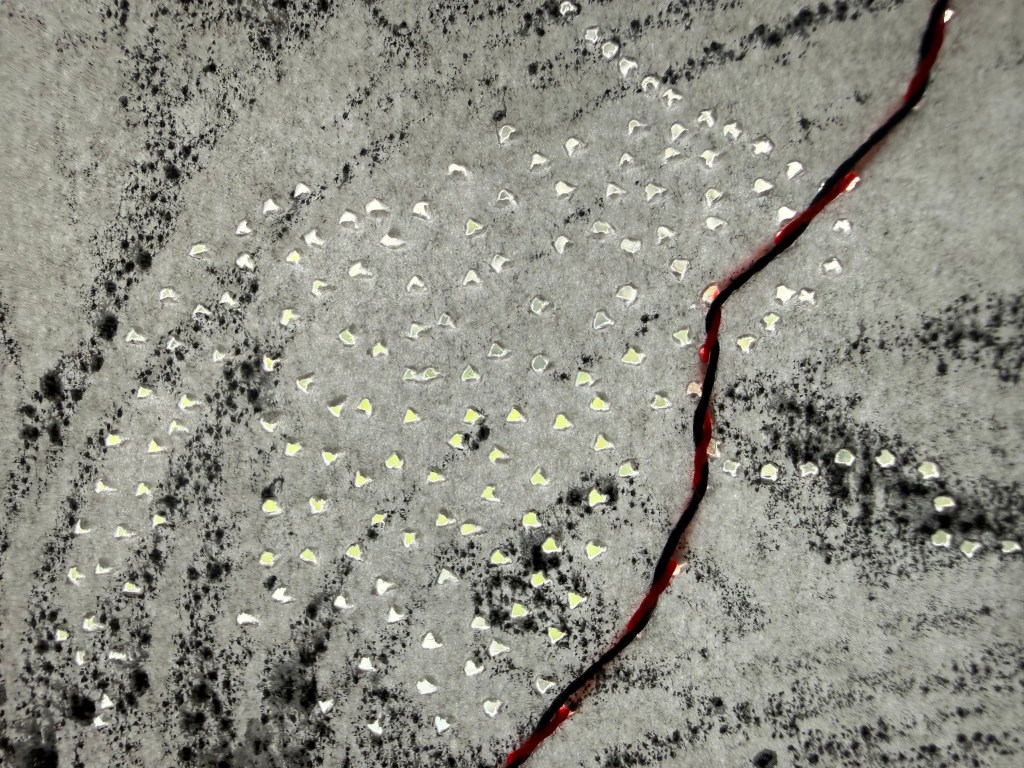
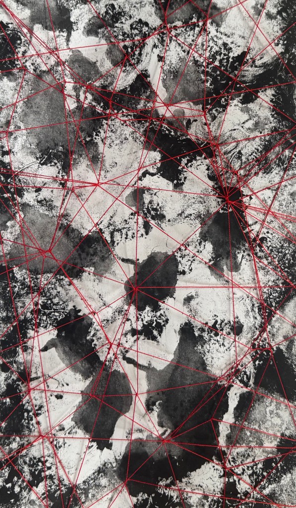
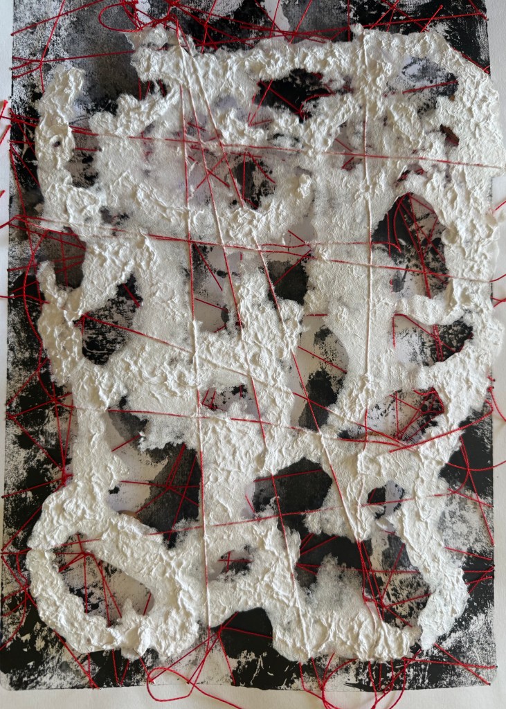
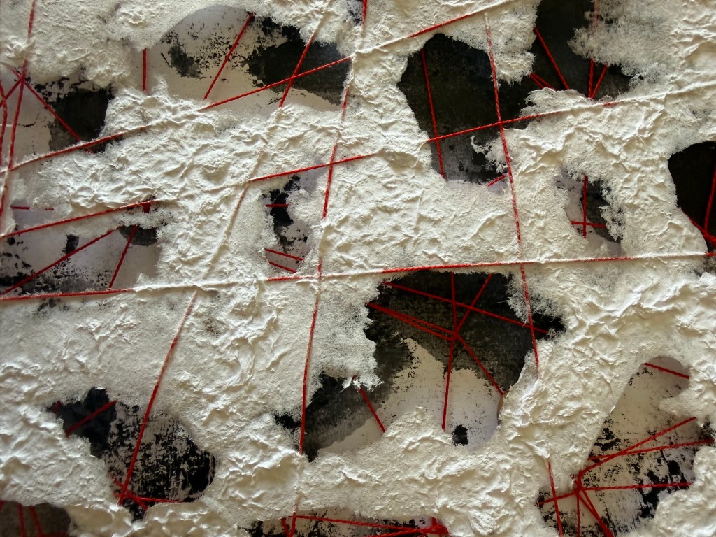
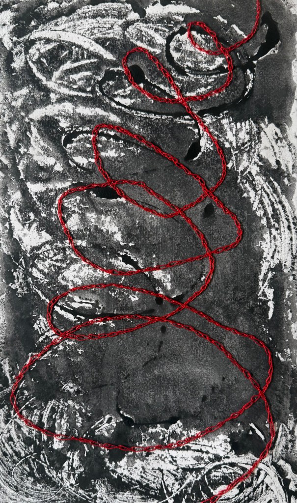
After they had dried, I decided to add another layer, another process – I used thread. I played around with the burnt paper and threaded paper I made the other day.
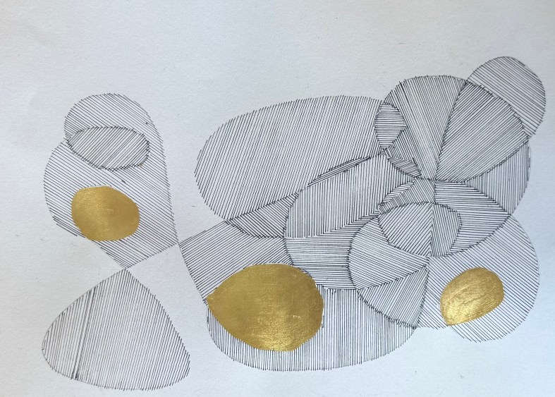
My daughter walked in while I was doing the next one – oh, do different stitches she said. I’m not making an embroidery sampler I replied, but then I did end up experimenting with different stitches and combinations of colour. I much prefer the lines in which the stitches aren’t apparent – where it looks like a line made by thread.
I punctured the paper from the reverse to make raised bits to add texture – nothing new, I’ve seen a lot of it on Instagram.
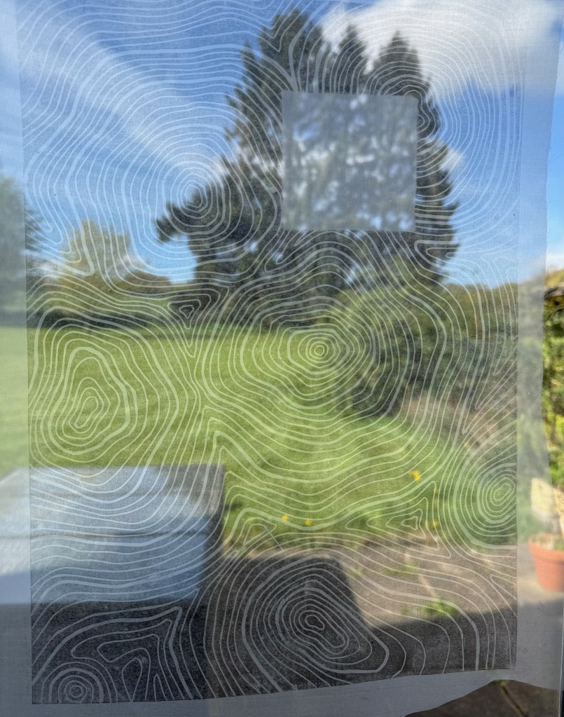
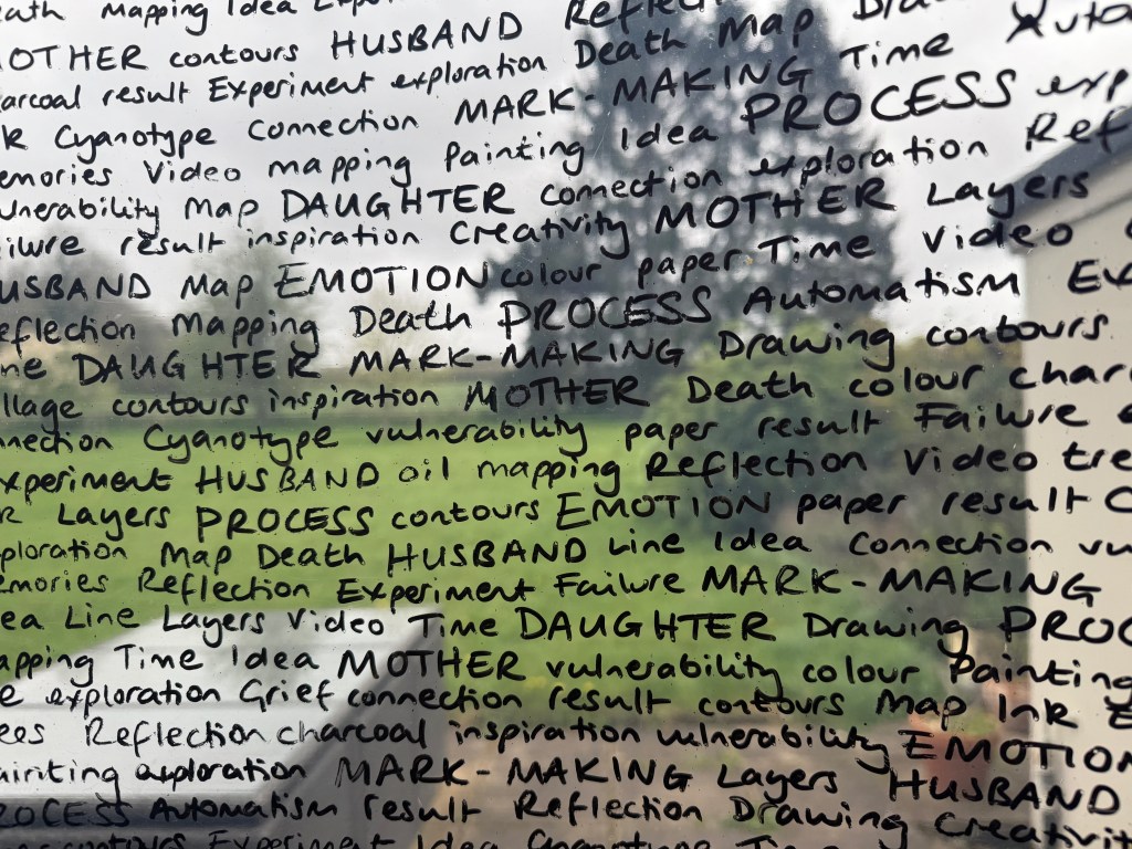
And held up against the window:
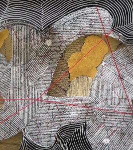
I’m still thinking about Shiota’s threads.
And threads on top of threads.
Originally in this post, I wrote about an incident in my childhood in which my mother intentionally tried to disassociate herself from me by walking away when I was not feeling very well. I published the post but then deleted the passage. It felt unnecessary because this image is enough.
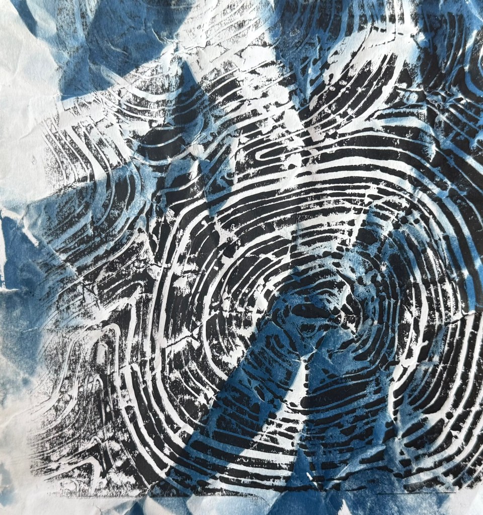
I’m interested in trying combinations of processes, like print over cyanotype. I used a piece of scrap cyanotype for this one and I like the effect – I’ll experiment some more.
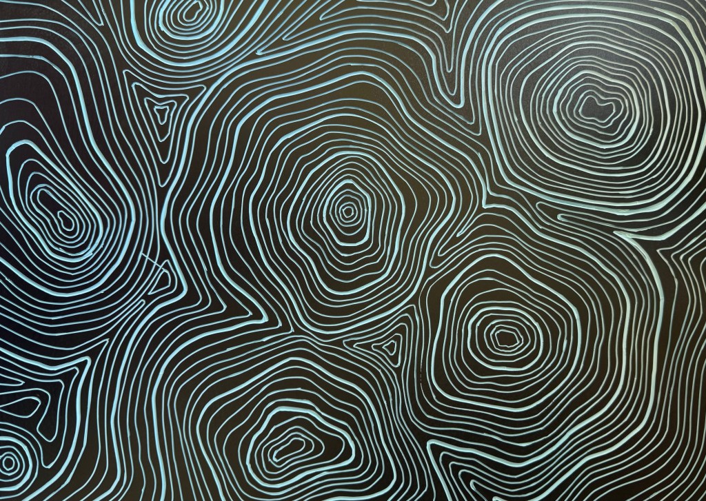
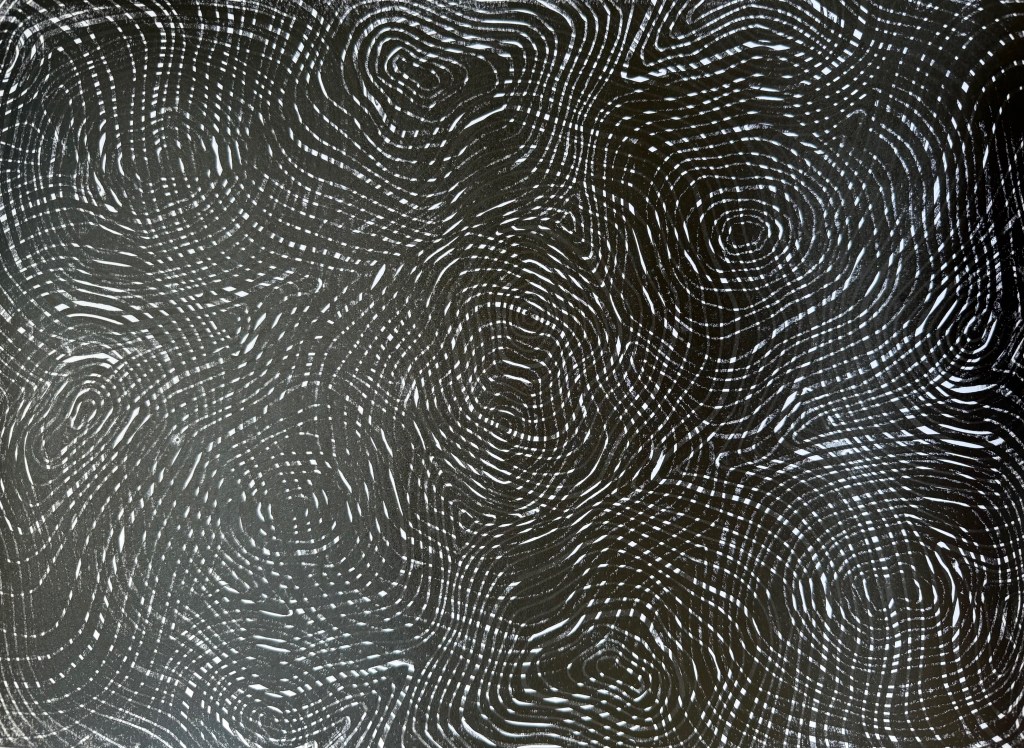
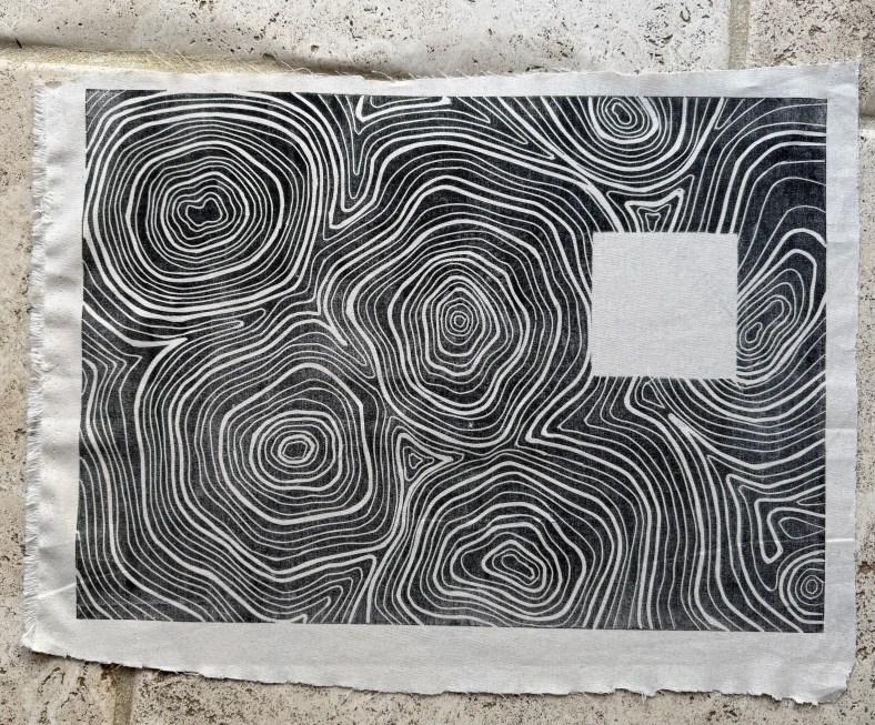
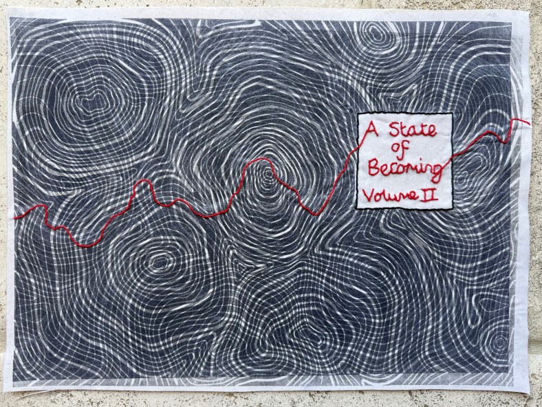
I’ve been making the book cloth for the second book. This time I lino printed onto a sheer fabric and a plain cotton.
I need to sharpen my cutting tools – there was slip on the left side. I’ll be able to cover it up with the mask for the title block.
Overprinting on paper
Print on sheer fabric
Print on cotton fabric
Fabrics bonded together and backed with mulberry paper and addition of title.
For the end papers I asked my husband and daughter to draw some more outlines for me to fill. I’d been experimenting with not using straight lines.
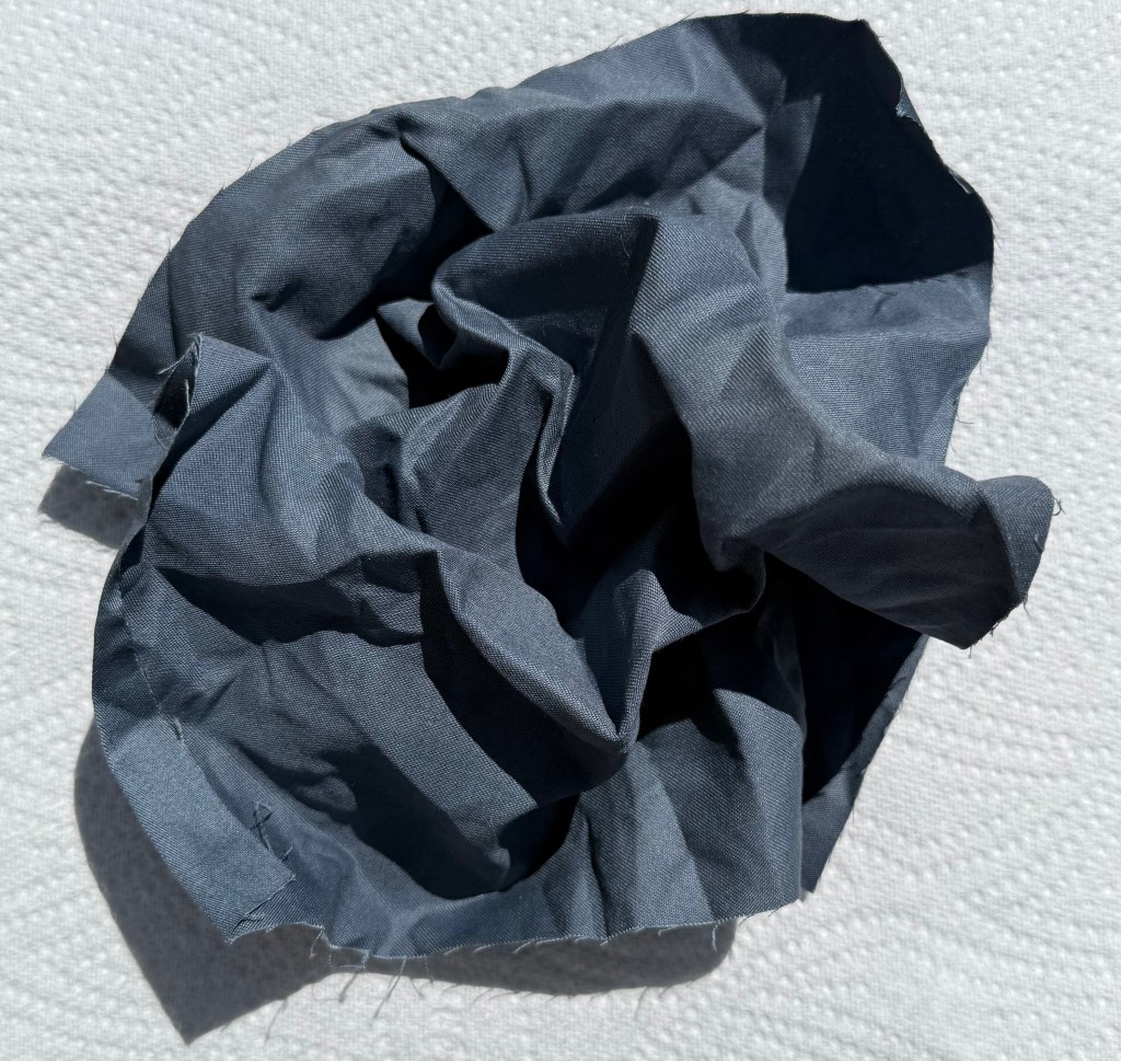
I then redid the cyantotype for the remake of Volume I. Whilst I was waiting for it to develop, I scrunched a piece of fabric up and left it outside. I was pleasantly surprised by the result.
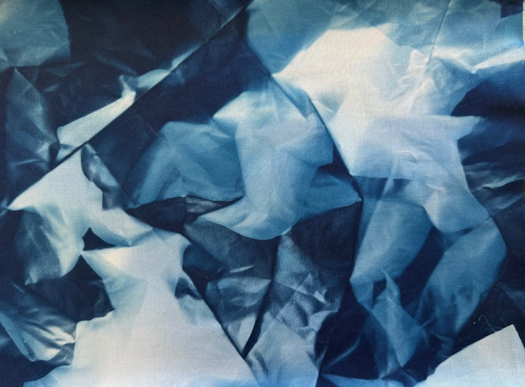
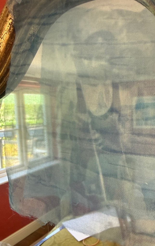
Whilst I’ve been contemplating the book cloth that I might make for the second volume of the book, I cyanotyped an image onto some sheer fabric. Cyanotyping onto fabric is something that I’ve been attracted to and tried, somewhat unsuccessfully, over the last couple of years. As early as the Interim Show I had visions of long billowing swathes of fabric.
But what caught my attention was the effect when I held it in front of a mirror, almost like the effect of the 3D printed images you get on postcards and bookmarks. I’ve still got a sheet of mirrored acrylic from my ‘A Die and A Log’ and I thought it would be interesting to experiment with layering images over each other on top of a mirrored surface. I toned the image with coffee to see what it would like other than in blue. I also wondered about using a different process – solar plate printing is something that’s been on my radar for a while, but I think that it can be quite tricky and it’s probably something best learnt in a workshop setting – again something to think about for the future.
It’s impossible for a photo to convey what the eye can see, and also I may need a better image.You can just about make out the reflection of the second head.
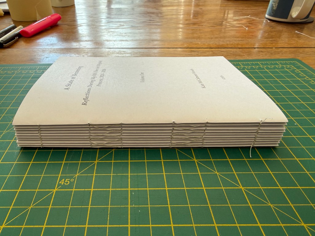
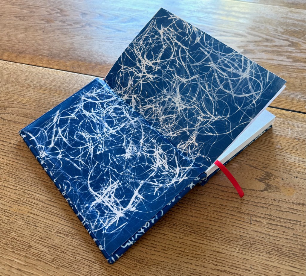
I haven’t made a book before. I’ve watched a couple of YouTube videos. I told myself not to have any expectations.
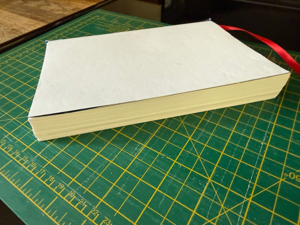
I copy and pasted my blog posts into Word booklets. Each booklet is 5 A4 sheets which is 10 sides and therefore 20 A5 pages amounting to 1 signature. The book will have 10 signatures (totalling 200 pages) and already I know that there will be more than one volume.
It was a laborious task of formatting, copying and resizing the images and creating QR codes for the videos.
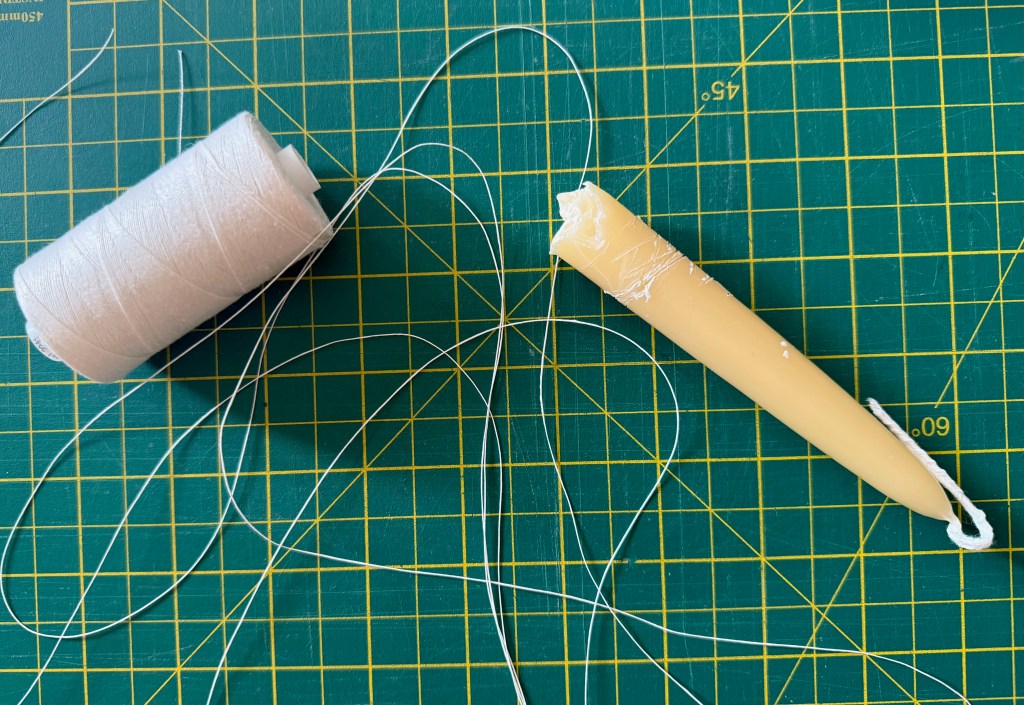
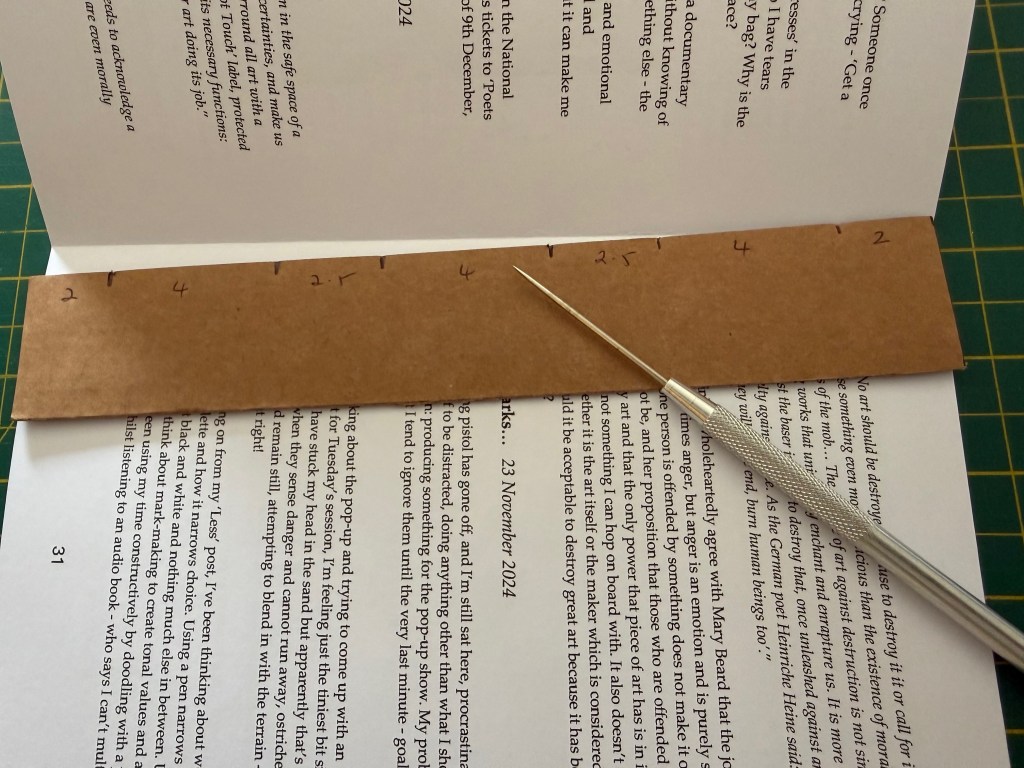
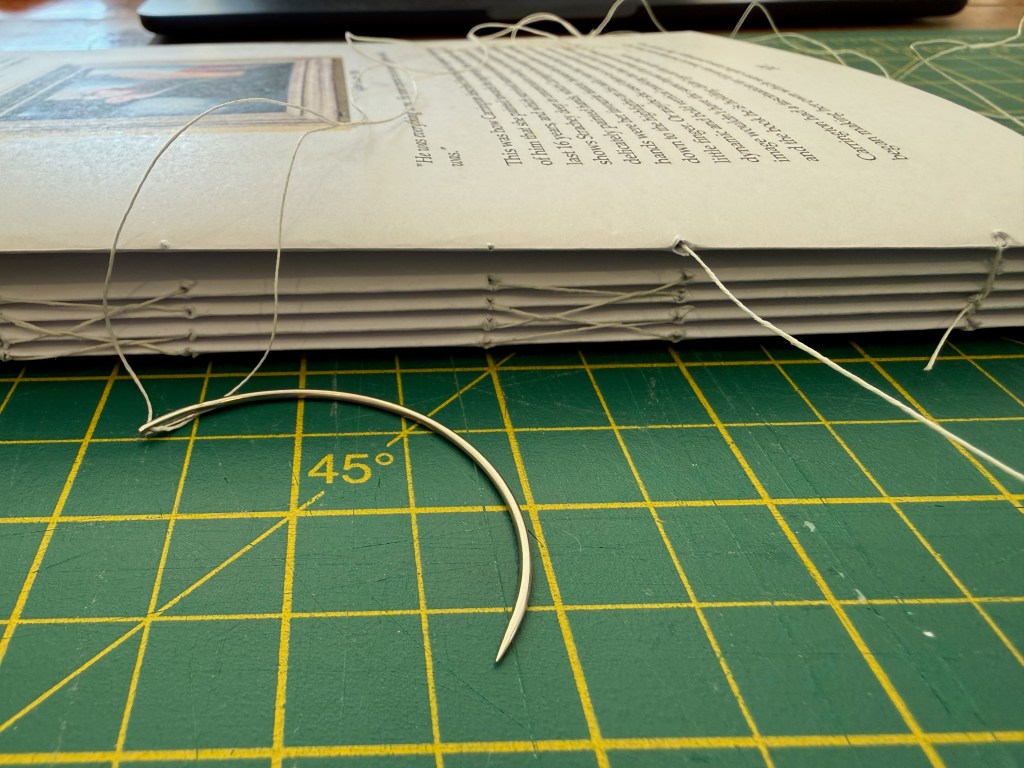
Having printed each of the signatures and folded them, I set about sewing them together using linen thread, which I waxed using a beeswax candle, and an upholstery needle. The wax helps prevent the thread from fraying and tangling. First, I had to use an awl to puncture the holes.
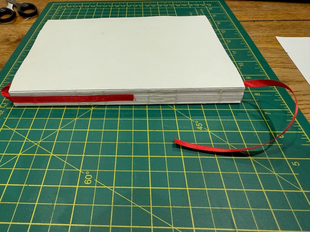
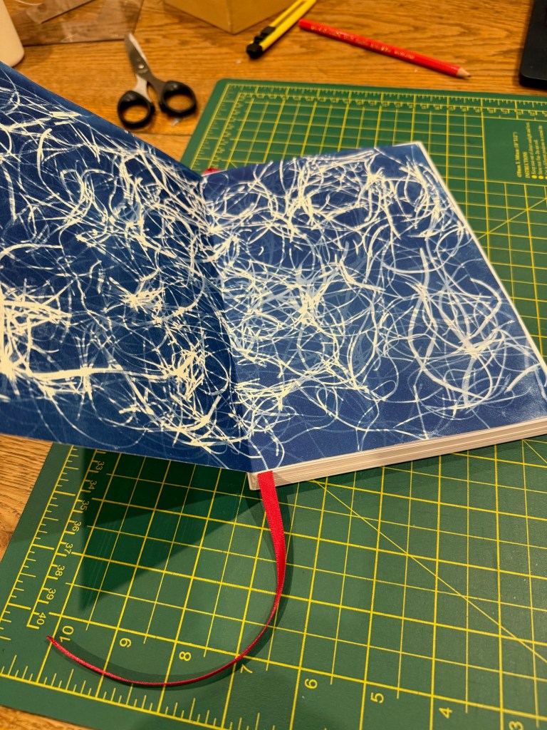
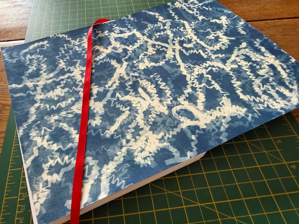
Then I applied two layers of archival PVA glue to the spine and attached the ribbon.
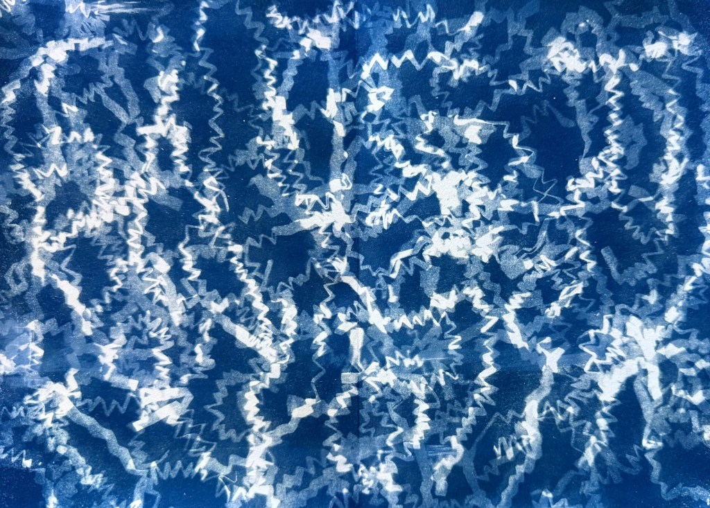
Next I had to attach the end papers. I decided to use a couple of cyanotype prints that I had made using the lino cuttings and the shredded cardboard.
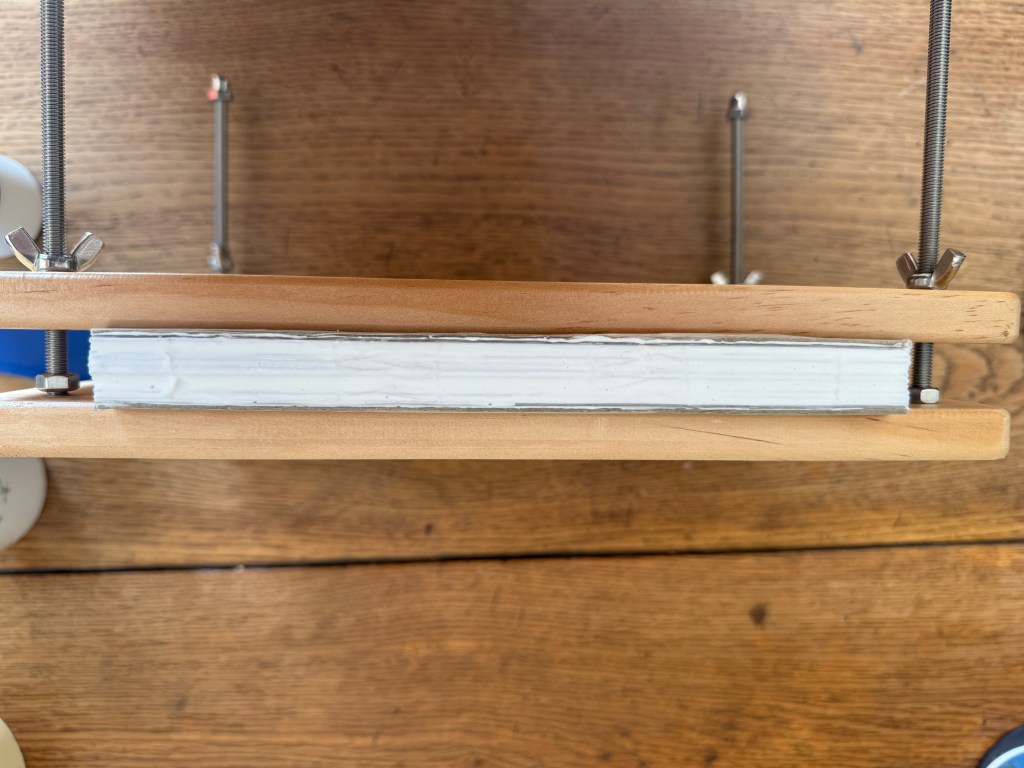
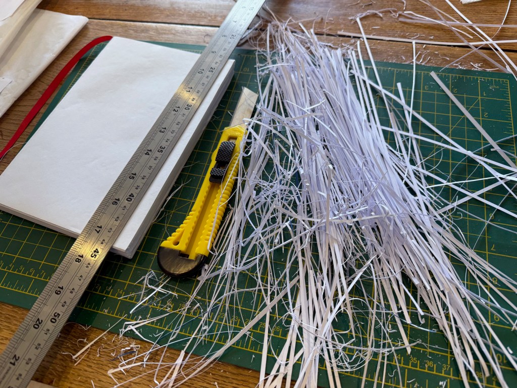
The next step was to trim the edge of the text block. When the paper is folded into signatures the outside sheets have further to wrap around and so protrude less than the inner pages. When they are sewn together it creates a zig zag effect down the edge of the pages and so this needs to be tidied up. A stack paper cutter would be ideal in this situation but the woman in the video successfully used a metal ruler and a craft knife.
This is where it all started to go wrong. I think that the craft knife I used was too lightweight and the blade flexed so that the cut edge was all over the place. I tried to remedy it by re-trimming and unfortunately it turned into something akin to the time I trimmed my daughter’s fringe and in repeated efforts to level it out had to resort to taking her to the local hairdresser to get it fixed – ok, made to look less awful.
In an effort to straighten things up I clamped the text block between two pieces of grey card and used 220 grit sand paper to smooth down the edges, which seemed to make it a bit better. I appeared to be back on track.
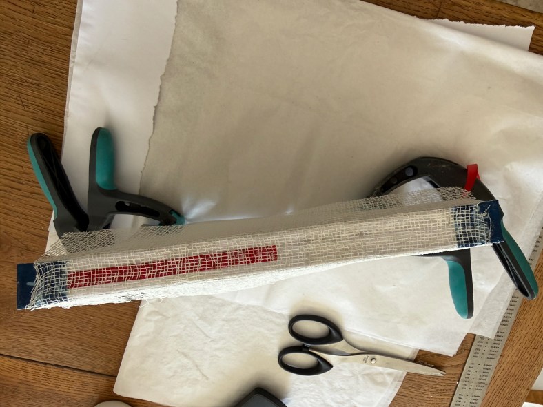
The next stage was to make and attach the head and tail bands, and the mull.
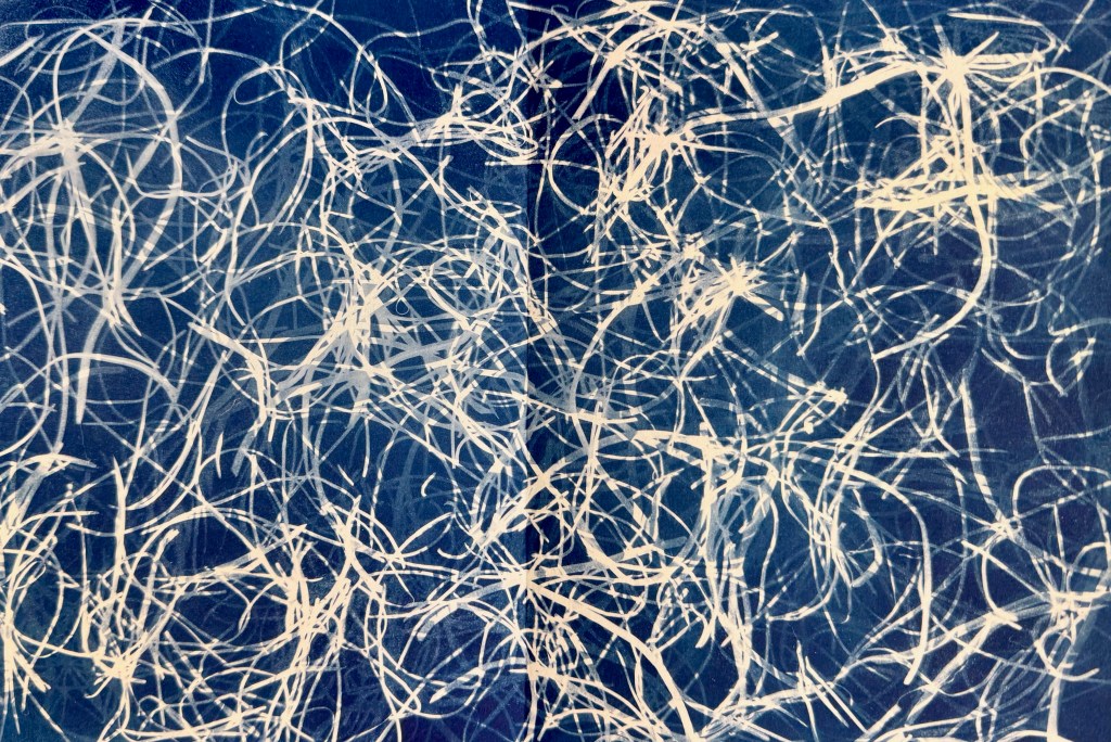
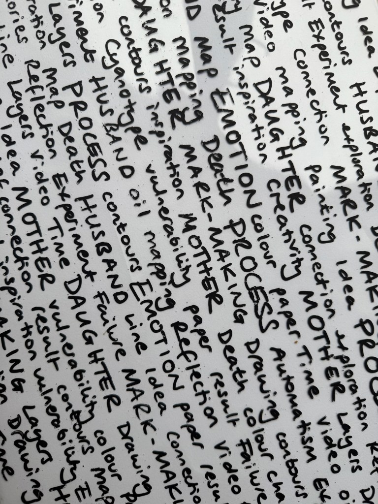
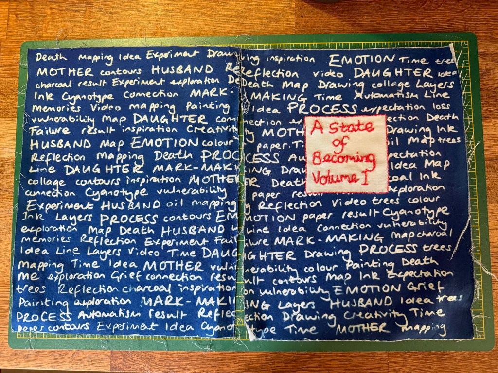
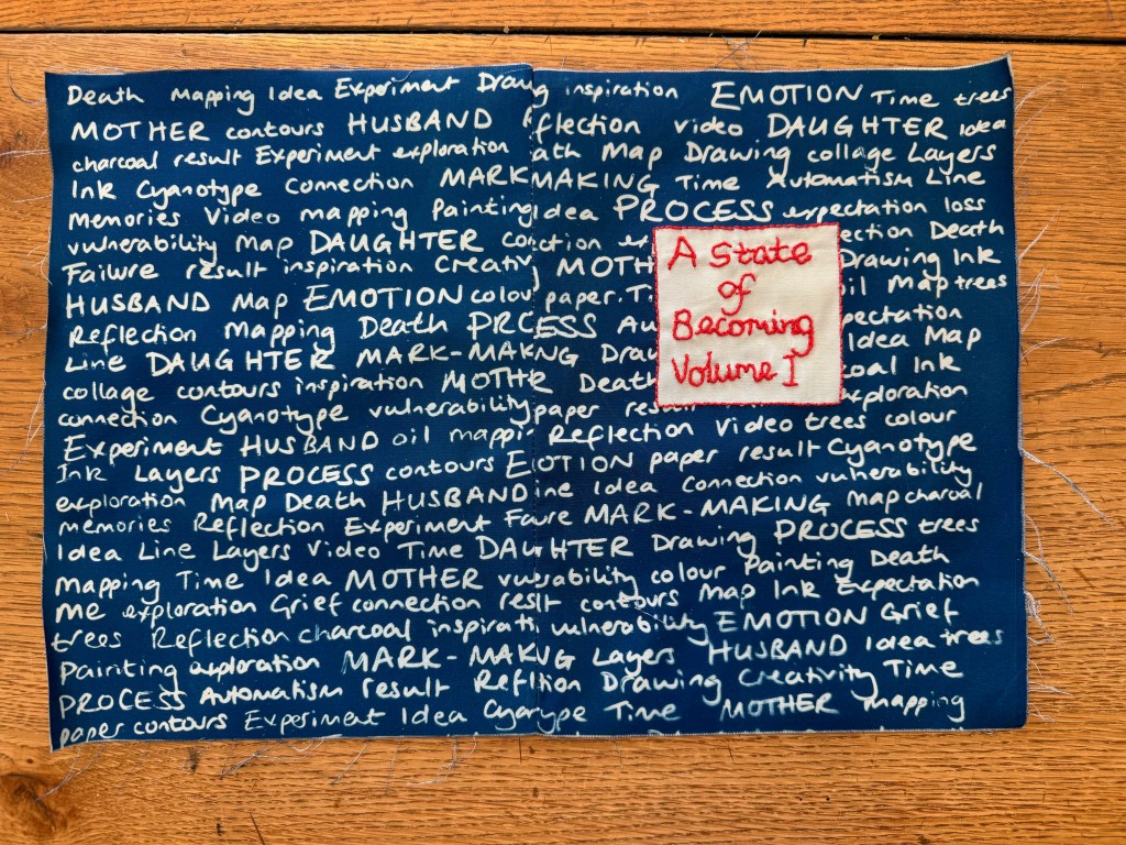
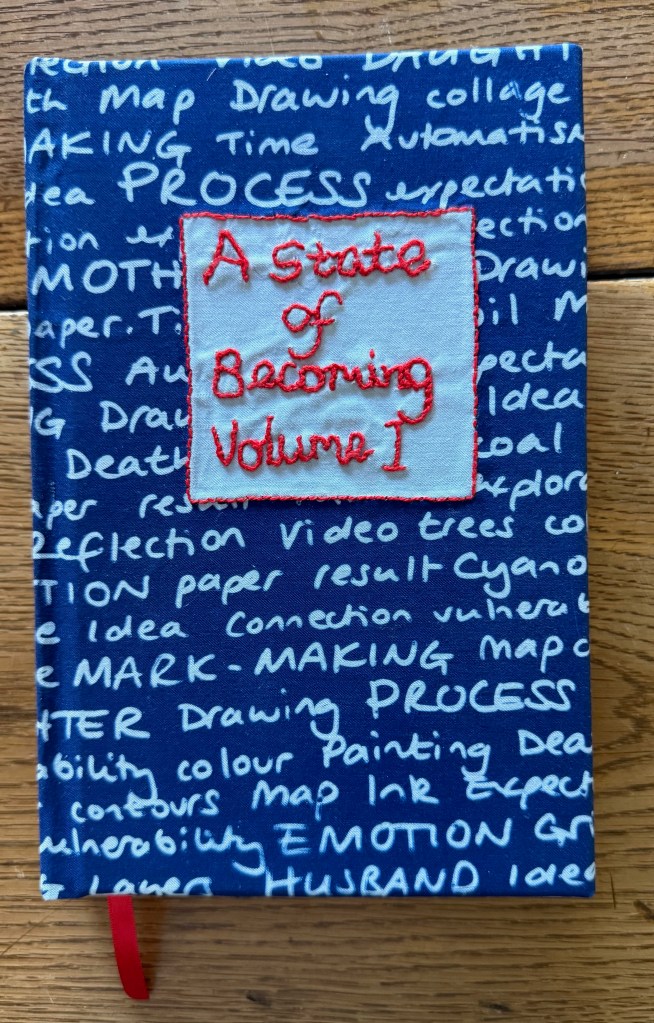
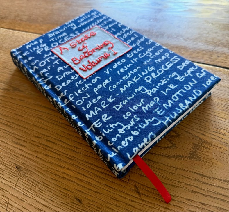
I then had to start thinking about the cover. I decided to make my own book cloth and made a cyanotype using some of the main words from my blog’s tag cloud. I wrote them onto an A3 plastic sheet and used some pretreated fabric, which unfortunately only came in A4. I masked out an area onto which I then ’embroidered’ the title.
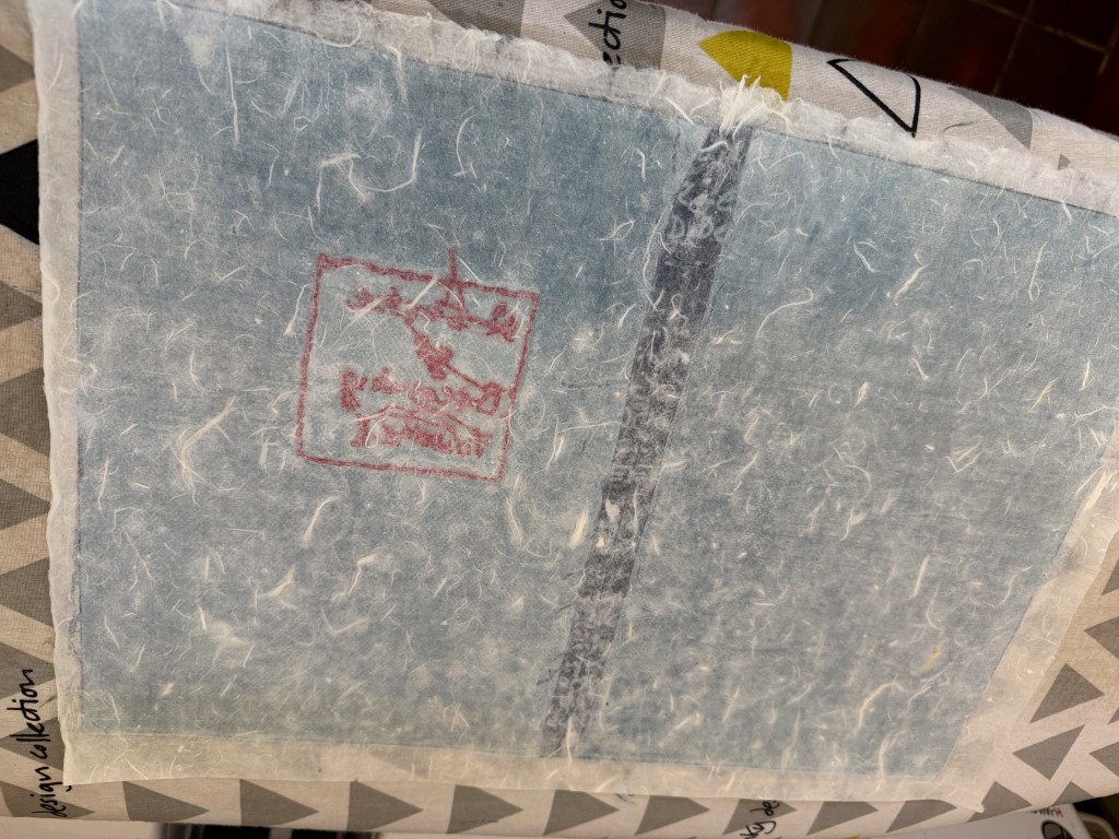
To make it into book cloth I sewed it together in such a way that the seam would run down the middle of the spine – unfortunately because of the measurements I couldn’t do it so that the words matched up. I attached some Japanese mulberry paper to the reverse using Heat and Bond.
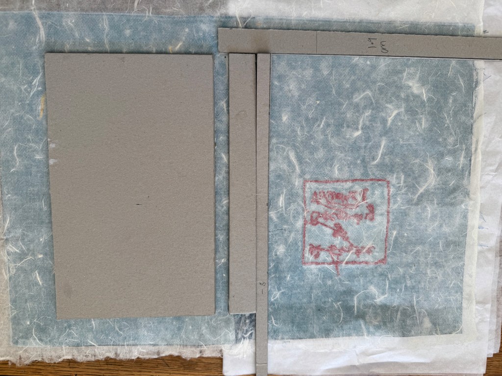
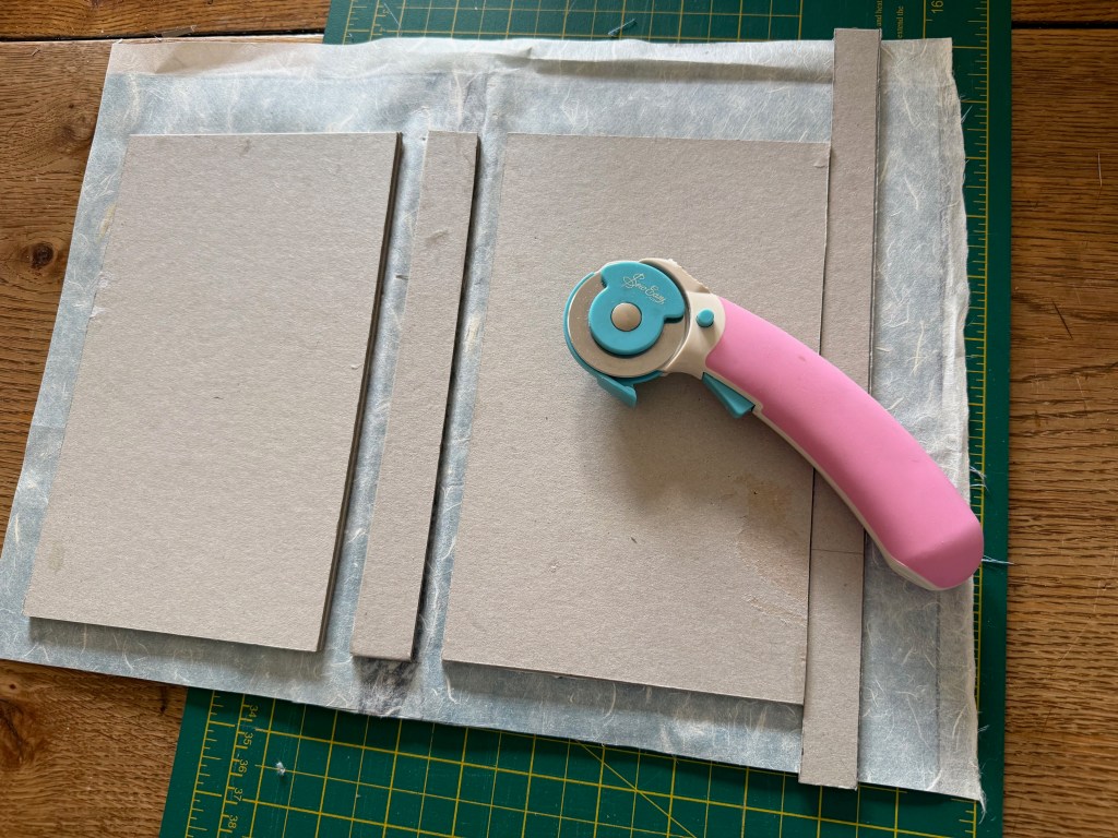
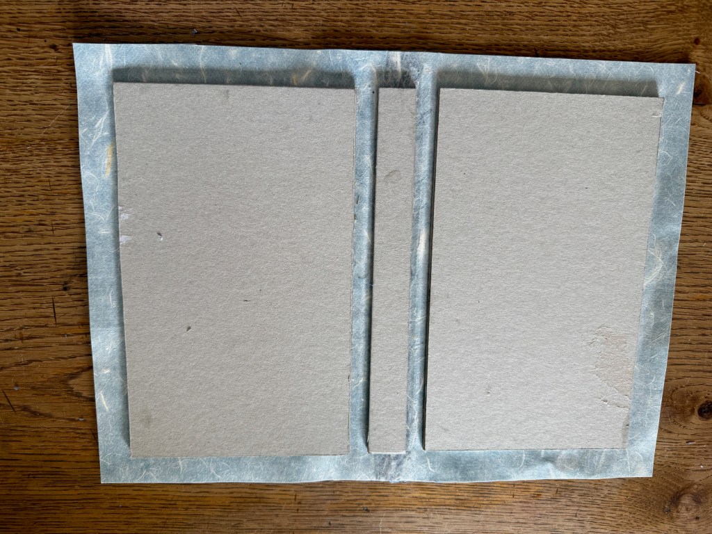
I then measured and cut the front and back boards and the spine, and then taped them together to see how they fitted the text block. The idea was to trim the long edge of the front and back boards so that they overhung the text block by 3mm. And this is where it went irretrievably wrong. I’m not quite sure what happened.
I don’t usually do fiddly and I thought that I was being extra careful in my measuring and cutting but something went wrong somewhere and 3mm doesn’t leave a lot of wiggle room. When I had folded over and glued down the edges of the book cloth I tried putting the text block inside only to find that not only was there no overhang but that the paper protruded beyond the edge of the cover in some places.
I tried removing the spine board and replacing it with thinner card and sanding down the edge of the paper. Eventually it fitted so that there was a miniscule amount of overhang but the price was that the text was very close to the edge of the page. Nevertheless, I carried on because I wanted to complete the process.
So there we have it.
What do I think? I’m amazed that I’ve managed to produce something that looks like a book. For a first effort I’m pretty pleased with it. I feel like it’s a real achievement. Obviously there are some major issues with it but on the whole apart from the last stage I think it went quite well. I really like the cover and the end papers – I think that they work really well. I clearly didn’t set out thinking that it wouldn’t work, otherwise perhaps I would have used substitutes as I’m now going to have to make them all over again. But now that I know what I’m doing and where to be careful, it won’t take as long.
I will remake this book, but not yet. I need to feel like I’m making some progress so I will get going on volume 2, which will hopefully go a bit better, and then come back to it.
On the whole it was an enjoyable process – I enjoyed learning something new. What will I do differently next time? Oh, quite a bit! It was a great exercise from which I learnt:
accuracy in measuring and cutting is crucial
I need to get a more robust craft knife or alterrnatively contact my local printers to see if they can do the trimming for me.
The paper used for the end papers was cut from larger sheets and either wasn’t truly A4 in size or had shrunk after the cyanotyping process as they turned out to be slightly too small, but as usual I thought that I might be able to get away with it. I didn’t. Next time I should make them larger and cut down to size before attaching them to the text block.
Change the font and size of the page numbers
Think about where the thread is on the reverse of the title – connecting threads can cause lumps and bumps once the mulberry paper is bonded to the fabric
I need to adjust the margin settings – I allowed for an inside margin of 1.5cm plus a 0.5cm gutter and an outside margin of 1.5cm. Once the book was put together the inside margin turned out to be quite generous whereas the outside margin turned out to be problematical after my attempts at trimming. I think next time I will reduce the inside by 0.5cm and increase the outer by 0.5cm.
What I find intriguing is that the act of researching and making this book to document my becoming, is itself part of the process of becoming.
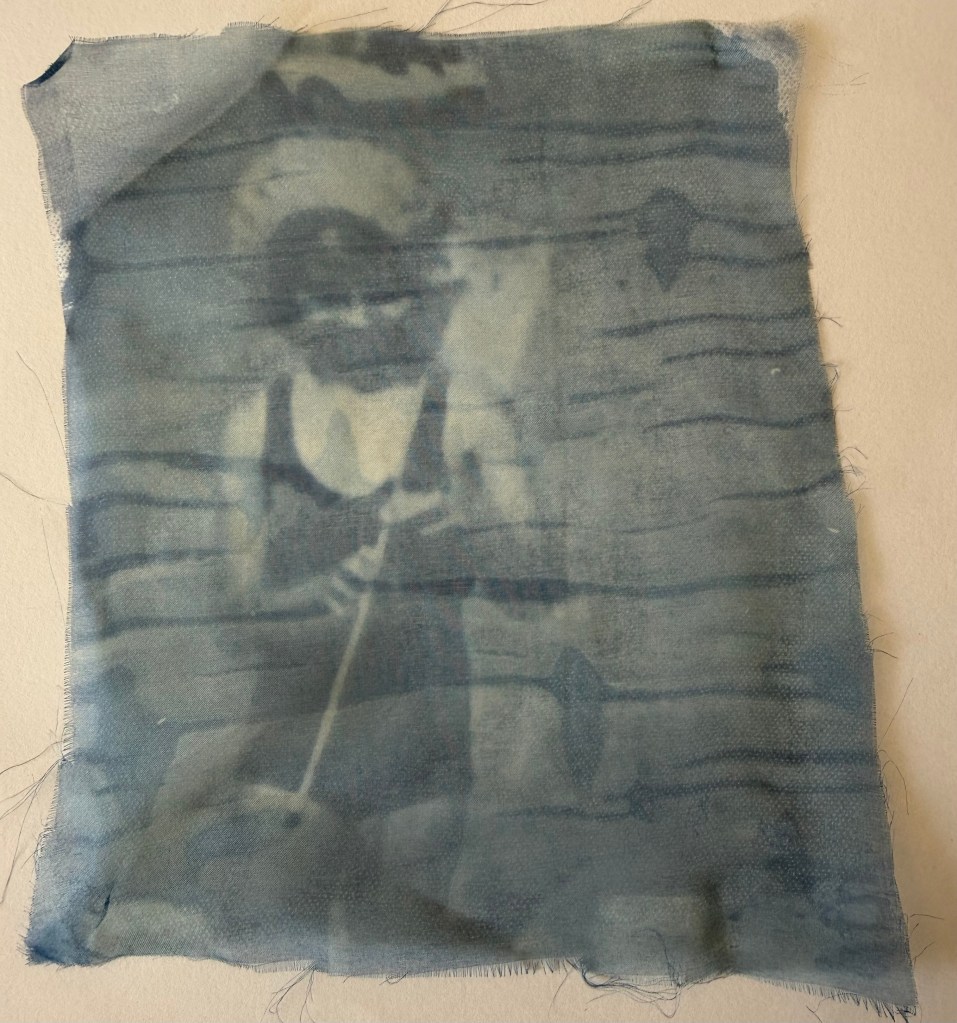
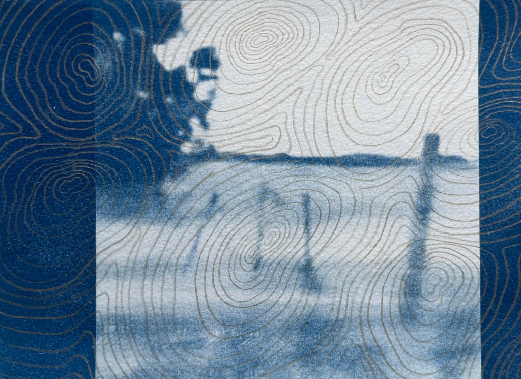
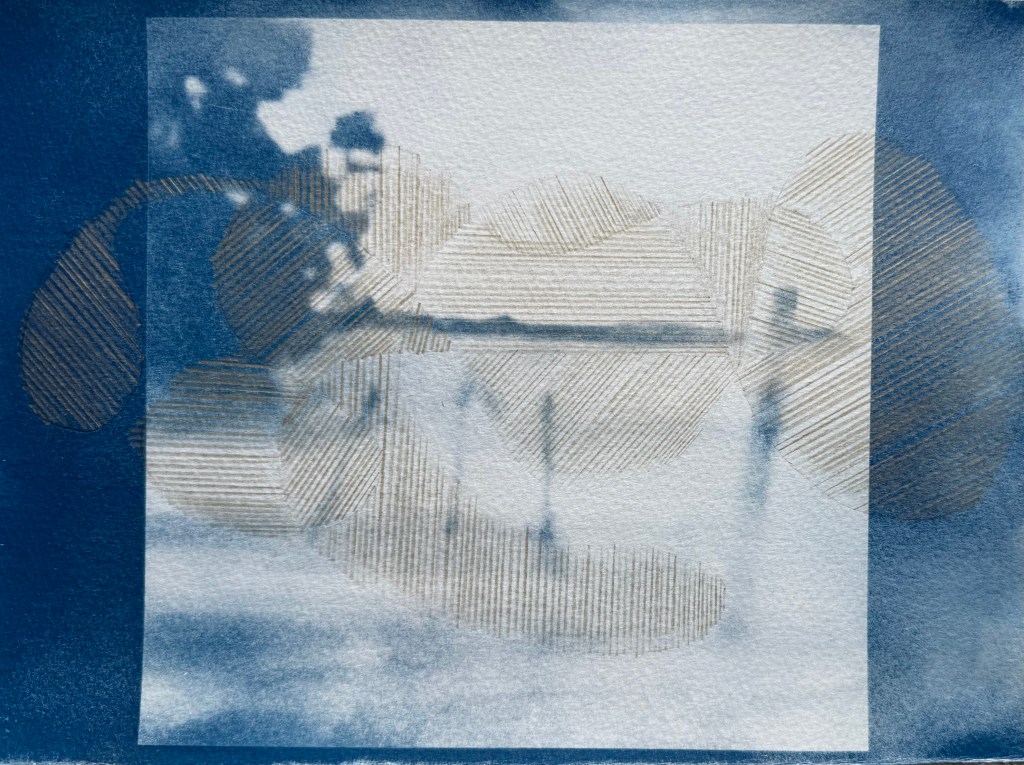
I was interested to see Jo Love’s remediation of old black and white photos using metallic pencils, in our session a couple of weeks ago. Photographic images quite often form the basis of my work. I decided to experiment with gold and silver pencils on some old unsuccessful cyanotypes I made from the video stills in In A Flash. The results were varied.
I used the silver pencil first but thought that it didn’t stand out enough. On reflection I think there is a subtlety about it which I like, and perhaps it would have been a better choice than the gold.
I’m not particularly drawn to any of them, but if I had to make a choice I prefer the last two images, particularly the last one. What works for me are the marks outside of the original image, the sunlike shape on the left and the drifting cloud on the top right. The overdrawing creates an image within an image, something which always appeals to me. I think part of the problem is the fact that the images are on watercolour paper which wasn’t overly receptive of the pencil. Overdrawing does appeal to me as a concept, though.
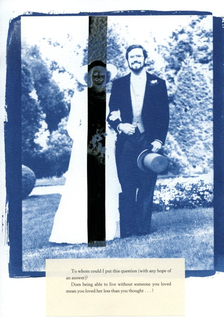
On my wedding day, my mother lent me her handkerchief. I never gave it back; I wonder whether that means that it wasn’t borrowed but appropriated, and does that affect its power to confer luck? Probably not, as I only intended to borrow it, and besides as it was over 20 years ago, I think it conferred the requisite good fortune of my mother’s happy marriage.
What’s cyanotyping without a bit of lace?
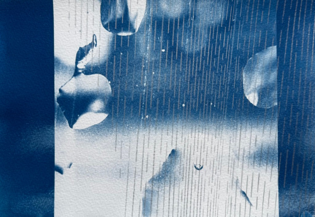
I’ve also been doing some doodling. I came across an American cyanotype artist, Marie Craig, who uses highlighter pens on her cyanotypes, so I gave it a go on the prints which didn’t really work in Out Of The Blue.
It’s an interesting effect. I’m not sure what I think about it. Maybe it would work better on a different style of image, one with defined lines as opposed to the organic shapes in these images. I’m definitely not ruling it out.
I also took an unsuccessful print of the digital image I made recently and experimented with drawing on it in pen. I had no plan in mind, and just followed some of the shapes. It was a mindless activity, just doodling. Several areas are not particularly successful, but I like the combination of the cyanotype and the pen. I’m not sure how I might use it; I think that I need to explore using some different images.
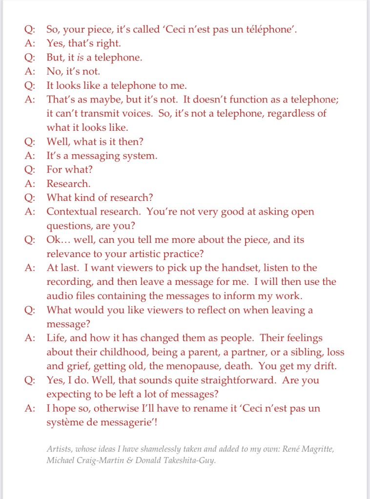
My main piece is the telephone. I’ve managed to figure out how it works – now I’ve just got to record my message which I think will be quite short and to the point.
I struggled for a while to come up with a way to indicate that it is an interactive piece. Also, if I’m going to use the audio files as well as the content of the messages in future work, I think I should say as much so that people have an opt out if they’re not happy with the possibility of their voice being used.
I was trying to get to sleep the other night, tossing and turning, when it came to me – I’d do what Michael Craig-Martin did for ‘The Oak Tree’ i.e. have a transcript of an imaginary conversation between me and a third party.
So I came up with this, which I will display alongside the telephone. And yes, I’ve also ripped off Magritte, and used Donald’s comment from a few sessions ago about mobile phones not really being used for their primary purpose, making and receiving calls, but for messaging etc.
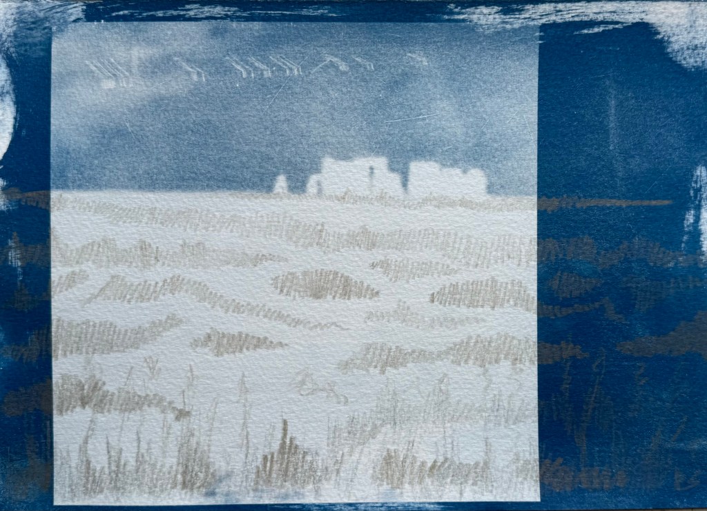
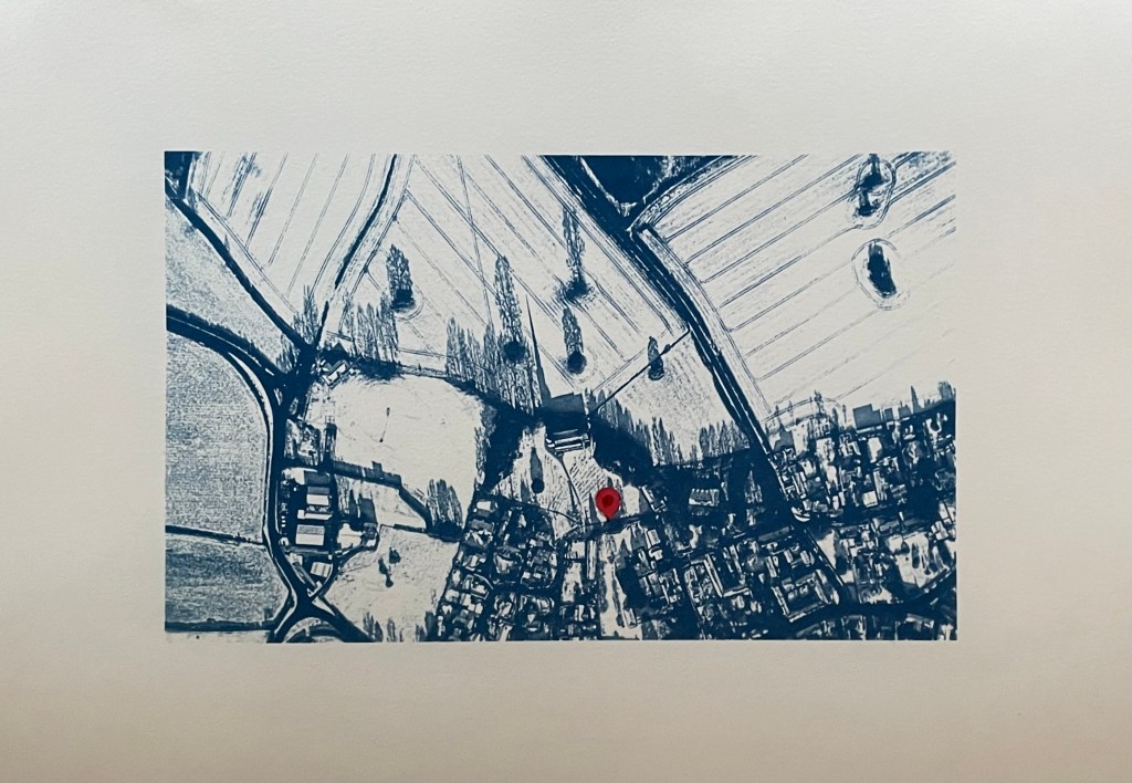
I’ve also had another bash at the cyanotype of the aerial view of the village. I couldn’t get it right on A3 for some reason as the detail of the fields just wouldn’t stick. I tried so many times but I think that because I was doing it quite late at night my brain just stuck, and instead of stopping and leaving it for a while so I could reflect on it with some distance and clarity, I just kept on making the same mistakes over again which made me feel really frustrated. I’m going to park it for now – it could be something to do with the height of the UV lamp.
So I’ve gone back to the smaller negative and printed it on A3 and added in a location pin. I’ve decided to call it In Loco Parentis. I feel much better about it now, and, on reflection, A3 would just have been too large an image for something which is quite intimate and personal.
I’ve also tried doing a triptych of the view from my window. I had initial success in finding out how to split the image into 3 equal parts and printing separate negatives for each. After that it just went downhill; it has been so difficult to get any consistency between each of the separate sections because I’m doing them each individually and there doesn’t seem to be any rhyme or reason as to why they turn out differently despite using the same solution and applying it as consistently as possible, exposing for the same amount of time and washing out in the same way. I even tried to make sure that the temperature of the water was the same by starting to run it at exactly the same time before the exposure had finished, but the difference in results between them was staggering. I’ve now got lots of different sections, and having sorted through them all, these three are the best fit that I could come up with.
I think I might sort out the sizing a bit more and then fix them to another piece of watercolour paper.
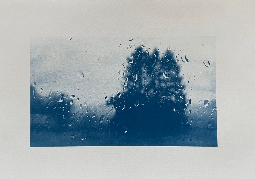
Disheartened by the exercise I did the same as with the aerial view, took the original negative and printed it on A3. It was much more straightforward, and made me feel an awful lot better. Is it a bit boring? I don’t think so as I think you get a much better sense of atmosphere, and I’m trying to change myself to subscribe to the view that less is more.
As I took the original photo on New Year’s Day, I think I’ll call it, Another New Year’s Day. On reflection I think I prefer it. I’m not sure that disjointed views really do it for me, but then again I didn’t think that I liked collage.
In addition to the pieces above, I’m taking along Motherhood I which I’ve had printed on A1. I’ll see what seems right on the day.
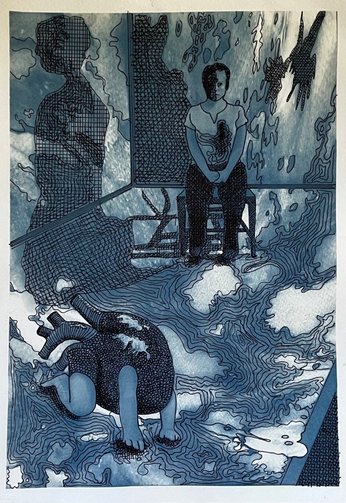
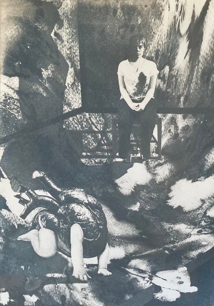
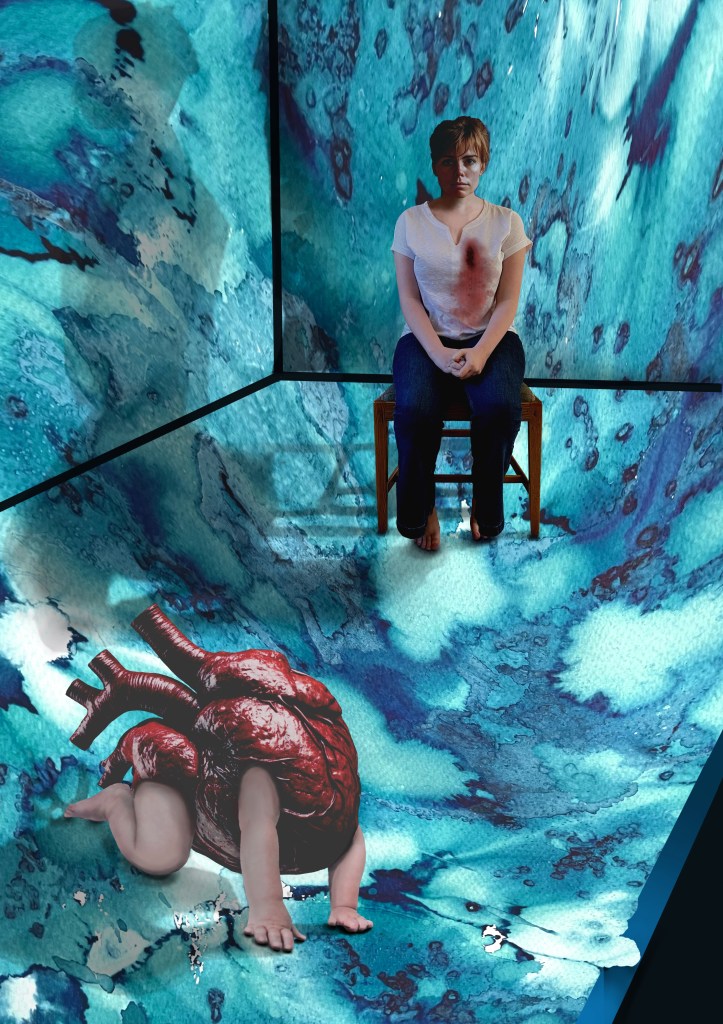
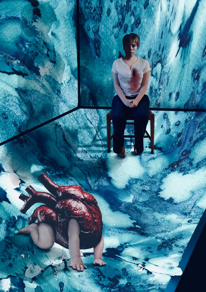
I have had an image in my mind for months. It came from the Elizabeth Stone quotation, I first mentioned in Hearts & Linos .
”Making the decision to have a child – it is momentous. It is to decide forever to have your heart go walking around outside your body.”
I think it encapsulates perfectly how I felt when I became a mother. My whole world was turned upside down. I was suddenly responsible for raising and protecting another human being. I felt overwhelmed by the magnitude of it all; that life would never be the same again. It made me question the sort of world I had brought her into, how her life might be; how much of it I would be a part of, the unthinkable and unbearable pain I would suffer if anything happened to her. She was precious and intrinsic to me, now living and breathing in the world, independently of me.
Original VersionDramatic FilterCyanotypeCoffee Toned CyanotypeAltered background and darker tonesDramatic Filter.Dramatic cool Filter. Worked on hands.
It’s taken a while. Bearing in mind that I’m still finding my way around Procreate I don’t think that I’ve done too badly. I’m sure that I’ve done lots of things incorrectly, but I don’t really care. It’s all a learning process and it was fundamentally about me trying to realise an image that I had in my head. I feel that I’ve achieved what I set out to do. In that respect, I’m pleased with it. I think it conveys the visceral nature of my feelings.
Actually, it has taken me more than a while; it’s taken ages, probably because I kept on making mistakes, but I have learnt lots along the way. I’ve redone parts of it several times but I have to say that it has all been about the process of discovery and realisation. It’s allowed me time to focus on the detail, but it’s been as part of the process rather than with a view to trying to achieve a perfect result. I don’t think that Procreate is a tool with which I can be loose and expressive in the physical sense, but it seems to satisfy that part of me that likes to focus on surreal detail every now and then. Hopefully that will allow the other part of me to enjoy the experimentation of being looser and more expressive in my mark-making when, say, painting.
I decided ages ago that I wanted to incorporate my ink experiments as a background to a collage type piece. I sourced the heart, crawling baby and head of the woman from royalty free image sites which allow for reproduction of the resultant work, if need be. The body is my daughter. She’s a bit freaked out by someone else’s head being on it, but I wanted a neutral character, and I couldn’t find an image of a woman sitting on a chair that fitted my requirements, so I roped in a free model.
It was challenging constructing the crawling heart. I’ve had to rebuild parts of it including the hands as some of the fingers were hidden in the original image. It was quite difficult finding source images whose licences allowed me to do what I wanted to do, and were also free. I’ve played around with editing effects and colours and I think that I’m settled on the last image for now. The slight greenish tones, complement the red heart. I really like the cyanotypes, but unfortunately there isn’t enough tonal variation and the slightly chaotic background loses its delicate tonal transitions in the process. I might try again but change the background to something a little less busy. But I like the historical, almost Victorian Penny Dreadful feel to them. I might develop it further, but I’ll leave it on the back burner for now.
The time delay video created by Procreate is of epic proportions, but it’s helpful for me to watch it back so I can see what a song and dance I made of it all. This is a shortened version.
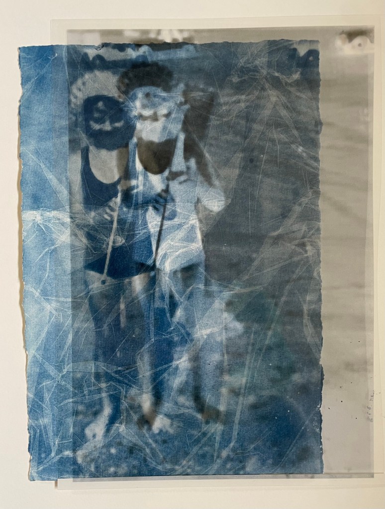
After my disaster trying to do my own, I managed to source some pre-treated fabric and have another go. The result is quite good, but the clingfilm effect suggests that the fabric is creased which irks me somewhere deep inside. Also, I don’t think that I rinsed it thoroughly as some hydrogen peroxide seems to have discoloured the fabric in places. I’m not sure how I might use fabric based cyanotypes yet – I need to think about it, and look for some inspiration.
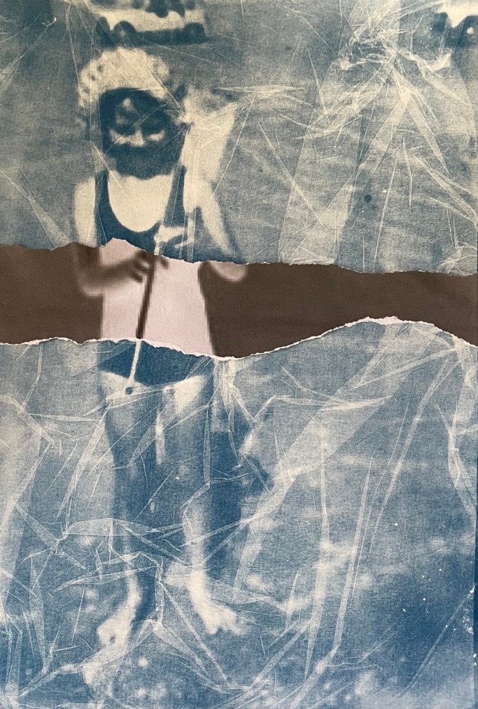
In the meantime, I’ve been experimenting with adding in sections of the negative print. I got this idea from these works by a visual artist and photographer from Luxembourg, Jean Bettingen who is interested in the constructs of identity, memory and self-representation. I also like his use of text to accompany the images. I’m guessing that he has overlaid the transparency over the top of the cyanotype.
I didn’t want to cut up my negative transparency just yet, so I printed it out and tore off a section. I think that it adds some extra interest, and I particularly like the way in which it’s not obvious which is on top, the cyanotype or the negative. It’s actually the print of the negative which is just lying loose on top of the cyanotype, but it gives a sense of distant space behind it. I tried placing the transparency on top of the print to see what that would look like and I’m intrigued by the effect, so when I’m feeling a little less precious about the transparency I’ll chop it up.
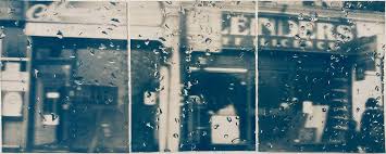
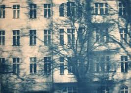
I also came across a German artist called Katja Liebmann, whose work records the energy, isolation and alienation of urban life.
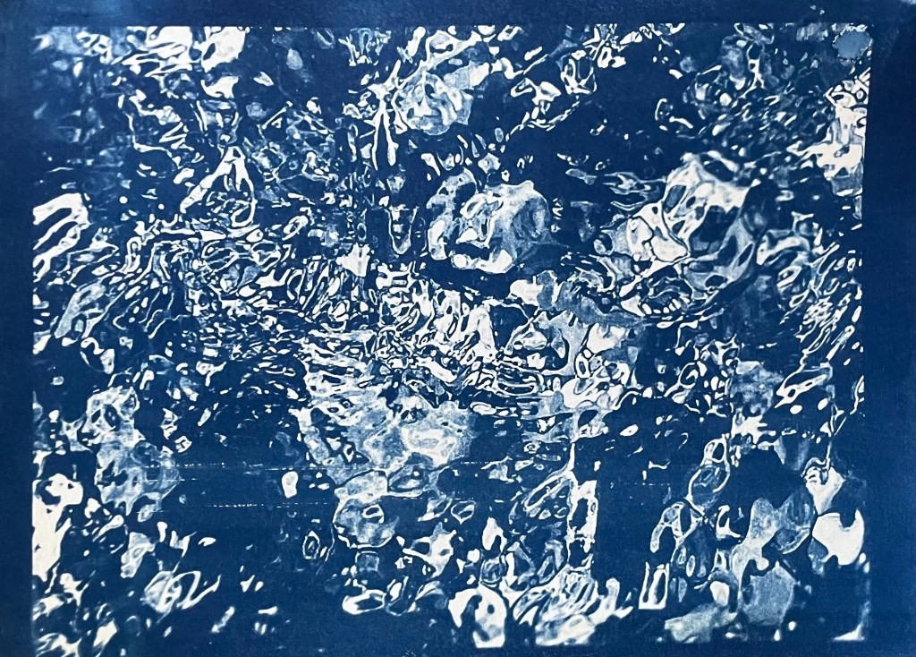
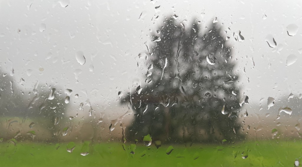
The water droplets on the first image reminded me of a photo I took out of my bedroom window on New Year’s Day this year. I hoped to myself that it wasn’t a taste of things to come.
I really like this image. It’s only A4. I’m going to try and do it as a triptych, like Liebman’s first image.