Making A Sound

When I went to the Pallant House Gallery to see Dora Carrington recently there was another exhibition on at the same time: Maggi Hambling – ‘Nightingale Night’.

Nightingale Night VI
Nightingale Night X
Nightingale Night XIV
Nightingale Night III
Nightingale Night IV

Hambling spent a night in a woodland in Sussex in the Spring of 2023 listening to nightingales. I didn’t take photos of all of the paintings – I think I was only drawn to some of them on the day, or maybe I was tired from exploring Dora, but Iooking again at the images on the identification labels, I’m regretting not having done so.

I’ve since read an entertaining interview with Hambling about the exhibition in ROSA Magazine – I like doing further research after I’ve been to an exhibition; never before.

I’m not entirely sure what I think about it all. I’m not sure that I like the gold on the black ground, although I can absolutely understand her reasoning behind it, and I do like a bit of gold. Does she succeed in communicating the otherworldly divinity of the nightingale in the darkness? The sense of it, absolutely, but the sound of it? I’m not convinced, and I think it’s the mark-making. The swirls and definite vertical and horizontal marks are successful, I think, in representing sound; my issue is with the drip-like marks – they don’t allude to the beautiful song of a nightingale to me; it’s more akin to me having a warble and eventually running out of steam and giving up. But I think I’m being harsh, because even she admits that it’s impossible to paint the sound of a nightingale, and that what she hopes to have captured is a sense of the fleeting moment. She comments:

…there wouldn’t be much point in painting a picture that it was possible to paint…”

It’s an interesting comment, one to think about.

It would be interesting to know whether Hambling made the paintings from memory, or whether she played a recording of nightingale song whilst she worked. I’ve assumed that it is the former because it’s about the whole experience, of being in a certain place at a certain time bearing witness to something extraordinary.

I have been carrying on with my pen doodling, some of which is unfinished – I became bored, and moved on. I also decided to give nightingales a go. The concept of representing sound in a 2-D form is really interesting – the consideration of tone, volume, intonation, rhythm etc. I’ve represented it in a linear way, thinking initially about sound waves, but it would be interesting to explore other methods of representation.

The song is so diverse and improvisational that it was very difficult to think of different mar–making to represent what I was hearing. It was an interesting exercise, and very calming listening to birdsong with my eyes closed.

I like having an inked page – I think I will go through my sketchbook and randomly ink up or paint pages. I also like trying to work with unexpected events such as the solvent stains from the gold coming through to the reverse of the page. This is, literally, just playing – it’s enables a period of convalescence.

Out Of The Blue

Last summer I became obsessed with cyanotypes. Then there was plenty of sun. There was some sun the other day, but not much since, so I decided to make myself an exposure unit using my Speedball UV lamp and following instructions on Handprinted. I do love a bit of DIY; there’s something very satisfying about making do with something handmade which didn’t cost a fortune to buy, or require some fancy kit, or having to go to a specialist location.

I used an old printer box which was large enough to take A3 sheets, cut out a hole for the lamp to sit in, and then lined it with aluminium foil.

I selected a few photographs to experiment with; some from the family photos which I’ve been sorting out, and others which I have collected on my phone as inspirational resources, as well as some images from the experiments earlier on in this blog. I converted them all to black and white and then inverted them in Photoshop, printing them off on transparencies. I had to dust off my old printer to do this as I wasn’t sure how to do it on my husband’s printer. This took a while because between each print I had to perform a ritual of pressing certain buttons in a certain order in order to fool the printer into thinking that I was using genuine HP ink cartridges, which I wasn’t. The things you can learn on YouTube.

Ironically, the sun came out, so I did a mix of au naturel and my DIY unit.

The first two prints were made using the unit, the first being over- exposed at 20 minutes, the second being just about right at 15 minutes. The last two prints I did outside in the sun, which was a bit more hit and miss because the strength of the sun was not constant as it kept disappearing behind some cloud cover. However, I do really like the effect of the visible strokes which I left when applying the solution to the paper, which was A4 300g/m2 hot pressed watercolour paper. The markings give the effect of a moving, flickering , transitory image – there, but not quite there. I put two images on the same negative transparency because I wanted to create a number of smaller images to experiment with. However, the suggestion that the images are on a roll of film is really interesting.

It’s been really difficult getting some of the old photographs out of the albums; they are the sort which have sticky pages on which you position the photos, and then put a transparent film over the top. Over the years the adhesive has seized up and practically bonded to the back of the photos. I’ve tried all sorts including gentle heat, dental floss and a bendy, very sharp filleting knife.

This one of my mother and brother is a favourite, but sustained a small tear on the right. I am pleased with both images – the first one was done outside and the second in the unit, which seems to have more of a Prussian Blue hue to it although I’m not sure that there’s any rhyme or reason as to the differentiation in the blues – but I really like the movement in the second one, again giving the impression of a fleeting moment. I think that the solid areas at the top and bottom add to it, suggesting a frame from a film of a moving image.

This is a photo of the statue which sits at the bottom of my mother’s garden next to her makeshift pond made out of an old washing-up bowl. I always used to wander around the garden when I visited, stopping at the pond to see if there were any frogs around. I do like a frog – my grandmother on my father’s side used to have a rockery, and I used to spend most of my visits looking for, and trying to catch frogs. That, and hanging out in her shed and greenhouse with the tomato plants – I love the smell of tomatoes; it takes me right back.

The problem with a cyanotype is that if you leave it too long, you over-expose it, and whilst you get deep blues you lose the midtones, which is what I thought I had done with the first one, so I exposed the second one for less, but it turned out to be under-exposed – even putting it in a hydrogen peroxide bath didn’t help. Both were done outside; perhaps I should have done a straight 15 mins in the unit, but where’s the jeopardy in that?

This is a photo that I took looking up into the branches of the three trees that I like. The negative image is also really interesting, and I might do something with that at a later date. The image (last photo) is underexposed again, but has a feeling of being removed, almost as if I’m looking at it through my window (which incidentally does need a good clean). I wanted to try fabric, but could only find some thin cotton lawn. I was so disappointed – it turned out terribly. I had visions of being able to create long, flowing, billowing, wispy cyanotypes, but ended up with the image above. You can just about make out the branches.

I will need to think about this a bit more. My first thoughts are that maybe there was a coating on the fabric, so I’ve washed it; maybe the image was too detailed, but I’ve seen quite detailed images on fabric; that the structure of the fabric is not robust enough – you can get pretreated fabric which is like a sateen so I could try that; or maybe there wasn’t enough contact between the fabric and the negative. I need to take some time to reflect, and try again.

The images above were from my experiment with ink in Blot II , and from A State of Flow II . It was a useful exercise in that it confirmed to me that not everything works as a cyanotype – I much prefer the original images, particularly the ink one, as the edges between areas of flooding and blots are much more defined, and there is more of a delicacy about them. The contrast between the blue and the black ink also adds interest which is lost in the cyanotype.

So, on reflection a really useful and enjoyable exercise. The thing that I really enjoy about this process is the anticipation, and then the slow reveal as you rinse off the solution to see an image slowly emerge, or not, as the case maybe. Doing it outside as opposed to in the controlled environment of the unit adds a degree of extra excitement, but equally there is the risk of crushing disappointment when it doesn’t quite work out.

Moving forwards, I was intending to experiment with toning some of the smaller images of me with tea, coffee, wine etc, but I actually like the last couple as they are, so I will keep them as finished. I’m thinking about how I could use multiple exposures to create layers, and also thinking about manipulating the source image a bit more in Photoshop and printing from the original image rather than reversing etc. I’m not sure whether I’ll get straight to it, or do something else in the meantime – sometimes I go hell for leather with something and then exhaust it, or myself, or become disenchanted with it. I don’t want to get too far down a rabbit hole, so maybe I should leave a bit of space before going back to it, to allow for some more subconscious reflection. I suppose the clue was in the opening sentence: “Last summer I became obsessed with cyanotypes”, and I haven’t done it since.

Resisting The Urge

It’s been difficult, but I’ve been managing to stop myself from altering things after the event. To leave things undone with elements which really jar with me, which are clearly wrong and which look awful, and to post them anyway. I think that it’s starting to make a difference as to how I work – if I can get into the habit of showing the worst of it, the imperfect, work which I’d much rather never see the light of day, and preferably end up in the bin, I hope that I will be able to engage fully with the process, and not worry about the result.

The mantras I’ve adopted so far:

  • I will choose the mark-making processes which I enjoy, and not worry about the result
  • I choose the process, not the result
  • I don’t have to like what I make, and I don’t have to make what I like

So, we’ve been continuing with the subject of figures in my weekly oil painting class. We had a model today. I certainly haven’t done her justice, and just don’t get me onto the subject of faces. We had to do a few warm up drawings, starting with continuous line – always difficult to get things in the right place – and then just normal sketching, a couple of minutes each. I used an oil pastel – I like that it’s a commitment, and can’t be rubbed out. There’s nowhere to hide, mistakes remain visible – the new me. Then an hour painting.

What to say? I’ve realised that since I’ve been posting my ‘Undones’ (seems a more positive word than failures), no matter how unhappy I am with the result, I can always find something that I like, if I look hard enough. It has just dawned on me, that I probably wouldn’t notice these elements if I was happy with the end result if, indeed, they managed to survive the perfecting process. There’s always some beauty, no matter the ugliness.

I think that I’ve unintentionally transferred my feelings of being weighed down onto the model. The dress looks so heavy; although it was velvet. I think I’ve managed to capture the sense of velvet. I’m trying to avoid using any blending in my paintings at the moment – I’m working on keeping my brushstrokes defined and with a sense of movement – I think I’ve achieved this. The figure is generally good and I particularly like the neck.

I’ve just been watching Sky Arts LAOTY, and now Gareth Reid is now giving a masterclass on drawing faces – I could definitely do with watching this.

Doing Lines

Following my tutorial with Jonathan, I decided to test the theory that if you say something to yourself enough times, you’ll start to believe it. So, I’ve been doing lines. To be honest I didn’t have to do lines as a punishment at school: I was a conformist.

We make marks everyday in one way or another. An obvious one is our handwriting. I learnt handwriting at school in the same way as every other child, in the book with the lines which indicated where the top and bottom of your letters should go, and the line in the middle indicating the height of the small letters. Once we had mastered the basics, we were allowed to go free range, first with a pencil, and then with a pen, as a reward for continued neatness, and perfection. Those were the days when everyone was taught to write with their right hand; left-handedness was not tolerated. But the need to express ourselves in how we write the words, not just with the words we choose, will always out.

Our handwriting reveals things about us, from the tilt, the size, the pressure, the failure to close our loops. I’ve never had consistent handwriting. It changes depending on my mood. I wonder what that says about me. Maybe I’ve never found a style which says to me: yes, this is you. And maybe that’s the point – I’m forever changing. Or maybe I just haven’t found my mark-making processes. It doesn’t really bother me, but at times I do feel jealous of the beautifully formed letters of others. I think – yes, you’ve got it together; you know who you are.

Doing Lines I

I like that the redaction is scruffy and that there are jagged edges. When I was doing it I wasn’t aware how scruffy it was because I was doing it against a white background, and so it just looked like the redacted words were disappearing. Surprisingly, I didn’t even have the urge to tidy it up once it revealed itself to me. As I was going through the words trying to make different phrases each time, there was a section in the middle which became a bit negative. It’s quite difficult to find different phrases from the same words in the same order. Phrases like ‘I worry about not making’, ‘Is it enough that I enjoy the process’ and ‘I worry about not making the mark’ started to pop up.

Doing Lines II

Well, I’ve written the words that many times, that if they haven’t sunk in by now, they never will.

It seems to have all been about words recently. What are words worth? That’s what the Tom Tom Club asked in their rather bizarre new wave hit from the early eighties, Wordy Rappinghood. You have to be of a certain age to remember this one. I rather like the artwork.

We’re So Excited

No, not the Pointer Sisters. My second tutorial with Jonathan this morning.

I’ve had some additional thoughts whilst writing this up and put them in brackets in italics as a reminder to me – they didn’t form part of our discussion.

He asked me whether I feel that I have been productive.

I told him about something my husband had read out to me from his Facebook feed last night on the basis that he thought it was relevant to me: “ambition without action turns into anxiety”.

In terms of posting on my blog and thinking and having ideas, yes. In terms of actual physical output, no. But that doesn’t really concern me as I feel that I am about to enter a different phase; up until now I have been collecting ideas and inspiration. I’ve done enough now, although the process of collecting will always continue. I tend to have periods of inactivity, of thinking and pondering, followed by intense periods of activity.

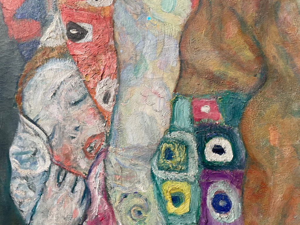
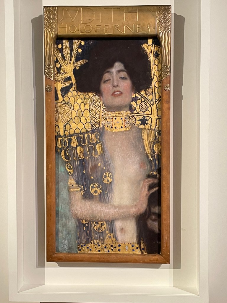
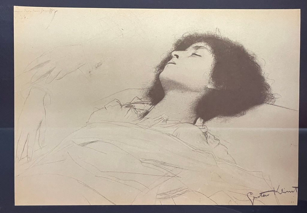
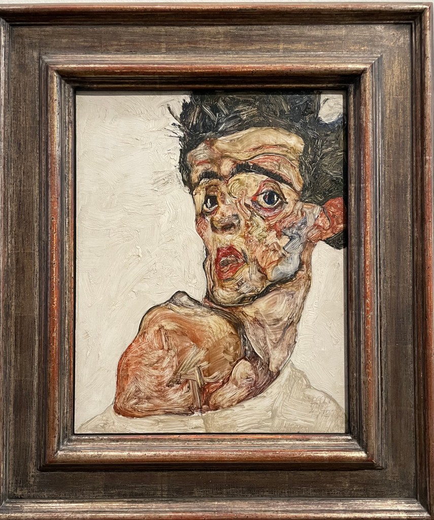
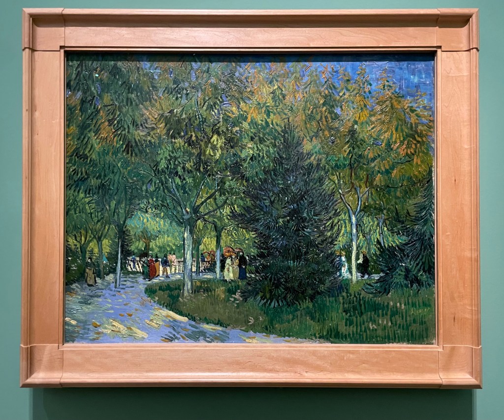
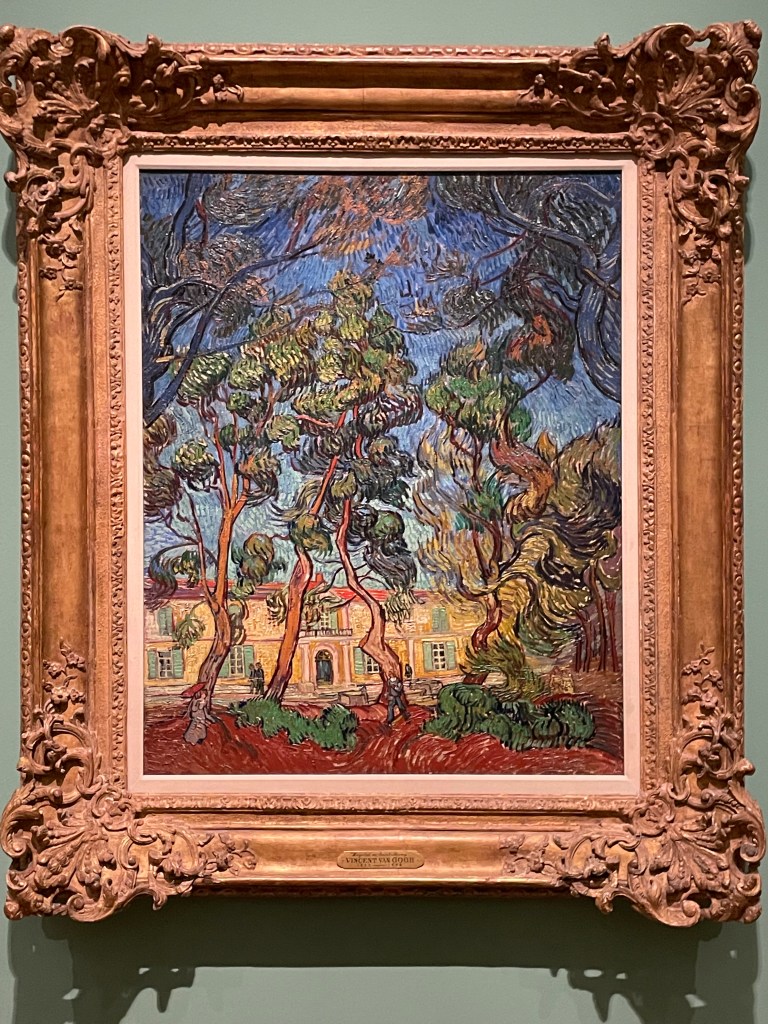
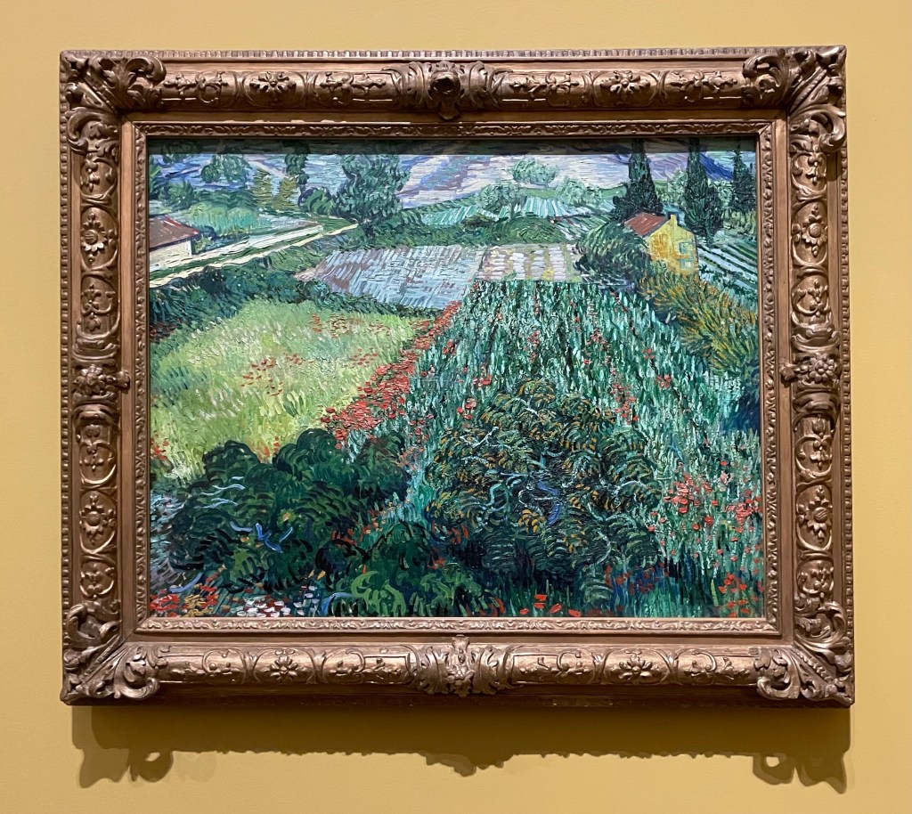
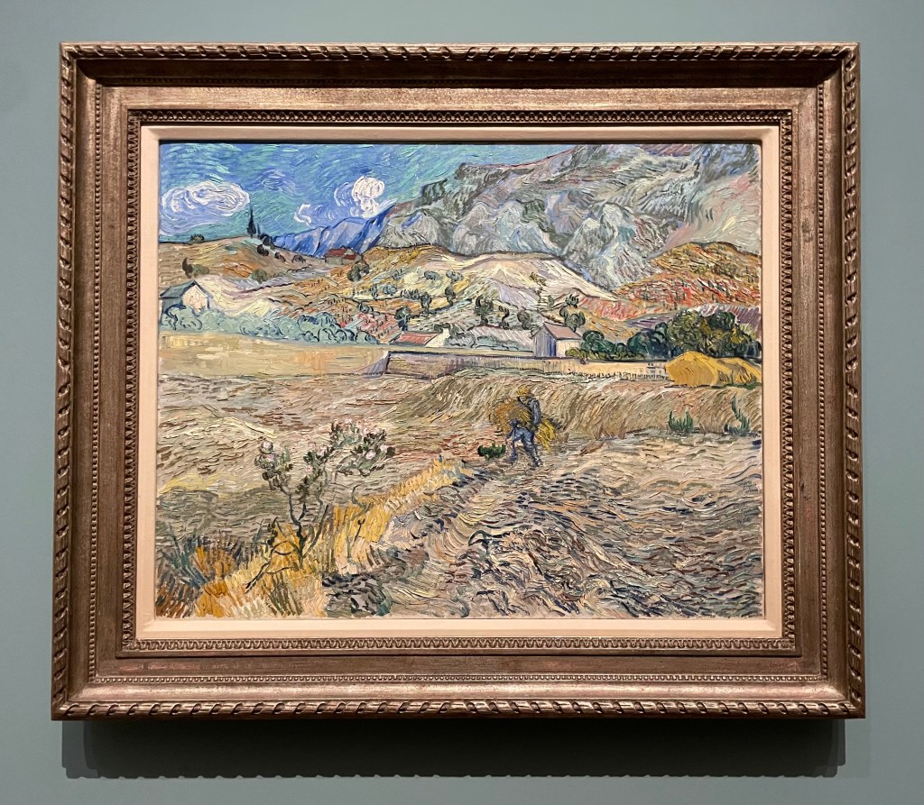
We talked about the exhibitions that I’ve visited and written about in my blog; my thoughts and takes on the artists and work I have seen, which he found interesting.

I mentioned entering the Summer Exhibition as a way to make myself make and how I’m viewing it as an experiment. In previous years I have spent a lot of time and emotional energy in creating work which has then been rejected, but still I enter every year – it is almost a masochistic ritual. This year I’m not investing the same amount of energy, although it’s turning out that my time has been taken up with problem-solving, rather than emotional input anyway. It will be interesting to see whether the feeling of rejection stings as much. Theoretically it should, because a work which I create in 5 minutes should still have the same value to me as a work which takes me 5 years to create.

*(How to value work? Time spent? Size? Type of material used? Obviously, there’s a break even point, but beyond that?)*

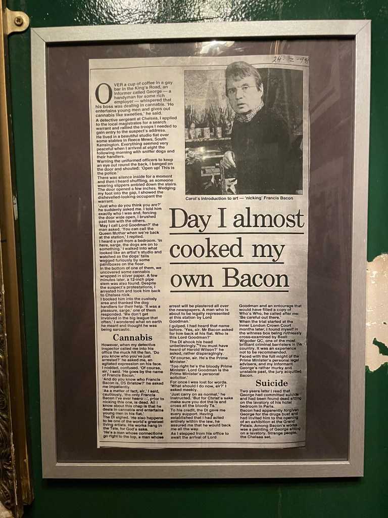
This feeds into my concern about the extent to which I can take credit for a work in which others have had an input, or in which chance has played a major part. I mentioned the possibility of having to engage the services of a professional printer to screen print on a mirror and referred to the Phyllida Barlow video in yesterday’s session; I saw an exhibition of Barlow’s work last year at Hauser + Wirth and watched the accompanying video documentary in which she had technicians assisting her. I also mentioned artists such as Damien Hirst who have a team of people who help make their work. I tell myself that it is enough that it is my idea, or that I created the particular circumstances in which chance created something. It is a mantra I keep repeating to myself, and I think that I am starting to accept it.

Jonathan advised that it’s absolutely ok to have others involved in the making. He mentioned master printmakers to whom artists would look to print their images and his augmented reality project in Cornwall in which he had to enlist help with the more complex coding he couldn’t do himself. These others don’t necessarily have to be acknowledged on the label (although he did acknowledge his) – it is enough that they are acknowledged in the process and the work itself. In fact, printmakers would often supply a certificate in an edition print to confirm that they had destroyed the plate, their input being acknowledged that way.

We then went onto to discuss readymades. I mentioned that I’d had an idea for the Summer Exhibition (which in the end wouldn’t have worked because it would require having to be regularly recharged) of using an old rotary telephone with a message on it from me inviting the viewing public to leave their own messages. Donald had mentioned in the session last week about mobile phones no longer being used for their initial primary purpose of calling people but as a messaging tool. I have researched sourcing an old one and getting a sound board fitted etc, but then discovered that the wedding industry has actually already produced one. I thought that I could possibly use this idea for the interim show; the fact that it is a space which is open to the public for a prolonged period of time seems to me to be a resource which shouldn’t be wasted – I could use the phone as a way to collect research data and then use that to inform my work. Jonathan commented that it is interesting that I have thought about the space and what it offers as a potential for interactivity. A student in one of the past interim shows had a work which was made by the public writing on postcards on the subject of grief and loss – there were the odd few on which children had drawn pictures, and that’s the issue with interactive exhibits. Usually in a gallery setting there is a line across which the public cannot cross; once the public are encouraged to cross it by an interactive piece, they are without any guidance as to how they should behave. He referred to an interactive exhibition where many of the exhibits had elements which had been damaged by the public, although not maliciously, even whilst the exhibition was being invigilated. I would probably need to think about maybe just having it there for the opening night, which would give me the opportunity to engage with people.

*(I need to think about this. The benefit of people using it when no-one else is around is that it would encourage a more personal response? What is the piece of work? The telephone or the messages? Does it matter if it is damaged after the first night as long as I have downloaded the messages from it? Leaving it longer will increase the number of interactions, but increase the risk of misuse.) *

Jonathan asked me what energises me. I don’t really have much energy at the moment, but maintaining my blog energises me: I enjoy doing it and it’s something that I find easy to do on a regular basis. I see it as being very important to me as both a note making tool which I can just scroll through to remind myself of what has interested me and as a record of the process. I see it as being a piece of work in its own right at the end of the course as it will embody everything about me. Jonathan mentioned that a past student had actually turned her blog into a book, which takes a lot of time to work out how to do particularly when deciding what to do about videos etc. This is actually something that I have been thinking about doing myself. Jonathan commented that the tag cloud at the moment shows ‘mother’ and ‘drawing’ as being the areas of interest. I need to go through all my past posts and make sure that I have categorised and tagged them correctly and this process itself, Jonathan observed, would be a valuable reflective exercise.

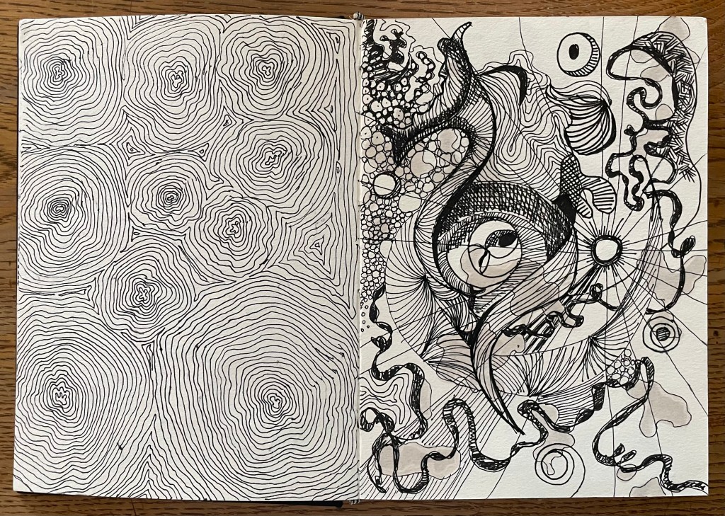
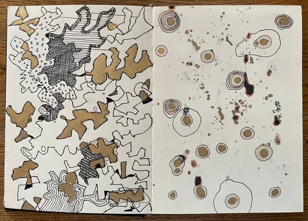
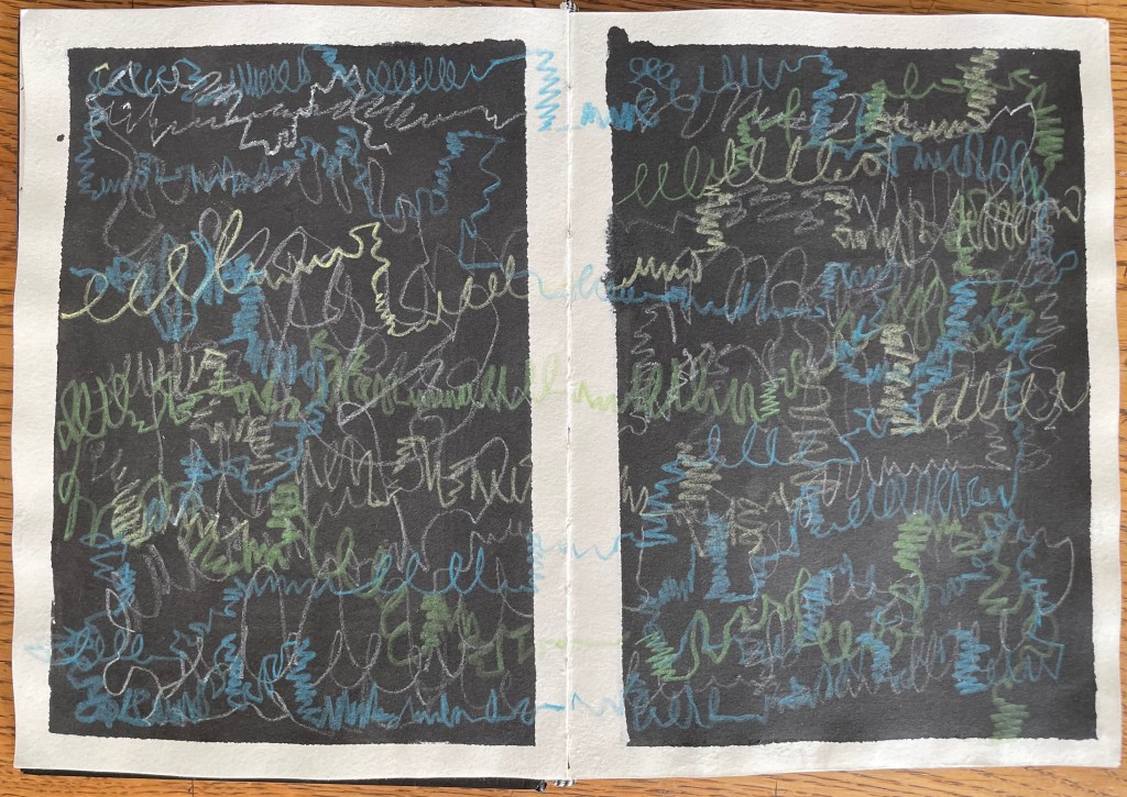
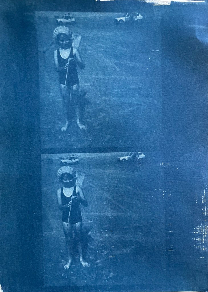
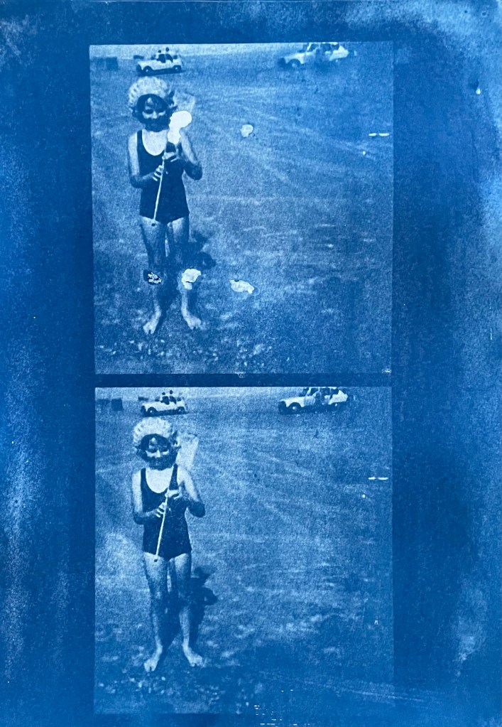
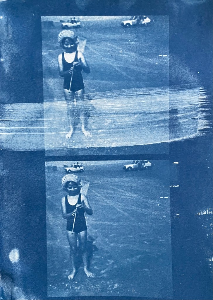
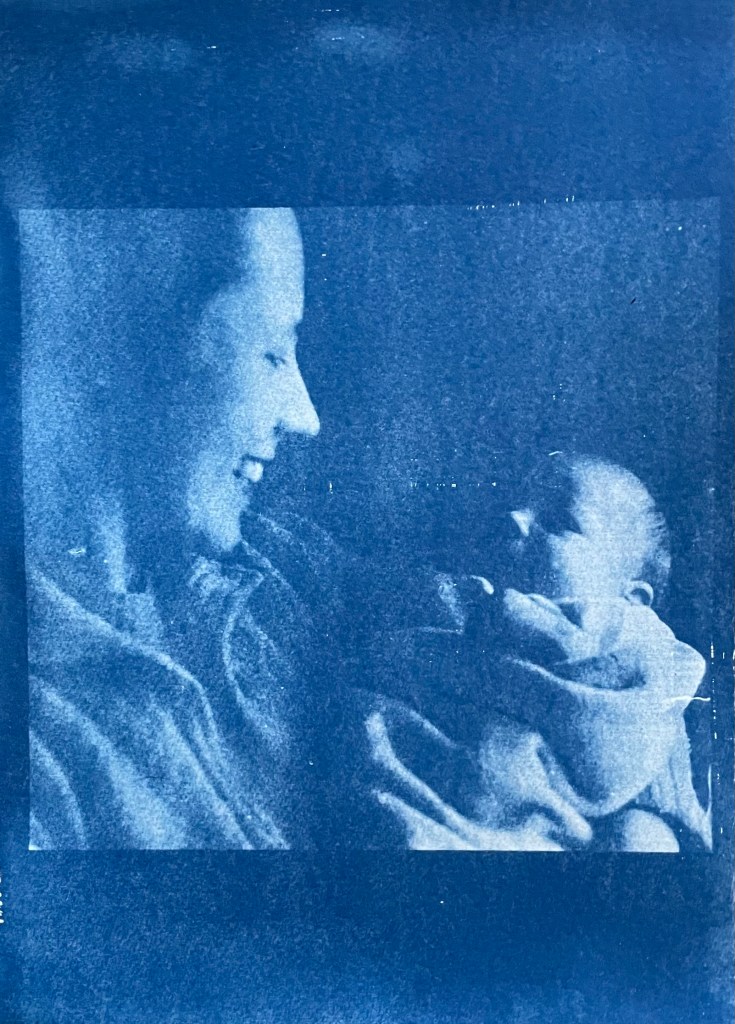
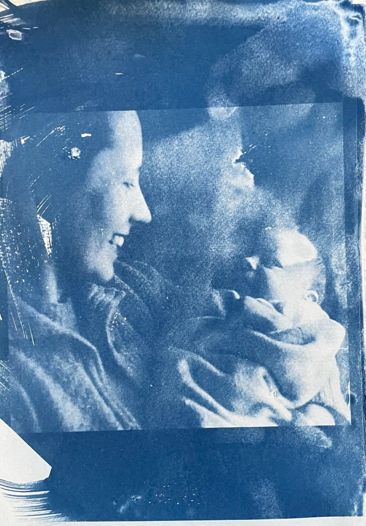
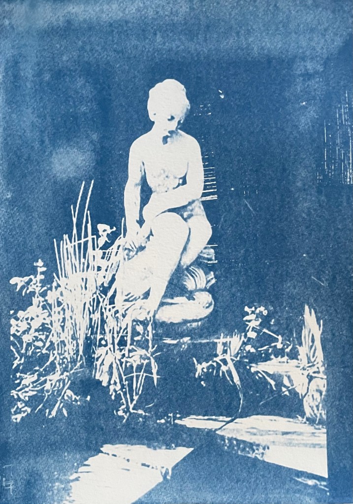
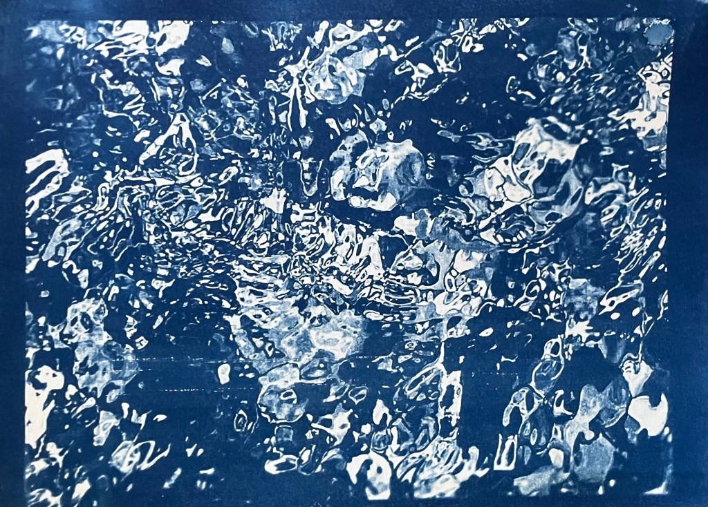
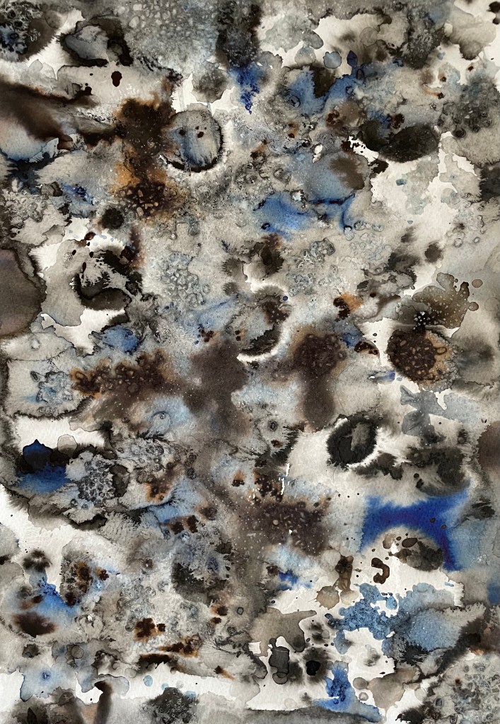
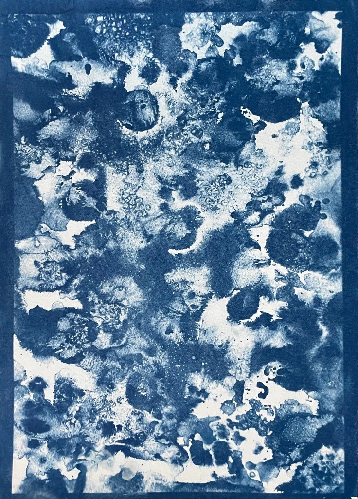
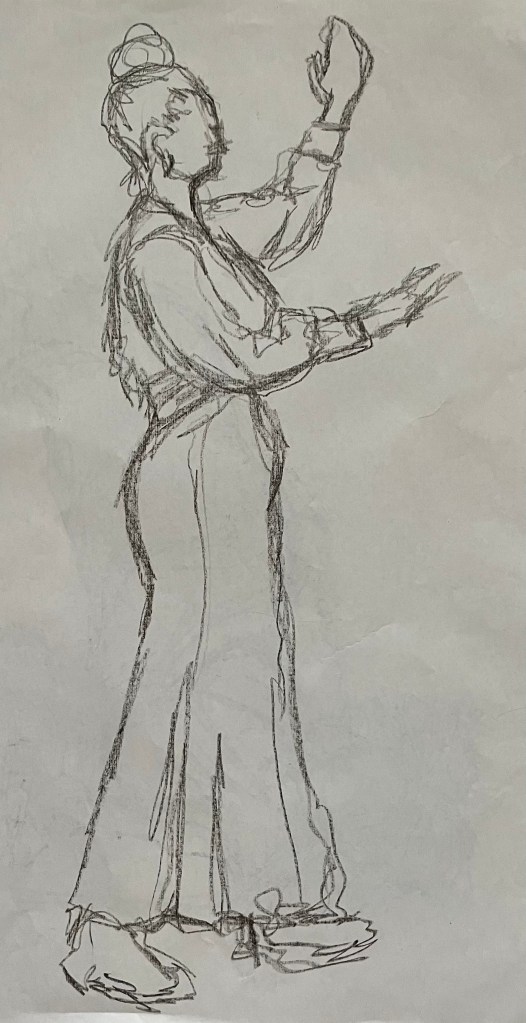
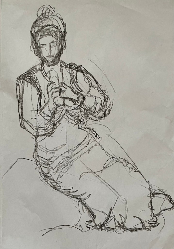
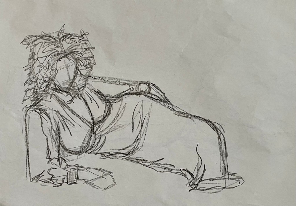
Jonathan then asked me what is a challenge. Making ‘finished’ work. I feel that I have been dipping my toes in various ponds, trying things out, experimenting but not taking things that step further. We talked about the kitchen lithography and whether I would do it again. I think I will. The DIY aspect really appeals to me in the sense that I can do it at home, and not have to go into a specialist place, with expert people, where I don’t really know what I’m doing. I mentioned that last summer I became obsessed with cyanotypes and want to revisit them. To this end I’ve googled how to make my own lightbox and have bought a UV light etc.

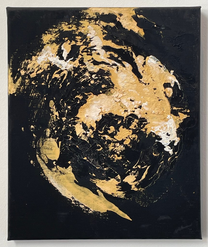
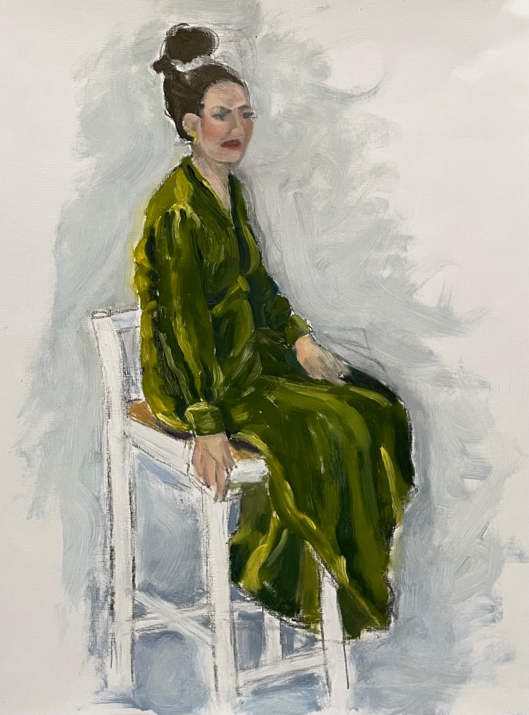
He asked me whether there is any particular mark-making process that I like. I am not sure at the moment, I’m still dipping my toes. On the subject of liking something, I mentioned my painting which I recently did in my oil painting class, and not liking it but enjoying the process and my subsequent quandary about thinking that I should, as an artist, embody everything that I like in other artists and their work, which I think has made me feel as if I’m in an identity crisis. I can’t be every artist that I admire, I can only be me. I love colour but I’m not a colourful person in terms of the way I dress. I don’t want to pigeon hole myself. Jonathan asked whether I felt that there is an expectation to. I have in the past in the sense that people have told me that as an artist people expect a consistency in approach, although Picasso was a painter, printmaker, ceramicist and sculptor.

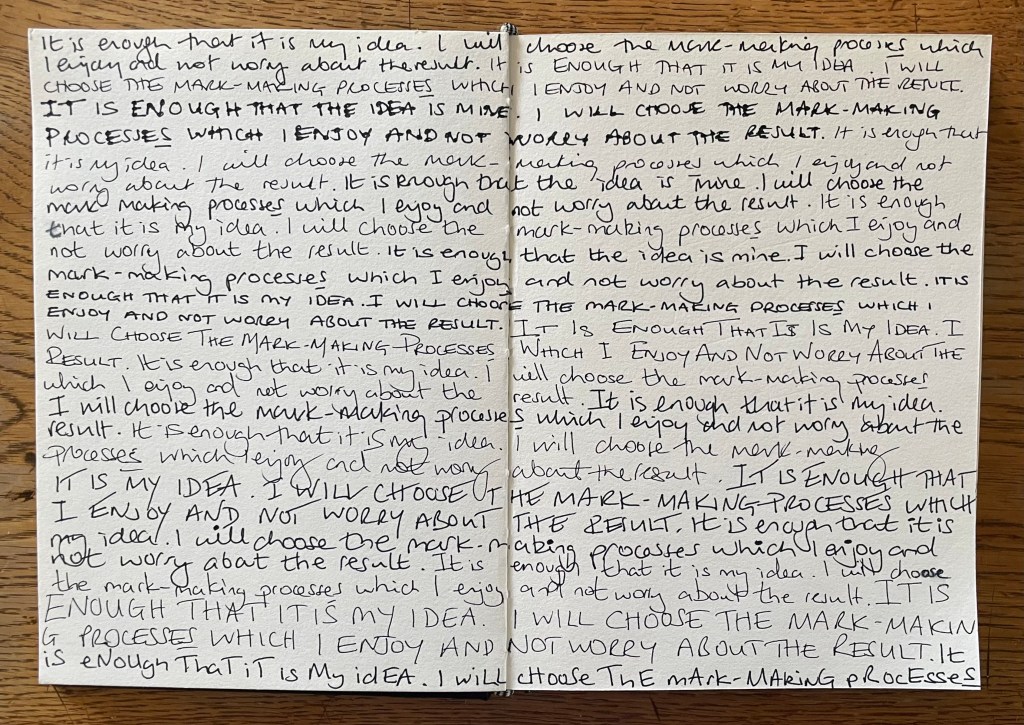
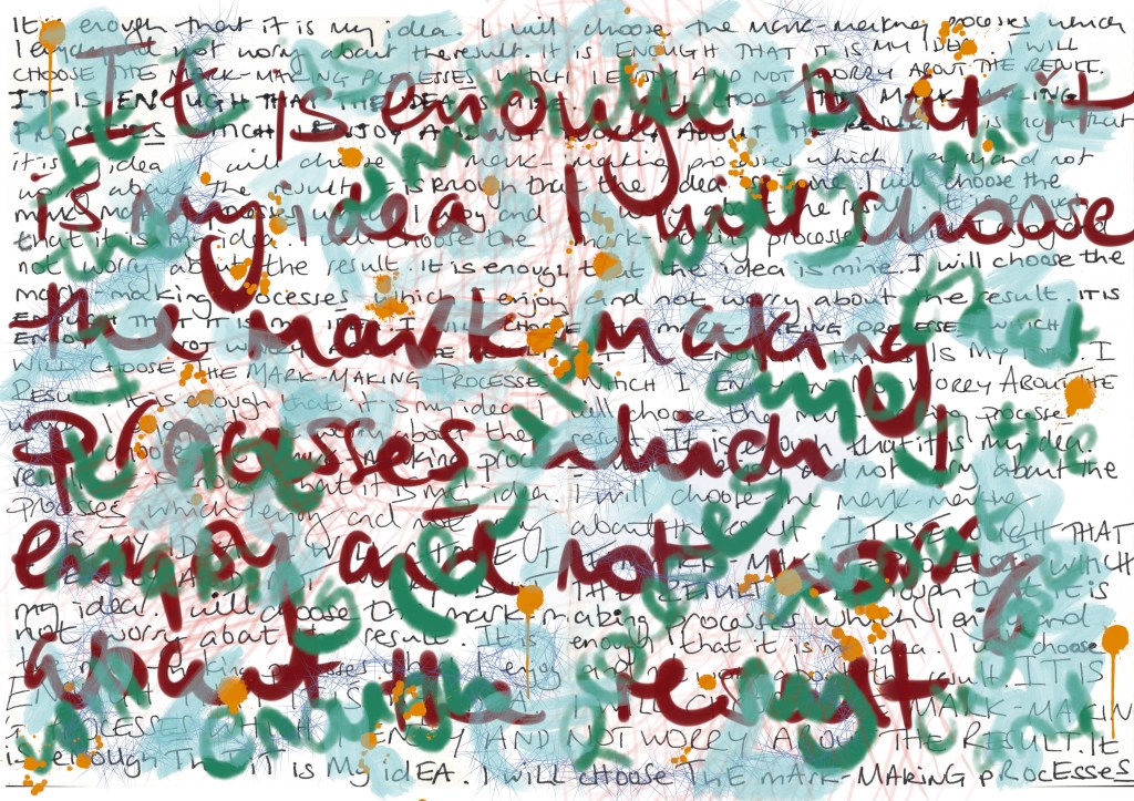
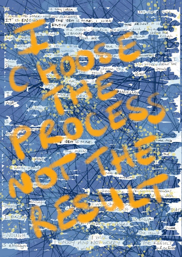
I’ve also asked myself whether I should even have to like my work or if enjoying the process is enough. I think I have reached a place where I will choose the mark-making processes which I enjoy, and not worry about the result. Jonathan read my comment back to me, because this is a huge shift in perspective for me. I really think that the blog has been instrumental in this – making me put work up which ordinarily wouldn’t see the light of day. He said that he gets a real sense of everything that I’ve been doing is being directed towards a point, which is unknown as yet, and that I shouldn’t feel a pressure to produce work.

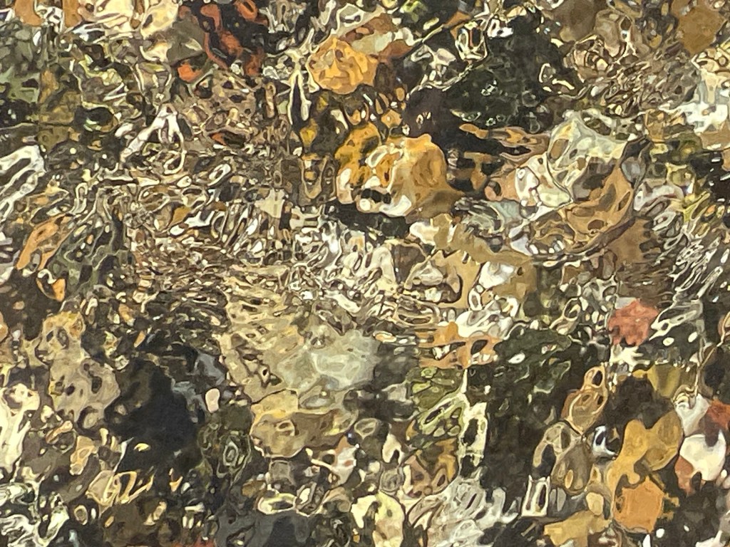
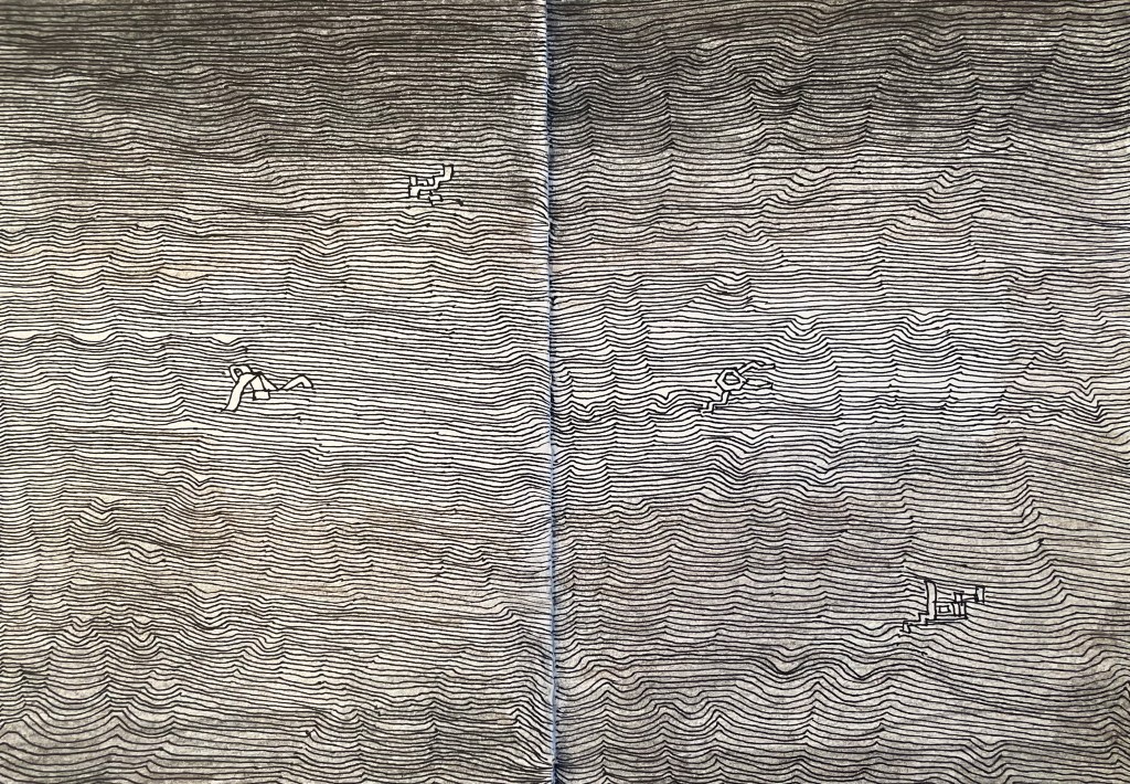
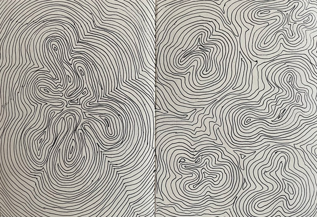
Whilst I can multi-task, I find it difficult dealing with several things which are mentally and emotionally draining at the same time. I think that once I get the study statement out of the way, I’ll feel like I can start to make. It’s not that I see the statement as a barrier to making, unlike the inertia I felt at the time of my last tutorial. It’s been incredibly helpful to focus my thoughts and set out a framework within which to operate but which allows enough room for exploration. I commented that I often go off on tangents, for example, I was looking again at the flowing water posts and thought to myself that it would be interesting to follow a river from its source to its end, and make a body of work. Jonathan said that would be an interesting project as it could involve all sorts of media, such as video. He said that it is important to make note of these ideas so that they can be revisited in the future.

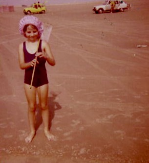
As from next week I feel that things will change. It’s a bit like learning how to play a new game. You can look at the rules, but the real knowledge comes from actually playing it. I feel like I’ve been having a quick look through the rule book to get the general gist, and now I’m ready to play the game. Jonathan asked whether the interim show is helping with this. It is, definitely. Aside from the telephone, I have been thinking about cyanotypes on fabric which can be draped – I’m in the process of digitising my parents’ family photos which I’m thinking I could use – or maybe some prints. I hope to become a bit clearer on where I’m going from next week.

I told Jonathan that I feel like a different person to the one who started the course in October. I feel like me, whoever that is. I feel alive.

*(On that basis, I should have answered the question about what energises me, as being the course. I mean ‘alive’ in the sense of feeling open to new experiences, noticing so many more things, feeling whole, engaged and energised.)*

Jonathan ended by reflecting that it’s great that I’ve really put myself into the blog and that I’m letting myself get lost in the confusion. He’s looking forward to seeing what comes next, and that I should carry on as I’m doing. He’s excited. I’m excited.

Vienna Calling

I have just returned from an amazing 4 nights in magically festive Vienna, having had my fill of glühwein, Sachertorte and boiled beef broth (it loses something in translation!).

I’ve never been before, but will definitely be going back. Beautiful architecture, and so much to do, not least the seemingly endless supply of museums and galleries.

The Leopold and Belvedere were on my hit list as housing the greatest number of works by Klimt and Schiele. I had a nagging fear that the episode might end the same way as Michael Craig-Martin but, instead, I came away with a greater appreciation of all the details that can’t be gleaned from a photograph: the brushstrokes, the surprising thickness and coverage of the paint, sometimes leaving areas of the canvas exposed and the purity of colour. It was a revelation to get up really close and just look.

Death and Life 1910/15 , Klimt

Detail

I had always thought that Klimt applied paint quite uniformly and flat, so I was surprised to see the thickness of the paint and multi-directional brushstrokes. I like the way Klimt paints skin in all its imperfections and blotchiness, ranging from the pale and cold whiteness to the warmer, darker tones of the male figure.

Seeing ‘The Kiss’ was an interesting experience; it reminded me of when I saw the ‘Mona Lisa’ in the Louvre. Being one of Klimt’s most famous works, along with the ‘Mona Lisa’ and Van Gogh’s ‘Starry, Starry Night’, it is one of the most mass reproduced images of all time. I was underwhelmed, and I found it quite sad, as I was expecting to be bowled over by it. It was the most crowded room at the Belvedere, but what I found particularly interesting was that the crowd of people in front of it, holding up their phones and cameras, seemed totally uninterested in looking at it in any great detail – in fact they had left a sizeable gap in front of it so that they could get it in shot. This was handy as it allowed me to perform a flanking manoeuvre to get in front of it, to try and appreciate it as a work of art, as opposed to just a selfie opportunity with a celebrity. There was no point taking a photo – it was so strongly lit, and the lights reflected in the glass covering it. I grappled with my feeling of ‘numbness’ for the rest of the day, and as I was mulling it over in my mind, holding yet another mug of mulled wine in my hand, the answer came to me when I remembered John Berger’s ‘Ways of Seeing’ in which he considers the effect of reproduction:

”When the camera reproduces a painting, it destroys the uniqueness of its image. As a result its meaning changes. Or, more exactly, its meaning multiplies and fragments into many meanings … Alternatively one can forget about the quality of the reproduction and simply be reminded, when one sees the original, that it is a famous painting of which somewhere one has already seen a reproduction. But in either case the uniqueness of the original now lies in it being the original of a reproduction. It is no longer what its image shows that strikes one as unique; its first meaning is no longer to be found in what it says, but in what it is.”

By contrast, in the next room was one of my favourites, ‘Judith and the Head of Holofernes’, a depiction of a strong femme fatale, the polar opposite to ‘The Kiss’.

Judith and the Head of Holofernes, Klimt, 1901

What can I say? I love gold leaf: I’m a magpie. Despite the abundance of gold in the painting, the eye is still drawn to the figure of Judith which is thrown forward by the decorative background. She is holding the head of Holofernes, somewhat gently, which is shown half in and half out of the frame, relegating him to a secondary role in the drama which has unfolded. There are intriguingly two decapitated heads in the painting; the treatment of the choker has effectively severed Judith’s head from her body. It is an image full of female power, sexual and otherwise.

It’s easy to forget that Klimt was a master draughtsman.

His drawings are exquisite. The simple monochrome of pencil or black chalk, a quiet antidote to the noise of gold and vibrant colour.

Self-Portrait with Raised bare Shoulder, Egon Schiele, 1912

I love this self-portrait; it is so expressive, and the fluidity of the brushstrokes creates a sense of movement and vitality. It is reminiscent of the Lucian Freud self-portrait in my earlier post, “I’m Sorry, Michael…”. It is quite small but he manages to pack a lot into such a confined space, including his shoulder, which by extension includes his body. The difference in treatment between the figure itself, which is quite thinly painted, and the more heavy impasto in the background is extremely effective. It is painted on wood, which might explain the wonderful textures on the face which would have been caused by the hog bristles in the brushes, although I have read, in a book on artists’ palettes, that Schiele would often use a brush to remove paint from a canvas in order to create texture. I particularly like the simple use of sgrafitto particularly above his left eye, and to delineate the edge of the chin against the neck.

The description next to this piece was interesting in that it described Schiele’s connection with his own body as both a fusion and a dissociation, in the context of the main theme of Viennese Modernism ie the individual becomes a dividual – something that can be divided.

The Embrace, 1917, Egon Schiele

This painting is so impactful. It’s approximately 1.5m by 1m. It shows Schiele with his wife, Edith Harms, in a loving and tender embrace. Unlike a lot of his work, this does not, to me at least, have any sexual or erotic overtones. There is a sense of completeness, in that Schiele depicts himself physically emaciated as he envelops and buries his head in the hair of his wife, almost blending into one, in an act of nourishing love. It’s even more poignant to think that this is one of his last works, as they both died within days of each other a few years later in the flu epidemic of 1918-20. He was only 28.

Both Schiele and Klimt were ahead of their time; they were disruptors. Schiele was akin to Sid Vicious and the punk movement, and Klimt founded the Viennese Secession, breaking away from the constraints of the Künstlerhaus. In today’s art world there is no prescribed way of doing things, no longer any art movements or – isms against which to rebel; artists have never been freer to express themselves in whatever way they wish, so I wonder how it is possible for an artist to stand out; how to make a difference in a world of differences.

Poets And Lovers, And A Side Of Bacon

Well, I made it through without a tear. It might have been the sheer number of people which meant that it was impossible to stand and contemplate too deeply, or the audio commentary going on in my ear which distracted me. The ‘Poets and Lovers’ exhibition at the National Gallery was a cornucopia of Van Gogh brilliance, although I was left wondering why it didn’t include some of the Van Goghs I had seen in other galleries, such as the self-portrait with bandaged ear at the Courtauld, but then I don’t have the faintest idea about curation. That said, it didn’t detract from the luscious visual delights on offer, many of which I hadn’t come across before.

What struck me more than anything was the direct correlation between how he drew and how he painted. The range and quality of mark-making was phenomenal. Whilst up close, the brushstrokes and colour palette made me virtually tachycardial, it was standing in the centre of each of the rooms which gave the most rewarding experience.

The only moment when I almost cracked, was when I found myself in front of the Sunflowers from the National Gallery and the Philadelphia Museum of Art: he painted his Sunflower series to decorate his guest room in anticipation of Gaugin’s visit to Arles, in an effort to impress Gaugin, who he greatly admired, almost to the point of obsession. Van Gogh’s sensitivity and vulnerability weren’t a good match for Gaugin who, by some accounts, was aggressive and egocentric, which served only to reinforce Van Gogh’s insecurities. It all made me blink a bit quicker. I have to declare my bias – I’m not a fan of Gaugin for various reasons, not least because he abandoned his wife and five children to go off and indulge his predilection for young girls.

The day was rounded off by a trip to the Colony Room Green, a replica, as near as dammit, of the bohemian Soho legend that was the Colony Room Club which closed down in 2008 after 60 years, and which was the creation of the queen of Soho, Muriel Belcher – apparently, you knew you were in if she called you the ‘C’ word. It was the favourite haunt of creatives such as Francis Bacon, Lucian Freud, John Craxton, Damien Hirst, Tracey Emin, Dylan Thomas, John Deakin, Frank Auerbach, Michael Andrews, Giacometti, and the list goes on. My husband was particularly keen to visit as he’s reading Darren Coffield’s ‘Tales from the Colony Room’.

‘ Francis Bacon was very fashion-conscious and always immaculately dressed. One afternoon Francis walked in, annoyed and pulling his collar. – “What’s wrong, Francis?” – “Harrods, I’m never going back there again.” He’d attended a special night for select clients and bought lots of clothes, but when he’d got back home he’d decided he didn’t like any of them. “I bought so many suits and shirts and threw the lot in the dustbin.” You’d never seen the club empty so quickly. The next day everyone was up the club parading around in their new suits and shirts from Francis’ dustbin.’

Colony Room I, Michael Andrews, 1962

It’s very small and down some stairs underneath Ziggy Green, 4 Heddon Street, a side street off Regent Street. It’s reminiscent of a dive bar/ speakeasy.

It was great meeting Liam, the house jazz pianist and chatting to Tim, the barman who explained that it’s not trying to be a re-creation of the original, but somewhere to come and meet an eclectic mix of people. Despite what he said, I couldn’t help but feel that I had stepped back in time, waiting for the door to open and for one of my artistic heroes or heroines to walk through it. They often have events which are free to attend, such as talks and book launches. Unfortunately, we couldn’t hang around for the Portrait of Muriel Belcher evening.

There’s something very inspiring about the idea of a group of creative people coming together regularly to discuss work, ideas and concepts. I’ll definitely pop back in next time I’m in town, in the hope that something might rub off.

Lines

There’s something very satisfying about drawing a line.

Paul Klee loved a line. Taking a line for a walk.

Bewölkung (Clouds), Paul Klee, 1926

I stand in front of this Paul Klee every time I go to the Pallant House Gallery in Chichester. Ink lines drawn over watercolour evoke feelings and moods, suggesting, not defining.

I listened to a film whilst I did this. I like the suggestion of form created by the pattern of the lines. It’s made me think about something underneath trying to get out. The real me? I find these sculptures to be disturbing but compelling at the same time.

Maybe the lines are the contours of my life on a map. My own satnav so I know where I’ve been and where I’m going. Lots to think about.

On Your Marks…

Well, the starting pistol has gone off, and I’m still sat here, procrastinating, allowing myself to be distracted, doing anything other than what I should be concentrating on: producing something for the pop-up show. My problem with deadlines is that I tend to ignore them until the very last minute – goal driven, that’s me.

What, with thinking about the pop-up and trying to come up with an inspirational text for Tuesday’s session, I’m feeling just the tiniest bit sick. I would say that I have stuck my head in the sand but apparently that’s a popular misconception: when they sense danger and cannot run away, ostriches will flop to the ground and remain still, attempting to blend in with the terrain – that sounds just about right!

Anyway, following on from my ‘Less’ post, I’ve been thinking about working with a limited palette and how it narrows choice. Using a pen narrows choice even further – just black and white and nothing much else in between. Using a pen forces you to think about mark-making in order to create tonal values and areas of interest. So, I’ve been using my time constructively by doodling with a pen in my sketchbook whilst listening to an audio book – who says I can’t multi-task!

I found the process of mark-making to be meditative and grounding, totally different from the anticipation of putting ink onto wet paper and waiting to see what happens. Strangely, I like it. I think I am a person of extremes: I’m either fastidiously tidy or chaotically messy; organised or haphazard; focused in on the minutiae or just wanting to see the bigger picture. Somehow I have to find a path along which both sides of me are satisfied.

I will definitely use pen again, if only as a way to order my thoughts. Going forward I think I should try to build up a bank of possible marks, almost like a painter might have a bank of colour swatches. Having said that, I’m mindful that I’ve still got to do a few things to which I’ve committed in earlier posts, so I think I need to embark on some self-accountability first.

Less

I haven’t posted for a while – I’ve been busy sorting things out before going off to Marrakech for a four day trip with my book club.

Marrakech was amazing. Colour. Noise. Smells. People. Heat. Contrast that with this morning when I had to defrost the car before heading off to my weekly art class. I love this drive, along an old Roman road – straight and undulating through the Hampshire countryside to Stockbridge, a small town in the Test Valley. The sun came out and the trees came to life – burning oranges, golds and yellows. It was beautiful, and by the time I arrived at my class, late because I couldn’t find anywhere to park, I was still feeling its effects.

I can’t deal with too much choice – it paralyses me and then I can’t make a choice. Needless to say, I didn’t buy anything in the souks in Marrakech – the choice was overwhelming, so I resolved not to buy anything at all, and was then able just to wander and enjoy the atmosphere and culture.

So today’s task was perfect for how I was feeling. A landscape using a limited palette of burnt sienna, burnt umber, ultramarine, pale cadmium yellow, white and cadmium red. We took a board, roughly primed – in my case it was an old piece of MDF which I had previously coated with professional Dulux oil-based primer, which can make it a bit like an ice rink – and put down a loose ground of burnt sienna with a bit of sansador which ended up not drying for some reason. Then we put in some outlines using burnt umber following with thick patches of colour keeping it very general, but the wet burnt sienna contaminated some areas and lifted off the board in others. We experimented with dragging a dry brush across the paint and I also did a bit of sgraffito which I can’t help doing when using thicker paint.

This is the result:

I haven’t painted for ages – not since beginning this course – I don’t know why. Perhaps it’s because I’ve been doing a lot of thinking and experimenting with other media. At first, it felt a bit strange coming back to it, almost awkward, like I’d been unfaithful in some way.

It’s not my best by far, but it’s ok for an hour and a half. I am leaving it. The ‘me’ I’m trying to change would say that it is not finished by a long way. There’s lots I don’t like and would love to change – I’m itching to tinker – but I’m exercising some will power and calling it a day. Just like I’ve been trying to change my mindset about having an expectation as to how a piece will turn out, I am also trying to train myself to walk away.

Jonathan told me that the job of mark-making is to tell us what to do next. These marks are telling me to leave it alone and to be happy with what bits of it appeal to me – I like the lack of clarity and blurriness caused by the dry brush; the light coming through the burnt sienna ground in the foreground; the energy in the marks, which I would absolutely kill if I allowed myself to do more; the lack of definition which gives a sense of a fleeting moment; and the recreation of the feeling I had whilst driving to class.

Will I do this again? Yes, I always like going back to basics and using a limited palette – I’ll use a different image and next time I will definitely make sure that the ground is dry before carrying on so that the colours aren’t so muddy in places.