

After my disaster trying to do my own, I managed to source some pre-treated fabric and have another go. The result is quite good, but the clingfilm effect suggests that the fabric is creased which irks me somewhere deep inside. Also, I don’t think that I rinsed it thoroughly as some hydrogen peroxide seems to have discoloured the fabric in places. I’m not sure how I might use fabric based cyanotypes yet – I need to think about it, and look for some inspiration.
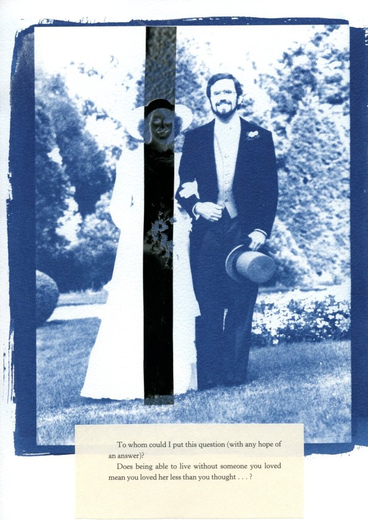
In the meantime, I’ve been experimenting with adding in sections of the negative print. I got this idea from these works by a visual artist and photographer from Luxembourg, Jean Bettingen who is interested in the constructs of identity, memory and self-representation. I also like his use of text to accompany the images. I’m guessing that he has overlaid the transparency over the top of the cyanotype.

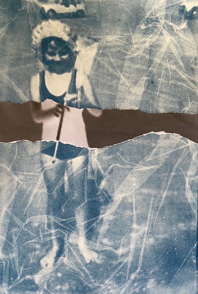
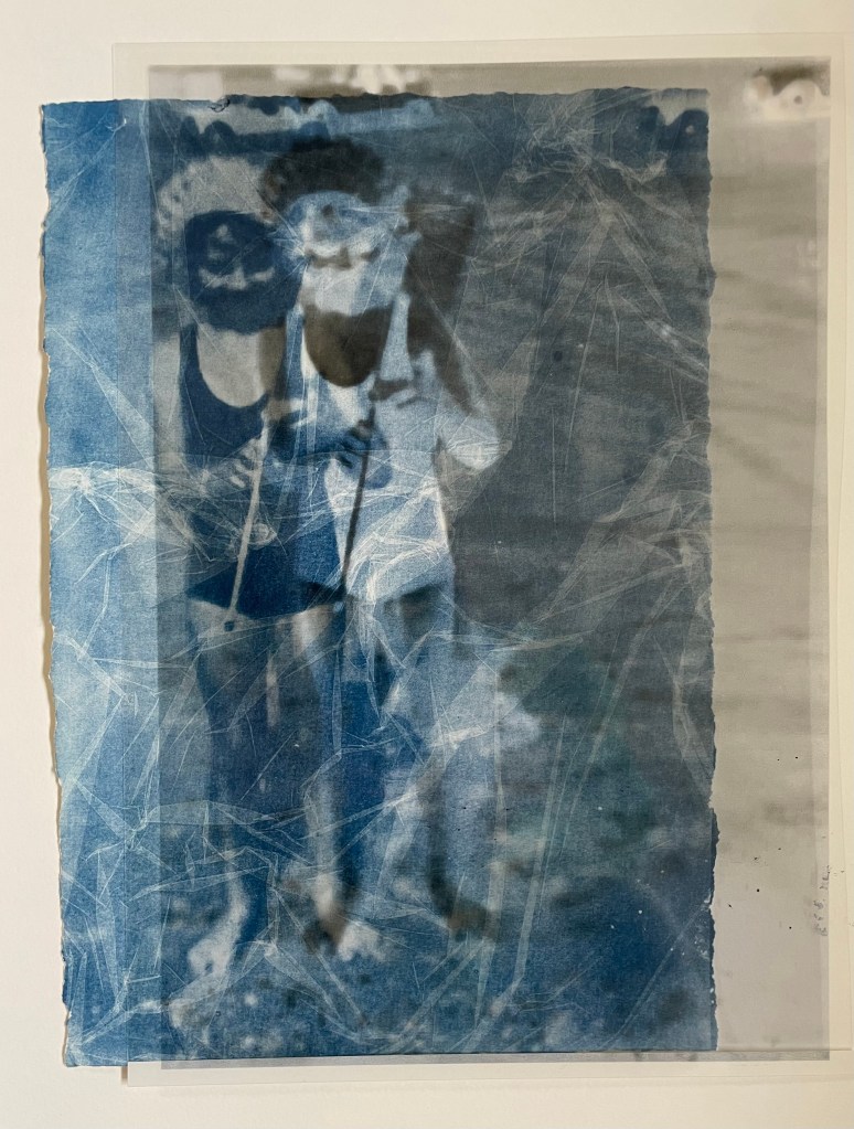
I didn’t want to cut up my negative transparency just yet, so I printed it out and tore off a section. I think that it adds some extra interest, and I particularly like the way in which it’s not obvious which is on top, the cyanotype or the negative. It’s actually the print of the negative which is just lying loose on top of the cyanotype, but it gives a sense of distant space behind it. I tried placing the transparency on top of the print to see what that would look like and I’m intrigued by the effect, so when I’m feeling a little less precious about the transparency I’ll chop it up.
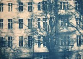
I also came across a German artist called Katja Liebmann, whose work records the energy, isolation and alienation of urban life.
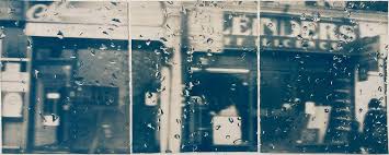
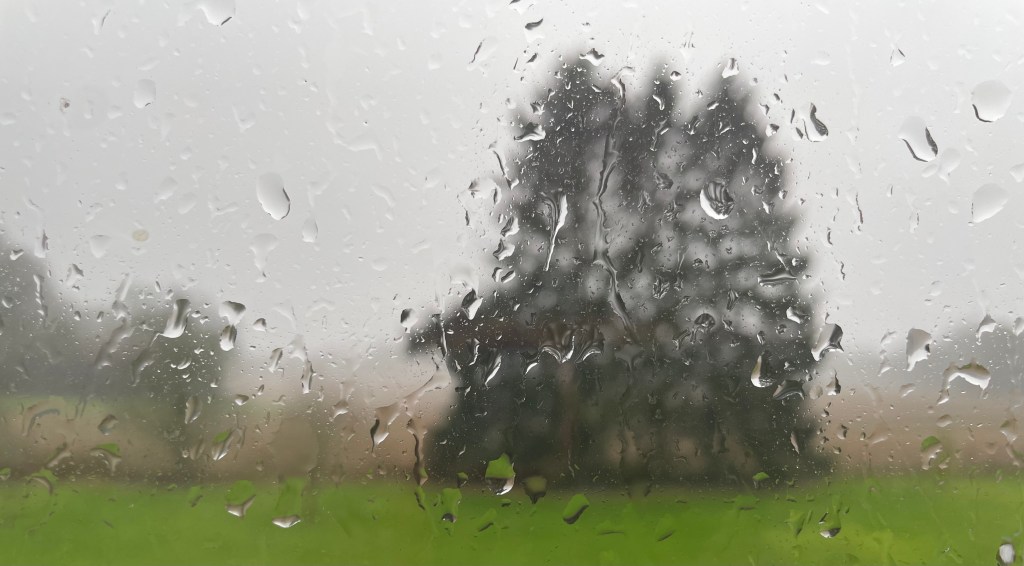
The water droplets on the first image reminded me of a photo I took out of my bedroom window on New Year’s Day this year. I hoped to myself that it wasn’t a taste of things to come.

I really like this image. It’s only A4. I’m going to try and do it as a triptych, like Liebman’s first image.
