
We’ve gone to St Ives in my weekly oil painting class, more specifically looking at the work of Ben Nicholson.
I’ve only recently looked at the work of the St Ives artists; aside from Barbara Hepworth, it didn’t really interest me before. I often go to the Pallant House Gallery and they have a few as a part of their permanent collection.
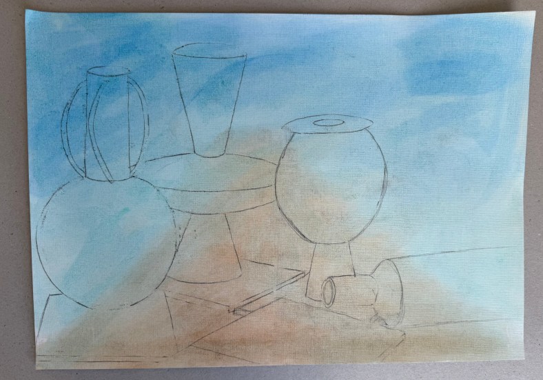
The brief was to make a drawing of the still life and then make two pieces, one with a slightly Cubist slant (using a tracing of the drawing to recreate shapes) and the other with a landscape in the background, both in the style of or influenced by, Nicholson. We used a limited palette of burnt umber, ultramarine blue, cadmium red light, lemon yellow and white.


I think that I would say that the finished pieces were more influenced by, than in the style of Nicholson! I’m not sure what I think about them. I swing from loathing them to actually quite liking them. I prefer the more abstract of the two.
What I have taken away from this exercise:
- Lemon yellow takes an age to dry.
- I really like the contrast between areas of pure ground and areas of opaque colour – I’ve often thought that some of Nicholson’s work has a ‘collage’ effect to it, which I like.
- I like the interplay between the visible graphite lines and the oil paint.
- The combination of the different genres of still life and landscape is really interesting.
- I feel that I’m veering away from the figurative.
- I wish that I had been less literal – I should have been more adventurous in my composition of the still life, mixed it up a bit more and not included figurative renditions of the individual elements, especially in the one with the landscape.
Next, is one of Nicholson’s inspirations, Alfred Wallis, known for his naïve art-making.
