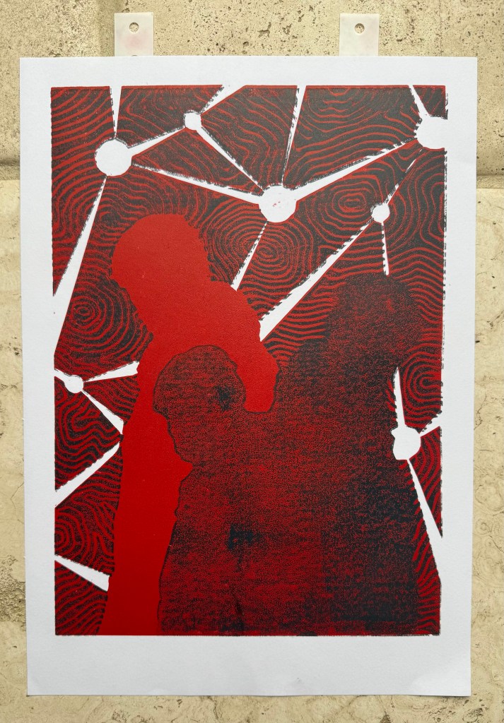
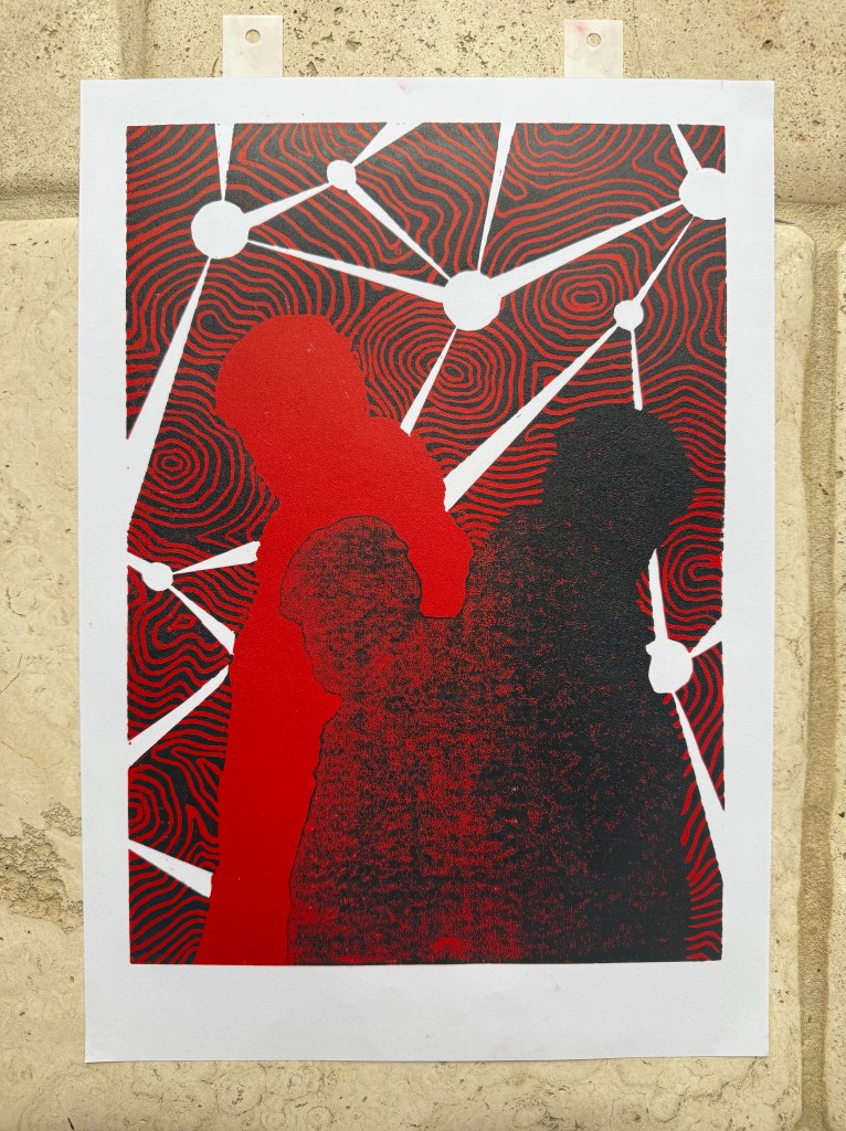
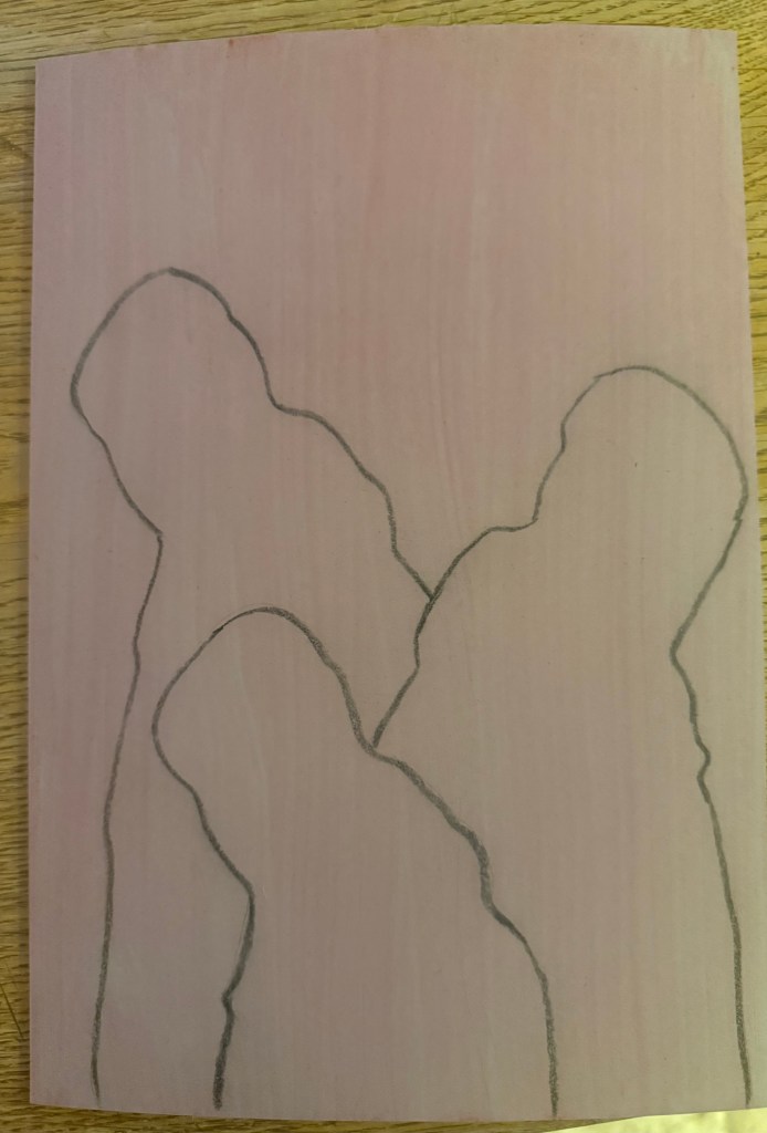
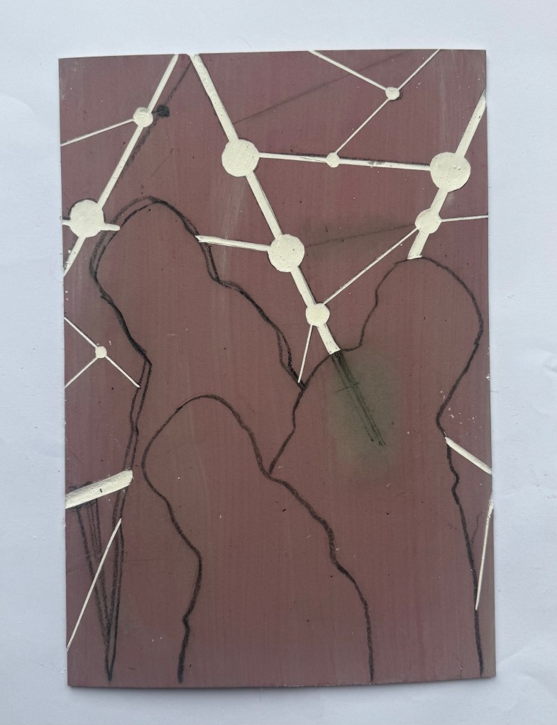
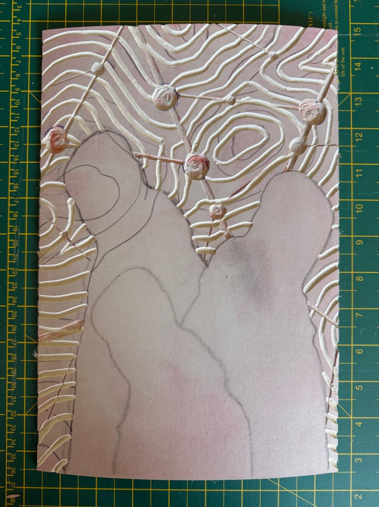
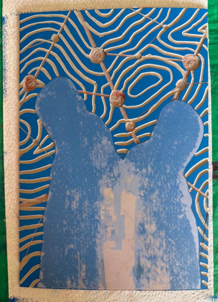
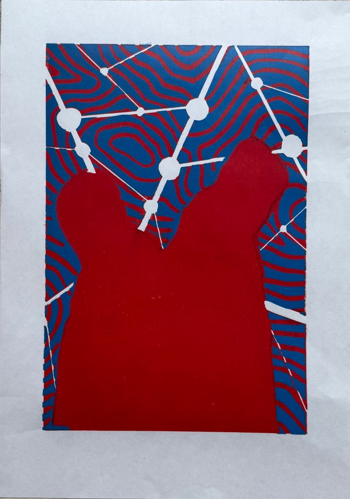
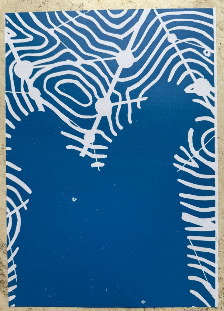
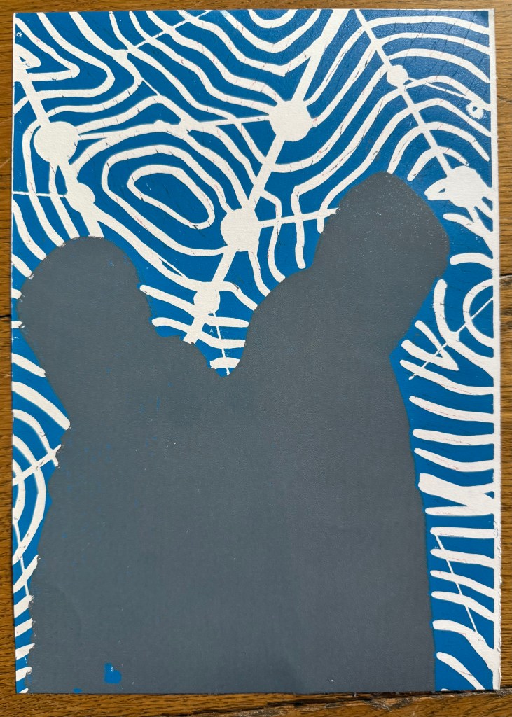
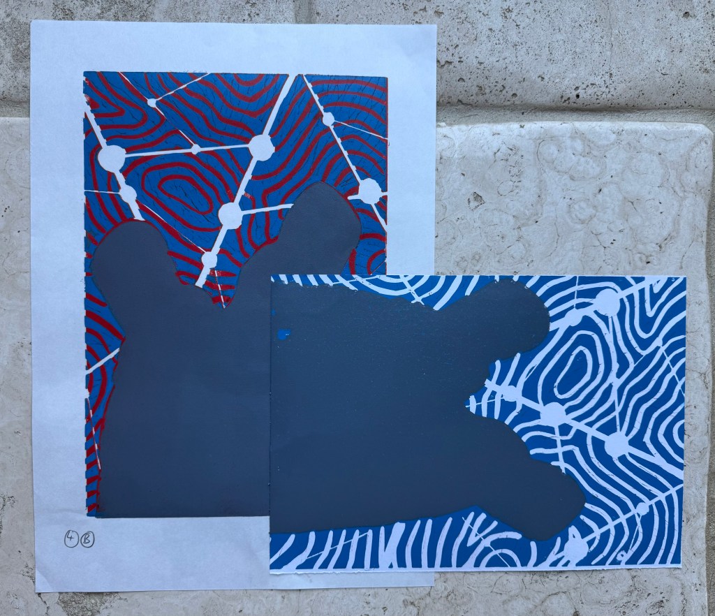
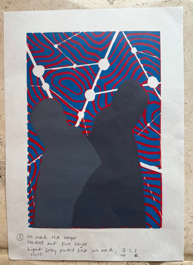
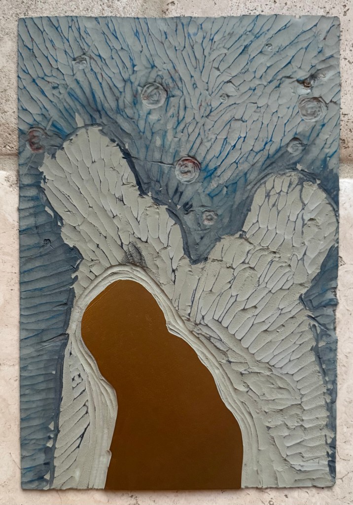
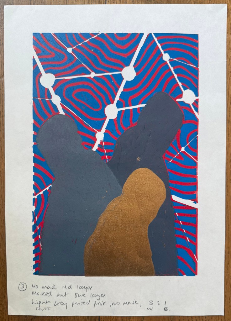
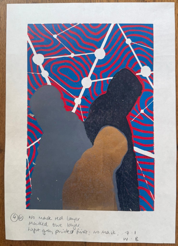
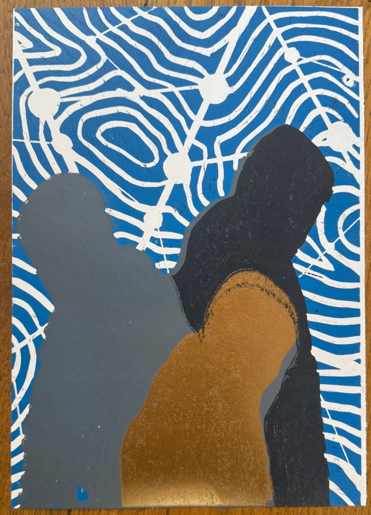
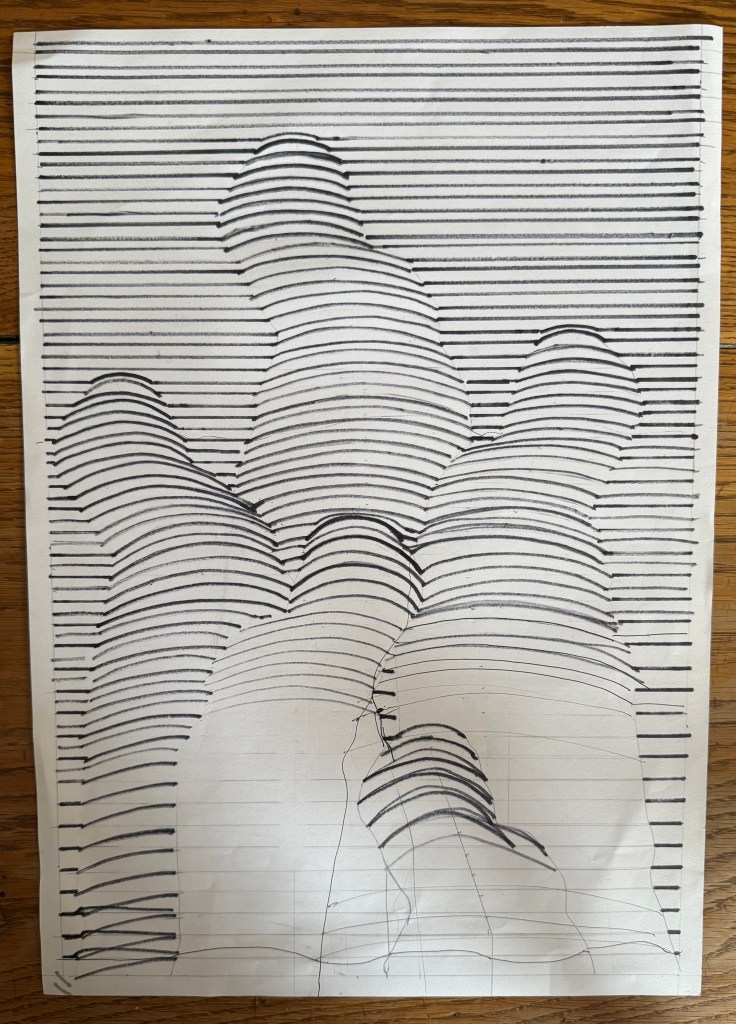
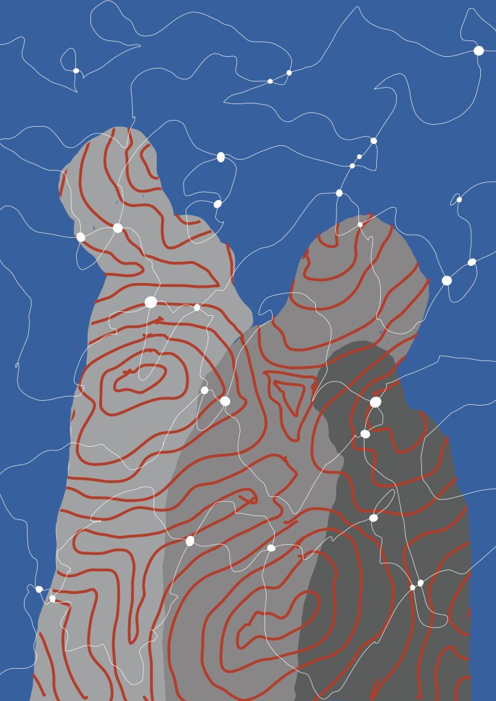
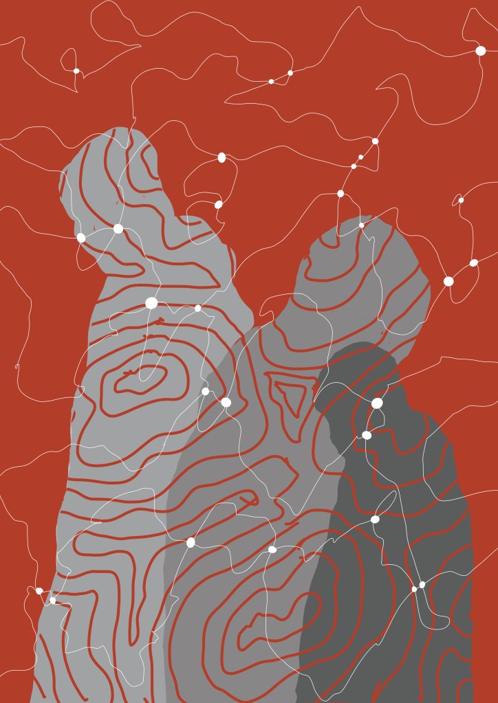
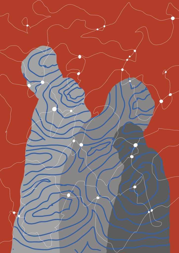
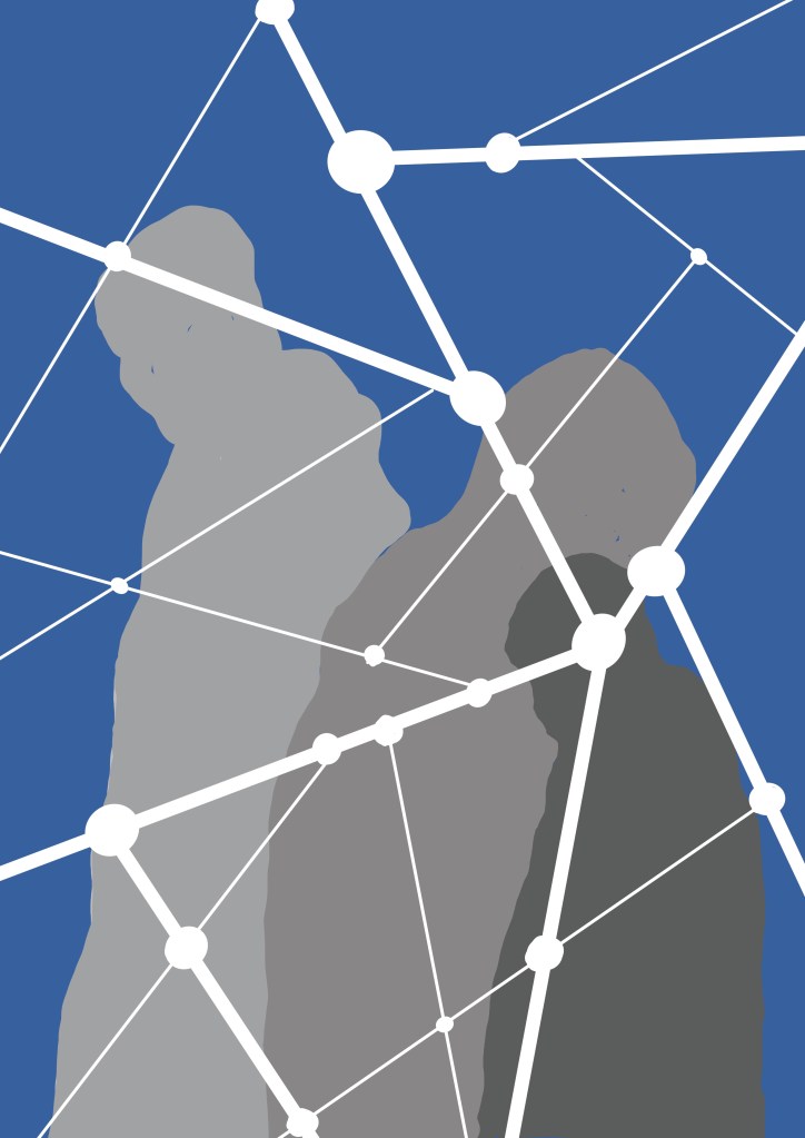
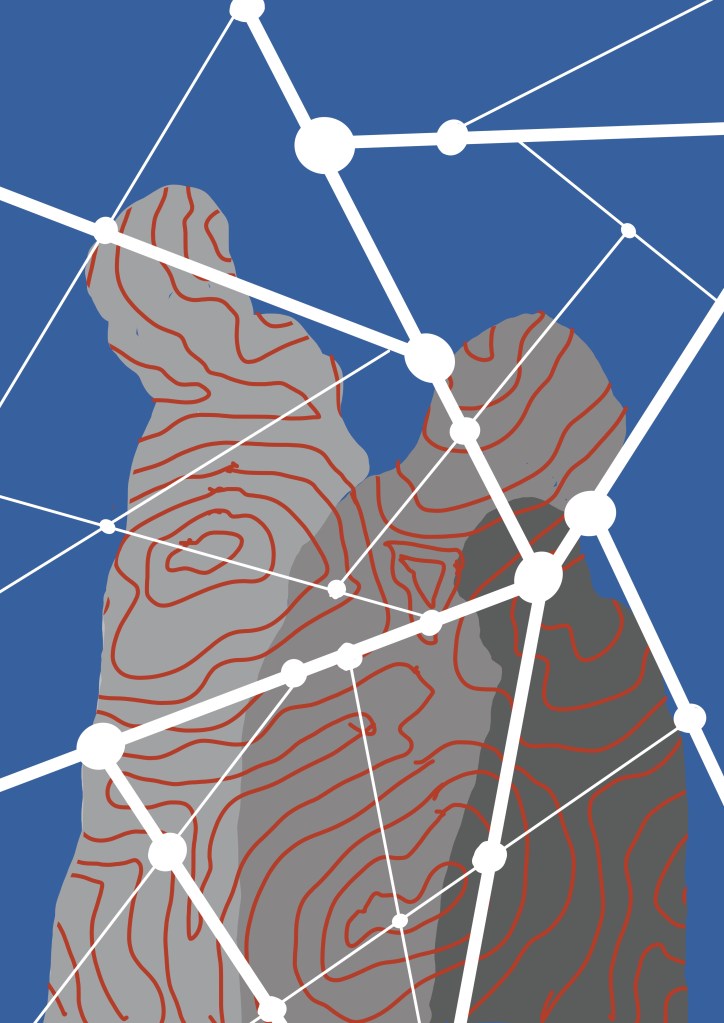
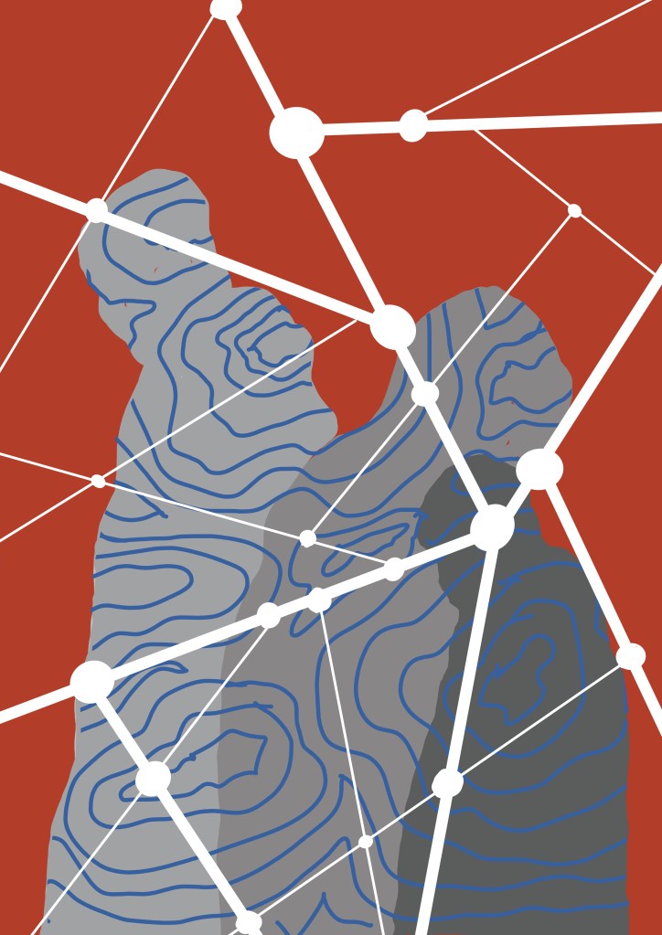
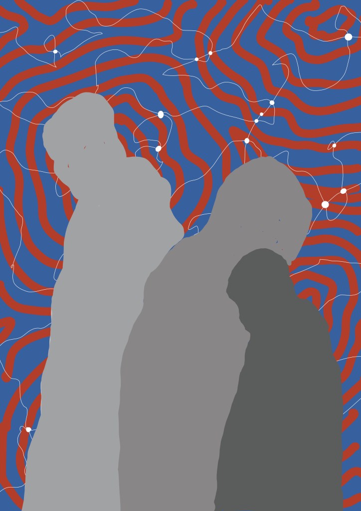
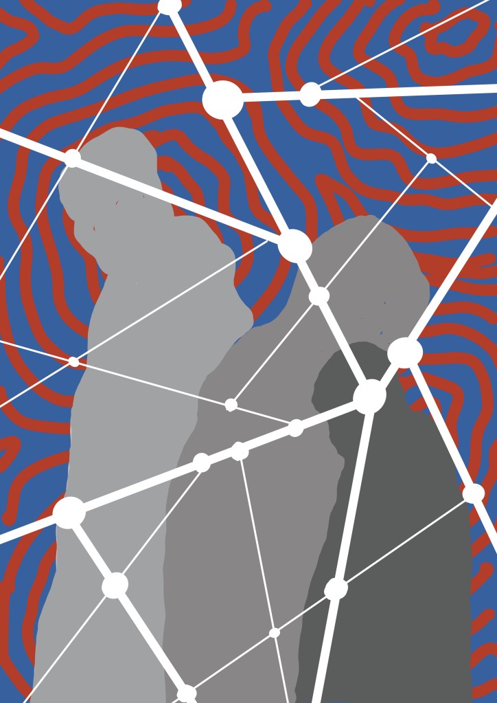
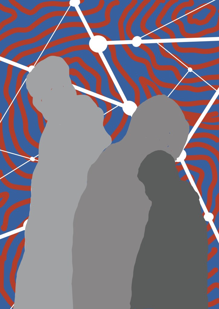
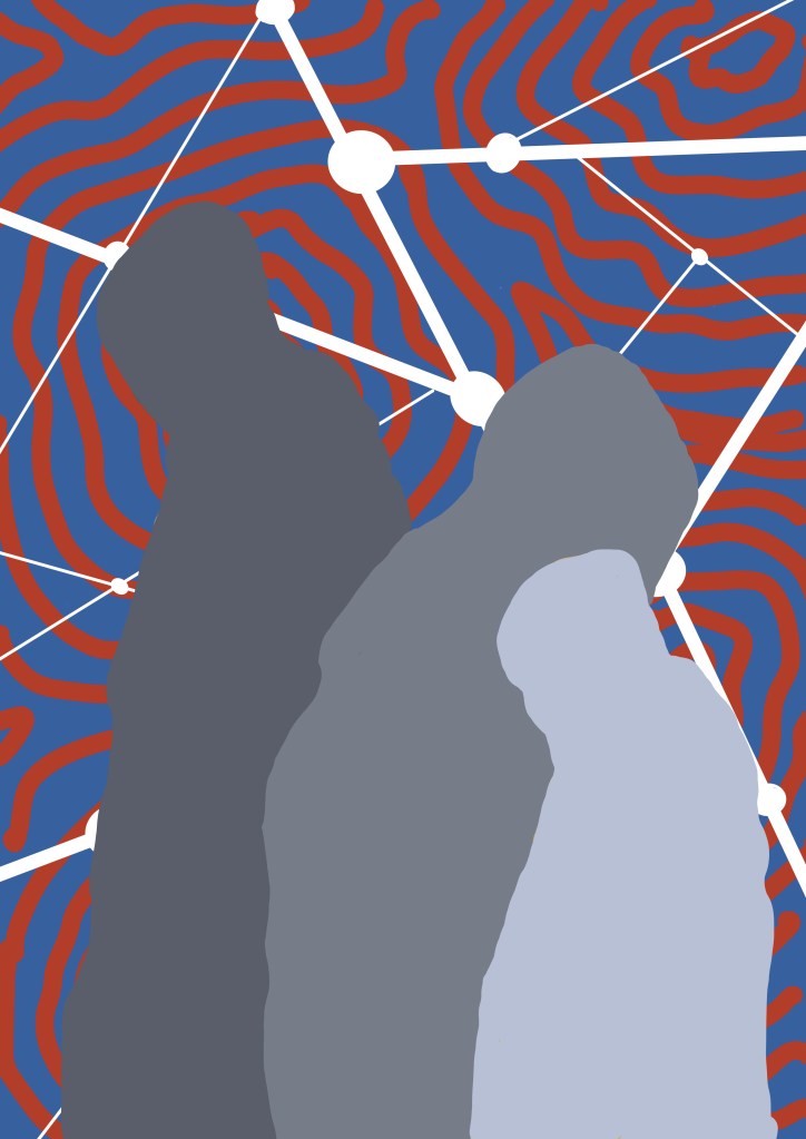
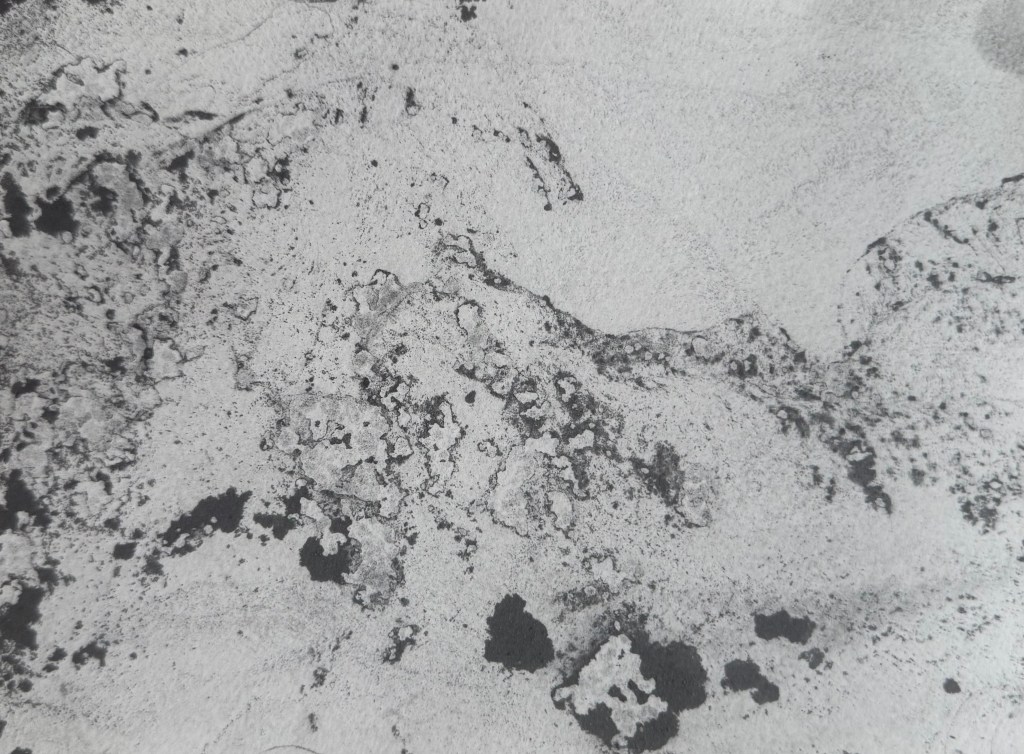
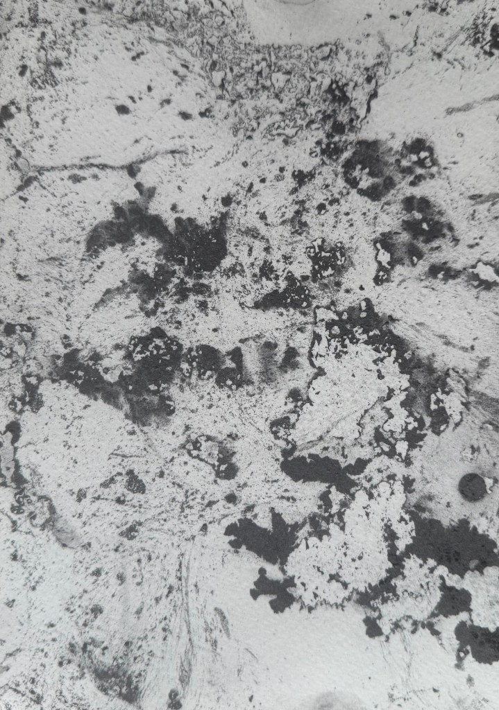
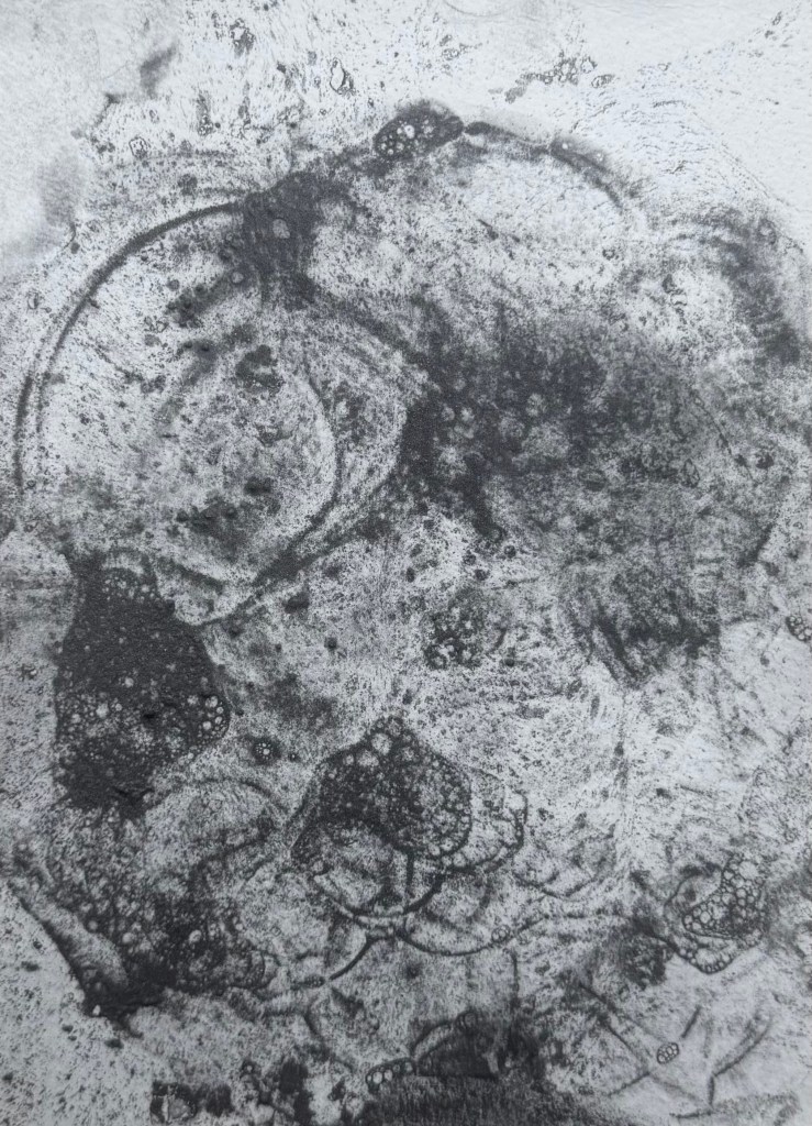
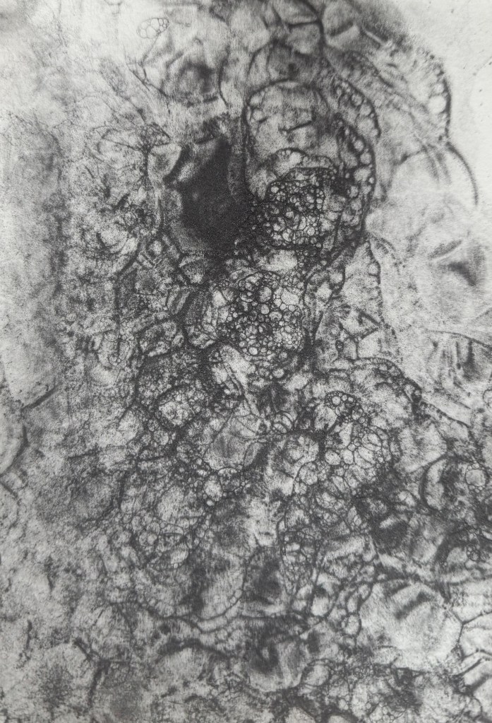
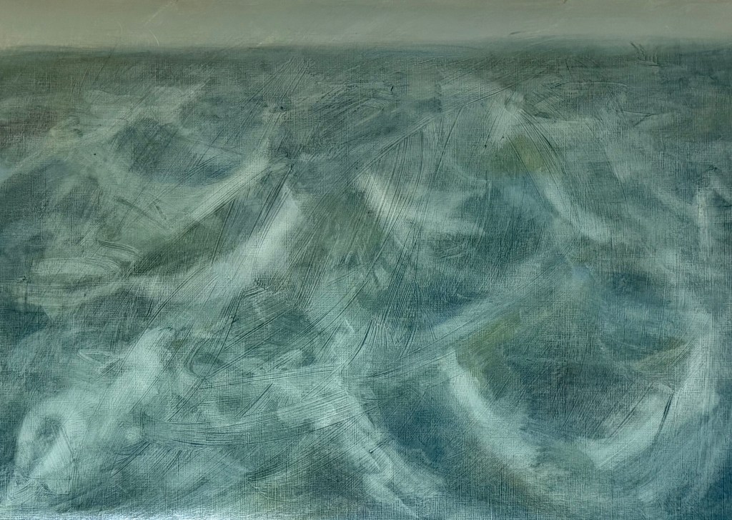
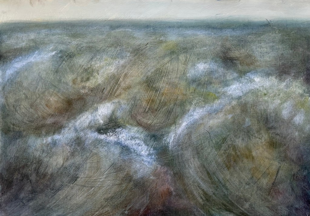
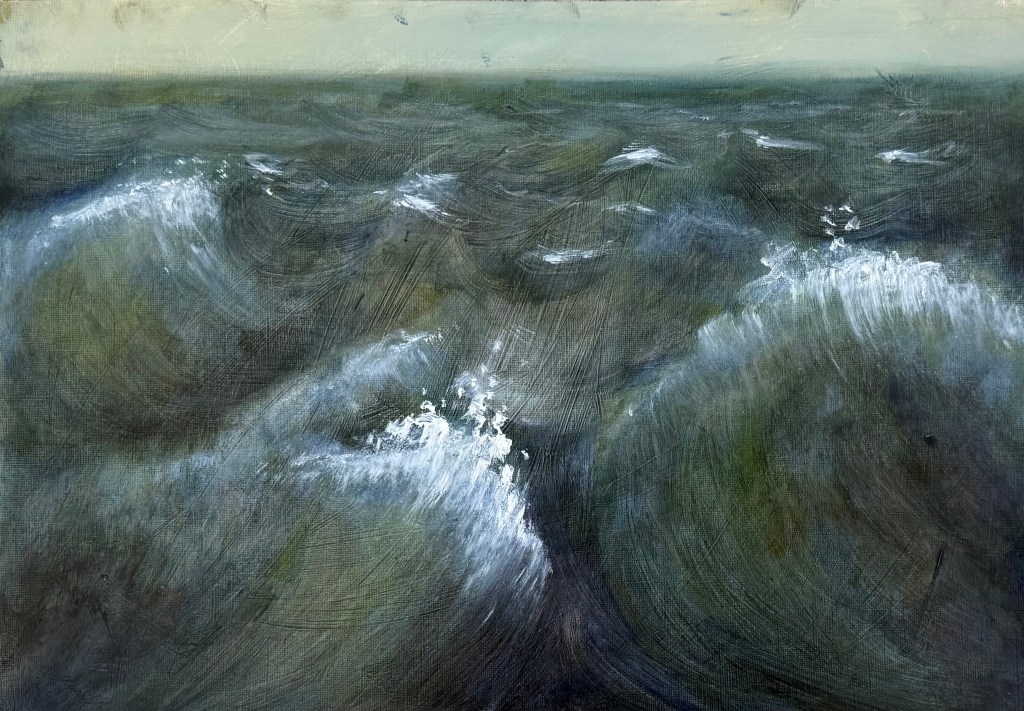
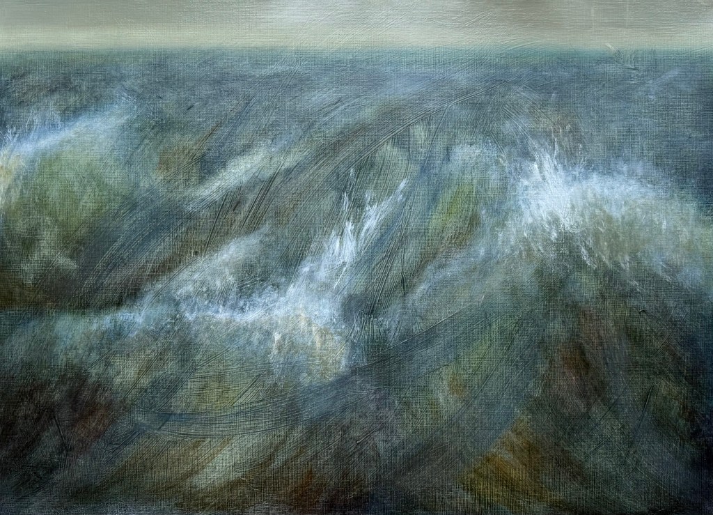
The self is in a constant state of becoming, and each time we reflect, we create iterations of ourselves, crystallised in time; shadow selves. ‘Wayfinding’ – my first reduction linocut – evidences the processual nature of its making, with each layer being a trace of what was once, but is no longer, fixed in time and unalterable. It embodies how the act of making and the evolving self are intertwined, the self being both mapped and remade.
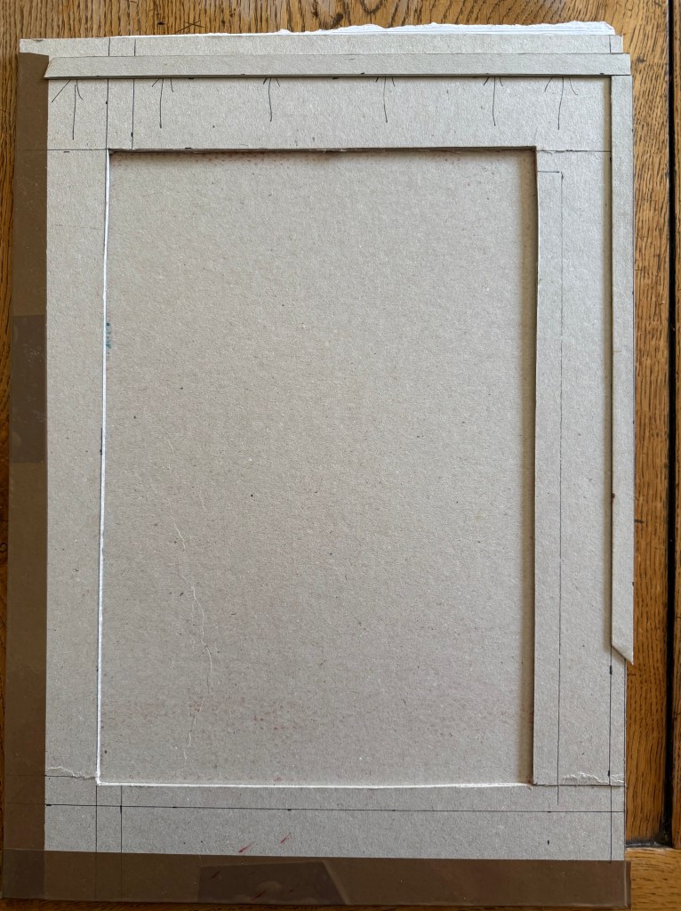
It’s been a steep learning curve, with highs and plummeting lows. I have learnt a lot from the experience – the physical process of the making of the prints, with its inherent breaks from activity, and the potential and restrictions of the materials themselves which have challenged me, requiring me to find solutions to the problems I have encountered along the way.
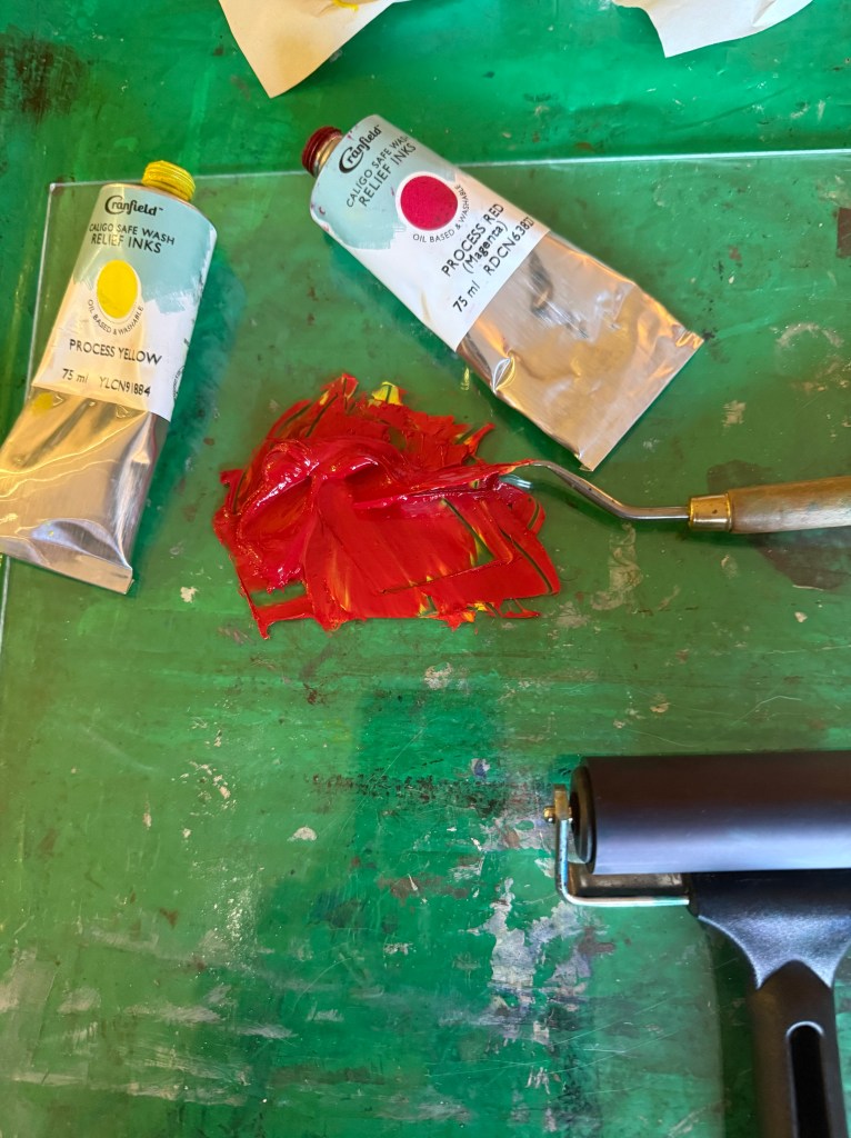
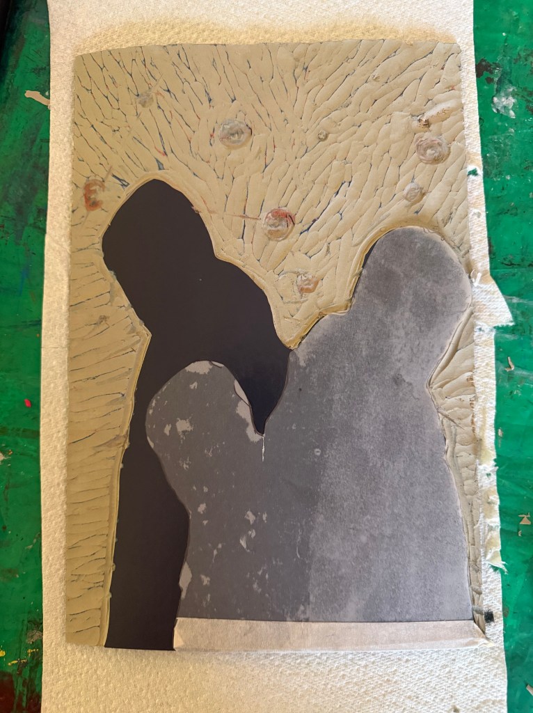
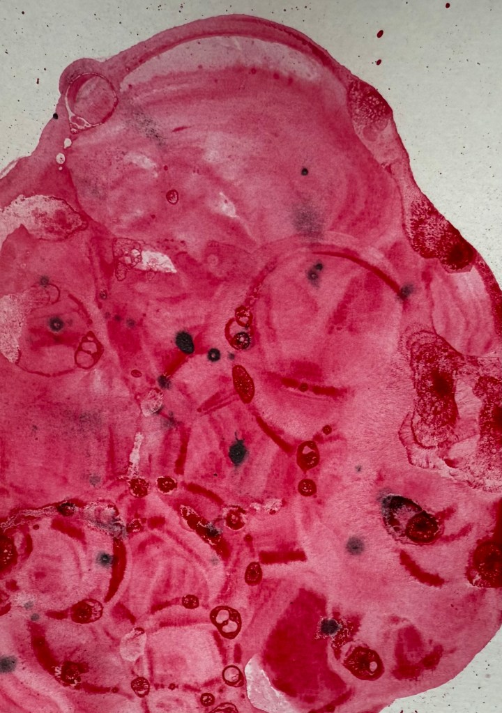
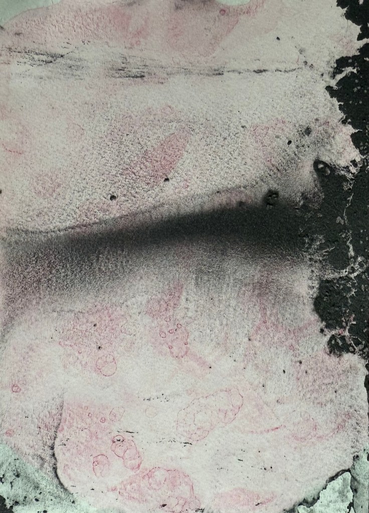
I liked the contemplative feeling of cutting the lino and the nature of rolling out the ink, observing its texture on the brayer akin to suede, listening to the sound of the brayer and ink sizzling, and the relief (or crushing disappointment) when pulling the print. I feel that the experience has enriched me and that hopefully I will continue to become a better printmaker – I don’t say that I have become a better printmaker because aside from possibly being factually incorrect, that indicates that my becoming has stopped – I want to be in the process of continuing transformation. The prints themselves evidence my learning and development in all their imperfection.
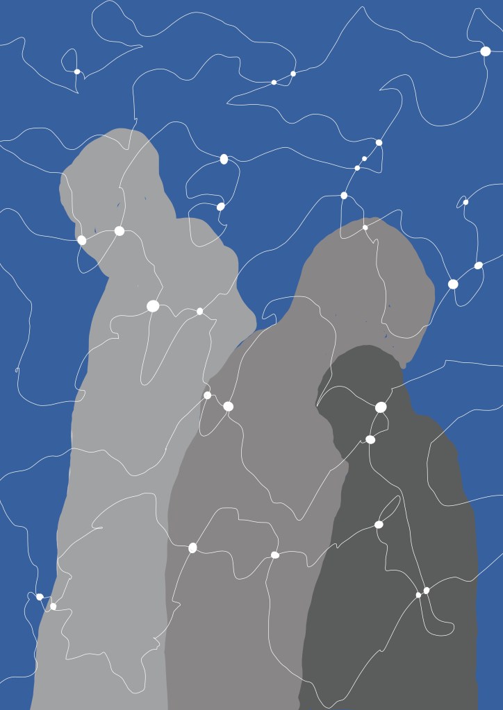
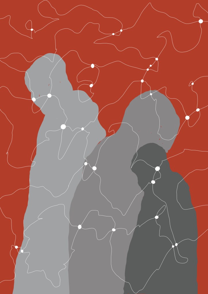
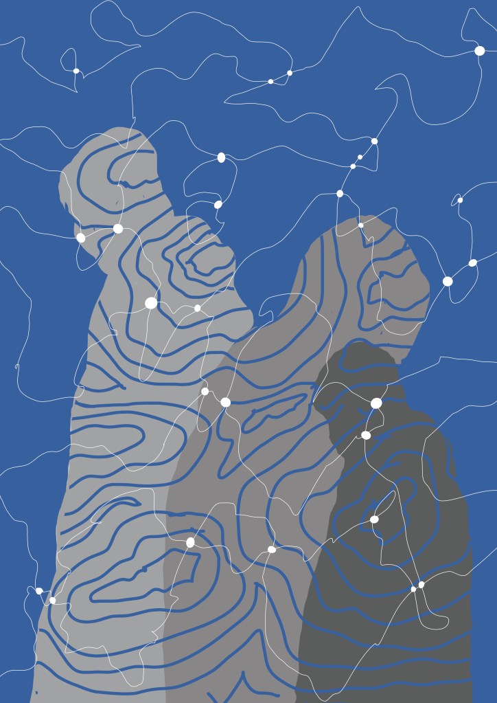
In his paper Making Hands and Tools – Steps to a Process Archaeology of the Mind (2021), Malafouris argues that ‘thinking is thinging’, in that we think with and through things, not simply about them, and that human becoming refers to the process of ongoing transformation that characterizes the human condition as indeterminate and incomplete, or else always about to become. As we engage creatively with the world, the new things we make shape our developmental pathways and our ways of being in the world and, as such, human intelligence is handmade.
’Hands and tools can be moved but they are not moving; it is the brain that moves the hand to move the tool. Taken together hands and tools can be seen as interactive processes. They co-constitute each other’s life by means of thinging. It is now the tool that moves the hand to move the brain because the brain is already attuned to the hand and the hand is aware and responsive to the tool. In one sense, the hand acts as for the tool, in another sense the tool acts on behalf of the hand or other tools…The agency of the hand derives from the tool and the agency of the tool derives from the hand.’
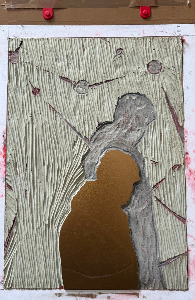
He asserts that hands and tools are made for action, in action. So my hand is made for action and without that action it is not a hand. I pick up the carving tool which is made for action and without my hand it is not a tool. My hand moves the tool to carve the lino and the tool responds to my hand at the same time as my hand responds to the tool. The lino responds to the tool as well as my hand, and in turn my hand and the tool respond to the lino. The lino is not lino without the tool and my hand to carve into it. My hand and the tool are not a hand and a tool without the lino to carve into, and so on. As my brain is in tune with my hand, then so is the carving tool, the lino, the brayer, the ink, and the paper, and, as such, they all influence my developmental pathways and my way of being (or should it be becoming?) in the world.
On reflection, I’m not sure that I enjoyed the process that much. The restrictions of a deadline, the specifics of size and number, the fact that it was being made with a view to being sold, all contributed to a feeling of unease and pressure. I much prefer experimenting with no expectation, focussing on the process, and not the product.