For the last couple of weeks we’ve been continuing to explore Turner in my painting class. The subject is water and stormy weather. As before, we’ve been applying thin layers of paint and sansador with a rag, and then applying several layers of glazing.
We started with a couple of small studies.
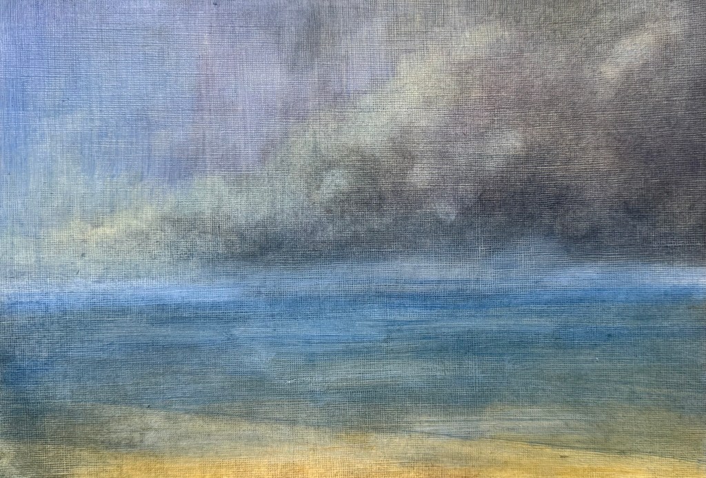
I used a limited palette of mineral colours – ultramarine blue, cadmium yellow light, burnt umber, alizarin crimson and titanium white. I’m not keen on it, it jars with me, in fact, I really don’t like it, but it meets the brief.
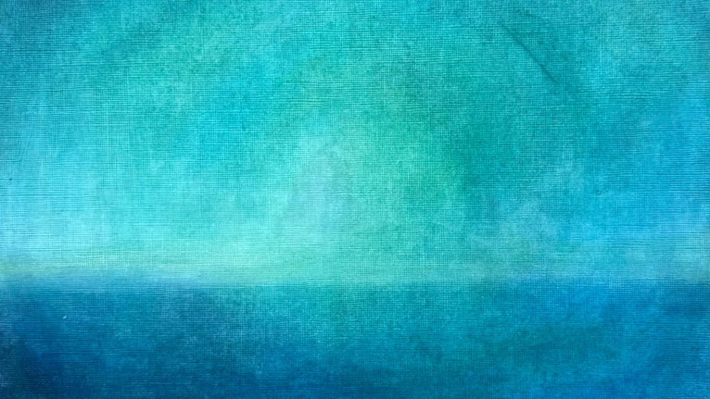
I much prefer this one – to me, it’s less figurative, although as soon as you put in a horizontal it automatically reads as a seascape. A post-Turner palette of cerulean blue, Prussian blue, phthalocyanine turquoise, cadmium free yellow, winsor violet and titanium white.
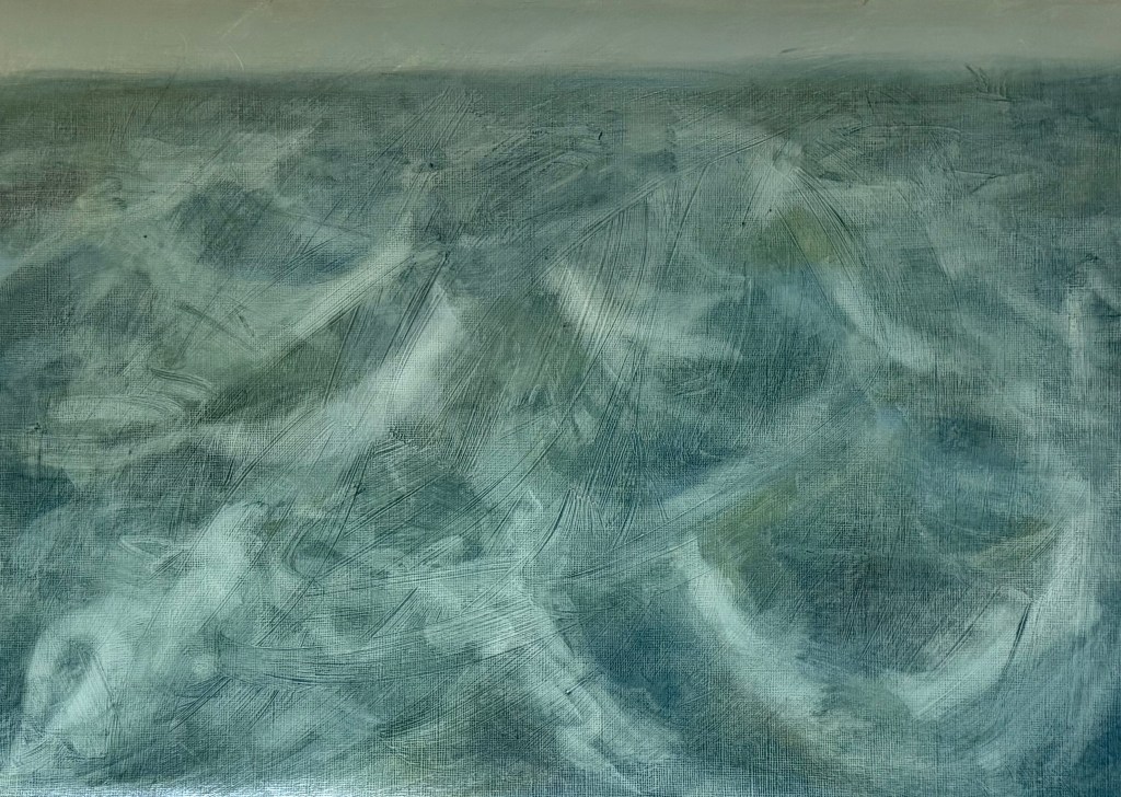
Then starting with an acrylic ground of a yellow grey, applied thickly and roughly so that definite brushstrokes are visible, I used the same limited palette of mineral pigments as in the first study.
It all started to become a bit twee, for want of a better word, so I blurred the horizon, and tried to break it all up, knocked it back and accentuated the sweeping brushstrokes in the ground using an ultramarine glaze. I feel better about it, but in retrospect maybe I should have done away with the horizon completely, as Turner tended to do, or maybe the horizon allows it some space? I think I need to put it away and reflect on it at a later date.
I’m conflicted; over the last year, I have found that I have been moving away from figurative work, particularly in terms of art that I like to look at, perhaps in an attempt to free myself. I’ve always taken the view that I attend these weekly classes because I like to explore different directions, and that there is no point just turning up and making what I want to make each week regardless. I try my best to complete the task, but I’m finding it increasingly difficult. Maybe this is a lesson for the future – of not always being able to make the work which I want to make.
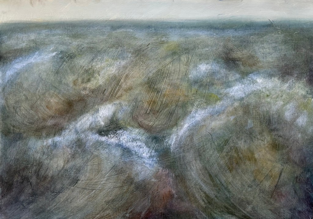
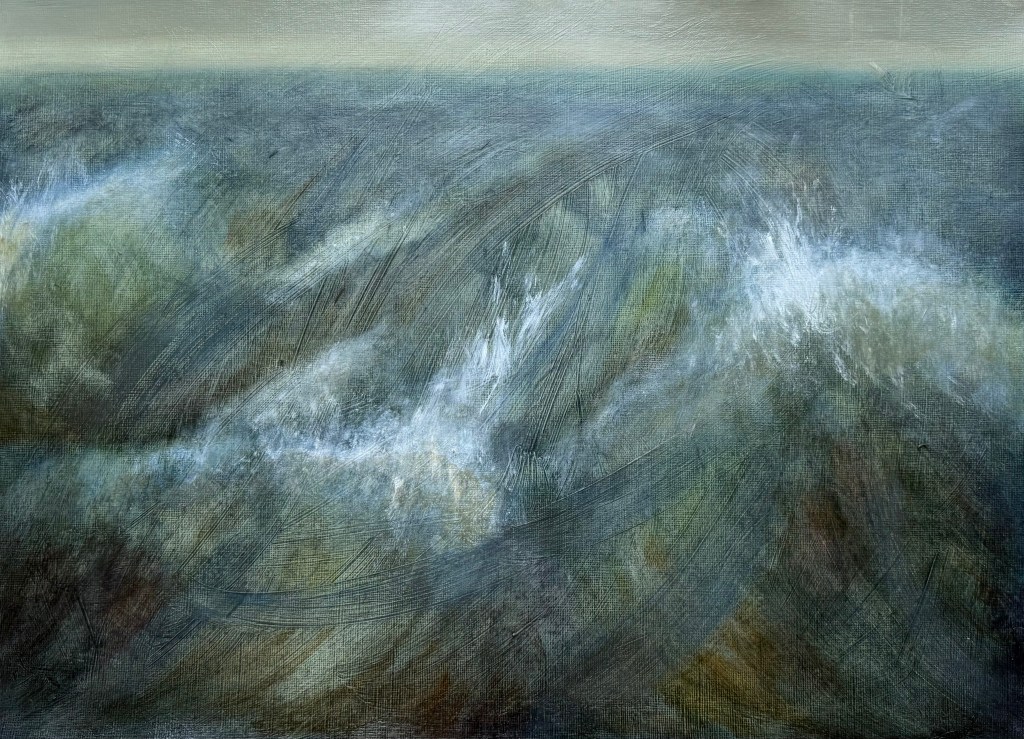
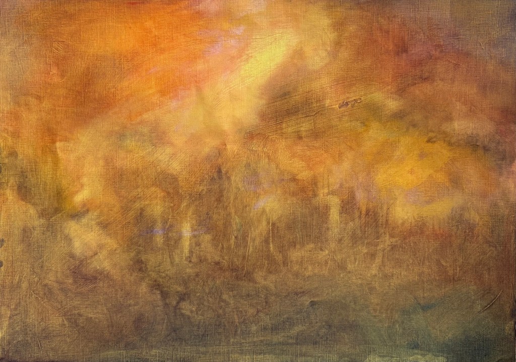
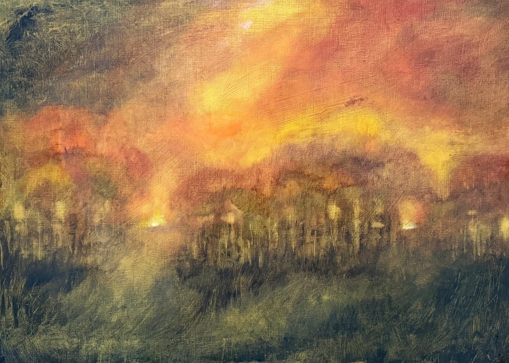
We’re looking at Turner in my weekly art class, in the context of climate catastrophe; forest fires, flooding. He didn’t follow the rules and did whatever took his fancy. Layer upon layer, ignoring fat over lean, whiting out. A conservator’s nightmare.
We started off by looking at some imagery and then, without any further reference to it, got to work. We put down a ground with acrylic paint and then applied layers of thin oil paint and solvent with a rag.
It wasn’t a conscious decision, but I ended up using a very limited palette of cadmium red light, cadmium yellow, ultramarine blue, burnt umber and some white. Once the thin paint was dry we applied glazes on top. I did a lot of wiping on and wiping off – it seems to be my modus operandi, as well as doing a lot of scratching – not particularly Turneresque, but never mind.
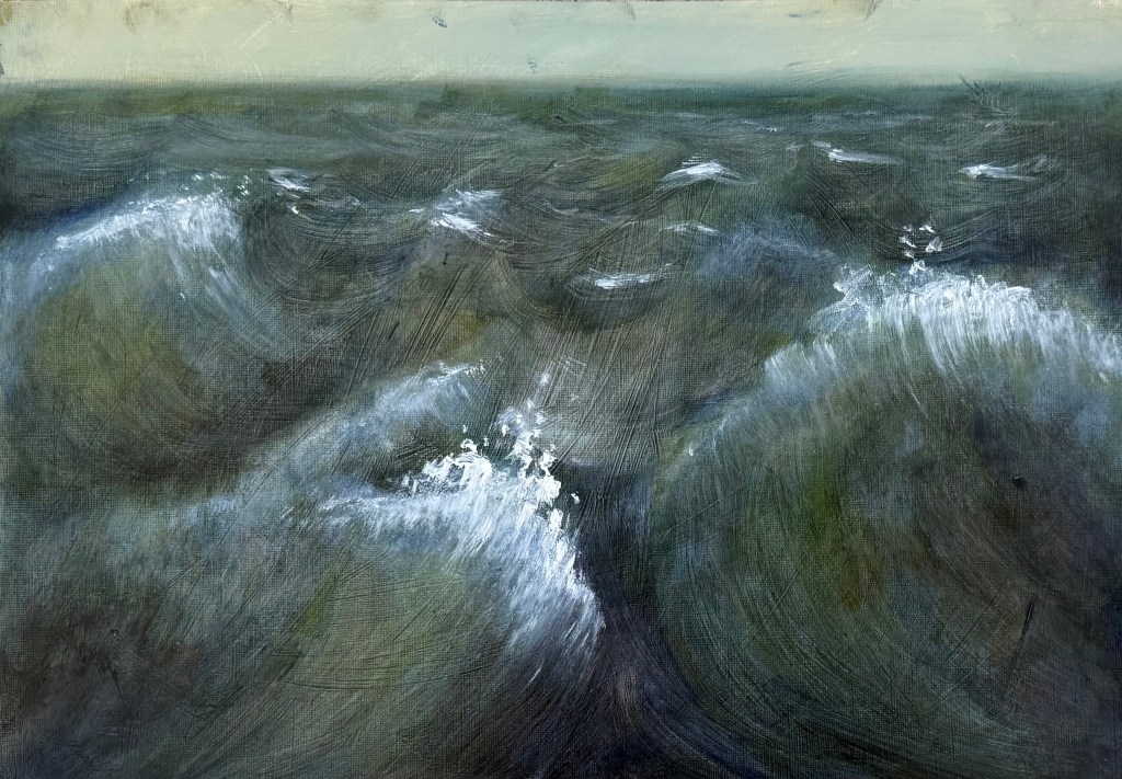
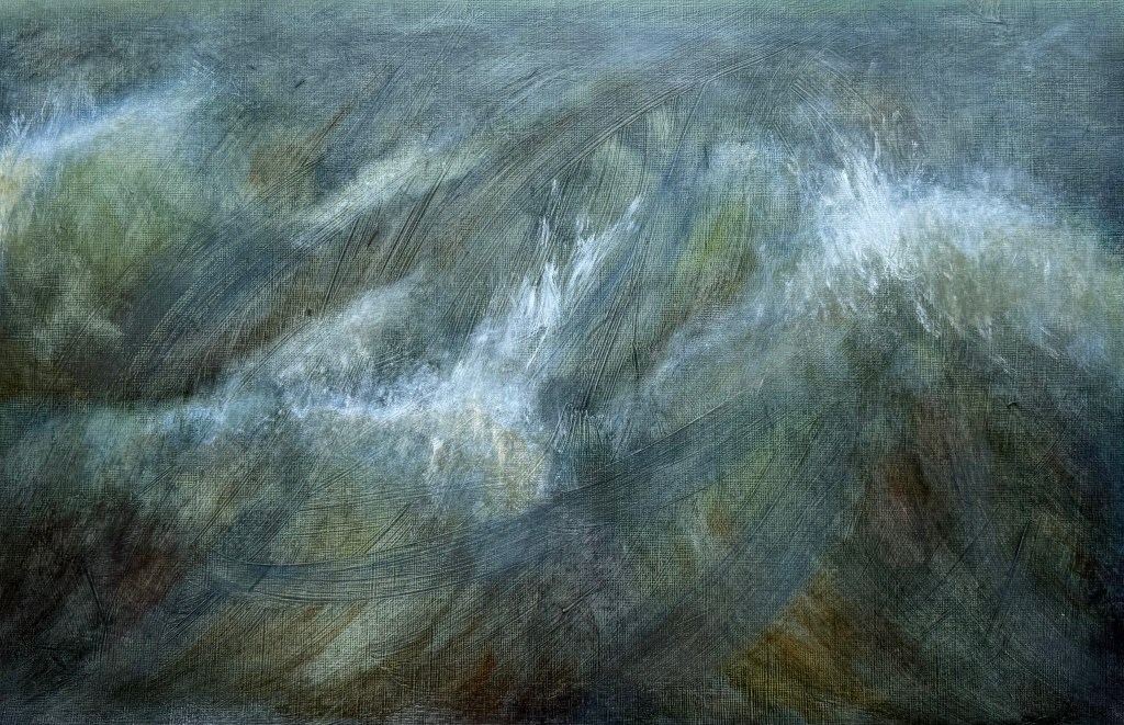
What do I think of it? As a study of an imaginary forest fire à la Turner, well, I think I’ve done ok. I’ve managed to create lots of layers and there is definitely some optical mixing going on. I think that I’ve managed to keep it quite loose (for me, anyway). I enjoyed putting the glazes on, colour was caught in the marks and grooves in lower layers which had been made when I had loosely put down the ground. I like that it was out of my control to a certain extent.
At the end of the day, I don’t like it. It was an exercise which I completed, I haven’t invested any of me into it, and it doesn’t do anything for me. But that doesn’t really matter because it is about trying different things, being open to new approaches and trying them out with an enquiring mind.
Putting paint on and wiping or scratching it off is something I instinctively do – it’s a very tactile way of working, and I’ve realised that it’s all about the materiality and the dialogue, which seems to be a bit of a tussle at times.
In my weekly art class they’ve been making collages on top of a sheet of patterned wallpaper (so that in theory the negative space is already filled), followed by figurative paintings and then abstraction. I’ve missed one or two classes, so I went straight in for the collage and then abstraction.
Whilst I enjoy flicking through magazines, predominantly House & Garden in this instance, I find it quite overwhelming trying to decide which images I should cut out, so more often than not I just go with what appeals and worry about how it’s all going to work later on. I think that I’m a ‘Ready Steady Cook’ kind of person – I feel much more comfortable being given a red or green bag containing an odd assortment and being asked to make something out of it.
Anyway, it was whimsical and light hearted, and I couldn’t resist the image of Sean Connery.
I then selected a couple of areas of interest.
And then interpreted them using oil pastels and paint.
I enjoyed the process. I can honestly say it was pure play and experimentation. I used a mixture of layers of thin and thick paint. I particularly like the two large green areas in the first one – I used a fan brush to create texture in the lighter section and drew into the lower section with the end of the paintbrush. I really like the interaction between the pastel and paint, how the pastel bleeds into the paint and how some edges are lost, whiting out some areas and tickling in bits of colour, scratching out.
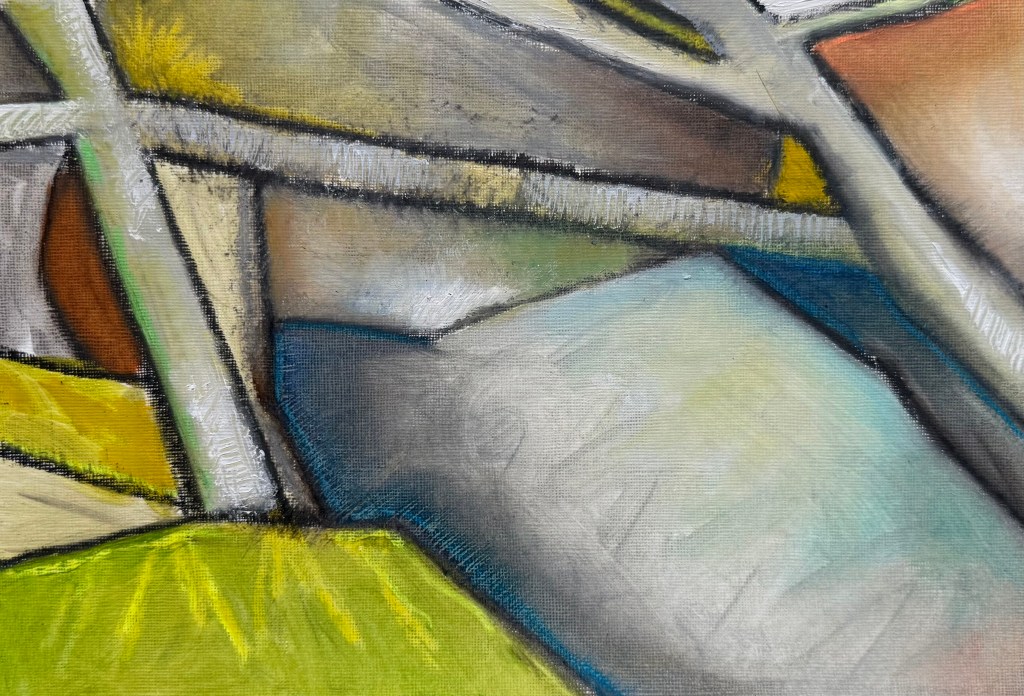
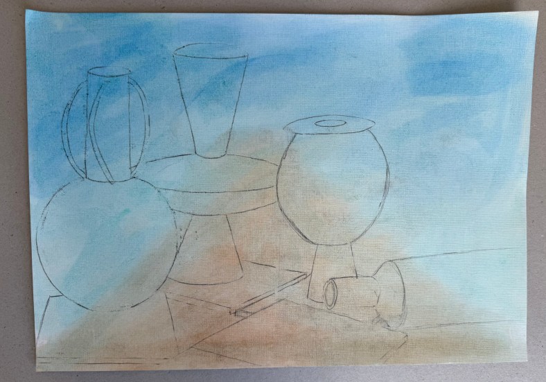
We’ve gone to St Ives in my weekly oil painting class, more specifically looking at the work of Ben Nicholson.
I’ve only recently looked at the work of the St Ives artists; aside from Barbara Hepworth, it didn’t really interest me before. I often go to the Pallant House Gallery and they have a few as a part of their permanent collection.
The brief was to make a drawing of the still life and then make two pieces, one with a slightly Cubist slant (using a tracing of the drawing to recreate shapes) and the other with a landscape in the background, both in the style of or influenced by, Nicholson. We used a limited palette of burnt umber, ultramarine blue, cadmium red light, lemon yellow and white.
I think that I would say that the finished pieces were more influenced by, than in the style of Nicholson! I’m not sure what I think about them. I swing from loathing them to actually quite liking them. I prefer the more abstract of the two.
What I have taken away from this exercise:
Lemon yellow takes an age to dry.
I really like the contrast between areas of pure ground and areas of opaque colour – I’ve often thought that some of Nicholson’s work has a ‘collage’ effect to it, which I like.
I like the interplay between the visible graphite lines and the oil paint.
The combination of the different genres of still life and landscape is really interesting.
I feel that I’m veering away from the figurative.
I wish that I had been less literal – I should have been more adventurous in my composition of the still life, mixed it up a bit more and not included figurative renditions of the individual elements, especially in the one with the landscape.
Next, is one of Nicholson’s inspirations, Alfred Wallis, known for his naïve art-making.
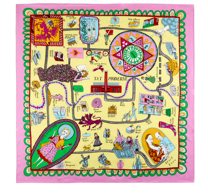
Is my destination, according to the Grayson Perry scarf which the wonderfully generous ladies in my oil painting class gifted me last weekend. Just when I thought that I was directionless, I now have a map. I’m an incredibly lucky person to have these marvellously creative, funny and supportive women in my life.
It’s been difficult, but I’ve been managing to stop myself from altering things after the event. To leave things undone with elements which really jar with me, which are clearly wrong and which look awful, and to post them anyway. I think that it’s starting to make a difference as to how I work – if I can get into the habit of showing the worst of it, the imperfect, work which I’d much rather never see the light of day, and preferably end up in the bin, I hope that I will be able to engage fully with the process, and not worry about the result.
The mantras I’ve adopted so far:
I will choose the mark-making processes which I enjoy, and not worry about the result
I choose the process, not the result
I don’t have to like what I make, and I don’t have to make what I like
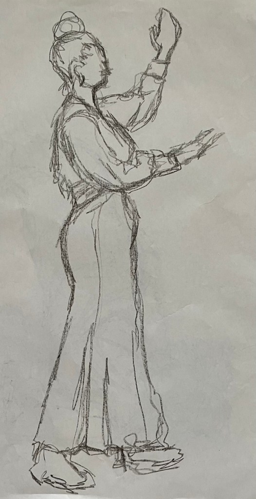
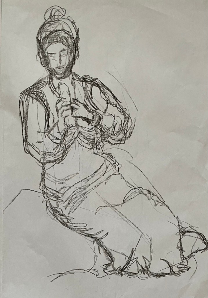
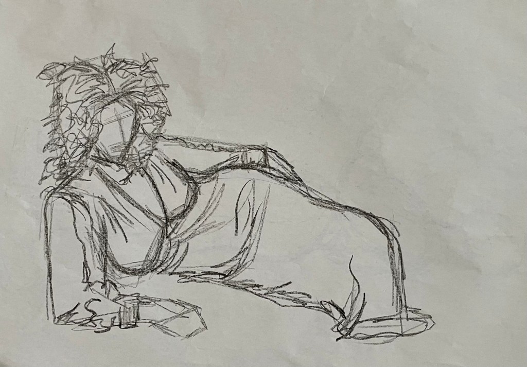
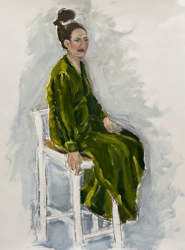
So, we’ve been continuing with the subject of figures in my weekly oil painting class. We had a model today. I certainly haven’t done her justice, and just don’t get me onto the subject of faces. We had to do a few warm up drawings, starting with continuous line – always difficult to get things in the right place – and then just normal sketching, a couple of minutes each. I used an oil pastel – I like that it’s a commitment, and can’t be rubbed out. There’s nowhere to hide, mistakes remain visible – the new me. Then an hour painting.
What to say? I’ve realised that since I’ve been posting my ‘Undones’ (seems a more positive word than failures), no matter how unhappy I am with the result, I can always find something that I like, if I look hard enough. It has just dawned on me, that I probably wouldn’t notice these elements if I was happy with the end result if, indeed, they managed to survive the perfecting process. There’s always some beauty, no matter the ugliness.
I think that I’ve unintentionally transferred my feelings of being weighed down onto the model. The dress looks so heavy; although it was velvet. I think I’ve managed to capture the sense of velvet. I’m trying to avoid using any blending in my paintings at the moment – I’m working on keeping my brushstrokes defined and with a sense of movement – I think I’ve achieved this. The figure is generally good and I particularly like the neck.
I’ve just been watching Sky Arts LAOTY, and now Gareth Reid is now giving a masterclass on drawing faces – I could definitely do with watching this.
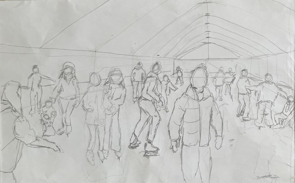
I’ve started back at my weekly art class after the Christmas break, and over the last two sessions we have been looking at figures, in particular, figures in an environment. I’m not very good at depicting humans (or any animate subject for that matter), so this was a bit of a challenge.
We had to work from images which we had sourced: I took my nieces ice-skating at Christmas, which was really entertaining to watch. There were the confident, well-practised skaters who came equipped with their own boots; the ‘I’m-competent-but every-now-and-then-lose-my-balance-and-windmill-my-arms-brigade; and then the rest – hopelessly clutching the side, or each other, for dear life, inching their way round. There was a whole range of shapes, gestures and weights, in the sense of where in the body the weight is being distributed, and there was a lot of tension.
We started by sketching out the composition.
I used a combination of photos and video stills from my phone – I could have been more organised because I lost track of which figure was on which photo, which wasted quite a bit of time. Next time I work from numerous image sources I will organise them so that they are more accessible and easier to switch between.
I then applied a ground to the support (I used oil paper as opposed to a canvas, as I wasn’t sure how it was going to go). As it was a painting of ice-skaters, I chose burnt umber thinned down with Sansador as my ground, as it’s the blue equivalent of the earth colours. I then drew in the figures using a rigger brush and thinned paint – I found the techniques covered by Chris Koning’s workshop of gestural drawing (‘Perception of the Whole’) to be really helpful in trying to get some dynamism in the portrayal of the figures. I also changed the composition from the pencil sketch to bring forward the pair of skaters on the left and to give the skater next to the pair some extra space into which he could move. I also packed some more figures in, including my favourites, the couple in the centre – the man skating alongside and watching his partner who is leaning forward – and the girl behind them.
The next step was to block in the background. I decided that I didn’t want to put the figures in the specific setting of an ice rink, so I left out the details of the roof and sides which were included in the original sketch. This gives a feeling of more space.
I used a thinned down mixture of titanium white, ultramarine blue and burnt umber to create a grey/blue and then scratched into it with the end of the paintbrush to create skate marks.
I then started blocking in some colour using thinned paint. I liked the fact that the burnt umber drawing was still visible and decided to try and retain as much of it as possible. This meant that I would not be able to use much thick paint in subsequent layers, and so the painting will retain a sketch-like quality. The purpose of the exercise was to capture the essence of the figures, so there will be very little detail in the figures and their faces, other than those in the foreground, and even then I will keep these limited.
I regretted having the large figure in the foreground, but he felt necessary to add variation to the height of the figures, and his static quality should hopefully contrast with the sense of movement in some of the other figures.
I carried on adding some more colour and changed the colour of the skater’s hoodie to differentiate him from the figure in the foreground.
I really enjoyed the process of being looser: the multiple visible alterations and the pared back application of paint. I’m not sure that I like the finished piece, probably because of its subject matter – it’s all a bit twee. But that’s my own fault – I hadn’t adequately prepared for the class and so made a rushed decision. Next time we have to work from a preselected source, I will make sure that I prepare properly, so that the subject matter appeals to me as much as possible.
There are areas which really appeal to me; I like the way I have treated the ice and I think that I have managed to capture the sense of movement, the hesitancy and tension in the figures, and the atmosphere. I don’t like the way I’ve painted the faces in the foreground. Whilst the exercise was all about the figures, I don’t think I’ve managed to find a method to render faces in a non-detailed way which does not look childish. I need to work on this.
I was thinking about this painting whilst I was out on a dog walk yesterday. I enjoyed making it, but I’m not that enamoured with the overall result, which made me ask myself whether I need to like the work I make or whether enjoying the process is enough. Also, I like and am attracted to a wide variety of artists working in very different ways. I suspect that I have previously thought that I need to make myself like them and make the sort of work they make because it is something that I like and am drawn to. I’m starting to realise that this isn’t necessarily the case – I just need to be ‘me’.
Generally, the work which I produce at my art class is not something that I would ordinarily choose to do, (which is a good thing) and won’t necessarily be relevant to my field of study in terms of subject matter, but it will provide a useful source of exploration in terms of technique and approach in my art practice. As such it is a valuable resource and a good use of time as well as a commitment which ensures that I create work on a regular basis.
I haven’t posted for a while – I’ve been busy sorting things out before going off to Marrakech for a four day trip with my book club.
Marrakech was amazing. Colour. Noise. Smells. People. Heat. Contrast that with this morning when I had to defrost the car before heading off to my weekly art class. I love this drive, along an old Roman road – straight and undulating through the Hampshire countryside to Stockbridge, a small town in the Test Valley. The sun came out and the trees came to life – burning oranges, golds and yellows. It was beautiful, and by the time I arrived at my class, late because I couldn’t find anywhere to park, I was still feeling its effects.
I can’t deal with too much choice – it paralyses me and then I can’t make a choice. Needless to say, I didn’t buy anything in the souks in Marrakech – the choice was overwhelming, so I resolved not to buy anything at all, and was then able just to wander and enjoy the atmosphere and culture.
So today’s task was perfect for how I was feeling. A landscape using a limited palette of burnt sienna, burnt umber, ultramarine, pale cadmium yellow, white and cadmium red. We took a board, roughly primed – in my case it was an old piece of MDF which I had previously coated with professional Dulux oil-based primer, which can make it a bit like an ice rink – and put down a loose ground of burnt sienna with a bit of sansador which ended up not drying for some reason. Then we put in some outlines using burnt umber following with thick patches of colour keeping it very general, but the wet burnt sienna contaminated some areas and lifted off the board in others. We experimented with dragging a dry brush across the paint and I also did a bit of sgraffito which I can’t help doing when using thicker paint.
This is the result:
I haven’t painted for ages – not since beginning this course – I don’t know why. Perhaps it’s because I’ve been doing a lot of thinking and experimenting with other media. At first, it felt a bit strange coming back to it, almost awkward, like I’d been unfaithful in some way.
It’s not my best by far, but it’s ok for an hour and a half. I am leaving it. The ‘me’ I’m trying to change would say that it is not finished by a long way. There’s lots I don’t like and would love to change – I’m itching to tinker – but I’m exercising some will power and calling it a day. Just like I’ve been trying to change my mindset about having an expectation as to how a piece will turn out, I am also trying to train myself to walk away.
Jonathan told me that the job of mark-making is to tell us what to do next. These marks are telling me to leave it alone and to be happy with what bits of it appeal to me – I like the lack of clarity and blurriness caused by the dry brush; the light coming through the burnt sienna ground in the foreground; the energy in the marks, which I would absolutely kill if I allowed myself to do more; the lack of definition which gives a sense of a fleeting moment; and the recreation of the feeling I had whilst driving to class.
Will I do this again? Yes, I always like going back to basics and using a limited palette – I’ll use a different image and next time I will definitely make sure that the ground is dry before carrying on so that the colours aren’t so muddy in places.