Making Sense of Worth

Yesterday’s session turned out to be quite timely for me.

We watched a video of William Kentridge’s Tide Table and part of an interview with him. He likes working with charcoal because it can be erased very easily, and speed of thinking is equal to the speed of drawing. This reminded me of paint being liquid thought (Elkins, J What Paint Is). Kentridge describes his work as being on a trajectory – a path followed, which finds structure and subject through being made.

Amongst other things, we considered what advantage exists in using material that changes easily, and what the advantages are of working in a fast or slow way? We discussed how working quickly can be more intuitive and stops the conscious mind from overthinking. In this respect, some expressed the opinion that work made in a short period of time does not have as much value as work which takes longer to make.

This is a concept that I have been grappling with for some time, in an attempt to shake it off (Dialogue I; Dialogue IV – I’m So Over It; We’re So Excited; Am I Bovvered?). It seems to me to be illogical, because I wouldn’t think that a book which took a year to write is of greater value than a book which only took a month. Maybe one author was in a flow state and it all came easily, whilst the other had to struggle, but theoretically they are of equal value.

What determines art’s worth? The time spent on it, the skill involved, the size, the materials used? Would a small piece using 24 carat gold leaf encrusted with diamonds which took me 5 minutes to make using quite complex skills be worth the same as something I took days to produce using a child’s wax crayon and a piece of scrap paper, but into which I poured all of my emotional being? I’m trying to bring myself over to the point of view that none of it matters; what matters is that I made it because I thought it worth making, and that it connects with me. But it’s very difficult to shift the mindset.

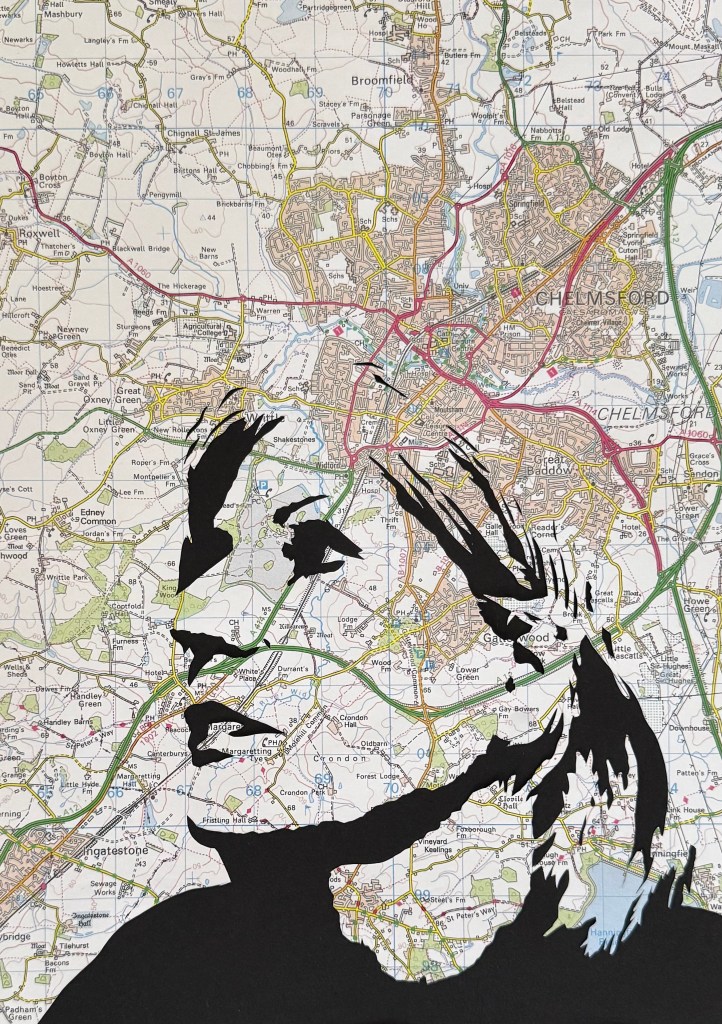
In my posts, which I refer to above, I was considering value in terms of rejection and how that might impact how I felt. I have the opposite scenario at the moment; I saw one of Rebecca’s blog posts about an exhibition she had been to, and I was intrigued by the technique used by the artist. I thought that I would quite like to try it out, and so I did. I made ‘Siblings’. It took me about 45 minutes or less to make. It didn’t take much skill to make – to be fair it could have been made by a primary school child with appropriate supervision while using the craft knife – but it represents and embodies something deeply emotional to me and it was very much about the process. As it turned out, I wasn’t disappointed with the end result and so I decided, on a whim, to enter it into the ING Discerning Eye Open Call, for which the deadline was the following day. It has been selected. You would think that I would be over the moon. I pretend to be to the outside world, but inside I still can’t help feeling that it’s unworthy because of the limited time it took to make.

You Can Take The Girl Out Of Essex…

So, you’re an Essex Girl!

No, I’m not from Essex (I’m not really from anywhere). A pejorative term used to belittle a certain group of women, used so much in everyday speech that it earned itself a formal dictionary definition: promiscuous, unintelligent, materialistic and lacking in taste. It was only 5 years ago that Oxford University Press eventually relented to a petition and agreed to remove the term from one of its dictionaries – the one used to teach foreign students English. A member of the Essex Girls Liberation Front, the campaign which spearheaded the move, is conceptual artist, Elsa James.

Elsa James (image: Tessa Hallmann http://www.greatbritishlife.co.uk 22/08/25)

Nowadays, I don’t really give two hoots. In fact, I often don the mantle and wear it with pride, even though it’s not really mine to wear. I still don’t understand why it’s the only county which has given rise to such a term of speech. Once you get out of ‘London Essex’ the countryside is beautiful, just like its neighbour, Suffolk, a landscape favoured by Constable, and the accent is so totally different from the stereotype.

I was in a local bookshop the other day and was looking at their maps when I noticed that they had a bundle of OS maps on sale, and, as if by luck, they had Landranger Map No 167 ‘Chelmsford, Harlow & Bishop’s Stortford’, so I bought it.

I lived in Essex with my parents on and off for about 12 years. I couldn’t wait to leave; it was on a road to nowhere and I spent the school summer holidays, which seemed to go on forever in those days, sunbathing in the back garden with cooking oil, reading Jilly Cooper novels and dreaming of finally breaking free and moving to London or somewhere else equally as exciting, perhaps one of the destinations of the planes that I used to watch leaving trails across the big blue sky.

I’m not sure why, but my old school isn’t on the map (the map is not the territory). It definitely still exists. It should be where the 08 is. I had to travel over half an hour on the 311 bus to get to school; the bus stop was right outside my house, which meant that rolling up my school skirt to make it shorter had to be done with expert precision as the bus pulled up at the bus stop, just in case anyone was watching. Then up to the top deck where you could smoke, with my small stash of cigarettes which I had pilfered from my father’s packet of Rothmans, left on the side in the kitchen.

It was an all girl school. There was a boys’ school across the road, KEGS, and in the fifth year there was a lunchtime club, Senior Christian Fellowship, to which the boys from across the road could come. It was the most popular club.

What has Essex ever done for us?

  • Grayson Perry went to KEGS: he left a few years before my time. He went on to do his foundation at Braintree College of Art. That’s where I wanted to go, but didn’t. We both got out, by different roads, and to very different destinations.
  • Ignoring the obvious ones, there’s The Prodigy, Depeche Mode, Yazoo, Olly Murs, Jamie Oliver, Maggie Smith, Helen Mirren, Damon Albarn, Richard Osman, and Robert the Bruce, amongst others.
  • Colchester is Britain’s oldest town.
  • It has the smallest town (Manningtree) and the largest village (Tiptree, home to jam-makers, Wilkins & Sons).
  • Southend has the world’s longest pier.
  • The world’s oldest wooden church is in Greensted.
  • It has 350 miles of coastline, second only to Cornwall, and the most islands of any county.
  • Chelmsford is the birthplace of radio.
  • The Mayflower was built in Harwich.

But even so, I still don’t think that I’ll ever go back and live there.

I’ve taken myself out of Essex…

Carbon Dating II

In the words of Vinnie Jones: it’s been emotional.

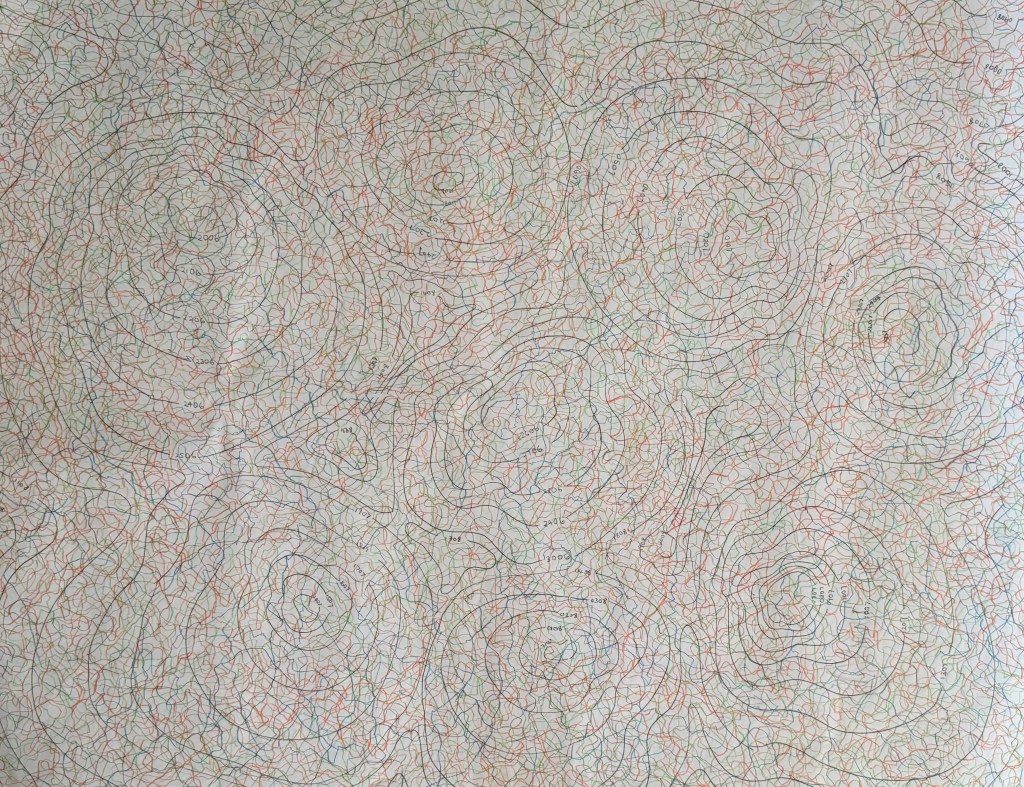
Over the last 54 days I have been mapping my emotions each day, using orange for positive, green for neutral and blue for negative. At the beginning, I was going to use different shades of each colour but I soon realised that this would over-complicate things. I also realised that I needed to put some rules into place: I started each line from the dated contour line, drew for two minutes, trying to explore as much of the sheet as possible to achieve an even distribution of mark-making, and finished the line off the page. I wanted to make it so that theoretically I can pick any day and trace the line which represents it. I drew each line at the end of the day, and took a photo. Unfortunately, sometimes it wasn’t light enough and so I had to take photos including a number of days’ worth of lines, so instead of having 54 photos, I’ve only got 46 which has resulted in a sudden surge in orange lines towards the end – maybe I was enjoying the positive. They are not the best photos – the lighting is all over the place. Next time I do something like this I will try and make them consistent, although I do quite like the movement it creates.

What have I learnt from this exercise? Had I not done it and you had asked me what the last 2 months have been like for me, I would have said that they have been difficult, and that for the most part I have felt negative emotions such as sadness, grief, stress, frustration and anxiety. However, looking at the end result I can see that this isn’t actually the case; I can see that there are more orange lines than green, which in turn outnumber the blue. This must mean that I feel negative emotions more strongly than positive ones, and this results in my perception of life being somewhat skewed. The map reflects this, in that, whilst they are few in number, the blue lines jump out at me from the rest. I think the technical term is the negativity bias. I don’t think that I would have had the same result had I represented my daily emotions diagrammatically in a chart – it matters that each day is individually represented. Maybe there is another way of doing it – I’m just not a mathematician!

I found the exercise to be a positive one; the act of drawing a line each day not only meant that I was making, but it also allowed me to reflect on the day as I drew – a form of visual journaling. I enjoyed the process of it and whilst it can be said that the resultant map is interesting, what it reveals also became apparent during the process itself; as the map was becoming each time I engaged with it, so I was becoming.

As ever, I’m not sure how I can develop this, if at all. Or maybe, there’s no need. Today was the last day. I think I will miss doing it, so I might just continue.

Just Because

In my weekly art class they’ve been making collages on top of a sheet of patterned wallpaper (so that in theory the negative space is already filled), followed by figurative paintings and then abstraction. I’ve missed one or two classes, so I went straight in for the collage and then abstraction.

Whilst I enjoy flicking through magazines, predominantly House & Garden in this instance, I find it quite overwhelming trying to decide which images I should cut out, so more often than not I just go with what appeals and worry about how it’s all going to work later on. I think that I’m a ‘Ready Steady Cook’ kind of person – I feel much more comfortable being given a red or green bag containing an odd assortment and being asked to make something out of it.

Anyway, it was whimsical and light hearted, and I couldn’t resist the image of Sean Connery.

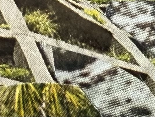
I then selected a couple of areas of interest.

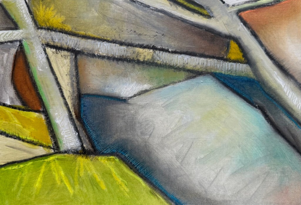
And then interpreted them using oil pastels and paint.

I enjoyed the process. I can honestly say it was pure play and experimentation. I used a mixture of layers of thin and thick paint. I particularly like the two large green areas in the first one – I used a fan brush to create texture in the lighter section and drew into the lower section with the end of the paintbrush. I really like the interaction between the pastel and paint, how the pastel bleeds into the paint and how some edges are lost, whiting out some areas and tickling in bits of colour, scratching out.

As I Was Going To St Ives …

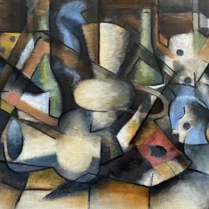
We’ve gone to St Ives in my weekly oil painting class, more specifically looking at the work of Ben Nicholson.

I’ve only recently looked at the work of the St Ives artists; aside from Barbara Hepworth, it didn’t really interest me before. I often go to the Pallant House Gallery and they have a few as a part of their permanent collection.

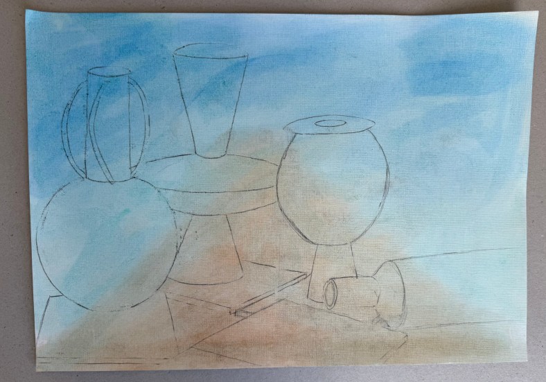
The brief was to make a drawing of the still life and then make two pieces, one with a slightly Cubist slant (using a tracing of the drawing to recreate shapes) and the other with a landscape in the background, both in the style of or influenced by, Nicholson. We used a limited palette of burnt umber, ultramarine blue, cadmium red light, lemon yellow and white.

I think that I would say that the finished pieces were more influenced by, than in the style of Nicholson! I’m not sure what I think about them. I swing from loathing them to actually quite liking them. I prefer the more abstract of the two.

What I have taken away from this exercise:

  • Lemon yellow takes an age to dry.
  • I really like the contrast between areas of pure ground and areas of opaque colour – I’ve often thought that some of Nicholson’s work has a ‘collage’ effect to it, which I like.
  • I like the interplay between the visible graphite lines and the oil paint.
  • The combination of the different genres of still life and landscape is really interesting.
  • I feel that I’m veering away from the figurative.
  • I wish that I had been less literal – I should have been more adventurous in my composition of the still life, mixed it up a bit more and not included figurative renditions of the individual elements, especially in the one with the landscape.

Next, is one of Nicholson’s inspirations, Alfred Wallis, known for his naïve art-making.

Solitude

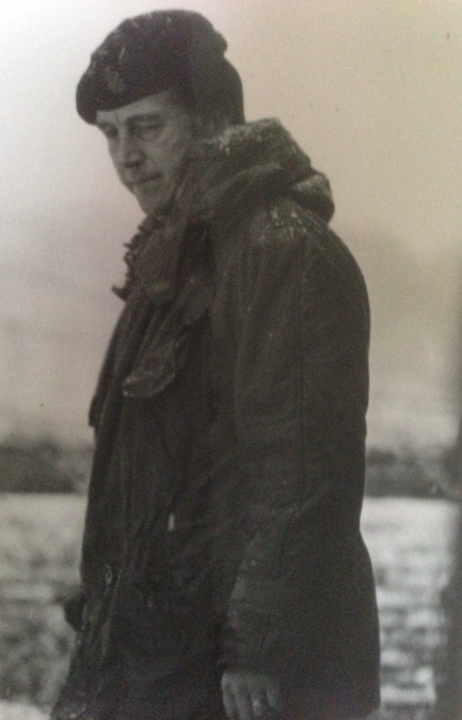
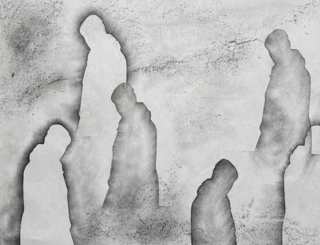
I feel particularly drawn to this photograph of my father. It’s solitary and contemplative, evoking a sense of vulnerability – a side which was never apparent whilst I was growing up. It makes me want to go and give him a hug. He was the world’s best hugger. Either that, or he’s watching someone doing something and he’s not that impressed – a more familiar experience.

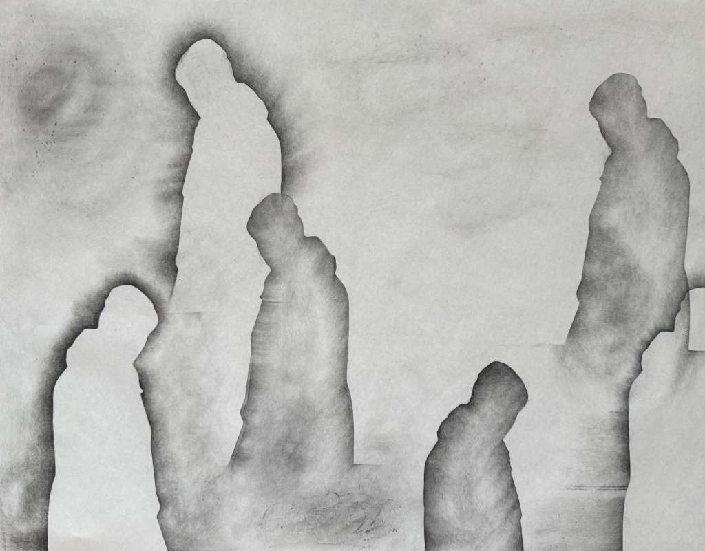
Having missed out on visiting a couple of exhibitions on Sunday, I decided to experiment. I took a piece of A1 flipchart paper, a graphite stick and a 5B pencil and got to work. First I created multiple silhouettes of the image using the graphite stick.

I was inspired by the Richter drawings (The Rich Are Getting Richter) and used the tiles on the kitchen floor to create texture with some frottaging.

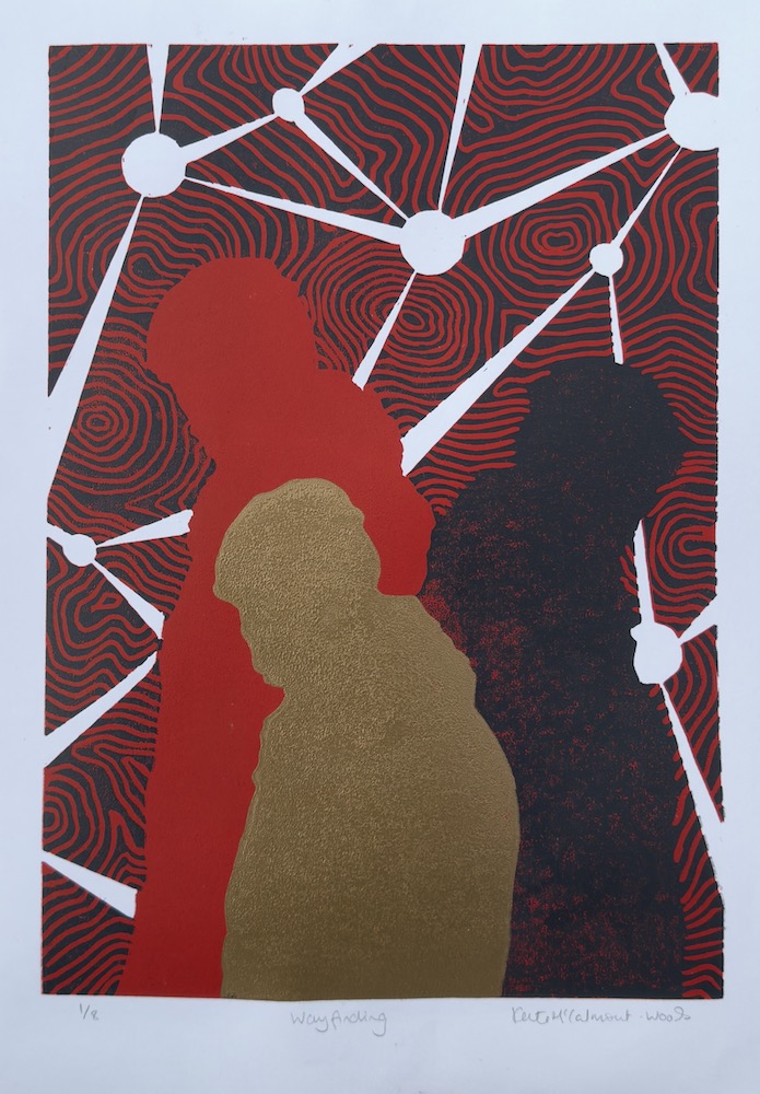
Having really liked the effect of some of the lines and marks made in my automatic drawings, I used the 5B pencil to create a wandering line, holding it at the top and twisting it from side to side in the process and then holding it on its side to create a second softer line. I like the idea of tree roots and mycorrhizas connecting and creating a support network for trees, a concept we touched on in last week’s session. The lines are connecting each figure so it’s no longer alone. They are also reminiscent of a map or a mapping out. Not sure which, but I like the effect. I like the delicacy of the lines. They also remind me of the lines in skulls at the points where the plates have fused or cracks in a surface, fault lines. I wasn’t keen on the overlap on the two figures on the right which created a hard box-like edge, so I cropped it out on the last image.

I really enjoyed doing this, particularly the lack of control of the line making and the unpredictability of the frottaging, and despite that, it does bear a resemblance to the vague image I had in my head. It ties in with the idea of shadow selves (Sniper’s Alley) and the idea of inheritance and being made up of multitudes (Bus Replacement Service). It’s definitely an approach I will develop further, but I’ll use better quality paper next time.

Interim Show

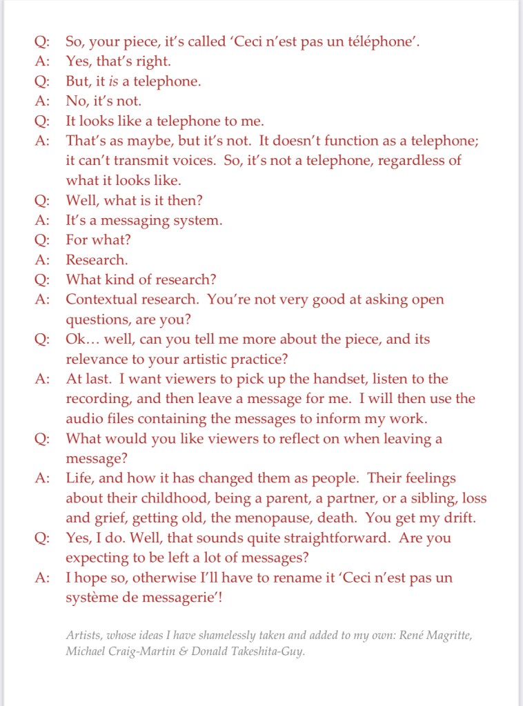
My main piece is the telephone. I’ve managed to figure out how it works – now I’ve just got to record my message which I think will be quite short and to the point.

I struggled for a while to come up with a way to indicate that it is an interactive piece. Also, if I’m going to use the audio files as well as the content of the messages in future work, I think I should say as much so that people have an opt out if they’re not happy with the possibility of their voice being used.

I was trying to get to sleep the other night, tossing and turning, when it came to me – I’d do what Michael Craig-Martin did for ‘The Oak Tree’ i.e. have a transcript of an imaginary conversation between me and a third party.

So I came up with this, which I will display alongside the telephone. And yes, I’ve also ripped off Magritte, and used Donald’s comment from a few sessions ago about mobile phones not really being used for their primary purpose, making and receiving calls, but for messaging etc.

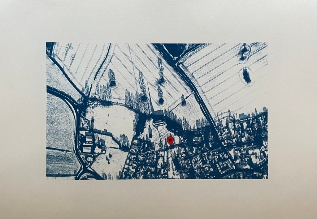
I’ve also had another bash at the cyanotype of the aerial view of the village. I couldn’t get it right on A3 for some reason as the detail of the fields just wouldn’t stick. I tried so many times but I think that because I was doing it quite late at night my brain just stuck, and instead of stopping and leaving it for a while so I could reflect on it with some distance and clarity, I just kept on making the same mistakes over again which made me feel really frustrated. I’m going to park it for now – it could be something to do with the height of the UV lamp.

So I’ve gone back to the smaller negative and printed it on A3 and added in a location pin. I’ve decided to call it In Loco Parentis. I feel much better about it now, and, on reflection, A3 would just have been too large an image for something which is quite intimate and personal.

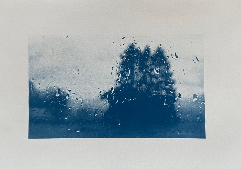
I’ve also tried doing a triptych of the view from my window. I had initial success in finding out how to split the image into 3 equal parts and printing separate negatives for each. After that it just went downhill; it has been so difficult to get any consistency between each of the separate sections because I’m doing them each individually and there doesn’t seem to be any rhyme or reason as to why they turn out differently despite using the same solution and applying it as consistently as possible, exposing for the same amount of time and washing out in the same way. I even tried to make sure that the temperature of the water was the same by starting to run it at exactly the same time before the exposure had finished, but the difference in results between them was staggering. I’ve now got lots of different sections, and having sorted through them all, these three are the best fit that I could come up with.

I think I might sort out the sizing a bit more and then fix them to another piece of watercolour paper.

Disheartened by the exercise I did the same as with the aerial view, took the original negative and printed it on A3. It was much more straightforward, and made me feel an awful lot better. Is it a bit boring? I don’t think so as I think you get a much better sense of atmosphere, and I’m trying to change myself to subscribe to the view that less is more.

As I took the original photo on New Year’s Day, I think I’ll call it, Another New Year’s Day. On reflection I think I prefer it. I’m not sure that disjointed views really do it for me, but then again I didn’t think that I liked collage.

In addition to the pieces above, I’m taking along Motherhood I which I’ve had printed on A1. I’ll see what seems right on the day.

Motherhood I

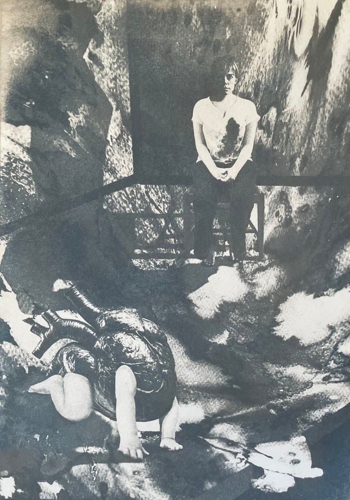
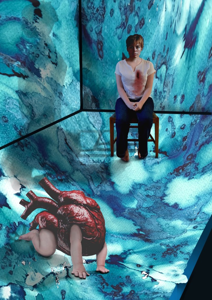
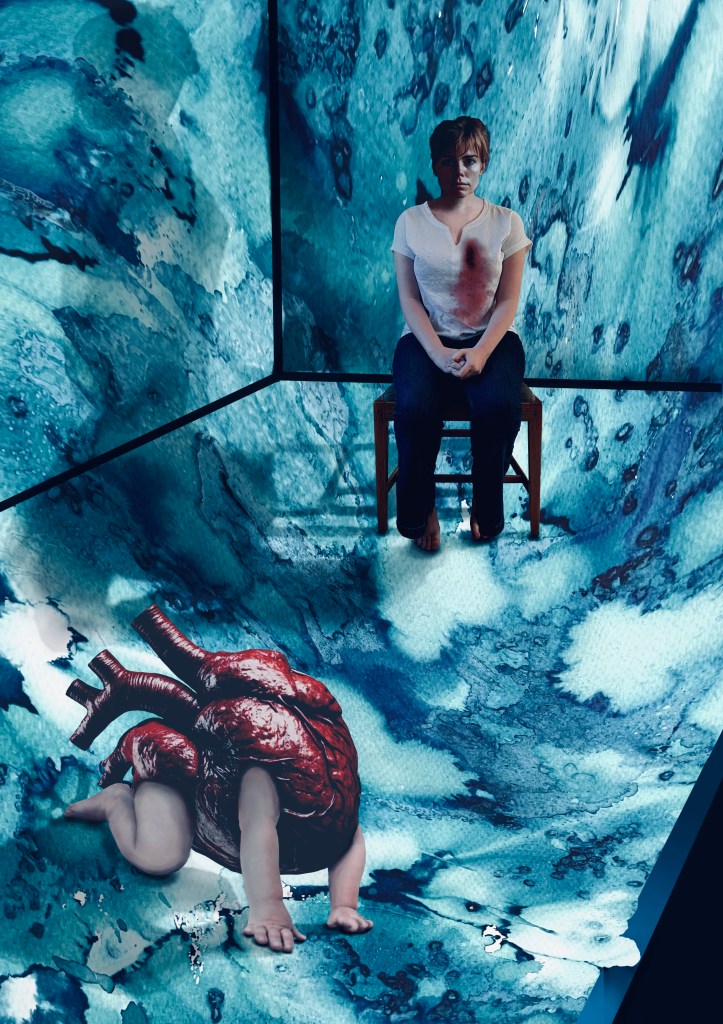
I have had an image in my mind for months. It came from the Elizabeth Stone quotation, I first mentioned in Hearts & Linos .

”Making the decision to have a child – it is momentous. It is to decide forever to have your heart go walking around outside your body.”

I think it encapsulates perfectly how I felt when I became a mother. My whole world was turned upside down. I was suddenly responsible for raising and protecting another human being. I felt overwhelmed by the magnitude of it all; that life would never be the same again. It made me question the sort of world I had brought her into, how her life might be; how much of it I would be a part of, the unthinkable and unbearable pain I would suffer if anything happened to her. She was precious and intrinsic to me, now living and breathing in the world, independently of me.

It’s taken a while. Bearing in mind that I’m still finding my way around Procreate I don’t think that I’ve done too badly. I’m sure that I’ve done lots of things incorrectly, but I don’t really care. It’s all a learning process and it was fundamentally about me trying to realise an image that I had in my head. I feel that I’ve achieved what I set out to do. In that respect, I’m pleased with it. I think it conveys the visceral nature of my feelings.

Actually, it has taken me more than a while; it’s taken ages, probably because I kept on making mistakes, but I have learnt lots along the way. I’ve redone parts of it several times but I have to say that it has all been about the process of discovery and realisation. It’s allowed me time to focus on the detail, but it’s been as part of the process rather than with a view to trying to achieve a perfect result. I don’t think that Procreate is a tool with which I can be loose and expressive in the physical sense, but it seems to satisfy that part of me that likes to focus on surreal detail every now and then. Hopefully that will allow the other part of me to enjoy the experimentation of being looser and more expressive in my mark-making when, say, painting.

I decided ages ago that I wanted to incorporate my ink experiments as a background to a collage type piece. I sourced the heart, crawling baby and head of the woman from royalty free image sites which allow for reproduction of the resultant work, if need be. The body is my daughter. She’s a bit freaked out by someone else’s head being on it, but I wanted a neutral character, and I couldn’t find an image of a woman sitting on a chair that fitted my requirements, so I roped in a free model.

It was challenging constructing the crawling heart. I’ve had to rebuild parts of it including the hands as some of the fingers were hidden in the original image. It was quite difficult finding source images whose licences allowed me to do what I wanted to do, and were also free. I’ve played around with editing effects and colours and I think that I’m settled on the last image for now. The slight greenish tones, complement the red heart. I really like the cyanotypes, but unfortunately there isn’t enough tonal variation and the slightly chaotic background loses its delicate tonal transitions in the process. I might try again but change the background to something a little less busy. But I like the historical, almost Victorian Penny Dreadful feel to them. I might develop it further, but I’ll leave it on the back burner for now.

The time delay video created by Procreate is of epic proportions, but it’s helpful for me to watch it back so I can see what a song and dance I made of it all. This is a shortened version.