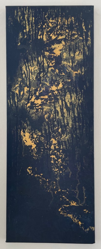
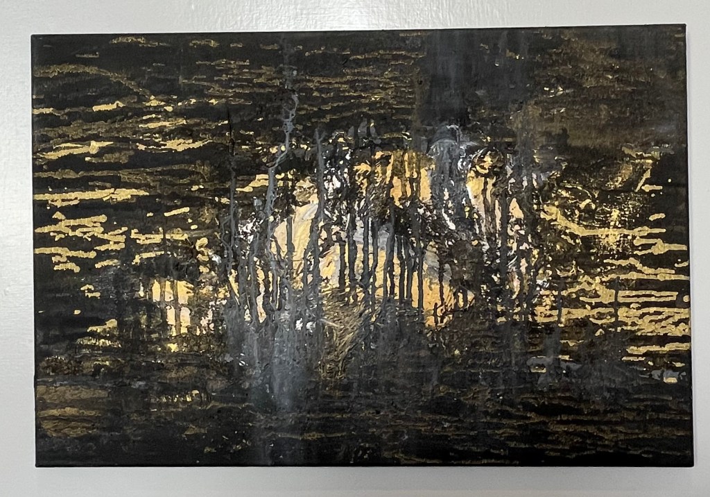
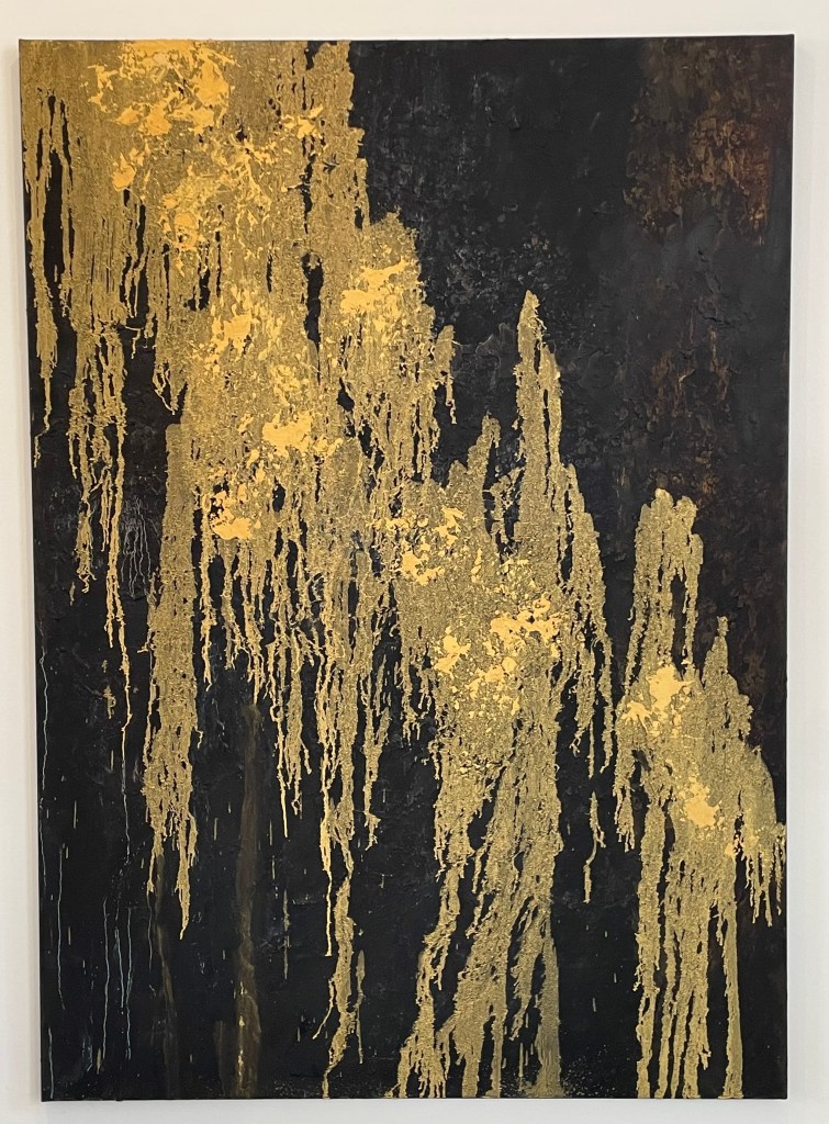
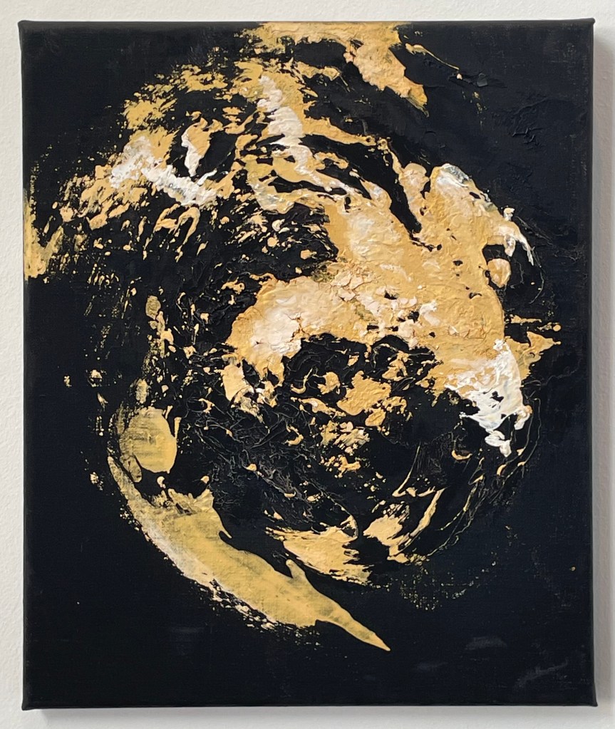
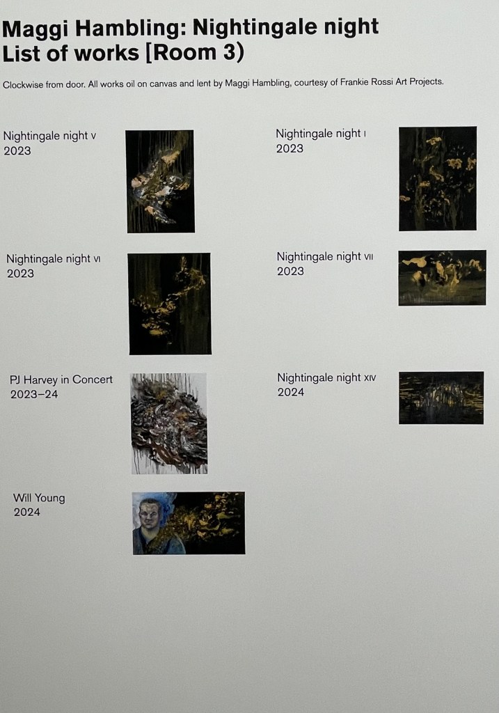
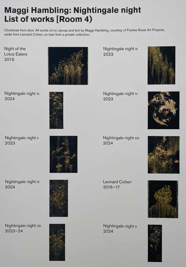
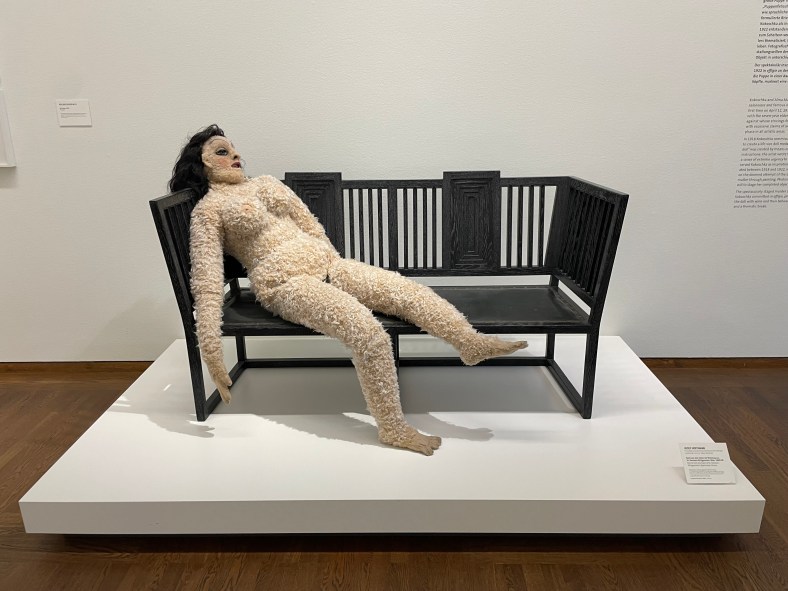
When I went to the Pallant House Gallery to see Dora Carrington recently there was another exhibition on at the same time: Maggi Hambling – ‘Nightingale Night’.
Nightingale Night VI
Nightingale Night X
Nightingale Night XIV
Nightingale Night III
Nightingale Night IV
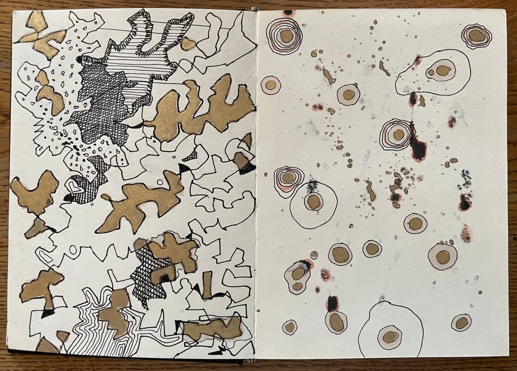
Hambling spent a night in a woodland in Sussex in the Spring of 2023 listening to nightingales. I didn’t take photos of all of the paintings – I think I was only drawn to some of them on the day, or maybe I was tired from exploring Dora, but Iooking again at the images on the identification labels, I’m regretting not having done so.
I’ve since read an entertaining interview with Hambling about the exhibition in ROSA Magazine – I like doing further research after I’ve been to an exhibition; never before.
I’m not entirely sure what I think about it all. I’m not sure that I like the gold on the black ground, although I can absolutely understand her reasoning behind it, and I do like a bit of gold. Does she succeed in communicating the otherworldly divinity of the nightingale in the darkness? The sense of it, absolutely, but the sound of it? I’m not convinced, and I think it’s the mark-making. The swirls and definite vertical and horizontal marks are successful, I think, in representing sound; my issue is with the drip-like marks – they don’t allude to the beautiful song of a nightingale to me; it’s more akin to me having a warble and eventually running out of steam and giving up. But I think I’m being harsh, because even she admits that it’s impossible to paint the sound of a nightingale, and that what she hopes to have captured is a sense of the fleeting moment. She comments:
”…there wouldn’t be much point in painting a picture that it was possible to paint…”
It’s an interesting comment, one to think about.
It would be interesting to know whether Hambling made the paintings from memory, or whether she played a recording of nightingale song whilst she worked. I’ve assumed that it is the former because it’s about the whole experience, of being in a certain place at a certain time bearing witness to something extraordinary.
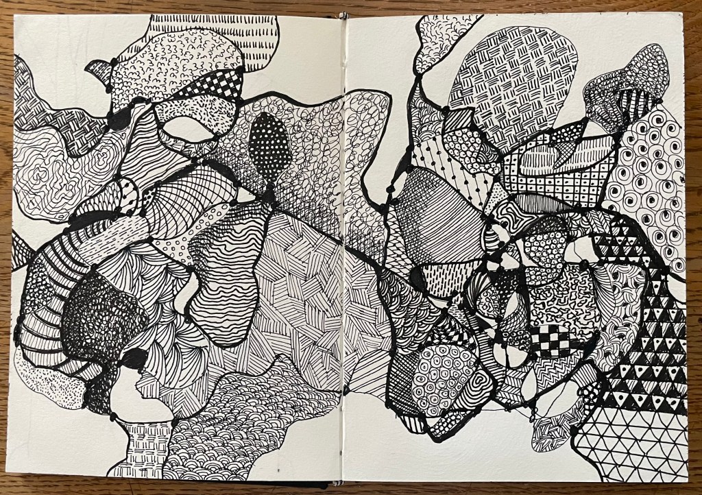
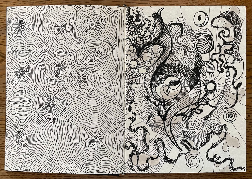
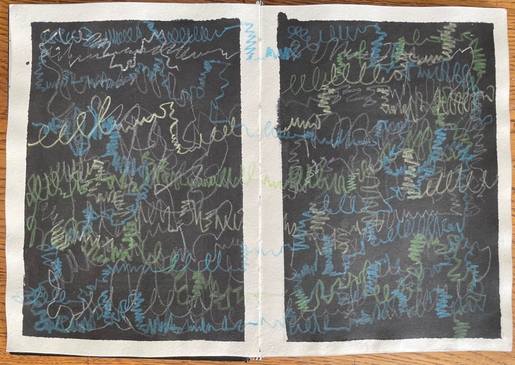
I have been carrying on with my pen doodling, some of which is unfinished – I became bored, and moved on. I also decided to give nightingales a go. The concept of representing sound in a 2-D form is really interesting – the consideration of tone, volume, intonation, rhythm etc. I’ve represented it in a linear way, thinking initially about sound waves, but it would be interesting to explore other methods of representation.
The song is so diverse and improvisational that it was very difficult to think of different mar–making to represent what I was hearing. It was an interesting exercise, and very calming listening to birdsong with my eyes closed.
I like having an inked page – I think I will go through my sketchbook and randomly ink up or paint pages. I also like trying to work with unexpected events such as the solvent stains from the gold coming through to the reverse of the page. This is, literally, just playing – it’s enables a period of convalescence.
I had a thing for Richard Gere when I was a teenager. I remember watching the film ‘American Gigolo’ which I had rented on video – one of his early films, before the likes of ‘An Officer and a Gentleman’ and ‘Pretty Woman’ – which had a brilliant soundtrack, ‘Call Me’ by Blondie. I tried to source the 7” from my local record shop, but had no luck as it had been released a few years before. One of my classmates at school told me her brother had it, and that he would sell it to me for £10 – in those days I could have bought almost 2 LPs for that amount; a single was just over £1. Needless to say, my crush on Richard and my newly discovered love of Blondie made me cough up some of the cash that I had earned from my Saturday job at the local Sainsbury’s. Even now when I hear the track, it takes me back to the opening scene with Richard driving along in his convertible, shades on, the wind in his hair. Ah, I could but dream…
’Call me’ is a strange phrase – often uttered when someone is pushed for time and can’t stop to talk; doesn’t want to talk; can’t make the time to talk; wants to leave it up to someone else to initiate the talk; is desperate to talk; is extending an invitation to talk. It’s not even as if we speak on the phone that often anymore – many households in the UK don’t have a landline, relying on their mobile phones instead, but as Donald commented in one of our sessions, we tend to use a device designed to allow us to communicate on the move, to message, take photos, make videos, play games, navigate, play music, and look things up, instead.
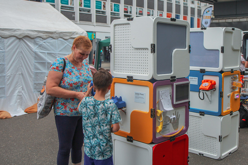
Anyway, I have managed to source a telephone for the interim show, as discussed with Jonathan in my last tutorial.
Am I bothered about using an object which I have sourced rather than made? No, as Jonathan commented, there’s no point making something which already exists; I don’t grind my own pigments to make oil paint, although many do as they feel it provides a greater connection with the work, and I respect that level of patience and dedication – it’s just not for me. But I do, now and then, and if time permits, stretch and prime my own canvases, but this is something I know how to do – all things electronic are alien to me. Also, I generally only do it when I want to recycle some old stretchers. And at the end of the day, ‘readymades’ were ok for Duchamp. I think what is most important to me is the haptics of using the dial – many of the phones I researched had push buttons. I used to love dialling a number – the slight resistance, followed by that sound.
The phone will enable me to leave a pre-recorded message and allow members of the public to leave messages for me, which will then form part of my research – I plan to exploit the public nature of the space. My issue now is, what’s the message going to be, and how will I exhibit it?
It’s not a new idea, not surprisingly, but I will put my own take on it. Having done a bit of research about artists who have used phones as interactive exhibits in their work, I came across Joe Sweeney who, in 2019, installed a phone booth facing France on a beach in Dungeness entitled ‘+44… Leave A Message for Europe!’. Members of the public were invited to leave messages relaying their feelings about Brexit, forming part of a permanent archive of public opinion. The statement on site explains: “The inactive phone box acts as a beacon. It is a nostalgic call to action – a reminder of the way we once communicated – with the nuance of the voice.”
Norton: “The inspiration for the question/answer phones came from a desire to build a device that lets you share a message with someone you’ll never meet. A digital time capsule of anonymous thoughts, advice, stories, and memories that could be listened to by anyone. You have no idea who might hear your message and how it could affect them.”
Unlike in these two installations, my phone won’t have the ability to allow viewers to hear other people’s messages. Mine’s not so complex, but I still think it gives the person a sense of speaking to someone anonymously, and perhaps sharing thoughts which they haven’t shared with anyone else. Those words initially communicated by a phone, then also have the potential to be further communicated in my work.
Dora The Explorer was one of my daughter’s favourite TV programmes when she was a toddler. I don’t know how they did it, but Nickelodeon managed to give Dora the most irritatingly grating voice possible. Anyway, thankfully, this is not the Dora the Explorer who is the subject of this post.
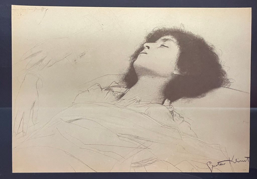
I went to the Pallant House Gallery in Chichester yesterday morning to have a look at the DoraCarrington: Beyond Bloomsbury exhibition. I had heard of her, and had a vague recollection of having seen some of her work.
Dora Carrington certainly was an explorer of sorts: associated with, but not a fully paid up member of, the Bloomsbury Group, she explored her art as well as her relationships and sexuality. To be honest, I couldn’t quite keep up with the complexity of it all. At the heart of it was her enduring love for the gay writer, Lytton Strachey, who was 13 years older than her and with whom she set up home. At one point they lived with Ralph Partridge who Carrington (whilst studying at the Slade, she dropped the name ‘Dora’ preferring to be known by her surname) married in order to keep their ‘triangular trinity of happiness’: Partridge was enamoured with Carrington, Strachey fancied Partridge, and they all had relationships with each other (apart from Carrington and Strachey whose relationship was only ever platonic) as well as others of the same or opposite sex. It seems all and sundry found themselves hopelessly in love with Carrington, not least the artist, Mark Gertler, with whom she had a moment, but otherwise whose long-lasting passion was unrequited.
Alas, it all ended tragically in 1932 with Carrington shooting herself in the chest shortly after Strachey died. She was 38 years old.
The last exhibition of her work was 30 years ago at the Barbican. During her life she rarely exhibited, and her work, many pieces of which she destroyed, seems to have been overshadowed by her adventurous private life and tragic death. She has been described by a former director of the Tate as being’ the mostneglected serious painter of her time’.
It was a mixed bag, but there were a few pieces which caught my interest. Her early drawings and paintings of nudes were very good, but I found myself lingering in front of these.
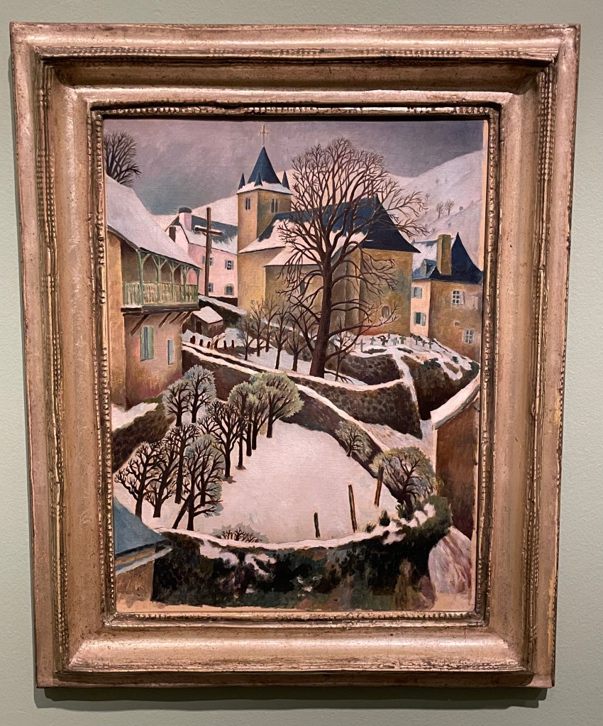
Larrau in the Snow, 1922
Perfect Christmas card material, I really like the simplicity of this painting; its muted colours and, in particular, the composition with its recurring curved shapes of the stone walls and the use of verticals in the posts and trees in the foreground, the large tree and the church with its spire punctuating the sky in the middle ground and the mountains in the background. The positioning of the trees leads the eye up through the painting in a zig zag pattern.
Farm at Watendlath, 1921
Again, I like the composition: the path leads across from left to right, up through the farmhouse along the rear stone wall to the large ominous trees, up to the huge hills in the background which seem to squeeze out the sky. The three areas of white – the figures in the foreground, the farmhouse (and what look like sheets on a washing line) in the middle ground and the clouds in the sky in the background – break up the large areas of green preventing them from becoming too overpowering, but leaving enough areas unbroken to give a sense of being overpowered: the tall trees and hills seem to be bearing down on the woman and child, creating a feeling of foreboding, and the stillness (if they are sheets on a line, they’re not moving at all) and claustrophobia created by the tiny sliver of sky adds to the mood.
It was suggested by the blurb accompanying this piece, that its unsettling atmosphere might have reflected the turmoil which Carrington was experiencing at the time: she had gone to Cumbria on holiday with Partridge and his friend, Gerald Brenan, and they had stayed at the farm. Whilst there, she began a relationship with Brenan.
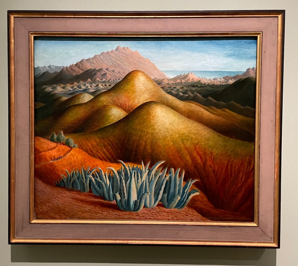
Spanish Landscape with Mountains, 1924
I was drawn to the surreal nature of this painting. Carrington made it from memory, after visiting Brenan in Andalusia, where he lived. According to the blurb, she built up the colour by layers upon layers of glazing on top of what was already a vibrant underpainting. She painted it on a cold day in March, which may have been a contributing factor to her use of colour and the sense of heat and aridity which she manages to create. There are menacing looking succulents in the foreground and a few token olive trees just behind, and these, together with the slight greenish tone to the area in from of the background mountain range, cleverly break up the large areas of warm reds and yellows which form the undulating hills in the middle ground. There is the lovely detail of the figures on horseback moving towards the viewer along the ridge on the left hand side. It has an otherworldly quality to it: apparently Carrington felt transported to another world when she visited Spain.
Lytton Strachey, 1916
“He was everything to me. He never expected me to be anything different to what I was.” This was how Carrington described Strachey, and it is apparent in this portrait of him which she painted towards the beginning of their relationship which was to last 16 years, and which survived numerous relationships on both sides. It shows Strachey deep in concentration reading a book which he is holding in his delicately painted hands, which Carrington has strangely elongated. Maybe his hands were her favourite feature, because she captures them in a detailed way, down to the highlights on his nails, even their white tips, particularly on his little finger. Or maybe she used them as a compositional device to create a dynamic and bold vertical marking the final vertical third of the painting. The image wouldn’t have the same impact if his hands were sized more realistically, and the book he is holding didn’t go off the top of the panel.
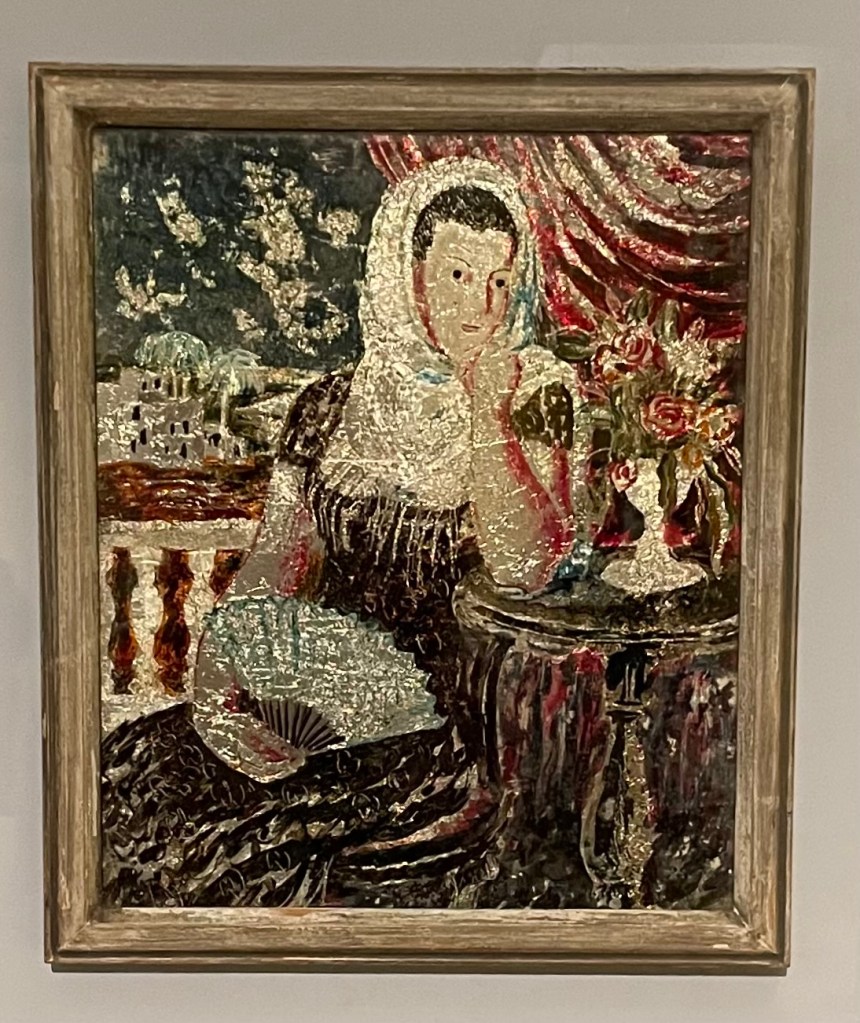
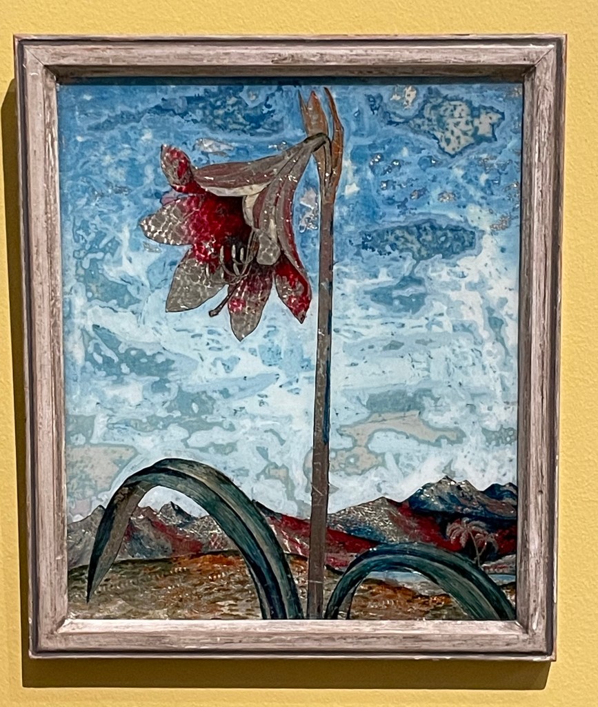
Carrington had a fascination for Victorian ‘treacle’ paintings and from 1923 began making her own which were called tinsel paintings. They weren’t very large and involved making a painting on the reverse of a piece of glass using foil from sweet wrappers and cigarette packets together with inks and oil paint. She sold them through Fortnum & Mason as a way to earn an income in the winter months to finance her serious art making. She also made them for friends: the ones below were made for Augustus John’s wife, Dorelia. Very few of the tinsel paintings survived, and one of them sold 4 years ago for £57,000.
Spanish Woman
Lily
I’m strangely drawn to them as I’ve never seen anything like them before. They have a strange luminescent quality to them and I particularly like the textures in the sky in Lily – the combination of the resplendent lily in a barren landscape reminds me of Georgia O’Keefe.
Anyway, I’ve done some further research: Dora Carrington’s life was made the subject of a film in 1995 – ‘Carrington’ – starring Emma Thompson and some other notable actors. I watched it last night. Perhaps not surprisingly, it’s a film about her, based on a book about him. I’m not sure that it managed to truly capture the complexities of her life and certainly only touched on her relationships with men, and not women. It was a tearjerker.
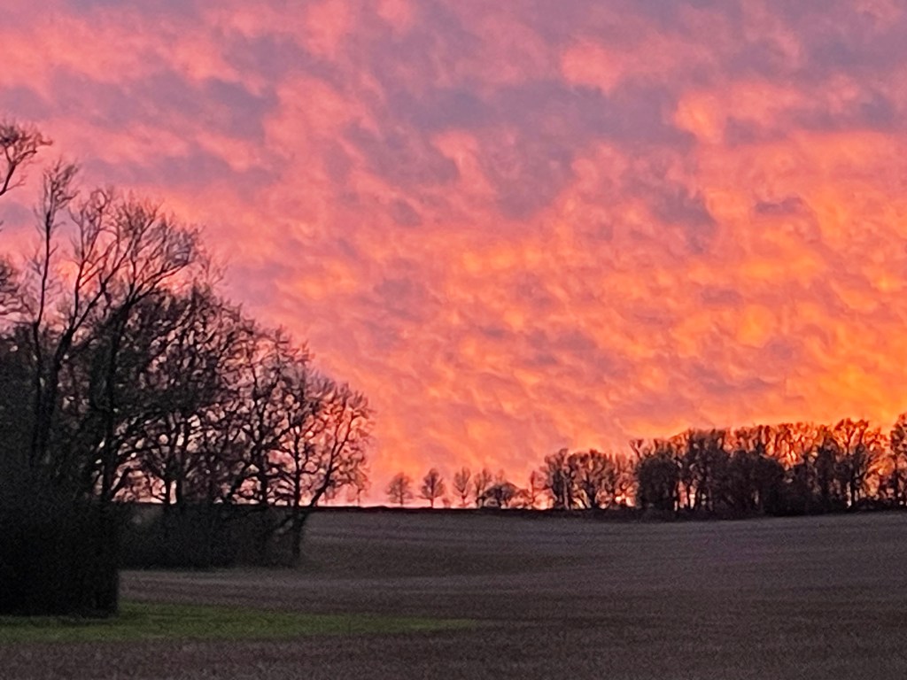
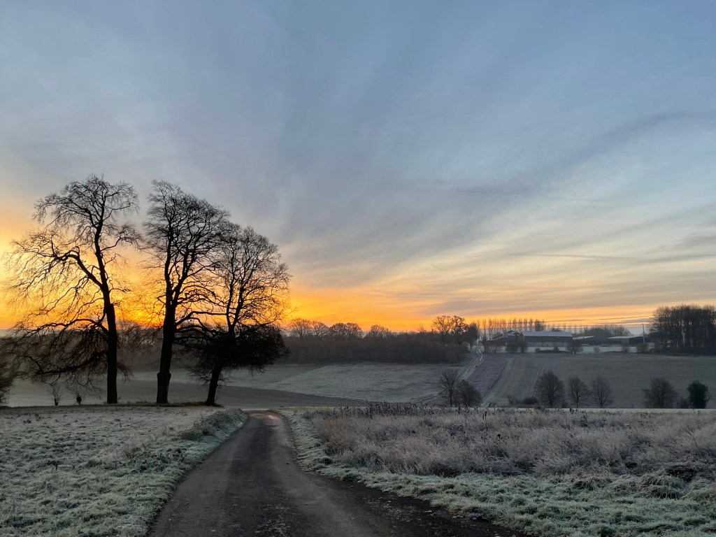
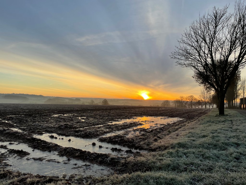
Whilst I was starting to write this post yesterday evening, I looked up and saw the most amazing sky through the kitchen window and had to go outside and take a photo of it. As usual, the image doesn’t really do it justice.
It’s taken me a while to finish this post – other things have got in the way – but I needed to complete it to make note of what I saw, and what I thought.
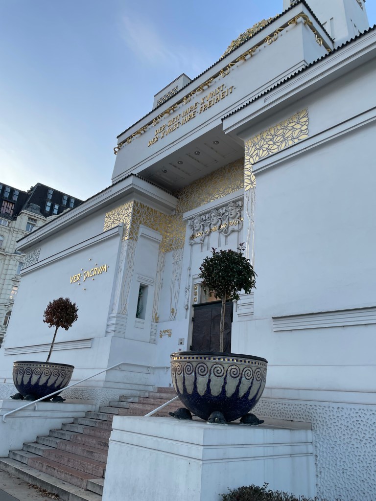
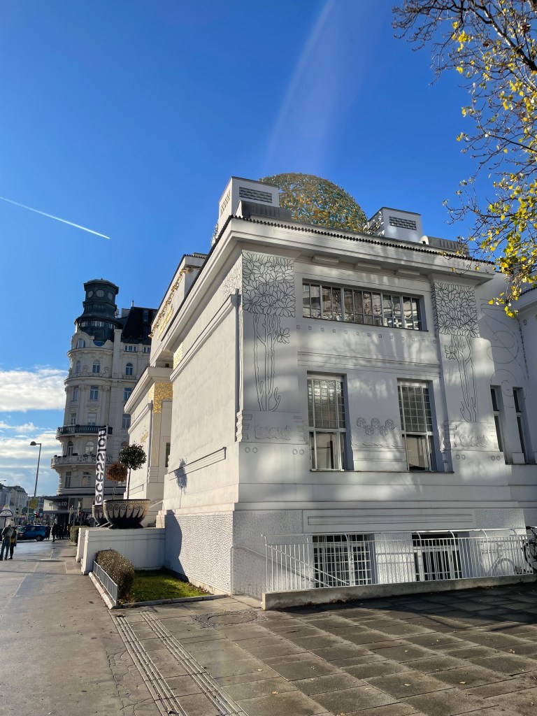
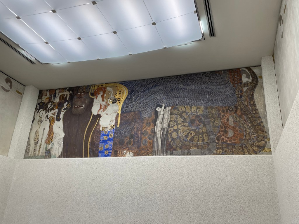
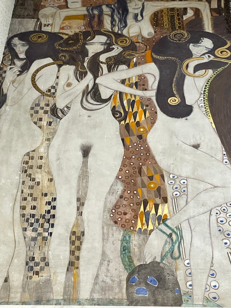
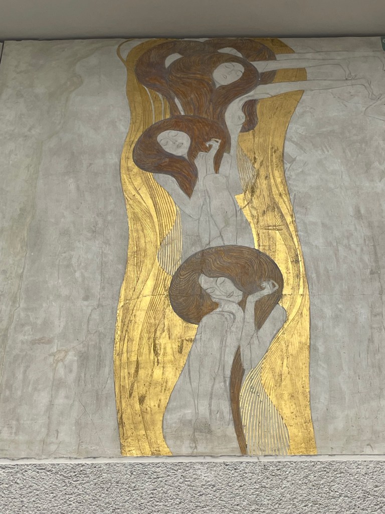
Whilst in Vienna, we also managed to visit the Secession Building, which was designed by the architect, Joseph Maria Olbrich, in 1898, as an exhibition space for the Secession. He was one of the founding members along with a group of artists, including Klimt, who had broken away from the traditional Künstlerhaus to pursue progressive contemporary art. The group’s motto which appears above the door is “To every age its art, to every art its freedom.” Topped by a golden cabbage comprised of 2,500 gilded iron laurel leaves, it houses Klimt’s Beethoven Frieze.
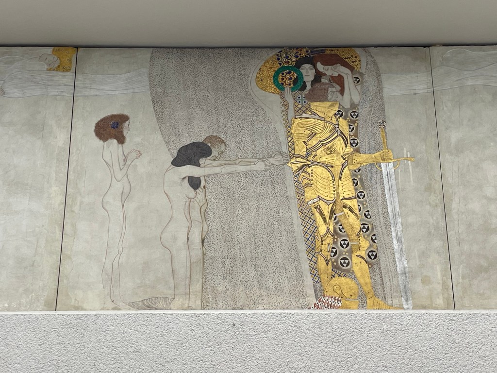
The frieze is based on Wagner’s interpretation of Beethoven’s Ninth Symphony: it is a tale of humankind’s search for happiness.
The kneeling couple symbolize suffering humanity and beg the knight for helpIn this scene humanity faces of Typhoeus, a hybrid monster with a snakelike body and blue wings.To his left are his daughters, the Gorgons and above them masklike representations of Sickness, Madness and Death.To his right are Lasciviousness, Wantoness and the large-bellied IntemperanceGnawing GriefHumanity’s search for happiness is found in poetry – a female figure playing a lyreFigures representing the arts lead to the ideal realm of artThe deification of art is a couple kissing in front of of a choir of angels – “This kiss to the whole world” (Ode to Joy)
I didn’t know what I was expecting really, which is a bit daft considering that I had seen pictures of it in books. I initially felt, yeah ok, but now reflecting on it I think I must have been suffering from a case of art gallery overload. It was really remarkable. It’s been relocated from its original position. It’s high up on the walls of the room, and surrounds you. The fact that you have to look up, makes viewing it an almost reverential experience. That coupled with the fact that you can listen to Beethoven whilst you admire it.
In addition to Klimt and Schiele, I saw many works by other artists, which I felt might be useful over the next year or so, some of whom I hadn’t previously come across.
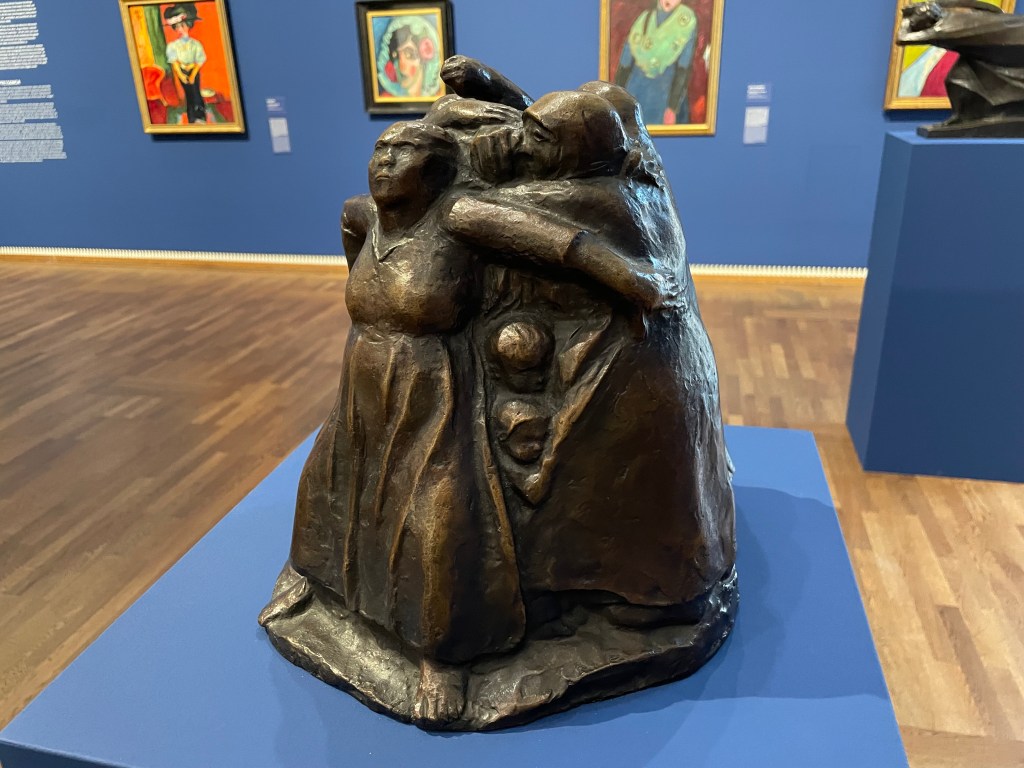
This bronze sculpture is Tower of Mothers, 1937/38 by Käthe Kollwitz. It shows a group of mothers standing together and forming a circle to protect their children, who can be seen peering out from between their skirts. The strength and determination to defend whatever the cost is beautifully captured in the postures of the figures, particularly the mother with her arms spread wide. There is no fear in this sculpture. The mothers are protecting their children from war and the horrors of war, which is poignant as Kollwitz herself lost one of her sons in the First World War, a loss she never recovered from.
Lovers, 1914Venus in the Grotto , 1914
These oil paintings on canvas are by Koloman Moser. Moser was a founding member of the Secession, and was primarily a graphic designer and illustrator, as well as a set designer, furniture and textile designer, and painter. I like the slight graphic quality of these paintings as well as the unusual palette – his use of what looks like a lime green gives a sickly feel to the works, and works really well with the purplish reds in the skin tones and the shroud. They appear almost luminous.
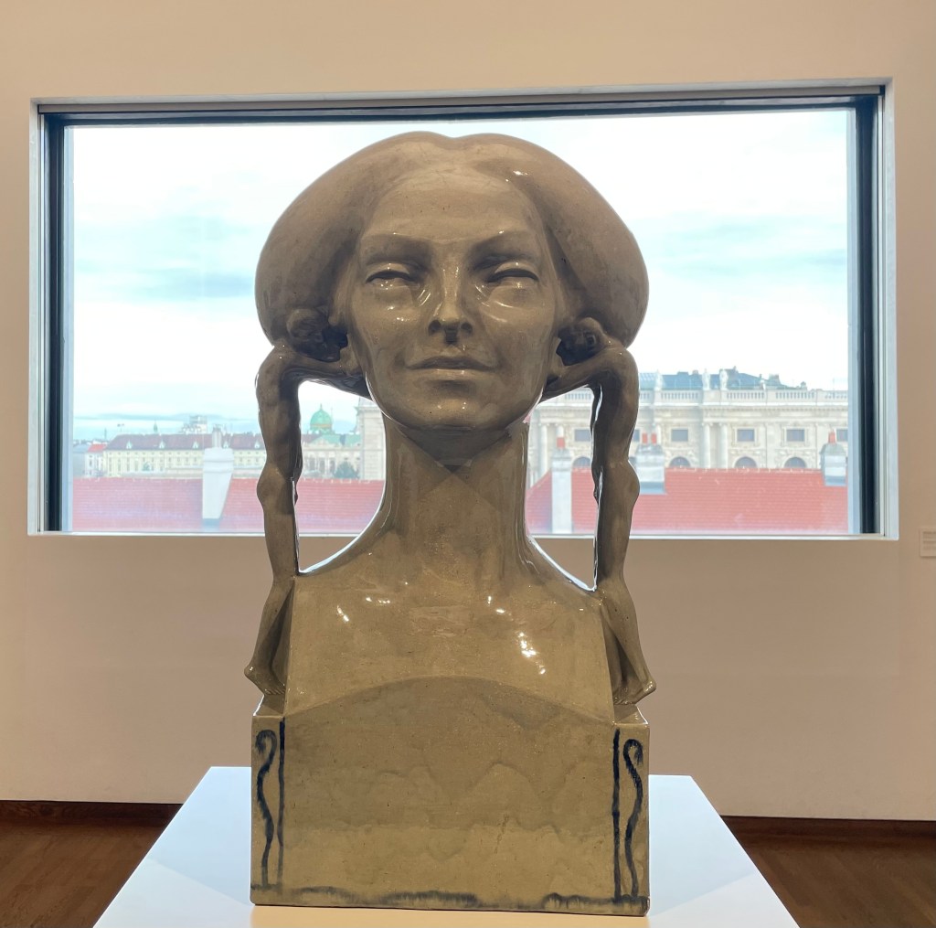
The ceramic glazed sculpture above is Insinuation, 1902/03, by Richard Lucksch. I had to resist the urge to touch it. I found myself wondering what the young men are whispering in her ears; what are they insinuating? The very title implies something negative. It reminded me how difficult it can be to navigate a true course through life, when others are constantly whispering things into one’s ears, insinuating, commenting, doubting, demoralising, chipping away.
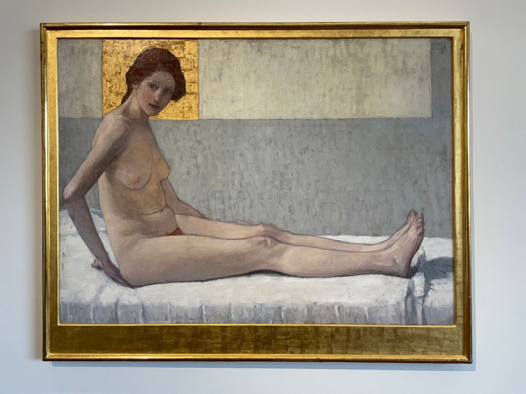
I felt drawn to this painting, for some reason. There’s some gold; that’s a start. The skin is beautifully rendered and I like the composition: I start from the head encased in the golden square and make my way down her body with the interesting detour created by her right arm, along her legs, through her toes up towards the top right and then back to the golden square via the light coloured rectangle. It’s satisfyingly complete.
It’s Seated Woman (Marietta), 1907 by Broncia Koller-Pinells, the Austrian equivalent of radical, Laura Knight, who also challenged the taboo for women artists at the time – the nude.
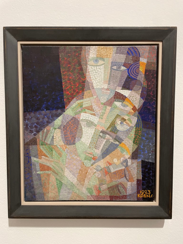
Head of A Dancer, 1923, by Erika Klien is an example of Viennese Kineticism, which was inspired by Cubism, Constructivism, Futurism, dance, music and architecture. I like the sense of movement of the head and the hands, which have also been deconstructed in parts, as well as the quite limited colour palette.
What’s not to like about a Degas figure? This one Pregnant Woman, was risqué for its time, depicting a woman in a pregnant state, and was cast in bronze after his death.
This definitely gets the award for most interesting. The Doll is from the film, My Alma – Oskar Kokoschkas’ Love to a Doll. I’ve since researched it a bit further and it really is a strange tale. Alma was Alma Mahler, Gustav Mahler’s widow. Having had her first kiss from Klimt when she was 17, she went on to have many love affairs before , during and after her several marriages. One of those affairs was with the young artist, Oskar Kokoschka for whom she became the love of his life. I think it’s fair to say he was obsessed with her. He had to go off and fight in the First World War War and whilst he was away she married a previous lover. Needless to say he was quite devastated when he returned home, after having been bayoneted in the chest, suffered a major brain injury and declared mentally unstable, to find that she had ended their relationship. So he did what all spurned lovers do, he commissioned a doll maker to make a life size doll of her providing very specific instructions as to how it should be made and what it should feel like to the touch. When she finally arrived he was a bit perturbed by the fact that her body had been covered in feathers but went on to pose her for paintings and photographs, dress her up and even take her to the opera. But eventually he resolved himself to the fact that his Alma doll wasn’t doing it for him, so he threw a party, then took her out into the garden where he chopped off her head and broke a bottle of red wine over her. I’m not sure that I’ll watch the film…
I have just returned from an amazing 4 nights in magically festive Vienna, having had my fill of glühwein, Sachertorte and boiled beef broth (it loses something in translation!).
I’ve never been before, but will definitely be going back. Beautiful architecture, and so much to do, not least the seemingly endless supply of museums and galleries.
The Leopold and Belvedere were on my hit list as housing the greatest number of works by Klimt and Schiele. I had a nagging fear that the episode might end the same way as Michael Craig-Martin but, instead, I came away with a greater appreciation of all the details that can’t be gleaned from a photograph: the brushstrokes, the surprising thickness and coverage of the paint, sometimes leaving areas of the canvas exposed and the purity of colour. It was a revelation to get up really close and just look.
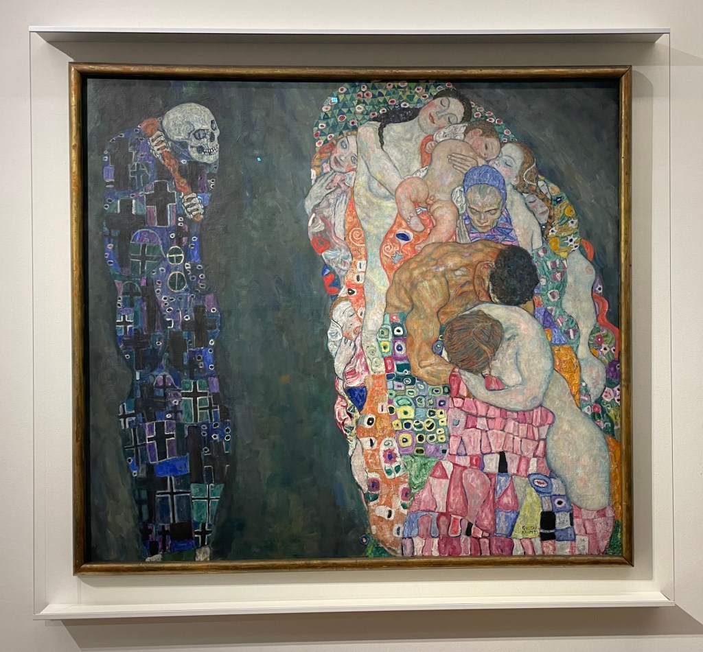
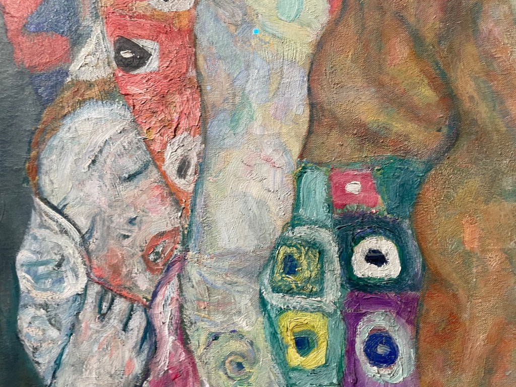
Death and Life 1910/15 , Klimt
Detail
I had always thought that Klimt applied paint quite uniformly and flat, so I was surprised to see the thickness of the paint and multi-directional brushstrokes. I like the way Klimt paints skin in all its imperfections and blotchiness, ranging from the pale and cold whiteness to the warmer, darker tones of the male figure.
Seeing ‘The Kiss’ was an interesting experience; it reminded me of when I saw the ‘Mona Lisa’ in the Louvre. Being one of Klimt’s most famous works, along with the ‘Mona Lisa’ and Van Gogh’s ‘Starry, Starry Night’, it is one of the most mass reproduced images of all time. I was underwhelmed, and I found it quite sad, as I was expecting to be bowled over by it. It was the most crowded room at the Belvedere, but what I found particularly interesting was that the crowd of people in front of it, holding up their phones and cameras, seemed totally uninterested in looking at it in any great detail – in fact they had left a sizeable gap in front of it so that they could get it in shot. This was handy as it allowed me to perform a flanking manoeuvre to get in front of it, to try and appreciate it as a work of art, as opposed to just a selfie opportunity with a celebrity. There was no point taking a photo – it was so strongly lit, and the lights reflected in the glass covering it. I grappled with my feeling of ‘numbness’ for the rest of the day, and as I was mulling it over in my mind, holding yet another mug of mulled wine in my hand, the answer came to me when I remembered John Berger’s ‘Ways of Seeing’ in which he considers the effect of reproduction:
”When the camera reproduces a painting, it destroys the uniqueness of its image. As a result its meaning changes. Or, more exactly, its meaning multiplies and fragments into many meanings … Alternatively one can forget about the quality of the reproduction and simply be reminded, when one sees the original, that it is a famous painting of which somewhere one has already seen a reproduction. But in either case the uniqueness of the original now lies in it being the original of a reproduction. It is no longer what its image shows that strikes one as unique; its first meaning is no longer to be found in what it says, but in what it is.”
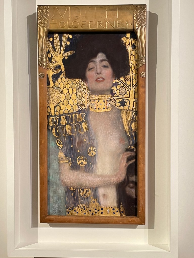
By contrast, in the next room was one of my favourites, ‘Judith and the Head of Holofernes’, a depiction of a strong femme fatale, the polar opposite to ‘The Kiss’.
Judith and the Head of Holofernes, Klimt, 1901
What can I say? I love gold leaf: I’m a magpie. Despite the abundance of gold in the painting, the eye is still drawn to the figure of Judith which is thrown forward by the decorative background. She is holding the head of Holofernes, somewhat gently, which is shown half in and half out of the frame, relegating him to a secondary role in the drama which has unfolded. There are intriguingly two decapitated heads in the painting; the treatment of the choker has effectively severed Judith’s head from her body. It is an image full of female power, sexual and otherwise.
It’s easy to forget that Klimt was a master draughtsman.
His drawings are exquisite. The simple monochrome of pencil or black chalk, a quiet antidote to the noise of gold and vibrant colour.
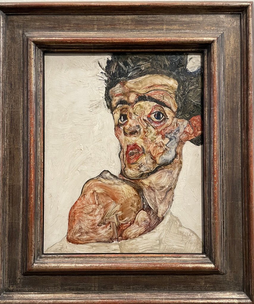
Self-Portrait with Raised bare Shoulder, Egon Schiele, 1912
I love this self-portrait; it is so expressive, and the fluidity of the brushstrokes creates a sense of movement and vitality. It is reminiscent of the Lucian Freud self-portrait in my earlier post, “I’m Sorry, Michael…”. It is quite small but he manages to pack a lot into such a confined space, including his shoulder, which by extension includes his body. The difference in treatment between the figure itself, which is quite thinly painted, and the more heavy impasto in the background is extremely effective. It is painted on wood, which might explain the wonderful textures on the face which would have been caused by the hog bristles in the brushes, although I have read, in a book on artists’ palettes, that Schiele would often use a brush to remove paint from a canvas in order to create texture. I particularly like the simple use of sgrafitto particularly above his left eye, and to delineate the edge of the chin against the neck.
The description next to this piece was interesting in that it described Schiele’s connection with his own body as both a fusion and a dissociation, in the context of the main theme of Viennese Modernism ie the individual becomes a dividual – something that can be divided.
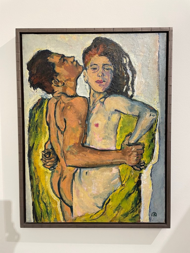
The Embrace, 1917, Egon Schiele
This painting is so impactful. It’s approximately 1.5m by 1m. It shows Schiele with his wife, Edith Harms, in a loving and tender embrace. Unlike a lot of his work, this does not, to me at least, have any sexual or erotic overtones. There is a sense of completeness, in that Schiele depicts himself physically emaciated as he envelops and buries his head in the hair of his wife, almost blending into one, in an act of nourishing love. It’s even more poignant to think that this is one of his last works, as they both died within days of each other a few years later in the flu epidemic of 1918-20. He was only 28.
Both Schiele and Klimt were ahead of their time; they were disruptors. Schiele was akin to Sid Vicious and the punk movement, and Klimt founded the Viennese Secession, breaking away from the constraints of the Künstlerhaus. In today’s art world there is no prescribed way of doing things, no longer any art movements or – isms against which to rebel; artists have never been freer to express themselves in whatever way they wish, so I wonder how it is possible for an artist to stand out; how to make a difference in a world of differences.
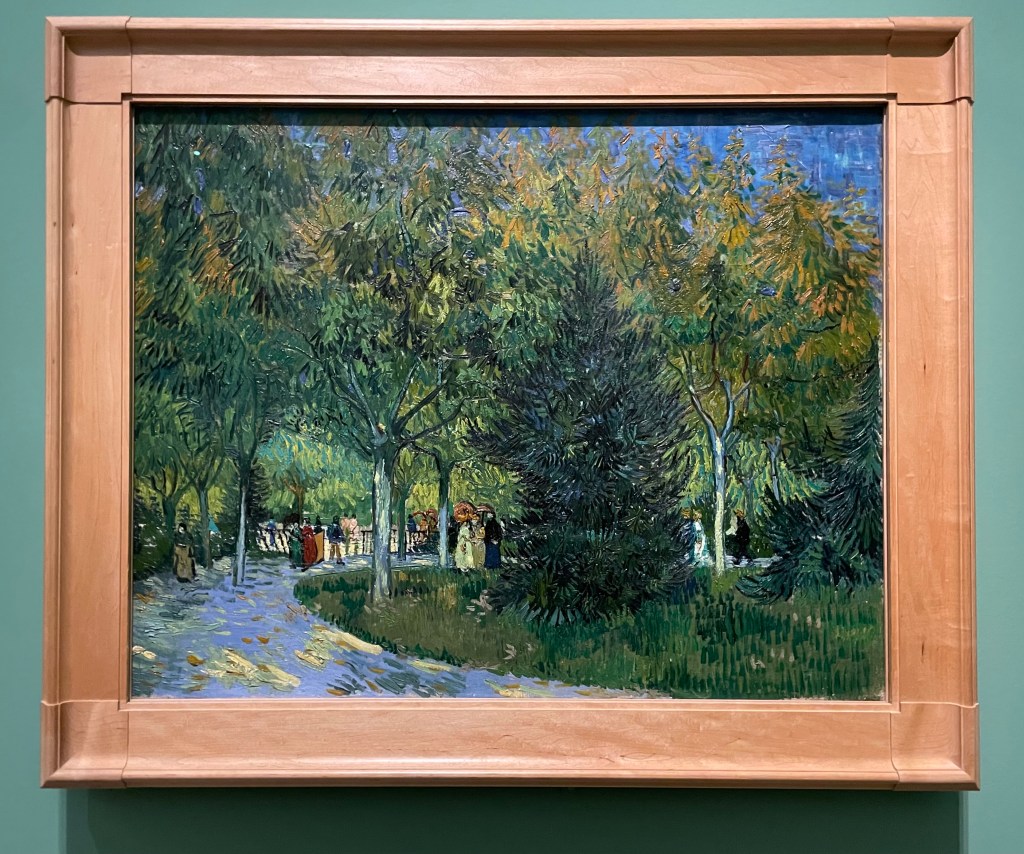
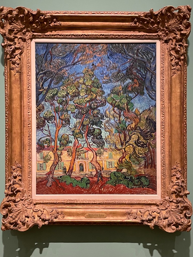
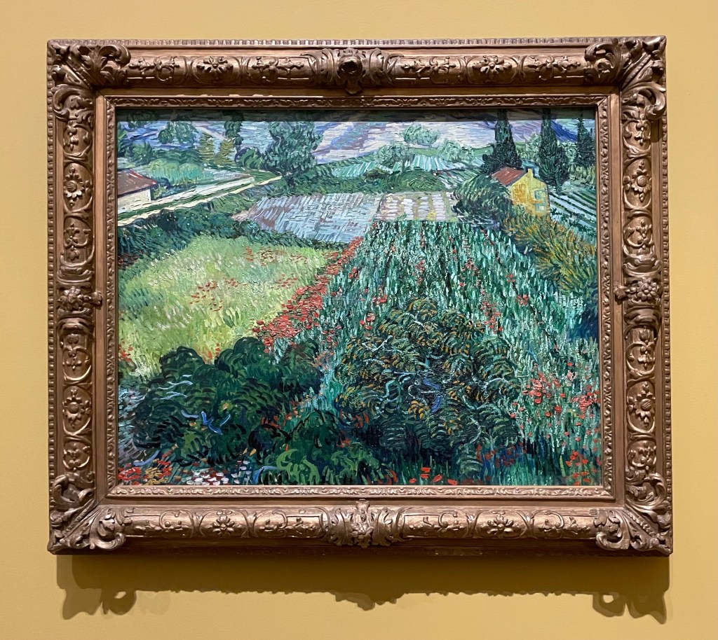
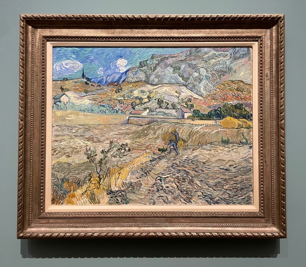
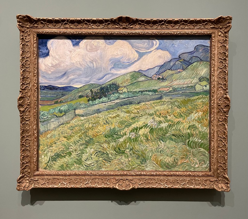
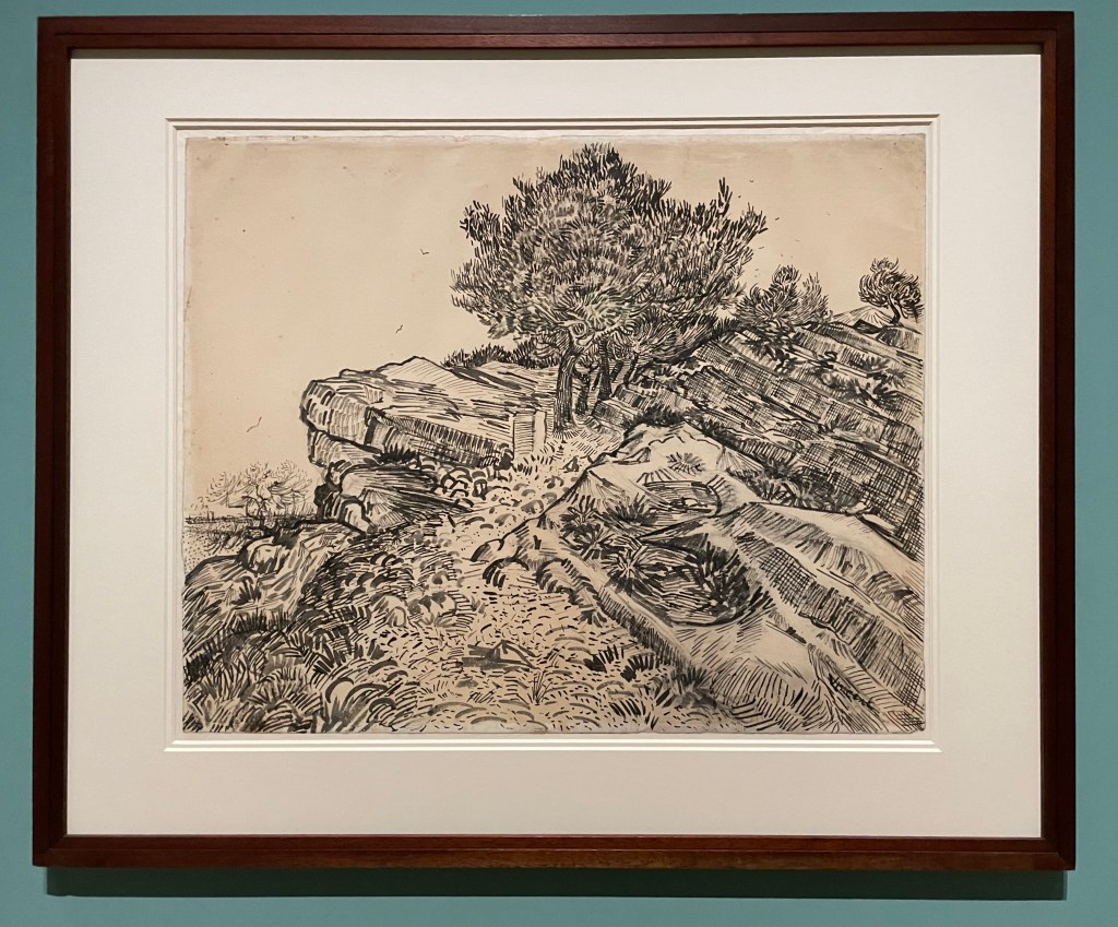
Well, I made it through without a tear. It might have been the sheer number of people which meant that it was impossible to stand and contemplate too deeply, or the audio commentary going on in my ear which distracted me. The ‘Poets and Lovers’ exhibition at the National Gallery was a cornucopia of Van Gogh brilliance, although I was left wondering why it didn’t include some of the Van Goghs I had seen in other galleries, such as the self-portrait with bandaged ear at the Courtauld, but then I don’t have the faintest idea about curation. That said, it didn’t detract from the luscious visual delights on offer, many of which I hadn’t come across before.
What struck me more than anything was the direct correlation between how he drew and how he painted. The range and quality of mark-making was phenomenal. Whilst up close, the brushstrokes and colour palette made me virtually tachycardial, it was standing in the centre of each of the rooms which gave the most rewarding experience.
The only moment when I almost cracked, was when I found myself in front of the Sunflowers from the National Gallery and the Philadelphia Museum of Art: he painted his Sunflower series to decorate his guest room in anticipation of Gaugin’s visit to Arles, in an effort to impress Gaugin, who he greatly admired, almost to the point of obsession. Van Gogh’s sensitivity and vulnerability weren’t a good match for Gaugin who, by some accounts, was aggressive and egocentric, which served only to reinforce Van Gogh’s insecurities. It all made me blink a bit quicker. I have to declare my bias – I’m not a fan of Gaugin for various reasons, not least because he abandoned his wife and five children to go off and indulge his predilection for young girls.
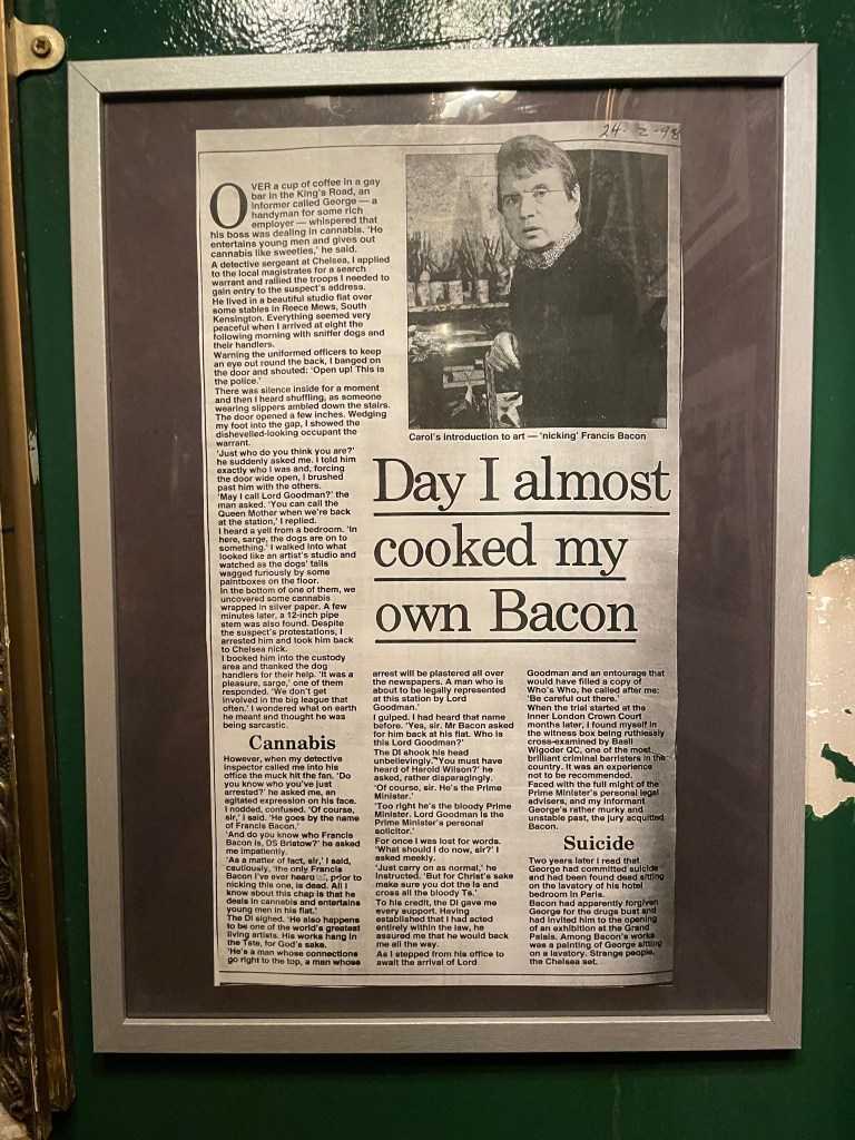
The day was rounded off by a trip to the Colony Room Green, a replica, as near as dammit, of the bohemian Soho legend that was the Colony Room Club which closed down in 2008 after 60 years, and which was the creation of the queen of Soho, Muriel Belcher – apparently, you knew you were in if she called you the ‘C’ word. It was the favourite haunt of creatives such as Francis Bacon, Lucian Freud, John Craxton, Damien Hirst, Tracey Emin, Dylan Thomas, John Deakin, Frank Auerbach, Michael Andrews, Giacometti, and the list goes on. My husband was particularly keen to visit as he’s reading Darren Coffield’s ‘Tales from the Colony Room’.
‘ Francis Bacon was very fashion-conscious and always immaculately dressed. One afternoon Francis walked in, annoyed and pulling his collar. – “What’s wrong, Francis?” – “Harrods, I’m never going back there again.” He’d attended a special night for select clients and bought lots of clothes, but when he’d got back home he’d decided he didn’t like any of them. “I bought so many suits and shirts and threw the lot in the dustbin.” You’d never seen the club empty so quickly. The next day everyone was up the club parading around in their new suits and shirts from Francis’ dustbin.’
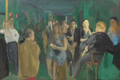
Colony Room I, Michael Andrews, 1962
It’s very small and down some stairs underneath Ziggy Green, 4 Heddon Street, a side street off Regent Street. It’s reminiscent of a dive bar/ speakeasy.
It was great meeting Liam, the house jazz pianist and chatting to Tim, the barman who explained that it’s not trying to be a re-creation of the original, but somewhere to come and meet an eclectic mix of people. Despite what he said, I couldn’t help but feel that I had stepped back in time, waiting for the door to open and for one of my artistic heroes or heroines to walk through it. They often have events which are free to attend, such as talks and book launches. Unfortunately, we couldn’t hang around for the Portrait of Muriel Belcher evening.
There’s something very inspiring about the idea of a group of creative people coming together regularly to discuss work, ideas and concepts. I’ll definitely pop back in next time I’m in town, in the hope that something might rub off.
It started with a bracing dog walk, first thing. It was the best start to the day.
Then a train ride to London to visit the Michael Craig-Martin exhibition at the Royal Academy before it closes in a little over a week. I have to say that going into a gallery has the same effect on me as going into a church – a sense of wonderment and contemplation comes over me: people even speak in hushed tones.
It was joyously colourful, but for me, that was just about it. I was left wondering to myself, if it wasn’t for the painted walls and the sheer scale of some of the works, would they still have been so impactful? If they had been A3 in size and hanging on a bare white wall, would I still have experienced chromatic overload? I used to be attracted to the graphic simplicity of his work, elevating everyday objects to something out of the ordinary, but I’m sad to say that I don’t think it does it for me anymore. I’ve changed. If anything, I was more intrigued by his earlier conceptual work.
The Oak Tree (1974) is a small glass filled with water to a specific level and mounted on a wall at a specific height of 253cm. It is accompanied by the text of a conversation in which Craig-Martin explains how he has changed the glass of water into an oak tree without changing the physical form of the glass – I don’t know whether it was meant to be amusing, but I certainly had a titter. In a short film for the RA, which I watched when I got back home, he explains that he was trying to find something that constituted the essence of art, in that art is based on the notion of transformation, and the most extreme proposition for transformation would be to have no transformation at all. Others have alluded to his Catholic upbringing and have suggested that it is to do with transubstantiation. I also read that it was seized by Australian customs officials on its way to an exhibition in the 1970s on the basis that it was illegal to import plants into Australia!
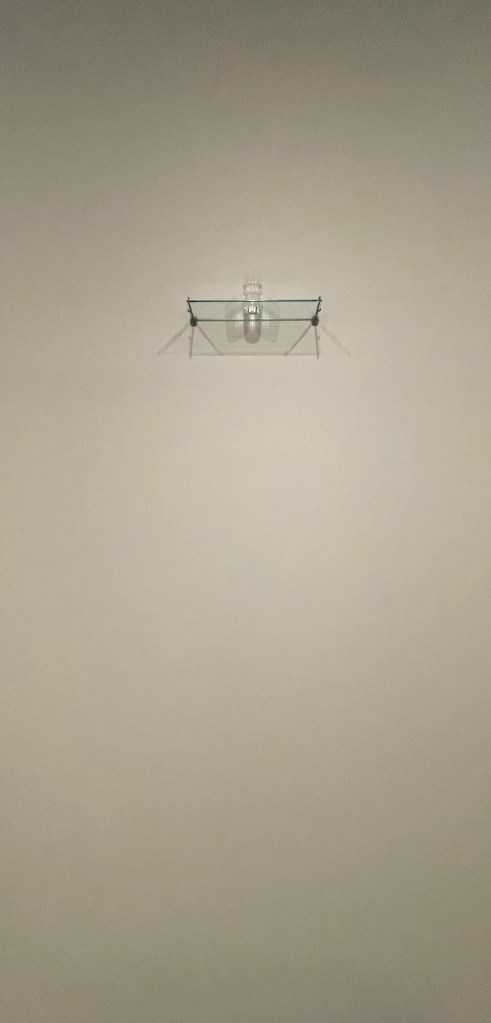
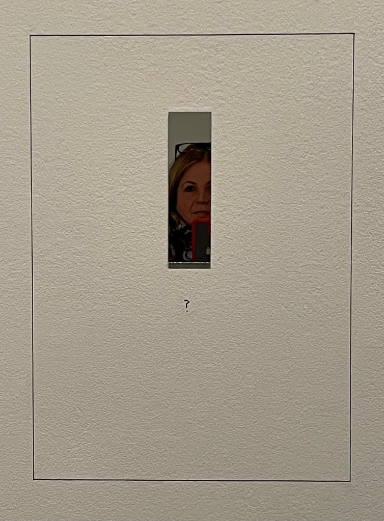
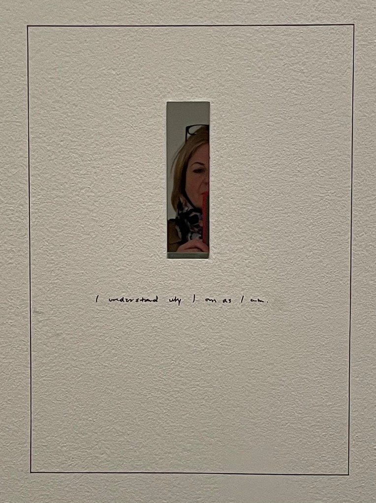
I was particularly drawn to ‘Conviction’, a series of mirrors on paper, as it directly relates to what I’m planning to explore.
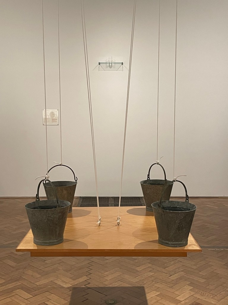
’On The Shelf’ comprises 15 milk bottles positioned at a precarious angle on a shelf, but the varying levels of water create a level horizon. The four buckets on the table are actually supporting the table, rather than the other way round. Finally, ‘Box that never closes’ questions what makes a work of art: the box has lost all functionality, and does not even form something that is aesthetically pleasing.
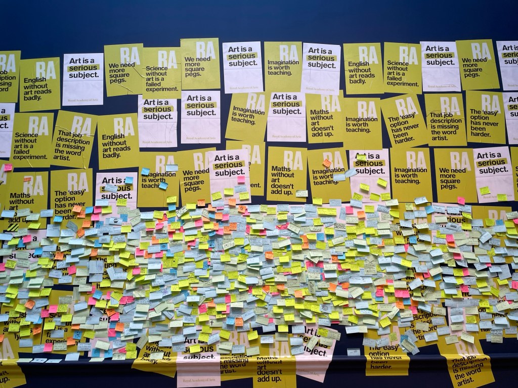
I went into the shop but didn’t buy anything: instead I had a look at the wall which supports teaching art in schools. I put a post-it note up following on from our session a couple of weeks ago: ‘creativity will save the planet’, but I forgot to take a photo.
I was then going to nip into the National Gallery but the queue was half way down the street – probably caused by the extra security and bag searches. So I went round the corner to the National Portrait Gallery which I haven’t been in since its refurb.
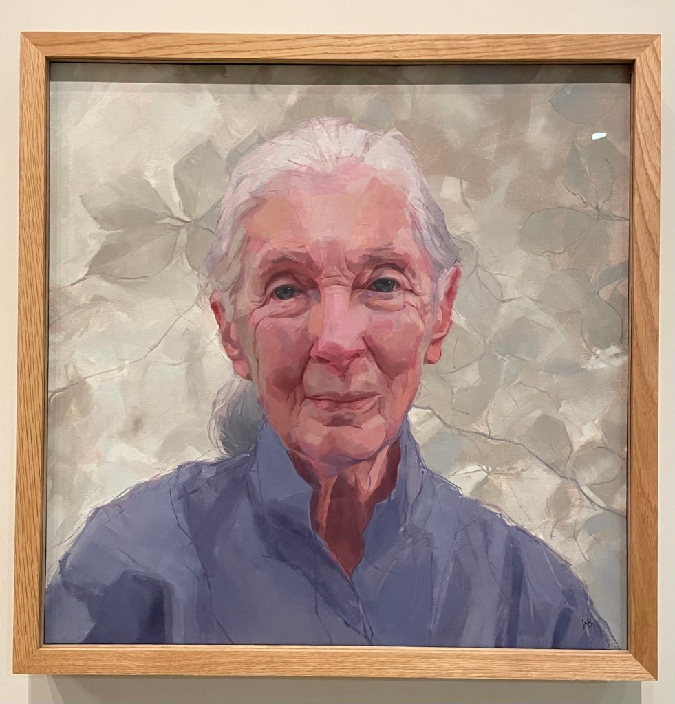
I was pleased to see the portrait of zoologist and conservationist, Dame Jane Goodall, by Wendy Barrett, the winner of Sky’s PAOTY 2023. Compared to the photograph taken by Ken Regan, it gives the viewer so much more. I thought it was tremendous, and full of intelligence, sensitivity and humanity.
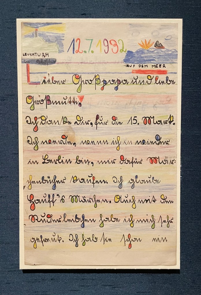
Lucian Freud’s letter to his grandparents, thanking them for the money they gave him, which he was going to use to buy a book of fairytales, reminded me of Miró with its coloured shapes and black lines. It took me back to a hot day in Sóller over the summer when we found relief from the sun in the train station, which happened to be exhibiting various ceramics by Picasso and works by Miró – can’t see that happening at Waterloo Station anytime soon. Freud’s self-portrait is a favourite: the way he applies paint and his minimal brushstrokes are lush.
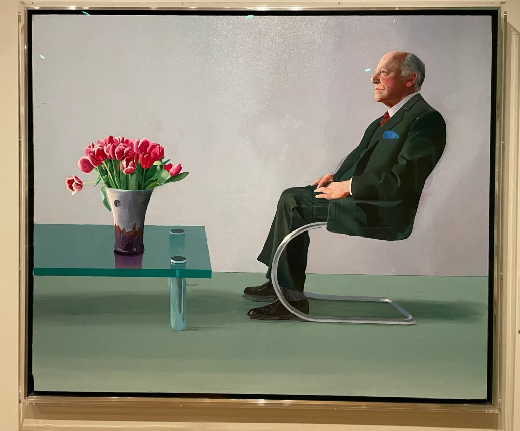
Bearing in mind my latest experiments using a pen, I was fascinated by the mark-making in Eileen Agar’s drawing of the modernist architect, Ernö Goldfinger. Hockney’s portrait of Sir David Webster with Tulips is stunning: I was a bit perturbed by the size of his head at first, and the fact that the sole of his left shoe seems to be coming away, but I think I’m ok with it now. In any event, it’s all eclipsed by the beautiful rendering of the table and tulips, and the fact that the jacket hanging over the arm of the chair makes him look like he’s levitating.
Colin Davidson’s Silent Testimony was moving: a collection of 18 large scale portraits of individuals who have all experienced loss in the Troubles in Northern Ireland, although it is also more generally about everyone who is left behind after conflict. They are impartial: there is no reference to the sitters’ religion or politics. What is striking is that none of the sitters are looking directly out of the canvas; they look off to the side as though deep in thought, as if they are remembering. There is a real sense of loss and pain, and contemplation – it is etched onto their faces, quite literally in some areas. They are painted in thick paint which seems to be weighing them down. But it’s all about the eyes. They are painted with a much more careful and detailed application of thinner paint. They almost look haunted.
And then I walked back to Waterloo Station, over the bridge, with Ray Davies crooning in my ear, although, let’s face it, his voice isn’t what it is used to be. All in all, apart from my break-up with Michael, a good day.
I draw you in with suggestions of Picasso, but I’m afraid it’s me, again.
I’ve always known that art can move, but reduce one to tears? Someone once told me that they couldn’t stand in front of a Rothko without crying – ‘Get a grip’ is how I responded, in my head.
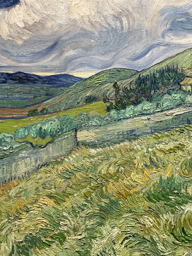
Then I stood in front of Van Gogh’s ‘A Wheatfield, with Cypresses’ in the National Gallery. Why can’t I see it clearly anymore? Why do I have tears running down my cheeks? Why hadn’t I put any tissues in my bag? Why is the guard coming towards me with a strange expression on his face?
Was it because I had recently watched ‘Loving Vincent’ and a documentary about this tortured and anguished soul? That he had died without knowing of the fame and recognition which was to come? Or was it something else – the way he applied paint perhaps? Does it actually matter?
For me, I can’t separate the artist from his work – his mental and emotional fragility is embedded in his work and I find it both beautiful and overwhelmingly sad. So sad, that just someone talking about it can make me well up.
So, after spending one and a half hours in a virtual queue on the National Gallery website I have managed to secure two very precious tickets to ‘Poets and Lovers’, except that for one time only, on the morning of 9th December, there will be a lone Picasso amongst all the Van Goghs.