
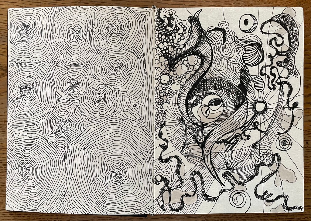
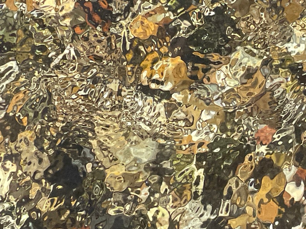
I’ve been spending a lot of time in woods just recently. Maybe it’s because they offer respite from the sunshine, perfect for dog walks. But they’re also havens of stillness, of light and shade, of music and form. But, they also make me feel uneasy.
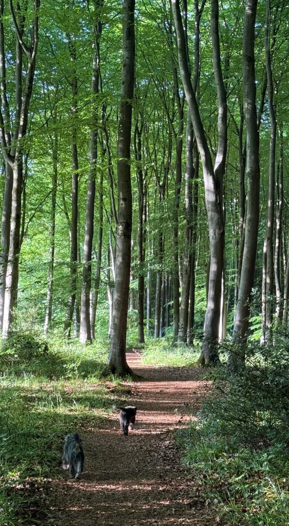


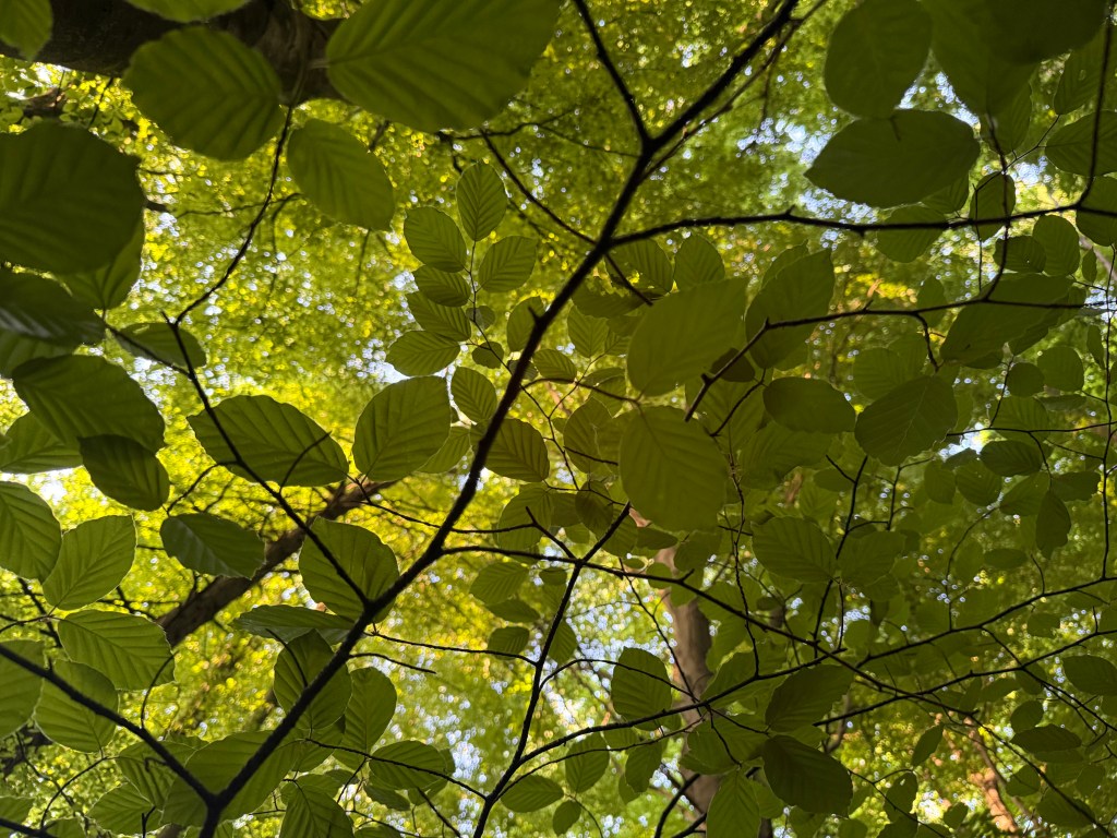
I’ve been spending a lot of time in woods just recently. Maybe it’s because they offer respite from the sunshine, perfect for dog walks. But they’re also havens of stillness, of light and shade, of music and form. But, they also make me feel uneasy.
Following on from Solitude, I decided to try and develop it further.
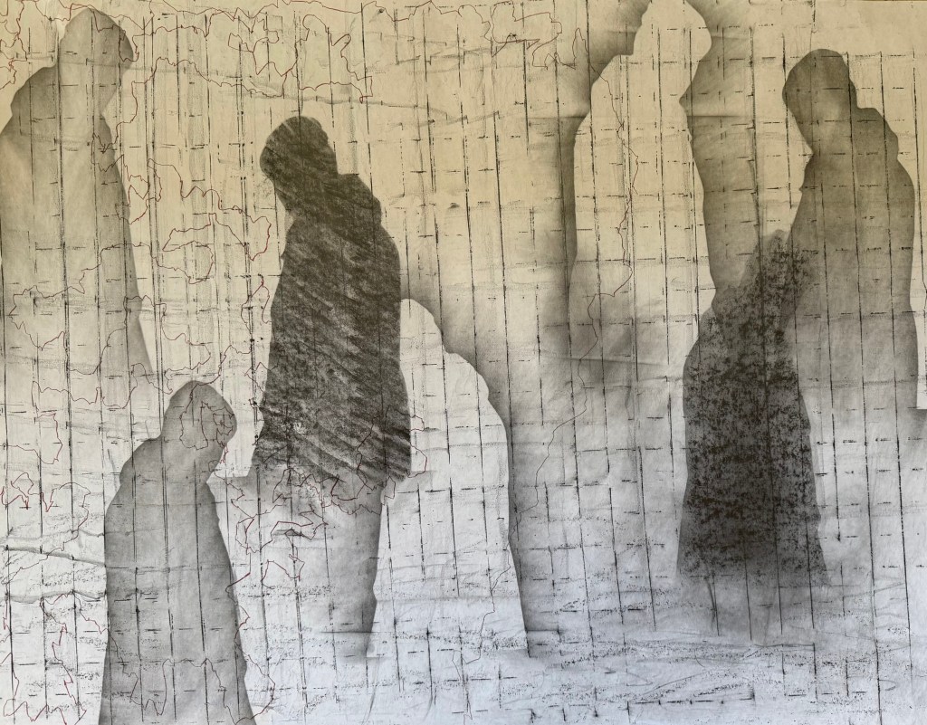


I used flipchart paper again, as it was easier to manhandle it over the obstinately curved wire fencing which I used for the grid effect. A downside was that the grid is a bit off kilter, but nonetheless I like the grid and the lines of coloured automatic drawing – it reminds me of map grid lines, a road map. I explored trying to have some figures behind and some in front of the grid. Not sure I succeeded and I am in two minds about the light figures.
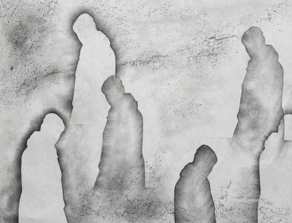
I decided to have a go with soluble graphite sticks using heavyweight cartridge paper.
I wanted to get away from the soft diffused figures and experimented with hatching and rubbing on a textured surface. I sprayed with water and held upside down to create some streaks and drips. Not one for less is more, I drew some green and red lines and then thought it would be interesting to see what kind of a random pattern would be created by drawing dots at the intersections of the lines.

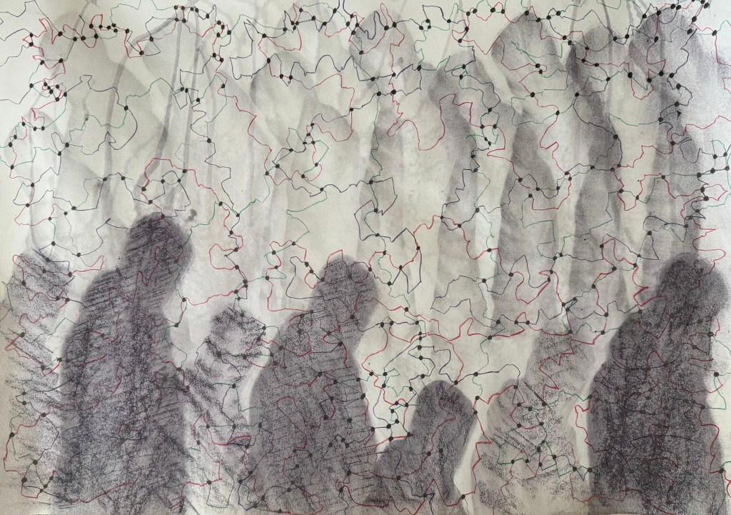
I still didn’t like the dark figures at the bottom and so to try and break them up a bit, I coloured in some random shapes like I’ve done previously using different marks in my monochrome doodles.

I really don’t like it, and I’m struggling to find anything positive to say about it other than I like the idea of the lines and the dots at intersections emphasising the concept of connectedness and the idea of multiple figures in the background; the idea of all those who have come before, and of inheritance (Bus Replacement Service)
This time I left out the water, but I still used the water soluble graphite stick which had a purple tint to it which isn’t apparent in the photos. I don’t think it is as easily blended as normal graphite.


I much prefer this one out of the two. I’m starting to wonder what it would be like on a painted ground or even using thin layers of oil paint gradually building them up. Or am I done for now?
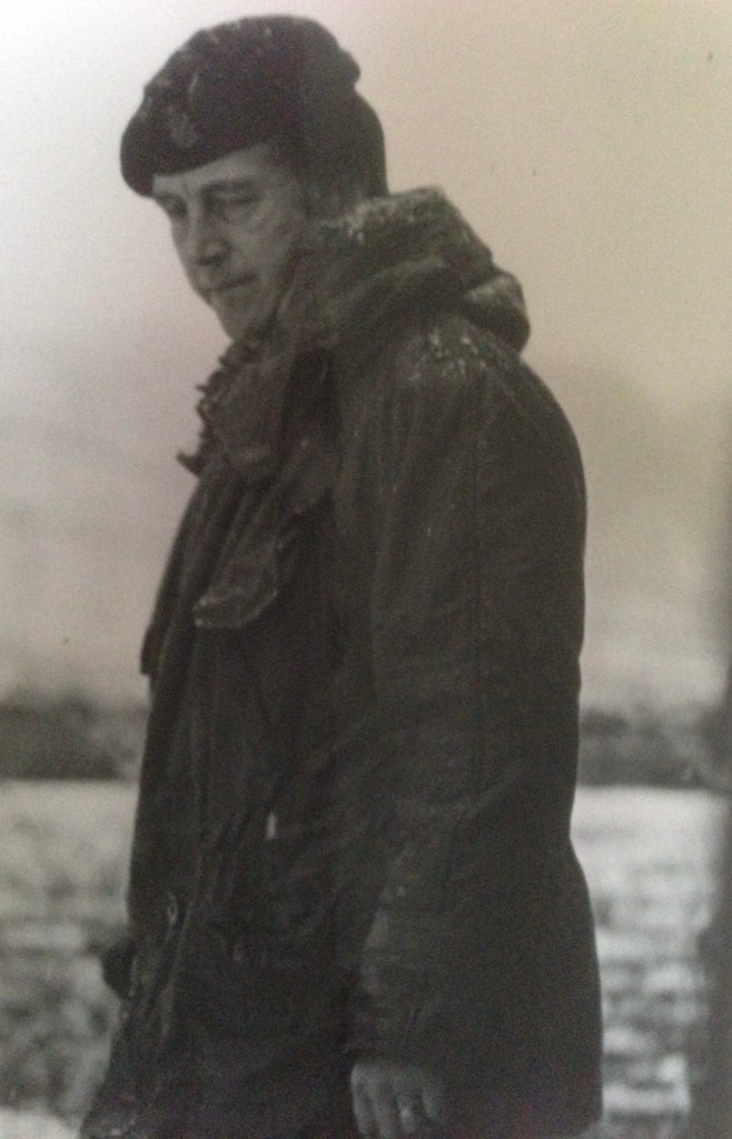
I feel particularly drawn to this photograph of my father. It’s solitary and contemplative, evoking a sense of vulnerability – a side which was never apparent whilst I was growing up. It makes me want to go and give him a hug. He was the world’s best hugger. Either that, or he’s watching someone doing something and he’s not that impressed – a more familiar experience.
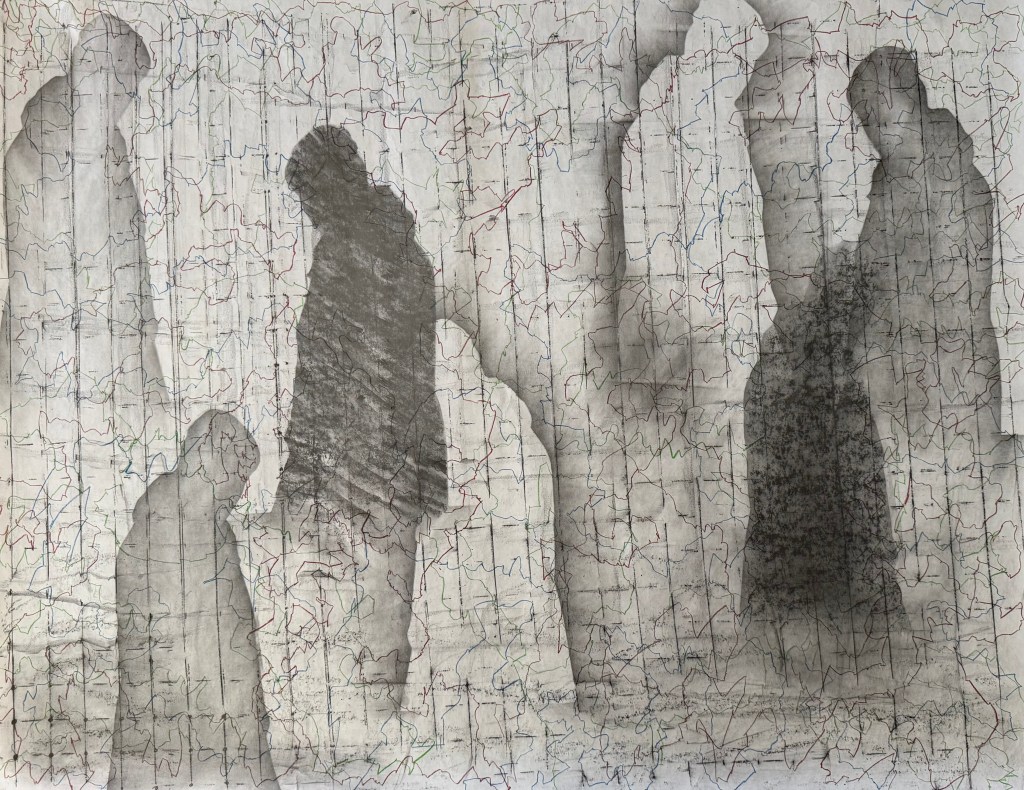
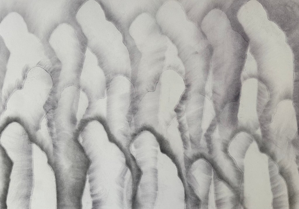
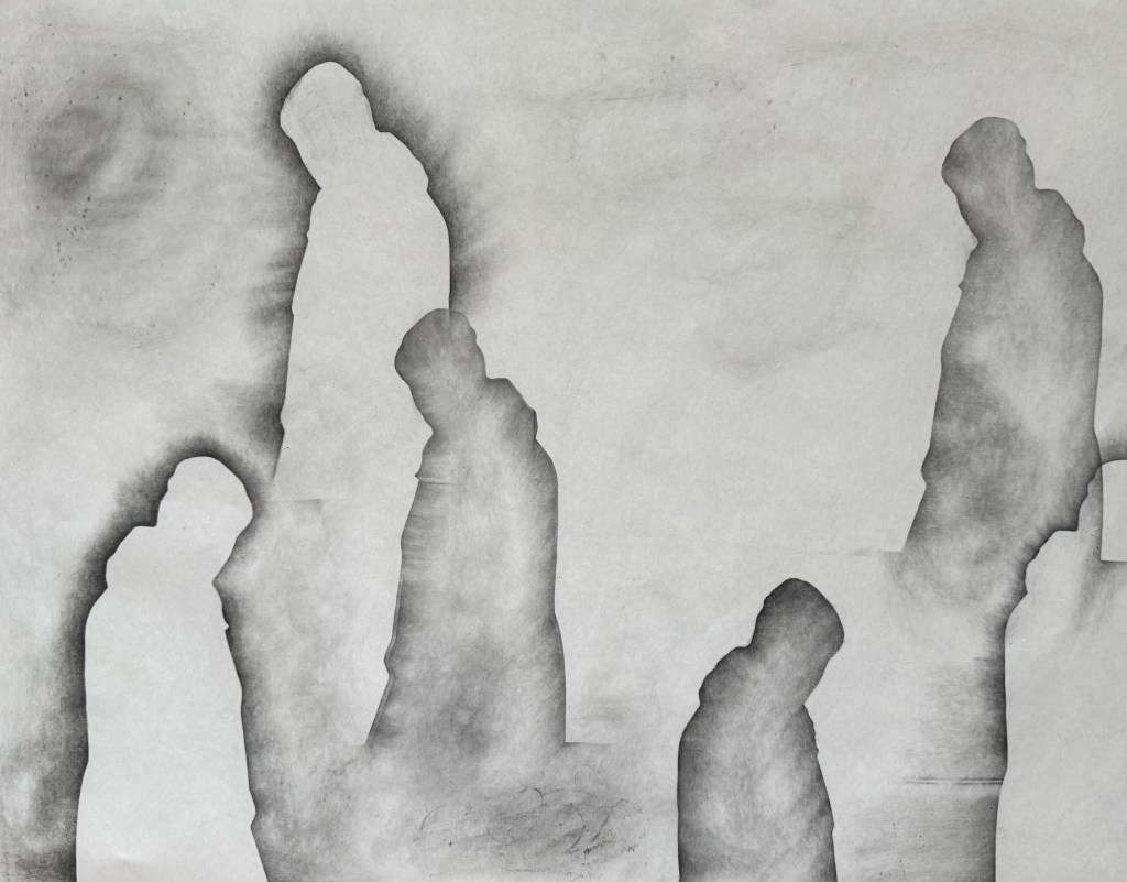
Having missed out on visiting a couple of exhibitions on Sunday, I decided to experiment. I took a piece of A1 flipchart paper, a graphite stick and a 5B pencil and got to work. First I created multiple silhouettes of the image using the graphite stick.
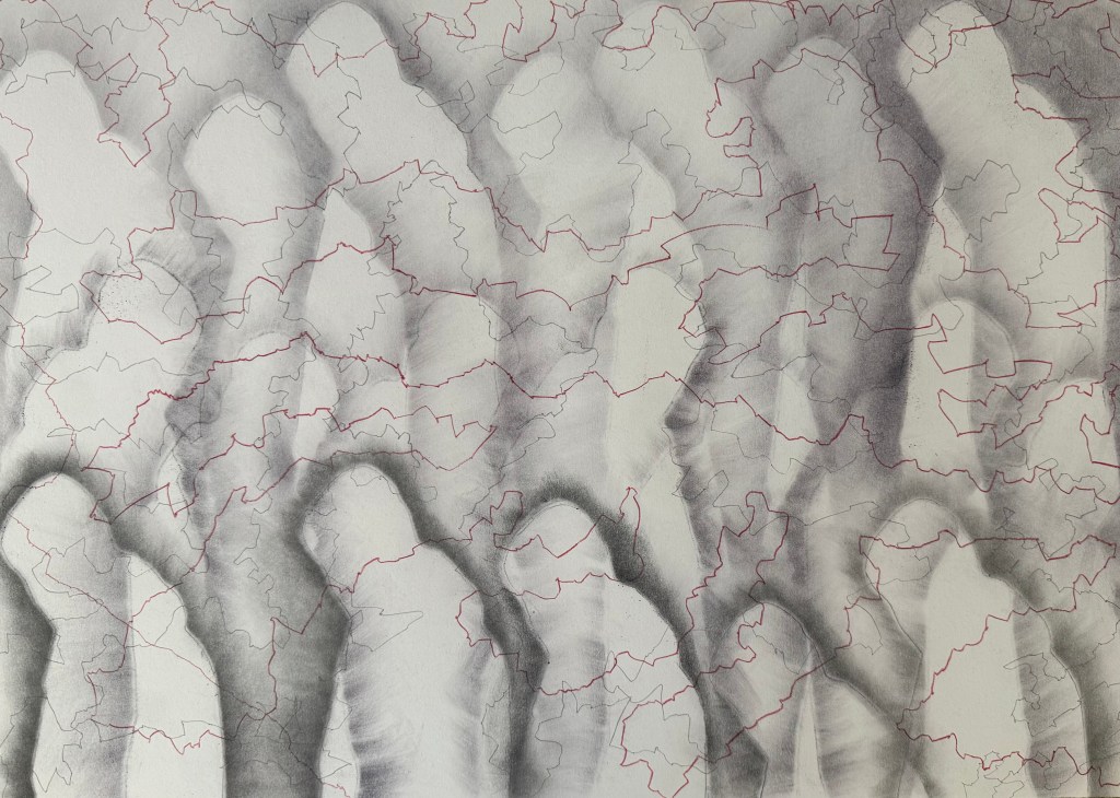
I was inspired by the Richter drawings (The Rich Are Getting Richter) and used the tiles on the kitchen floor to create texture with some frottaging.
Having really liked the effect of some of the lines and marks made in my automatic drawings, I used the 5B pencil to create a wandering line, holding it at the top and twisting it from side to side in the process and then holding it on its side to create a second softer line. I like the idea of tree roots and mycorrhizas connecting and creating a support network for trees, a concept we touched on in last week’s session. The lines are connecting each figure so it’s no longer alone. They are also reminiscent of a map or a mapping out. Not sure which, but I like the effect. I like the delicacy of the lines. They also remind me of the lines in skulls at the points where the plates have fused or cracks in a surface, fault lines. I wasn’t keen on the overlap on the two figures on the right which created a hard box-like edge, so I cropped it out on the last image.

I really enjoyed doing this, particularly the lack of control of the line making and the unpredictability of the frottaging, and despite that, it does bear a resemblance to the vague image I had in my head. It ties in with the idea of shadow selves (Sniper’s Alley) and the idea of inheritance and being made up of multitudes (Bus Replacement Service). It’s definitely an approach I will develop further, but I’ll use better quality paper next time.
Something blue.
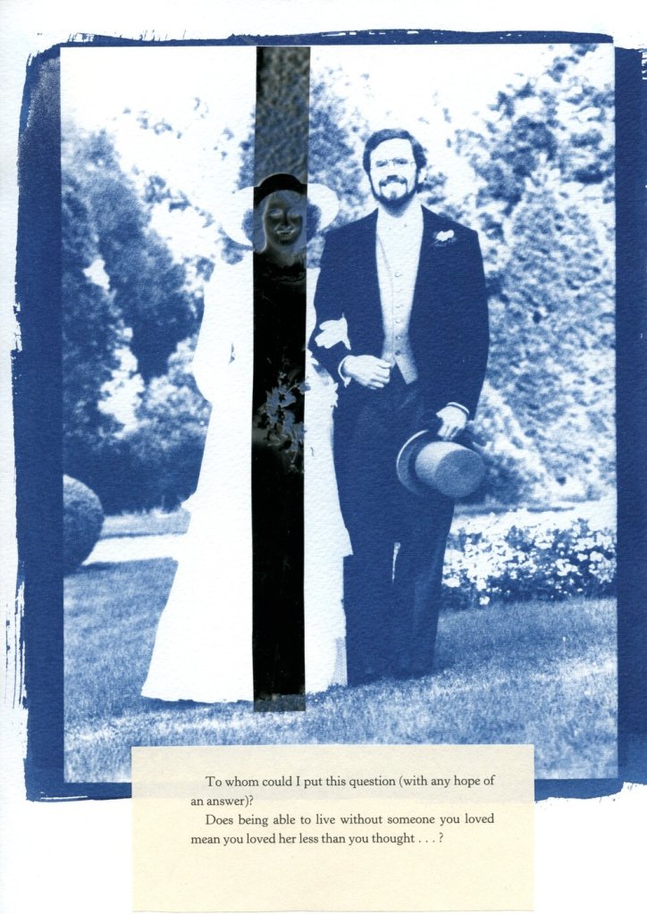
On my wedding day, my mother lent me her handkerchief. I never gave it back; I wonder whether that means that it wasn’t borrowed but appropriated, and does that affect its power to confer luck? Probably not, as I only intended to borrow it, and besides as it was over 20 years ago, I think it conferred the requisite good fortune of my mother’s happy marriage.
What’s cyanotyping without a bit of lace?

I’ve also been doing some doodling. I came across an American cyanotype artist, Marie Craig, who uses highlighter pens on her cyanotypes, so I gave it a go on the prints which didn’t really work in Out Of The Blue.
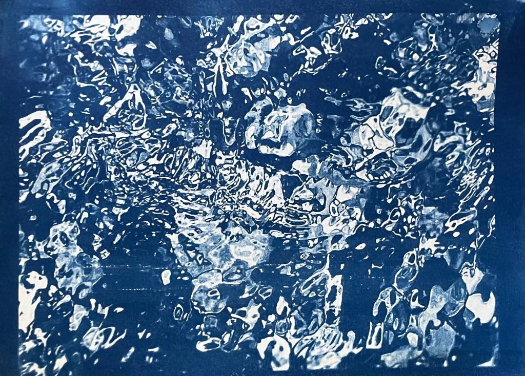
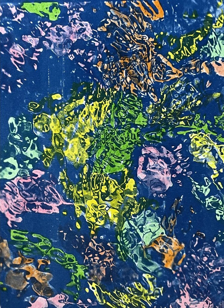

It’s an interesting effect. I’m not sure what I think about it. Maybe it would work better on a different style of image, one with defined lines as opposed to the organic shapes in these images. I’m definitely not ruling it out.
I also took an unsuccessful print of the digital image I made recently and experimented with drawing on it in pen. I had no plan in mind, and just followed some of the shapes. It was a mindless activity, just doodling. Several areas are not particularly successful, but I like the combination of the cyanotype and the pen. I’m not sure how I might use it; I think that I need to explore using some different images.
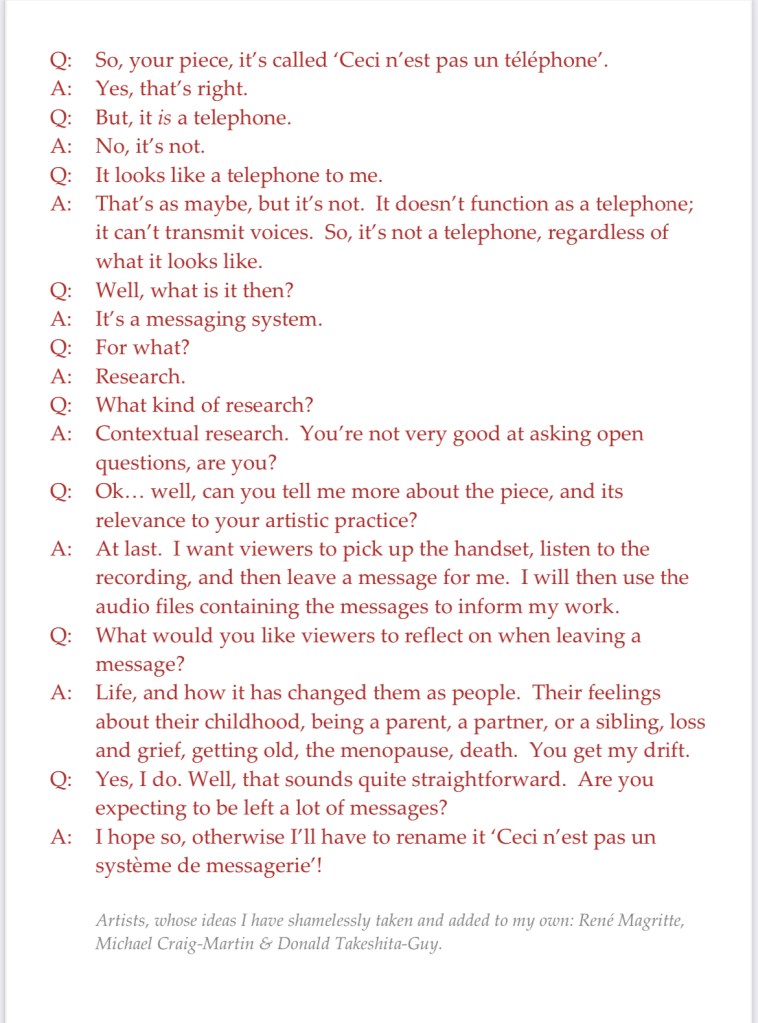
My main piece is the telephone. I’ve managed to figure out how it works – now I’ve just got to record my message which I think will be quite short and to the point.
I struggled for a while to come up with a way to indicate that it is an interactive piece. Also, if I’m going to use the audio files as well as the content of the messages in future work, I think I should say as much so that people have an opt out if they’re not happy with the possibility of their voice being used.
I was trying to get to sleep the other night, tossing and turning, when it came to me – I’d do what Michael Craig-Martin did for ‘The Oak Tree’ i.e. have a transcript of an imaginary conversation between me and a third party.
So I came up with this, which I will display alongside the telephone. And yes, I’ve also ripped off Magritte, and used Donald’s comment from a few sessions ago about mobile phones not really being used for their primary purpose, making and receiving calls, but for messaging etc.
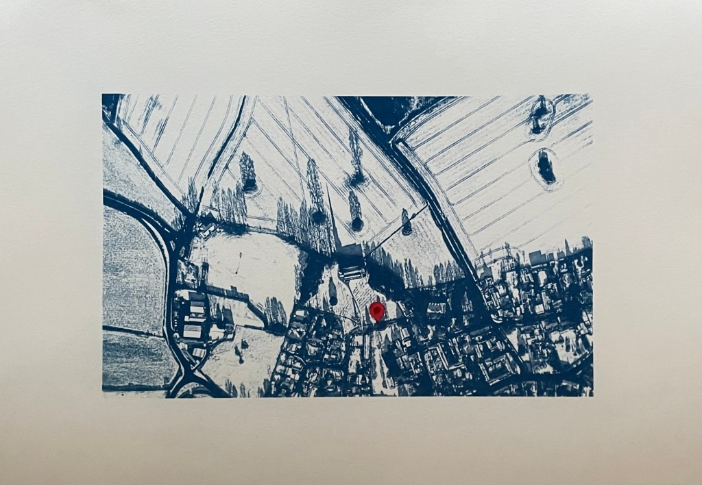
I’ve also had another bash at the cyanotype of the aerial view of the village. I couldn’t get it right on A3 for some reason as the detail of the fields just wouldn’t stick. I tried so many times but I think that because I was doing it quite late at night my brain just stuck, and instead of stopping and leaving it for a while so I could reflect on it with some distance and clarity, I just kept on making the same mistakes over again which made me feel really frustrated. I’m going to park it for now – it could be something to do with the height of the UV lamp.
So I’ve gone back to the smaller negative and printed it on A3 and added in a location pin. I’ve decided to call it In Loco Parentis. I feel much better about it now, and, on reflection, A3 would just have been too large an image for something which is quite intimate and personal.
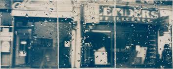
I’ve also tried doing a triptych of the view from my window. I had initial success in finding out how to split the image into 3 equal parts and printing separate negatives for each. After that it just went downhill; it has been so difficult to get any consistency between each of the separate sections because I’m doing them each individually and there doesn’t seem to be any rhyme or reason as to why they turn out differently despite using the same solution and applying it as consistently as possible, exposing for the same amount of time and washing out in the same way. I even tried to make sure that the temperature of the water was the same by starting to run it at exactly the same time before the exposure had finished, but the difference in results between them was staggering. I’ve now got lots of different sections, and having sorted through them all, these three are the best fit that I could come up with.

I think I might sort out the sizing a bit more and then fix them to another piece of watercolour paper.
Disheartened by the exercise I did the same as with the aerial view, took the original negative and printed it on A3. It was much more straightforward, and made me feel an awful lot better. Is it a bit boring? I don’t think so as I think you get a much better sense of atmosphere, and I’m trying to change myself to subscribe to the view that less is more.
As I took the original photo on New Year’s Day, I think I’ll call it, Another New Year’s Day. On reflection I think I prefer it. I’m not sure that disjointed views really do it for me, but then again I didn’t think that I liked collage.
In addition to the pieces above, I’m taking along Motherhood I which I’ve had printed on A1. I’ll see what seems right on the day.

After my disaster trying to do my own, I managed to source some pre-treated fabric and have another go. The result is quite good, but the clingfilm effect suggests that the fabric is creased which irks me somewhere deep inside. Also, I don’t think that I rinsed it thoroughly as some hydrogen peroxide seems to have discoloured the fabric in places. I’m not sure how I might use fabric based cyanotypes yet – I need to think about it, and look for some inspiration.
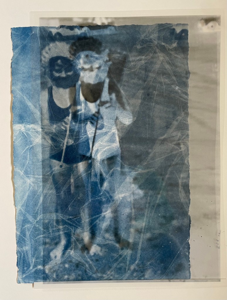
In the meantime, I’ve been experimenting with adding in sections of the negative print. I got this idea from these works by a visual artist and photographer from Luxembourg, Jean Bettingen who is interested in the constructs of identity, memory and self-representation. I also like his use of text to accompany the images. I’m guessing that he has overlaid the transparency over the top of the cyanotype.

I didn’t want to cut up my negative transparency just yet, so I printed it out and tore off a section. I think that it adds some extra interest, and I particularly like the way in which it’s not obvious which is on top, the cyanotype or the negative. It’s actually the print of the negative which is just lying loose on top of the cyanotype, but it gives a sense of distant space behind it. I tried placing the transparency on top of the print to see what that would look like and I’m intrigued by the effect, so when I’m feeling a little less precious about the transparency I’ll chop it up.
I also came across a German artist called Katja Liebmann, whose work records the energy, isolation and alienation of urban life.
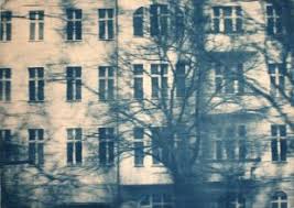
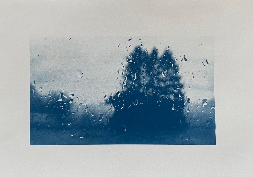
The water droplets on the first image reminded me of a photo I took out of my bedroom window on New Year’s Day this year. I hoped to myself that it wasn’t a taste of things to come.
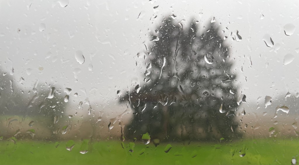

I really like this image. It’s only A4. I’m going to try and do it as a triptych, like Liebman’s first image.
There’s a passage that I find really moving. It comes from Deborah Levy’s The Cost of Living which I selected as an inspirational text (see The Cost Of Living). In it she describes how she felt after her mother died and, in particular, her reaction after coming across a postcard her mother had sent her.
“My mother had made a biro’d X on the front of the postcard and written’ X is where I am’… It is this X that touches me most now, her hand holding the biro, pressing it into the postcard, marking where she is so that I can find her.”
In response, I had an urge to do something similar. I’ve had an image in my head for some time. I looked at the satellite image of the village where my mother grew up, of the church where my parents were married, and of the churchyard where they now rest, together with my grandparents, aunt and uncle, and other distant relations. The image was taken on a sunny day with snow on the ground, and I love the shadows which are cast by the trees and the buildings, in particular, the church; the shadow of the spire revealing a building, which is otherwise indistinct from the air, as being a church.
Luckily, after a bit of research I managed to work out how to remove the road and building labels.
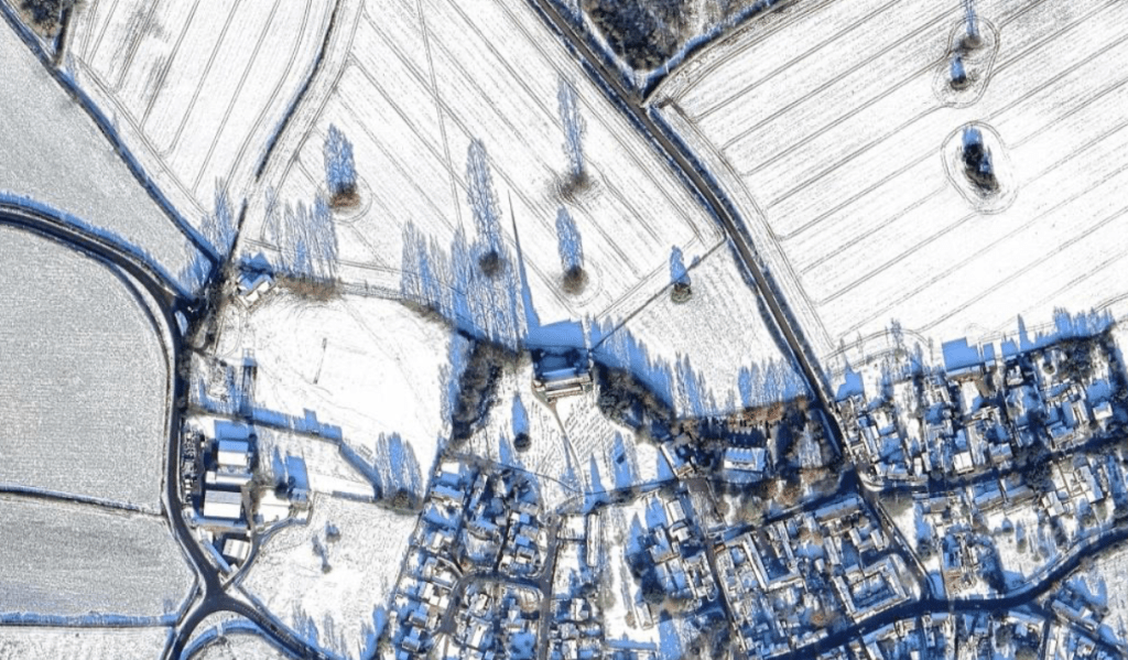
So, I made a cyanotype. It’s only A4 in size. I’m thinking about making it larger, say, A3. I don’t think that I can make the image any sharper, but I don’t think that really matters – it’s not about the detail of the buildings; it’s about the shadows revealing the nature of the buildings, about the sense of place and about the topography; the tramlines in the fields, the clusters of trees in the middle of fields and the pattern of the roads I walked down as a child. I love the patchwork nature of the countryside. I know that I’m coming home when I see it from a plane.
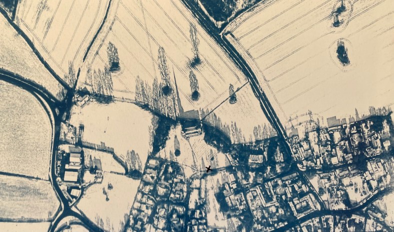
I’ve put in an ‘x’ but black ink doesn’t really work. I might try red, or maybe replace the ‘x’ with a location pin instead which might contrast well with the historical feel of the cyanotype.
There’s not been much experimenting. I think it’s because I’ve known what I wanted to do for a while and it was a clearly formed idea. It’s been an easy process and a cathartic one, but it does make me feel sad. My parents were my anchor to the past and without them I feel adrift from where I came from, and from a substantial part of my history.
When I went to the Pallant House Gallery to see Dora Carrington recently there was another exhibition on at the same time: Maggi Hambling – ‘Nightingale Night’.

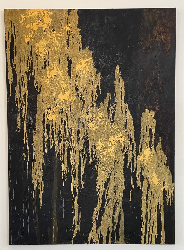
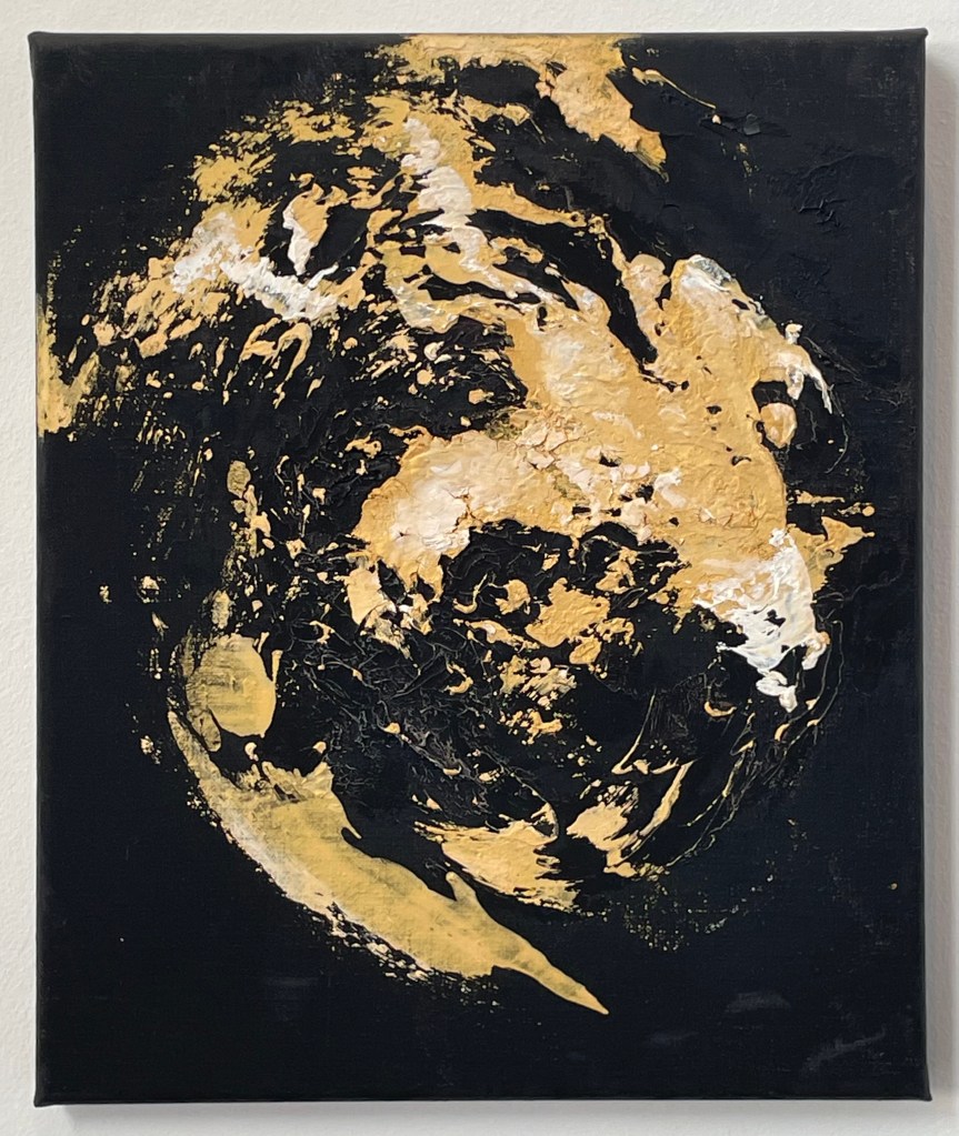
Hambling spent a night in a woodland in Sussex in the Spring of 2023 listening to nightingales. I didn’t take photos of all of the paintings – I think I was only drawn to some of them on the day, or maybe I was tired from exploring Dora, but Iooking again at the images on the identification labels, I’m regretting not having done so.
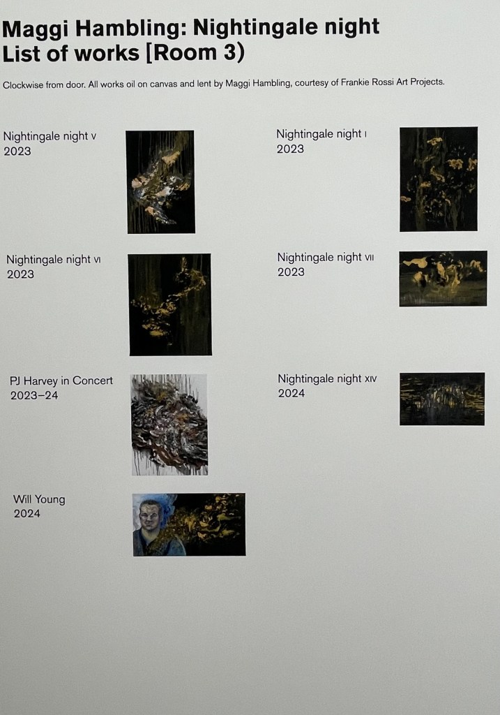
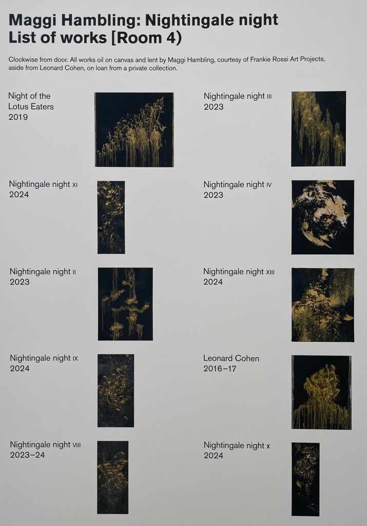
I’ve since read an entertaining interview with Hambling about the exhibition in ROSA Magazine – I like doing further research after I’ve been to an exhibition; never before.
I’m not entirely sure what I think about it all. I’m not sure that I like the gold on the black ground, although I can absolutely understand her reasoning behind it, and I do like a bit of gold. Does she succeed in communicating the otherworldly divinity of the nightingale in the darkness? The sense of it, absolutely, but the sound of it? I’m not convinced, and I think it’s the mark-making. The swirls and definite vertical and horizontal marks are successful, I think, in representing sound; my issue is with the drip-like marks – they don’t allude to the beautiful song of a nightingale to me; it’s more akin to me having a warble and eventually running out of steam and giving up. But I think I’m being harsh, because even she admits that it’s impossible to paint the sound of a nightingale, and that what she hopes to have captured is a sense of the fleeting moment. She comments:
”…there wouldn’t be much point in painting a picture that it was possible to paint…”
It’s an interesting comment, one to think about.
It would be interesting to know whether Hambling made the paintings from memory, or whether she played a recording of nightingale song whilst she worked. I’ve assumed that it is the former because it’s about the whole experience, of being in a certain place at a certain time bearing witness to something extraordinary.
I have been carrying on with my pen doodling, some of which is unfinished – I became bored, and moved on. I also decided to give nightingales a go. The concept of representing sound in a 2-D form is really interesting – the consideration of tone, volume, intonation, rhythm etc. I’ve represented it in a linear way, thinking initially about sound waves, but it would be interesting to explore other methods of representation.

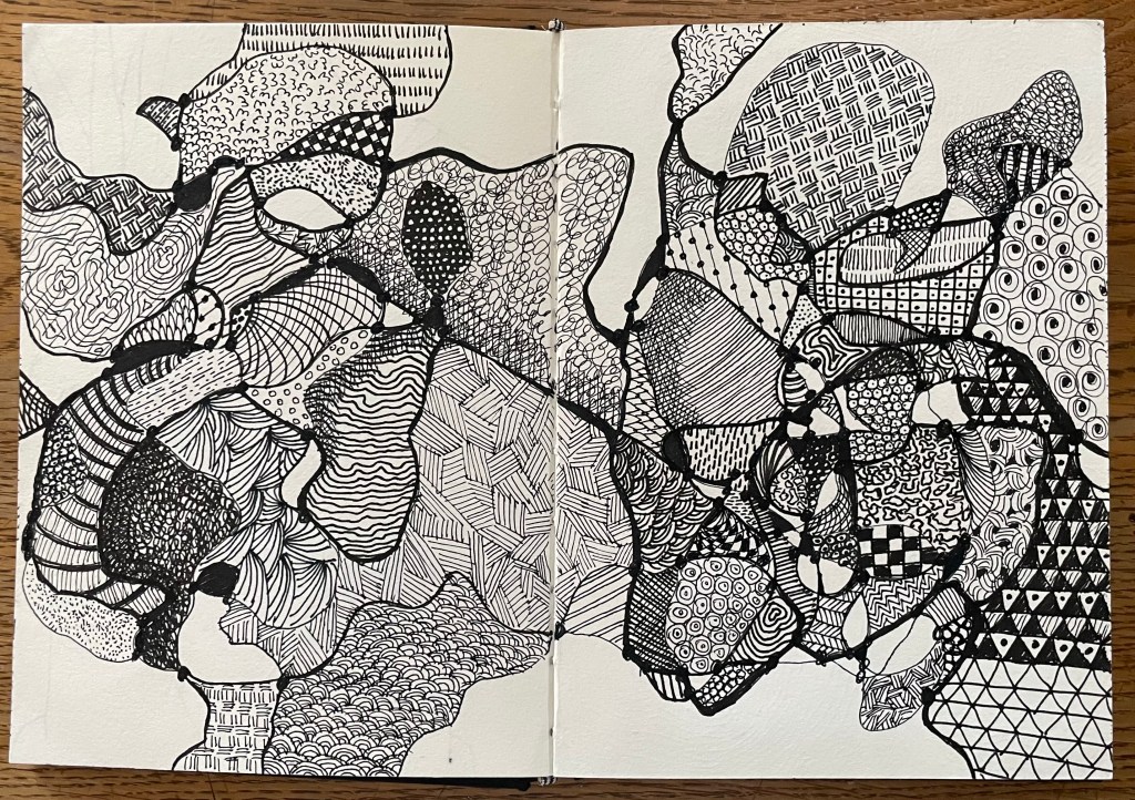

The song is so diverse and improvisational that it was very difficult to think of different mar–making to represent what I was hearing. It was an interesting exercise, and very calming listening to birdsong with my eyes closed.
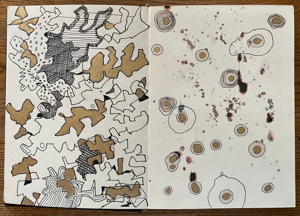
I like having an inked page – I think I will go through my sketchbook and randomly ink up or paint pages. I also like trying to work with unexpected events such as the solvent stains from the gold coming through to the reverse of the page. This is, literally, just playing – it’s enables a period of convalescence.
I took the overexposed images of me on the beach and lightened them by putting them in a bath of sodium carbonate (made by heating sodium bicarbonate in the oven) and water. I think that the solution was too strong as it lightened the images considerably.
I then made up some toning baths, and used the lightened images and two of the ones which had been ok from the previous session.


It took several hours for the tones to develop especially in the images which hadn’t been lightened first. Thinking about it I haven’t been particularly scientific or logical about this as I was too keen to experiment, but going forward I will need to be more careful about keeping a record of process: applications, timings, volumes, amounts etc if I am to stand much chance of recreating effects that I like. ( Left: Turmeric tea – lightened)
To get a true comparison I will need to repeat the process using lightened and unlightened images and specific volumes of toner and timings etc.
I then started playing around with exposures. I prepared a new print of the trees using the unit, re-applied some solution, and then placed some amorphic shaped paper masks over areas of it and put it back in the unit for 5 mins. I then put it in a hydrogen peroxide bath in an attempt to get some deeper blues and definition in the dark areas.
I like the added depth that is achieved by the second exposure; it creates some more interesting areas within the darks, and a mid tone in the lights, making 4 tonal values.
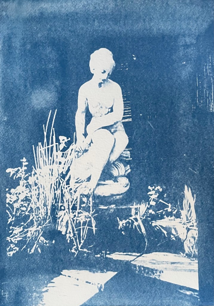
I then tried a triple exposure. I took the underexposed image of the pond statue from the previous session, reapplied the solution (not particularly evenly as it turned out), and used some torn paper to retain sections of the original image. I exposed it for 5 mins in the unit.

I then recoated it, and masked off most of statue, laid on some foliage and then exposed for 5 mins in the unit, finishing with hydrogen peroxide to accentuate the different tones in the dark areas.

I’m pleased with the result, although I would have liked to have achieved greater definition of the leaves where they cross the vertical strips. Perhaps less time on the second exposure?
Exploring the idea of masks further, I tried using various items on the first exposure. Some were more successful than others. Soap suds between sheets of plexiglass didn’t really work (I think that’s more for when working wet in wet):

I also swapped from watercolour to oil paper, with a view to developing the prints by painting on them in the next session.


I really like the effects achieved in the images above. I now need to sit back and reflect on if, and how I can develop them further.
I think that my brain is at risk of becoming overwhelmed by all the possible permutations. My natural reaction is to explore every combination possible. To this end, I enjoy making up colour charts, recording every possible combination using all of my paints, even if I never use the charts. I suppose that I like to know all of the options available to me, with which I can work. It makes me feel safe. I like the comfort of having some form of structure in place. That’s how I am – I like to be informed: to know all the options before making a decision, to see all that there is to see in the place where I am on holiday, read every book or article which might be relevant – hence my delay in tackling the UAL library online. I think it comes back to the feeling that I have done all that I can possibly do, and so the decision or path that I choose to go down has to be the right one. I like resolution. Nothing irritates me more than watching a film or reading a book and getting to the end where there is no end, even if it is a bad ending; no resolution. And yet, the ending could be whatever I want it to be and has infinite possibilities which in many respects should be a better and far more exciting place to be.
Last summer I became obsessed with cyanotypes. Then there was plenty of sun. There was some sun the other day, but not much since, so I decided to make myself an exposure unit using my Speedball UV lamp and following instructions on Handprinted. I do love a bit of DIY; there’s something very satisfying about making do with something handmade which didn’t cost a fortune to buy, or require some fancy kit, or having to go to a specialist location.
I used an old printer box which was large enough to take A3 sheets, cut out a hole for the lamp to sit in, and then lined it with aluminium foil.


I selected a few photographs to experiment with; some from the family photos which I’ve been sorting out, and others which I have collected on my phone as inspirational resources, as well as some images from the experiments earlier on in this blog. I converted them all to black and white and then inverted them in Photoshop, printing them off on transparencies. I had to dust off my old printer to do this as I wasn’t sure how to do it on my husband’s printer. This took a while because between each print I had to perform a ritual of pressing certain buttons in a certain order in order to fool the printer into thinking that I was using genuine HP ink cartridges, which I wasn’t. The things you can learn on YouTube.
Ironically, the sun came out, so I did a mix of au naturel and my DIY unit.
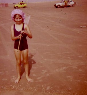
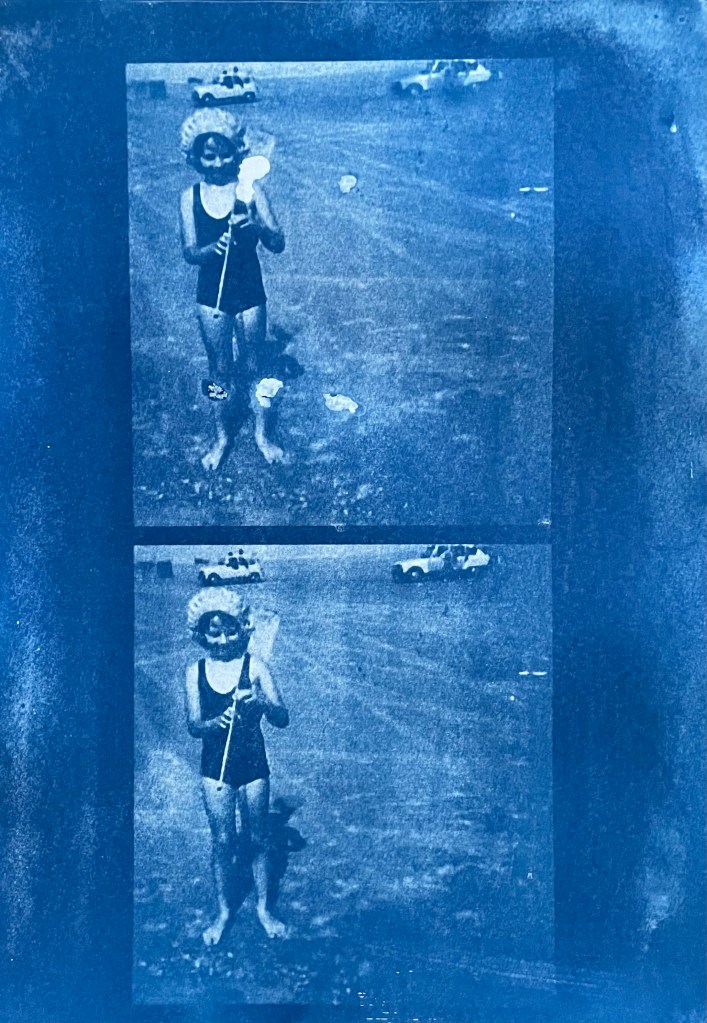
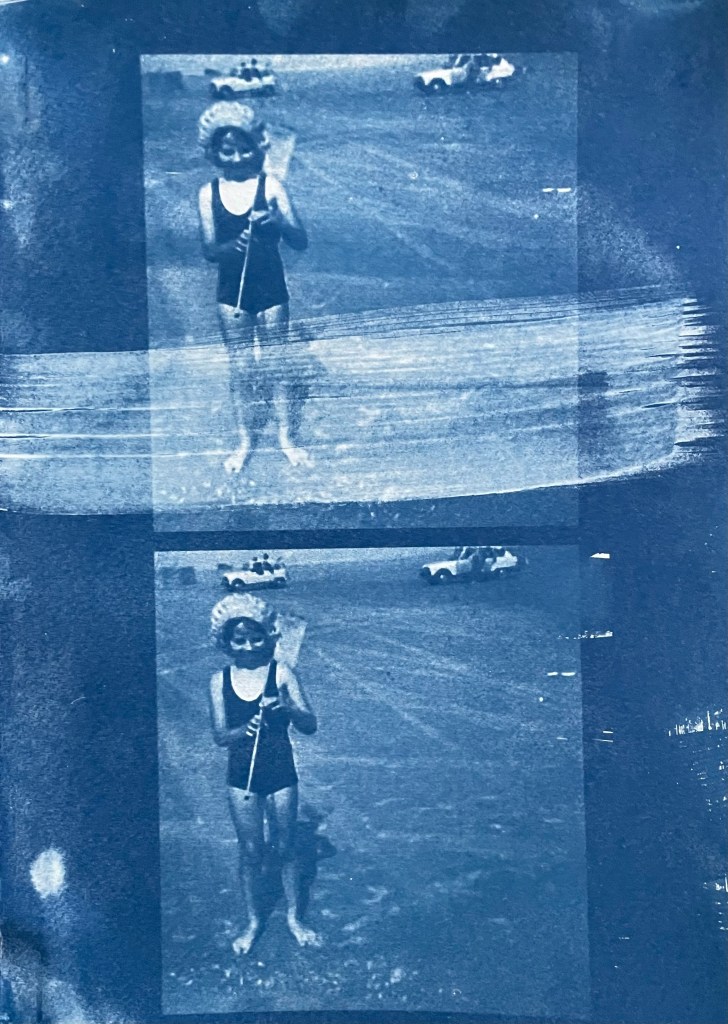

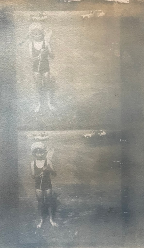
The first two prints were made using the unit, the first being over- exposed at 20 minutes, the second being just about right at 15 minutes. The last two prints I did outside in the sun, which was a bit more hit and miss because the strength of the sun was not constant as it kept disappearing behind some cloud cover. However, I do really like the effect of the visible strokes which I left when applying the solution to the paper, which was A4 300g/m2 hot pressed watercolour paper. The markings give the effect of a moving, flickering , transitory image – there, but not quite there. I put two images on the same negative transparency because I wanted to create a number of smaller images to experiment with. However, the suggestion that the images are on a roll of film is really interesting.

It’s been really difficult getting some of the old photographs out of the albums; they are the sort which have sticky pages on which you position the photos, and then put a transparent film over the top. Over the years the adhesive has seized up and practically bonded to the back of the photos. I’ve tried all sorts including gentle heat, dental floss and a bendy, very sharp filleting knife.
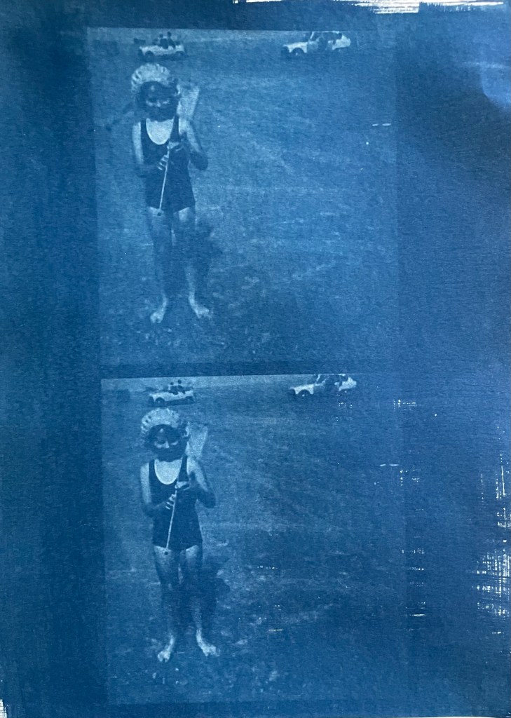
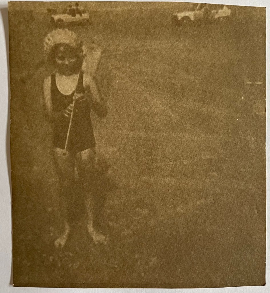
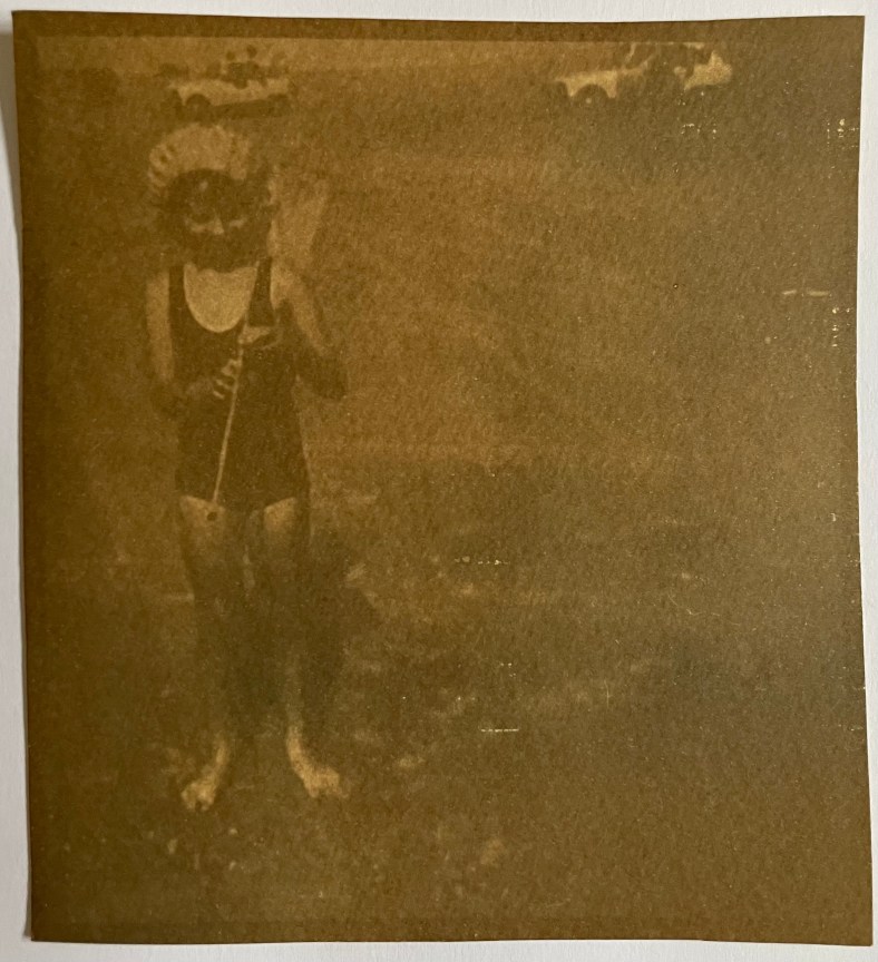
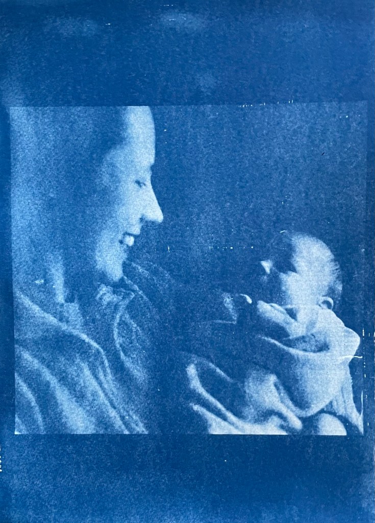
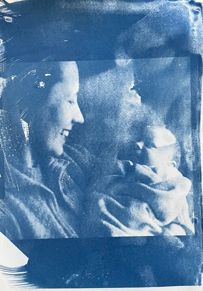
This one of my mother and brother is a favourite, but sustained a small tear on the right. I am pleased with both images – the first one was done outside and the second in the unit, which seems to have more of a Prussian Blue hue to it although I’m not sure that there’s any rhyme or reason as to the differentiation in the blues – but I really like the movement in the second one, again giving the impression of a fleeting moment. I think that the solid areas at the top and bottom add to it, suggesting a frame from a film of a moving image.
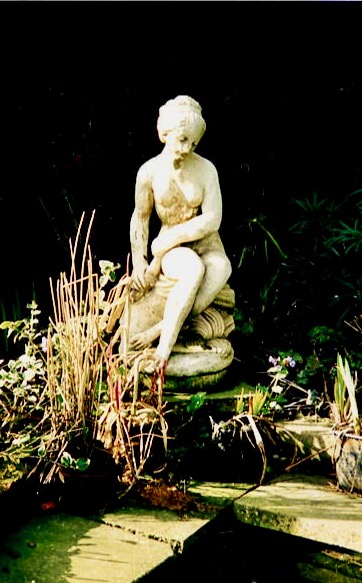

This is a photo of the statue which sits at the bottom of my mother’s garden next to her makeshift pond made out of an old washing-up bowl. I always used to wander around the garden when I visited, stopping at the pond to see if there were any frogs around. I do like a frog – my grandmother on my father’s side used to have a rockery, and I used to spend most of my visits looking for, and trying to catch frogs. That, and hanging out in her shed and greenhouse with the tomato plants – I love the smell of tomatoes; it takes me right back.
The problem with a cyanotype is that if you leave it too long, you over-expose it, and whilst you get deep blues you lose the midtones, which is what I thought I had done with the first one, so I exposed the second one for less, but it turned out to be under-exposed – even putting it in a hydrogen peroxide bath didn’t help. Both were done outside; perhaps I should have done a straight 15 mins in the unit, but where’s the jeopardy in that?

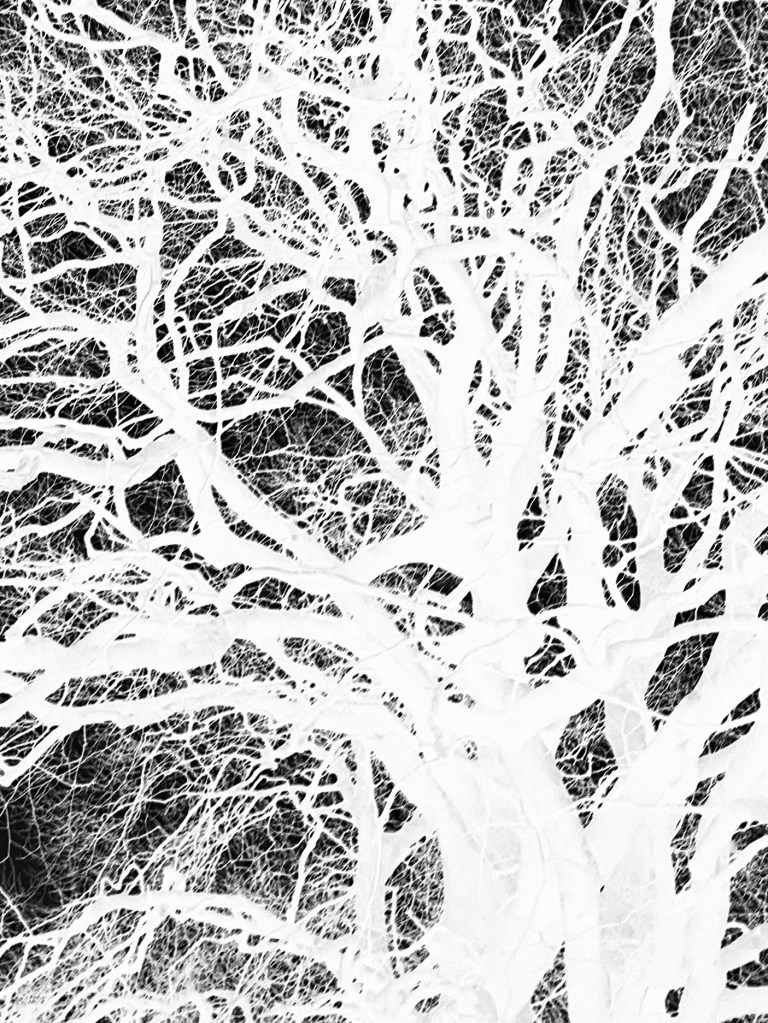


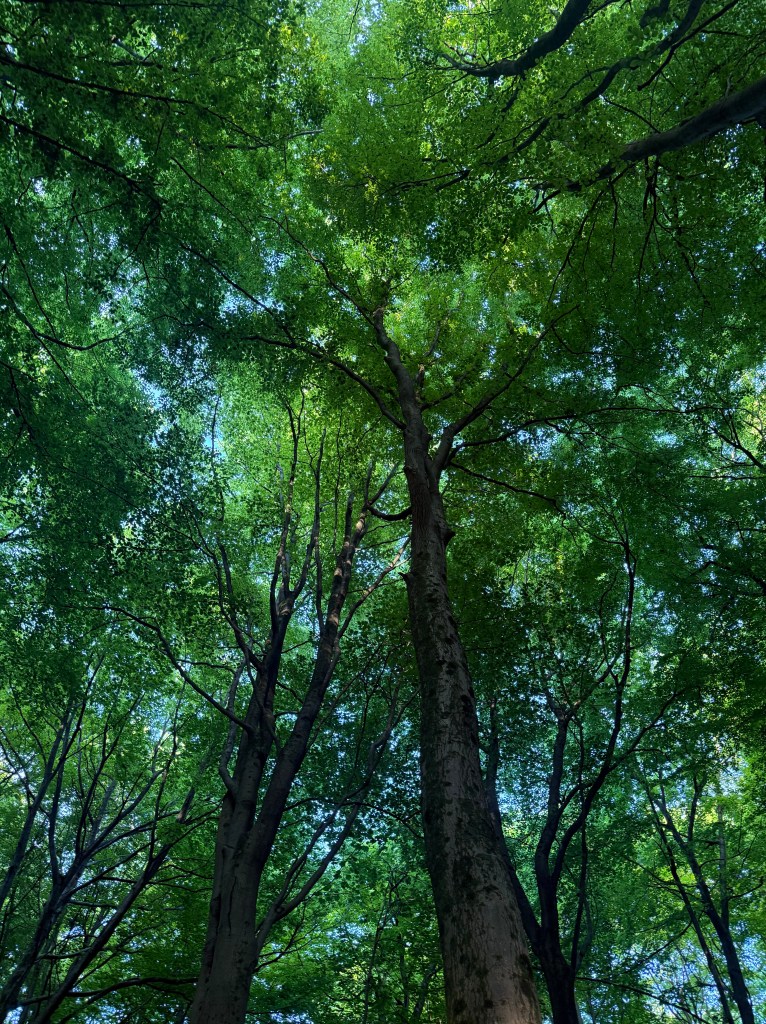
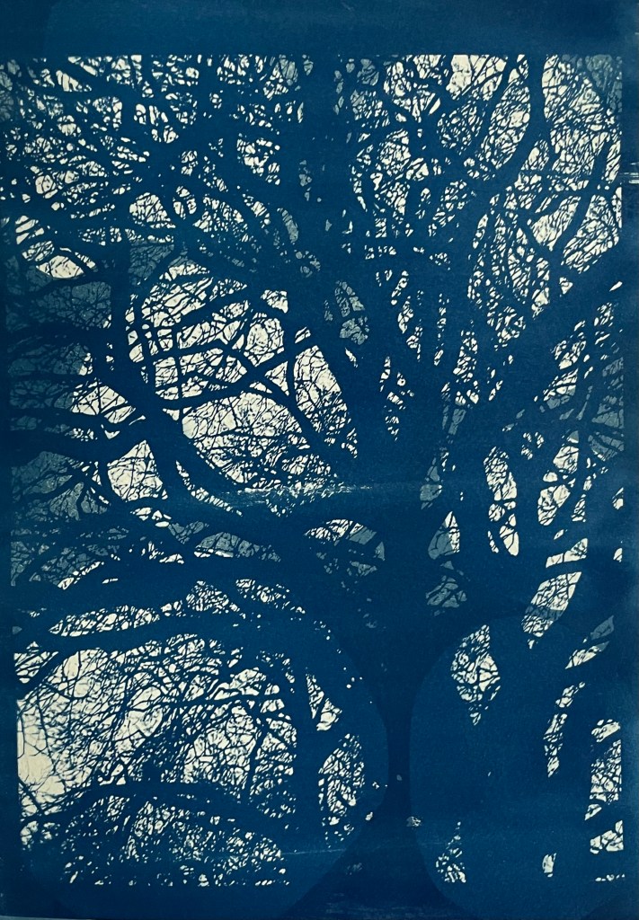
This is a photo that I took looking up into the branches of the three trees that I like. The negative image is also really interesting, and I might do something with that at a later date. The image (last photo) is underexposed again, but has a feeling of being removed, almost as if I’m looking at it through my window (which incidentally does need a good clean). I wanted to try fabric, but could only find some thin cotton lawn. I was so disappointed – it turned out terribly. I had visions of being able to create long, flowing, billowing, wispy cyanotypes, but ended up with the image above. You can just about make out the branches.
I will need to think about this a bit more. My first thoughts are that maybe there was a coating on the fabric, so I’ve washed it; maybe the image was too detailed, but I’ve seen quite detailed images on fabric; that the structure of the fabric is not robust enough – you can get pretreated fabric which is like a sateen so I could try that; or maybe there wasn’t enough contact between the fabric and the negative. I need to take some time to reflect, and try again.
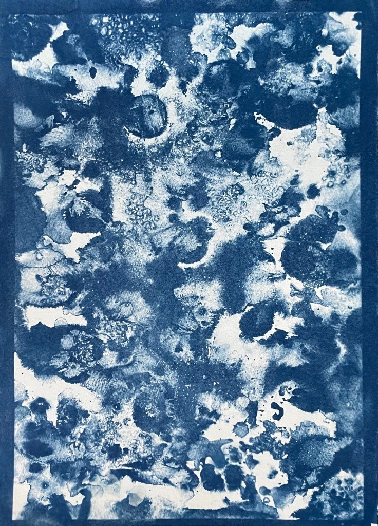
The images above were from my experiment with ink in Blot II , and from A State of Flow II . It was a useful exercise in that it confirmed to me that not everything works as a cyanotype – I much prefer the original images, particularly the ink one, as the edges between areas of flooding and blots are much more defined, and there is more of a delicacy about them. The contrast between the blue and the black ink also adds interest which is lost in the cyanotype.
So, on reflection a really useful and enjoyable exercise. The thing that I really enjoy about this process is the anticipation, and then the slow reveal as you rinse off the solution to see an image slowly emerge, or not, as the case maybe. Doing it outside as opposed to in the controlled environment of the unit adds a degree of extra excitement, but equally there is the risk of crushing disappointment when it doesn’t quite work out.
Moving forwards, I was intending to experiment with toning some of the smaller images of me with tea, coffee, wine etc, but I actually like the last couple as they are, so I will keep them as finished. I’m thinking about how I could use multiple exposures to create layers, and also thinking about manipulating the source image a bit more in Photoshop and printing from the original image rather than reversing etc. I’m not sure whether I’ll get straight to it, or do something else in the meantime – sometimes I go hell for leather with something and then exhaust it, or myself, or become disenchanted with it. I don’t want to get too far down a rabbit hole, so maybe I should leave a bit of space before going back to it, to allow for some more subconscious reflection. I suppose the clue was in the opening sentence: “Last summer I became obsessed with cyanotypes”, and I haven’t done it since.
