Call Me

I had a thing for Richard Gere when I was a teenager. I remember watching the film ‘American Gigolo’ which I had rented on video – one of his early films, before the likes of ‘An Officer and a Gentleman’ and ‘Pretty Woman’ – which had a brilliant soundtrack, ‘Call Me’ by Blondie. I tried to source the 7” from my local record shop, but had no luck as it had been released a few years before. One of my classmates at school told me her brother had it, and that he would sell it to me for £10 – in those days I could have bought almost 2 LPs for that amount; a single was just over £1. Needless to say, my crush on Richard and my newly discovered love of Blondie made me cough up some of the cash that I had earned from my Saturday job at the local Sainsbury’s. Even now when I hear the track, it takes me back to the opening scene with Richard driving along in his convertible, shades on, the wind in his hair. Ah, I could but dream…

’Call me’ is a strange phrase – often uttered when someone is pushed for time and can’t stop to talk; doesn’t want to talk; can’t make the time to talk; wants to leave it up to someone else to initiate the talk; is desperate to talk; is extending an invitation to talk. It’s not even as if we speak on the phone that often anymore – many households in the UK don’t have a landline, relying on their mobile phones instead, but as Donald commented in one of our sessions, we tend to use a device designed to allow us to communicate on the move, to message, take photos, make videos, play games, navigate, play music, and look things up, instead.

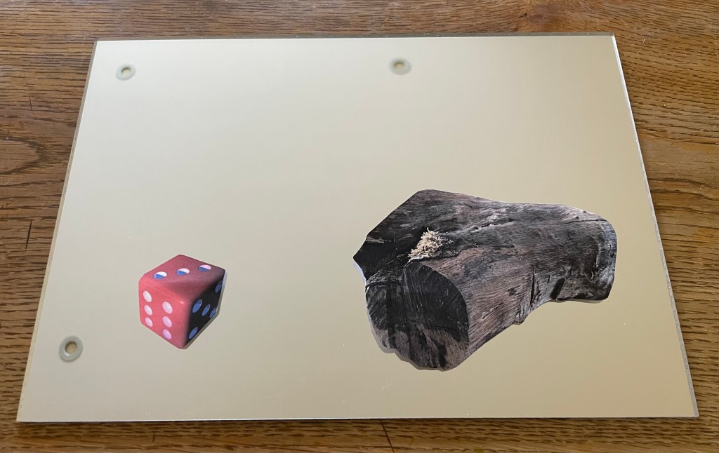
Anyway, I have managed to source a telephone for the interim show, as discussed with Jonathan in my last tutorial.

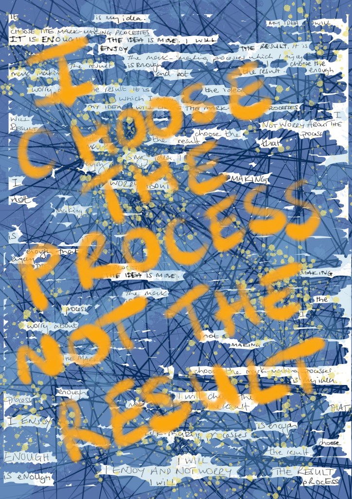
Am I bothered about using an object which I have sourced rather than made? No, as Jonathan commented, there’s no point making something which already exists; I don’t grind my own pigments to make oil paint, although many do as they feel it provides a greater connection with the work, and I respect that level of patience and dedication – it’s just not for me. But I do, now and then, and if time permits, stretch and prime my own canvases, but this is something I know how to do – all things electronic are alien to me. Also, I generally only do it when I want to recycle some old stretchers. And at the end of the day, ‘readymades’ were ok for Duchamp. I think what is most important to me is the haptics of using the dial – many of the phones I researched had push buttons. I used to love dialling a number – the slight resistance, followed by that sound.

The phone will enable me to leave a pre-recorded message and allow members of the public to leave messages for me, which will then form part of my research – I plan to exploit the public nature of the space. My issue now is, what’s the message going to be, and how will I exhibit it?

It’s not a new idea, not surprisingly, but I will put my own take on it. Having done a bit of research about artists who have used phones as interactive exhibits in their work, I came across Joe Sweeney who, in 2019, installed a phone booth facing France on a beach in Dungeness entitled ‘+44… Leave A Message for Europe!’. Members of the public were invited to leave messages relaying their feelings about Brexit, forming part of a permanent archive of public opinion. The statement on site explains: “The inactive phone box acts as a beacon. It is a nostalgic call to action – a reminder of the way we once communicated – with the nuance of the voice.”

(Source: http://www.ignant.com – 17/2/25)

I also discovered a project in Basildon, Essex – the Rotary Dial Phone Project which is part of a bigger initiative, ‘Bit Time’, devised by artists Dave Norton and Laura Travail. https://magpi.raspberrypi.com/articles/bit-time-rotary-dial-phone-project-showcase (17/2/25)

Norton: “The inspiration for the question/answer phones came from a desire to build a device that lets you share a message with someone you’ll never meet. A digital time capsule of anonymous thoughts, advice, stories, and memories that could be listened to by anyone. You have no idea who might hear your message and how it could affect them.”

Unlike in these two installations, my phone won’t have the ability to allow viewers to hear other people’s messages. Mine’s not so complex, but I still think it gives the person a sense of speaking to someone anonymously, and perhaps sharing thoughts which they haven’t shared with anyone else. Those words initially communicated by a phone, then also have the potential to be further communicated in my work.

Dialogue IV – I’m So Over It

I’ve had enough of this side quest (©️Rebecca). I regret the day that I started it. Have I enjoyed any part of it? Maybe the beginning, the anticipation, the thinking about it. But when it comes to the process, it has been a monumental headache, from the execution to the photographing.

I realise a few things may be influencing my feelings about it. I keep getting reminder emails that the submission deadline is approaching – like I don’t know. Also, my daughter phoned me up yesterday morning in a crisis during an online exam – she was having IT issues. She had already contacted the helpdesk and taken screenshots, so my only advice was that she could only do what she could and not to stress, they must have procedures for this sort of thing. A couple of hours later she was feeling better, whilst I was still feeling the effects of all her stress, and trying to work out how on earth I was going to take a photo of a reflective surface. That, and the fact that some of the glue had managed to escape from under the cut-outs, and the realisation that I had fixed the die on the wrong way round.

Anyway, this morning it wasn’t raining for a change, so I took it outside. I’m not entirely sure how I’m supposed to convey its reflective qualities without including a reflection which then looks like it’s part of the work. Well, following my own advice, I can only do what I can do.

I feel like it’s been a shambles and that I’ve been amateurishly stumbling from one thing to another. The process hasn’t been the experience I thought that it would be. Because I had no expectations, I thought that there would be no stress – instead I’ve experienced confusion and frustration, and it has taken just as much out of me as other years, just in a different way. The only difference is, if it doesn’t get anywhere, I really don’t think I care at this point.

But every experience is a useful one. So what have I learnt?

  • Mirrored acrylic has an amazing quality of turning into a super static magnetic for all manner of minute particles floating around in the air and so is impossible to get clean.
  • Whilst deadlines can assist in making decision making and getting on with it, a lack of time reduces options, options which may have been the better course to follow. I should have had the image screen printed – it would have avoided so many issues – but I just didn’t leave myself enough time.
  • I’m not neat, and I don’t do small and fiddly.
  • I’ve tried something different – maybe next time I’ll enjoy it.
  • I can submit work which I don’t like and which contains what I know to be obvious errors.
  • I’m going to do mirrors again, sometime – they will not defeat me.
  • The process of exploration and experimentation is not just about serendipity and happy accidents or things that just don’t work, it can provoke feelings of confusion, frustration and it’s just not that easy.

But for the moment, I’m so over it.

Dialogue III – That Will Do

I’ve always thought that if you do something, you should do it to the very best of your ability, no matter what. My husband is very much of the ‘that will do’ approach, which used to really irritate me.

With hindsight, it was an impossible ideal – it’s obvious that I couldn’t do my absolute best at everything I did in life; there’s only so much time, and so much of me. It was a tall order to impose not only on myself, but also on others – it led to feelings of disappointment and dissatisfaction. It was also the slippery slope which led me to strive for perfectionism in my art. Over the last few months, my mindset has shifted, I would say, seismically.

That’s not to say that I’ve stopped caring, or have become laissez-faire. I would like to say it’s because I now care much less about the result, and more about the process, but I’m not quite at that point yet. It’s more that I’ve stopped imposing such high expectations on myself – in the past their achievement might ultimately have given me a moment of satisfaction, but it was rarely ever enjoyable or something that I actually wanted to do. Now, I feel that I am motivated by what interests me, and I would still like to do my best, for example, in the sense of making the most of opportunities and ideas, but I recognise that there are so many variables which could influence what that might be.

Anyway, long story short, I’m done, finito, and heaven forbid – it’ll do.

So, I had the mirror images printed and fixed them to the back of the existing cut outs. I used a crafter’s glue – Tombow mono liquid glue – as it seemed the least likely to cause buckling etc. Now the cut-outs were thicker than they were originally which caused a problem of the white edging. Also, even using a brand new craft knife didn’t prevent some of the edging being visible face on, which was particularly irritating – I don’t really do fiddly stuff and I’m not the neatest – as I had been really careful when cutting them out. I used some highly pigmented coloured pencil to get rid of the white as best I could. I then glued the cutouts onto the mirror, which proved tricky as the mirror surface had to be wet for the glue to cure properly. I managed it as best I could, but it was a tricky process trying to get enough glue on the back of the cutout for it to fix, but not so much that it would ooze out from underneath and react with the water on the surface.

It will do.

Next problem: photographing the finished piece.

Doing Lines

Following my tutorial with Jonathan, I decided to test the theory that if you say something to yourself enough times, you’ll start to believe it. So, I’ve been doing lines. To be honest I didn’t have to do lines as a punishment at school: I was a conformist.

We make marks everyday in one way or another. An obvious one is our handwriting. I learnt handwriting at school in the same way as every other child, in the book with the lines which indicated where the top and bottom of your letters should go, and the line in the middle indicating the height of the small letters. Once we had mastered the basics, we were allowed to go free range, first with a pencil, and then with a pen, as a reward for continued neatness, and perfection. Those were the days when everyone was taught to write with their right hand; left-handedness was not tolerated. But the need to express ourselves in how we write the words, not just with the words we choose, will always out.

Our handwriting reveals things about us, from the tilt, the size, the pressure, the failure to close our loops. I’ve never had consistent handwriting. It changes depending on my mood. I wonder what that says about me. Maybe I’ve never found a style which says to me: yes, this is you. And maybe that’s the point – I’m forever changing. Or maybe I just haven’t found my mark-making processes. It doesn’t really bother me, but at times I do feel jealous of the beautifully formed letters of others. I think – yes, you’ve got it together; you know who you are.

Doing Lines I

I like that the redaction is scruffy and that there are jagged edges. When I was doing it I wasn’t aware how scruffy it was because I was doing it against a white background, and so it just looked like the redacted words were disappearing. Surprisingly, I didn’t even have the urge to tidy it up once it revealed itself to me. As I was going through the words trying to make different phrases each time, there was a section in the middle which became a bit negative. It’s quite difficult to find different phrases from the same words in the same order. Phrases like ‘I worry about not making’, ‘Is it enough that I enjoy the process’ and ‘I worry about not making the mark’ started to pop up.

Doing Lines II

Well, I’ve written the words that many times, that if they haven’t sunk in by now, they never will.

It seems to have all been about words recently. What are words worth? That’s what the Tom Tom Club asked in their rather bizarre new wave hit from the early eighties, Wordy Rappinghood. You have to be of a certain age to remember this one. I rather like the artwork.

Dialogue II

“So, what do you think?”

”It’s not one of your best”

And now I’m in a state of flux, and feeling a bit stressed, thinking where do I go from here? I have nothing else.

I use my husband as a sounding board and as a gauge as to what I’m feeling and what I’m doing. I value having someone to give me feedback, to hold a mirror up to me. But to what extent should I rely on this and allow it to influence how I see my own ideas and work? Why is it when someone says they really like my work, I feel it’s easy to ‘do it down’ – ‘oh, it’s not one of my best’, ‘there are some bits of it I’m not totally happy with’ (when actually I think that it’s as good as it could possibly be and I’m actually quite pleased with it), and yet when someone is ambivalent about my work, I feel unable to ‘big it up’?

Anyway, I now feel directionless, and at a loss as to what to do.

I have looked at how other artists have approached the concept of dialogue, and, in the main, they all involve figures. None of what I have looked at has inspired me so I haven’t even bothered to include any images of them in this post.

I don’t know what it is, but I’m feeling a bit fed up at the moment. Maybe it’s the theme of ‘Dialogues’ and the idea of connections etc. – it all seems as if it’s something that has been done before ad infinitum. Maybe it actually bores me – I don’t know – I just can’t seem to get inspired by it. Maybe it’s the fact that I only have a week to make something and I’ve got other more pressing things to be getting on with. Maybe this little side quest of mine is becoming an unnecessary distraction.

As a reaction to this feeling, I decided to take a literal, and some might say, infantile approach. I kept on coming back to my perverse love of Catchphrase and the birthday card. I started fiddling around on Procreate and came up with this:

A die, a log.

It’s pretty basic, but strangely appeals to something inside me. Maybe it’s a bit cheesy – but do I care? – maybe I need a bit of cheese at the moment. Then I remembered a piece I saw at the Pallant Gallery last weekend.

’Neighbourhood Witch’, 2008, Simon Periton, Silkscreen on mirror coated polyester

I really like the use of the mirror which reflects the viewer so that they then form part of the work. It reminded me of Craig-Martin’s ‘Conviction’ which I had seen at the RA. I could use this idea because one of the thoughts on my mind map referenced the need to reflect when engaged in dialogue.

I have decided to incorporate a mirror, possibly with the images of the die and log being raised slightly away from it so that they reflect in the mirror as well as the viewer – a die, a log, with you. It’s now becoming a fully matured wedge of Stilton!

I experimented by printing them off on some inkjet friendly acetate but my home printer didn’t do a particularly good job, but good enough to allow me to see whether the idea had legs. I wasn’t averse to it: it would mean that I would have to have it professionally printed on something more rigid, such as acrylic/perspex, and frankly, I don’t really have the time to get this done. Also, on reflection, I wasn’t sure about the reflections creating multiple images, as it was no longer a die and a log.

The only solution that I can think of is to fix the image directly to the mirror. The image in ‘Neighbourhood Witch’ above is screen printed on. I don’t know how to do this and I don’t have time to learn. I could get it done professionally, and after having done some research, it may still be a possibility but it depends on timing. Another solution would be just to collage them on. I researched the best type of adhesive and came up with Gorilla Clear Glue which is used a lot in glass mosaics. I will need to experiment with how best to apply it. In the meantime, I put some image cut-outs on a A4 mirrored piece of acrylic. I like the size.

Despite its luke warm reception, I’m going to carry on with my current train of thought. It may not be my best, but I like it because it is something that is totally different for me and it’s way outside of my box, and frankly, I’m all out of other ideas. And as General Patton said – a good plan violently executed now, is better than a perfect plan executed next week.

So I had a couple of sets of the images printed up on some 200gsm paper by my local print shop and cut them out and placed them on the mirrored acrylic to see how they would look.

I don’t know why I didn’t realise that this would happen, as it seems so obvious now – unless you stand dead straight on to it you can see the white reverse of the cut out image in the mirror.

My proposed solution is to have the mirror images printed and then fix them together so that any reflection is of the image itself.

Onwards and upwards, I hope!

Figuring It Out

I’ve started back at my weekly art class after the Christmas break, and over the last two sessions we have been looking at figures, in particular, figures in an environment. I’m not very good at depicting humans (or any animate subject for that matter), so this was a bit of a challenge.

We had to work from images which we had sourced: I took my nieces ice-skating at Christmas, which was really entertaining to watch. There were the confident, well-practised skaters who came equipped with their own boots; the ‘I’m-competent-but every-now-and-then-lose-my-balance-and-windmill-my-arms-brigade; and then the rest – hopelessly clutching the side, or each other, for dear life, inching their way round. There was a whole range of shapes, gestures and weights, in the sense of where in the body the weight is being distributed, and there was a lot of tension.

We started by sketching out the composition.

I used a combination of photos and video stills from my phone – I could have been more organised because I lost track of which figure was on which photo, which wasted quite a bit of time. Next time I work from numerous image sources I will organise them so that they are more accessible and easier to switch between.

I then applied a ground to the support (I used oil paper as opposed to a canvas, as I wasn’t sure how it was going to go). As it was a painting of ice-skaters, I chose burnt umber thinned down with Sansador as my ground, as it’s the blue equivalent of the earth colours. I then drew in the figures using a rigger brush and thinned paint – I found the techniques covered by Chris Koning’s workshop of gestural drawing (‘Perception of the Whole’) to be really helpful in trying to get some dynamism in the portrayal of the figures. I also changed the composition from the pencil sketch to bring forward the pair of skaters on the left and to give the skater next to the pair some extra space into which he could move. I also packed some more figures in, including my favourites, the couple in the centre – the man skating alongside and watching his partner who is leaning forward – and the girl behind them.

The next step was to block in the background. I decided that I didn’t want to put the figures in the specific setting of an ice rink, so I left out the details of the roof and sides which were included in the original sketch. This gives a feeling of more space.

I used a thinned down mixture of titanium white, ultramarine blue and burnt umber to create a grey/blue and then scratched into it with the end of the paintbrush to create skate marks.

I then started blocking in some colour using thinned paint. I liked the fact that the burnt umber drawing was still visible and decided to try and retain as much of it as possible. This meant that I would not be able to use much thick paint in subsequent layers, and so the painting will retain a sketch-like quality. The purpose of the exercise was to capture the essence of the figures, so there will be very little detail in the figures and their faces, other than those in the foreground, and even then I will keep these limited.

I regretted having the large figure in the foreground, but he felt necessary to add variation to the height of the figures, and his static quality should hopefully contrast with the sense of movement in some of the other figures.

I carried on adding some more colour and changed the colour of the skater’s hoodie to differentiate him from the figure in the foreground.

I really enjoyed the process of being looser: the multiple visible alterations and the pared back application of paint. I’m not sure that I like the finished piece, probably because of its subject matter – it’s all a bit twee. But that’s my own fault – I hadn’t adequately prepared for the class and so made a rushed decision. Next time we have to work from a preselected source, I will make sure that I prepare properly, so that the subject matter appeals to me as much as possible.

There are areas which really appeal to me; I like the way I have treated the ice and I think that I have managed to capture the sense of movement, the hesitancy and tension in the figures, and the atmosphere. I don’t like the way I’ve painted the faces in the foreground. Whilst the exercise was all about the figures, I don’t think I’ve managed to find a method to render faces in a non-detailed way which does not look childish. I need to work on this.

I was thinking about this painting whilst I was out on a dog walk yesterday. I enjoyed making it, but I’m not that enamoured with the overall result, which made me ask myself whether I need to like the work I make or whether enjoying the process is enough. Also, I like and am attracted to a wide variety of artists working in very different ways. I suspect that I have previously thought that I need to make myself like them and make the sort of work they make because it is something that I like and am drawn to. I’m starting to realise that this isn’t necessarily the case – I just need to be ‘me’.

Generally, the work which I produce at my art class is not something that I would ordinarily choose to do, (which is a good thing) and won’t necessarily be relevant to my field of study in terms of subject matter, but it will provide a useful source of exploration in terms of technique and approach in my art practice. As such it is a valuable resource and a good use of time as well as a commitment which ensures that I create work on a regular basis.

Dialogue I

I’ve been thinking about what I can do for my submission to the Summer Exhibition.

One thing is for certain, the resource of time over the next two weeks is extremely limited, what with the deadlines for my study statement, curation of my blog and something for the interim show in March, all of which take precedence. In previous years I’ve given a lot of thought and time to my entry and got precisely nowhere, so this year I’m going to do something different. It will be interesting to see whether rejection feels different depending on how much time has been invested. I’m going to follow the philosophy of Gino D’Acampo – minimum effort, maximum satisfaction – have a bit of an experiment and not get too hung up about it.

I’ve put my initial thoughts into a mind map although, to be honest, when I’ve been round the exhibition in previous years, I’ve struggled to see the relevance of some works to the theme.

There are quite a few ideas to consider:

  • I quite like the idea that ‘dialogue’ literally means ‘through words’ – words in the work itself/ posing a question?
  • What about the ability of images to convey phrases and words? One of my favourite TV programmes when I was a teenager was Catchphrase, in which contestants had to guess the phrases being represented by a short animation. Those were the days when it was hosted by Roy Walker – much better than the revival hosted by Stephen Mulhern. A while ago I was looking for a birthday card, and I came across this one. It took me ages to get out of the shop – I tried to solve the clues, the women behind the counter had been trying to solve them all morning, it seemed everyone in the shop wanted to have a go.
  • Exchange – does a dialogue have to be continuous or can there be pauses eg written dialogue in letters, email etc? Can it be in different forms eg verbal met with non-verbal response?
  • Dialogue between the viewer and the work?

Anyway, I’m going to have a quick look to see how other artists have dealt with the subject of dialogue, whilst giving it all some further thought.

Never Drinking Coke Again

I had some free time yesterday, so I decided to try out kitchen lithography using some aluminium foil and cola.

This is the first time I’ve tried it – I’ve been interested in doing it since I came across a Canadian artist who uses it in her work, in addition to other printing processes, Valerie Syposz. Her work primarily deals with self-perception and existence.

I like the surreal quality of her work, and her subject matter is relevant to what I’m exploring.

I have to be honest and say that it didn’t really go to plan. First of all, I discovered that the foil I have in my kitchen drawer has a honeycomb pattern embossed on it, and then I forgot to use the dull rather than the shiny side of the foil. I made various marks using different pencils, pens, markers, graphite sticks and pastels, but I was doomed to failure. Not wanting to go out into the cold to my shed to find some plexiglass sheets to wrap the foil around, I had used an Amazon envelope which I found in the recycling bin, which turns out had some raised edges on it. But, hey, it’s just an experiment. I also didn’t apply enough water to the plate which meant that the ink adhered to areas it shouldn’t have.

Once I had realised my mistakes I gave it another go. I used a small plexiglass sheet this time, and found some other foil which had a smooth surface. I made a quick, not so good, drawing of the plant in front of me. I used a combination of a chinagraph pencil, basic oil pastel, and a 6B graphite pencil. I did try using a biro, but it ripped a hole in the foil – this was probably because the foil wasn’t very strong. I then poured cola over the top of the plate, rinsed it off, and then rubbed the image away using vegetable oil. Once the plate was dampened with water, I rolled on the ink, re-applying water using a sponge between each ink application. The idea is that the cola contains gum arabic and phosphoric acid which makes the foil which hasn’t been drawn on, hygroscopic. I then used a bamboo baren to transfer the image to a sheet of Hosho paper.

They’re not great, but I’m just happy that I managed to get a defined image at all, bearing in mind my first attempt was such a complete Horlicks.

It felt good trying something new, and what made it particularly enjoyable was the fact that it could be done at home with easily accessible tools and supplies. I will definitely explore it further perhaps after doing some further research so that I can appreciate its full potential. There is a lot of scope for experimentation with different printmakers having different opinions as to the best methodology to adopt: some lightly sand the foil before drawing on it, others use cornflour and maple syrup on the plate; some don’t use a support and just use the foil as a sheet. Maybe the brand of cola has a bearing on whether the process is successful: perhaps I’ll need to have a Pepsi challenge.