There’s something very satisfying about drawing a line.
Paul Klee loved a line. Taking a line for a walk.
Bewölkung (Clouds), Paul Klee, 1926
I stand in front of this Paul Klee every time I go to the Pallant House Gallery in Chichester. Ink lines drawn over watercolour evoke feelings and moods, suggesting, not defining.
I listened to a film whilst I did this. I like the suggestion of form created by the pattern of the lines. It’s made me think about something underneath trying to get out. The real me? I find these sculptures to be disturbing but compelling at the same time.
Maybe the lines are the contours of my life on a map. My own satnav so I know where I’ve been and where I’m going. Lots to think about.
Well, the starting pistol has gone off, and I’m still sat here, procrastinating, allowing myself to be distracted, doing anything other than what I should be concentrating on: producing something for the pop-up show. My problem with deadlines is that I tend to ignore them until the very last minute – goal driven, that’s me.
What, with thinking about the pop-up and trying to come up with an inspirational text for Tuesday’s session, I’m feeling just the tiniest bit sick. I would say that I have stuck my head in the sand but apparently that’s a popular misconception: when they sense danger and cannot run away, ostriches will flop to the ground and remain still, attempting to blend in with the terrain – that sounds just about right!
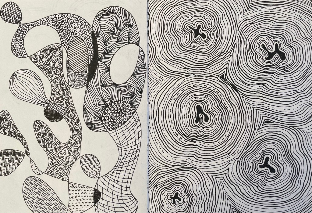
Anyway, following on from my ‘Less’ post, I’ve been thinking about working with a limited palette and how it narrows choice. Using a pen narrows choice even further – just black and white and nothing much else in between. Using a pen forces you to think about mark-making in order to create tonal values and areas of interest. So, I’ve been using my time constructively by doodling with a pen in my sketchbook whilst listening to an audio book – who says I can’t multi-task!
I found the process of mark-making to be meditative and grounding, totally different from the anticipation of putting ink onto wet paper and waiting to see what happens. Strangely, I like it. I think I am a person of extremes: I’m either fastidiously tidy or chaotically messy; organised or haphazard; focused in on the minutiae or just wanting to see the bigger picture. Somehow I have to find a path along which both sides of me are satisfied.
I will definitely use pen again, if only as a way to order my thoughts. Going forward I think I should try to build up a bank of possible marks, almost like a painter might have a bank of colour swatches. Having said that, I’m mindful that I’ve still got to do a few things to which I’ve committed in earlier posts, so I think I need to embark on some self-accountability first.
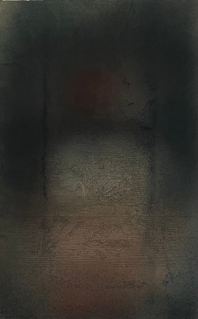
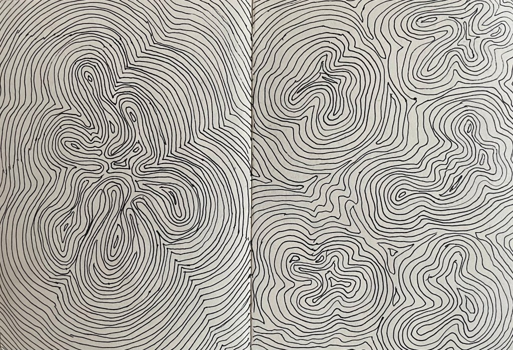
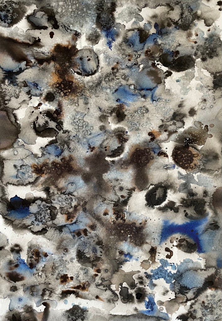
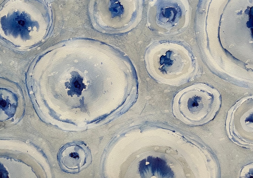
There’s no expectation. It feels free. I like that you have to wait until they are dry to see the full effect. I feel like I have made them, which is an important step for me as I have struggled to accept the concept of randomness in art making; but I applied the water, the ink, chose the brush and I dropped and flicked the ink where I did, and just because I didn’t control what happened next doesn’t mean I didn’t in some way influence it. I like the combination of the different inks. The black Indian ink did not reveal as many tones as I was expecting, so I also used black writing ink which revealed tones of brown. I enjoy looking at them and identifying areas of interest as well as random shapes of faces, flowers, and cuddly toys! I have an idea as to how I might incorporate them into future work.
There’s not a lot to say about these images. Apart from the middle one, which was influenced by thoughts on cells and became all too contrived, there’s something very liberating about putting water on paper and watching the ink do its thing.
I’m beginning to think that maybe I should be getting on and producing some actual work.
”Making the decision to have a child – it is momentous. It is to decide forever to have your heart go walking around outside your body.”
This quote from Elizabeth Stone (I’m yet to fathom out who she is!) is apparently well-known, but I only heard it recently when someone, I think it was an actor, was being interviewed about becoming a parent.
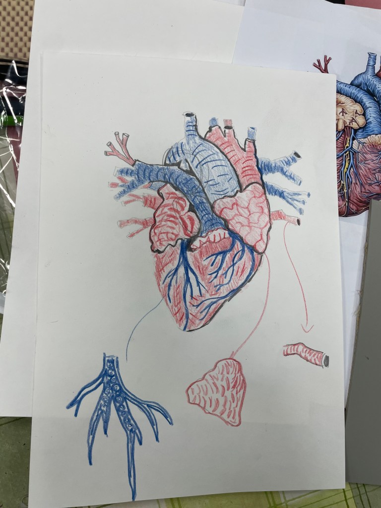
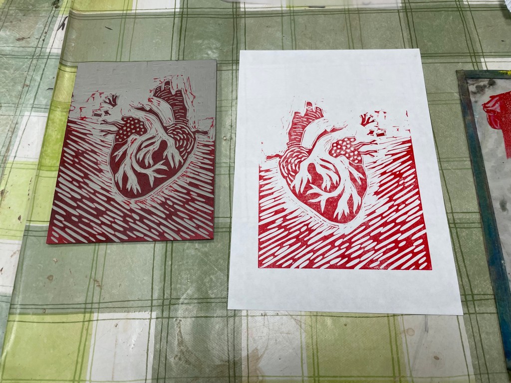
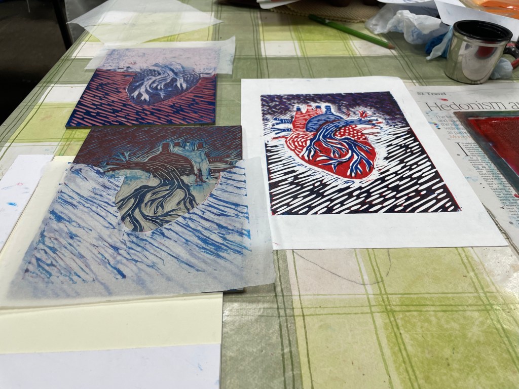
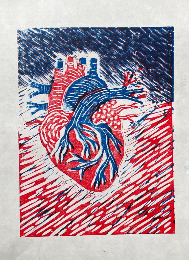
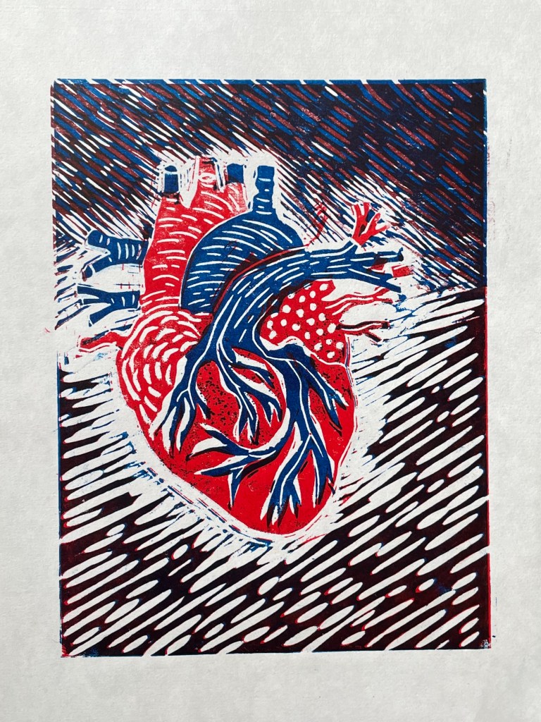
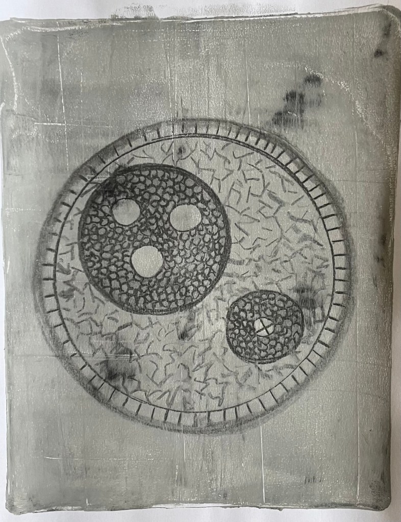
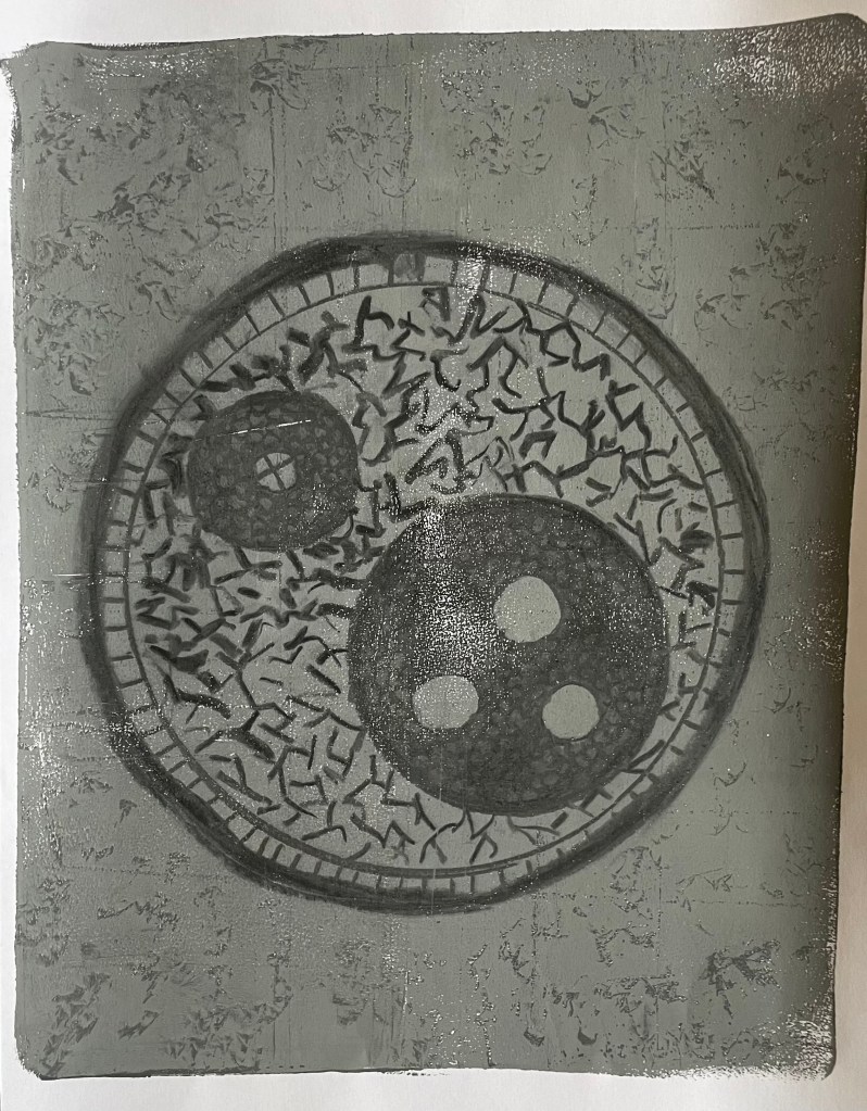
I think it sums up brilliantly the utter overwhelming sense of vulnerability and responsibility that I felt on becoming a mother. With this in mind, I attended a workshop on Saturday and Sunday on linocut led by Lisa Takahashi. Whilst everyone else started working on their images of sea urchins, birds, landscapes and flowers, I sat there, initially reluctant to reveal my chosen image of an anatomical diagram of a heart – it seemed particularly grisly and gruesome in this environment of natural loveliness. I suspect a few eyebrows were raised, on the side!
The workshop was on multiple-block linocut, a process in which you use separate blocks of lino to print individual colours, as opposed to reductive linocut where the colours are printed from the same block. I’ve only ever done a basic linocut with a single colour, so the process of working out what areas to cut for each colour meddled with my head a bit. Also, because you use separate blocks you can reprint in different colourways, although there is more room for error in terms of cutting and registration when printing, which can lead to unintended gaps and overlaps which add to the feeling of it being handmade, apparently! Also, as with all linocuts, you can sometimes get marks from ridges of lino which have inadvertently picked up the ink, particularly in large areas which have been cleared out, and this is called “chatter”, which is a lovely term.
We were limited to two colours, which effectively means that there can be up to four colours in the print: the two chosen colours, their resultant mix, and the white of the paper. I chose red and blue as they were the colours on the diagram.
Well, the prints are a bit rough and ready. I’m not keen on the white area around the heart – originally the background was also red and so I wanted some differentiation between the two, but later on I decided that I preferred the darker background. Having said that, I think it does give the image some dynamism, as if the heart is beating and pulsating.
“A sister is not a friend. Who can explain the urge to take a relationship as primal and complex as a sibling and reduce it to something as replaceable, as banal as a friend? Yet this status is used again and again to connote the highest intimacy. My mother is my best friend. My husband is my best friend. No. True sisterhood, the kind where you grew fingernails in the same womb, were pushed screaming through identical birth canals, is not the same as friendship. You don’t choose each other, and there’s no furtive period of getting to know the other. You’re part of each other, right from the start. Look at an umbilical cord – tough, sinuous, unlovely, yet essential – and compare it to a friendship bracelet of brightly woven thread. That is the difference between a sister and a friend.”
‘Blue Sisters’, by Coco Mellors
I stumbled across this passage whilst I was having a mooch in Waterstones on Saturday. It cuts right to the heart of what it is to be a sibling. I find the imagery particularly strong – the inhabited space of the womb, growth and development, umbilical cord, connection. Lots of food for thought.
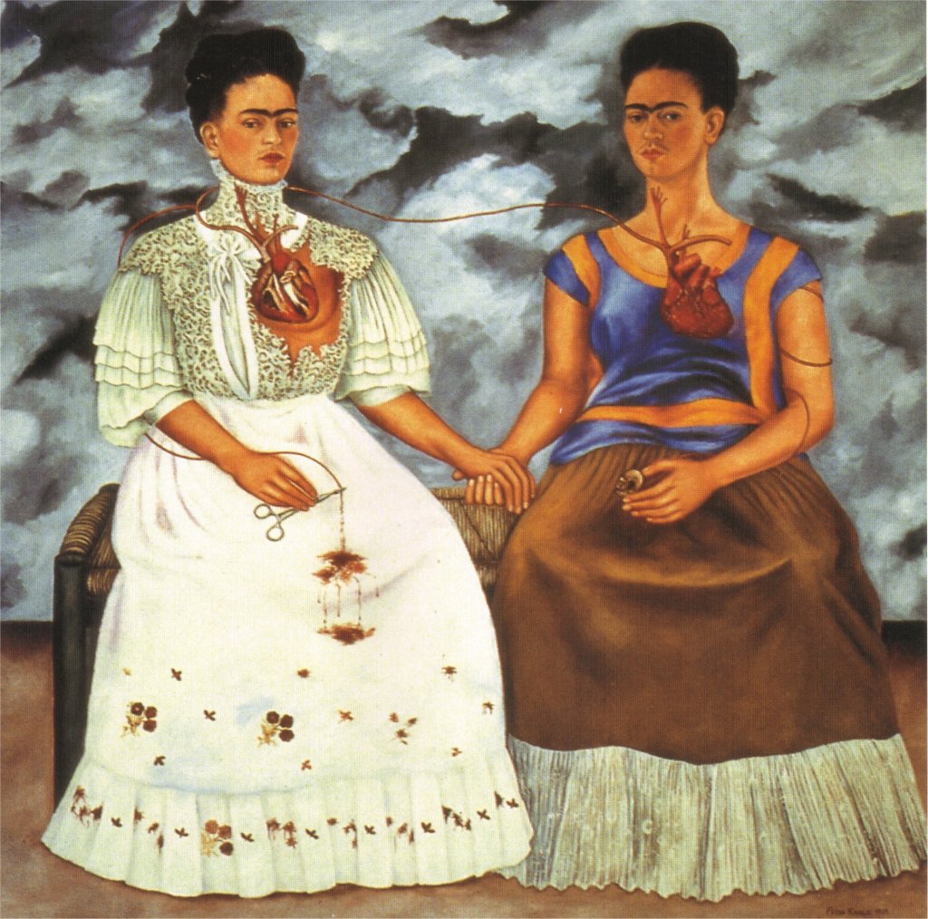
‘The Two Fridas’, Frida Kahlo 1939 (oil on canvas)
On the subject of thinking, this image above has been floating around in the back of my head whilst I’ve been contemplating my role as a sibling, and as a mother, but more on the latter some other time. In this painting, Kahlo’s traditional identity is connected by an artery from her complete heart to the heart of her modern identity which has been torn apart by her divorce from Diego Rivera. I find it a very powerful image: full of pain and conflict, but, at the same time, resilience. It’s already informing some ideas for a piece of work.
I’ve been experimenting with pressing charcoal drawings onto a gelatine plate and then printing – the archival quality it produces is interesting – and also applying paint onto the plate randomly. It was all done in a bit of a rush as I suddenly thought: less thinking, more doing. I didn’t find the process satisfying: the colours are really unappealing and murky – in fact they are just varying shades of grey. I’ve been meaning to try this process for sometime now, since I saw it on a facebook reel, so I was really quite excited at the outset but I ended up feeling underwhelmed – the subtleties inherent in charcoal are totally lost. Maybe starting with a cross-section of an unlovely umbilical cord inadvertently set the tone, but my quickie self-portrait certainly expresses how I felt!
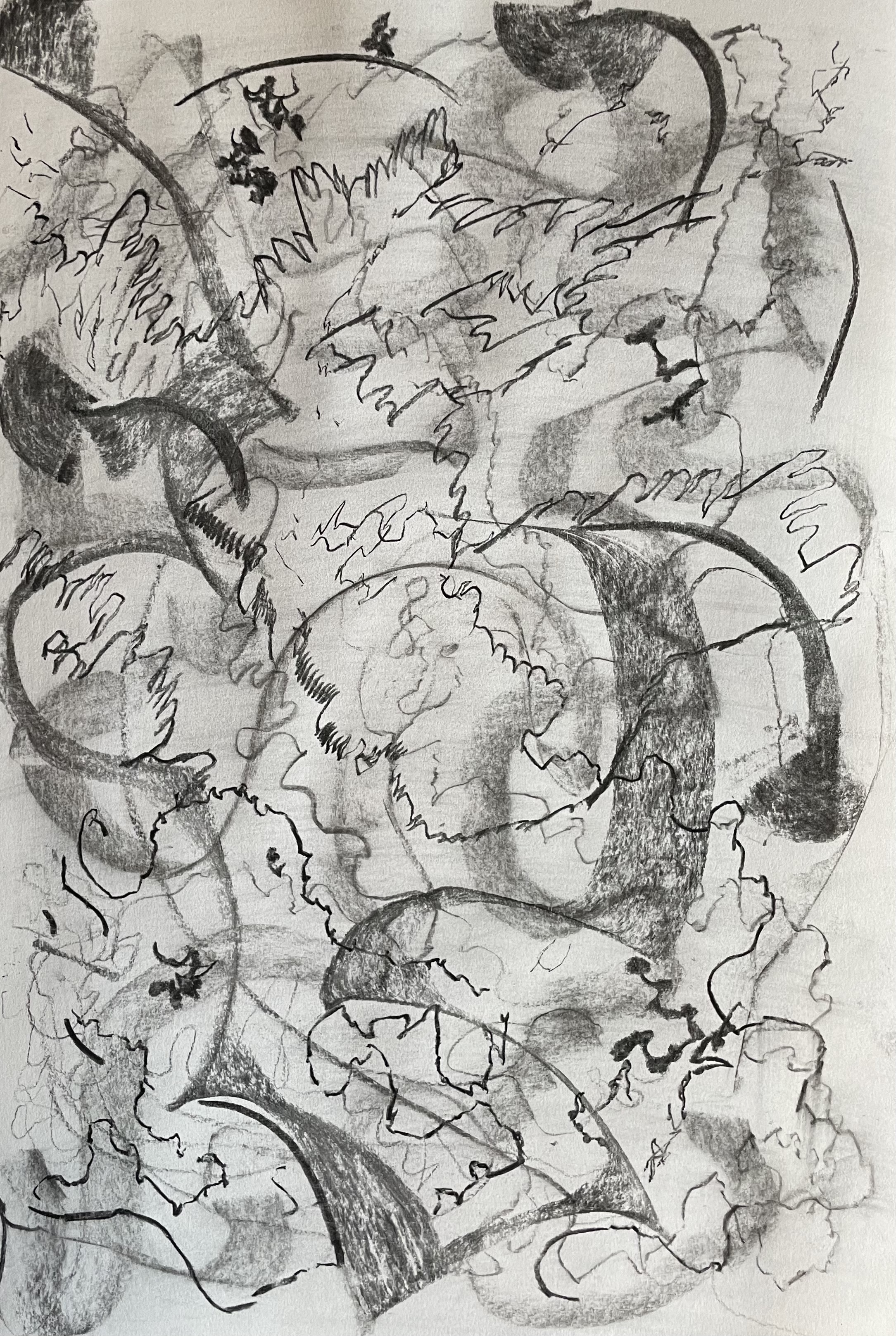
I’m conscious that I committed to doing an automatic drawing a day to try and change my mindset. I’m allowing myself the inclusion of exploring Procreate as well!
I particularly like the charcoal drawing. I used a piece of compressed charcoal and made swirling marks using it on its narrow edge and full on its side. I then rubbed it out and repeated it but this time playing around with the end and varying the motions. The concept of layers appeals to me (memories, past lives/ identities…) particularly the traces left behind of the first drawing and I was surprised by the range of marks I made depending on how I held the charcoal and the pressure I used. There are some delicate areas, followed by some jagged, harsh marks. Some lines appear to be faltering and hesitant whilst others have more purpose and at times are almost punctuation marks in what would otherwise be a stream of unconsciousness.
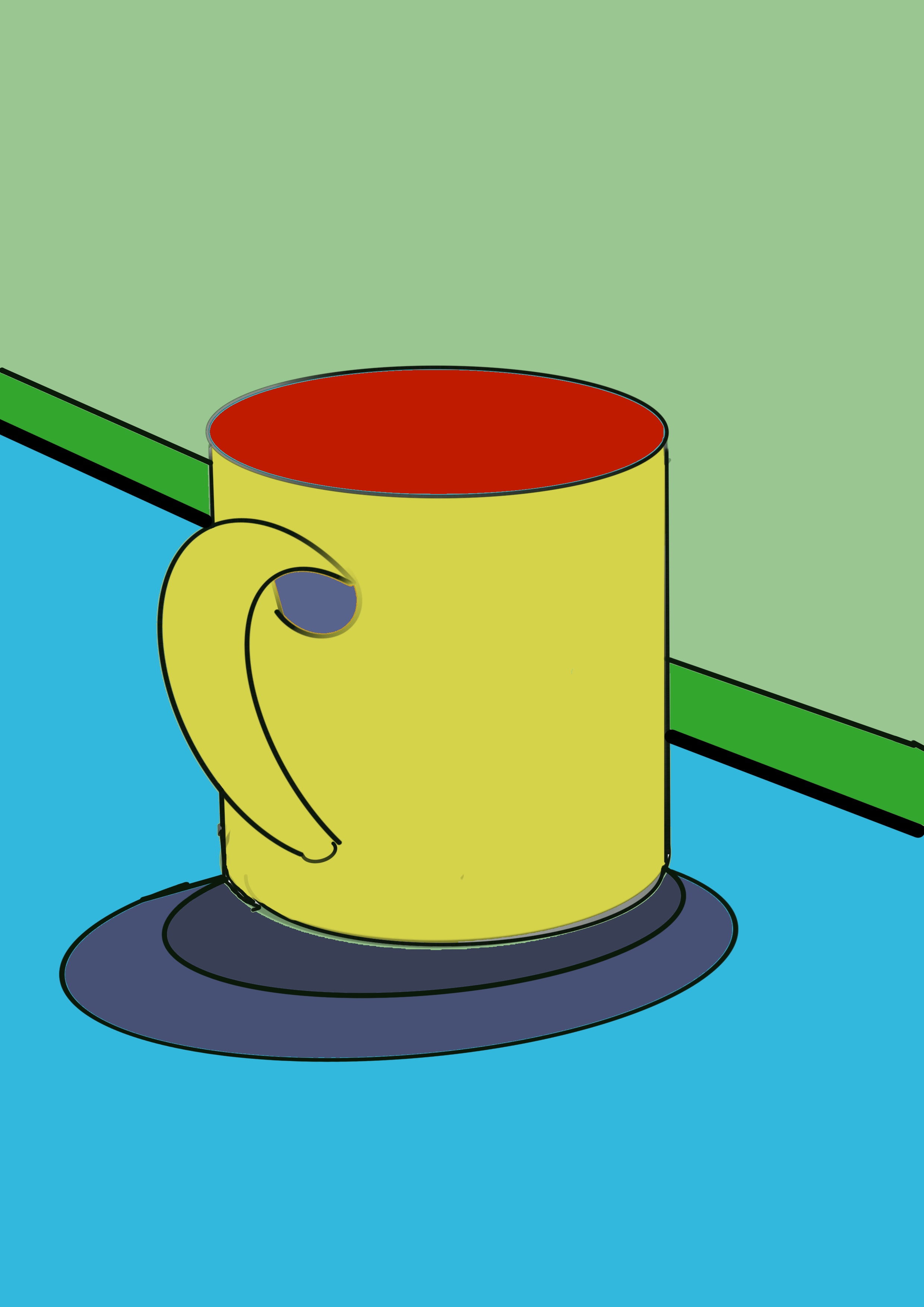
The second image I am treating as an automatic pastel drawing – I randomly chose colours and effects from the Procreate menu and I think the result is interesting, although I miss the haptics and the smell of the real thing as well as the tactile relationship between the medium and support. I’m not sure that I would use it going forward, except maybe as a tool to experiment with, although I have previously decreed that collage is just not my bag – how times change! I might use it if I decided to go down a graphic flat colour route (as in the third image) and digital collage is something I will definitely explore further – no bits on the floor and no need to glue – what’s not to like? I’ve been thinking about how I could incorporate digital collage into a mixed media piece of work – perhaps a giclée print onto a canvas, sealed with medium and then oil paint?
There are lots of thoughts chasing themselves around my head – I’ve been ignoring them in the hope that as and when I consciously acknowledge them they may have already got themselves into some kind of order. Just doing what I’m doing at the moment seems to be creating even more possibilities and permutations which is exciting.
I can sense that I’m feeling a lot more relaxed about making my experimental work ‘public’. I really look forward to starting the day by just letting my hand wander across the page – it’s the only time when there’s no expectation on me to achieve anything – renewing the buildings insurance, fixing the E20 error message on the washing machine – just a moment when I’m at one…
Last week’s task was to try something different in our artistic practice: something which might not work out.
I’ve been thinking about trying digital art for a while. I like the feel of a paintbrush or piece of charcoal in my hand and so a foray into the world of an Apple Pencil and a flat screen would seem to lack the tactile nature of applying paint to a canvas or smudging and blending charcoal with my fingers. It is, as expected sadly lacking, although Procreate, the app I used, has a wide range of effects and tricks, it’s not at all the same.
I’m not the most technically minded person, so I had to watch numerous YouTube videos and even then with my current inability to retain information, I decided that the best way to learn is to get stuck in. It took me ages just get to grips with the basics!
I discovered that one area in which using Procreate might be of use is in collage. Instead of cutting out images and assembling them, I created several different layers of images which I first isolated from their backgrounds. It was much easier to move them around than using physical pieces and the ability to use my own photographic images and images from websites such as Pexels, means that there won’t be any issues in terms of copyright, something of which I’ve always been mindful.
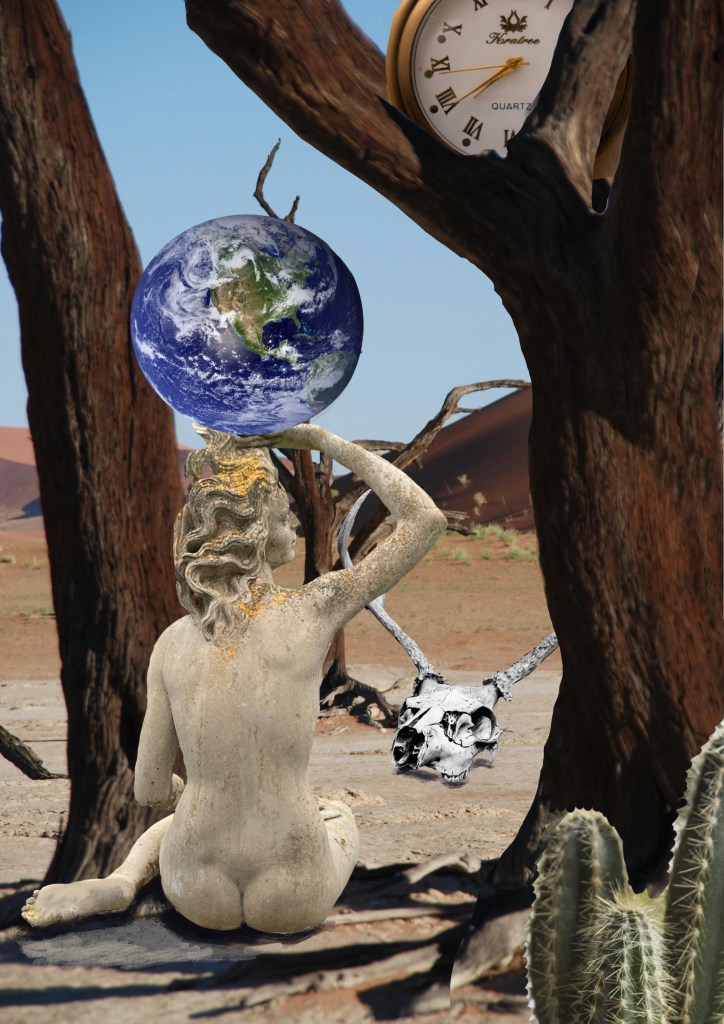
This is the result:
I’m quite pleased with it as a first attempt and I can see that there is a lot of potential in producing digital collages. I found the process quite frustrating at times, but that was mainly due to my incompetence and this will improve with practice, hopefully. Next time I will take a bit more care in selecting my images; I don’t think the cactus in the foreground works particularly well, but I just needed something to detract from the lack of clarity in the tree roots. I used the paintbrush option to put in a shadow under the skull, but the shadow of the figure doesn’t work at all – I was unable to alter it as I had merged several layers together by that stage. Going forward, I think I need to give more thought to the interaction of the layers and also, to save time, it would be a good idea to start to create a collection of images rather than searching through photos and websites on the hoof.