Whenever I go to B&Q, I always want to come home and do some DIY; whenever I visit a beautiful garden, I always want to come home and sort out our garden; whenever I go to an exhibition, I always want to come home and make.
I’ve been feeling in need of a pick me up recently, and so yesterday I headed into London on a hot, Notting Hill Carnival, Bank Holiday Monday to catch Louise Bourgois’ ‘Maman’ on its last day at Tate Modern, the very space for which it was commissioned back in 2000. There’s no doubt that it’s impressive at 9m tall – again, I ask myself whether it’s all about the size, but I think any spider larger than real life would have an impact. I had an overwhelming urge to touch it, but resisted in light of the ‘Please Do Not Touch Sign’. I also found myself wondering how they got it into the building, memories of Johnny Vegas’ struggles coming to mind.
It was well worth the trip, a rare chance to see a piece in the flesh in the very place for which it had been made. Having said that, I’ve seen some images of it in a landscape, which I find particularly effective.
Tate Modern’s website on ‘Maman’:
Louise Bourgeois started making sculptures of spiders in the 1990s. This version is her biggest spider. Its title, Maman, is French for mummy. The artist said spiders reminded her of her mother: ‘Like a spider, my mother was a weaver. My family was in the business of tapestry restoration, and my mother was in charge of the workshop. Like spiders, my mother was very clever … spiders are helpful and protective, just like my mother.‘
I’m a bit behind with things at home, and we’re starting to amass some really impressive cobwebs. I watched as a flying insect became entangled in one of them; in a flash the spider came from nowhere and quickly got to work wrapping it up.
I’m not sure that spiders are clever as such, but they do have great skill. I don’t really think of them as being helpful and protective: they set traps that you can’t see, they ambush you and then swaddle you up until they consume you. Although, I don’t have a problem with them, as they catch flies etc, as long as they are not where they’re not supposed to be, such as on the bedroom ceiling above my head, or in the bed.
Lifelong arachnaphobe, Primo Levi, in his essay ‘The Fear of Spiders’:
“The spider is the enemy-mother who envelops and encompasses, who wants to make us re-enter the womb from which we have issued, bind us tightly and take us back to the impotency of infancy, subject us again to her power…”
I’ve tried not to be either of those spider mothers. I’ve tried not to be suffocating and I’ve tried to resist the urge to fix things. I’ve definitely failed; I often tell my daughter that I’m trying my best, and, when she’s older, not just to remember the times when I’ve not been at my best, like I seem to have done with my own mother. It’s that negative bias again, I suppose. I’m now actively remembering all the times when she was kind and caring, supportive, and all the laughs we had together, which by far outnumber the not so good.
At the beginning we were told that our dog, Monty, has metastatic melanoma. Without treatment he will rapidly decline in a matter of weeks. With treatment he has a chance of possibly living to his natural life expectancy. With no significant side effects to the treatment, we are giving it a go, and he had the first dose of chemo and immunotherapy on Friday. If it becomes obvious that it isn’t working, we will stop.
We are devastated. I know he’s only a dog but he’s been a part of our family for the last 12 years; he’s been a part of my daughter’s childhood for more time than he hasn’t. I also can’t help thinking that some of the desperately crippling sadness I’m feeling is unresolved grief from my mother’s death, because I’ve been teleported straight back there.
For me, emotion and food are intrinsically linked. The need to eat in order to survive is a primal instinct. I have a need to feed. When I became a mother, my need to nurture and provide nourishment, in all its forms, for my family became paramount. And, of course, many people express their love by making food for others.
The refusal of food is one of the first steps in withdrawing from the world. I remember the lengths I would go to in order to try and encourage my mother to eat. I would spend so much time making her dishes which she said she fancied only for her to take one taste and decide that she didn’t want it anymore. The most difficult moment was when I had to accept that all I could do was to offer it, and not to try and browbeat her into eating it.
Monty’s not as keen on his food as he was. I have dishes full of different vegetables and meats that I’ve cooked, in an attempt to encourage him, in the fridge. Unfortunately, the only food he seems keen on at the moment is steak. When he eats it I feel like everything will be ok, but in the back of my mind is the nagging thought that all I’m succeeding in doing is nourishing the very thing which is killing him.
On a happier note, we had a party to celebrate my daughter’s 21st birthday this weekend. Family and friends came from all over to join us to sit down and have dinner together. There was much drinking and dancing, and everyone had a good time, welcoming the chance to reconnect with old friends or form new connections over food. Some of them I hadn’t seen for a few years – they looked older, as I’m sure I did to them. Even more reason to make the time to meet up with people as much as possible – to walk the walk, and not just talk the talk.
My main piece is the telephone. I’ve managed to figure out how it works – now I’ve just got to record my message which I think will be quite short and to the point.
I struggled for a while to come up with a way to indicate that it is an interactive piece. Also, if I’m going to use the audio files as well as the content of the messages in future work, I think I should say as much so that people have an opt out if they’re not happy with the possibility of their voice being used.
I was trying to get to sleep the other night, tossing and turning, when it came to me – I’d do what Michael Craig-Martin did for ‘The Oak Tree’ i.e. have a transcript of an imaginary conversation between me and a third party.
So I came up with this, which I will display alongside the telephone. And yes, I’ve also ripped off Magritte, and used Donald’s comment from a few sessions ago about mobile phones not really being used for their primary purpose, making and receiving calls, but for messaging etc.
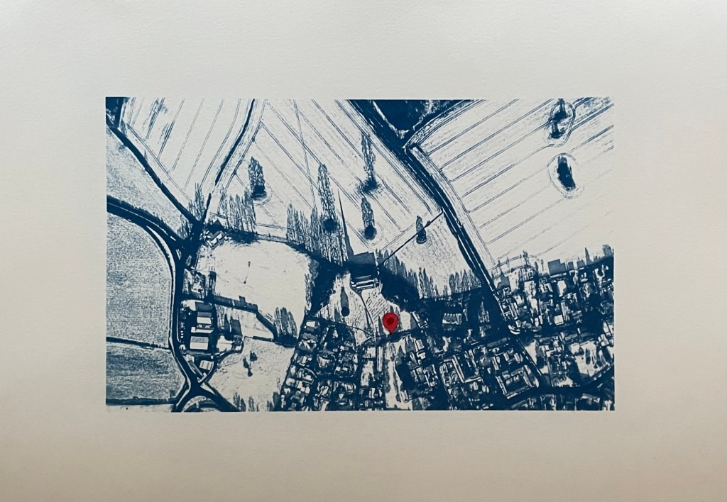
I’ve also had another bash at the cyanotype of the aerial view of the village. I couldn’t get it right on A3 for some reason as the detail of the fields just wouldn’t stick. I tried so many times but I think that because I was doing it quite late at night my brain just stuck, and instead of stopping and leaving it for a while so I could reflect on it with some distance and clarity, I just kept on making the same mistakes over again which made me feel really frustrated. I’m going to park it for now – it could be something to do with the height of the UV lamp.
So I’ve gone back to the smaller negative and printed it on A3 and added in a location pin. I’ve decided to call it In Loco Parentis. I feel much better about it now, and, on reflection, A3 would just have been too large an image for something which is quite intimate and personal.
I’ve also tried doing a triptych of the view from my window. I had initial success in finding out how to split the image into 3 equal parts and printing separate negatives for each. After that it just went downhill; it has been so difficult to get any consistency between each of the separate sections because I’m doing them each individually and there doesn’t seem to be any rhyme or reason as to why they turn out differently despite using the same solution and applying it as consistently as possible, exposing for the same amount of time and washing out in the same way. I even tried to make sure that the temperature of the water was the same by starting to run it at exactly the same time before the exposure had finished, but the difference in results between them was staggering. I’ve now got lots of different sections, and having sorted through them all, these three are the best fit that I could come up with.
I think I might sort out the sizing a bit more and then fix them to another piece of watercolour paper.
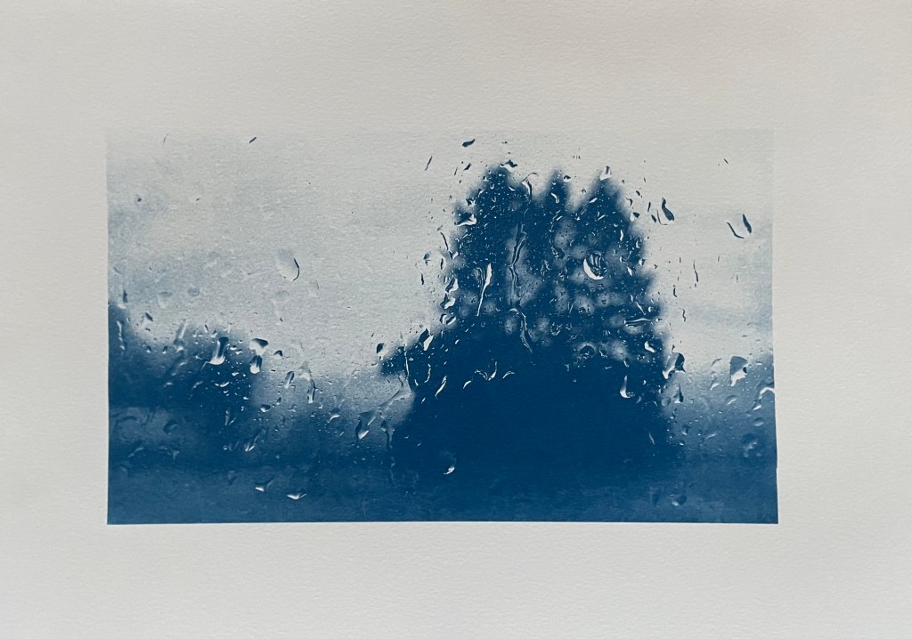
Disheartened by the exercise I did the same as with the aerial view, took the original negative and printed it on A3. It was much more straightforward, and made me feel an awful lot better. Is it a bit boring? I don’t think so as I think you get a much better sense of atmosphere, and I’m trying to change myself to subscribe to the view that less is more.
As I took the original photo on New Year’s Day, I think I’ll call it, Another New Year’s Day. On reflection I think I prefer it. I’m not sure that disjointed views really do it for me, but then again I didn’t think that I liked collage.
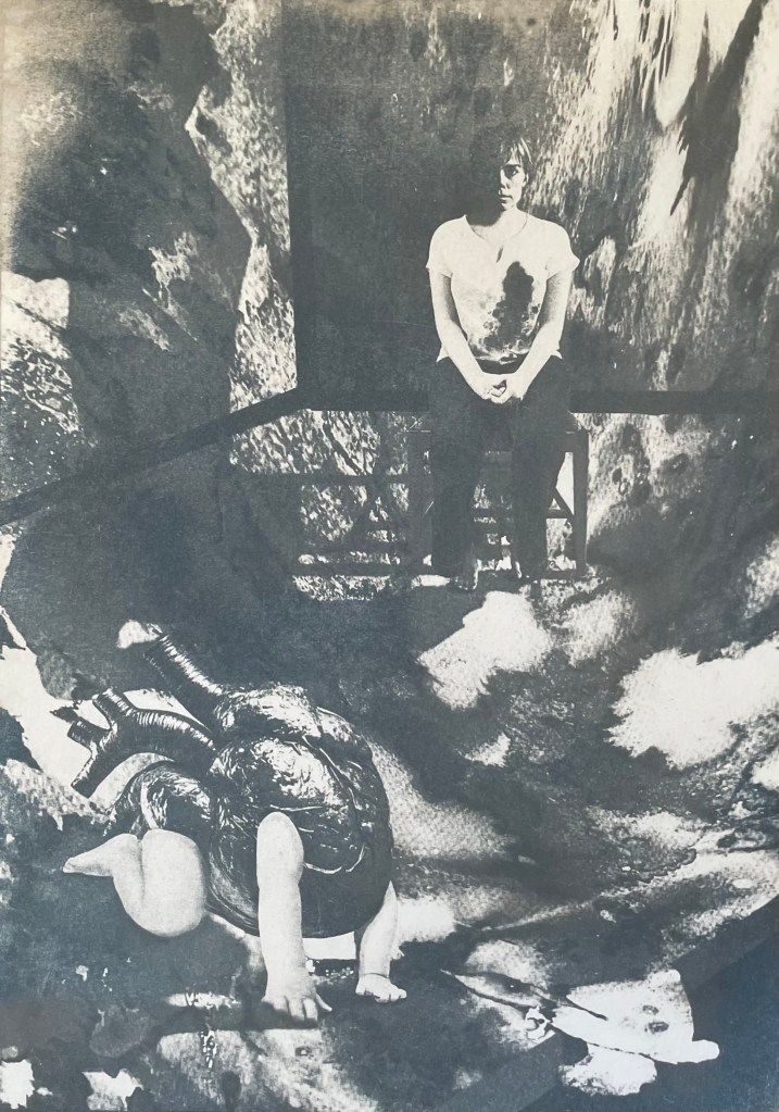
In addition to the pieces above, I’m taking along Motherhood I which I’ve had printed on A1. I’ll see what seems right on the day.
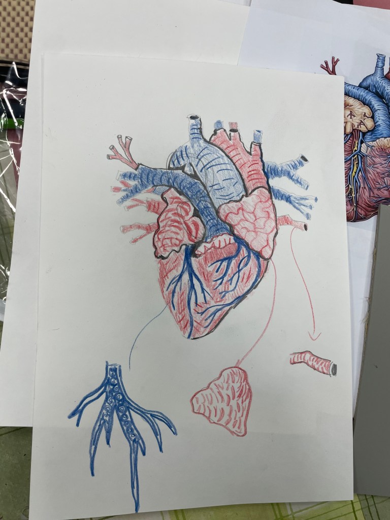
I have had an image in my mind for months. It came from the Elizabeth Stone quotation, I first mentioned in Hearts & Linos .
”Making the decision to have a child – it is momentous. It is to decide forever to have your heart go walking around outside your body.”
I think it encapsulates perfectly how I felt when I became a mother. My whole world was turned upside down. I was suddenly responsible for raising and protecting another human being. I felt overwhelmed by the magnitude of it all; that life would never be the same again. It made me question the sort of world I had brought her into, how her life might be; how much of it I would be a part of, the unthinkable and unbearable pain I would suffer if anything happened to her. She was precious and intrinsic to me, now living and breathing in the world, independently of me.
Original VersionDramatic FilterCyanotypeCoffee Toned CyanotypeAltered background and darker tonesDramatic Filter.Dramatic cool Filter. Worked on hands.
It’s taken a while. Bearing in mind that I’m still finding my way around Procreate I don’t think that I’ve done too badly. I’m sure that I’ve done lots of things incorrectly, but I don’t really care. It’s all a learning process and it was fundamentally about me trying to realise an image that I had in my head. I feel that I’ve achieved what I set out to do. In that respect, I’m pleased with it. I think it conveys the visceral nature of my feelings.
Actually, it has taken me more than a while; it’s taken ages, probably because I kept on making mistakes, but I have learnt lots along the way. I’ve redone parts of it several times but I have to say that it has all been about the process of discovery and realisation. It’s allowed me time to focus on the detail, but it’s been as part of the process rather than with a view to trying to achieve a perfect result. I don’t think that Procreate is a tool with which I can be loose and expressive in the physical sense, but it seems to satisfy that part of me that likes to focus on surreal detail every now and then. Hopefully that will allow the other part of me to enjoy the experimentation of being looser and more expressive in my mark-making when, say, painting.
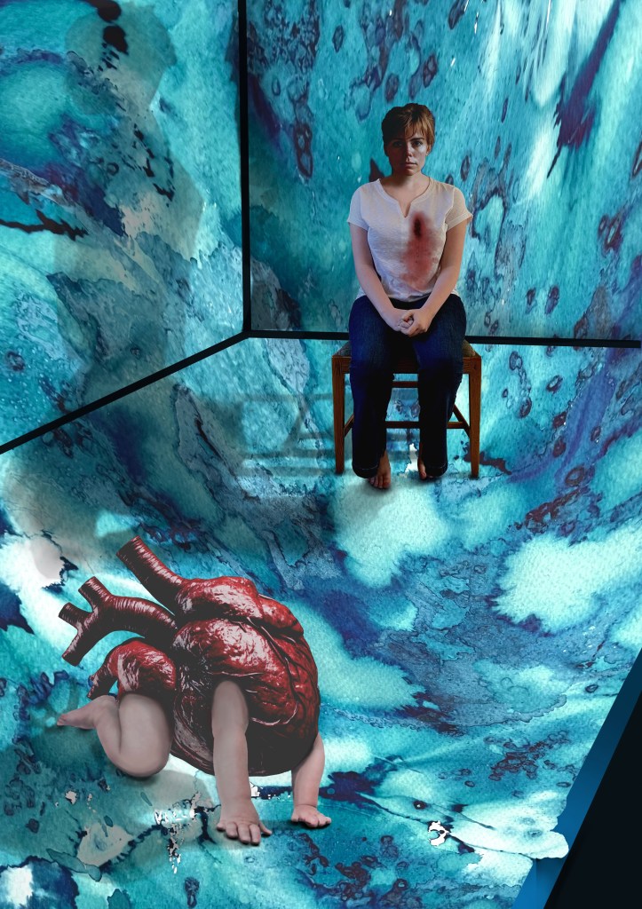
I decided ages ago that I wanted to incorporate my ink experiments as a background to a collage type piece. I sourced the heart, crawling baby and head of the woman from royalty free image sites which allow for reproduction of the resultant work, if need be. The body is my daughter. She’s a bit freaked out by someone else’s head being on it, but I wanted a neutral character, and I couldn’t find an image of a woman sitting on a chair that fitted my requirements, so I roped in a free model.
It was challenging constructing the crawling heart. I’ve had to rebuild parts of it including the hands as some of the fingers were hidden in the original image. It was quite difficult finding source images whose licences allowed me to do what I wanted to do, and were also free. I’ve played around with editing effects and colours and I think that I’m settled on the last image for now. The slight greenish tones, complement the red heart. I really like the cyanotypes, but unfortunately there isn’t enough tonal variation and the slightly chaotic background loses its delicate tonal transitions in the process. I might try again but change the background to something a little less busy. But I like the historical, almost Victorian Penny Dreadful feel to them. I might develop it further, but I’ll leave it on the back burner for now.
The time delay video created by Procreate is of epic proportions, but it’s helpful for me to watch it back so I can see what a song and dance I made of it all. This is a shortened version.
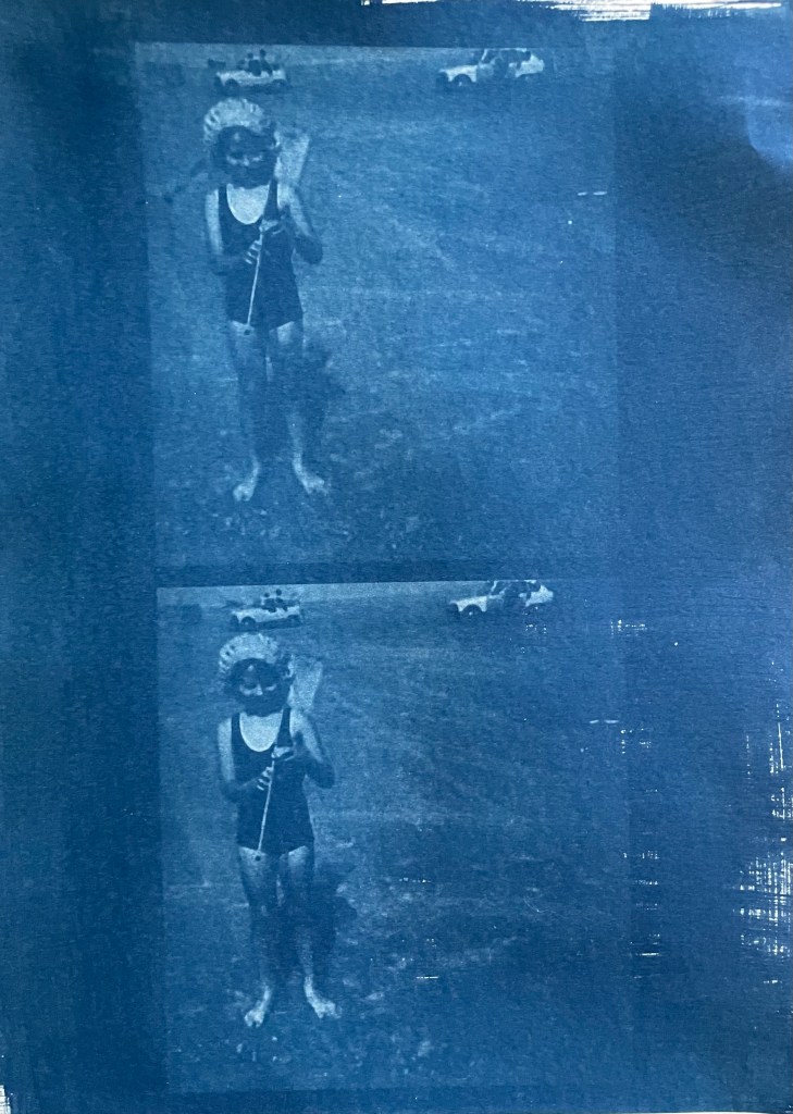
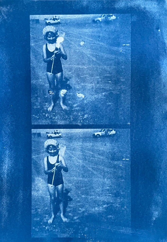
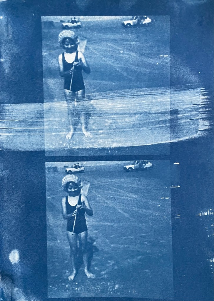
Last summer I became obsessed with cyanotypes. Then there was plenty of sun. There was some sun the other day, but not much since, so I decided to make myself an exposure unit using my Speedball UV lamp and following instructions on Handprinted. I do love a bit of DIY; there’s something very satisfying about making do with something handmade which didn’t cost a fortune to buy, or require some fancy kit, or having to go to a specialist location.
I used an old printer box which was large enough to take A3 sheets, cut out a hole for the lamp to sit in, and then lined it with aluminium foil.
I selected a few photographs to experiment with; some from the family photos which I’ve been sorting out, and others which I have collected on my phone as inspirational resources, as well as some images from the experiments earlier on in this blog. I converted them all to black and white and then inverted them in Photoshop, printing them off on transparencies. I had to dust off my old printer to do this as I wasn’t sure how to do it on my husband’s printer. This took a while because between each print I had to perform a ritual of pressing certain buttons in a certain order in order to fool the printer into thinking that I was using genuine HP ink cartridges, which I wasn’t. The things you can learn on YouTube.
Ironically, the sun came out, so I did a mix of au naturel and my DIY unit.
Me
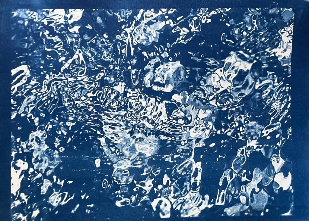
The first two prints were made using the unit, the first being over- exposed at 20 minutes, the second being just about right at 15 minutes. The last two prints I did outside in the sun, which was a bit more hit and miss because the strength of the sun was not constant as it kept disappearing behind some cloud cover. However, I do really like the effect of the visible strokes which I left when applying the solution to the paper, which was A4 300g/m2 hot pressed watercolour paper. The markings give the effect of a moving, flickering , transitory image – there, but not quite there. I put two images on the same negative transparency because I wanted to create a number of smaller images to experiment with. However, the suggestion that the images are on a roll of film is really interesting.
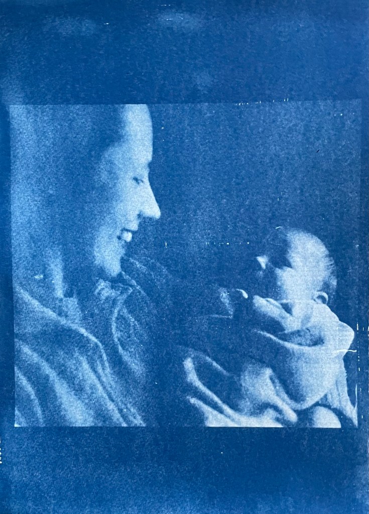
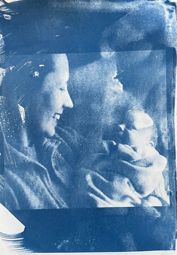
My mother & my brother – capturing a connection and a perfect expression of motherhood
It’s been really difficult getting some of the old photographs out of the albums; they are the sort which have sticky pages on which you position the photos, and then put a transparent film over the top. Over the years the adhesive has seized up and practically bonded to the back of the photos. I’ve tried all sorts including gentle heat, dental floss and a bendy, very sharp filleting knife.
This one of my mother and brother is a favourite, but sustained a small tear on the right. I am pleased with both images – the first one was done outside and the second in the unit, which seems to have more of a Prussian Blue hue to it although I’m not sure that there’s any rhyme or reason as to the differentiation in the blues – but I really like the movement in the second one, again giving the impression of a fleeting moment. I think that the solid areas at the top and bottom add to it, suggesting a frame from a film of a moving image.
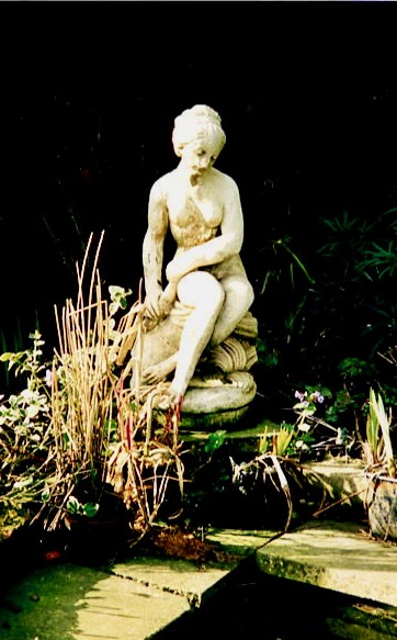
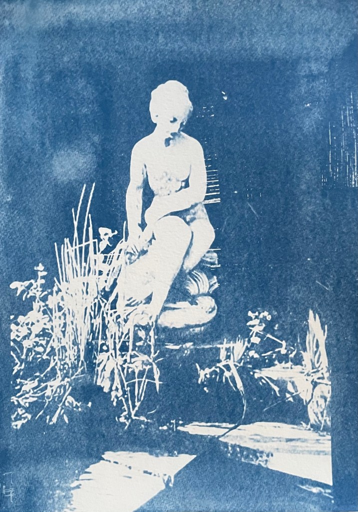
This is a photo of the statue which sits at the bottom of my mother’s garden next to her makeshift pond made out of an old washing-up bowl. I always used to wander around the garden when I visited, stopping at the pond to see if there were any frogs around. I do like a frog – my grandmother on my father’s side used to have a rockery, and I used to spend most of my visits looking for, and trying to catch frogs. That, and hanging out in her shed and greenhouse with the tomato plants – I love the smell of tomatoes; it takes me right back.
The problem with a cyanotype is that if you leave it too long, you over-expose it, and whilst you get deep blues you lose the midtones, which is what I thought I had done with the first one, so I exposed the second one for less, but it turned out to be under-exposed – even putting it in a hydrogen peroxide bath didn’t help. Both were done outside; perhaps I should have done a straight 15 mins in the unit, but where’s the jeopardy in that?
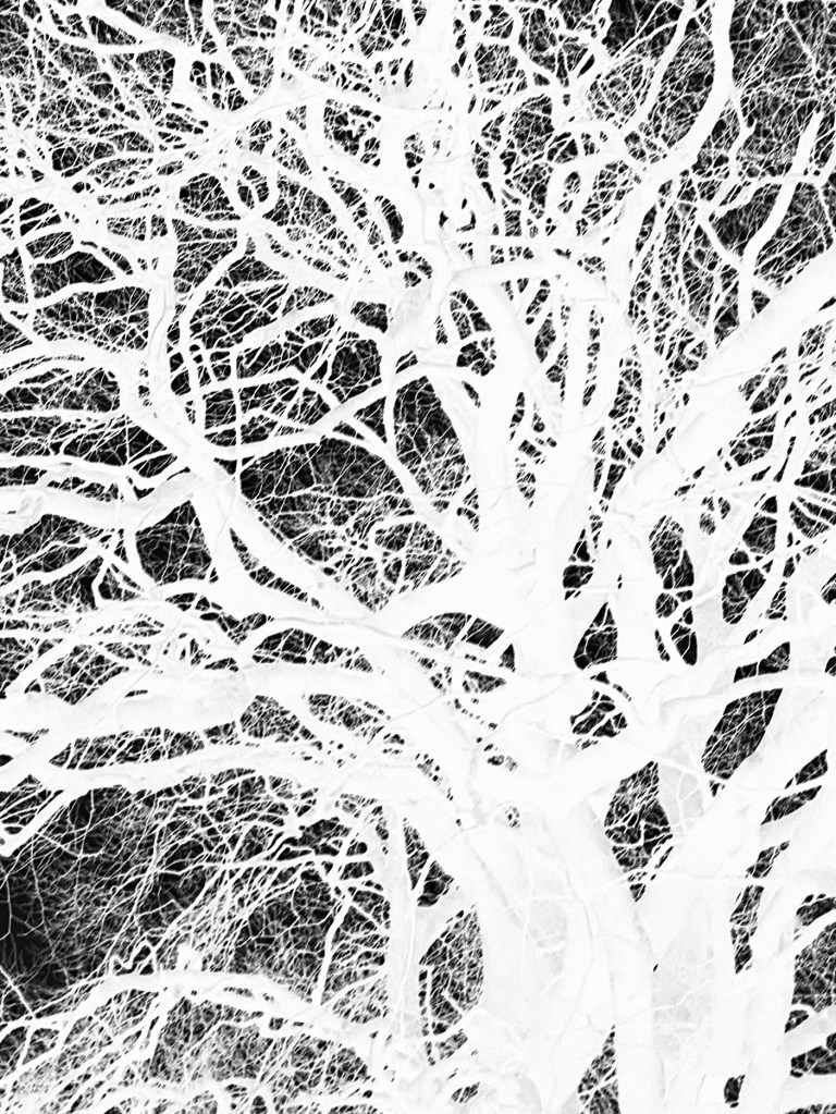
This is a photo that I took looking up into the branches of the three trees that I like. The negative image is also really interesting, and I might do something with that at a later date. The image (last photo) is underexposed again, but has a feeling of being removed, almost as if I’m looking at it through my window (which incidentally does need a good clean). I wanted to try fabric, but could only find some thin cotton lawn. I was so disappointed – it turned out terribly. I had visions of being able to create long, flowing, billowing, wispy cyanotypes, but ended up with the image above. You can just about make out the branches.
I will need to think about this a bit more. My first thoughts are that maybe there was a coating on the fabric, so I’ve washed it; maybe the image was too detailed, but I’ve seen quite detailed images on fabric; that the structure of the fabric is not robust enough – you can get pretreated fabric which is like a sateen so I could try that; or maybe there wasn’t enough contact between the fabric and the negative. I need to take some time to reflect, and try again.
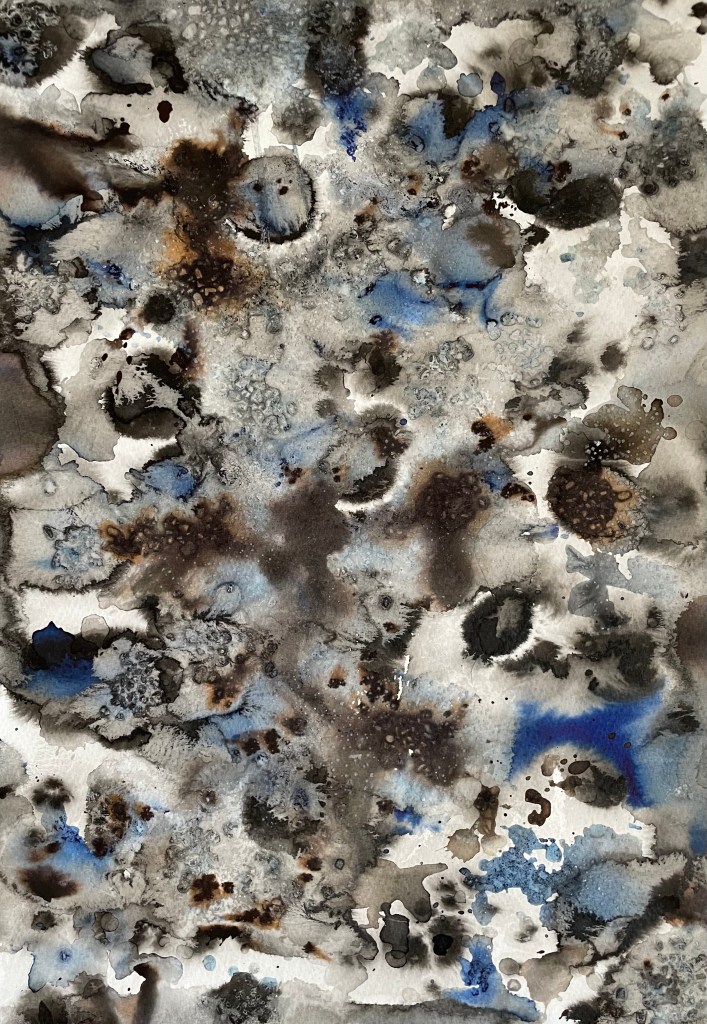
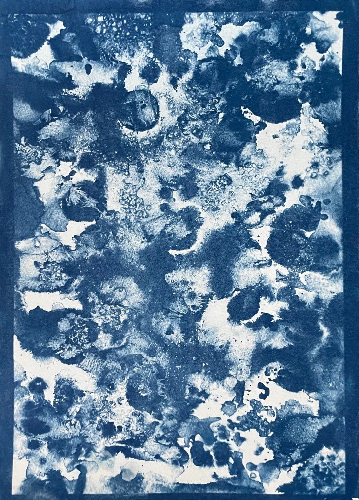
The images above were from my experiment with ink in Blot II , and from A State of Flow II . It was a useful exercise in that it confirmed to me that not everything works as a cyanotype – I much prefer the original images, particularly the ink one, as the edges between areas of flooding and blots are much more defined, and there is more of a delicacy about them. The contrast between the blue and the black ink also adds interest which is lost in the cyanotype.
So, on reflection a really useful and enjoyable exercise. The thing that I really enjoy about this process is the anticipation, and then the slow reveal as you rinse off the solution to see an image slowly emerge, or not, as the case maybe. Doing it outside as opposed to in the controlled environment of the unit adds a degree of extra excitement, but equally there is the risk of crushing disappointment when it doesn’t quite work out.
Moving forwards, I was intending to experiment with toning some of the smaller images of me with tea, coffee, wine etc, but I actually like the last couple as they are, so I will keep them as finished. I’m thinking about how I could use multiple exposures to create layers, and also thinking about manipulating the source image a bit more in Photoshop and printing from the original image rather than reversing etc. I’m not sure whether I’ll get straight to it, or do something else in the meantime – sometimes I go hell for leather with something and then exhaust it, or myself, or become disenchanted with it. I don’t want to get too far down a rabbit hole, so maybe I should leave a bit of space before going back to it, to allow for some more subconscious reflection. I suppose the clue was in the opening sentence: “Last summer I became obsessed with cyanotypes”, and I haven’t done it since.
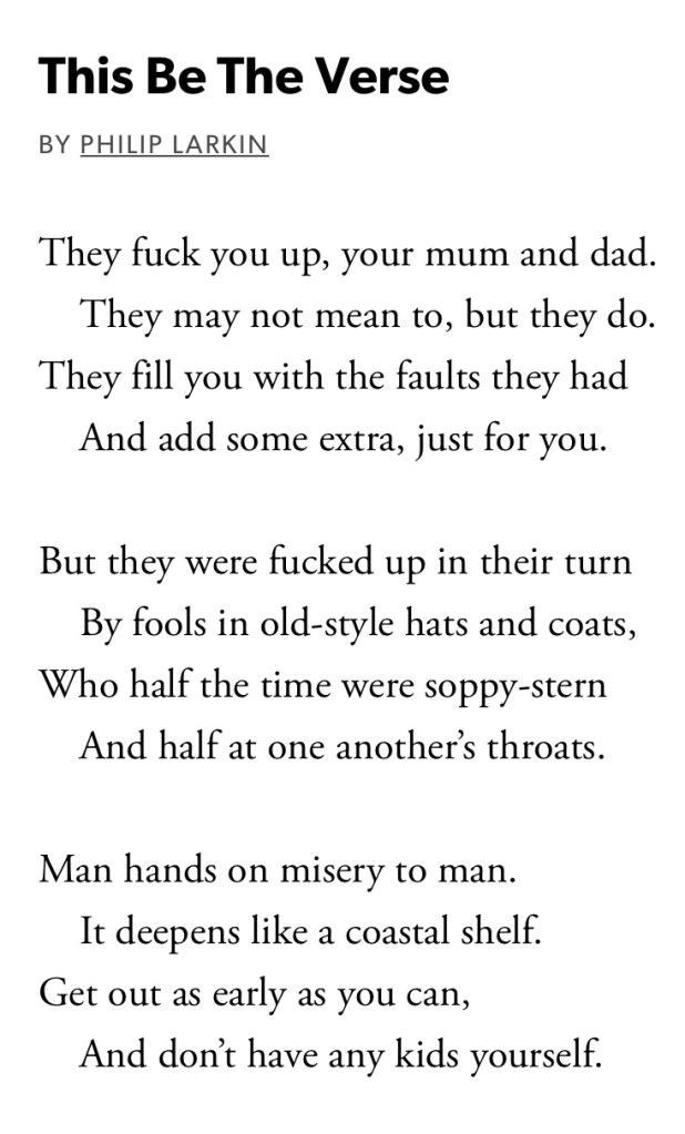
I’ve just been catching up with what my fellow students have been up to by doing my regular blog read. My husband read me this poem last night – it seems particularly relevant in the light of the several references to trauma and Louise Bourgeois.
”Making the decision to have a child – it is momentous. It is to decide forever to have your heart go walking around outside your body.”
This quote from Elizabeth Stone (I’m yet to fathom out who she is!) is apparently well-known, but I only heard it recently when someone, I think it was an actor, was being interviewed about becoming a parent.
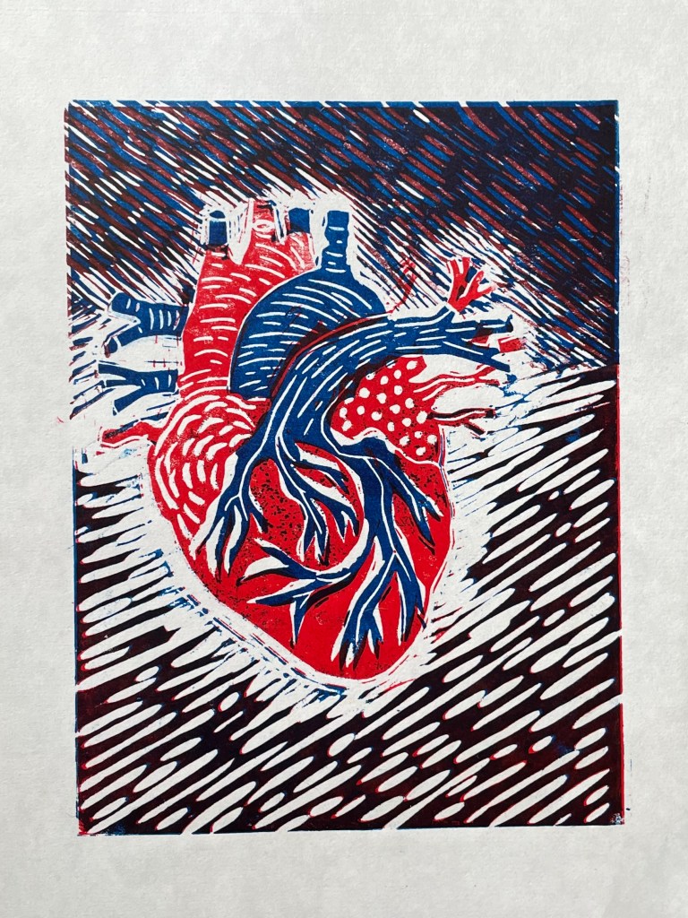
I think it sums up brilliantly the utter overwhelming sense of vulnerability and responsibility that I felt on becoming a mother. With this in mind, I attended a workshop on Saturday and Sunday on linocut led by Lisa Takahashi. Whilst everyone else started working on their images of sea urchins, birds, landscapes and flowers, I sat there, initially reluctant to reveal my chosen image of an anatomical diagram of a heart – it seemed particularly grisly and gruesome in this environment of natural loveliness. I suspect a few eyebrows were raised, on the side!
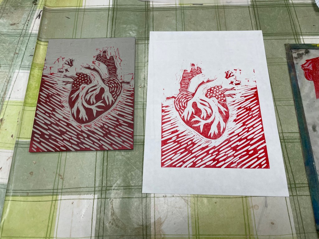
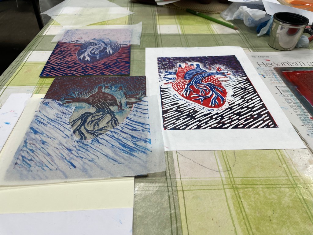
The workshop was on multiple-block linocut, a process in which you use separate blocks of lino to print individual colours, as opposed to reductive linocut where the colours are printed from the same block. I’ve only ever done a basic linocut with a single colour, so the process of working out what areas to cut for each colour meddled with my head a bit. Also, because you use separate blocks you can reprint in different colourways, although there is more room for error in terms of cutting and registration when printing, which can lead to unintended gaps and overlaps which add to the feeling of it being handmade, apparently! Also, as with all linocuts, you can sometimes get marks from ridges of lino which have inadvertently picked up the ink, particularly in large areas which have been cleared out, and this is called “chatter”, which is a lovely term.
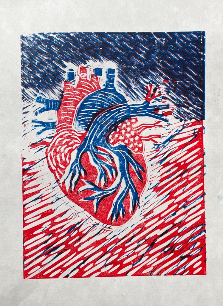
We were limited to two colours, which effectively means that there can be up to four colours in the print: the two chosen colours, their resultant mix, and the white of the paper. I chose red and blue as they were the colours on the diagram.
Well, the prints are a bit rough and ready. I’m not keen on the white area around the heart – originally the background was also red and so I wanted some differentiation between the two, but later on I decided that I preferred the darker background. Having said that, I think it does give the image some dynamism, as if the heart is beating and pulsating.