Six Degrees Of Separation

Image: http://www.justwatch.com

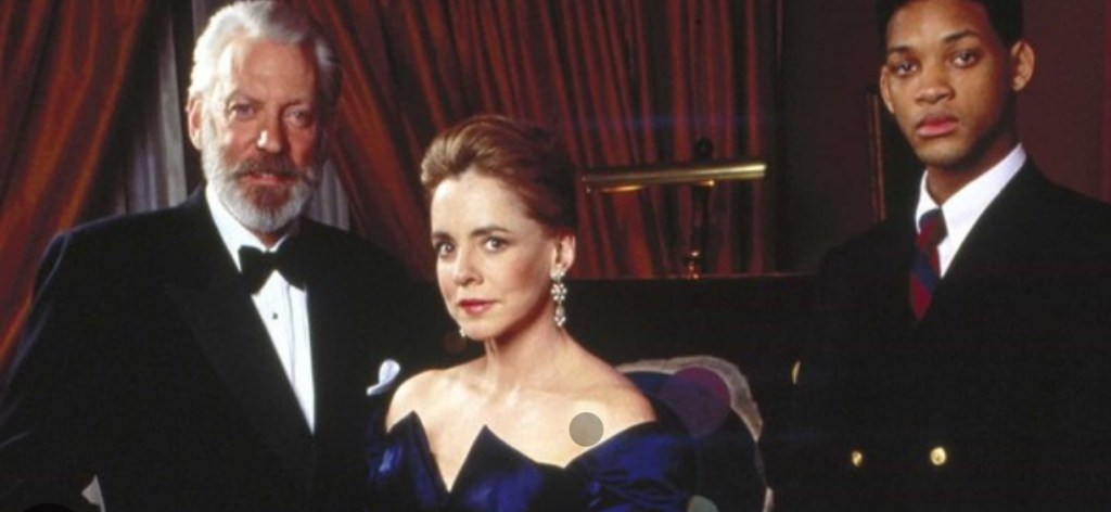
In the film Six Degrees of Separation (based on the play of the same name written by John Guare) one of the main characters, Ouisa Kittredge played by Stockard Channing, says:

I read somewhere that everybody on this planet is separated by only six people. Six degrees of separation between us and everyone else on this planet. The President of the United States, a gondolier in Venice, just fill in the names. I find it extremely comforting that we’re so close. But I also find it like … water torture that we’re so close because you have to find the right six people to make the connection. I am bound, you are bound, to everyone on this planet by a trail of six people. It’s a profound thought… How everyone is a new door opening into other worlds.”

I don’t think I agree with her that it’s comforting to be that close to the President of the United States, or to many other people who live in this world of ours, for that matter.

The film was made in 1993, more than 10 years before the advent of social media, and so application of the theory would be dependent on your level of knowledge of the networks of friends and acquaintances. It was a fun game to play when we didn’t have anything better to do. I once got to Nelson Mandela in 4, Edward VII in 3 and perhaps most impressive of all, Ant & Dec in 2. In the age of social media it’s definitely a lot easier, and research carried out a while ago by Meta suggests that, certainly in terms of social networking, the number of degrees is probably closer to 3.5.

But, yes, connections are important and they enhance our lives and can be discovered in the most unlikely of circumstances. Unexpected connections can provide comfort that the choices we have made are the right ones. Who would have thought that even if I wasn’t on this course I would still be able to connect to Jonathan in 2? I just wouldn’t know it.

There are connections which become long-lasting and develop into relationships, and those that stay transitory. On my first night in London for the Low Res, I was having dinner in a restaurant near to my hotel, trying to make some headway into Stephen Fry’s Mythos but getting terribly distracted people-watching. A couple came in and sat at the table next to me. The woman saw my book and asked me whether it was his latest. One and a half hours’ of non-stop talking later, with the restaurant staff clearly eager to close up and head off home, we said our goodbyes never to see each other again. He was a lawyer with a keen interest in Roman civilisation and Greek mythology, and he would read books to his wife in bed (each to their own). I told him my story and encouraged him to embrace his passion and seize the day. He won’t, but that doesn’t matter because we talked about anything and everything connecting on so many different levels, but sometimes that’s all it’s destined to be, a connection in a moment in time.

I have been able to make even stronger connections with the majority of my course mates having now met them in person and spent hours in their company. We did a lot of travelling and walking over the course of the week which was a great opportunity to chat with everyone including the second year students who imparted some really helpful advice. It was a strange experience meeting people who I have seen on Zoom every week – would greeting them with a hug be appropriate?

It was an amazing time spent with like-minded people. I spent hours chatting about life and work with Rebecca who is such good company. She was explaining how each piece of her work is influenced by one of her stories (one of my favourites being Maureen and the Pope) whilst we were on our way back to CSM on the tube one day, when I noticed a young girl sitting opposite us holding a camera in her lap absolutely transfixed by Rebecca. After a couple of stops she got up from her seat and moved to stand next to Rebecca (who later confessed to being slightly worried that she was going to ask her to give up her seat because she wasn’t feeling well). She then rather apologetically explained that she couldn’t help but listen to what Rebecca had been saying, and that she found it really interesting as she is doing an Art A level and has had difficulty in finding focus in her work. The conversation continued for several more stops, up the escalators and through the tunnel until we parted ways. Another connection for just a moment in time, but hopefully one which was inspirational.

Sorry, Are You Talking To Me?

I’ve decided that I’m probably learning far more about myself by simply being in this process than I am by looking back on my life.

I need to retrain my brain. My legal training has made me focus on detail, anticipate every possible eventuality, dot every ‘i’ and cross every ‘t’ all within a rigid framework of rules and regulations. That way of thinking served its purpose then, but it now stultifies creativity.

When I’m in a scenario which is unfamiliar, I like to know the parameters within which I’m expected to navigate; quite often I feel discombobulated when things don’t go the way I am expecting, the paper workshop with Christian Azolan being a case in point. We were instructed to fold the paper. To my pedantic mind, folding involves a deliberate act of bending something over on itself to create a clearly defined edge. It doesn’t include scrunching. But once I had overcome my initial confusion and accepted this unexpected variation of the parameters, I enjoyed myself.

I definitely preferred using the blank paper – I don’t know what brand it was, but it felt really good. It led me to confess my fetish for pristine white paper to some of my fellow students. I think it stems from being at primary school when the teacher would write my name on the front of a new exercise book with a marker pen and I would go back to my desk and give it a good sniff. I now appear to associate blank paper with a solvent high. I don’t think that my school ever had a pupil who was so keen to man the stationery cupboard at break time. In fact, I used to get palpitations and a bit of a sweat on just walking into WH Smith (R.I.P).

Working with the blank paper seemed to allow more freedom and I liked that the results took on a sculptural quality. The effect of the folding on the reverse of the paper was equally, if not more, interesting at times than the right side; areas which were peaks on one side became troughs on the other and vice versa.

I felt inhibited using the print of the back of my head; I became too concerned with the resultant image which seemed to impose restrictions on how I folded, so maybe I like clear parameters, but not too many of them? Also, the effect is less sculptural than when using the blank paper; the areas of shadow are less apparent and the focus shifts to the distortion and concealment of parts of the image rather than the creation of form.

We then went on to do some linocutting – it seemed a bit incongruous with the folding activity, but nevertheless we all launched into it with equal enthusiasm.

I prepared two linocuts; one inspired by tree roots and the other a reduction linocut of an abstract shape – I printed it using yellow ink first, then cut away more lino and printed using red ink.

I also printed the tree roots image on a transparency, having torn up bits of paper to create a random mask. It is interesting to see the effect of overlaying it with the two prints; how it creates a sense of discord on the prints where it’s not in sync with the image below, and how it creates areas of intensity on the print over which it lines up.

As I was taking my lino into the next door room to print it, Christian heard me reminding myself as to what I was planning to do. Sorry, are you talking to me? No, just myself. Doesn’t everyone do that? Yes, of course. When I went back in to print my second lino, I asked him how long we had left. Sorry, are you talking to me?…

Out Of Sorts

I haven’t done anything since coming home from the Low Res.

There was an intense period building up to it, followed by a period of sitting back and taking stock. I’m still thinking about it all, but whilst doing so I’ve allowed myself to get sucked back into domestic life. My daughter’s now home from uni for a month, along with all her ‘stuff’. Whilst it’s lovely that she’s back, it’s upset the normal way of things. Glasses and crockery disappear into the blackhole that is her bedroom, and the bottom of the stairs has become a footwear hotspot. Could be worse, I suppose.

Also, one of our dogs, Monty, hasn’t been so good. He’s an old boy at 12. Enlarged prostrate, chemical castration, hormonal inbalance making him not himself, and removal of a malignant melanoma. Waiting to talk to the vet about prognosis. I suspect there may be trouble ahead and difficult decisions to make. He’s out of sorts. We’re all out of sorts. But tomorrow’s another day.

I haven’t made anything. I am conscious that I haven’t and it’s starting to stress me a bit. My last two posts could have been cheerier, but there’s no point in putting on a fake smile. My colours are definitely muted at the moment. I feel like I’m stuck and I can’t progress until I’ve managed to process and order all that I took away from the week in London, but up until now I haven’t been able to set aside the time to do it. Also, my logical side dictates that I should deal with it all in chronological order, but that’s impossible to do because it all seems to be intertwined.

Second year Catherine told me that she feels like a spider spinning a web. I told Jonathan that I felt like I had been collecting during the week; it’s as if I’m accumulating pieces of a jigsaw puzzle, but I don’t have the benefit of an image on a box to guide me. I just hope it makes something, because it’s making me feel out of sorts.

I’m looking forward to the start of a new term next week. I need some structure.

A Little Fish In an Absolutely Huge Lake (Actually, Just Plankton, Really)

I had a conversation this morning with my husband prompted by a post on my facebook feed. As usual, I can’t find it when I want it. It was about how we can’t control the circumstances we find ourselves in, but we can control our reaction to them. It gave an example of being a small fish in a big pond and how some people will react by seeing it as an opportunity to learn and grow, whilst others will experience self-doubt and a negative impact on their self-esteem.

I’ve always considered myself to be one of the former and in my very first post on this blog, I said that I felt like a small fish in a big pond, and that I wouldn’t want it any other way. Well, in an attempt to reinvigorate myself, I decided to have a quick look at some of the blogs of the second years whom I met and spoke to on the Low Res. Well, I don’t feel like a small fish anymore – something more akin to plankton. In fact, they seem to be swimming in an entirely different lake.

Maybe it’s because I’m on a bit a of a downer and, had I looked at them on a different day, I would have thought, yes, there’s something to aspire towards.

So, in an attempt to cheer myself up by doing something whimsical, (or maybe bash myself up a bit more?), I decided to take up one of their suggestions and ask AI to critique Motherhood I. This is how ChatGPT responded:

”This is an evocative and surreal image, rich with symbolic undertones. Let’s break it down and offer a critique in terms of composition, symbolism, emotional impact, and technique.

1. Composition and Lighting:

  • The image uses a confined, claustrophobic space, with walls and floor covered in abstract blue textures that resemble fluid watercolors or deep-sea imagery. This immersive backdrop creates a sense of being trapped or submerged, heightening tension and unease.
  • The lighting is soft and casts shadows that add depth, particularly highlighting the seated figure in the center. The dramatic shadows further enhance the isolated and introspective mood.

2. Subject and Symbolism:

  • The Woman: Seated with a somber expression and slouched posture, she conveys emotional distress or exhaustion. The stain on her chest, resembling blood, suggests themes of suffering, heartbreak, or vulnerability.
  • The Heart-Creature: This surreal element—a human heart with legs—adds an unsettling, grotesque, and perhaps metaphorical layer to the scene. It could represent raw emotion, a burden of grief, or the physical embodiment of trauma or love. The crawling position implies helplessness or infancy, giving it a disturbing yet pitiable quality.

3. Emotional Impact:

  • The combination of organic textures, the heart-creature, and the woman’s expression evokes discomfort, sadness, and introspection. It appears to explore themes of emotional pain, isolation, and perhaps the fragility of the human condition.
  • There is a surreal, almost dreamlike quality, which can leave viewers contemplating its deeper meaning long after they’ve seen it.

4. Use of Color:

  • The predominant blue tones evoke feelings of coldness, sadness, or depth. Blue is often associated with melancholy, and here it amplifies the mood of emotional detachment or depression.
  • The vivid red of the heart stands out starkly against the cool background, drawing the eye and emphasizing its visceral, unsettling presence.

5. Potential Suggestions for Enhancement:

  • Narrative Clarity: Depending on the intended message, adding subtle clues—like small objects or additional symbols—could enhance the narrative and guide interpretation.
  • Texture Variation: Adding some slightly sharper textures or contrasts in certain areas (like the woman’s figure) might enhance the sense of three-dimensionality and separation from the abstract walls.
  • Lighting Drama: A more pronounced lighting contrast (e.g., spotlighting the heart more intensely) could heighten the eerie atmosphere and emotional focus.

Overall Impression:

This image is thought-provoking and visually compelling, successfully blending surrealism and emotional intensity. It invites interpretation and introspection, effectively using color, symbolism, and composition to create a haunting, memorable scene.

I think that I’m starting to change my view of ChatGPT!

Motherhood I

I have had an image in my mind for months. It came from the Elizabeth Stone quotation, I first mentioned in Hearts & Linos .

”Making the decision to have a child – it is momentous. It is to decide forever to have your heart go walking around outside your body.”

I think it encapsulates perfectly how I felt when I became a mother. My whole world was turned upside down. I was suddenly responsible for raising and protecting another human being. I felt overwhelmed by the magnitude of it all; that life would never be the same again. It made me question the sort of world I had brought her into, how her life might be; how much of it I would be a part of, the unthinkable and unbearable pain I would suffer if anything happened to her. She was precious and intrinsic to me, now living and breathing in the world, independently of me.

It’s taken a while. Bearing in mind that I’m still finding my way around Procreate I don’t think that I’ve done too badly. I’m sure that I’ve done lots of things incorrectly, but I don’t really care. It’s all a learning process and it was fundamentally about me trying to realise an image that I had in my head. I feel that I’ve achieved what I set out to do. In that respect, I’m pleased with it. I think it conveys the visceral nature of my feelings.

Actually, it has taken me more than a while; it’s taken ages, probably because I kept on making mistakes, but I have learnt lots along the way. I’ve redone parts of it several times but I have to say that it has all been about the process of discovery and realisation. It’s allowed me time to focus on the detail, but it’s been as part of the process rather than with a view to trying to achieve a perfect result. I don’t think that Procreate is a tool with which I can be loose and expressive in the physical sense, but it seems to satisfy that part of me that likes to focus on surreal detail every now and then. Hopefully that will allow the other part of me to enjoy the experimentation of being looser and more expressive in my mark-making when, say, painting.

I decided ages ago that I wanted to incorporate my ink experiments as a background to a collage type piece. I sourced the heart, crawling baby and head of the woman from royalty free image sites which allow for reproduction of the resultant work, if need be. The body is my daughter. She’s a bit freaked out by someone else’s head being on it, but I wanted a neutral character, and I couldn’t find an image of a woman sitting on a chair that fitted my requirements, so I roped in a free model.

It was challenging constructing the crawling heart. I’ve had to rebuild parts of it including the hands as some of the fingers were hidden in the original image. It was quite difficult finding source images whose licences allowed me to do what I wanted to do, and were also free. I’ve played around with editing effects and colours and I think that I’m settled on the last image for now. The slight greenish tones, complement the red heart. I really like the cyanotypes, but unfortunately there isn’t enough tonal variation and the slightly chaotic background loses its delicate tonal transitions in the process. I might try again but change the background to something a little less busy. But I like the historical, almost Victorian Penny Dreadful feel to them. I might develop it further, but I’ll leave it on the back burner for now.

The time delay video created by Procreate is of epic proportions, but it’s helpful for me to watch it back so I can see what a song and dance I made of it all. This is a shortened version.

Parental Loss I

There’s a passage that I find really moving. It comes from Deborah Levy’s The Cost of Living which I selected as an inspirational text (see The Cost Of Living). In it she describes how she felt after her mother died and, in particular, her reaction after coming across a postcard her mother had sent her.

My mother had made a biro’d X on the front of the postcard and written’ X is where I am’… It is this X that touches me most now, her hand holding the biro, pressing it into the postcard, marking where she is so that I can find her.”

In response, I had an urge to do something similar. I’ve had an image in my head for some time. I looked at the satellite image of the village where my mother grew up, of the church where my parents were married, and of the churchyard where they now rest, together with my grandparents, aunt and uncle, and other distant relations. The image was taken on a sunny day with snow on the ground, and I love the shadows which are cast by the trees and the buildings, in particular, the church; the shadow of the spire revealing a building, which is otherwise indistinct from the air, as being a church.

Luckily, after a bit of research I managed to work out how to remove the road and building labels.

So, I made a cyanotype. It’s only A4 in size. I’m thinking about making it larger, say, A3. I don’t think that I can make the image any sharper, but I don’t think that really matters – it’s not about the detail of the buildings; it’s about the shadows revealing the nature of the buildings, about the sense of place and about the topography; the tramlines in the fields, the clusters of trees in the middle of fields and the pattern of the roads I walked down as a child. I love the patchwork nature of the countryside. I know that I’m coming home when I see it from a plane.

I’ve put in an ‘x’ but black ink doesn’t really work. I might try red, or maybe replace the ‘x’ with a location pin instead which might contrast well with the historical feel of the cyanotype.

There’s not been much experimenting. I think it’s because I’ve known what I wanted to do for a while and it was a clearly formed idea. It’s been an easy process and a cathartic one, but it does make me feel sad. My parents were my anchor to the past and without them I feel adrift from where I came from, and from a substantial part of my history.

Out Of The Blue II

I took the overexposed images of me on the beach and lightened them by putting them in a bath of sodium carbonate (made by heating sodium bicarbonate in the oven) and water. I think that the solution was too strong as it lightened the images considerably.

I then made up some toning baths, and used the lightened images and two of the ones which had been ok from the previous session.

It took several hours for the tones to develop especially in the images which hadn’t been lightened first. Thinking about it I haven’t been particularly scientific or logical about this as I was too keen to experiment, but going forward I will need to be more careful about keeping a record of process: applications, timings, volumes, amounts etc if I am to stand much chance of recreating effects that I like. ( Left: Turmeric tealightened)

To get a true comparison I will need to repeat the process using lightened and unlightened images and specific volumes of toner and timings etc.

I then started playing around with exposures. I prepared a new print of the trees using the unit, re-applied some solution, and then placed some amorphic shaped paper masks over areas of it and put it back in the unit for 5 mins. I then put it in a hydrogen peroxide bath in an attempt to get some deeper blues and definition in the dark areas.

I like the added depth that is achieved by the second exposure; it creates some more interesting areas within the darks, and a mid tone in the lights, making 4 tonal values.

I then tried a triple exposure. I took the underexposed image of the pond statue from the previous session, reapplied the solution (not particularly evenly as it turned out), and used some torn paper to retain sections of the original image. I exposed it for 5 mins in the unit.

I then recoated it, and masked off most of statue, laid on some foliage and then exposed for 5 mins in the unit, finishing with hydrogen peroxide to accentuate the different tones in the dark areas.

I’m pleased with the result, although I would have liked to have achieved greater definition of the leaves where they cross the vertical strips. Perhaps less time on the second exposure?

Exploring the idea of masks further, I tried using various items on the first exposure. Some were more successful than others. Soap suds between sheets of plexiglass didn’t really work (I think that’s more for when working wet in wet):

Soap Suds

I also swapped from watercolour to oil paper, with a view to developing the prints by painting on them in the next session.

Cling Film

Piece of Cord

Bubble Wrap

I really like the effects achieved in the images above. I now need to sit back and reflect on if, and how I can develop them further.

I think that my brain is at risk of becoming overwhelmed by all the possible permutations. My natural reaction is to explore every combination possible. To this end, I enjoy making up colour charts, recording every possible combination using all of my paints, even if I never use the charts. I suppose that I like to know all of the options available to me, with which I can work. It makes me feel safe. I like the comfort of having some form of structure in place. That’s how I am – I like to be informed: to know all the options before making a decision, to see all that there is to see in the place where I am on holiday, read every book or article which might be relevant – hence my delay in tackling the UAL library online. I think it comes back to the feeling that I have done all that I can possibly do, and so the decision or path that I choose to go down has to be the right one. I like resolution. Nothing irritates me more than watching a film or reading a book and getting to the end where there is no end, even if it is a bad ending; no resolution. And yet, the ending could be whatever I want it to be and has infinite possibilities which in many respects should be a better and far more exciting place to be.

It’s All Part Of The Process

I’ve been doing quite a bit of thinking this week.

The first time, as a result of our weekly session, unprofessional v professional. We considered all that is implicit in the terms professional and unprofessional, and then read and discussed an article ‘How to be an Unprofessional Artist’ by Andrew Berardini, 23 March 2016, MOMUS.

I came away from the session feeling confused, and no longer having a clear sense of direction. My aims in my Study Statement are designed to help me fulfil my aspiration of becoming a practising professional artist. I’m now questioning what I even mean when I use the term ‘professional’. If it means losing creative autonomy, losing the love of creating because it has become an expectation or much worse, a chore; having to repeatedly make things because they are popular or asked for, then, no, I don’t think that’s what I want. But what is the alternative, just to carry on as I am now, making art for me and leave it at that – be a hobbyist like my mother said; be an amateur? I don’t think that’s what I want either. That’s not why I’m here.

Maybe when I get there, if I ever do, the answer will become clear. Perhaps the best course of action is to aspire to be a practising artist for the time being, making more time for creating. There’s no point trying to run before I can even walk.

I then spent some time reflecting on the cyanotypes I made, and all the possible further paths that I could go down. I started thinking about processes and re-processing. How you can take a painting, for example, take a photo of it, digitally alter that photo, incorporate other elements, say, by way of collage, print it out, print on top of it, paint on it, photograph it, keep changing it, keep re-processing it.

It then occurred to me that I’m just one big walking process made up innumerable smaller processes – breathing, talking, thinking, digesting, and on and on. Not just that, but that life is a process with all its constituent processes. Growing, having children, loving, caring, grieving, healing, dying are all processes by which we are, ourselves, processed.

So, I think that I’ve reached a point where I’m thinking about the reprocessing of art and the reprocessing of me. It’s probably because I’ve been thinking a lot about process recently, writing the word goodness knows how many times in Doing Lines, and reading ‘Ultra-Processed People’ by Chris van Tulleken. But it does occur to me that I have led most of my life too focused on the product, and not really living in the process.

Something for me to think about.

A Brainstorm In A Coffee Cup

I’ve been thinking about my discussion with Jonathan; about the ideas I have, and his advice that I should record them in this blog to remind me of them in the future. I find it easier to scroll quickly through the blog than sift through bits of paper, or flick through sketchbooks trying to find them.

I had an unexpected opportunity to start the process this morning. One of the good things about getting older is that you start being called in for regular tests and health reviews. I’m in the process of one such MOT – I have had my bloods done; liver function OK I noted from my NHS app (which seems to be filling up with more and more of my records everyday) and Type II Diabetes is still a way away so that’s good news for both my gin collection and my stash of chocolate. Cholesterol is a bit on the high side, but then it always has been – it’s all that good cholesterol, or so I keep telling myself – but there’s no getting away from the fact that women of my age are at an increased risk of heart attack. I’m starting to think that I’m a hypochondriac who is obsessed with death, but really I think that I have quite a positive outlook on life.

Anyway, for some reason I got a message on my phone yesterday notifying me of an appointment this morning for an ECG. Maybe it was a follow up to my cholesterol levels? They don’t even phone you nowadays I thought to myself – imagine if I hadn’t seen the notification? Anyway, long story short, when I arrived at the surgery after having rushed because I thought that I would be late, heart pumping a bit too quickly just before an ECG I thought to myself, it turns out that it was an admin error and it had been meant for someone else. I was out of bed now, so I might as well go and have a quiet stimulating coffee before heading back home.

So I did, and I did some thinking, made some notes and made a quick mind scribble when I got back home. It feels a bit like just having put the children to bed – I know where they are, and they’re safe.

Out Of The Blue

Last summer I became obsessed with cyanotypes. Then there was plenty of sun. There was some sun the other day, but not much since, so I decided to make myself an exposure unit using my Speedball UV lamp and following instructions on Handprinted. I do love a bit of DIY; there’s something very satisfying about making do with something handmade which didn’t cost a fortune to buy, or require some fancy kit, or having to go to a specialist location.

I used an old printer box which was large enough to take A3 sheets, cut out a hole for the lamp to sit in, and then lined it with aluminium foil.

I selected a few photographs to experiment with; some from the family photos which I’ve been sorting out, and others which I have collected on my phone as inspirational resources, as well as some images from the experiments earlier on in this blog. I converted them all to black and white and then inverted them in Photoshop, printing them off on transparencies. I had to dust off my old printer to do this as I wasn’t sure how to do it on my husband’s printer. This took a while because between each print I had to perform a ritual of pressing certain buttons in a certain order in order to fool the printer into thinking that I was using genuine HP ink cartridges, which I wasn’t. The things you can learn on YouTube.

Ironically, the sun came out, so I did a mix of au naturel and my DIY unit.

The first two prints were made using the unit, the first being over- exposed at 20 minutes, the second being just about right at 15 minutes. The last two prints I did outside in the sun, which was a bit more hit and miss because the strength of the sun was not constant as it kept disappearing behind some cloud cover. However, I do really like the effect of the visible strokes which I left when applying the solution to the paper, which was A4 300g/m2 hot pressed watercolour paper. The markings give the effect of a moving, flickering , transitory image – there, but not quite there. I put two images on the same negative transparency because I wanted to create a number of smaller images to experiment with. However, the suggestion that the images are on a roll of film is really interesting.

It’s been really difficult getting some of the old photographs out of the albums; they are the sort which have sticky pages on which you position the photos, and then put a transparent film over the top. Over the years the adhesive has seized up and practically bonded to the back of the photos. I’ve tried all sorts including gentle heat, dental floss and a bendy, very sharp filleting knife.

This one of my mother and brother is a favourite, but sustained a small tear on the right. I am pleased with both images – the first one was done outside and the second in the unit, which seems to have more of a Prussian Blue hue to it although I’m not sure that there’s any rhyme or reason as to the differentiation in the blues – but I really like the movement in the second one, again giving the impression of a fleeting moment. I think that the solid areas at the top and bottom add to it, suggesting a frame from a film of a moving image.

This is a photo of the statue which sits at the bottom of my mother’s garden next to her makeshift pond made out of an old washing-up bowl. I always used to wander around the garden when I visited, stopping at the pond to see if there were any frogs around. I do like a frog – my grandmother on my father’s side used to have a rockery, and I used to spend most of my visits looking for, and trying to catch frogs. That, and hanging out in her shed and greenhouse with the tomato plants – I love the smell of tomatoes; it takes me right back.

The problem with a cyanotype is that if you leave it too long, you over-expose it, and whilst you get deep blues you lose the midtones, which is what I thought I had done with the first one, so I exposed the second one for less, but it turned out to be under-exposed – even putting it in a hydrogen peroxide bath didn’t help. Both were done outside; perhaps I should have done a straight 15 mins in the unit, but where’s the jeopardy in that?

This is a photo that I took looking up into the branches of the three trees that I like. The negative image is also really interesting, and I might do something with that at a later date. The image (last photo) is underexposed again, but has a feeling of being removed, almost as if I’m looking at it through my window (which incidentally does need a good clean). I wanted to try fabric, but could only find some thin cotton lawn. I was so disappointed – it turned out terribly. I had visions of being able to create long, flowing, billowing, wispy cyanotypes, but ended up with the image above. You can just about make out the branches.

I will need to think about this a bit more. My first thoughts are that maybe there was a coating on the fabric, so I’ve washed it; maybe the image was too detailed, but I’ve seen quite detailed images on fabric; that the structure of the fabric is not robust enough – you can get pretreated fabric which is like a sateen so I could try that; or maybe there wasn’t enough contact between the fabric and the negative. I need to take some time to reflect, and try again.

The images above were from my experiment with ink in Blot II , and from A State of Flow II . It was a useful exercise in that it confirmed to me that not everything works as a cyanotype – I much prefer the original images, particularly the ink one, as the edges between areas of flooding and blots are much more defined, and there is more of a delicacy about them. The contrast between the blue and the black ink also adds interest which is lost in the cyanotype.

So, on reflection a really useful and enjoyable exercise. The thing that I really enjoy about this process is the anticipation, and then the slow reveal as you rinse off the solution to see an image slowly emerge, or not, as the case maybe. Doing it outside as opposed to in the controlled environment of the unit adds a degree of extra excitement, but equally there is the risk of crushing disappointment when it doesn’t quite work out.

Moving forwards, I was intending to experiment with toning some of the smaller images of me with tea, coffee, wine etc, but I actually like the last couple as they are, so I will keep them as finished. I’m thinking about how I could use multiple exposures to create layers, and also thinking about manipulating the source image a bit more in Photoshop and printing from the original image rather than reversing etc. I’m not sure whether I’ll get straight to it, or do something else in the meantime – sometimes I go hell for leather with something and then exhaust it, or myself, or become disenchanted with it. I don’t want to get too far down a rabbit hole, so maybe I should leave a bit of space before going back to it, to allow for some more subconscious reflection. I suppose the clue was in the opening sentence: “Last summer I became obsessed with cyanotypes”, and I haven’t done it since.