I’ve decided to experiment with using the contour image in Procreate as a layer.
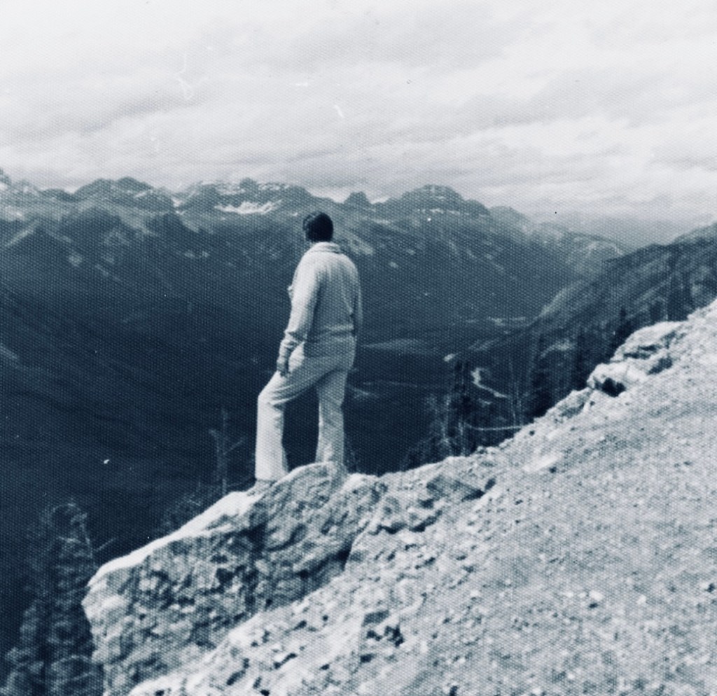
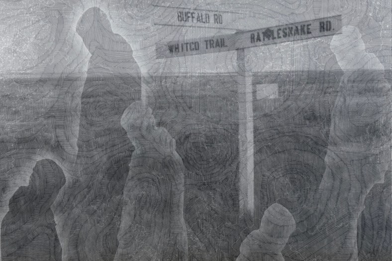
I was looking through some old family photos and found this one of my father in Canada. This is a recurring image from my childhood – if there was an edge or a high place, my father would always go and stand on it despite us pleading with him not to. I think he would have been about 40 years old when this was taken. I took him on the London Eye when he was in his 70s and I don’t think he looked out at the view once, choosing to spend the entire time sitting on the central seat, ashen-faced.
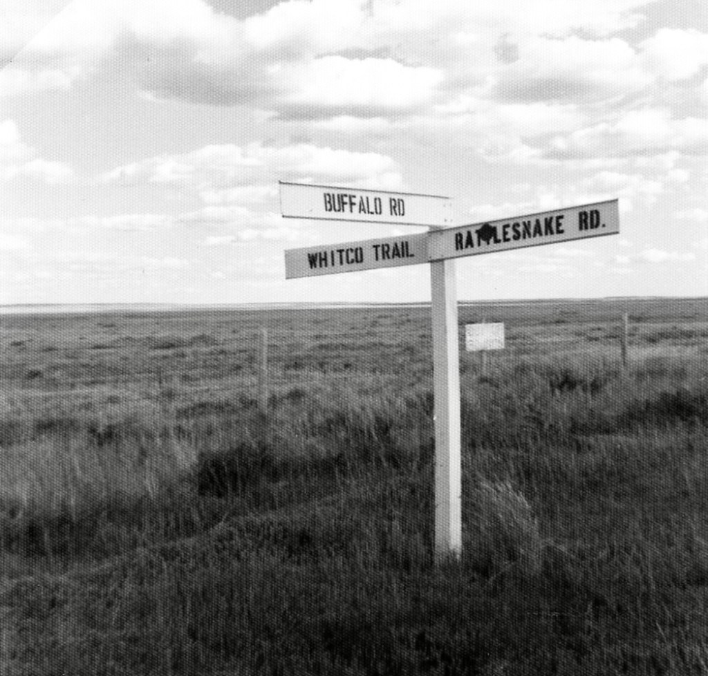
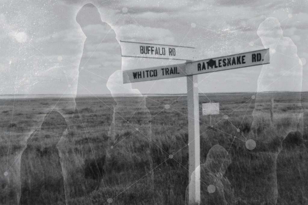
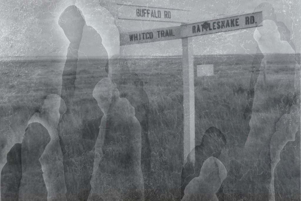
I also found this photo of a signpost.
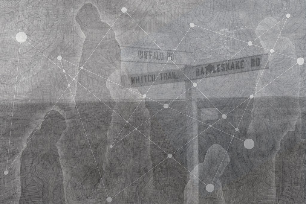
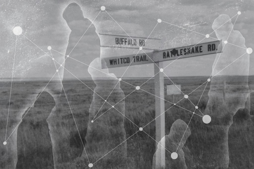
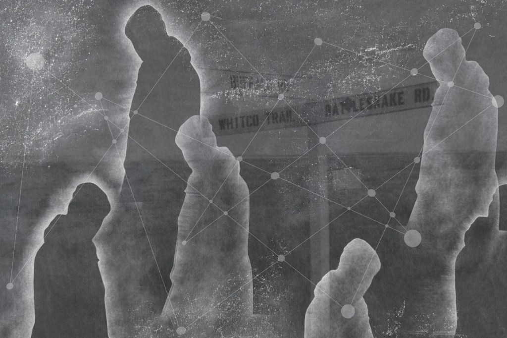
I played around with layering using filters, inverting and adjusting opacity:
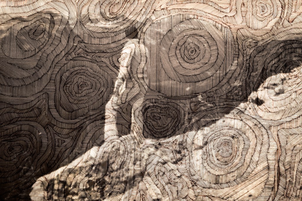
The image above is tonally bland; I prefer the one below. I like how the lined contouring gives the effect of the image being woven or embroidered.
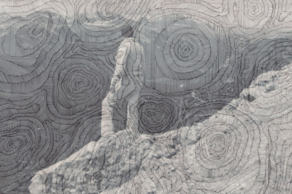
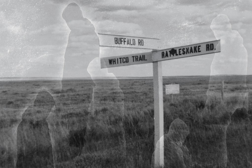
Again, the images above don’t have enough tonal range. I don’t think the contouring adds anything, it’s probably more of a distraction.
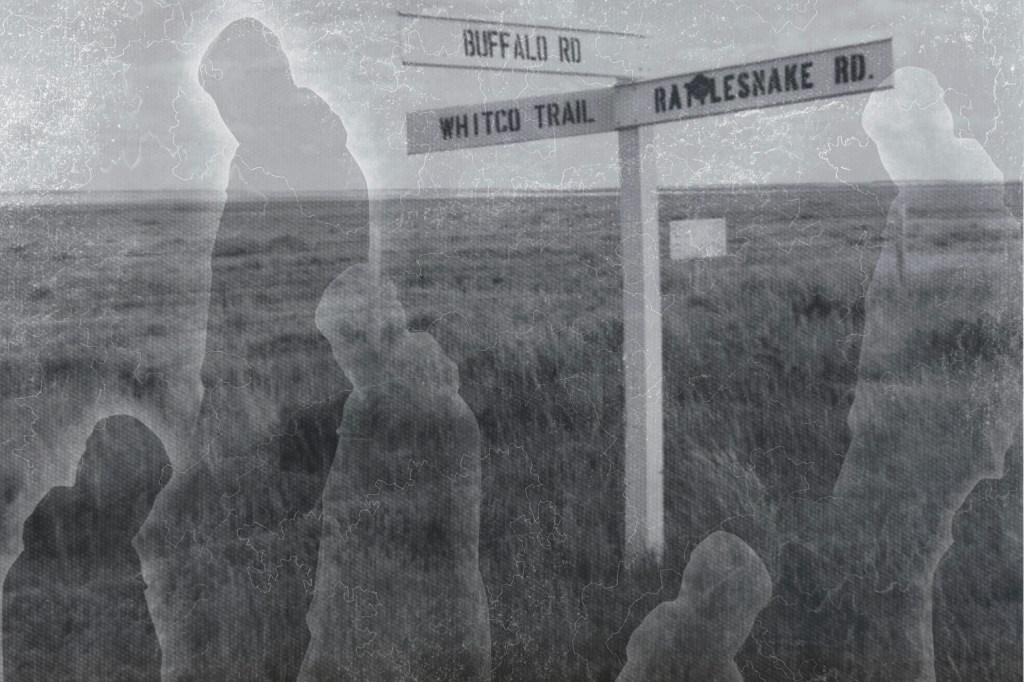
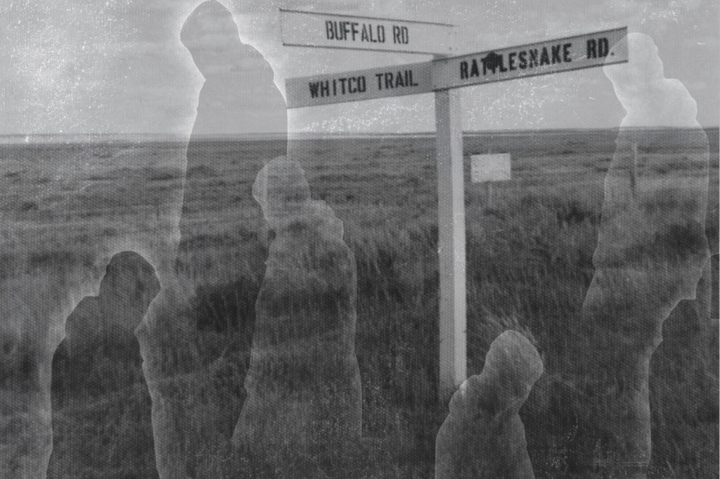
A mixed bag of results. I prefer the images which don’t crop off the bottom of the sign post. The most successful is probably the penultimate image, but again I think it needs a greater tonal range. However, I do like the effect of the figures against the landscape, the idea of crossroads in life, decisions made, a different path followed and shadow selves.
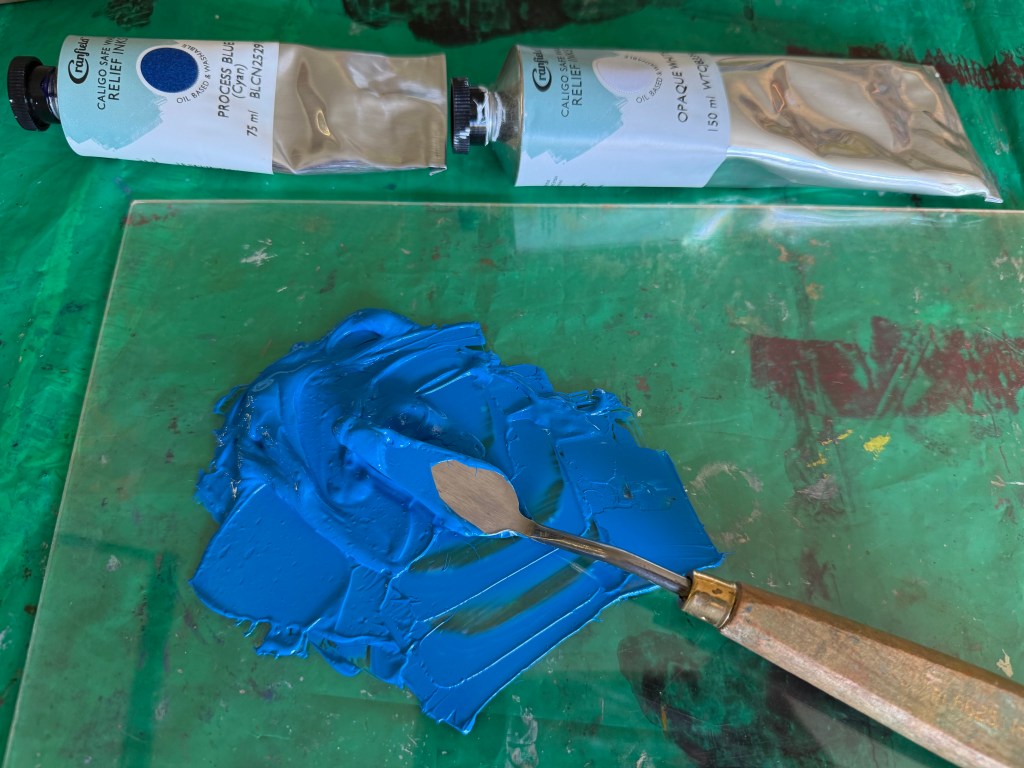
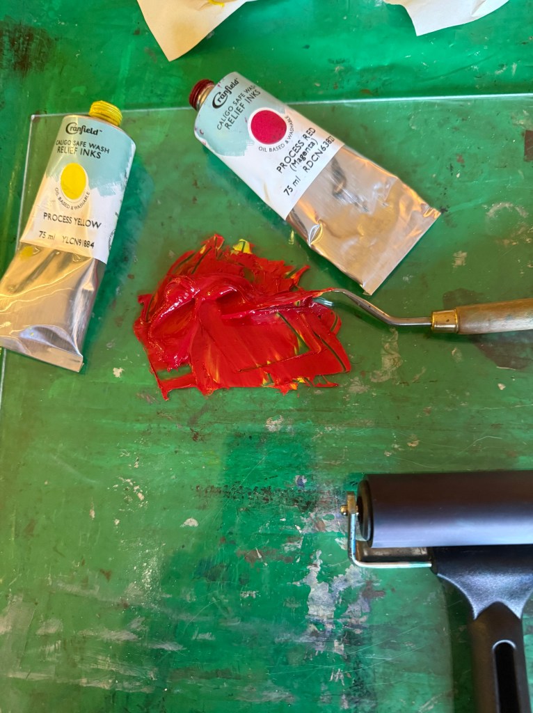
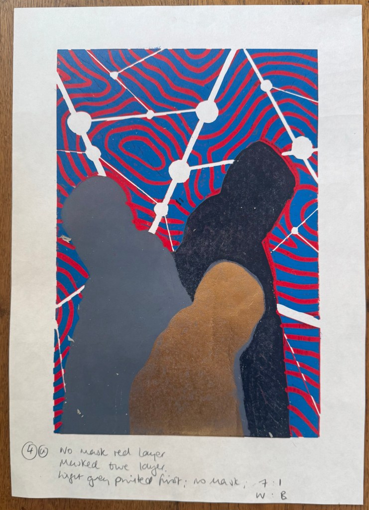
So, Plan A was dependent on me being able to overprint the red with blue. I did a quick test print. The process blue ink I was using must have some transparency as it turned into a very dark purple, so I made it more opaque by adding opaque white which resulted in a kind of cerulean blue which I liked against the red, although the photos don’t do it justice.
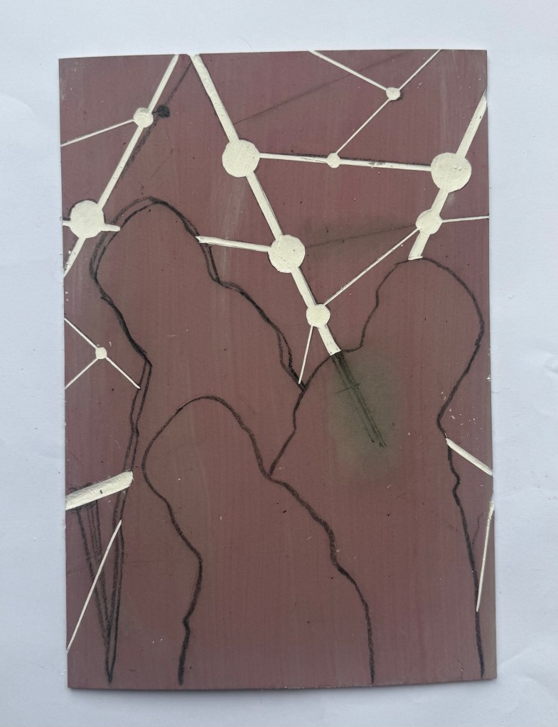
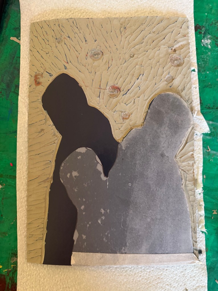
I then prepped a sheet of A4 lino by lightly sanding and wiping with white spirit before staining it with an acrylic ink and drawing on the figures and the white lines. I went over the pencil marks with a chinagraph pencil to make them stand out more. As usual I had launched in without giving it enough thought and ended up having to reposition some lines although I couldn’t erase the chinagraph marks, which becomes relevant later on in the test printing. I used a metal ruler to cut out the white areas and filled them with cornflour to see how they looked, neatening up where necessary – the circles are bit all over the place, so I resolved to use a template when making the actual prints.
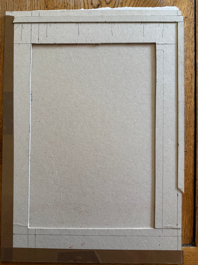
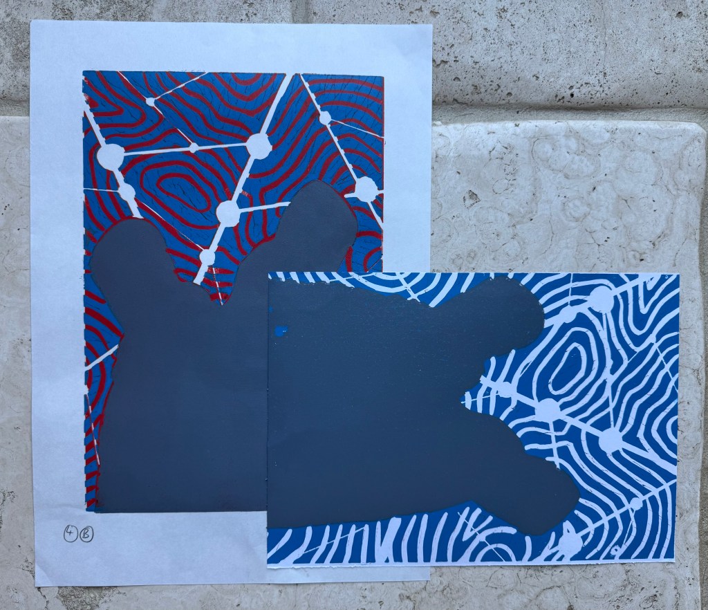
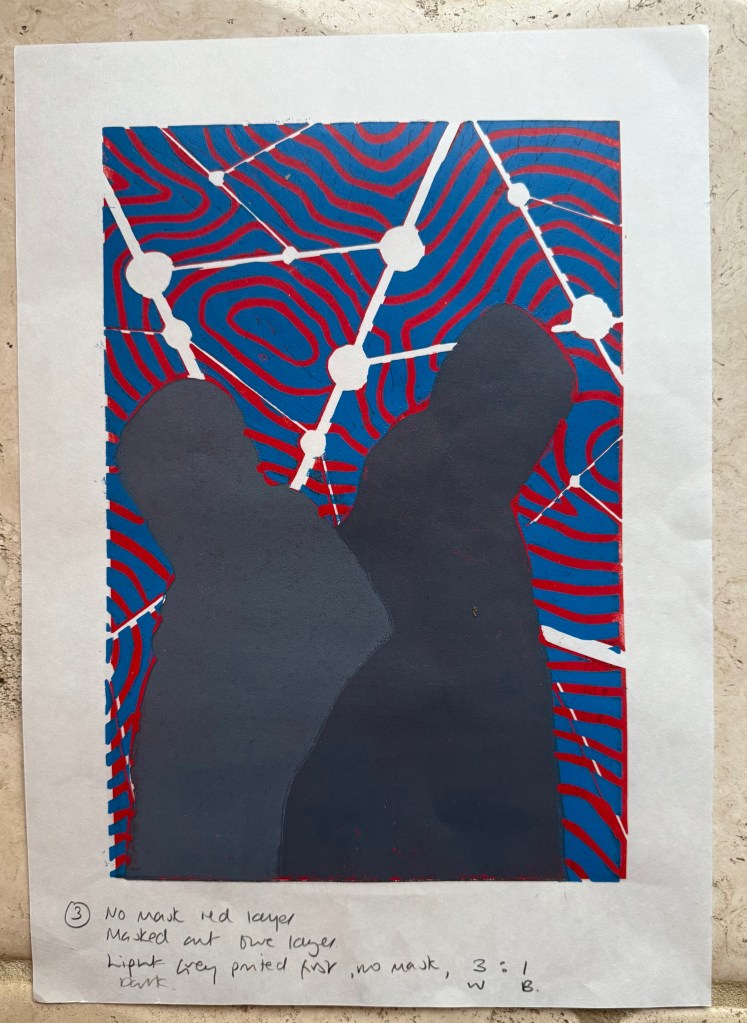
I created a registration board for the lino, drew lines where the paper was to go, and printed the first layer using equal parts process red and process yellow. Initially, I thought that I could mask out the figures using some tracing paper. Reduction linocuts work from light to dark ordinarily, but my image doesn’t really conform to that process. I knew one, if not two, of the figures would be a med/light grey and I wasn’t sure how that would sit on top of a bright red. I tried inking up whilst the mask was on the block and then removing it, but it was difficult to do because the mask kept on sticking to the brayer and the result wasn’t great. I decided to ink up the entire block for the rest of the prints. I also noticed that some of the chinagraph was coming off the block onto the prints.
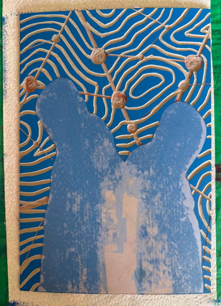
Next, I cut out the contour lines and printed with blue ink. By this stage I had realised my previous error and masked the figures after inking the block, but before printing – a much better result, and I can’t work out why I hadn’t realised this to start with. However, after the first print it was obvious that the registration was off. I had thought that I had lined up the paper the same each time when I was printing the red layer, but I clearly hadn’t. I created a raised edge against which to place the paper on subsequent prints, but I had to accept that the blue and red layers wouldn’t line up on all of the test prints, which would cause problems in relation to the white areas.
There was also misalignment around the edges of the figures which could have been caused by poor registration on the first layer, but could also have been caused by a lack of accuracy in creating the mask, or even applying too much ink.
To complicate matters further, the paper I used was Japanese HoSho paper which being lightweight (90gsm) and strong makes it ideal for printing linocuts. However, it turns out that it is slightly smaller than A3. I already had some Snowdon 130gsm paper, so I thought that I would give that a go, to see if it would be a suitable alternative, even though it is heavier than the HoSho.
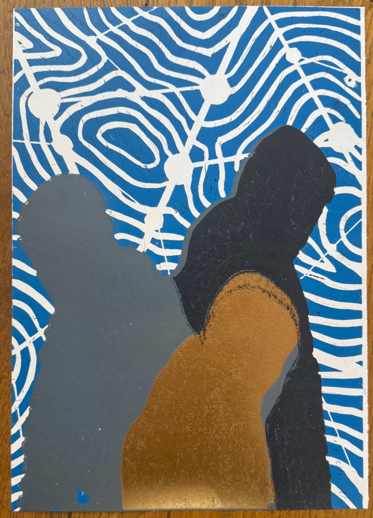
Other than a few areas where some bits had managed to get stuck onto the block, it seemed to print quite well.
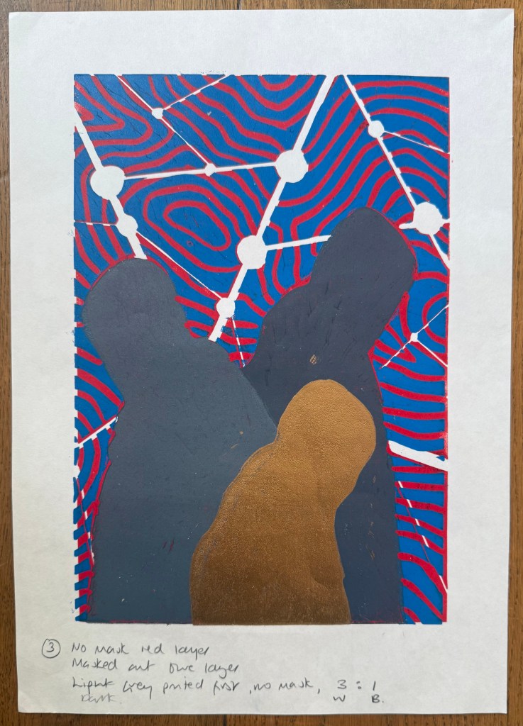
I then cut away the rest of the block leaving just the figures. I wanted to experiment with both masking areas and inking up the whole block to see how the subsequent layers printed so I could decide on a final approach ie whether to use a mask or to layer the ink. I would have preferred not to mask any areas as it seemed to increase the risk of mis-registration of the print. But before I decided I needed to find out how the final metallic gold layer would sit on top of all the other layers. I noticed that there were some indentations in the outlines of the figures from where I had cut out the contour lines.
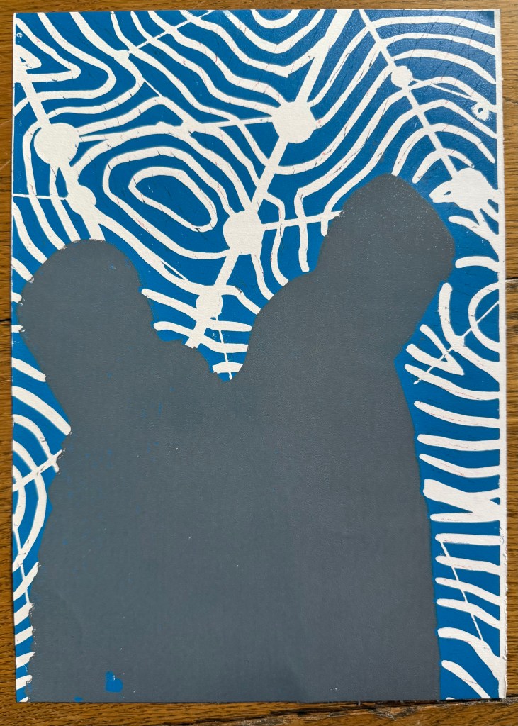
I also wanted to see how the grey would print on top of the blue as well as the red, and it seemed to fare quite well, although it definitely has a cooler undertone to it than when printed over the red.
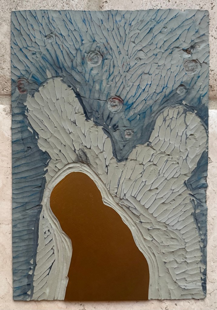
The blue and grey layers seemed to dry slower than the red and, as a result, the dark grey/black ink didn’t print well, and also the cut away areas picked up some of some of the blue and transferred it to the prints. I had the same issue with the gold ink, but by that stage I had become a bit frustrated and impatient, and just wanted to see what the colours looked like together. There are agents which can be added to the ink to speed up the drying process but you have to be careful as to the amount used, as they can alter the colours. I could have swapped from oil based to water based inks, which I didn’t have. So I decided to make the best of what I had.
I know that I make things more complicated for myself than they need to be. I could have watched videos on how to make reduction linocuts before starting, but there is a part of me that thinks that learning on the job is a more valuable, if not more frustrating, experience, and that the lessons learnt are more likely to be remembered (and possibly put me off linocuts for good).
So, what did I learn?
Preparation is key
Registration is everything – I watched a couple of videos after the event and invested in some Ternes Burton registration pins and tabs
It’s preferable not to mask areas if possible but to cut away the lino on each layer
Don’t use chinagraph or anything else which could transfer from the block to the paper
Accuracy is important
I should have had a resolved image before I started, rather than winging it in the process
When cutting out the first and second layers I needed to ensure a clean edge with the figures by using a craft knife
I needed to check that there isn’t any ink on the cut out areas of lino before printing
The ink needed to be dry before printing the next layer
But, the most important lesson is that because of the number of layers and the time needed for drying, it would not have been possible to complete the print before the end of the month. I needed to go back to the drawing board and have less colours so that it reduced the amount of drying time etc. So I amended the image to just white, red, grey and gold.
I’ve decided that I would like to make physical prints for the Editions Sale, if possible, and I have resolved to do a linocut, on the basis that I don’t have an etching press at home, and I probably won’t be able to make it in to CSM this month. I also want it to be something which is relevant to, and an extension of, my recent work.
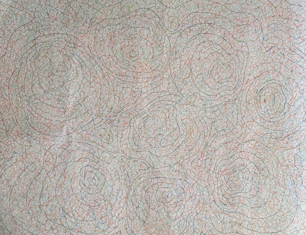
I’ve not much experience of linocutting, but this is a good opportunity to try and improve my skills. I’ve been experimenting with some of the mapping imagery that I’ve been exploring over the last few months.
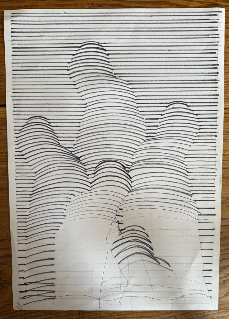
Originally I thought about the line drawing I did and how form can emerge from lines. I used my father’s silhouette from Solitude to experiment.
The lines are all over the place as I did them freehand (how does Bridget Riley manage?) and there were a few errors. In the top half I experimented with rounded curves, whilst in the bottom half the lines are flatter.
I tried drawing out how it might work but in the end I decided that it would just be too difficult, and gave up.
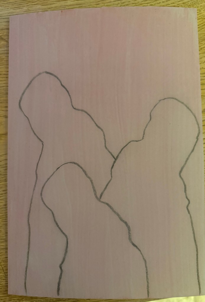
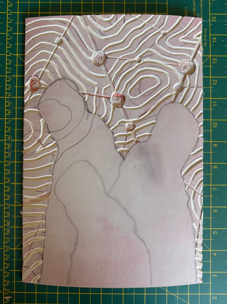
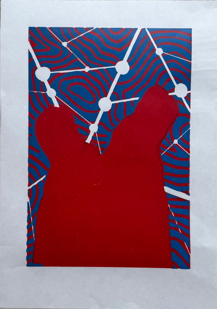
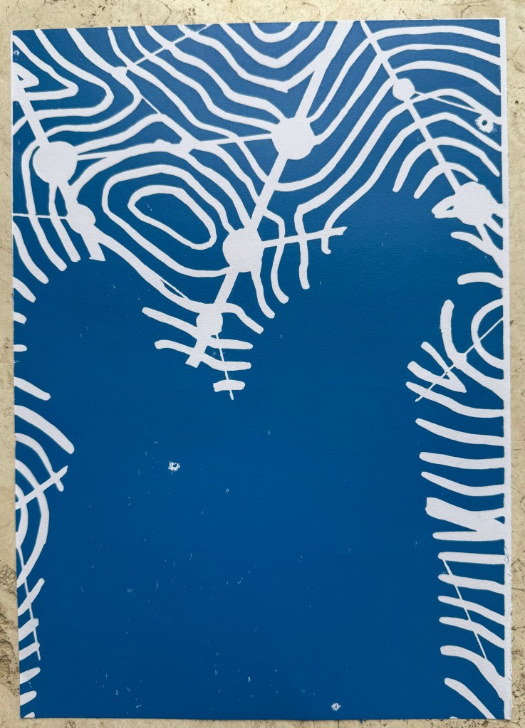
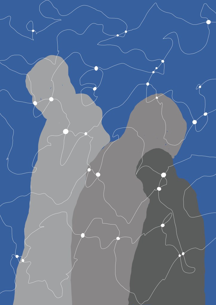
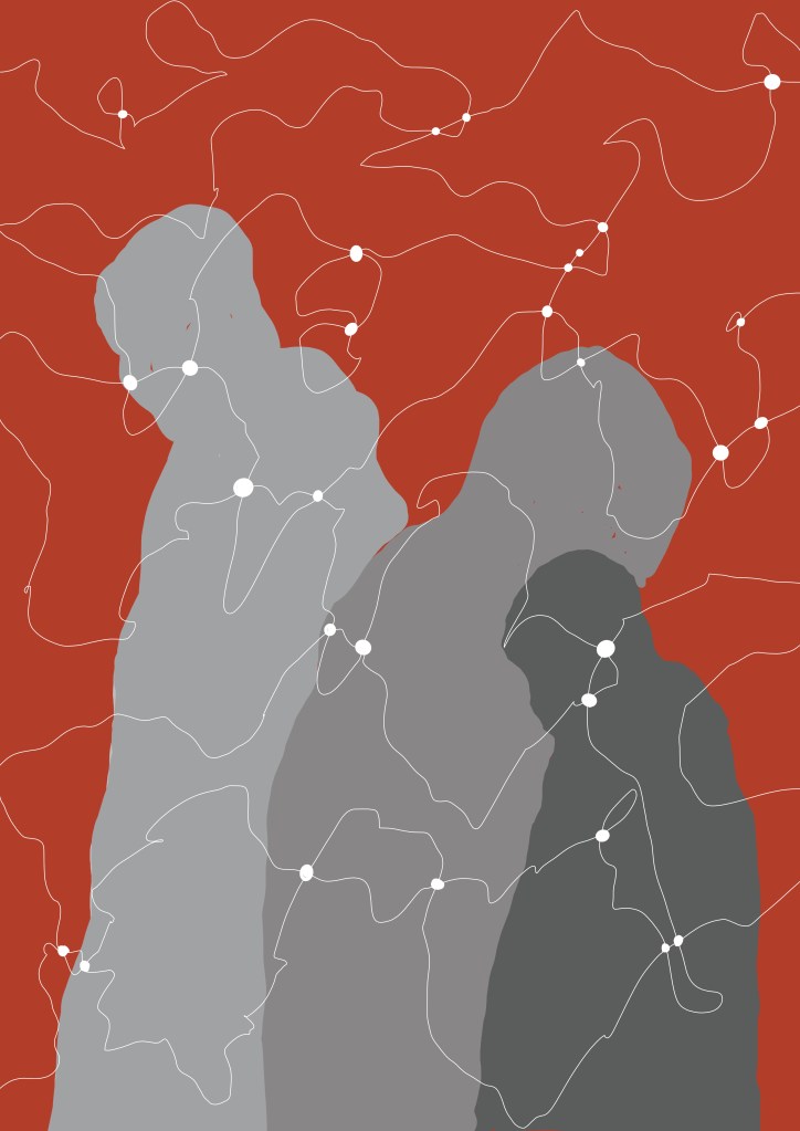
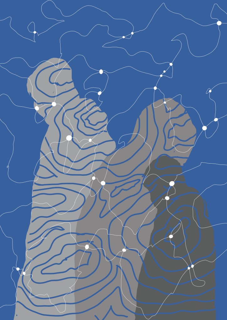
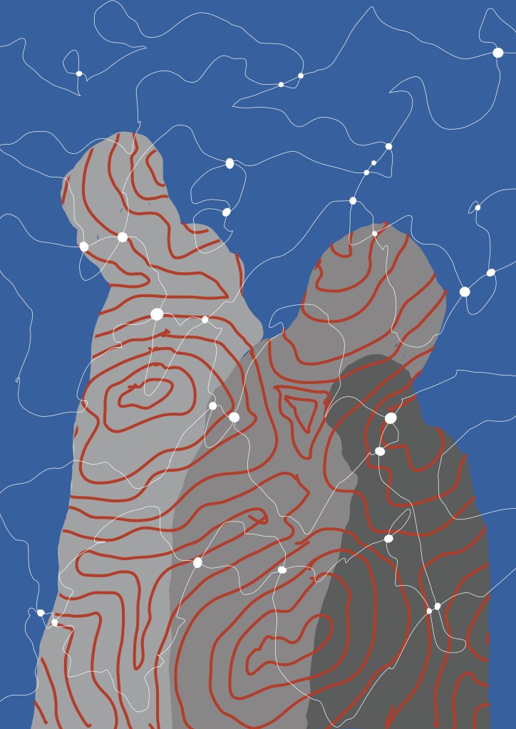
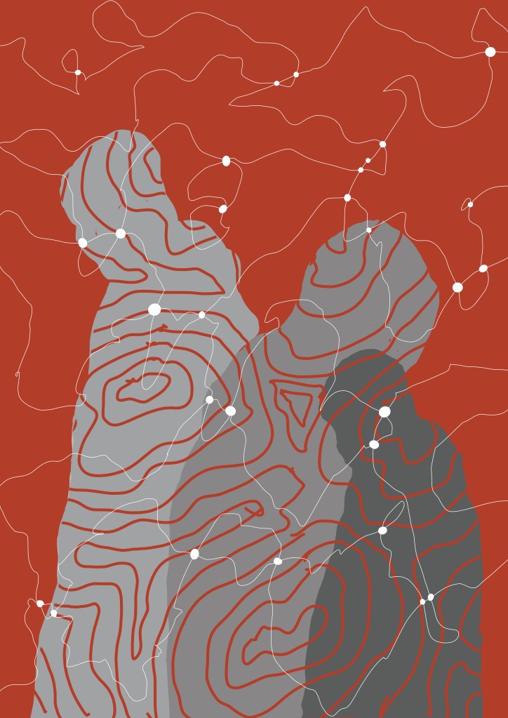
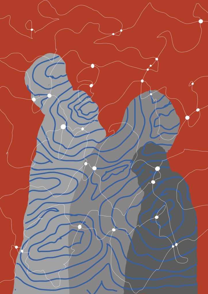
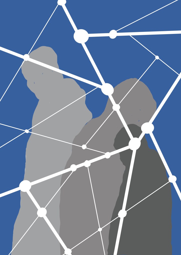
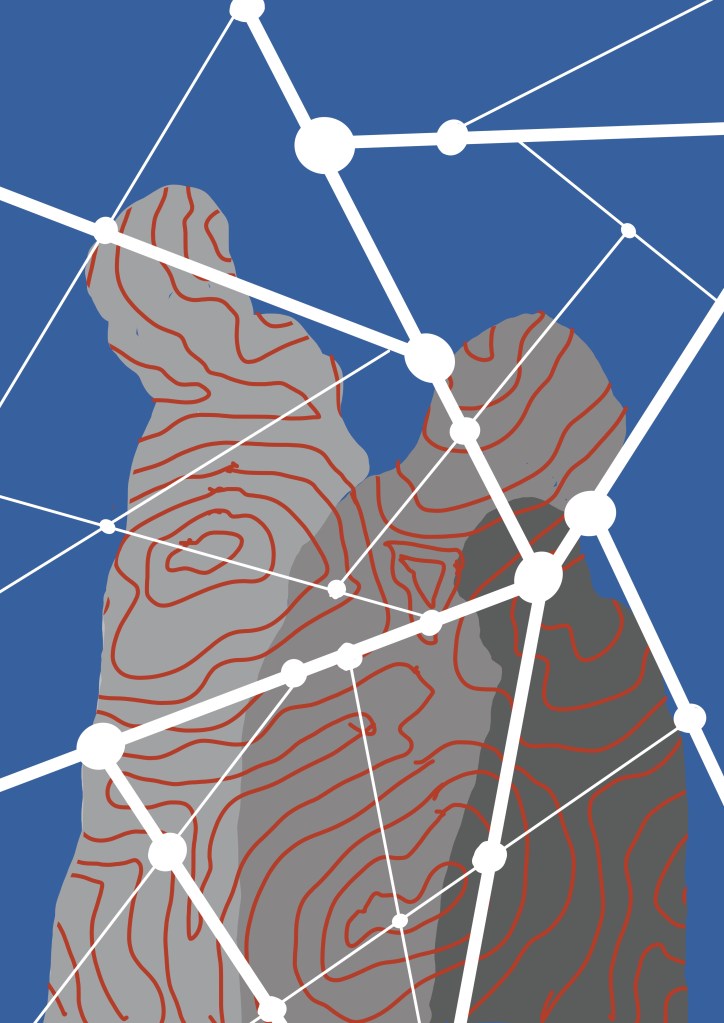
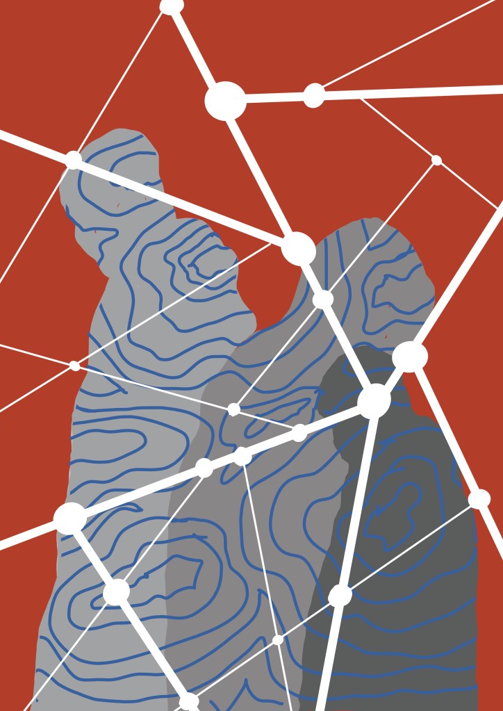
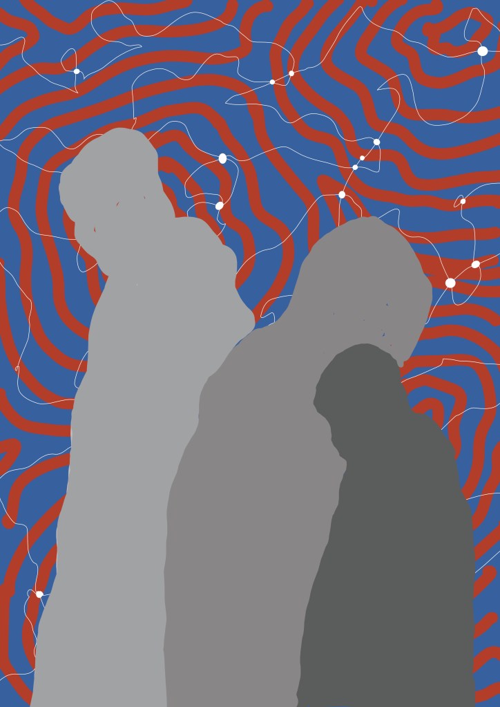
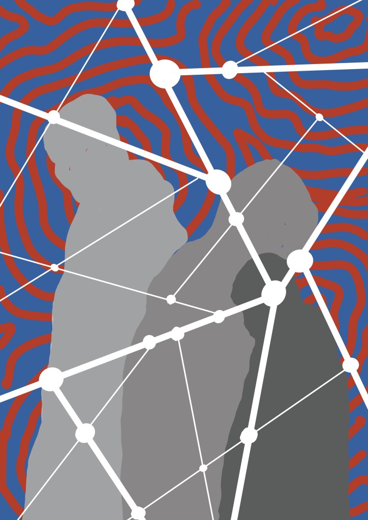
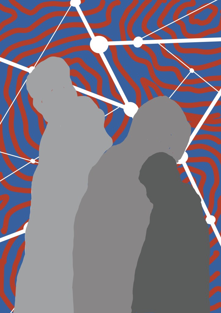
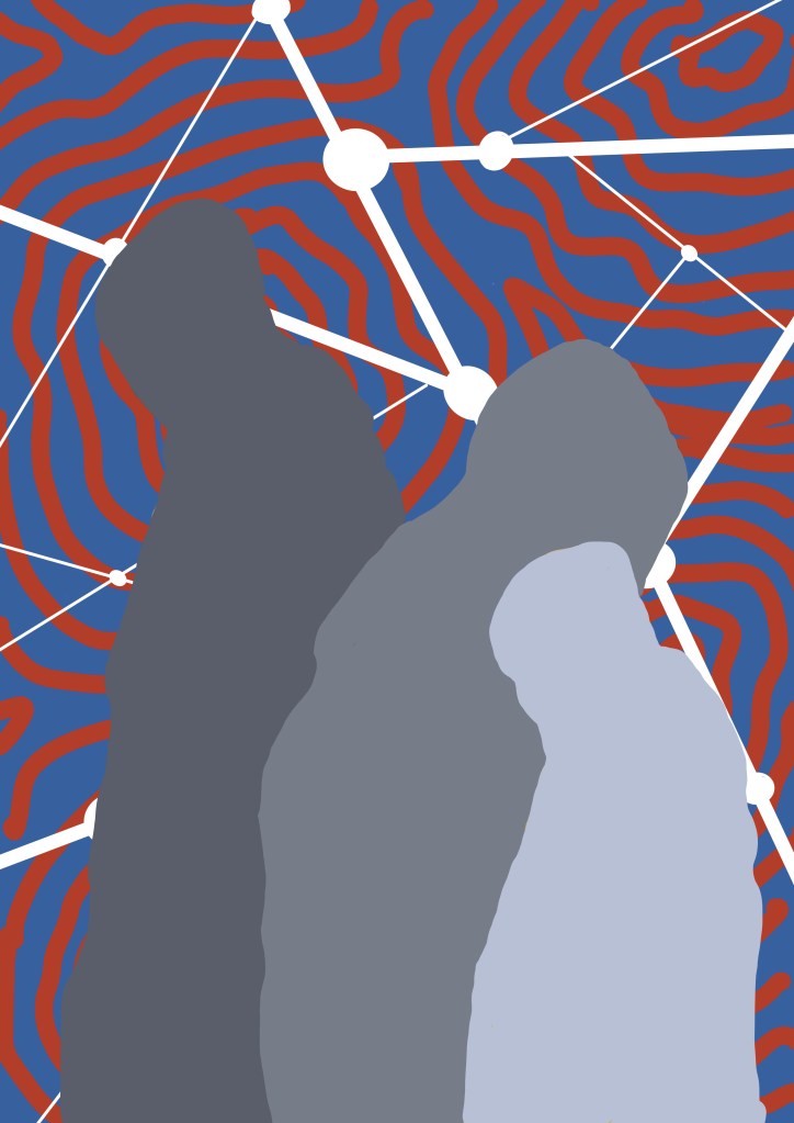
I then looked at the contouring and the automatic drawing that I have incorporated into some of my recent work. I used a group of three figures, composition yet to be decided, and red and blue as the colour choice for the time being. I created multiple layers in Procreate which then allowed me to play around with possible combinations.
I like the red and blue contoured background with the figures standing in front of the straight white lines (last two images), maybe using gold leaf or even metallic ink (which would be cheaper) to add some additional interest. I’ve also put the darker figure in the background so that it gives the feeling of being in the shadows, even though, technically, lighter figures are supposed to recede, which in this case they don’t seem to because of the background.
So I’m sorted, apart from the fact that it will need to be a reduction linocut, something which I haven’t done before, put off by the suspicion that my brain doesn’t work in a reductive way, but there’s nothing like a challenge. Maybe I need a Plan B, just in case.
In the words of Vinnie Jones: it’s been emotional.
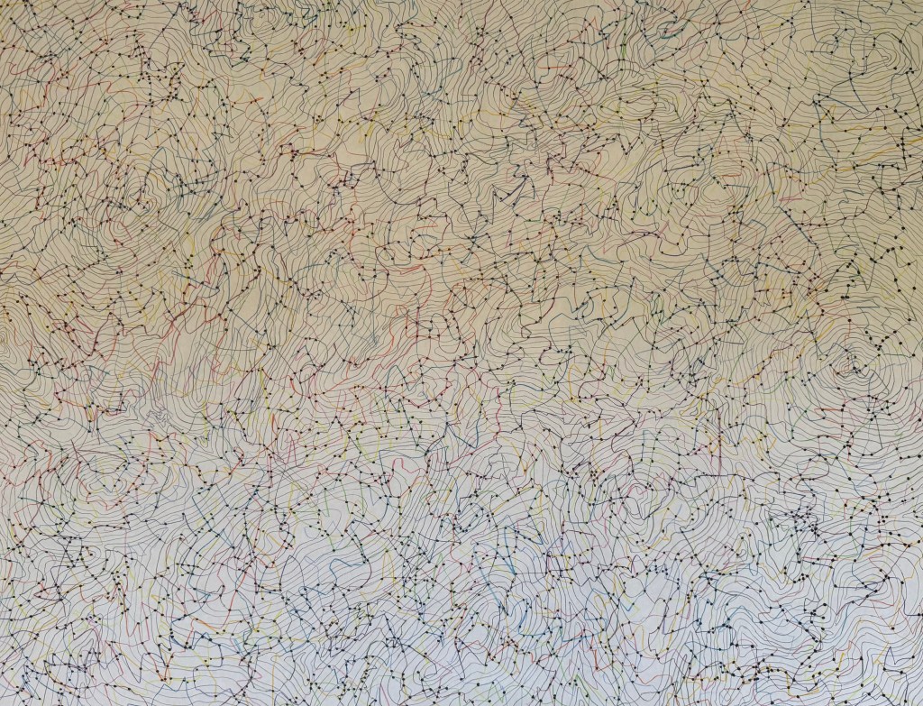
Over the last 54 days I have been mapping my emotions each day, using orange for positive, green for neutral and blue for negative. At the beginning, I was going to use different shades of each colour but I soon realised that this would over-complicate things. I also realised that I needed to put some rules into place: I started each line from the dated contour line, drew for two minutes, trying to explore as much of the sheet as possible to achieve an even distribution of mark-making, and finished the line off the page. I wanted to make it so that theoretically I can pick any day and trace the line which represents it. I drew each line at the end of the day, and took a photo. Unfortunately, sometimes it wasn’t light enough and so I had to take photos including a number of days’ worth of lines, so instead of having 54 photos, I’ve only got 46 which has resulted in a sudden surge in orange lines towards the end – maybe I was enjoying the positive. They are not the best photos – the lighting is all over the place. Next time I do something like this I will try and make them consistent, although I do quite like the movement it creates.
What have I learnt from this exercise? Had I not done it and you had asked me what the last 2 months have been like for me, I would have said that they have been difficult, and that for the most part I have felt negative emotions such as sadness, grief, stress, frustration and anxiety. However, looking at the end result I can see that this isn’t actually the case; I can see that there are more orange lines than green, which in turn outnumber the blue. This must mean that I feel negative emotions more strongly than positive ones, and this results in my perception of life being somewhat skewed. The map reflects this, in that, whilst they are few in number, the blue lines jump out at me from the rest. I think the technical term is the negativity bias. I don’t think that I would have had the same result had I represented my daily emotions diagrammatically in a chart – it matters that each day is individually represented. Maybe there is another way of doing it – I’m just not a mathematician!
I found the exercise to be a positive one; the act of drawing a line each day not only meant that I was making, but it also allowed me to reflect on the day as I drew – a form of visual journaling. I enjoyed the process of it and whilst it can be said that the resultant map is interesting, what it reveals also became apparent during the process itself; as the map was becoming each time I engaged with it, so I was becoming.
As ever, I’m not sure how I can develop this, if at all. Or maybe, there’s no need. Today was the last day. I think I will miss doing it, so I might just continue.
During my tutorial Jonathan mentioned carbon paper.
It brings back memories of a time when it was the only way to make copies, of secretaries putting a sheet between the top and bottom copies when they typed. Those were the days when the most technologically advanced piece of equipment in the office was a fax machine, which would regularly spew out reams of documents on thin, shiny paper, the print fading away to nothingness over time, thus requiring photocopies to be made, just like some present day shop receipts, so I’ve discovered.
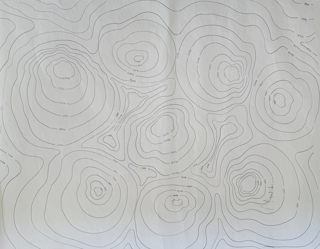
So what to do with it? Recently, I have been reading about map-making and the act of mapping, considering the difference between the two. Contemporary cartographic theorists consider the process of mapping to be of paramount of importance, the creation of the artifact of the map being just one step in the process. In particular, psychogeographic mapping seeks to represent how individuals feel about the place they are in, a process in which subjective experience is prioritised over factual accuracy. Artist, Christian Nold, who uses a bio-mapping device to record individuals’ changes in emotional state, creates emotional maps of places, and one I’m particularly interested in is Brentford Biopsy because I used to live next door in Chiswick before I moved out of London. The project was undertaken in 2008 before areas of Brentford were redeveloped, and it’s really interesting to see how people felt about the area: it reveals so much more information than you would get by simply looking at a map: a map details the historic buildings and the riverside, but not how people respond to them, their view as to how they should be dealt with in future development, and how it actually feels to be there.
So, I’ve decided to embark on some emotional mapping of my own, not in relation to a sense of place (that may come later when I revisit my grandmother’s village) but of my day to day life. The bonus is that it means that I have to make a line everyday which will hopefully lead me to doing other making. I have drawn the contour lines using carbon paper (I‘m currently thinking that they may be too dark and overpowering, but we’ll see how it goes; it’s an experiment after all) and each one relates to an individual day.
I’ve already started, and it should take me up to the 12th of August. I’ve had to invoke some rules. There are three colours which represent three emotional states which I assess at the end of the day; green represents a neutral emotional state, orange positive and blue negative. Obviously within the generalised emotional states is a whole range of different specific emotions, but I decided just to keep it simple. Each line starts from the contour of the day in question and ends by going off the sheet otherwise it may be associated with more than one day. I draw each line for no longer than two minutes. I had thought about allowing myself however long I felt I needed and varying the intensity of the line depending on how I felt, but decided that would over-complicate things. The map will give an indication of how often I was in each emotional state over a period of time. I’m now thinking that I should have had another map on the go at the same time; not just to depict frequency but also depth of emotion. Maybe next time, if this works out.
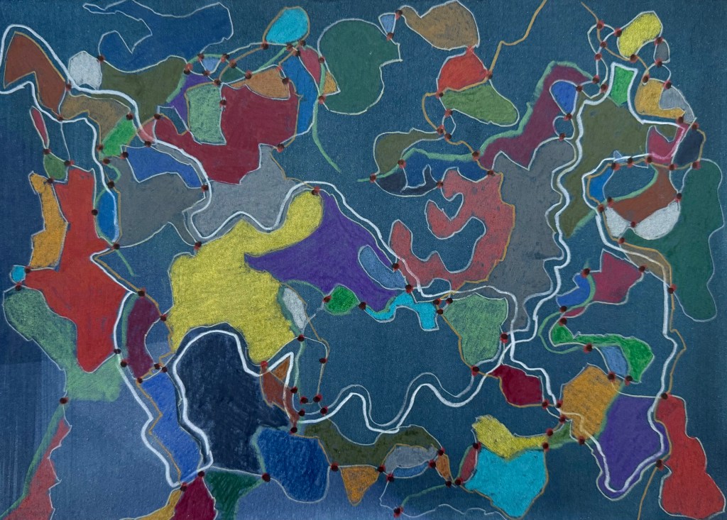
I also found some watercolour paper which I had used for an unsuccessful cyanotype and experimented with it. I like the intensity of the colour against the blue background, and the way the coloured in areas look like countries on a map of the world.
The groupings of colours also remind me in a way of the Art Emotions Map which has been produced by Google Arts & Culture and the University of California, Berkeley, which I’ve spent a bit of time exploring and which reminds me of one of our Miro boards. My husband suggested that I could do something similar relating to life experiences, with getting married to him falling within ‘Wonder & Awe’. Oh, he does have a sense of humour!
It was a long day at the hospital yesterday and once everything was sorted and my daughter was settled in bed, I needed to do something to switch off.
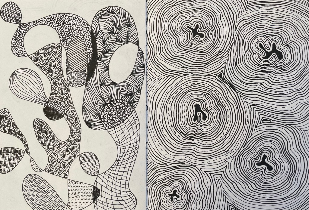
Some wandering lines in different colours on flip chart paper – I quite like the flimsy quality to it. Then dotting the connections, many of which I’ve missed I’m sure but my eyes were getting tired. It was brainless activity, but incredibly soothing. That done, I decided to incorporate some of the contour-like lines I have previously used in my doodles.
Add in some grid lines and the result is something akin to a map. But what to do next? How can I incorporate this into something else or develop it further? I decided to leave it for now, whilst I still like it, before I do something I’ll undoubtedly regret but which is all part of the experimental process.
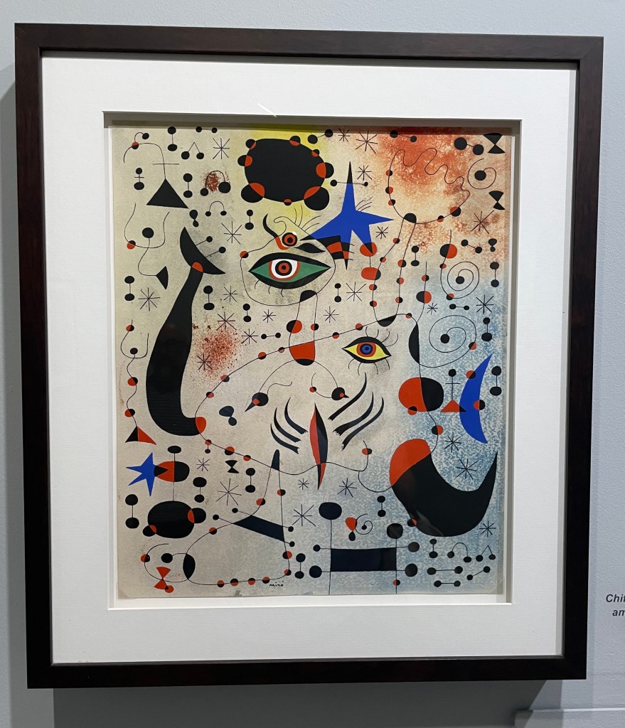
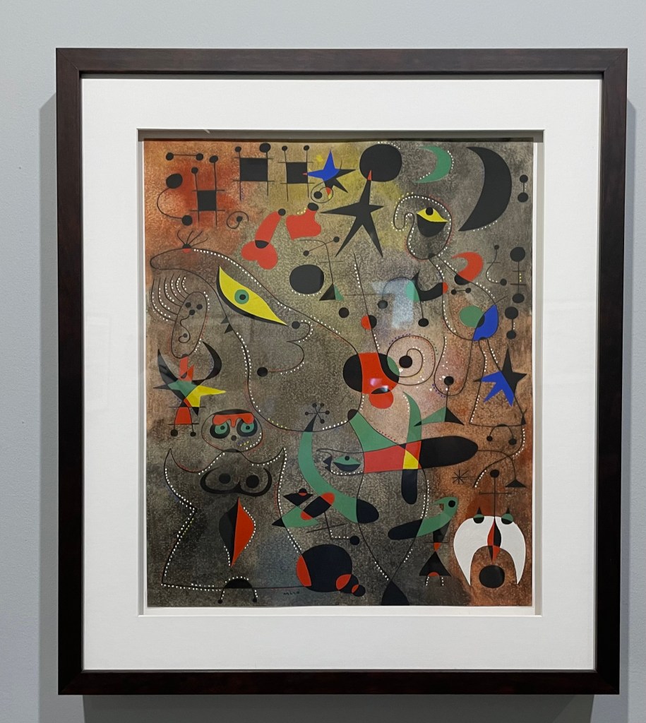
I’ve reflected on it further today – I had a look at some ordnance survey maps (incidentally OS is half an hour down the road from me in Southampton) to think about symbols. I remembered last year in Mallorca and the Miró/ Picasso exhibition at Sóller train station. There was a key showing the symbols Miró used and their meanings.
I didn’t think that I liked Miró, but then I hadn’t seen any of his work in the flesh. They were extraordinary and thinking about it now full of map like qualities; symbols in a spatial relationship, a visual expression of his inner world. Which now makes sense, considering these ones are part of his ‘Constellation’ series!
There’s something very satisfying about drawing a line.
Paul Klee loved a line. Taking a line for a walk.
Bewölkung (Clouds), Paul Klee, 1926
I stand in front of this Paul Klee every time I go to the Pallant House Gallery in Chichester. Ink lines drawn over watercolour evoke feelings and moods, suggesting, not defining.
I listened to a film whilst I did this. I like the suggestion of form created by the pattern of the lines. It’s made me think about something underneath trying to get out. The real me? I find these sculptures to be disturbing but compelling at the same time.
Maybe the lines are the contours of my life on a map. My own satnav so I know where I’ve been and where I’m going. Lots to think about.


