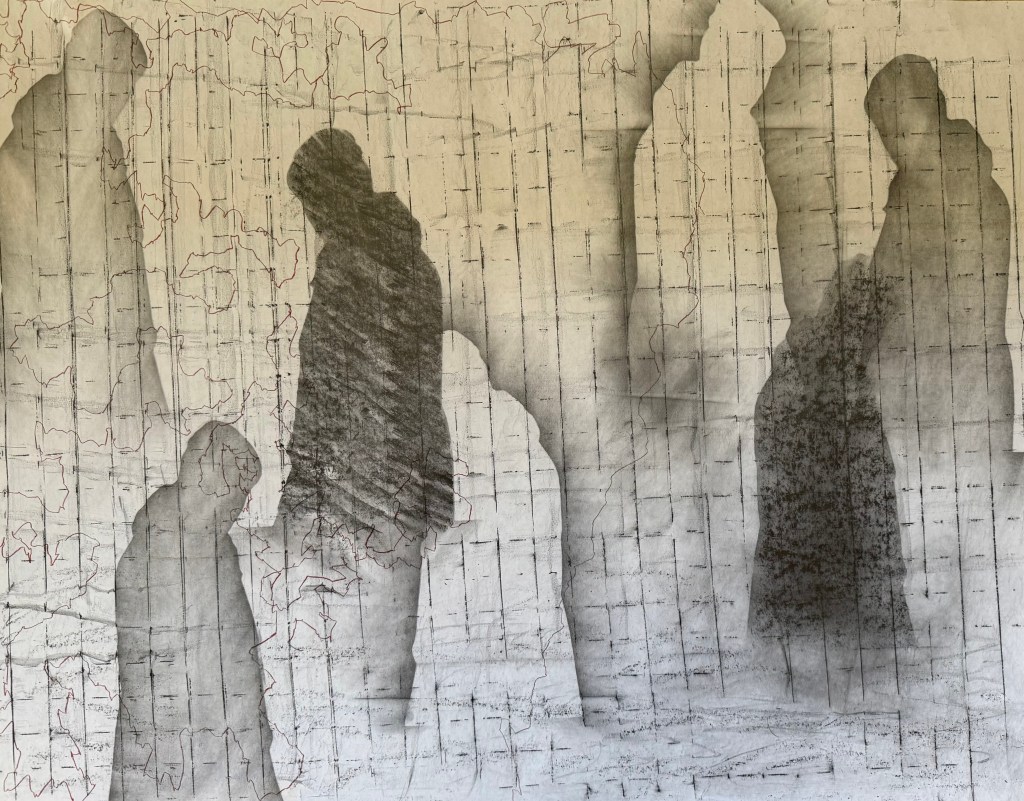
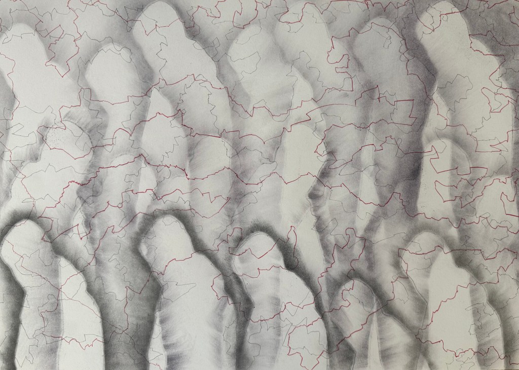
Following on from Solitude, I decided to try and develop it further.
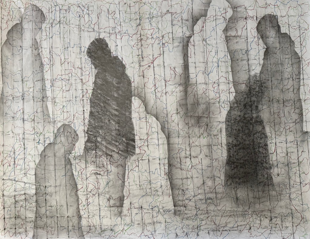
I used flipchart paper again, as it was easier to manhandle it over the obstinately curved wire fencing which I used for the grid effect. A downside was that the grid is a bit off kilter, but nonetheless I like the grid and the lines of coloured automatic drawing – it reminds me of map grid lines, a road map. I explored trying to have some figures behind and some in front of the grid. Not sure I succeeded and I am in two minds about the light figures.
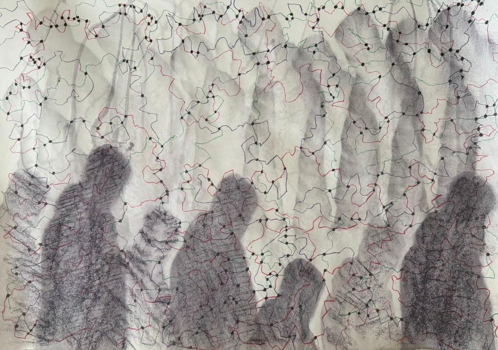
I decided to have a go with soluble graphite sticks using heavyweight cartridge paper.
I wanted to get away from the soft diffused figures and experimented with hatching and rubbing on a textured surface. I sprayed with water and held upside down to create some streaks and drips. Not one for less is more, I drew some green and red lines and then thought it would be interesting to see what kind of a random pattern would be created by drawing dots at the intersections of the lines.
I still didn’t like the dark figures at the bottom and so to try and break them up a bit, I coloured in some random shapes like I’ve done previously using different marks in my monochrome doodles.
I really don’t like it, and I’m struggling to find anything positive to say about it other than I like the idea of the lines and the dots at intersections emphasising the concept of connectedness and the idea of multiple figures in the background; the idea of all those who have come before, and of inheritance (Bus Replacement Service)
This time I left out the water, but I still used the water soluble graphite stick which had a purple tint to it which isn’t apparent in the photos. I don’t think it is as easily blended as normal graphite.
I much prefer this one out of the two. I’m starting to wonder what it would be like on a painted ground or even using thin layers of oil paint gradually building them up. Or am I done for now?
I realise a few things may be influencing my feelings about it. I keep getting reminder emails that the submission deadline is approaching – like I don’t know. Also, my daughter phoned me up yesterday morning in a crisis during an online exam – she was having IT issues. She had already contacted the helpdesk and taken screenshots, so my only advice was that she could only do what she could and not to stress, they must have procedures for this sort of thing. A couple of hours later she was feeling better, whilst I was still feeling the effects of all her stress, and trying to work out how on earth I was going to take a photo of a reflective surface. That, and the fact that some of the glue had managed to escape from under the cut-outs, and the realisation that I had fixed the die on the wrong way round.
Anyway, this morning it wasn’t raining for a change, so I took it outside. I’m not entirely sure how I’m supposed to convey its reflective qualities without including a reflection which then looks like it’s part of the work. Well, following my own advice, I can only do what I can do.
I feel like it’s been a shambles and that I’ve been amateurishly stumbling from one thing to another. The process hasn’t been the experience I thought that it would be. Because I had no expectations, I thought that there would be no stress – instead I’ve experienced confusion and frustration, and it has taken just as much out of me as other years, just in a different way. The only difference is, if it doesn’t get anywhere, I really don’t think I care at this point.
But every experience is a useful one. So what have I learnt?
Mirrored acrylic has an amazing quality of turning into a super static magnetic for all manner of minute particles floating around in the air and so is impossible to get clean.
Whilst deadlines can assist in making decision making and getting on with it, a lack of time reduces options, options which may have been the better course to follow. I should have had the image screen printed – it would have avoided so many issues – but I just didn’t leave myself enough time.
I’m not neat, and I don’t do small and fiddly.
I’ve tried something different – maybe next time I’ll enjoy it.
I can submit work which I don’t like and which contains what I know to be obvious errors.
I’m going to do mirrors again, sometime – they will not defeat me.
The process of exploration and experimentation is not just about serendipity and happy accidents or things that just don’t work, it can provoke feelings of confusion, frustration and it’s just not that easy.
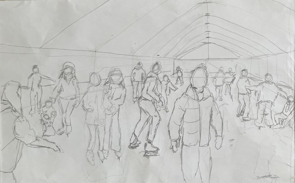
I’ve started back at my weekly art class after the Christmas break, and over the last two sessions we have been looking at figures, in particular, figures in an environment. I’m not very good at depicting humans (or any animate subject for that matter), so this was a bit of a challenge.
We had to work from images which we had sourced: I took my nieces ice-skating at Christmas, which was really entertaining to watch. There were the confident, well-practised skaters who came equipped with their own boots; the ‘I’m-competent-but every-now-and-then-lose-my-balance-and-windmill-my-arms-brigade; and then the rest – hopelessly clutching the side, or each other, for dear life, inching their way round. There was a whole range of shapes, gestures and weights, in the sense of where in the body the weight is being distributed, and there was a lot of tension.
We started by sketching out the composition.
I used a combination of photos and video stills from my phone – I could have been more organised because I lost track of which figure was on which photo, which wasted quite a bit of time. Next time I work from numerous image sources I will organise them so that they are more accessible and easier to switch between.
I then applied a ground to the support (I used oil paper as opposed to a canvas, as I wasn’t sure how it was going to go). As it was a painting of ice-skaters, I chose burnt umber thinned down with Sansador as my ground, as it’s the blue equivalent of the earth colours. I then drew in the figures using a rigger brush and thinned paint – I found the techniques covered by Chris Koning’s workshop of gestural drawing (‘Perception of the Whole’) to be really helpful in trying to get some dynamism in the portrayal of the figures. I also changed the composition from the pencil sketch to bring forward the pair of skaters on the left and to give the skater next to the pair some extra space into which he could move. I also packed some more figures in, including my favourites, the couple in the centre – the man skating alongside and watching his partner who is leaning forward – and the girl behind them.
The next step was to block in the background. I decided that I didn’t want to put the figures in the specific setting of an ice rink, so I left out the details of the roof and sides which were included in the original sketch. This gives a feeling of more space.
I used a thinned down mixture of titanium white, ultramarine blue and burnt umber to create a grey/blue and then scratched into it with the end of the paintbrush to create skate marks.
I then started blocking in some colour using thinned paint. I liked the fact that the burnt umber drawing was still visible and decided to try and retain as much of it as possible. This meant that I would not be able to use much thick paint in subsequent layers, and so the painting will retain a sketch-like quality. The purpose of the exercise was to capture the essence of the figures, so there will be very little detail in the figures and their faces, other than those in the foreground, and even then I will keep these limited.
I regretted having the large figure in the foreground, but he felt necessary to add variation to the height of the figures, and his static quality should hopefully contrast with the sense of movement in some of the other figures.
I carried on adding some more colour and changed the colour of the skater’s hoodie to differentiate him from the figure in the foreground.
I really enjoyed the process of being looser: the multiple visible alterations and the pared back application of paint. I’m not sure that I like the finished piece, probably because of its subject matter – it’s all a bit twee. But that’s my own fault – I hadn’t adequately prepared for the class and so made a rushed decision. Next time we have to work from a preselected source, I will make sure that I prepare properly, so that the subject matter appeals to me as much as possible.
There are areas which really appeal to me; I like the way I have treated the ice and I think that I have managed to capture the sense of movement, the hesitancy and tension in the figures, and the atmosphere. I don’t like the way I’ve painted the faces in the foreground. Whilst the exercise was all about the figures, I don’t think I’ve managed to find a method to render faces in a non-detailed way which does not look childish. I need to work on this.
I was thinking about this painting whilst I was out on a dog walk yesterday. I enjoyed making it, but I’m not that enamoured with the overall result, which made me ask myself whether I need to like the work I make or whether enjoying the process is enough. Also, I like and am attracted to a wide variety of artists working in very different ways. I suspect that I have previously thought that I need to make myself like them and make the sort of work they make because it is something that I like and am drawn to. I’m starting to realise that this isn’t necessarily the case – I just need to be ‘me’.
Generally, the work which I produce at my art class is not something that I would ordinarily choose to do, (which is a good thing) and won’t necessarily be relevant to my field of study in terms of subject matter, but it will provide a useful source of exploration in terms of technique and approach in my art practice. As such it is a valuable resource and a good use of time as well as a commitment which ensures that I create work on a regular basis.
Dora The Explorer was one of my daughter’s favourite TV programmes when she was a toddler. I don’t know how they did it, but Nickelodeon managed to give Dora the most irritatingly grating voice possible. Anyway, thankfully, this is not the Dora the Explorer who is the subject of this post.
I went to the Pallant House Gallery in Chichester yesterday morning to have a look at the DoraCarrington: Beyond Bloomsbury exhibition. I had heard of her, and had a vague recollection of having seen some of her work.
Dora Carrington certainly was an explorer of sorts: associated with, but not a fully paid up member of, the Bloomsbury Group, she explored her art as well as her relationships and sexuality. To be honest, I couldn’t quite keep up with the complexity of it all. At the heart of it was her enduring love for the gay writer, Lytton Strachey, who was 13 years older than her and with whom she set up home. At one point they lived with Ralph Partridge who Carrington (whilst studying at the Slade, she dropped the name ‘Dora’ preferring to be known by her surname) married in order to keep their ‘triangular trinity of happiness’: Partridge was enamoured with Carrington, Strachey fancied Partridge, and they all had relationships with each other (apart from Carrington and Strachey whose relationship was only ever platonic) as well as others of the same or opposite sex. It seems all and sundry found themselves hopelessly in love with Carrington, not least the artist, Mark Gertler, with whom she had a moment, but otherwise whose long-lasting passion was unrequited.
Alas, it all ended tragically in 1932 with Carrington shooting herself in the chest shortly after Strachey died. She was 38 years old.
The last exhibition of her work was 30 years ago at the Barbican. During her life she rarely exhibited, and her work, many pieces of which she destroyed, seems to have been overshadowed by her adventurous private life and tragic death. She has been described by a former director of the Tate as being’ the mostneglected serious painter of her time’.
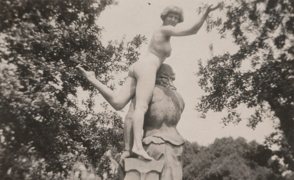
It was a mixed bag, but there were a few pieces which caught my interest. Her early drawings and paintings of nudes were very good, but I found myself lingering in front of these.
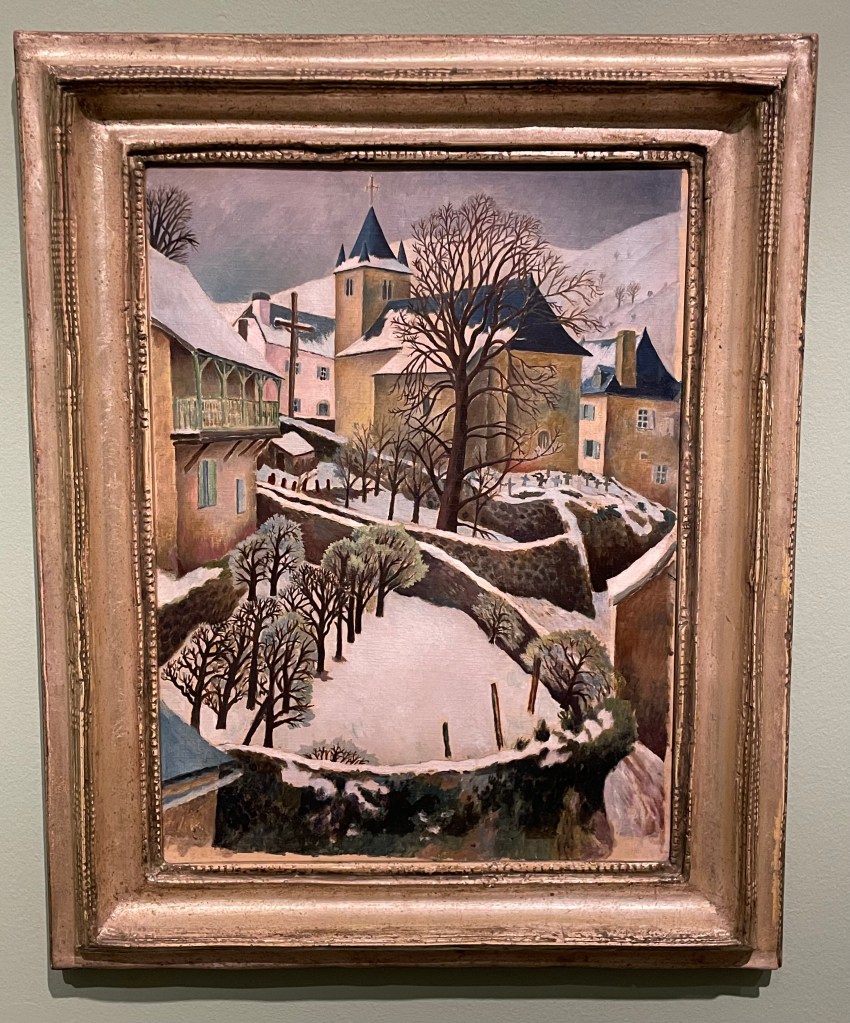
Larrau in the Snow, 1922
Perfect Christmas card material, I really like the simplicity of this painting; its muted colours and, in particular, the composition with its recurring curved shapes of the stone walls and the use of verticals in the posts and trees in the foreground, the large tree and the church with its spire punctuating the sky in the middle ground and the mountains in the background. The positioning of the trees leads the eye up through the painting in a zig zag pattern.
Farm at Watendlath, 1921
Again, I like the composition: the path leads across from left to right, up through the farmhouse along the rear stone wall to the large ominous trees, up to the huge hills in the background which seem to squeeze out the sky. The three areas of white – the figures in the foreground, the farmhouse (and what look like sheets on a washing line) in the middle ground and the clouds in the sky in the background – break up the large areas of green preventing them from becoming too overpowering, but leaving enough areas unbroken to give a sense of being overpowered: the tall trees and hills seem to be bearing down on the woman and child, creating a feeling of foreboding, and the stillness (if they are sheets on a line, they’re not moving at all) and claustrophobia created by the tiny sliver of sky adds to the mood.
It was suggested by the blurb accompanying this piece, that its unsettling atmosphere might have reflected the turmoil which Carrington was experiencing at the time: she had gone to Cumbria on holiday with Partridge and his friend, Gerald Brenan, and they had stayed at the farm. Whilst there, she began a relationship with Brenan.
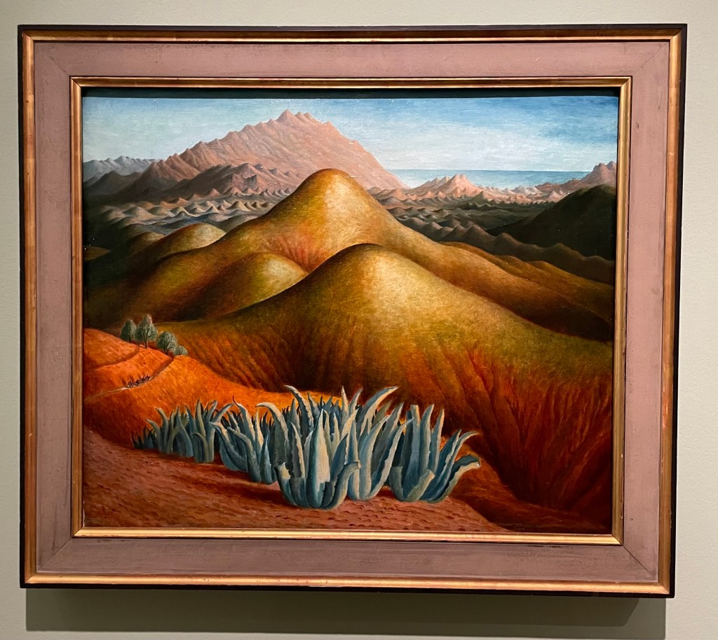
Spanish Landscape with Mountains, 1924
I was drawn to the surreal nature of this painting. Carrington made it from memory, after visiting Brenan in Andalusia, where he lived. According to the blurb, she built up the colour by layers upon layers of glazing on top of what was already a vibrant underpainting. She painted it on a cold day in March, which may have been a contributing factor to her use of colour and the sense of heat and aridity which she manages to create. There are menacing looking succulents in the foreground and a few token olive trees just behind, and these, together with the slight greenish tone to the area in from of the background mountain range, cleverly break up the large areas of warm reds and yellows which form the undulating hills in the middle ground. There is the lovely detail of the figures on horseback moving towards the viewer along the ridge on the left hand side. It has an otherworldly quality to it: apparently Carrington felt transported to another world when she visited Spain.
Lytton Strachey, 1916
“He was everything to me. He never expected me to be anything different to what I was.” This was how Carrington described Strachey, and it is apparent in this portrait of him which she painted towards the beginning of their relationship which was to last 16 years, and which survived numerous relationships on both sides. It shows Strachey deep in concentration reading a book which he is holding in his delicately painted hands, which Carrington has strangely elongated. Maybe his hands were her favourite feature, because she captures them in a detailed way, down to the highlights on his nails, even their white tips, particularly on his little finger. Or maybe she used them as a compositional device to create a dynamic and bold vertical marking the final vertical third of the painting. The image wouldn’t have the same impact if his hands were sized more realistically, and the book he is holding didn’t go off the top of the panel.
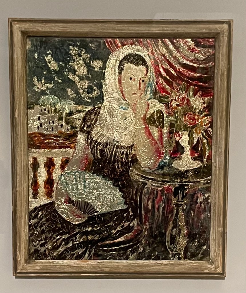
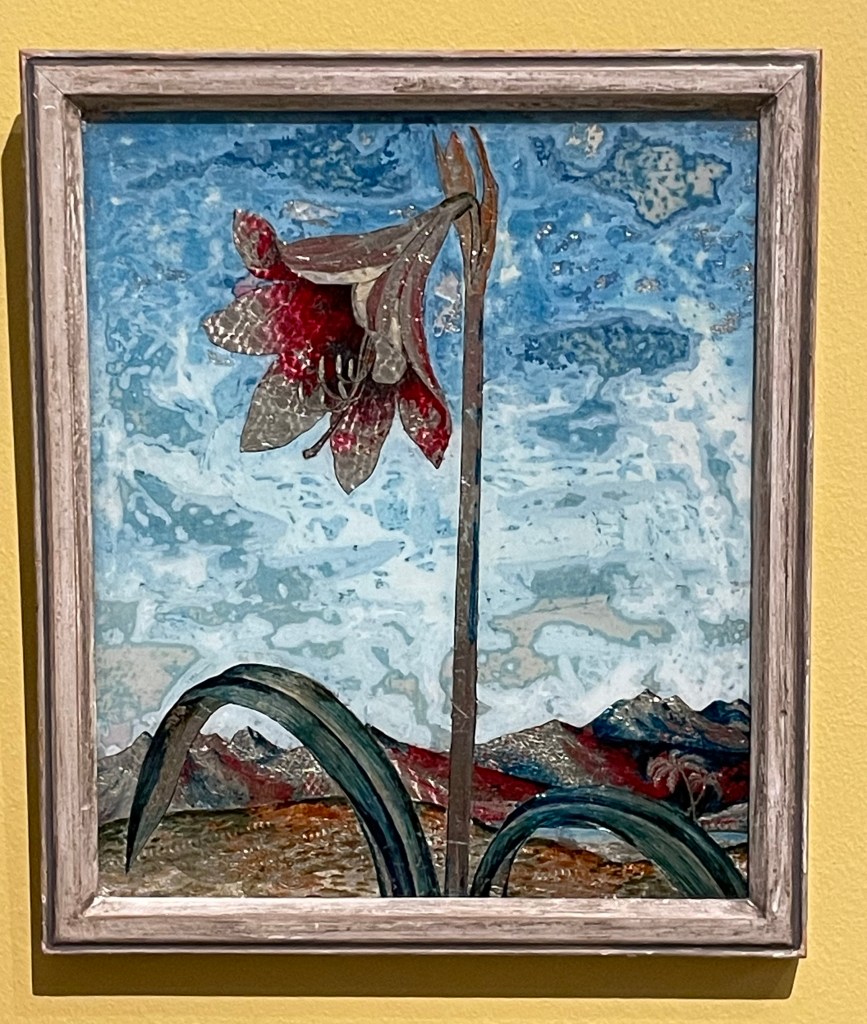
Carrington had a fascination for Victorian ‘treacle’ paintings and from 1923 began making her own which were called tinsel paintings. They weren’t very large and involved making a painting on the reverse of a piece of glass using foil from sweet wrappers and cigarette packets together with inks and oil paint. She sold them through Fortnum & Mason as a way to earn an income in the winter months to finance her serious art making. She also made them for friends: the ones below were made for Augustus John’s wife, Dorelia. Very few of the tinsel paintings survived, and one of them sold 4 years ago for £57,000.
Spanish Woman
Lily
I’m strangely drawn to them as I’ve never seen anything like them before. They have a strange luminescent quality to them and I particularly like the textures in the sky in Lily – the combination of the resplendent lily in a barren landscape reminds me of Georgia O’Keefe.
Anyway, I’ve done some further research: Dora Carrington’s life was made the subject of a film in 1995 – ‘Carrington’ – starring Emma Thompson and some other notable actors. I watched it last night. Perhaps not surprisingly, it’s a film about her, based on a book about him. I’m not sure that it managed to truly capture the complexities of her life and certainly only touched on her relationships with men, and not women. It was a tearjerker.
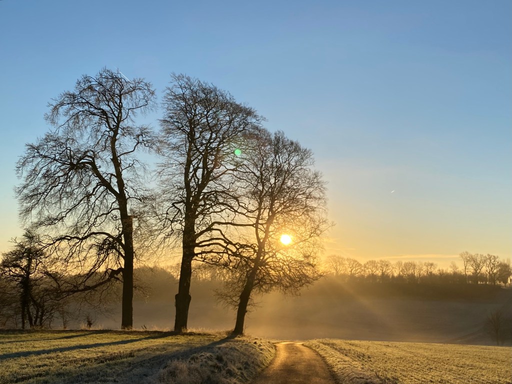
Whilst I was starting to write this post yesterday evening, I looked up and saw the most amazing sky through the kitchen window and had to go outside and take a photo of it. As usual, the image doesn’t really do it justice.
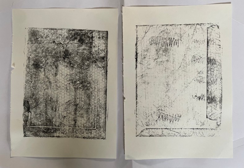
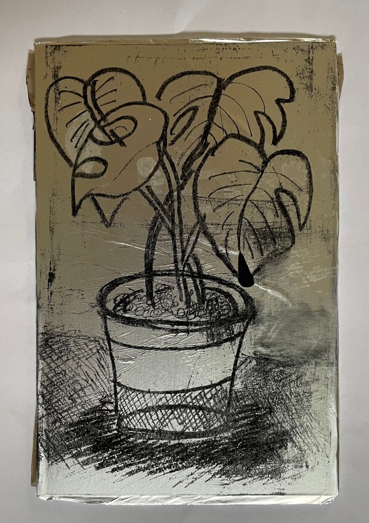
I had some free time yesterday, so I decided to try out kitchen lithography using some aluminium foil and cola.
This is the first time I’ve tried it – I’ve been interested in doing it since I came across a Canadian artist who uses it in her work, in addition to other printing processes, Valerie Syposz. Her work primarily deals with self-perception and existence.
’Treasure’ 2021’Shelter’ 2022‘Embers’ 2023
I like the surreal quality of her work, and her subject matter is relevant to what I’m exploring.
I have to be honest and say that it didn’t really go to plan. First of all, I discovered that the foil I have in my kitchen drawer has a honeycomb pattern embossed on it, and then I forgot to use the dull rather than the shiny side of the foil. I made various marks using different pencils, pens, markers, graphite sticks and pastels, but I was doomed to failure. Not wanting to go out into the cold to my shed to find some plexiglass sheets to wrap the foil around, I had used an Amazon envelope which I found in the recycling bin, which turns out had some raised edges on it. But, hey, it’s just an experiment. I also didn’t apply enough water to the plate which meant that the ink adhered to areas it shouldn’t have.
Once I had realised my mistakes I gave it another go. I used a small plexiglass sheet this time, and found some other foil which had a smooth surface. I made a quick, not so good, drawing of the plant in front of me. I used a combination of a chinagraph pencil, basic oil pastel, and a 6B graphite pencil. I did try using a biro, but it ripped a hole in the foil – this was probably because the foil wasn’t very strong. I then poured cola over the top of the plate, rinsed it off, and then rubbed the image away using vegetable oil. Once the plate was dampened with water, I rolled on the ink, re-applying water using a sponge between each ink application. The idea is that the cola contains gum arabic and phosphoric acid which makes the foil which hasn’t been drawn on, hygroscopic. I then used a bamboo baren to transfer the image to a sheet of Hosho paper.
They’re not great, but I’m just happy that I managed to get a defined image at all, bearing in mind my first attempt was such a complete Horlicks.
It felt good trying something new, and what made it particularly enjoyable was the fact that it could be done at home with easily accessible tools and supplies. I will definitely explore it further perhaps after doing some further research so that I can appreciate its full potential. There is a lot of scope for experimentation with different printmakers having different opinions as to the best methodology to adopt: some lightly sand the foil before drawing on it, others use cornflour and maple syrup on the plate; some don’t use a support and just use the foil as a sheet. Maybe the brand of cola has a bearing on whether the process is successful: perhaps I’ll need to have a Pepsi challenge.
As ever, I’m conscious that time is ticking by. Whilst the study statement will be useful to focus what’s buzzing around in my head, moving forward I need to develop a more concentrated and sustainable way of working in order to ensure that I get the most out of the next 5 terms.
Up until now I’ve been all over the place, immersing myself in art, books, programmes, aimlessly ‘doodling’, without any direction, just exposing myself to everything I can and seeing what might stick. Jumping from one thing to another. This process has given me lots of ideas. It’s not too difficult to have ideas – the difficulty is having good ideas and then developing them into a piece of work. I’m feeling that at the moment I’m talking the talk, but not walking the walk.
I lack self-discipline; I get easily distracted; I get bored; I often don’t finish things; sometimes I wake up and know that the day is not going to work for me, and it’s a case of just getting through it; tomorrow’s always another day; I have no routine. I need to establish a routine, if I can, one that allows me to fulfil my everyday responsibilities but which dedicates time to developing creativity. I have no idea how much time I have spent so far on this course. So, moving forward I’m going to record how long I spend doing what. Just roughly, not down to the minute. I’ve had to do this previously – it’s soul destroying having to account for your existence – but the reason for doing it now is to give me a better understanding of how I work, what works for me, whether I’m doing enough and how I need to plan for the future.
Thirty hours a week is a long time, I’ve realised. So, that’s blog 20 mins…
I’ve decided to take a leaf out of Sophie’s book and formalise the thoughts I’ve had since we finished our first term.
I don’t think that I have felt more like myself (whoever that might be) than I have over the course of the last 3 months. I can’t pinpoint why exactly; I’ve just felt like ‘me’.
It has been overwhelming (I suspect that I use this word an awful lot) in the sense that I have been totally free to create and, more importantly, to think about creating. I feel as if I am at the start of an important journey – I don’t want to rush into it; I want to take my time and be prepared. I don’t even know where I’m going – there are no limitations – but I know that I will discover something by the end of it.
I think that I have mostly engaged in the preparation side of things rather than the physical manifestation of work, but that’s been the best bit. I’ve been collecting ideas, inspiration, and information. I think about it most of the time. I’ll have a thought and think, yes, I could use that, and then it’s gone. I need to find a workable way of recording my thoughts – I can’t really open a notebook or Notes on my phone whilst driving – maybe I’ll have to call someone (hands free, of course) and get them to record it for me. Funnily enough, I used to do that: if, whilst at home, I thought of something I needed to do at work the next day, I would call my work phone and leave a voicemail. Just writing that has made me think about what voicemails I might leave younger versions of myself at various points in my life. And that is how it’s been, going off on tangents, suddenly striking up a conversation with whoever I’m with, on the thought I’ve just had.
It has also made me feel anxious – I don’t want to miss anything. I have amassed a large pile of books which I ‘need’ to read. I haven’t really tackled the online library resources with any conviction just yet – the thought of it makes my heart race – all that information out there – how can I take it all in?
The preparation of my study statement has come at just the right time. I need to marshall my thoughts and commit them to words, but in the knowledge that it is a living document which can change over time. I’m actually really looking forward to it as it will bring a sense of calm and order. I hope. Who knows, I might be feeling differently come the beginning of February.
Thinking back on the work I have done over the last few months, I think I have become much freer – I’ve been leaving things as being what I would term as ‘unfinished’ and managing not to go back to them. Making them public by putting them on this blog has helped tremendously. I’m now enjoying the process of making much more than I have previously – it was often an ordeal.
I think I have identified areas which I would like to explore in more depth: I have invested in a book on Procreate (it’s not going to beat me) which I’m working my way through, and I have some ideas in my head as to a series of three digital collages on the subject of motherhood which I may or may not develop further. I like the number three: I am one of three; there are three in my immediate family; there are three trees which together form one tree on my favourite walk near my home; and three is the smallest number by which you can seek the input of others and still avoid a deadlock. Having said that, it’s probably not so great for a friendship group.
I would also like to experiment with printing techniques, photography and a previous obsession, cyanotypes. This term I’m determined to book some sessions and get into CSM on a regular basis.
I’m now able to look back at the three monotypes that I made of my mother. I feel that it was the right thing to do. It was something that I always knew I would have to address and it was something that I had to tackle early doors. I think it has helped. I went back to my mother’s house not so long ago and I didn’t feel the usual sinking feeling of dread as I walked through the front door. I was actually able to sit down by myself in silence and remember some of the good times when we all lived there as a family, even when it became dark outside. A small positive step in the right direction.
As finished pieces of work, they are what they are, vehicles by which I transferred debilitating thoughts into another space. Could I have done them differently or executed them better? Yes, obviously, but I don’t look at them that way; it is what they signify and make me feel that matters: despair, confusion, sadness, resentment, helplessness, isolation and fear. I chose monotype because it is, as soon as it is, and there is no way back. It was all about the process, not the result. If I had to make a change I would change their order – I made them in the order of the conversations – they would work better as a series if their order was reversed, with each one making more sense of the one before.
I took my daughter back to uni at the weekend, and she phoned me up earlier, chasing me for some information I was supposed to give her. My husband chipped in that it wasn’t any wonder that I hadn’t got round to it as I seem to spend all my time blogging – well, if I don’t have anything else to show for the next year and a half, at least I’ll have this blog!