Water

For the last couple of weeks we’ve been continuing to explore Turner in my painting class. The subject is water and stormy weather. As before, we’ve been applying thin layers of paint and sansador with a rag, and then applying several layers of glazing.

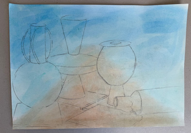
We started with a couple of small studies.

I used a limited palette of mineral colours – ultramarine blue, cadmium yellow light, burnt umber, alizarin crimson and titanium white. I’m not keen on it, it jars with me, in fact, I really don’t like it, but it meets the brief.

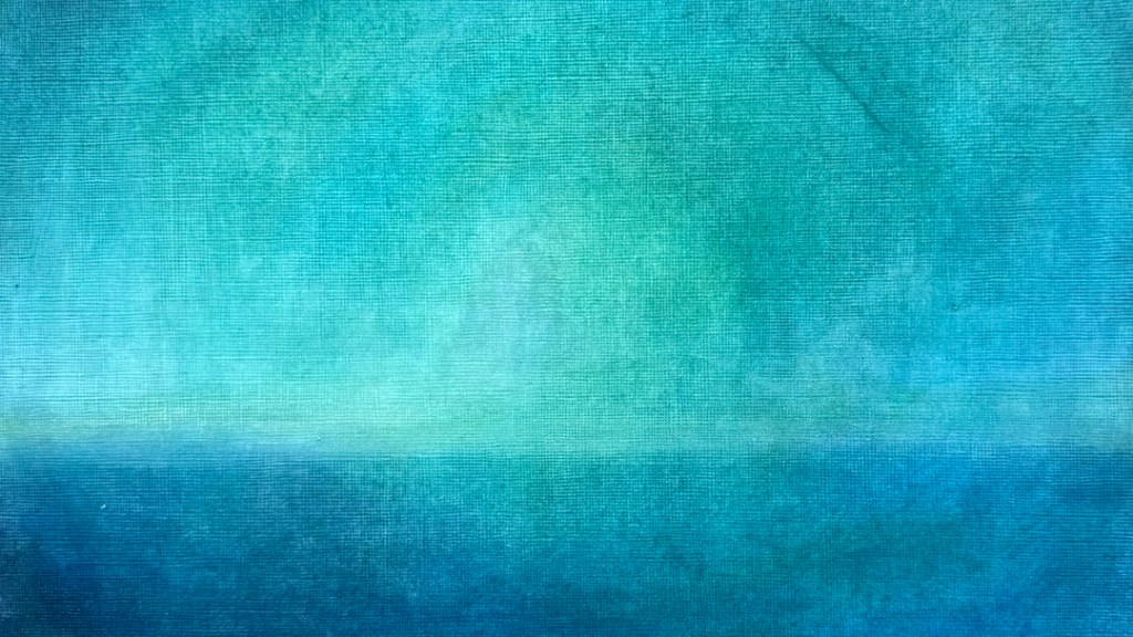
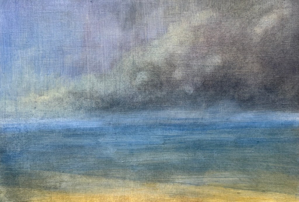
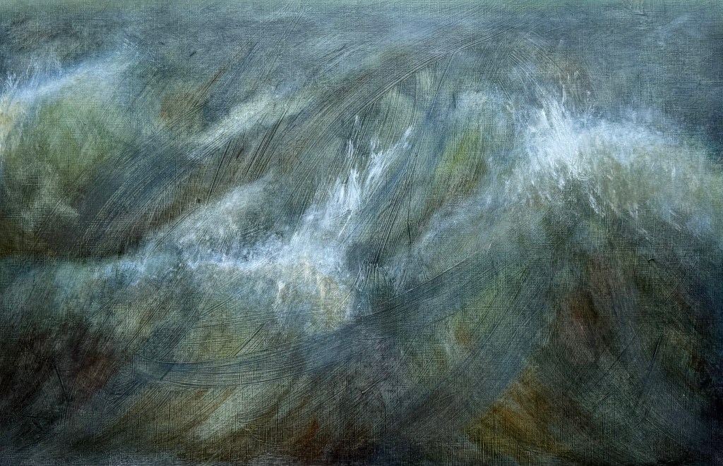
I much prefer this one – to me, it’s less figurative, although as soon as you put in a horizontal it automatically reads as a seascape. A post-Turner palette of cerulean blue, Prussian blue, phthalocyanine turquoise, cadmium free yellow, winsor violet and titanium white.

Then starting with an acrylic ground of a yellow grey, applied thickly and roughly so that definite brushstrokes are visible, I used the same limited palette of mineral pigments as in the first study.

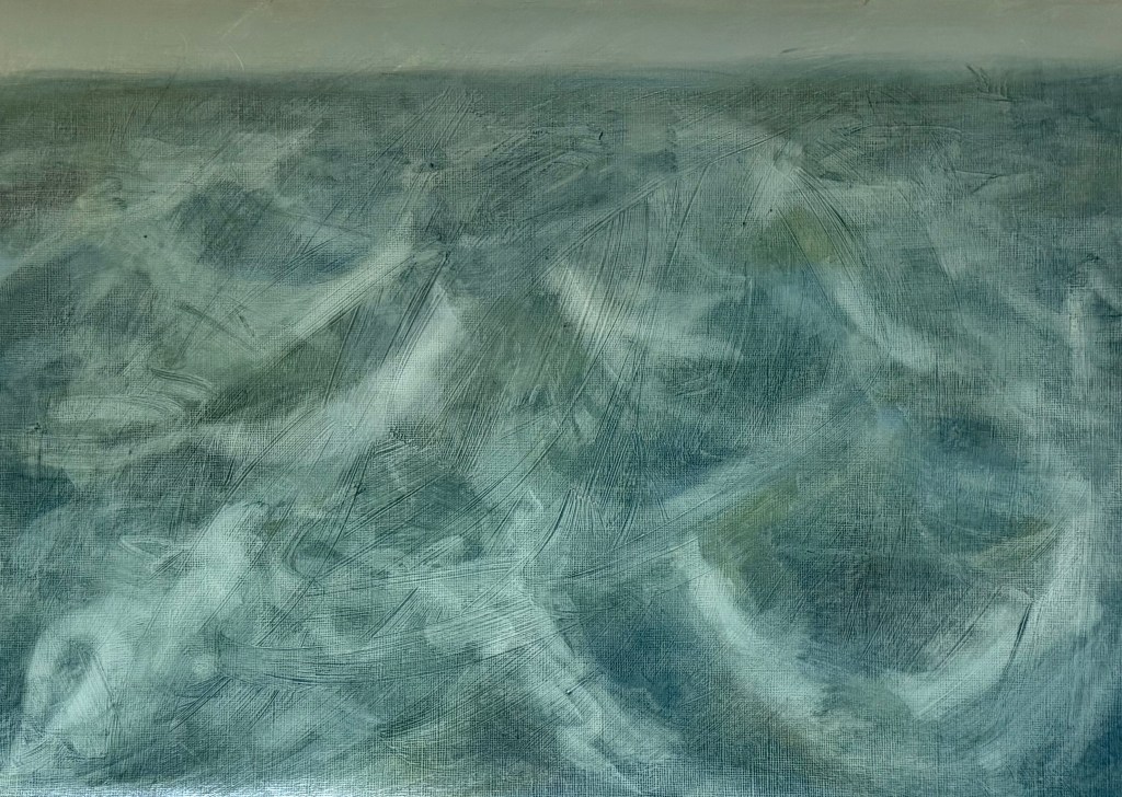
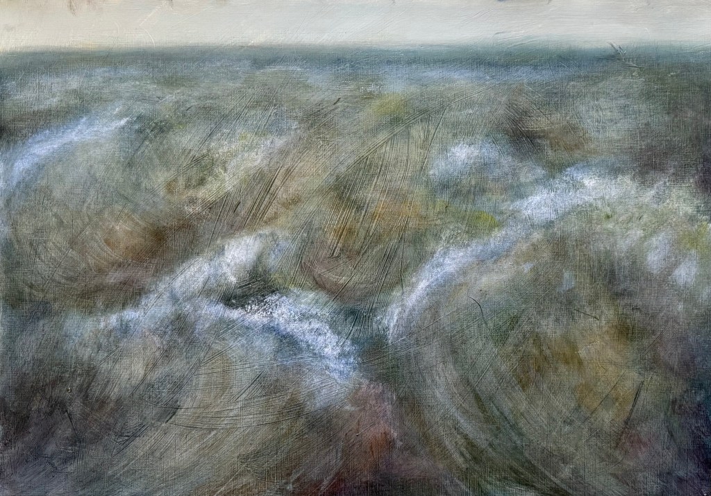
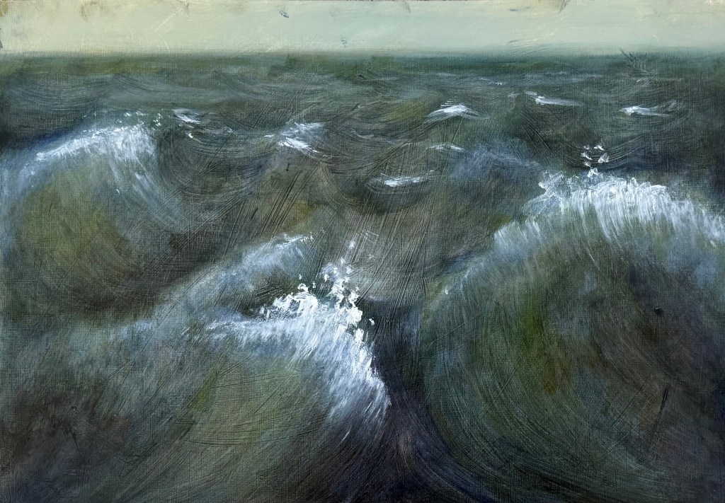
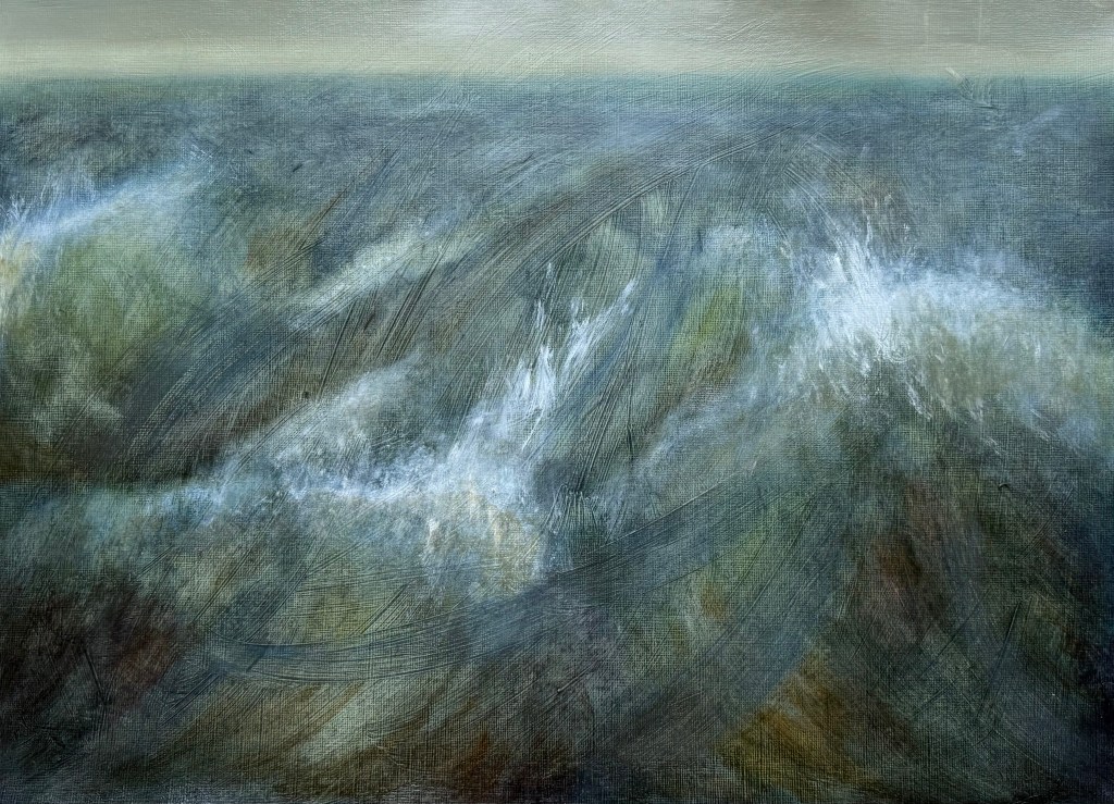
It all started to become a bit twee, for want of a better word, so I blurred the horizon, and tried to break it all up, knocked it back and accentuated the sweeping brushstrokes in the ground using an ultramarine glaze. I feel better about it, but in retrospect maybe I should have done away with the horizon completely, as Turner tended to do, or maybe the horizon allows it some space? I think I need to put it away and reflect on it at a later date.

I’m conflicted; over the last year, I have found that I have been moving away from figurative work, particularly in terms of art that I like to look at, perhaps in an attempt to free myself. I’ve always taken the view that I attend these weekly classes because I like to explore different directions, and that there is no point just turning up and making what I want to make each week regardless. I try my best to complete the task, but I’m finding it increasingly difficult. Maybe this is a lesson for the future – of not always being able to make the work which I want to make.

The Eyes Have It

I went to see Jenny Saville’s The Anatomy of Painting at the National Portrait Gallery a few weeks ago. I went thinking that I admired her work; I came out knowing that I only liked some of it, mainly her early work. It was Michael Craig- Martin all over again.

Her canvases are huge. It made me wonder whether it is all about size. If they were smaller would they still have the same impact? If something is large do we immediately perceive it as being impressive? I always thought that large meant there was nowhere to hide, but now I’m not so sure; maybe it’s just a case of first impressions.

I love the way she paints flesh, in her earlier work that is. I look at my skin and I see those colours, usually with the advent of summer, with a sigh and a determination to keep as much of it covered up as possible, no matter the heat. I have those imprints once I have relieved myself from the claustrophobia of overly restrictive clothing. I can relate.

And then there’s the work which comes later, the last image being an example, at the more restrained end of the spectrum. I can’t connect with it; I think to myself, why paint such wonderfully realistic eyes and then treat the rest in the way that she has, bordering on abstract figurativism? I feel like she’s stuck on a fence; she wants to embrace the abstract approach but still wants us to know that she can paint a good eye. I find it jarring and slightly irritating, probably because it resonates with my own feelings of indecision.

Last night I was channel surfing, and came across Alan Yentob’s last interview which he made in March this year, two months before he died. I’m a great fan of his Imagine series; you can tell that he has a real interest in people. The interview is with Jenny Saville, on the eve of the opening of her Gaze exhibition at the Albertina in Vienna. It is only 10 minutes long.

During the interview, in which it rather ironically takes her an age to make eye contact with Yentob, Saville comments that she likes painting eyes; think of all the visual information and memories which go through this structure, something she has been intrigued by since she was a child. Making her heads so large allows her the freedom to experiment with the surface of the paint. From a distance there is the holistic nature of the head, but as you get closer the surface is heightened. She confirms that she is committed to figurative painting but is experimenting with how she can get realism in the face which goes beyond a simple rendering. Whilst looking at one of her large heads, she comments that there is something psychological going on in that you are convinced by the head because of the eyes – something happens in your brain that allows you to piece it together, and as you get closer to it you go on a journey. So she’s using the figurative to help the viewer make sense of the abstract?

That’s explains a lot, but I’m still not convinced by the eyes.

To The Manor Born

I love this time of year. The hedgerows are full of hawthorn blossom and clouds of cow parsley, there are blue carpets of bluebells in the woods, if a little threadbare by now, swathes of flowering wild garlic, crops growing in the fields and trees in full leaf.

I took my daughter back to uni in Exeter a week or so ago: a lovely drive down the A303 past Stonehenge, under the mystical big skies of Wiltshire and the rambling green fields of Somerset and Devon. On the way back I took the alternate route through Dorset along the Jurassic Coast and stopped off at Athelhampton House, a Tudor manor house I haven’t visited for a number of years with a very strong connection to Thomas Hardy. I didn’t know that Hardy was an architect before he became a writer and that he had worked on the house with his father, or even that he had lived into the early part of the 20th century. He seems to belong to a different time.

The gardens are wonderful – a house with many rooms (this seems to be a recurring theme recently).

Inside, apart from some wonderfully old glass windows which distorted the view outside,

was an exhibition of work by Arthur Neal, a painter and printmaker practising since the 1970s. He appears to vacillate between the figurative and the abstract. It would have been difficult to guess that all of the works on display were made by the same artist. I was particularly drawn to his small abstract oil paintings, his work in charcoal and his more recent prints.

The exhibition made me think. I would still like to explore charcoal and drypoint, and after that I think I’ll be done. It will be time to reflect.

The small oil paintings reminded me of a stack of small canvas boards we’ve had for ages, as yet unused. I can’t recall why we got them – I don’t generally do small. I think my husband bought them because they fit in a small pochard box he is going to use for all those landscapes sketches he’s going to paint, once he has wiped off all the dust. It wouldn’t take more than a few brush strokes to cover them. No excuse really, not to do something every day.

I have a fascination with Jackson’s Inside the sketchbook series – of looking at the sketchbooks of artists, to see how they work and think. Sketchbooks are personal spaces and it’s exciting to get to look inside, although I’m in no doubt that they choose to talk about their best ones. A recent one which springs to mind is Unga from Broken Fingaz. He talks about how working small means that you have to let go of detail. I think I’ll give it a go.

As I Was Going To St Ives …

We’ve gone to St Ives in my weekly oil painting class, more specifically looking at the work of Ben Nicholson.

I’ve only recently looked at the work of the St Ives artists; aside from Barbara Hepworth, it didn’t really interest me before. I often go to the Pallant House Gallery and they have a few as a part of their permanent collection.

The brief was to make a drawing of the still life and then make two pieces, one with a slightly Cubist slant (using a tracing of the drawing to recreate shapes) and the other with a landscape in the background, both in the style of or influenced by, Nicholson. We used a limited palette of burnt umber, ultramarine blue, cadmium red light, lemon yellow and white.

I think that I would say that the finished pieces were more influenced by, than in the style of Nicholson! I’m not sure what I think about them. I swing from loathing them to actually quite liking them. I prefer the more abstract of the two.

What I have taken away from this exercise:

  • Lemon yellow takes an age to dry.
  • I really like the contrast between areas of pure ground and areas of opaque colour – I’ve often thought that some of Nicholson’s work has a ‘collage’ effect to it, which I like.
  • I like the interplay between the visible graphite lines and the oil paint.
  • The combination of the different genres of still life and landscape is really interesting.
  • I feel that I’m veering away from the figurative.
  • I wish that I had been less literal – I should have been more adventurous in my composition of the still life, mixed it up a bit more and not included figurative renditions of the individual elements, especially in the one with the landscape.

Next, is one of Nicholson’s inspirations, Alfred Wallis, known for his naïve art-making.