I decided to try out the ‘map’ drawing using oil paints. I liked the combination of pencil and oil paint in As I Was Going To St Ives and so I drew the grid lines on some oil paper – I was limited to A3. I put the paper on the floor and lightly rubbed over the tiles which created an interesting texture. Then I did the figures and the automatic drawing, just as before.
I’ve decided that I really enjoy making the lines and marking the intersections. My brain must truly have become disconnected from the process because, for some inexplicable reason, I thought that a quick spray of fixative would be sufficient before I applied the oil paints. Oh, how wrong I was. The solvent and graphite mixed really well – that’s the positive I’m taking from this! It needs to be the other way round, possibly, maybe, or maybe not. But time to stop and give up for the day, but not before I salvage something from the process. I’ve been thinking as I’ve been experimenting that the cutouts look really interesting in themselves, so I cut out the figures from the latest effort and did a bit of arranging on a spare sheet of paper. Interesting, particularly the figures in transparent film…
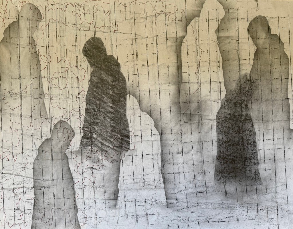
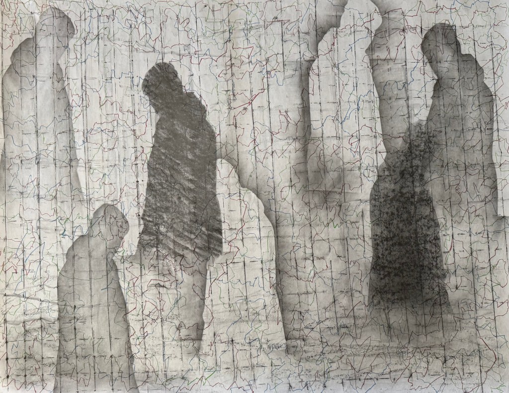
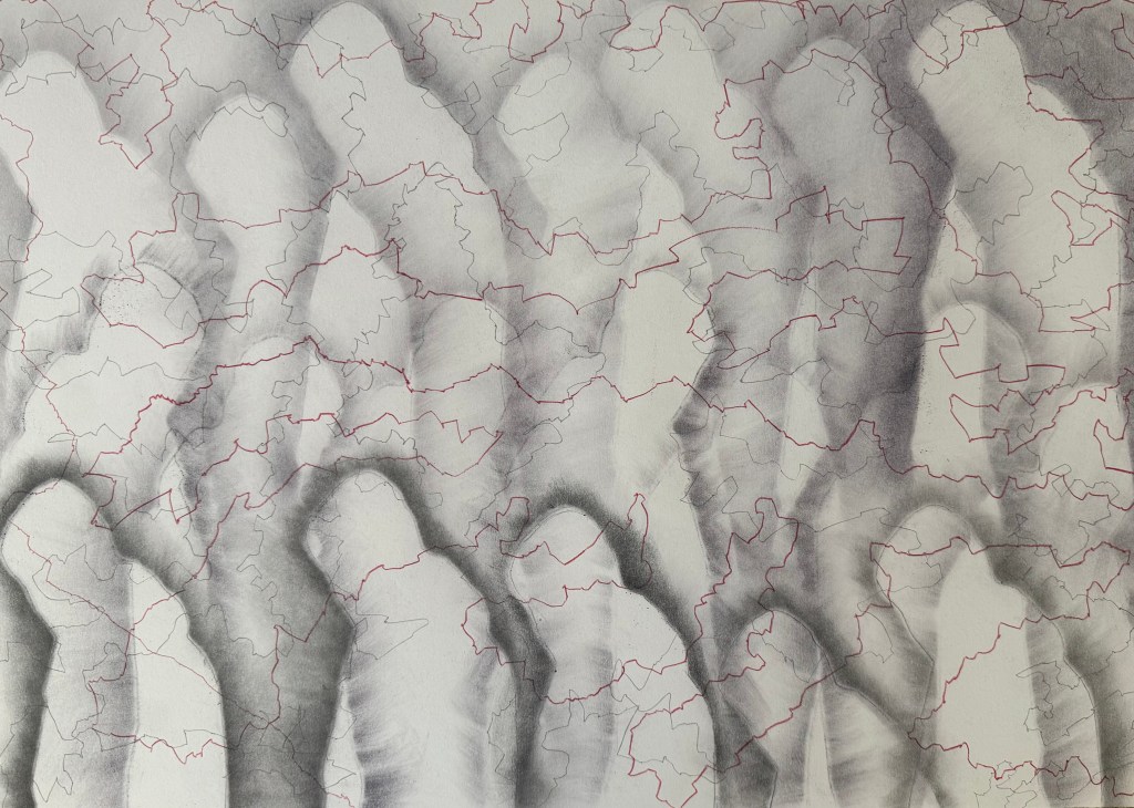
Following on from Solitude, I decided to try and develop it further.
I used flipchart paper again, as it was easier to manhandle it over the obstinately curved wire fencing which I used for the grid effect. A downside was that the grid is a bit off kilter, but nonetheless I like the grid and the lines of coloured automatic drawing – it reminds me of map grid lines, a road map. I explored trying to have some figures behind and some in front of the grid. Not sure I succeeded and I am in two minds about the light figures.
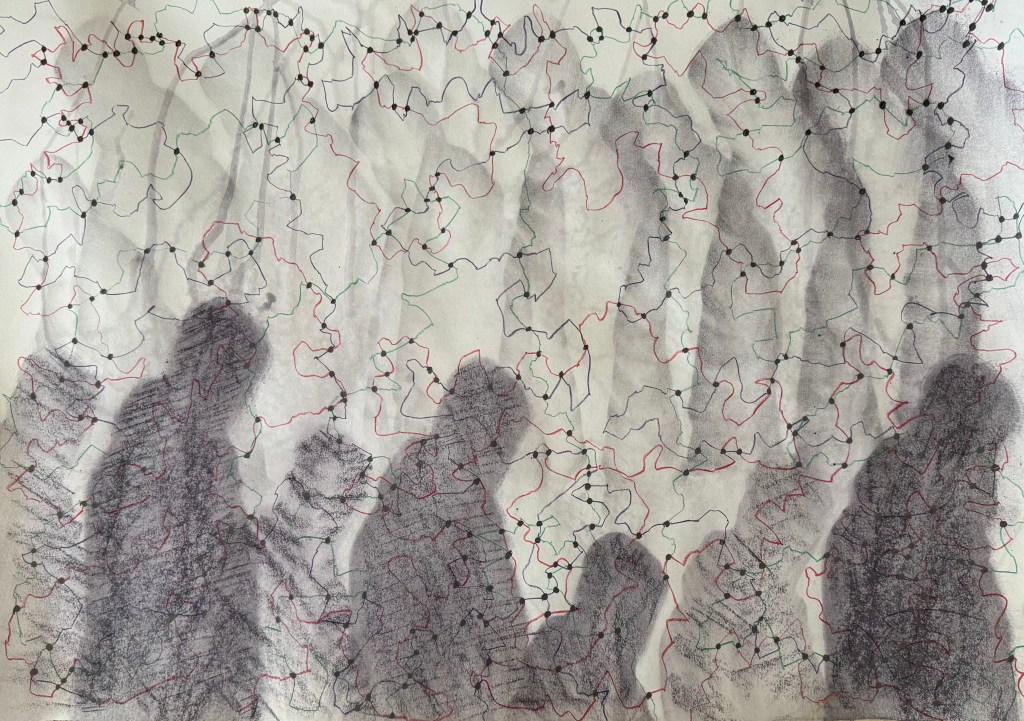
I decided to have a go with soluble graphite sticks using heavyweight cartridge paper.
I wanted to get away from the soft diffused figures and experimented with hatching and rubbing on a textured surface. I sprayed with water and held upside down to create some streaks and drips. Not one for less is more, I drew some green and red lines and then thought it would be interesting to see what kind of a random pattern would be created by drawing dots at the intersections of the lines.
I still didn’t like the dark figures at the bottom and so to try and break them up a bit, I coloured in some random shapes like I’ve done previously using different marks in my monochrome doodles.
I really don’t like it, and I’m struggling to find anything positive to say about it other than I like the idea of the lines and the dots at intersections emphasising the concept of connectedness and the idea of multiple figures in the background; the idea of all those who have come before, and of inheritance (Bus Replacement Service)
This time I left out the water, but I still used the water soluble graphite stick which had a purple tint to it which isn’t apparent in the photos. I don’t think it is as easily blended as normal graphite.
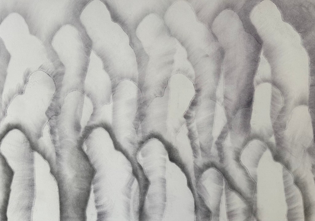
I much prefer this one out of the two. I’m starting to wonder what it would be like on a painted ground or even using thin layers of oil paint gradually building them up. Or am I done for now?
It’s been difficult, but I’ve been managing to stop myself from altering things after the event. To leave things undone with elements which really jar with me, which are clearly wrong and which look awful, and to post them anyway. I think that it’s starting to make a difference as to how I work – if I can get into the habit of showing the worst of it, the imperfect, work which I’d much rather never see the light of day, and preferably end up in the bin, I hope that I will be able to engage fully with the process, and not worry about the result.
The mantras I’ve adopted so far:
I will choose the mark-making processes which I enjoy, and not worry about the result
I choose the process, not the result
I don’t have to like what I make, and I don’t have to make what I like
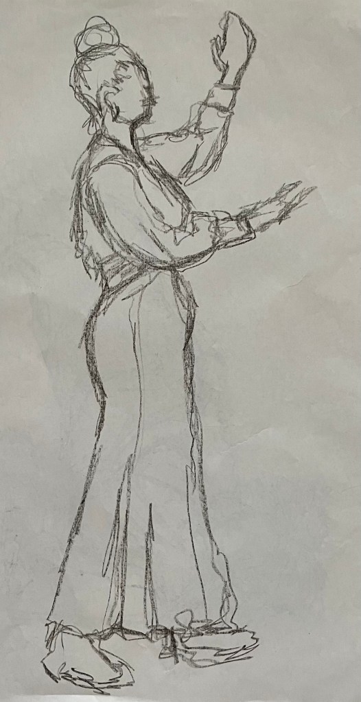
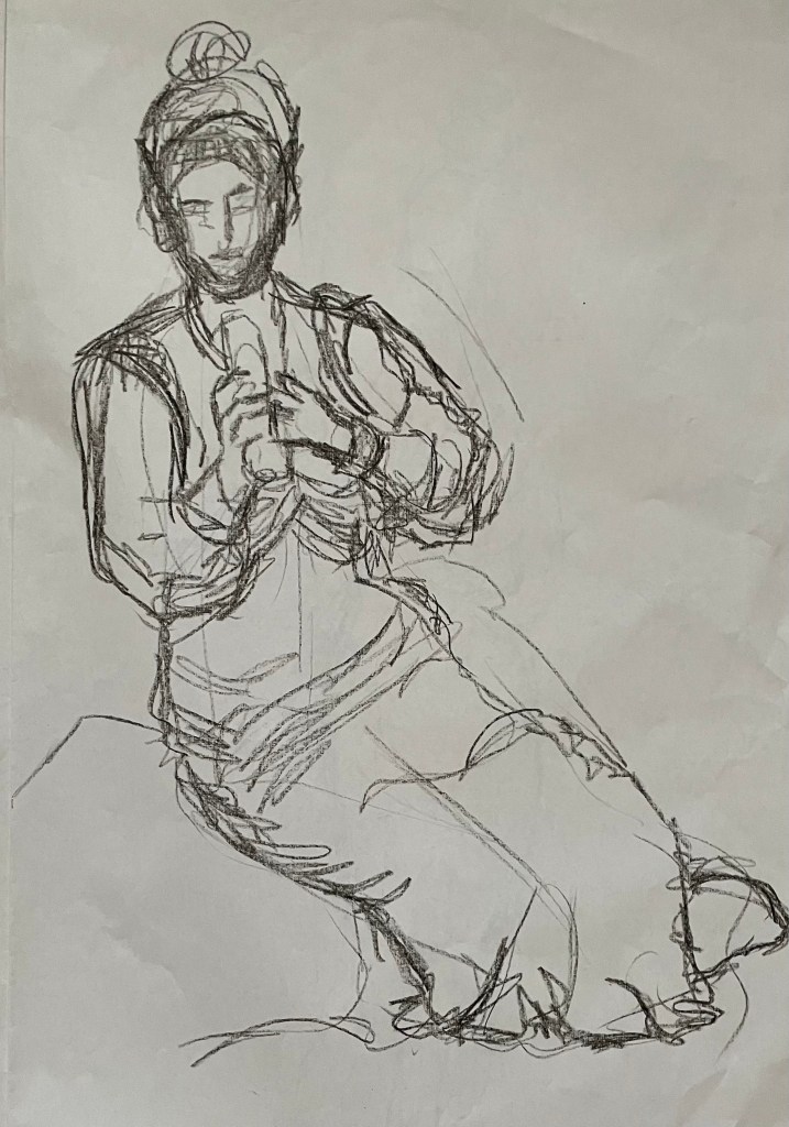
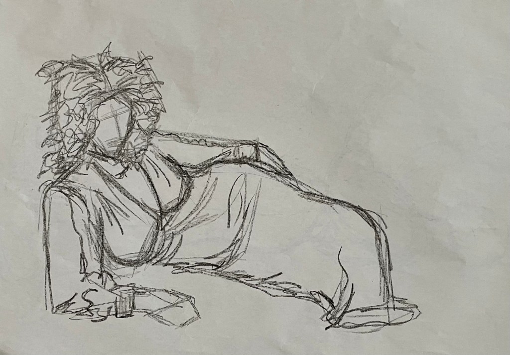
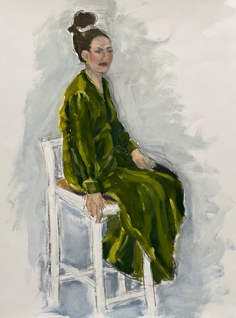
So, we’ve been continuing with the subject of figures in my weekly oil painting class. We had a model today. I certainly haven’t done her justice, and just don’t get me onto the subject of faces. We had to do a few warm up drawings, starting with continuous line – always difficult to get things in the right place – and then just normal sketching, a couple of minutes each. I used an oil pastel – I like that it’s a commitment, and can’t be rubbed out. There’s nowhere to hide, mistakes remain visible – the new me. Then an hour painting.
What to say? I’ve realised that since I’ve been posting my ‘Undones’ (seems a more positive word than failures), no matter how unhappy I am with the result, I can always find something that I like, if I look hard enough. It has just dawned on me, that I probably wouldn’t notice these elements if I was happy with the end result if, indeed, they managed to survive the perfecting process. There’s always some beauty, no matter the ugliness.
I think that I’ve unintentionally transferred my feelings of being weighed down onto the model. The dress looks so heavy; although it was velvet. I think I’ve managed to capture the sense of velvet. I’m trying to avoid using any blending in my paintings at the moment – I’m working on keeping my brushstrokes defined and with a sense of movement – I think I’ve achieved this. The figure is generally good and I particularly like the neck.
I’ve just been watching Sky Arts LAOTY, and now Gareth Reid is now giving a masterclass on drawing faces – I could definitely do with watching this.
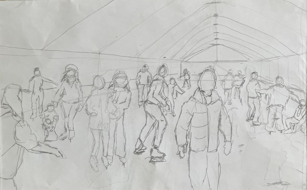
I’ve started back at my weekly art class after the Christmas break, and over the last two sessions we have been looking at figures, in particular, figures in an environment. I’m not very good at depicting humans (or any animate subject for that matter), so this was a bit of a challenge.
We had to work from images which we had sourced: I took my nieces ice-skating at Christmas, which was really entertaining to watch. There were the confident, well-practised skaters who came equipped with their own boots; the ‘I’m-competent-but every-now-and-then-lose-my-balance-and-windmill-my-arms-brigade; and then the rest – hopelessly clutching the side, or each other, for dear life, inching their way round. There was a whole range of shapes, gestures and weights, in the sense of where in the body the weight is being distributed, and there was a lot of tension.
We started by sketching out the composition.
I used a combination of photos and video stills from my phone – I could have been more organised because I lost track of which figure was on which photo, which wasted quite a bit of time. Next time I work from numerous image sources I will organise them so that they are more accessible and easier to switch between.
I then applied a ground to the support (I used oil paper as opposed to a canvas, as I wasn’t sure how it was going to go). As it was a painting of ice-skaters, I chose burnt umber thinned down with Sansador as my ground, as it’s the blue equivalent of the earth colours. I then drew in the figures using a rigger brush and thinned paint – I found the techniques covered by Chris Koning’s workshop of gestural drawing (‘Perception of the Whole’) to be really helpful in trying to get some dynamism in the portrayal of the figures. I also changed the composition from the pencil sketch to bring forward the pair of skaters on the left and to give the skater next to the pair some extra space into which he could move. I also packed some more figures in, including my favourites, the couple in the centre – the man skating alongside and watching his partner who is leaning forward – and the girl behind them.
The next step was to block in the background. I decided that I didn’t want to put the figures in the specific setting of an ice rink, so I left out the details of the roof and sides which were included in the original sketch. This gives a feeling of more space.
I used a thinned down mixture of titanium white, ultramarine blue and burnt umber to create a grey/blue and then scratched into it with the end of the paintbrush to create skate marks.
I then started blocking in some colour using thinned paint. I liked the fact that the burnt umber drawing was still visible and decided to try and retain as much of it as possible. This meant that I would not be able to use much thick paint in subsequent layers, and so the painting will retain a sketch-like quality. The purpose of the exercise was to capture the essence of the figures, so there will be very little detail in the figures and their faces, other than those in the foreground, and even then I will keep these limited.
I regretted having the large figure in the foreground, but he felt necessary to add variation to the height of the figures, and his static quality should hopefully contrast with the sense of movement in some of the other figures.
I carried on adding some more colour and changed the colour of the skater’s hoodie to differentiate him from the figure in the foreground.
I really enjoyed the process of being looser: the multiple visible alterations and the pared back application of paint. I’m not sure that I like the finished piece, probably because of its subject matter – it’s all a bit twee. But that’s my own fault – I hadn’t adequately prepared for the class and so made a rushed decision. Next time we have to work from a preselected source, I will make sure that I prepare properly, so that the subject matter appeals to me as much as possible.
There are areas which really appeal to me; I like the way I have treated the ice and I think that I have managed to capture the sense of movement, the hesitancy and tension in the figures, and the atmosphere. I don’t like the way I’ve painted the faces in the foreground. Whilst the exercise was all about the figures, I don’t think I’ve managed to find a method to render faces in a non-detailed way which does not look childish. I need to work on this.
I was thinking about this painting whilst I was out on a dog walk yesterday. I enjoyed making it, but I’m not that enamoured with the overall result, which made me ask myself whether I need to like the work I make or whether enjoying the process is enough. Also, I like and am attracted to a wide variety of artists working in very different ways. I suspect that I have previously thought that I need to make myself like them and make the sort of work they make because it is something that I like and am drawn to. I’m starting to realise that this isn’t necessarily the case – I just need to be ‘me’.
Generally, the work which I produce at my art class is not something that I would ordinarily choose to do, (which is a good thing) and won’t necessarily be relevant to my field of study in terms of subject matter, but it will provide a useful source of exploration in terms of technique and approach in my art practice. As such it is a valuable resource and a good use of time as well as a commitment which ensures that I create work on a regular basis.