Last Minute

I made a last minute decision to go to Tate Britain on Friday to see the Ithell Colquhoun and Edward Burra exhibitions before they ended yesterday.

I didn’t enjoy the Colquhoun exhibition as much as I was anticipating, and I think it was because there wasn’t much surrealism.

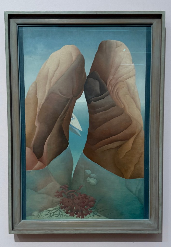
As I was standing in front of Scylla, a woman commented to me that she had been expecting it to be a lot bigger as it had been used so extensively in the marketing of the exhibition. I assume that she had thought that because the image was used for marketing purposes that it was an important work of Colquhoun’s and because it was important and of value, that it would be large in scale – the old perennial issue of size.

Scylla, 1938, oil on board, 91.4 x 61cm

‘It was suggested by what I could see of myself in a bath… It is thus a pictorial pun or double-image in the Daliesque sense – not the result of a dream, but of a dreamlike state.’

Colquhoun used the Surrealist process of decalcomania to produce a mirror image of randomly applied marks which she then used as a starting point for her work.

Gorgon, 1946, oil on board & its decalcomania counterpart of oil on paper

’I meant to paint a ‘Guardian Angel’ but the result of the automatism was so horrific that I had to call it a Gorgon instead’.

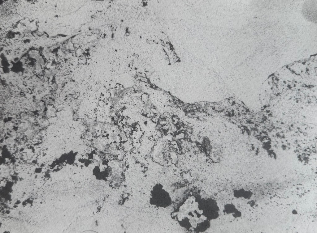
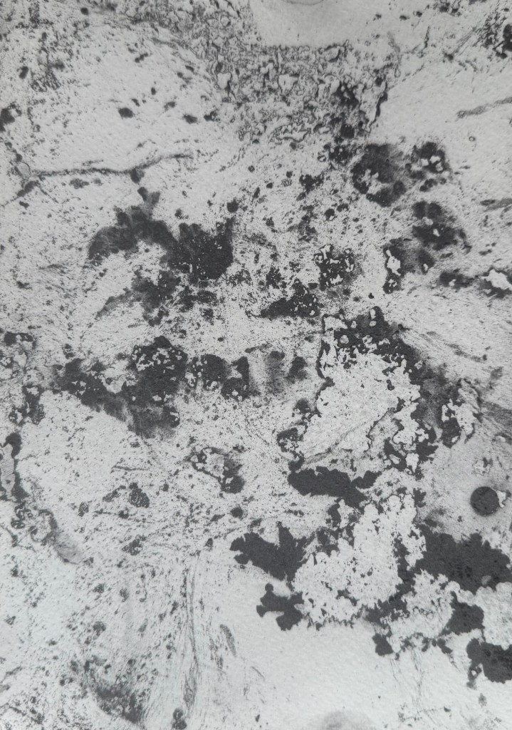
She also used a technique called parsemage, which involved submerging paper in water which had powdered chalk or charcoal on the surface.

These processes offered intuitive access to the unconscious mind, according to the accompanying blurb.

Colquhoun also utilised automatic drawing.

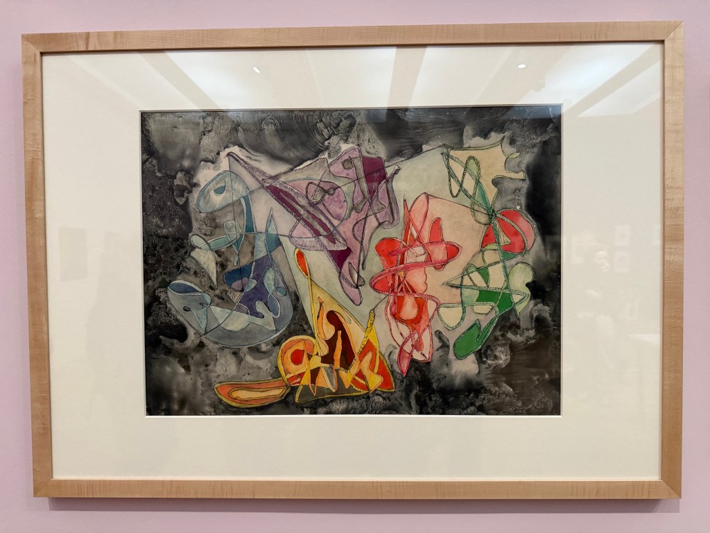
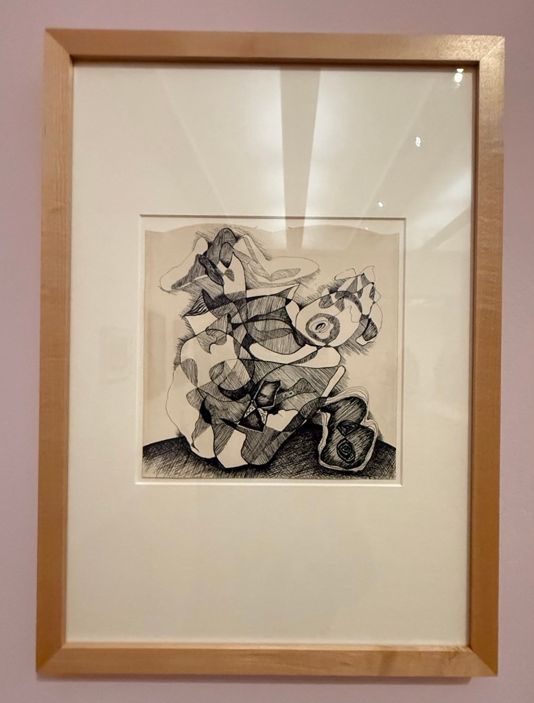
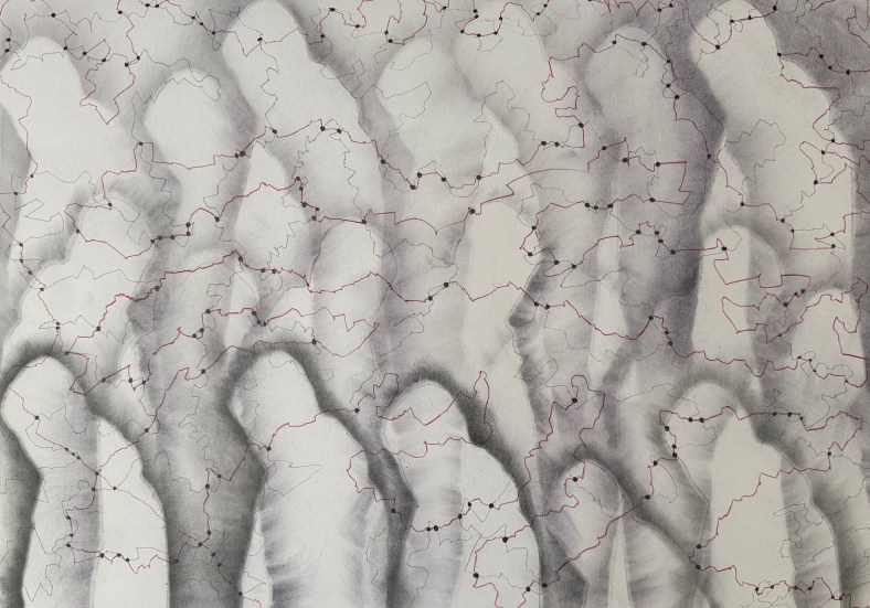
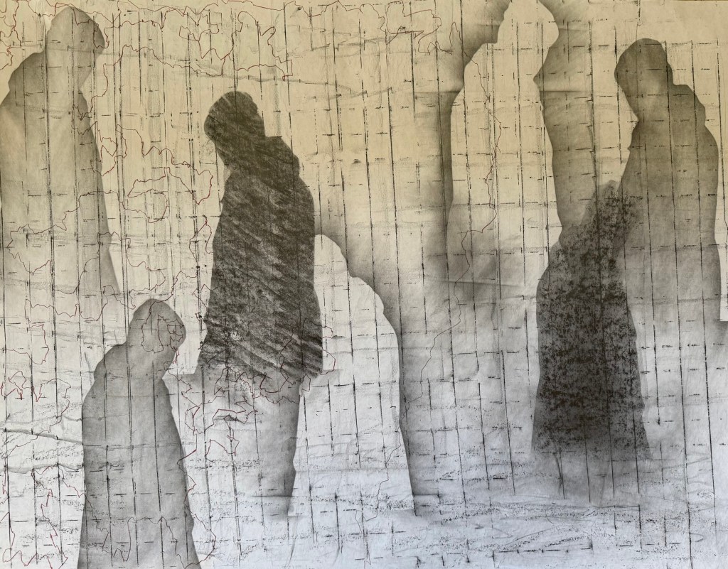
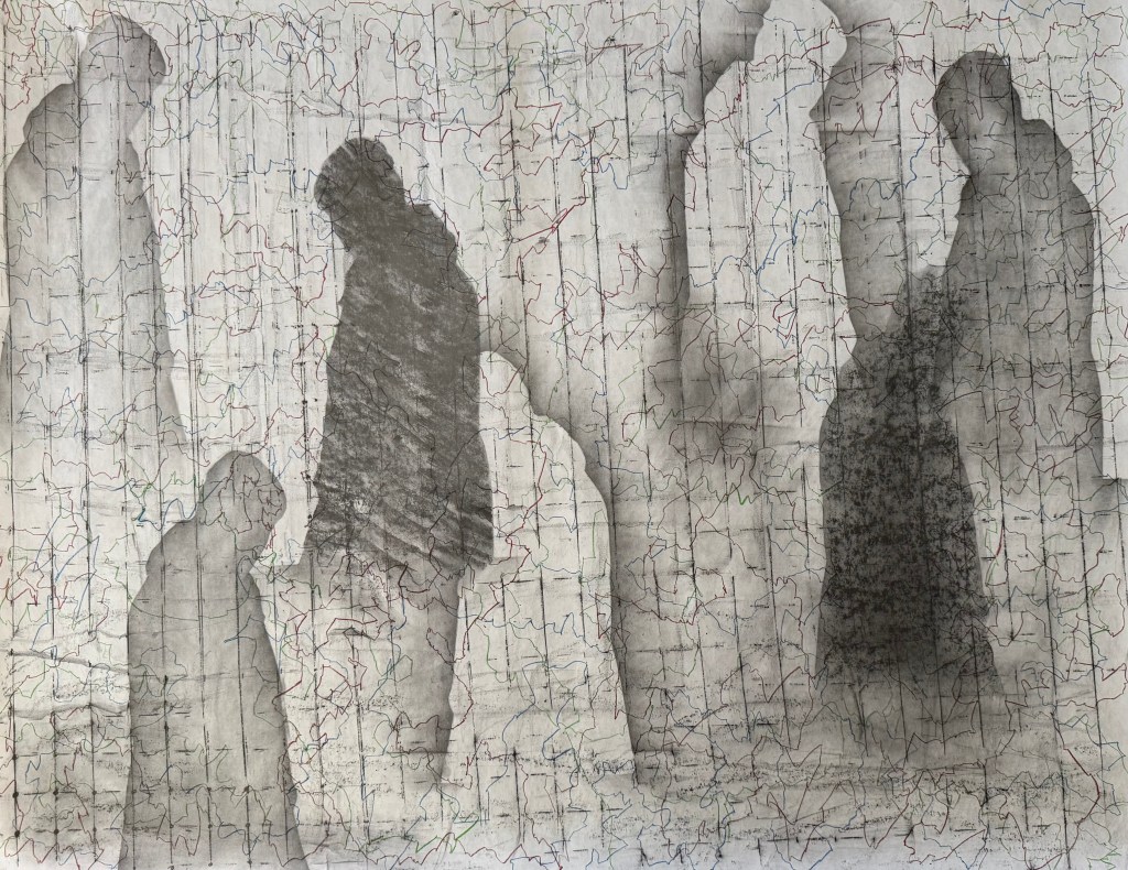
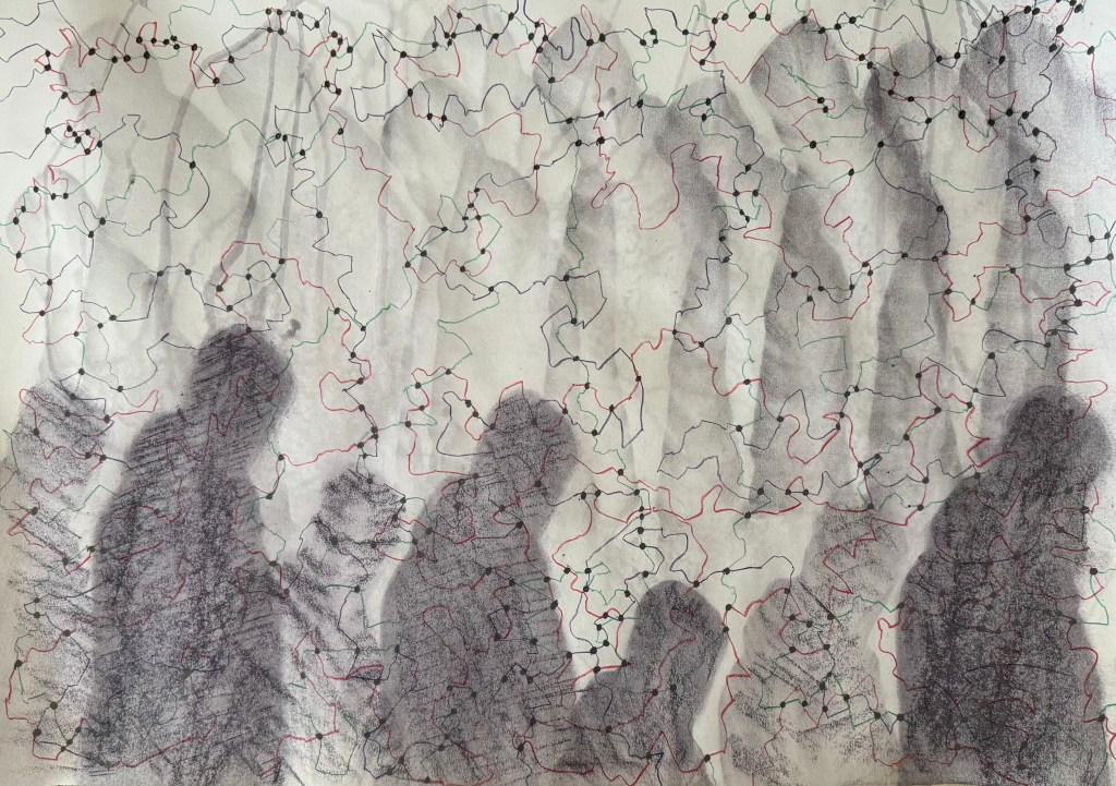
They remind me of my pen drawings in On Your Marks & Lines.

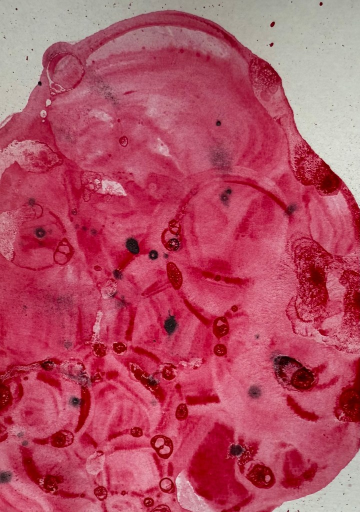
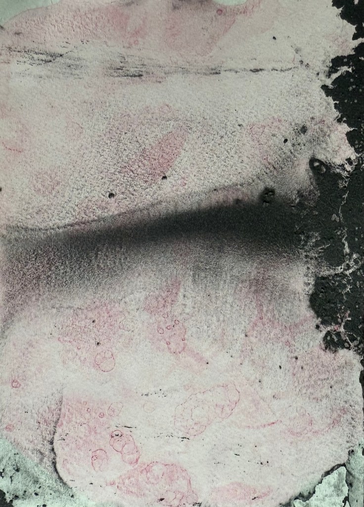
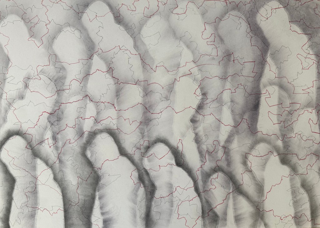
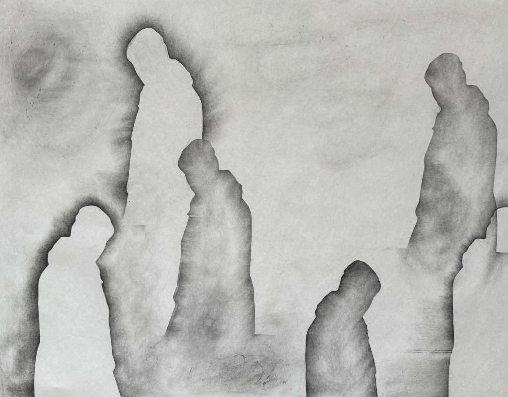
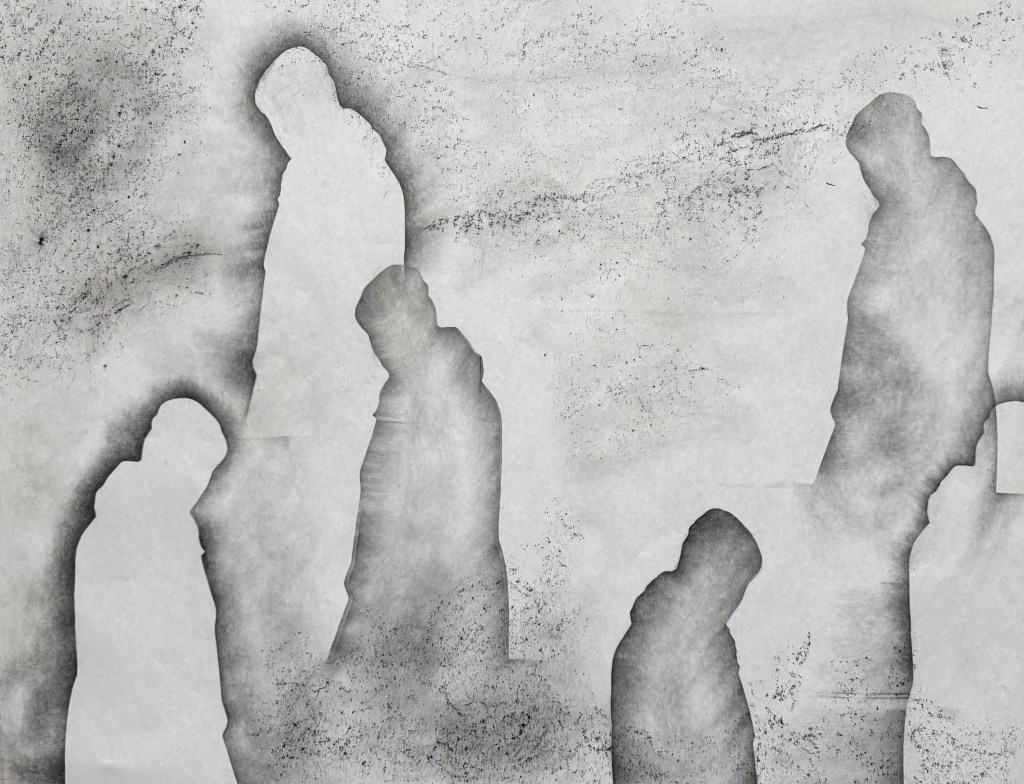
I decided to give parsemage a go – I think that you can do it with anything that can be ground to a dust – I used powdered graphite which has a slightly metallic quality to it. I was really pleased with the results.

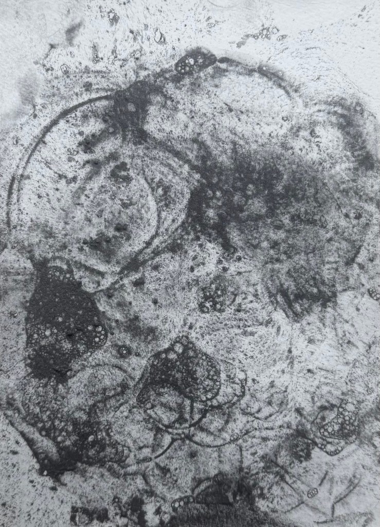
I then remembered a post on Instagram of a potter decorating bowls by blowing bubbles. I’ve used bubbles in wet cyanotyping before, so I decided to try it with the powdered graphite. I really like the delicate lines which were created and it was fascinating watching the effect of the bubbles popping – it reminded me of looking at cells under a microscope.

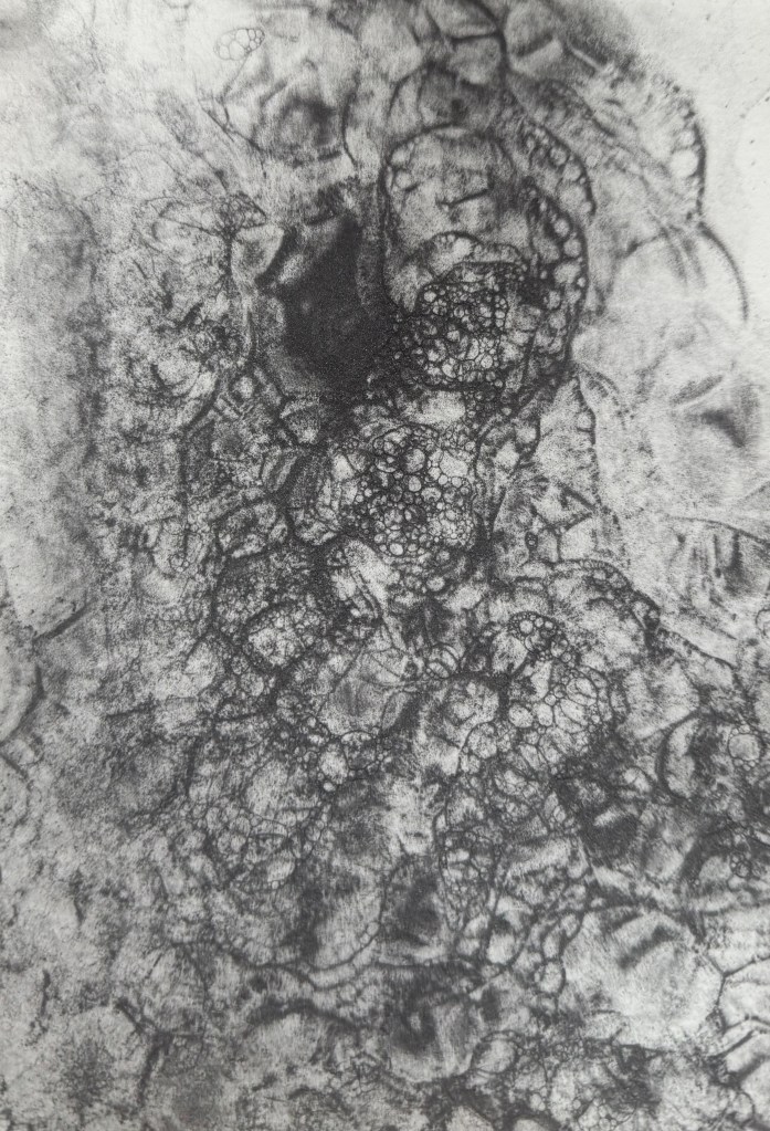
I then experimented with acrylic ink – maybe I should have realised beforehand – but it failed miserably. I wanted to try again with a water based ink, but I couldn’t find them. It might offer a more effective way of creating something akin to cells, than my previous attempts, so I’ll try again when I eventually locate them.

Maps

I was very lucky to have Cheng and Dalal in my group for this week’s group crit.

I showed my recent experiments with graphite and pencil.

I explained that I have become interested in the idea of inheritance recently and mentioned Donald Rodney’s work. We had a really interesting discussion about where we come from and our legacy, how it’s sometimes comforting to know that someone else before us was like us which frees us from feelings of fault and guilt, the idea of all that has gone before distilling down into us, much like our family tree before us, ends with us. How what we pass on feels like a responsibility or a burden.

Cheng commented that the white shapes give the impression of something that is no longer there and the dark shapes are reminiscent of shadows. Thinking about it, the shadows are cast by something that is there but is not visible. A figure’s absence is felt yet we feel a figure’s presence somewhere – it just about sums up ancestry.

I explained the process of making the pieces and how they seemed to develop into a type of map. I mentioned that the subject of maps has come to the forefront of my thinking recently along with the idea of connection. In my Unit 1 feedback one of the comments was: “It feels as though you have been working through an abundance of techniques that are maybe a type of mapping – now is the time to compare and contrast all of those experiments in order to develop an intuitive and personal way of mapping your experiences…”.

For sometime I’ve been interested in Deborah Levy’s idea of her mother being her internal sat nav and I used Google maps to obtain the aerial image I used in Parental Loss. My art class recently gave me a scarf with a Grayson Perry map on it. I was thinking earlier in the year of mapping the course of a river. The coincidence that I chose to draw the lines in colours which reminded me of maps somehow has linked all of this together. That, and the fact that I have been complaining ad nauseum about not having a sense of direction.

During these two years, I am, to all intents and purposes, mapping my life.

There seems to be a strong unintentional link to maps in the images: Cheng said that the images in which I’ve marked the intersections remind her of constellations, and Dalal observed that the lines themselves could be interpreted as borders, which then feeds into borders marking the the point where countries connect. This led to me seeing that the outline of the shapes themselves resemble coastlines.

Cheng and Dalal both made some really helpful comments about potential development:

  • playing with scale: a large image on a wall giving the impression of a map but then coming in close on a small scale to create a more personal experience and stronger connections
  • Drawing on a vintage map or incorporating old family photos
  • Using a pin to attach separate images to the points of intersection – this has since led me to think about criminal investigation maps – maps with string coming off from them to images and additional information on the perimeter
  • Thinking about how I can use materials to create something that looks older, that comes from a past time – this brought to mind highly decorative old maps with sea monsters in the oceans
  • creating a large scale reimagined map

Shortly after our session ended, I had a thought about making a digital map of my life with events or periods of significance being marked by specific points, a bit like a Google map, which you could then drag the yellow man to and drop into a space where you have a street view – maybe of images relating to that particular event. And then I laughed, Alexa laughed, Siri laughed, my husband laughed.

Lots to think about, as ever.

What Was I Thinking?

I decided to try out the ‘map’ drawing using oil paints. I liked the combination of pencil and oil paint in As I Was Going To St Ives and so I drew the grid lines on some oil paper – I was limited to A3. I put the paper on the floor and lightly rubbed over the tiles which created an interesting texture. Then I did the figures and the automatic drawing, just as before.

I’ve decided that I really enjoy making the lines and marking the intersections. My brain must truly have become disconnected from the process because, for some inexplicable reason, I thought that a quick spray of fixative would be sufficient before I applied the oil paints. Oh, how wrong I was. The solvent and graphite mixed really well – that’s the positive I’m taking from this! It needs to be the other way round, possibly, maybe, or maybe not. But time to stop and give up for the day, but not before I salvage something from the process. I’ve been thinking as I’ve been experimenting that the cutouts look really interesting in themselves, so I cut out the figures from the latest effort and did a bit of arranging on a spare sheet of paper. Interesting, particularly the figures in transparent film…

Rubbing It Out

Following on from Solitude, I decided to try and develop it further.

I used flipchart paper again, as it was easier to manhandle it over the obstinately curved wire fencing which I used for the grid effect. A downside was that the grid is a bit off kilter, but nonetheless I like the grid and the lines of coloured automatic drawing – it reminds me of map grid lines, a road map. I explored trying to have some figures behind and some in front of the grid. Not sure I succeeded and I am in two minds about the light figures.

I decided to have a go with soluble graphite sticks using heavyweight cartridge paper.

I wanted to get away from the soft diffused figures and experimented with hatching and rubbing on a textured surface. I sprayed with water and held upside down to create some streaks and drips. Not one for less is more, I drew some green and red lines and then thought it would be interesting to see what kind of a random pattern would be created by drawing dots at the intersections of the lines.

I still didn’t like the dark figures at the bottom and so to try and break them up a bit, I coloured in some random shapes like I’ve done previously using different marks in my monochrome doodles.

I really don’t like it, and I’m struggling to find anything positive to say about it other than I like the idea of the lines and the dots at intersections emphasising the concept of connectedness and the idea of multiple figures in the background; the idea of all those who have come before, and of inheritance (Bus Replacement Service)

This time I left out the water, but I still used the water soluble graphite stick which had a purple tint to it which isn’t apparent in the photos. I don’t think it is as easily blended as normal graphite.

I much prefer this one out of the two. I’m starting to wonder what it would be like on a painted ground or even using thin layers of oil paint gradually building them up. Or am I done for now?

Solitude

I feel particularly drawn to this photograph of my father. It’s solitary and contemplative, evoking a sense of vulnerability – a side which was never apparent whilst I was growing up. It makes me want to go and give him a hug. He was the world’s best hugger. Either that, or he’s watching someone doing something and he’s not that impressed – a more familiar experience.

Having missed out on visiting a couple of exhibitions on Sunday, I decided to experiment. I took a piece of A1 flipchart paper, a graphite stick and a 5B pencil and got to work. First I created multiple silhouettes of the image using the graphite stick.

I was inspired by the Richter drawings (The Rich Are Getting Richter) and used the tiles on the kitchen floor to create texture with some frottaging.

Having really liked the effect of some of the lines and marks made in my automatic drawings, I used the 5B pencil to create a wandering line, holding it at the top and twisting it from side to side in the process and then holding it on its side to create a second softer line. I like the idea of tree roots and mycorrhizas connecting and creating a support network for trees, a concept we touched on in last week’s session. The lines are connecting each figure so it’s no longer alone. They are also reminiscent of a map or a mapping out. Not sure which, but I like the effect. I like the delicacy of the lines. They also remind me of the lines in skulls at the points where the plates have fused or cracks in a surface, fault lines. I wasn’t keen on the overlap on the two figures on the right which created a hard box-like edge, so I cropped it out on the last image.

I really enjoyed doing this, particularly the lack of control of the line making and the unpredictability of the frottaging, and despite that, it does bear a resemblance to the vague image I had in my head. It ties in with the idea of shadow selves (Sniper’s Alley) and the idea of inheritance and being made up of multitudes (Bus Replacement Service). It’s definitely an approach I will develop further, but I’ll use better quality paper next time.