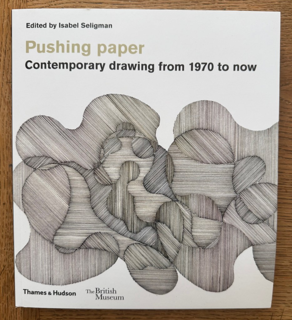
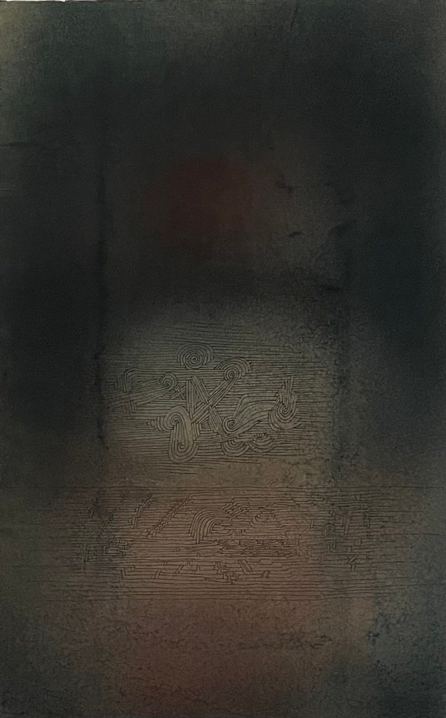
I bought ‘Pushing Paper’ in the hope that I would find its contents enlightening, but primarily because I felt drawn to the cover. The image is ‘Some Interference’ (2006) by Richard Deacon, which he made during his residency at the Oxford Centre for the Study of Gene Function. According to the book, Deacon was initially trying to represent multiple surfaces on a flat plane – the paper splitting into interconnected layers. As things developed, he realised that what he was drawing was difficult to clarify.
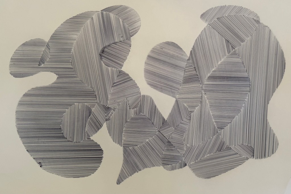
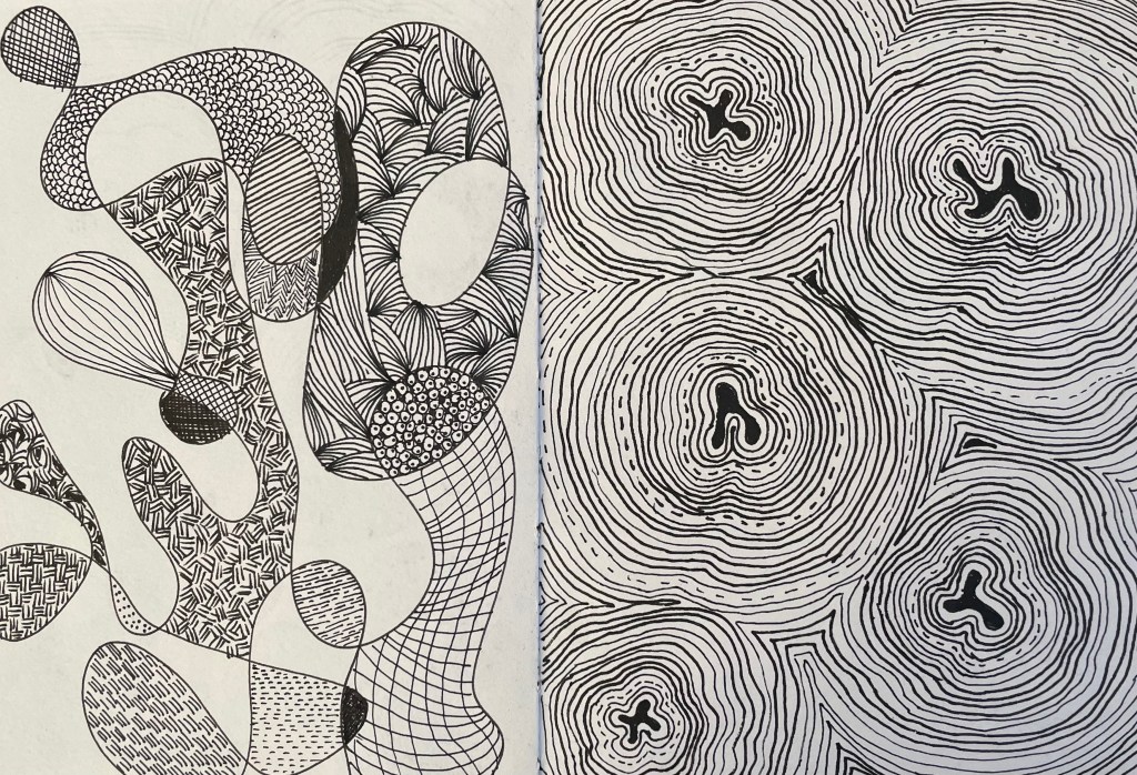
Something about it really appeals to me. It reminds me of the doodle type drawings I’ve been doing (On Your Marks… & Lines). Aside from Etch-A-Sketch and Spirograph, this process entertained me for hours as a child. I would draw a random enclosed shape with overlapping lines which created segments to be coloured in. It takes me right back to my childhood. Maybe that’s why I’m drawn to it. Maybe it’s because it embodies its simple process as well as having a temporal dimension – the act of drawing each individual straight line. I like the darker line which is formed around the edges of the shapes where the lines have crossed.
Well, whatever the reason, I picked up the nearest pen, a leaky biro, and had a go.
It was a very satisying exercise, despite the blobs and smears. The ‘me’ at the beginning of this course would have discarded it. Instead, the blobs and smears are all part of the process, caused by the movement of the ruler and my hand, a moment hesitating too long in one spot. Nevertheless, I’d like to repeat the exercise with a proper pen, maybe a variety of pens of different thicknesses. In the meantime, I experimented in Procreate.
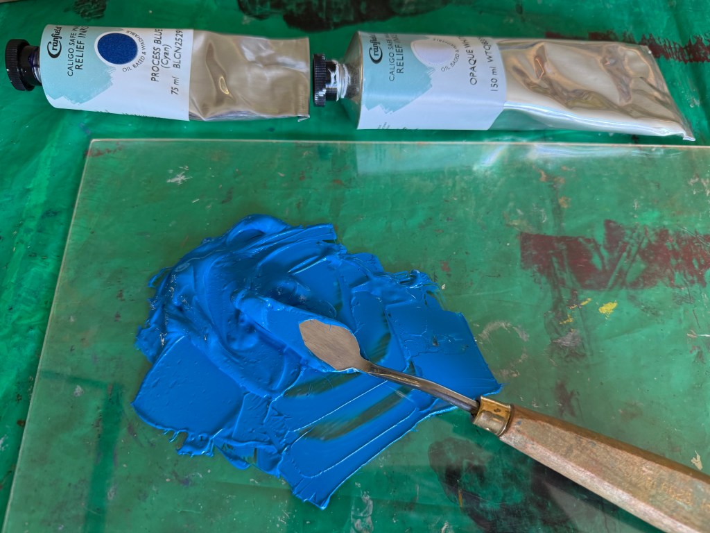
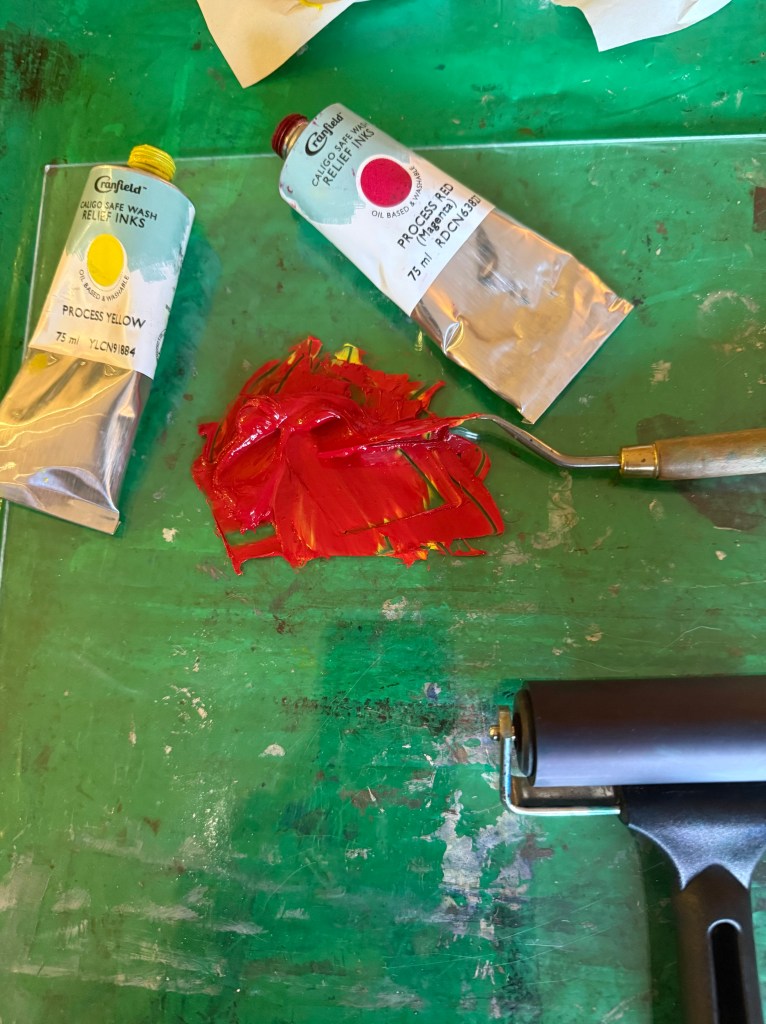
So, Plan A was dependent on me being able to overprint the red with blue. I did a quick test print. The process blue ink I was using must have some transparency as it turned into a very dark purple, so I made it more opaque by adding opaque white which resulted in a kind of cerulean blue which I liked against the red, although the photos don’t do it justice.
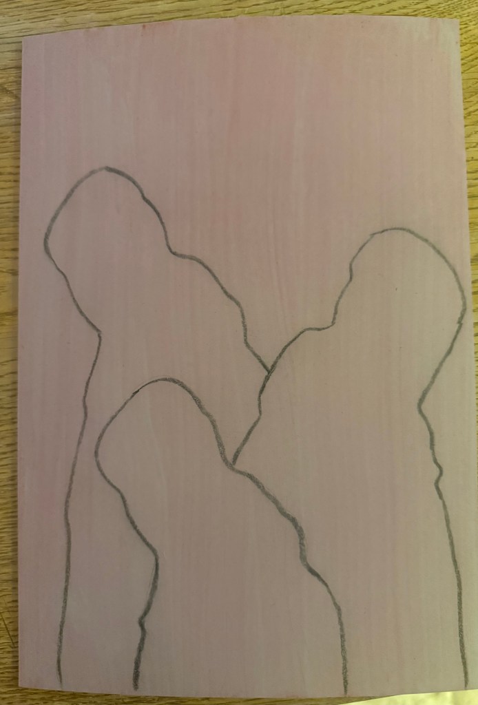
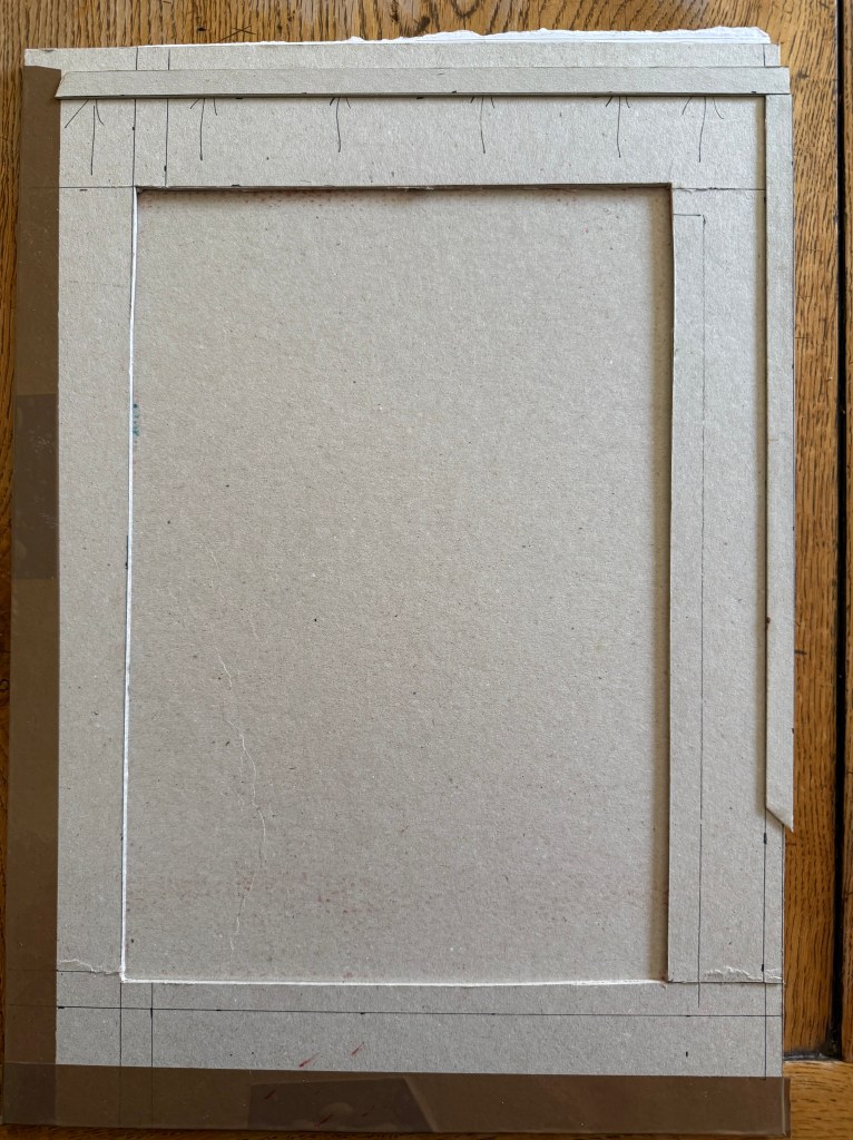
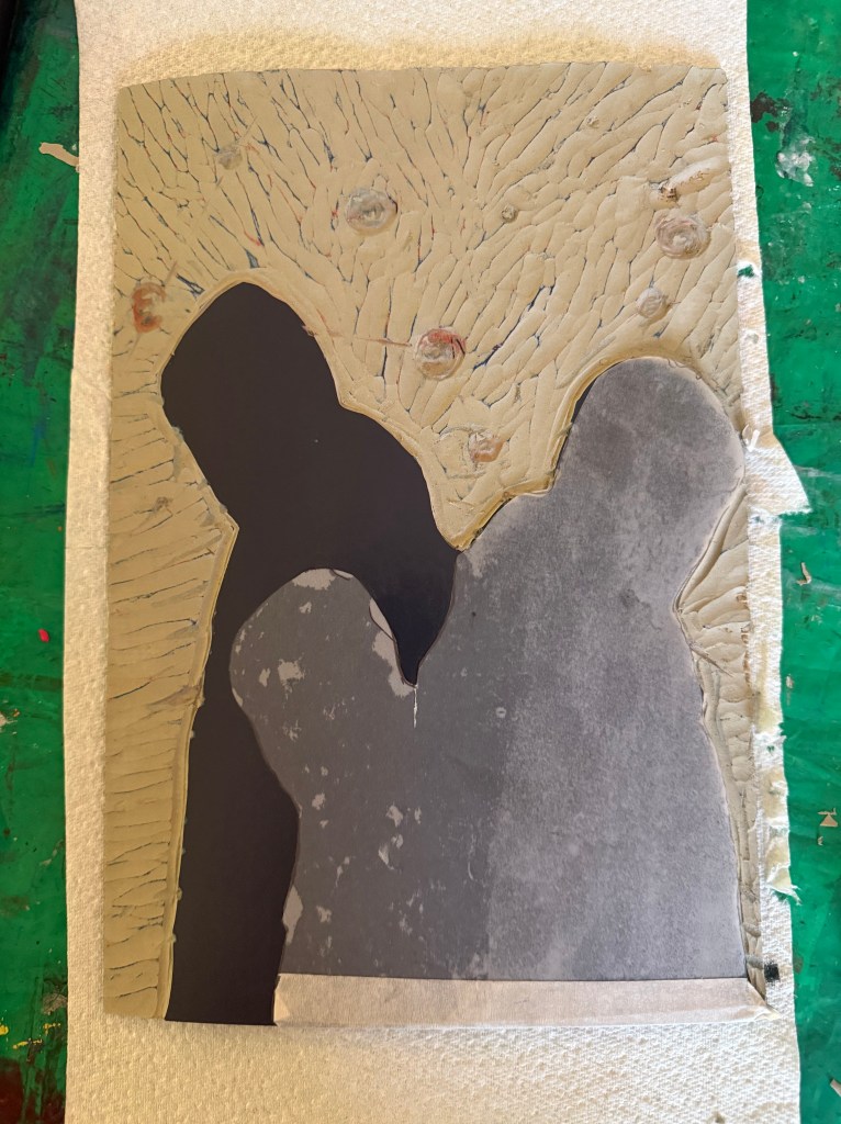
I then prepped a sheet of A4 lino by lightly sanding and wiping with white spirit before staining it with an acrylic ink and drawing on the figures and the white lines. I went over the pencil marks with a chinagraph pencil to make them stand out more. As usual I had launched in without giving it enough thought and ended up having to reposition some lines although I couldn’t erase the chinagraph marks, which becomes relevant later on in the test printing. I used a metal ruler to cut out the white areas and filled them with cornflour to see how they looked, neatening up where necessary – the circles are bit all over the place, so I resolved to use a template when making the actual prints.
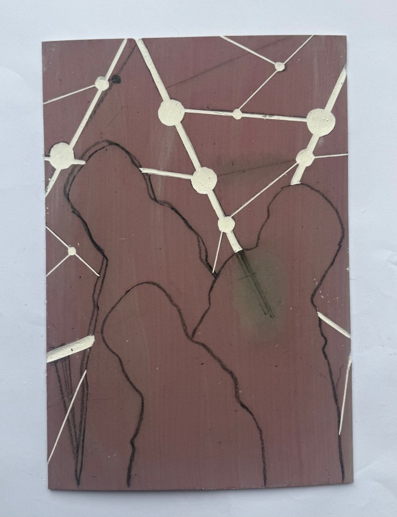
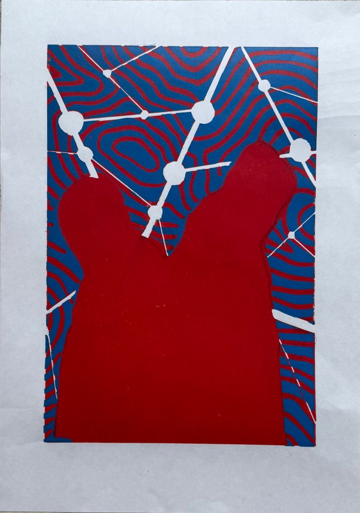
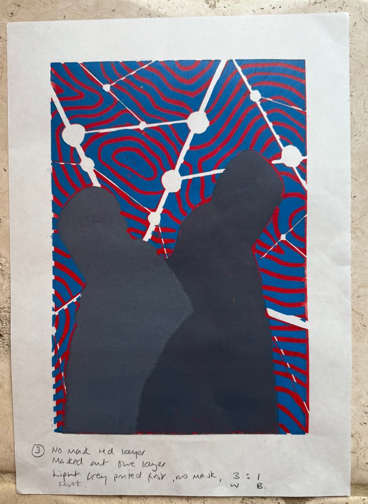
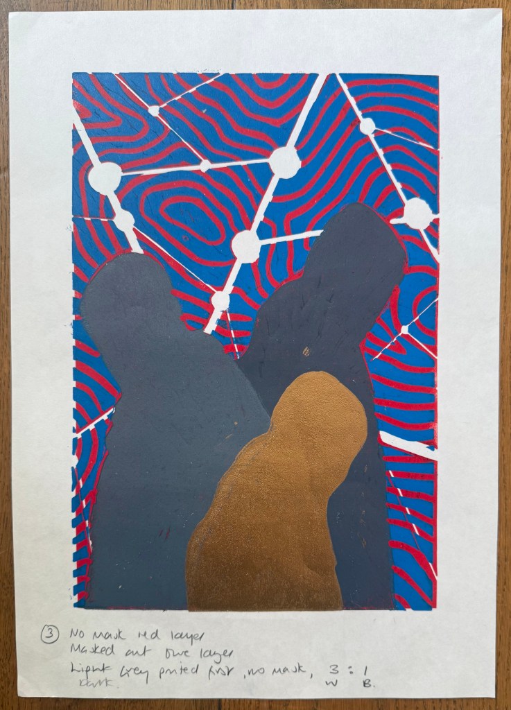
I created a registration board for the lino, drew lines where the paper was to go, and printed the first layer using equal parts process red and process yellow. Initially, I thought that I could mask out the figures using some tracing paper. Reduction linocuts work from light to dark ordinarily, but my image doesn’t really conform to that process. I knew one, if not two, of the figures would be a med/light grey and I wasn’t sure how that would sit on top of a bright red. I tried inking up whilst the mask was on the block and then removing it, but it was difficult to do because the mask kept on sticking to the brayer and the result wasn’t great. I decided to ink up the entire block for the rest of the prints. I also noticed that some of the chinagraph was coming off the block onto the prints.
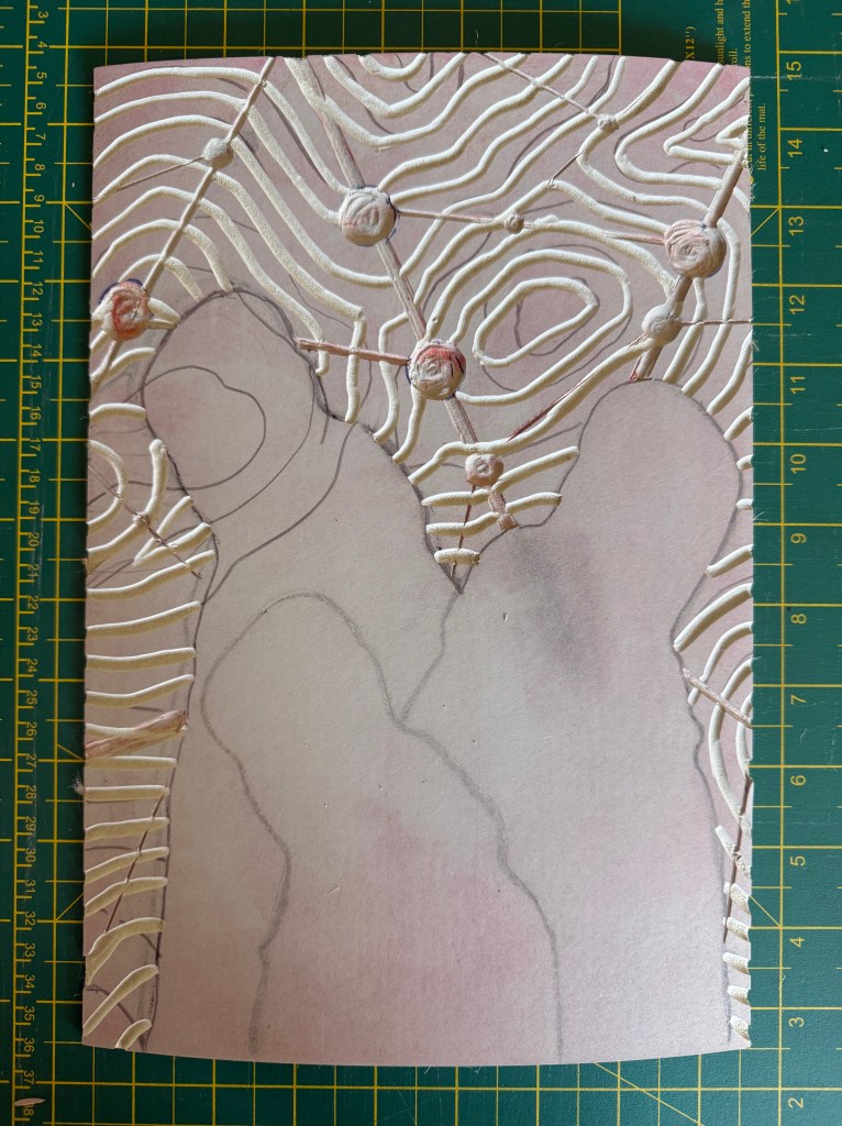
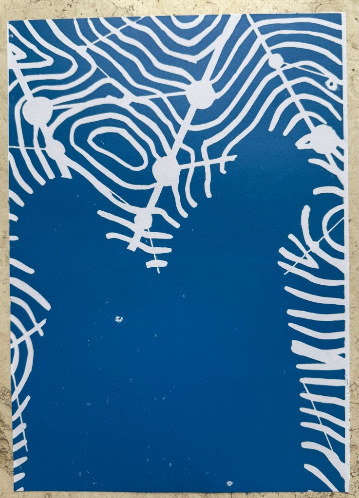
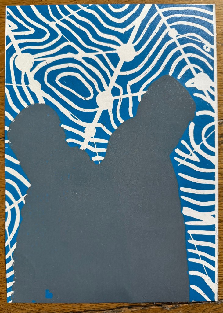
Next, I cut out the contour lines and printed with blue ink. By this stage I had realised my previous error and masked the figures after inking the block, but before printing – a much better result, and I can’t work out why I hadn’t realised this to start with. However, after the first print it was obvious that the registration was off. I had thought that I had lined up the paper the same each time when I was printing the red layer, but I clearly hadn’t. I created a raised edge against which to place the paper on subsequent prints, but I had to accept that the blue and red layers wouldn’t line up on all of the test prints, which would cause problems in relation to the white areas.
There was also misalignment around the edges of the figures which could have been caused by poor registration on the first layer, but could also have been caused by a lack of accuracy in creating the mask, or even applying too much ink.
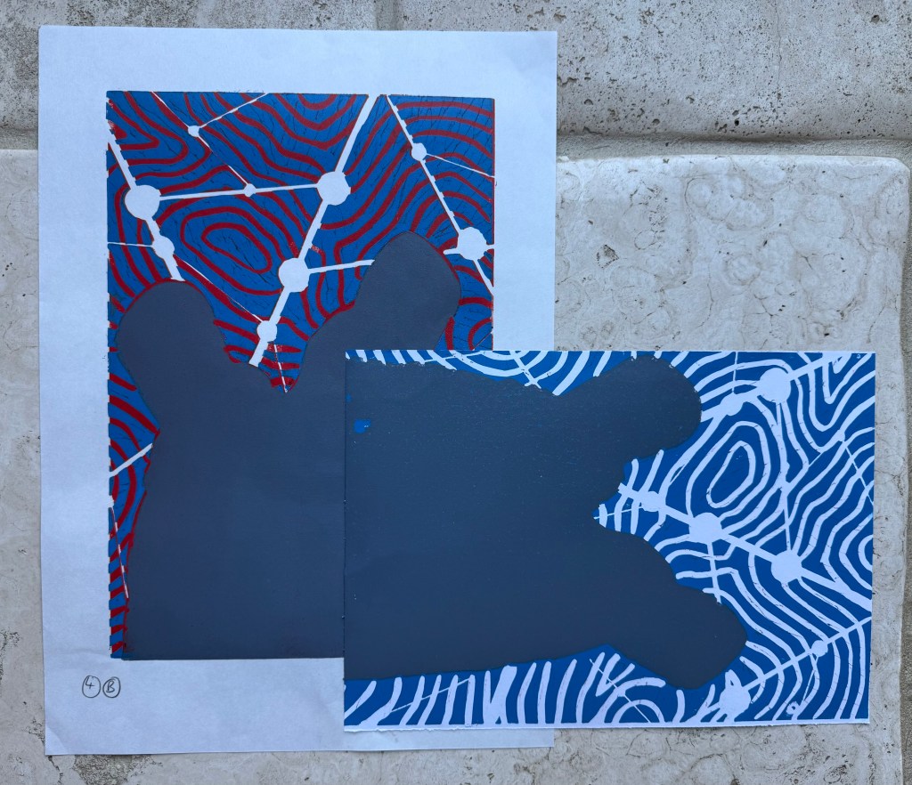
To complicate matters further, the paper I used was Japanese HoSho paper which being lightweight (90gsm) and strong makes it ideal for printing linocuts. However, it turns out that it is slightly smaller than A3. I already had some Snowdon 130gsm paper, so I thought that I would give that a go, to see if it would be a suitable alternative, even though it is heavier than the HoSho.
Other than a few areas where some bits had managed to get stuck onto the block, it seemed to print quite well.
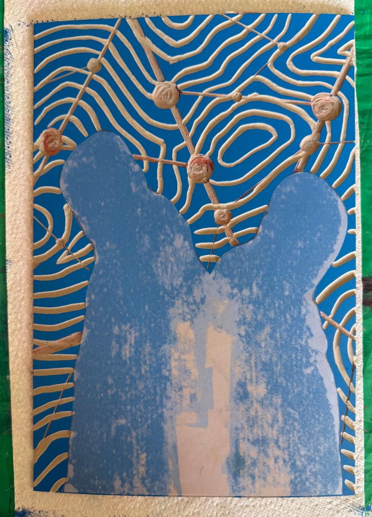
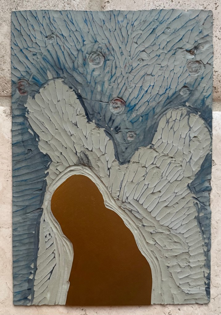
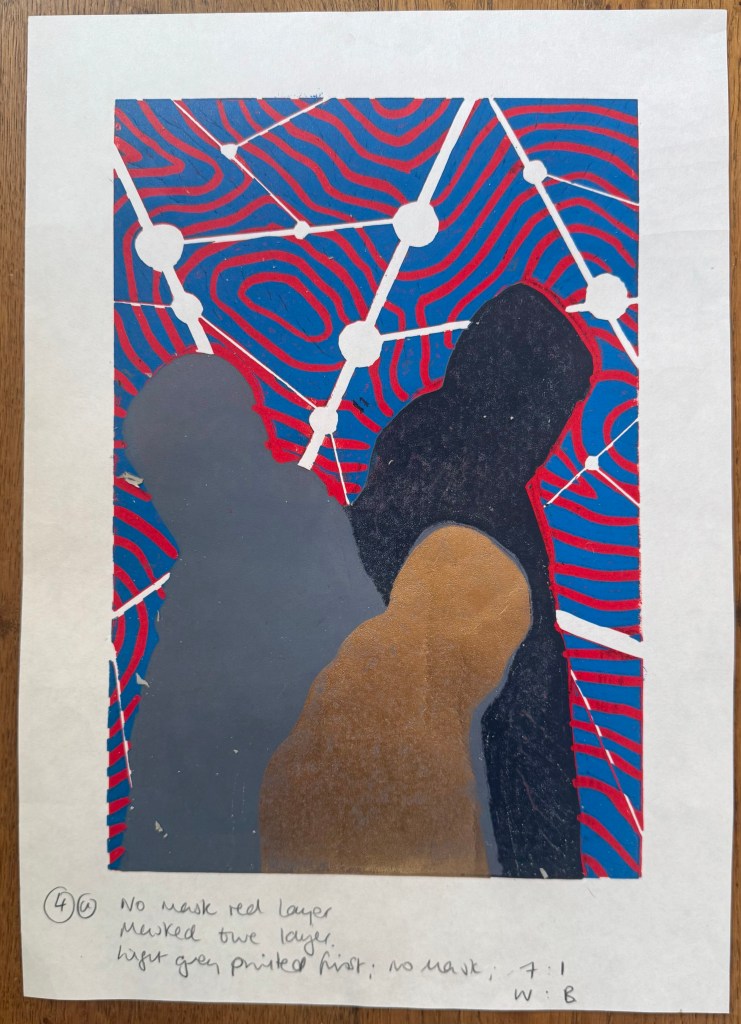
I then cut away the rest of the block leaving just the figures. I wanted to experiment with both masking areas and inking up the whole block to see how the subsequent layers printed so I could decide on a final approach ie whether to use a mask or to layer the ink. I would have preferred not to mask any areas as it seemed to increase the risk of mis-registration of the print. But before I decided I needed to find out how the final metallic gold layer would sit on top of all the other layers. I noticed that there were some indentations in the outlines of the figures from where I had cut out the contour lines.
I also wanted to see how the grey would print on top of the blue as well as the red, and it seemed to fare quite well, although it definitely has a cooler undertone to it than when printed over the red.
The blue and grey layers seemed to dry slower than the red and, as a result, the dark grey/black ink didn’t print well, and also the cut away areas picked up some of some of the blue and transferred it to the prints. I had the same issue with the gold ink, but by that stage I had become a bit frustrated and impatient, and just wanted to see what the colours looked like together. There are agents which can be added to the ink to speed up the drying process but you have to be careful as to the amount used, as they can alter the colours. I could have swapped from oil based to water based inks, which I didn’t have. So I decided to make the best of what I had.
I know that I make things more complicated for myself than they need to be. I could have watched videos on how to make reduction linocuts before starting, but there is a part of me that thinks that learning on the job is a more valuable, if not more frustrating, experience, and that the lessons learnt are more likely to be remembered (and possibly put me off linocuts for good).
So, what did I learn?
Preparation is key
Registration is everything – I watched a couple of videos after the event and invested in some Ternes Burton registration pins and tabs
It’s preferable not to mask areas if possible but to cut away the lino on each layer
Don’t use chinagraph or anything else which could transfer from the block to the paper
Accuracy is important
I should have had a resolved image before I started, rather than winging it in the process
When cutting out the first and second layers I needed to ensure a clean edge with the figures by using a craft knife
I needed to check that there isn’t any ink on the cut out areas of lino before printing
The ink needed to be dry before printing the next layer
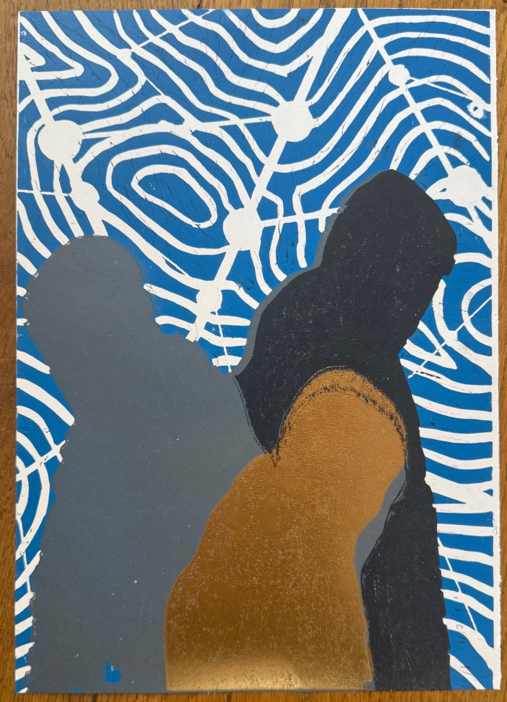
But, the most important lesson is that because of the number of layers and the time needed for drying, it would not have been possible to complete the print before the end of the month. I needed to go back to the drawing board and have less colours so that it reduced the amount of drying time etc. So I amended the image to just white, red, grey and gold.
I made a last minute decision to go to Tate Britain on Friday to see the Ithell Colquhoun and Edward Burra exhibitions before they ended yesterday.
I didn’t enjoy the Colquhoun exhibition as much as I was anticipating, and I think it was because there wasn’t much surrealism.
As I was standing in front of Scylla, a woman commented to me that she had been expecting it to be a lot bigger as it had been used so extensively in the marketing of the exhibition. I assume that she had thought that because the image was used for marketing purposes that it was an important work of Colquhoun’s and because it was important and of value, that it would be large in scale – the old perennial issue of size.
Scylla, 1938, oil on board, 91.4 x 61cm
‘It was suggested by what I could see of myself in a bath… It is thus a pictorial pun or double-image in the Daliesque sense – not the result of a dream, but of a dreamlike state.’
Colquhoun used the Surrealist process of decalcomania to produce a mirror image of randomly applied marks which she then used as a starting point for her work.
Gorgon, 1946, oil on board & its decalcomania counterpart of oil on paper
’I meant to paint a ‘Guardian Angel’ but the result of the automatism was so horrific that I had to call it a Gorgon instead’.
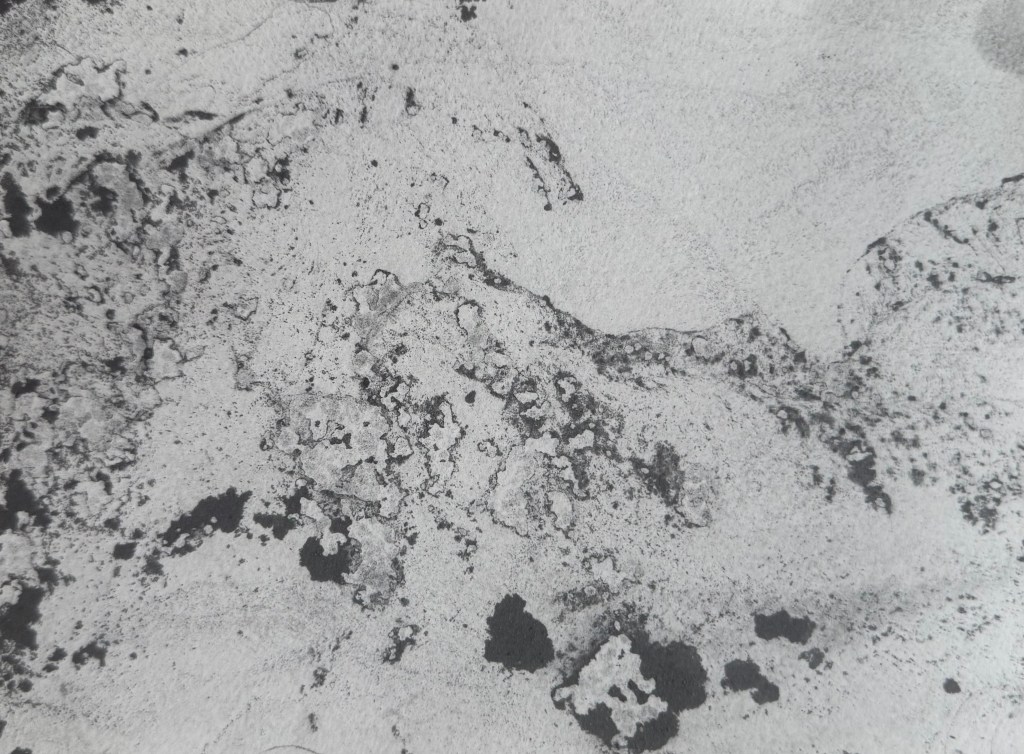
She also used a technique called parsemage, which involved submerging paper in water which had powdered chalk or charcoal on the surface.
These processes offered intuitive access to the unconscious mind, according to the accompanying blurb.
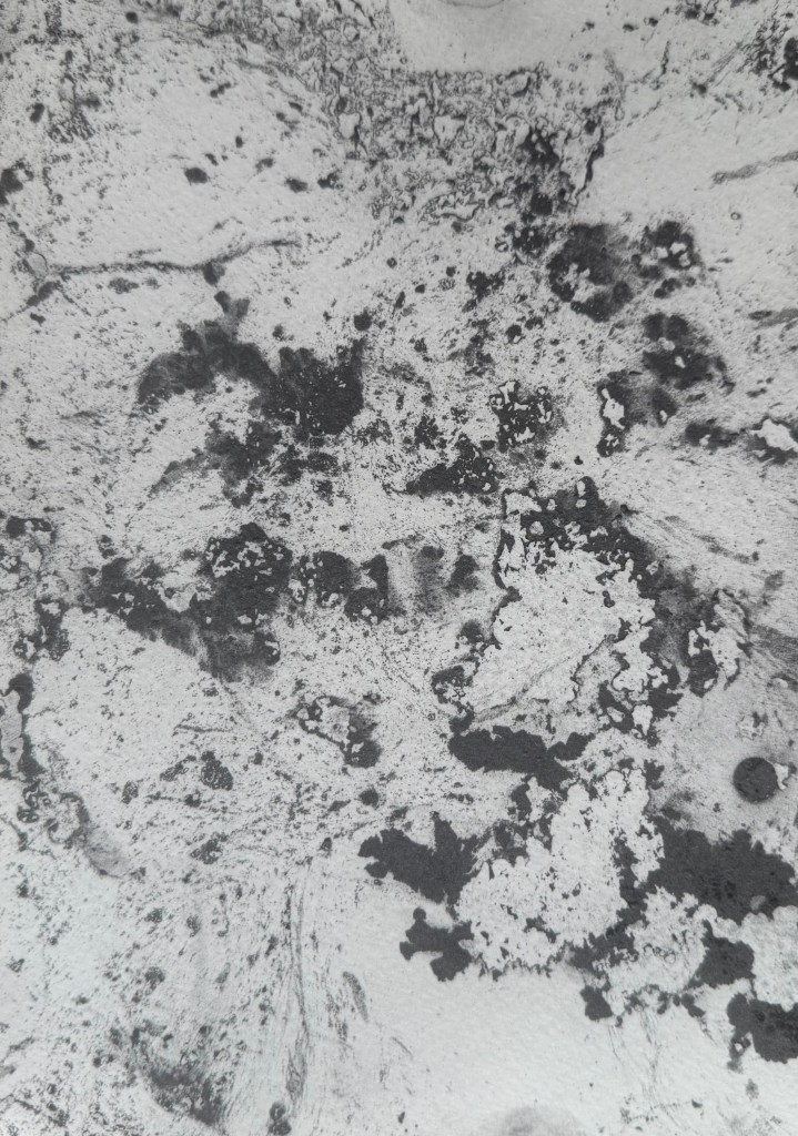
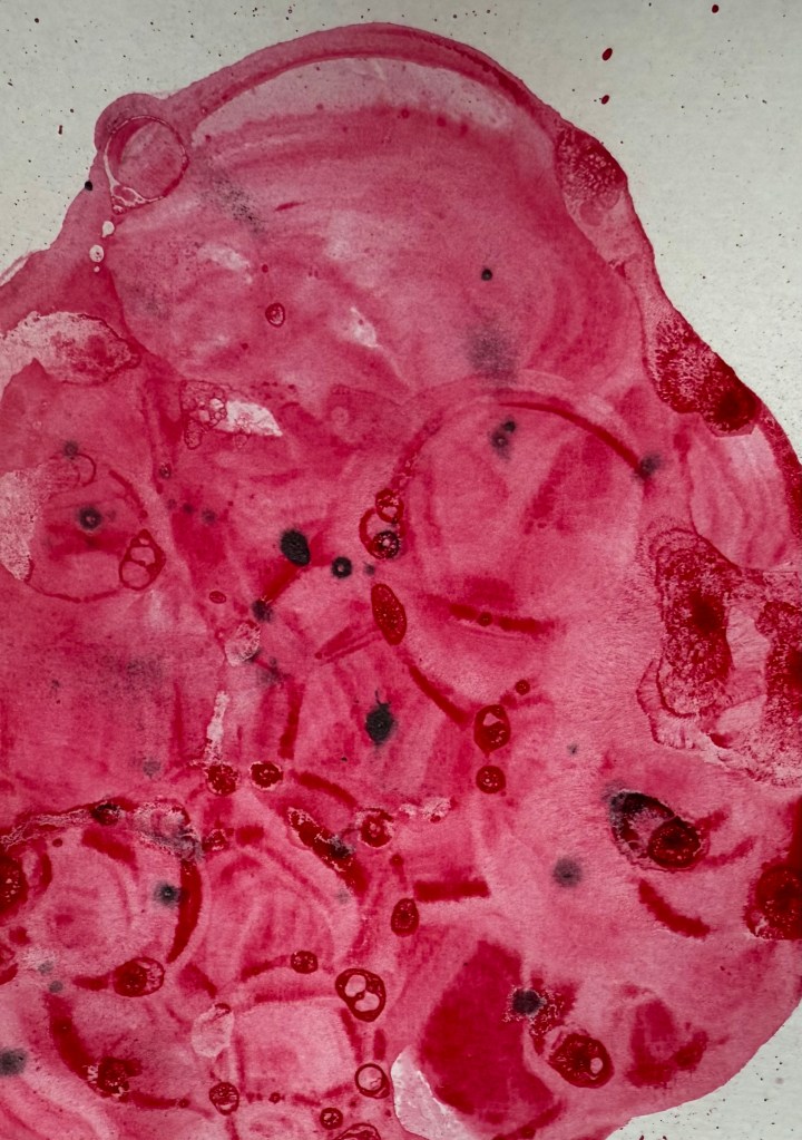
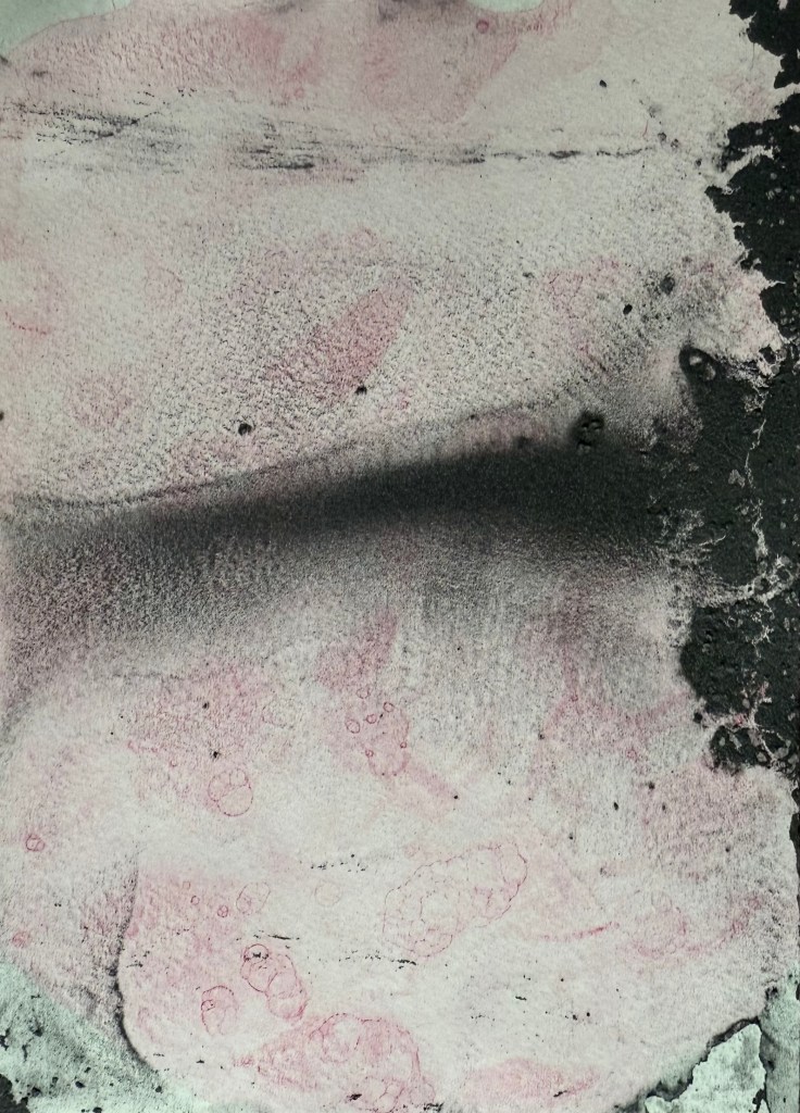
I decided to give parsemage a go – I think that you can do it with anything that can be ground to a dust – I used powdered graphite which has a slightly metallic quality to it. I was really pleased with the results.
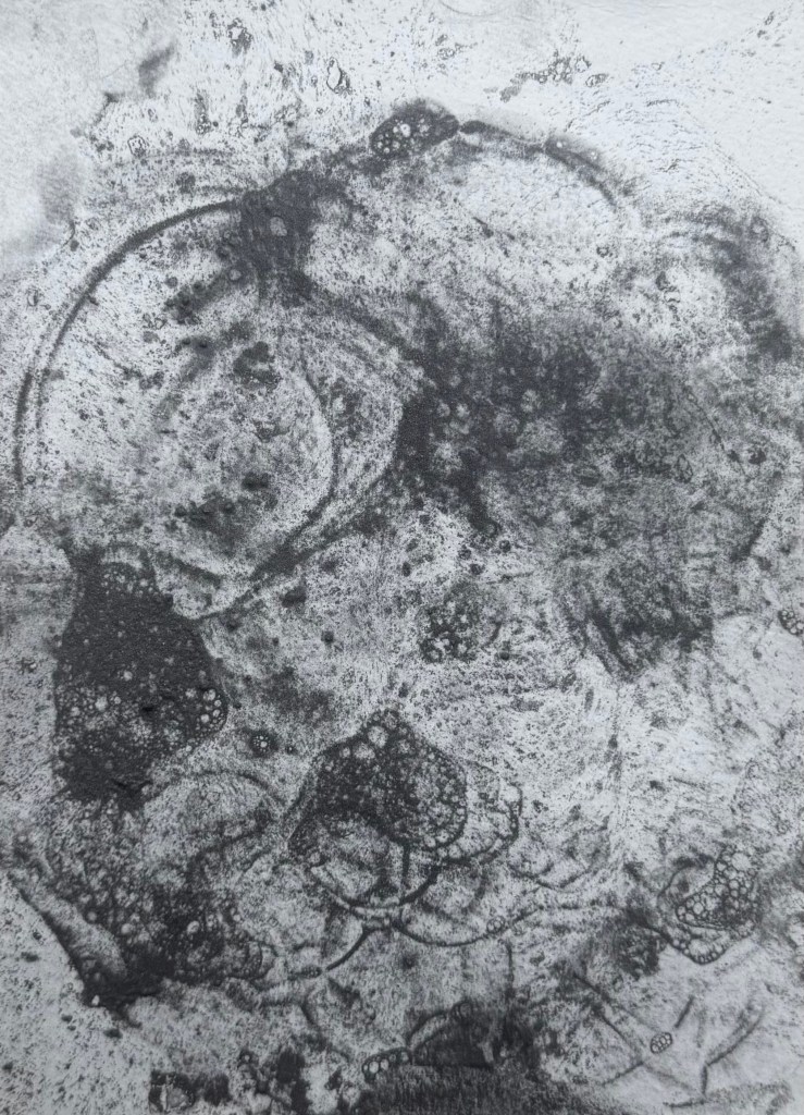
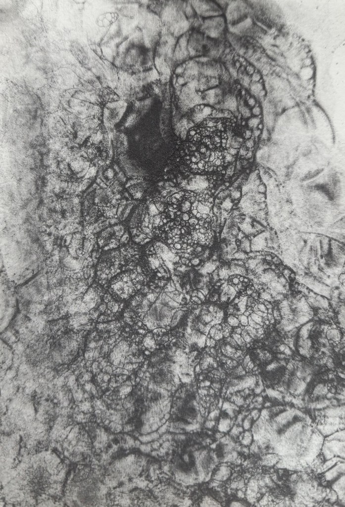
I then remembered a post on Instagram of a potter decorating bowls by blowing bubbles. I’ve used bubbles in wet cyanotyping before, so I decided to try it with the powdered graphite. I really like the delicate lines which were created and it was fascinating watching the effect of the bubbles popping – it reminded me of looking at cells under a microscope.
I then experimented with acrylic ink – maybe I should have realised beforehand – but it failed miserably. I wanted to try again with a water based ink, but I couldn’t find them. It might offer a more effective way of creating something akin to cells, than my previous attempts, so I’ll try again when I eventually locate them.
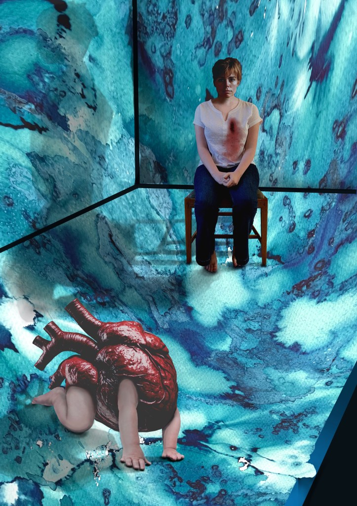
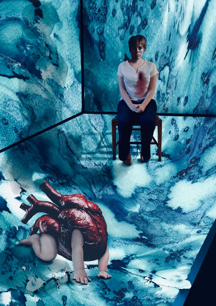
I have had an image in my mind for months. It came from the Elizabeth Stone quotation, I first mentioned in Hearts & Linos .
”Making the decision to have a child – it is momentous. It is to decide forever to have your heart go walking around outside your body.”
I think it encapsulates perfectly how I felt when I became a mother. My whole world was turned upside down. I was suddenly responsible for raising and protecting another human being. I felt overwhelmed by the magnitude of it all; that life would never be the same again. It made me question the sort of world I had brought her into, how her life might be; how much of it I would be a part of, the unthinkable and unbearable pain I would suffer if anything happened to her. She was precious and intrinsic to me, now living and breathing in the world, independently of me.
Original VersionDramatic FilterCyanotypeCoffee Toned CyanotypeAltered background and darker tonesDramatic Filter.Dramatic cool Filter. Worked on hands.
It’s taken a while. Bearing in mind that I’m still finding my way around Procreate I don’t think that I’ve done too badly. I’m sure that I’ve done lots of things incorrectly, but I don’t really care. It’s all a learning process and it was fundamentally about me trying to realise an image that I had in my head. I feel that I’ve achieved what I set out to do. In that respect, I’m pleased with it. I think it conveys the visceral nature of my feelings.
Actually, it has taken me more than a while; it’s taken ages, probably because I kept on making mistakes, but I have learnt lots along the way. I’ve redone parts of it several times but I have to say that it has all been about the process of discovery and realisation. It’s allowed me time to focus on the detail, but it’s been as part of the process rather than with a view to trying to achieve a perfect result. I don’t think that Procreate is a tool with which I can be loose and expressive in the physical sense, but it seems to satisfy that part of me that likes to focus on surreal detail every now and then. Hopefully that will allow the other part of me to enjoy the experimentation of being looser and more expressive in my mark-making when, say, painting.
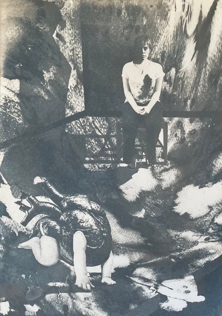
I decided ages ago that I wanted to incorporate my ink experiments as a background to a collage type piece. I sourced the heart, crawling baby and head of the woman from royalty free image sites which allow for reproduction of the resultant work, if need be. The body is my daughter. She’s a bit freaked out by someone else’s head being on it, but I wanted a neutral character, and I couldn’t find an image of a woman sitting on a chair that fitted my requirements, so I roped in a free model.
It was challenging constructing the crawling heart. I’ve had to rebuild parts of it including the hands as some of the fingers were hidden in the original image. It was quite difficult finding source images whose licences allowed me to do what I wanted to do, and were also free. I’ve played around with editing effects and colours and I think that I’m settled on the last image for now. The slight greenish tones, complement the red heart. I really like the cyanotypes, but unfortunately there isn’t enough tonal variation and the slightly chaotic background loses its delicate tonal transitions in the process. I might try again but change the background to something a little less busy. But I like the historical, almost Victorian Penny Dreadful feel to them. I might develop it further, but I’ll leave it on the back burner for now.
The time delay video created by Procreate is of epic proportions, but it’s helpful for me to watch it back so I can see what a song and dance I made of it all. This is a shortened version.
Last summer I became obsessed with cyanotypes. Then there was plenty of sun. There was some sun the other day, but not much since, so I decided to make myself an exposure unit using my Speedball UV lamp and following instructions on Handprinted. I do love a bit of DIY; there’s something very satisfying about making do with something handmade which didn’t cost a fortune to buy, or require some fancy kit, or having to go to a specialist location.
I used an old printer box which was large enough to take A3 sheets, cut out a hole for the lamp to sit in, and then lined it with aluminium foil.
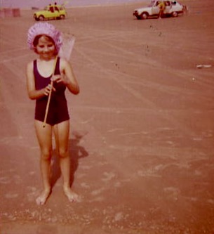
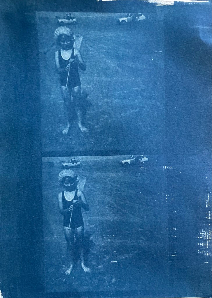
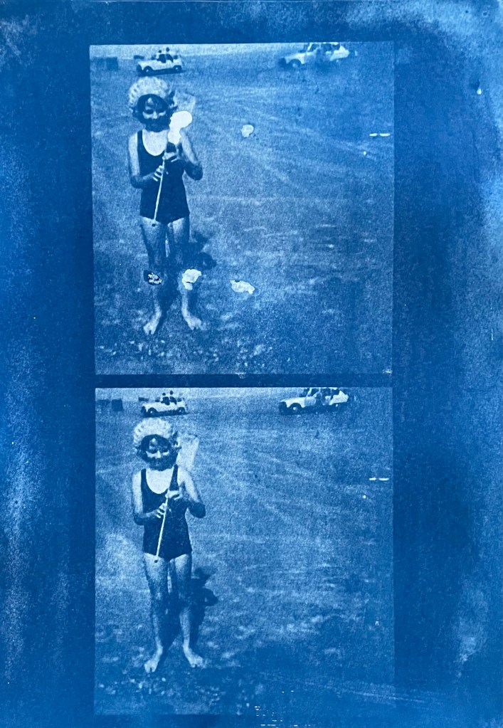
I selected a few photographs to experiment with; some from the family photos which I’ve been sorting out, and others which I have collected on my phone as inspirational resources, as well as some images from the experiments earlier on in this blog. I converted them all to black and white and then inverted them in Photoshop, printing them off on transparencies. I had to dust off my old printer to do this as I wasn’t sure how to do it on my husband’s printer. This took a while because between each print I had to perform a ritual of pressing certain buttons in a certain order in order to fool the printer into thinking that I was using genuine HP ink cartridges, which I wasn’t. The things you can learn on YouTube.
Ironically, the sun came out, so I did a mix of au naturel and my DIY unit.
Me
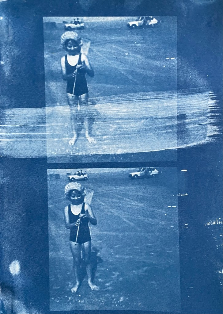
The first two prints were made using the unit, the first being over- exposed at 20 minutes, the second being just about right at 15 minutes. The last two prints I did outside in the sun, which was a bit more hit and miss because the strength of the sun was not constant as it kept disappearing behind some cloud cover. However, I do really like the effect of the visible strokes which I left when applying the solution to the paper, which was A4 300g/m2 hot pressed watercolour paper. The markings give the effect of a moving, flickering , transitory image – there, but not quite there. I put two images on the same negative transparency because I wanted to create a number of smaller images to experiment with. However, the suggestion that the images are on a roll of film is really interesting.
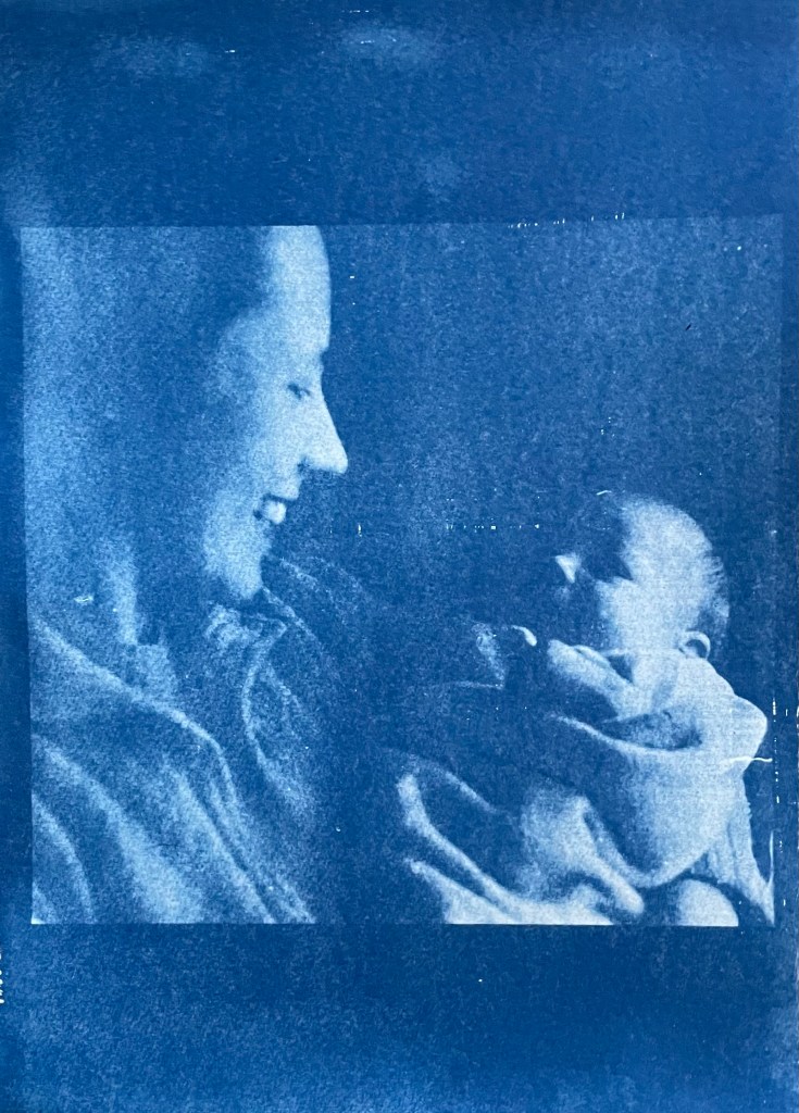
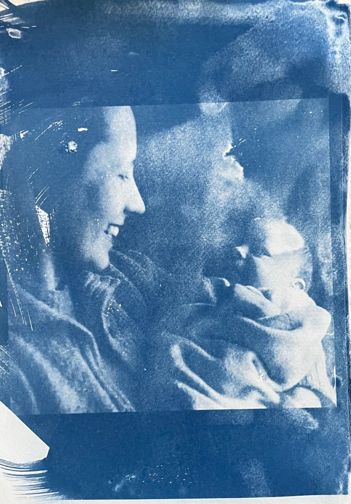
My mother & my brother – capturing a connection and a perfect expression of motherhood
It’s been really difficult getting some of the old photographs out of the albums; they are the sort which have sticky pages on which you position the photos, and then put a transparent film over the top. Over the years the adhesive has seized up and practically bonded to the back of the photos. I’ve tried all sorts including gentle heat, dental floss and a bendy, very sharp filleting knife.
This one of my mother and brother is a favourite, but sustained a small tear on the right. I am pleased with both images – the first one was done outside and the second in the unit, which seems to have more of a Prussian Blue hue to it although I’m not sure that there’s any rhyme or reason as to the differentiation in the blues – but I really like the movement in the second one, again giving the impression of a fleeting moment. I think that the solid areas at the top and bottom add to it, suggesting a frame from a film of a moving image.
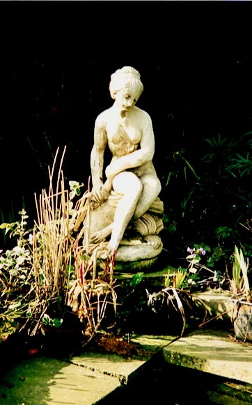
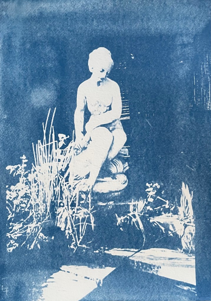
This is a photo of the statue which sits at the bottom of my mother’s garden next to her makeshift pond made out of an old washing-up bowl. I always used to wander around the garden when I visited, stopping at the pond to see if there were any frogs around. I do like a frog – my grandmother on my father’s side used to have a rockery, and I used to spend most of my visits looking for, and trying to catch frogs. That, and hanging out in her shed and greenhouse with the tomato plants – I love the smell of tomatoes; it takes me right back.
The problem with a cyanotype is that if you leave it too long, you over-expose it, and whilst you get deep blues you lose the midtones, which is what I thought I had done with the first one, so I exposed the second one for less, but it turned out to be under-exposed – even putting it in a hydrogen peroxide bath didn’t help. Both were done outside; perhaps I should have done a straight 15 mins in the unit, but where’s the jeopardy in that?
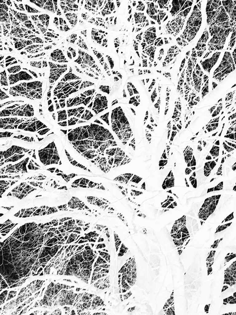
This is a photo that I took looking up into the branches of the three trees that I like. The negative image is also really interesting, and I might do something with that at a later date. The image (last photo) is underexposed again, but has a feeling of being removed, almost as if I’m looking at it through my window (which incidentally does need a good clean). I wanted to try fabric, but could only find some thin cotton lawn. I was so disappointed – it turned out terribly. I had visions of being able to create long, flowing, billowing, wispy cyanotypes, but ended up with the image above. You can just about make out the branches.
I will need to think about this a bit more. My first thoughts are that maybe there was a coating on the fabric, so I’ve washed it; maybe the image was too detailed, but I’ve seen quite detailed images on fabric; that the structure of the fabric is not robust enough – you can get pretreated fabric which is like a sateen so I could try that; or maybe there wasn’t enough contact between the fabric and the negative. I need to take some time to reflect, and try again.
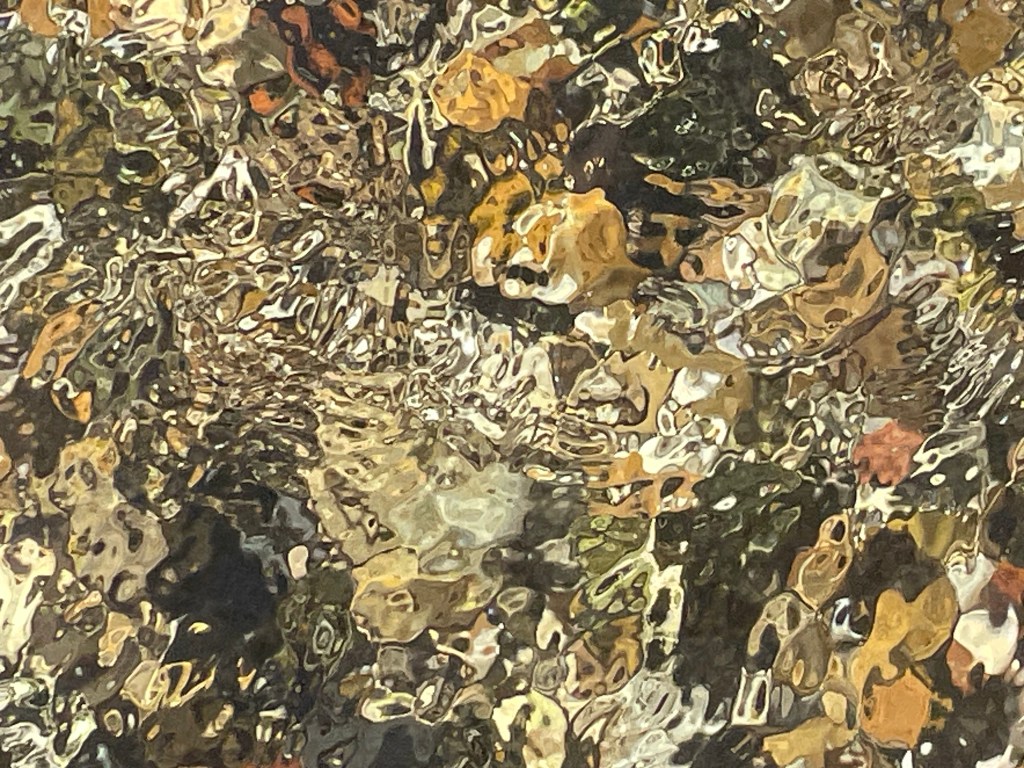
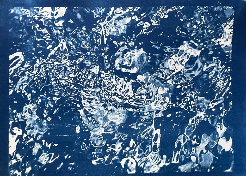
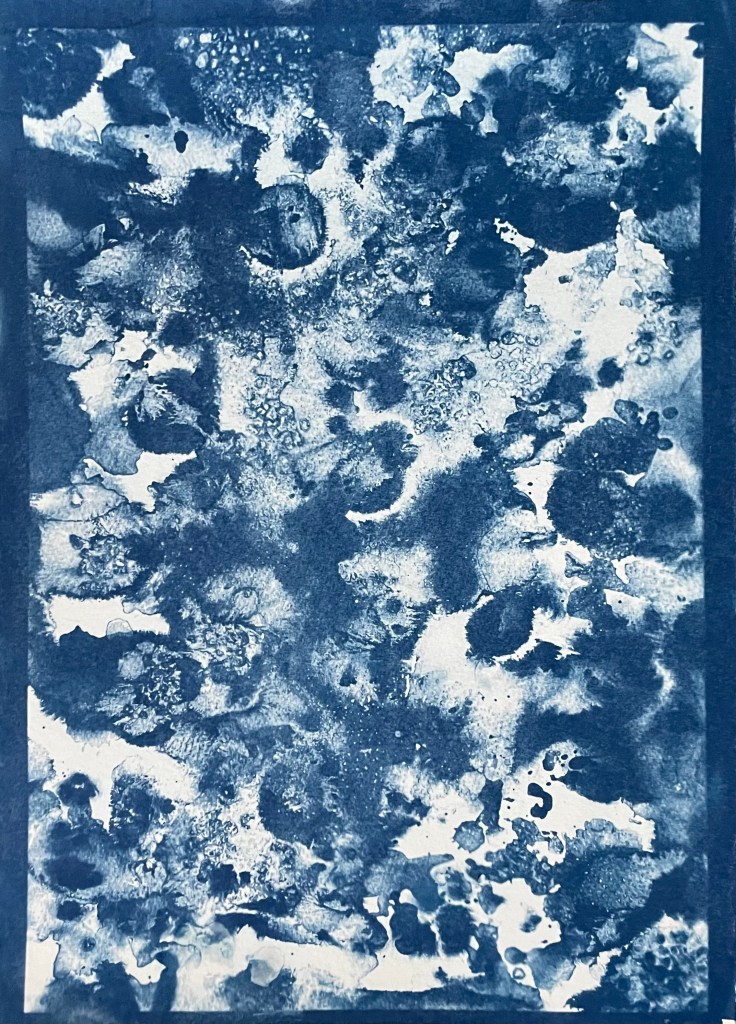
The images above were from my experiment with ink in Blot II , and from A State of Flow II . It was a useful exercise in that it confirmed to me that not everything works as a cyanotype – I much prefer the original images, particularly the ink one, as the edges between areas of flooding and blots are much more defined, and there is more of a delicacy about them. The contrast between the blue and the black ink also adds interest which is lost in the cyanotype.
So, on reflection a really useful and enjoyable exercise. The thing that I really enjoy about this process is the anticipation, and then the slow reveal as you rinse off the solution to see an image slowly emerge, or not, as the case maybe. Doing it outside as opposed to in the controlled environment of the unit adds a degree of extra excitement, but equally there is the risk of crushing disappointment when it doesn’t quite work out.
Moving forwards, I was intending to experiment with toning some of the smaller images of me with tea, coffee, wine etc, but I actually like the last couple as they are, so I will keep them as finished. I’m thinking about how I could use multiple exposures to create layers, and also thinking about manipulating the source image a bit more in Photoshop and printing from the original image rather than reversing etc. I’m not sure whether I’ll get straight to it, or do something else in the meantime – sometimes I go hell for leather with something and then exhaust it, or myself, or become disenchanted with it. I don’t want to get too far down a rabbit hole, so maybe I should leave a bit of space before going back to it, to allow for some more subconscious reflection. I suppose the clue was in the opening sentence: “Last summer I became obsessed with cyanotypes”, and I haven’t done it since.
I had some free time yesterday, so I decided to try out kitchen lithography using some aluminium foil and cola.
This is the first time I’ve tried it – I’ve been interested in doing it since I came across a Canadian artist who uses it in her work, in addition to other printing processes, Valerie Syposz. Her work primarily deals with self-perception and existence.
’Treasure’ 2021’Shelter’ 2022‘Embers’ 2023
I like the surreal quality of her work, and her subject matter is relevant to what I’m exploring.
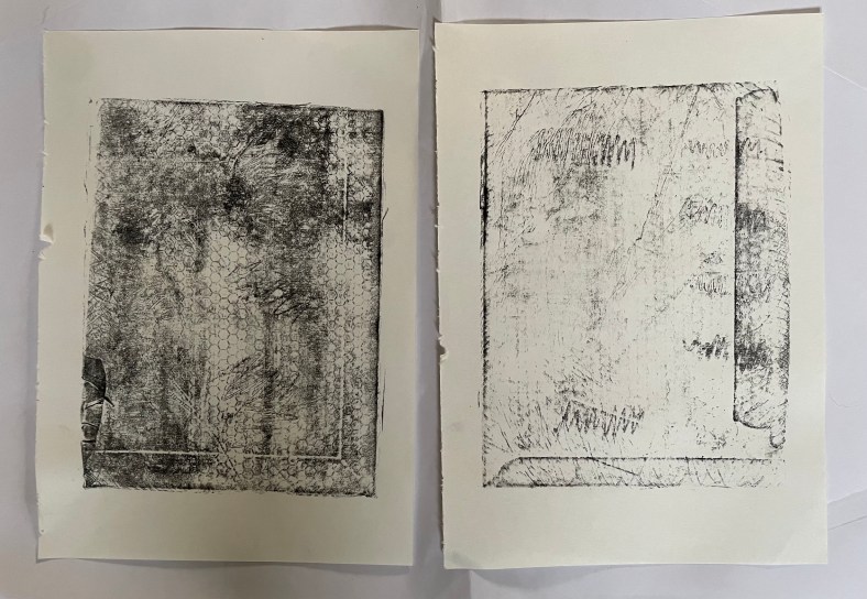
I have to be honest and say that it didn’t really go to plan. First of all, I discovered that the foil I have in my kitchen drawer has a honeycomb pattern embossed on it, and then I forgot to use the dull rather than the shiny side of the foil. I made various marks using different pencils, pens, markers, graphite sticks and pastels, but I was doomed to failure. Not wanting to go out into the cold to my shed to find some plexiglass sheets to wrap the foil around, I had used an Amazon envelope which I found in the recycling bin, which turns out had some raised edges on it. But, hey, it’s just an experiment. I also didn’t apply enough water to the plate which meant that the ink adhered to areas it shouldn’t have.
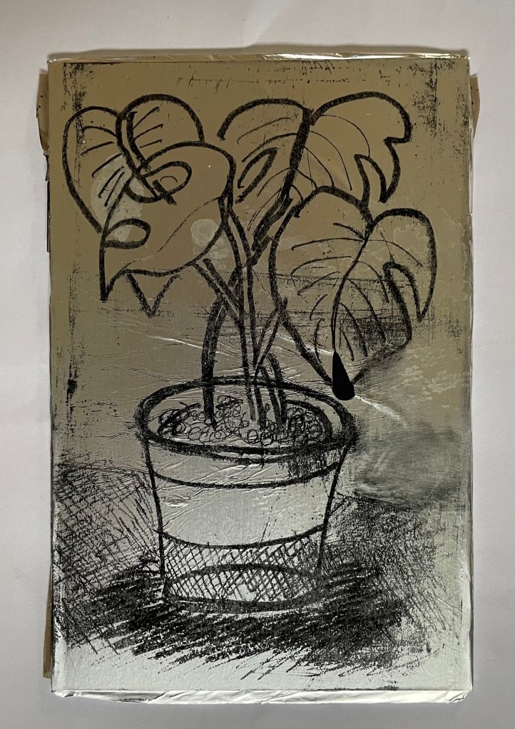
Once I had realised my mistakes I gave it another go. I used a small plexiglass sheet this time, and found some other foil which had a smooth surface. I made a quick, not so good, drawing of the plant in front of me. I used a combination of a chinagraph pencil, basic oil pastel, and a 6B graphite pencil. I did try using a biro, but it ripped a hole in the foil – this was probably because the foil wasn’t very strong. I then poured cola over the top of the plate, rinsed it off, and then rubbed the image away using vegetable oil. Once the plate was dampened with water, I rolled on the ink, re-applying water using a sponge between each ink application. The idea is that the cola contains gum arabic and phosphoric acid which makes the foil which hasn’t been drawn on, hygroscopic. I then used a bamboo baren to transfer the image to a sheet of Hosho paper.
They’re not great, but I’m just happy that I managed to get a defined image at all, bearing in mind my first attempt was such a complete Horlicks.
It felt good trying something new, and what made it particularly enjoyable was the fact that it could be done at home with easily accessible tools and supplies. I will definitely explore it further perhaps after doing some further research so that I can appreciate its full potential. There is a lot of scope for experimentation with different printmakers having different opinions as to the best methodology to adopt: some lightly sand the foil before drawing on it, others use cornflour and maple syrup on the plate; some don’t use a support and just use the foil as a sheet. Maybe the brand of cola has a bearing on whether the process is successful: perhaps I’ll need to have a Pepsi challenge.
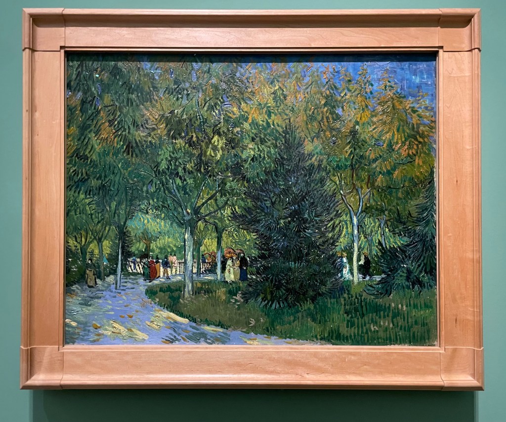
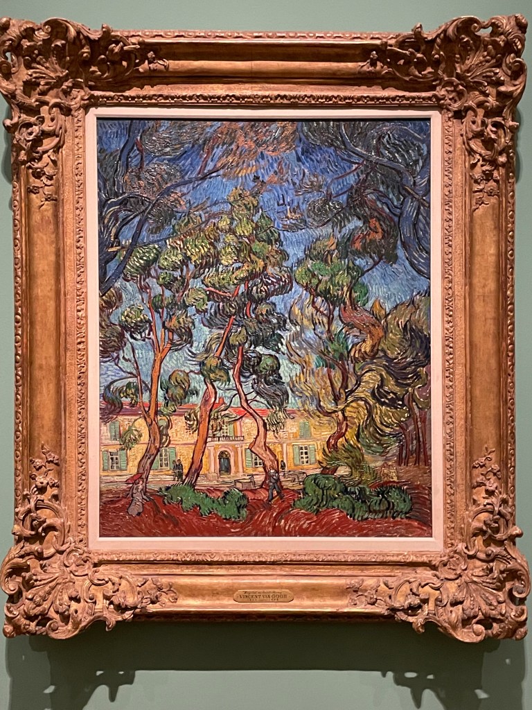
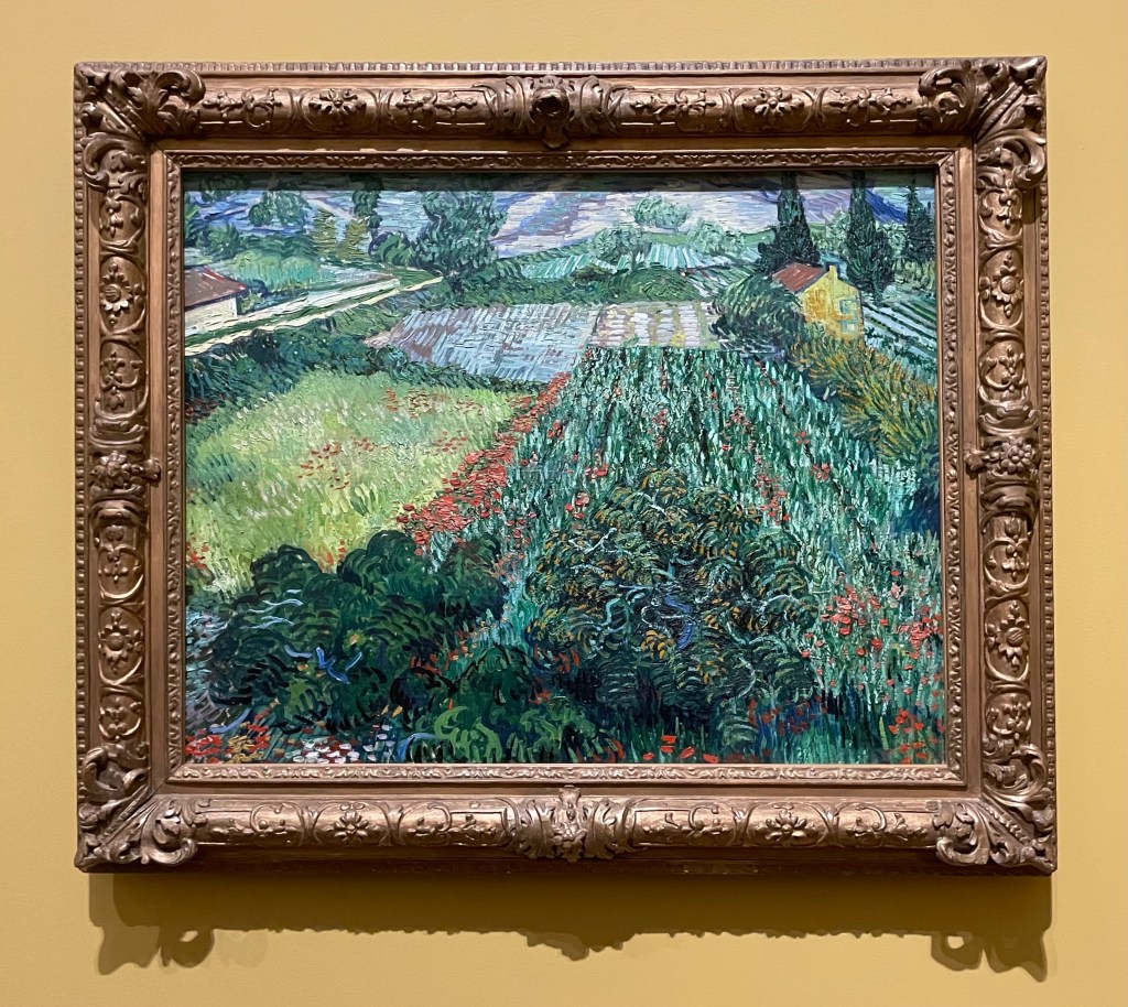
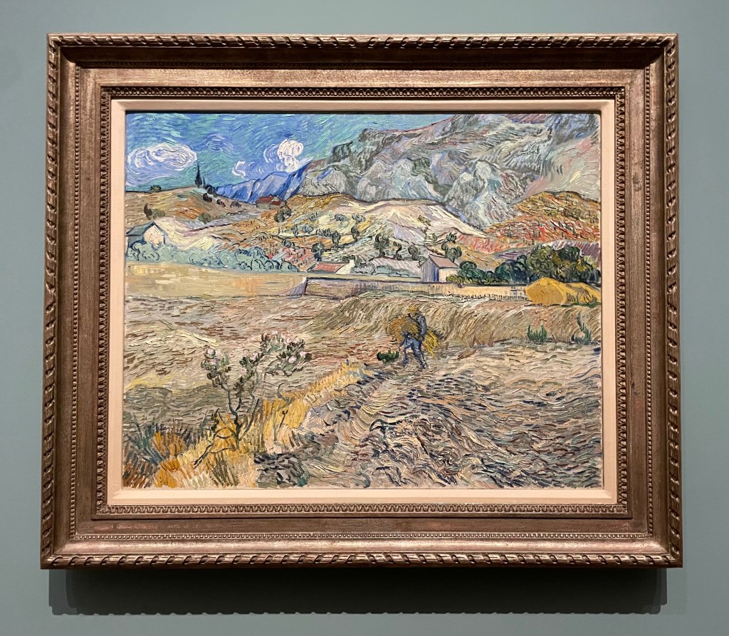
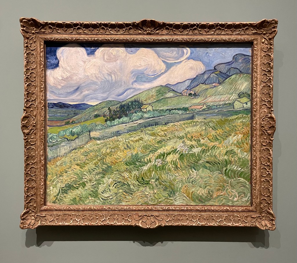
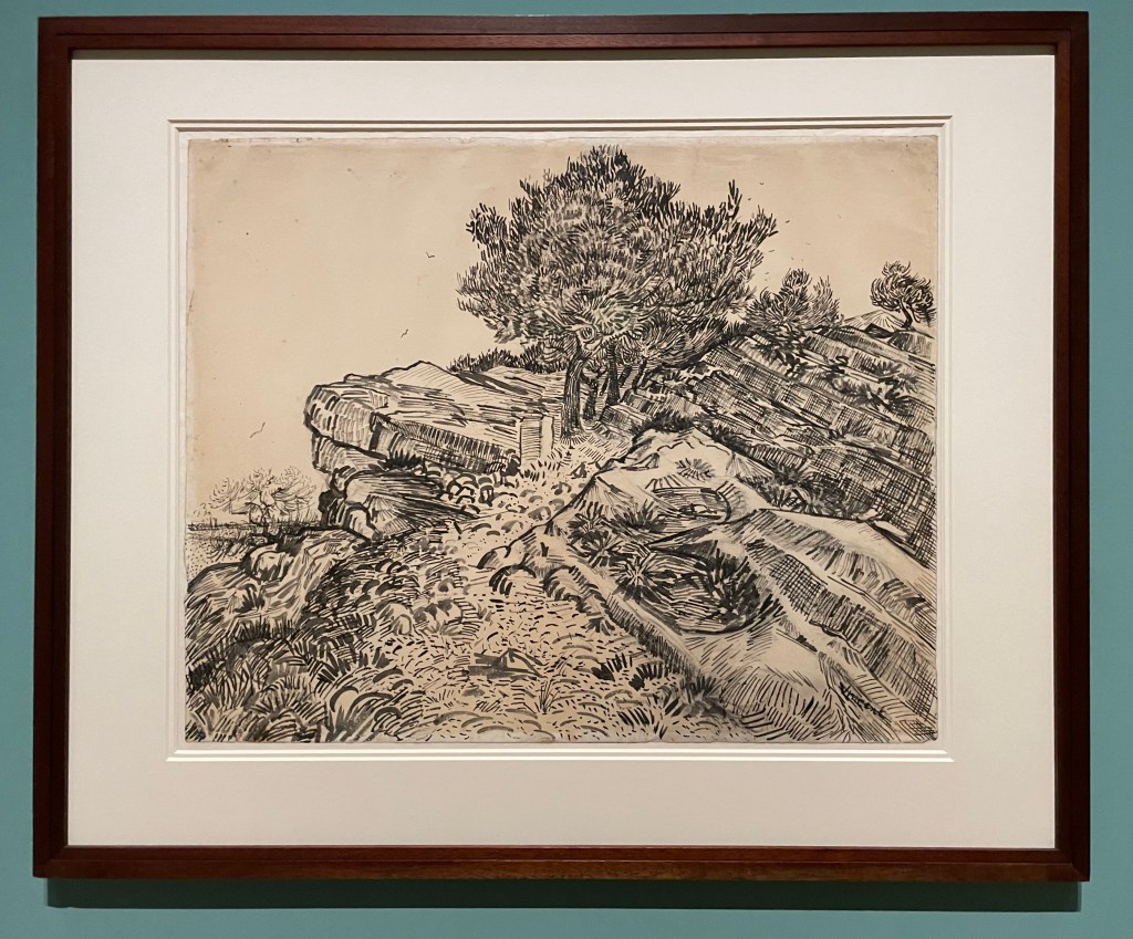
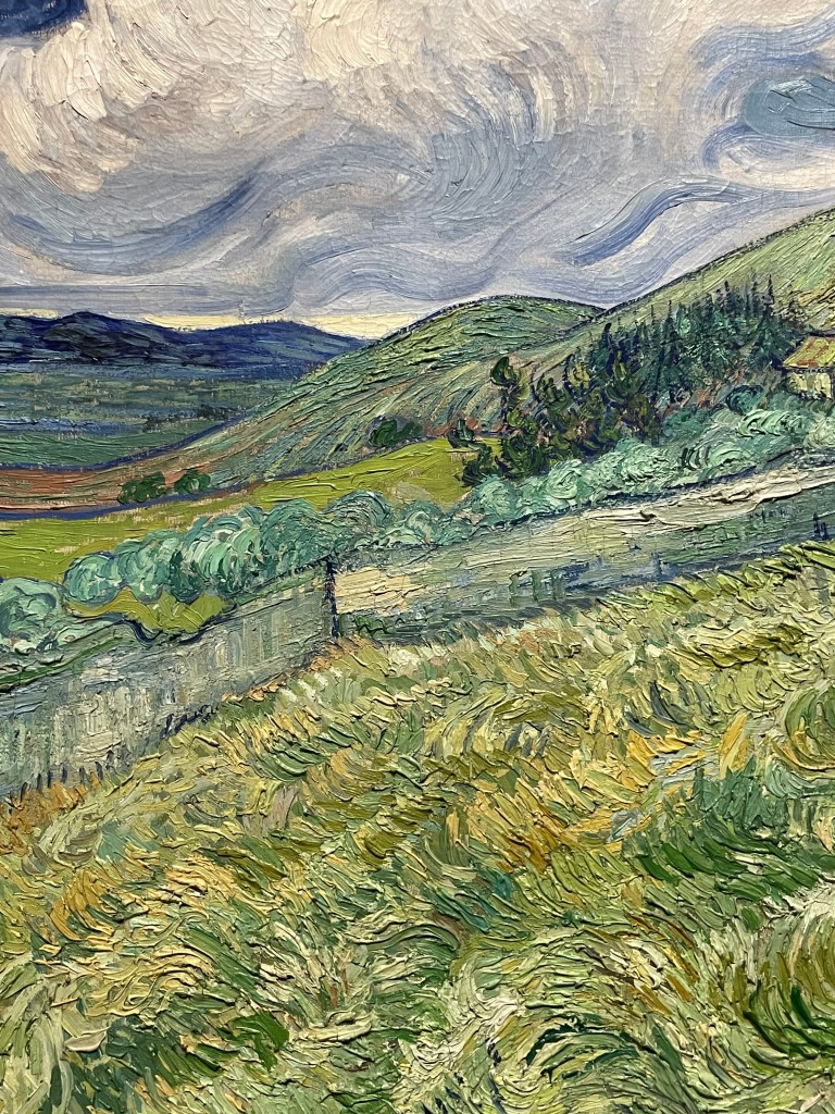
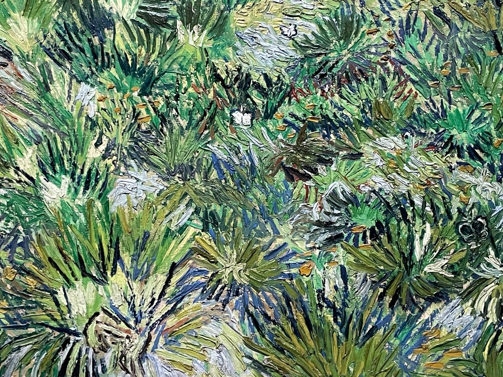
Well, I made it through without a tear. It might have been the sheer number of people which meant that it was impossible to stand and contemplate too deeply, or the audio commentary going on in my ear which distracted me. The ‘Poets and Lovers’ exhibition at the National Gallery was a cornucopia of Van Gogh brilliance, although I was left wondering why it didn’t include some of the Van Goghs I had seen in other galleries, such as the self-portrait with bandaged ear at the Courtauld, but then I don’t have the faintest idea about curation. That said, it didn’t detract from the luscious visual delights on offer, many of which I hadn’t come across before.
What struck me more than anything was the direct correlation between how he drew and how he painted. The range and quality of mark-making was phenomenal. Whilst up close, the brushstrokes and colour palette made me virtually tachycardial, it was standing in the centre of each of the rooms which gave the most rewarding experience.
The only moment when I almost cracked, was when I found myself in front of the Sunflowers from the National Gallery and the Philadelphia Museum of Art: he painted his Sunflower series to decorate his guest room in anticipation of Gaugin’s visit to Arles, in an effort to impress Gaugin, who he greatly admired, almost to the point of obsession. Van Gogh’s sensitivity and vulnerability weren’t a good match for Gaugin who, by some accounts, was aggressive and egocentric, which served only to reinforce Van Gogh’s insecurities. It all made me blink a bit quicker. I have to declare my bias – I’m not a fan of Gaugin for various reasons, not least because he abandoned his wife and five children to go off and indulge his predilection for young girls.
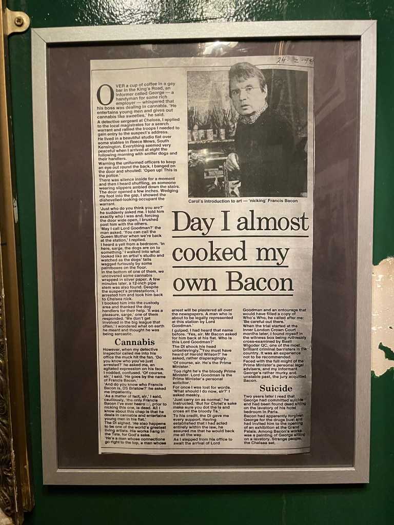
The day was rounded off by a trip to the Colony Room Green, a replica, as near as dammit, of the bohemian Soho legend that was the Colony Room Club which closed down in 2008 after 60 years, and which was the creation of the queen of Soho, Muriel Belcher – apparently, you knew you were in if she called you the ‘C’ word. It was the favourite haunt of creatives such as Francis Bacon, Lucian Freud, John Craxton, Damien Hirst, Tracey Emin, Dylan Thomas, John Deakin, Frank Auerbach, Michael Andrews, Giacometti, and the list goes on. My husband was particularly keen to visit as he’s reading Darren Coffield’s ‘Tales from the Colony Room’.
‘ Francis Bacon was very fashion-conscious and always immaculately dressed. One afternoon Francis walked in, annoyed and pulling his collar. – “What’s wrong, Francis?” – “Harrods, I’m never going back there again.” He’d attended a special night for select clients and bought lots of clothes, but when he’d got back home he’d decided he didn’t like any of them. “I bought so many suits and shirts and threw the lot in the dustbin.” You’d never seen the club empty so quickly. The next day everyone was up the club parading around in their new suits and shirts from Francis’ dustbin.’
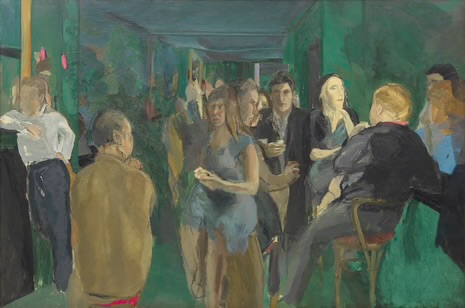
Colony Room I, Michael Andrews, 1962
It’s very small and down some stairs underneath Ziggy Green, 4 Heddon Street, a side street off Regent Street. It’s reminiscent of a dive bar/ speakeasy.
It was great meeting Liam, the house jazz pianist and chatting to Tim, the barman who explained that it’s not trying to be a re-creation of the original, but somewhere to come and meet an eclectic mix of people. Despite what he said, I couldn’t help but feel that I had stepped back in time, waiting for the door to open and for one of my artistic heroes or heroines to walk through it. They often have events which are free to attend, such as talks and book launches. Unfortunately, we couldn’t hang around for the Portrait of Muriel Belcher evening.
There’s something very inspiring about the idea of a group of creative people coming together regularly to discuss work, ideas and concepts. I’ll definitely pop back in next time I’m in town, in the hope that something might rub off.
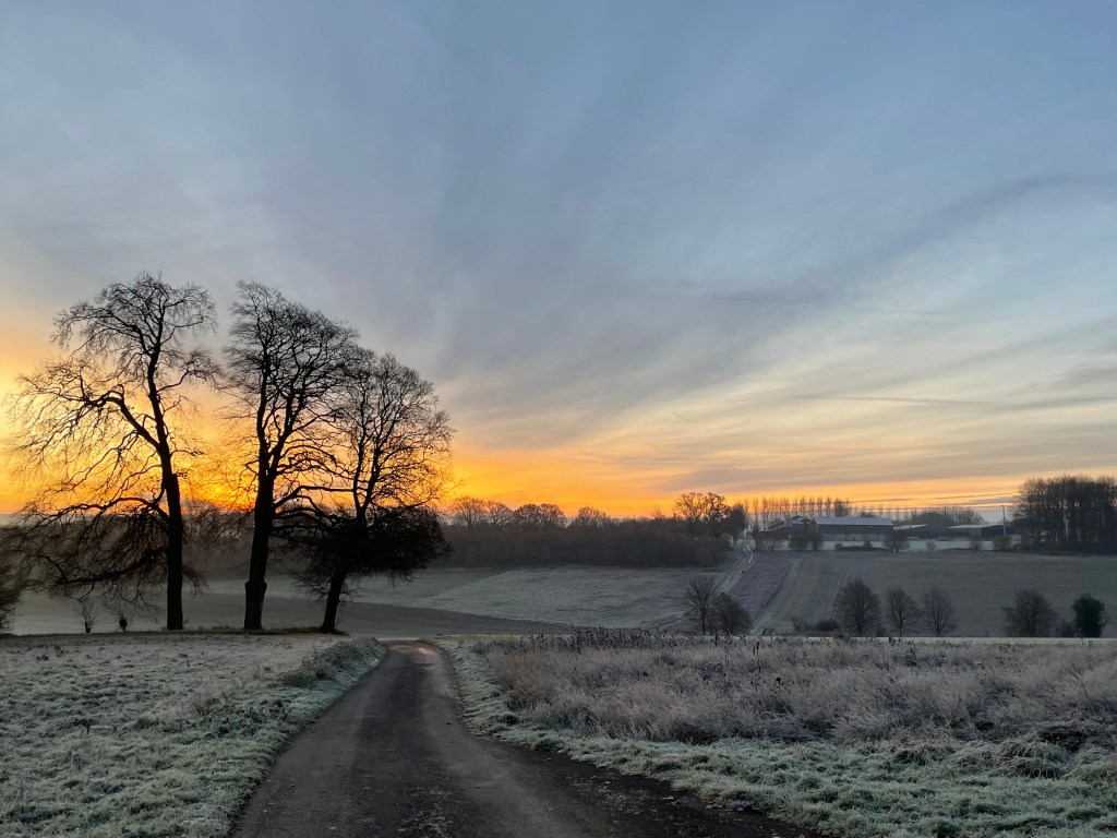
It started with a bracing dog walk, first thing. It was the best start to the day.
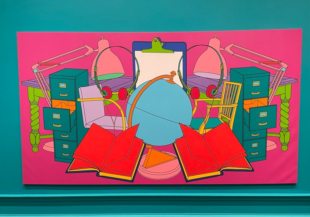
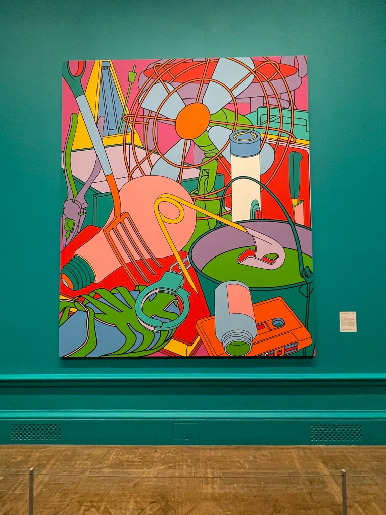
Then a train ride to London to visit the Michael Craig-Martin exhibition at the Royal Academy before it closes in a little over a week. I have to say that going into a gallery has the same effect on me as going into a church – a sense of wonderment and contemplation comes over me: people even speak in hushed tones.
It was joyously colourful, but for me, that was just about it. I was left wondering to myself, if it wasn’t for the painted walls and the sheer scale of some of the works, would they still have been so impactful? If they had been A3 in size and hanging on a bare white wall, would I still have experienced chromatic overload? I used to be attracted to the graphic simplicity of his work, elevating everyday objects to something out of the ordinary, but I’m sad to say that I don’t think it does it for me anymore. I’ve changed. If anything, I was more intrigued by his earlier conceptual work.
The Oak Tree (1974) is a small glass filled with water to a specific level and mounted on a wall at a specific height of 253cm. It is accompanied by the text of a conversation in which Craig-Martin explains how he has changed the glass of water into an oak tree without changing the physical form of the glass – I don’t know whether it was meant to be amusing, but I certainly had a titter. In a short film for the RA, which I watched when I got back home, he explains that he was trying to find something that constituted the essence of art, in that art is based on the notion of transformation, and the most extreme proposition for transformation would be to have no transformation at all. Others have alluded to his Catholic upbringing and have suggested that it is to do with transubstantiation. I also read that it was seized by Australian customs officials on its way to an exhibition in the 1970s on the basis that it was illegal to import plants into Australia!
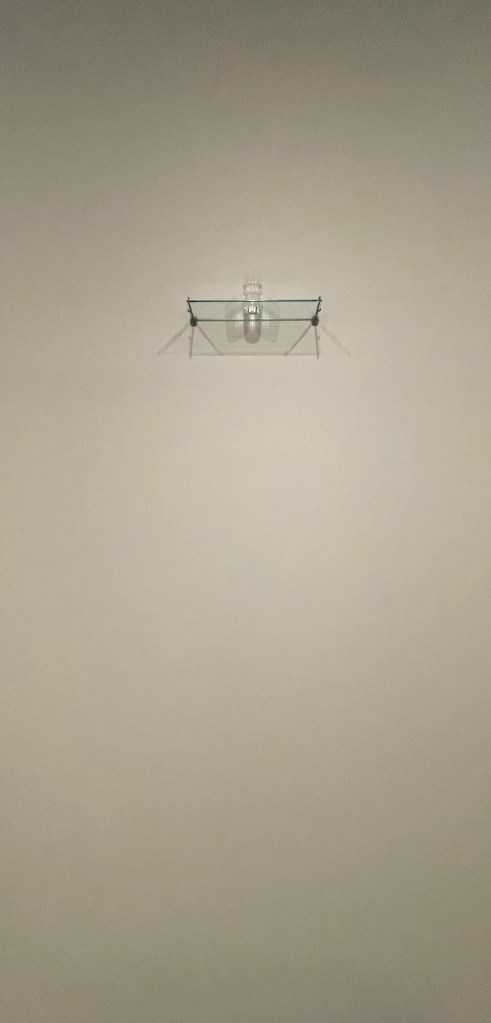
I was particularly drawn to ‘Conviction’, a series of mirrors on paper, as it directly relates to what I’m planning to explore.
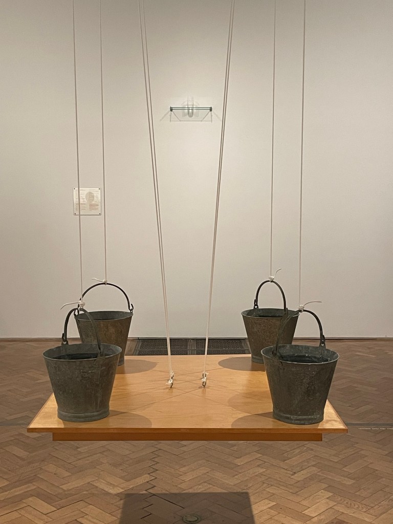
’On The Shelf’ comprises 15 milk bottles positioned at a precarious angle on a shelf, but the varying levels of water create a level horizon. The four buckets on the table are actually supporting the table, rather than the other way round. Finally, ‘Box that never closes’ questions what makes a work of art: the box has lost all functionality, and does not even form something that is aesthetically pleasing.
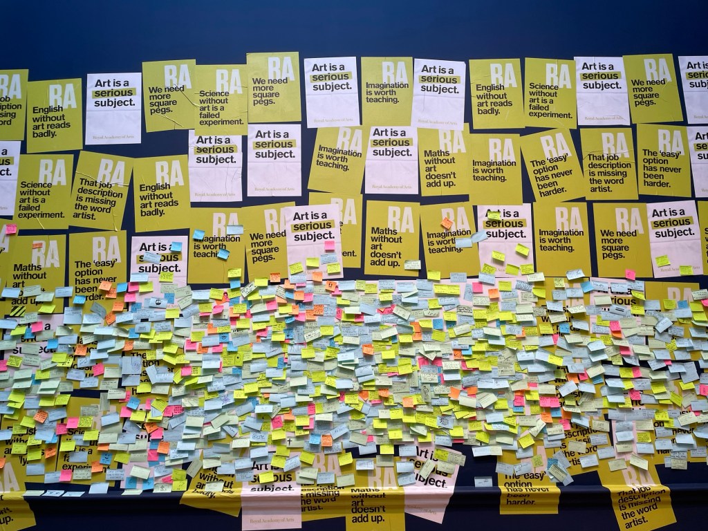
I went into the shop but didn’t buy anything: instead I had a look at the wall which supports teaching art in schools. I put a post-it note up following on from our session a couple of weeks ago: ‘creativity will save the planet’, but I forgot to take a photo.
I was then going to nip into the National Gallery but the queue was half way down the street – probably caused by the extra security and bag searches. So I went round the corner to the National Portrait Gallery which I haven’t been in since its refurb.
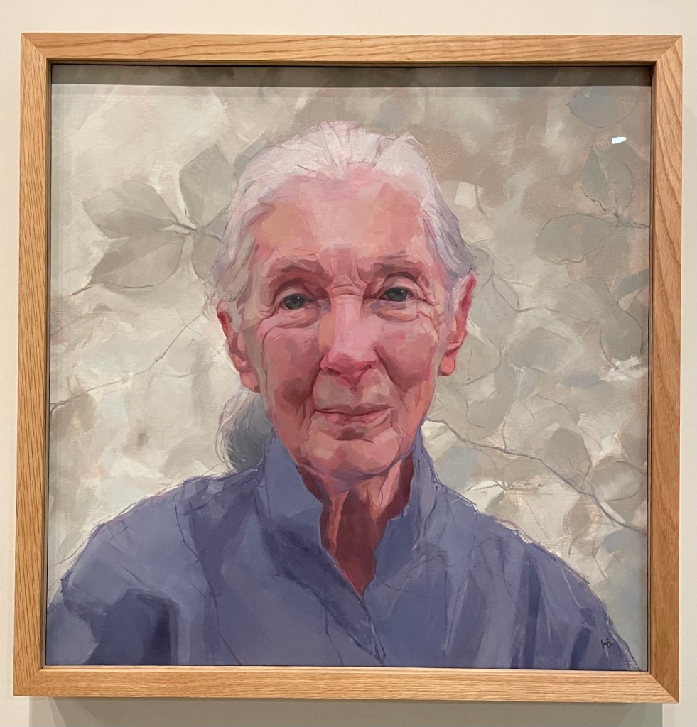
I was pleased to see the portrait of zoologist and conservationist, Dame Jane Goodall, by Wendy Barrett, the winner of Sky’s PAOTY 2023. Compared to the photograph taken by Ken Regan, it gives the viewer so much more. I thought it was tremendous, and full of intelligence, sensitivity and humanity.
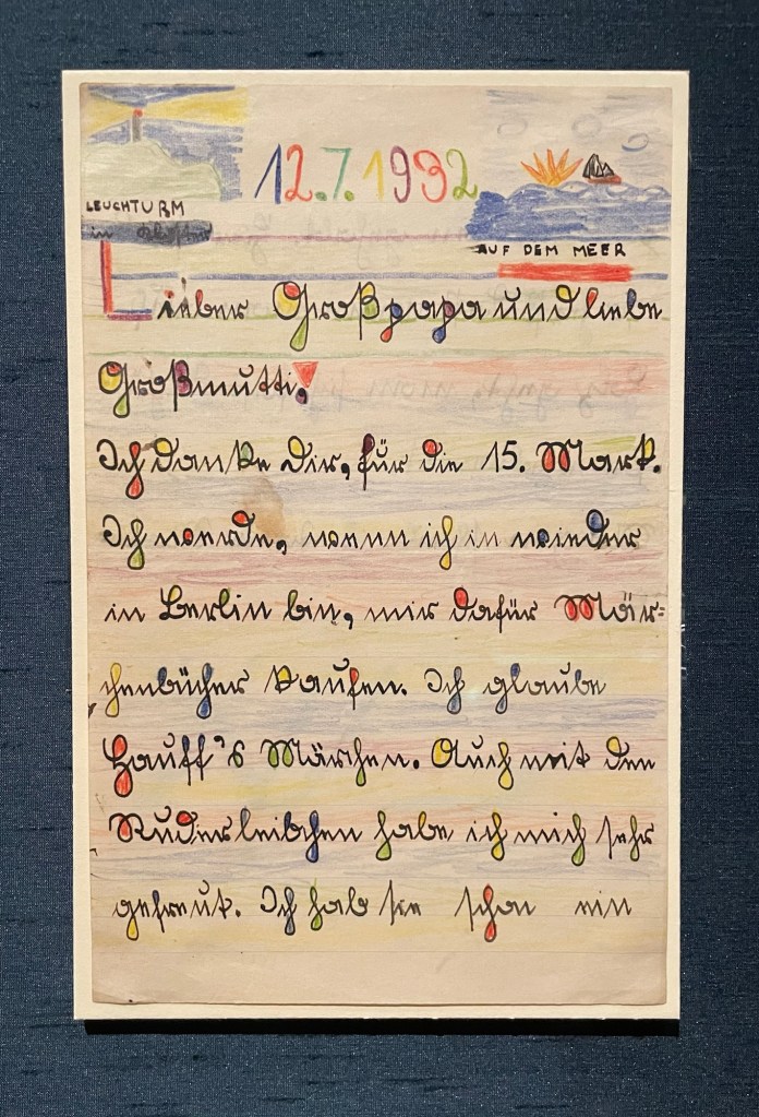
Lucian Freud’s letter to his grandparents, thanking them for the money they gave him, which he was going to use to buy a book of fairytales, reminded me of Miró with its coloured shapes and black lines. It took me back to a hot day in Sóller over the summer when we found relief from the sun in the train station, which happened to be exhibiting various ceramics by Picasso and works by Miró – can’t see that happening at Waterloo Station anytime soon. Freud’s self-portrait is a favourite: the way he applies paint and his minimal brushstrokes are lush.
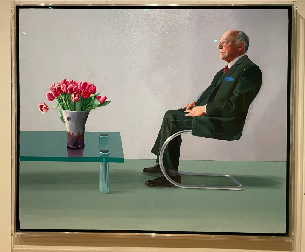
Bearing in mind my latest experiments using a pen, I was fascinated by the mark-making in Eileen Agar’s drawing of the modernist architect, Ernö Goldfinger. Hockney’s portrait of Sir David Webster with Tulips is stunning: I was a bit perturbed by the size of his head at first, and the fact that the sole of his left shoe seems to be coming away, but I think I’m ok with it now. In any event, it’s all eclipsed by the beautiful rendering of the table and tulips, and the fact that the jacket hanging over the arm of the chair makes him look like he’s levitating.
Colin Davidson’s Silent Testimony was moving: a collection of 18 large scale portraits of individuals who have all experienced loss in the Troubles in Northern Ireland, although it is also more generally about everyone who is left behind after conflict. They are impartial: there is no reference to the sitters’ religion or politics. What is striking is that none of the sitters are looking directly out of the canvas; they look off to the side as though deep in thought, as if they are remembering. There is a real sense of loss and pain, and contemplation – it is etched onto their faces, quite literally in some areas. They are painted in thick paint which seems to be weighing them down. But it’s all about the eyes. They are painted with a much more careful and detailed application of thinner paint. They almost look haunted.
And then I walked back to Waterloo Station, over the bridge, with Ray Davies crooning in my ear, although, let’s face it, his voice isn’t what it is used to be. All in all, apart from my break-up with Michael, a good day.
There’s something very satisfying about drawing a line.
Paul Klee loved a line. Taking a line for a walk.
Bewölkung (Clouds), Paul Klee, 1926
I stand in front of this Paul Klee every time I go to the Pallant House Gallery in Chichester. Ink lines drawn over watercolour evoke feelings and moods, suggesting, not defining.
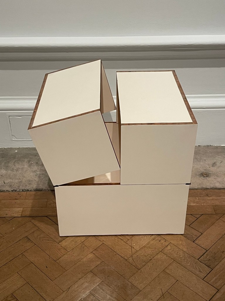
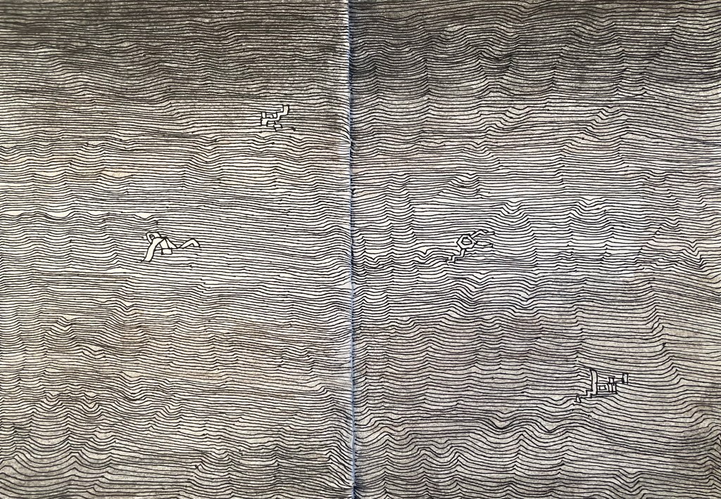
I listened to a film whilst I did this. I like the suggestion of form created by the pattern of the lines. It’s made me think about something underneath trying to get out. The real me? I find these sculptures to be disturbing but compelling at the same time.
Maybe the lines are the contours of my life on a map. My own satnav so I know where I’ve been and where I’m going. Lots to think about.
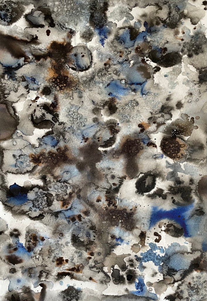
There’s no expectation. It feels free. I like that you have to wait until they are dry to see the full effect. I feel like I have made them, which is an important step for me as I have struggled to accept the concept of randomness in art making; but I applied the water, the ink, chose the brush and I dropped and flicked the ink where I did, and just because I didn’t control what happened next doesn’t mean I didn’t in some way influence it. I like the combination of the different inks. The black Indian ink did not reveal as many tones as I was expecting, so I also used black writing ink which revealed tones of brown. I enjoy looking at them and identifying areas of interest as well as random shapes of faces, flowers, and cuddly toys! I have an idea as to how I might incorporate them into future work.