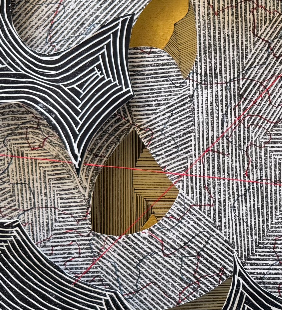
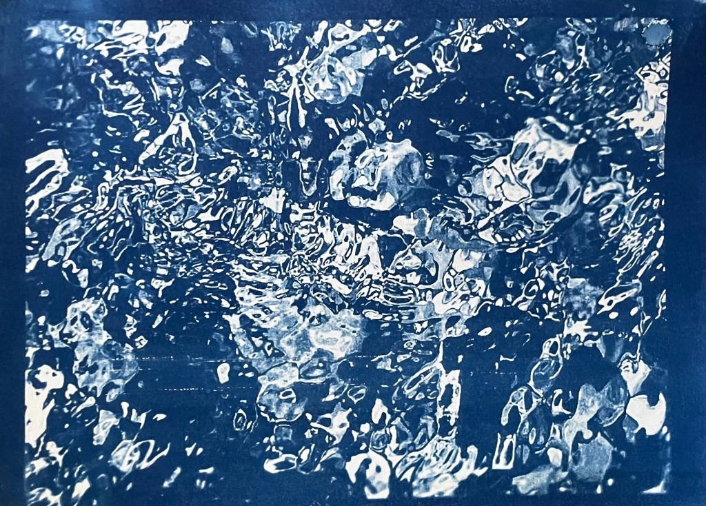
I quite like the idea of revelation, and layering seems to facilitate this.
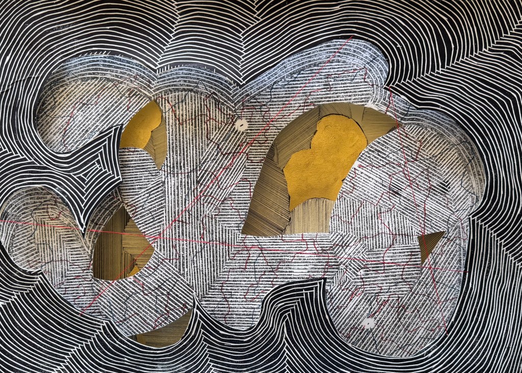
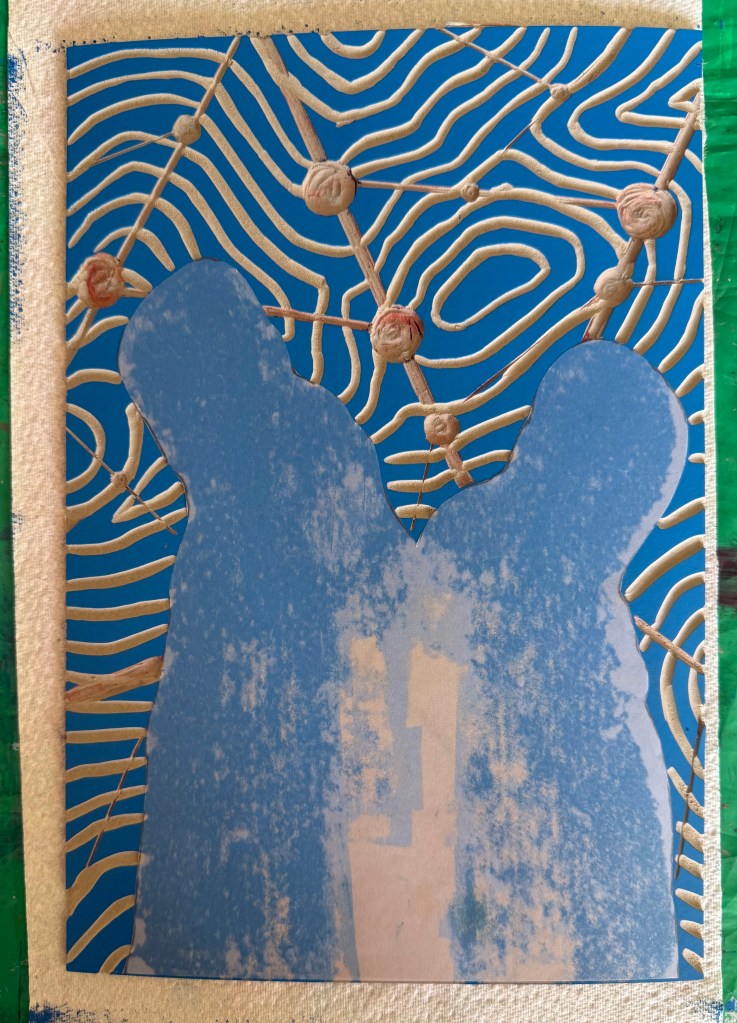
Drawing lines on the first print I made of the linocut – there must have been some loose bits because it left small circular areas of white which reminded me of places or points of interest on a map. I then cut out some areas and laid it on top of a section of the figures line drawing using some cut up old corks as makeshift spacers. I then stuck the print with the large white space onto some watercolour paper and cut out the centre. I sewed some threads across the centre – thicker embroidery silk would have been better but I had to make do with what I had to hand. I laid it on top, slightly off from the print below.
I’ve filmed from my iPad screen covered in clingfilm before, but I decided to try videoing a projection as inspired by Johanna Love. I’ve also tweaked a few bits and re-recorded the audio again – I sounded really peed off in the original.
As usual, it turned out to be more complicated than anticipated. I wasn’t able to connect the old projector to my laptop because it didn’t have the right size or shape holes. So I had to dig out and charge up my old laptop. After a lot of time faffing around I eventually managed to record it and then I set about remaking the video. I think that I prefer this version.
I’ve decided to experiment with using the contour image in Procreate as a layer.
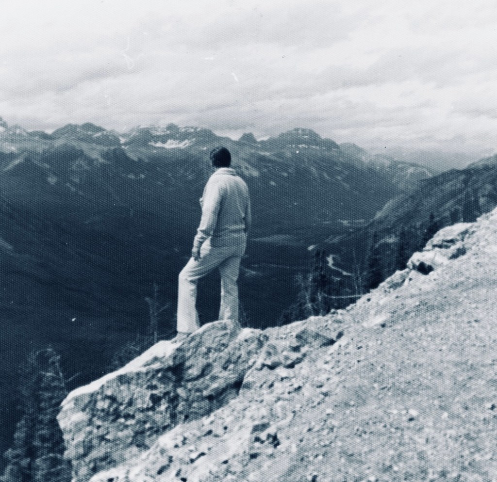
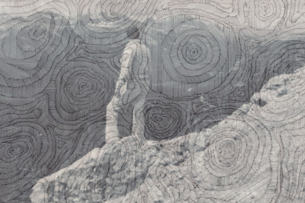
I was looking through some old family photos and found this one of my father in Canada. This is a recurring image from my childhood – if there was an edge or a high place, my father would always go and stand on it despite us pleading with him not to. I think he would have been about 40 years old when this was taken. I took him on the London Eye when he was in his 70s and I don’t think he looked out at the view once, choosing to spend the entire time sitting on the central seat, ashen-faced.
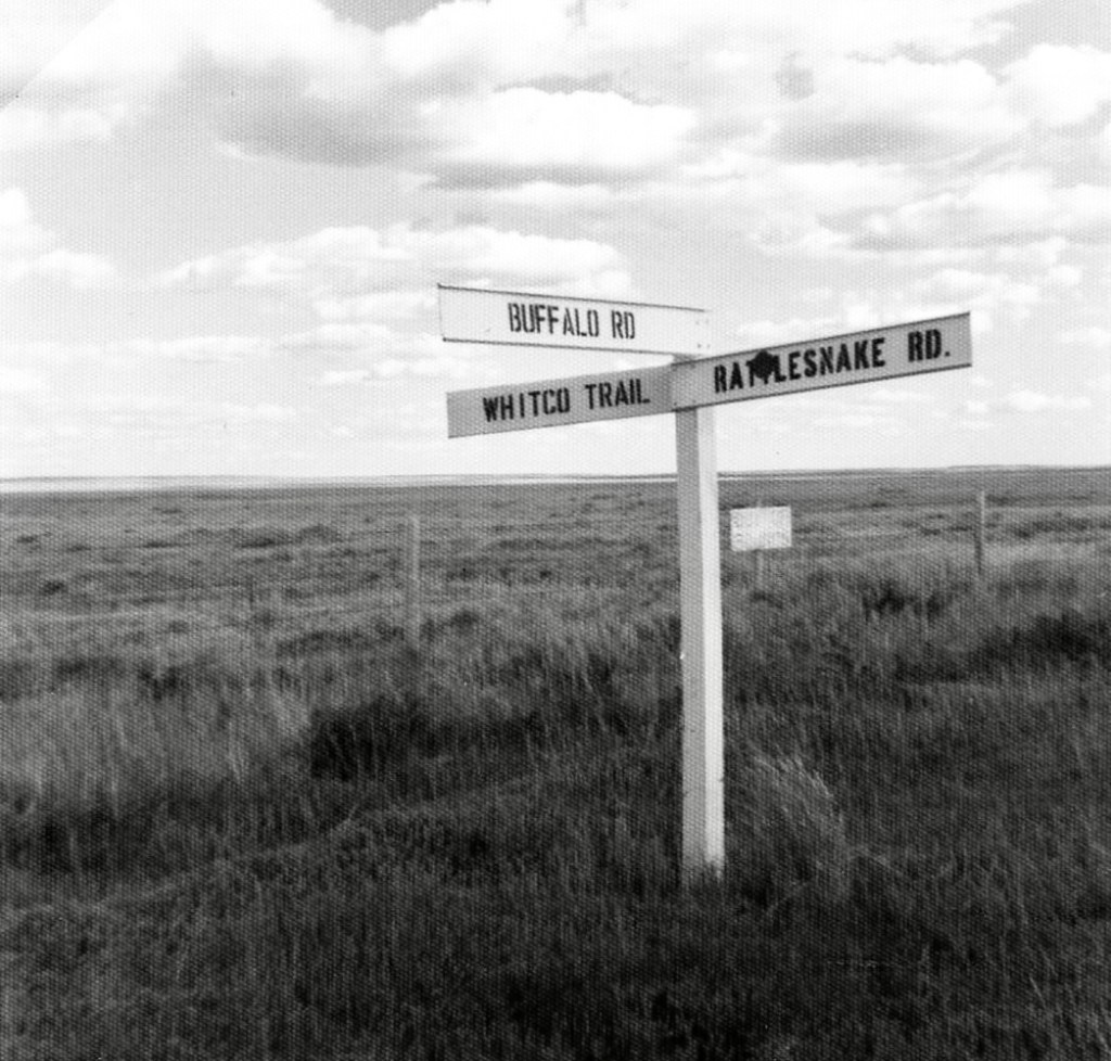
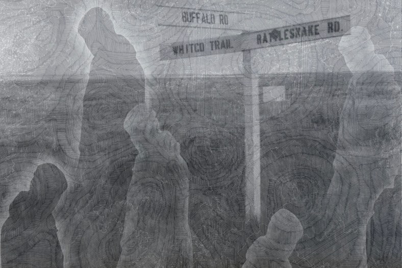
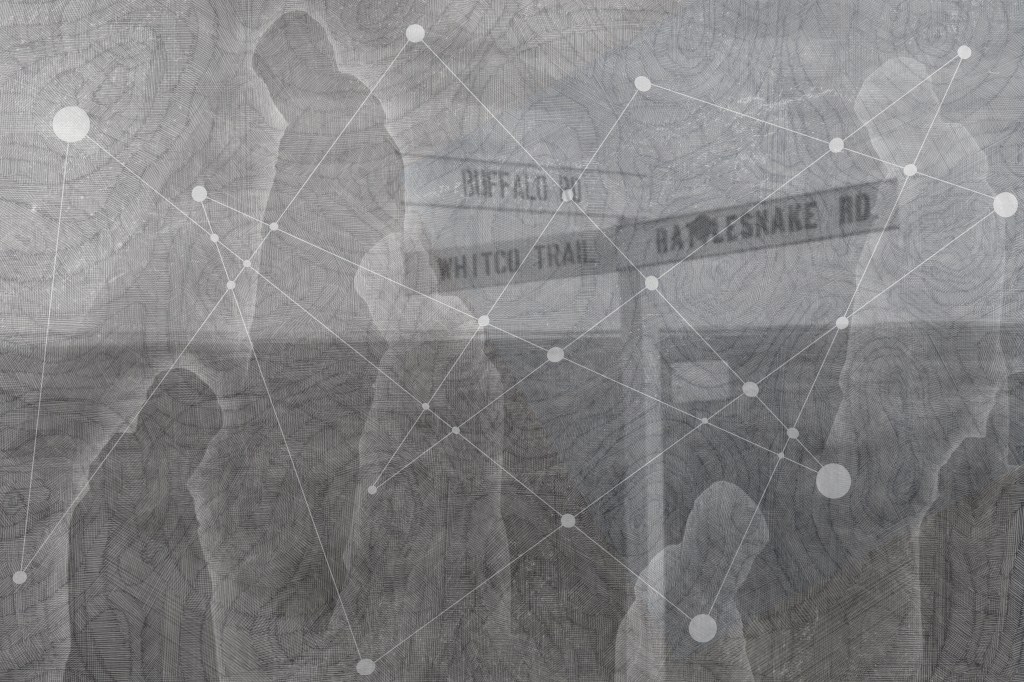
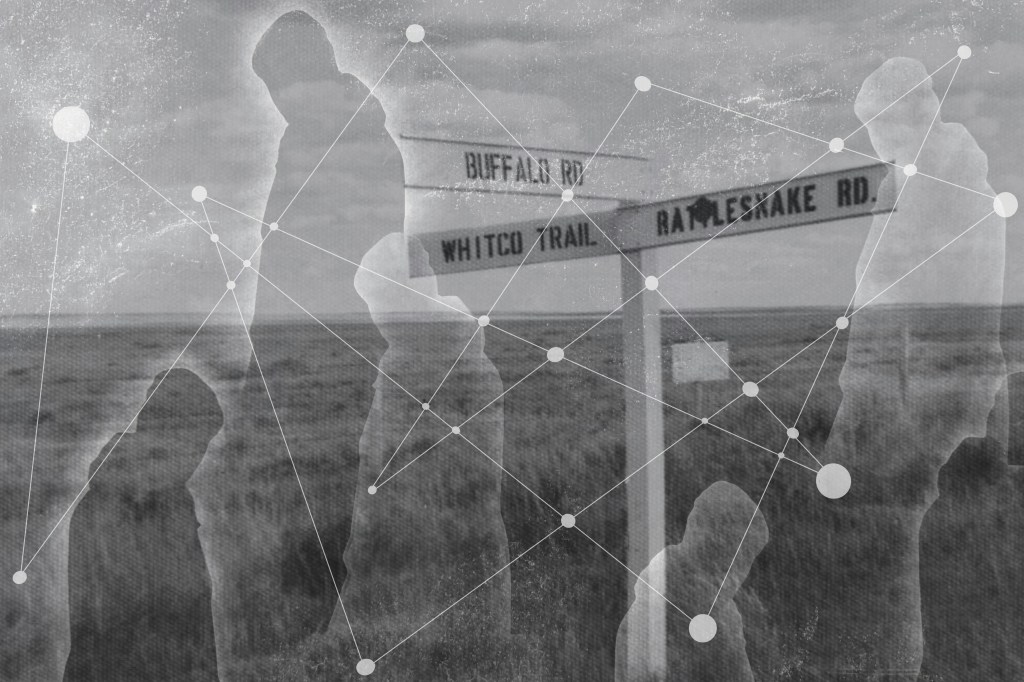
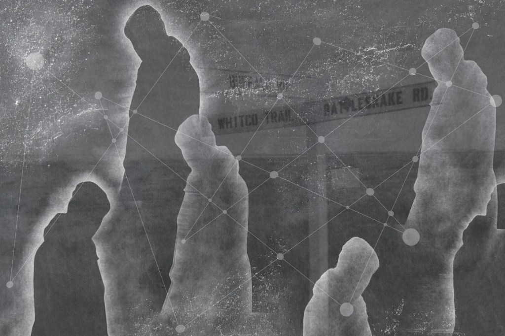
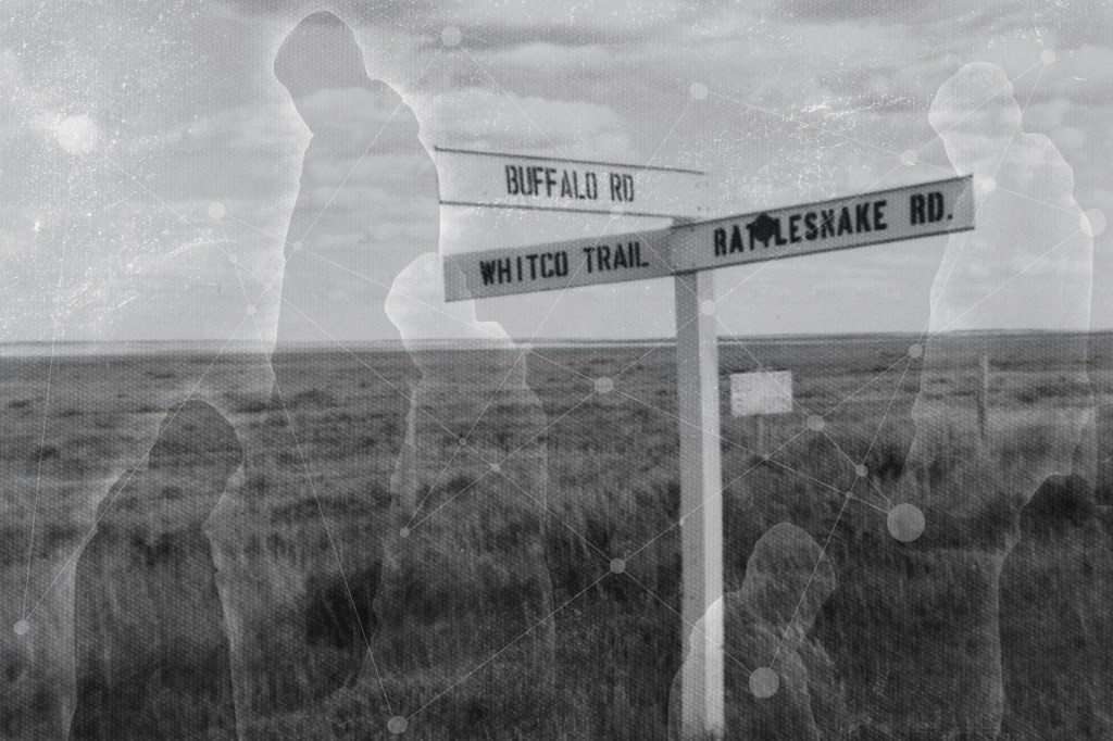
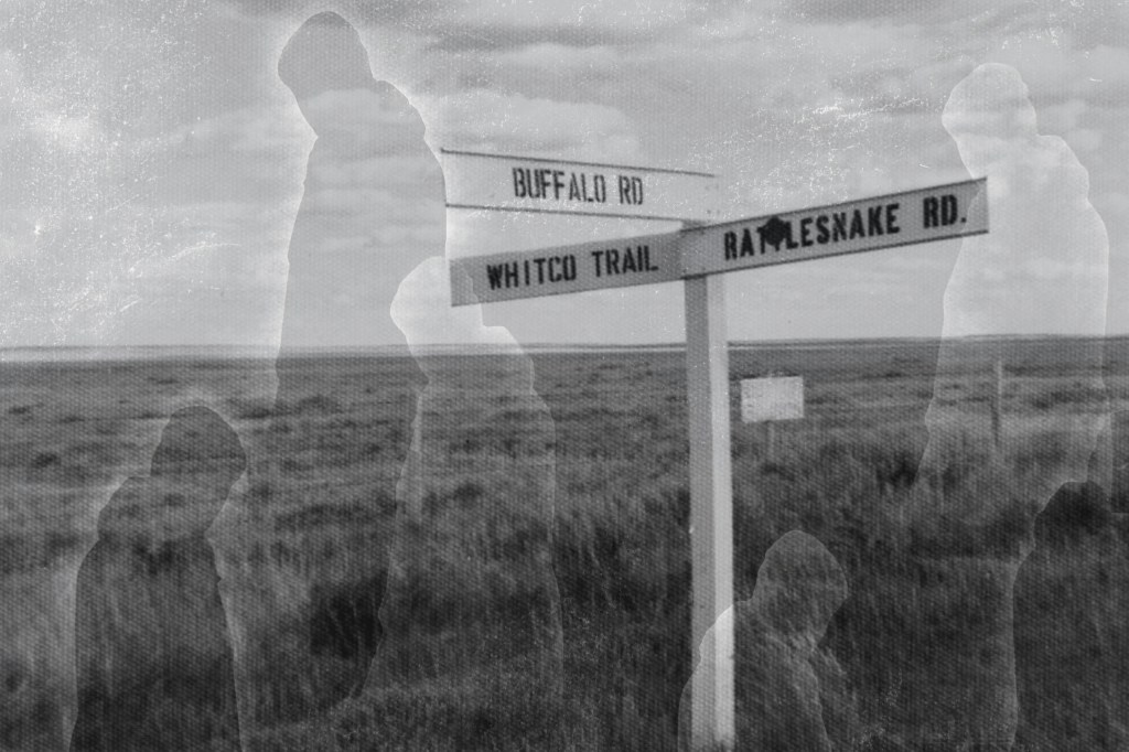
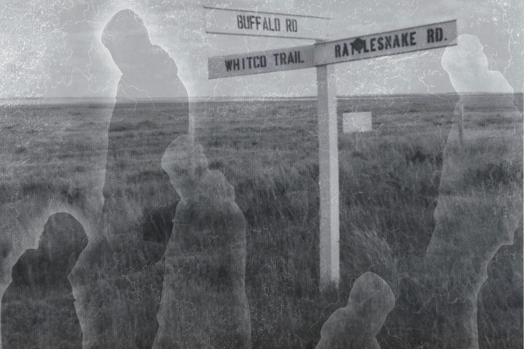
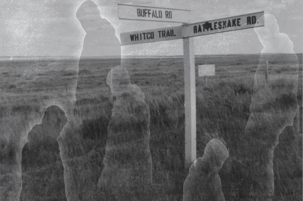
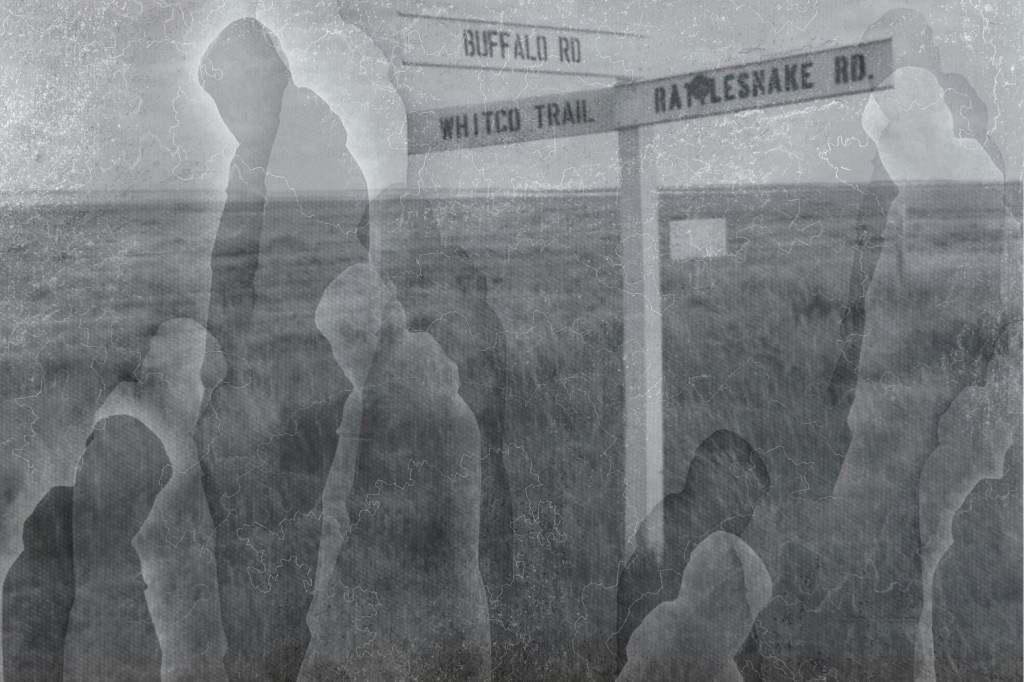
I also found this photo of a signpost.
I played around with layering using filters, inverting and adjusting opacity:
The image above is tonally bland; I prefer the one below. I like how the lined contouring gives the effect of the image being woven or embroidered.
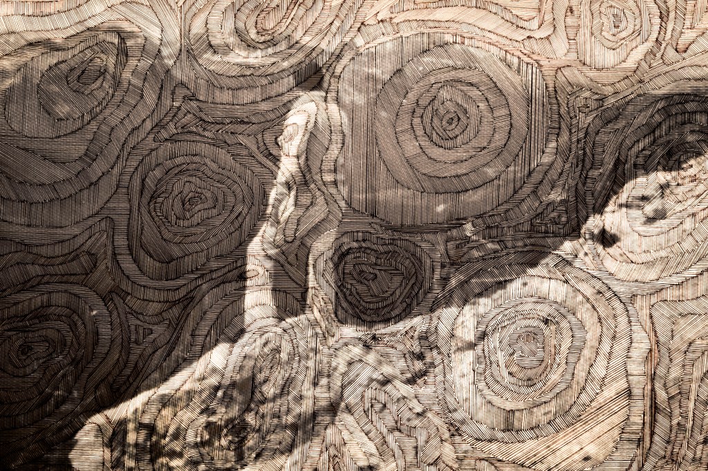
Again, the images above don’t have enough tonal range. I don’t think the contouring adds anything, it’s probably more of a distraction.
A mixed bag of results. I prefer the images which don’t crop off the bottom of the sign post. The most successful is probably the penultimate image, but again I think it needs a greater tonal range. However, I do like the effect of the figures against the landscape, the idea of crossroads in life, decisions made, a different path followed and shadow selves.
The idea of layering has always been in the background. It could be in the form of separate physical layers or the layering of media, or the remediation of images. I wanted to explore layering the moving image over the static image. I have to confess to adopting Lyberis’s approach of the monotone audio on his 3-minute video. To me, it’s the sound of silence, the sound that sometimes keeps me awake at night when I’m convinced someone’s running a car engine nearby or there’s an extractor fan which has been left on. It’s not quite right at the moment and it needs some more work, but I’m quite pleased with it so far.
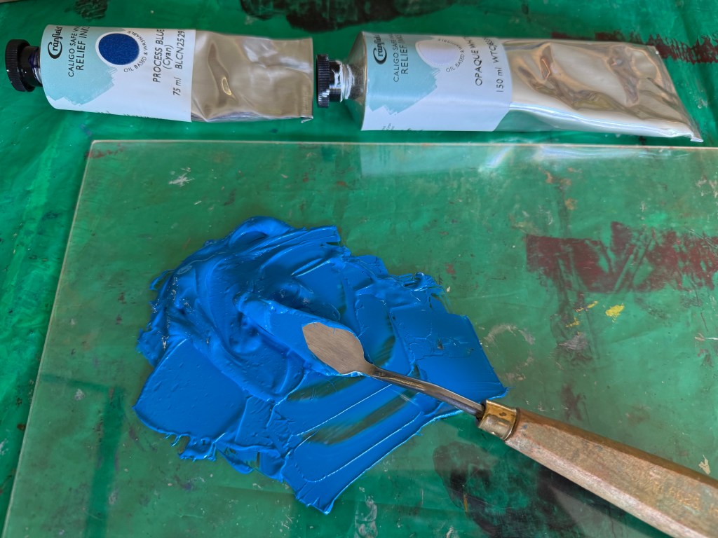
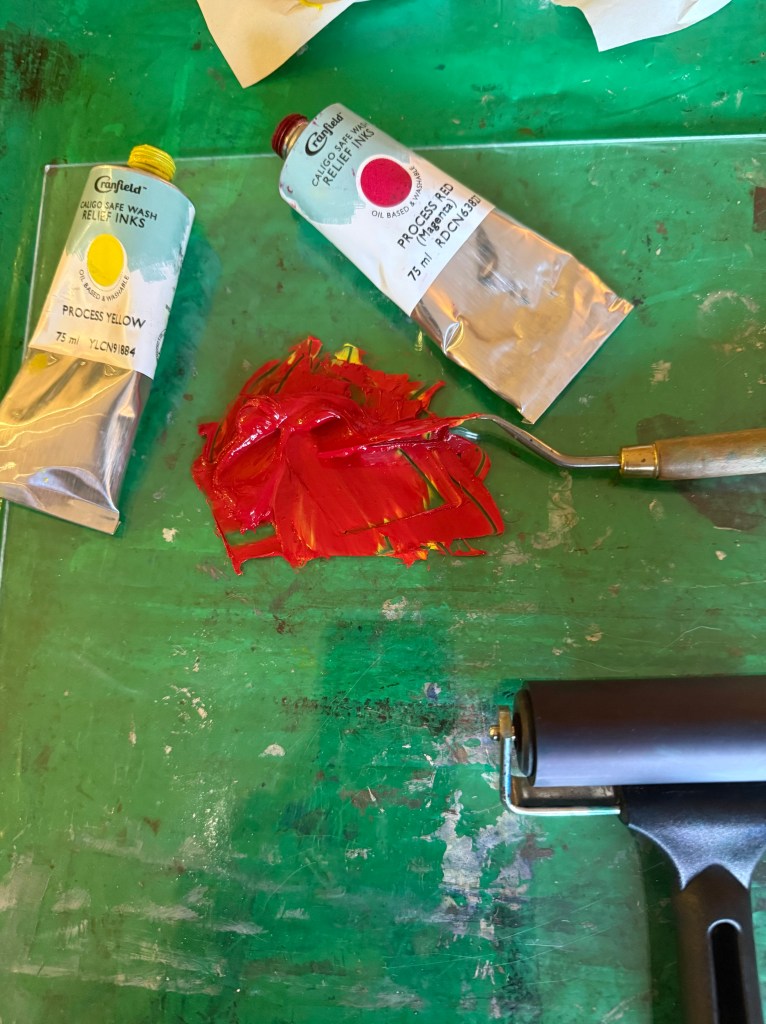
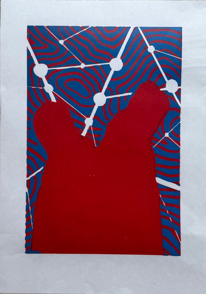
So, Plan A was dependent on me being able to overprint the red with blue. I did a quick test print. The process blue ink I was using must have some transparency as it turned into a very dark purple, so I made it more opaque by adding opaque white which resulted in a kind of cerulean blue which I liked against the red, although the photos don’t do it justice.
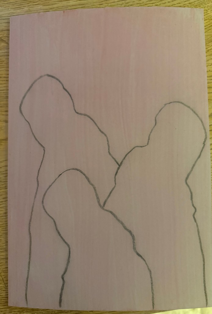
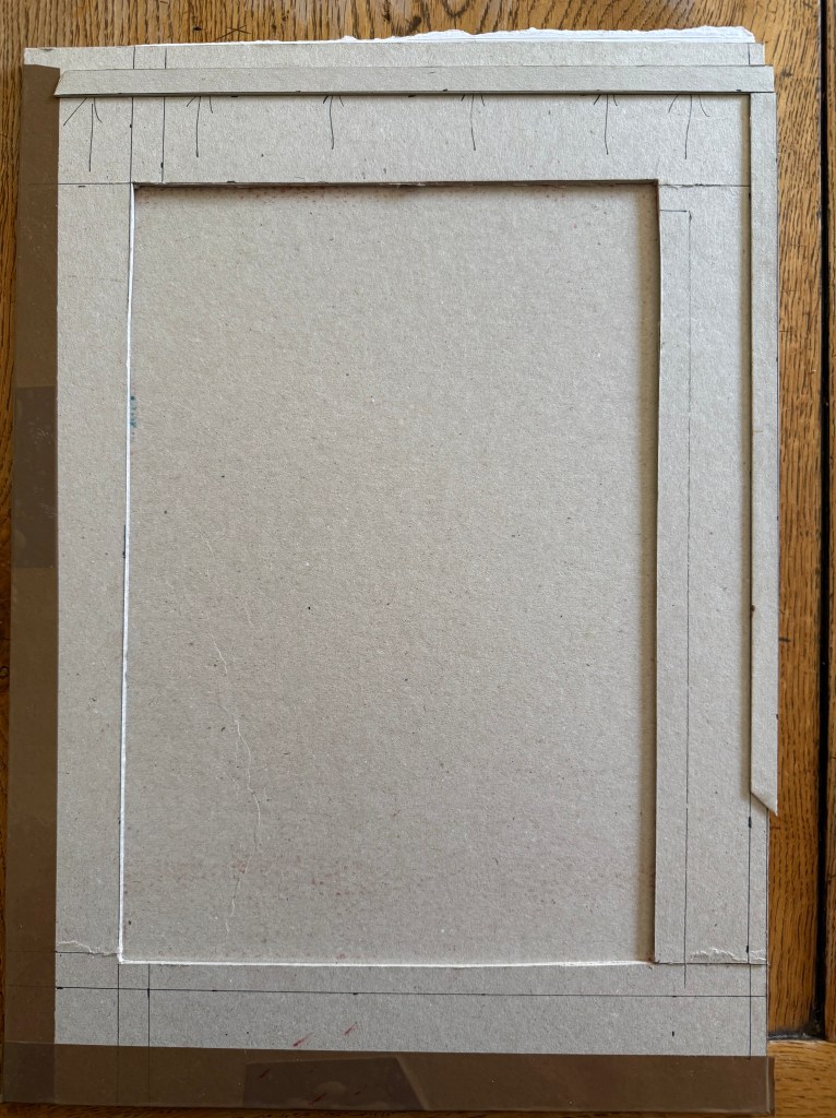
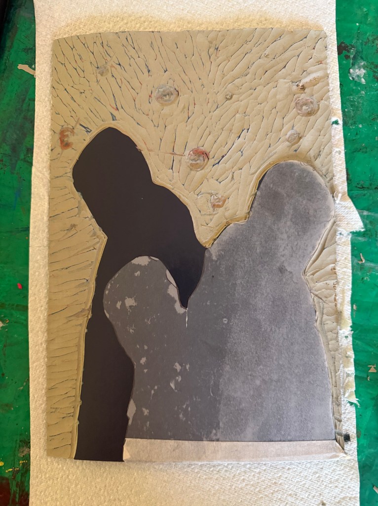
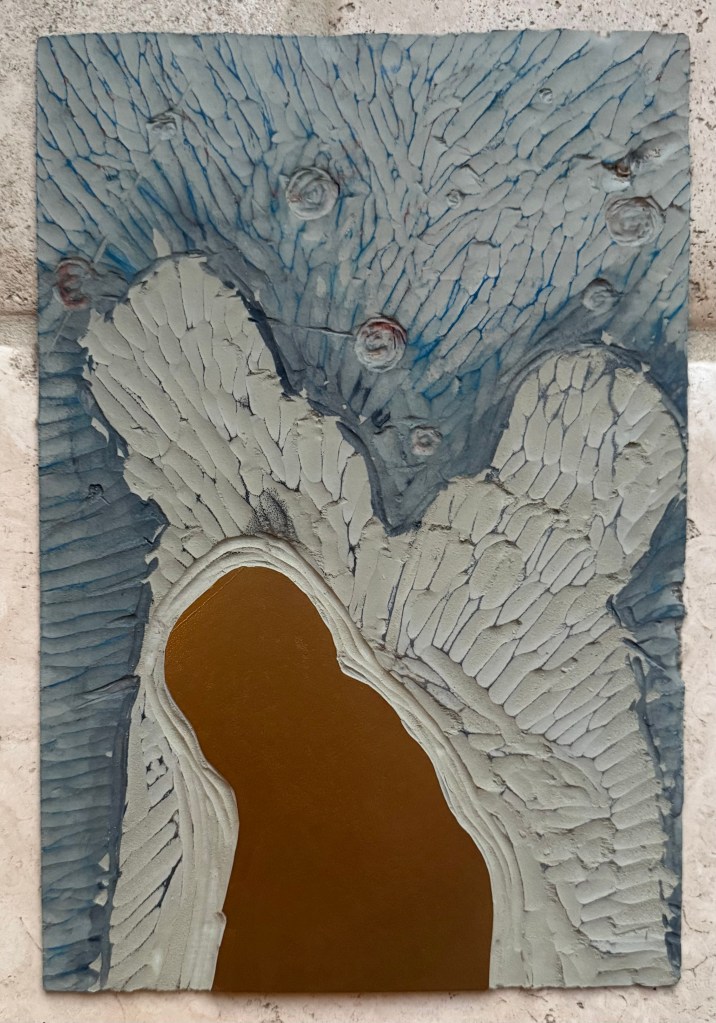
I then prepped a sheet of A4 lino by lightly sanding and wiping with white spirit before staining it with an acrylic ink and drawing on the figures and the white lines. I went over the pencil marks with a chinagraph pencil to make them stand out more. As usual I had launched in without giving it enough thought and ended up having to reposition some lines although I couldn’t erase the chinagraph marks, which becomes relevant later on in the test printing. I used a metal ruler to cut out the white areas and filled them with cornflour to see how they looked, neatening up where necessary – the circles are bit all over the place, so I resolved to use a template when making the actual prints.
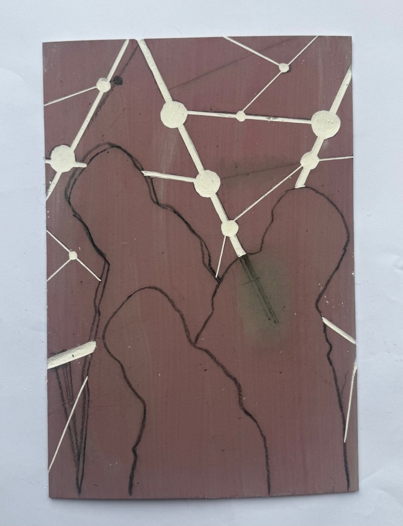
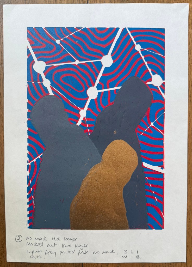
I created a registration board for the lino, drew lines where the paper was to go, and printed the first layer using equal parts process red and process yellow. Initially, I thought that I could mask out the figures using some tracing paper. Reduction linocuts work from light to dark ordinarily, but my image doesn’t really conform to that process. I knew one, if not two, of the figures would be a med/light grey and I wasn’t sure how that would sit on top of a bright red. I tried inking up whilst the mask was on the block and then removing it, but it was difficult to do because the mask kept on sticking to the brayer and the result wasn’t great. I decided to ink up the entire block for the rest of the prints. I also noticed that some of the chinagraph was coming off the block onto the prints.
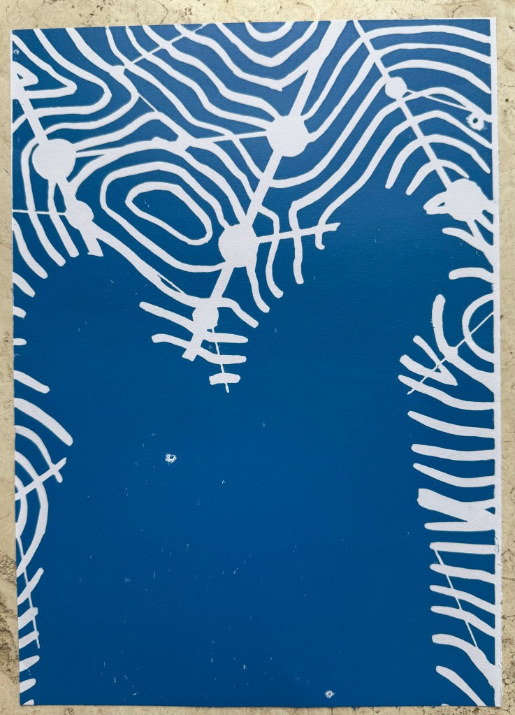
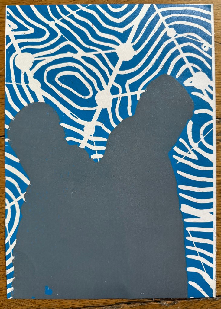
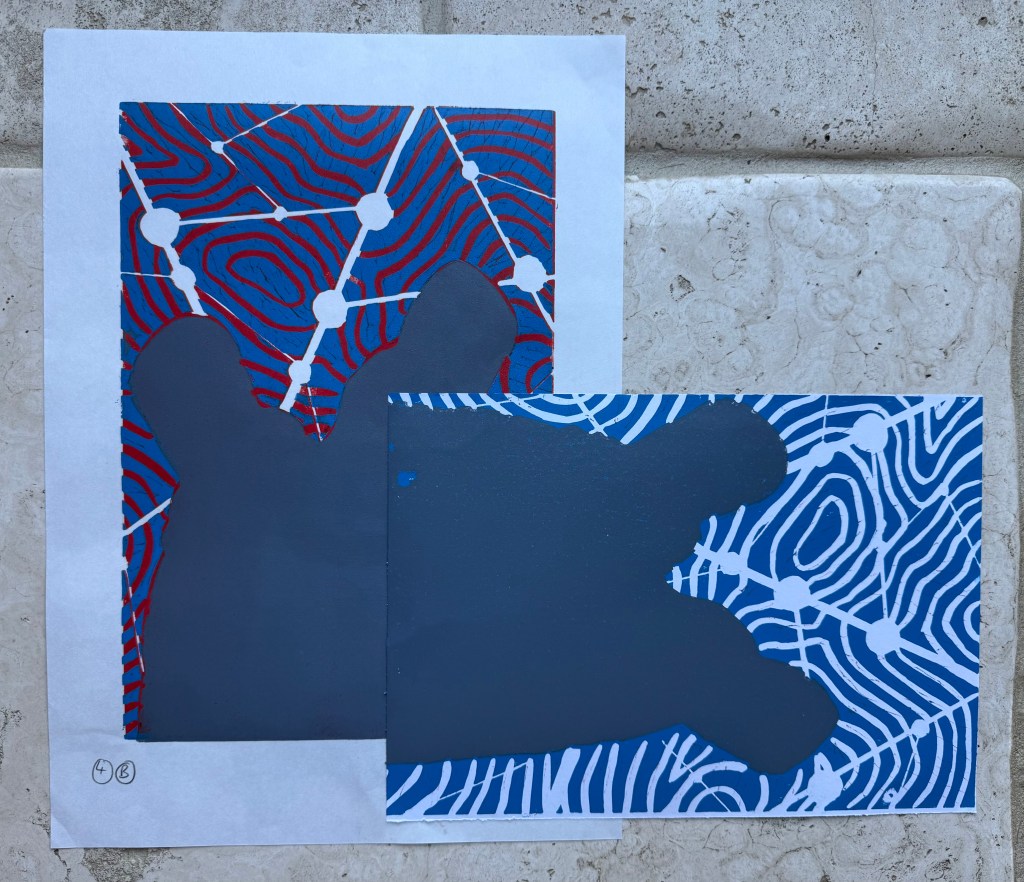
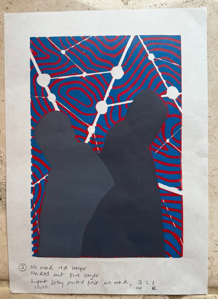
Next, I cut out the contour lines and printed with blue ink. By this stage I had realised my previous error and masked the figures after inking the block, but before printing – a much better result, and I can’t work out why I hadn’t realised this to start with. However, after the first print it was obvious that the registration was off. I had thought that I had lined up the paper the same each time when I was printing the red layer, but I clearly hadn’t. I created a raised edge against which to place the paper on subsequent prints, but I had to accept that the blue and red layers wouldn’t line up on all of the test prints, which would cause problems in relation to the white areas.
There was also misalignment around the edges of the figures which could have been caused by poor registration on the first layer, but could also have been caused by a lack of accuracy in creating the mask, or even applying too much ink.
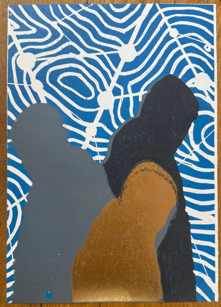
To complicate matters further, the paper I used was Japanese HoSho paper which being lightweight (90gsm) and strong makes it ideal for printing linocuts. However, it turns out that it is slightly smaller than A3. I already had some Snowdon 130gsm paper, so I thought that I would give that a go, to see if it would be a suitable alternative, even though it is heavier than the HoSho.
Other than a few areas where some bits had managed to get stuck onto the block, it seemed to print quite well.
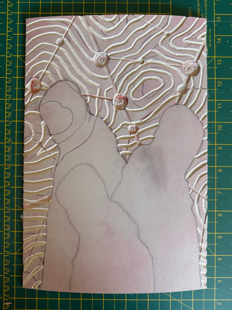
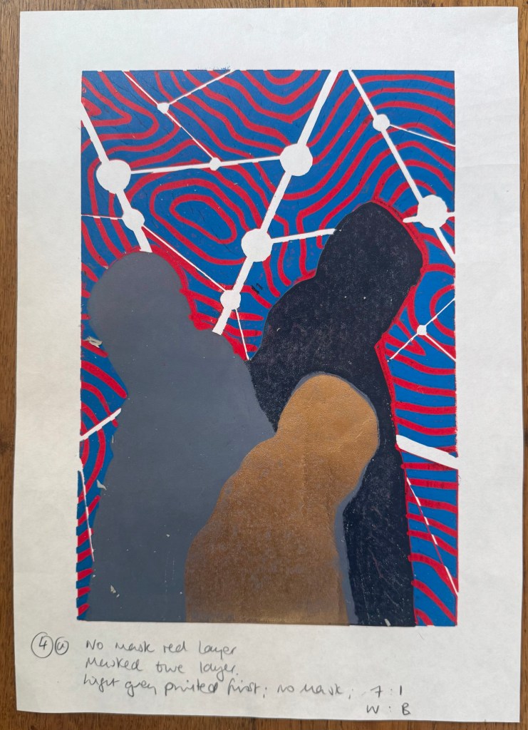
I then cut away the rest of the block leaving just the figures. I wanted to experiment with both masking areas and inking up the whole block to see how the subsequent layers printed so I could decide on a final approach ie whether to use a mask or to layer the ink. I would have preferred not to mask any areas as it seemed to increase the risk of mis-registration of the print. But before I decided I needed to find out how the final metallic gold layer would sit on top of all the other layers. I noticed that there were some indentations in the outlines of the figures from where I had cut out the contour lines.
I also wanted to see how the grey would print on top of the blue as well as the red, and it seemed to fare quite well, although it definitely has a cooler undertone to it than when printed over the red.
The blue and grey layers seemed to dry slower than the red and, as a result, the dark grey/black ink didn’t print well, and also the cut away areas picked up some of some of the blue and transferred it to the prints. I had the same issue with the gold ink, but by that stage I had become a bit frustrated and impatient, and just wanted to see what the colours looked like together. There are agents which can be added to the ink to speed up the drying process but you have to be careful as to the amount used, as they can alter the colours. I could have swapped from oil based to water based inks, which I didn’t have. So I decided to make the best of what I had.
I know that I make things more complicated for myself than they need to be. I could have watched videos on how to make reduction linocuts before starting, but there is a part of me that thinks that learning on the job is a more valuable, if not more frustrating, experience, and that the lessons learnt are more likely to be remembered (and possibly put me off linocuts for good).
So, what did I learn?
Preparation is key
Registration is everything – I watched a couple of videos after the event and invested in some Ternes Burton registration pins and tabs
It’s preferable not to mask areas if possible but to cut away the lino on each layer
Don’t use chinagraph or anything else which could transfer from the block to the paper
Accuracy is important
I should have had a resolved image before I started, rather than winging it in the process
When cutting out the first and second layers I needed to ensure a clean edge with the figures by using a craft knife
I needed to check that there isn’t any ink on the cut out areas of lino before printing
The ink needed to be dry before printing the next layer
But, the most important lesson is that because of the number of layers and the time needed for drying, it would not have been possible to complete the print before the end of the month. I needed to go back to the drawing board and have less colours so that it reduced the amount of drying time etc. So I amended the image to just white, red, grey and gold.
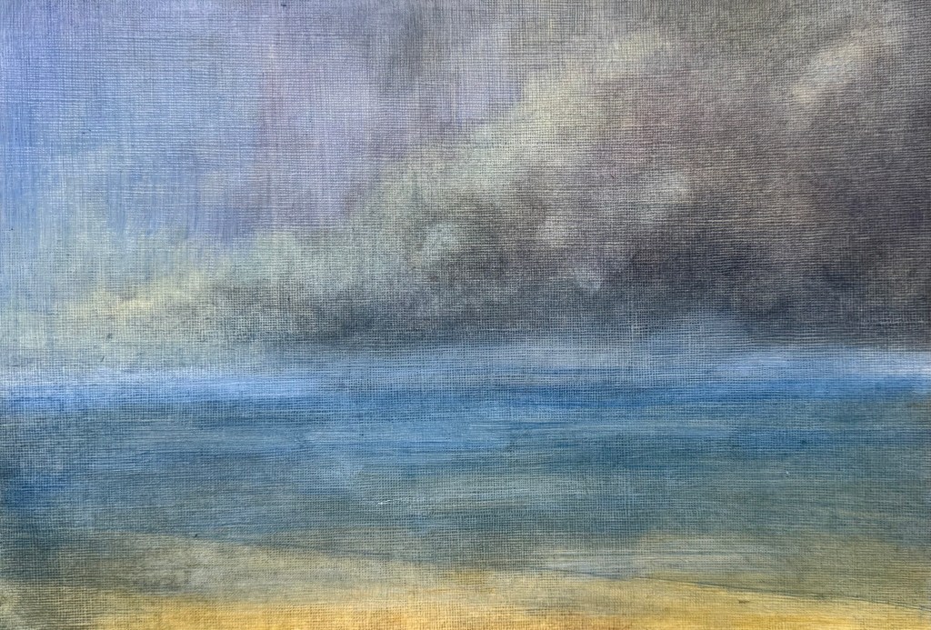
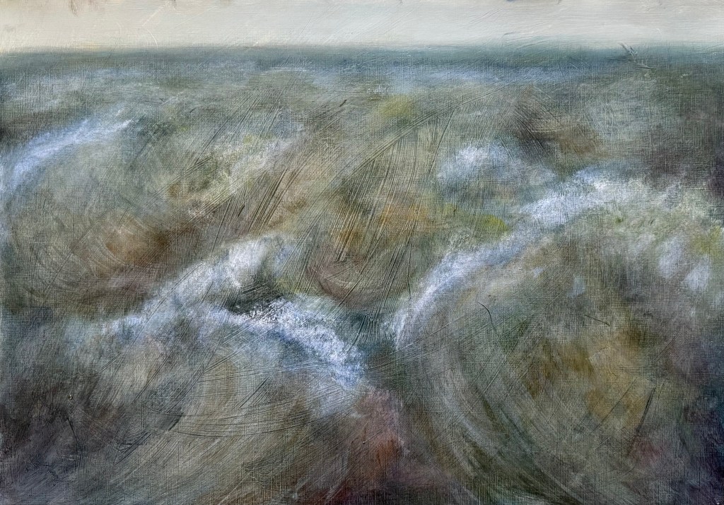
For the last couple of weeks we’ve been continuing to explore Turner in my painting class. The subject is water and stormy weather. As before, we’ve been applying thin layers of paint and sansador with a rag, and then applying several layers of glazing.
We started with a couple of small studies.
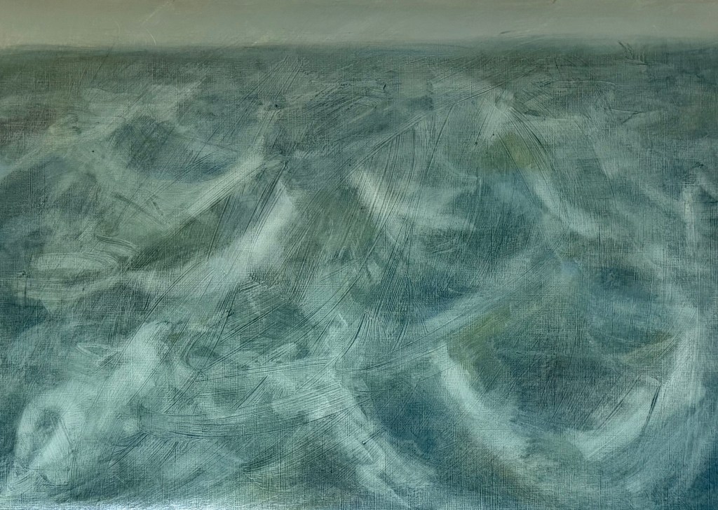
I used a limited palette of mineral colours – ultramarine blue, cadmium yellow light, burnt umber, alizarin crimson and titanium white. I’m not keen on it, it jars with me, in fact, I really don’t like it, but it meets the brief.
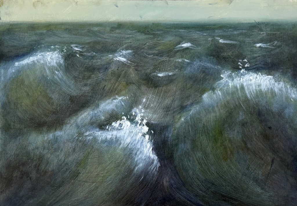
I much prefer this one – to me, it’s less figurative, although as soon as you put in a horizontal it automatically reads as a seascape. A post-Turner palette of cerulean blue, Prussian blue, phthalocyanine turquoise, cadmium free yellow, winsor violet and titanium white.
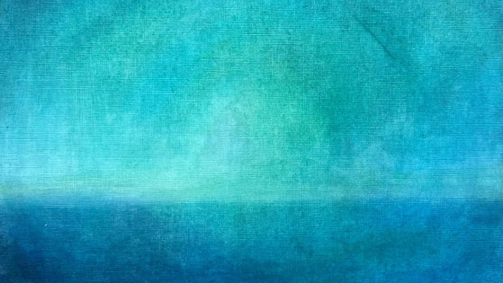
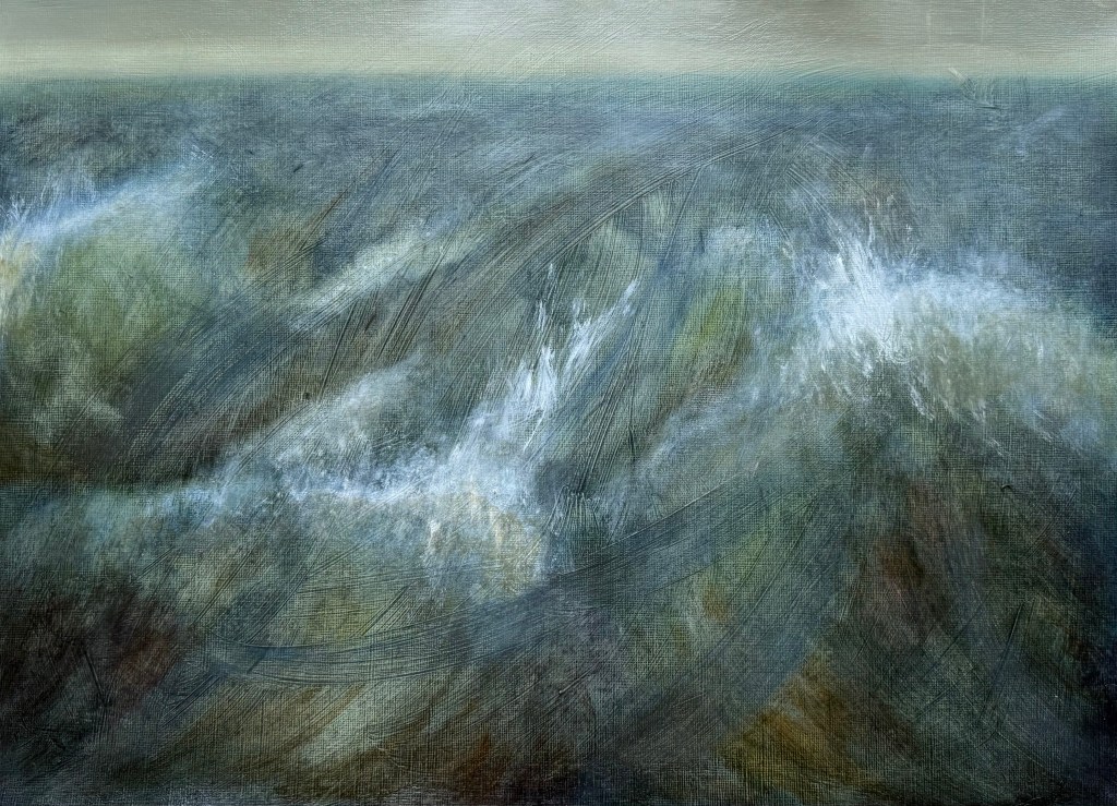
Then starting with an acrylic ground of a yellow grey, applied thickly and roughly so that definite brushstrokes are visible, I used the same limited palette of mineral pigments as in the first study.
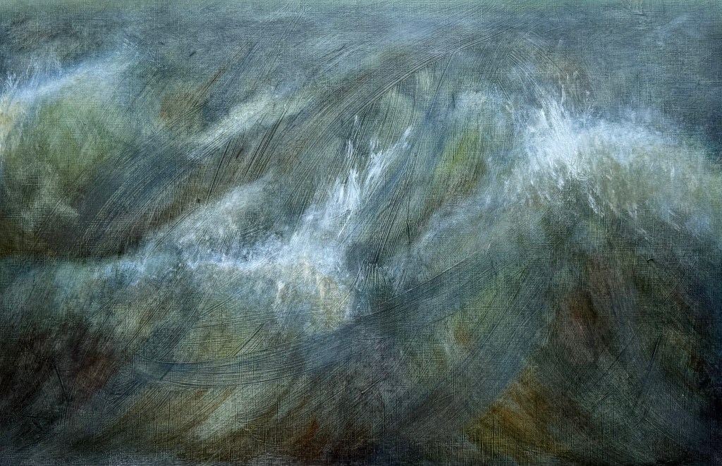
It all started to become a bit twee, for want of a better word, so I blurred the horizon, and tried to break it all up, knocked it back and accentuated the sweeping brushstrokes in the ground using an ultramarine glaze. I feel better about it, but in retrospect maybe I should have done away with the horizon completely, as Turner tended to do, or maybe the horizon allows it some space? I think I need to put it away and reflect on it at a later date.
I’m conflicted; over the last year, I have found that I have been moving away from figurative work, particularly in terms of art that I like to look at, perhaps in an attempt to free myself. I’ve always taken the view that I attend these weekly classes because I like to explore different directions, and that there is no point just turning up and making what I want to make each week regardless. I try my best to complete the task, but I’m finding it increasingly difficult. Maybe this is a lesson for the future – of not always being able to make the work which I want to make.
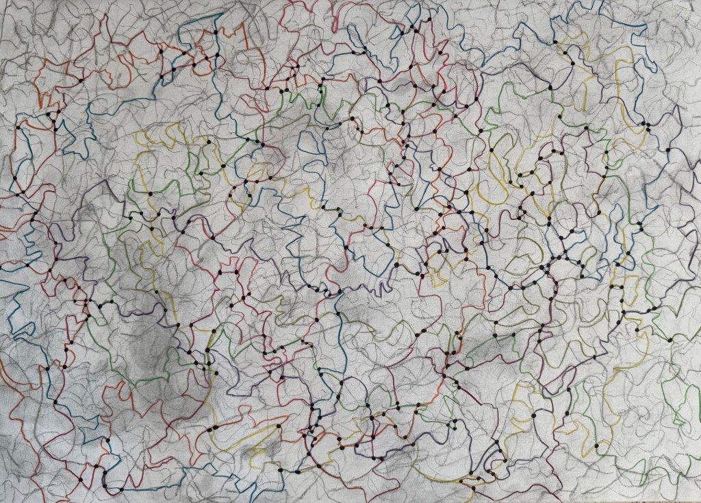
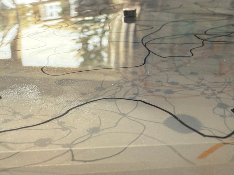
I decided to try and progress the idea of automatic map-like drawing by experimenting with charcoal. I drew a single line and then rubbed it out and repeated the process numerous times, building up layers of mark-making. I then took some coloured pencils and traced a path randomly following the marks.
I’m not sure that it takes me much further forward in developing this line of enquiry. However, I enjoyed the process and I like the different nature of the coloured lines which I made consciously by making decisions as to which of the paths of faded charcoal to follow, almost like a dérive – they have a different character to the ones I make when I draw automatically.
I’ve been thinking a lot recently about the course, about being half-way through and what I would like to have achieved by the time it finishes – what work I might produce by the end of it. At the moment, the concept of mapping is at the centre of it. I want to produce something which reflects all that I have learnt during the course, about myself and how I relate to the world around me. It will inevitably be an artifact, a map, of some shape or form, but I want it to reflect a process which is ongoing, that will never be complete, a piece of work in a state of flux, constantly subject to change, so there has to be some sense of impermanence, of it being unfinished. I also want to encompass the idea that memory plays a large part in the process and much like maps which are constantly being made and remade, so are the memories on which the map is based. The idea of layers and distorted imagery seem to be relevant in this respect.
I’ve thought about paper and canvas, maps being folded and rolled , but I don’t think that these offer the ability to create layers in the way that I want. I’m currently thinking that I may make a number of squares which together make up the grids of a map.
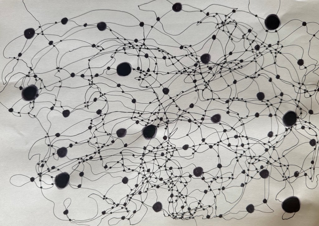
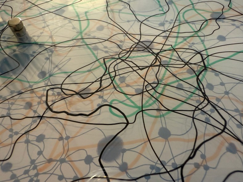
I used a pen to try and keep a marble on the paper. I like the lines which were made as a result – they have a sense of fluidity about them, much more than the lines that I have been making up until now. I’ve been meaning to experiment with the size of the dots at the intersections, to see if different sizes create a sense of perspective and three dimensionality. I don’t think that I have managed to achieve enough diversity in the sizes – it was very much an afterthought – I’ll try again another time. The image makes me think of something neural, cognitive mapping?
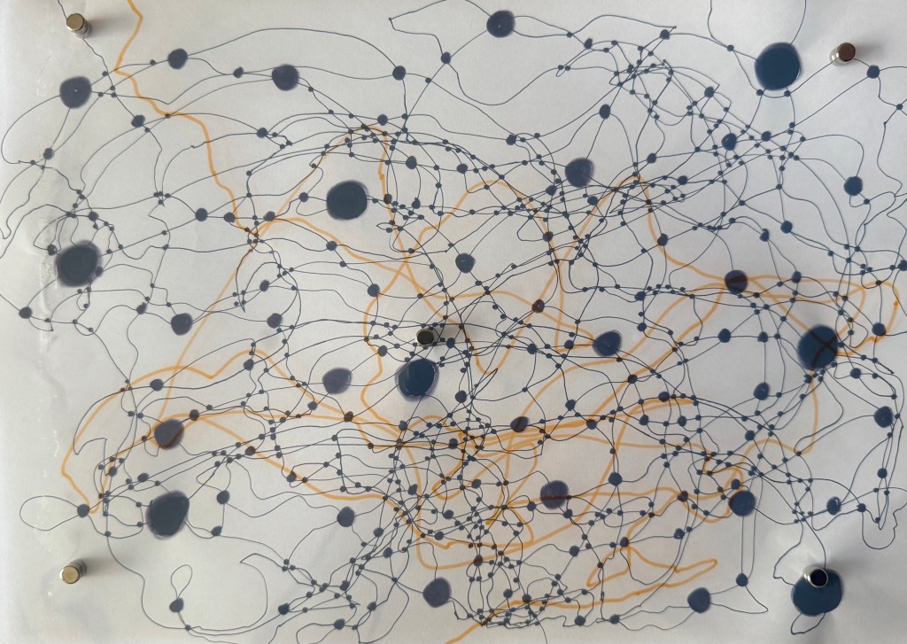
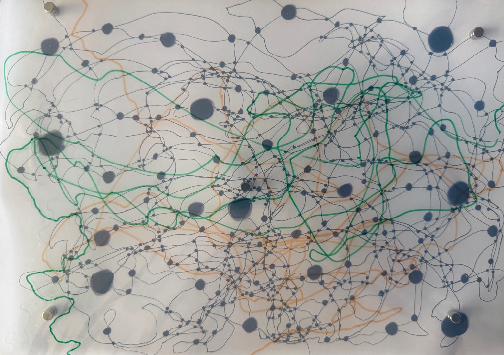
I took some inkjet compatible transparencies and drew some lines to see if I could create layers. Unfortunately, they are not totally clear – they have a milky appearance, probably because of the coating which allows them to be used in inkjet printers. I need to do some research to see if this is the case or whether I can source some others. Having said that, the milky film does cloud what’s underneath, making it hazy, almost like a memory that’s not quite there. Ultimately, I’m thinking that I could use layers of acrylic sheets over a background image, possibly together with milky transparencies, some can be drawn, painted and printed on, and I can also include some cyanotype images as well a negatives. I could cut holes in some layers to allow direct access to layers below. The use of reflective surfaces would also add depth.
I layered up the sheets using small magnets which not only hold them stacked together but also act as spacers between the layers. I had to add one in the middle because otherwise the sheets would sag – this won’t be a problem with rigid acrylic sheets. The magnets themselves suggest impermanence, the ability to be easily changed.
Last summer I became obsessed with cyanotypes. Then there was plenty of sun. There was some sun the other day, but not much since, so I decided to make myself an exposure unit using my Speedball UV lamp and following instructions on Handprinted. I do love a bit of DIY; there’s something very satisfying about making do with something handmade which didn’t cost a fortune to buy, or require some fancy kit, or having to go to a specialist location.
I used an old printer box which was large enough to take A3 sheets, cut out a hole for the lamp to sit in, and then lined it with aluminium foil.
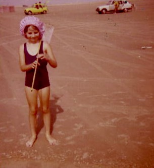
I selected a few photographs to experiment with; some from the family photos which I’ve been sorting out, and others which I have collected on my phone as inspirational resources, as well as some images from the experiments earlier on in this blog. I converted them all to black and white and then inverted them in Photoshop, printing them off on transparencies. I had to dust off my old printer to do this as I wasn’t sure how to do it on my husband’s printer. This took a while because between each print I had to perform a ritual of pressing certain buttons in a certain order in order to fool the printer into thinking that I was using genuine HP ink cartridges, which I wasn’t. The things you can learn on YouTube.
Ironically, the sun came out, so I did a mix of au naturel and my DIY unit.
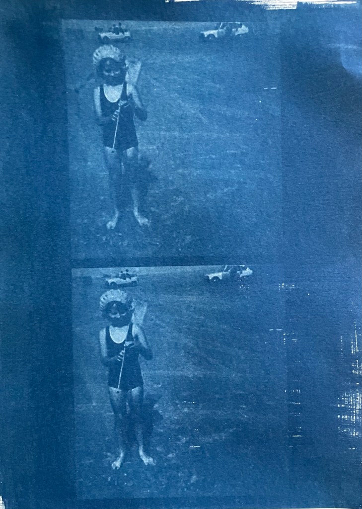
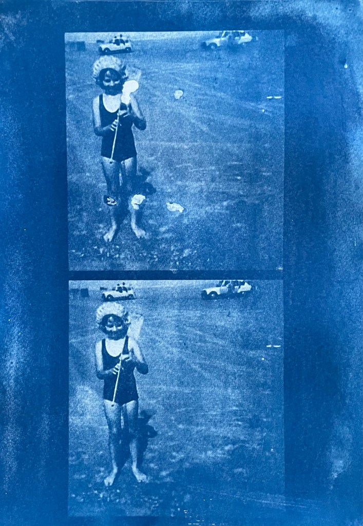
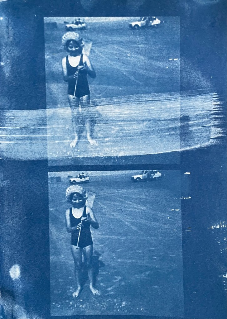
Me
The first two prints were made using the unit, the first being over- exposed at 20 minutes, the second being just about right at 15 minutes. The last two prints I did outside in the sun, which was a bit more hit and miss because the strength of the sun was not constant as it kept disappearing behind some cloud cover. However, I do really like the effect of the visible strokes which I left when applying the solution to the paper, which was A4 300g/m2 hot pressed watercolour paper. The markings give the effect of a moving, flickering , transitory image – there, but not quite there. I put two images on the same negative transparency because I wanted to create a number of smaller images to experiment with. However, the suggestion that the images are on a roll of film is really interesting.
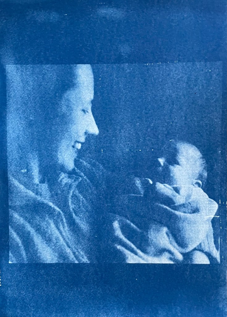
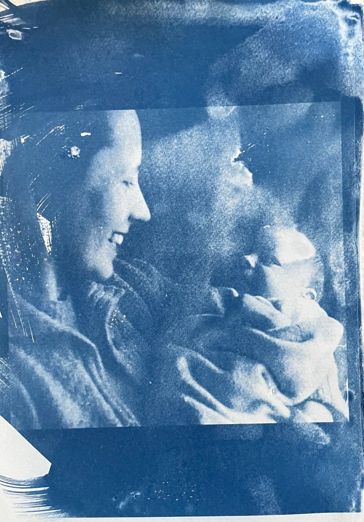
My mother & my brother – capturing a connection and a perfect expression of motherhood
It’s been really difficult getting some of the old photographs out of the albums; they are the sort which have sticky pages on which you position the photos, and then put a transparent film over the top. Over the years the adhesive has seized up and practically bonded to the back of the photos. I’ve tried all sorts including gentle heat, dental floss and a bendy, very sharp filleting knife.
This one of my mother and brother is a favourite, but sustained a small tear on the right. I am pleased with both images – the first one was done outside and the second in the unit, which seems to have more of a Prussian Blue hue to it although I’m not sure that there’s any rhyme or reason as to the differentiation in the blues – but I really like the movement in the second one, again giving the impression of a fleeting moment. I think that the solid areas at the top and bottom add to it, suggesting a frame from a film of a moving image.
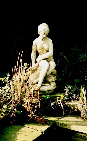
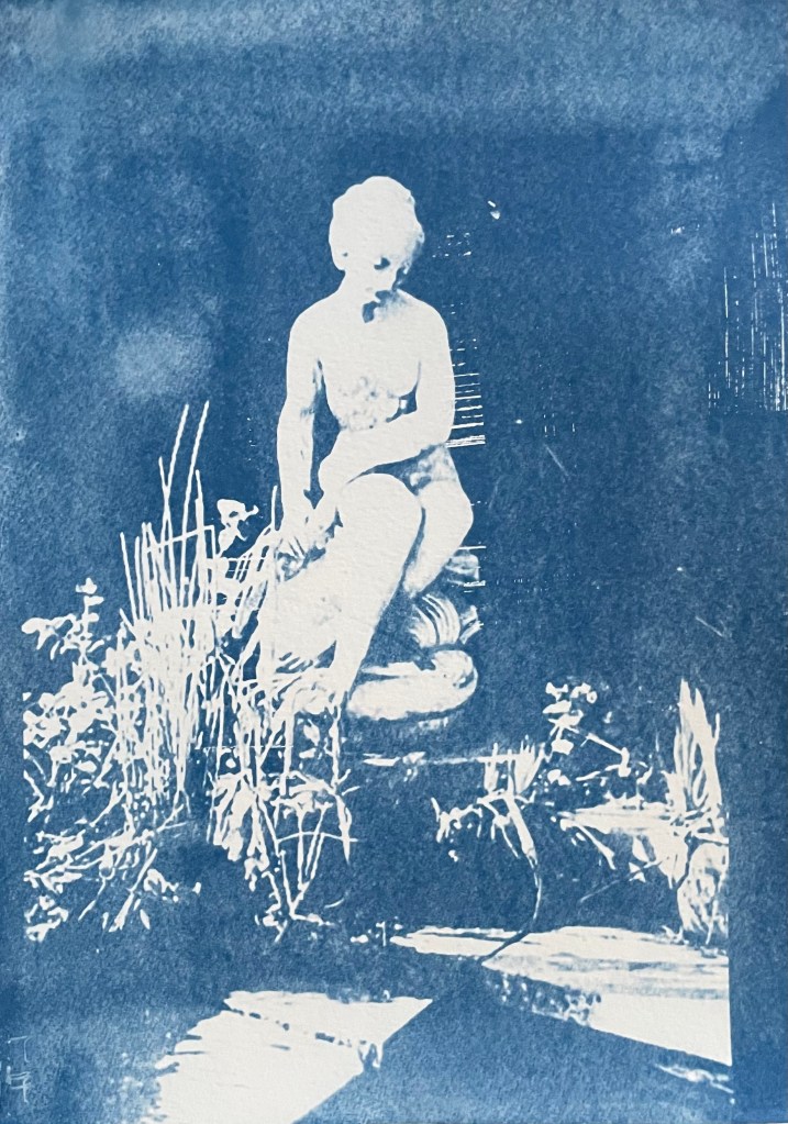
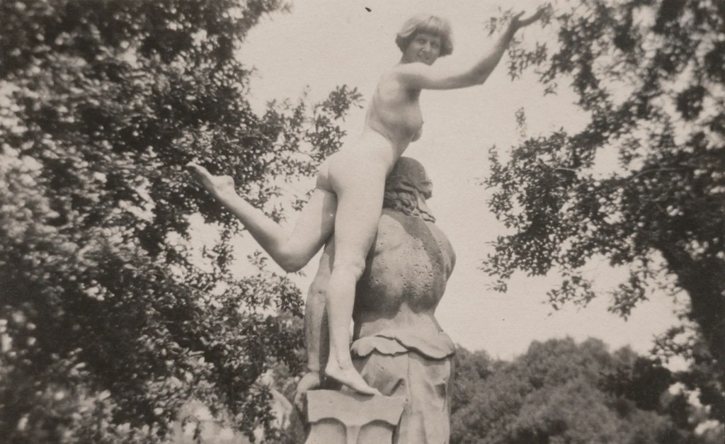
This is a photo of the statue which sits at the bottom of my mother’s garden next to her makeshift pond made out of an old washing-up bowl. I always used to wander around the garden when I visited, stopping at the pond to see if there were any frogs around. I do like a frog – my grandmother on my father’s side used to have a rockery, and I used to spend most of my visits looking for, and trying to catch frogs. That, and hanging out in her shed and greenhouse with the tomato plants – I love the smell of tomatoes; it takes me right back.
The problem with a cyanotype is that if you leave it too long, you over-expose it, and whilst you get deep blues you lose the midtones, which is what I thought I had done with the first one, so I exposed the second one for less, but it turned out to be under-exposed – even putting it in a hydrogen peroxide bath didn’t help. Both were done outside; perhaps I should have done a straight 15 mins in the unit, but where’s the jeopardy in that?
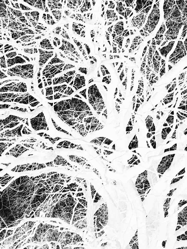
This is a photo that I took looking up into the branches of the three trees that I like. The negative image is also really interesting, and I might do something with that at a later date. The image (last photo) is underexposed again, but has a feeling of being removed, almost as if I’m looking at it through my window (which incidentally does need a good clean). I wanted to try fabric, but could only find some thin cotton lawn. I was so disappointed – it turned out terribly. I had visions of being able to create long, flowing, billowing, wispy cyanotypes, but ended up with the image above. You can just about make out the branches.
I will need to think about this a bit more. My first thoughts are that maybe there was a coating on the fabric, so I’ve washed it; maybe the image was too detailed, but I’ve seen quite detailed images on fabric; that the structure of the fabric is not robust enough – you can get pretreated fabric which is like a sateen so I could try that; or maybe there wasn’t enough contact between the fabric and the negative. I need to take some time to reflect, and try again.
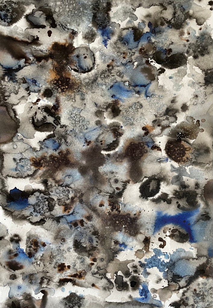
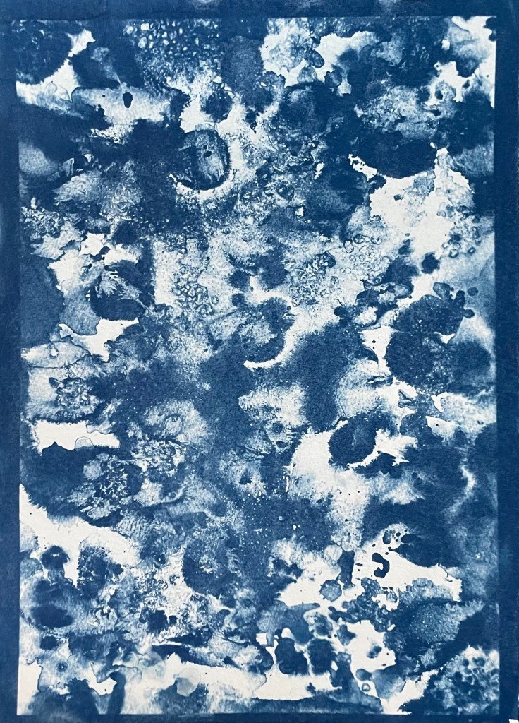
The images above were from my experiment with ink in Blot II , and from A State of Flow II . It was a useful exercise in that it confirmed to me that not everything works as a cyanotype – I much prefer the original images, particularly the ink one, as the edges between areas of flooding and blots are much more defined, and there is more of a delicacy about them. The contrast between the blue and the black ink also adds interest which is lost in the cyanotype.
So, on reflection a really useful and enjoyable exercise. The thing that I really enjoy about this process is the anticipation, and then the slow reveal as you rinse off the solution to see an image slowly emerge, or not, as the case maybe. Doing it outside as opposed to in the controlled environment of the unit adds a degree of extra excitement, but equally there is the risk of crushing disappointment when it doesn’t quite work out.
Moving forwards, I was intending to experiment with toning some of the smaller images of me with tea, coffee, wine etc, but I actually like the last couple as they are, so I will keep them as finished. I’m thinking about how I could use multiple exposures to create layers, and also thinking about manipulating the source image a bit more in Photoshop and printing from the original image rather than reversing etc. I’m not sure whether I’ll get straight to it, or do something else in the meantime – sometimes I go hell for leather with something and then exhaust it, or myself, or become disenchanted with it. I don’t want to get too far down a rabbit hole, so maybe I should leave a bit of space before going back to it, to allow for some more subconscious reflection. I suppose the clue was in the opening sentence: “Last summer I became obsessed with cyanotypes”, and I haven’t done it since.
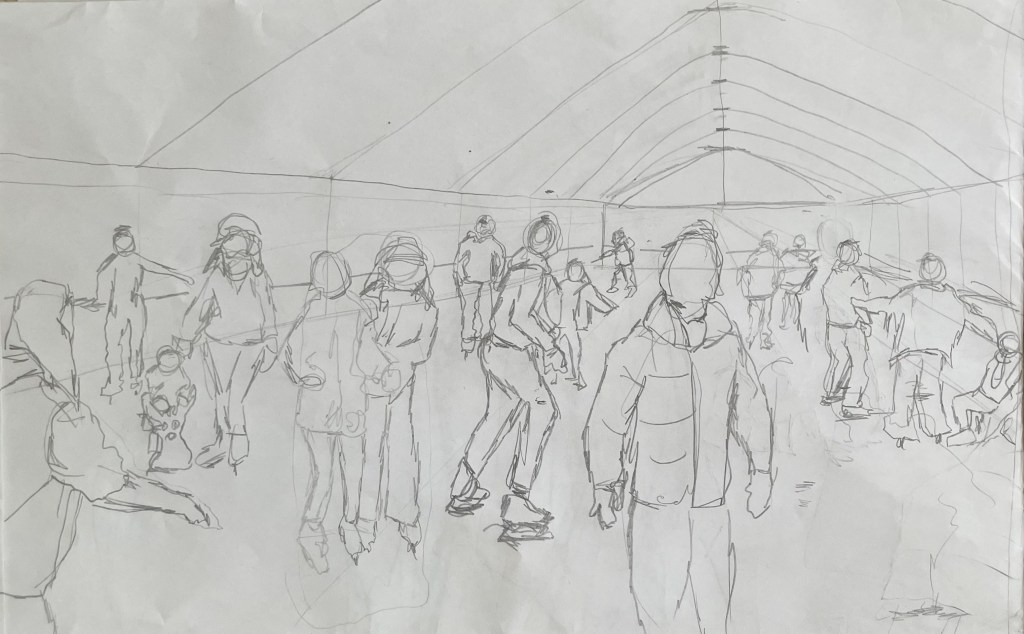
I’ve started back at my weekly art class after the Christmas break, and over the last two sessions we have been looking at figures, in particular, figures in an environment. I’m not very good at depicting humans (or any animate subject for that matter), so this was a bit of a challenge.
We had to work from images which we had sourced: I took my nieces ice-skating at Christmas, which was really entertaining to watch. There were the confident, well-practised skaters who came equipped with their own boots; the ‘I’m-competent-but every-now-and-then-lose-my-balance-and-windmill-my-arms-brigade; and then the rest – hopelessly clutching the side, or each other, for dear life, inching their way round. There was a whole range of shapes, gestures and weights, in the sense of where in the body the weight is being distributed, and there was a lot of tension.
We started by sketching out the composition.
I used a combination of photos and video stills from my phone – I could have been more organised because I lost track of which figure was on which photo, which wasted quite a bit of time. Next time I work from numerous image sources I will organise them so that they are more accessible and easier to switch between.
I then applied a ground to the support (I used oil paper as opposed to a canvas, as I wasn’t sure how it was going to go). As it was a painting of ice-skaters, I chose burnt umber thinned down with Sansador as my ground, as it’s the blue equivalent of the earth colours. I then drew in the figures using a rigger brush and thinned paint – I found the techniques covered by Chris Koning’s workshop of gestural drawing (‘Perception of the Whole’) to be really helpful in trying to get some dynamism in the portrayal of the figures. I also changed the composition from the pencil sketch to bring forward the pair of skaters on the left and to give the skater next to the pair some extra space into which he could move. I also packed some more figures in, including my favourites, the couple in the centre – the man skating alongside and watching his partner who is leaning forward – and the girl behind them.
The next step was to block in the background. I decided that I didn’t want to put the figures in the specific setting of an ice rink, so I left out the details of the roof and sides which were included in the original sketch. This gives a feeling of more space.
I used a thinned down mixture of titanium white, ultramarine blue and burnt umber to create a grey/blue and then scratched into it with the end of the paintbrush to create skate marks.
I then started blocking in some colour using thinned paint. I liked the fact that the burnt umber drawing was still visible and decided to try and retain as much of it as possible. This meant that I would not be able to use much thick paint in subsequent layers, and so the painting will retain a sketch-like quality. The purpose of the exercise was to capture the essence of the figures, so there will be very little detail in the figures and their faces, other than those in the foreground, and even then I will keep these limited.
I regretted having the large figure in the foreground, but he felt necessary to add variation to the height of the figures, and his static quality should hopefully contrast with the sense of movement in some of the other figures.
I carried on adding some more colour and changed the colour of the skater’s hoodie to differentiate him from the figure in the foreground.
I really enjoyed the process of being looser: the multiple visible alterations and the pared back application of paint. I’m not sure that I like the finished piece, probably because of its subject matter – it’s all a bit twee. But that’s my own fault – I hadn’t adequately prepared for the class and so made a rushed decision. Next time we have to work from a preselected source, I will make sure that I prepare properly, so that the subject matter appeals to me as much as possible.
There are areas which really appeal to me; I like the way I have treated the ice and I think that I have managed to capture the sense of movement, the hesitancy and tension in the figures, and the atmosphere. I don’t like the way I’ve painted the faces in the foreground. Whilst the exercise was all about the figures, I don’t think I’ve managed to find a method to render faces in a non-detailed way which does not look childish. I need to work on this.
I was thinking about this painting whilst I was out on a dog walk yesterday. I enjoyed making it, but I’m not that enamoured with the overall result, which made me ask myself whether I need to like the work I make or whether enjoying the process is enough. Also, I like and am attracted to a wide variety of artists working in very different ways. I suspect that I have previously thought that I need to make myself like them and make the sort of work they make because it is something that I like and am drawn to. I’m starting to realise that this isn’t necessarily the case – I just need to be ‘me’.
Generally, the work which I produce at my art class is not something that I would ordinarily choose to do, (which is a good thing) and won’t necessarily be relevant to my field of study in terms of subject matter, but it will provide a useful source of exploration in terms of technique and approach in my art practice. As such it is a valuable resource and a good use of time as well as a commitment which ensures that I create work on a regular basis.
Dora The Explorer was one of my daughter’s favourite TV programmes when she was a toddler. I don’t know how they did it, but Nickelodeon managed to give Dora the most irritatingly grating voice possible. Anyway, thankfully, this is not the Dora the Explorer who is the subject of this post.
I went to the Pallant House Gallery in Chichester yesterday morning to have a look at the DoraCarrington: Beyond Bloomsbury exhibition. I had heard of her, and had a vague recollection of having seen some of her work.
Dora Carrington certainly was an explorer of sorts: associated with, but not a fully paid up member of, the Bloomsbury Group, she explored her art as well as her relationships and sexuality. To be honest, I couldn’t quite keep up with the complexity of it all. At the heart of it was her enduring love for the gay writer, Lytton Strachey, who was 13 years older than her and with whom she set up home. At one point they lived with Ralph Partridge who Carrington (whilst studying at the Slade, she dropped the name ‘Dora’ preferring to be known by her surname) married in order to keep their ‘triangular trinity of happiness’: Partridge was enamoured with Carrington, Strachey fancied Partridge, and they all had relationships with each other (apart from Carrington and Strachey whose relationship was only ever platonic) as well as others of the same or opposite sex. It seems all and sundry found themselves hopelessly in love with Carrington, not least the artist, Mark Gertler, with whom she had a moment, but otherwise whose long-lasting passion was unrequited.
Alas, it all ended tragically in 1932 with Carrington shooting herself in the chest shortly after Strachey died. She was 38 years old.
The last exhibition of her work was 30 years ago at the Barbican. During her life she rarely exhibited, and her work, many pieces of which she destroyed, seems to have been overshadowed by her adventurous private life and tragic death. She has been described by a former director of the Tate as being’ the mostneglected serious painter of her time’.
It was a mixed bag, but there were a few pieces which caught my interest. Her early drawings and paintings of nudes were very good, but I found myself lingering in front of these.
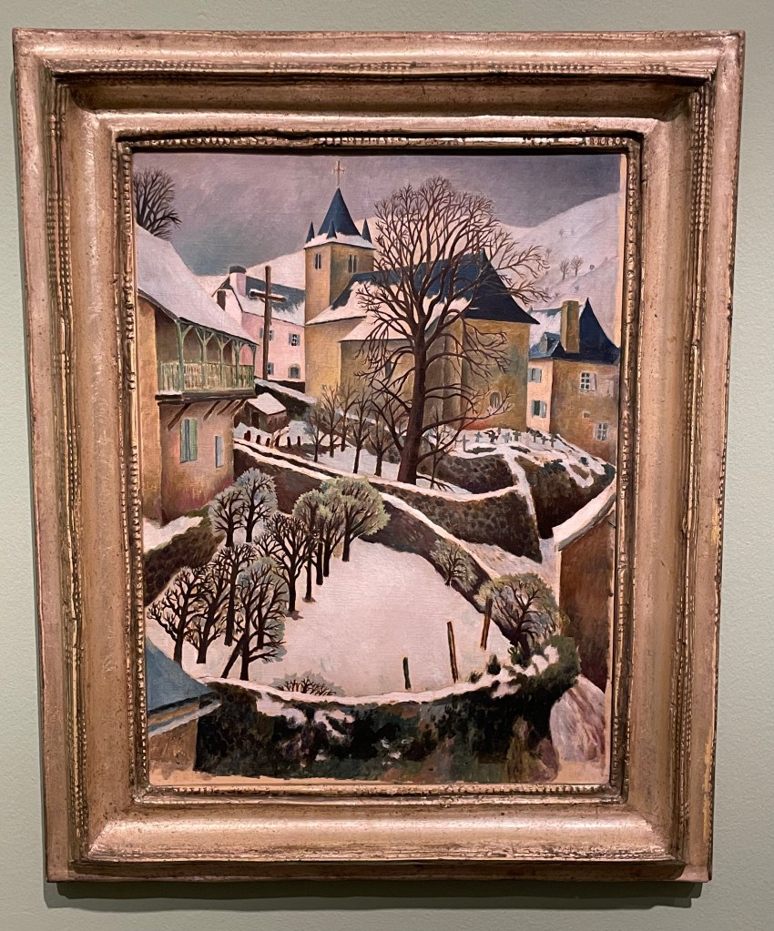
Larrau in the Snow, 1922
Perfect Christmas card material, I really like the simplicity of this painting; its muted colours and, in particular, the composition with its recurring curved shapes of the stone walls and the use of verticals in the posts and trees in the foreground, the large tree and the church with its spire punctuating the sky in the middle ground and the mountains in the background. The positioning of the trees leads the eye up through the painting in a zig zag pattern.
Farm at Watendlath, 1921
Again, I like the composition: the path leads across from left to right, up through the farmhouse along the rear stone wall to the large ominous trees, up to the huge hills in the background which seem to squeeze out the sky. The three areas of white – the figures in the foreground, the farmhouse (and what look like sheets on a washing line) in the middle ground and the clouds in the sky in the background – break up the large areas of green preventing them from becoming too overpowering, but leaving enough areas unbroken to give a sense of being overpowered: the tall trees and hills seem to be bearing down on the woman and child, creating a feeling of foreboding, and the stillness (if they are sheets on a line, they’re not moving at all) and claustrophobia created by the tiny sliver of sky adds to the mood.
It was suggested by the blurb accompanying this piece, that its unsettling atmosphere might have reflected the turmoil which Carrington was experiencing at the time: she had gone to Cumbria on holiday with Partridge and his friend, Gerald Brenan, and they had stayed at the farm. Whilst there, she began a relationship with Brenan.
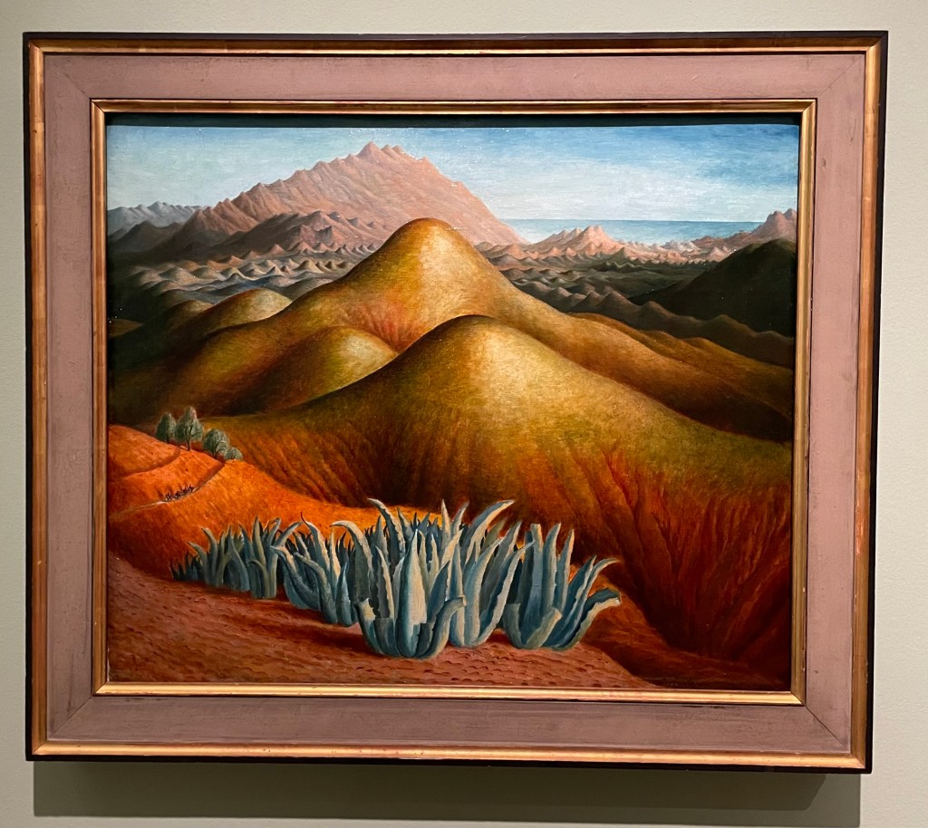
Spanish Landscape with Mountains, 1924
I was drawn to the surreal nature of this painting. Carrington made it from memory, after visiting Brenan in Andalusia, where he lived. According to the blurb, she built up the colour by layers upon layers of glazing on top of what was already a vibrant underpainting. She painted it on a cold day in March, which may have been a contributing factor to her use of colour and the sense of heat and aridity which she manages to create. There are menacing looking succulents in the foreground and a few token olive trees just behind, and these, together with the slight greenish tone to the area in from of the background mountain range, cleverly break up the large areas of warm reds and yellows which form the undulating hills in the middle ground. There is the lovely detail of the figures on horseback moving towards the viewer along the ridge on the left hand side. It has an otherworldly quality to it: apparently Carrington felt transported to another world when she visited Spain.
Lytton Strachey, 1916
“He was everything to me. He never expected me to be anything different to what I was.” This was how Carrington described Strachey, and it is apparent in this portrait of him which she painted towards the beginning of their relationship which was to last 16 years, and which survived numerous relationships on both sides. It shows Strachey deep in concentration reading a book which he is holding in his delicately painted hands, which Carrington has strangely elongated. Maybe his hands were her favourite feature, because she captures them in a detailed way, down to the highlights on his nails, even their white tips, particularly on his little finger. Or maybe she used them as a compositional device to create a dynamic and bold vertical marking the final vertical third of the painting. The image wouldn’t have the same impact if his hands were sized more realistically, and the book he is holding didn’t go off the top of the panel.
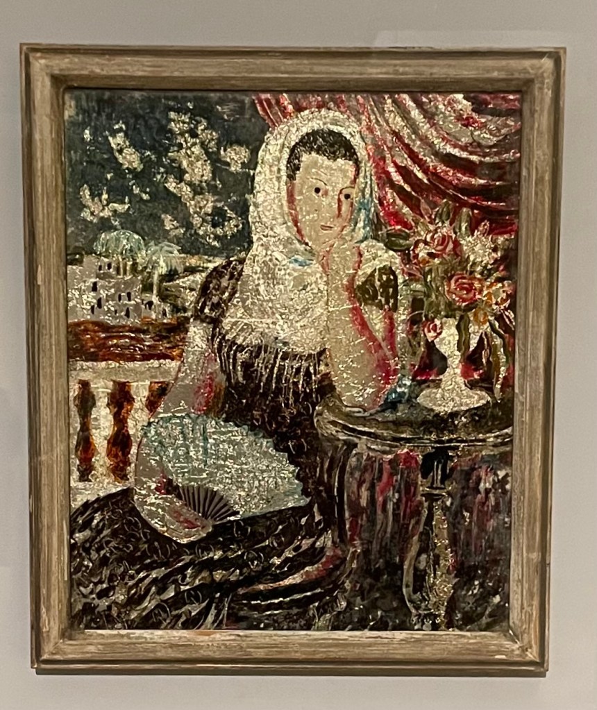
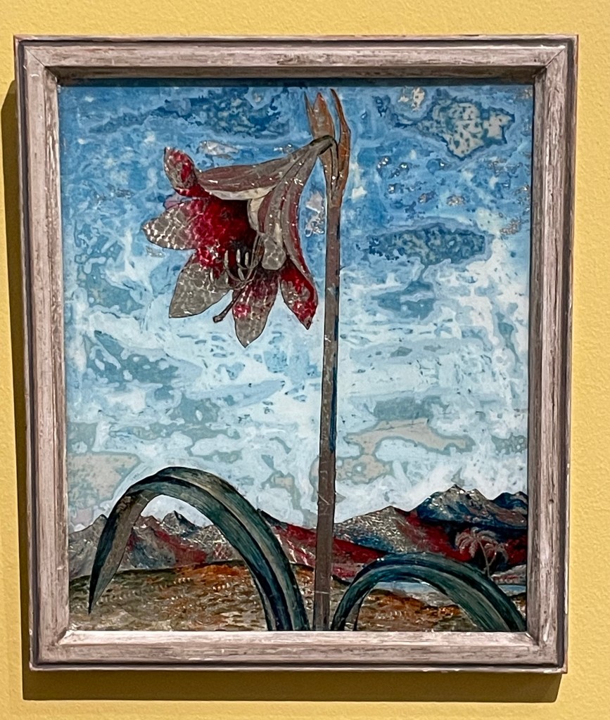
Carrington had a fascination for Victorian ‘treacle’ paintings and from 1923 began making her own which were called tinsel paintings. They weren’t very large and involved making a painting on the reverse of a piece of glass using foil from sweet wrappers and cigarette packets together with inks and oil paint. She sold them through Fortnum & Mason as a way to earn an income in the winter months to finance her serious art making. She also made them for friends: the ones below were made for Augustus John’s wife, Dorelia. Very few of the tinsel paintings survived, and one of them sold 4 years ago for £57,000.
Spanish Woman
Lily
I’m strangely drawn to them as I’ve never seen anything like them before. They have a strange luminescent quality to them and I particularly like the textures in the sky in Lily – the combination of the resplendent lily in a barren landscape reminds me of Georgia O’Keefe.
Anyway, I’ve done some further research: Dora Carrington’s life was made the subject of a film in 1995 – ‘Carrington’ – starring Emma Thompson and some other notable actors. I watched it last night. Perhaps not surprisingly, it’s a film about her, based on a book about him. I’m not sure that it managed to truly capture the complexities of her life and certainly only touched on her relationships with men, and not women. It was a tearjerker.
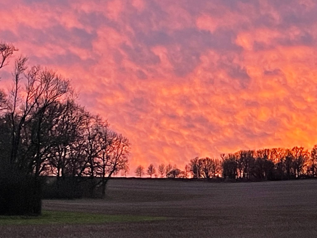
Whilst I was starting to write this post yesterday evening, I looked up and saw the most amazing sky through the kitchen window and had to go outside and take a photo of it. As usual, the image doesn’t really do it justice.