Paper

I was really intrigued by Do Ho Suh’s thread drawings at Tate Modern last summer (Summer II). After some research I discovered that his method was developed during a residency at the Singapore Tyler Print Institute. He had been spending a lot of time drawing in his sketchbook when it was suggested to him that he might try drawing with thread. Applying thread to wet paper proved unsuccessful as the thread was difficult to control and so he tried sewing on tissue paper but it proved too difficult. It was an intern at the institute, who had experience of textiles, who suggested that he might try gelatine tissue paper which is used in embroidery. So he sews his drawings on gelatine paper and then applies it to wet handmade paper and the gelatine paper dissolves leaving the thread bound into the paper.

This has got experiment written all over it.

I couldn’t find gelatine tissue paper as such, but I managed to source some water soluble embroidery stabiliser. I haven’t attempted to make paper before but I did a bit of research online and gave it a go. The results are not great, mainly because I’m so impatient and kept on touching it etc and so there are lots of overlaps and tears – but then that is me in the process, so actually it’s all good.

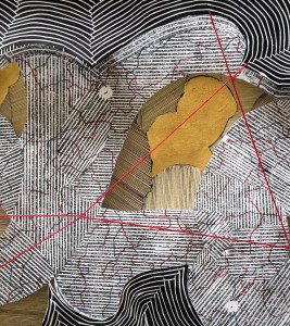
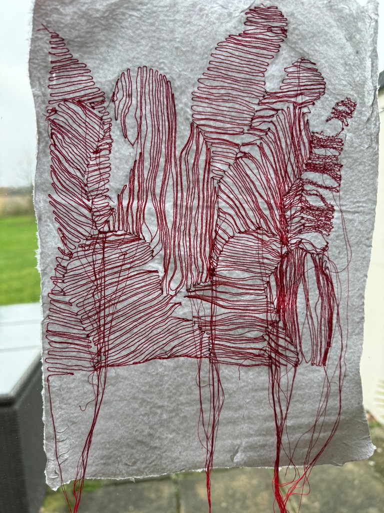
I borrowed my daughter’s sewing machine, sewed on a couple of test pieces and applied to the wet paper and these are the results:

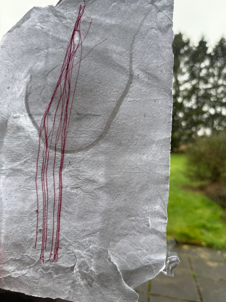
The thread has, for the most part, bound to the paper, so it’s been a success. You can still see where the embroidery stabiliser was, and when it is lying flat there is a slight sheen to the paper. I’m not sure what can be done about that and I probably need to experiment more. The stitching doesn’t have the same effect as Do Ho Suh’s, and he has commented that he likes the unpredictability of how the bobbin thread appears. I think it would be worth using a larger stitch which might create a more interesting effect.

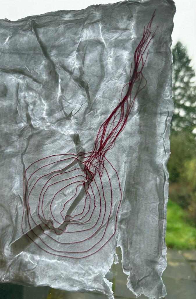
I double dunked this one in the paper pulp and water solution (there’s probably a technical term for it) to see if I could get rid of more of the stabiliser. The effect was quite interesting as in some areas the paper folded over itself trapping in some of the thread and in others the pulp settled on top of the thread, partly obscuring it.

I need to do some more research and experimentation and think about how I might incorporate this approach into my work.

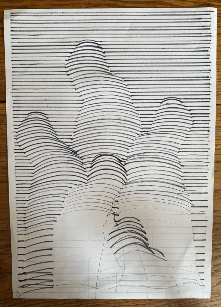
In the meantime, I decided to do some more lines.

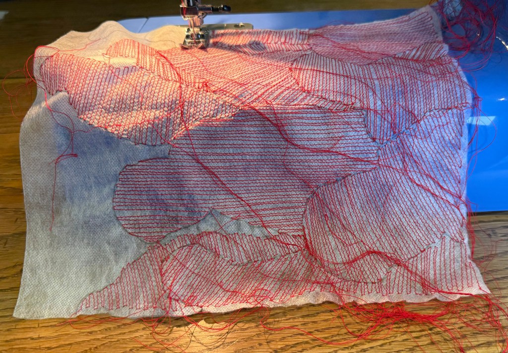
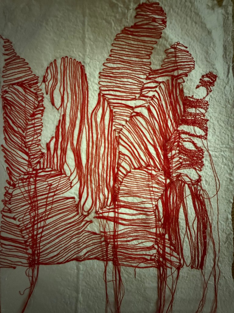
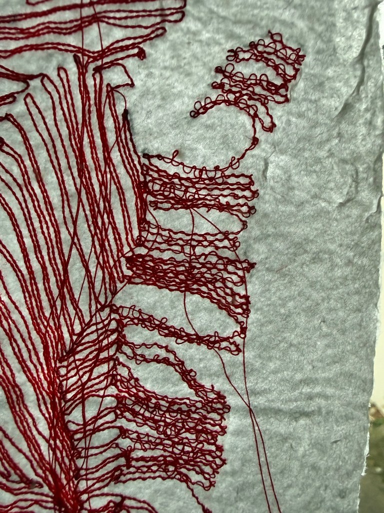
Because the stabiliser doesn’t dissolve very well when placing it on top of the wet paper, it’s necessary to help it along using a spray bottle. I think the spray combined with the excess water and movement in the stabiliser as it dissolved, caused some of the threads to distort. Initially, I was a bit disappointed, but I actually quite like the movement it creates and also the loopiness of the stiching on the right. It has the feeling of a continuous line drawing.

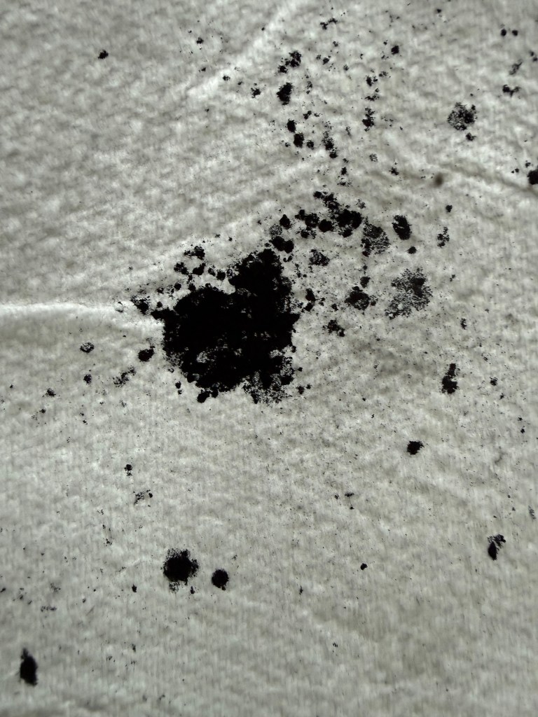
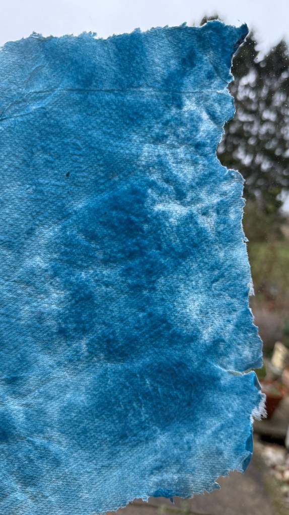
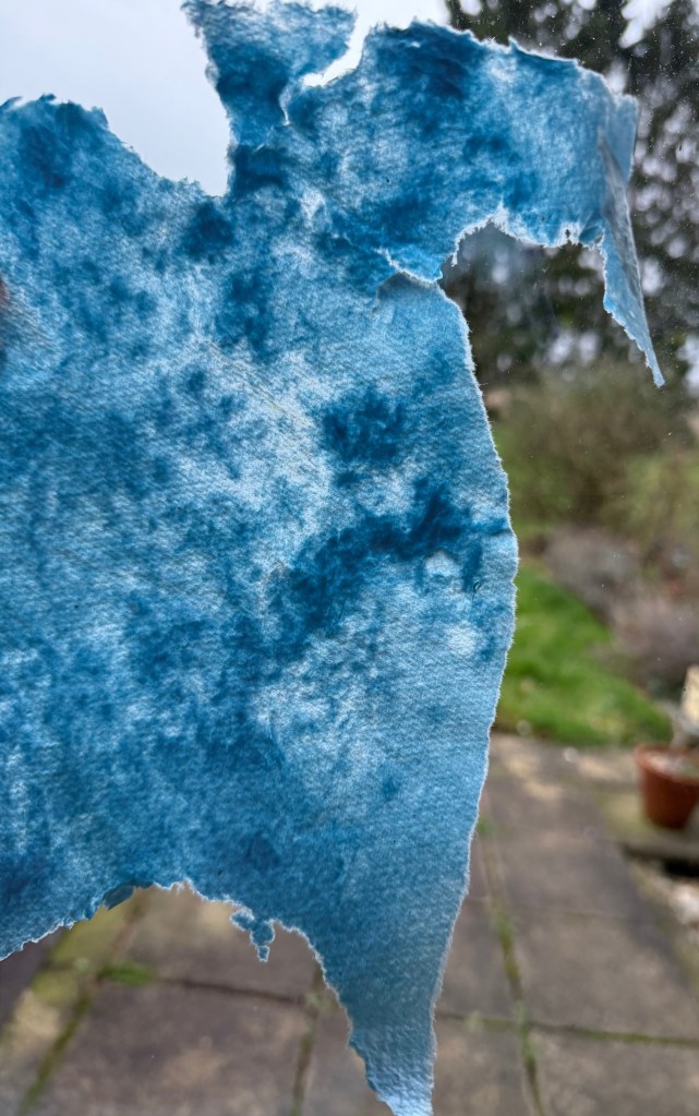
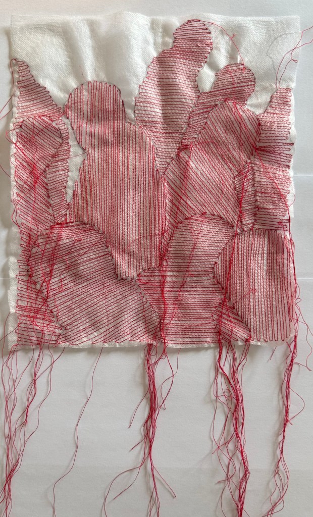
There was some pulp leftover so I played with some colour and some graphite powder. The graphite powder didn’t really do anything interesting, and still remains quite loose on the surface of the paper. I like the mottled effect of the colour as well as the impression from the kitchen paper it had been sitting on.

Pushing Paper IV

I’ve decided to experiment with using the contour image in Procreate as a layer.

I was looking through some old family photos and found this one of my father in Canada. This is a recurring image from my childhood – if there was an edge or a high place, my father would always go and stand on it despite us pleading with him not to. I think he would have been about 40 years old when this was taken. I took him on the London Eye when he was in his 70s and I don’t think he looked out at the view once, choosing to spend the entire time sitting on the central seat, ashen-faced.

I also found this photo of a signpost.

I played around with layering using filters, inverting and adjusting opacity:

The image above is tonally bland; I prefer the one below. I like how the lined contouring gives the effect of the image being woven or embroidered.

Again, the images above don’t have enough tonal range. I don’t think the contouring adds anything, it’s probably more of a distraction.

A mixed bag of results. I prefer the images which don’t crop off the bottom of the sign post. The most successful is probably the penultimate image, but again I think it needs a greater tonal range. However, I do like the effect of the figures against the landscape, the idea of crossroads in life, decisions made, a different path followed and shadow selves.

Pushing Paper II

I’m generally quite a logical person, but I’m not always methodological. Often I’ll have an idea that I want to try out, and instead of following the steps which logically come before it, I launch straight in. Maybe I’m just not that interested in the preceding steps, or maybe I’m just impatient.

Anyway, armed with some Micron fine liners I decided that rather than start again where I left off last time, I would change a few things all at once. Sometimes in my art class we will do an exercise where we draw something and then pass our work onto the next person who then adds to or modifies it. I’m not keen on this exercise, in relinquishing control to someone else, of letting someone else be a part of my work.

As drawing lines is a repetitive, controlled and focussed act, I decided that I wanted to shake it up a bit, to introduce an element of unpredictability. Whilst drawing a random outline is to all intents and purposes unpredictable, because I’ve done it so many times I suspected that I might have developed an unconscious pattern of movement, a comfortable way of doing it. So, I decided to ask my husband and daughter each to draw an outline to which I would then respond with a simple system of using the same width of pen and filling in each section with lines, ensuring the lines in adjacent sections are going in different directions. I also allowed myself the opportunity of leaving a few sections blank or treating them in a different way. I worked on A2 off white cartridge paper.

My husband’s:

This is the orientation it was drawn in and I prefer it this way as it gives it a feeling of instability, discord, of something melting. Anyway, the other way up it reads as a cyclist with a flat rear tyre.

My daughter’s:

The first thing that strikes me is the relevance of selfhood and the act of becoming. Becoming happens through entanglement with others and selfhood is shaped by those relationships, and the world around us. These images embody my relationship with the people who drew the outlines. I didn’t choose the outlines but I can choose how I respond to them, how I engage, how I attend to them. I transform the outlines with time and devotion much as I do in the relationships with my husband and daughter. They then respond to what I have done and all of us are changed by the process.

I really enjoyed making these images. The repetitive act of drawing the lines allowed me to switch off and to engage fully with the process rather than thinking about the result. I had no idea how they would turn out. The decision as to direction was made in the moment – it may not even have been a decision as such, just an intuitive adjustment of the angle of the ruler. I like that the mark-making is the subject of the images and consequently so is the process. The only active decision was which parts to leave out and how to deal with them. I love how the process is so evident – the times when the repetitive act and the sound of the pen on the paper made me lose focus and overshoot, how when I moved the ruler it left a spidery trail, how the areas where the lines cross form and edge which is at times irregular, creating a distortion, an interference, almost a vibration. Against the flat areas of colour the lines even appear to have a dynamism about them which I think is helped by the variation in tone – there are lighter areas where the pen is starting to dry up.

Whilst I was making them I felt content, as if two parts of myself were both being satisfied, balanced – the part which likes order and certainty and the other which likes the unpredictable and the unknown. There must be something about it which resonates with me because I subsequently went on to spend the following week experimenting with more images.

It would be interesting to see what the process is like involving people who aren’t experienced with making art to see how their outlines might differ in the sense that they might be less confident and their mark making more hesitant. Also, what about strangers? How might I feel responding to outlines which have not been made by people that I know?

Pushing Paper

I bought ‘Pushing Paper’ in the hope that I would find its contents enlightening, but primarily because I felt drawn to the cover. The image is ‘Some Interference’ (2006) by Richard Deacon, which he made during his residency at the Oxford Centre for the Study of Gene Function. According to the book, Deacon was initially trying to represent multiple surfaces on a flat plane – the paper splitting into interconnected layers. As things developed, he realised that what he was drawing was difficult to clarify.

Something about it really appeals to me. It reminds me of the doodle type drawings I’ve been doing (On Your Marks… & Lines). Aside from Etch-A-Sketch and Spirograph, this process entertained me for hours as a child. I would draw a random enclosed shape with overlapping lines which created segments to be coloured in. It takes me right back to my childhood. Maybe that’s why I’m drawn to it. Maybe it’s because it embodies its simple process as well as having a temporal dimension – the act of drawing each individual straight line. I like the darker line which is formed around the edges of the shapes where the lines have crossed.

Well, whatever the reason, I picked up the nearest pen, a leaky biro, and had a go.

It was a very satisying exercise, despite the blobs and smears. The ‘me’ at the beginning of this course would have discarded it. Instead, the blobs and smears are all part of the process, caused by the movement of the ruler and my hand, a moment hesitating too long in one spot. Nevertheless, I’d like to repeat the exercise with a proper pen, maybe a variety of pens of different thicknesses. In the meantime, I experimented in Procreate.

Prints

I’ve decided that I would like to make physical prints for the Editions Sale, if possible, and I have resolved to do a linocut, on the basis that I don’t have an etching press at home, and I probably won’t be able to make it in to CSM this month. I also want it to be something which is relevant to, and an extension of, my recent work.

I’ve not much experience of linocutting, but this is a good opportunity to try and improve my skills. I’ve been experimenting with some of the mapping imagery that I’ve been exploring over the last few months.

Originally I thought about the line drawing I did and how form can emerge from lines. I used my father’s silhouette from Solitude to experiment.

The lines are all over the place as I did them freehand (how does Bridget Riley manage?) and there were a few errors. In the top half I experimented with rounded curves, whilst in the bottom half the lines are flatter.

I tried drawing out how it might work but in the end I decided that it would just be too difficult, and gave up.

I then looked at the contouring and the automatic drawing that I have incorporated into some of my recent work. I used a group of three figures, composition yet to be decided, and red and blue as the colour choice for the time being. I created multiple layers in Procreate which then allowed me to play around with possible combinations.

I like the red and blue contoured background with the figures standing in front of the straight white lines (last two images), maybe using gold leaf or even metallic ink (which would be cheaper) to add some additional interest. I’ve also put the darker figure in the background so that it gives the feeling of being in the shadows, even though, technically, lighter figures are supposed to recede, which in this case they don’t seem to because of the background.

So I’m sorted, apart from the fact that it will need to be a reduction linocut, something which I haven’t done before, put off by the suspicion that my brain doesn’t work in a reductive way, but there’s nothing like a challenge. Maybe I need a Plan B, just in case.