Interim Show

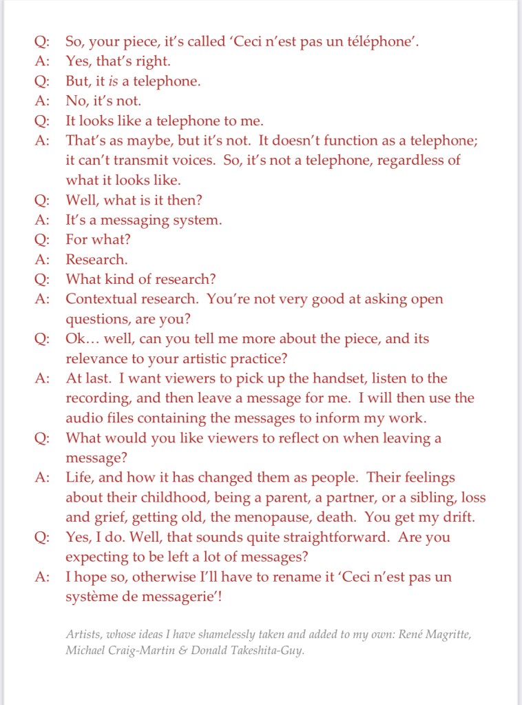
My main piece is the telephone. I’ve managed to figure out how it works – now I’ve just got to record my message which I think will be quite short and to the point.

I struggled for a while to come up with a way to indicate that it is an interactive piece. Also, if I’m going to use the audio files as well as the content of the messages in future work, I think I should say as much so that people have an opt out if they’re not happy with the possibility of their voice being used.

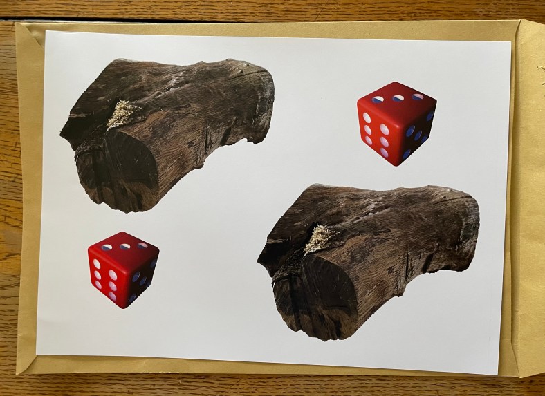
I was trying to get to sleep the other night, tossing and turning, when it came to me – I’d do what Michael Craig-Martin did for ‘The Oak Tree’ i.e. have a transcript of an imaginary conversation between me and a third party.

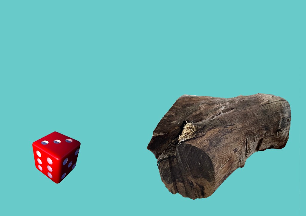
So I came up with this, which I will display alongside the telephone. And yes, I’ve also ripped off Magritte, and used Donald’s comment from a few sessions ago about mobile phones not really being used for their primary purpose, making and receiving calls, but for messaging etc.

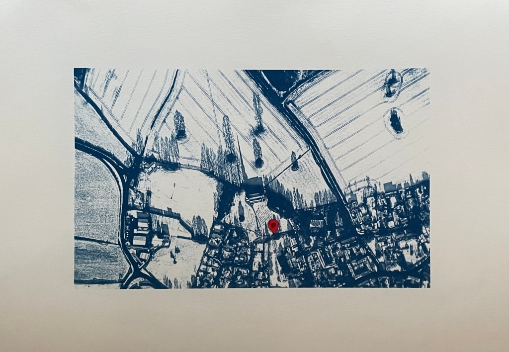
I’ve also had another bash at the cyanotype of the aerial view of the village. I couldn’t get it right on A3 for some reason as the detail of the fields just wouldn’t stick. I tried so many times but I think that because I was doing it quite late at night my brain just stuck, and instead of stopping and leaving it for a while so I could reflect on it with some distance and clarity, I just kept on making the same mistakes over again which made me feel really frustrated. I’m going to park it for now – it could be something to do with the height of the UV lamp.

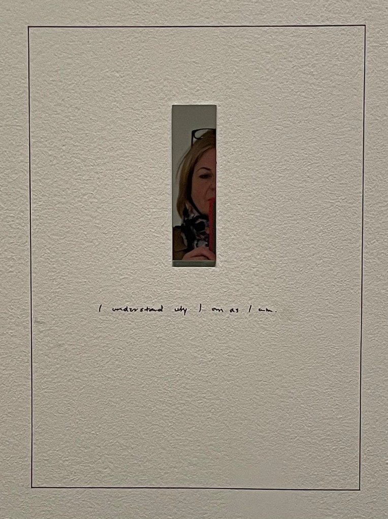
So I’ve gone back to the smaller negative and printed it on A3 and added in a location pin. I’ve decided to call it In Loco Parentis. I feel much better about it now, and, on reflection, A3 would just have been too large an image for something which is quite intimate and personal.

I’ve also tried doing a triptych of the view from my window. I had initial success in finding out how to split the image into 3 equal parts and printing separate negatives for each. After that it just went downhill; it has been so difficult to get any consistency between each of the separate sections because I’m doing them each individually and there doesn’t seem to be any rhyme or reason as to why they turn out differently despite using the same solution and applying it as consistently as possible, exposing for the same amount of time and washing out in the same way. I even tried to make sure that the temperature of the water was the same by starting to run it at exactly the same time before the exposure had finished, but the difference in results between them was staggering. I’ve now got lots of different sections, and having sorted through them all, these three are the best fit that I could come up with.

I think I might sort out the sizing a bit more and then fix them to another piece of watercolour paper.

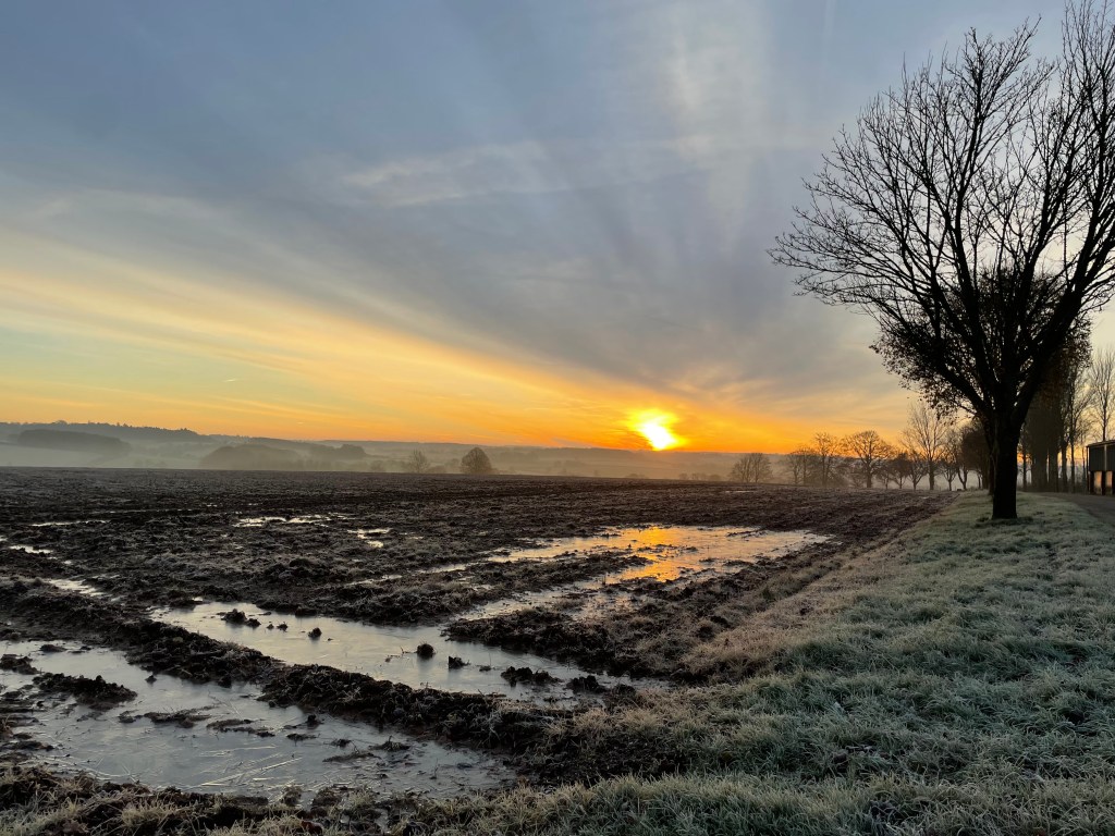
Disheartened by the exercise I did the same as with the aerial view, took the original negative and printed it on A3. It was much more straightforward, and made me feel an awful lot better. Is it a bit boring? I don’t think so as I think you get a much better sense of atmosphere, and I’m trying to change myself to subscribe to the view that less is more.

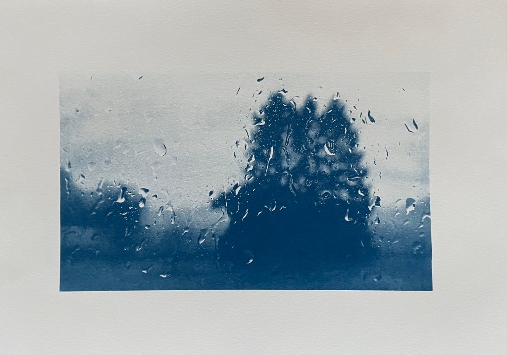
As I took the original photo on New Year’s Day, I think I’ll call it, Another New Year’s Day. On reflection I think I prefer it. I’m not sure that disjointed views really do it for me, but then again I didn’t think that I liked collage.

In addition to the pieces above, I’m taking along Motherhood I which I’ve had printed on A1. I’ll see what seems right on the day.

Dialogue II

“So, what do you think?”

”It’s not one of your best”

And now I’m in a state of flux, and feeling a bit stressed, thinking where do I go from here? I have nothing else.

I use my husband as a sounding board and as a gauge as to what I’m feeling and what I’m doing. I value having someone to give me feedback, to hold a mirror up to me. But to what extent should I rely on this and allow it to influence how I see my own ideas and work? Why is it when someone says they really like my work, I feel it’s easy to ‘do it down’ – ‘oh, it’s not one of my best’, ‘there are some bits of it I’m not totally happy with’ (when actually I think that it’s as good as it could possibly be and I’m actually quite pleased with it), and yet when someone is ambivalent about my work, I feel unable to ‘big it up’?

Anyway, I now feel directionless, and at a loss as to what to do.

I have looked at how other artists have approached the concept of dialogue, and, in the main, they all involve figures. None of what I have looked at has inspired me so I haven’t even bothered to include any images of them in this post.

I don’t know what it is, but I’m feeling a bit fed up at the moment. Maybe it’s the theme of ‘Dialogues’ and the idea of connections etc. – it all seems as if it’s something that has been done before ad infinitum. Maybe it actually bores me – I don’t know – I just can’t seem to get inspired by it. Maybe it’s the fact that I only have a week to make something and I’ve got other more pressing things to be getting on with. Maybe this little side quest of mine is becoming an unnecessary distraction.

As a reaction to this feeling, I decided to take a literal, and some might say, infantile approach. I kept on coming back to my perverse love of Catchphrase and the birthday card. I started fiddling around on Procreate and came up with this:

A die, a log.

It’s pretty basic, but strangely appeals to something inside me. Maybe it’s a bit cheesy – but do I care? – maybe I need a bit of cheese at the moment. Then I remembered a piece I saw at the Pallant Gallery last weekend.

’Neighbourhood Witch’, 2008, Simon Periton, Silkscreen on mirror coated polyester

I really like the use of the mirror which reflects the viewer so that they then form part of the work. It reminded me of Craig-Martin’s ‘Conviction’ which I had seen at the RA. I could use this idea because one of the thoughts on my mind map referenced the need to reflect when engaged in dialogue.

I have decided to incorporate a mirror, possibly with the images of the die and log being raised slightly away from it so that they reflect in the mirror as well as the viewer – a die, a log, with you. It’s now becoming a fully matured wedge of Stilton!

I experimented by printing them off on some inkjet friendly acetate but my home printer didn’t do a particularly good job, but good enough to allow me to see whether the idea had legs. I wasn’t averse to it: it would mean that I would have to have it professionally printed on something more rigid, such as acrylic/perspex, and frankly, I don’t really have the time to get this done. Also, on reflection, I wasn’t sure about the reflections creating multiple images, as it was no longer a die and a log.

The only solution that I can think of is to fix the image directly to the mirror. The image in ‘Neighbourhood Witch’ above is screen printed on. I don’t know how to do this and I don’t have time to learn. I could get it done professionally, and after having done some research, it may still be a possibility but it depends on timing. Another solution would be just to collage them on. I researched the best type of adhesive and came up with Gorilla Clear Glue which is used a lot in glass mosaics. I will need to experiment with how best to apply it. In the meantime, I put some image cut-outs on a A4 mirrored piece of acrylic. I like the size.

Despite its luke warm reception, I’m going to carry on with my current train of thought. It may not be my best, but I like it because it is something that is totally different for me and it’s way outside of my box, and frankly, I’m all out of other ideas. And as General Patton said – a good plan violently executed now, is better than a perfect plan executed next week.

So I had a couple of sets of the images printed up on some 200gsm paper by my local print shop and cut them out and placed them on the mirrored acrylic to see how they would look.

I don’t know why I didn’t realise that this would happen, as it seems so obvious now – unless you stand dead straight on to it you can see the white reverse of the cut out image in the mirror.

My proposed solution is to have the mirror images printed and then fix them together so that any reflection is of the image itself.

Onwards and upwards, I hope!

Arty-farty

In the hope of finding some inspiration, I sorted out my art bookcase and came across the exhibition handout to the Michael Craig-Martin exhibition at the Royal Academy. This quote caught my attention:

I dislike jargon intensely and cannot stand people who think that complex ideas need to be expressed in a way that is obscure or rarified… The great minds whom I have admired … are precise and economic in their use of simple language.”

Michael Craig- Martin, “On Being An Artist

I have to agree with him. I’m very much an advocate of the Plain English campaign. Maybe it’s because I don’t have the necessary range of vocabulary to achieve such verbal smoke and mirrors, or the attention span.

Clarity of language is what made reading Will Gompertz’s ‘Think Like An Artist…’ such a breath of fresh air. He cuts through all the jargon and makes his points in such a way that someone who doesn’t have an ounce of art knowledge would be able to understand and appreciate them.

As Craig-Martin says, it’s not about having very complex ideas: ideas which challenge are good but, if we want art to be accessible to all, why use convoluted and, frankly, nonsensical language to explain and critique it? Is it to maintain an air of mystery, of intellectual superiority? And who is responsible? The artists, the critics, the galleries or curators, or all of them?

Thinking back to our first sessions when we introduced ourselves and our work, I can’t think of a single instance when I didn’t understand the ideas being expressed. There was just authenticity.

This year’s Summer Exhibition is dedicated to art’s capacity to forge dialogues but, how can art ever hope to change things if people just don’t get it? It goes back to the idea of ‘connection’ in my previous post: without a connection, however small, there can’t be engagement, and without engagement there can’t be a dialogue.

When I started this course a friend asked me whether I was going to become all arty-farty. I said I hope not but, if I ever come across that way, she should give me good slap!

I’m Sorry, Michael. It’s Not You, It’s Me.

It was a colourful day yesterday.

It started with a bracing dog walk, first thing. It was the best start to the day.

Then a train ride to London to visit the Michael Craig-Martin exhibition at the Royal Academy before it closes in a little over a week. I have to say that going into a gallery has the same effect on me as going into a church – a sense of wonderment and contemplation comes over me: people even speak in hushed tones.

It was joyously colourful, but for me, that was just about it. I was left wondering to myself, if it wasn’t for the painted walls and the sheer scale of some of the works, would they still have been so impactful? If they had been A3 in size and hanging on a bare white wall, would I still have experienced chromatic overload? I used to be attracted to the graphic simplicity of his work, elevating everyday objects to something out of the ordinary, but I’m sad to say that I don’t think it does it for me anymore. I’ve changed. If anything, I was more intrigued by his earlier conceptual work.

The Oak Tree (1974) is a small glass filled with water to a specific level and mounted on a wall at a specific height of 253cm. It is accompanied by the text of a conversation in which Craig-Martin explains how he has changed the glass of water into an oak tree without changing the physical form of the glass – I don’t know whether it was meant to be amusing, but I certainly had a titter. In a short film for the RA, which I watched when I got back home, he explains that he was trying to find something that constituted the essence of art, in that art is based on the notion of transformation, and the most extreme proposition for transformation would be to have no transformation at all. Others have alluded to his Catholic upbringing and have suggested that it is to do with transubstantiation. I also read that it was seized by Australian customs officials on its way to an exhibition in the 1970s on the basis that it was illegal to import plants into Australia!

I was particularly drawn to ‘Conviction’, a series of mirrors on paper, as it directly relates to what I’m planning to explore.

’On The Shelf’ comprises 15 milk bottles positioned at a precarious angle on a shelf, but the varying levels of water create a level horizon. The four buckets on the table are actually supporting the table, rather than the other way round. Finally, ‘Box that never closes’ questions what makes a work of art: the box has lost all functionality, and does not even form something that is aesthetically pleasing.

I went into the shop but didn’t buy anything: instead I had a look at the wall which supports teaching art in schools. I put a post-it note up following on from our session a couple of weeks ago: ‘creativity will save the planet’, but I forgot to take a photo.

I was then going to nip into the National Gallery but the queue was half way down the street – probably caused by the extra security and bag searches. So I went round the corner to the National Portrait Gallery which I haven’t been in since its refurb.

I was pleased to see the portrait of zoologist and conservationist, Dame Jane Goodall, by Wendy Barrett, the winner of Sky’s PAOTY 2023. Compared to the photograph taken by Ken Regan, it gives the viewer so much more. I thought it was tremendous, and full of intelligence, sensitivity and humanity.

Lucian Freud’s letter to his grandparents, thanking them for the money they gave him, which he was going to use to buy a book of fairytales, reminded me of Miró with its coloured shapes and black lines. It took me back to a hot day in Sóller over the summer when we found relief from the sun in the train station, which happened to be exhibiting various ceramics by Picasso and works by Miró – can’t see that happening at Waterloo Station anytime soon. Freud’s self-portrait is a favourite: the way he applies paint and his minimal brushstrokes are lush.

Bearing in mind my latest experiments using a pen, I was fascinated by the mark-making in Eileen Agar’s drawing of the modernist architect, Ernö Goldfinger. Hockney’s portrait of Sir David Webster with Tulips is stunning: I was a bit perturbed by the size of his head at first, and the fact that the sole of his left shoe seems to be coming away, but I think I’m ok with it now. In any event, it’s all eclipsed by the beautiful rendering of the table and tulips, and the fact that the jacket hanging over the arm of the chair makes him look like he’s levitating.

Colin Davidson’s Silent Testimony was moving: a collection of 18 large scale portraits of individuals who have all experienced loss in the Troubles in Northern Ireland, although it is also more generally about everyone who is left behind after conflict. They are impartial: there is no reference to the sitters’ religion or politics. What is striking is that none of the sitters are looking directly out of the canvas; they look off to the side as though deep in thought, as if they are remembering. There is a real sense of loss and pain, and contemplation – it is etched onto their faces, quite literally in some areas. They are painted in thick paint which seems to be weighing them down. But it’s all about the eyes. They are painted with a much more careful and detailed application of thinner paint. They almost look haunted.

And then I walked back to Waterloo Station, over the bridge, with Ray Davies crooning in my ear, although, let’s face it, his voice isn’t what it is used to be. All in all, apart from my break-up with Michael, a good day.