Whenever I go to B&Q, I always want to come home and do some DIY; whenever I visit a beautiful garden, I always want to come home and sort out our garden; whenever I go to an exhibition, I always want to come home and make.
I’ve been feeling in need of a pick me up recently, and so yesterday I headed into London on a hot, Notting Hill Carnival, Bank Holiday Monday to catch Louise Bourgois’ ‘Maman’ on its last day at Tate Modern, the very space for which it was commissioned back in 2000. There’s no doubt that it’s impressive at 9m tall – again, I ask myself whether it’s all about the size, but I think any spider larger than real life would have an impact. I had an overwhelming urge to touch it, but resisted in light of the ‘Please Do Not Touch Sign’. I also found myself wondering how they got it into the building, memories of Johnny Vegas’ struggles coming to mind.
It was well worth the trip, a rare chance to see a piece in the flesh in the very place for which it had been made. Having said that, I’ve seen some images of it in a landscape, which I find particularly effective.
Tate Modern’s website on ‘Maman’:
Louise Bourgeois started making sculptures of spiders in the 1990s. This version is her biggest spider. Its title, Maman, is French for mummy. The artist said spiders reminded her of her mother: ‘Like a spider, my mother was a weaver. My family was in the business of tapestry restoration, and my mother was in charge of the workshop. Like spiders, my mother was very clever … spiders are helpful and protective, just like my mother.‘
I’m a bit behind with things at home, and we’re starting to amass some really impressive cobwebs. I watched as a flying insect became entangled in one of them; in a flash the spider came from nowhere and quickly got to work wrapping it up.
I’m not sure that spiders are clever as such, but they do have great skill. I don’t really think of them as being helpful and protective: they set traps that you can’t see, they ambush you and then swaddle you up until they consume you. Although, I don’t have a problem with them, as they catch flies etc, as long as they are not where they’re not supposed to be, such as on the bedroom ceiling above my head, or in the bed.
Lifelong arachnaphobe, Primo Levi, in his essay ‘The Fear of Spiders’:
“The spider is the enemy-mother who envelops and encompasses, who wants to make us re-enter the womb from which we have issued, bind us tightly and take us back to the impotency of infancy, subject us again to her power…”
I’ve tried not to be either of those spider mothers. I’ve tried not to be suffocating and I’ve tried to resist the urge to fix things. I’ve definitely failed; I often tell my daughter that I’m trying my best, and, when she’s older, not just to remember the times when I’ve not been at my best, like I seem to have done with my own mother. It’s that negative bias again, I suppose. I’m now actively remembering all the times when she was kind and caring, supportive, and all the laughs we had together, which by far outnumber the not so good.
I have had an image in my mind for months. It came from the Elizabeth Stone quotation, I first mentioned in Hearts & Linos .
”Making the decision to have a child – it is momentous. It is to decide forever to have your heart go walking around outside your body.”
I think it encapsulates perfectly how I felt when I became a mother. My whole world was turned upside down. I was suddenly responsible for raising and protecting another human being. I felt overwhelmed by the magnitude of it all; that life would never be the same again. It made me question the sort of world I had brought her into, how her life might be; how much of it I would be a part of, the unthinkable and unbearable pain I would suffer if anything happened to her. She was precious and intrinsic to me, now living and breathing in the world, independently of me.
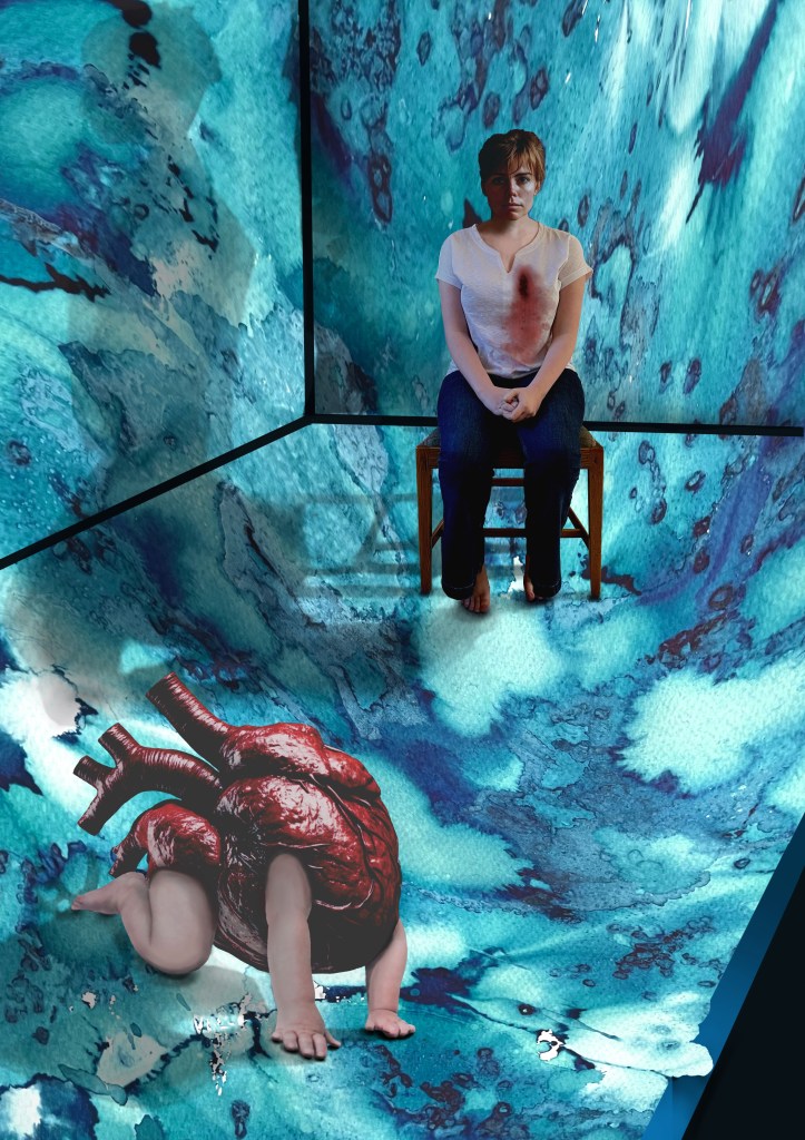
Original VersionDramatic FilterCyanotypeCoffee Toned CyanotypeAltered background and darker tonesDramatic Filter.Dramatic cool Filter. Worked on hands.
It’s taken a while. Bearing in mind that I’m still finding my way around Procreate I don’t think that I’ve done too badly. I’m sure that I’ve done lots of things incorrectly, but I don’t really care. It’s all a learning process and it was fundamentally about me trying to realise an image that I had in my head. I feel that I’ve achieved what I set out to do. In that respect, I’m pleased with it. I think it conveys the visceral nature of my feelings.
Actually, it has taken me more than a while; it’s taken ages, probably because I kept on making mistakes, but I have learnt lots along the way. I’ve redone parts of it several times but I have to say that it has all been about the process of discovery and realisation. It’s allowed me time to focus on the detail, but it’s been as part of the process rather than with a view to trying to achieve a perfect result. I don’t think that Procreate is a tool with which I can be loose and expressive in the physical sense, but it seems to satisfy that part of me that likes to focus on surreal detail every now and then. Hopefully that will allow the other part of me to enjoy the experimentation of being looser and more expressive in my mark-making when, say, painting.
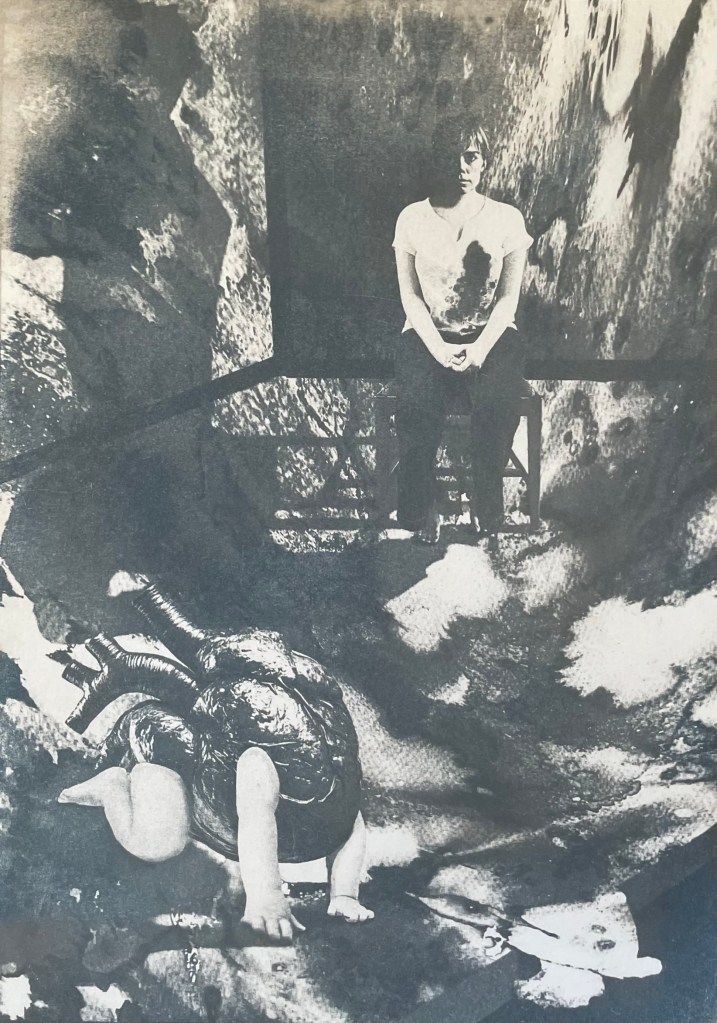
I decided ages ago that I wanted to incorporate my ink experiments as a background to a collage type piece. I sourced the heart, crawling baby and head of the woman from royalty free image sites which allow for reproduction of the resultant work, if need be. The body is my daughter. She’s a bit freaked out by someone else’s head being on it, but I wanted a neutral character, and I couldn’t find an image of a woman sitting on a chair that fitted my requirements, so I roped in a free model.
It was challenging constructing the crawling heart. I’ve had to rebuild parts of it including the hands as some of the fingers were hidden in the original image. It was quite difficult finding source images whose licences allowed me to do what I wanted to do, and were also free. I’ve played around with editing effects and colours and I think that I’m settled on the last image for now. The slight greenish tones, complement the red heart. I really like the cyanotypes, but unfortunately there isn’t enough tonal variation and the slightly chaotic background loses its delicate tonal transitions in the process. I might try again but change the background to something a little less busy. But I like the historical, almost Victorian Penny Dreadful feel to them. I might develop it further, but I’ll leave it on the back burner for now.
The time delay video created by Procreate is of epic proportions, but it’s helpful for me to watch it back so I can see what a song and dance I made of it all. This is a shortened version.
I knew that last week would be a busy week for other things; I haven’t even managed to post anything, on anything.
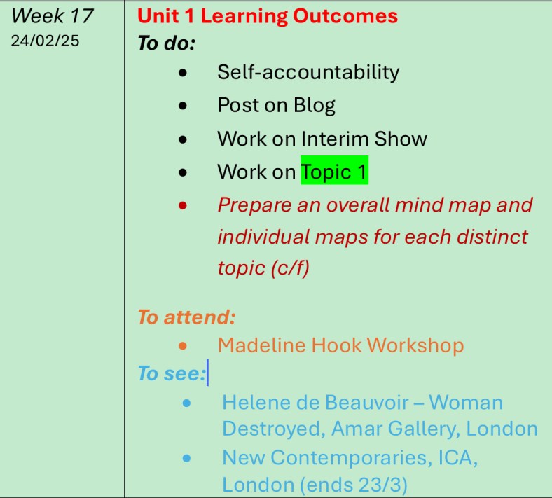
I managed to attend Madeline Hook’s online workshop on Visual Research which was very interesting and demonstrated how the online resources are a much richer environment for searching for visual inspiration than a Google search, which is primarily made up of images in a commercial context. I don’t know why that hasn’t dawned on me until now.
As it turned out, I didn’t need to do anything on the New Contemporaries, as the exhibition is part of the low residency week activities.
I did think some more about the interim show in between doing other things; I have now managed to come up with a way of making it obvious that the telephone is interactive – I’m going to do something along the lines of the accompanying piece to Michael Craig-Martin’s ‘An Oak Tree’.
I have started to do some work on Topic 1; I’ve changed it to be about motherhood as I’ve finally started realising some ideas that I’ve had in my head for months and so that seemed the natural place to start, although it’s out of chronological order. Depending on how these go, I might think about putting them in the interim show.
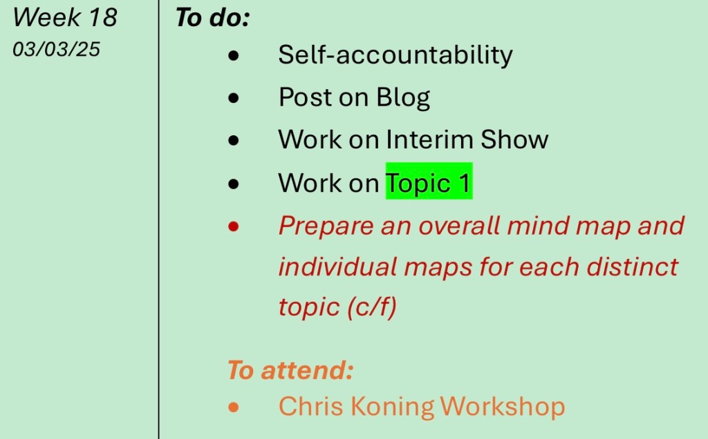
I haven’t done a mind map so I’ll have to shift that as an ongoing item into this week.
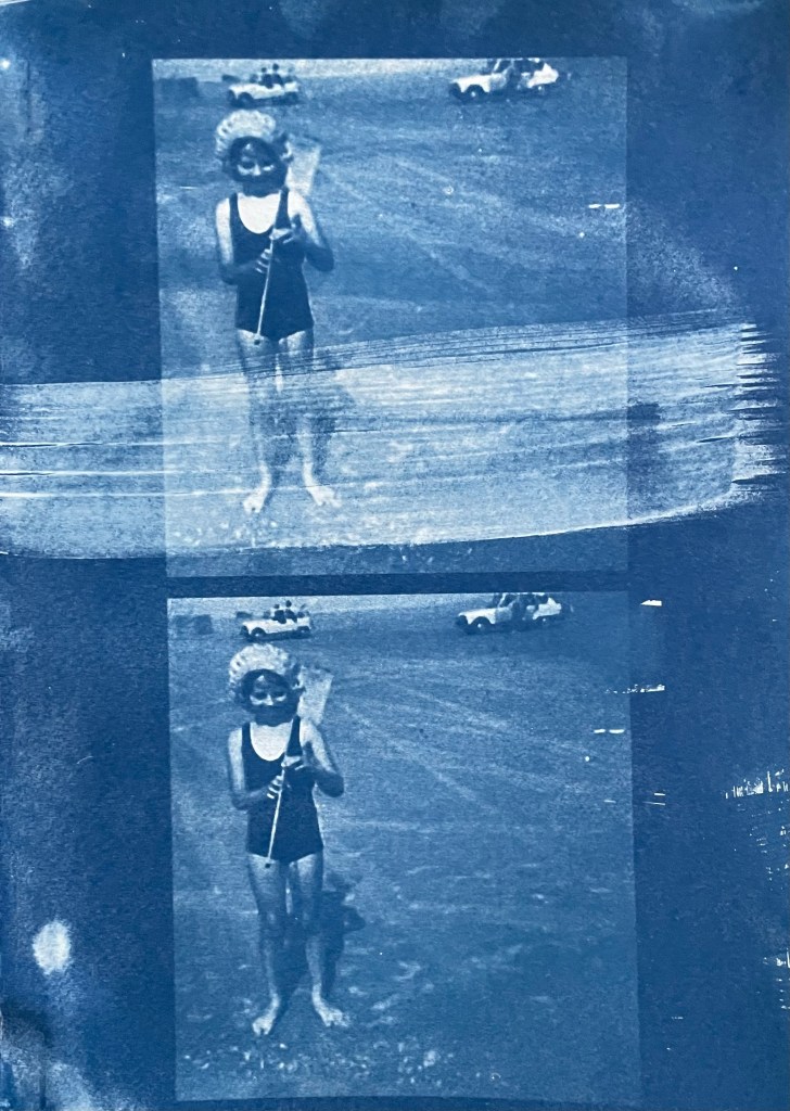
Last summer I became obsessed with cyanotypes. Then there was plenty of sun. There was some sun the other day, but not much since, so I decided to make myself an exposure unit using my Speedball UV lamp and following instructions on Handprinted. I do love a bit of DIY; there’s something very satisfying about making do with something handmade which didn’t cost a fortune to buy, or require some fancy kit, or having to go to a specialist location.
I used an old printer box which was large enough to take A3 sheets, cut out a hole for the lamp to sit in, and then lined it with aluminium foil.
I selected a few photographs to experiment with; some from the family photos which I’ve been sorting out, and others which I have collected on my phone as inspirational resources, as well as some images from the experiments earlier on in this blog. I converted them all to black and white and then inverted them in Photoshop, printing them off on transparencies. I had to dust off my old printer to do this as I wasn’t sure how to do it on my husband’s printer. This took a while because between each print I had to perform a ritual of pressing certain buttons in a certain order in order to fool the printer into thinking that I was using genuine HP ink cartridges, which I wasn’t. The things you can learn on YouTube.
Ironically, the sun came out, so I did a mix of au naturel and my DIY unit.
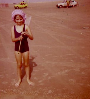
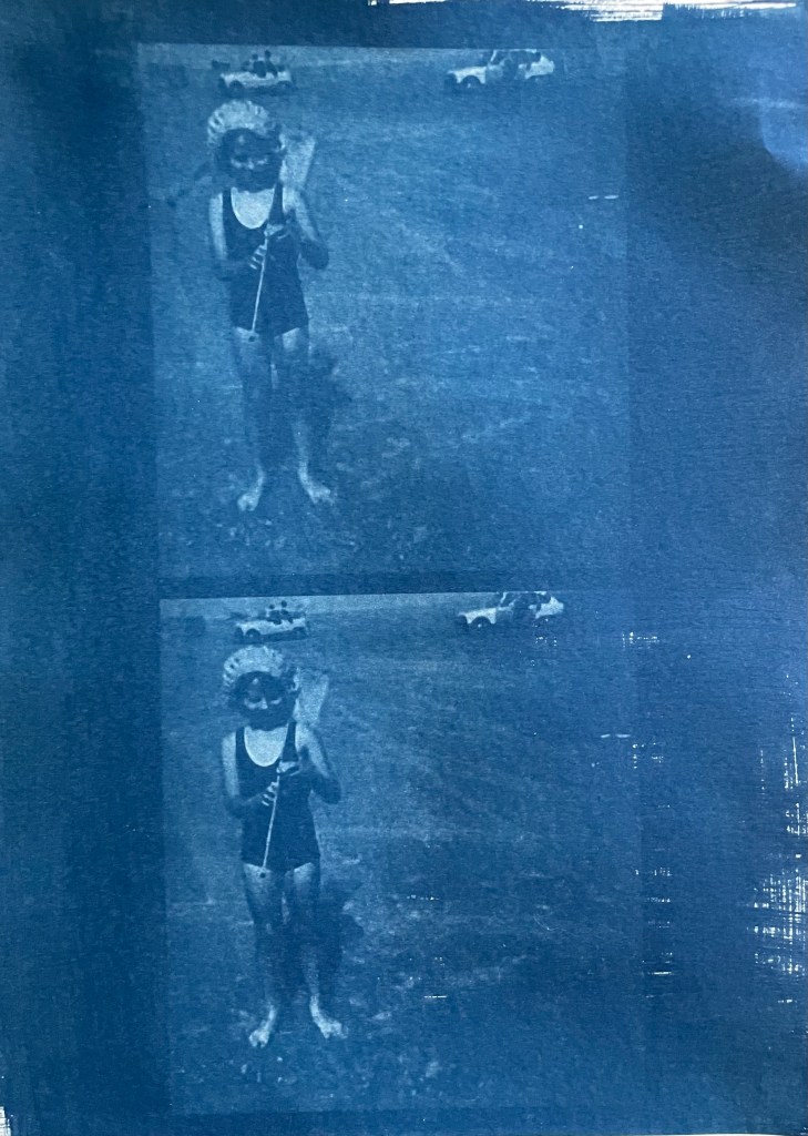
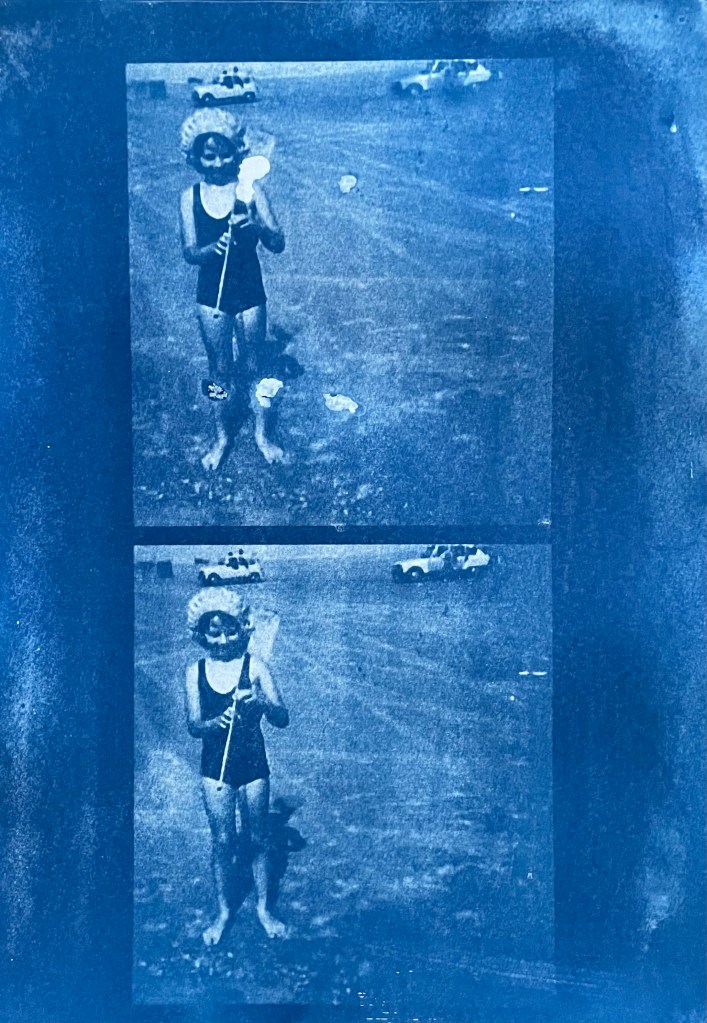
Me
The first two prints were made using the unit, the first being over- exposed at 20 minutes, the second being just about right at 15 minutes. The last two prints I did outside in the sun, which was a bit more hit and miss because the strength of the sun was not constant as it kept disappearing behind some cloud cover. However, I do really like the effect of the visible strokes which I left when applying the solution to the paper, which was A4 300g/m2 hot pressed watercolour paper. The markings give the effect of a moving, flickering , transitory image – there, but not quite there. I put two images on the same negative transparency because I wanted to create a number of smaller images to experiment with. However, the suggestion that the images are on a roll of film is really interesting.
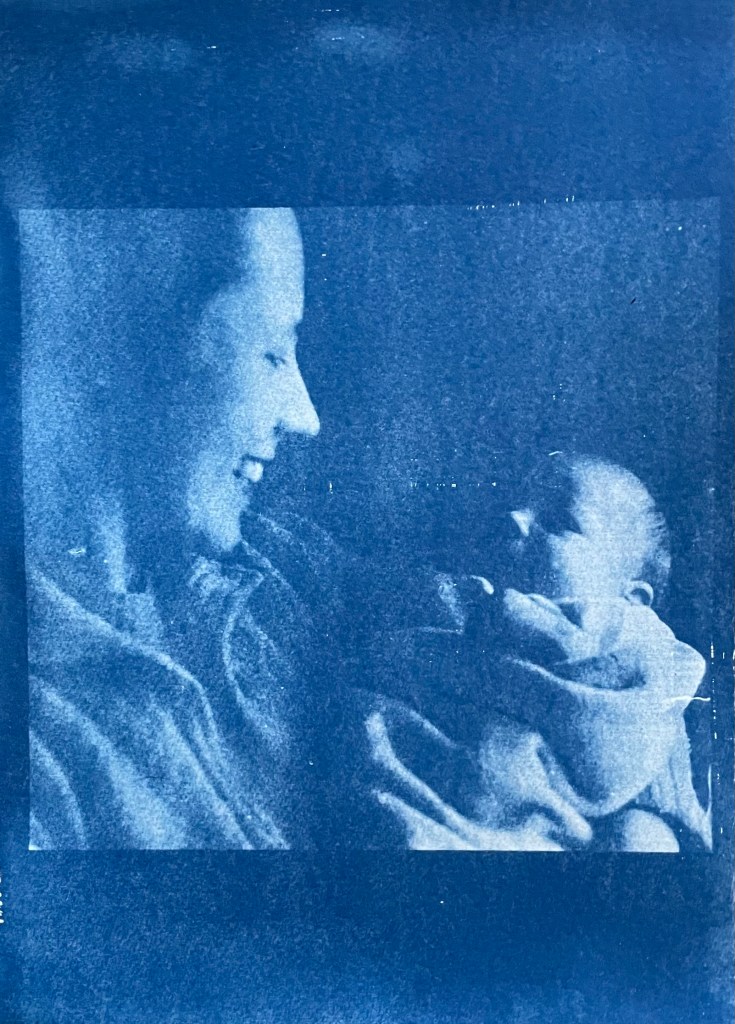
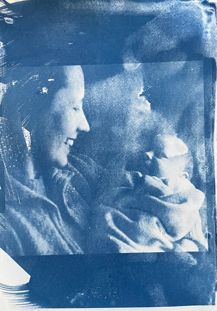
My mother & my brother – capturing a connection and a perfect expression of motherhood
It’s been really difficult getting some of the old photographs out of the albums; they are the sort which have sticky pages on which you position the photos, and then put a transparent film over the top. Over the years the adhesive has seized up and practically bonded to the back of the photos. I’ve tried all sorts including gentle heat, dental floss and a bendy, very sharp filleting knife.
This one of my mother and brother is a favourite, but sustained a small tear on the right. I am pleased with both images – the first one was done outside and the second in the unit, which seems to have more of a Prussian Blue hue to it although I’m not sure that there’s any rhyme or reason as to the differentiation in the blues – but I really like the movement in the second one, again giving the impression of a fleeting moment. I think that the solid areas at the top and bottom add to it, suggesting a frame from a film of a moving image.
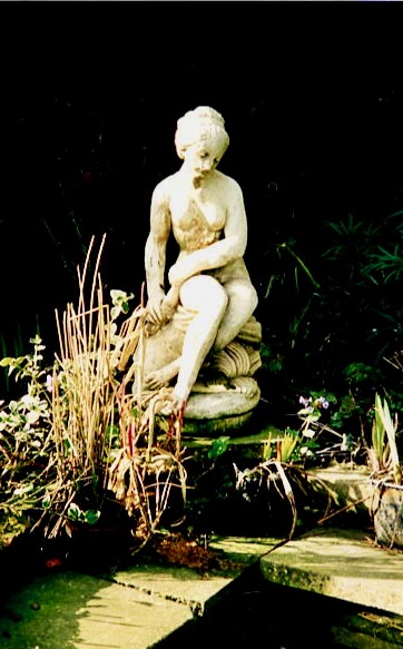
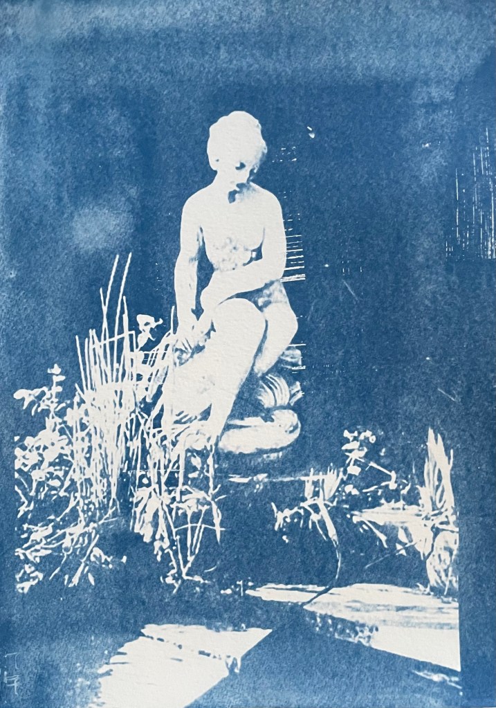
This is a photo of the statue which sits at the bottom of my mother’s garden next to her makeshift pond made out of an old washing-up bowl. I always used to wander around the garden when I visited, stopping at the pond to see if there were any frogs around. I do like a frog – my grandmother on my father’s side used to have a rockery, and I used to spend most of my visits looking for, and trying to catch frogs. That, and hanging out in her shed and greenhouse with the tomato plants – I love the smell of tomatoes; it takes me right back.
The problem with a cyanotype is that if you leave it too long, you over-expose it, and whilst you get deep blues you lose the midtones, which is what I thought I had done with the first one, so I exposed the second one for less, but it turned out to be under-exposed – even putting it in a hydrogen peroxide bath didn’t help. Both were done outside; perhaps I should have done a straight 15 mins in the unit, but where’s the jeopardy in that?
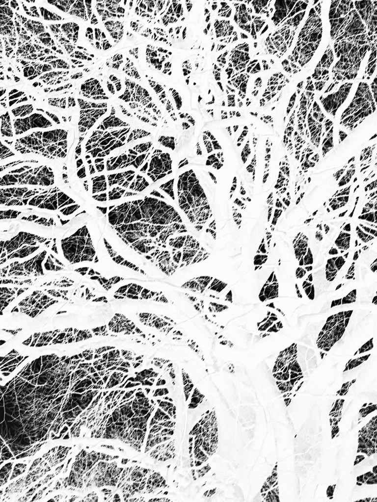
This is a photo that I took looking up into the branches of the three trees that I like. The negative image is also really interesting, and I might do something with that at a later date. The image (last photo) is underexposed again, but has a feeling of being removed, almost as if I’m looking at it through my window (which incidentally does need a good clean). I wanted to try fabric, but could only find some thin cotton lawn. I was so disappointed – it turned out terribly. I had visions of being able to create long, flowing, billowing, wispy cyanotypes, but ended up with the image above. You can just about make out the branches.
I will need to think about this a bit more. My first thoughts are that maybe there was a coating on the fabric, so I’ve washed it; maybe the image was too detailed, but I’ve seen quite detailed images on fabric; that the structure of the fabric is not robust enough – you can get pretreated fabric which is like a sateen so I could try that; or maybe there wasn’t enough contact between the fabric and the negative. I need to take some time to reflect, and try again.
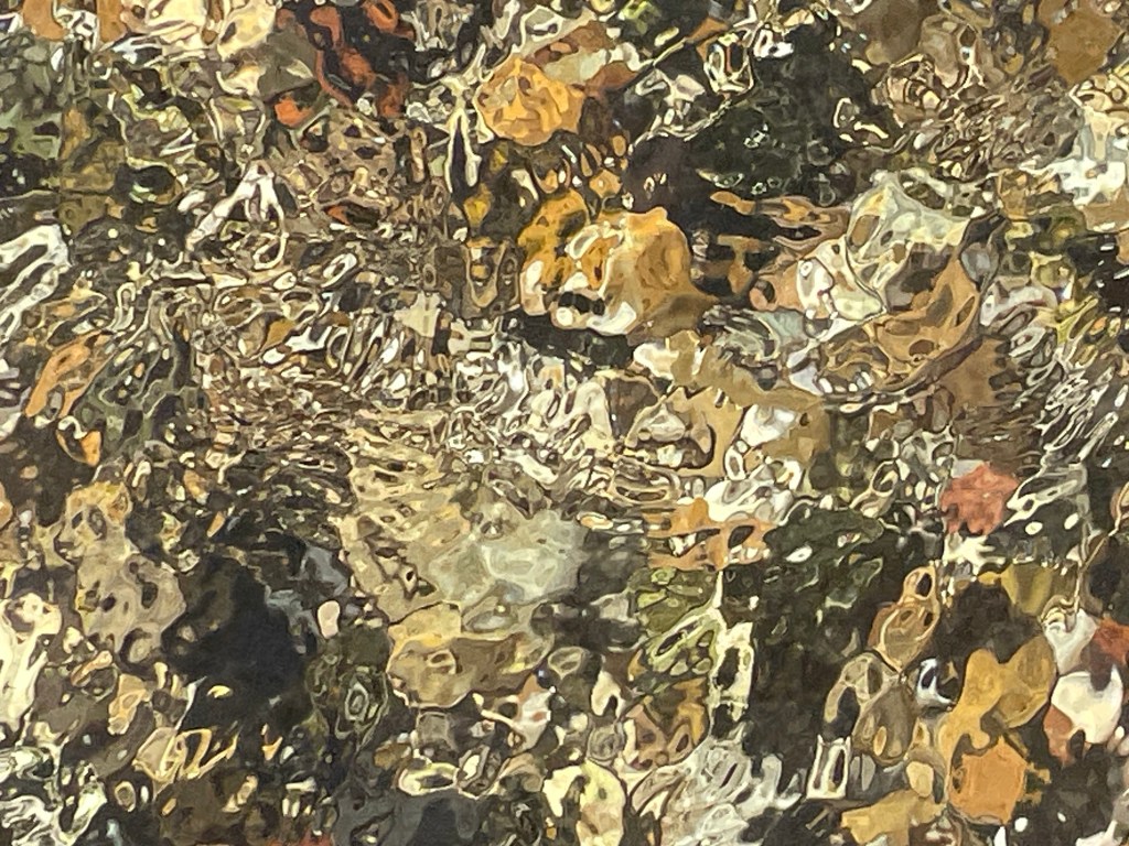
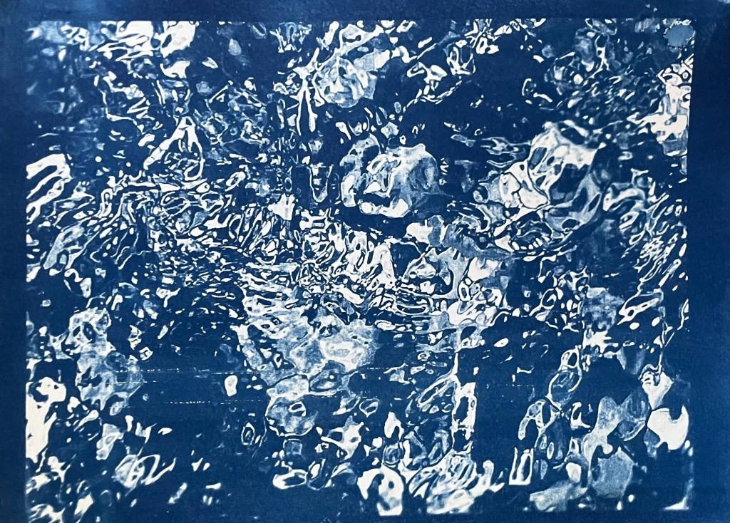
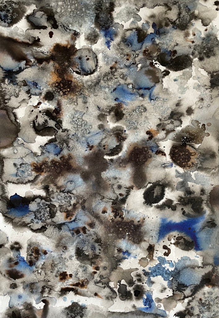
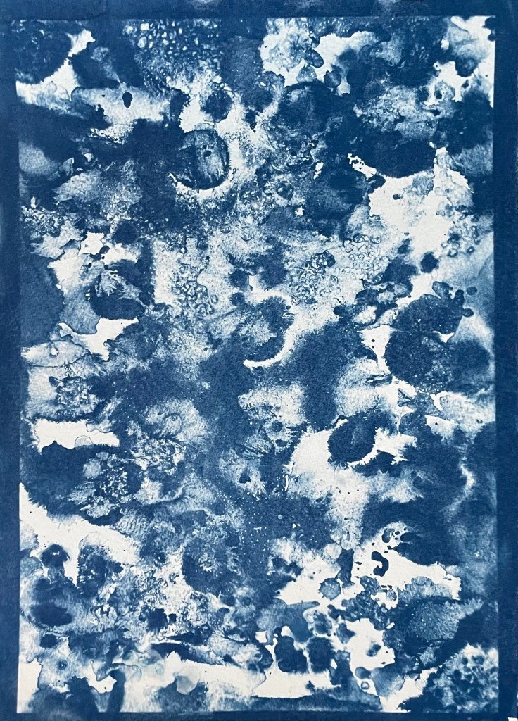
The images above were from my experiment with ink in Blot II , and from A State of Flow II . It was a useful exercise in that it confirmed to me that not everything works as a cyanotype – I much prefer the original images, particularly the ink one, as the edges between areas of flooding and blots are much more defined, and there is more of a delicacy about them. The contrast between the blue and the black ink also adds interest which is lost in the cyanotype.
So, on reflection a really useful and enjoyable exercise. The thing that I really enjoy about this process is the anticipation, and then the slow reveal as you rinse off the solution to see an image slowly emerge, or not, as the case maybe. Doing it outside as opposed to in the controlled environment of the unit adds a degree of extra excitement, but equally there is the risk of crushing disappointment when it doesn’t quite work out.
Moving forwards, I was intending to experiment with toning some of the smaller images of me with tea, coffee, wine etc, but I actually like the last couple as they are, so I will keep them as finished. I’m thinking about how I could use multiple exposures to create layers, and also thinking about manipulating the source image a bit more in Photoshop and printing from the original image rather than reversing etc. I’m not sure whether I’ll get straight to it, or do something else in the meantime – sometimes I go hell for leather with something and then exhaust it, or myself, or become disenchanted with it. I don’t want to get too far down a rabbit hole, so maybe I should leave a bit of space before going back to it, to allow for some more subconscious reflection. I suppose the clue was in the opening sentence: “Last summer I became obsessed with cyanotypes”, and I haven’t done it since.
It’s taken me a while to finish this post – other things have got in the way – but I needed to complete it to make note of what I saw, and what I thought.
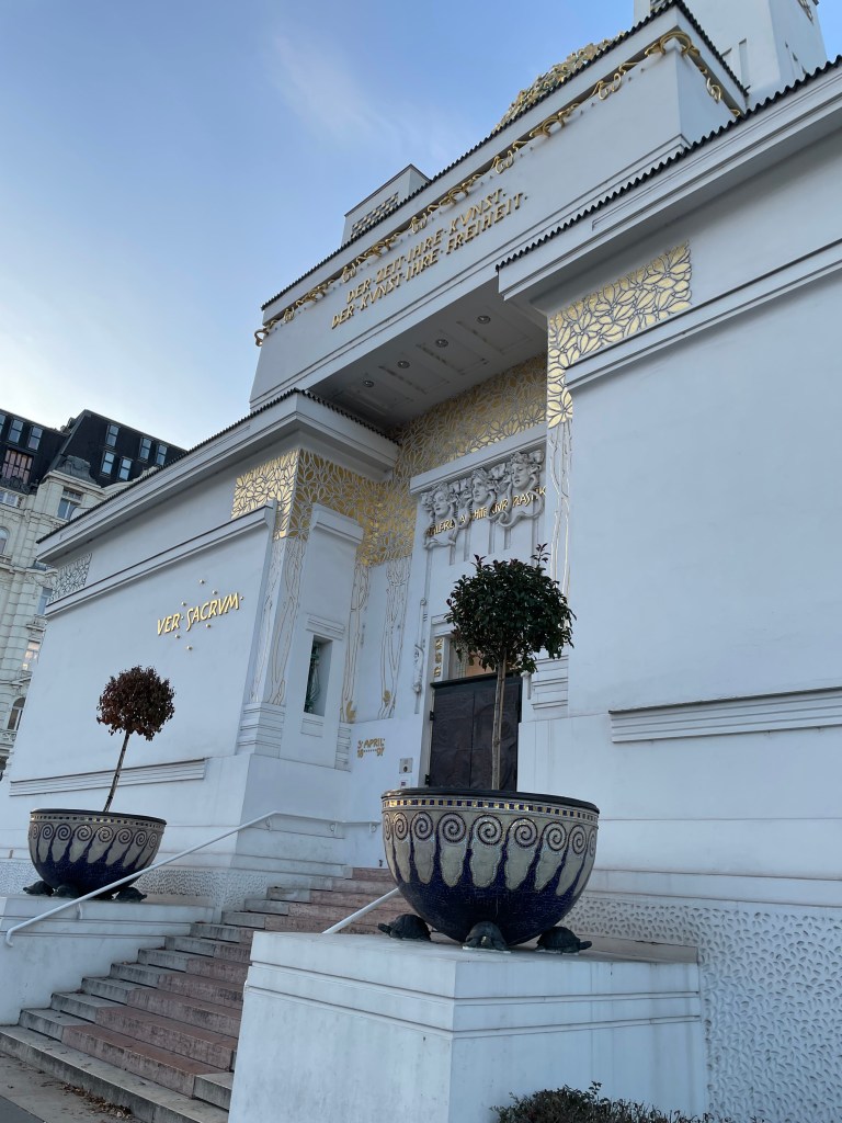
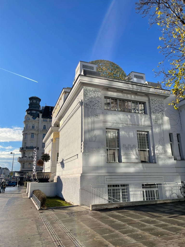
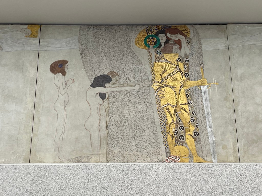
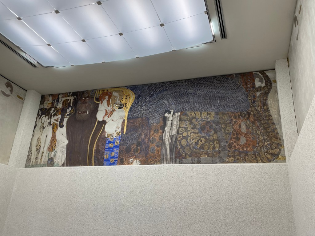
Whilst in Vienna, we also managed to visit the Secession Building, which was designed by the architect, Joseph Maria Olbrich, in 1898, as an exhibition space for the Secession. He was one of the founding members along with a group of artists, including Klimt, who had broken away from the traditional Künstlerhaus to pursue progressive contemporary art. The group’s motto which appears above the door is “To every age its art, to every art its freedom.” Topped by a golden cabbage comprised of 2,500 gilded iron laurel leaves, it houses Klimt’s Beethoven Frieze.
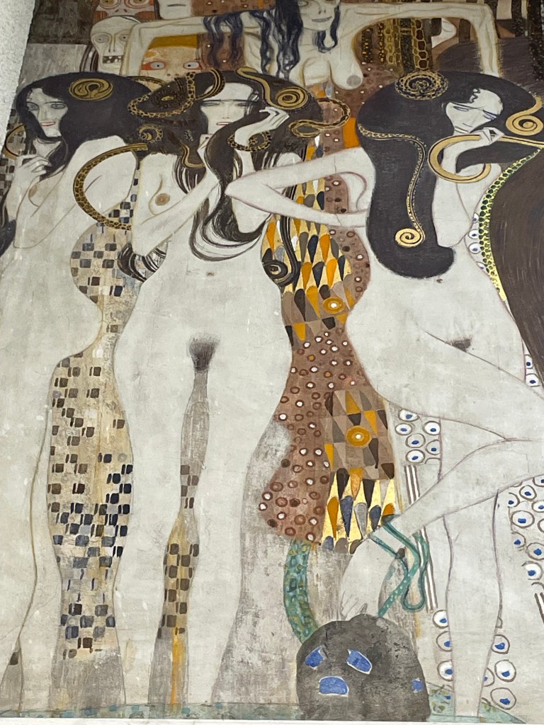
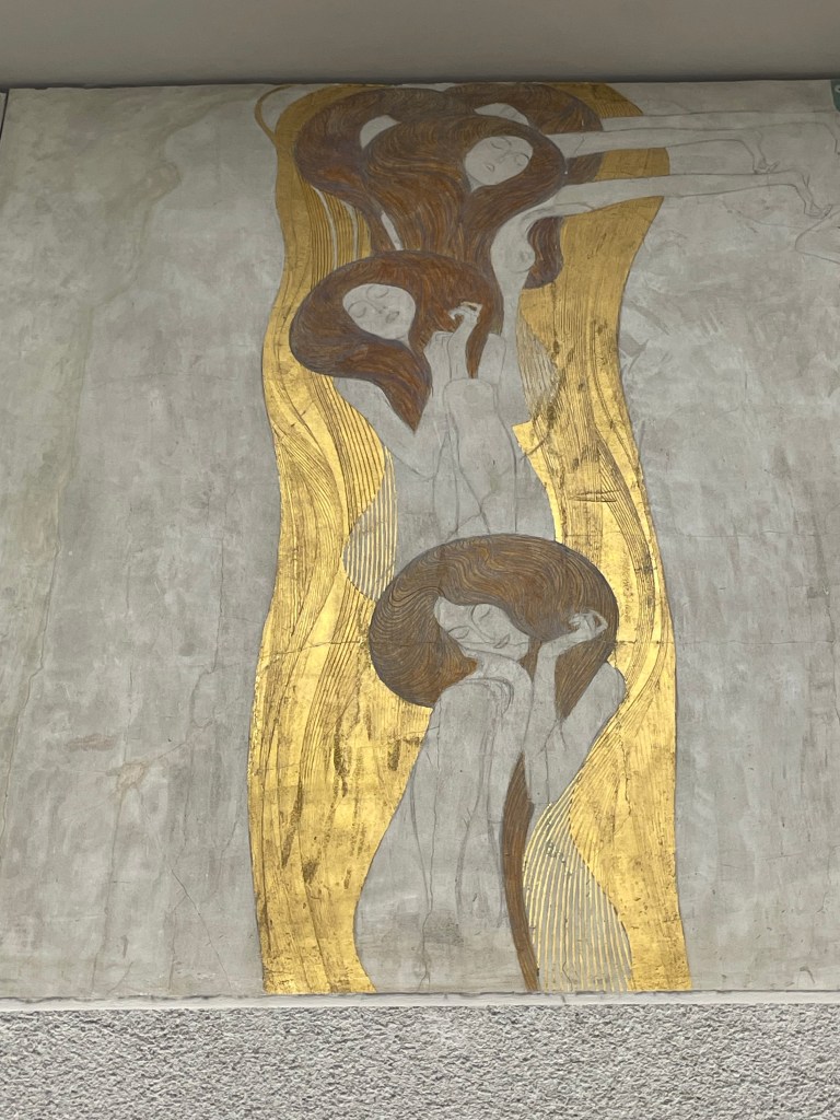
The frieze is based on Wagner’s interpretation of Beethoven’s Ninth Symphony: it is a tale of humankind’s search for happiness.
The kneeling couple symbolize suffering humanity and beg the knight for helpIn this scene humanity faces of Typhoeus, a hybrid monster with a snakelike body and blue wings.To his left are his daughters, the Gorgons and above them masklike representations of Sickness, Madness and Death.To his right are Lasciviousness, Wantoness and the large-bellied IntemperanceGnawing GriefHumanity’s search for happiness is found in poetry – a female figure playing a lyreFigures representing the arts lead to the ideal realm of artThe deification of art is a couple kissing in front of of a choir of angels – “This kiss to the whole world” (Ode to Joy)
I didn’t know what I was expecting really, which is a bit daft considering that I had seen pictures of it in books. I initially felt, yeah ok, but now reflecting on it I think I must have been suffering from a case of art gallery overload. It was really remarkable. It’s been relocated from its original position. It’s high up on the walls of the room, and surrounds you. The fact that you have to look up, makes viewing it an almost reverential experience. That coupled with the fact that you can listen to Beethoven whilst you admire it.
In addition to Klimt and Schiele, I saw many works by other artists, which I felt might be useful over the next year or so, some of whom I hadn’t previously come across.
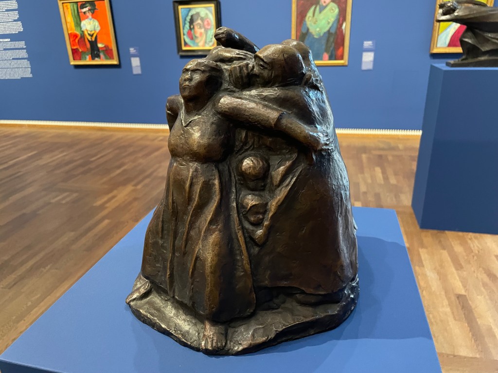
This bronze sculpture is Tower of Mothers, 1937/38 by Käthe Kollwitz. It shows a group of mothers standing together and forming a circle to protect their children, who can be seen peering out from between their skirts. The strength and determination to defend whatever the cost is beautifully captured in the postures of the figures, particularly the mother with her arms spread wide. There is no fear in this sculpture. The mothers are protecting their children from war and the horrors of war, which is poignant as Kollwitz herself lost one of her sons in the First World War, a loss she never recovered from.
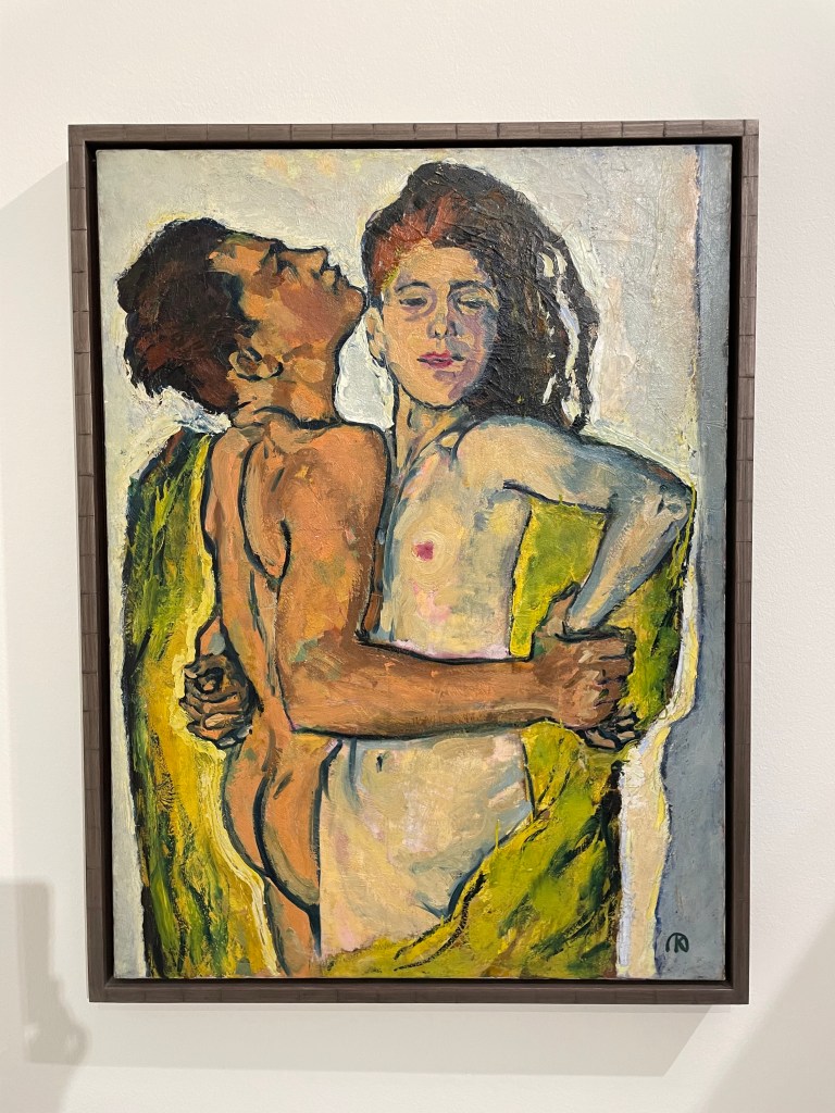
Lovers, 1914Venus in the Grotto , 1914
These oil paintings on canvas are by Koloman Moser. Moser was a founding member of the Secession, and was primarily a graphic designer and illustrator, as well as a set designer, furniture and textile designer, and painter. I like the slight graphic quality of these paintings as well as the unusual palette – his use of what looks like a lime green gives a sickly feel to the works, and works really well with the purplish reds in the skin tones and the shroud. They appear almost luminous.
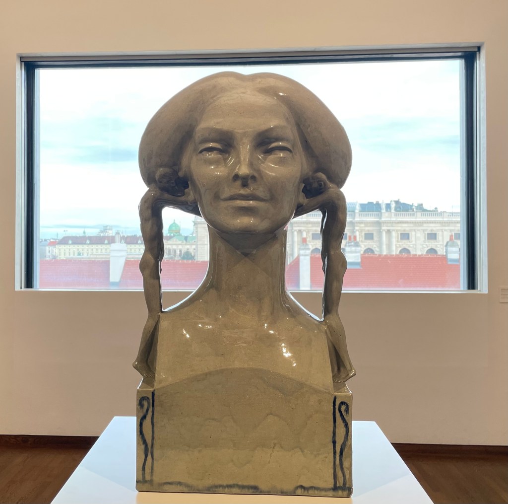
The ceramic glazed sculpture above is Insinuation, 1902/03, by Richard Lucksch. I had to resist the urge to touch it. I found myself wondering what the young men are whispering in her ears; what are they insinuating? The very title implies something negative. It reminded me how difficult it can be to navigate a true course through life, when others are constantly whispering things into one’s ears, insinuating, commenting, doubting, demoralising, chipping away.
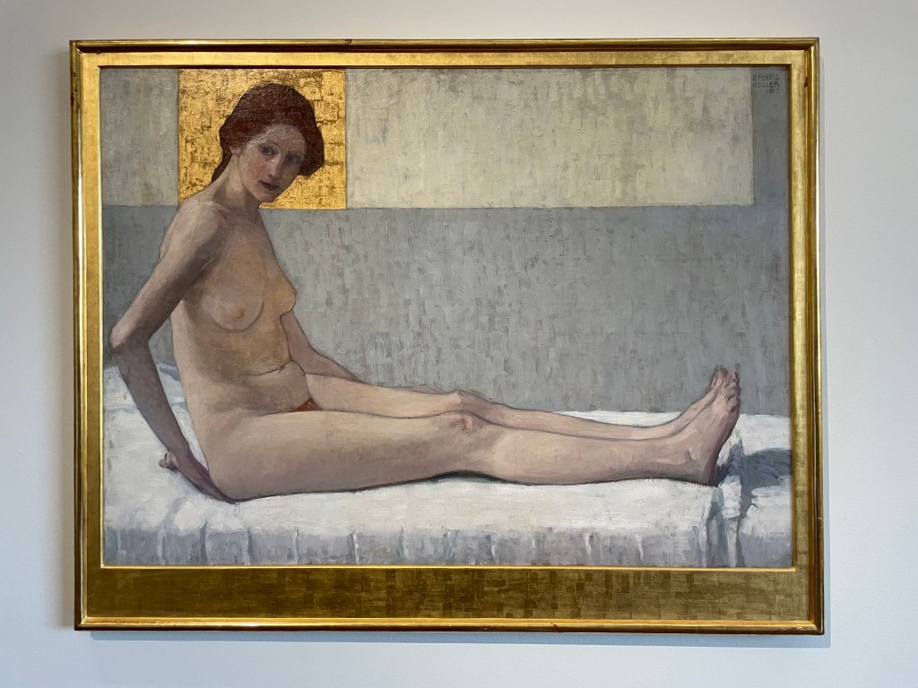
I felt drawn to this painting, for some reason. There’s some gold; that’s a start. The skin is beautifully rendered and I like the composition: I start from the head encased in the golden square and make my way down her body with the interesting detour created by her right arm, along her legs, through her toes up towards the top right and then back to the golden square via the light coloured rectangle. It’s satisfyingly complete.
It’s Seated Woman (Marietta), 1907 by Broncia Koller-Pinells, the Austrian equivalent of radical, Laura Knight, who also challenged the taboo for women artists at the time – the nude.
Head of A Dancer, 1923, by Erika Klien is an example of Viennese Kineticism, which was inspired by Cubism, Constructivism, Futurism, dance, music and architecture. I like the sense of movement of the head and the hands, which have also been deconstructed in parts, as well as the quite limited colour palette.
What’s not to like about a Degas figure? This one Pregnant Woman, was risqué for its time, depicting a woman in a pregnant state, and was cast in bronze after his death.
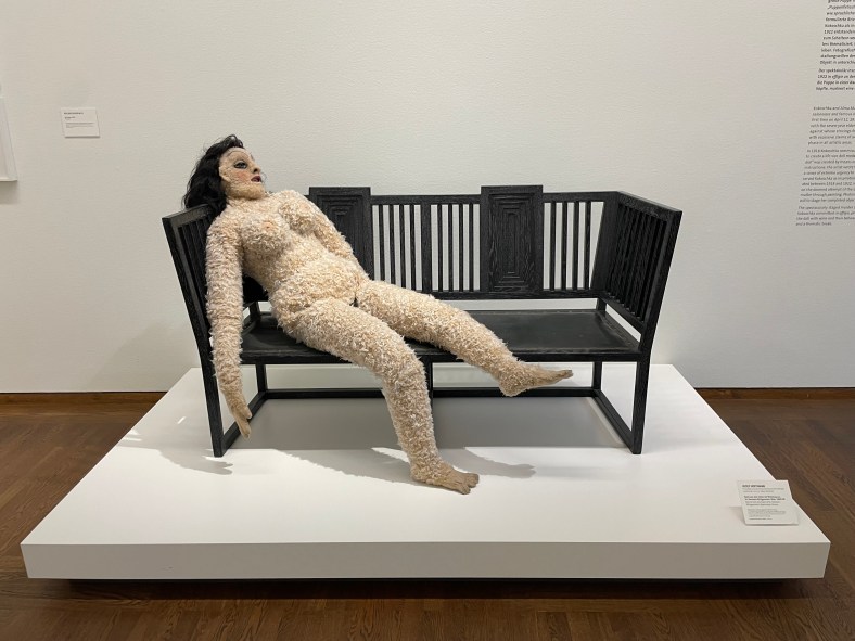
This definitely gets the award for most interesting. The Doll is from the film, My Alma – Oskar Kokoschkas’ Love to a Doll. I’ve since researched it a bit further and it really is a strange tale. Alma was Alma Mahler, Gustav Mahler’s widow. Having had her first kiss from Klimt when she was 17, she went on to have many love affairs before , during and after her several marriages. One of those affairs was with the young artist, Oskar Kokoschka for whom she became the love of his life. I think it’s fair to say he was obsessed with her. He had to go off and fight in the First World War War and whilst he was away she married a previous lover. Needless to say he was quite devastated when he returned home, after having been bayoneted in the chest, suffered a major brain injury and declared mentally unstable, to find that she had ended their relationship. So he did what all spurned lovers do, he commissioned a doll maker to make a life size doll of her providing very specific instructions as to how it should be made and what it should feel like to the touch. When she finally arrived he was a bit perturbed by the fact that her body had been covered in feathers but went on to pose her for paintings and photographs, dress her up and even take her to the opera. But eventually he resolved himself to the fact that his Alma doll wasn’t doing it for him, so he threw a party, then took her out into the garden where he chopped off her head and broke a bottle of red wine over her. I’m not sure that I’ll watch the film…
I’ve decided to take a leaf out of Sophie’s book and formalise the thoughts I’ve had since we finished our first term.
I don’t think that I have felt more like myself (whoever that might be) than I have over the course of the last 3 months. I can’t pinpoint why exactly; I’ve just felt like ‘me’.
It has been overwhelming (I suspect that I use this word an awful lot) in the sense that I have been totally free to create and, more importantly, to think about creating. I feel as if I am at the start of an important journey – I don’t want to rush into it; I want to take my time and be prepared. I don’t even know where I’m going – there are no limitations – but I know that I will discover something by the end of it.
I think that I have mostly engaged in the preparation side of things rather than the physical manifestation of work, but that’s been the best bit. I’ve been collecting ideas, inspiration, and information. I think about it most of the time. I’ll have a thought and think, yes, I could use that, and then it’s gone. I need to find a workable way of recording my thoughts – I can’t really open a notebook or Notes on my phone whilst driving – maybe I’ll have to call someone (hands free, of course) and get them to record it for me. Funnily enough, I used to do that: if, whilst at home, I thought of something I needed to do at work the next day, I would call my work phone and leave a voicemail. Just writing that has made me think about what voicemails I might leave younger versions of myself at various points in my life. And that is how it’s been, going off on tangents, suddenly striking up a conversation with whoever I’m with, on the thought I’ve just had.
It has also made me feel anxious – I don’t want to miss anything. I have amassed a large pile of books which I ‘need’ to read. I haven’t really tackled the online library resources with any conviction just yet – the thought of it makes my heart race – all that information out there – how can I take it all in?
The preparation of my study statement has come at just the right time. I need to marshall my thoughts and commit them to words, but in the knowledge that it is a living document which can change over time. I’m actually really looking forward to it as it will bring a sense of calm and order. I hope. Who knows, I might be feeling differently come the beginning of February.
Thinking back on the work I have done over the last few months, I think I have become much freer – I’ve been leaving things as being what I would term as ‘unfinished’ and managing not to go back to them. Making them public by putting them on this blog has helped tremendously. I’m now enjoying the process of making much more than I have previously – it was often an ordeal.
I think I have identified areas which I would like to explore in more depth: I have invested in a book on Procreate (it’s not going to beat me) which I’m working my way through, and I have some ideas in my head as to a series of three digital collages on the subject of motherhood which I may or may not develop further. I like the number three: I am one of three; there are three in my immediate family; there are three trees which together form one tree on my favourite walk near my home; and three is the smallest number by which you can seek the input of others and still avoid a deadlock. Having said that, it’s probably not so great for a friendship group.
I would also like to experiment with printing techniques, photography and a previous obsession, cyanotypes. This term I’m determined to book some sessions and get into CSM on a regular basis.
I’m now able to look back at the three monotypes that I made of my mother. I feel that it was the right thing to do. It was something that I always knew I would have to address and it was something that I had to tackle early doors. I think it has helped. I went back to my mother’s house not so long ago and I didn’t feel the usual sinking feeling of dread as I walked through the front door. I was actually able to sit down by myself in silence and remember some of the good times when we all lived there as a family, even when it became dark outside. A small positive step in the right direction.
As finished pieces of work, they are what they are, vehicles by which I transferred debilitating thoughts into another space. Could I have done them differently or executed them better? Yes, obviously, but I don’t look at them that way; it is what they signify and make me feel that matters: despair, confusion, sadness, resentment, helplessness, isolation and fear. I chose monotype because it is, as soon as it is, and there is no way back. It was all about the process, not the result. If I had to make a change I would change their order – I made them in the order of the conversations – they would work better as a series if their order was reversed, with each one making more sense of the one before.
I took my daughter back to uni at the weekend, and she phoned me up earlier, chasing me for some information I was supposed to give her. My husband chipped in that it wasn’t any wonder that I hadn’t got round to it as I seem to spend all my time blogging – well, if I don’t have anything else to show for the next year and a half, at least I’ll have this blog!
I was watching a YouTube video yesterday morning and happened to look at the list of related videos on the right hand side: The Power of Ugly Art – Creativity Exercise for Dealing with your Inner Critic In Your Sketchbook, Marie-Noëlle Wurm, caught my eye.
During our critique session on Tuesday afternoon, whilst talking about my experimental digital collage, I mentioned that I feel particularly drawn to the process and that I have some ideas as to how I can use it to express my feelings on motherhood, in particular, in relation to the quote in Hearts and Lino about the heart walking around outside the body. I commented that it might be a bit gruesome, reflecting that actually that didn’t matter as sometimes art has to be ugly to convey what it needs to; it doesn’t always have to be aesthetically pleasing.
I mentioned N’s reference, in her introduction to her artistic practice, to Louise Fletcher’s course in which she actively encourages the creation of ugly art, which I have also watched. This is what Wurm encourages – an artist’s fear is creating ugly art, so lean into the fear instead of running way from it. Creating beautiful art is an expectation and she suggests detailing the expectations we may have as artists, and then expressing them in our sketchbooks. By letting our expectations exist, instead of pushing them away, we give them space to exist within our art practice, which will lead to more powerful art, growth and compassion for ourselves.
I’m going to give her exercises a go in my sketchbook, ordinarily a safe place for no one’s eyes but my own.
”Making the decision to have a child – it is momentous. It is to decide forever to have your heart go walking around outside your body.”
This quote from Elizabeth Stone (I’m yet to fathom out who she is!) is apparently well-known, but I only heard it recently when someone, I think it was an actor, was being interviewed about becoming a parent.
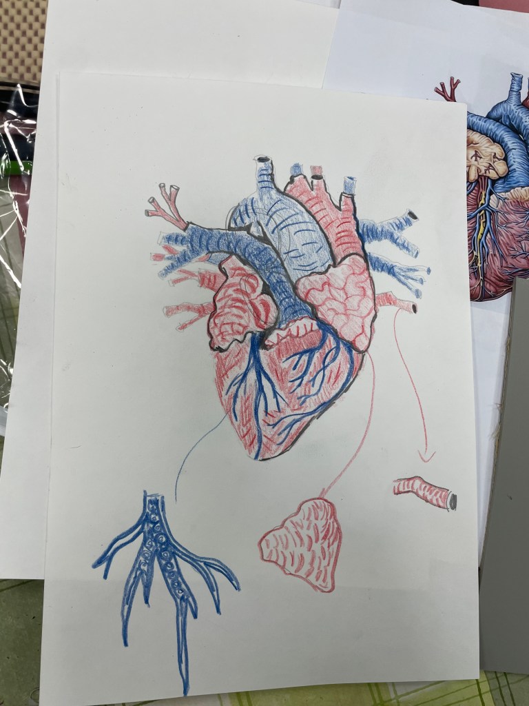
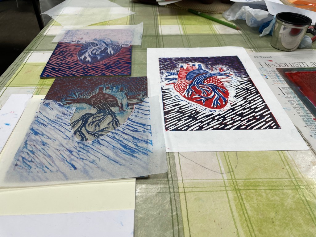
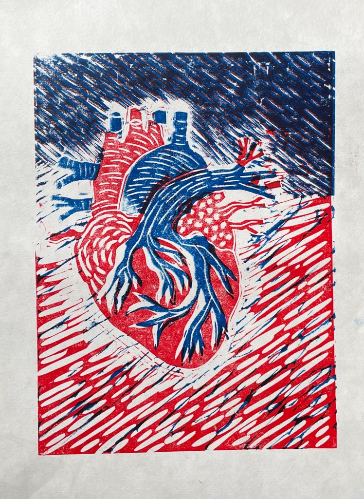
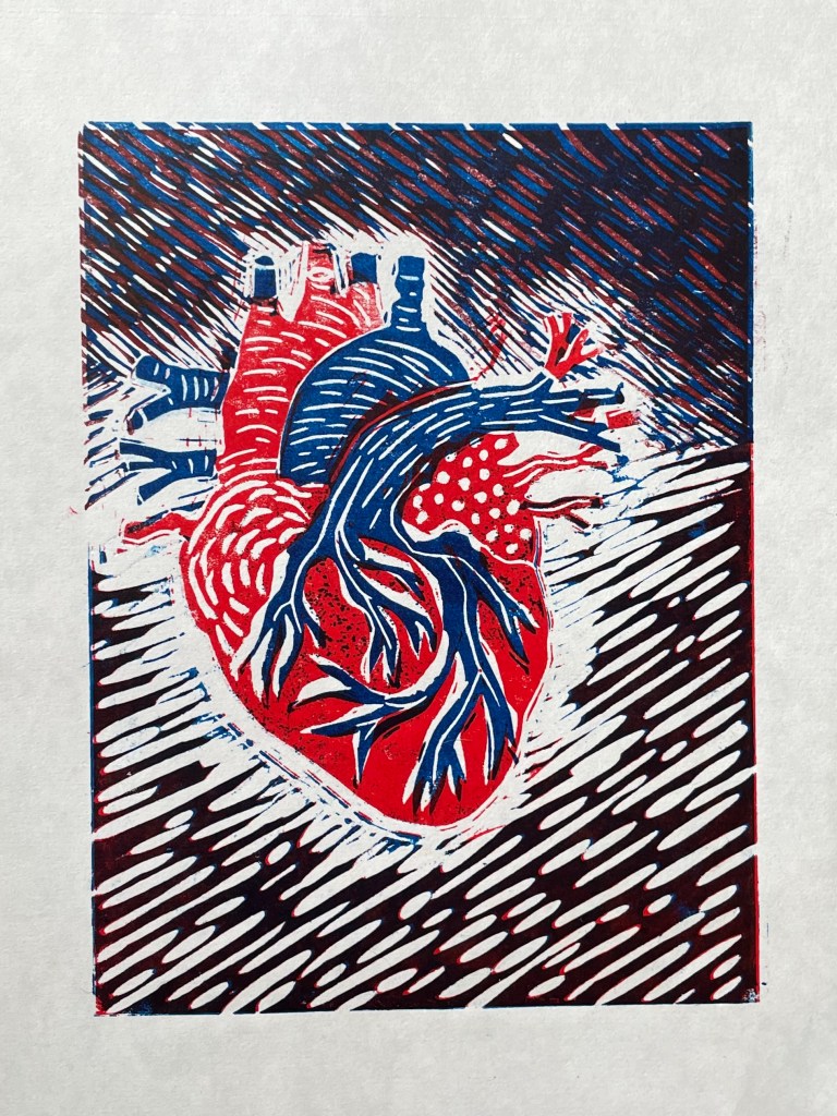
I think it sums up brilliantly the utter overwhelming sense of vulnerability and responsibility that I felt on becoming a mother. With this in mind, I attended a workshop on Saturday and Sunday on linocut led by Lisa Takahashi. Whilst everyone else started working on their images of sea urchins, birds, landscapes and flowers, I sat there, initially reluctant to reveal my chosen image of an anatomical diagram of a heart – it seemed particularly grisly and gruesome in this environment of natural loveliness. I suspect a few eyebrows were raised, on the side!
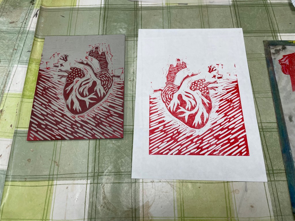
The workshop was on multiple-block linocut, a process in which you use separate blocks of lino to print individual colours, as opposed to reductive linocut where the colours are printed from the same block. I’ve only ever done a basic linocut with a single colour, so the process of working out what areas to cut for each colour meddled with my head a bit. Also, because you use separate blocks you can reprint in different colourways, although there is more room for error in terms of cutting and registration when printing, which can lead to unintended gaps and overlaps which add to the feeling of it being handmade, apparently! Also, as with all linocuts, you can sometimes get marks from ridges of lino which have inadvertently picked up the ink, particularly in large areas which have been cleared out, and this is called “chatter”, which is a lovely term.
We were limited to two colours, which effectively means that there can be up to four colours in the print: the two chosen colours, their resultant mix, and the white of the paper. I chose red and blue as they were the colours on the diagram.
Well, the prints are a bit rough and ready. I’m not keen on the white area around the heart – originally the background was also red and so I wanted some differentiation between the two, but later on I decided that I preferred the darker background. Having said that, I think it does give the image some dynamism, as if the heart is beating and pulsating.