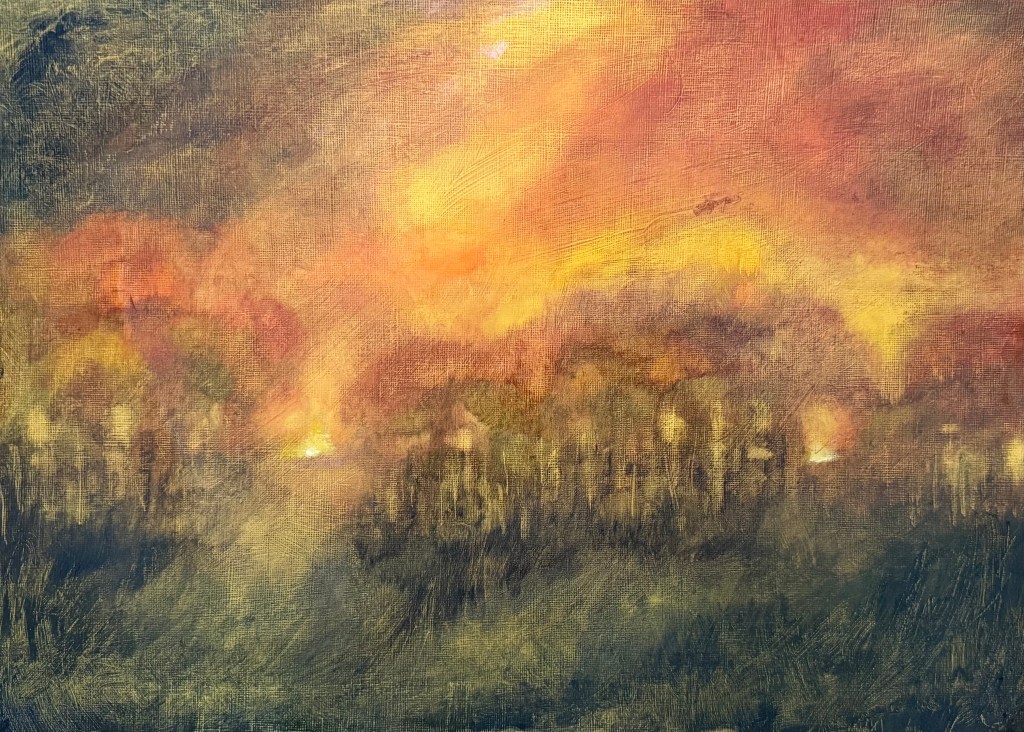
For the last couple of weeks we’ve been continuing to explore Turner in my painting class. The subject is water and stormy weather. As before, we’ve been applying thin layers of paint and sansador with a rag, and then applying several layers of glazing.
We started with a couple of small studies.
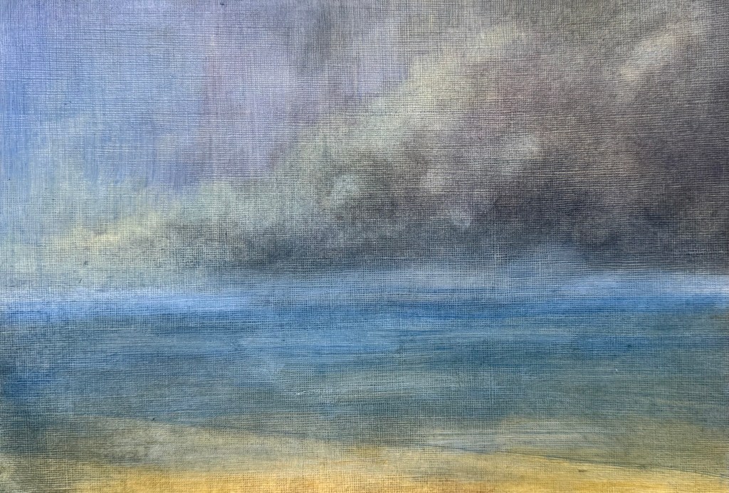
I used a limited palette of mineral colours – ultramarine blue, cadmium yellow light, burnt umber, alizarin crimson and titanium white. I’m not keen on it, it jars with me, in fact, I really don’t like it, but it meets the brief.
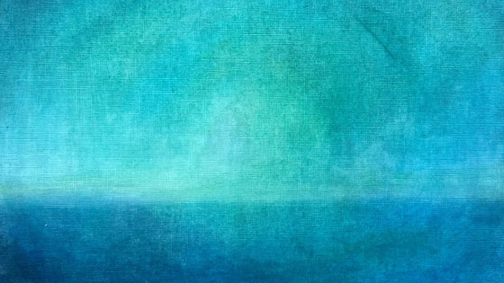
I much prefer this one – to me, it’s less figurative, although as soon as you put in a horizontal it automatically reads as a seascape. A post-Turner palette of cerulean blue, Prussian blue, phthalocyanine turquoise, cadmium free yellow, winsor violet and titanium white.
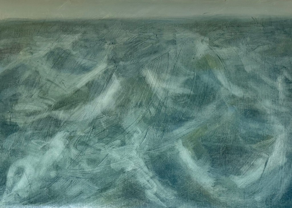
Then starting with an acrylic ground of a yellow grey, applied thickly and roughly so that definite brushstrokes are visible, I used the same limited palette of mineral pigments as in the first study.
It all started to become a bit twee, for want of a better word, so I blurred the horizon, and tried to break it all up, knocked it back and accentuated the sweeping brushstrokes in the ground using an ultramarine glaze. I feel better about it, but in retrospect maybe I should have done away with the horizon completely, as Turner tended to do, or maybe the horizon allows it some space? I think I need to put it away and reflect on it at a later date.
I’m conflicted; over the last year, I have found that I have been moving away from figurative work, particularly in terms of art that I like to look at, perhaps in an attempt to free myself. I’ve always taken the view that I attend these weekly classes because I like to explore different directions, and that there is no point just turning up and making what I want to make each week regardless. I try my best to complete the task, but I’m finding it increasingly difficult. Maybe this is a lesson for the future – of not always being able to make the work which I want to make.
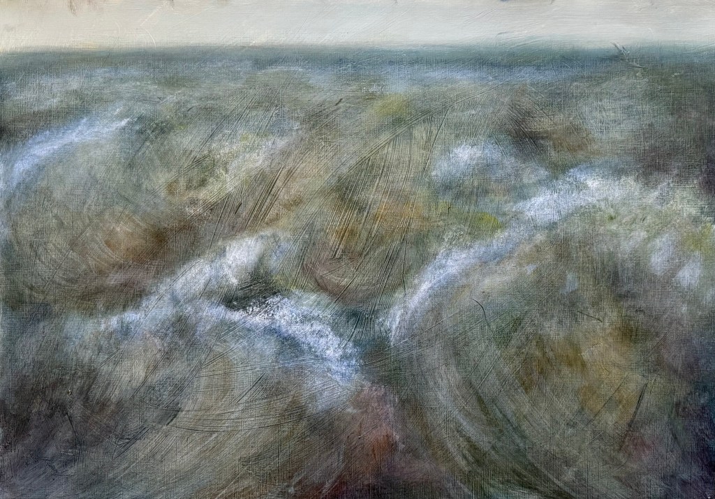
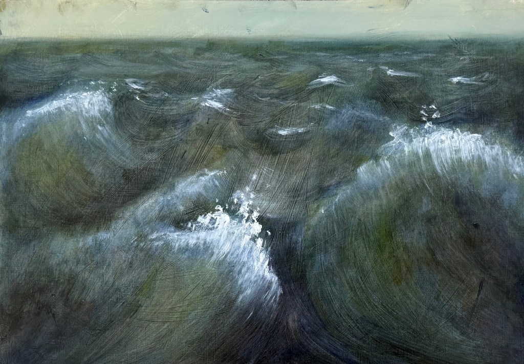
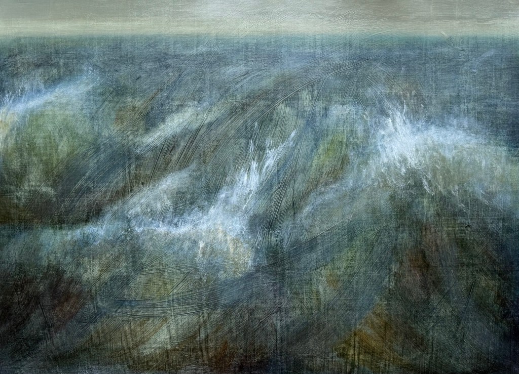
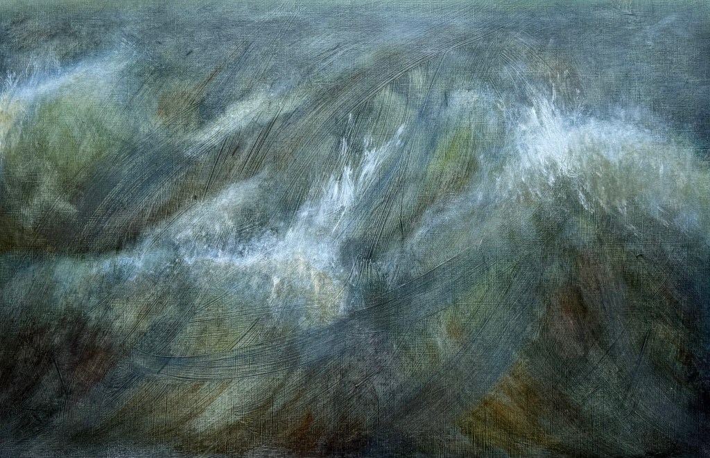
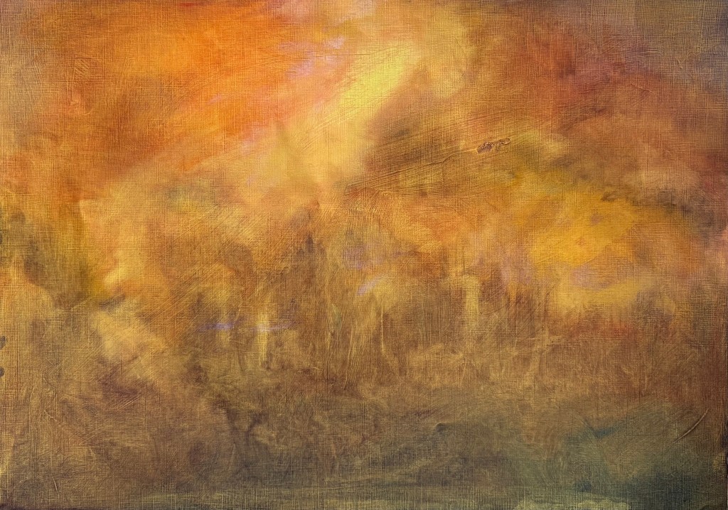
We’re looking at Turner in my weekly art class, in the context of climate catastrophe; forest fires, flooding. He didn’t follow the rules and did whatever took his fancy. Layer upon layer, ignoring fat over lean, whiting out. A conservator’s nightmare.
We started off by looking at some imagery and then, without any further reference to it, got to work. We put down a ground with acrylic paint and then applied layers of thin oil paint and solvent with a rag.
It wasn’t a conscious decision, but I ended up using a very limited palette of cadmium red light, cadmium yellow, ultramarine blue, burnt umber and some white. Once the thin paint was dry we applied glazes on top. I did a lot of wiping on and wiping off – it seems to be my modus operandi, as well as doing a lot of scratching – not particularly Turneresque, but never mind.
What do I think of it? As a study of an imaginary forest fire à la Turner, well, I think I’ve done ok. I’ve managed to create lots of layers and there is definitely some optical mixing going on. I think that I’ve managed to keep it quite loose (for me, anyway). I enjoyed putting the glazes on, colour was caught in the marks and grooves in lower layers which had been made when I had loosely put down the ground. I like that it was out of my control to a certain extent.
At the end of the day, I don’t like it. It was an exercise which I completed, I haven’t invested any of me into it, and it doesn’t do anything for me. But that doesn’t really matter because it is about trying different things, being open to new approaches and trying them out with an enquiring mind.
Putting paint on and wiping or scratching it off is something I instinctively do – it’s a very tactile way of working, and I’ve realised that it’s all about the materiality and the dialogue, which seems to be a bit of a tussle at times.
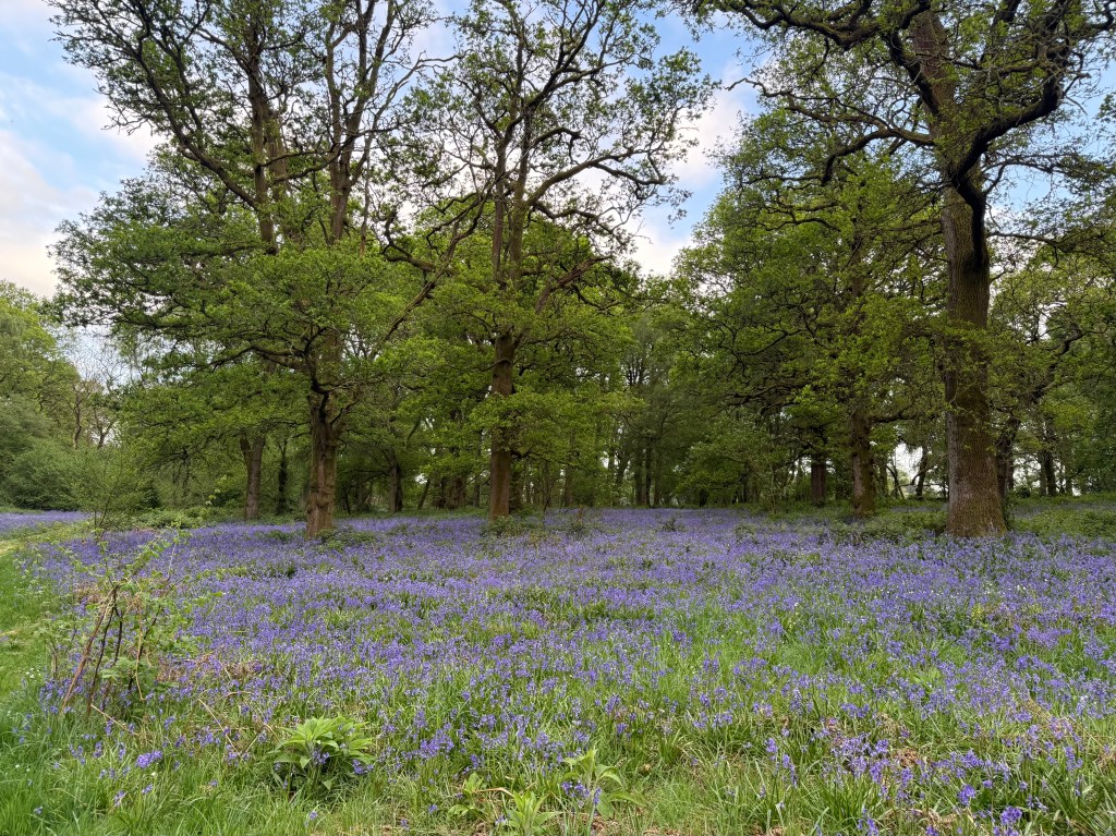
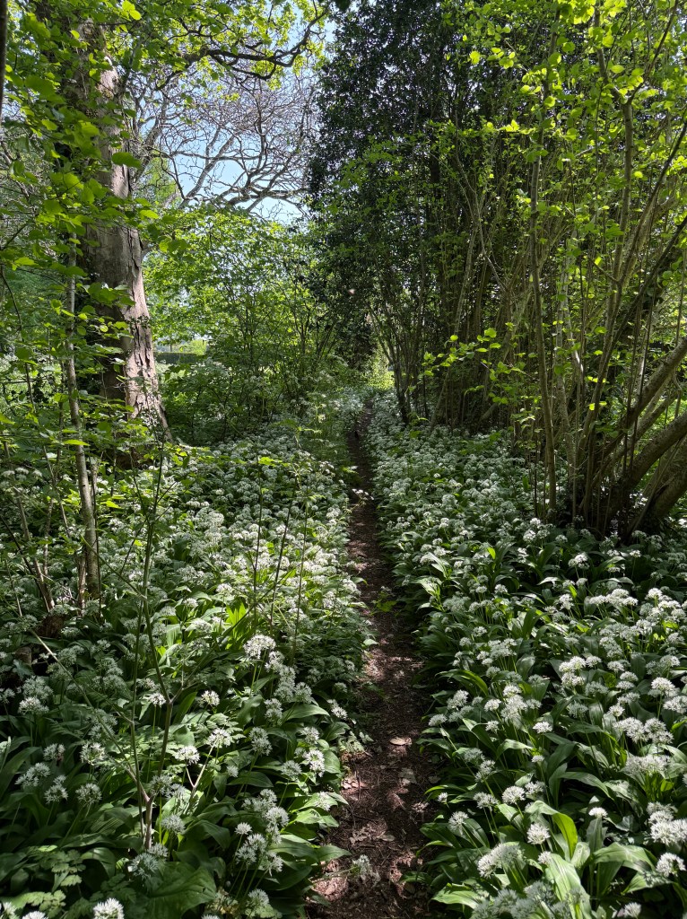
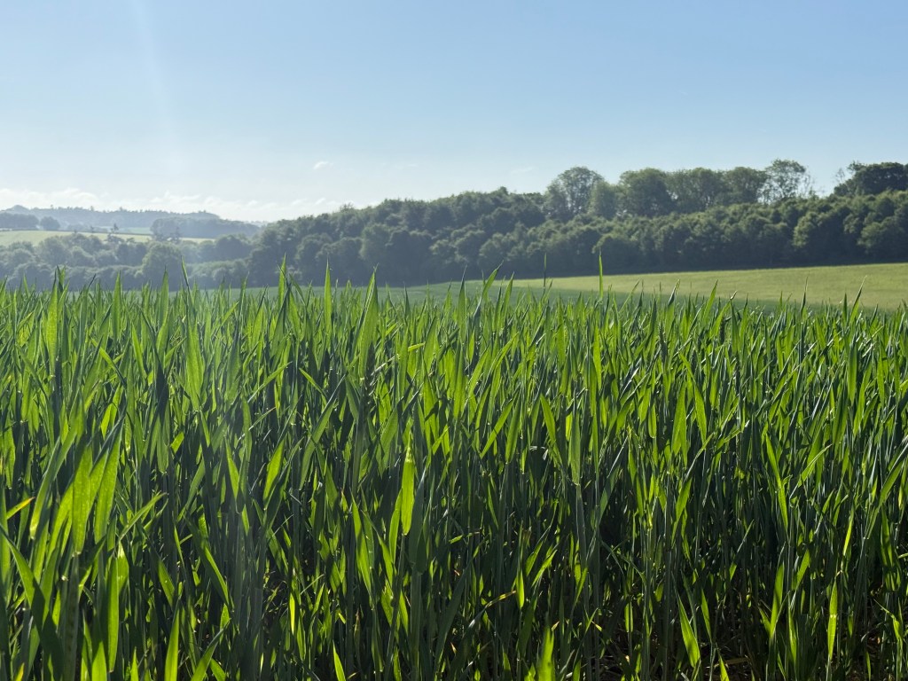
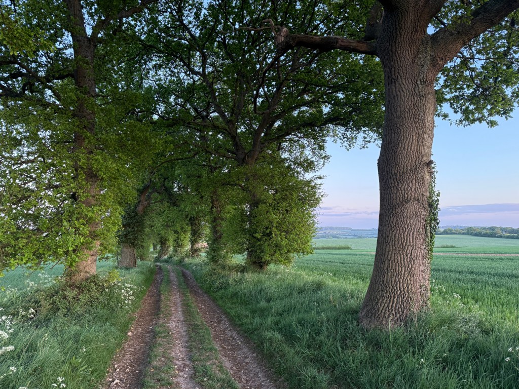
I love this time of year. The hedgerows are full of hawthorn blossom and clouds of cow parsley, there are blue carpets of bluebells in the woods, if a little threadbare by now, swathes of flowering wild garlic, crops growing in the fields and trees in full leaf.
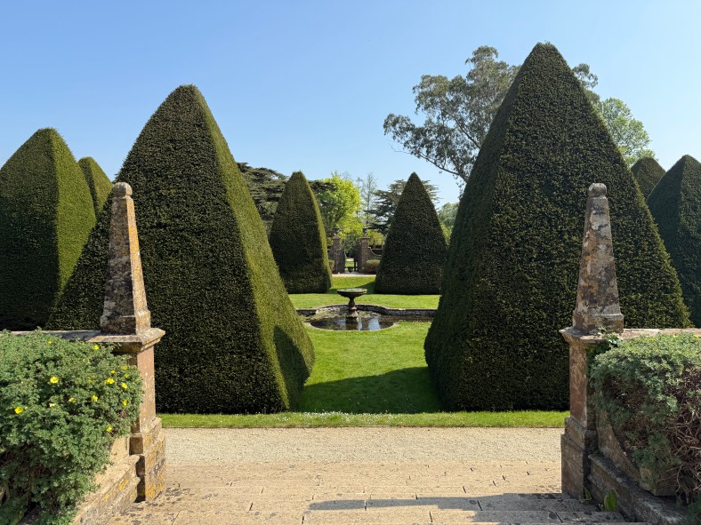
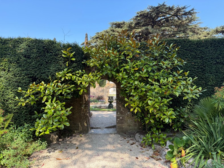
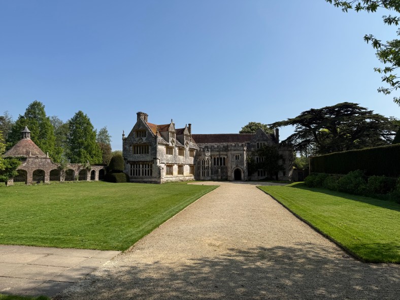
I took my daughter back to uni in Exeter a week or so ago: a lovely drive down the A303 past Stonehenge, under the mystical big skies of Wiltshire and the rambling green fields of Somerset and Devon. On the way back I took the alternate route through Dorset along the Jurassic Coast and stopped off at Athelhampton House, a Tudor manor house I haven’t visited for a number of years with a very strong connection to Thomas Hardy. I didn’t know that Hardy was an architect before he became a writer and that he had worked on the house with his father, or even that he had lived into the early part of the 20th century. He seems to belong to a different time.
The gardens are wonderful – a house with many rooms (this seems to be a recurring theme recently).
Inside, apart from some wonderfully old glass windows which distorted the view outside,
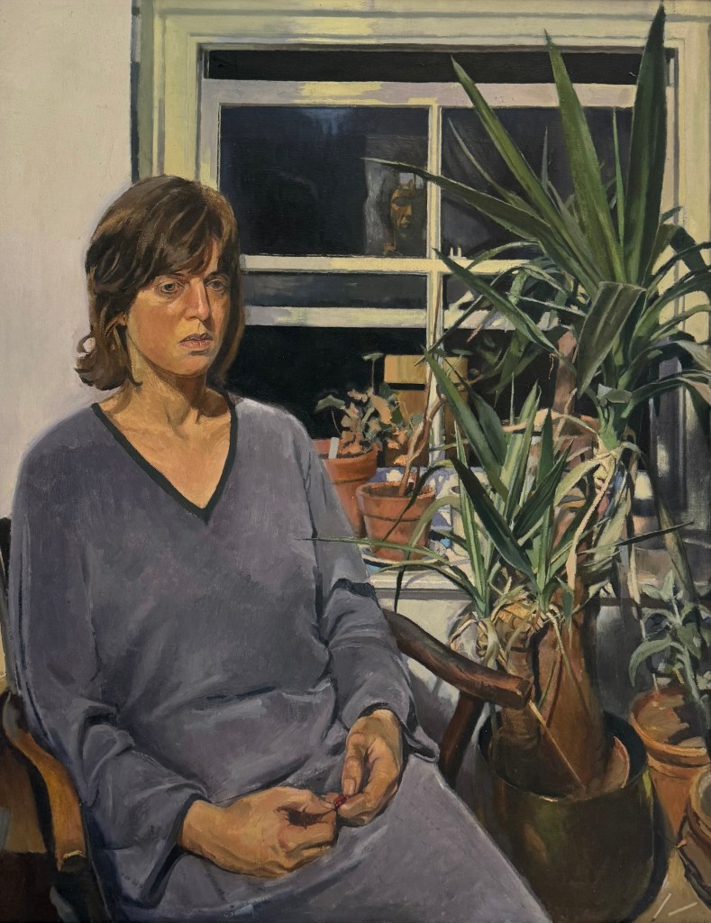
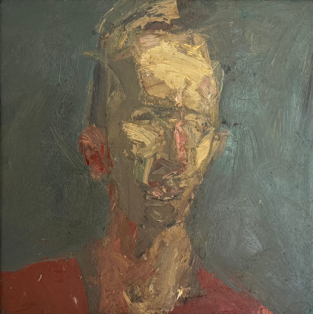
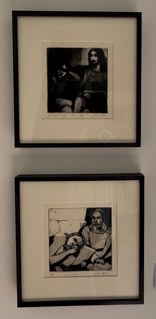
was an exhibition of work by Arthur Neal, a painter and printmaker practising since the 1970s. He appears to vacillate between the figurative and the abstract. It would have been difficult to guess that all of the works on display were made by the same artist. I was particularly drawn to his small abstract oil paintings, his work in charcoal and his more recent prints.
The exhibition made me think. I would still like to explore charcoal and drypoint, and after that I think I’ll be done. It will be time to reflect.
The small oil paintings reminded me of a stack of small canvas boards we’ve had for ages, as yet unused. I can’t recall why we got them – I don’t generally do small. I think my husband bought them because they fit in a small pochard box he is going to use for all those landscapes sketches he’s going to paint, once he has wiped off all the dust. It wouldn’t take more than a few brush strokes to cover them. No excuse really, not to do something every day.
I have a fascination with Jackson’s Inside the sketchbook series – of looking at the sketchbooks of artists, to see how they work and think. Sketchbooks are personal spaces and it’s exciting to get to look inside, although I’m in no doubt that they choose to talk about their best ones. A recent one which springs to mind is Unga from Broken Fingaz. He talks about how working small means that you have to let go of detail. I think I’ll give it a go.
I decided to try out the ‘map’ drawing using oil paints. I liked the combination of pencil and oil paint in As I Was Going To St Ives and so I drew the grid lines on some oil paper – I was limited to A3. I put the paper on the floor and lightly rubbed over the tiles which created an interesting texture. Then I did the figures and the automatic drawing, just as before.
I’ve decided that I really enjoy making the lines and marking the intersections. My brain must truly have become disconnected from the process because, for some inexplicable reason, I thought that a quick spray of fixative would be sufficient before I applied the oil paints. Oh, how wrong I was. The solvent and graphite mixed really well – that’s the positive I’m taking from this! It needs to be the other way round, possibly, maybe, or maybe not. But time to stop and give up for the day, but not before I salvage something from the process. I’ve been thinking as I’ve been experimenting that the cutouts look really interesting in themselves, so I cut out the figures from the latest effort and did a bit of arranging on a spare sheet of paper. Interesting, particularly the figures in transparent film…
We’ve gone to St Ives in my weekly oil painting class, more specifically looking at the work of Ben Nicholson.
I’ve only recently looked at the work of the St Ives artists; aside from Barbara Hepworth, it didn’t really interest me before. I often go to the Pallant House Gallery and they have a few as a part of their permanent collection.
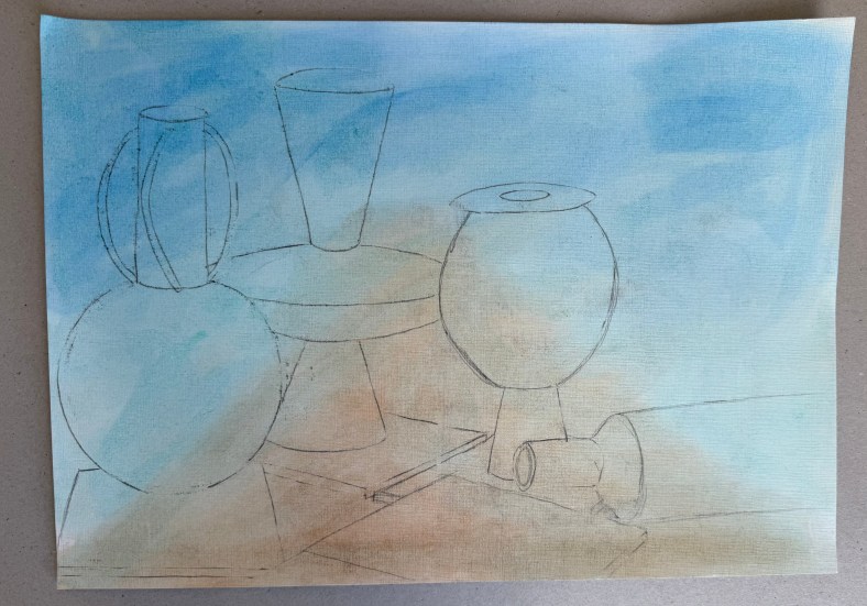
The brief was to make a drawing of the still life and then make two pieces, one with a slightly Cubist slant (using a tracing of the drawing to recreate shapes) and the other with a landscape in the background, both in the style of or influenced by, Nicholson. We used a limited palette of burnt umber, ultramarine blue, cadmium red light, lemon yellow and white.
I think that I would say that the finished pieces were more influenced by, than in the style of Nicholson! I’m not sure what I think about them. I swing from loathing them to actually quite liking them. I prefer the more abstract of the two.
What I have taken away from this exercise:
Lemon yellow takes an age to dry.
I really like the contrast between areas of pure ground and areas of opaque colour – I’ve often thought that some of Nicholson’s work has a ‘collage’ effect to it, which I like.
I like the interplay between the visible graphite lines and the oil paint.
The combination of the different genres of still life and landscape is really interesting.
I feel that I’m veering away from the figurative.
I wish that I had been less literal – I should have been more adventurous in my composition of the still life, mixed it up a bit more and not included figurative renditions of the individual elements, especially in the one with the landscape.
Next, is one of Nicholson’s inspirations, Alfred Wallis, known for his naïve art-making.
It’s been difficult, but I’ve been managing to stop myself from altering things after the event. To leave things undone with elements which really jar with me, which are clearly wrong and which look awful, and to post them anyway. I think that it’s starting to make a difference as to how I work – if I can get into the habit of showing the worst of it, the imperfect, work which I’d much rather never see the light of day, and preferably end up in the bin, I hope that I will be able to engage fully with the process, and not worry about the result.
The mantras I’ve adopted so far:
I will choose the mark-making processes which I enjoy, and not worry about the result
I choose the process, not the result
I don’t have to like what I make, and I don’t have to make what I like
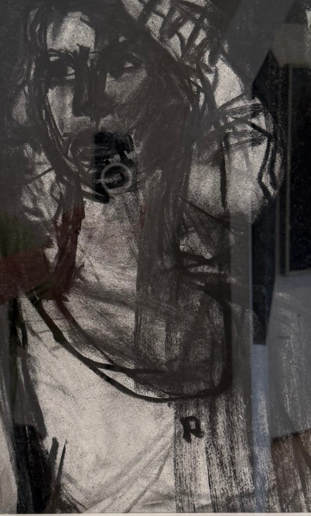
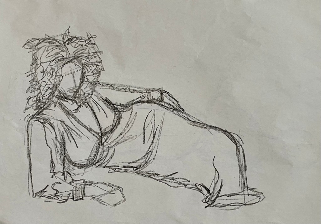
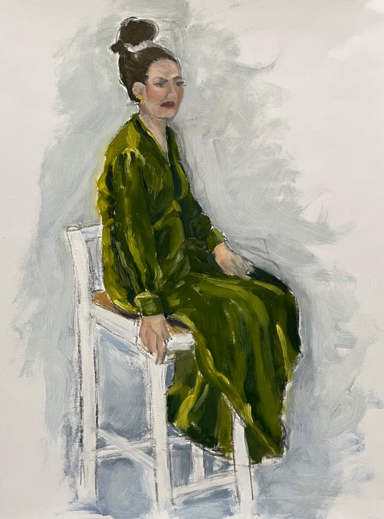
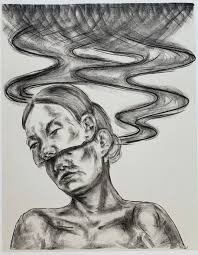
So, we’ve been continuing with the subject of figures in my weekly oil painting class. We had a model today. I certainly haven’t done her justice, and just don’t get me onto the subject of faces. We had to do a few warm up drawings, starting with continuous line – always difficult to get things in the right place – and then just normal sketching, a couple of minutes each. I used an oil pastel – I like that it’s a commitment, and can’t be rubbed out. There’s nowhere to hide, mistakes remain visible – the new me. Then an hour painting.
What to say? I’ve realised that since I’ve been posting my ‘Undones’ (seems a more positive word than failures), no matter how unhappy I am with the result, I can always find something that I like, if I look hard enough. It has just dawned on me, that I probably wouldn’t notice these elements if I was happy with the end result if, indeed, they managed to survive the perfecting process. There’s always some beauty, no matter the ugliness.
I think that I’ve unintentionally transferred my feelings of being weighed down onto the model. The dress looks so heavy; although it was velvet. I think I’ve managed to capture the sense of velvet. I’m trying to avoid using any blending in my paintings at the moment – I’m working on keeping my brushstrokes defined and with a sense of movement – I think I’ve achieved this. The figure is generally good and I particularly like the neck.
I’ve just been watching Sky Arts LAOTY, and now Gareth Reid is now giving a masterclass on drawing faces – I could definitely do with watching this.
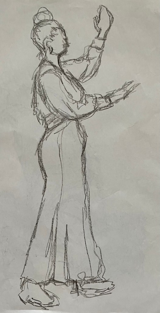
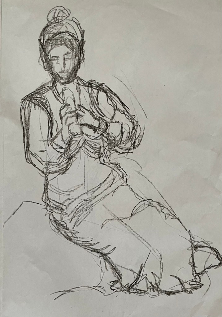
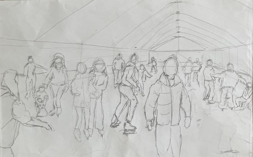
I’ve started back at my weekly art class after the Christmas break, and over the last two sessions we have been looking at figures, in particular, figures in an environment. I’m not very good at depicting humans (or any animate subject for that matter), so this was a bit of a challenge.
We had to work from images which we had sourced: I took my nieces ice-skating at Christmas, which was really entertaining to watch. There were the confident, well-practised skaters who came equipped with their own boots; the ‘I’m-competent-but every-now-and-then-lose-my-balance-and-windmill-my-arms-brigade; and then the rest – hopelessly clutching the side, or each other, for dear life, inching their way round. There was a whole range of shapes, gestures and weights, in the sense of where in the body the weight is being distributed, and there was a lot of tension.
We started by sketching out the composition.
I used a combination of photos and video stills from my phone – I could have been more organised because I lost track of which figure was on which photo, which wasted quite a bit of time. Next time I work from numerous image sources I will organise them so that they are more accessible and easier to switch between.
I then applied a ground to the support (I used oil paper as opposed to a canvas, as I wasn’t sure how it was going to go). As it was a painting of ice-skaters, I chose burnt umber thinned down with Sansador as my ground, as it’s the blue equivalent of the earth colours. I then drew in the figures using a rigger brush and thinned paint – I found the techniques covered by Chris Koning’s workshop of gestural drawing (‘Perception of the Whole’) to be really helpful in trying to get some dynamism in the portrayal of the figures. I also changed the composition from the pencil sketch to bring forward the pair of skaters on the left and to give the skater next to the pair some extra space into which he could move. I also packed some more figures in, including my favourites, the couple in the centre – the man skating alongside and watching his partner who is leaning forward – and the girl behind them.
The next step was to block in the background. I decided that I didn’t want to put the figures in the specific setting of an ice rink, so I left out the details of the roof and sides which were included in the original sketch. This gives a feeling of more space.
I used a thinned down mixture of titanium white, ultramarine blue and burnt umber to create a grey/blue and then scratched into it with the end of the paintbrush to create skate marks.
I then started blocking in some colour using thinned paint. I liked the fact that the burnt umber drawing was still visible and decided to try and retain as much of it as possible. This meant that I would not be able to use much thick paint in subsequent layers, and so the painting will retain a sketch-like quality. The purpose of the exercise was to capture the essence of the figures, so there will be very little detail in the figures and their faces, other than those in the foreground, and even then I will keep these limited.
I regretted having the large figure in the foreground, but he felt necessary to add variation to the height of the figures, and his static quality should hopefully contrast with the sense of movement in some of the other figures.
I carried on adding some more colour and changed the colour of the skater’s hoodie to differentiate him from the figure in the foreground.
I really enjoyed the process of being looser: the multiple visible alterations and the pared back application of paint. I’m not sure that I like the finished piece, probably because of its subject matter – it’s all a bit twee. But that’s my own fault – I hadn’t adequately prepared for the class and so made a rushed decision. Next time we have to work from a preselected source, I will make sure that I prepare properly, so that the subject matter appeals to me as much as possible.
There are areas which really appeal to me; I like the way I have treated the ice and I think that I have managed to capture the sense of movement, the hesitancy and tension in the figures, and the atmosphere. I don’t like the way I’ve painted the faces in the foreground. Whilst the exercise was all about the figures, I don’t think I’ve managed to find a method to render faces in a non-detailed way which does not look childish. I need to work on this.
I was thinking about this painting whilst I was out on a dog walk yesterday. I enjoyed making it, but I’m not that enamoured with the overall result, which made me ask myself whether I need to like the work I make or whether enjoying the process is enough. Also, I like and am attracted to a wide variety of artists working in very different ways. I suspect that I have previously thought that I need to make myself like them and make the sort of work they make because it is something that I like and am drawn to. I’m starting to realise that this isn’t necessarily the case – I just need to be ‘me’.
Generally, the work which I produce at my art class is not something that I would ordinarily choose to do, (which is a good thing) and won’t necessarily be relevant to my field of study in terms of subject matter, but it will provide a useful source of exploration in terms of technique and approach in my art practice. As such it is a valuable resource and a good use of time as well as a commitment which ensures that I create work on a regular basis.
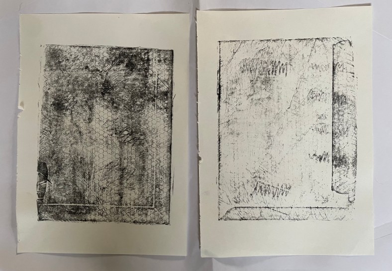
I had some free time yesterday, so I decided to try out kitchen lithography using some aluminium foil and cola.
This is the first time I’ve tried it – I’ve been interested in doing it since I came across a Canadian artist who uses it in her work, in addition to other printing processes, Valerie Syposz. Her work primarily deals with self-perception and existence.
’Treasure’ 2021’Shelter’ 2022‘Embers’ 2023
I like the surreal quality of her work, and her subject matter is relevant to what I’m exploring.
I have to be honest and say that it didn’t really go to plan. First of all, I discovered that the foil I have in my kitchen drawer has a honeycomb pattern embossed on it, and then I forgot to use the dull rather than the shiny side of the foil. I made various marks using different pencils, pens, markers, graphite sticks and pastels, but I was doomed to failure. Not wanting to go out into the cold to my shed to find some plexiglass sheets to wrap the foil around, I had used an Amazon envelope which I found in the recycling bin, which turns out had some raised edges on it. But, hey, it’s just an experiment. I also didn’t apply enough water to the plate which meant that the ink adhered to areas it shouldn’t have.
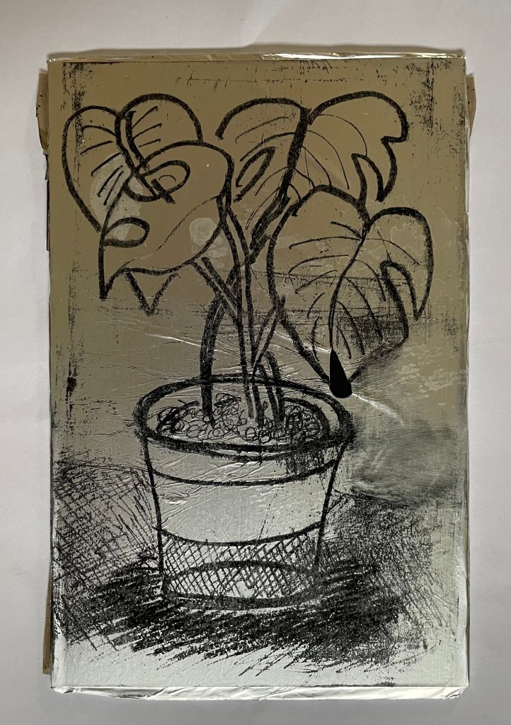
Once I had realised my mistakes I gave it another go. I used a small plexiglass sheet this time, and found some other foil which had a smooth surface. I made a quick, not so good, drawing of the plant in front of me. I used a combination of a chinagraph pencil, basic oil pastel, and a 6B graphite pencil. I did try using a biro, but it ripped a hole in the foil – this was probably because the foil wasn’t very strong. I then poured cola over the top of the plate, rinsed it off, and then rubbed the image away using vegetable oil. Once the plate was dampened with water, I rolled on the ink, re-applying water using a sponge between each ink application. The idea is that the cola contains gum arabic and phosphoric acid which makes the foil which hasn’t been drawn on, hygroscopic. I then used a bamboo baren to transfer the image to a sheet of Hosho paper.
They’re not great, but I’m just happy that I managed to get a defined image at all, bearing in mind my first attempt was such a complete Horlicks.
It felt good trying something new, and what made it particularly enjoyable was the fact that it could be done at home with easily accessible tools and supplies. I will definitely explore it further perhaps after doing some further research so that I can appreciate its full potential. There is a lot of scope for experimentation with different printmakers having different opinions as to the best methodology to adopt: some lightly sand the foil before drawing on it, others use cornflour and maple syrup on the plate; some don’t use a support and just use the foil as a sheet. Maybe the brand of cola has a bearing on whether the process is successful: perhaps I’ll need to have a Pepsi challenge.
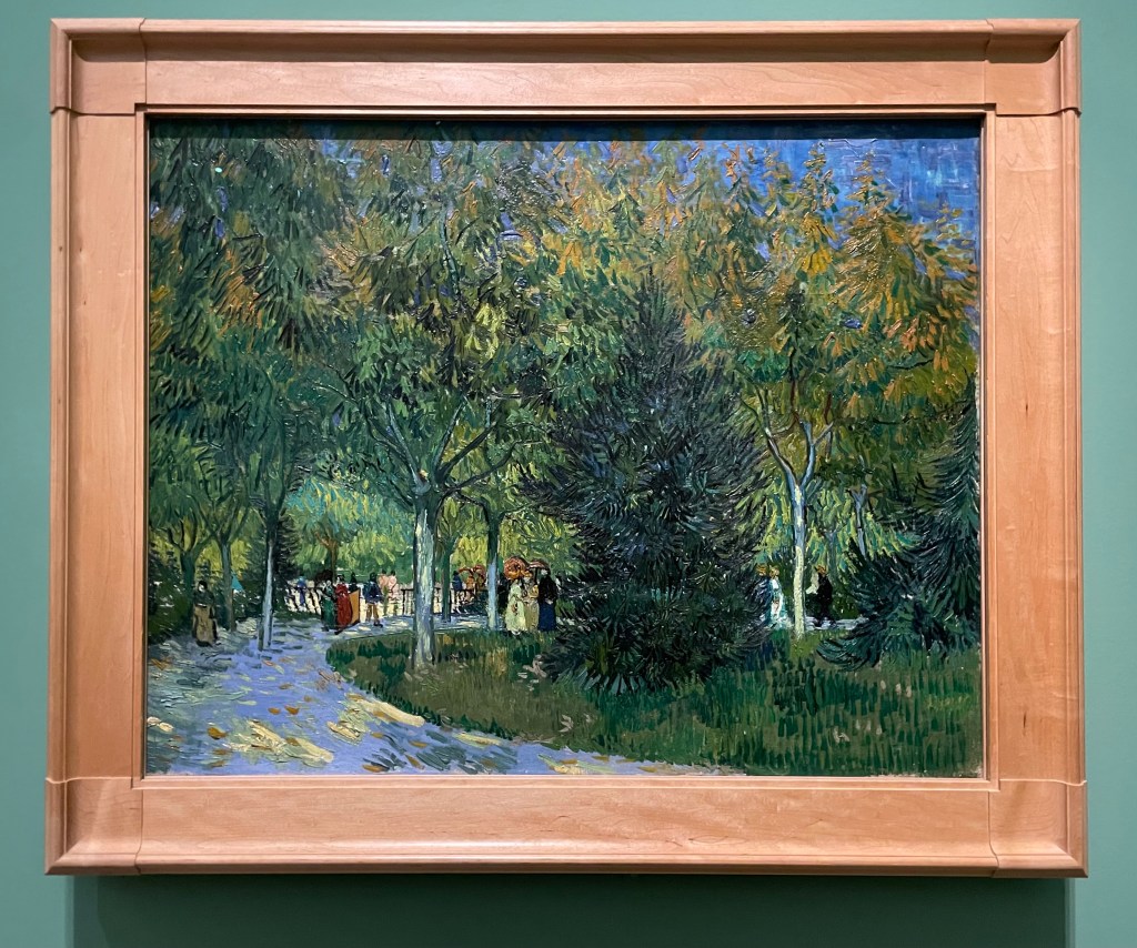
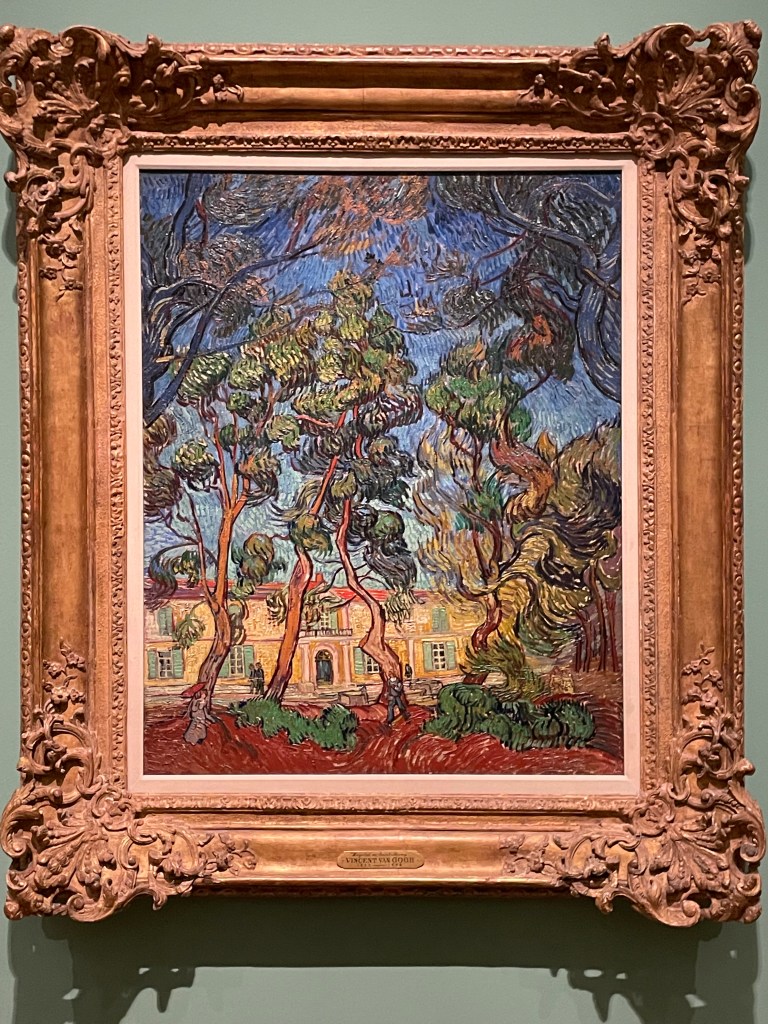
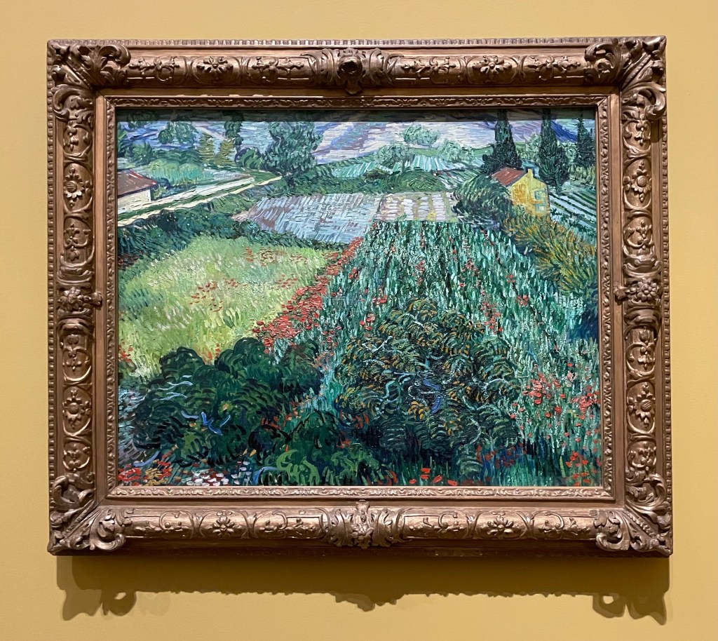
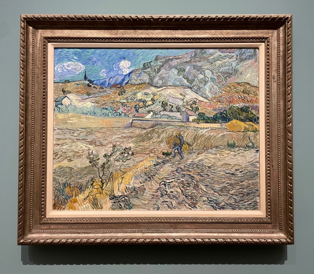
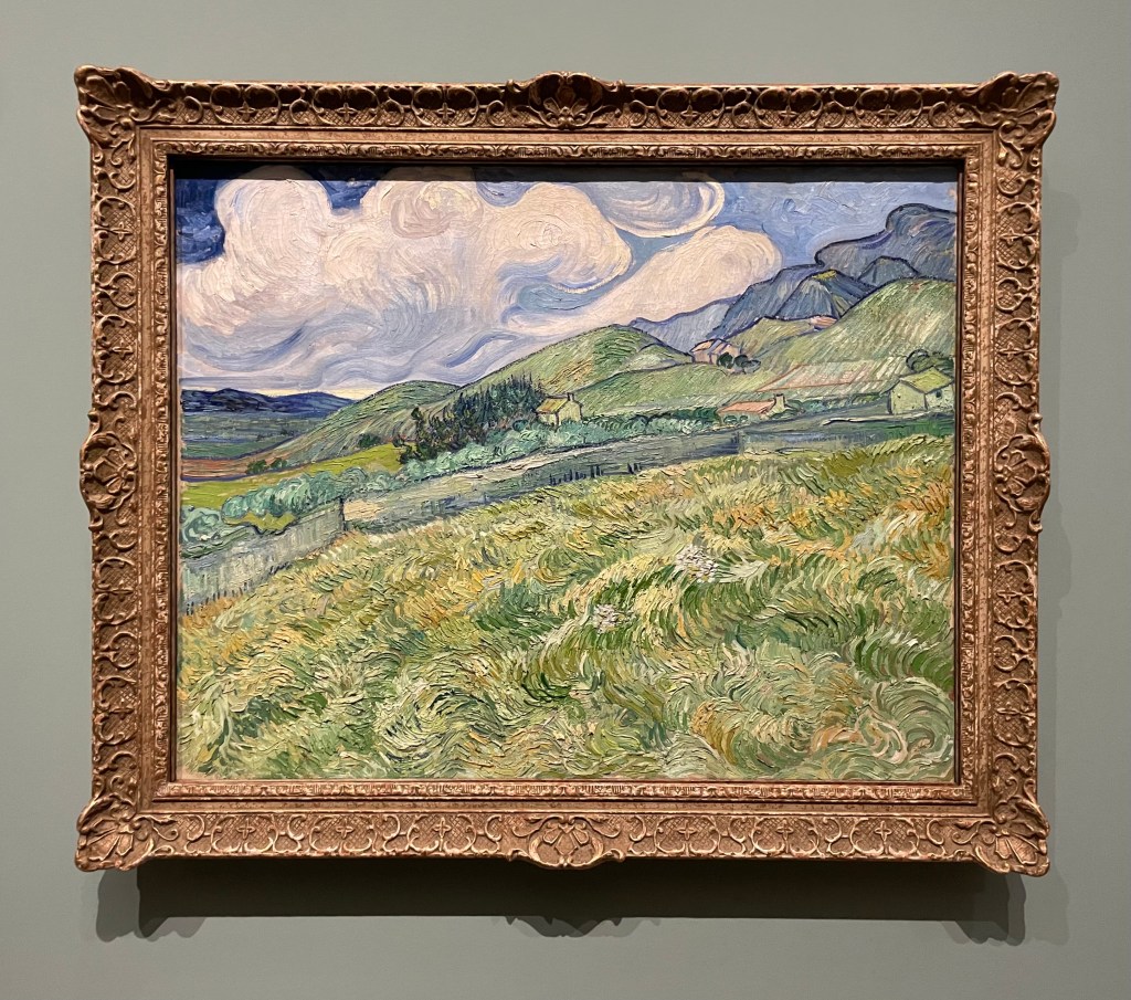
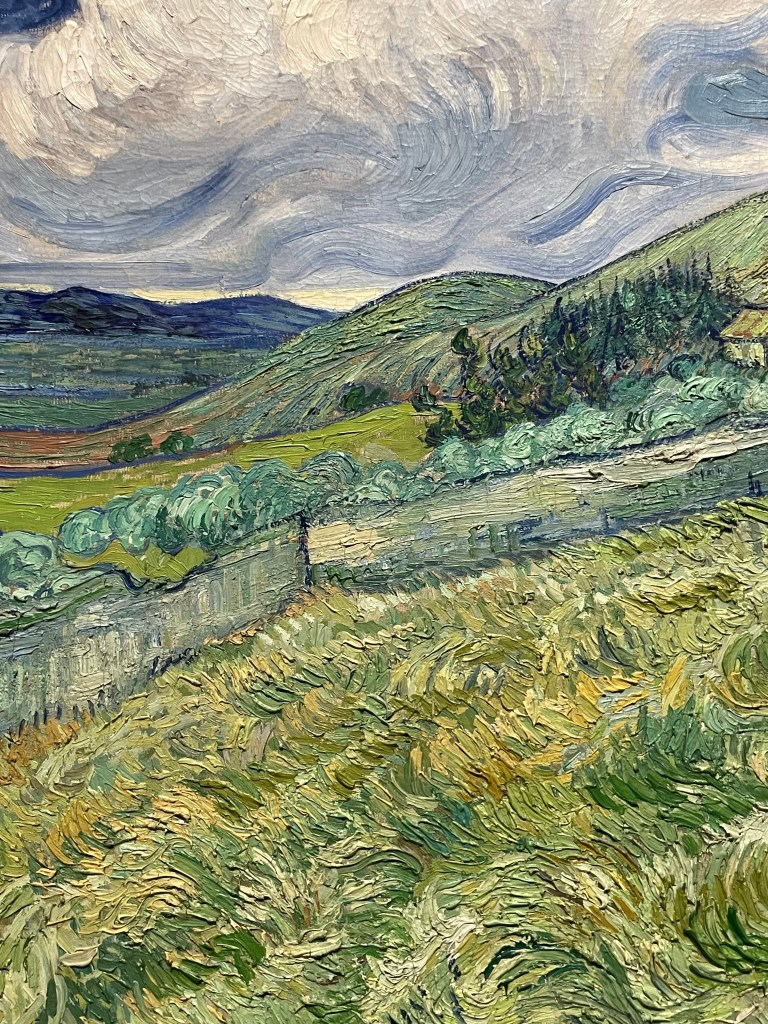
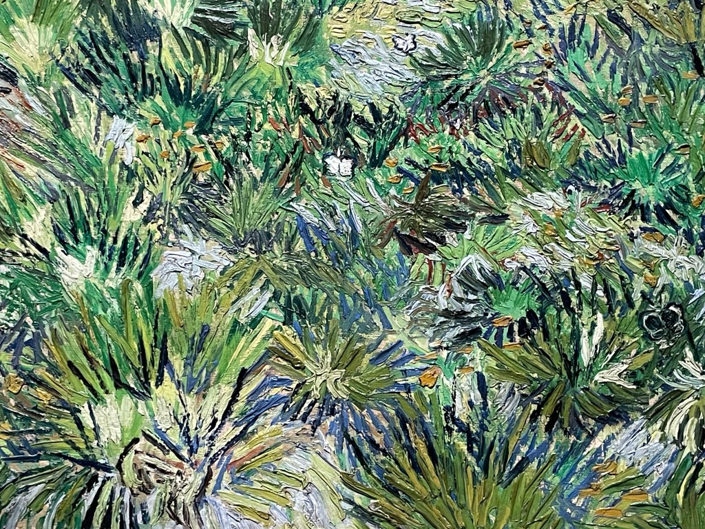
Well, I made it through without a tear. It might have been the sheer number of people which meant that it was impossible to stand and contemplate too deeply, or the audio commentary going on in my ear which distracted me. The ‘Poets and Lovers’ exhibition at the National Gallery was a cornucopia of Van Gogh brilliance, although I was left wondering why it didn’t include some of the Van Goghs I had seen in other galleries, such as the self-portrait with bandaged ear at the Courtauld, but then I don’t have the faintest idea about curation. That said, it didn’t detract from the luscious visual delights on offer, many of which I hadn’t come across before.
What struck me more than anything was the direct correlation between how he drew and how he painted. The range and quality of mark-making was phenomenal. Whilst up close, the brushstrokes and colour palette made me virtually tachycardial, it was standing in the centre of each of the rooms which gave the most rewarding experience.
The only moment when I almost cracked, was when I found myself in front of the Sunflowers from the National Gallery and the Philadelphia Museum of Art: he painted his Sunflower series to decorate his guest room in anticipation of Gaugin’s visit to Arles, in an effort to impress Gaugin, who he greatly admired, almost to the point of obsession. Van Gogh’s sensitivity and vulnerability weren’t a good match for Gaugin who, by some accounts, was aggressive and egocentric, which served only to reinforce Van Gogh’s insecurities. It all made me blink a bit quicker. I have to declare my bias – I’m not a fan of Gaugin for various reasons, not least because he abandoned his wife and five children to go off and indulge his predilection for young girls.
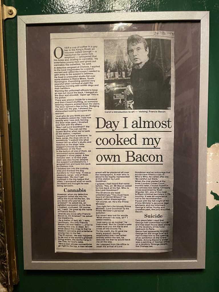
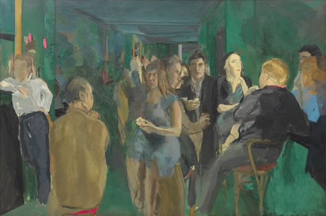
The day was rounded off by a trip to the Colony Room Green, a replica, as near as dammit, of the bohemian Soho legend that was the Colony Room Club which closed down in 2008 after 60 years, and which was the creation of the queen of Soho, Muriel Belcher – apparently, you knew you were in if she called you the ‘C’ word. It was the favourite haunt of creatives such as Francis Bacon, Lucian Freud, John Craxton, Damien Hirst, Tracey Emin, Dylan Thomas, John Deakin, Frank Auerbach, Michael Andrews, Giacometti, and the list goes on. My husband was particularly keen to visit as he’s reading Darren Coffield’s ‘Tales from the Colony Room’.
‘ Francis Bacon was very fashion-conscious and always immaculately dressed. One afternoon Francis walked in, annoyed and pulling his collar. – “What’s wrong, Francis?” – “Harrods, I’m never going back there again.” He’d attended a special night for select clients and bought lots of clothes, but when he’d got back home he’d decided he didn’t like any of them. “I bought so many suits and shirts and threw the lot in the dustbin.” You’d never seen the club empty so quickly. The next day everyone was up the club parading around in their new suits and shirts from Francis’ dustbin.’
Colony Room I, Michael Andrews, 1962
It’s very small and down some stairs underneath Ziggy Green, 4 Heddon Street, a side street off Regent Street. It’s reminiscent of a dive bar/ speakeasy.
It was great meeting Liam, the house jazz pianist and chatting to Tim, the barman who explained that it’s not trying to be a re-creation of the original, but somewhere to come and meet an eclectic mix of people. Despite what he said, I couldn’t help but feel that I had stepped back in time, waiting for the door to open and for one of my artistic heroes or heroines to walk through it. They often have events which are free to attend, such as talks and book launches. Unfortunately, we couldn’t hang around for the Portrait of Muriel Belcher evening.
There’s something very inspiring about the idea of a group of creative people coming together regularly to discuss work, ideas and concepts. I’ll definitely pop back in next time I’m in town, in the hope that something might rub off.
During the last session we considered the premise that resentment blocks creativity.
Resentment is a feeling of anger or unhappiness about something that you have been forced to accept and you don’t like, or think is unfair. It comes from the Latin verb sentire, and so it is an emotion which is ‘re-sensed’ time after time, perhaps even increasing in intensity. Perhaps we feel resentment that other artists are better than us, or that they have works accepted in exhibitions and we don’t.
As I get older, I try as best I can to keep as much negativity out of my life as possible. I may initially feel it, but then I try to process it by turning it on its head, or actively dealing with it. I can’t feel resentment (in the sense of it being a recurring emotion) that other artists are better than me or are more successful – instead I use the initial negative feeling (which is probably more envy than anything else) to spur me on to try again, to fail again and to fail better, because inherent in that form of resentment is the feeling of failure.
For the last few years I have submitted work to the RA Summer Exhibition but I have never made it to the next round of judging. Each year I experience a moment of crushing disappointment and vow never to do it again, but then January comes around and off I go again. I’m clearly looking for validation, but I often think to myself that if ever I do get in I’ll probably never submit again, and maybe it won’t even make me happy.
My husband confessed to me that he had always wanted to paint. Why don’t you just do it, I asked him. He started with watercolours and over time became good at it. I suggested that he try oils as they are far more forgiving and I thought he might enjoy the freedom of using them. I bought him some as a gift along with some boards and brushes. He signed up to an oil painting class and shortly afterwards submitted one of his oil paintings to the Summer Exhibition. He made it through to the last 4,000 out of 16,000 entries on his first attempt. Did I feel resentment? No – I felt proud, with a strong sense of irony. He felt ecstatic with a strong sense of embarrassment.
If someone treats me badly I tend to think that it is more about them rather than me, but if it is something that I know will eat away at me and become a resentment I try to deal with it head on, unless doing so will cause irreparable harm. But, there is one particular instance of resentment which I haven’t been able to let go of no matter what I do, and I feel it as strongly today as the day I first felt it.