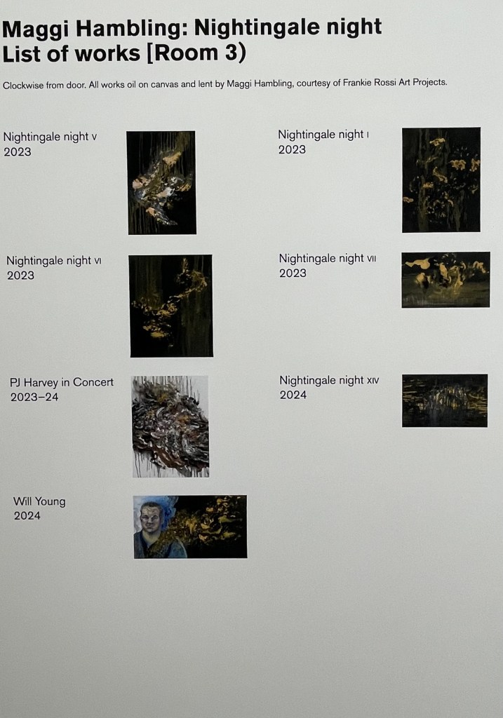
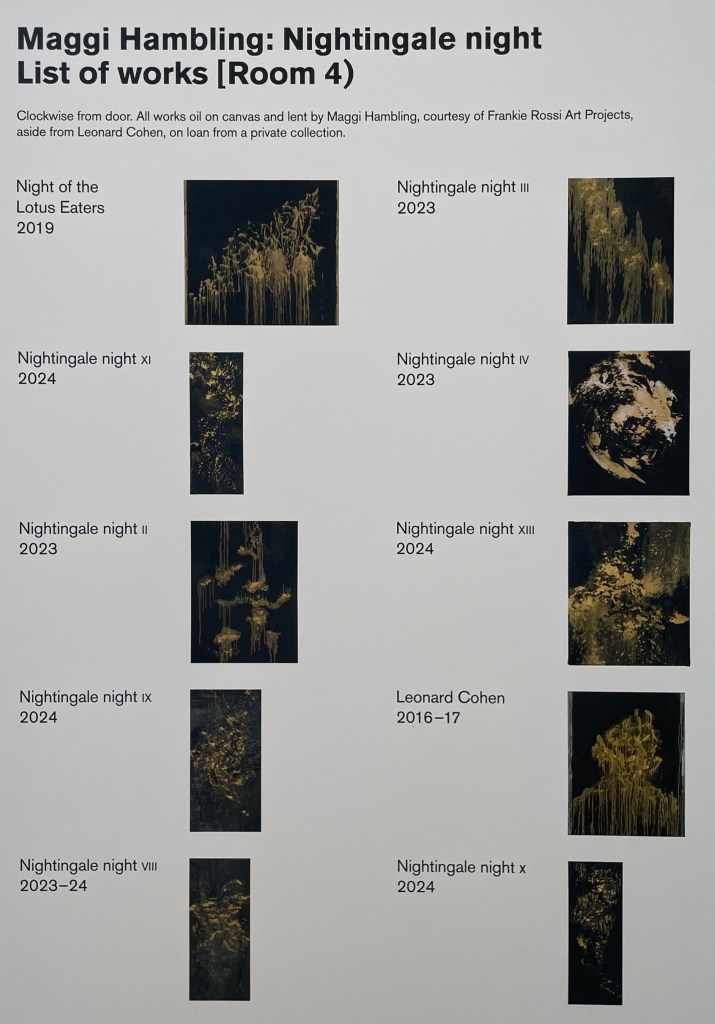
When I went to the Pallant House Gallery to see Dora Carrington recently there was another exhibition on at the same time: Maggi Hambling – ‘Nightingale Night’.
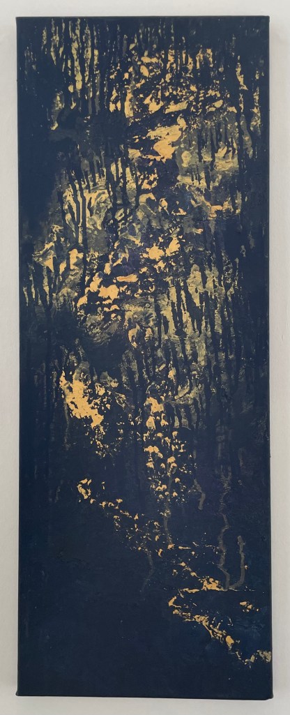
Nightingale Night VI
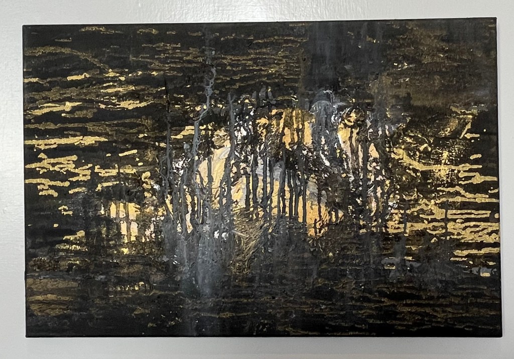
Nightingale Night X
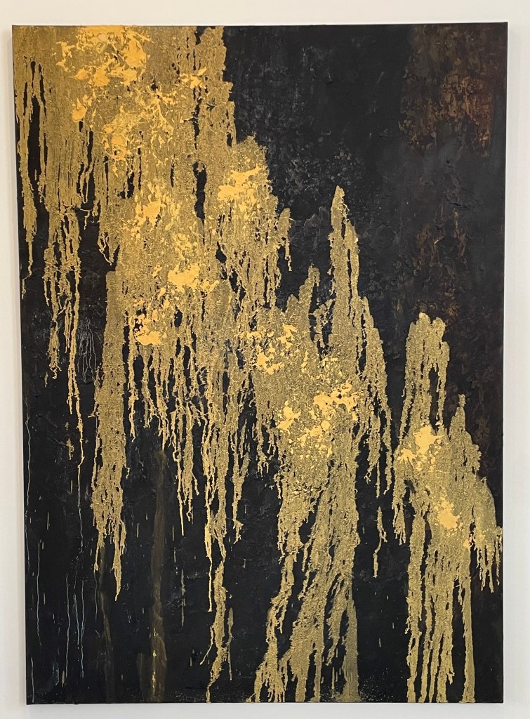
Nightingale Night XIV
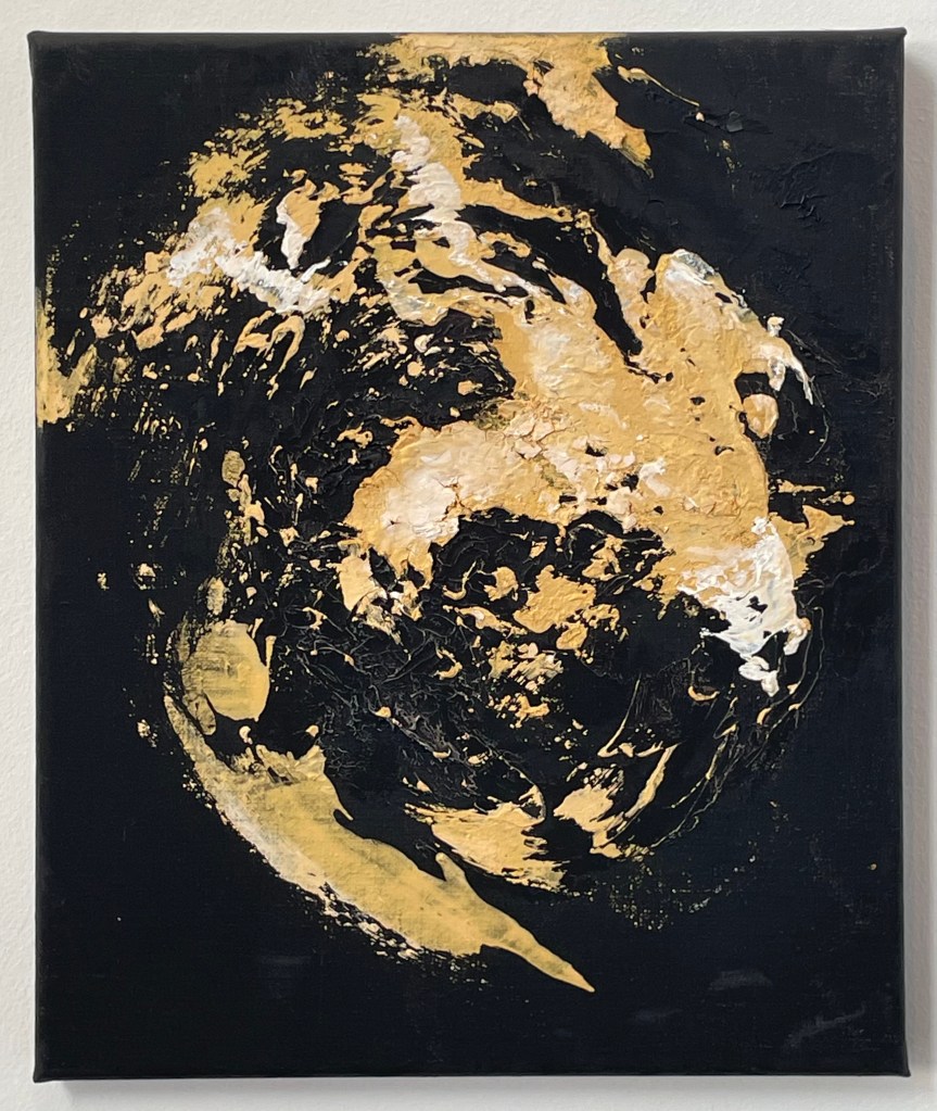
Nightingale Night III
Nightingale Night IV
Hambling spent a night in a woodland in Sussex in the Spring of 2023 listening to nightingales. I didn’t take photos of all of the paintings – I think I was only drawn to some of them on the day, or maybe I was tired from exploring Dora, but Iooking again at the images on the identification labels, I’m regretting not having done so.
I’ve since read an entertaining interview with Hambling about the exhibition in ROSA Magazine – I like doing further research after I’ve been to an exhibition; never before.
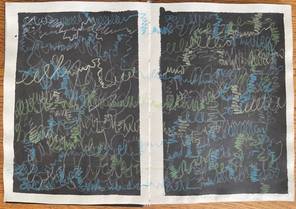
I’m not entirely sure what I think about it all. I’m not sure that I like the gold on the black ground, although I can absolutely understand her reasoning behind it, and I do like a bit of gold. Does she succeed in communicating the otherworldly divinity of the nightingale in the darkness? The sense of it, absolutely, but the sound of it? I’m not convinced, and I think it’s the mark-making. The swirls and definite vertical and horizontal marks are successful, I think, in representing sound; my issue is with the drip-like marks – they don’t allude to the beautiful song of a nightingale to me; it’s more akin to me having a warble and eventually running out of steam and giving up. But I think I’m being harsh, because even she admits that it’s impossible to paint the sound of a nightingale, and that what she hopes to have captured is a sense of the fleeting moment. She comments:
”…there wouldn’t be much point in painting a picture that it was possible to paint…”
It’s an interesting comment, one to think about.
It would be interesting to know whether Hambling made the paintings from memory, or whether she played a recording of nightingale song whilst she worked. I’ve assumed that it is the former because it’s about the whole experience, of being in a certain place at a certain time bearing witness to something extraordinary.
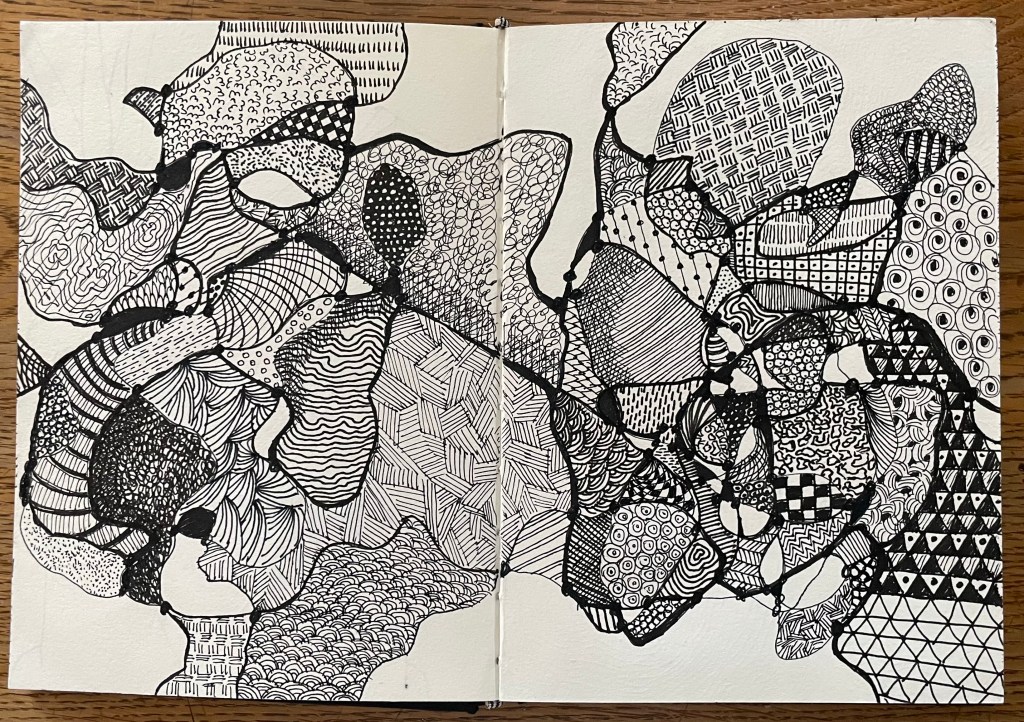
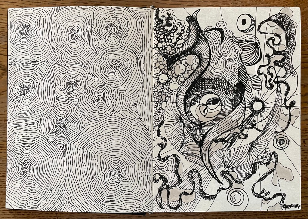
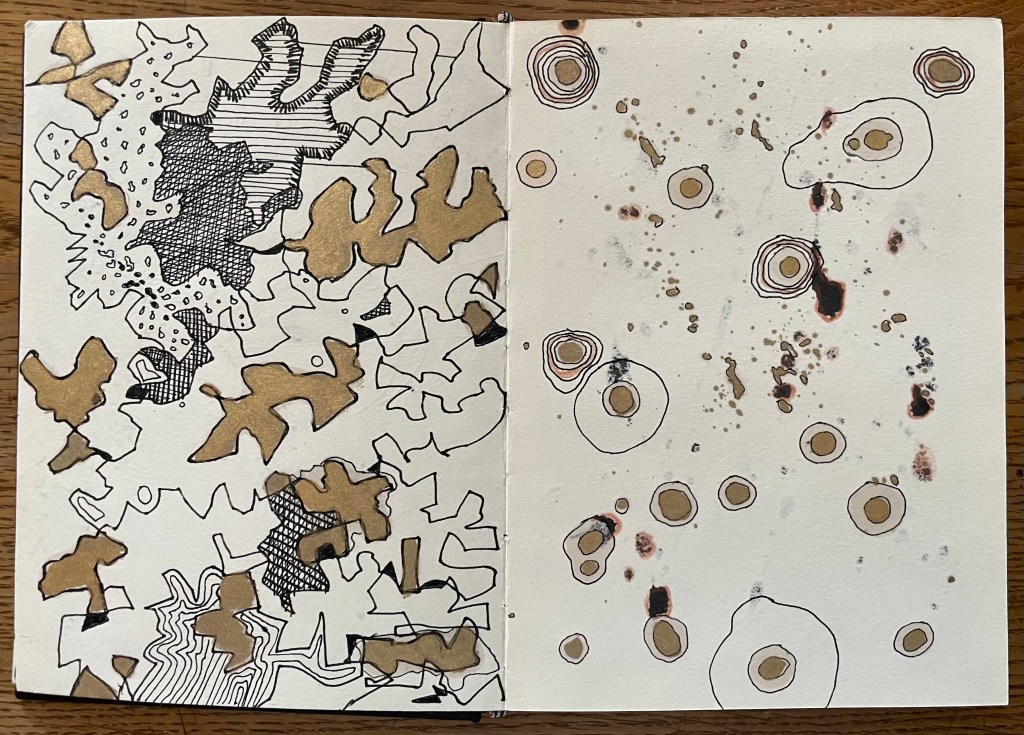
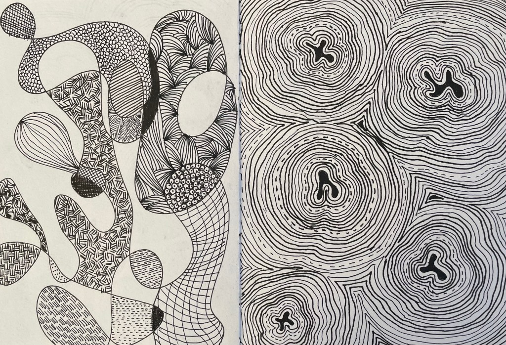
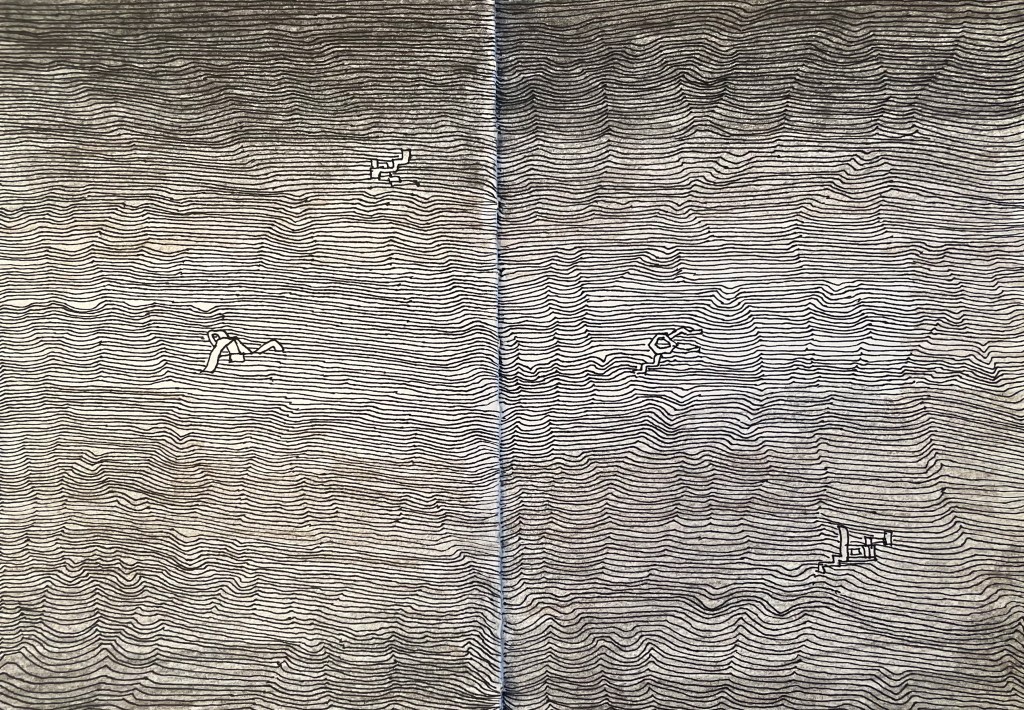
I have been carrying on with my pen doodling, some of which is unfinished – I became bored, and moved on. I also decided to give nightingales a go. The concept of representing sound in a 2-D form is really interesting – the consideration of tone, volume, intonation, rhythm etc. I’ve represented it in a linear way, thinking initially about sound waves, but it would be interesting to explore other methods of representation.
The song is so diverse and improvisational that it was very difficult to think of different mar–making to represent what I was hearing. It was an interesting exercise, and very calming listening to birdsong with my eyes closed.
I like having an inked page – I think I will go through my sketchbook and randomly ink up or paint pages. I also like trying to work with unexpected events such as the solvent stains from the gold coming through to the reverse of the page. This is, literally, just playing – it’s enables a period of convalescence.
And now I’m in a state of flux, and feeling a bit stressed, thinking where do I go from here? I have nothing else.
I use my husband as a sounding board and as a gauge as to what I’m feeling and what I’m doing. I value having someone to give me feedback, to hold a mirror up to me. But to what extent should I rely on this and allow it to influence how I see my own ideas and work? Why is it when someone says they really like my work, I feel it’s easy to ‘do it down’ – ‘oh, it’s not one of my best’, ‘there are some bits of it I’m not totally happy with’ (when actually I think that it’s as good as it could possibly be and I’m actually quite pleased with it), and yet when someone is ambivalent about my work, I feel unable to ‘big it up’?
Anyway, I now feel directionless, and at a loss as to what to do.
I have looked at how other artists have approached the concept of dialogue, and, in the main, they all involve figures. None of what I have looked at has inspired me so I haven’t even bothered to include any images of them in this post.
I don’t know what it is, but I’m feeling a bit fed up at the moment. Maybe it’s the theme of ‘Dialogues’ and the idea of connections etc. – it all seems as if it’s something that has been done before ad infinitum. Maybe it actually bores me – I don’t know – I just can’t seem to get inspired by it. Maybe it’s the fact that I only have a week to make something and I’ve got other more pressing things to be getting on with. Maybe this little side quest of mine is becoming an unnecessary distraction.
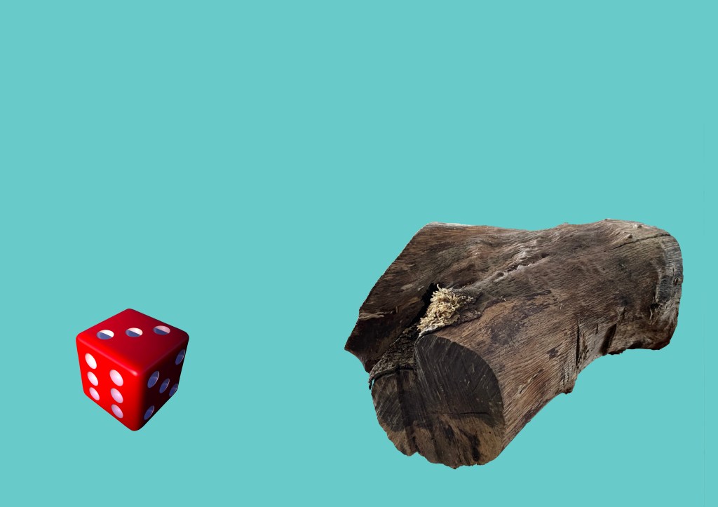
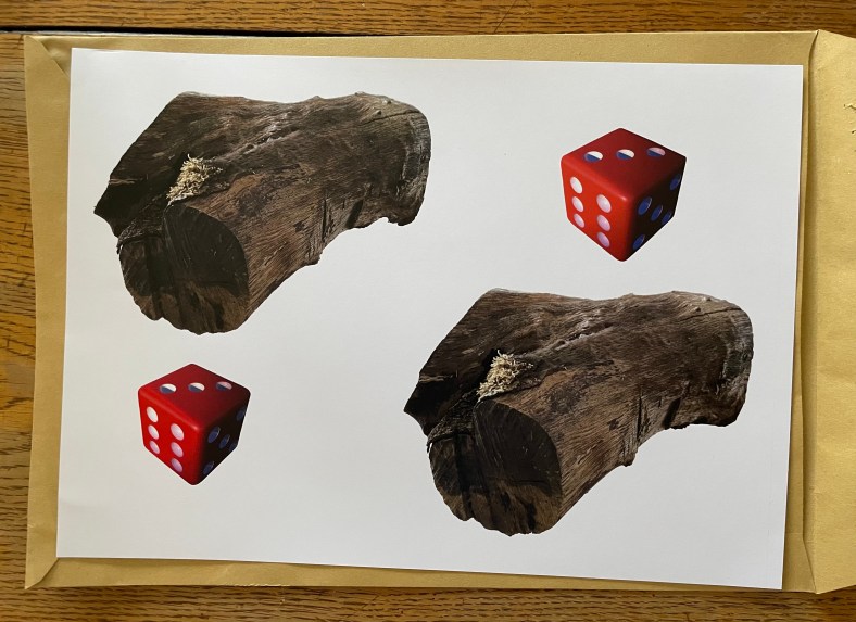
As a reaction to this feeling, I decided to take a literal, and some might say, infantile approach. I kept on coming back to my perverse love of Catchphrase and the birthday card. I started fiddling around on Procreate and came up with this:
A die, a log.
It’s pretty basic, but strangely appeals to something inside me. Maybe it’s a bit cheesy – but do I care? – maybe I need a bit of cheese at the moment. Then I remembered a piece I saw at the Pallant Gallery last weekend.
’Neighbourhood Witch’, 2008, Simon Periton, Silkscreen on mirror coated polyester
I really like the use of the mirror which reflects the viewer so that they then form part of the work. It reminded me of Craig-Martin’s ‘Conviction’ which I had seen at the RA. I could use this idea because one of the thoughts on my mind map referenced the need to reflect when engaged in dialogue.
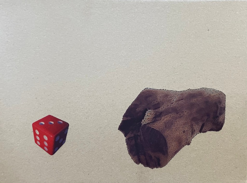
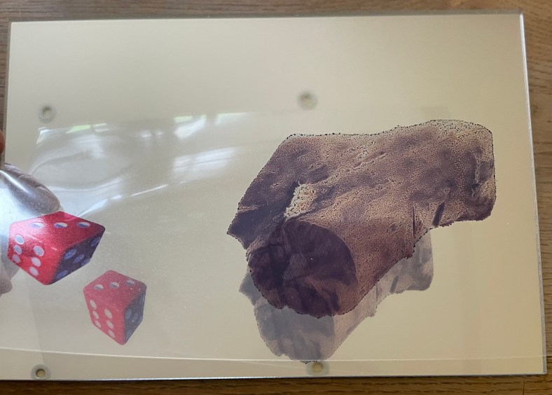
I have decided to incorporate a mirror, possibly with the images of the die and log being raised slightly away from it so that they reflect in the mirror as well as the viewer – a die, a log, with you. It’s now becoming a fully matured wedge of Stilton!
I experimented by printing them off on some inkjet friendly acetate but my home printer didn’t do a particularly good job, but good enough to allow me to see whether the idea had legs. I wasn’t averse to it: it would mean that I would have to have it professionally printed on something more rigid, such as acrylic/perspex, and frankly, I don’t really have the time to get this done. Also, on reflection, I wasn’t sure about the reflections creating multiple images, as it was no longer a die and a log.
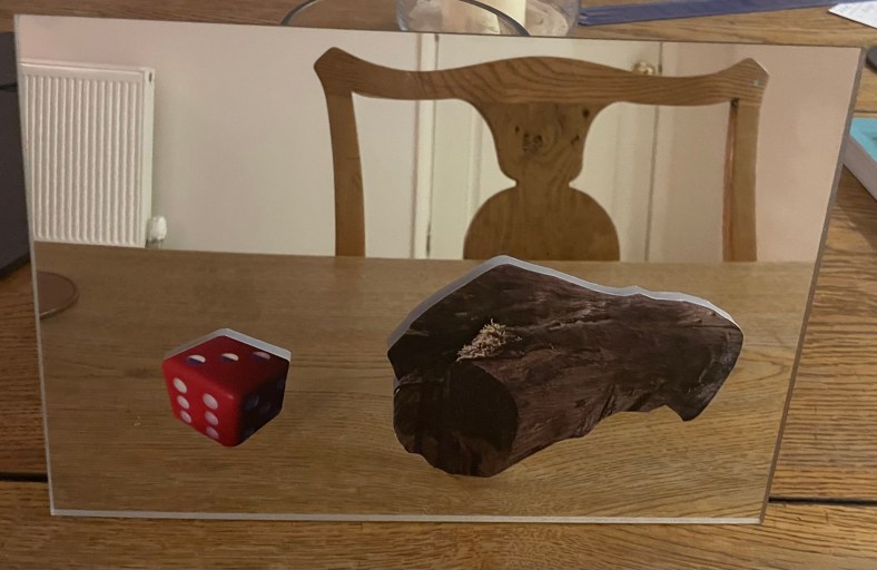
The only solution that I can think of is to fix the image directly to the mirror. The image in ‘Neighbourhood Witch’ above is screen printed on. I don’t know how to do this and I don’t have time to learn. I could get it done professionally, and after having done some research, it may still be a possibility but it depends on timing. Another solution would be just to collage them on. I researched the best type of adhesive and came up with Gorilla Clear Glue which is used a lot in glass mosaics. I will need to experiment with how best to apply it. In the meantime, I put some image cut-outs on a A4 mirrored piece of acrylic. I like the size.
Despite its luke warm reception, I’m going to carry on with my current train of thought. It may not be my best, but I like it because it is something that is totally different for me and it’s way outside of my box, and frankly, I’m all out of other ideas. And as General Patton said – a good plan violently executed now, is better than a perfect plan executed next week.
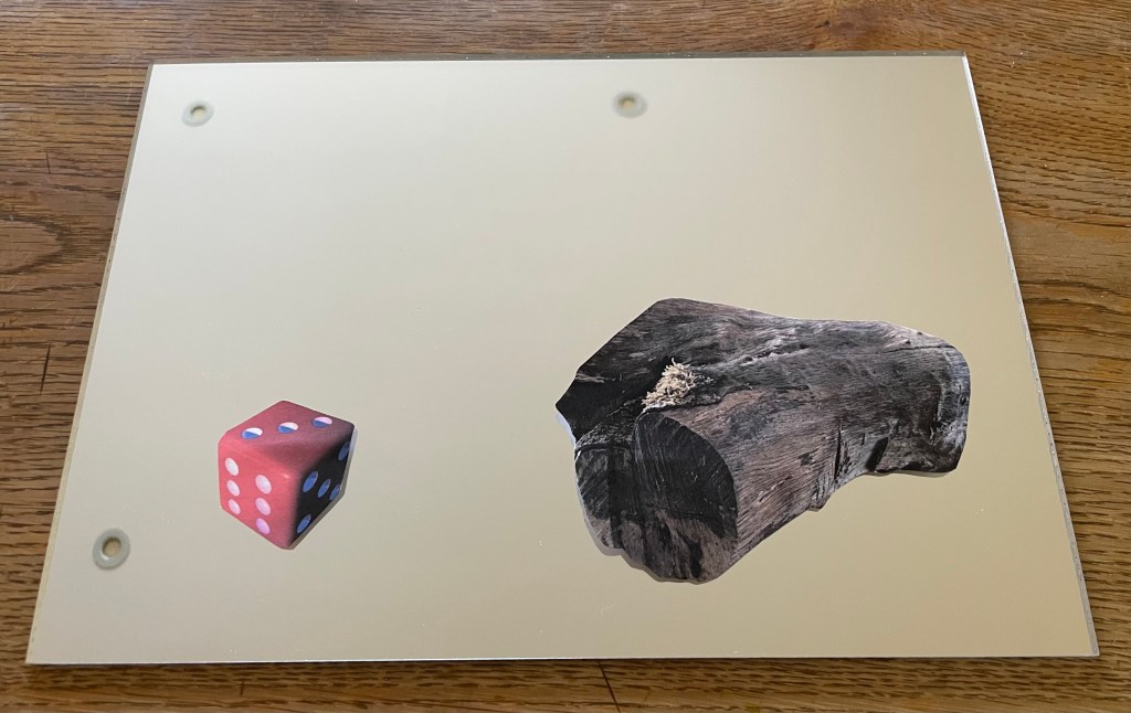
So I had a couple of sets of the images printed up on some 200gsm paper by my local print shop and cut them out and placed them on the mirrored acrylic to see how they would look.
I don’t know why I didn’t realise that this would happen, as it seems so obvious now – unless you stand dead straight on to it you can see the white reverse of the cut out image in the mirror.
My proposed solution is to have the mirror images printed and then fix them together so that any reflection is of the image itself.
Dora The Explorer was one of my daughter’s favourite TV programmes when she was a toddler. I don’t know how they did it, but Nickelodeon managed to give Dora the most irritatingly grating voice possible. Anyway, thankfully, this is not the Dora the Explorer who is the subject of this post.
I went to the Pallant House Gallery in Chichester yesterday morning to have a look at the DoraCarrington: Beyond Bloomsbury exhibition. I had heard of her, and had a vague recollection of having seen some of her work.
Dora Carrington certainly was an explorer of sorts: associated with, but not a fully paid up member of, the Bloomsbury Group, she explored her art as well as her relationships and sexuality. To be honest, I couldn’t quite keep up with the complexity of it all. At the heart of it was her enduring love for the gay writer, Lytton Strachey, who was 13 years older than her and with whom she set up home. At one point they lived with Ralph Partridge who Carrington (whilst studying at the Slade, she dropped the name ‘Dora’ preferring to be known by her surname) married in order to keep their ‘triangular trinity of happiness’: Partridge was enamoured with Carrington, Strachey fancied Partridge, and they all had relationships with each other (apart from Carrington and Strachey whose relationship was only ever platonic) as well as others of the same or opposite sex. It seems all and sundry found themselves hopelessly in love with Carrington, not least the artist, Mark Gertler, with whom she had a moment, but otherwise whose long-lasting passion was unrequited.
Alas, it all ended tragically in 1932 with Carrington shooting herself in the chest shortly after Strachey died. She was 38 years old.
The last exhibition of her work was 30 years ago at the Barbican. During her life she rarely exhibited, and her work, many pieces of which she destroyed, seems to have been overshadowed by her adventurous private life and tragic death. She has been described by a former director of the Tate as being’ the mostneglected serious painter of her time’.
It was a mixed bag, but there were a few pieces which caught my interest. Her early drawings and paintings of nudes were very good, but I found myself lingering in front of these.
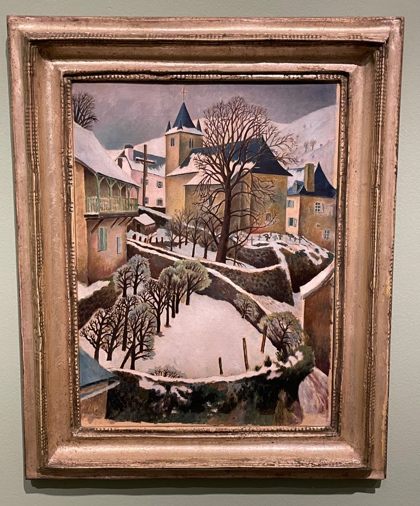
Larrau in the Snow, 1922
Perfect Christmas card material, I really like the simplicity of this painting; its muted colours and, in particular, the composition with its recurring curved shapes of the stone walls and the use of verticals in the posts and trees in the foreground, the large tree and the church with its spire punctuating the sky in the middle ground and the mountains in the background. The positioning of the trees leads the eye up through the painting in a zig zag pattern.
Farm at Watendlath, 1921
Again, I like the composition: the path leads across from left to right, up through the farmhouse along the rear stone wall to the large ominous trees, up to the huge hills in the background which seem to squeeze out the sky. The three areas of white – the figures in the foreground, the farmhouse (and what look like sheets on a washing line) in the middle ground and the clouds in the sky in the background – break up the large areas of green preventing them from becoming too overpowering, but leaving enough areas unbroken to give a sense of being overpowered: the tall trees and hills seem to be bearing down on the woman and child, creating a feeling of foreboding, and the stillness (if they are sheets on a line, they’re not moving at all) and claustrophobia created by the tiny sliver of sky adds to the mood.
It was suggested by the blurb accompanying this piece, that its unsettling atmosphere might have reflected the turmoil which Carrington was experiencing at the time: she had gone to Cumbria on holiday with Partridge and his friend, Gerald Brenan, and they had stayed at the farm. Whilst there, she began a relationship with Brenan.
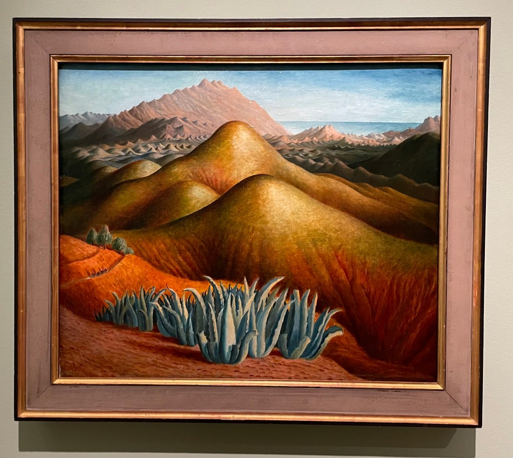
Spanish Landscape with Mountains, 1924
I was drawn to the surreal nature of this painting. Carrington made it from memory, after visiting Brenan in Andalusia, where he lived. According to the blurb, she built up the colour by layers upon layers of glazing on top of what was already a vibrant underpainting. She painted it on a cold day in March, which may have been a contributing factor to her use of colour and the sense of heat and aridity which she manages to create. There are menacing looking succulents in the foreground and a few token olive trees just behind, and these, together with the slight greenish tone to the area in from of the background mountain range, cleverly break up the large areas of warm reds and yellows which form the undulating hills in the middle ground. There is the lovely detail of the figures on horseback moving towards the viewer along the ridge on the left hand side. It has an otherworldly quality to it: apparently Carrington felt transported to another world when she visited Spain.
Lytton Strachey, 1916
“He was everything to me. He never expected me to be anything different to what I was.” This was how Carrington described Strachey, and it is apparent in this portrait of him which she painted towards the beginning of their relationship which was to last 16 years, and which survived numerous relationships on both sides. It shows Strachey deep in concentration reading a book which he is holding in his delicately painted hands, which Carrington has strangely elongated. Maybe his hands were her favourite feature, because she captures them in a detailed way, down to the highlights on his nails, even their white tips, particularly on his little finger. Or maybe she used them as a compositional device to create a dynamic and bold vertical marking the final vertical third of the painting. The image wouldn’t have the same impact if his hands were sized more realistically, and the book he is holding didn’t go off the top of the panel.
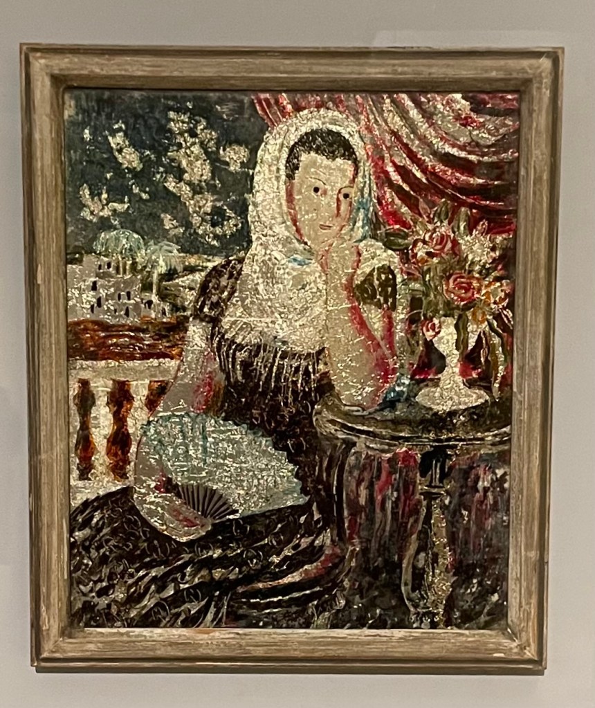
Carrington had a fascination for Victorian ‘treacle’ paintings and from 1923 began making her own which were called tinsel paintings. They weren’t very large and involved making a painting on the reverse of a piece of glass using foil from sweet wrappers and cigarette packets together with inks and oil paint. She sold them through Fortnum & Mason as a way to earn an income in the winter months to finance her serious art making. She also made them for friends: the ones below were made for Augustus John’s wife, Dorelia. Very few of the tinsel paintings survived, and one of them sold 4 years ago for £57,000.
Spanish Woman
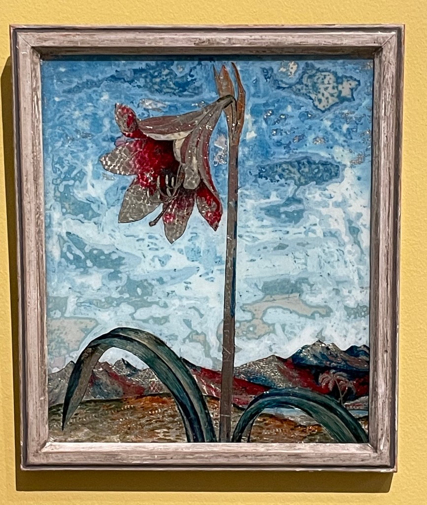
Lily
I’m strangely drawn to them as I’ve never seen anything like them before. They have a strange luminescent quality to them and I particularly like the textures in the sky in Lily – the combination of the resplendent lily in a barren landscape reminds me of Georgia O’Keefe.
Anyway, I’ve done some further research: Dora Carrington’s life was made the subject of a film in 1995 – ‘Carrington’ – starring Emma Thompson and some other notable actors. I watched it last night. Perhaps not surprisingly, it’s a film about her, based on a book about him. I’m not sure that it managed to truly capture the complexities of her life and certainly only touched on her relationships with men, and not women. It was a tearjerker.
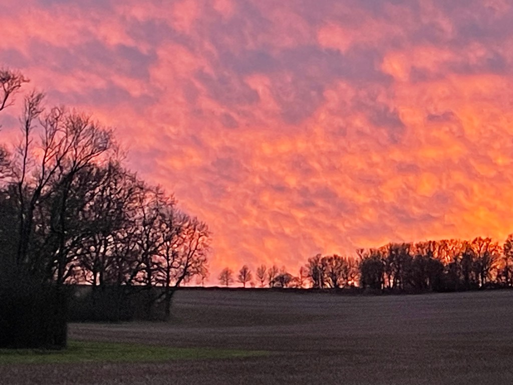
Whilst I was starting to write this post yesterday evening, I looked up and saw the most amazing sky through the kitchen window and had to go outside and take a photo of it. As usual, the image doesn’t really do it justice.
There’s something very satisfying about drawing a line.
Paul Klee loved a line. Taking a line for a walk.
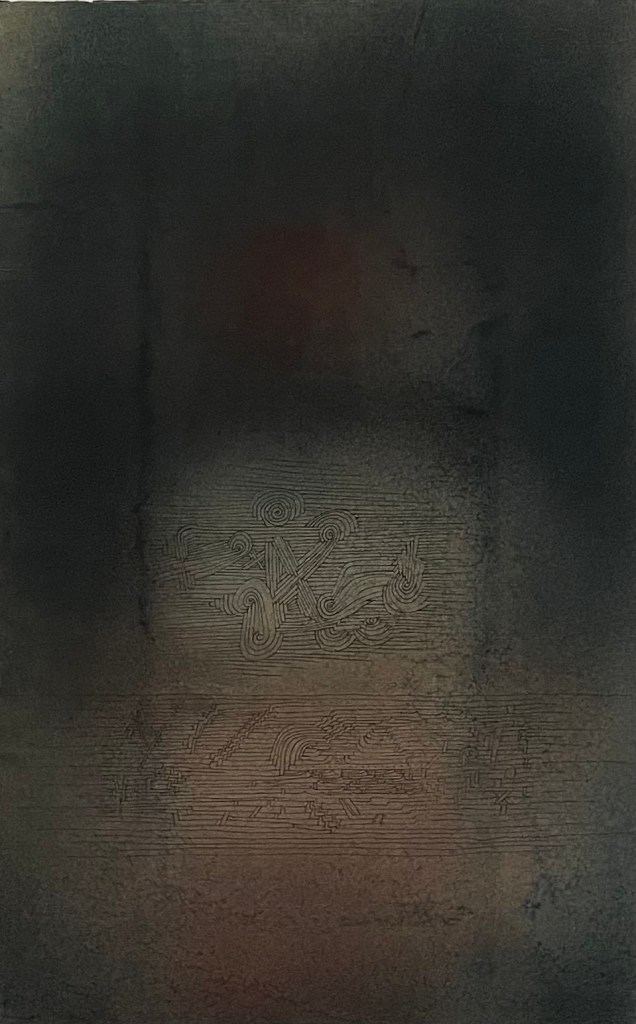
Bewölkung (Clouds), Paul Klee, 1926
I stand in front of this Paul Klee every time I go to the Pallant House Gallery in Chichester. Ink lines drawn over watercolour evoke feelings and moods, suggesting, not defining.
I listened to a film whilst I did this. I like the suggestion of form created by the pattern of the lines. It’s made me think about something underneath trying to get out. The real me? I find these sculptures to be disturbing but compelling at the same time.
Maybe the lines are the contours of my life on a map. My own satnav so I know where I’ve been and where I’m going. Lots to think about.