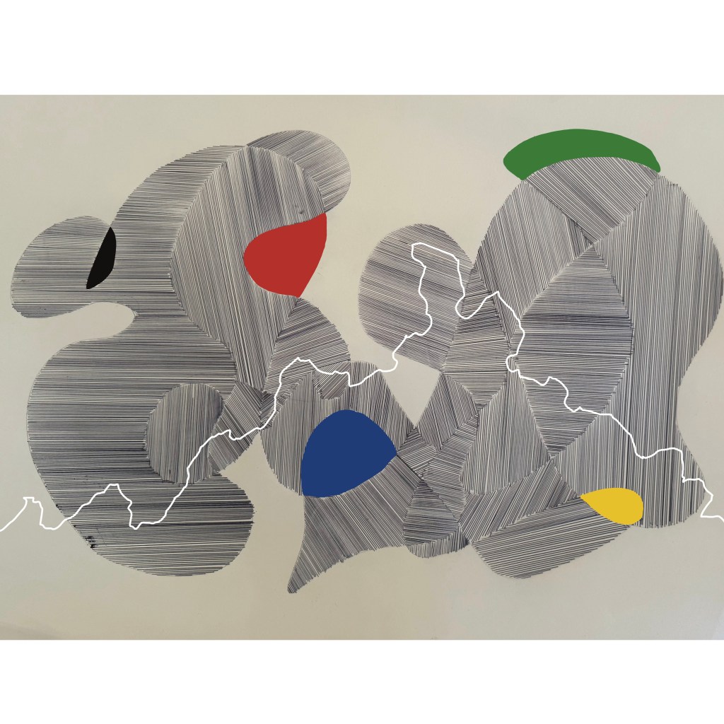
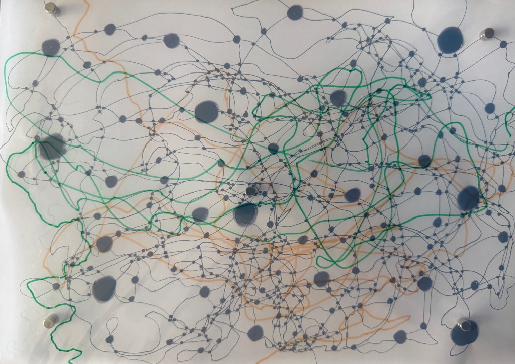
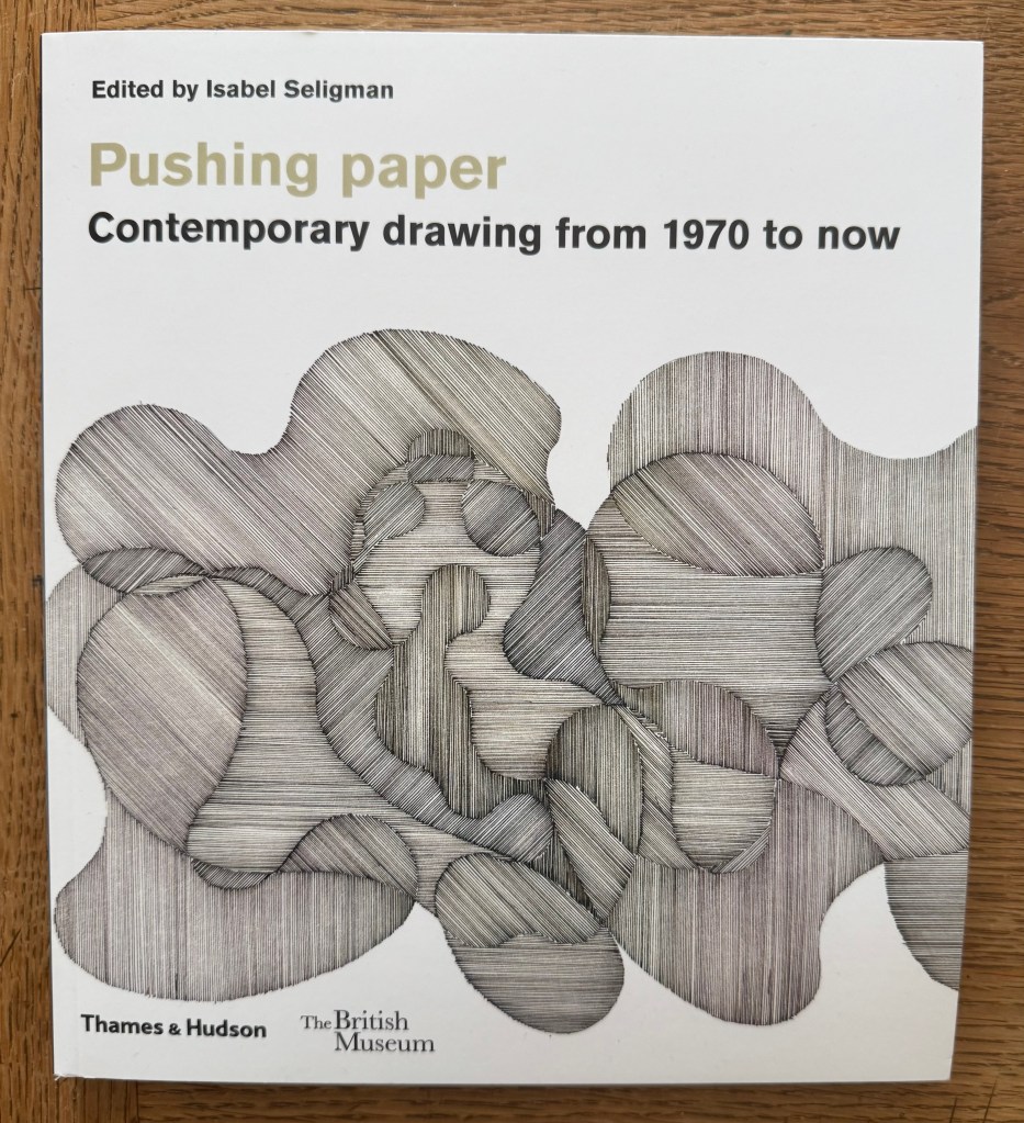
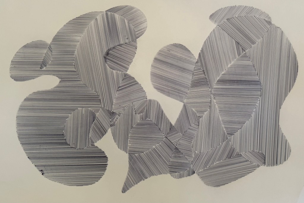
I bought ‘Pushing Paper’ in the hope that I would find its contents enlightening, but primarily because I felt drawn to the cover. The image is ‘Some Interference’ (2006) by Richard Deacon, which he made during his residency at the Oxford Centre for the Study of Gene Function. According to the book, Deacon was initially trying to represent multiple surfaces on a flat plane – the paper splitting into interconnected layers. As things developed, he realised that what he was drawing was difficult to clarify.
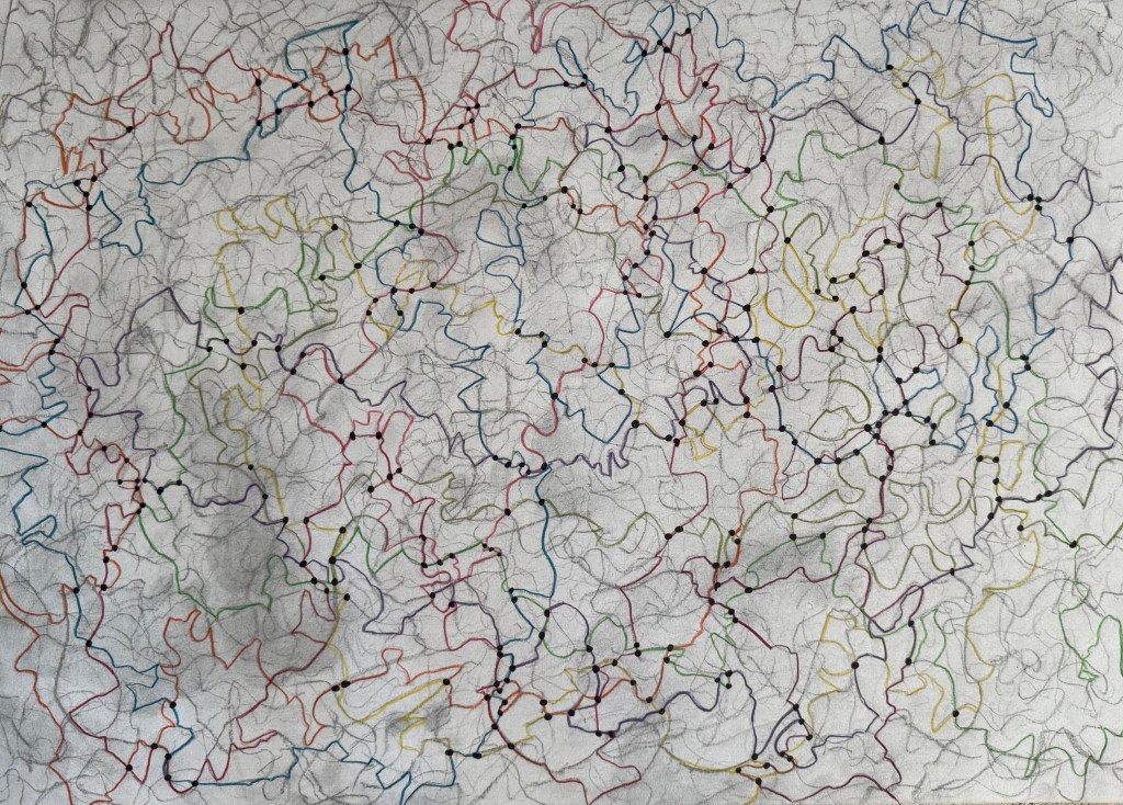
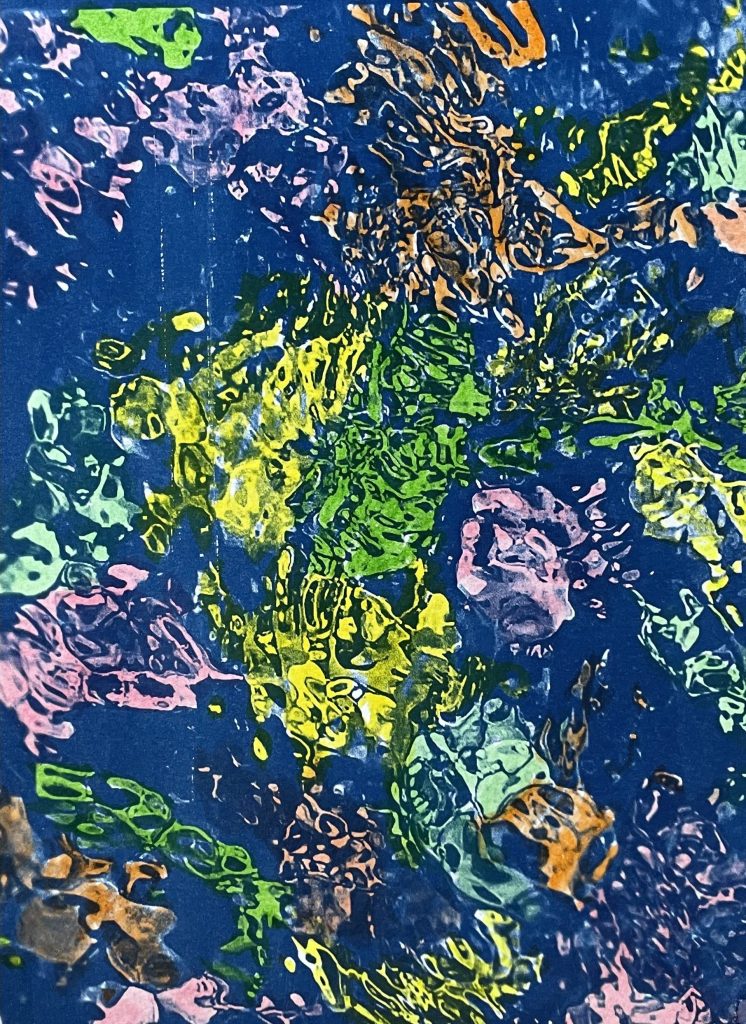
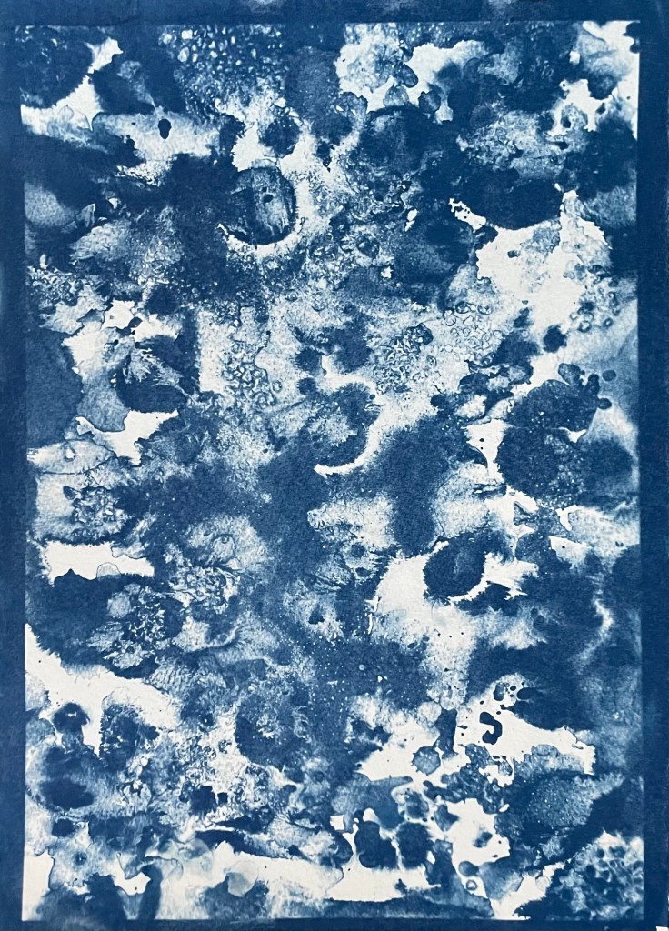
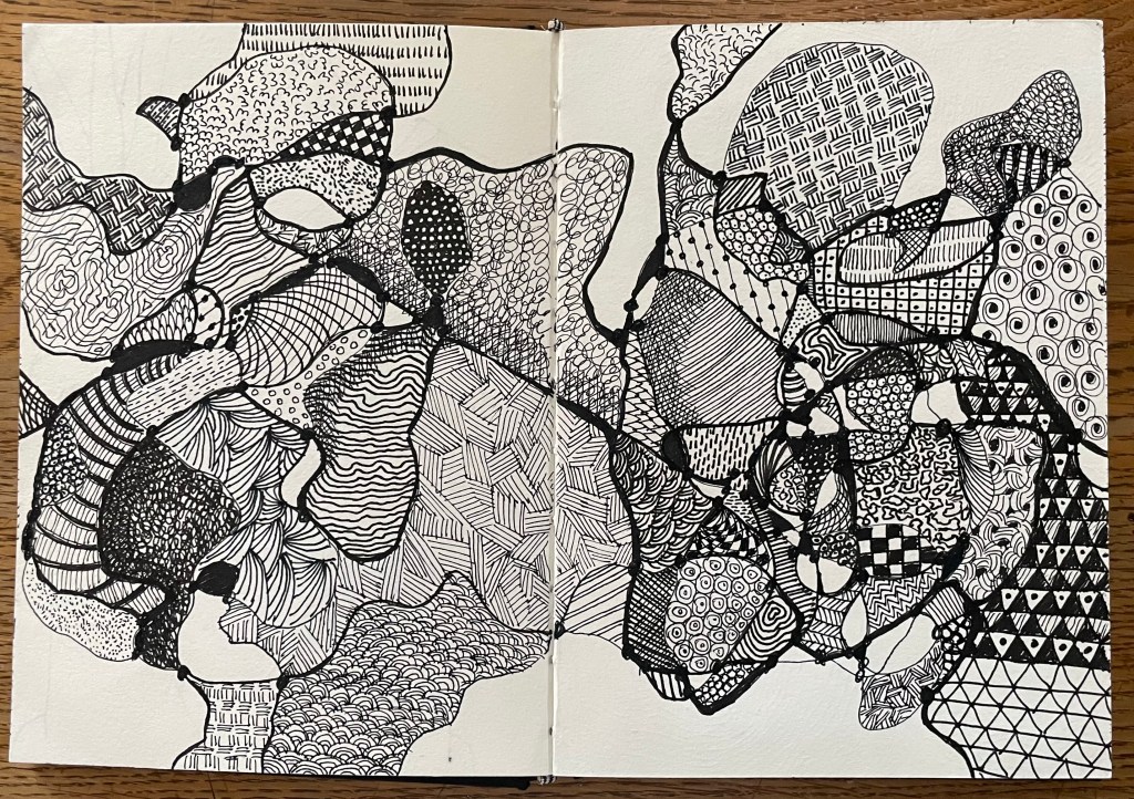
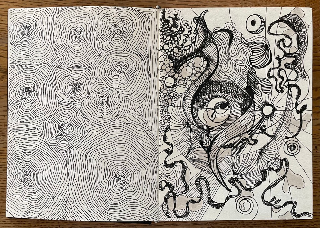
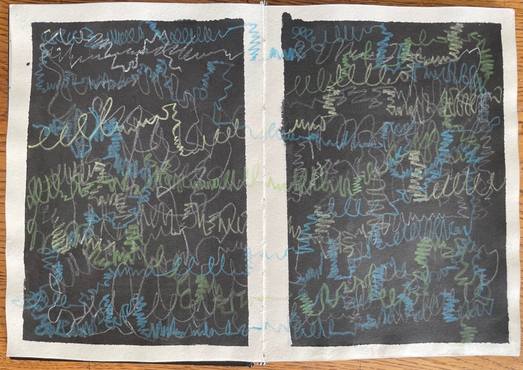
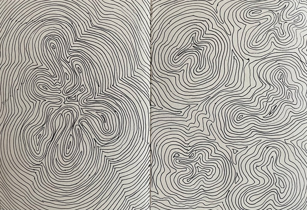
Something about it really appeals to me. It reminds me of the doodle type drawings I’ve been doing (On Your Marks… & Lines). Aside from Etch-A-Sketch and Spirograph, this process entertained me for hours as a child. I would draw a random enclosed shape with overlapping lines which created segments to be coloured in. It takes me right back to my childhood. Maybe that’s why I’m drawn to it. Maybe it’s because it embodies its simple process as well as having a temporal dimension – the act of drawing each individual straight line. I like the darker line which is formed around the edges of the shapes where the lines have crossed.
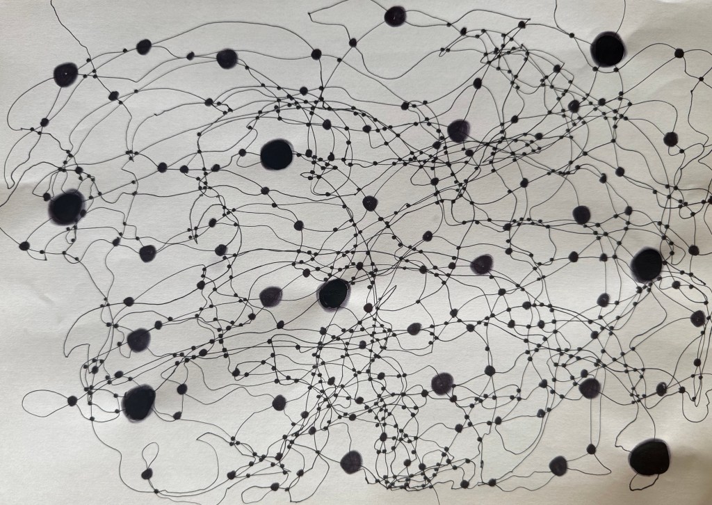
Well, whatever the reason, I picked up the nearest pen, a leaky biro, and had a go.
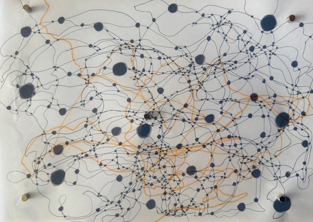
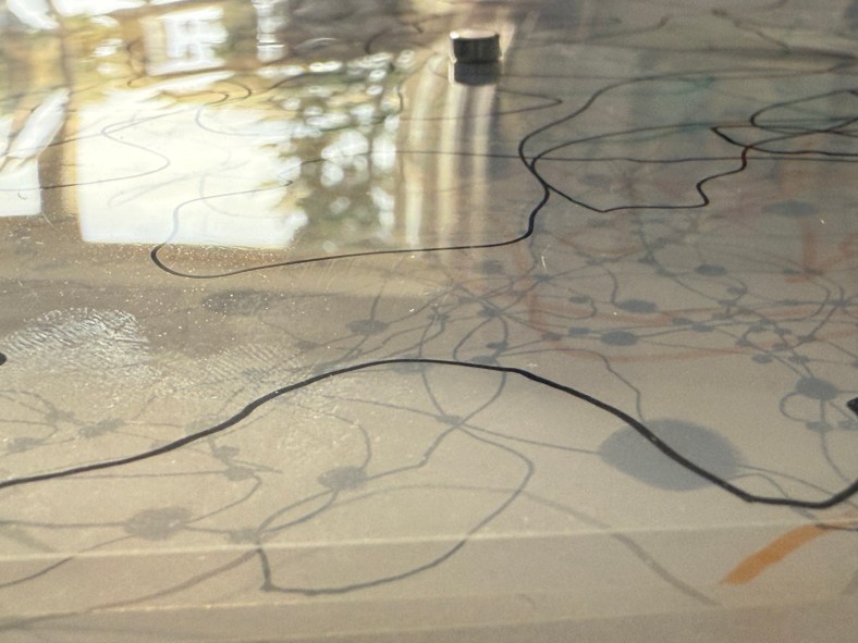
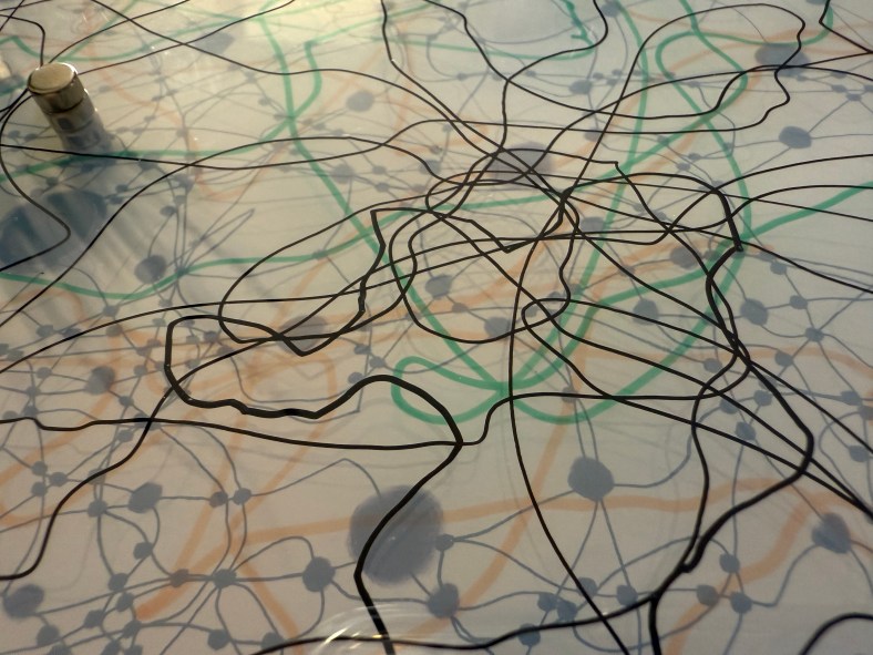
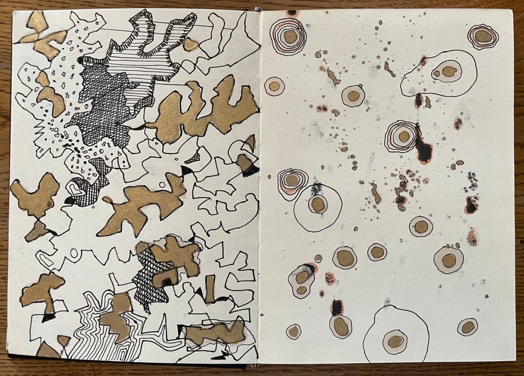
It was a very satisying exercise, despite the blobs and smears. The ‘me’ at the beginning of this course would have discarded it. Instead, the blobs and smears are all part of the process, caused by the movement of the ruler and my hand, a moment hesitating too long in one spot. Nevertheless, I’d like to repeat the exercise with a proper pen, maybe a variety of pens of different thicknesses. In the meantime, I experimented in Procreate.