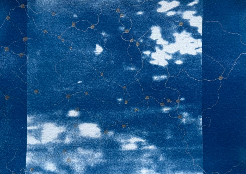
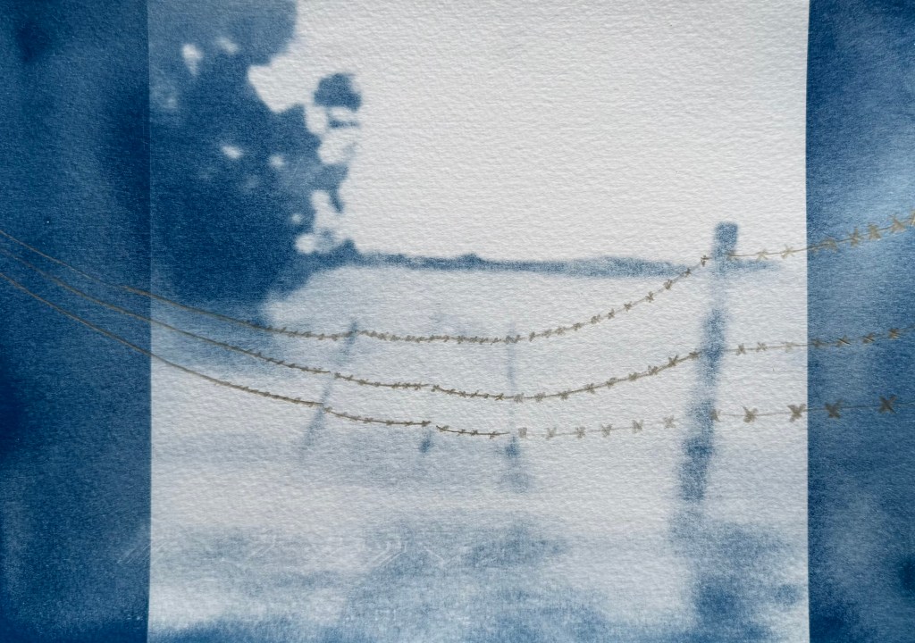
I’ve decided to experiment with using the contour image in Procreate as a layer.
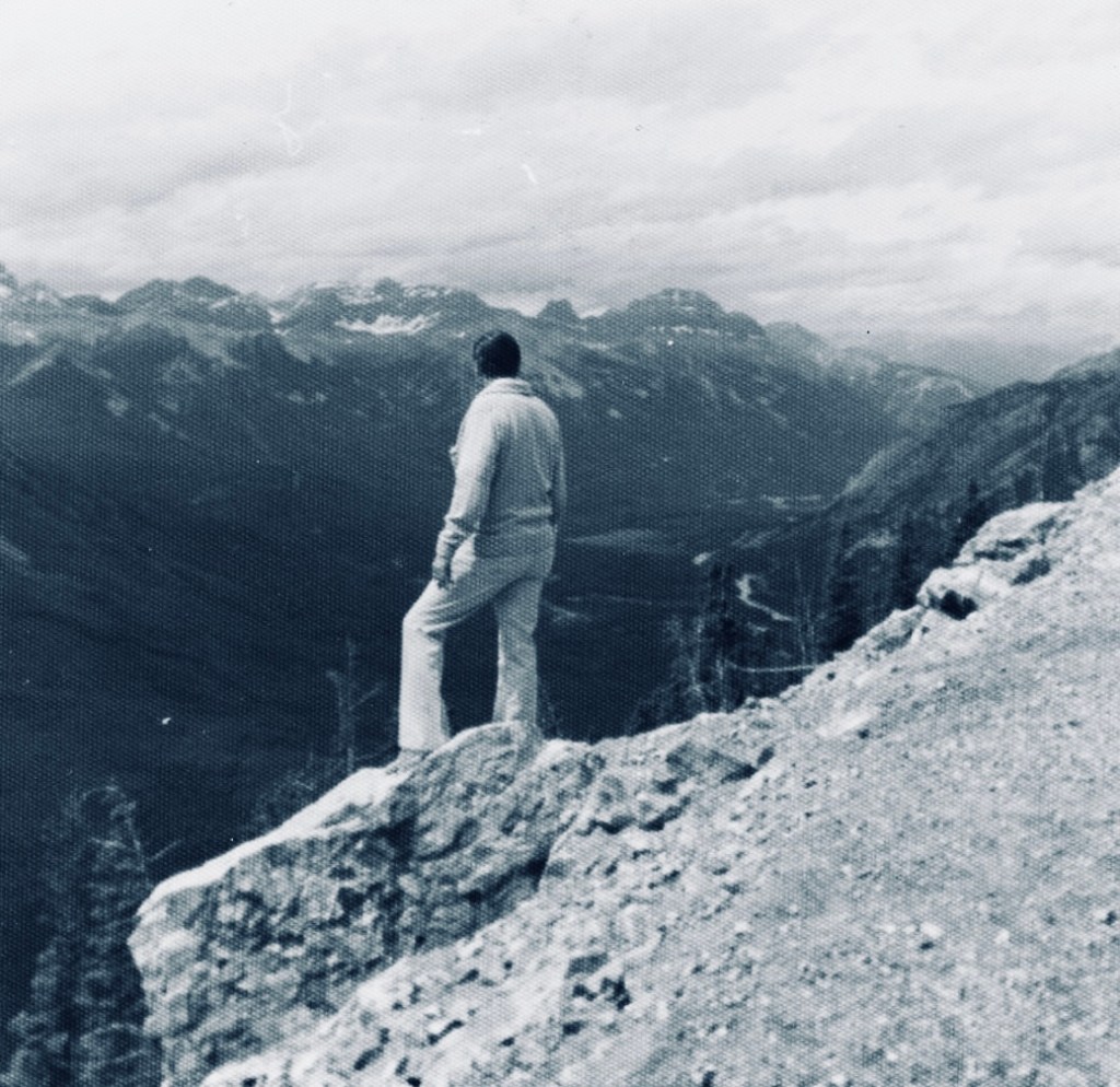
I was looking through some old family photos and found this one of my father in Canada. This is a recurring image from my childhood – if there was an edge or a high place, my father would always go and stand on it despite us pleading with him not to. I think he would have been about 40 years old when this was taken. I took him on the London Eye when he was in his 70s and I don’t think he looked out at the view once, choosing to spend the entire time sitting on the central seat, ashen-faced.
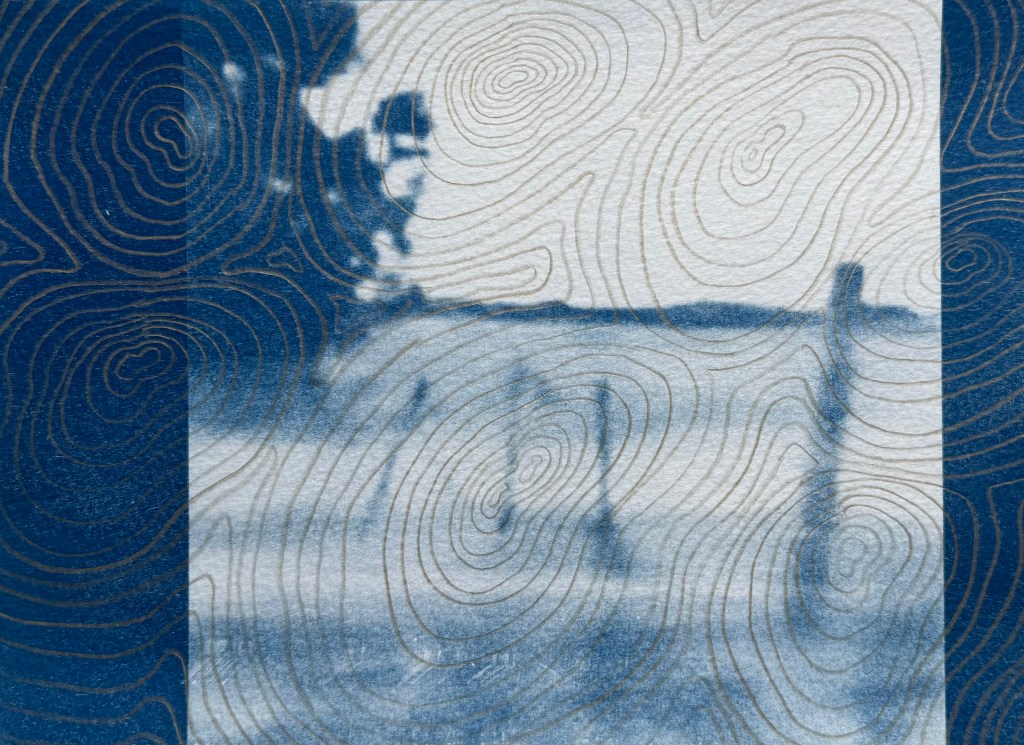
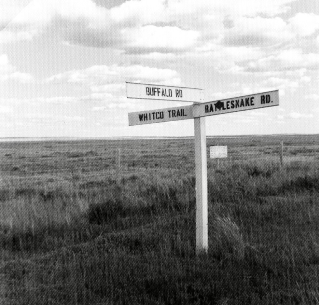
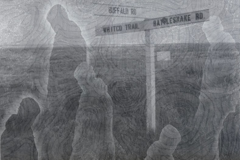
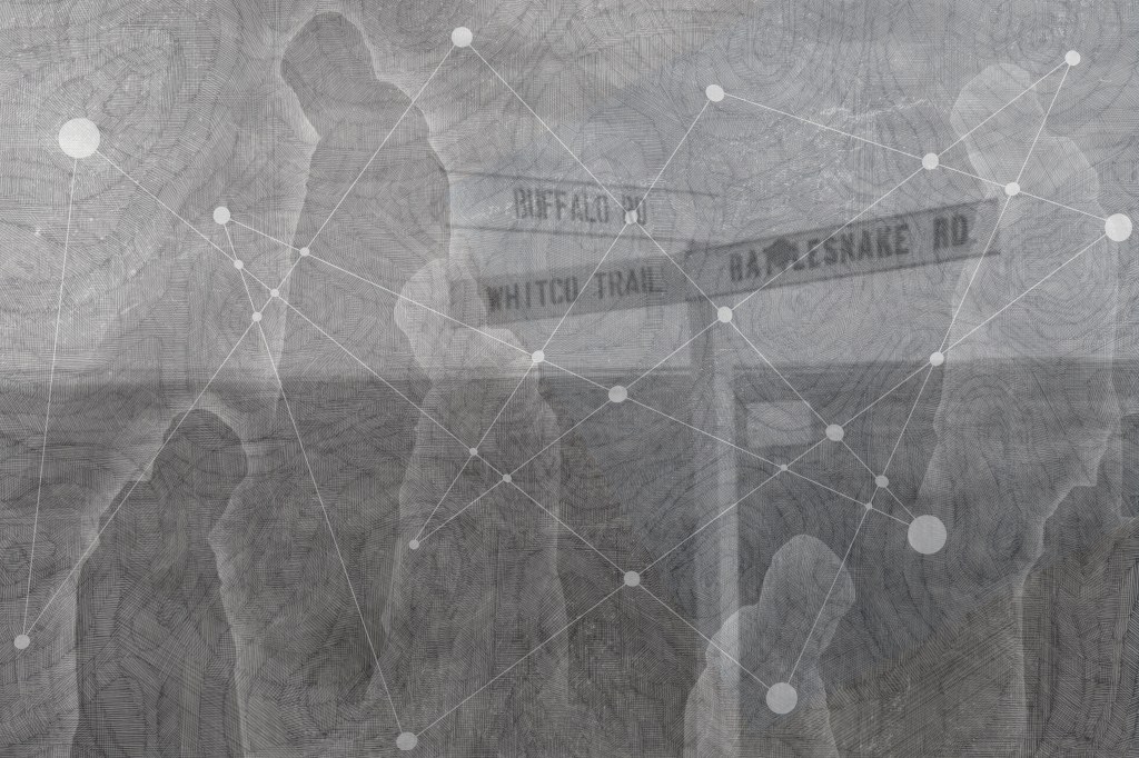
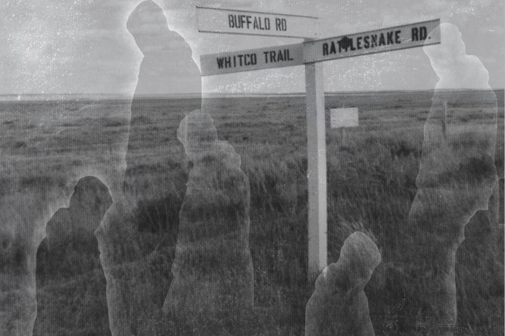
I also found this photo of a signpost.
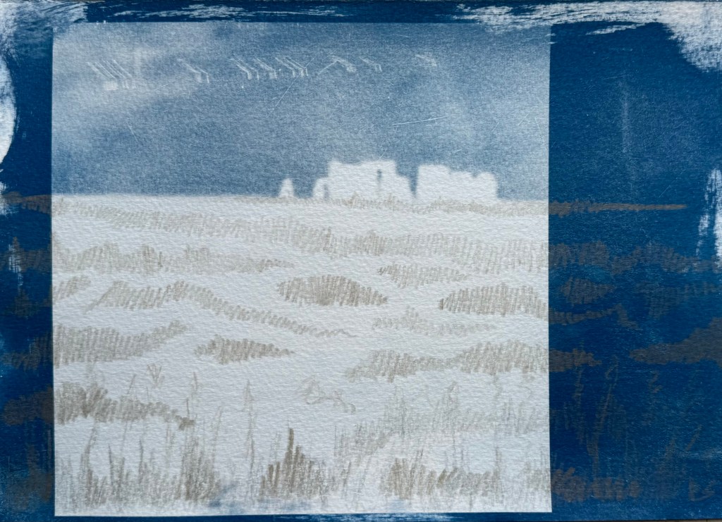
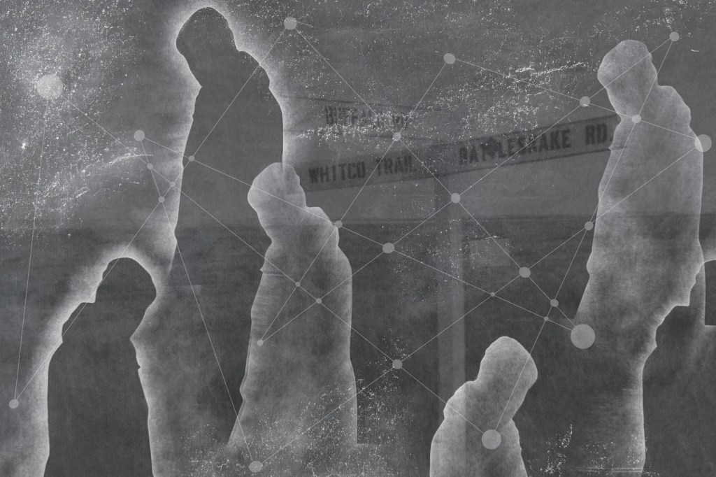
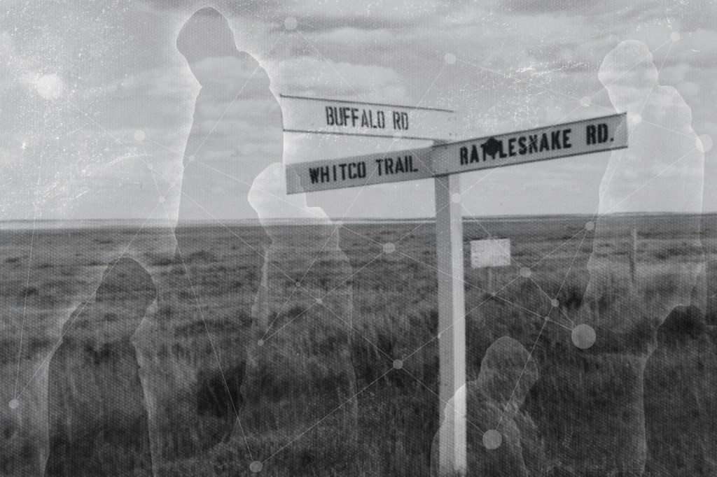
I played around with layering using filters, inverting and adjusting opacity:
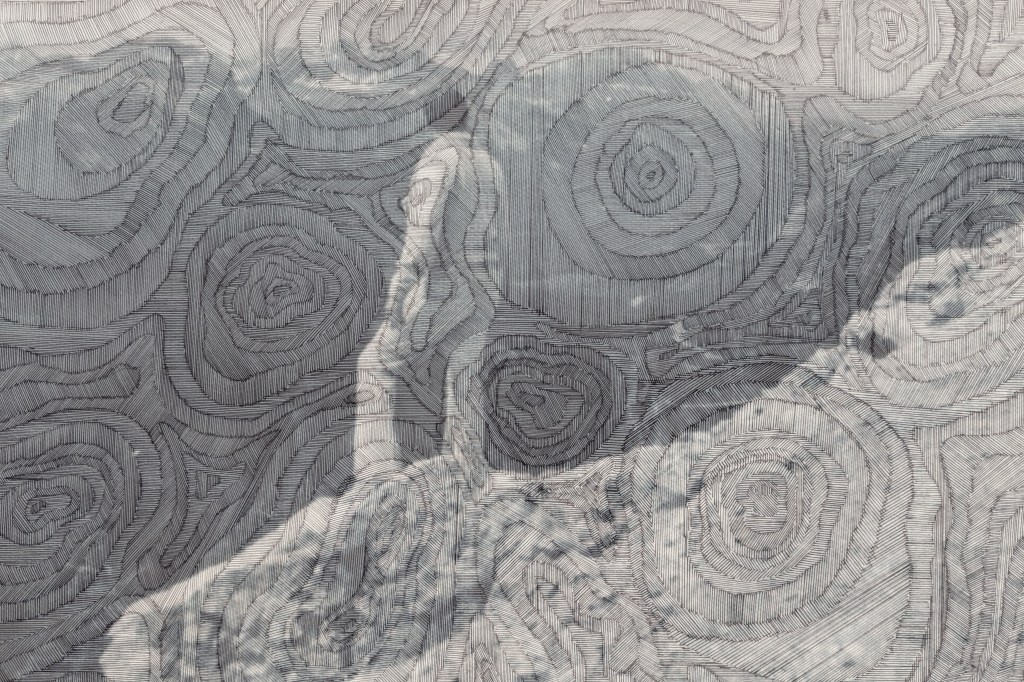
The image above is tonally bland; I prefer the one below. I like how the lined contouring gives the effect of the image being woven or embroidered.
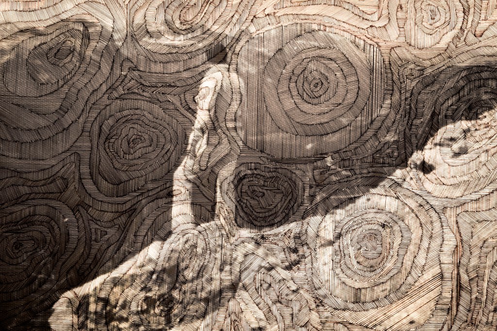
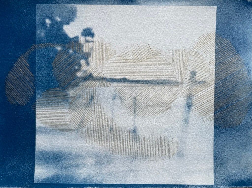
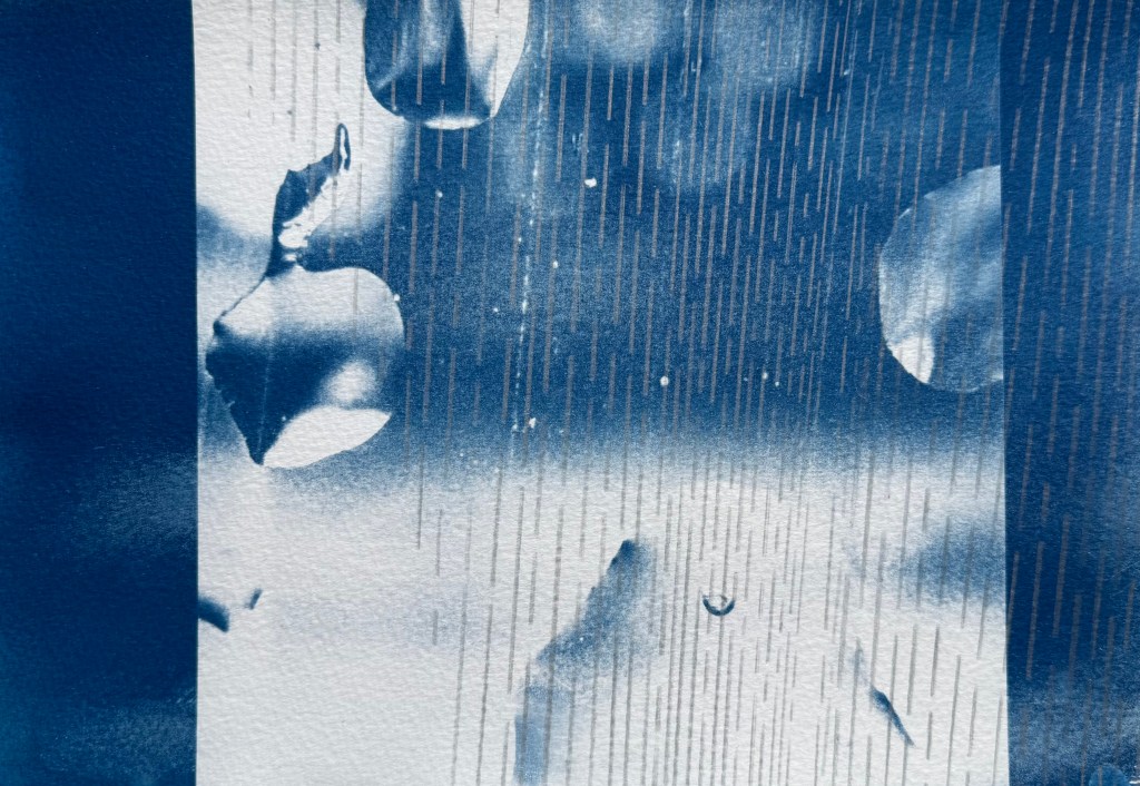
Again, the images above don’t have enough tonal range. I don’t think the contouring adds anything, it’s probably more of a distraction.
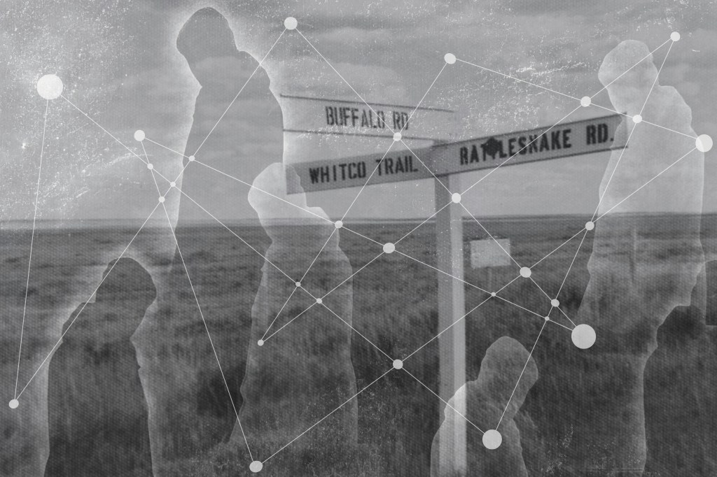
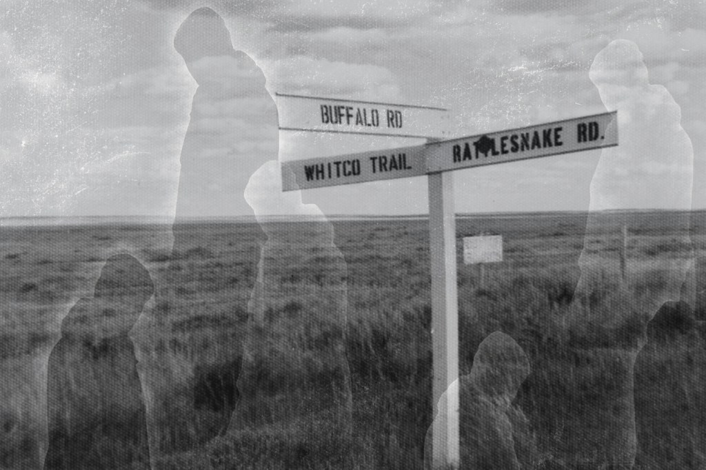
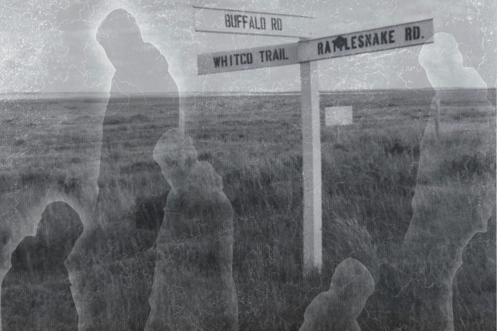
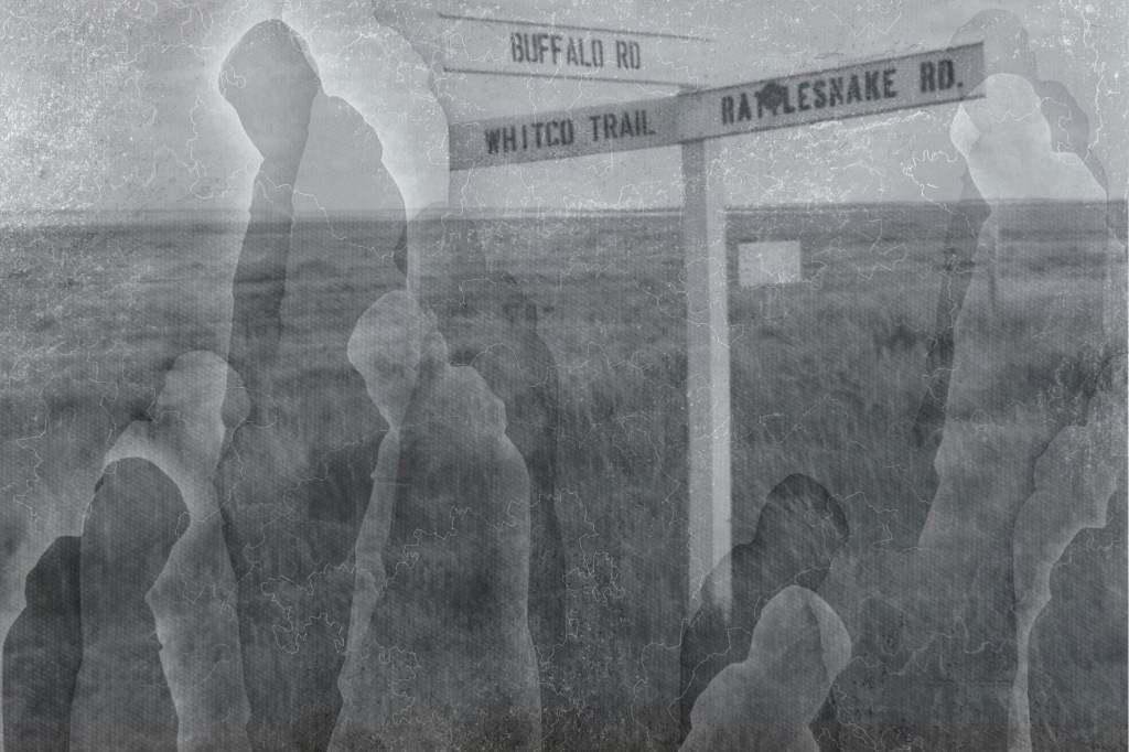
A mixed bag of results. I prefer the images which don’t crop off the bottom of the sign post. The most successful is probably the penultimate image, but again I think it needs a greater tonal range. However, I do like the effect of the figures against the landscape, the idea of crossroads in life, decisions made, a different path followed and shadow selves.