Dora The Explorer was one of my daughter’s favourite TV programmes when she was a toddler. I don’t know how they did it, but Nickelodeon managed to give Dora the most irritatingly grating voice possible. Anyway, thankfully, this is not the Dora the Explorer who is the subject of this post.
I went to the Pallant House Gallery in Chichester yesterday morning to have a look at the Dora Carrington: Beyond Bloomsbury exhibition. I had heard of her, and had a vague recollection of having seen some of her work.
Dora Carrington certainly was an explorer of sorts: associated with, but not a fully paid up member of, the Bloomsbury Group, she explored her art as well as her relationships and sexuality. To be honest, I couldn’t quite keep up with the complexity of it all. At the heart of it was her enduring love for the gay writer, Lytton Strachey, who was 13 years older than her and with whom she set up home. At one point they lived with Ralph Partridge who Carrington (whilst studying at the Slade, she dropped the name ‘Dora’ preferring to be known by her surname) married in order to keep their ‘triangular trinity of happiness’: Partridge was enamoured with Carrington, Strachey fancied Partridge, and they all had relationships with each other (apart from Carrington and Strachey whose relationship was only ever platonic) as well as others of the same or opposite sex. It seems all and sundry found themselves hopelessly in love with Carrington, not least the artist, Mark Gertler, with whom she had a moment, but otherwise whose long-lasting passion was unrequited.

Portrait of a Girl in a Blue Jersey (Carrington), 1912, Mark Gertler (image: http://www.emuseum.huntingdon.org)
Dora Carrington, 1917, by Lady Ottoline Morrell (image: http://www.wallpaper.com)
Alas, it all ended tragically in 1932 with Carrington shooting herself in the chest shortly after Strachey died. She was 38 years old.
The last exhibition of her work was 30 years ago at the Barbican. During her life she rarely exhibited, and her work, many pieces of which she destroyed, seems to have been overshadowed by her adventurous private life and tragic death. She has been described by a former director of the Tate as being’ the most neglected serious painter of her time’.
It was a mixed bag, but there were a few pieces which caught my interest. Her early drawings and paintings of nudes were very good, but I found myself lingering in front of these.
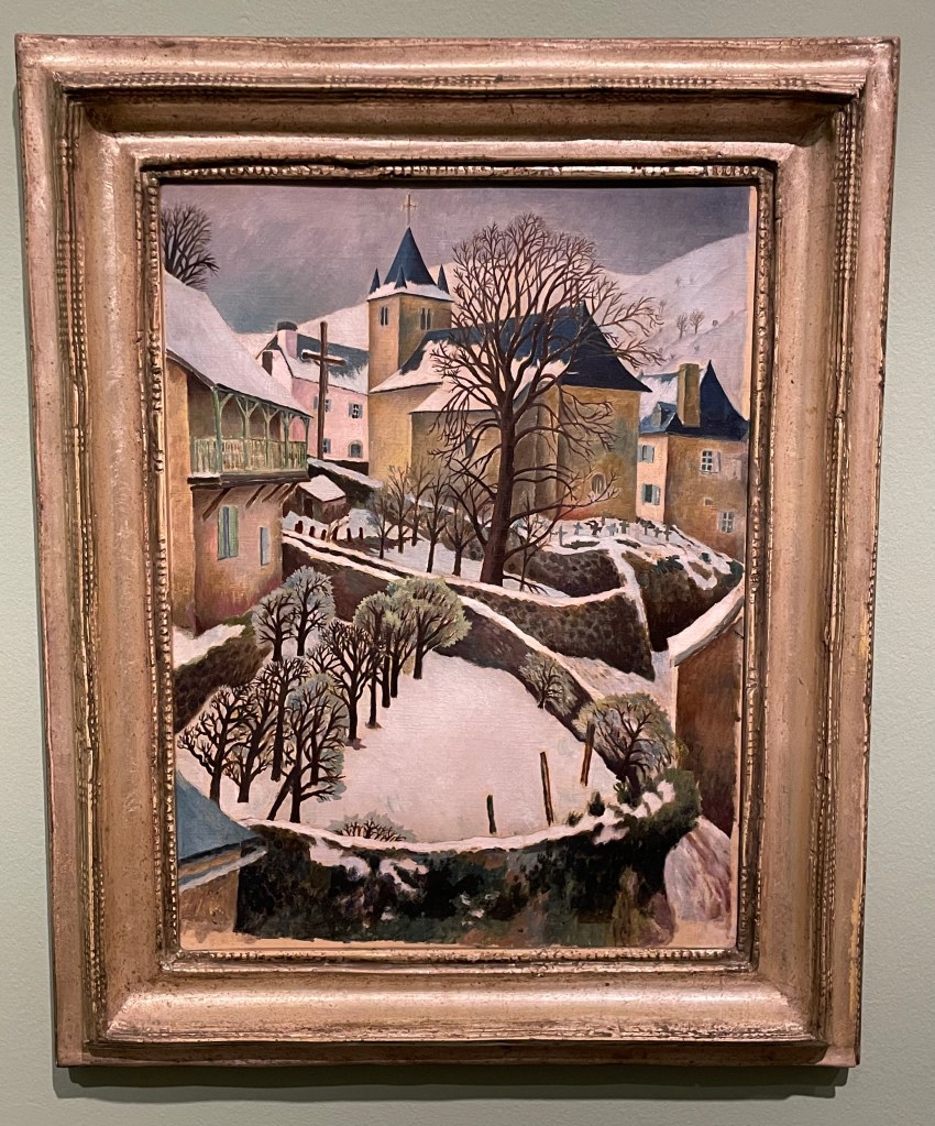
Larrau in the Snow, 1922
Perfect Christmas card material, I really like the simplicity of this painting; its muted colours and, in particular, the composition with its recurring curved shapes of the stone walls and the use of verticals in the posts and trees in the foreground, the large tree and the church with its spire punctuating the sky in the middle ground and the mountains in the background. The positioning of the trees leads the eye up through the painting in a zig zag pattern.

Farm at Watendlath, 1921
Again, I like the composition: the path leads across from left to right, up through the farmhouse along the rear stone wall to the large ominous trees, up to the huge hills in the background which seem to squeeze out the sky. The three areas of white – the figures in the foreground, the farmhouse (and what look like sheets on a washing line) in the middle ground and the clouds in the sky in the background – break up the large areas of green preventing them from becoming too overpowering, but leaving enough areas unbroken to give a sense of being overpowered: the tall trees and hills seem to be bearing down on the woman and child, creating a feeling of foreboding, and the stillness (if they are sheets on a line, they’re not moving at all) and claustrophobia created by the tiny sliver of sky adds to the mood.
It was suggested by the blurb accompanying this piece, that its unsettling atmosphere might have reflected the turmoil which Carrington was experiencing at the time: she had gone to Cumbria on holiday with Partridge and his friend, Gerald Brenan, and they had stayed at the farm. Whilst there, she began a relationship with Brenan.
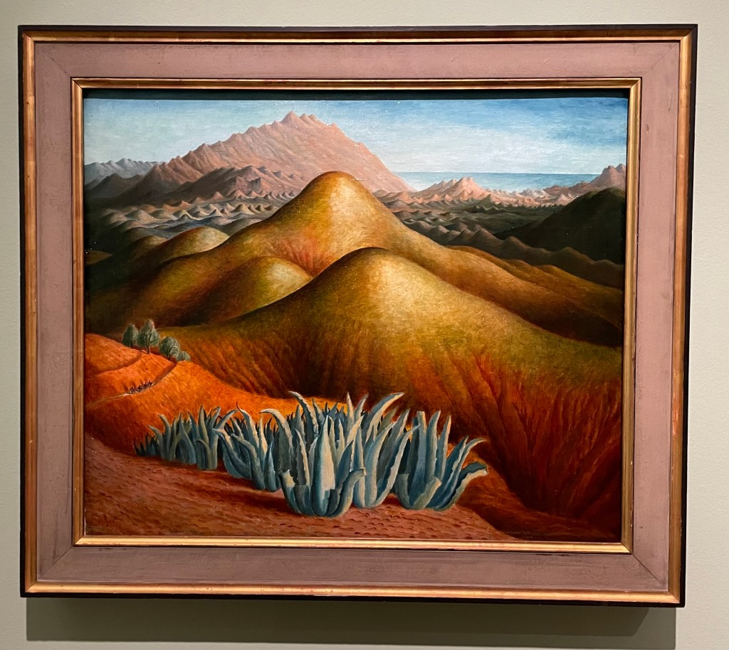
Spanish Landscape with Mountains, 1924
I was drawn to the surreal nature of this painting. Carrington made it from memory, after visiting Brenan in Andalusia, where he lived. According to the blurb, she built up the colour by layers upon layers of glazing on top of what was already a vibrant underpainting. She painted it on a cold day in March, which may have been a contributing factor to her use of colour and the sense of heat and aridity which she manages to create. There are menacing looking succulents in the foreground and a few token olive trees just behind, and these, together with the slight greenish tone to the area in from of the background mountain range, cleverly break up the large areas of warm reds and yellows which form the undulating hills in the middle ground. There is the lovely detail of the figures on horseback moving towards the viewer along the ridge on the left hand side. It has an otherworldly quality to it: apparently Carrington felt transported to another world when she visited Spain.

Lytton Strachey, 1916
“He was everything to me. He never expected me to be anything different to what I was.” This was how Carrington described Strachey, and it is apparent in this portrait of him which she painted towards the beginning of their relationship which was to last 16 years, and which survived numerous relationships on both sides. It shows Strachey deep in concentration reading a book which he is holding in his delicately painted hands, which Carrington has strangely elongated. Maybe his hands were her favourite feature, because she captures them in a detailed way, down to the highlights on his nails, even their white tips, particularly on his little finger. Or maybe she used them as a compositional device to create a dynamic and bold vertical marking the final vertical third of the painting. The image wouldn’t have the same impact if his hands were sized more realistically, and the book he is holding didn’t go off the top of the panel.
Carrington had a fascination for Victorian ‘treacle’ paintings and from 1923 began making her own which were called tinsel paintings. They weren’t very large and involved making a painting on the reverse of a piece of glass using foil from sweet wrappers and cigarette packets together with inks and oil paint. She sold them through Fortnum & Mason as a way to earn an income in the winter months to finance her serious art making. She also made them for friends: the ones below were made for Augustus John’s wife, Dorelia. Very few of the tinsel paintings survived, and one of them sold 4 years ago for £57,000.
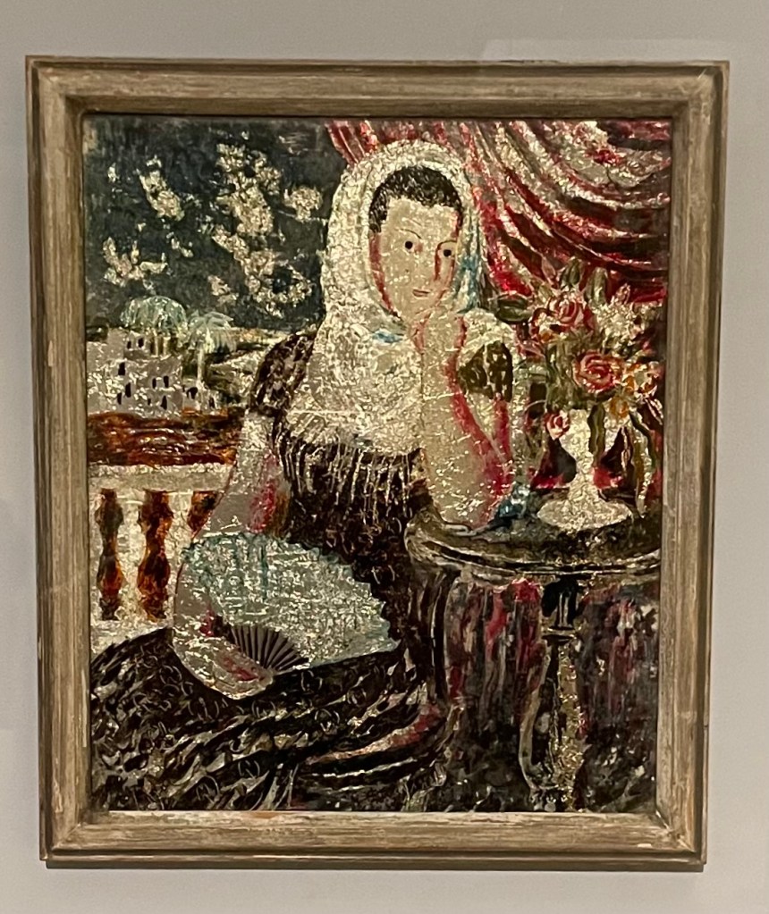
Spanish Woman
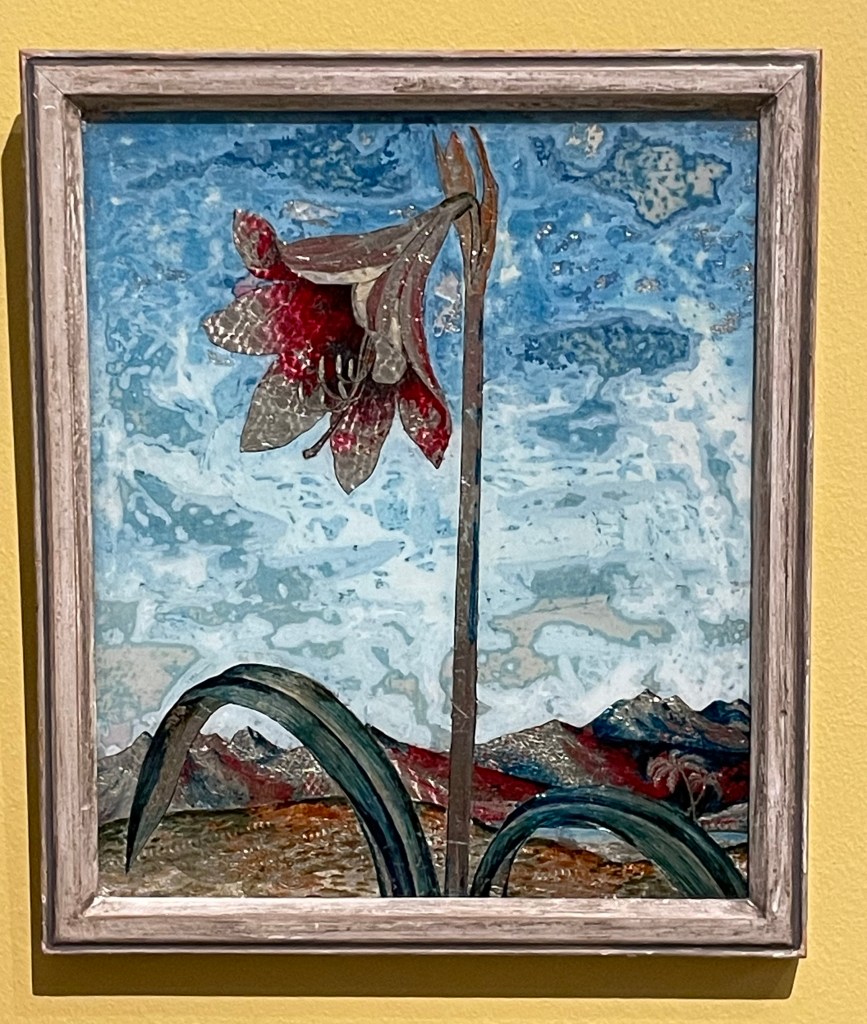
Lily
I’m strangely drawn to them as I’ve never seen anything like them before. They have a strange luminescent quality to them and I particularly like the textures in the sky in Lily – the combination of the resplendent lily in a barren landscape reminds me of Georgia O’Keefe.
Anyway, I’ve done some further research: Dora Carrington’s life was made the subject of a film in 1995 – ‘Carrington’ – starring Emma Thompson and some other notable actors. I watched it last night. Perhaps not surprisingly, it’s a film about her, based on a book about him. I’m not sure that it managed to truly capture the complexities of her life and certainly only touched on her relationships with men, and not women. It was a tearjerker.
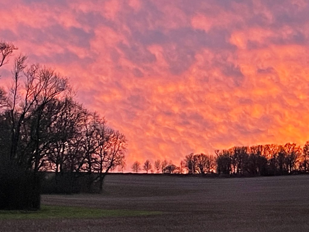
Whilst I was starting to write this post yesterday evening, I looked up and saw the most amazing sky through the kitchen window and had to go outside and take a photo of it. As usual, the image doesn’t really do it justice.