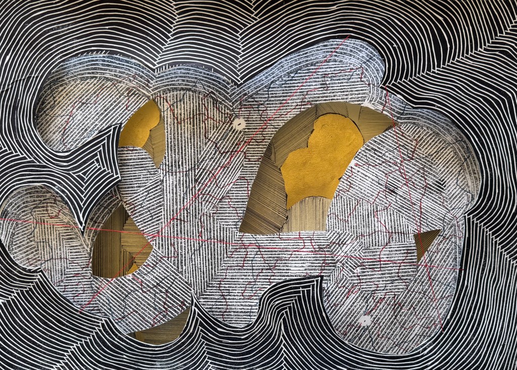
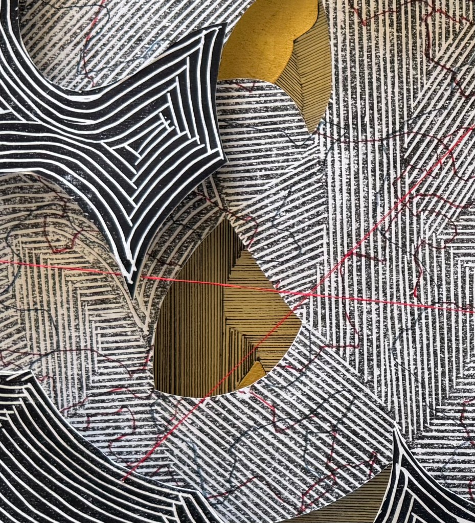
I quite like the idea of revelation, and layering seems to facilitate this.
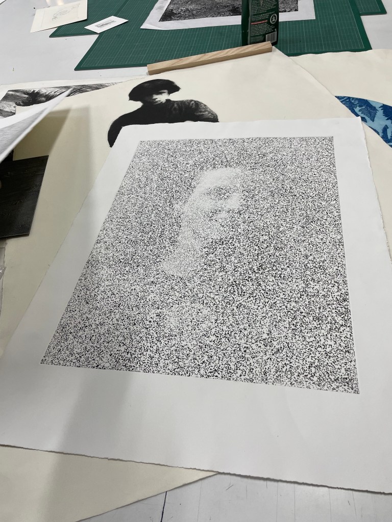
Drawing lines on the first print I made of the linocut – there must have been some loose bits because it left small circular areas of white which reminded me of places or points of interest on a map. I then cut out some areas and laid it on top of a section of the figures line drawing using some cut up old corks as makeshift spacers. I then stuck the print with the large white space onto some watercolour paper and cut out the centre. I sewed some threads across the centre – thicker embroidery silk would have been better but I had to make do with what I had to hand. I laid it on top, slightly off from the print below.
And I was right. And I wish that I had thought about doing this sooner.
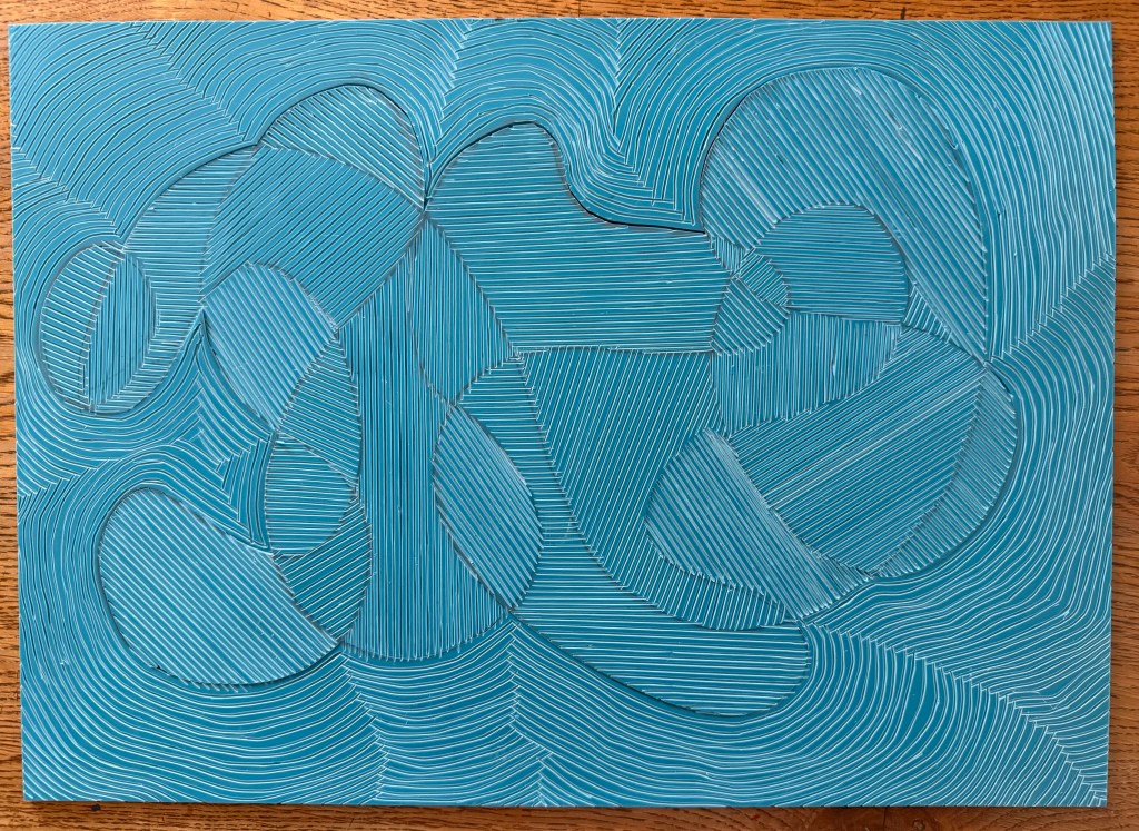
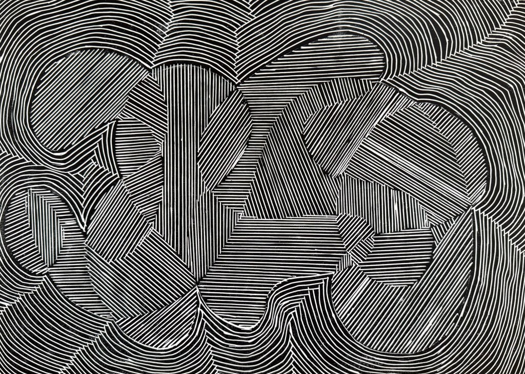
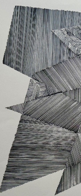
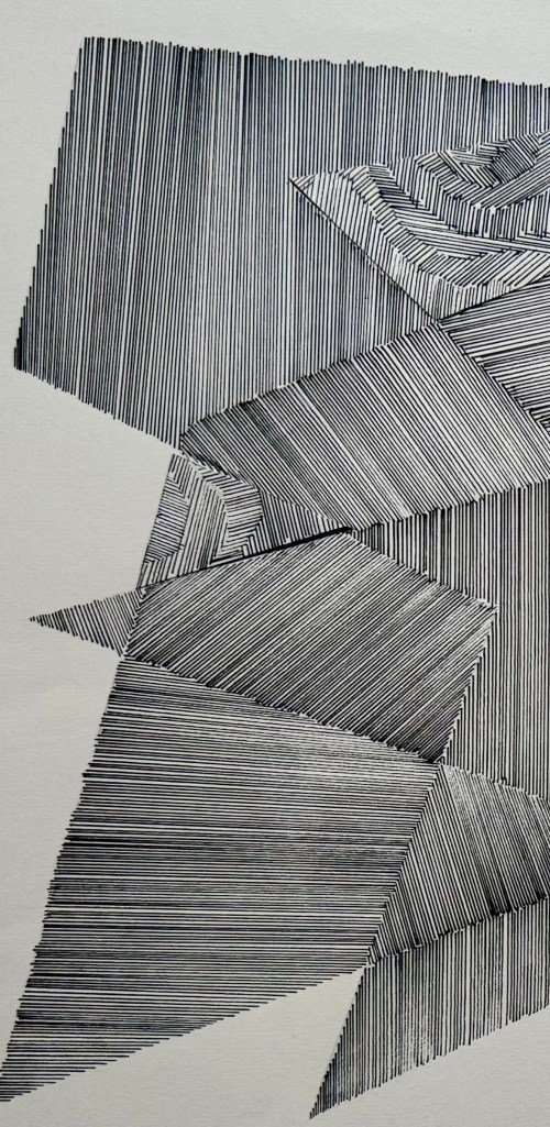
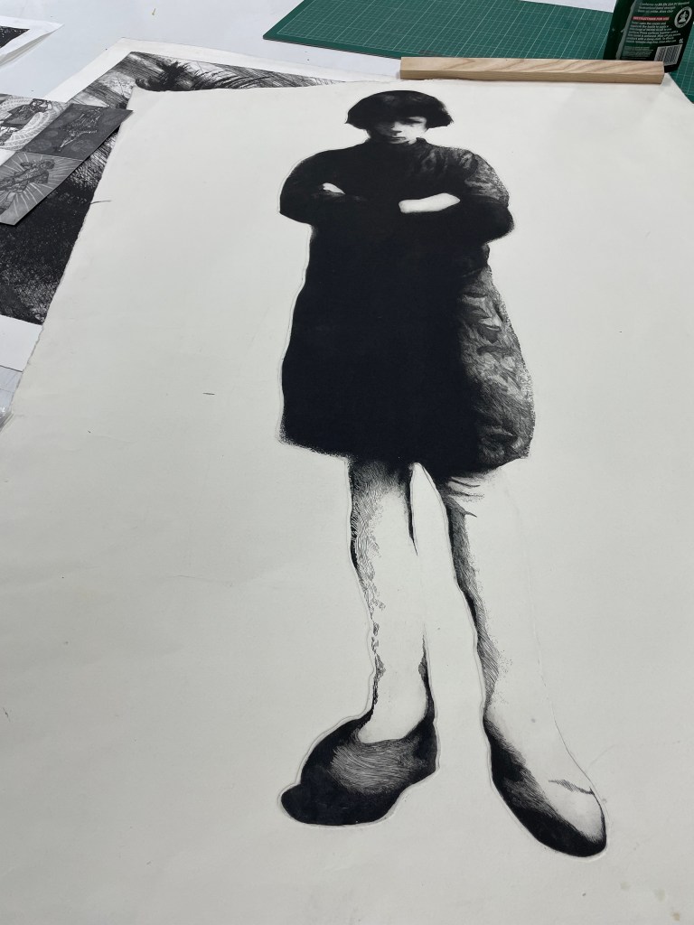
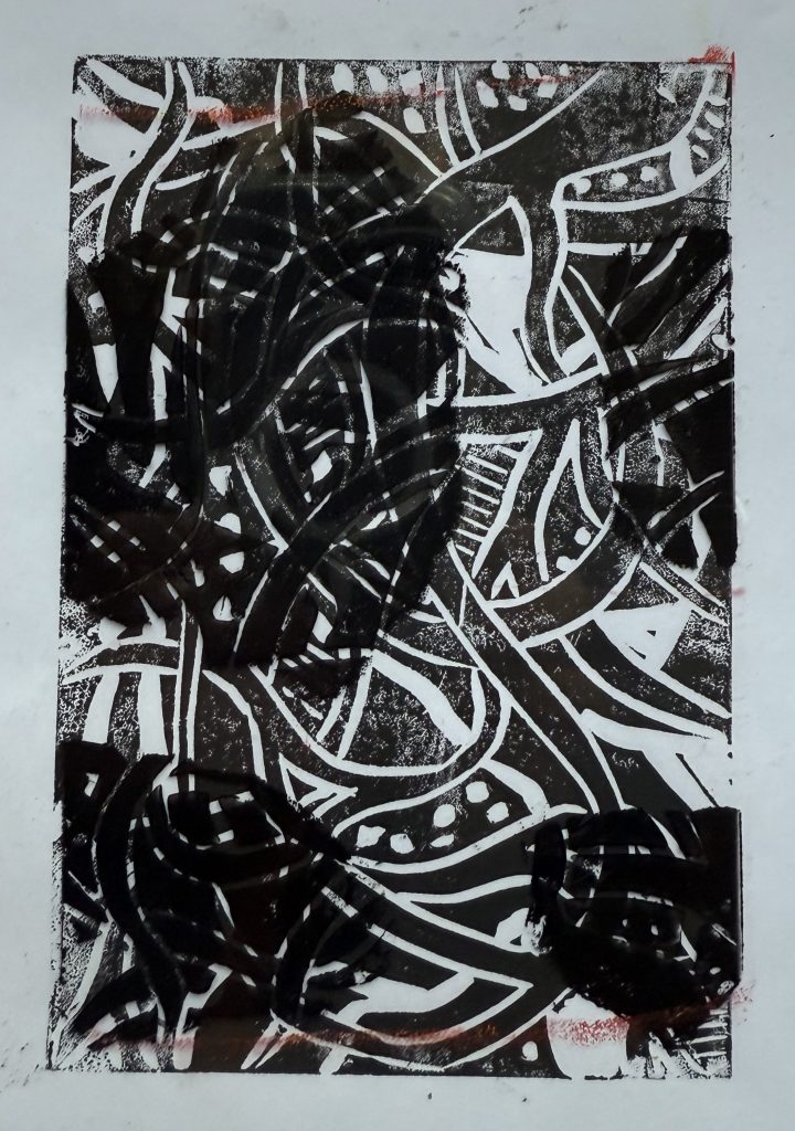
I dusted off my printing box and experimented with printing a line drawing. I used an A3 piece of soft cut Lino as I didn’t want to be shooting off all over the place, and have bits crumbling away. I used my smallest tool. The good thing about soft cut is that you can easily use a craft knife to cut out sections.
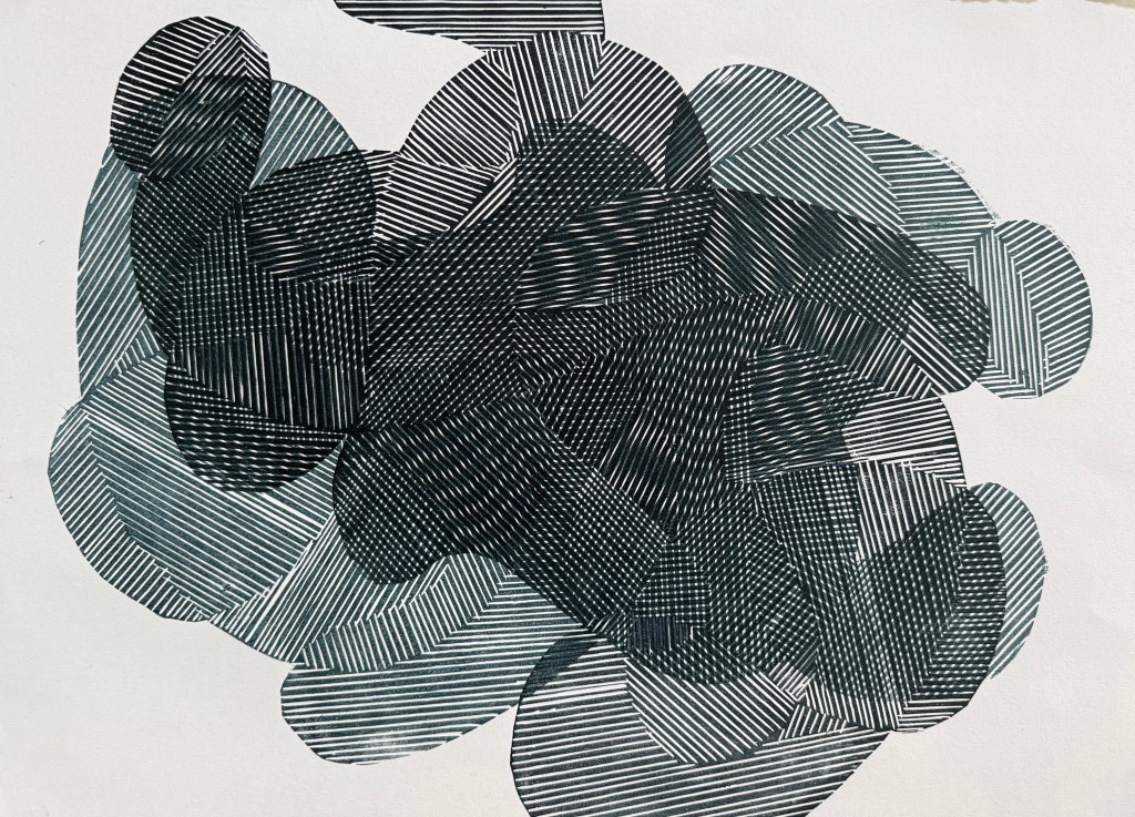
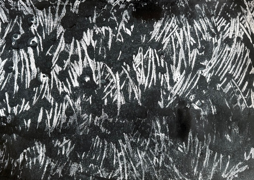
I started by tinting black with some blue, and printing the whole block:
I like.
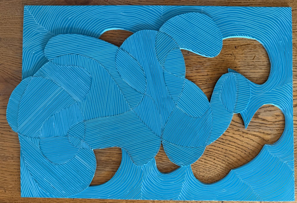
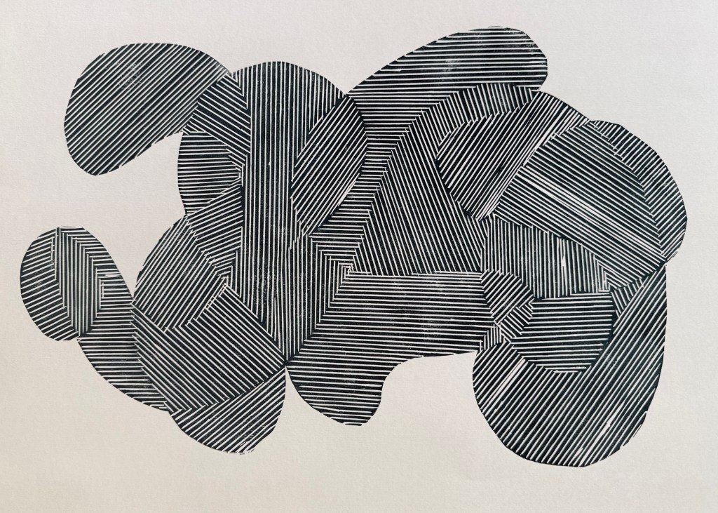
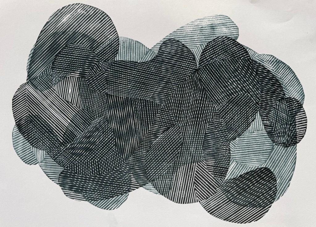
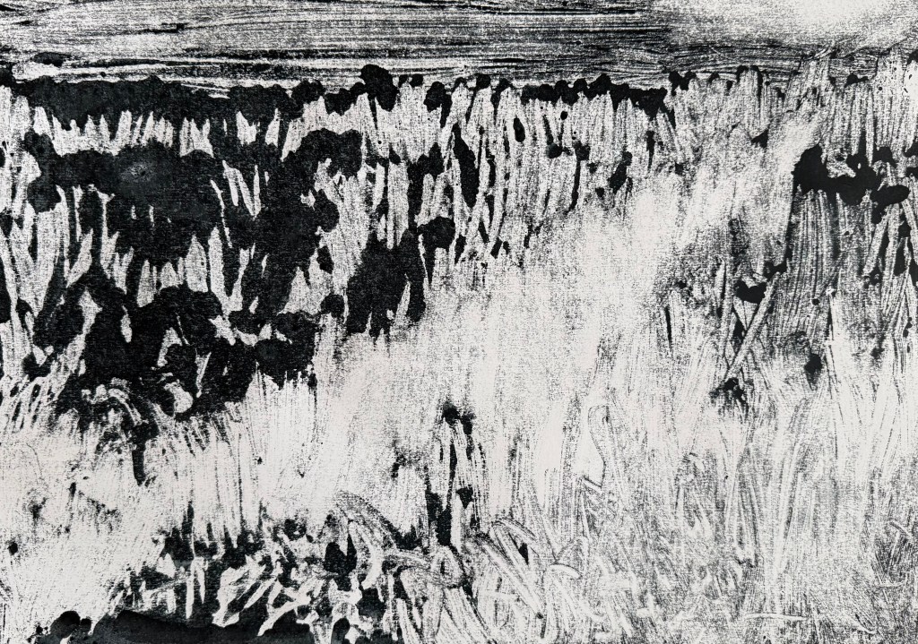
Then the two separate sections:
I also like. This way around, it reminds me of a figure, curled up, cowering, face protected by hands.
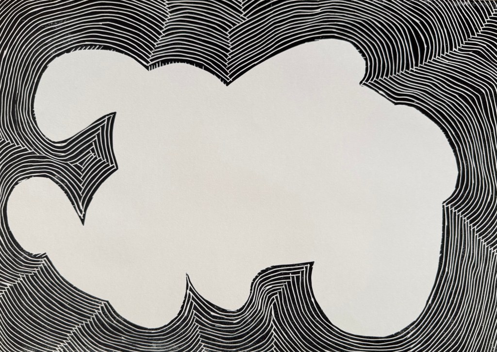
Then I added in some extender to make a lighter, more transparent colour:
Nice.
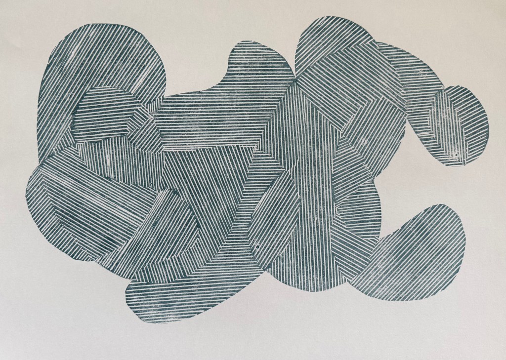
Printing on tracing paper:
Interesting. Possibilities.
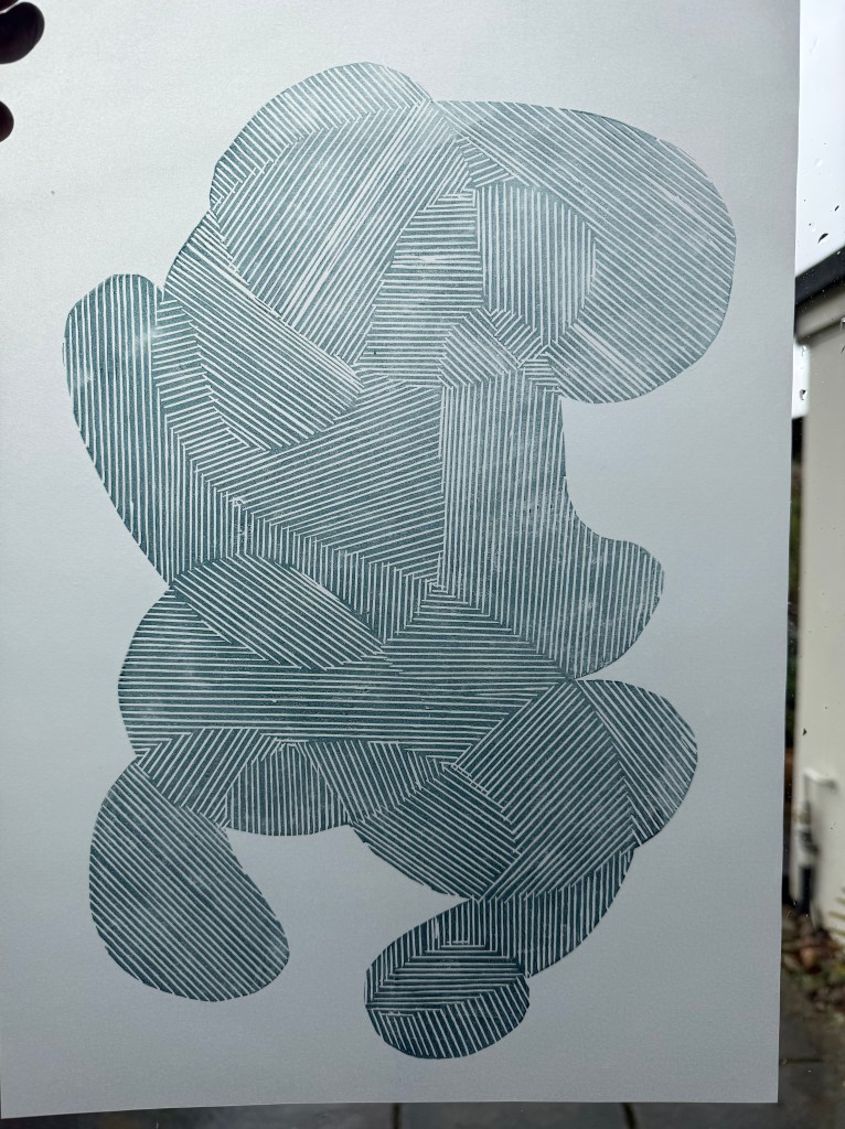
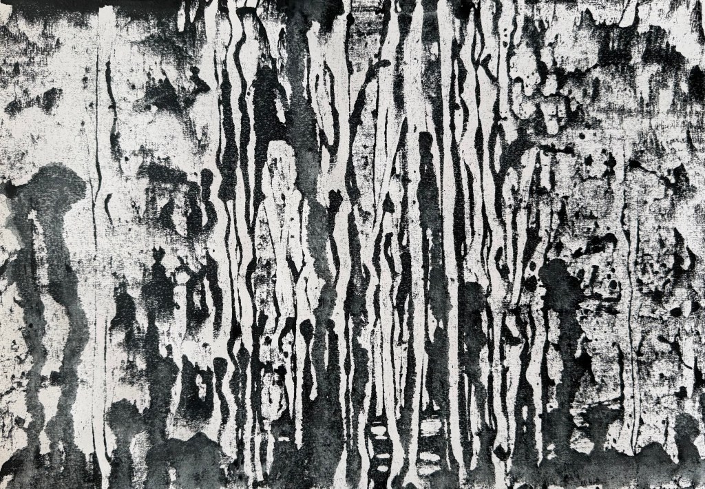
I then experimented with overprinting:
Absolutely love.
I’ve noticed that I’ve been using that word a lot more recently.
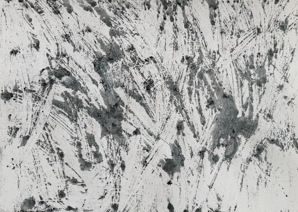
It’s fascinating that by overlapping the prints I’ve recreated some of the mark-making I was experimenting with using the Micron pens (Pushing Paper III) and also the strange effects created when I photographed the pen drawings. It was almost as if the camera couldn’t quite work out what was going on. For example, when the image is displayed on my phone normally it looks like the first image below. It is only when I zoom in, that I can see that the lines look as they do in the second image.
Anyway, I think that it was a very productive session and has given me lots to thinks about. I’ve decided that I’m warming to linocut. It used to bug me before, because it can be quite patchy in places (probably my ineptitude), but since using the fineliners to make line drawings, and noticing the texture created when the ink dried up a bit and the effect of mistakes, I’ve noticed that Lino has the same qualities. They both evidence the process of making which I’ve recently been embracing, rather than a perfect print.
I used up the leftover ink to make some mono prints. The inks are safe wash – they are oil-based but soluble in water. I like the effect of spraying the ink with water, and running the brayer over it. These could maybe form the basis of something else.
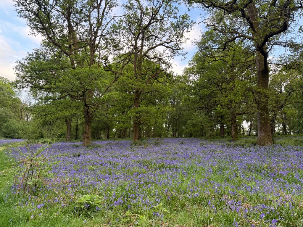
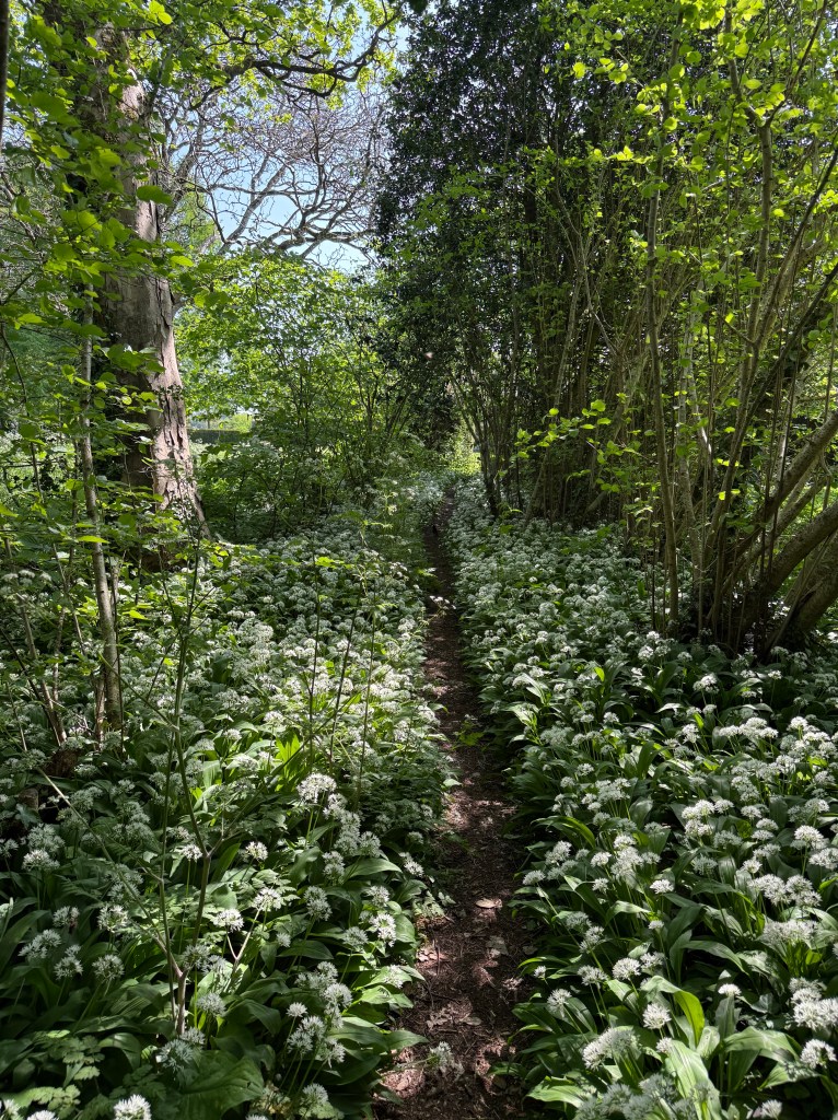
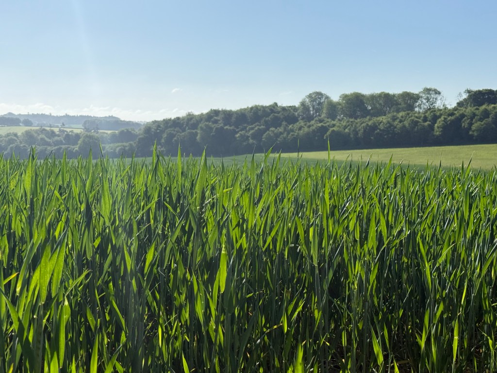
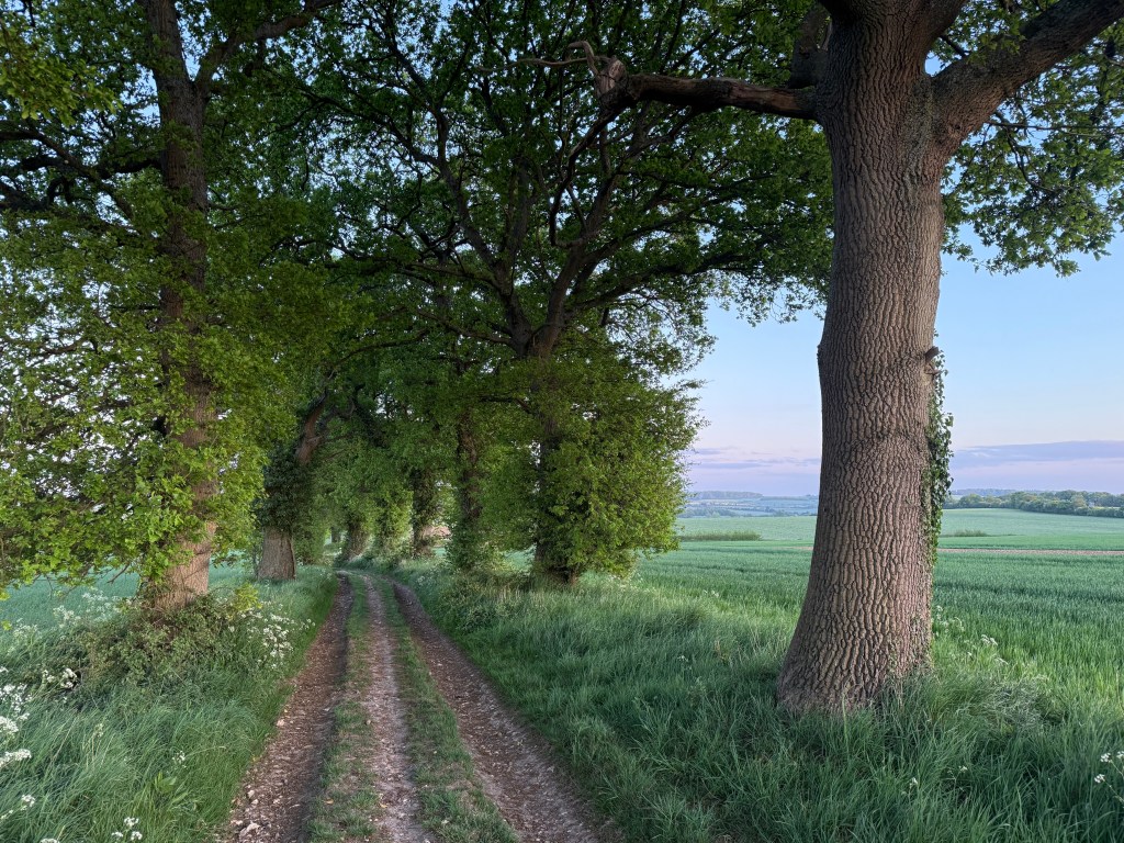
I love this time of year. The hedgerows are full of hawthorn blossom and clouds of cow parsley, there are blue carpets of bluebells in the woods, if a little threadbare by now, swathes of flowering wild garlic, crops growing in the fields and trees in full leaf.
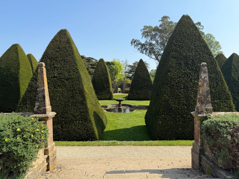
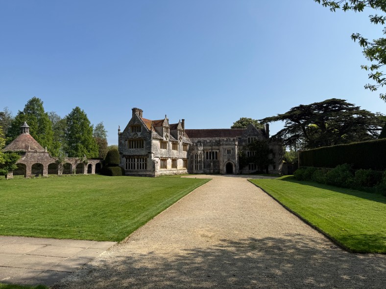
I took my daughter back to uni in Exeter a week or so ago: a lovely drive down the A303 past Stonehenge, under the mystical big skies of Wiltshire and the rambling green fields of Somerset and Devon. On the way back I took the alternate route through Dorset along the Jurassic Coast and stopped off at Athelhampton House, a Tudor manor house I haven’t visited for a number of years with a very strong connection to Thomas Hardy. I didn’t know that Hardy was an architect before he became a writer and that he had worked on the house with his father, or even that he had lived into the early part of the 20th century. He seems to belong to a different time.
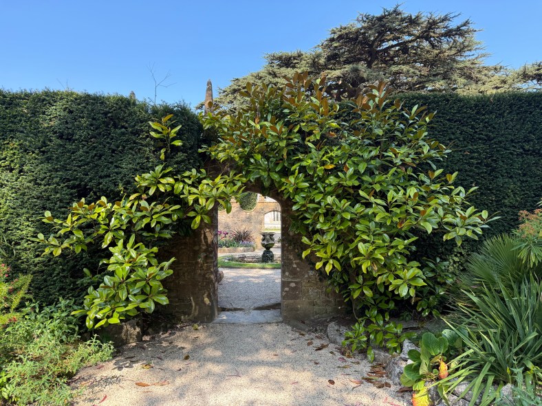
The gardens are wonderful – a house with many rooms (this seems to be a recurring theme recently).
Inside, apart from some wonderfully old glass windows which distorted the view outside,
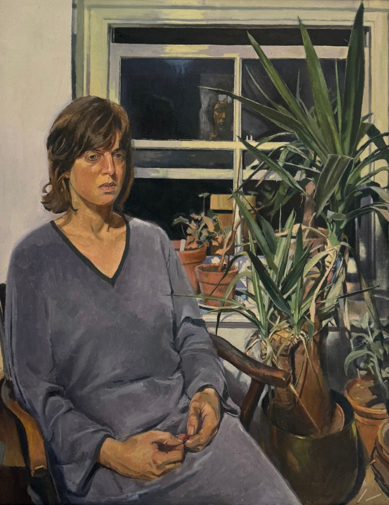
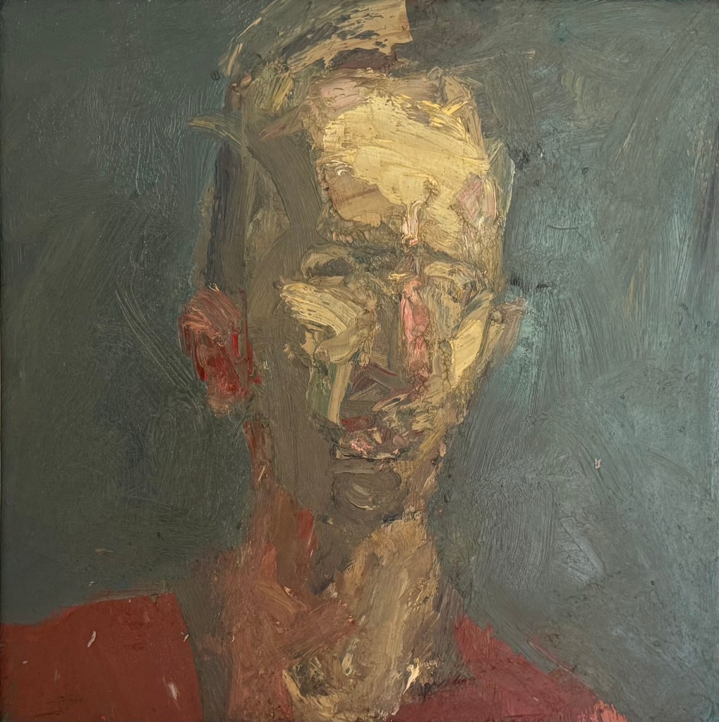
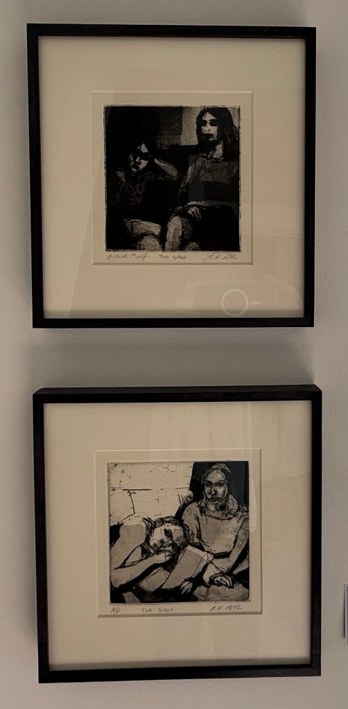
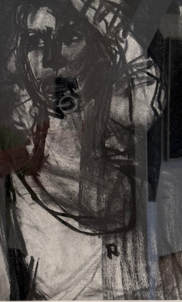
was an exhibition of work by Arthur Neal, a painter and printmaker practising since the 1970s. He appears to vacillate between the figurative and the abstract. It would have been difficult to guess that all of the works on display were made by the same artist. I was particularly drawn to his small abstract oil paintings, his work in charcoal and his more recent prints.
The exhibition made me think. I would still like to explore charcoal and drypoint, and after that I think I’ll be done. It will be time to reflect.
The small oil paintings reminded me of a stack of small canvas boards we’ve had for ages, as yet unused. I can’t recall why we got them – I don’t generally do small. I think my husband bought them because they fit in a small pochard box he is going to use for all those landscapes sketches he’s going to paint, once he has wiped off all the dust. It wouldn’t take more than a few brush strokes to cover them. No excuse really, not to do something every day.
I have a fascination with Jackson’s Inside the sketchbook series – of looking at the sketchbooks of artists, to see how they work and think. Sketchbooks are personal spaces and it’s exciting to get to look inside, although I’m in no doubt that they choose to talk about their best ones. A recent one which springs to mind is Unga from Broken Fingaz. He talks about how working small means that you have to let go of detail. I think I’ll give it a go.
Apparently, Guns N’ Roses didn’t know how to end their most successful song, Sweet Child O Mine. Whilst in the recording studio, Axl Rose reputedly started singing, ‘Where do we go? Where do we go now?’ And the rest is history and, in my humble opinion, probably the best bit of the song.
So a moment of inspired creativity can come from a total lack of direction and confusion. Here’s hoping…
I’m resolved to wallowing in the myre of confusion. There’s not much point in fighting it; I can’t understand everything. The latest book we read in my book club was Michael Ondaatje’s ComingThrough Slaughter. I’ve never read a book like it. It deals with the mental decline and eventual death of the New Orleans cornet player, Buddy Bolden, who is considered to be the father of jazz. I didn’t understand what was going on half of the time, who was talking, and to whom. It jumped around all over the place. There aren’t any chapters as such, just three parts, no speech marks and paragraphs end at odd points on the page and continue on the next – visually it is striking. It is a book to be read, not to be listened to; its format echoes the improvisation and syncopation of jazz music. Once I had decided that perhaps I wasn’t supposed to understand it and just went along with it, reading each phrase and word in its own right, looking at the patterns, and the sounds of the words, a bit like reading a poem (after all, Ondaatje is a poet), I got a lot more out of it.
So this is how I intend to move forward. And it’s just as well, because try as I might to keep up with the constant flow of information being offered up by Paul in the Low Res etching workshop, I just couldn’t. I started taking notes, but just gave up in the end and surrendered myself up to not understanding anything and just enjoying being along for the ride.
It kicked off with Paul showing us what we could have gone home with, had we the requisite skills. There were some impressive prints which demonstrated the versatility of printmaking which I hadn’t really fully appreciated until now.
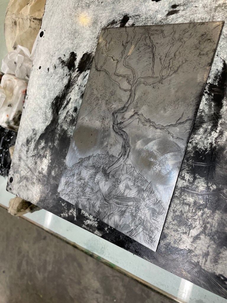
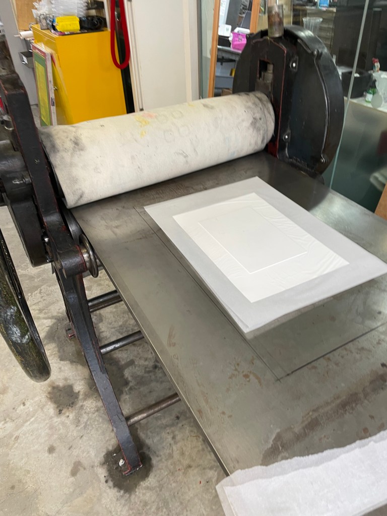
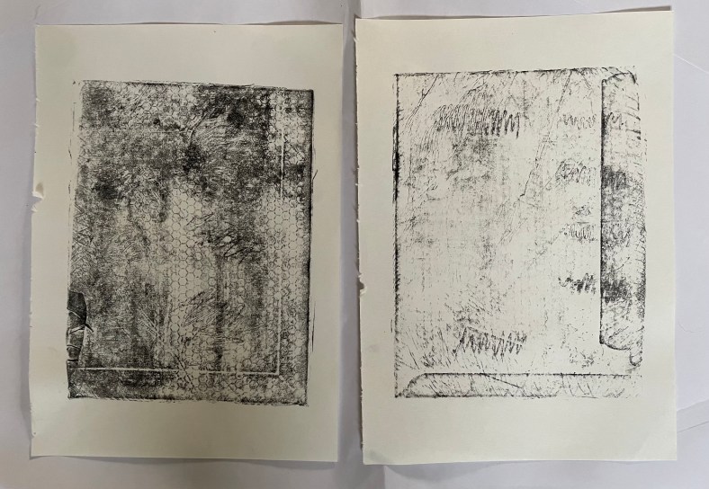
We started off by putting down a hard ground on a zinc plate and then we had about 20 minutes to create the image using a selection of Paul’s tools. What to do? I had a quick look on my phone and chose Schiele’s Small Tree in Late Autumn.
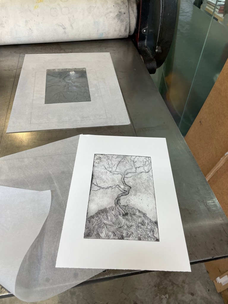
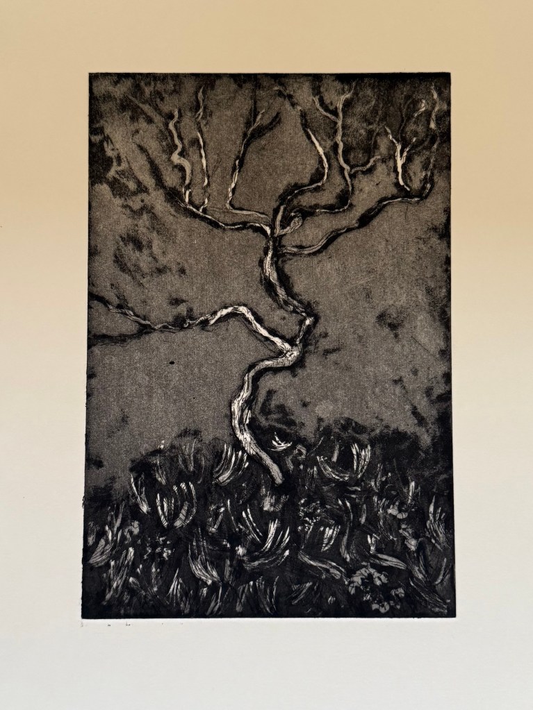
This is the plate once the hard ground had been removed and it had been cleaned followed by the printed images, using aquatint on the last one.
How do I feel about them? Pretty good bearing in mind I only had 20 minutes to create the plate and I had very little idea what I was supposed to be doing most of the time. Will I do it again? I don’t know – it’s very process driven, and whilst I love the excitement and anticipation of the big reveal, I’m more of an instant gratification kind of person. That’s not to say that I’ve ruled out etching altogether, it’s just that I would need a greater understanding of the different and quite complicated steps involved to do it any justice, and that’s just not compatible with the ‘new me’ at the moment.
I’ve decided that I’m probably learning far more about myself by simply being in this process than I am by looking back on my life.
I need to retrain my brain. My legal training has made me focus on detail, anticipate every possible eventuality, dot every ‘i’ and cross every ‘t’ all within a rigid framework of rules and regulations. That way of thinking served its purpose then, but it now stultifies creativity.
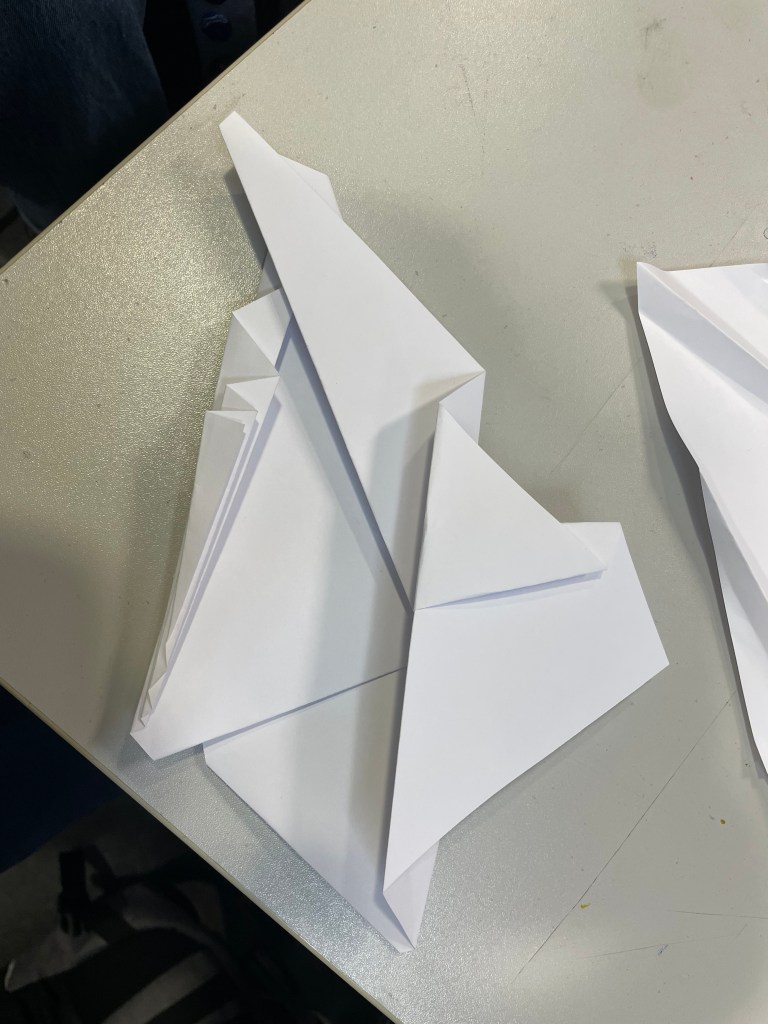
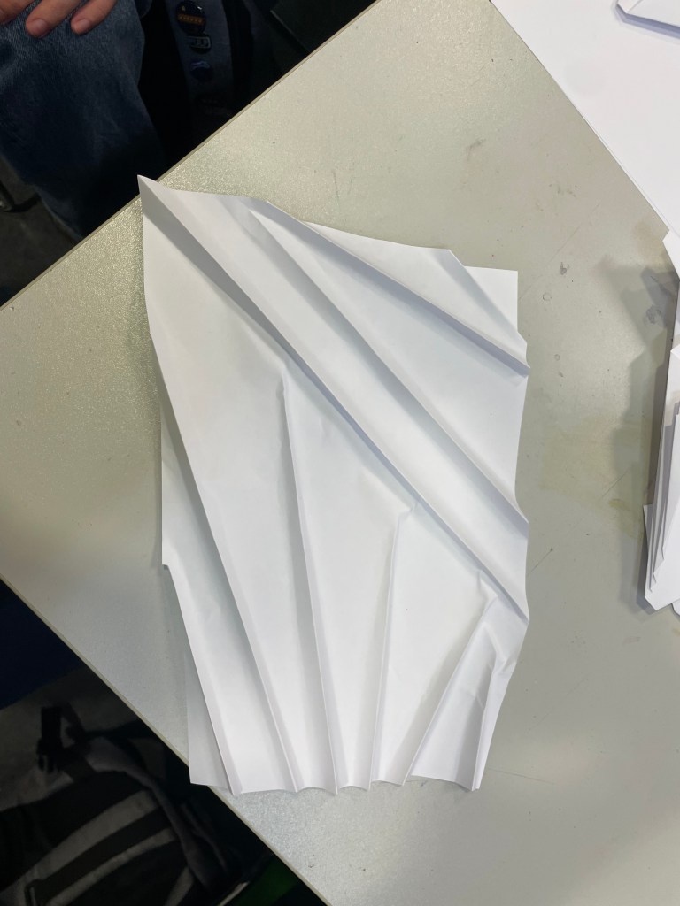
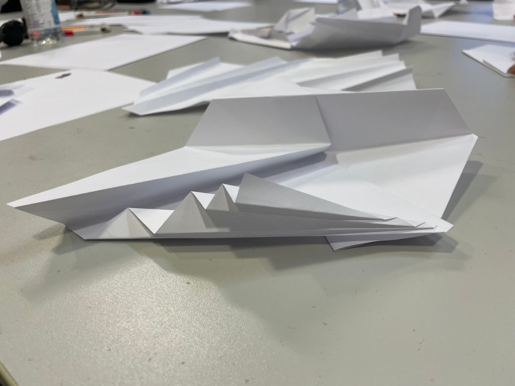
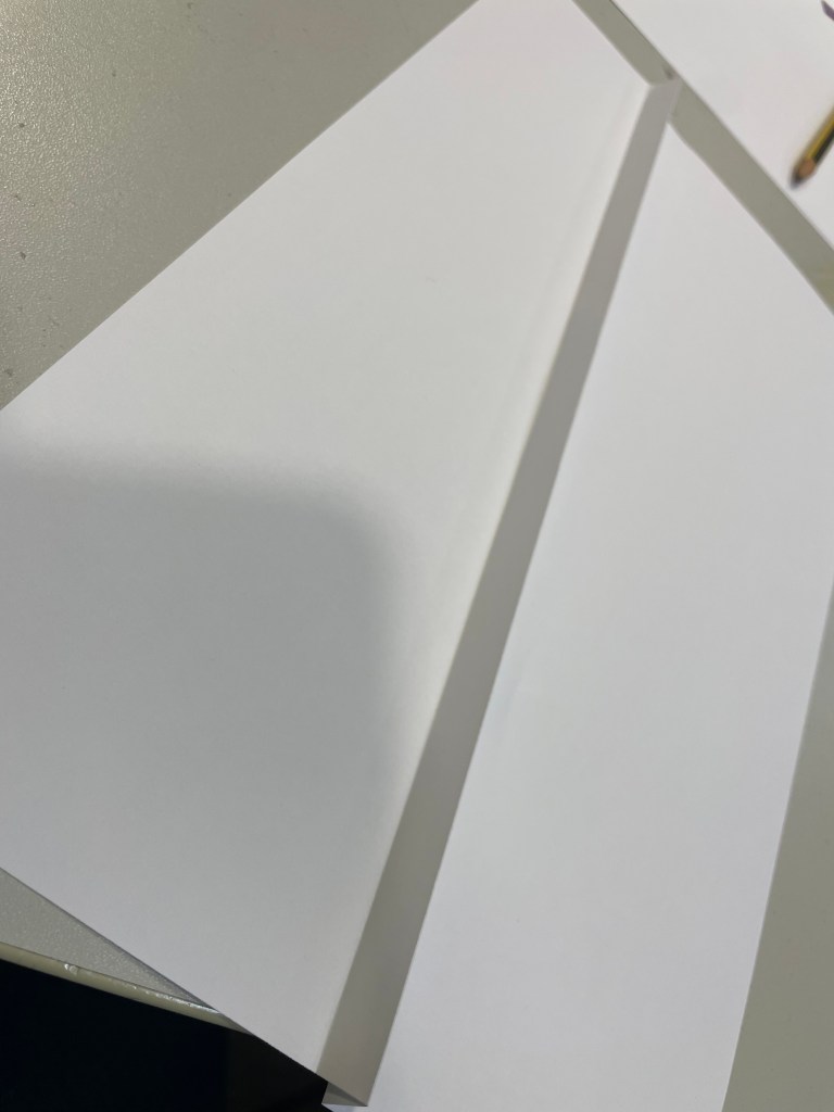
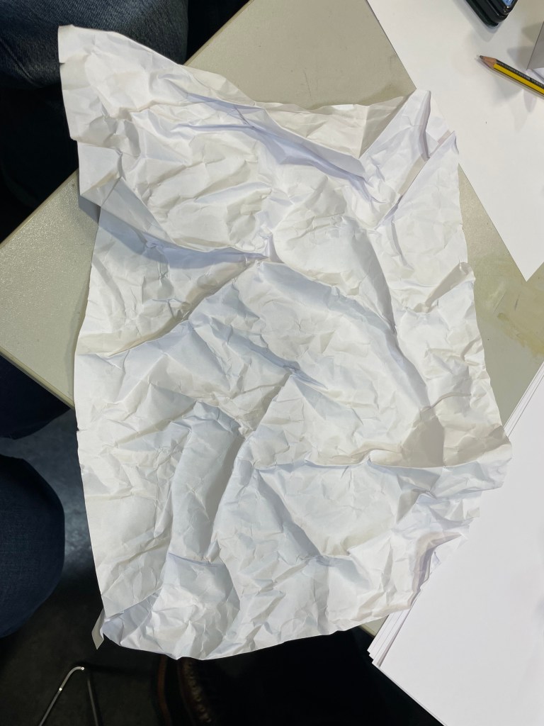
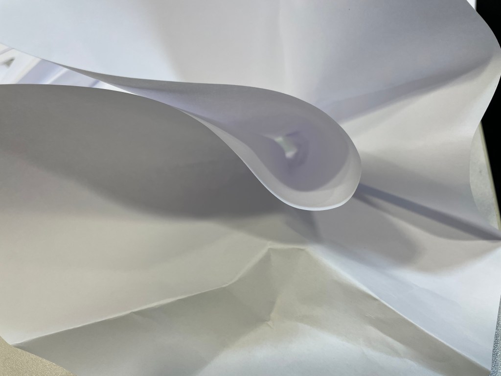
When I’m in a scenario which is unfamiliar, I like to know the parameters within which I’m expected to navigate; quite often I feel discombobulated when things don’t go the way I am expecting, the paper workshop with Christian Azolan being a case in point. We were instructed to fold the paper. To my pedantic mind, folding involves a deliberate act of bending something over on itself to create a clearly defined edge. It doesn’t include scrunching. But once I had overcome my initial confusion and accepted this unexpected variation of the parameters, I enjoyed myself.
I definitely preferred using the blank paper – I don’t know what brand it was, but it felt really good. It led me to confess my fetish for pristine white paper to some of my fellow students. I think it stems from being at primary school when the teacher would write my name on the front of a new exercise book with a marker pen and I would go back to my desk and give it a good sniff. I now appear to associate blank paper with a solvent high. I don’t think that my school ever had a pupil who was so keen to man the stationery cupboard at break time. In fact, I used to get palpitations and a bit of a sweat on just walking into WH Smith (R.I.P).
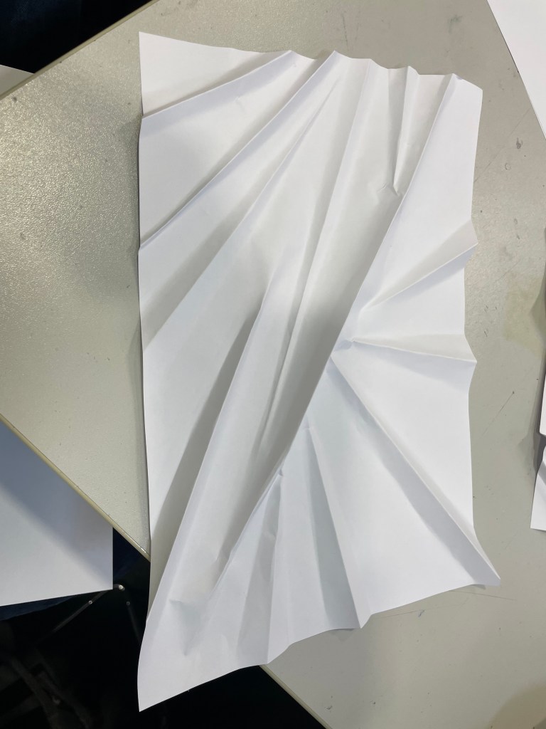
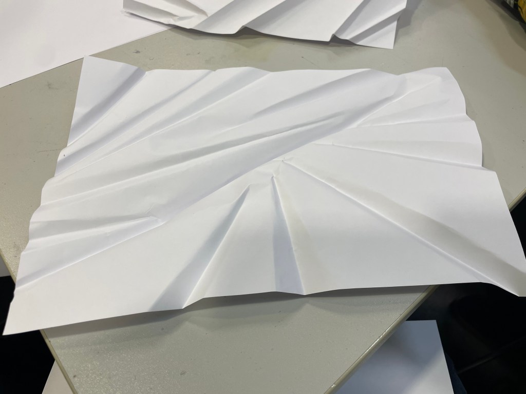
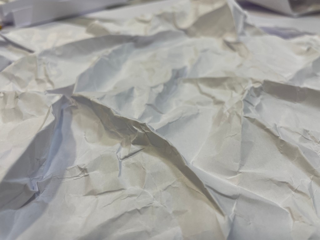
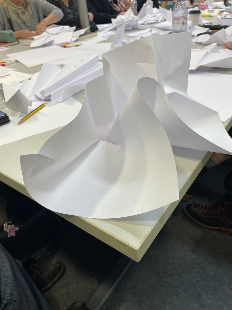
Working with the blank paper seemed to allow more freedom and I liked that the results took on a sculptural quality. The effect of the folding on the reverse of the paper was equally, if not more, interesting at times than the right side; areas which were peaks on one side became troughs on the other and vice versa.
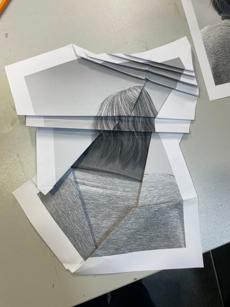
I felt inhibited using the print of the back of my head; I became too concerned with the resultant image which seemed to impose restrictions on how I folded, so maybe I like clear parameters, but not too many of them? Also, the effect is less sculptural than when using the blank paper; the areas of shadow are less apparent and the focus shifts to the distortion and concealment of parts of the image rather than the creation of form.
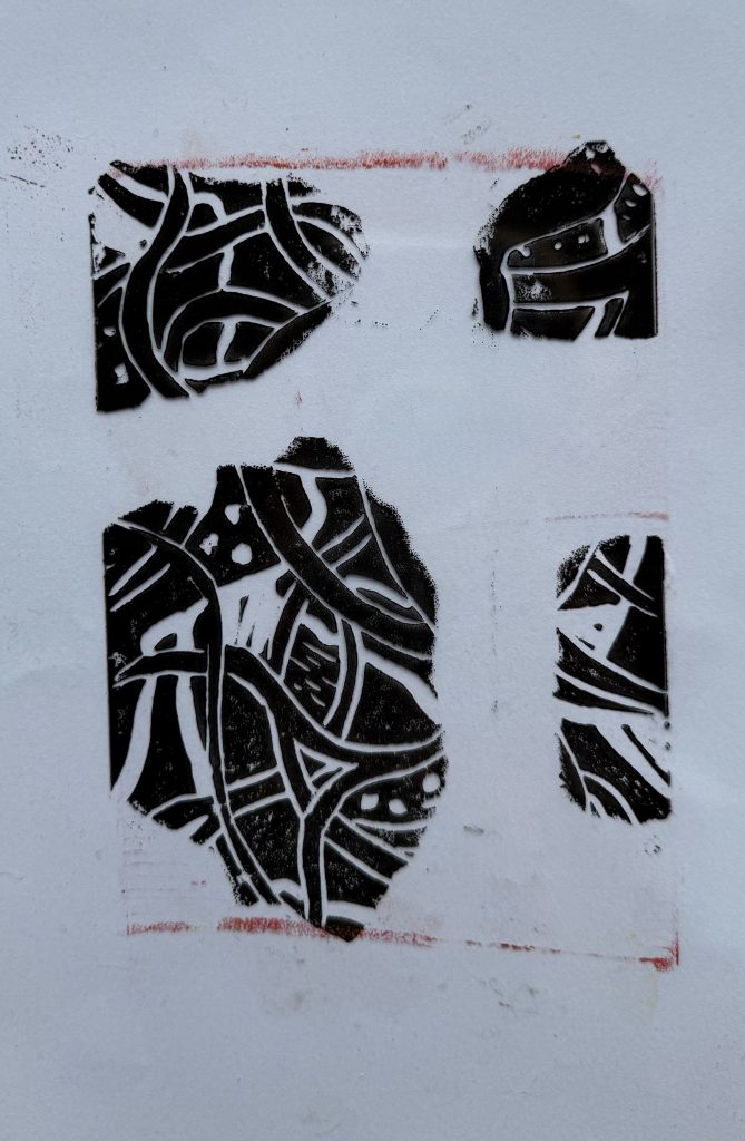
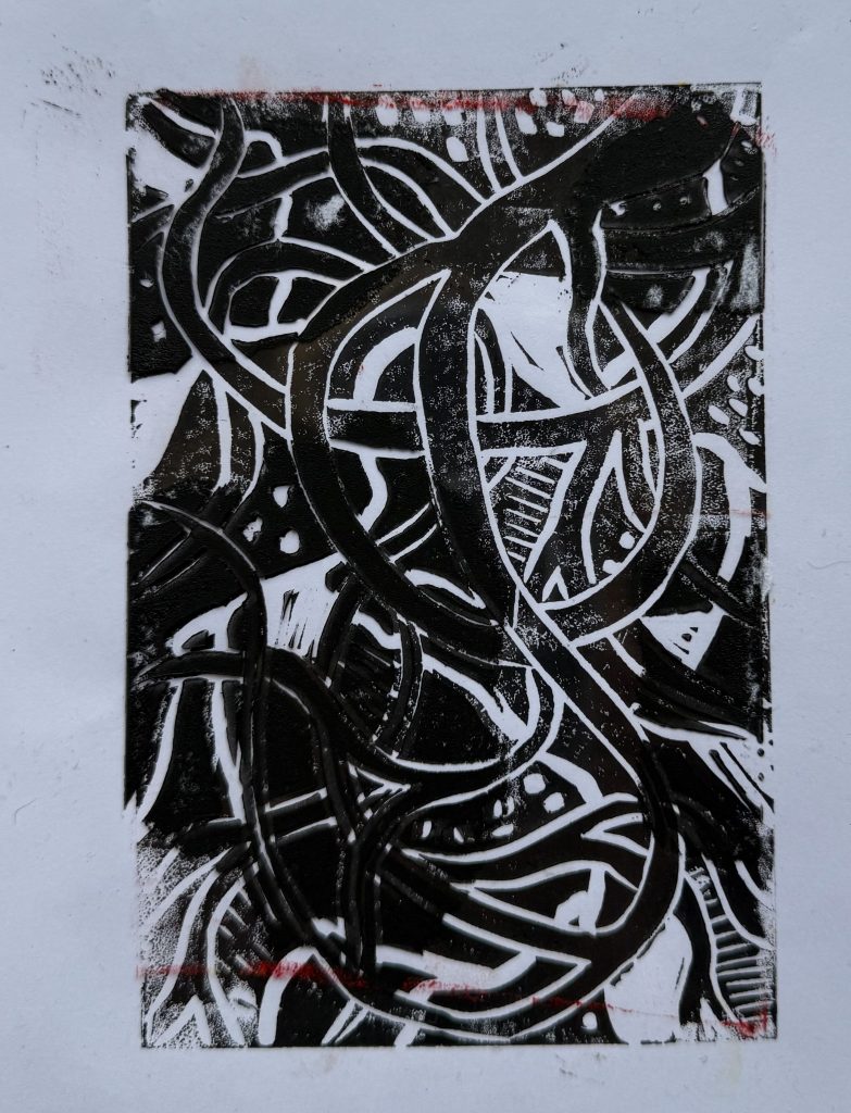
We then went on to do some linocutting – it seemed a bit incongruous with the folding activity, but nevertheless we all launched into it with equal enthusiasm.
I prepared two linocuts; one inspired by tree roots and the other a reduction linocut of an abstract shape – I printed it using yellow ink first, then cut away more lino and printed using red ink.
I also printed the tree roots image on a transparency, having torn up bits of paper to create a random mask. It is interesting to see the effect of overlaying it with the two prints; how it creates a sense of discord on the prints where it’s not in sync with the image below, and how it creates areas of intensity on the print over which it lines up.
As I was taking my lino into the next door room to print it, Christian heard me reminding myself as to what I was planning to do. Sorry, are you talking to me? No, just myself. Doesn’t everyone do that? Yes, of course. When I went back in to print my second lino, I asked him how long we had left. Sorry, are you talking to me?…
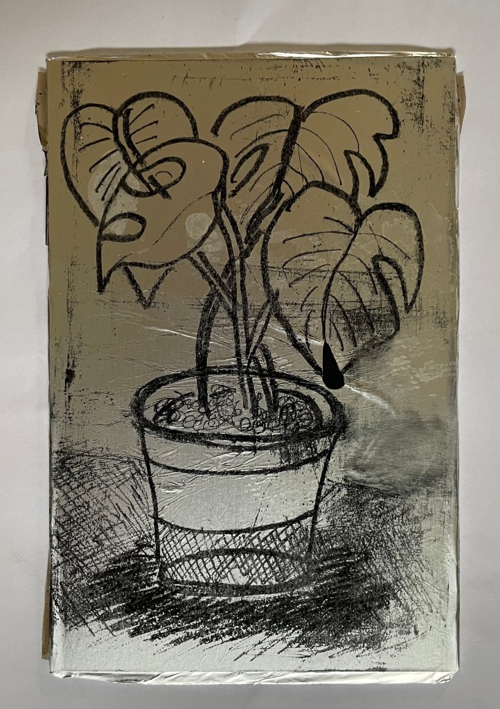
I had some free time yesterday, so I decided to try out kitchen lithography using some aluminium foil and cola.
This is the first time I’ve tried it – I’ve been interested in doing it since I came across a Canadian artist who uses it in her work, in addition to other printing processes, Valerie Syposz. Her work primarily deals with self-perception and existence.
’Treasure’ 2021’Shelter’ 2022‘Embers’ 2023
I like the surreal quality of her work, and her subject matter is relevant to what I’m exploring.
I have to be honest and say that it didn’t really go to plan. First of all, I discovered that the foil I have in my kitchen drawer has a honeycomb pattern embossed on it, and then I forgot to use the dull rather than the shiny side of the foil. I made various marks using different pencils, pens, markers, graphite sticks and pastels, but I was doomed to failure. Not wanting to go out into the cold to my shed to find some plexiglass sheets to wrap the foil around, I had used an Amazon envelope which I found in the recycling bin, which turns out had some raised edges on it. But, hey, it’s just an experiment. I also didn’t apply enough water to the plate which meant that the ink adhered to areas it shouldn’t have.
Once I had realised my mistakes I gave it another go. I used a small plexiglass sheet this time, and found some other foil which had a smooth surface. I made a quick, not so good, drawing of the plant in front of me. I used a combination of a chinagraph pencil, basic oil pastel, and a 6B graphite pencil. I did try using a biro, but it ripped a hole in the foil – this was probably because the foil wasn’t very strong. I then poured cola over the top of the plate, rinsed it off, and then rubbed the image away using vegetable oil. Once the plate was dampened with water, I rolled on the ink, re-applying water using a sponge between each ink application. The idea is that the cola contains gum arabic and phosphoric acid which makes the foil which hasn’t been drawn on, hygroscopic. I then used a bamboo baren to transfer the image to a sheet of Hosho paper.
They’re not great, but I’m just happy that I managed to get a defined image at all, bearing in mind my first attempt was such a complete Horlicks.
It felt good trying something new, and what made it particularly enjoyable was the fact that it could be done at home with easily accessible tools and supplies. I will definitely explore it further perhaps after doing some further research so that I can appreciate its full potential. There is a lot of scope for experimentation with different printmakers having different opinions as to the best methodology to adopt: some lightly sand the foil before drawing on it, others use cornflour and maple syrup on the plate; some don’t use a support and just use the foil as a sheet. Maybe the brand of cola has a bearing on whether the process is successful: perhaps I’ll need to have a Pepsi challenge.