Having been distracted momentarily by my line drawing phase, I’m experiencing delayed January blues. When is it going to stop raining? It’s really difficult to get enthusiastic about much when it’s constantly dark and raining outside. Opportunities to go out for a good walk are limited, although Otto, the dog, still has to have his walks but they’re generally quite quick because, likewise, he doesn’t like the rain, and won’t go in puddles.
Nevertheless, I’m keen to keep up my recent momentum in making. One pressing concern is next week’s looming deadline for the Royal Academy’s Summer Exhibition. Somehow, I managed to apply for two entries this year – I was intending to apply for my husband to encourage him to pick up a paintbrush again, but clearly I wasn’t wearing my thinking head that day. So I’m now setting myself for a double rejection, but it’s happened so many times now, I’m feeling quite immune. As always, there is a theme but I’m not even going to bother thinking about it this year, although I do note that they are encouraging students to enter – maybe that will improve my chances!
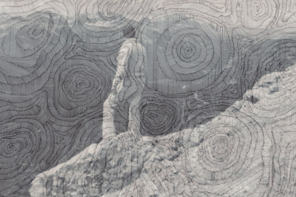
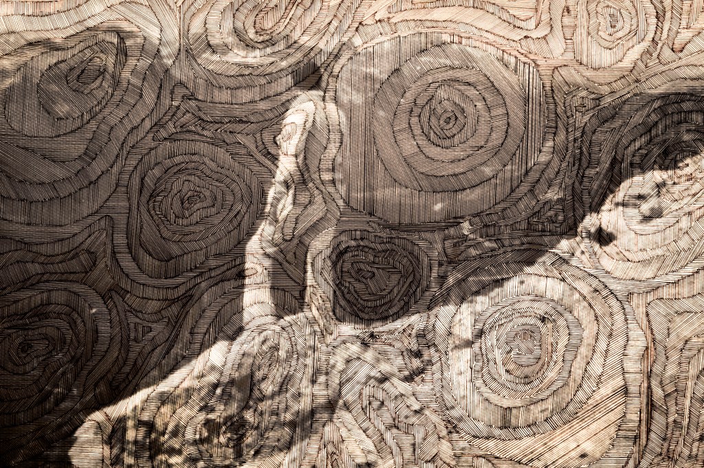
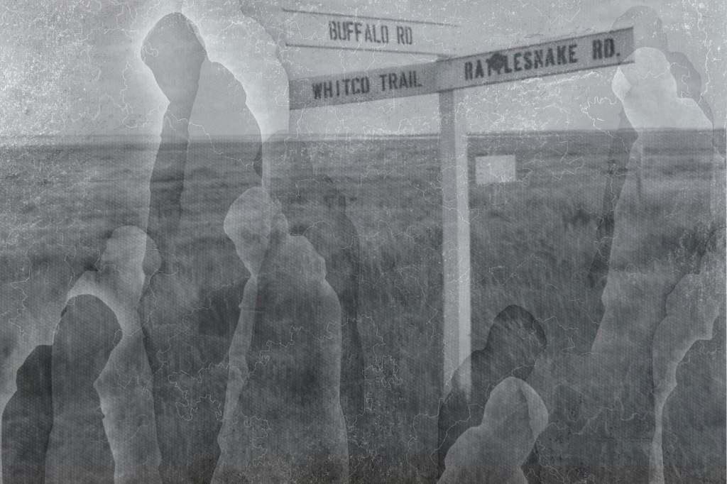
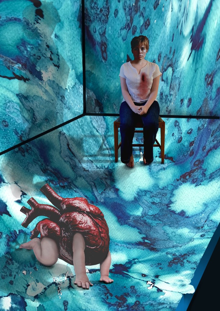
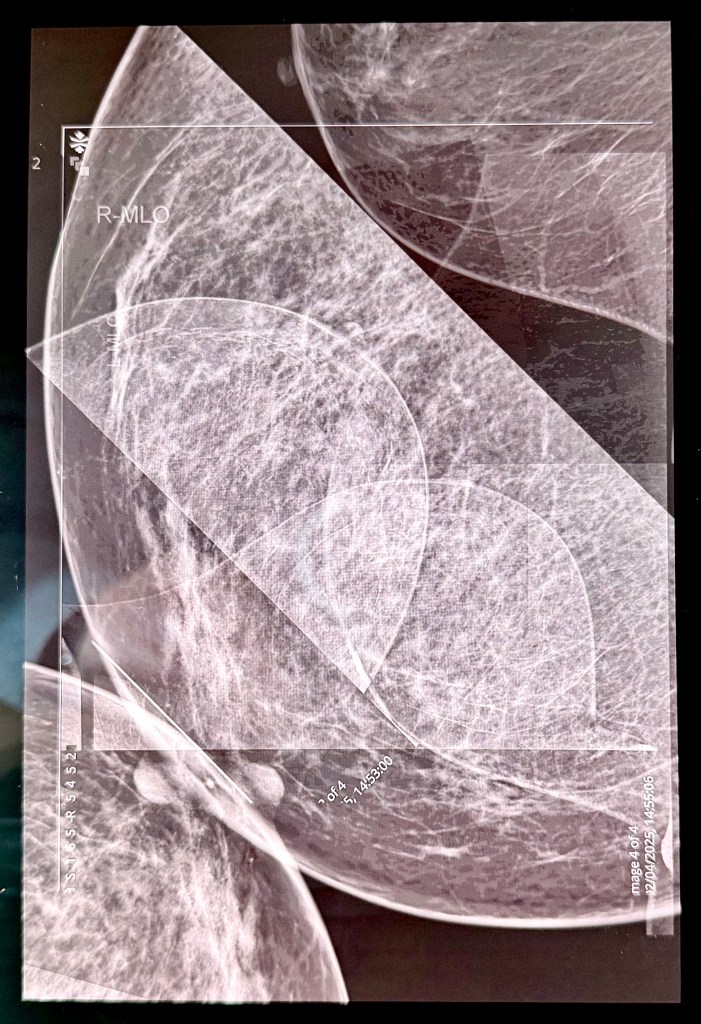
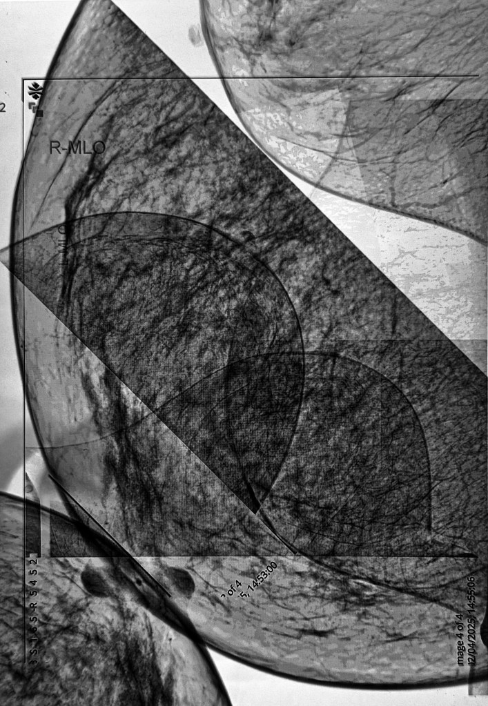
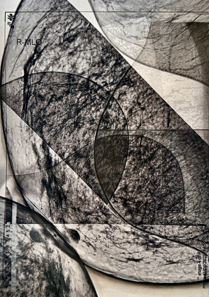
I had the idea during last year’s low residency to get hold of the images from my endoscopy which I’d had a month or so before. Well, I eventually got around to requesting them, but the good old NHS has sent me everything but what I actually wanted. Whilst I’m waiting to hear back from them (let’s face it they’ve probably got better things to be doing), I thought I could make use of last year’s mammogram. There’s really nothing quite like having your breasts squeezed between two rigid surfaces. Before I had my first one, a friend of mine commented that she hates having them done because the machine reminds her of the meat slicers you get on delicatessen counters. I relayed this remark to the radiographer who grimaced and squeezed her legs together. I have to say that the thought does flit across my mind in the moment. Rather ironically, because it feels less clinical than a hospital, I always choose to go to the mobile unit in Tesco’s car park. It means I can do the weekly shop afterwards – two birds, one stone, and all that.
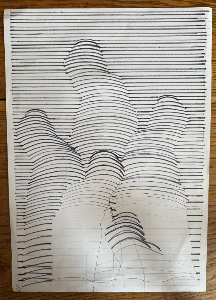
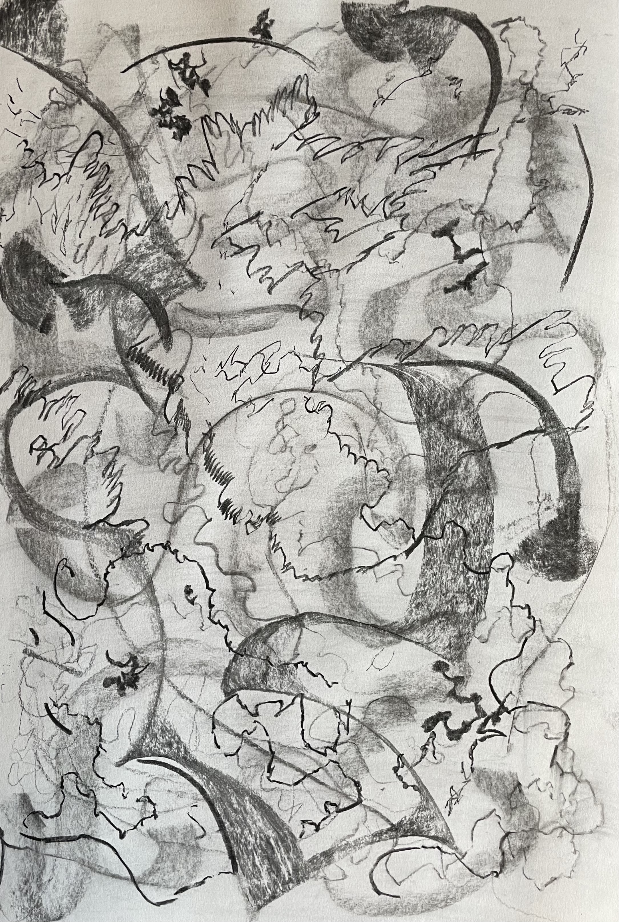
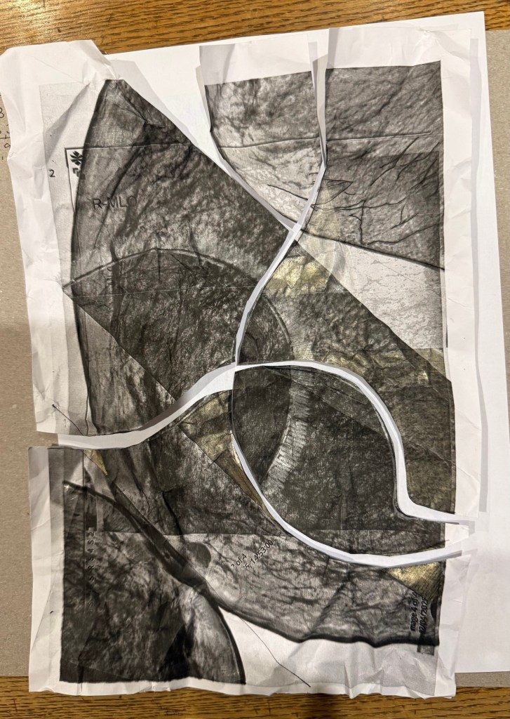
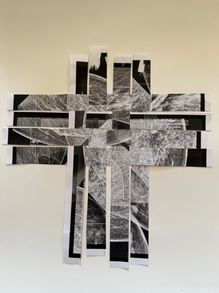
I took all four images: right and left mediolateral oblique and right and left craniocaudal. I removed my personal info and removed some digits from my hospital number as I wanted it to be apparent that they are medical images. I then imported them into Procreate and played around with inverting and layering etc. And this is when I learnt an important lesson – whilst it’s great to experiment and try lots of different things, if you don’t make a note of it somewhere you won’t be able to recreate it. I liked the first image I made but wanted to adjust some of the transparency in some areas. So I adjusted it but couldn’t remember what I had done to create the final image. Try as I might I just couldn’t recreate it so, in the end, I decided to run with the original image. I displayed the image on my laptop screen and then took a photograph of it which incorporated some of the reflections on the screen, which I think add a bit of depth and additional interest to the image. The idea was to print it and then overdraw with pencils, charcoal etc. I experimented on a home-printed image. I became even more despondent because nothing seemed to work. I decided to fold it, scrunch it and cut it up. Then I thought, a good approach when something isn’t working is to cut it into strips and weave it. I liked the effect, and my mood lifted.
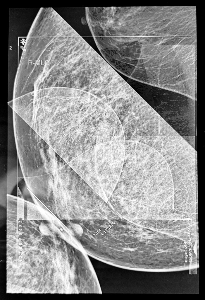
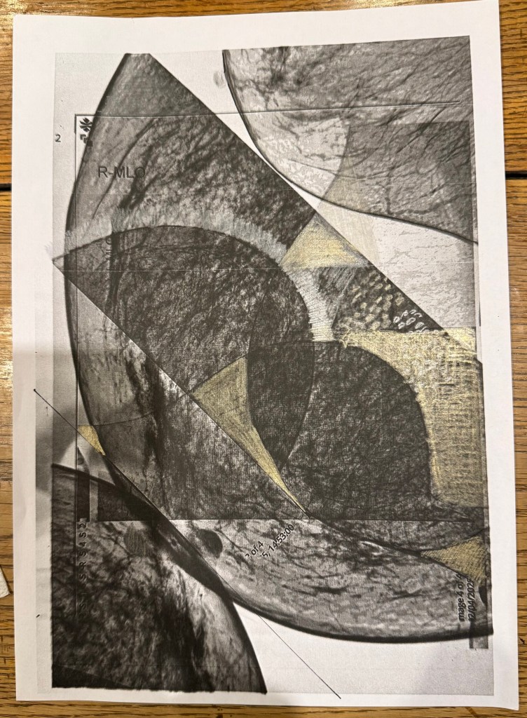
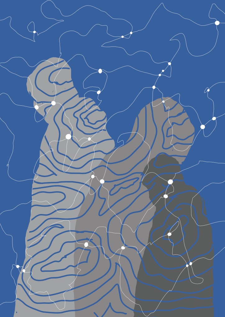
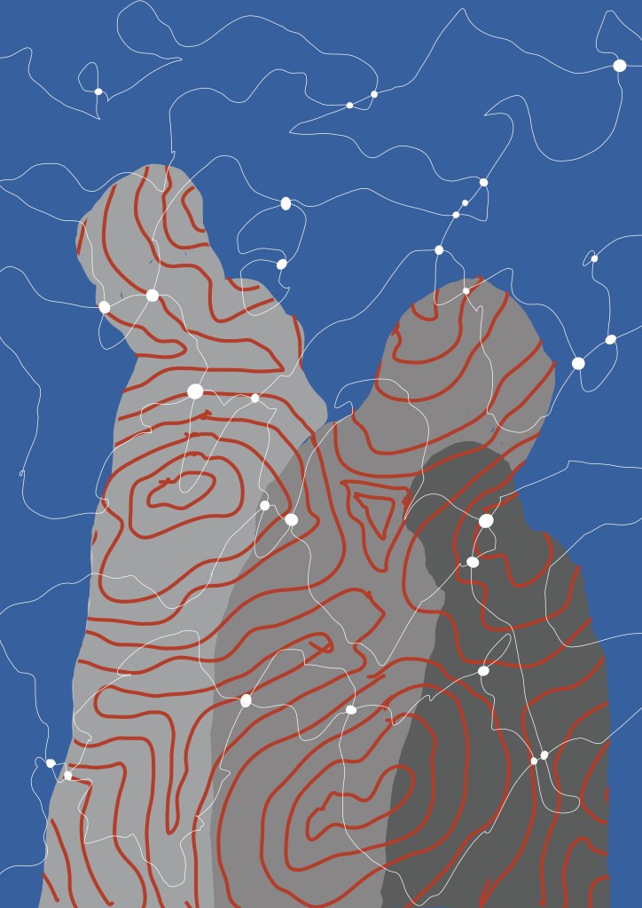
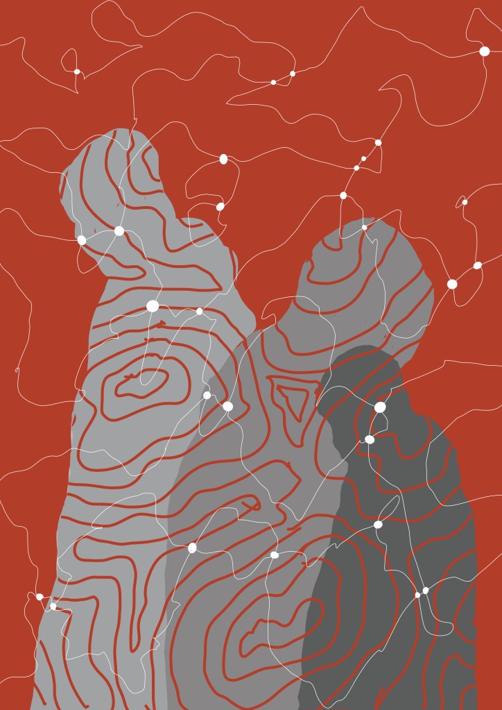
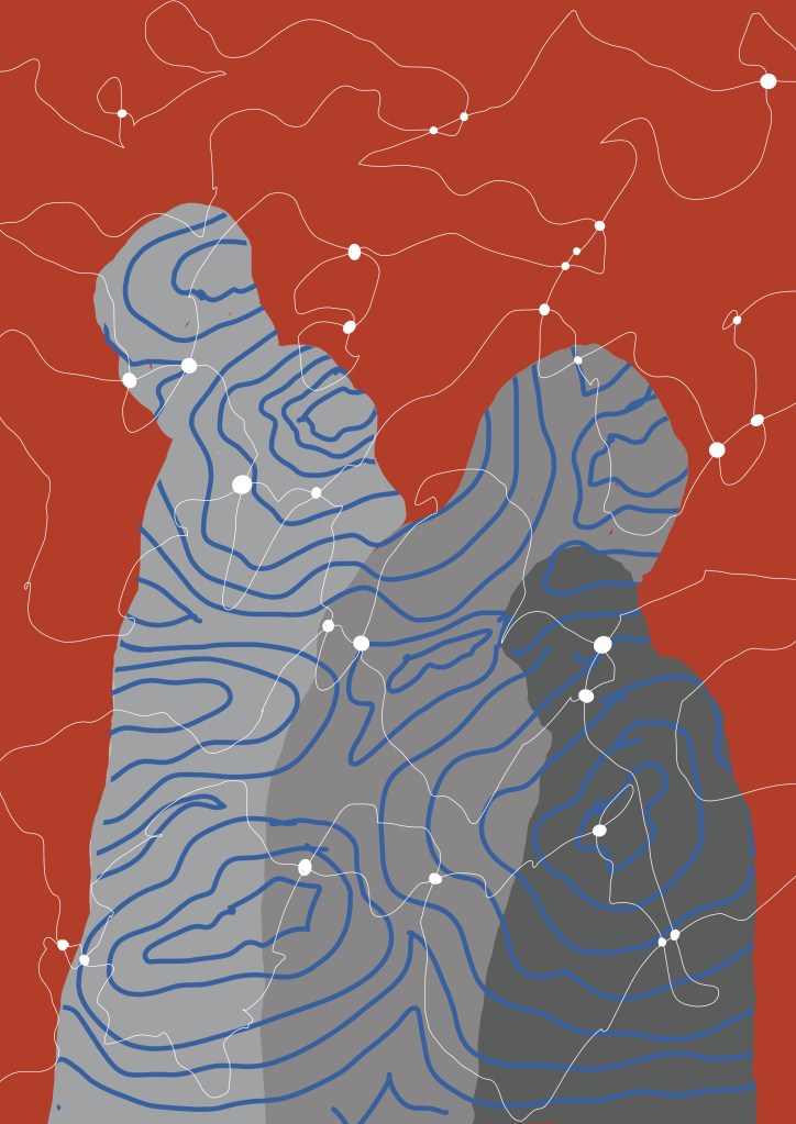
Anyway, when I got the A3 image from the printers I didn’t think it was that bad, and I couldn’t bring myself to cut it up so I just overdrew some areas adjusting tones using black, grey and silver pencils and some charcoal. I quite like how the inclusion of the straight lines and the curves suggest a graph of some sort, how it has both a geometric feel but also a natural, landscape feel, as if the line towards the centre is the waterline and beyond is a land mass, the dark area on the left almost reading as a tree. It was rolled up, so I’m going to have to flatten it and sort out proper lighting before I take a photo for submission. I actually really like it.
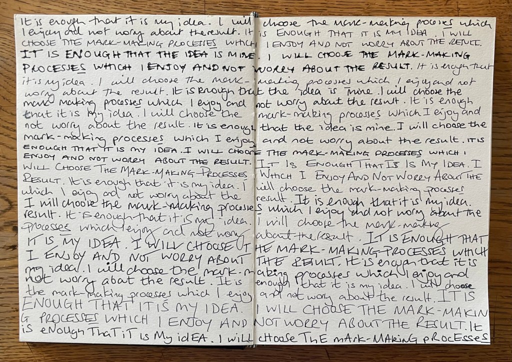
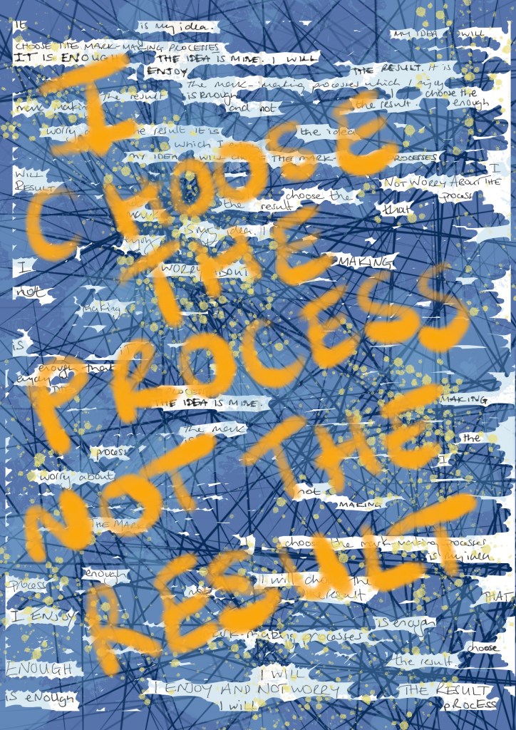
Aside from the importance of making notes whilst experimenting, this exercise has also taught me something about myself, which I suppose I have secretly always suspected. I started out with the idea of overdrawing the image. Initially that didn’t work, but rather than accept that I could change my thought process, and go off in a different direction, I allowed myself to press on and become despondent. My thought process was not flexible – it was a form of tunnel vision. Once I let go of it, I felt more positive.
Now for number two…