Apparently, Guns N’ Roses didn’t know how to end their most successful song, Sweet Child O Mine. Whilst in the recording studio, Axl Rose reputedly started singing, ‘Where do we go? Where do we go now?’ And the rest is history and, in my humble opinion, probably the best bit of the song.
So a moment of inspired creativity can come from a total lack of direction and confusion. Here’s hoping…
I’m resolved to wallowing in the myre of confusion. There’s not much point in fighting it; I can’t understand everything. The latest book we read in my book club was Michael Ondaatje’s ComingThrough Slaughter. I’ve never read a book like it. It deals with the mental decline and eventual death of the New Orleans cornet player, Buddy Bolden, who is considered to be the father of jazz. I didn’t understand what was going on half of the time, who was talking, and to whom. It jumped around all over the place. There aren’t any chapters as such, just three parts, no speech marks and paragraphs end at odd points on the page and continue on the next – visually it is striking. It is a book to be read, not to be listened to; its format echoes the improvisation and syncopation of jazz music. Once I had decided that perhaps I wasn’t supposed to understand it and just went along with it, reading each phrase and word in its own right, looking at the patterns, and the sounds of the words, a bit like reading a poem (after all, Ondaatje is a poet), I got a lot more out of it.
So this is how I intend to move forward. And it’s just as well, because try as I might to keep up with the constant flow of information being offered up by Paul in the Low Res etching workshop, I just couldn’t. I started taking notes, but just gave up in the end and surrendered myself up to not understanding anything and just enjoying being along for the ride.
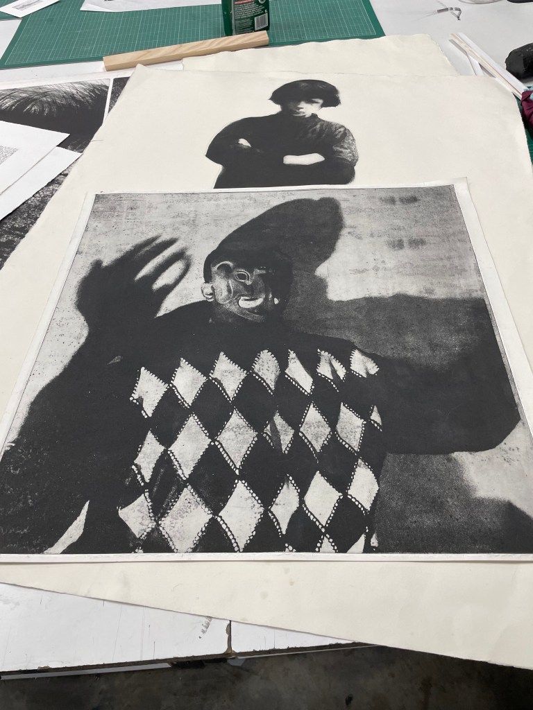
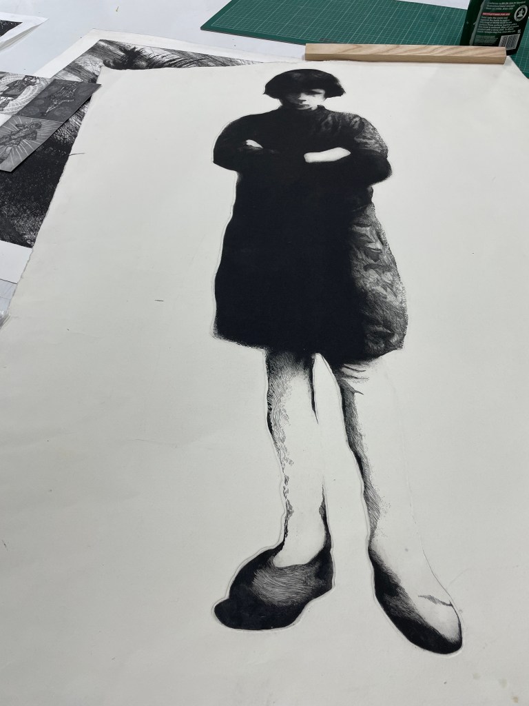
It kicked off with Paul showing us what we could have gone home with, had we the requisite skills. There were some impressive prints which demonstrated the versatility of printmaking which I hadn’t really fully appreciated until now.
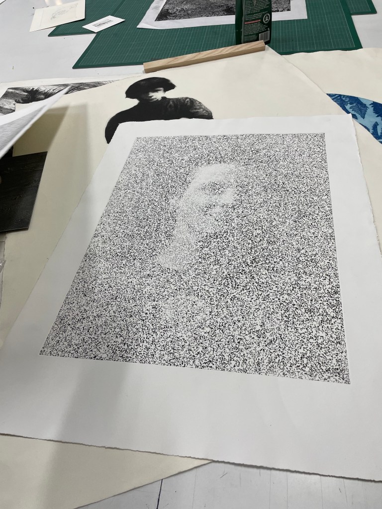
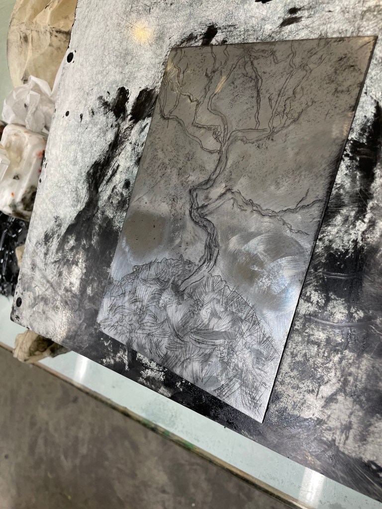
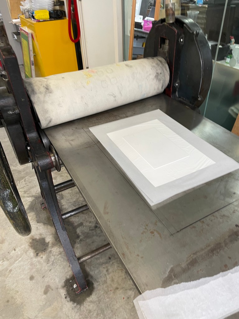
We started off by putting down a hard ground on a zinc plate and then we had about 20 minutes to create the image using a selection of Paul’s tools. What to do? I had a quick look on my phone and chose Schiele’s Small Tree in Late Autumn.
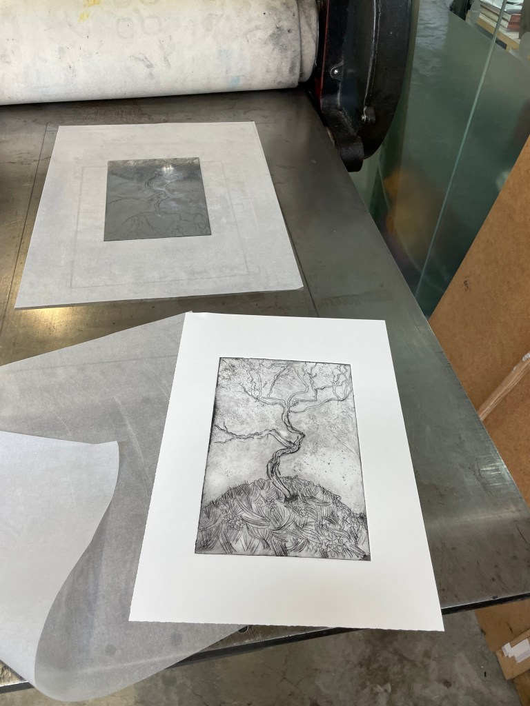
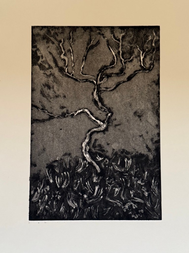
This is the plate once the hard ground had been removed and it had been cleaned followed by the printed images, using aquatint on the last one.
How do I feel about them? Pretty good bearing in mind I only had 20 minutes to create the plate and I had very little idea what I was supposed to be doing most of the time. Will I do it again? I don’t know – it’s very process driven, and whilst I love the excitement and anticipation of the big reveal, I’m more of an instant gratification kind of person. That’s not to say that I’ve ruled out etching altogether, it’s just that I would need a greater understanding of the different and quite complicated steps involved to do it any justice, and that’s just not compatible with the ‘new me’ at the moment.
I have just returned from an amazing 4 nights in magically festive Vienna, having had my fill of glühwein, Sachertorte and boiled beef broth (it loses something in translation!).
I’ve never been before, but will definitely be going back. Beautiful architecture, and so much to do, not least the seemingly endless supply of museums and galleries.
The Leopold and Belvedere were on my hit list as housing the greatest number of works by Klimt and Schiele. I had a nagging fear that the episode might end the same way as Michael Craig-Martin but, instead, I came away with a greater appreciation of all the details that can’t be gleaned from a photograph: the brushstrokes, the surprising thickness and coverage of the paint, sometimes leaving areas of the canvas exposed and the purity of colour. It was a revelation to get up really close and just look.
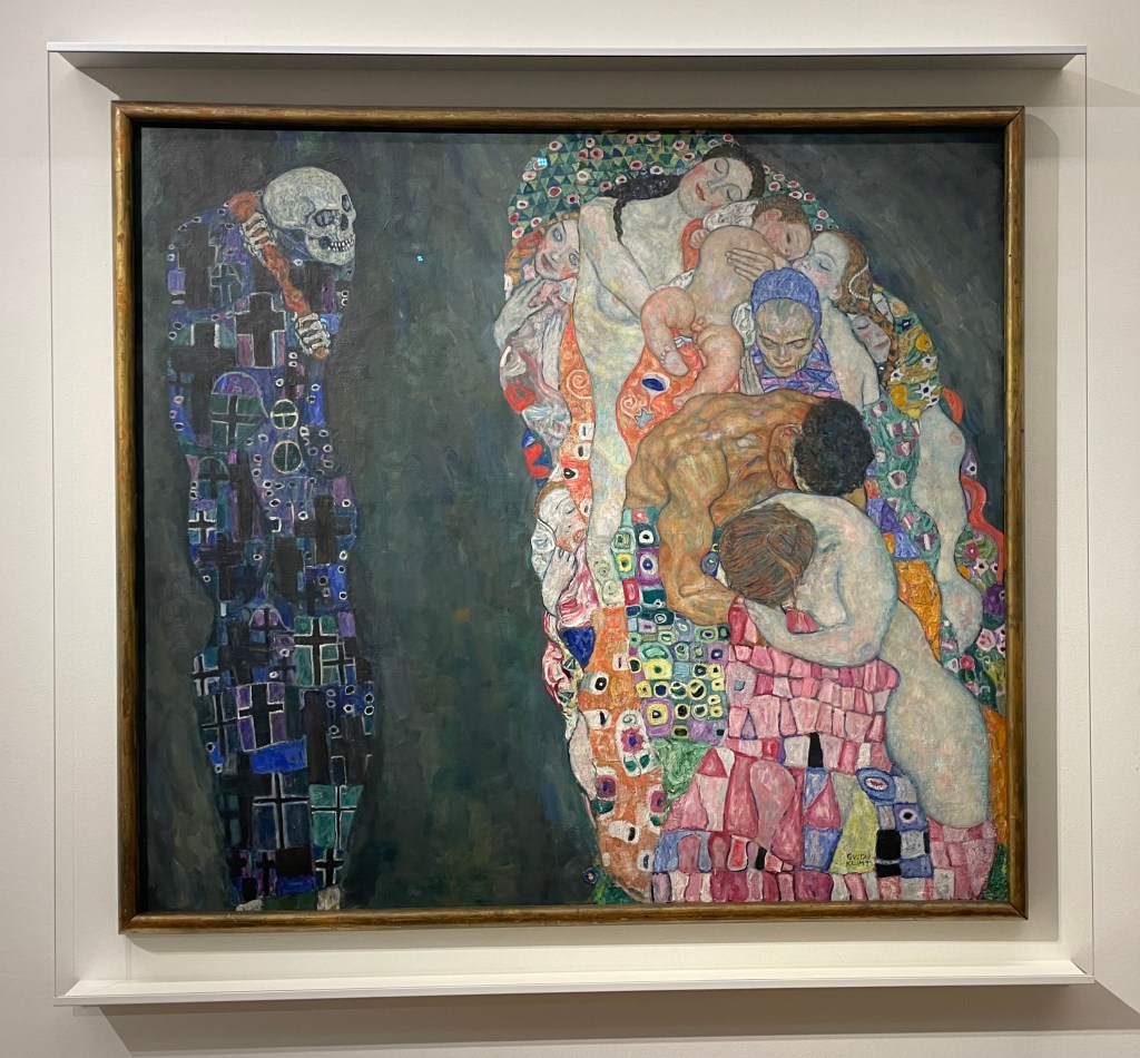
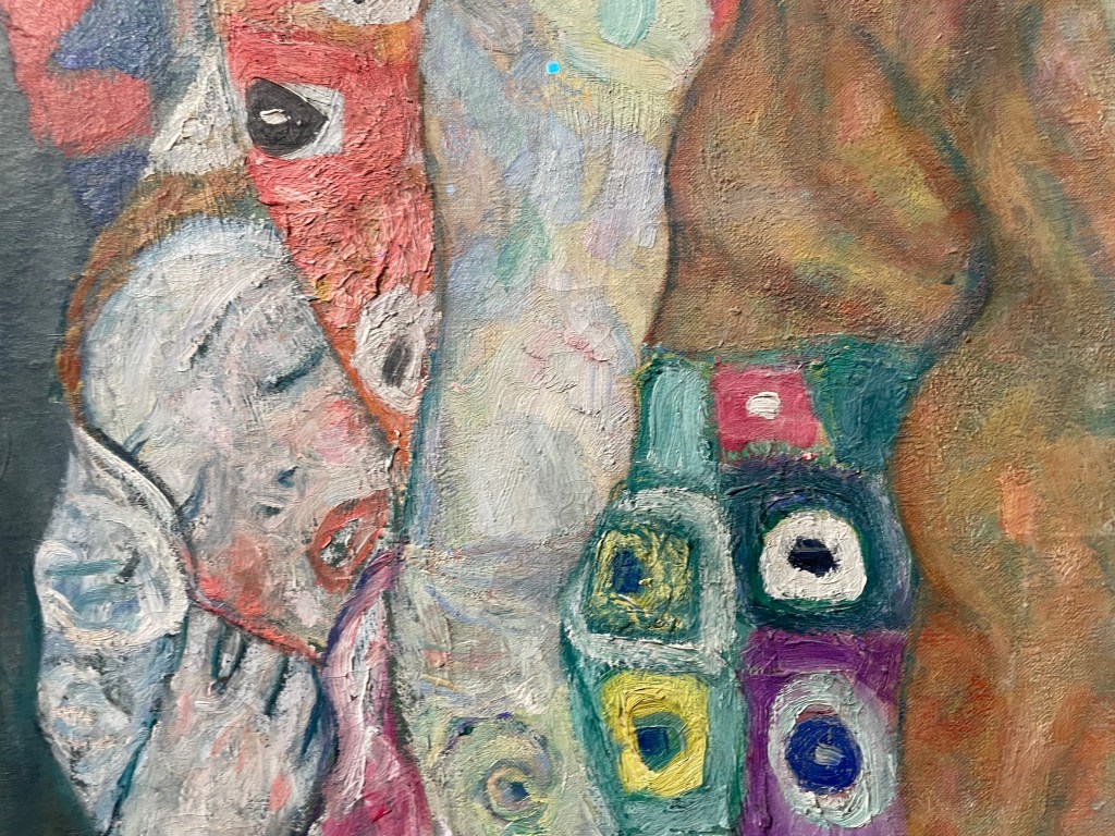
Death and Life 1910/15 , Klimt
Detail
I had always thought that Klimt applied paint quite uniformly and flat, so I was surprised to see the thickness of the paint and multi-directional brushstrokes. I like the way Klimt paints skin in all its imperfections and blotchiness, ranging from the pale and cold whiteness to the warmer, darker tones of the male figure.
Seeing ‘The Kiss’ was an interesting experience; it reminded me of when I saw the ‘Mona Lisa’ in the Louvre. Being one of Klimt’s most famous works, along with the ‘Mona Lisa’ and Van Gogh’s ‘Starry, Starry Night’, it is one of the most mass reproduced images of all time. I was underwhelmed, and I found it quite sad, as I was expecting to be bowled over by it. It was the most crowded room at the Belvedere, but what I found particularly interesting was that the crowd of people in front of it, holding up their phones and cameras, seemed totally uninterested in looking at it in any great detail – in fact they had left a sizeable gap in front of it so that they could get it in shot. This was handy as it allowed me to perform a flanking manoeuvre to get in front of it, to try and appreciate it as a work of art, as opposed to just a selfie opportunity with a celebrity. There was no point taking a photo – it was so strongly lit, and the lights reflected in the glass covering it. I grappled with my feeling of ‘numbness’ for the rest of the day, and as I was mulling it over in my mind, holding yet another mug of mulled wine in my hand, the answer came to me when I remembered John Berger’s ‘Ways of Seeing’ in which he considers the effect of reproduction:
”When the camera reproduces a painting, it destroys the uniqueness of its image. As a result its meaning changes. Or, more exactly, its meaning multiplies and fragments into many meanings … Alternatively one can forget about the quality of the reproduction and simply be reminded, when one sees the original, that it is a famous painting of which somewhere one has already seen a reproduction. But in either case the uniqueness of the original now lies in it being the original of a reproduction. It is no longer what its image shows that strikes one as unique; its first meaning is no longer to be found in what it says, but in what it is.”
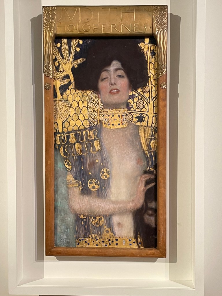
By contrast, in the next room was one of my favourites, ‘Judith and the Head of Holofernes’, a depiction of a strong femme fatale, the polar opposite to ‘The Kiss’.
Judith and the Head of Holofernes, Klimt, 1901
What can I say? I love gold leaf: I’m a magpie. Despite the abundance of gold in the painting, the eye is still drawn to the figure of Judith which is thrown forward by the decorative background. She is holding the head of Holofernes, somewhat gently, which is shown half in and half out of the frame, relegating him to a secondary role in the drama which has unfolded. There are intriguingly two decapitated heads in the painting; the treatment of the choker has effectively severed Judith’s head from her body. It is an image full of female power, sexual and otherwise.
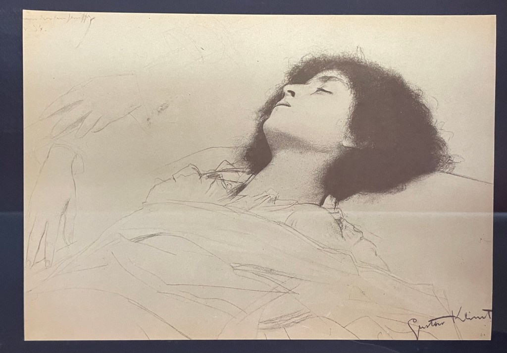
It’s easy to forget that Klimt was a master draughtsman.
His drawings are exquisite. The simple monochrome of pencil or black chalk, a quiet antidote to the noise of gold and vibrant colour.
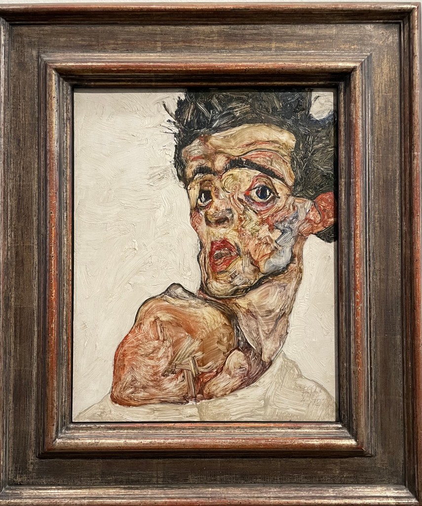
Self-Portrait with Raised bare Shoulder, Egon Schiele, 1912
I love this self-portrait; it is so expressive, and the fluidity of the brushstrokes creates a sense of movement and vitality. It is reminiscent of the Lucian Freud self-portrait in my earlier post, “I’m Sorry, Michael…”. It is quite small but he manages to pack a lot into such a confined space, including his shoulder, which by extension includes his body. The difference in treatment between the figure itself, which is quite thinly painted, and the more heavy impasto in the background is extremely effective. It is painted on wood, which might explain the wonderful textures on the face which would have been caused by the hog bristles in the brushes, although I have read, in a book on artists’ palettes, that Schiele would often use a brush to remove paint from a canvas in order to create texture. I particularly like the simple use of sgrafitto particularly above his left eye, and to delineate the edge of the chin against the neck.
The description next to this piece was interesting in that it described Schiele’s connection with his own body as both a fusion and a dissociation, in the context of the main theme of Viennese Modernism ie the individual becomes a dividual – something that can be divided.
The Embrace, 1917, Egon Schiele
This painting is so impactful. It’s approximately 1.5m by 1m. It shows Schiele with his wife, Edith Harms, in a loving and tender embrace. Unlike a lot of his work, this does not, to me at least, have any sexual or erotic overtones. There is a sense of completeness, in that Schiele depicts himself physically emaciated as he envelops and buries his head in the hair of his wife, almost blending into one, in an act of nourishing love. It’s even more poignant to think that this is one of his last works, as they both died within days of each other a few years later in the flu epidemic of 1918-20. He was only 28.
Both Schiele and Klimt were ahead of their time; they were disruptors. Schiele was akin to Sid Vicious and the punk movement, and Klimt founded the Viennese Secession, breaking away from the constraints of the Künstlerhaus. In today’s art world there is no prescribed way of doing things, no longer any art movements or – isms against which to rebel; artists have never been freer to express themselves in whatever way they wish, so I wonder how it is possible for an artist to stand out; how to make a difference in a world of differences.
I’m starting to feel excited about a trip I’ve booked to Vienna in December. I’m planning to binge on Schiele and Klimt, as well as Sachertorte (if I can find one that is definitely nut free)!
I love Klimt, in particular the way in which his figures disappear into, or emerge out of, his highly patterned and decorative backgrounds.
Portrait of Adele Bloch-Bauer I, 1907
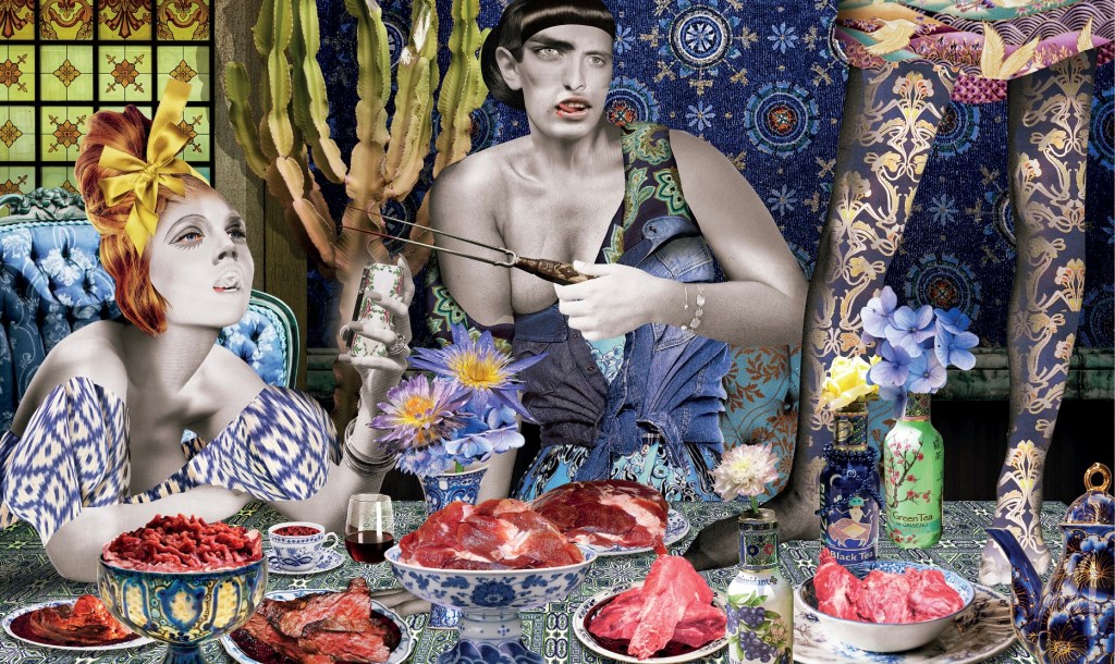
I’ve only recently discovered a Berlin collage artist, Kathrin Kuhn, who produced a series called Housewives.
” The Housewives project began as an experiment. In the Natural Science Museum I started thinking about animals tricks to make themselves invisible, a camouflage strategy called somatolysis. Butterflies for example use confusing patterns to melt into their environment to disappear from enemies eyes.
I started to apply that effect to my images, melting peoples clothes with the wallpaper patterns, mixing them up in the most bewildering way. I called the project Housewives because I found it a good metaphor for the way women were living in the past decades as housewives; being one with their homes, being connected with their domestic tasks so closely that it becomes an identity, even having a decorative function. The women in the pictures could use their patterns to disappear in their established setting, or leave it, to stand out in the most striking way in another environment.”
Housewives VII, Kathrin Kuhn
Am I a part of my background, or is it part of me?