Figuring It Out

I’ve started back at my weekly art class after the Christmas break, and over the last two sessions we have been looking at figures, in particular, figures in an environment. I’m not very good at depicting humans (or any animate subject for that matter), so this was a bit of a challenge.

We had to work from images which we had sourced: I took my nieces ice-skating at Christmas, which was really entertaining to watch. There were the confident, well-practised skaters who came equipped with their own boots; the ‘I’m-competent-but every-now-and-then-lose-my-balance-and-windmill-my-arms-brigade; and then the rest – hopelessly clutching the side, or each other, for dear life, inching their way round. There was a whole range of shapes, gestures and weights, in the sense of where in the body the weight is being distributed, and there was a lot of tension.

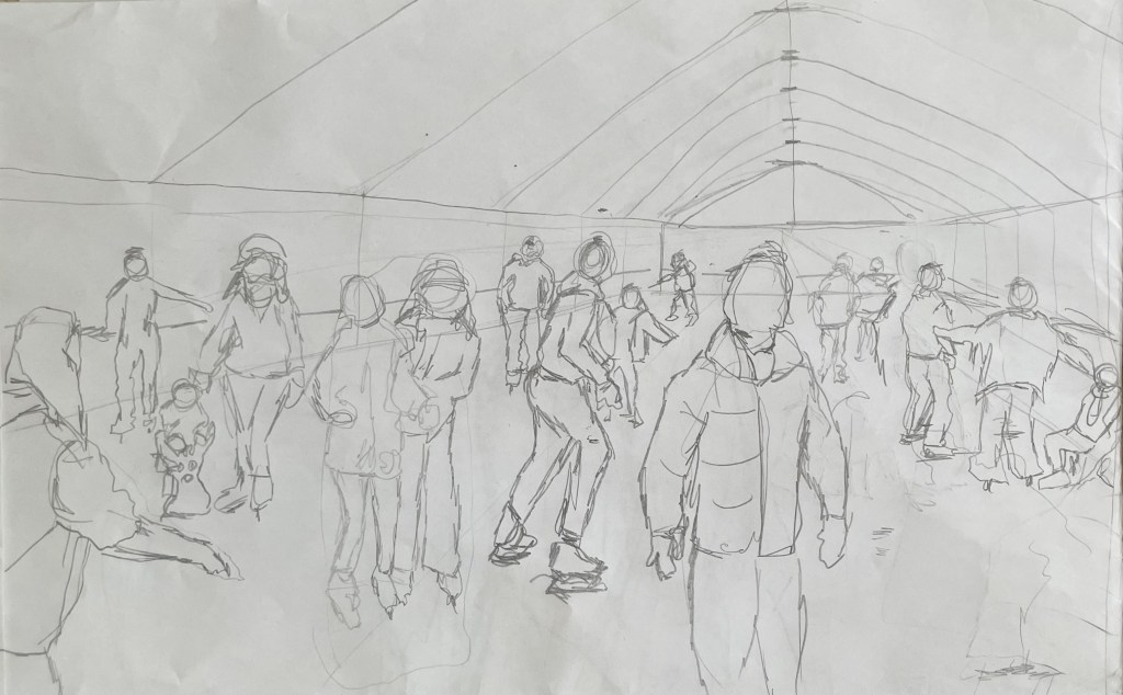
We started by sketching out the composition.

I used a combination of photos and video stills from my phone – I could have been more organised because I lost track of which figure was on which photo, which wasted quite a bit of time. Next time I work from numerous image sources I will organise them so that they are more accessible and easier to switch between.

I then applied a ground to the support (I used oil paper as opposed to a canvas, as I wasn’t sure how it was going to go). As it was a painting of ice-skaters, I chose burnt umber thinned down with Sansador as my ground, as it’s the blue equivalent of the earth colours. I then drew in the figures using a rigger brush and thinned paint – I found the techniques covered by Chris Koning’s workshop of gestural drawing (‘Perception of the Whole’) to be really helpful in trying to get some dynamism in the portrayal of the figures. I also changed the composition from the pencil sketch to bring forward the pair of skaters on the left and to give the skater next to the pair some extra space into which he could move. I also packed some more figures in, including my favourites, the couple in the centre – the man skating alongside and watching his partner who is leaning forward – and the girl behind them.

The next step was to block in the background. I decided that I didn’t want to put the figures in the specific setting of an ice rink, so I left out the details of the roof and sides which were included in the original sketch. This gives a feeling of more space.

I used a thinned down mixture of titanium white, ultramarine blue and burnt umber to create a grey/blue and then scratched into it with the end of the paintbrush to create skate marks.

I then started blocking in some colour using thinned paint. I liked the fact that the burnt umber drawing was still visible and decided to try and retain as much of it as possible. This meant that I would not be able to use much thick paint in subsequent layers, and so the painting will retain a sketch-like quality. The purpose of the exercise was to capture the essence of the figures, so there will be very little detail in the figures and their faces, other than those in the foreground, and even then I will keep these limited.

I regretted having the large figure in the foreground, but he felt necessary to add variation to the height of the figures, and his static quality should hopefully contrast with the sense of movement in some of the other figures.

I carried on adding some more colour and changed the colour of the skater’s hoodie to differentiate him from the figure in the foreground.

I really enjoyed the process of being looser: the multiple visible alterations and the pared back application of paint. I’m not sure that I like the finished piece, probably because of its subject matter – it’s all a bit twee. But that’s my own fault – I hadn’t adequately prepared for the class and so made a rushed decision. Next time we have to work from a preselected source, I will make sure that I prepare properly, so that the subject matter appeals to me as much as possible.

There are areas which really appeal to me; I like the way I have treated the ice and I think that I have managed to capture the sense of movement, the hesitancy and tension in the figures, and the atmosphere. I don’t like the way I’ve painted the faces in the foreground. Whilst the exercise was all about the figures, I don’t think I’ve managed to find a method to render faces in a non-detailed way which does not look childish. I need to work on this.

I was thinking about this painting whilst I was out on a dog walk yesterday. I enjoyed making it, but I’m not that enamoured with the overall result, which made me ask myself whether I need to like the work I make or whether enjoying the process is enough. Also, I like and am attracted to a wide variety of artists working in very different ways. I suspect that I have previously thought that I need to make myself like them and make the sort of work they make because it is something that I like and am drawn to. I’m starting to realise that this isn’t necessarily the case – I just need to be ‘me’.

Generally, the work which I produce at my art class is not something that I would ordinarily choose to do, (which is a good thing) and won’t necessarily be relevant to my field of study in terms of subject matter, but it will provide a useful source of exploration in terms of technique and approach in my art practice. As such it is a valuable resource and a good use of time as well as a commitment which ensures that I create work on a regular basis.

Vienna Calling

I have just returned from an amazing 4 nights in magically festive Vienna, having had my fill of glühwein, Sachertorte and boiled beef broth (it loses something in translation!).

I’ve never been before, but will definitely be going back. Beautiful architecture, and so much to do, not least the seemingly endless supply of museums and galleries.

The Leopold and Belvedere were on my hit list as housing the greatest number of works by Klimt and Schiele. I had a nagging fear that the episode might end the same way as Michael Craig-Martin but, instead, I came away with a greater appreciation of all the details that can’t be gleaned from a photograph: the brushstrokes, the surprising thickness and coverage of the paint, sometimes leaving areas of the canvas exposed and the purity of colour. It was a revelation to get up really close and just look.

Death and Life 1910/15 , Klimt

Detail

I had always thought that Klimt applied paint quite uniformly and flat, so I was surprised to see the thickness of the paint and multi-directional brushstrokes. I like the way Klimt paints skin in all its imperfections and blotchiness, ranging from the pale and cold whiteness to the warmer, darker tones of the male figure.

Seeing ‘The Kiss’ was an interesting experience; it reminded me of when I saw the ‘Mona Lisa’ in the Louvre. Being one of Klimt’s most famous works, along with the ‘Mona Lisa’ and Van Gogh’s ‘Starry, Starry Night’, it is one of the most mass reproduced images of all time. I was underwhelmed, and I found it quite sad, as I was expecting to be bowled over by it. It was the most crowded room at the Belvedere, but what I found particularly interesting was that the crowd of people in front of it, holding up their phones and cameras, seemed totally uninterested in looking at it in any great detail – in fact they had left a sizeable gap in front of it so that they could get it in shot. This was handy as it allowed me to perform a flanking manoeuvre to get in front of it, to try and appreciate it as a work of art, as opposed to just a selfie opportunity with a celebrity. There was no point taking a photo – it was so strongly lit, and the lights reflected in the glass covering it. I grappled with my feeling of ‘numbness’ for the rest of the day, and as I was mulling it over in my mind, holding yet another mug of mulled wine in my hand, the answer came to me when I remembered John Berger’s ‘Ways of Seeing’ in which he considers the effect of reproduction:

”When the camera reproduces a painting, it destroys the uniqueness of its image. As a result its meaning changes. Or, more exactly, its meaning multiplies and fragments into many meanings … Alternatively one can forget about the quality of the reproduction and simply be reminded, when one sees the original, that it is a famous painting of which somewhere one has already seen a reproduction. But in either case the uniqueness of the original now lies in it being the original of a reproduction. It is no longer what its image shows that strikes one as unique; its first meaning is no longer to be found in what it says, but in what it is.”

By contrast, in the next room was one of my favourites, ‘Judith and the Head of Holofernes’, a depiction of a strong femme fatale, the polar opposite to ‘The Kiss’.

Judith and the Head of Holofernes, Klimt, 1901

What can I say? I love gold leaf: I’m a magpie. Despite the abundance of gold in the painting, the eye is still drawn to the figure of Judith which is thrown forward by the decorative background. She is holding the head of Holofernes, somewhat gently, which is shown half in and half out of the frame, relegating him to a secondary role in the drama which has unfolded. There are intriguingly two decapitated heads in the painting; the treatment of the choker has effectively severed Judith’s head from her body. It is an image full of female power, sexual and otherwise.

It’s easy to forget that Klimt was a master draughtsman.

His drawings are exquisite. The simple monochrome of pencil or black chalk, a quiet antidote to the noise of gold and vibrant colour.

Self-Portrait with Raised bare Shoulder, Egon Schiele, 1912

I love this self-portrait; it is so expressive, and the fluidity of the brushstrokes creates a sense of movement and vitality. It is reminiscent of the Lucian Freud self-portrait in my earlier post, “I’m Sorry, Michael…”. It is quite small but he manages to pack a lot into such a confined space, including his shoulder, which by extension includes his body. The difference in treatment between the figure itself, which is quite thinly painted, and the more heavy impasto in the background is extremely effective. It is painted on wood, which might explain the wonderful textures on the face which would have been caused by the hog bristles in the brushes, although I have read, in a book on artists’ palettes, that Schiele would often use a brush to remove paint from a canvas in order to create texture. I particularly like the simple use of sgrafitto particularly above his left eye, and to delineate the edge of the chin against the neck.

The description next to this piece was interesting in that it described Schiele’s connection with his own body as both a fusion and a dissociation, in the context of the main theme of Viennese Modernism ie the individual becomes a dividual – something that can be divided.

The Embrace, 1917, Egon Schiele

This painting is so impactful. It’s approximately 1.5m by 1m. It shows Schiele with his wife, Edith Harms, in a loving and tender embrace. Unlike a lot of his work, this does not, to me at least, have any sexual or erotic overtones. There is a sense of completeness, in that Schiele depicts himself physically emaciated as he envelops and buries his head in the hair of his wife, almost blending into one, in an act of nourishing love. It’s even more poignant to think that this is one of his last works, as they both died within days of each other a few years later in the flu epidemic of 1918-20. He was only 28.

Both Schiele and Klimt were ahead of their time; they were disruptors. Schiele was akin to Sid Vicious and the punk movement, and Klimt founded the Viennese Secession, breaking away from the constraints of the Künstlerhaus. In today’s art world there is no prescribed way of doing things, no longer any art movements or – isms against which to rebel; artists have never been freer to express themselves in whatever way they wish, so I wonder how it is possible for an artist to stand out; how to make a difference in a world of differences.

Less

I haven’t posted for a while – I’ve been busy sorting things out before going off to Marrakech for a four day trip with my book club.

Marrakech was amazing. Colour. Noise. Smells. People. Heat. Contrast that with this morning when I had to defrost the car before heading off to my weekly art class. I love this drive, along an old Roman road – straight and undulating through the Hampshire countryside to Stockbridge, a small town in the Test Valley. The sun came out and the trees came to life – burning oranges, golds and yellows. It was beautiful, and by the time I arrived at my class, late because I couldn’t find anywhere to park, I was still feeling its effects.

I can’t deal with too much choice – it paralyses me and then I can’t make a choice. Needless to say, I didn’t buy anything in the souks in Marrakech – the choice was overwhelming, so I resolved not to buy anything at all, and was then able just to wander and enjoy the atmosphere and culture.

So today’s task was perfect for how I was feeling. A landscape using a limited palette of burnt sienna, burnt umber, ultramarine, pale cadmium yellow, white and cadmium red. We took a board, roughly primed – in my case it was an old piece of MDF which I had previously coated with professional Dulux oil-based primer, which can make it a bit like an ice rink – and put down a loose ground of burnt sienna with a bit of sansador which ended up not drying for some reason. Then we put in some outlines using burnt umber following with thick patches of colour keeping it very general, but the wet burnt sienna contaminated some areas and lifted off the board in others. We experimented with dragging a dry brush across the paint and I also did a bit of sgraffito which I can’t help doing when using thicker paint.

This is the result:

I haven’t painted for ages – not since beginning this course – I don’t know why. Perhaps it’s because I’ve been doing a lot of thinking and experimenting with other media. At first, it felt a bit strange coming back to it, almost awkward, like I’d been unfaithful in some way.

It’s not my best by far, but it’s ok for an hour and a half. I am leaving it. The ‘me’ I’m trying to change would say that it is not finished by a long way. There’s lots I don’t like and would love to change – I’m itching to tinker – but I’m exercising some will power and calling it a day. Just like I’ve been trying to change my mindset about having an expectation as to how a piece will turn out, I am also trying to train myself to walk away.

Jonathan told me that the job of mark-making is to tell us what to do next. These marks are telling me to leave it alone and to be happy with what bits of it appeal to me – I like the lack of clarity and blurriness caused by the dry brush; the light coming through the burnt sienna ground in the foreground; the energy in the marks, which I would absolutely kill if I allowed myself to do more; the lack of definition which gives a sense of a fleeting moment; and the recreation of the feeling I had whilst driving to class.

Will I do this again? Yes, I always like going back to basics and using a limited palette – I’ll use a different image and next time I will definitely make sure that the ground is dry before carrying on so that the colours aren’t so muddy in places.