Maps

I was very lucky to have Cheng and Dalal in my group for this week’s group crit.

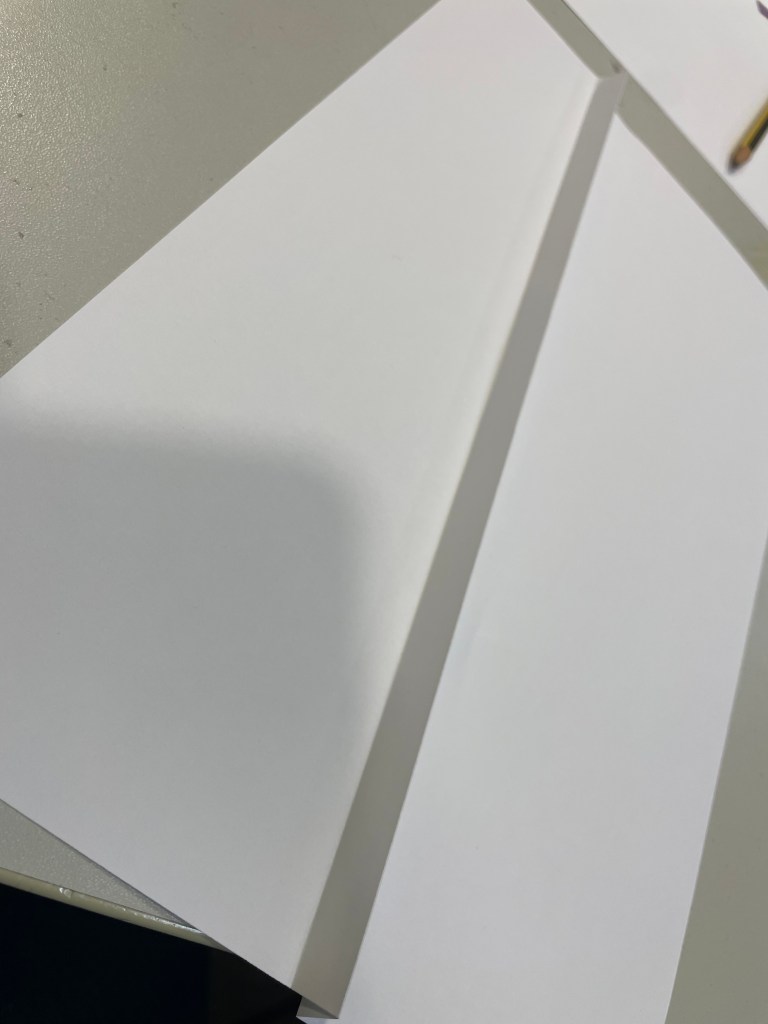
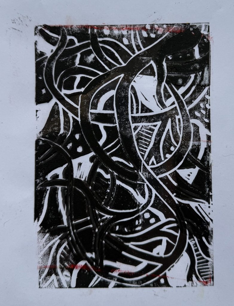
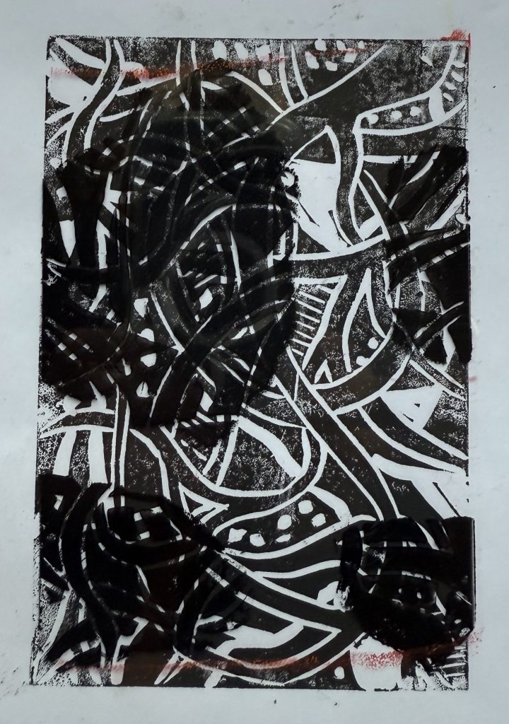
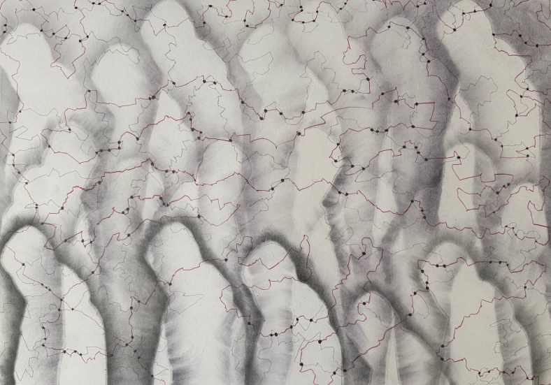
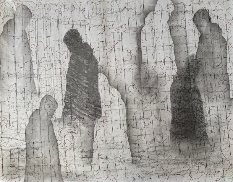
I showed my recent experiments with graphite and pencil.

I explained that I have become interested in the idea of inheritance recently and mentioned Donald Rodney’s work. We had a really interesting discussion about where we come from and our legacy, how it’s sometimes comforting to know that someone else before us was like us which frees us from feelings of fault and guilt, the idea of all that has gone before distilling down into us, much like our family tree before us, ends with us. How what we pass on feels like a responsibility or a burden.

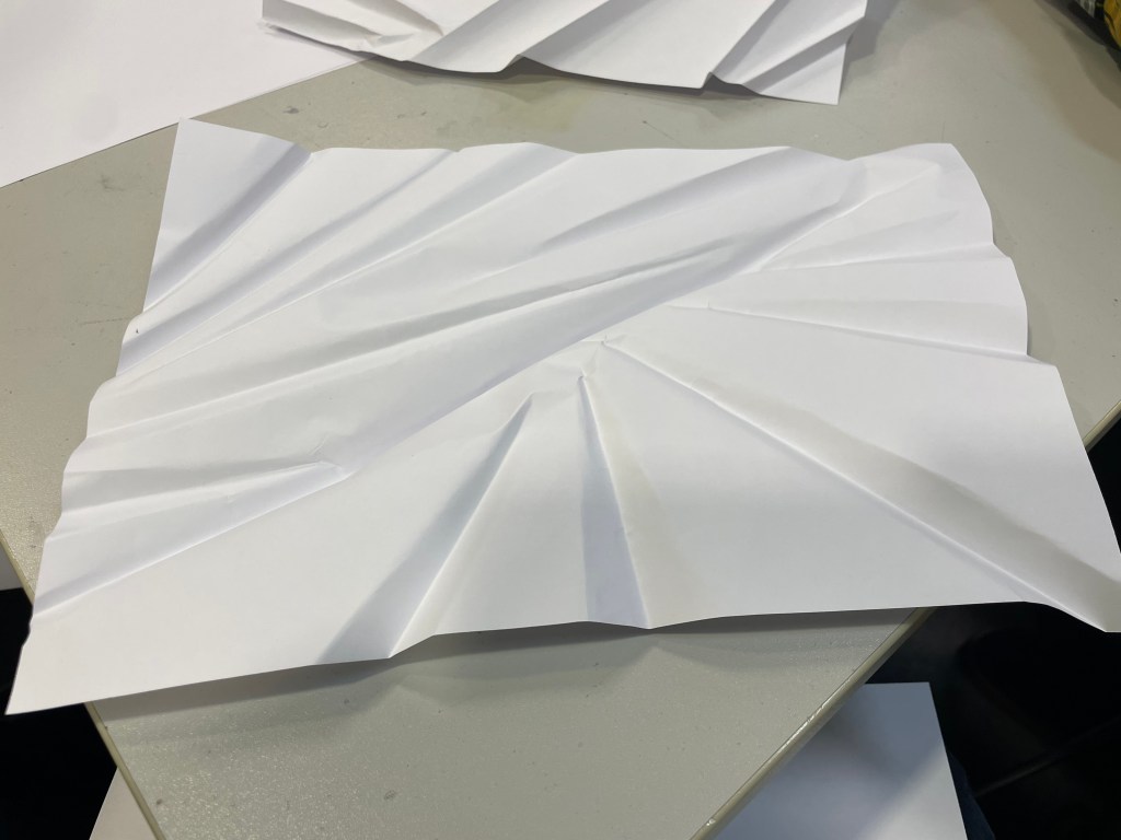
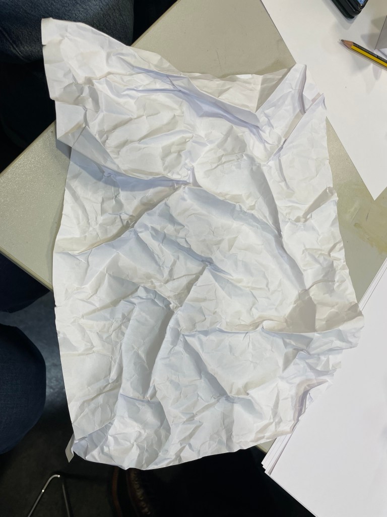
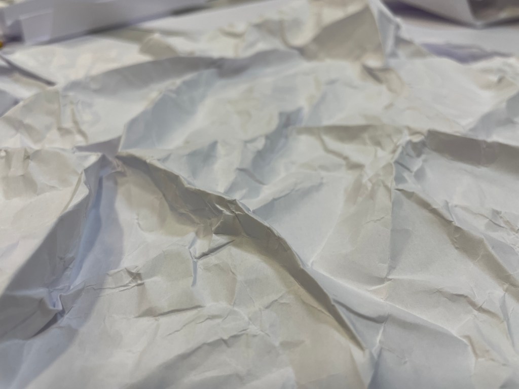
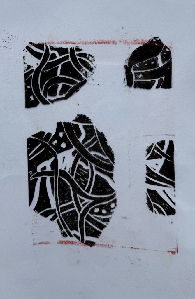
Cheng commented that the white shapes give the impression of something that is no longer there and the dark shapes are reminiscent of shadows. Thinking about it, the shadows are cast by something that is there but is not visible. A figure’s absence is felt yet we feel a figure’s presence somewhere – it just about sums up ancestry.

I explained the process of making the pieces and how they seemed to develop into a type of map. I mentioned that the subject of maps has come to the forefront of my thinking recently along with the idea of connection. In my Unit 1 feedback one of the comments was: “It feels as though you have been working through an abundance of techniques that are maybe a type of mapping – now is the time to compare and contrast all of those experiments in order to develop an intuitive and personal way of mapping your experiences…”.

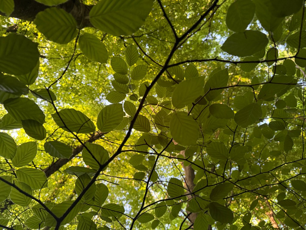
For sometime I’ve been interested in Deborah Levy’s idea of her mother being her internal sat nav and I used Google maps to obtain the aerial image I used in Parental Loss. My art class recently gave me a scarf with a Grayson Perry map on it. I was thinking earlier in the year of mapping the course of a river. The coincidence that I chose to draw the lines in colours which reminded me of maps somehow has linked all of this together. That, and the fact that I have been complaining ad nauseum about not having a sense of direction.

During these two years, I am, to all intents and purposes, mapping my life.

There seems to be a strong unintentional link to maps in the images: Cheng said that the images in which I’ve marked the intersections remind her of constellations, and Dalal observed that the lines themselves could be interpreted as borders, which then feeds into borders marking the the point where countries connect. This led to me seeing that the outline of the shapes themselves resemble coastlines.

Cheng and Dalal both made some really helpful comments about potential development:

  • playing with scale: a large image on a wall giving the impression of a map but then coming in close on a small scale to create a more personal experience and stronger connections
  • Drawing on a vintage map or incorporating old family photos
  • Using a pin to attach separate images to the points of intersection – this has since led me to think about criminal investigation maps – maps with string coming off from them to images and additional information on the perimeter
  • Thinking about how I can use materials to create something that looks older, that comes from a past time – this brought to mind highly decorative old maps with sea monsters in the oceans
  • creating a large scale reimagined map

Shortly after our session ended, I had a thought about making a digital map of my life with events or periods of significance being marked by specific points, a bit like a Google map, which you could then drag the yellow man to and drop into a space where you have a street view – maybe of images relating to that particular event. And then I laughed, Alexa laughed, Siri laughed, my husband laughed.

Lots to think about, as ever.

Sorry, Are You Talking To Me?

I’ve decided that I’m probably learning far more about myself by simply being in this process than I am by looking back on my life.

I need to retrain my brain. My legal training has made me focus on detail, anticipate every possible eventuality, dot every ‘i’ and cross every ‘t’ all within a rigid framework of rules and regulations. That way of thinking served its purpose then, but it now stultifies creativity.

When I’m in a scenario which is unfamiliar, I like to know the parameters within which I’m expected to navigate; quite often I feel discombobulated when things don’t go the way I am expecting, the paper workshop with Christian Azolan being a case in point. We were instructed to fold the paper. To my pedantic mind, folding involves a deliberate act of bending something over on itself to create a clearly defined edge. It doesn’t include scrunching. But once I had overcome my initial confusion and accepted this unexpected variation of the parameters, I enjoyed myself.

I definitely preferred using the blank paper – I don’t know what brand it was, but it felt really good. It led me to confess my fetish for pristine white paper to some of my fellow students. I think it stems from being at primary school when the teacher would write my name on the front of a new exercise book with a marker pen and I would go back to my desk and give it a good sniff. I now appear to associate blank paper with a solvent high. I don’t think that my school ever had a pupil who was so keen to man the stationery cupboard at break time. In fact, I used to get palpitations and a bit of a sweat on just walking into WH Smith (R.I.P).

Working with the blank paper seemed to allow more freedom and I liked that the results took on a sculptural quality. The effect of the folding on the reverse of the paper was equally, if not more, interesting at times than the right side; areas which were peaks on one side became troughs on the other and vice versa.

I felt inhibited using the print of the back of my head; I became too concerned with the resultant image which seemed to impose restrictions on how I folded, so maybe I like clear parameters, but not too many of them? Also, the effect is less sculptural than when using the blank paper; the areas of shadow are less apparent and the focus shifts to the distortion and concealment of parts of the image rather than the creation of form.

We then went on to do some linocutting – it seemed a bit incongruous with the folding activity, but nevertheless we all launched into it with equal enthusiasm.

I prepared two linocuts; one inspired by tree roots and the other a reduction linocut of an abstract shape – I printed it using yellow ink first, then cut away more lino and printed using red ink.

I also printed the tree roots image on a transparency, having torn up bits of paper to create a random mask. It is interesting to see the effect of overlaying it with the two prints; how it creates a sense of discord on the prints where it’s not in sync with the image below, and how it creates areas of intensity on the print over which it lines up.

As I was taking my lino into the next door room to print it, Christian heard me reminding myself as to what I was planning to do. Sorry, are you talking to me? No, just myself. Doesn’t everyone do that? Yes, of course. When I went back in to print my second lino, I asked him how long we had left. Sorry, are you talking to me?…

Light & Shadows

I attended another of Chris Koning’s online drawing workshops at lunchtime, to brush up.

She explained the concept of light logic:

  • Highlight – the brightest light
  • Cast Shadow – caused by the object blocking the light and so the darkest dark
  • Reflected Light – dim light bounced back up from light on the surface
  • Crest/Form Shadow – shadow which lies on the crest of a rounded form between highlight and reflected light

When drawing we are not interested in contrast, but in value ie what something looks like against something else.

‘The Artist’s Mother’, Georges Seurat, 1883

This drawing by Seurat is made up of lots of different areas of tone. The parting in the hair is not a definite line; it has been created by different areas of tonal value. There are no harsh lines anywhere and there is very little contrast in the image. It is Seurat’s flawless light logic which allows us to create the rest of the information ourselves.

We then did a quick 10 minute exercise. We lightly shaded in a rectangle. Then we were shown a blurred image and told to fill in the darkest areas and then use an eraser to show the lightest. We then had to fill in the rest of the tonal values in the knowledge that nothing else will be as dark or as light as the existing areas of tone.

Chris then inverted the image and made it clearer:

It was a helpful reminder not to ‘see’ what I’m drawing and thereby create an expectation, but just to see shapes of tone, and to start from the general, keeping in mind the relationships between areas in the whole of the composition, and then move towards the specific.