Testing Plan A

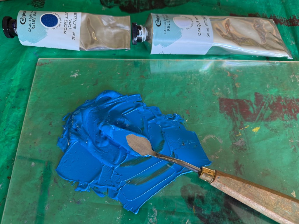
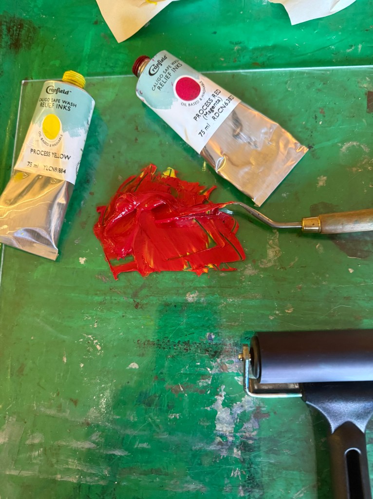
So, Plan A was dependent on me being able to overprint the red with blue. I did a quick test print. The process blue ink I was using must have some transparency as it turned into a very dark purple, so I made it more opaque by adding opaque white which resulted in a kind of cerulean blue which I liked against the red, although the photos don’t do it justice.

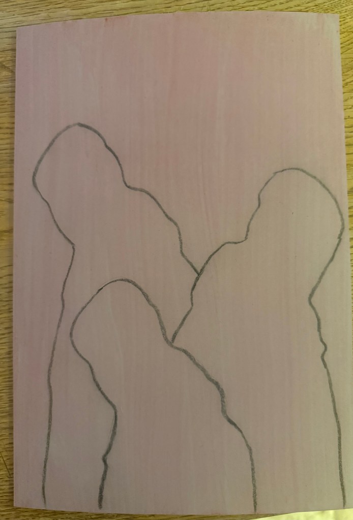
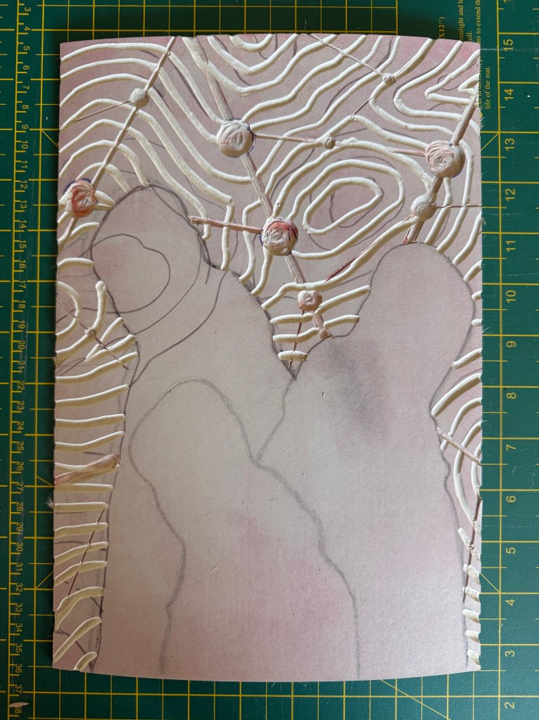
I then prepped a sheet of A4 lino by lightly sanding and wiping with white spirit before staining it with an acrylic ink and drawing on the figures and the white lines. I went over the pencil marks with a chinagraph pencil to make them stand out more. As usual I had launched in without giving it enough thought and ended up having to reposition some lines although I couldn’t erase the chinagraph marks, which becomes relevant later on in the test printing. I used a metal ruler to cut out the white areas and filled them with cornflour to see how they looked, neatening up where necessary – the circles are bit all over the place, so I resolved to use a template when making the actual prints.

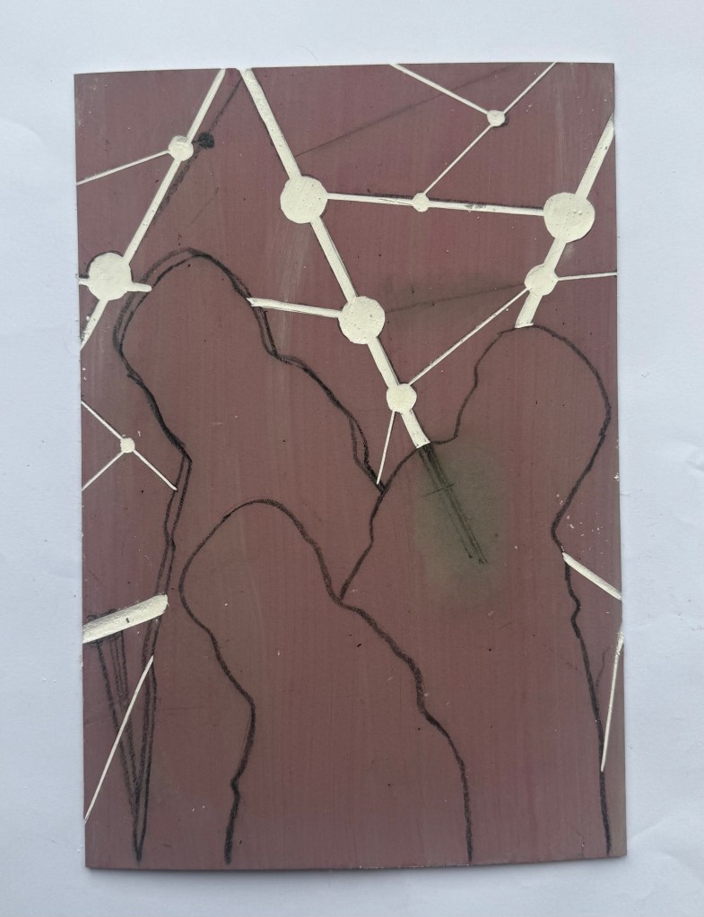
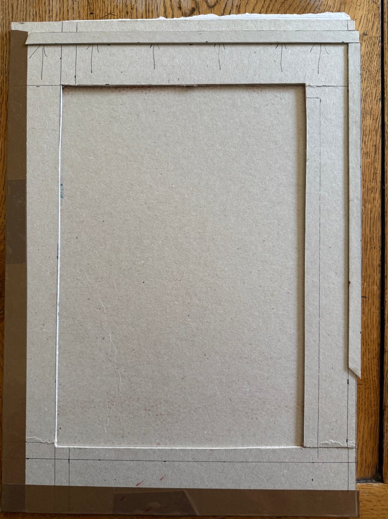
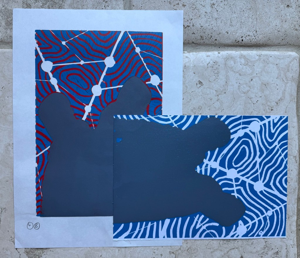
I created a registration board for the lino, drew lines where the paper was to go, and printed the first layer using equal parts process red and process yellow. Initially, I thought that I could mask out the figures using some tracing paper. Reduction linocuts work from light to dark ordinarily, but my image doesn’t really conform to that process. I knew one, if not two, of the figures would be a med/light grey and I wasn’t sure how that would sit on top of a bright red. I tried inking up whilst the mask was on the block and then removing it, but it was difficult to do because the mask kept on sticking to the brayer and the result wasn’t great. I decided to ink up the entire block for the rest of the prints. I also noticed that some of the chinagraph was coming off the block onto the prints.

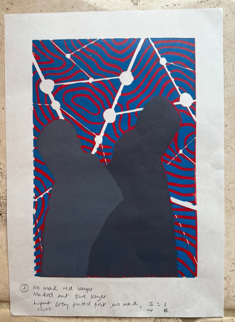
Next, I cut out the contour lines and printed with blue ink. By this stage I had realised my previous error and masked the figures after inking the block, but before printing – a much better result, and I can’t work out why I hadn’t realised this to start with. However, after the first print it was obvious that the registration was off. I had thought that I had lined up the paper the same each time when I was printing the red layer, but I clearly hadn’t. I created a raised edge against which to place the paper on subsequent prints, but I had to accept that the blue and red layers wouldn’t line up on all of the test prints, which would cause problems in relation to the white areas.

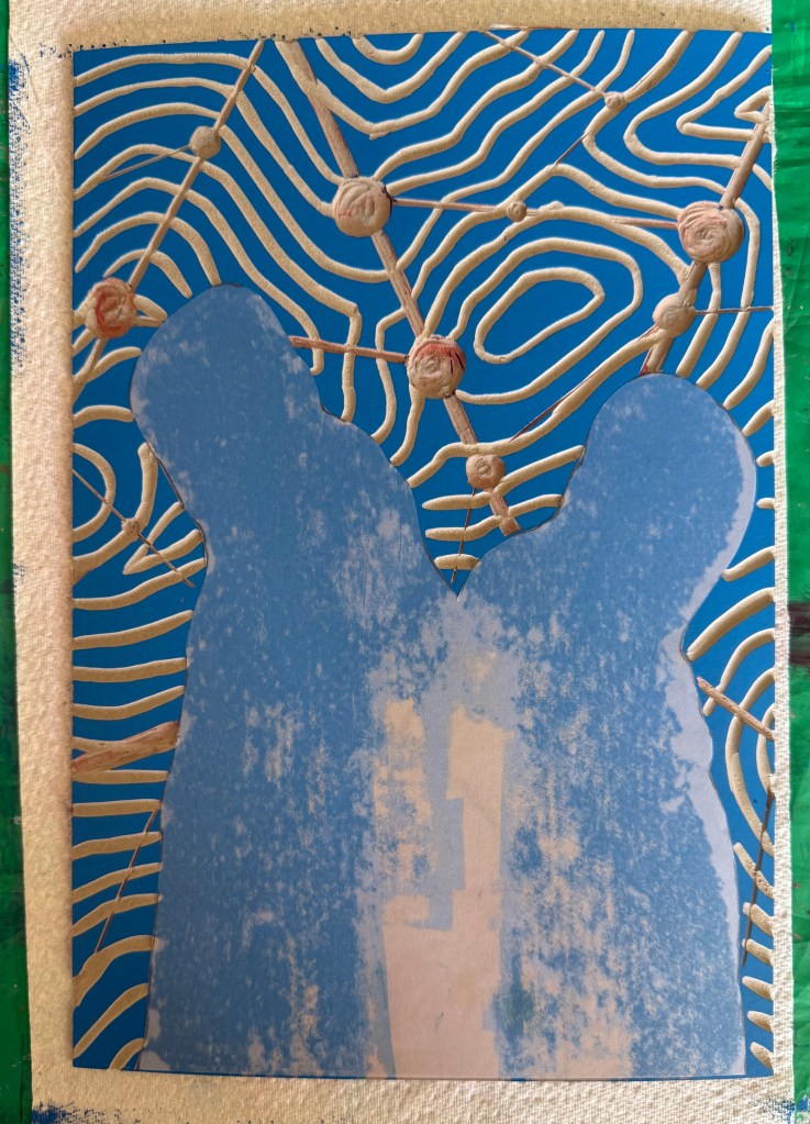
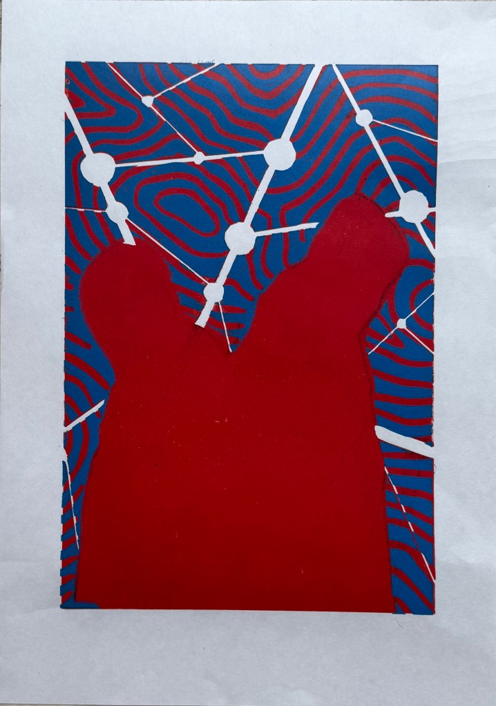
There was also misalignment around the edges of the figures which could have been caused by poor registration on the first layer, but could also have been caused by a lack of accuracy in creating the mask, or even applying too much ink.

To complicate matters further, the paper I used was Japanese HoSho paper which being lightweight (90gsm) and strong makes it ideal for printing linocuts. However, it turns out that it is slightly smaller than A3. I already had some Snowdon 130gsm paper, so I thought that I would give that a go, to see if it would be a suitable alternative, even though it is heavier than the HoSho.

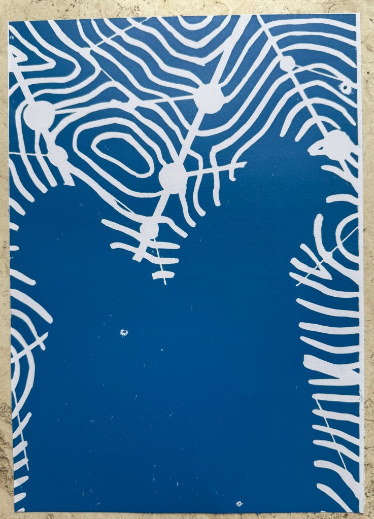
Other than a few areas where some bits had managed to get stuck onto the block, it seemed to print quite well.

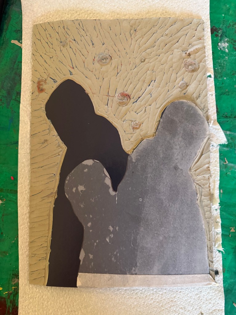
I then cut away the rest of the block leaving just the figures. I wanted to experiment with both masking areas and inking up the whole block to see how the subsequent layers printed so I could decide on a final approach ie whether to use a mask or to layer the ink. I would have preferred not to mask any areas as it seemed to increase the risk of mis-registration of the print. But before I decided I needed to find out how the final metallic gold layer would sit on top of all the other layers. I noticed that there were some indentations in the outlines of the figures from where I had cut out the contour lines.

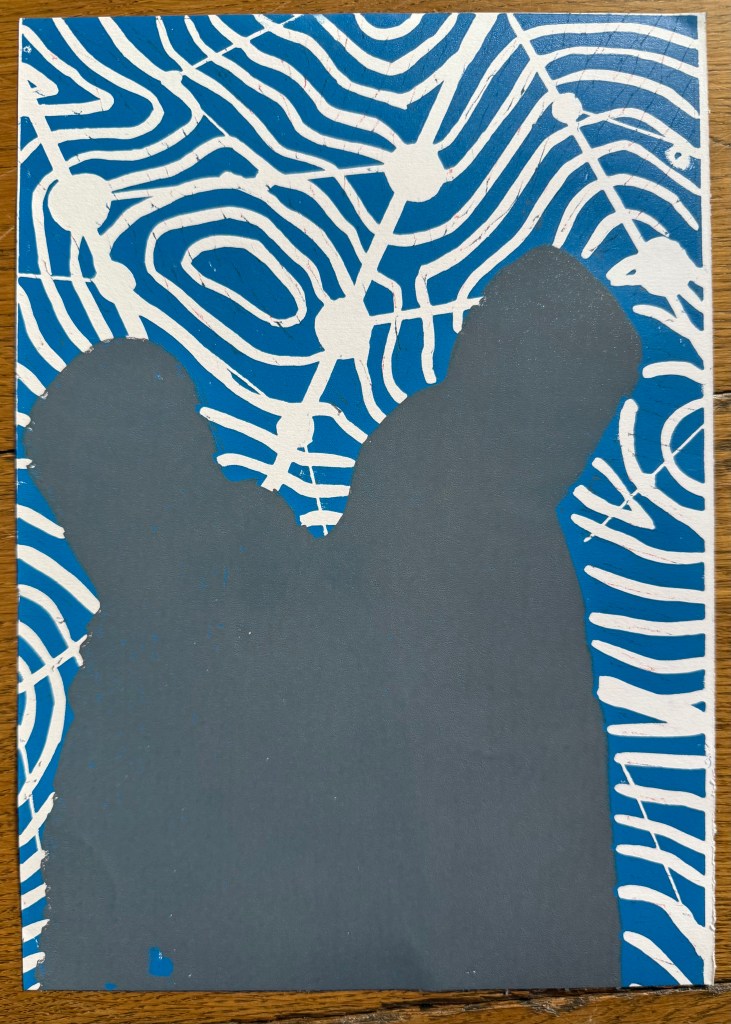
I also wanted to see how the grey would print on top of the blue as well as the red, and it seemed to fare quite well, although it definitely has a cooler undertone to it than when printed over the red.

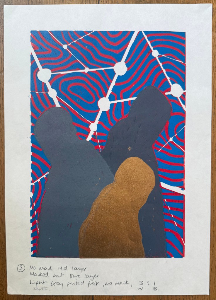
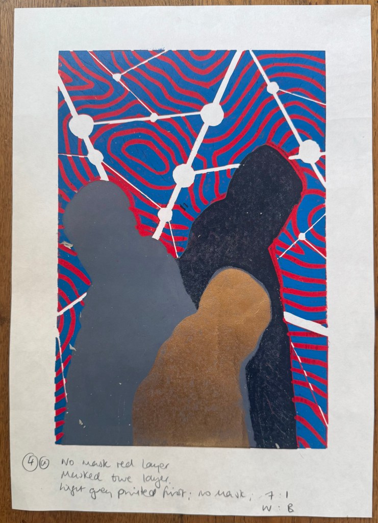
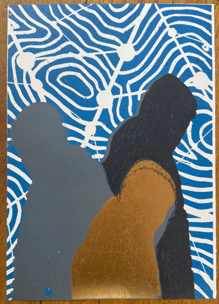
The blue and grey layers seemed to dry slower than the red and, as a result, the dark grey/black ink didn’t print well, and also the cut away areas picked up some of some of the blue and transferred it to the prints. I had the same issue with the gold ink, but by that stage I had become a bit frustrated and impatient, and just wanted to see what the colours looked like together. There are agents which can be added to the ink to speed up the drying process but you have to be careful as to the amount used, as they can alter the colours. I could have swapped from oil based to water based inks, which I didn’t have. So I decided to make the best of what I had.

I know that I make things more complicated for myself than they need to be. I could have watched videos on how to make reduction linocuts before starting, but there is a part of me that thinks that learning on the job is a more valuable, if not more frustrating, experience, and that the lessons learnt are more likely to be remembered (and possibly put me off linocuts for good).

So, what did I learn?

  • Preparation is key
  • Registration is everything – I watched a couple of videos after the event and invested in some Ternes Burton registration pins and tabs
  • It’s preferable not to mask areas if possible but to cut away the lino on each layer
  • Don’t use chinagraph or anything else which could transfer from the block to the paper
  • Accuracy is important
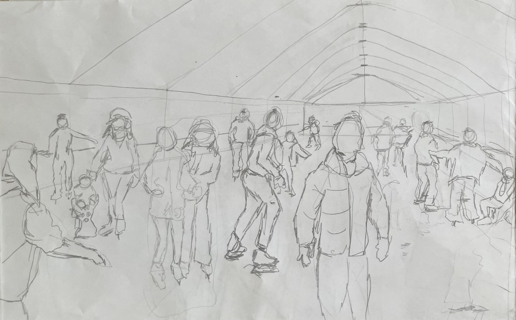
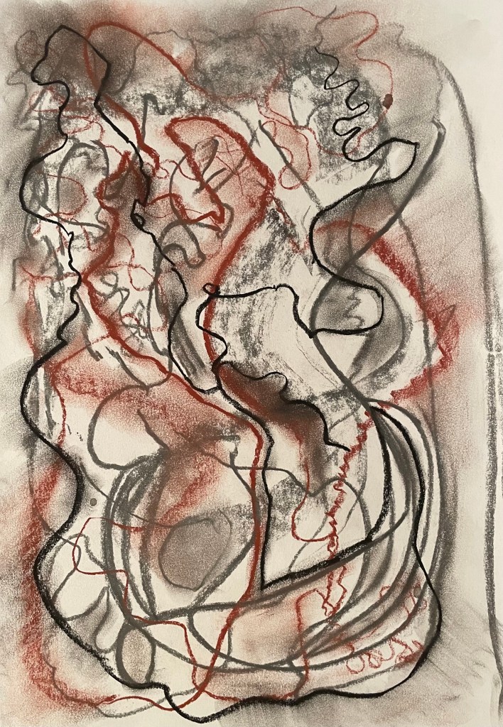
  • I should have had a resolved image before I started, rather than winging it in the process
  • When cutting out the first and second layers I needed to ensure a clean edge with the figures by using a craft knife
  • I needed to check that there isn’t any ink on the cut out areas of lino before printing
  • The ink needed to be dry before printing the next layer

But, the most important lesson is that because of the number of layers and the time needed for drying, it would not have been possible to complete the print before the end of the month. I needed to go back to the drawing board and have less colours so that it reduced the amount of drying time etc. So I amended the image to just white, red, grey and gold.

Making Sense of Worth

Yesterday’s session turned out to be quite timely for me.

We watched a video of William Kentridge’s Tide Table and part of an interview with him. He likes working with charcoal because it can be erased very easily, and speed of thinking is equal to the speed of drawing. This reminded me of paint being liquid thought (Elkins, J What Paint Is). Kentridge describes his work as being on a trajectory – a path followed, which finds structure and subject through being made.

Amongst other things, we considered what advantage exists in using material that changes easily, and what the advantages are of working in a fast or slow way? We discussed how working quickly can be more intuitive and stops the conscious mind from overthinking. In this respect, some expressed the opinion that work made in a short period of time does not have as much value as work which takes longer to make.

This is a concept that I have been grappling with for some time, in an attempt to shake it off (Dialogue I; Dialogue IV – I’m So Over It; We’re So Excited; Am I Bovvered?). It seems to me to be illogical, because I wouldn’t think that a book which took a year to write is of greater value than a book which only took a month. Maybe one author was in a flow state and it all came easily, whilst the other had to struggle, but theoretically they are of equal value.

What determines art’s worth? The time spent on it, the skill involved, the size, the materials used? Would a small piece using 24 carat gold leaf encrusted with diamonds which took me 5 minutes to make using quite complex skills be worth the same as something I took days to produce using a child’s wax crayon and a piece of scrap paper, but into which I poured all of my emotional being? I’m trying to bring myself over to the point of view that none of it matters; what matters is that I made it because I thought it worth making, and that it connects with me. But it’s very difficult to shift the mindset.

In my posts, which I refer to above, I was considering value in terms of rejection and how that might impact how I felt. I have the opposite scenario at the moment; I saw one of Rebecca’s blog posts about an exhibition she had been to, and I was intrigued by the technique used by the artist. I thought that I would quite like to try it out, and so I did. I made ‘Siblings’. It took me about 45 minutes or less to make. It didn’t take much skill to make – to be fair it could have been made by a primary school child with appropriate supervision while using the craft knife – but it represents and embodies something deeply emotional to me and it was very much about the process. As it turned out, I wasn’t disappointed with the end result and so I decided, on a whim, to enter it into the ING Discerning Eye Open Call, for which the deadline was the following day. It has been selected. You would think that I would be over the moon. I pretend to be to the outside world, but inside I still can’t help feeling that it’s unworthy because of the limited time it took to make.

Catching Some Rays

I’ve finally got around to doing something I’ve been wanting to try for ages – solargraphy.

I’ve been saving up used drinks cans in preparation, and today I managed to prepare some pinhole cameras and fix them in various parts of the garden. I took the top off the cans using a can opener, punctured a hole in the side using a pin and then inserted a piece of Ilford Multigrade satin photographic paper. I then sealed the unit using the bottom section of another securing it with gaffa tape

Hopefully I’ll get some images which show the movement of the sun across the sky, mapping its path – a perfect way to capture the passage of time within a single image. Maybe something like these:

Images from http://www.willgudgeon.com

I hope, but very much doubt!

Out Of Sorts

I haven’t done anything since coming home from the Low Res.

There was an intense period building up to it, followed by a period of sitting back and taking stock. I’m still thinking about it all, but whilst doing so I’ve allowed myself to get sucked back into domestic life. My daughter’s now home from uni for a month, along with all her ‘stuff’. Whilst it’s lovely that she’s back, it’s upset the normal way of things. Glasses and crockery disappear into the blackhole that is her bedroom, and the bottom of the stairs has become a footwear hotspot. Could be worse, I suppose.

Also, one of our dogs, Monty, hasn’t been so good. He’s an old boy at 12. Enlarged prostrate, chemical castration, hormonal inbalance making him not himself, and removal of a malignant melanoma. Waiting to talk to the vet about prognosis. I suspect there may be trouble ahead and difficult decisions to make. He’s out of sorts. We’re all out of sorts. But tomorrow’s another day.

I haven’t made anything. I am conscious that I haven’t and it’s starting to stress me a bit. My last two posts could have been cheerier, but there’s no point in putting on a fake smile. My colours are definitely muted at the moment. I feel like I’m stuck and I can’t progress until I’ve managed to process and order all that I took away from the week in London, but up until now I haven’t been able to set aside the time to do it. Also, my logical side dictates that I should deal with it all in chronological order, but that’s impossible to do because it all seems to be intertwined.

Second year Catherine told me that she feels like a spider spinning a web. I told Jonathan that I felt like I had been collecting during the week; it’s as if I’m accumulating pieces of a jigsaw puzzle, but I don’t have the benefit of an image on a box to guide me. I just hope it makes something, because it’s making me feel out of sorts.

I’m looking forward to the start of a new term next week. I need some structure.

Stuff

During our session at the brain gym this week, I explained to Dalal and Josh that I have been struggling to make finished work, as opposed to the products of experimentation. They both agreed with Jonathan, who, during my tutorial, had questioned whether I felt a pressure to make finished pieces; the experimentation stage is a place to stay for a while, and will, at the right point, turn into something more complete. I commented to Josh and Dalal that part of the problem may be that I’m ever conscious of time passing, and so I feel that I should be making the most of every minute – preparing the work plan had brought into perspective that there are a finite number of weeks left of the course, and that made me experience a moment of what I can only describe as loss.

I had hoped that a more productive phase would be imminent, but I suspect that at the moment this is being hampered by not having the headspace, or the physical space.

My husband is about (fingers crossed) to complete on the sale of his parents’ house in Liverpool – his childhood family home. He has been up and down, bringing things back. I find the process very difficult – I don’t have a problem with keeping things of use or of sentimental value, but another can opener? We have enough of our own stuff. We, or more specifically I, don’t need to add our parents’ stuff to the mix. I feel like I’m suffocating under the weight of belongings, many of which are occupying the physical space where I should be creating (more stuff?). Admittedly, I’ve been sorting this space out for I can’t remember how long, and made absolutely no progress. I’m conscious that my daughter will, one day, hopefully not in the foreseeable, have to undergo the same process – I don’t want her to be weighed down by all the stuff.

Along with the stuff, he also brought back what remains of one of his best friends from school, who died suddenly last year. His friend had left instructions as to all the places where he wanted to be scattered, including our garden, as he enjoyed coming to visit. Unbeknownst to me, my husband had brought him into the house and put him on the shelf, next to a glass bowl which had belonged to his parents, and which he had smuggled in as contraband whilst I wasn’t looking. My heart sank as I saw the bowl, and then the black bag next to it – what’s in here I thought as I opened the bag and took off the lid, another ornament?…

Dialogue IV – I’m So Over It

I’ve had enough of this side quest (©️Rebecca). I regret the day that I started it. Have I enjoyed any part of it? Maybe the beginning, the anticipation, the thinking about it. But when it comes to the process, it has been a monumental headache, from the execution to the photographing.

I realise a few things may be influencing my feelings about it. I keep getting reminder emails that the submission deadline is approaching – like I don’t know. Also, my daughter phoned me up yesterday morning in a crisis during an online exam – she was having IT issues. She had already contacted the helpdesk and taken screenshots, so my only advice was that she could only do what she could and not to stress, they must have procedures for this sort of thing. A couple of hours later she was feeling better, whilst I was still feeling the effects of all her stress, and trying to work out how on earth I was going to take a photo of a reflective surface. That, and the fact that some of the glue had managed to escape from under the cut-outs, and the realisation that I had fixed the die on the wrong way round.

Anyway, this morning it wasn’t raining for a change, so I took it outside. I’m not entirely sure how I’m supposed to convey its reflective qualities without including a reflection which then looks like it’s part of the work. Well, following my own advice, I can only do what I can do.

I feel like it’s been a shambles and that I’ve been amateurishly stumbling from one thing to another. The process hasn’t been the experience I thought that it would be. Because I had no expectations, I thought that there would be no stress – instead I’ve experienced confusion and frustration, and it has taken just as much out of me as other years, just in a different way. The only difference is, if it doesn’t get anywhere, I really don’t think I care at this point.

But every experience is a useful one. So what have I learnt?

  • Mirrored acrylic has an amazing quality of turning into a super static magnetic for all manner of minute particles floating around in the air and so is impossible to get clean.
  • Whilst deadlines can assist in making decision making and getting on with it, a lack of time reduces options, options which may have been the better course to follow. I should have had the image screen printed – it would have avoided so many issues – but I just didn’t leave myself enough time.
  • I’m not neat, and I don’t do small and fiddly.
  • I’ve tried something different – maybe next time I’ll enjoy it.
  • I can submit work which I don’t like and which contains what I know to be obvious errors.
  • I’m going to do mirrors again, sometime – they will not defeat me.
  • The process of exploration and experimentation is not just about serendipity and happy accidents or things that just don’t work, it can provoke feelings of confusion, frustration and it’s just not that easy.

But for the moment, I’m so over it.

Dialogue II

“So, what do you think?”

”It’s not one of your best”

And now I’m in a state of flux, and feeling a bit stressed, thinking where do I go from here? I have nothing else.

I use my husband as a sounding board and as a gauge as to what I’m feeling and what I’m doing. I value having someone to give me feedback, to hold a mirror up to me. But to what extent should I rely on this and allow it to influence how I see my own ideas and work? Why is it when someone says they really like my work, I feel it’s easy to ‘do it down’ – ‘oh, it’s not one of my best’, ‘there are some bits of it I’m not totally happy with’ (when actually I think that it’s as good as it could possibly be and I’m actually quite pleased with it), and yet when someone is ambivalent about my work, I feel unable to ‘big it up’?

Anyway, I now feel directionless, and at a loss as to what to do.

I have looked at how other artists have approached the concept of dialogue, and, in the main, they all involve figures. None of what I have looked at has inspired me so I haven’t even bothered to include any images of them in this post.

I don’t know what it is, but I’m feeling a bit fed up at the moment. Maybe it’s the theme of ‘Dialogues’ and the idea of connections etc. – it all seems as if it’s something that has been done before ad infinitum. Maybe it actually bores me – I don’t know – I just can’t seem to get inspired by it. Maybe it’s the fact that I only have a week to make something and I’ve got other more pressing things to be getting on with. Maybe this little side quest of mine is becoming an unnecessary distraction.

As a reaction to this feeling, I decided to take a literal, and some might say, infantile approach. I kept on coming back to my perverse love of Catchphrase and the birthday card. I started fiddling around on Procreate and came up with this:

A die, a log.

It’s pretty basic, but strangely appeals to something inside me. Maybe it’s a bit cheesy – but do I care? – maybe I need a bit of cheese at the moment. Then I remembered a piece I saw at the Pallant Gallery last weekend.

’Neighbourhood Witch’, 2008, Simon Periton, Silkscreen on mirror coated polyester

I really like the use of the mirror which reflects the viewer so that they then form part of the work. It reminded me of Craig-Martin’s ‘Conviction’ which I had seen at the RA. I could use this idea because one of the thoughts on my mind map referenced the need to reflect when engaged in dialogue.

I have decided to incorporate a mirror, possibly with the images of the die and log being raised slightly away from it so that they reflect in the mirror as well as the viewer – a die, a log, with you. It’s now becoming a fully matured wedge of Stilton!

I experimented by printing them off on some inkjet friendly acetate but my home printer didn’t do a particularly good job, but good enough to allow me to see whether the idea had legs. I wasn’t averse to it: it would mean that I would have to have it professionally printed on something more rigid, such as acrylic/perspex, and frankly, I don’t really have the time to get this done. Also, on reflection, I wasn’t sure about the reflections creating multiple images, as it was no longer a die and a log.

The only solution that I can think of is to fix the image directly to the mirror. The image in ‘Neighbourhood Witch’ above is screen printed on. I don’t know how to do this and I don’t have time to learn. I could get it done professionally, and after having done some research, it may still be a possibility but it depends on timing. Another solution would be just to collage them on. I researched the best type of adhesive and came up with Gorilla Clear Glue which is used a lot in glass mosaics. I will need to experiment with how best to apply it. In the meantime, I put some image cut-outs on a A4 mirrored piece of acrylic. I like the size.

Despite its luke warm reception, I’m going to carry on with my current train of thought. It may not be my best, but I like it because it is something that is totally different for me and it’s way outside of my box, and frankly, I’m all out of other ideas. And as General Patton said – a good plan violently executed now, is better than a perfect plan executed next week.

So I had a couple of sets of the images printed up on some 200gsm paper by my local print shop and cut them out and placed them on the mirrored acrylic to see how they would look.

I don’t know why I didn’t realise that this would happen, as it seems so obvious now – unless you stand dead straight on to it you can see the white reverse of the cut out image in the mirror.

My proposed solution is to have the mirror images printed and then fix them together so that any reflection is of the image itself.

Onwards and upwards, I hope!

Figuring It Out

I’ve started back at my weekly art class after the Christmas break, and over the last two sessions we have been looking at figures, in particular, figures in an environment. I’m not very good at depicting humans (or any animate subject for that matter), so this was a bit of a challenge.

We had to work from images which we had sourced: I took my nieces ice-skating at Christmas, which was really entertaining to watch. There were the confident, well-practised skaters who came equipped with their own boots; the ‘I’m-competent-but every-now-and-then-lose-my-balance-and-windmill-my-arms-brigade; and then the rest – hopelessly clutching the side, or each other, for dear life, inching their way round. There was a whole range of shapes, gestures and weights, in the sense of where in the body the weight is being distributed, and there was a lot of tension.

We started by sketching out the composition.

I used a combination of photos and video stills from my phone – I could have been more organised because I lost track of which figure was on which photo, which wasted quite a bit of time. Next time I work from numerous image sources I will organise them so that they are more accessible and easier to switch between.

I then applied a ground to the support (I used oil paper as opposed to a canvas, as I wasn’t sure how it was going to go). As it was a painting of ice-skaters, I chose burnt umber thinned down with Sansador as my ground, as it’s the blue equivalent of the earth colours. I then drew in the figures using a rigger brush and thinned paint – I found the techniques covered by Chris Koning’s workshop of gestural drawing (‘Perception of the Whole’) to be really helpful in trying to get some dynamism in the portrayal of the figures. I also changed the composition from the pencil sketch to bring forward the pair of skaters on the left and to give the skater next to the pair some extra space into which he could move. I also packed some more figures in, including my favourites, the couple in the centre – the man skating alongside and watching his partner who is leaning forward – and the girl behind them.

The next step was to block in the background. I decided that I didn’t want to put the figures in the specific setting of an ice rink, so I left out the details of the roof and sides which were included in the original sketch. This gives a feeling of more space.

I used a thinned down mixture of titanium white, ultramarine blue and burnt umber to create a grey/blue and then scratched into it with the end of the paintbrush to create skate marks.

I then started blocking in some colour using thinned paint. I liked the fact that the burnt umber drawing was still visible and decided to try and retain as much of it as possible. This meant that I would not be able to use much thick paint in subsequent layers, and so the painting will retain a sketch-like quality. The purpose of the exercise was to capture the essence of the figures, so there will be very little detail in the figures and their faces, other than those in the foreground, and even then I will keep these limited.

I regretted having the large figure in the foreground, but he felt necessary to add variation to the height of the figures, and his static quality should hopefully contrast with the sense of movement in some of the other figures.

I carried on adding some more colour and changed the colour of the skater’s hoodie to differentiate him from the figure in the foreground.

I really enjoyed the process of being looser: the multiple visible alterations and the pared back application of paint. I’m not sure that I like the finished piece, probably because of its subject matter – it’s all a bit twee. But that’s my own fault – I hadn’t adequately prepared for the class and so made a rushed decision. Next time we have to work from a preselected source, I will make sure that I prepare properly, so that the subject matter appeals to me as much as possible.

There are areas which really appeal to me; I like the way I have treated the ice and I think that I have managed to capture the sense of movement, the hesitancy and tension in the figures, and the atmosphere. I don’t like the way I’ve painted the faces in the foreground. Whilst the exercise was all about the figures, I don’t think I’ve managed to find a method to render faces in a non-detailed way which does not look childish. I need to work on this.

I was thinking about this painting whilst I was out on a dog walk yesterday. I enjoyed making it, but I’m not that enamoured with the overall result, which made me ask myself whether I need to like the work I make or whether enjoying the process is enough. Also, I like and am attracted to a wide variety of artists working in very different ways. I suspect that I have previously thought that I need to make myself like them and make the sort of work they make because it is something that I like and am drawn to. I’m starting to realise that this isn’t necessarily the case – I just need to be ‘me’.

Generally, the work which I produce at my art class is not something that I would ordinarily choose to do, (which is a good thing) and won’t necessarily be relevant to my field of study in terms of subject matter, but it will provide a useful source of exploration in terms of technique and approach in my art practice. As such it is a valuable resource and a good use of time as well as a commitment which ensures that I create work on a regular basis.

A Way of Working

As ever, I’m conscious that time is ticking by. Whilst the study statement will be useful to focus what’s buzzing around in my head, moving forward I need to develop a more concentrated and sustainable way of working in order to ensure that I get the most out of the next 5 terms.

Up until now I’ve been all over the place, immersing myself in art, books, programmes, aimlessly ‘doodling’, without any direction, just exposing myself to everything I can and seeing what might stick. Jumping from one thing to another. This process has given me lots of ideas. It’s not too difficult to have ideas – the difficulty is having good ideas and then developing them into a piece of work. I’m feeling that at the moment I’m talking the talk, but not walking the walk.

I lack self-discipline; I get easily distracted; I get bored; I often don’t finish things; sometimes I wake up and know that the day is not going to work for me, and it’s a case of just getting through it; tomorrow’s always another day; I have no routine. I need to establish a routine, if I can, one that allows me to fulfil my everyday responsibilities but which dedicates time to developing creativity. I have no idea how much time I have spent so far on this course. So, moving forward I’m going to record how long I spend doing what. Just roughly, not down to the minute. I’ve had to do this previously – it’s soul destroying having to account for your existence – but the reason for doing it now is to give me a better understanding of how I work, what works for me, whether I’m doing enough and how I need to plan for the future.

Thirty hours a week is a long time, I’ve realised. So, that’s blog 20 mins…

“Ever Tried. Ever Failed…

No matter. Try again. Fail again. Fail better.” (Samuel Beckett)

I hadn’t come across this quote until my daughter went to secondary school, where the headmistress used it as her mantra in her quest to produce strong, independent young women who would leave school ready to deal with whatever complexities the world threw at them. It was used to encourage the girls to go beyond their comfort zone in trying new things and not to be put off by the risk of failure – “feel the fear and do it anyway” was another one of her favourites!

There are many inspirational quotations dealing with the concept of failure such as:

“Try and fail, but don’t fail to try” – John Quincy Adams

“Success is the ability to go from failure to failure without losing your enthusiasm” – attributed to Winston Churchill

That’s all very well, but they don’t deal with how we should actually process the feeling of failure, and this is something we touched on in our online session this afternoon. The problem of dealing with failure is that the ego gets in the way. Strategies to overcome the ego include sharing stories (this allows others to learn from the failure without actually experiencing it); over-acceptance of the failure (that is actively taking it and collaborating with it to make an alternative outcome); and distancing the failure (for example, by using the third person when reflecting on it). The last strategy is particularly effective as it allows you to view the failure and the person who failed objectively giving rise to feelings of empathy.

So, our task for next week is to take a risk and do something in our art practice which might not work out!

For the first part of today’s session we finished our short introductions. I had been feeling ok about it, but towards the end I felt quite overwhelmed by emotion – maybe it was because I had mentioned my constant feeling that time is ticking by at quite a rate, or maybe it was the sudden realisation that it is only now that I have made the time to do something that I have always really wanted to do. Either way it came from nowhere and left me feeling quite out of sorts for some time afterwards. Even more reason to carpe diem!

Below is today’s automatic drawing in which I used a thin and a thick piece of willow charcoal, holding a piece in each hand moving at the same time. I then used a sanguine and black conte pastel on top. It’s not as dynamic as the previous drawing and seems a bit contained – maybe because I was using both hands at the same time – I’ve never been able to do the head pat/ tummy rub thing. Next time I think I will stick with charcoal, but maybe build up some layers, and also begin from a different starting point.