Out Of The Blue II

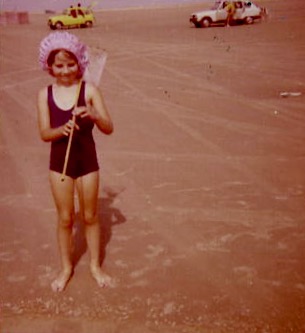
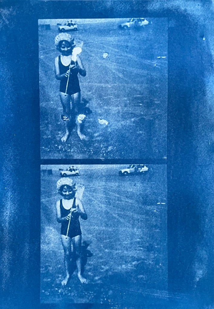
I took the overexposed images of me on the beach and lightened them by putting them in a bath of sodium carbonate (made by heating sodium bicarbonate in the oven) and water. I think that the solution was too strong as it lightened the images considerably.

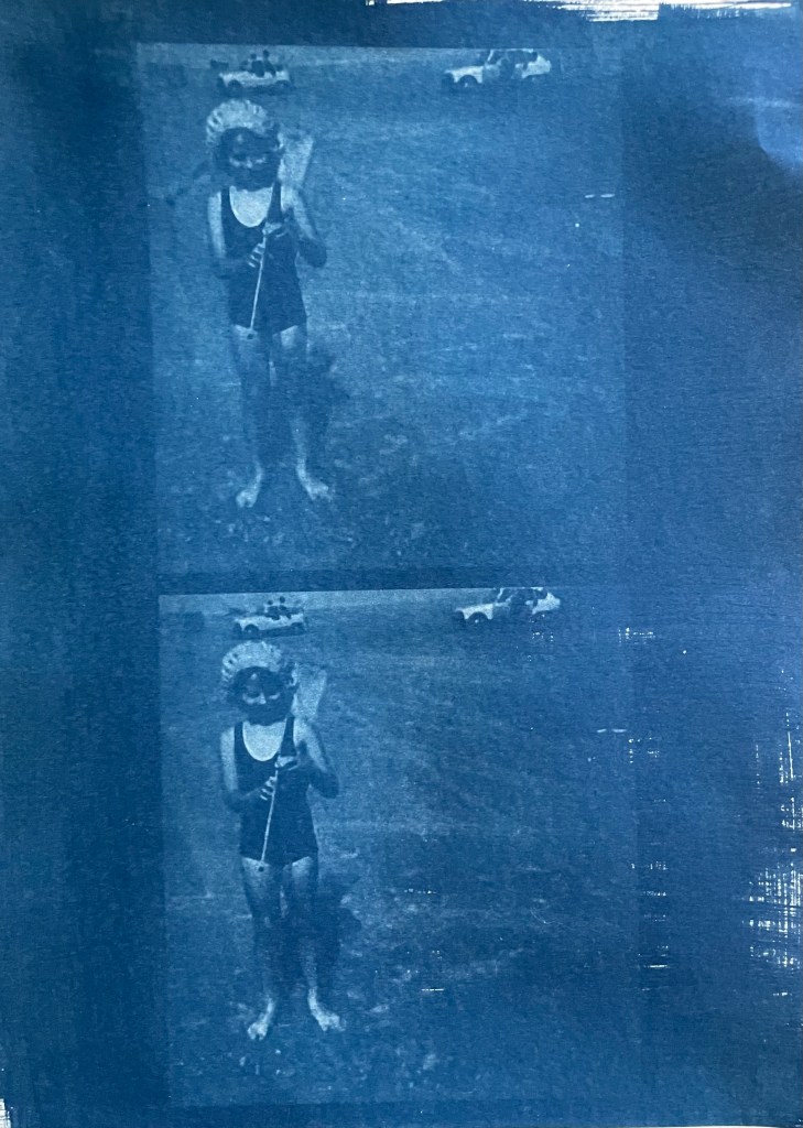
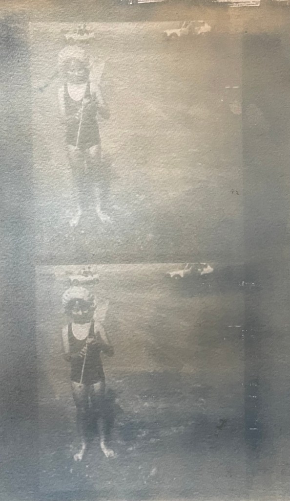
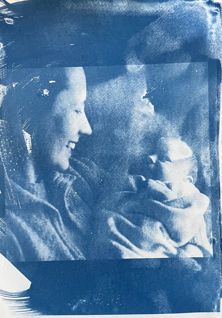
I then made up some toning baths, and used the lightened images and two of the ones which had been ok from the previous session.

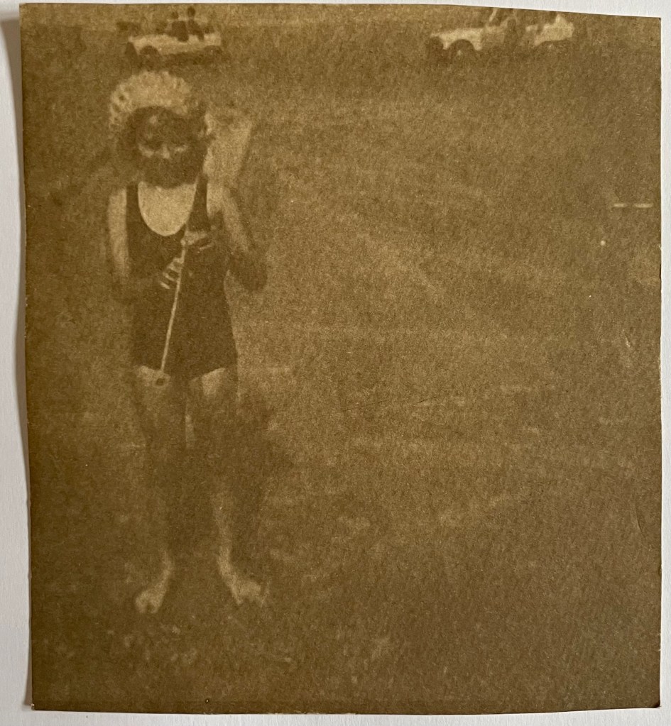
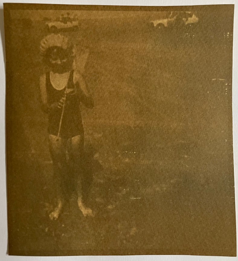
It took several hours for the tones to develop especially in the images which hadn’t been lightened first. Thinking about it I haven’t been particularly scientific or logical about this as I was too keen to experiment, but going forward I will need to be more careful about keeping a record of process: applications, timings, volumes, amounts etc if I am to stand much chance of recreating effects that I like. ( Left: Turmeric tealightened)

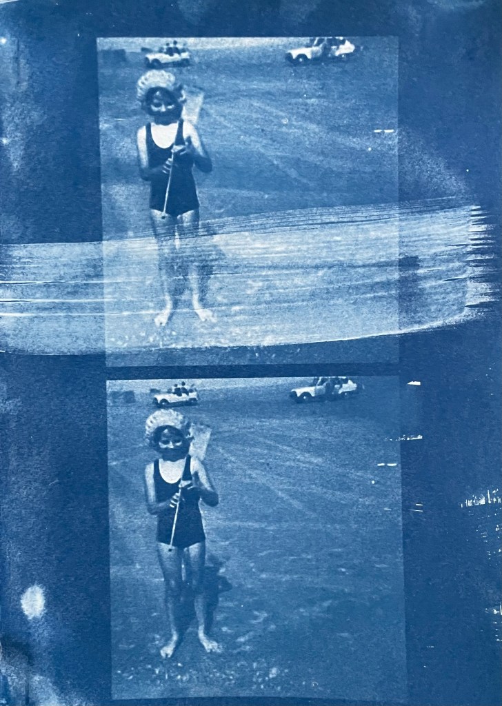
To get a true comparison I will need to repeat the process using lightened and unlightened images and specific volumes of toner and timings etc.

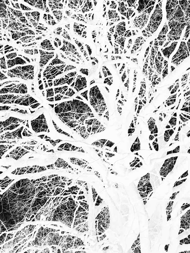
I then started playing around with exposures. I prepared a new print of the trees using the unit, re-applied some solution, and then placed some amorphic shaped paper masks over areas of it and put it back in the unit for 5 mins. I then put it in a hydrogen peroxide bath in an attempt to get some deeper blues and definition in the dark areas.

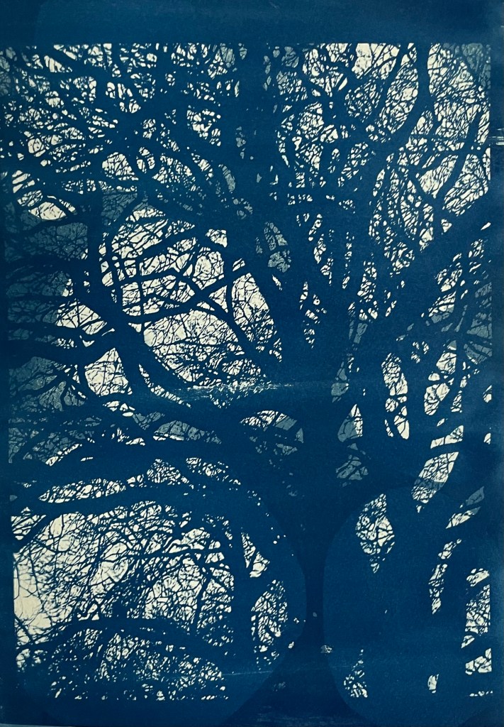
I like the added depth that is achieved by the second exposure; it creates some more interesting areas within the darks, and a mid tone in the lights, making 4 tonal values.

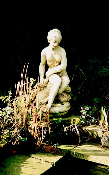
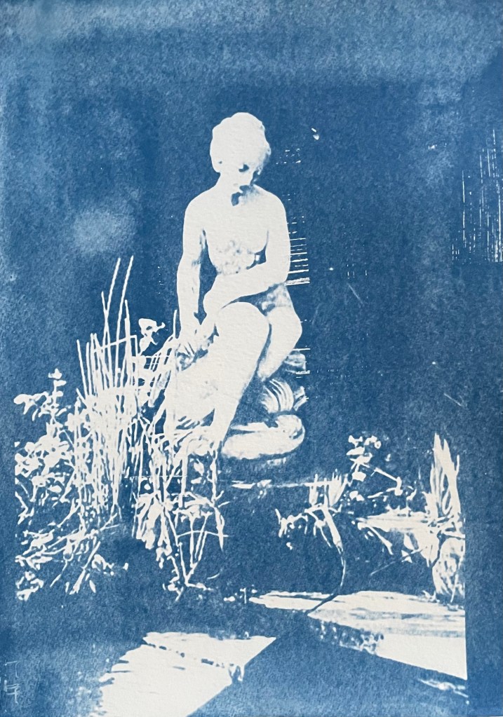
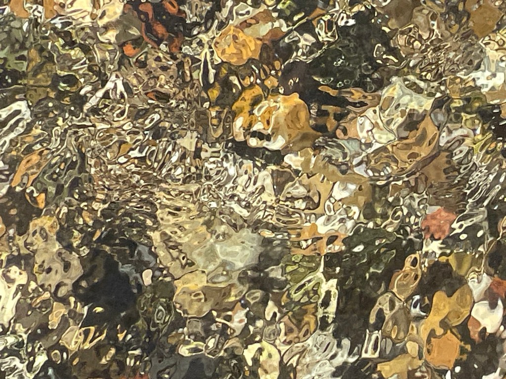
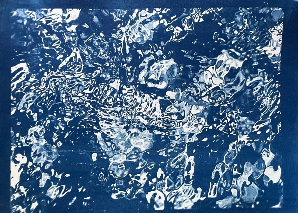
I then tried a triple exposure. I took the underexposed image of the pond statue from the previous session, reapplied the solution (not particularly evenly as it turned out), and used some torn paper to retain sections of the original image. I exposed it for 5 mins in the unit.

I then recoated it, and masked off most of statue, laid on some foliage and then exposed for 5 mins in the unit, finishing with hydrogen peroxide to accentuate the different tones in the dark areas.

I’m pleased with the result, although I would have liked to have achieved greater definition of the leaves where they cross the vertical strips. Perhaps less time on the second exposure?

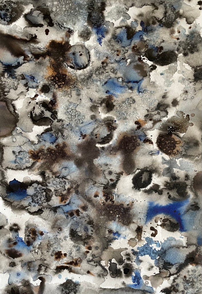
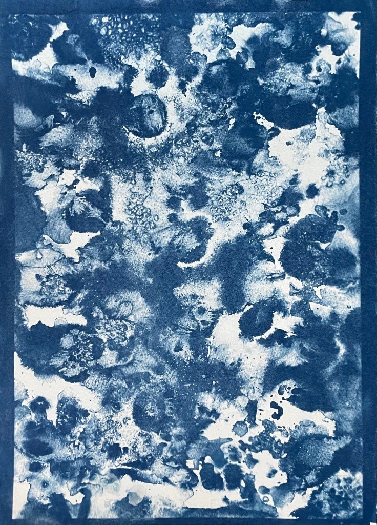
Exploring the idea of masks further, I tried using various items on the first exposure. Some were more successful than others. Soap suds between sheets of plexiglass didn’t really work (I think that’s more for when working wet in wet):

Soap Suds

I also swapped from watercolour to oil paper, with a view to developing the prints by painting on them in the next session.

Cling Film

Piece of Cord

Bubble Wrap

I really like the effects achieved in the images above. I now need to sit back and reflect on if, and how I can develop them further.

I think that my brain is at risk of becoming overwhelmed by all the possible permutations. My natural reaction is to explore every combination possible. To this end, I enjoy making up colour charts, recording every possible combination using all of my paints, even if I never use the charts. I suppose that I like to know all of the options available to me, with which I can work. It makes me feel safe. I like the comfort of having some form of structure in place. That’s how I am – I like to be informed: to know all the options before making a decision, to see all that there is to see in the place where I am on holiday, read every book or article which might be relevant – hence my delay in tackling the UAL library online. I think it comes back to the feeling that I have done all that I can possibly do, and so the decision or path that I choose to go down has to be the right one. I like resolution. Nothing irritates me more than watching a film or reading a book and getting to the end where there is no end, even if it is a bad ending; no resolution. And yet, the ending could be whatever I want it to be and has infinite possibilities which in many respects should be a better and far more exciting place to be.

Out Of The Blue

Last summer I became obsessed with cyanotypes. Then there was plenty of sun. There was some sun the other day, but not much since, so I decided to make myself an exposure unit using my Speedball UV lamp and following instructions on Handprinted. I do love a bit of DIY; there’s something very satisfying about making do with something handmade which didn’t cost a fortune to buy, or require some fancy kit, or having to go to a specialist location.

I used an old printer box which was large enough to take A3 sheets, cut out a hole for the lamp to sit in, and then lined it with aluminium foil.

I selected a few photographs to experiment with; some from the family photos which I’ve been sorting out, and others which I have collected on my phone as inspirational resources, as well as some images from the experiments earlier on in this blog. I converted them all to black and white and then inverted them in Photoshop, printing them off on transparencies. I had to dust off my old printer to do this as I wasn’t sure how to do it on my husband’s printer. This took a while because between each print I had to perform a ritual of pressing certain buttons in a certain order in order to fool the printer into thinking that I was using genuine HP ink cartridges, which I wasn’t. The things you can learn on YouTube.

Ironically, the sun came out, so I did a mix of au naturel and my DIY unit.

The first two prints were made using the unit, the first being over- exposed at 20 minutes, the second being just about right at 15 minutes. The last two prints I did outside in the sun, which was a bit more hit and miss because the strength of the sun was not constant as it kept disappearing behind some cloud cover. However, I do really like the effect of the visible strokes which I left when applying the solution to the paper, which was A4 300g/m2 hot pressed watercolour paper. The markings give the effect of a moving, flickering , transitory image – there, but not quite there. I put two images on the same negative transparency because I wanted to create a number of smaller images to experiment with. However, the suggestion that the images are on a roll of film is really interesting.

It’s been really difficult getting some of the old photographs out of the albums; they are the sort which have sticky pages on which you position the photos, and then put a transparent film over the top. Over the years the adhesive has seized up and practically bonded to the back of the photos. I’ve tried all sorts including gentle heat, dental floss and a bendy, very sharp filleting knife.

This one of my mother and brother is a favourite, but sustained a small tear on the right. I am pleased with both images – the first one was done outside and the second in the unit, which seems to have more of a Prussian Blue hue to it although I’m not sure that there’s any rhyme or reason as to the differentiation in the blues – but I really like the movement in the second one, again giving the impression of a fleeting moment. I think that the solid areas at the top and bottom add to it, suggesting a frame from a film of a moving image.

This is a photo of the statue which sits at the bottom of my mother’s garden next to her makeshift pond made out of an old washing-up bowl. I always used to wander around the garden when I visited, stopping at the pond to see if there were any frogs around. I do like a frog – my grandmother on my father’s side used to have a rockery, and I used to spend most of my visits looking for, and trying to catch frogs. That, and hanging out in her shed and greenhouse with the tomato plants – I love the smell of tomatoes; it takes me right back.

The problem with a cyanotype is that if you leave it too long, you over-expose it, and whilst you get deep blues you lose the midtones, which is what I thought I had done with the first one, so I exposed the second one for less, but it turned out to be under-exposed – even putting it in a hydrogen peroxide bath didn’t help. Both were done outside; perhaps I should have done a straight 15 mins in the unit, but where’s the jeopardy in that?

This is a photo that I took looking up into the branches of the three trees that I like. The negative image is also really interesting, and I might do something with that at a later date. The image (last photo) is underexposed again, but has a feeling of being removed, almost as if I’m looking at it through my window (which incidentally does need a good clean). I wanted to try fabric, but could only find some thin cotton lawn. I was so disappointed – it turned out terribly. I had visions of being able to create long, flowing, billowing, wispy cyanotypes, but ended up with the image above. You can just about make out the branches.

I will need to think about this a bit more. My first thoughts are that maybe there was a coating on the fabric, so I’ve washed it; maybe the image was too detailed, but I’ve seen quite detailed images on fabric; that the structure of the fabric is not robust enough – you can get pretreated fabric which is like a sateen so I could try that; or maybe there wasn’t enough contact between the fabric and the negative. I need to take some time to reflect, and try again.

The images above were from my experiment with ink in Blot II , and from A State of Flow II . It was a useful exercise in that it confirmed to me that not everything works as a cyanotype – I much prefer the original images, particularly the ink one, as the edges between areas of flooding and blots are much more defined, and there is more of a delicacy about them. The contrast between the blue and the black ink also adds interest which is lost in the cyanotype.

So, on reflection a really useful and enjoyable exercise. The thing that I really enjoy about this process is the anticipation, and then the slow reveal as you rinse off the solution to see an image slowly emerge, or not, as the case maybe. Doing it outside as opposed to in the controlled environment of the unit adds a degree of extra excitement, but equally there is the risk of crushing disappointment when it doesn’t quite work out.

Moving forwards, I was intending to experiment with toning some of the smaller images of me with tea, coffee, wine etc, but I actually like the last couple as they are, so I will keep them as finished. I’m thinking about how I could use multiple exposures to create layers, and also thinking about manipulating the source image a bit more in Photoshop and printing from the original image rather than reversing etc. I’m not sure whether I’ll get straight to it, or do something else in the meantime – sometimes I go hell for leather with something and then exhaust it, or myself, or become disenchanted with it. I don’t want to get too far down a rabbit hole, so maybe I should leave a bit of space before going back to it, to allow for some more subconscious reflection. I suppose the clue was in the opening sentence: “Last summer I became obsessed with cyanotypes”, and I haven’t done it since.

On Your Marks…

Well, the starting pistol has gone off, and I’m still sat here, procrastinating, allowing myself to be distracted, doing anything other than what I should be concentrating on: producing something for the pop-up show. My problem with deadlines is that I tend to ignore them until the very last minute – goal driven, that’s me.

What, with thinking about the pop-up and trying to come up with an inspirational text for Tuesday’s session, I’m feeling just the tiniest bit sick. I would say that I have stuck my head in the sand but apparently that’s a popular misconception: when they sense danger and cannot run away, ostriches will flop to the ground and remain still, attempting to blend in with the terrain – that sounds just about right!

Anyway, following on from my ‘Less’ post, I’ve been thinking about working with a limited palette and how it narrows choice. Using a pen narrows choice even further – just black and white and nothing much else in between. Using a pen forces you to think about mark-making in order to create tonal values and areas of interest. So, I’ve been using my time constructively by doodling with a pen in my sketchbook whilst listening to an audio book – who says I can’t multi-task!

I found the process of mark-making to be meditative and grounding, totally different from the anticipation of putting ink onto wet paper and waiting to see what happens. Strangely, I like it. I think I am a person of extremes: I’m either fastidiously tidy or chaotically messy; organised or haphazard; focused in on the minutiae or just wanting to see the bigger picture. Somehow I have to find a path along which both sides of me are satisfied.

I will definitely use pen again, if only as a way to order my thoughts. Going forward I think I should try to build up a bank of possible marks, almost like a painter might have a bank of colour swatches. Having said that, I’m mindful that I’ve still got to do a few things to which I’ve committed in earlier posts, so I think I need to embark on some self-accountability first.

Light & Shadows

I attended another of Chris Koning’s online drawing workshops at lunchtime, to brush up.

She explained the concept of light logic:

  • Highlight – the brightest light
  • Cast Shadow – caused by the object blocking the light and so the darkest dark
  • Reflected Light – dim light bounced back up from light on the surface
  • Crest/Form Shadow – shadow which lies on the crest of a rounded form between highlight and reflected light

When drawing we are not interested in contrast, but in value ie what something looks like against something else.

‘The Artist’s Mother’, Georges Seurat, 1883

This drawing by Seurat is made up of lots of different areas of tone. The parting in the hair is not a definite line; it has been created by different areas of tonal value. There are no harsh lines anywhere and there is very little contrast in the image. It is Seurat’s flawless light logic which allows us to create the rest of the information ourselves.

We then did a quick 10 minute exercise. We lightly shaded in a rectangle. Then we were shown a blurred image and told to fill in the darkest areas and then use an eraser to show the lightest. We then had to fill in the rest of the tonal values in the knowledge that nothing else will be as dark or as light as the existing areas of tone.

Chris then inverted the image and made it clearer:

It was a helpful reminder not to ‘see’ what I’m drawing and thereby create an expectation, but just to see shapes of tone, and to start from the general, keeping in mind the relationships between areas in the whole of the composition, and then move towards the specific.