Trying to Move Forward

I decided to try and progress the idea of automatic map-like drawing by experimenting with charcoal. I drew a single line and then rubbed it out and repeated the process numerous times, building up layers of mark-making. I then took some coloured pencils and traced a path randomly following the marks.

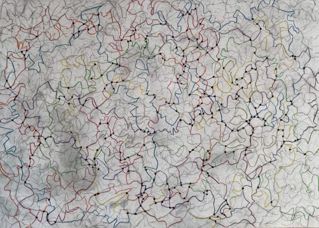
I’m not sure that it takes me much further forward in developing this line of enquiry. However, I enjoyed the process and I like the different nature of the coloured lines which I made consciously by making decisions as to which of the paths of faded charcoal to follow, almost like a dérive – they have a different character to the ones I make when I draw automatically.

I’ve been thinking a lot recently about the course, about being half-way through and what I would like to have achieved by the time it finishes – what work I might produce by the end of it. At the moment, the concept of mapping is at the centre of it. I want to produce something which reflects all that I have learnt during the course, about myself and how I relate to the world around me. It will inevitably be an artifact, a map, of some shape or form, but I want it to reflect a process which is ongoing, that will never be complete, a piece of work in a state of flux, constantly subject to change, so there has to be some sense of impermanence, of it being unfinished. I also want to encompass the idea that memory plays a large part in the process and much like maps which are constantly being made and remade, so are the memories on which the map is based. The idea of layers and distorted imagery seem to be relevant in this respect.

I’ve thought about paper and canvas, maps being folded and rolled , but I don’t think that these offer the ability to create layers in the way that I want. I’m currently thinking that I may make a number of squares which together make up the grids of a map.

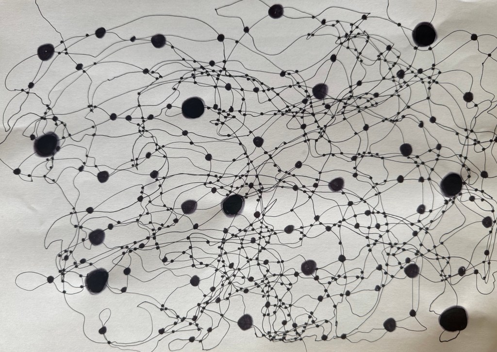
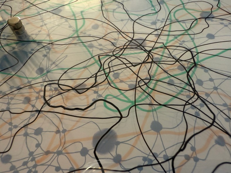
I used a pen to try and keep a marble on the paper. I like the lines which were made as a result – they have a sense of fluidity about them, much more than the lines that I have been making up until now. I’ve been meaning to experiment with the size of the dots at the intersections, to see if different sizes create a sense of perspective and three dimensionality. I don’t think that I have managed to achieve enough diversity in the sizes – it was very much an afterthought – I’ll try again another time. The image makes me think of something neural, cognitive mapping?

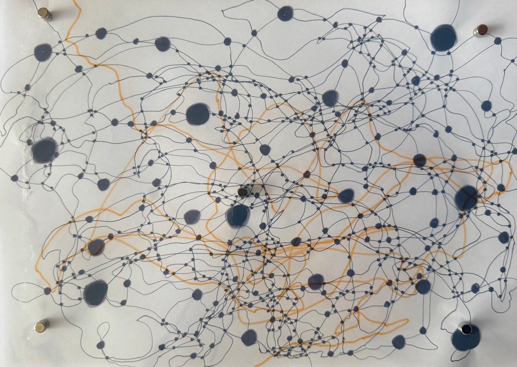
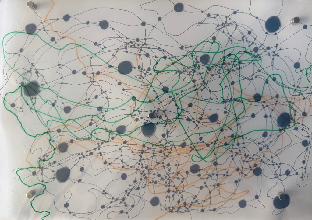
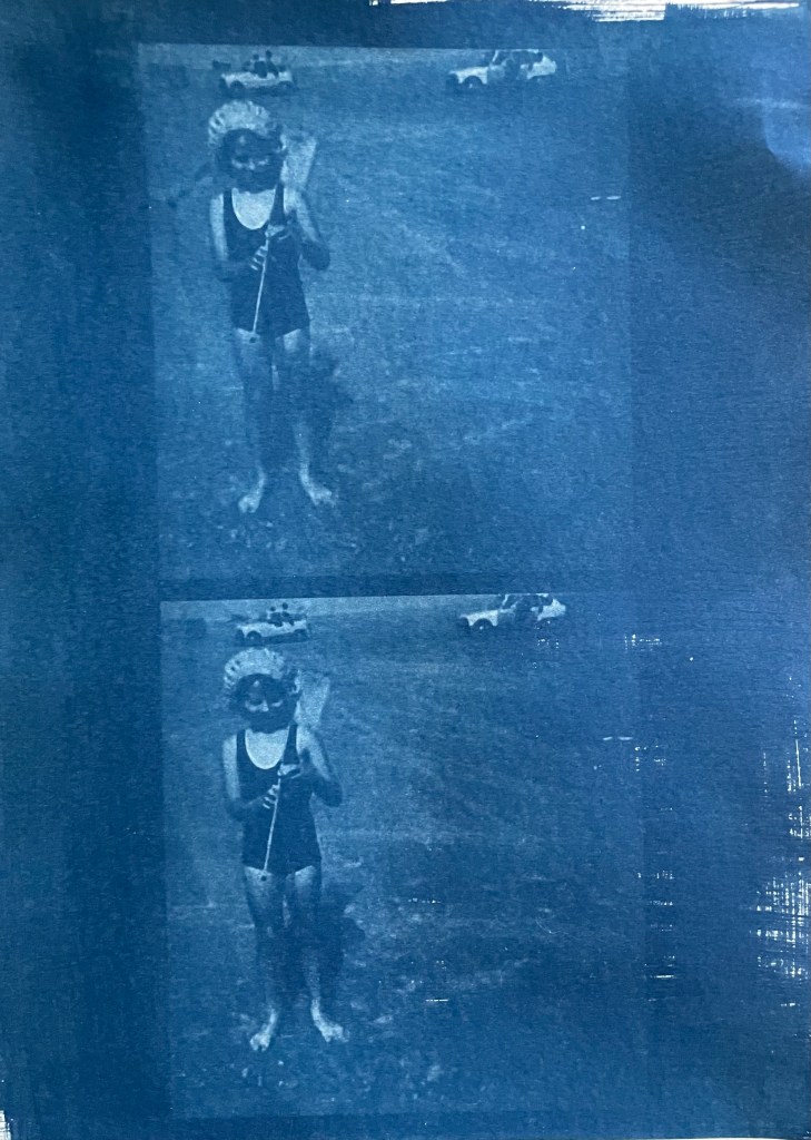
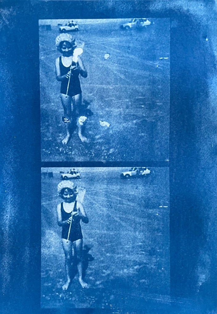
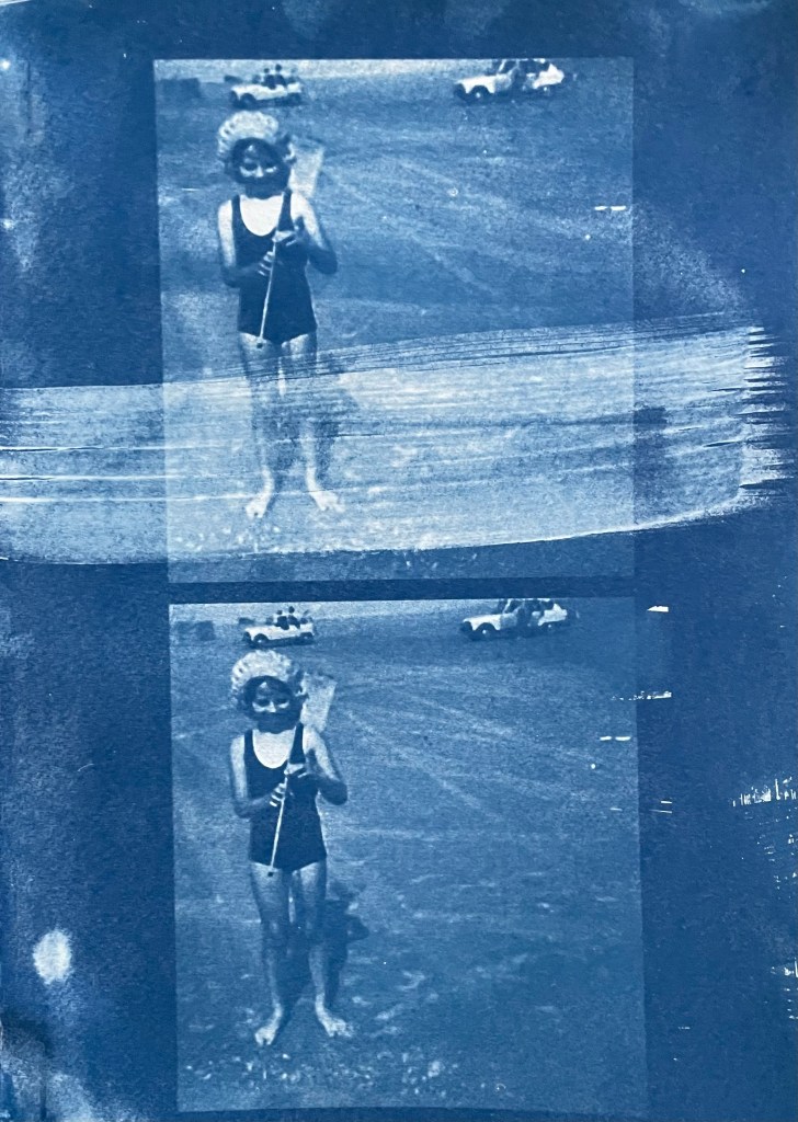
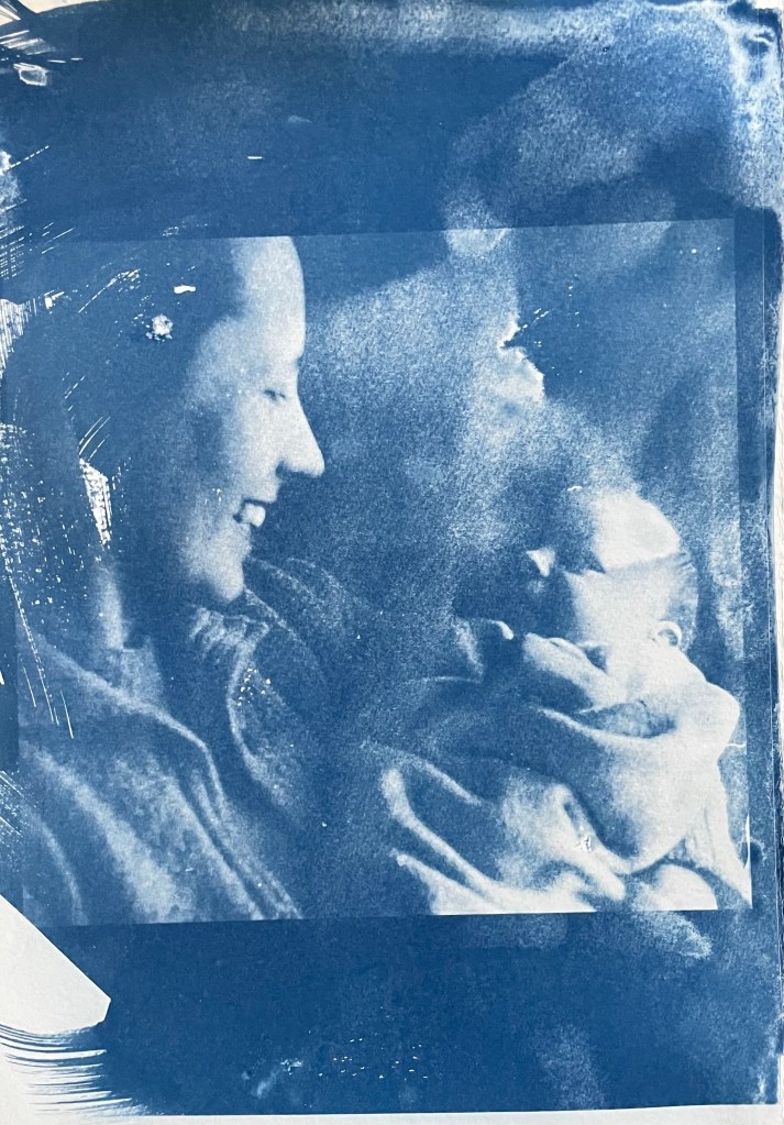
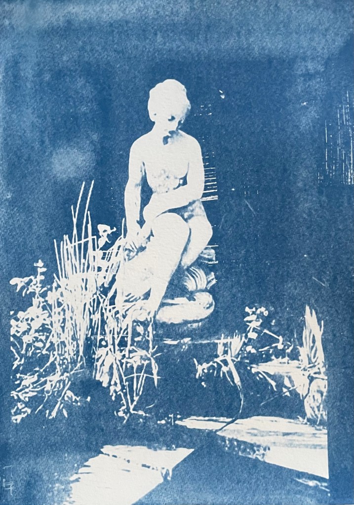
I took some inkjet compatible transparencies and drew some lines to see if I could create layers. Unfortunately, they are not totally clear – they have a milky appearance, probably because of the coating which allows them to be used in inkjet printers. I need to do some research to see if this is the case or whether I can source some others. Having said that, the milky film does cloud what’s underneath, making it hazy, almost like a memory that’s not quite there. Ultimately, I’m thinking that I could use layers of acrylic sheets over a background image, possibly together with milky transparencies, some can be drawn, painted and printed on, and I can also include some cyanotype images as well a negatives. I could cut holes in some layers to allow direct access to layers below. The use of reflective surfaces would also add depth.

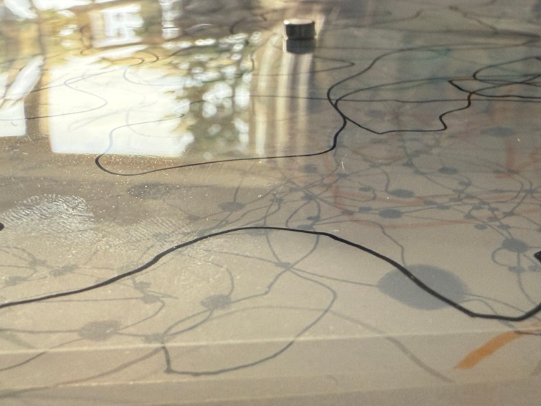
I layered up the sheets using small magnets which not only hold them stacked together but also act as spacers between the layers. I had to add one in the middle because otherwise the sheets would sag – this won’t be a problem with rigid acrylic sheets. The magnets themselves suggest impermanence, the ability to be easily changed.

Sorry, Are You Talking To Me?

I’ve decided that I’m probably learning far more about myself by simply being in this process than I am by looking back on my life.

I need to retrain my brain. My legal training has made me focus on detail, anticipate every possible eventuality, dot every ‘i’ and cross every ‘t’ all within a rigid framework of rules and regulations. That way of thinking served its purpose then, but it now stultifies creativity.

When I’m in a scenario which is unfamiliar, I like to know the parameters within which I’m expected to navigate; quite often I feel discombobulated when things don’t go the way I am expecting, the paper workshop with Christian Azolan being a case in point. We were instructed to fold the paper. To my pedantic mind, folding involves a deliberate act of bending something over on itself to create a clearly defined edge. It doesn’t include scrunching. But once I had overcome my initial confusion and accepted this unexpected variation of the parameters, I enjoyed myself.

I definitely preferred using the blank paper – I don’t know what brand it was, but it felt really good. It led me to confess my fetish for pristine white paper to some of my fellow students. I think it stems from being at primary school when the teacher would write my name on the front of a new exercise book with a marker pen and I would go back to my desk and give it a good sniff. I now appear to associate blank paper with a solvent high. I don’t think that my school ever had a pupil who was so keen to man the stationery cupboard at break time. In fact, I used to get palpitations and a bit of a sweat on just walking into WH Smith (R.I.P).

Working with the blank paper seemed to allow more freedom and I liked that the results took on a sculptural quality. The effect of the folding on the reverse of the paper was equally, if not more, interesting at times than the right side; areas which were peaks on one side became troughs on the other and vice versa.

I felt inhibited using the print of the back of my head; I became too concerned with the resultant image which seemed to impose restrictions on how I folded, so maybe I like clear parameters, but not too many of them? Also, the effect is less sculptural than when using the blank paper; the areas of shadow are less apparent and the focus shifts to the distortion and concealment of parts of the image rather than the creation of form.

We then went on to do some linocutting – it seemed a bit incongruous with the folding activity, but nevertheless we all launched into it with equal enthusiasm.

I prepared two linocuts; one inspired by tree roots and the other a reduction linocut of an abstract shape – I printed it using yellow ink first, then cut away more lino and printed using red ink.

I also printed the tree roots image on a transparency, having torn up bits of paper to create a random mask. It is interesting to see the effect of overlaying it with the two prints; how it creates a sense of discord on the prints where it’s not in sync with the image below, and how it creates areas of intensity on the print over which it lines up.

As I was taking my lino into the next door room to print it, Christian heard me reminding myself as to what I was planning to do. Sorry, are you talking to me? No, just myself. Doesn’t everyone do that? Yes, of course. When I went back in to print my second lino, I asked him how long we had left. Sorry, are you talking to me?…

Out Of The Blue

Last summer I became obsessed with cyanotypes. Then there was plenty of sun. There was some sun the other day, but not much since, so I decided to make myself an exposure unit using my Speedball UV lamp and following instructions on Handprinted. I do love a bit of DIY; there’s something very satisfying about making do with something handmade which didn’t cost a fortune to buy, or require some fancy kit, or having to go to a specialist location.

I used an old printer box which was large enough to take A3 sheets, cut out a hole for the lamp to sit in, and then lined it with aluminium foil.

I selected a few photographs to experiment with; some from the family photos which I’ve been sorting out, and others which I have collected on my phone as inspirational resources, as well as some images from the experiments earlier on in this blog. I converted them all to black and white and then inverted them in Photoshop, printing them off on transparencies. I had to dust off my old printer to do this as I wasn’t sure how to do it on my husband’s printer. This took a while because between each print I had to perform a ritual of pressing certain buttons in a certain order in order to fool the printer into thinking that I was using genuine HP ink cartridges, which I wasn’t. The things you can learn on YouTube.

Ironically, the sun came out, so I did a mix of au naturel and my DIY unit.

The first two prints were made using the unit, the first being over- exposed at 20 minutes, the second being just about right at 15 minutes. The last two prints I did outside in the sun, which was a bit more hit and miss because the strength of the sun was not constant as it kept disappearing behind some cloud cover. However, I do really like the effect of the visible strokes which I left when applying the solution to the paper, which was A4 300g/m2 hot pressed watercolour paper. The markings give the effect of a moving, flickering , transitory image – there, but not quite there. I put two images on the same negative transparency because I wanted to create a number of smaller images to experiment with. However, the suggestion that the images are on a roll of film is really interesting.

It’s been really difficult getting some of the old photographs out of the albums; they are the sort which have sticky pages on which you position the photos, and then put a transparent film over the top. Over the years the adhesive has seized up and practically bonded to the back of the photos. I’ve tried all sorts including gentle heat, dental floss and a bendy, very sharp filleting knife.

This one of my mother and brother is a favourite, but sustained a small tear on the right. I am pleased with both images – the first one was done outside and the second in the unit, which seems to have more of a Prussian Blue hue to it although I’m not sure that there’s any rhyme or reason as to the differentiation in the blues – but I really like the movement in the second one, again giving the impression of a fleeting moment. I think that the solid areas at the top and bottom add to it, suggesting a frame from a film of a moving image.

This is a photo of the statue which sits at the bottom of my mother’s garden next to her makeshift pond made out of an old washing-up bowl. I always used to wander around the garden when I visited, stopping at the pond to see if there were any frogs around. I do like a frog – my grandmother on my father’s side used to have a rockery, and I used to spend most of my visits looking for, and trying to catch frogs. That, and hanging out in her shed and greenhouse with the tomato plants – I love the smell of tomatoes; it takes me right back.

The problem with a cyanotype is that if you leave it too long, you over-expose it, and whilst you get deep blues you lose the midtones, which is what I thought I had done with the first one, so I exposed the second one for less, but it turned out to be under-exposed – even putting it in a hydrogen peroxide bath didn’t help. Both were done outside; perhaps I should have done a straight 15 mins in the unit, but where’s the jeopardy in that?

This is a photo that I took looking up into the branches of the three trees that I like. The negative image is also really interesting, and I might do something with that at a later date. The image (last photo) is underexposed again, but has a feeling of being removed, almost as if I’m looking at it through my window (which incidentally does need a good clean). I wanted to try fabric, but could only find some thin cotton lawn. I was so disappointed – it turned out terribly. I had visions of being able to create long, flowing, billowing, wispy cyanotypes, but ended up with the image above. You can just about make out the branches.

I will need to think about this a bit more. My first thoughts are that maybe there was a coating on the fabric, so I’ve washed it; maybe the image was too detailed, but I’ve seen quite detailed images on fabric; that the structure of the fabric is not robust enough – you can get pretreated fabric which is like a sateen so I could try that; or maybe there wasn’t enough contact between the fabric and the negative. I need to take some time to reflect, and try again.

The images above were from my experiment with ink in Blot II , and from A State of Flow II . It was a useful exercise in that it confirmed to me that not everything works as a cyanotype – I much prefer the original images, particularly the ink one, as the edges between areas of flooding and blots are much more defined, and there is more of a delicacy about them. The contrast between the blue and the black ink also adds interest which is lost in the cyanotype.

So, on reflection a really useful and enjoyable exercise. The thing that I really enjoy about this process is the anticipation, and then the slow reveal as you rinse off the solution to see an image slowly emerge, or not, as the case maybe. Doing it outside as opposed to in the controlled environment of the unit adds a degree of extra excitement, but equally there is the risk of crushing disappointment when it doesn’t quite work out.

Moving forwards, I was intending to experiment with toning some of the smaller images of me with tea, coffee, wine etc, but I actually like the last couple as they are, so I will keep them as finished. I’m thinking about how I could use multiple exposures to create layers, and also thinking about manipulating the source image a bit more in Photoshop and printing from the original image rather than reversing etc. I’m not sure whether I’ll get straight to it, or do something else in the meantime – sometimes I go hell for leather with something and then exhaust it, or myself, or become disenchanted with it. I don’t want to get too far down a rabbit hole, so maybe I should leave a bit of space before going back to it, to allow for some more subconscious reflection. I suppose the clue was in the opening sentence: “Last summer I became obsessed with cyanotypes”, and I haven’t done it since.