It’s been a blast of a week, with the Interim Show and then the Low Residency. Spending time with like-minded people in an environment of creativity, away from the humdrum of everyday life. And now I’m home, and struggling to get back into the swing of things. I haven’t posted on here for almost a fortnight, which is unusual for me. There is so much to think about and process. I’m not sure where to begin.
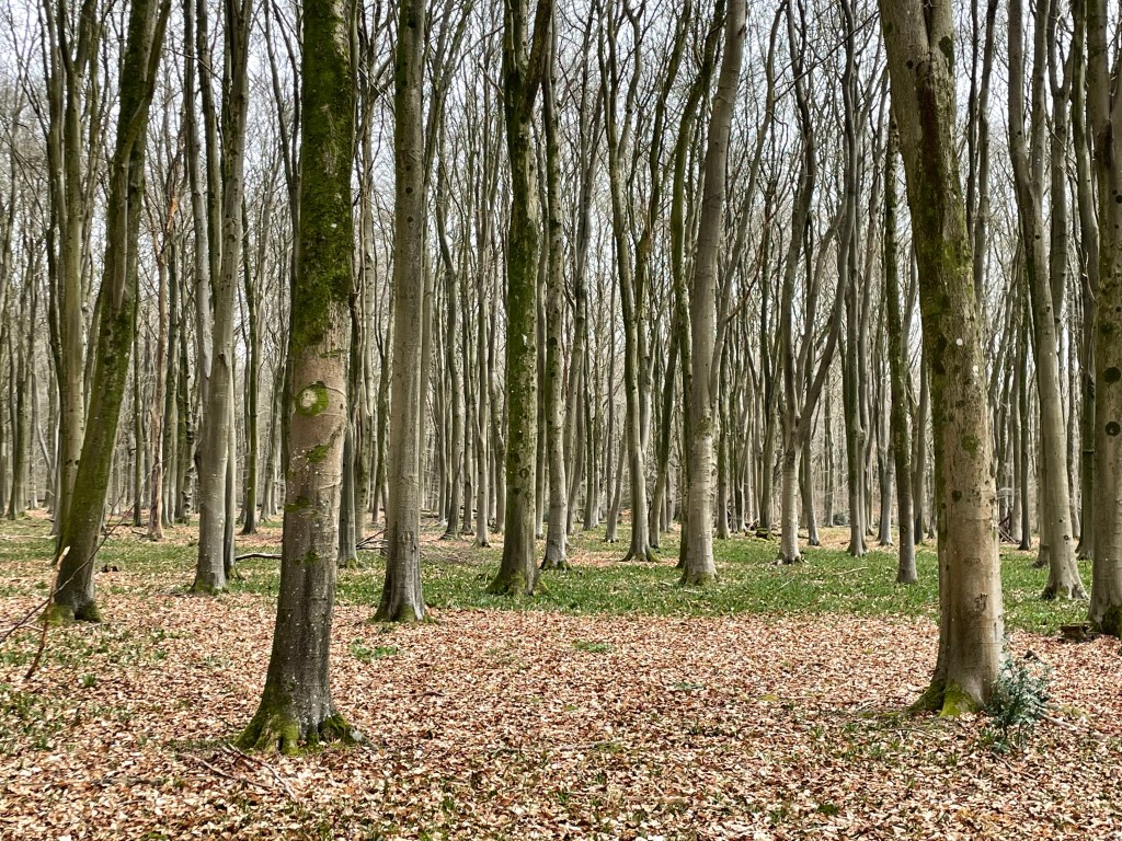
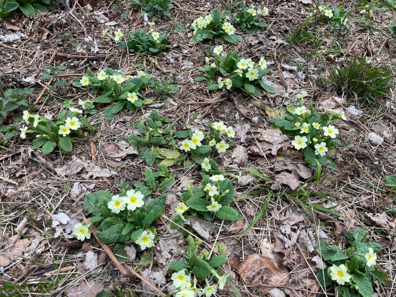
In the meantime, I’ve been trying to get on with tasks which don’t require much thought. Today I took the dogs for a walk in some woods which I haven’t been to for a while. It’s predominantly a beech wood. I love beech trees, even when they are leafless. It won’t be long until the bluebells are out and most of the floor of the wood is carpeted in blue, or is it purple? In the meantime, the primroses make me smile. A gentle reminder that time is passing. Maybe my motivation will return tomorrow…
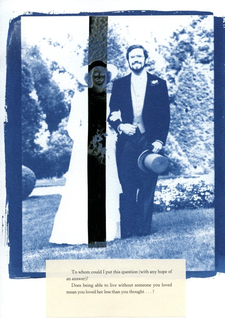
On my wedding day, my mother lent me her handkerchief. I never gave it back; I wonder whether that means that it wasn’t borrowed but appropriated, and does that affect its power to confer luck? Probably not, as I only intended to borrow it, and besides as it was over 20 years ago, I think it conferred the requisite good fortune of my mother’s happy marriage.
What’s cyanotyping without a bit of lace?
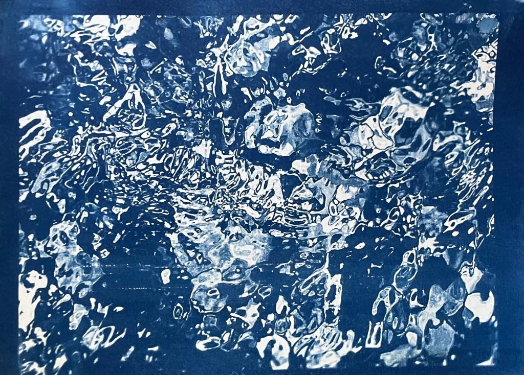
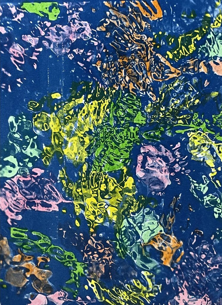
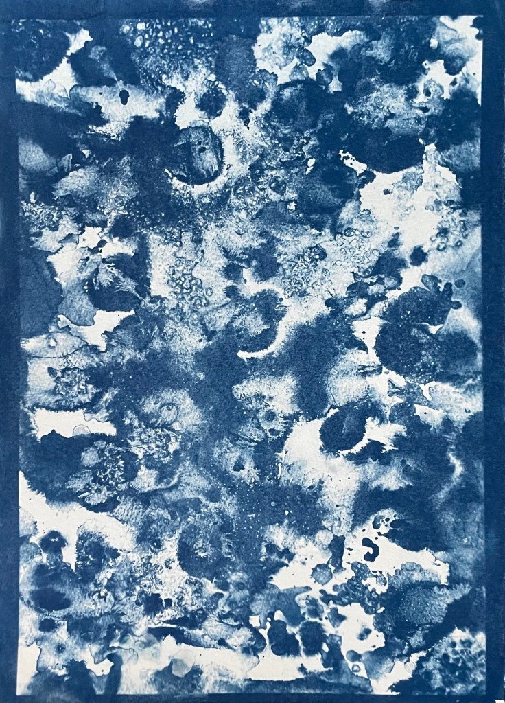
I’ve also been doing some doodling. I came across an American cyanotype artist, Marie Craig, who uses highlighter pens on her cyanotypes, so I gave it a go on the prints which didn’t really work in Out Of The Blue.
It’s an interesting effect. I’m not sure what I think about it. Maybe it would work better on a different style of image, one with defined lines as opposed to the organic shapes in these images. I’m definitely not ruling it out.
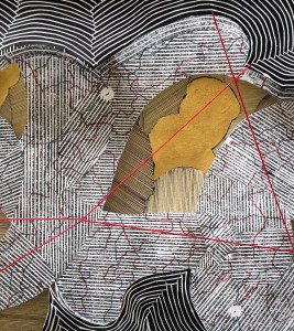
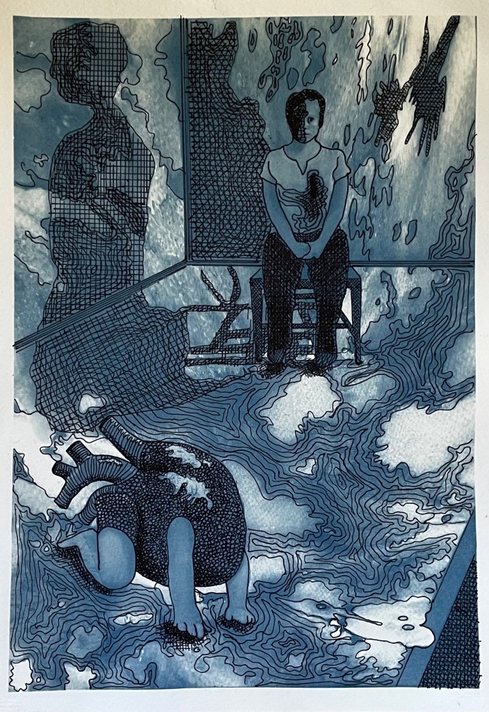
I also took an unsuccessful print of the digital image I made recently and experimented with drawing on it in pen. I had no plan in mind, and just followed some of the shapes. It was a mindless activity, just doodling. Several areas are not particularly successful, but I like the combination of the cyanotype and the pen. I’m not sure how I might use it; I think that I need to explore using some different images.
My main piece is the telephone. I’ve managed to figure out how it works – now I’ve just got to record my message which I think will be quite short and to the point.
I struggled for a while to come up with a way to indicate that it is an interactive piece. Also, if I’m going to use the audio files as well as the content of the messages in future work, I think I should say as much so that people have an opt out if they’re not happy with the possibility of their voice being used.
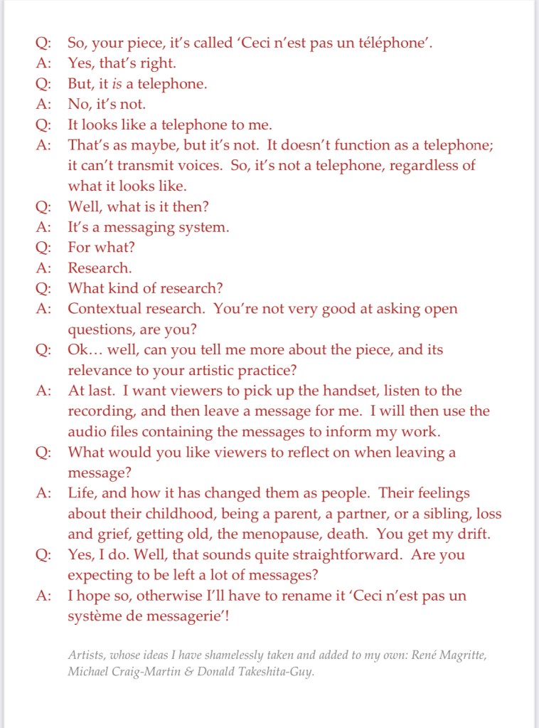
I was trying to get to sleep the other night, tossing and turning, when it came to me – I’d do what Michael Craig-Martin did for ‘The Oak Tree’ i.e. have a transcript of an imaginary conversation between me and a third party.
So I came up with this, which I will display alongside the telephone. And yes, I’ve also ripped off Magritte, and used Donald’s comment from a few sessions ago about mobile phones not really being used for their primary purpose, making and receiving calls, but for messaging etc.
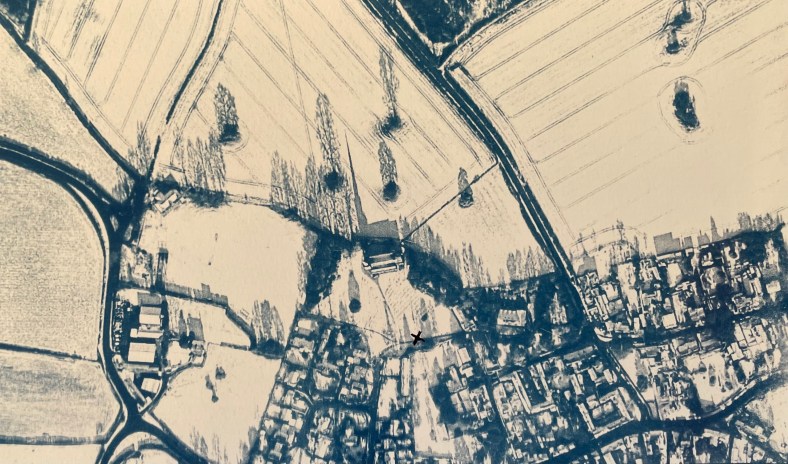
I’ve also had another bash at the cyanotype of the aerial view of the village. I couldn’t get it right on A3 for some reason as the detail of the fields just wouldn’t stick. I tried so many times but I think that because I was doing it quite late at night my brain just stuck, and instead of stopping and leaving it for a while so I could reflect on it with some distance and clarity, I just kept on making the same mistakes over again which made me feel really frustrated. I’m going to park it for now – it could be something to do with the height of the UV lamp.
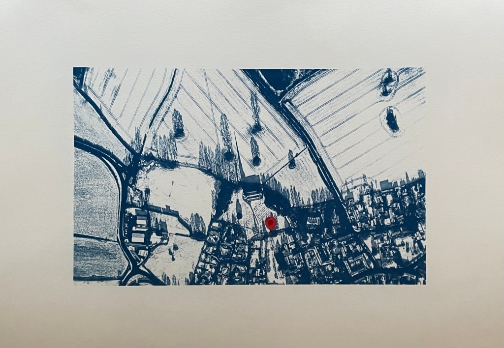
So I’ve gone back to the smaller negative and printed it on A3 and added in a location pin. I’ve decided to call it In Loco Parentis. I feel much better about it now, and, on reflection, A3 would just have been too large an image for something which is quite intimate and personal.
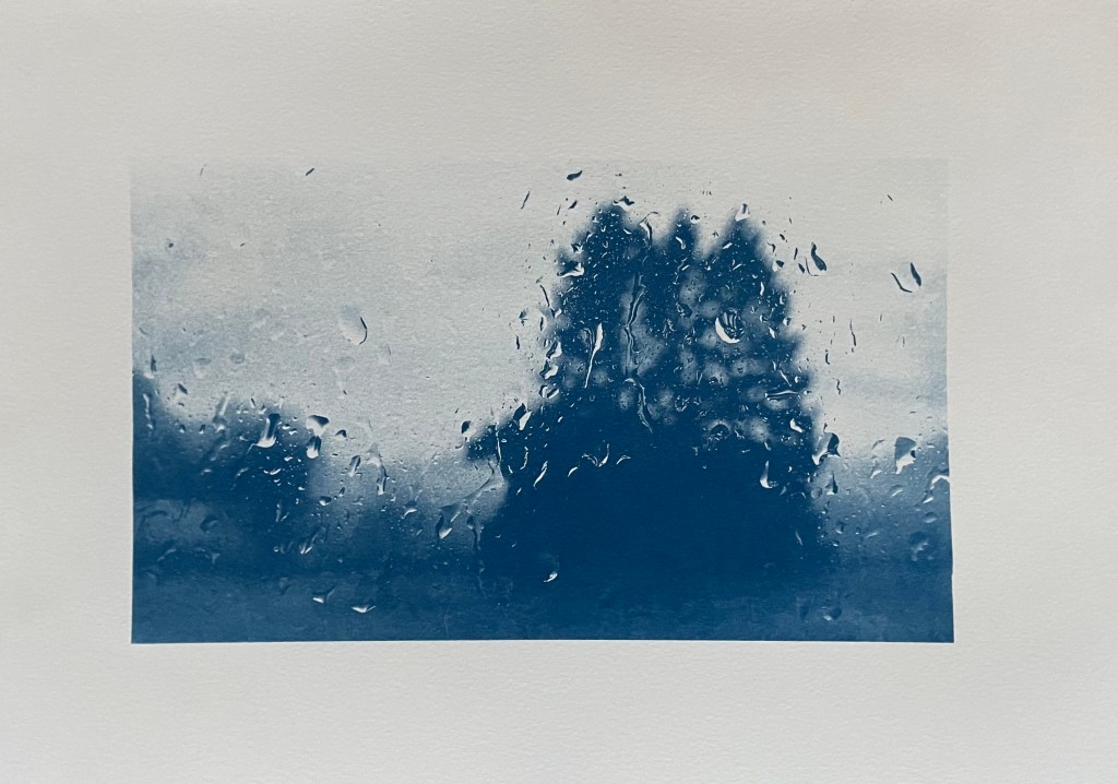
I’ve also tried doing a triptych of the view from my window. I had initial success in finding out how to split the image into 3 equal parts and printing separate negatives for each. After that it just went downhill; it has been so difficult to get any consistency between each of the separate sections because I’m doing them each individually and there doesn’t seem to be any rhyme or reason as to why they turn out differently despite using the same solution and applying it as consistently as possible, exposing for the same amount of time and washing out in the same way. I even tried to make sure that the temperature of the water was the same by starting to run it at exactly the same time before the exposure had finished, but the difference in results between them was staggering. I’ve now got lots of different sections, and having sorted through them all, these three are the best fit that I could come up with.
I think I might sort out the sizing a bit more and then fix them to another piece of watercolour paper.
Disheartened by the exercise I did the same as with the aerial view, took the original negative and printed it on A3. It was much more straightforward, and made me feel an awful lot better. Is it a bit boring? I don’t think so as I think you get a much better sense of atmosphere, and I’m trying to change myself to subscribe to the view that less is more.
As I took the original photo on New Year’s Day, I think I’ll call it, Another New Year’s Day. On reflection I think I prefer it. I’m not sure that disjointed views really do it for me, but then again I didn’t think that I liked collage.
In addition to the pieces above, I’m taking along Motherhood I which I’ve had printed on A1. I’ll see what seems right on the day.
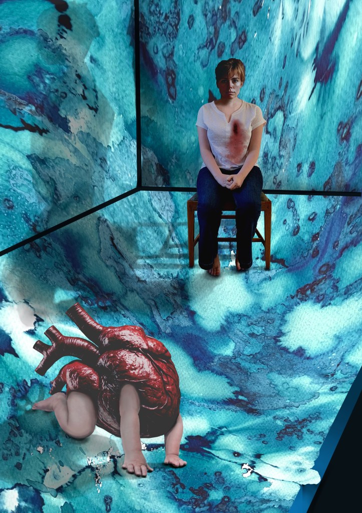
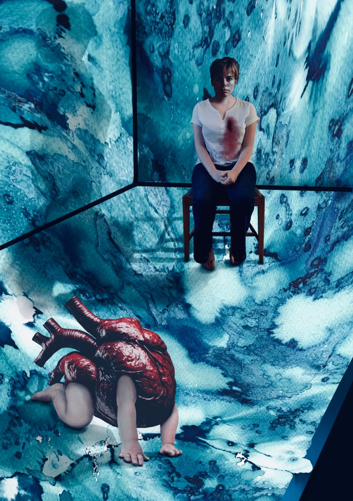
I have had an image in my mind for months. It came from the Elizabeth Stone quotation, I first mentioned in Hearts & Linos .
”Making the decision to have a child – it is momentous. It is to decide forever to have your heart go walking around outside your body.”
I think it encapsulates perfectly how I felt when I became a mother. My whole world was turned upside down. I was suddenly responsible for raising and protecting another human being. I felt overwhelmed by the magnitude of it all; that life would never be the same again. It made me question the sort of world I had brought her into, how her life might be; how much of it I would be a part of, the unthinkable and unbearable pain I would suffer if anything happened to her. She was precious and intrinsic to me, now living and breathing in the world, independently of me.
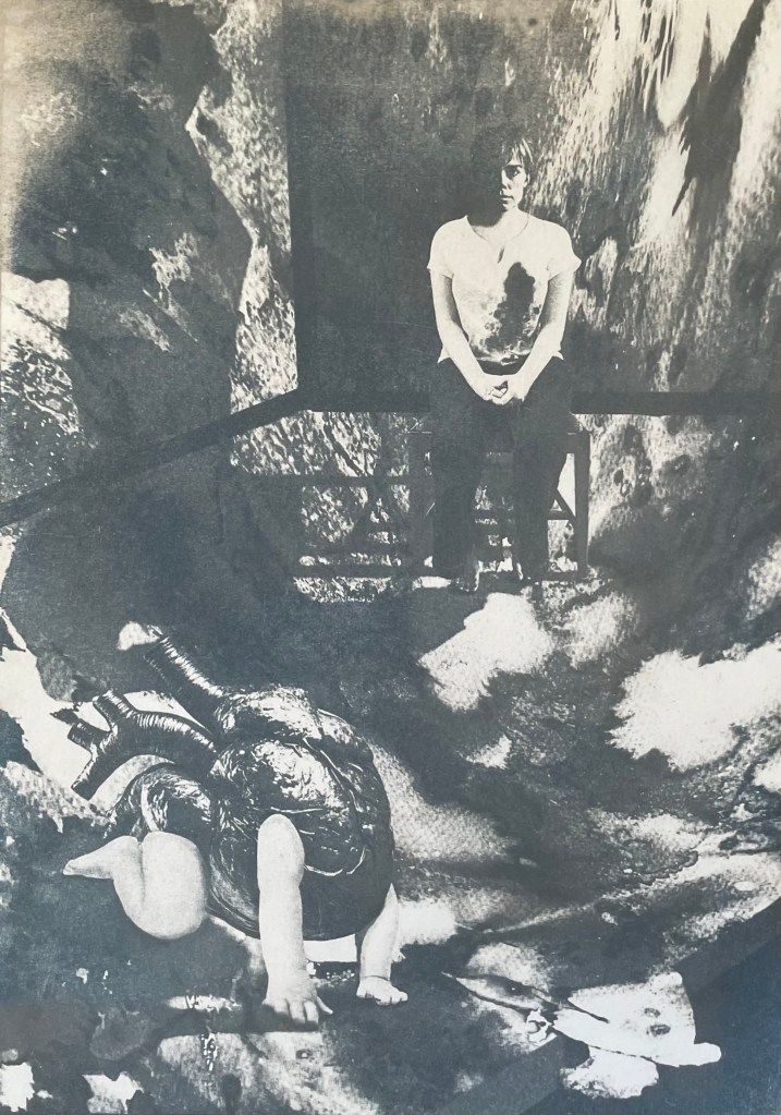
Original VersionDramatic FilterCyanotypeCoffee Toned CyanotypeAltered background and darker tonesDramatic Filter.Dramatic cool Filter. Worked on hands.
It’s taken a while. Bearing in mind that I’m still finding my way around Procreate I don’t think that I’ve done too badly. I’m sure that I’ve done lots of things incorrectly, but I don’t really care. It’s all a learning process and it was fundamentally about me trying to realise an image that I had in my head. I feel that I’ve achieved what I set out to do. In that respect, I’m pleased with it. I think it conveys the visceral nature of my feelings.
Actually, it has taken me more than a while; it’s taken ages, probably because I kept on making mistakes, but I have learnt lots along the way. I’ve redone parts of it several times but I have to say that it has all been about the process of discovery and realisation. It’s allowed me time to focus on the detail, but it’s been as part of the process rather than with a view to trying to achieve a perfect result. I don’t think that Procreate is a tool with which I can be loose and expressive in the physical sense, but it seems to satisfy that part of me that likes to focus on surreal detail every now and then. Hopefully that will allow the other part of me to enjoy the experimentation of being looser and more expressive in my mark-making when, say, painting.
I decided ages ago that I wanted to incorporate my ink experiments as a background to a collage type piece. I sourced the heart, crawling baby and head of the woman from royalty free image sites which allow for reproduction of the resultant work, if need be. The body is my daughter. She’s a bit freaked out by someone else’s head being on it, but I wanted a neutral character, and I couldn’t find an image of a woman sitting on a chair that fitted my requirements, so I roped in a free model.
It was challenging constructing the crawling heart. I’ve had to rebuild parts of it including the hands as some of the fingers were hidden in the original image. It was quite difficult finding source images whose licences allowed me to do what I wanted to do, and were also free. I’ve played around with editing effects and colours and I think that I’m settled on the last image for now. The slight greenish tones, complement the red heart. I really like the cyanotypes, but unfortunately there isn’t enough tonal variation and the slightly chaotic background loses its delicate tonal transitions in the process. I might try again but change the background to something a little less busy. But I like the historical, almost Victorian Penny Dreadful feel to them. I might develop it further, but I’ll leave it on the back burner for now.
The time delay video created by Procreate is of epic proportions, but it’s helpful for me to watch it back so I can see what a song and dance I made of it all. This is a shortened version.
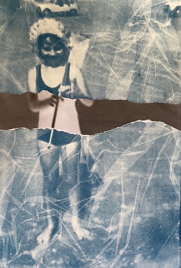
After my disaster trying to do my own, I managed to source some pre-treated fabric and have another go. The result is quite good, but the clingfilm effect suggests that the fabric is creased which irks me somewhere deep inside. Also, I don’t think that I rinsed it thoroughly as some hydrogen peroxide seems to have discoloured the fabric in places. I’m not sure how I might use fabric based cyanotypes yet – I need to think about it, and look for some inspiration.
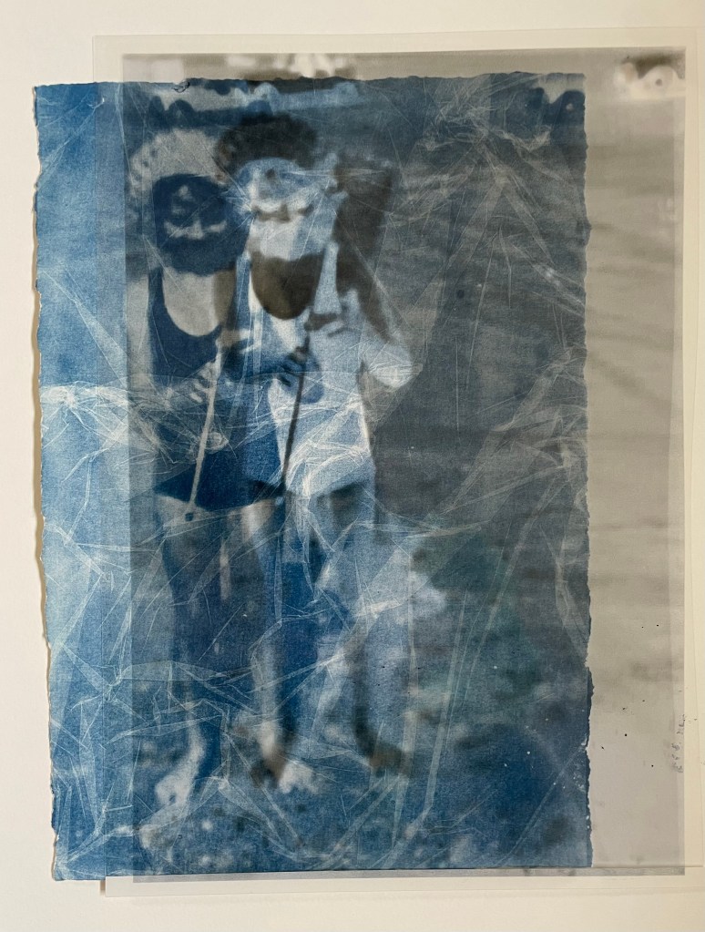
In the meantime, I’ve been experimenting with adding in sections of the negative print. I got this idea from these works by a visual artist and photographer from Luxembourg, Jean Bettingen who is interested in the constructs of identity, memory and self-representation. I also like his use of text to accompany the images. I’m guessing that he has overlaid the transparency over the top of the cyanotype.
I didn’t want to cut up my negative transparency just yet, so I printed it out and tore off a section. I think that it adds some extra interest, and I particularly like the way in which it’s not obvious which is on top, the cyanotype or the negative. It’s actually the print of the negative which is just lying loose on top of the cyanotype, but it gives a sense of distant space behind it. I tried placing the transparency on top of the print to see what that would look like and I’m intrigued by the effect, so when I’m feeling a little less precious about the transparency I’ll chop it up.
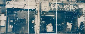
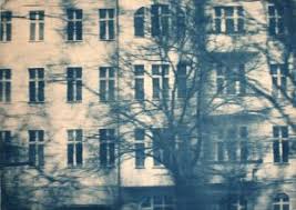
I also came across a German artist called Katja Liebmann, whose work records the energy, isolation and alienation of urban life.
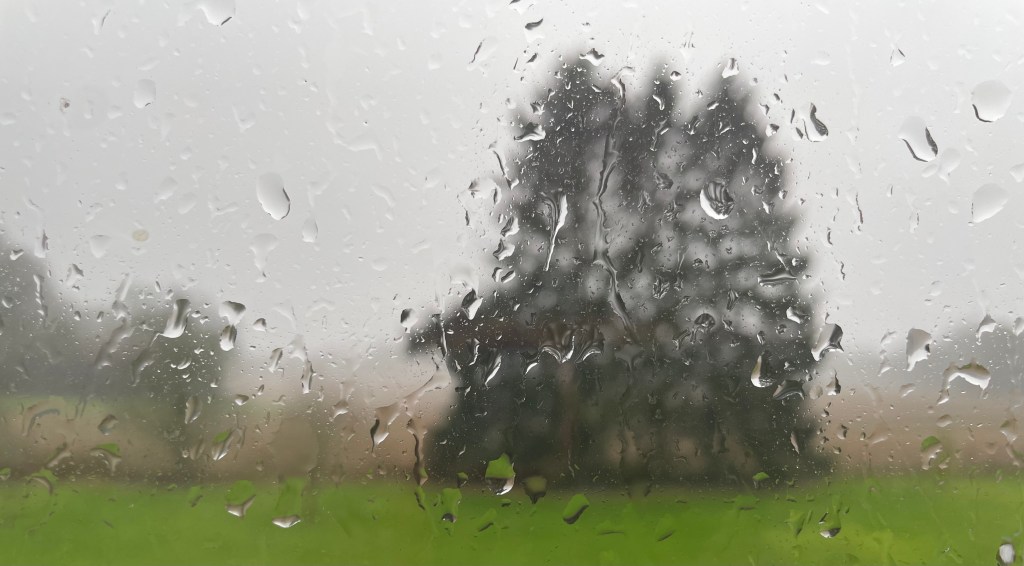
The water droplets on the first image reminded me of a photo I took out of my bedroom window on New Year’s Day this year. I hoped to myself that it wasn’t a taste of things to come.
I really like this image. It’s only A4. I’m going to try and do it as a triptych, like Liebman’s first image.
There’s a passage that I find really moving. It comes from Deborah Levy’s The Cost of Living which I selected as an inspirational text (see The Cost Of Living). In it she describes how she felt after her mother died and, in particular, her reaction after coming across a postcard her mother had sent her.
“My mother had made a biro’d X on the front of the postcard and written’ X is where I am’… It is this X that touches me most now, her hand holding the biro, pressing it into the postcard, marking where she is so that I can find her.”
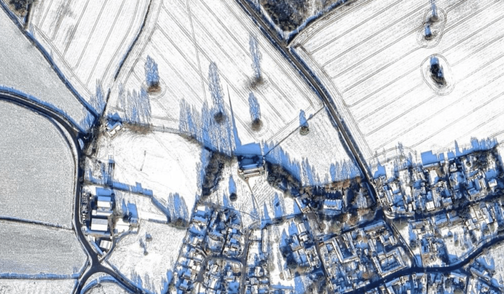
In response, I had an urge to do something similar. I’ve had an image in my head for some time. I looked at the satellite image of the village where my mother grew up, of the church where my parents were married, and of the churchyard where they now rest, together with my grandparents, aunt and uncle, and other distant relations. The image was taken on a sunny day with snow on the ground, and I love the shadows which are cast by the trees and the buildings, in particular, the church; the shadow of the spire revealing a building, which is otherwise indistinct from the air, as being a church.
Luckily, after a bit of research I managed to work out how to remove the road and building labels.
So, I made a cyanotype. It’s only A4 in size. I’m thinking about making it larger, say, A3. I don’t think that I can make the image any sharper, but I don’t think that really matters – it’s not about the detail of the buildings; it’s about the shadows revealing the nature of the buildings, about the sense of place and about the topography; the tramlines in the fields, the clusters of trees in the middle of fields and the pattern of the roads I walked down as a child. I love the patchwork nature of the countryside. I know that I’m coming home when I see it from a plane.
I’ve put in an ‘x’ but black ink doesn’t really work. I might try red, or maybe replace the ‘x’ with a location pin instead which might contrast well with the historical feel of the cyanotype.
There’s not been much experimenting. I think it’s because I’ve known what I wanted to do for a while and it was a clearly formed idea. It’s been an easy process and a cathartic one, but it does make me feel sad. My parents were my anchor to the past and without them I feel adrift from where I came from, and from a substantial part of my history.
We had a friend to stay at the weekend, so we took her to Jane Austen’s House which is less than half an hour away from where we live. It’s the 250th anniversary of her birth this year, and so there are lots of Austen celebrations happening to mark the occasion. She, together with her sister, Cassandra, and her mother lived in the village of Chawton, in one of the houses on the Chawton Estate, which was owned by one of her six brothers as his country residence. He had been adopted by a wealthy couple who were very distant relations, and who didn’t have a male heir.
My husband, who had been a bit reluctant to go as he hadn’t read any Austen and thought her writing a bit girlie, enjoyed himself. She’s far from girlie, I told him: she had an ascerbic wit and was a keen observer of human nature. I picked up a fancy edition of ‘Pride & Prejudice’ in the obligatory gift shop, and told him to read the first few lines; he laughed, I laughed, Alexa laughed, Siri laughed.
I discovered two interesting facts. Firstly, that many wealthy families were heirless, and so hunted around on the peripheries of their family trees for a suitable candidate who would inherit, but on the condition that he changed his family name to that of the bequeathing couple. Sometimes there were no suitable candidates and a daughter would inherit as in the case of Elizabeth Knight who inherited her parents’ estate at Chawton and Godmersham in Kent in 1702. Because of the size of her estates she had a raft of voting rights in Parliament, but was unable to exercise them, because she was a woman. A formidable woman at that, and thought to be the inspiration for Lady Catherine de Bourgh in Pride & Prejudice.
The second fact was that markings were often made next to vulnerable areas of a house, where evil spirits could enter e.g. doorways, chimneys, windows etc. They were called witches’ marks and ranged from daisy wheels to the letters V and M, possibly signifying the Virgin Mary. There was one such mark by a fireplace at Chawton.
Talking to Cat in yesterday’s session about her recent performance, and the drawing of a pentagram, reminded me of the rich tradition of mark-making as a form of protection.
I knew that last week would be a busy week for other things; I haven’t even managed to post anything, on anything.
I managed to attend Madeline Hook’s online workshop on Visual Research which was very interesting and demonstrated how the online resources are a much richer environment for searching for visual inspiration than a Google search, which is primarily made up of images in a commercial context. I don’t know why that hasn’t dawned on me until now.
As it turned out, I didn’t need to do anything on the New Contemporaries, as the exhibition is part of the low residency week activities.
I did think some more about the interim show in between doing other things; I have now managed to come up with a way of making it obvious that the telephone is interactive – I’m going to do something along the lines of the accompanying piece to Michael Craig-Martin’s ‘An Oak Tree’.
I have started to do some work on Topic 1; I’ve changed it to be about motherhood as I’ve finally started realising some ideas that I’ve had in my head for months and so that seemed the natural place to start, although it’s out of chronological order. Depending on how these go, I might think about putting them in the interim show.
I haven’t done a mind map so I’ll have to shift that as an ongoing item into this week.
Last week was mostly spent curating my blog, which turned out to be a monumental task as I had published over 70 posts. Despite that, I managed to explore cyanotypes, a process I’m really excited by and which is giving me lots of ideas in terms of processing and re-processing should I decide to go down that route.
I also thought a lot more about my ideas and also the direction of my research. I’ve got to think a lot more about the interim show and also, until I have resolved the issue of the direction of my research, I think I will delay the preparation of individual mind maps for now, and so I’ve carried that task forward to this week, but anticipate it being kicked further down the street.
This week:
Unfortunately, I won’t be able to make the Helene de Beauvoir exhibition after all, but will make some plans for the ICA. I’m supposed to be starting considering Topic 1, which I think I will keep to an element of the general theme for now.
I know already that I’m not going to achieve much this week as I have a lot on elswehere. I will do my best, but I anticipate a few items being carried forward to the following week.
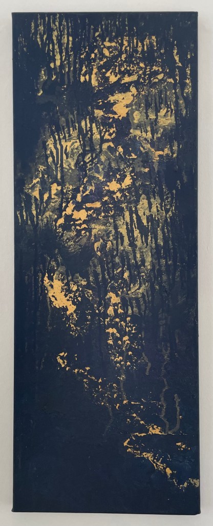
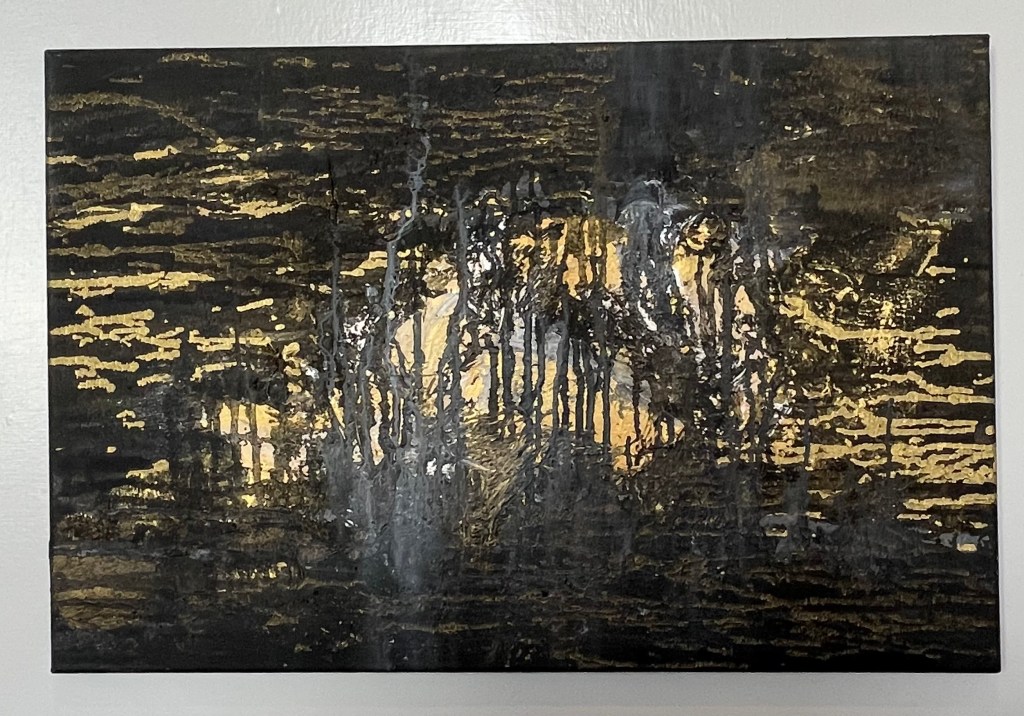
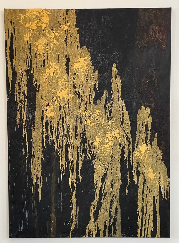
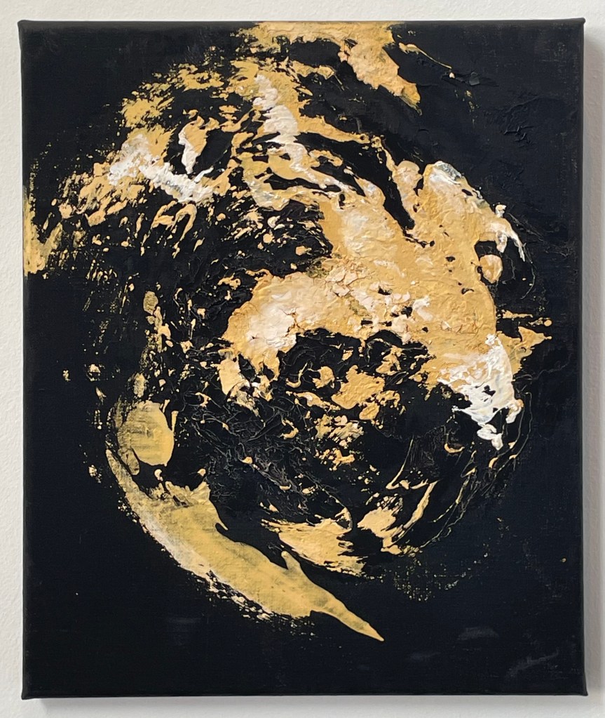
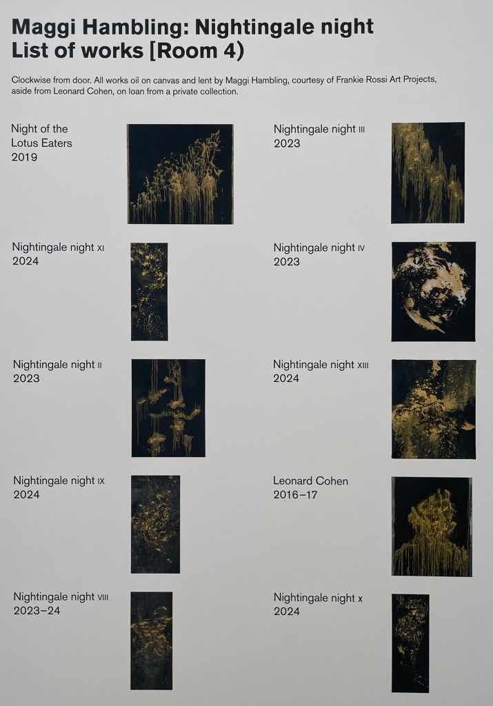
When I went to the Pallant House Gallery to see Dora Carrington recently there was another exhibition on at the same time: Maggi Hambling – ‘Nightingale Night’.
Nightingale Night VI
Nightingale Night X
Nightingale Night XIV
Nightingale Night III
Nightingale Night IV
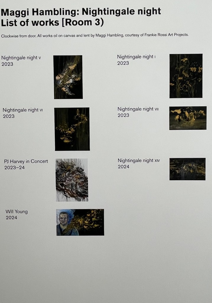
Hambling spent a night in a woodland in Sussex in the Spring of 2023 listening to nightingales. I didn’t take photos of all of the paintings – I think I was only drawn to some of them on the day, or maybe I was tired from exploring Dora, but Iooking again at the images on the identification labels, I’m regretting not having done so.
I’ve since read an entertaining interview with Hambling about the exhibition in ROSA Magazine – I like doing further research after I’ve been to an exhibition; never before.
I’m not entirely sure what I think about it all. I’m not sure that I like the gold on the black ground, although I can absolutely understand her reasoning behind it, and I do like a bit of gold. Does she succeed in communicating the otherworldly divinity of the nightingale in the darkness? The sense of it, absolutely, but the sound of it? I’m not convinced, and I think it’s the mark-making. The swirls and definite vertical and horizontal marks are successful, I think, in representing sound; my issue is with the drip-like marks – they don’t allude to the beautiful song of a nightingale to me; it’s more akin to me having a warble and eventually running out of steam and giving up. But I think I’m being harsh, because even she admits that it’s impossible to paint the sound of a nightingale, and that what she hopes to have captured is a sense of the fleeting moment. She comments:
”…there wouldn’t be much point in painting a picture that it was possible to paint…”
It’s an interesting comment, one to think about.
It would be interesting to know whether Hambling made the paintings from memory, or whether she played a recording of nightingale song whilst she worked. I’ve assumed that it is the former because it’s about the whole experience, of being in a certain place at a certain time bearing witness to something extraordinary.
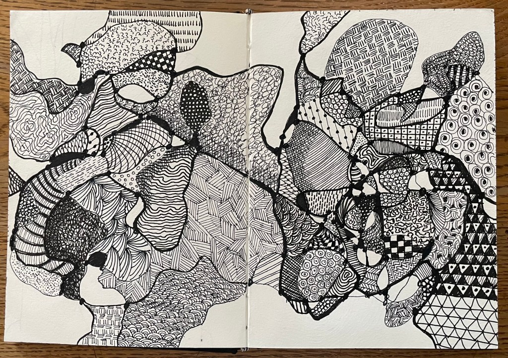
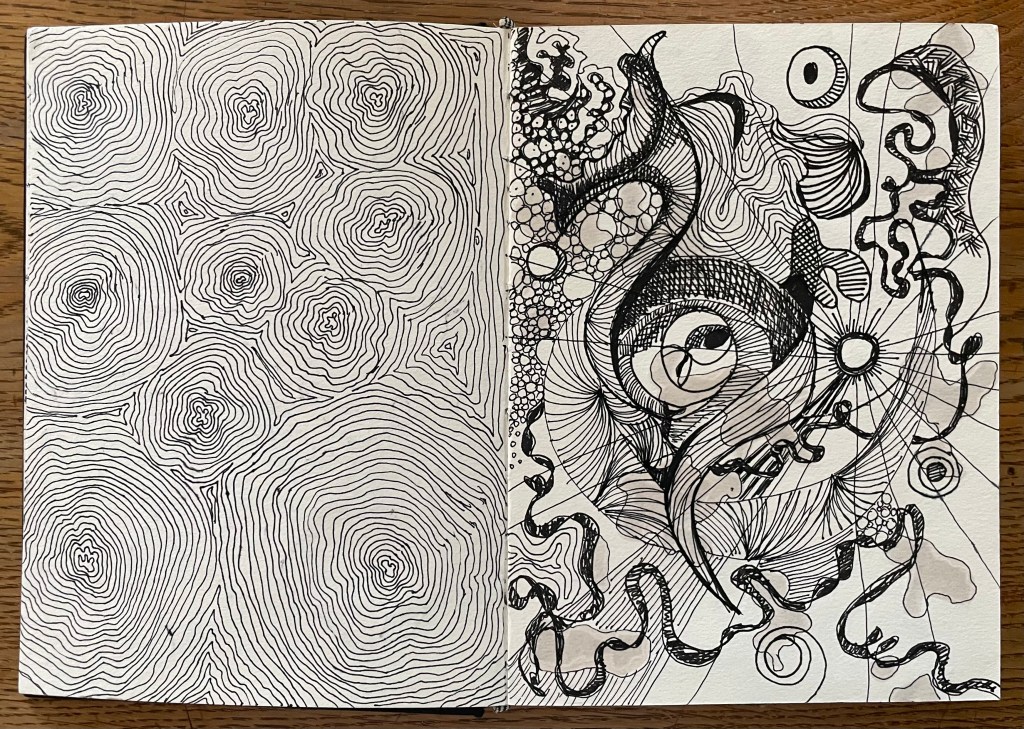
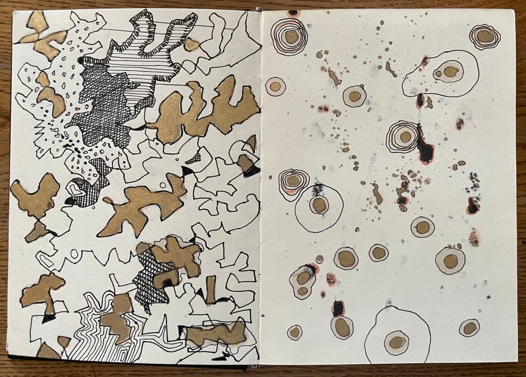
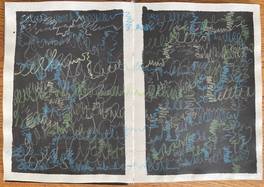
I have been carrying on with my pen doodling, some of which is unfinished – I became bored, and moved on. I also decided to give nightingales a go. The concept of representing sound in a 2-D form is really interesting – the consideration of tone, volume, intonation, rhythm etc. I’ve represented it in a linear way, thinking initially about sound waves, but it would be interesting to explore other methods of representation.
The song is so diverse and improvisational that it was very difficult to think of different mar–making to represent what I was hearing. It was an interesting exercise, and very calming listening to birdsong with my eyes closed.
I like having an inked page – I think I will go through my sketchbook and randomly ink up or paint pages. I also like trying to work with unexpected events such as the solvent stains from the gold coming through to the reverse of the page. This is, literally, just playing – it’s enables a period of convalescence.