Wien

I found myself back in Vienna in December – my husband had a conference and I tagged along as there were quite a few galleries we hadn’t made it to on our visit last year.

Also, I specifically wanted to go and see the Judenplatz Holocaust Memorial by Rachel Whiteread. There is an interesting history behind it and in many ways it echoes the city’s past. Walking around you get the sense that a lot of the city’s architecture remained intact after the Second World War. The city was annexed by Nazi Germany in early 1938 but didn’t suffer prolonged bombardment during the war, being targeted mainly towards the latter stages, and even then it was primarily strategic targets such as the industrial areas, until the city eventually surrendered to Soviet forces. Any buildings which were affected were rebuilt in line with their historical appearance.

As I left the hotel each morning I passed a statue which had been graffitied.

It’s a statue of Karl Lueger who was mayor of Vienna from 1897 to1910. He is a divisive figure. On the one hand he turned Vienna into a modern city by implenting major infrastructure projects including extending the water supply, introducing the tram transport system, building schools and hospitals and improving welfare. On the other, he was antisemitic and founded the populist Austrian Christian Social Party. He is believed to have influenced Hitler who was living in the city at the time, and who credits him in ‘Mein Kampf’ as being the greatest ‘German’ city mayor ever. Some believe that Lueger adopted antisemitic views in order to gain office and that they did not really represent his private beliefs. Whatever the truth, he is at the centre of an ongoing and controversial debate.

In an effort to come to terms with its troubled history, just over a decade ago the city renamed its main ring road which had originally been named after Lueger, and on which sit many prominent institutions including the University of Vienna, which had campaigned for change. The move has been divisive with accusations of whitewashing the city’s difficult history. The fate of the statue appears to be uncertain. There is a plaque next to it explaining Lueger’s legacy and his antisemitic beliefs and the graffiti which expresses how people feel has been left. There were plans to tilt it by 3.5 degrees to the right to give it an air of impermanence, but according to a friend who lives in Vienna, the cost of doing so would run into millions of euros and so it has been shelved for the time being. All I can say is that if I hadn’t seen it, wondered why it was covered in graffiti and read the plaque, then I would never have known, and I would have just walked on past. Incidentally, there areas of Vienna where graffiti, or more particularly, street art, is legal and encouraged.

But going back to Rachel Whiteread. There is a war memorial outside the Albertina Musem – the memorial against war and fascism. It was heavily criticised in particular because of the bronze figure of a kneeling Jew washing the street.

The Jewish community campaigned for a separate Holocaust memorial. Rachel Whiteread was chosen and her memorial is sited in Judenplatz above the excavations of a medieval synagogue which was uncovered during its construction. It resembles a bunker. The outside is lined with library shelves turned inside out so the spines and contents of the books are hidden – the nameless library. Apparently, Whiteread specifically requested that it should not have an anti-graffiti coating applied. Just opposite is a shop selling lingerie, and, when I was there, a couple were busy taking photos of themselves eating food. All very odd and out of keeping with the sense of solemnity created by the memorial. I spent quite a long time there – it demanded it. I also tried counting the number of books – by my reckoning there are 7,682. As a cast of empty space, it’s been suggested that it is almost a counter monument.

I walked around Vienna by myself, looking and experiencing. I took some photos and videos which I’m in the process of making into a video.

The Liminality of Memory II

I’ve filmed from my iPad screen covered in clingfilm before, but I decided to try videoing a projection as inspired by Johanna Love. I’ve also tweaked a few bits and re-recorded the audio again – I sounded really peed off in the original.

As usual, it turned out to be more complicated than anticipated. I wasn’t able to connect the old projector to my laptop because it didn’t have the right size or shape holes. So I had to dig out and charge up my old laptop. After a lot of time faffing around I eventually managed to record it and then I set about remaking the video. I think that I prefer this version.

Video

Feedback

Over the last couple of months I’ve had the benefit of receiving feedback on two occasions: Peer Feedback on my 3-minute video and Assessment Feedback for Unit 2.

Peer Feedback on 3-Minute Video

The first part was Emotional Feedback following the prompts ‘I feel…’, ‘I wonder…’, and ‘I think…’.

The feedback was incredibly supportive and generous. The words and phrases which particularly stood out for me were:

Reflection

Self-exploration

Open mind

Process

Letting go

Experimental

Experimental reflecting personal journey

Vulnerability

Openness

Impulsivity

Not avoiding or seeking to escape

Honesty

Threads

Don’t shy away

The second part comprised Affirmative Feedback using the prompt, ‘What worked for me…’.

Some comments which stood out for me:

Ever changing as people

Can relate to ‘choose the process, not the result’

Bravery in genuinely stepping away from the outcome

Feeling inspiration in seeing the processing of the process

Raw sense of vulnerability and the value of being transparent especially in this day and age

Letting the contours and mapping unfold and then running with it

Presentation seeming to be part of the work

Evidencing of own becoming and the becoming of each piece of work.

I’m pleased that what I’m trying to do is coming across, that it connects with others, and that the ongoing process of understanding myself and developing is intrinsically linked to the process of making.

It’s interesting that a few of my peers have mentioned that the process and the documenting of the process could be seen as being works in themselves. I’ve previously thought about possibly producing a printed form of the blog as a piece of work in its own right. I did a bit of research but decided that it might be rather complicated and time consuming. I might take another look.

Unit 2 Feedback

I was really pleased with the feedback for Unit 2. I was even more pleased with the number of questions that were posed, that have been loitering in the back of my head for the last month or so. Weirdly, some of them anticipated thoughts that I was already mulling over.

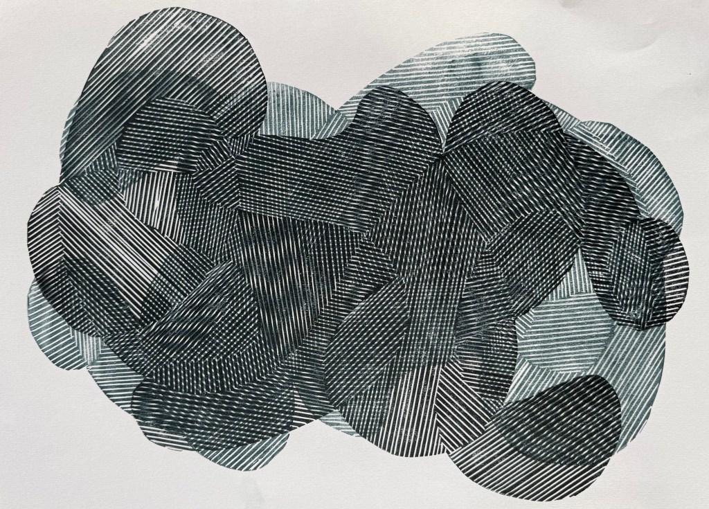
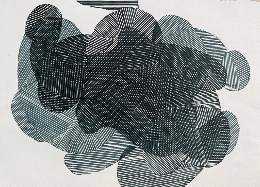
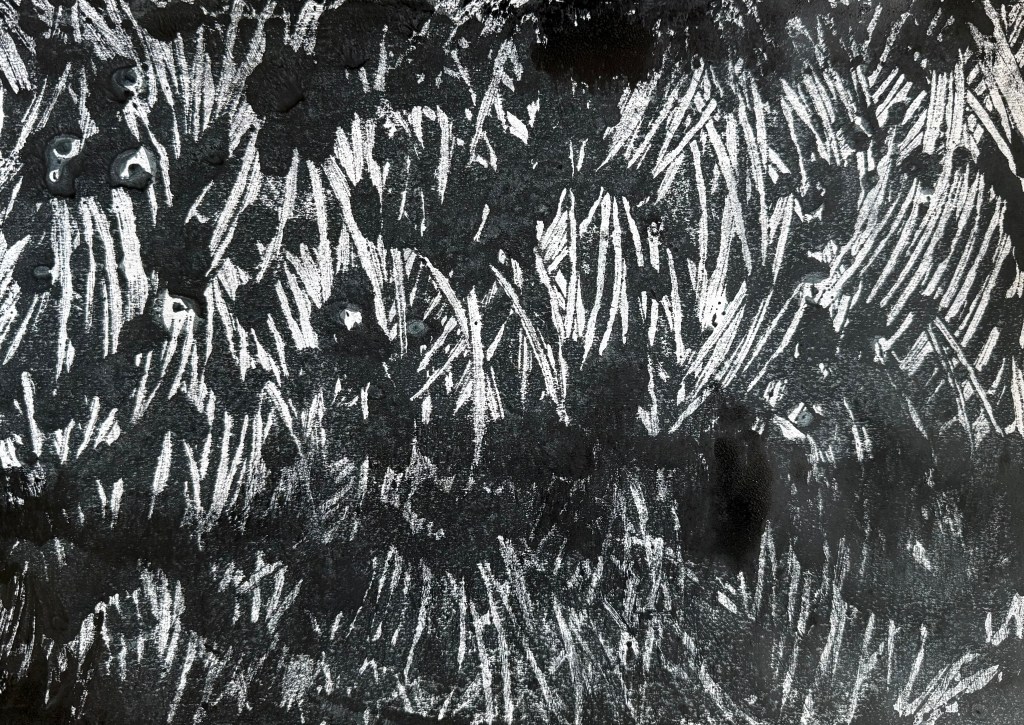
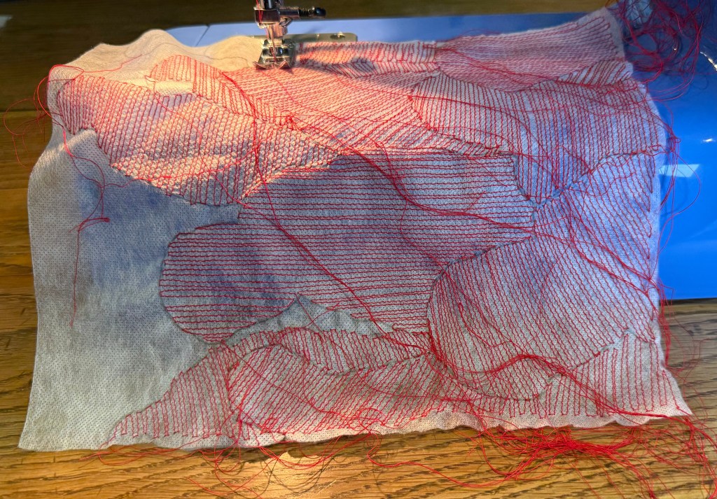
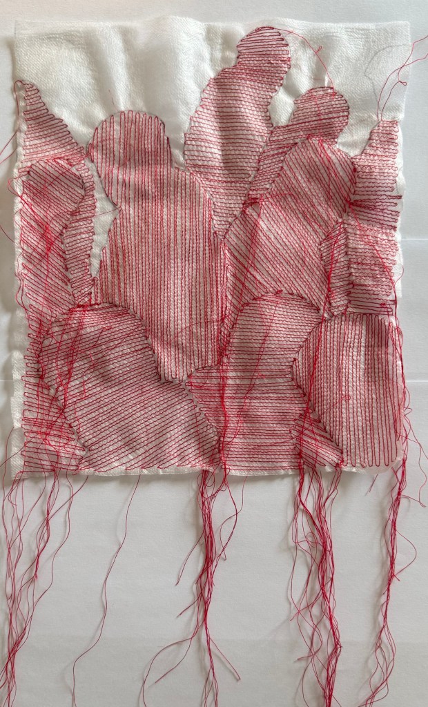
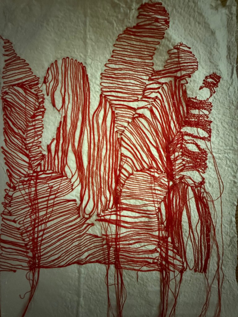
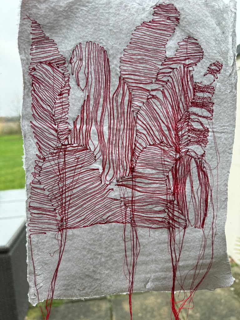
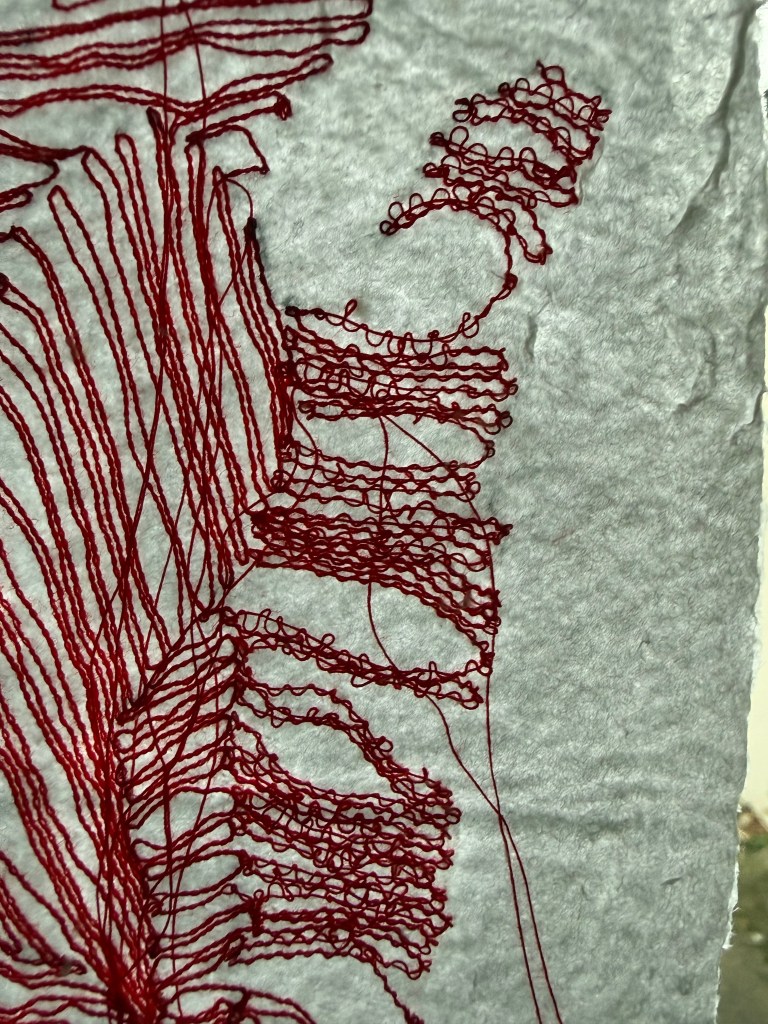
What role does the myriad of experiments, successful or otherwise, drafts, models etc play in representing the state of becoming?

Seen as a whole they represent an ongoing process of becoming. Each one is like a version of me at that moment in time. Whilst making and engaging with materials I learn about myself and develop, and often each step builds on what has gone before and influences future work.

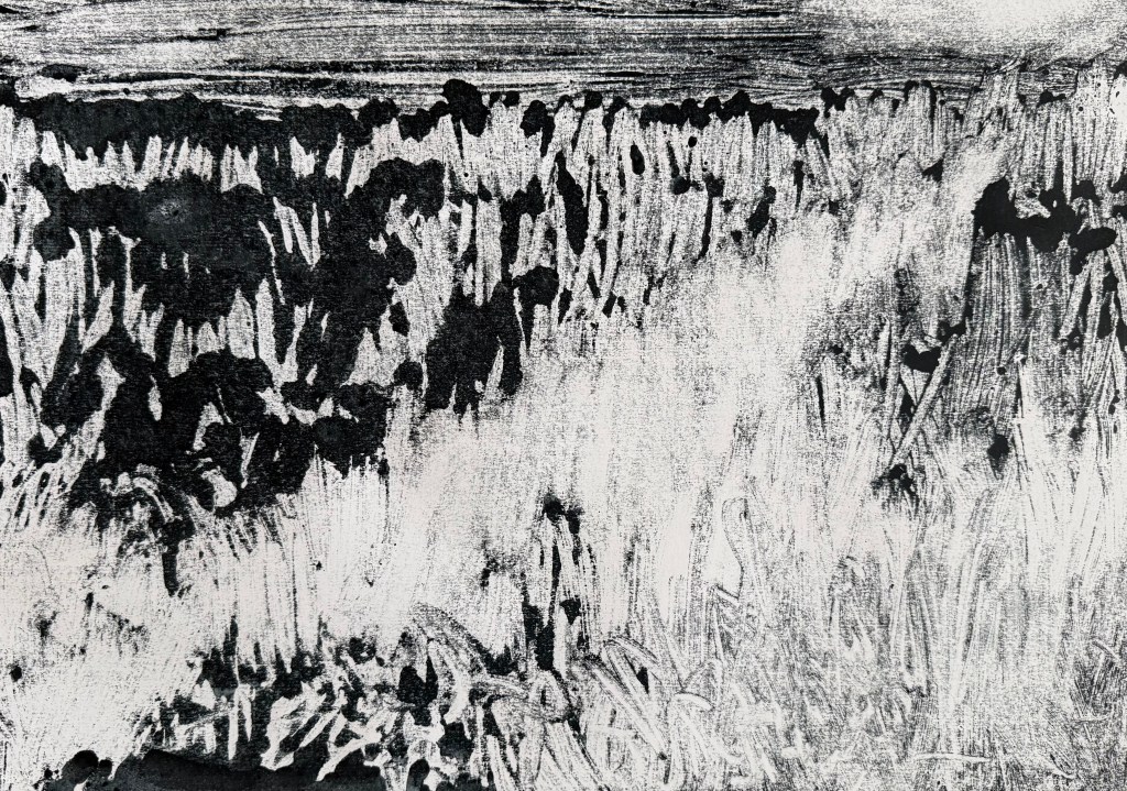
How might these represent those thoughts, ideas and problems that are being worked through not yet resolved? How important is it to share this part of your process with your audience?

Many of the experiments produce works which are unfinished or unresolved, or which have the potential to be developed further. They evidence what doesn’t work, my decision-making, or lack of it, make me ask questions of both it and myself, lead me to dead ends and force me to change direction and think of new lines of enquiry. Some experiments result in work which I can’t take any further but which perhaps could be taken in a different direction in a different work. Does that mean that they are resolved? I need to differentiate between resolution and evidencing process. I don’t think it matters whether work is resolved or not. If it isn’t then that just reflects the way in which I remain unresolved. If the process happens to result in a resolved work then that’s ok too because that just represents a snapshot in a moment in time – I’ve already moved on to become another edition of me.

I vacillate between thinking that the work needs to evidence the process and that it doesn’t, that it’s enough that I prioritise it over the product, that when I look at the product, to me at least, the process is evidenced, that the product has embodied the process of making and consequently, my becoming. After all I could view a piece of work as unresolved and as evidencing the process, and someone could come along with their own interpretation and think the complete opposite. Also, I need to resist thinking too much about the product in terms of what I hope to achieve with it, because that risks influencing the decisions I make within the process, instead of just being in the moment, and it could give rise to an expectation which might not be met. Of course that’s all well and good in a world in which I can just experiment and see what happens. I am having tremendous difficulty in figuring out how to deal with scenarios in which I need to make specific work as an end goal.

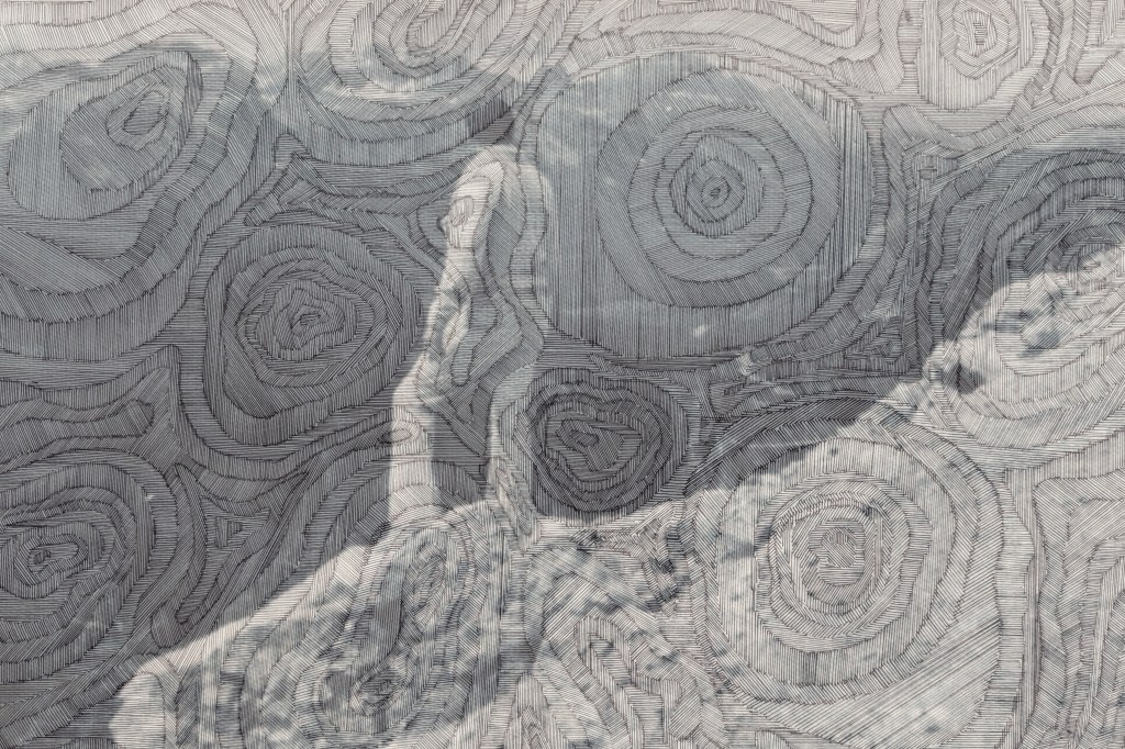
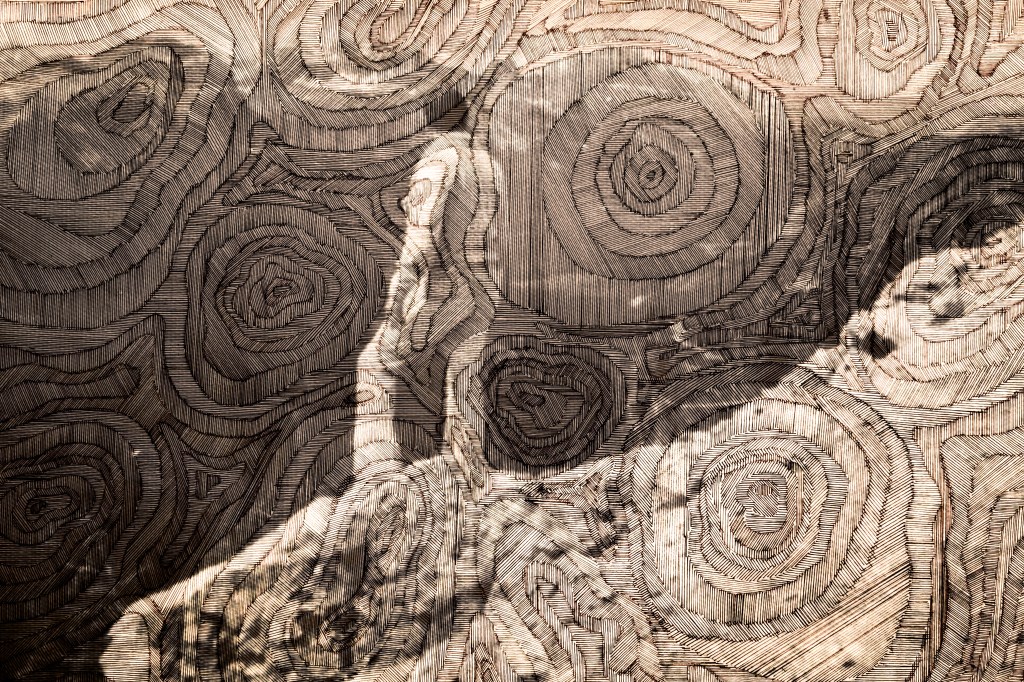
Your primary focus on mapping in Unit 2 has both narrowed your attention and deepened the possibilities. As I read your reflections and research paper I can’t help but think of Snakes and Ladders, the Möbius Strip and the idea ‘we are the children of stars.

I feel like I’m in a game of Snakes and Ladders – no sooner have I made some progress and I’m half way up the board, then I am sliding down the snake. I was only thinking about the Möbius strip over last summer. I like anything like that – I like Escher and it forms the basis of a lot of his work. I was also fascinated by the Klein bottle, with no inside and no outside. I suppose that I am observing myself becoming as I am becoming, but there is no differentiation between either, in a process which is essentially a never ending loop.

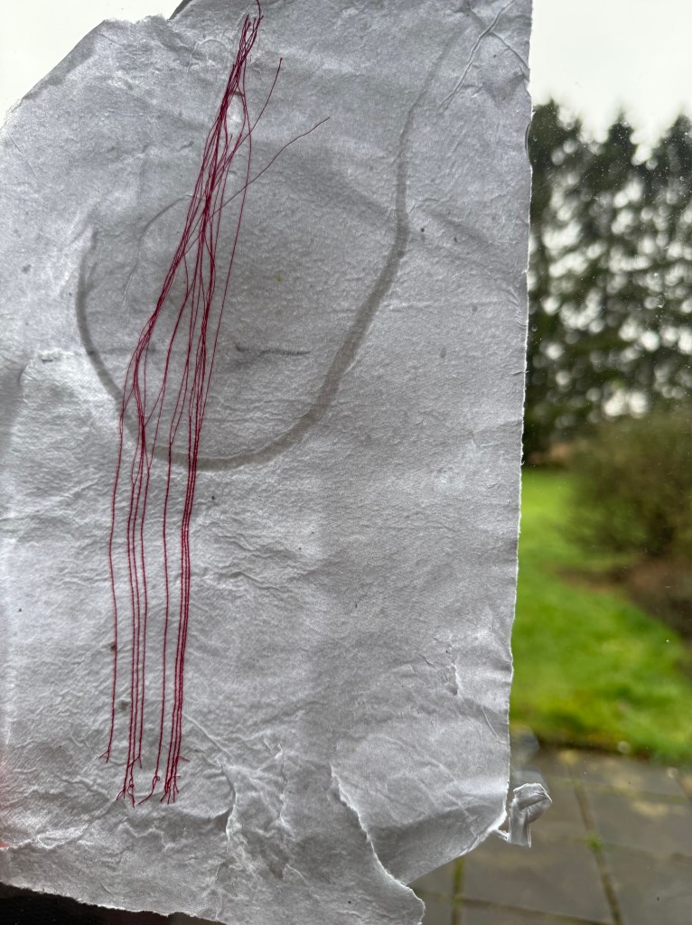
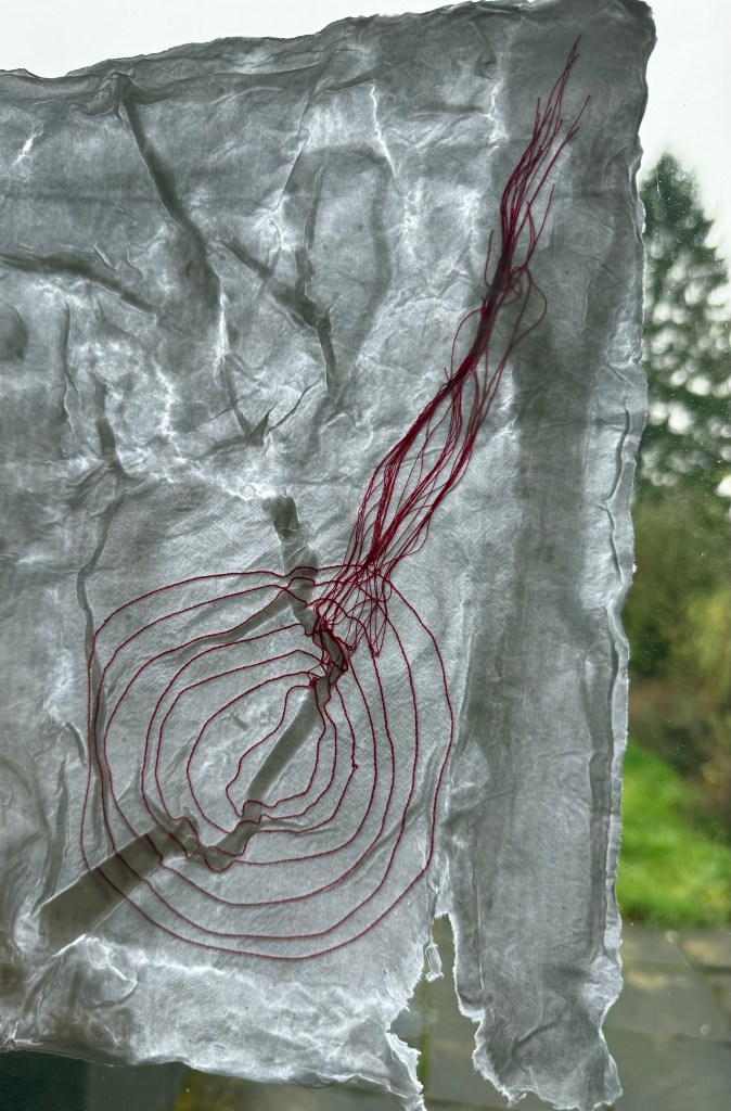
The maps are made from doodling, you write ‘no intention, no expectation’ – how does it feel to make work with no intention, what does the lack of intention reflect in terms of confidence and agency?

It feels great. It is liberating and creates confidence. In the past, having an intention to produce a piece work created an expectation as to how that might look. The process was a means to an end, and was more often than not, unenjoyable. When things didn’t go to plan, and expectations weren’t met, it would result in me doubting my ability, chipping away at my confidence. I think that I have reached a stage where the very word ‘intention’ makes me feel nervous, like it’s a snake lurking in the undergrowth waiting to take me back to the bottom of the board. As long as I restrict the idea of intention to methods of experimentation and not as to the result I should be ok. But, in the long term, as I mention above, I wonder how sustainable this approach is.

I have previously struggled with the idea of the ‘happy accident’, of chance, of unintentionality. I’ve questioned whether I can take credit for something which happened by accident or without conscious thought or application of skill. I think that I am now more or less comfortable with the idea that I can – it was me that did what I did that caused it to happen, it was my intuitive action based on all that I have done before which led to it happening.

We are excited to see how you further develop this work, will you continue to work with automatic drawing or perhaps include more deliberate mapping and revealing of the self?

I think that there will always be an element of automatic drawing, even if it’s just as an exercise – it is the bedrock of everything that I have done so far. It was what freed me from the shackles of intention and expectation. ‘Deliberate’ is intentional. Perhaps, as long as it stays within the realm of methodology?

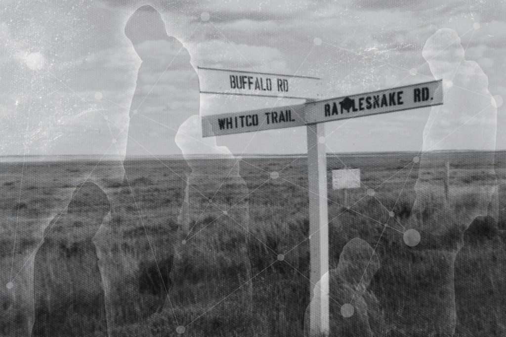
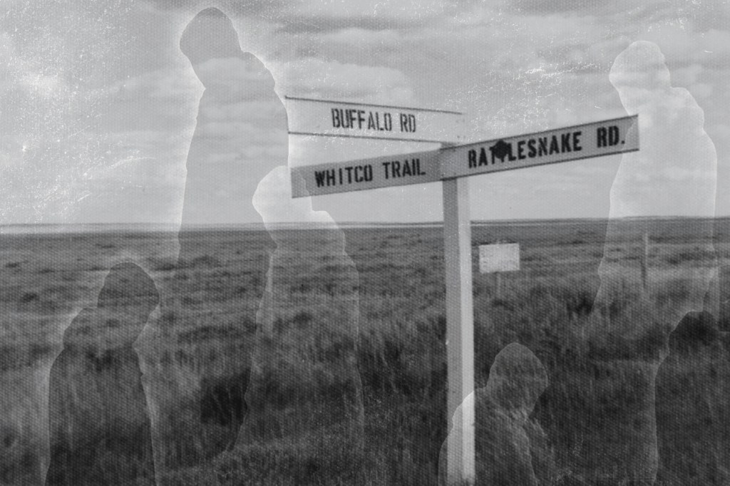
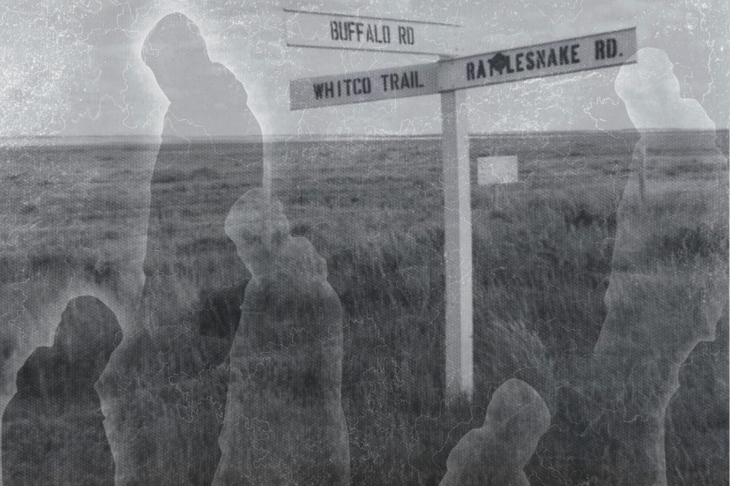
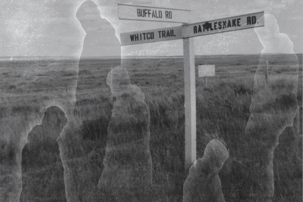
How might relationships, milestones, births, death, homes, struggles, goals, speculative futures be shared? Or might you map time, matter, emotions, culture, impermanence as it relates to you? What does a work that heavily references topography need to be resistant to fixity?

In my study statement I went on about how I was intending to explore my different roles and experiences etc. That intention fell by the wayside when I made the decision just to drift. I think that I’m more inclined towards exploring the emotions of relationships and events, maybe within the context of time, and how I relate to them, rather than the specifics. I don’t think that it needs to be resistant to fixity for the reasons mentioned above.

Or will you push the non-intentionality further by incorporating rules/games on what processes and materials to use?

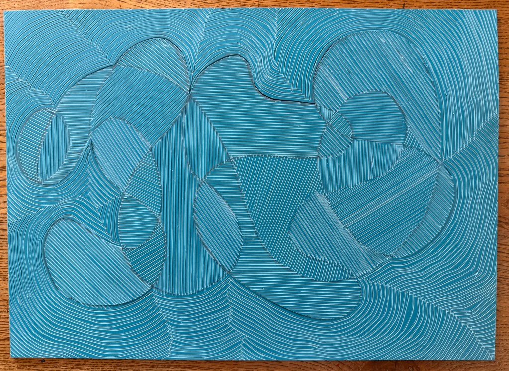
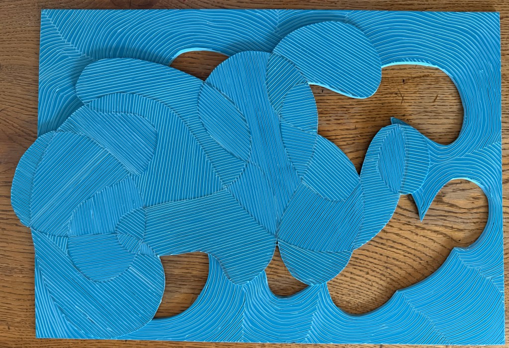
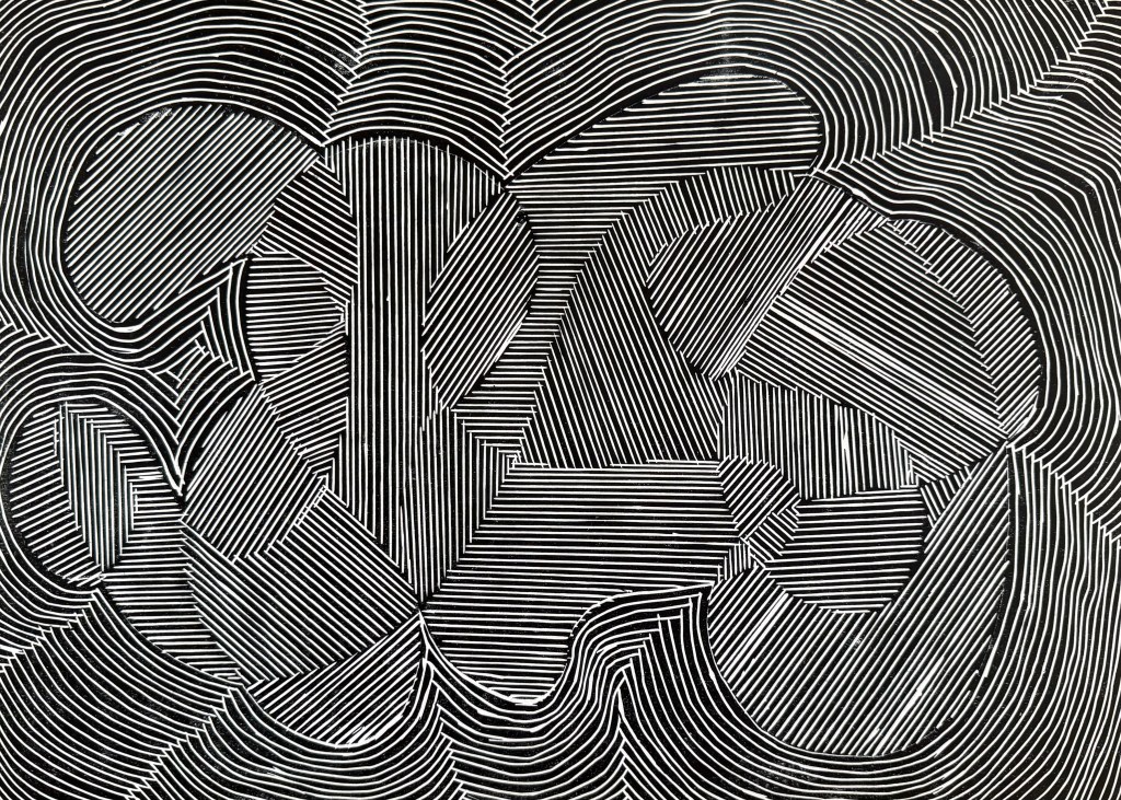
The benefit of imposing rules is that it creates a situation in which I am forced to react against something, to think differently. It also takes away control and agency when they are imposed by others. In my Pushing Paper posts I set myself the task of responding to outlines drawn by others without much direction from me save that the line should not have a beginning or an end and that the line should overlap itself so as to create distinct areas. I have yet to complete the second set of images – when the outlines were being drawn, I asked for some rules as to how I should complete them. I think that I prefer having others set the boundaries for me rather than doing it myself. I like the idea that I am responding to others which mirrors how I am shaped by others and the world around me.

Or will you choose to disrupt or misuse tools and materials intentionally? Like your abstract sticker experiments!

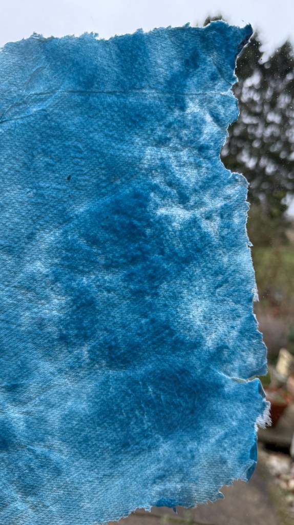
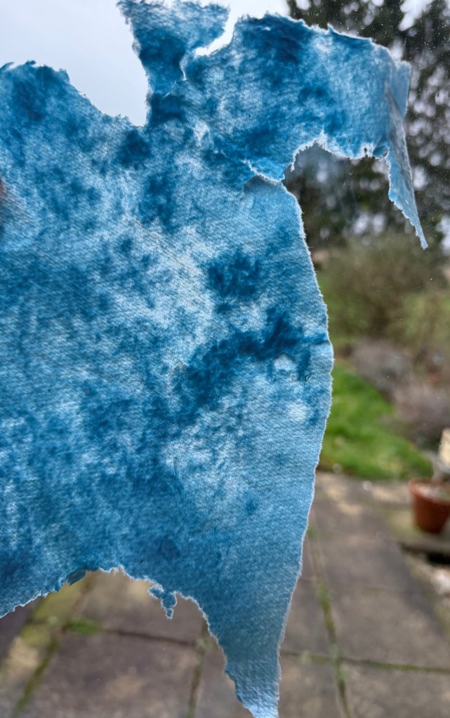
Those who have skills in the areas into which I’ve strayed would probably argue that I’m already misusing tools and materials. I like discovering things by accident, of finding another use for something which wasn’t intended.

You might find Miska Henner’s work interesting.

I will have a more detailed look at his work.

From your tutorial with Jonathan, you conclude that you will take a mixed medium approach. We are intrigued by how you might incorporate the various experiments and skills you have developed towards Unit 3. Perhaps this is also a time to consider what aspects of your practice no longer serve you?

I’m now thinking that I’ve inadvertently labelled myself. Mixed media, multi-disciplinary? I like the idea of mixed media because I’m drawn the idea of re-processing and remediating, but I still want to be able just to make a drawing or a painting if I want to.

You and me, both, although I already find myself linking back to things that I have done in the past.

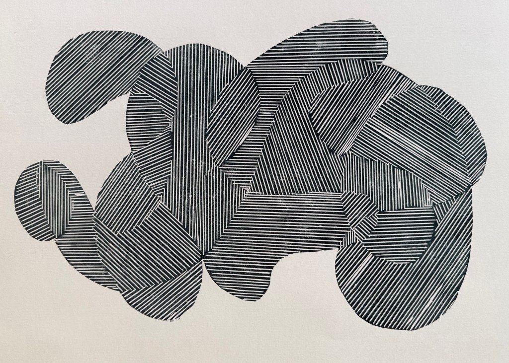
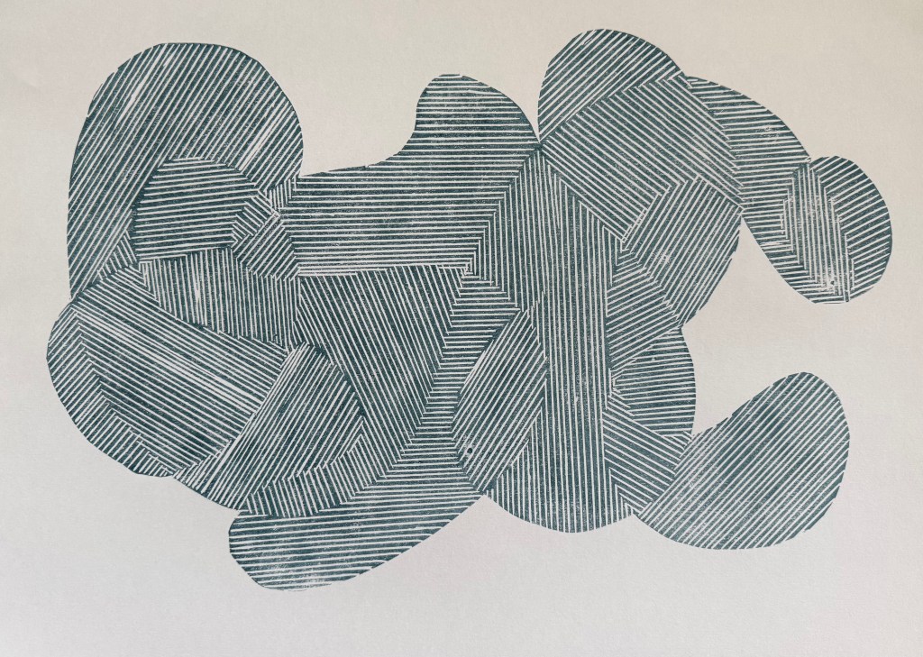
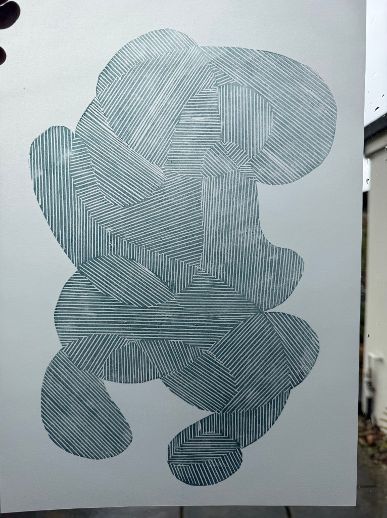
I’m not sure – I almost wrote off linocut but luckily decided to give it another go recently, but in a way that worked for me at this time. I think that perhaps I won’t need to make a conscious decision, it will just happen naturally – after all there are several experiments that I haven’t repeated or developed – gelplate printing and kitchen lithography, tetrapak etc. But there might come a time when I decide to approach them from a different angle.

From your daily walks and their photographic experiments to the topological references to the parsemage and bubble experiments, to the line drawings, we are struck by how often pattern repetition appears in your practice. It brings to mind Richard Long’s ‘A Line made By Walking’, 1967. Why might repetition appears repeatedly in your work? How does this relate to your thoughts on intentionality?

I think that there is repetition in my work because I’m in a recursive, iterative loop – I progress up a ladder and come down a snake, then go up a ladder a bit further than before and come down a snake etc. I’m building layers of iterations as well as some form of connection, maybe in the same way that becoming is influenced to a certain extent by what was before and what is to come.

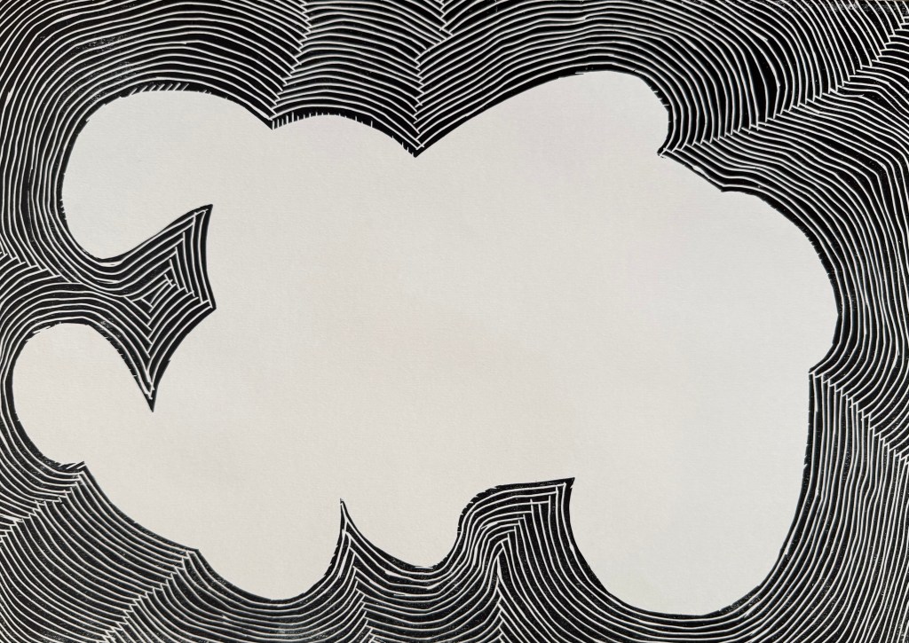
As you move away from figuration what is found between the figurative shapes, or fragments of these shapes – what happens when you zoom in on the negative spaces that are created? How might these be reused?

Whilst I think that I am moving away from the figurative, I think that it is likely that it may still feature in my work when it is the only method to express what I want to say. I need to give some more thought to negative space.

These are my thoughts for the time being. They may well change. I’m conscious that they contain contradictions. I think that the long and the short of it is that I simply don’t know at the moment how my research will play out in practice. It is theoretical and is bound to have practical limitations and to create puzzles to be solved. I feel as If I need to write myself some kind of a manifesto to order my thoughts and to try and address the practical implications.

Never Say Never

And I was right. And I wish that I had thought about doing this sooner.

I dusted off my printing box and experimented with printing a line drawing. I used an A3 piece of soft cut Lino as I didn’t want to be shooting off all over the place, and have bits crumbling away. I used my smallest tool. The good thing about soft cut is that you can easily use a craft knife to cut out sections.

I started by tinting black with some blue, and printing the whole block:

I like.

Then the two separate sections:

I also like. This way around, it reminds me of a figure, curled up, cowering, face protected by hands.

Then I added in some extender to make a lighter, more transparent colour:

Nice.

Printing on tracing paper:

Interesting. Possibilities.

I then experimented with overprinting:

Absolutely love.

I’ve noticed that I’ve been using that word a lot more recently.

It’s fascinating that by overlapping the prints I’ve recreated some of the mark-making I was experimenting with using the Micron pens (Pushing Paper III) and also the strange effects created when I photographed the pen drawings. It was almost as if the camera couldn’t quite work out what was going on. For example, when the image is displayed on my phone normally it looks like the first image below. It is only when I zoom in, that I can see that the lines look as they do in the second image.

Anyway, I think that it was a very productive session and has given me lots to thinks about. I’ve decided that I’m warming to linocut. It used to bug me before, because it can be quite patchy in places (probably my ineptitude), but since using the fineliners to make line drawings, and noticing the texture created when the ink dried up a bit and the effect of mistakes, I’ve noticed that Lino has the same qualities. They both evidence the process of making which I’ve recently been embracing, rather than a perfect print.

I used up the leftover ink to make some mono prints. The inks are safe wash – they are oil-based but soluble in water. I like the effect of spraying the ink with water, and running the brayer over it. These could maybe form the basis of something else.

Paper

I was really intrigued by Do Ho Suh’s thread drawings at Tate Modern last summer (Summer II). After some research I discovered that his method was developed during a residency at the Singapore Tyler Print Institute. He had been spending a lot of time drawing in his sketchbook when it was suggested to him that he might try drawing with thread. Applying thread to wet paper proved unsuccessful as the thread was difficult to control and so he tried sewing on tissue paper but it proved too difficult. It was an intern at the institute, who had experience of textiles, who suggested that he might try gelatine tissue paper which is used in embroidery. So he sews his drawings on gelatine paper and then applies it to wet handmade paper and the gelatine paper dissolves leaving the thread bound into the paper.

This has got experiment written all over it.

I couldn’t find gelatine tissue paper as such, but I managed to source some water soluble embroidery stabiliser. I haven’t attempted to make paper before but I did a bit of research online and gave it a go. The results are not great, mainly because I’m so impatient and kept on touching it etc and so there are lots of overlaps and tears – but then that is me in the process, so actually it’s all good.

I borrowed my daughter’s sewing machine, sewed on a couple of test pieces and applied to the wet paper and these are the results:

The thread has, for the most part, bound to the paper, so it’s been a success. You can still see where the embroidery stabiliser was, and when it is lying flat there is a slight sheen to the paper. I’m not sure what can be done about that and I probably need to experiment more. The stitching doesn’t have the same effect as Do Ho Suh’s, and he has commented that he likes the unpredictability of how the bobbin thread appears. I think it would be worth using a larger stitch which might create a more interesting effect.

I double dunked this one in the paper pulp and water solution (there’s probably a technical term for it) to see if I could get rid of more of the stabiliser. The effect was quite interesting as in some areas the paper folded over itself trapping in some of the thread and in others the pulp settled on top of the thread, partly obscuring it.

I need to do some more research and experimentation and think about how I might incorporate this approach into my work.

In the meantime, I decided to do some more lines.

Because the stabiliser doesn’t dissolve very well when placing it on top of the wet paper, it’s necessary to help it along using a spray bottle. I think the spray combined with the excess water and movement in the stabiliser as it dissolved, caused some of the threads to distort. Initially, I was a bit disappointed, but I actually quite like the movement it creates and also the loopiness of the stiching on the right. It has the feeling of a continuous line drawing.

There was some pulp leftover so I played with some colour and some graphite powder. The graphite powder didn’t really do anything interesting, and still remains quite loose on the surface of the paper. I like the mottled effect of the colour as well as the impression from the kitchen paper it had been sitting on.

Rain, Rain, Go Away III.

I was looking at Google Maps on my phone following directions to a restaurant. I sensed my husband, who was standing beside me, step off the curb to cross the road, so I stepped off too. His arm suddenly shot out and brought me to a halt as a bus went past us. My attention had been elsewhere and I had instinctively followed him. He just hadn’t been looking properly.

People walking along looking at their phones, not where they’re going, who they are about to bump into, or what’s going on around them, videoing events rather than experiencing the moment.

I recently took this photo of East Beach in West Bay.

We’ve spent a lot of time over the last 20 years or so on this part of the south coast, between Weymouth and Lyme Regis. The cliffs are made of sandstone which is undercut by the sea and in recent years the incidence of rockfalls and landslips has increased to at least two a year – a woman walking on the beach was killed in one in 2012. The extent of the coastal erosion is evidenced by the regular closures and rerouting of the South West Coastal path. Yet despite the large yellow warning signs on the beaches, there always seems to be someone either standing near the edge of the cliffs or sitting close to their base, if not directly under them.

I suppose that I’m interested in the sense of a general lack of awareness, which often comes about by seeing life through a lens rather thna living in the moment.

Anyway, I experimented by inverting the photo. My plan is to digitally collage some figures into it, all using a camera in some way, as I am in my shadow. Then I think that I will create a landslip in the cliffs on the right, probably using paint – I was interested in Johanna Love’s reference to Richter’s painted photographs.

After adding some figures in Procreate:

It was difficult getting the scale of the figures right and still being able to make them out, but it’s the best that I can do. Also, Procreate has desaturated the colours – from what I can tell it’s because it uses a different colour profile, but I think that I prefer the blue as it reminds me of a cyanotype. So I’ve had it printed onto satin photo paper, halfway between A3 and A2.

I needed to think about how the paint might behave on the photo paper. After some research I decided to spray the print with varnish to protect the ink from the next layer of gloss medium. I then painted on top.

I’m feeling ambivalent about the result.

Not much else to say really, so moving on…

Rain, Rain, Go Away II

It’s still raining, and a short while after I’d finished my last post, I realised something which put even more of a damper on things, just as I thought that I was making some headway – I hadn’t considered the issue of copyright.

Whilst it’s my data, the copyright in the images belongs to the maker, in this case the healthcare trust as employer of the radiographer. I did a bit of digging around and discovered that I needed to contact someone known as the Caldicott Guardian for my healthcare trust, and luckily the details were on the trust’s website. I sent off an email explaining who I am, what I’ve done and added in a bit extra about the benefits etc. Amazingly, after a couple of days I got a response:

Something to bear in mind for the future, but for now, a relief.

I’m starting to get the same feeling as last year – something that was supposed to be relatively straightforward, and into which I wasn’t going to invest too much effort, has become unexpectedly more complex and time consuming.

Rain, Rain, Go Away.

Having been distracted momentarily by my line drawing phase, I’m experiencing delayed January blues. When is it going to stop raining? It’s really difficult to get enthusiastic about much when it’s constantly dark and raining outside. Opportunities to go out for a good walk are limited, although Otto, the dog, still has to have his walks but they’re generally quite quick because, likewise, he doesn’t like the rain, and won’t go in puddles.

Nevertheless, I’m keen to keep up my recent momentum in making. One pressing concern is next week’s looming deadline for the Royal Academy’s Summer Exhibition. Somehow, I managed to apply for two entries this year – I was intending to apply for my husband to encourage him to pick up a paintbrush again, but clearly I wasn’t wearing my thinking head that day. So I’m now setting myself for a double rejection, but it’s happened so many times now, I’m feeling quite immune. As always, there is a theme but I’m not even going to bother thinking about it this year, although I do note that they are encouraging students to enter – maybe that will improve my chances!

I had the idea during last year’s low residency to get hold of the images from my endoscopy which I’d had a month or so before. Well, I eventually got around to requesting them, but the good old NHS has sent me everything but what I actually wanted. Whilst I’m waiting to hear back from them (let’s face it they’ve probably got better things to be doing), I thought I could make use of last year’s mammogram. There’s really nothing quite like having your breasts squeezed between two rigid surfaces. Before I had my first one, a friend of mine commented that she hates having them done because the machine reminds her of the meat slicers you get on delicatessen counters. I relayed this remark to the radiographer who grimaced and squeezed her legs together. I have to say that the thought does flit across my mind in the moment. Rather ironically, because it feels less clinical than a hospital, I always choose to go to the mobile unit in Tesco’s car park. It means I can do the weekly shop afterwards – two birds, one stone, and all that.

I took all four images: right and left mediolateral oblique and right and left craniocaudal. I removed my personal info and removed some digits from my hospital number as I wanted it to be apparent that they are medical images. I then imported them into Procreate and played around with inverting and layering etc. And this is when I learnt an important lesson – whilst it’s great to experiment and try lots of different things, if you don’t make a note of it somewhere you won’t be able to recreate it. I liked the first image I made but wanted to adjust some of the transparency in some areas. So I adjusted it but couldn’t remember what I had done to create the final image. Try as I might I just couldn’t recreate it so, in the end, I decided to run with the original image. I displayed the image on my laptop screen and then took a photograph of it which incorporated some of the reflections on the screen, which I think add a bit of depth and additional interest to the image. The idea was to print it and then overdraw with pencils, charcoal etc. I experimented on a home-printed image. I became even more despondent because nothing seemed to work. I decided to fold it, scrunch it and cut it up. Then I thought, a good approach when something isn’t working is to cut it into strips and weave it. I liked the effect, and my mood lifted.

Anyway, when I got the A3 image from the printers I didn’t think it was that bad, and I couldn’t bring myself to cut it up so I just overdrew some areas adjusting tones using black, grey and silver pencils and some charcoal. I quite like how the inclusion of the straight lines and the curves suggest a graph of some sort, how it has both a geometric feel but also a natural, landscape feel, as if the line towards the centre is the waterline and beyond is a land mass, the dark area on the left almost reading as a tree. It was rolled up, so I’m going to have to flatten it and sort out proper lighting before I take a photo for submission. I actually really like it.

Aside from the importance of making notes whilst experimenting, this exercise has also taught me something about myself, which I suppose I have secretly always suspected. I started out with the idea of overdrawing the image. Initially that didn’t work, but rather than accept that I could change my thought process, and go off in a different direction, I allowed myself to press on and become despondent. My thought process was not flexible – it was a form of tunnel vision. Once I let go of it, I felt more positive.

Now for number two…

Pushing Paper IV

I’ve decided to experiment with using the contour image in Procreate as a layer.

I was looking through some old family photos and found this one of my father in Canada. This is a recurring image from my childhood – if there was an edge or a high place, my father would always go and stand on it despite us pleading with him not to. I think he would have been about 40 years old when this was taken. I took him on the London Eye when he was in his 70s and I don’t think he looked out at the view once, choosing to spend the entire time sitting on the central seat, ashen-faced.

I also found this photo of a signpost.

I played around with layering using filters, inverting and adjusting opacity:

The image above is tonally bland; I prefer the one below. I like how the lined contouring gives the effect of the image being woven or embroidered.

Again, the images above don’t have enough tonal range. I don’t think the contouring adds anything, it’s probably more of a distraction.

A mixed bag of results. I prefer the images which don’t crop off the bottom of the sign post. The most successful is probably the penultimate image, but again I think it needs a greater tonal range. However, I do like the effect of the figures against the landscape, the idea of crossroads in life, decisions made, a different path followed and shadow selves.

Metallic

I was interested to see Jo Love’s remediation of old black and white photos using metallic pencils, in our session a couple of weeks ago. Photographic images quite often form the basis of my work. I decided to experiment with gold and silver pencils on some old unsuccessful cyanotypes I made from the video stills in In A Flash. The results were varied.

I used the silver pencil first but thought that it didn’t stand out enough. On reflection I think there is a subtlety about it which I like, and perhaps it would have been a better choice than the gold.

I’m not particularly drawn to any of them, but if I had to make a choice I prefer the last two images, particularly the last one. What works for me are the marks outside of the original image, the sunlike shape on the left and the drifting cloud on the top right. The overdrawing creates an image within an image, something which always appeals to me. I think part of the problem is the fact that the images are on watercolour paper which wasn’t overly receptive of the pencil. Overdrawing does appeal to me as a concept, though.