Dialogue III – That Will Do

I’ve always thought that if you do something, you should do it to the very best of your ability, no matter what. My husband is very much of the ‘that will do’ approach, which used to really irritate me.

With hindsight, it was an impossible ideal – it’s obvious that I couldn’t do my absolute best at everything I did in life; there’s only so much time, and so much of me. It was a tall order to impose not only on myself, but also on others – it led to feelings of disappointment and dissatisfaction. It was also the slippery slope which led me to strive for perfectionism in my art. Over the last few months, my mindset has shifted, I would say, seismically.

That’s not to say that I’ve stopped caring, or have become laissez-faire. I would like to say it’s because I now care much less about the result, and more about the process, but I’m not quite at that point yet. It’s more that I’ve stopped imposing such high expectations on myself – in the past their achievement might ultimately have given me a moment of satisfaction, but it was rarely ever enjoyable or something that I actually wanted to do. Now, I feel that I am motivated by what interests me, and I would still like to do my best, for example, in the sense of making the most of opportunities and ideas, but I recognise that there are so many variables which could influence what that might be.

Anyway, long story short, I’m done, finito, and heaven forbid – it’ll do.

So, I had the mirror images printed and fixed them to the back of the existing cut outs. I used a crafter’s glue – Tombow mono liquid glue – as it seemed the least likely to cause buckling etc. Now the cut-outs were thicker than they were originally which caused a problem of the white edging. Also, even using a brand new craft knife didn’t prevent some of the edging being visible face on, which was particularly irritating – I don’t really do fiddly stuff and I’m not the neatest – as I had been really careful when cutting them out. I used some highly pigmented coloured pencil to get rid of the white as best I could. I then glued the cutouts onto the mirror, which proved tricky as the mirror surface had to be wet for the glue to cure properly. I managed it as best I could, but it was a tricky process trying to get enough glue on the back of the cutout for it to fix, but not so much that it would ooze out from underneath and react with the water on the surface.

It will do.

Next problem: photographing the finished piece.

Doing Lines

Following my tutorial with Jonathan, I decided to test the theory that if you say something to yourself enough times, you’ll start to believe it. So, I’ve been doing lines. To be honest I didn’t have to do lines as a punishment at school: I was a conformist.

We make marks everyday in one way or another. An obvious one is our handwriting. I learnt handwriting at school in the same way as every other child, in the book with the lines which indicated where the top and bottom of your letters should go, and the line in the middle indicating the height of the small letters. Once we had mastered the basics, we were allowed to go free range, first with a pencil, and then with a pen, as a reward for continued neatness, and perfection. Those were the days when everyone was taught to write with their right hand; left-handedness was not tolerated. But the need to express ourselves in how we write the words, not just with the words we choose, will always out.

Our handwriting reveals things about us, from the tilt, the size, the pressure, the failure to close our loops. I’ve never had consistent handwriting. It changes depending on my mood. I wonder what that says about me. Maybe I’ve never found a style which says to me: yes, this is you. And maybe that’s the point – I’m forever changing. Or maybe I just haven’t found my mark-making processes. It doesn’t really bother me, but at times I do feel jealous of the beautifully formed letters of others. I think – yes, you’ve got it together; you know who you are.

Doing Lines I

I like that the redaction is scruffy and that there are jagged edges. When I was doing it I wasn’t aware how scruffy it was because I was doing it against a white background, and so it just looked like the redacted words were disappearing. Surprisingly, I didn’t even have the urge to tidy it up once it revealed itself to me. As I was going through the words trying to make different phrases each time, there was a section in the middle which became a bit negative. It’s quite difficult to find different phrases from the same words in the same order. Phrases like ‘I worry about not making’, ‘Is it enough that I enjoy the process’ and ‘I worry about not making the mark’ started to pop up.

Doing Lines II

Well, I’ve written the words that many times, that if they haven’t sunk in by now, they never will.

It seems to have all been about words recently. What are words worth? That’s what the Tom Tom Club asked in their rather bizarre new wave hit from the early eighties, Wordy Rappinghood. You have to be of a certain age to remember this one. I rather like the artwork.

A State of Flux

That’s my phrase of the moment. I feel like I’m in a state of flux.

I’ve been reflecting on State of Flow I and State of Flow II. Flowing water is in a state of flux.

Does that make me a river? Squeezed out of a tiny hole, small to start with, fast and quick, agile, fresh and exciting, periods of calm punctuated with the tumbles and effervescence of waterfalls and weirs, twisting and turning, carving out my way, sustaining the lives of others, being held back and contained by dams until being finally released, picking up along the way, depositing along the way, slowly getting wider and wider, slower and slower, filling up with sludge and pollution, before finally being discharged into a mass of indeterminate nothingness.

Dialogue II

“So, what do you think?”

”It’s not one of your best”

And now I’m in a state of flux, and feeling a bit stressed, thinking where do I go from here? I have nothing else.

I use my husband as a sounding board and as a gauge as to what I’m feeling and what I’m doing. I value having someone to give me feedback, to hold a mirror up to me. But to what extent should I rely on this and allow it to influence how I see my own ideas and work? Why is it when someone says they really like my work, I feel it’s easy to ‘do it down’ – ‘oh, it’s not one of my best’, ‘there are some bits of it I’m not totally happy with’ (when actually I think that it’s as good as it could possibly be and I’m actually quite pleased with it), and yet when someone is ambivalent about my work, I feel unable to ‘big it up’?

Anyway, I now feel directionless, and at a loss as to what to do.

I have looked at how other artists have approached the concept of dialogue, and, in the main, they all involve figures. None of what I have looked at has inspired me so I haven’t even bothered to include any images of them in this post.

I don’t know what it is, but I’m feeling a bit fed up at the moment. Maybe it’s the theme of ‘Dialogues’ and the idea of connections etc. – it all seems as if it’s something that has been done before ad infinitum. Maybe it actually bores me – I don’t know – I just can’t seem to get inspired by it. Maybe it’s the fact that I only have a week to make something and I’ve got other more pressing things to be getting on with. Maybe this little side quest of mine is becoming an unnecessary distraction.

As a reaction to this feeling, I decided to take a literal, and some might say, infantile approach. I kept on coming back to my perverse love of Catchphrase and the birthday card. I started fiddling around on Procreate and came up with this:

A die, a log.

It’s pretty basic, but strangely appeals to something inside me. Maybe it’s a bit cheesy – but do I care? – maybe I need a bit of cheese at the moment. Then I remembered a piece I saw at the Pallant Gallery last weekend.

’Neighbourhood Witch’, 2008, Simon Periton, Silkscreen on mirror coated polyester

I really like the use of the mirror which reflects the viewer so that they then form part of the work. It reminded me of Craig-Martin’s ‘Conviction’ which I had seen at the RA. I could use this idea because one of the thoughts on my mind map referenced the need to reflect when engaged in dialogue.

I have decided to incorporate a mirror, possibly with the images of the die and log being raised slightly away from it so that they reflect in the mirror as well as the viewer – a die, a log, with you. It’s now becoming a fully matured wedge of Stilton!

I experimented by printing them off on some inkjet friendly acetate but my home printer didn’t do a particularly good job, but good enough to allow me to see whether the idea had legs. I wasn’t averse to it: it would mean that I would have to have it professionally printed on something more rigid, such as acrylic/perspex, and frankly, I don’t really have the time to get this done. Also, on reflection, I wasn’t sure about the reflections creating multiple images, as it was no longer a die and a log.

The only solution that I can think of is to fix the image directly to the mirror. The image in ‘Neighbourhood Witch’ above is screen printed on. I don’t know how to do this and I don’t have time to learn. I could get it done professionally, and after having done some research, it may still be a possibility but it depends on timing. Another solution would be just to collage them on. I researched the best type of adhesive and came up with Gorilla Clear Glue which is used a lot in glass mosaics. I will need to experiment with how best to apply it. In the meantime, I put some image cut-outs on a A4 mirrored piece of acrylic. I like the size.

Despite its luke warm reception, I’m going to carry on with my current train of thought. It may not be my best, but I like it because it is something that is totally different for me and it’s way outside of my box, and frankly, I’m all out of other ideas. And as General Patton said – a good plan violently executed now, is better than a perfect plan executed next week.

So I had a couple of sets of the images printed up on some 200gsm paper by my local print shop and cut them out and placed them on the mirrored acrylic to see how they would look.

I don’t know why I didn’t realise that this would happen, as it seems so obvious now – unless you stand dead straight on to it you can see the white reverse of the cut out image in the mirror.

My proposed solution is to have the mirror images printed and then fix them together so that any reflection is of the image itself.

Onwards and upwards, I hope!

Figuring It Out

I’ve started back at my weekly art class after the Christmas break, and over the last two sessions we have been looking at figures, in particular, figures in an environment. I’m not very good at depicting humans (or any animate subject for that matter), so this was a bit of a challenge.

We had to work from images which we had sourced: I took my nieces ice-skating at Christmas, which was really entertaining to watch. There were the confident, well-practised skaters who came equipped with their own boots; the ‘I’m-competent-but every-now-and-then-lose-my-balance-and-windmill-my-arms-brigade; and then the rest – hopelessly clutching the side, or each other, for dear life, inching their way round. There was a whole range of shapes, gestures and weights, in the sense of where in the body the weight is being distributed, and there was a lot of tension.

We started by sketching out the composition.

I used a combination of photos and video stills from my phone – I could have been more organised because I lost track of which figure was on which photo, which wasted quite a bit of time. Next time I work from numerous image sources I will organise them so that they are more accessible and easier to switch between.

I then applied a ground to the support (I used oil paper as opposed to a canvas, as I wasn’t sure how it was going to go). As it was a painting of ice-skaters, I chose burnt umber thinned down with Sansador as my ground, as it’s the blue equivalent of the earth colours. I then drew in the figures using a rigger brush and thinned paint – I found the techniques covered by Chris Koning’s workshop of gestural drawing (‘Perception of the Whole’) to be really helpful in trying to get some dynamism in the portrayal of the figures. I also changed the composition from the pencil sketch to bring forward the pair of skaters on the left and to give the skater next to the pair some extra space into which he could move. I also packed some more figures in, including my favourites, the couple in the centre – the man skating alongside and watching his partner who is leaning forward – and the girl behind them.

The next step was to block in the background. I decided that I didn’t want to put the figures in the specific setting of an ice rink, so I left out the details of the roof and sides which were included in the original sketch. This gives a feeling of more space.

I used a thinned down mixture of titanium white, ultramarine blue and burnt umber to create a grey/blue and then scratched into it with the end of the paintbrush to create skate marks.

I then started blocking in some colour using thinned paint. I liked the fact that the burnt umber drawing was still visible and decided to try and retain as much of it as possible. This meant that I would not be able to use much thick paint in subsequent layers, and so the painting will retain a sketch-like quality. The purpose of the exercise was to capture the essence of the figures, so there will be very little detail in the figures and their faces, other than those in the foreground, and even then I will keep these limited.

I regretted having the large figure in the foreground, but he felt necessary to add variation to the height of the figures, and his static quality should hopefully contrast with the sense of movement in some of the other figures.

I carried on adding some more colour and changed the colour of the skater’s hoodie to differentiate him from the figure in the foreground.

I really enjoyed the process of being looser: the multiple visible alterations and the pared back application of paint. I’m not sure that I like the finished piece, probably because of its subject matter – it’s all a bit twee. But that’s my own fault – I hadn’t adequately prepared for the class and so made a rushed decision. Next time we have to work from a preselected source, I will make sure that I prepare properly, so that the subject matter appeals to me as much as possible.

There are areas which really appeal to me; I like the way I have treated the ice and I think that I have managed to capture the sense of movement, the hesitancy and tension in the figures, and the atmosphere. I don’t like the way I’ve painted the faces in the foreground. Whilst the exercise was all about the figures, I don’t think I’ve managed to find a method to render faces in a non-detailed way which does not look childish. I need to work on this.

I was thinking about this painting whilst I was out on a dog walk yesterday. I enjoyed making it, but I’m not that enamoured with the overall result, which made me ask myself whether I need to like the work I make or whether enjoying the process is enough. Also, I like and am attracted to a wide variety of artists working in very different ways. I suspect that I have previously thought that I need to make myself like them and make the sort of work they make because it is something that I like and am drawn to. I’m starting to realise that this isn’t necessarily the case – I just need to be ‘me’.

Generally, the work which I produce at my art class is not something that I would ordinarily choose to do, (which is a good thing) and won’t necessarily be relevant to my field of study in terms of subject matter, but it will provide a useful source of exploration in terms of technique and approach in my art practice. As such it is a valuable resource and a good use of time as well as a commitment which ensures that I create work on a regular basis.

Dialogue I

I’ve been thinking about what I can do for my submission to the Summer Exhibition.

One thing is for certain, the resource of time over the next two weeks is extremely limited, what with the deadlines for my study statement, curation of my blog and something for the interim show in March, all of which take precedence. In previous years I’ve given a lot of thought and time to my entry and got precisely nowhere, so this year I’m going to do something different. It will be interesting to see whether rejection feels different depending on how much time has been invested. I’m going to follow the philosophy of Gino D’Acampo – minimum effort, maximum satisfaction – have a bit of an experiment and not get too hung up about it.

I’ve put my initial thoughts into a mind map although, to be honest, when I’ve been round the exhibition in previous years, I’ve struggled to see the relevance of some works to the theme.

There are quite a few ideas to consider:

  • I quite like the idea that ‘dialogue’ literally means ‘through words’ – words in the work itself/ posing a question?
  • What about the ability of images to convey phrases and words? One of my favourite TV programmes when I was a teenager was Catchphrase, in which contestants had to guess the phrases being represented by a short animation. Those were the days when it was hosted by Roy Walker – much better than the revival hosted by Stephen Mulhern. A while ago I was looking for a birthday card, and I came across this one. It took me ages to get out of the shop – I tried to solve the clues, the women behind the counter had been trying to solve them all morning, it seemed everyone in the shop wanted to have a go.
  • Exchange – does a dialogue have to be continuous or can there be pauses eg written dialogue in letters, email etc? Can it be in different forms eg verbal met with non-verbal response?
  • Dialogue between the viewer and the work?

Anyway, I’m going to have a quick look to see how other artists have dealt with the subject of dialogue, whilst giving it all some further thought.

ARTificial Intelligence II

I’ve just been watching ‘Sunday with Laura Kuenssberg’ and one of her guests was Baroness Beeban Kidron, a former film director who was appointed as a crossbench peer. She specialises in protecting children’s rights in the digital world, and is an authority on digital regulation and accountability.

The topic of conversation was Labour’s plan to change copyright law so that tech companies can scrape copyrighted work from the internet to train their generative AI tools free of charge, unless individual creatives decide to opt out. They are proposing what is, in essence, legalised theft.

Labour launched their AI Opportunities Action Plan two weeks ago. They intend that the UK should become a world leader in AI with the amount of computing power under public control being increased 20 times over by 2030. They will achieve this by making huge investments (£14bn provided by tech companies, of course!) in setting up the infrastructure needed to create AI growth zones, a ‘super computer’ as well as huge energy intensive data centres necessary to support it. Clearly this will have a significant environmental impact and is at odds with Labour’s election promise to hit its green target to create a clean power system by the same date of 2030, which some experts think was going to be difficult to meet anyway.

Apparently, this will result in the UK’s economy being boosted by £470bn over the next 10 years. This may well turn out to be Starmer’s figure on the side of the bus. Kidron commented that the small print reveals that the figure was sourced from a tech lobbying group which was paid for Google and which was arrived at by asking generative AI, and which, in any event, reflects the global, not the national, uplift in the economy.

Kidron is a vocal supporter of the option to opt-in rather than putting the onus on the individual creative to contact each of the AI companies, who are using their work, to opt out. In fact, opting-out is something that’s not technically possible to do at the moment. To this end, she has put forward amendments to the Data (Use and Access) Bill which will be debated in the House of Lords this week. She has also previously commented in the press that she can’t think of another situation in which someone who is protected by law must actively wrap it around themselves on an individual basis. I think she makes a good point, and I agree with her view that the solution is to review the copyright laws and make them fit for purpose in an AI age. The creative sector, which includes artists, photographers, musicians, writers, journalists, and anyone else who creates original content, is made up of about 2.4 million people and is hugely important to the country’s economy, generating £126bn. That money should be kept within the economy, and not be siphoned off to Silicon Valley.

Not surprisingly there has been a great deal of backlash from creatives including actors and musicians, such as Kate Bush and Sir Paul McCartney, since Labour announced their plans. As part of the segment, Kuenssberg interviewed McCartney who is very concerned as to the effect this will have, especially on young up and coming artists. He commented that art is not just about the ‘muse’ but is about earning an income which allows the artist to keep on creating. He fears that people will just stop creating because they won’t own what they create, and someone else will profit from it. AI is also a positive thing: he explained that they used it to clean up John Lennon’s voice from a scratchy cassette recording making it sound like he only recorded it yesterday, but he is, nevertheless, concerned by its ability to ‘rip off’ artists. He mentioned that there is a recording of him singing ‘God Only Knows’ by the Beach Boys. He never recorded the track; it was created by AI. He can tell it doesn’t quite sound like him, but a normal bystander wouldn’t be able to tell the difference. In a year’s time, even he won’t be able to tell the difference.

There is a petition which has been signed by over 40,000 creatives, and the Government is undergoing a consultation procedure which you can respond to with your comments online here. The consultation ends on 25th February.

So, what can we do in the meantime?

Short of going offline, which isn’t really an option, there is nothing which will ensure that our work is not used in training generative AI. Just from some cursory research, which incidentally was helpfully summarised by Google’s AI Overview, there is the possibility of using a watermark to protect images either physically (not so good for promoting work) or invisibly embedded in the image, using digital signatures, or a cloaking app such as Glaze, which was developed by the University of Chicago, which confuses the way AI sees your image by altering the pixels, or by using another of their apps, Nightshade, which alters the match between image and descriptive text.

For now, all I can do is to change my privacy settings on my Facebook and Instagram accounts to prevent Meta from being able to use data from my posts to train its own AI tools. I had to fill in a form explaining why I objected to them using the data, and I received email confirmation that they would honour my objection, but who’s to know if they do or not? Apparently, there is a website, Have I Been Trained?, which allows you to search for your work in the most popular AI image dataset, LAION-5B.

What’s possibly just as disturbing is the Government’s plan to allow big tech access to one of the biggest and comprehensive datasets in the world – the NHS. It’s all in one place, we all have an NHS number which gives access to a lifetime’s history of personal and health data. It will be done on an anonymous basis, but with enough data, even experts say it’s easy to re-identify people. No-one’s doubting the incredible possibilities that AI offers in terms of delivering healthcare, but proper safeguards are needed.

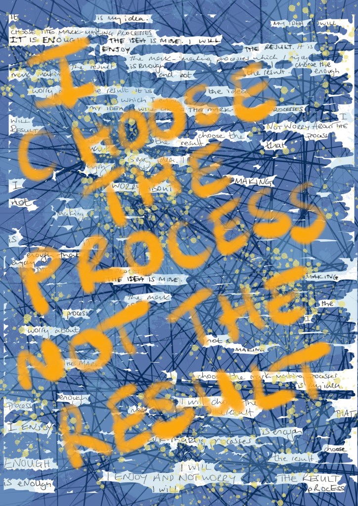
Anyway, I asked the WordPress AI to generate a header image based on its own prompt:

“Create a high-resolution, highly detailed image illustrating the theme of digital rights and AI regulation. Feature Baroness Beeban Kidron in a thoughtful pose, surrounded by symbols of creativity such as art supplies, musical instruments, and books. The backdrop should convey a digital landscape, with elements representing technology and copyright, like binary code and padlocks. Use soft, natural light to evoke a sense of seriousness, yet hopefulness. The image should be in a documentary style, capturing the urgency of the conversation about protecting creatives’ rights in the age of AI. Ensure sharp focus to highlight the intricate details in each element.”

Sorry, Jonathan – I will switch my mobile phone off for the rest of the day so I don’t have to recharge the battery, but, in the meantime, do we have much to worry about? It doesn’t even look like Beeban Kidron.

Prost, Vienna!

It’s taken me a while to finish this post – other things have got in the way – but I needed to complete it to make note of what I saw, and what I thought.

Whilst in Vienna, we also managed to visit the Secession Building, which was designed by the architect, Joseph Maria Olbrich, in 1898, as an exhibition space for the Secession. He was one of the founding members along with a group of artists, including Klimt, who had broken away from the traditional Künstlerhaus to pursue progressive contemporary art. The group’s motto which appears above the door is “To every age its art, to every art its freedom.” Topped by a golden cabbage comprised of 2,500 gilded iron laurel leaves, it houses Klimt’s Beethoven Frieze.

The frieze is based on Wagner’s interpretation of Beethoven’s Ninth Symphony: it is a tale of humankind’s search for happiness.

I didn’t know what I was expecting really, which is a bit daft considering that I had seen pictures of it in books. I initially felt, yeah ok, but now reflecting on it I think I must have been suffering from a case of art gallery overload. It was really remarkable. It’s been relocated from its original position. It’s high up on the walls of the room, and surrounds you. The fact that you have to look up, makes viewing it an almost reverential experience. That coupled with the fact that you can listen to Beethoven whilst you admire it.

In addition to Klimt and Schiele, I saw many works by other artists, which I felt might be useful over the next year or so, some of whom I hadn’t previously come across.

This bronze sculpture is Tower of Mothers, 1937/38 by Käthe Kollwitz. It shows a group of mothers standing together and forming a circle to protect their children, who can be seen peering out from between their skirts. The strength and determination to defend whatever the cost is beautifully captured in the postures of the figures, particularly the mother with her arms spread wide. There is no fear in this sculpture. The mothers are protecting their children from war and the horrors of war, which is poignant as Kollwitz herself lost one of her sons in the First World War, a loss she never recovered from.

These oil paintings on canvas are by Koloman Moser. Moser was a founding member of the Secession, and was primarily a graphic designer and illustrator, as well as a set designer, furniture and textile designer, and painter. I like the slight graphic quality of these paintings as well as the unusual palette – his use of what looks like a lime green gives a sickly feel to the works, and works really well with the purplish reds in the skin tones and the shroud. They appear almost luminous.

The ceramic glazed sculpture above is Insinuation, 1902/03, by Richard Lucksch. I had to resist the urge to touch it. I found myself wondering what the young men are whispering in her ears; what are they insinuating? The very title implies something negative. It reminded me how difficult it can be to navigate a true course through life, when others are constantly whispering things into one’s ears, insinuating, commenting, doubting, demoralising, chipping away.

I felt drawn to this painting, for some reason. There’s some gold; that’s a start. The skin is beautifully rendered and I like the composition: I start from the head encased in the golden square and make my way down her body with the interesting detour created by her right arm, along her legs, through her toes up towards the top right and then back to the golden square via the light coloured rectangle. It’s satisfyingly complete.

It’s Seated Woman (Marietta), 1907 by Broncia Koller-Pinells, the Austrian equivalent of radical, Laura Knight, who also challenged the taboo for women artists at the time – the nude.

Head of A Dancer, 1923, by Erika Klien is an example of Viennese Kineticism, which was inspired by Cubism, Constructivism, Futurism, dance, music and architecture. I like the sense of movement of the head and the hands, which have also been deconstructed in parts, as well as the quite limited colour palette.

What’s not to like about a Degas figure? This one Pregnant Woman, was risqué for its time, depicting a woman in a pregnant state, and was cast in bronze after his death.

This definitely gets the award for most interesting. The Doll is from the film, My Alma – Oskar Kokoschkas’ Love to a Doll. I’ve since researched it a bit further and it really is a strange tale. Alma was Alma Mahler, Gustav Mahler’s widow. Having had her first kiss from Klimt when she was 17, she went on to have many love affairs before , during and after her several marriages. One of those affairs was with the young artist, Oskar Kokoschka for whom she became the love of his life. I think it’s fair to say he was obsessed with her. He had to go off and fight in the First World War War and whilst he was away she married a previous lover. Needless to say he was quite devastated when he returned home, after having been bayoneted in the chest, suffered a major brain injury and declared mentally unstable, to find that she had ended their relationship. So he did what all spurned lovers do, he commissioned a doll maker to make a life size doll of her providing very specific instructions as to how it should be made and what it should feel like to the touch. When she finally arrived he was a bit perturbed by the fact that her body had been covered in feathers but went on to pose her for paintings and photographs, dress her up and even take her to the opera. But eventually he resolved himself to the fact that his Alma doll wasn’t doing it for him, so he threw a party, then took her out into the garden where he chopped off her head and broke a bottle of red wine over her. I’m not sure that I’ll watch the film…

Changing Places

That wasn’t how the last couple of days were supposed to have gone.

My daughter came home from uni just after our session ended on Tuesday with rapid onset tonsillitis. By Wednesday she was in tears. She is one of the bravest and most stoical people I know, so this unsettled me. It’s heartbreaking watching your child suffer in pain. When I was in pain, my mother used to tell me that, if she could, she would swap places with me. I wish I could say the same, but the truth is my daughter is far better equipped to deal with it than me. When it comes to pain, I don’t mind admitting that I’m a wimp. If there are drugs going that will make me feel better, just pump me full of them – that’s what advances in medical science are for, after all.

I don’t care that I didn’t have a ‘natural’ birth, without pain relief; that she came out of the sunroof. I wasn’t ‘too posh to push’ – she wasn’t going anywhere, and at risk of becoming distressed, and would it have mattered if she hadn’t been, anyway? Is a natural birth somehow superior to one with medical intervention? Why are we told, in that patronising way, that we are not the only woman to have ever given birth? I am the only ‘me’ to have given birth.

Whilst I’m doing my best to keep negativity out of my life, some things do just make me angry. I think it is now generally accepted that women are expected to put up with an unnecessary level of pain when it comes to matters of their health, just because they are women. Studies have shown that women experience pain more intensely, and for more of the time than men. However, they are less likely to have their pain scores recorded, or to be prescribed pain relief than men. Apparently, this is based on the misguided notion that women are more emotional, which means that they may exaggerate the pain they are feeling – after all, ‘hysteria’ comes from the Greek word hystera, which means uterus. Really? There is now a term for this way of thinking: medical misogyny.

It reminds me of a comment made by a male healthcare professional whilst discussing pain relief during the discharge process after an exploratory procedure, which had been initially attempted without sedation. Some women can ‘tolerate’ the ‘discomfort’. I wasn’t putting up with the intense pain. Did I feel like a failure, that I’d somehow let myself and womanhood down; that I should have been able to ‘tolerate’ the ‘discomfort’ like all those women who had gone before? Initially, yes, and it is very intimidating to be in a situation where you are surrounded by healthcare professionals, both men and women, where you feel that you have lost agency over what is being done to your body. Did I look in their eyes for judgement, particularly in the women’s, whilst I dressed, gathered my things and left? Yes. But the word ‘no’ is empowering, and so it was sedation for me. Anyway, getting back on point, I think I made some quip as to knowing what pain feels like, being a woman. He must have interpreted that comment as alluding to a badge of honour as to the amount of pain women can tolerate, as he replied, something along the lines of: “Women can’t have it both ways”.

Anyway, I’ve managed to make it all about me again; that wasn’t how this post was supposed to have gone. After several trips to, and many hours spent in A&E, pain relief, antibiotics, fluids, steroids, and a bit of an exploration up her nose and down her throat with a camera, she’s thankfully on the mend with plans to whip the little troublemakers out in due course.

Arty-farty

In the hope of finding some inspiration, I sorted out my art bookcase and came across the exhibition handout to the Michael Craig-Martin exhibition at the Royal Academy. This quote caught my attention:

I dislike jargon intensely and cannot stand people who think that complex ideas need to be expressed in a way that is obscure or rarified… The great minds whom I have admired … are precise and economic in their use of simple language.”

Michael Craig- Martin, “On Being An Artist

I have to agree with him. I’m very much an advocate of the Plain English campaign. Maybe it’s because I don’t have the necessary range of vocabulary to achieve such verbal smoke and mirrors, or the attention span.

Clarity of language is what made reading Will Gompertz’s ‘Think Like An Artist…’ such a breath of fresh air. He cuts through all the jargon and makes his points in such a way that someone who doesn’t have an ounce of art knowledge would be able to understand and appreciate them.

As Craig-Martin says, it’s not about having very complex ideas: ideas which challenge are good but, if we want art to be accessible to all, why use convoluted and, frankly, nonsensical language to explain and critique it? Is it to maintain an air of mystery, of intellectual superiority? And who is responsible? The artists, the critics, the galleries or curators, or all of them?

Thinking back to our first sessions when we introduced ourselves and our work, I can’t think of a single instance when I didn’t understand the ideas being expressed. There was just authenticity.

This year’s Summer Exhibition is dedicated to art’s capacity to forge dialogues but, how can art ever hope to change things if people just don’t get it? It goes back to the idea of ‘connection’ in my previous post: without a connection, however small, there can’t be engagement, and without engagement there can’t be a dialogue.

When I started this course a friend asked me whether I was going to become all arty-farty. I said I hope not but, if I ever come across that way, she should give me good slap!