Pushing Paper III

Moving away from organic shapes for a moment, and developing the sense of overlapping circles in my husband’s outline, I decided to try something more geometric.
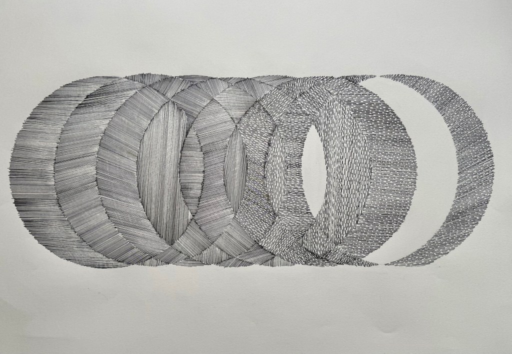
I also experimented with different combinations of broken and solid lines to create a different effect, and I left some areas blank. Overall I was really pleased with this. On reflection I think that’s it true to say there’s only been one out of all the images that I’ve produced that I’m not that keen on (at the end of this post), which is unusual for me.

I wanted to try and move things forward so that it didn’t become a merely stylistic treatment – something decorative or a pattern. So, I applied it to some previous motifs – contours and figures.
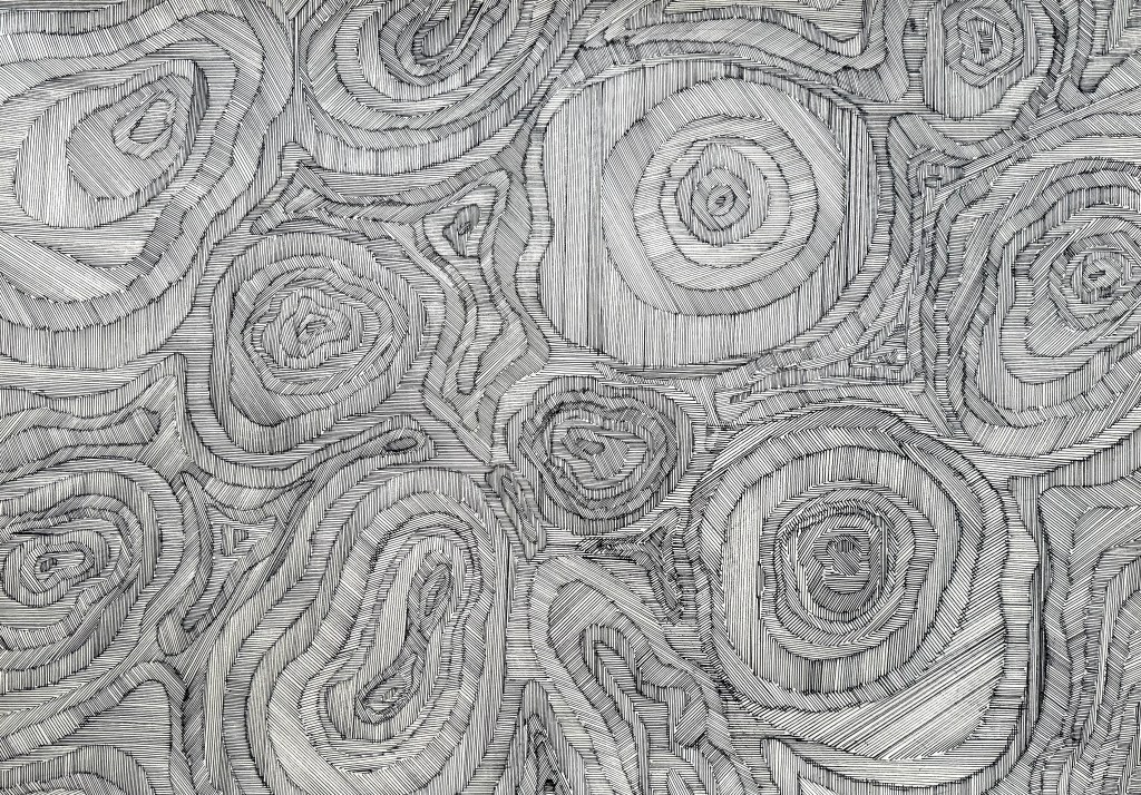
I really like the effect created using the contour lines. Some parts feel almost three dimensional. My system of working was a bit more regimented this time – I used a variety of different pen widths, using the same width and drawing in the same direction for each of the separate contours. It creates something quite textural, almost woven.
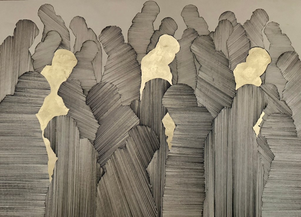
At first I wasn’t quite sure about the figures – I didn’t think that it added very much. Also, originally the three figures were solid black and were very prominent, which I wasn’t sure about so I changed them to gold – I think it gives them more of an absent quality. The more I look at it, the more happy I am with it. I used the thickest pen (0.8mm) in the foreground down to 0.1 – 0.05mm on the figures in the background. The choice of direction was made in the moment.

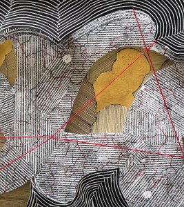
Next, I decided to try lines and I used the same pen throughout (0.8mm). I incorporated a collage element in some of the sections – cut outs from some contour work – which I think creates an effective contrast. There’s a strong sense of something having been folded, creating numerous different planes – almost like origami. The collages areas remind me of chipboard.
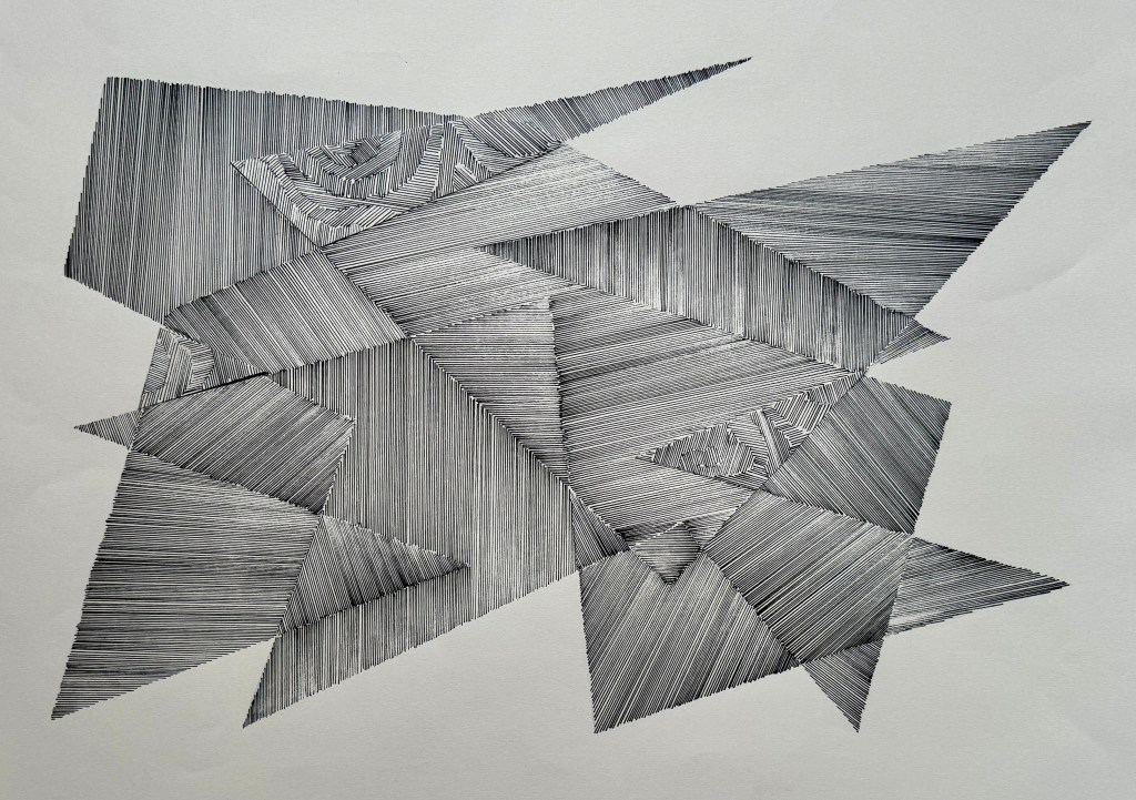
I then combined straight lines and circles using different widths of pens. I wanted to create something a bit more complex than the image above so I drew more lines and left some areas blank. I also made a conscious decision to go off the page. I think that the inclusion of circles and blank areas is effective but I think using different pens means that it doesn’t have as much presence as the image above – it’s more subtle – is that good? Is that bad? I’m not sure at the moment. I’ve been making these A2 images one after the other within quite a short space of time and I think that I need to give them some space, and come back to them in the cold light of day.
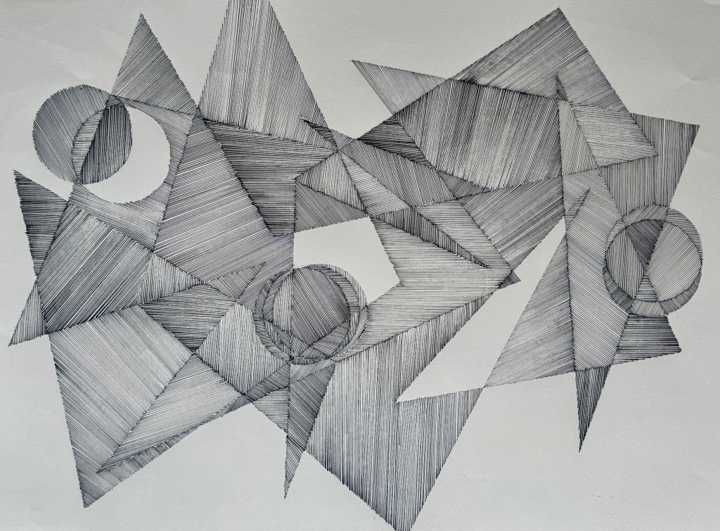
I wanted to experiment further with circles, but not in a uniform way.
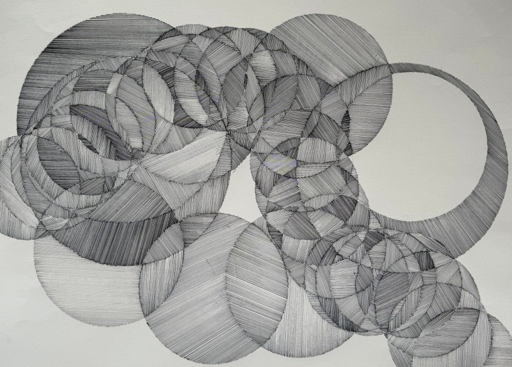
Again, I used different pen widths and made a conscious decision to go off the page (which is the norm for me as I don’t like to be restricted – but here I am filling in shapes with nothing but lines…). Yet again, I’m pleased with it, and I particularly like the tumbling section – there’s a sense of movement. But I’m starting to think of parquet flooring for some reason.

I went back to the more organic form incorporating some more linear elements.
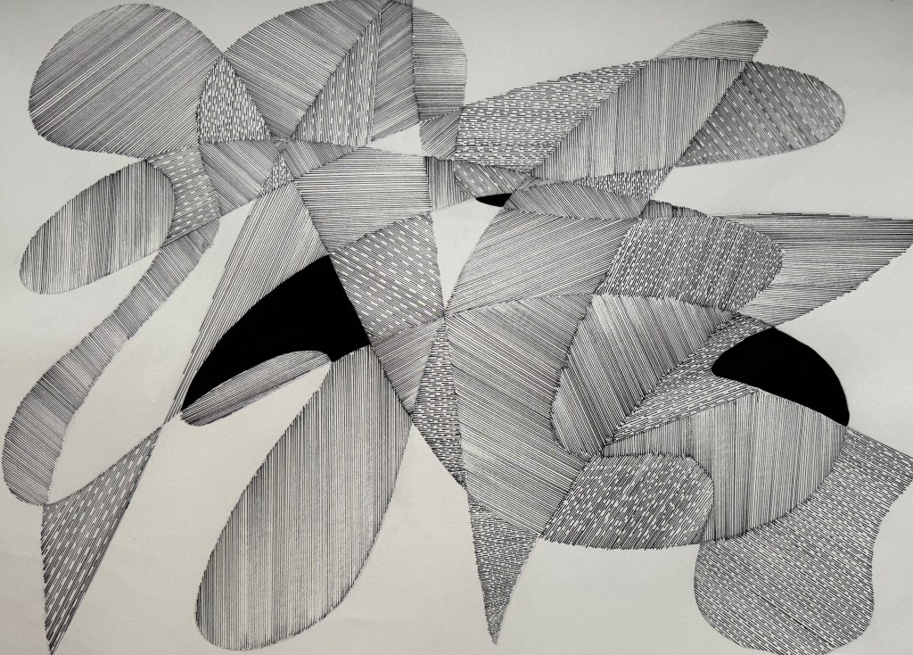
This time I used the same width of pen throughout but included some areas with broken lines as well as black gouache. I think this has caused it to be a more stylised image reminiscent of my original ‘doodles’. I think that I’ve gone backwards.

And then the wheels fell off, when I realised that I hadn’t thought about using different widths of pen, but keeping the lines in the same direction. I used a series of overlapping circles and filled in the sections within each circle in the same direction.
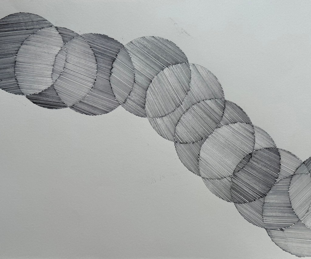
They might have a sense of movement but that’s about it. After making 11 A2 drawings in as many days, I’ve come to the end of the road, for now. Time to move on.

Moving forward I will further explore the giving up of control by enlisting some friends who don’t make art and someone I don’t know at all (how weird that relinquishing control is what we explored with Jo Boddy in this week’s session – I’m taking it as a sign). Otherwise I need to think about how I can progress what I have made so far. I’m thinking about layers, and perhaps cut outs revealing layers below. Stitching? Nails, pins and threads to map?

Last Minute II

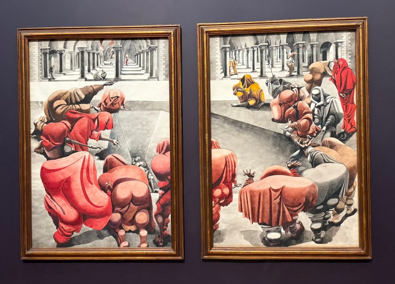
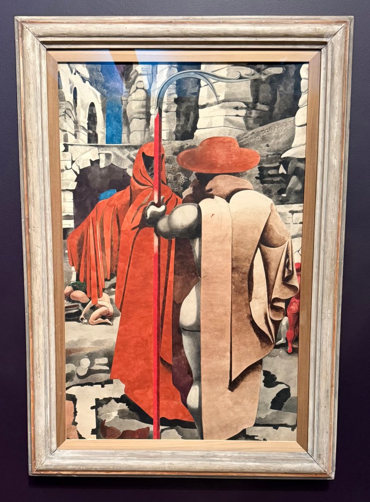
I didn’t expect to enjoy the Edward Burra exhibition at Tate Britain. His earlier works of figures in bars and cafés in France and the US were interesting, but I was particularly intrigued by his work during the Spanish Civil War, the Second World War, and his later work. He was diagnosed with rheumatoid arthritis as a young boy, and during the war his medication was subject to rationing which meant that not only was he isolated from his friends, but he was also in pain for most of the time.

He mostly drew from memory, and used watercolour to build up layers. They were extraordinary. They had the solidity of oil paintings, and yet had a remarkable quality of luminescence about them.

As he got older, and couldn’t travel abroad because of his failing health, he went on road trips with his sister, often accompanied by friends. When they stopped to enjoy the views he would just look, later recreating the scene months later in his work.

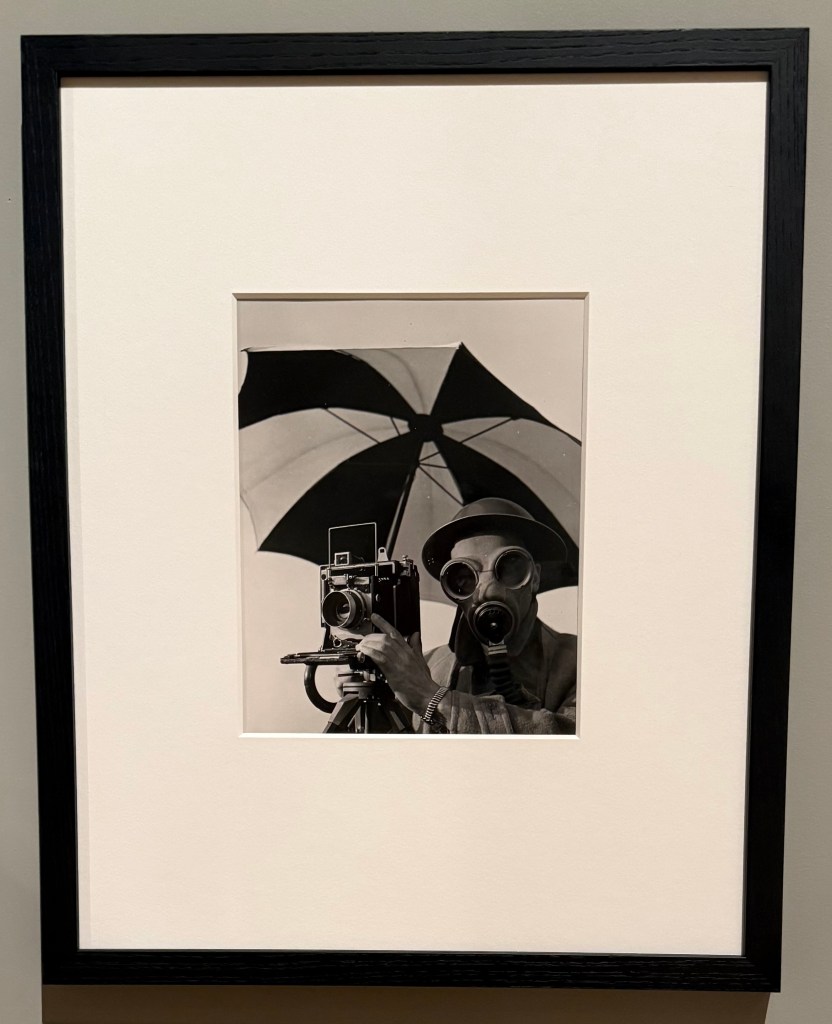
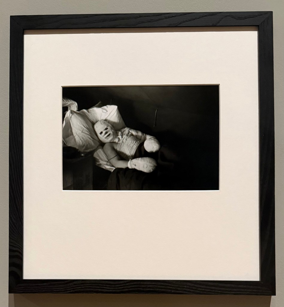
I then went round the Lee Miller retrospective which has around 250 photographic images on display. Originally a Vogue model, she moved from being in front of the camera to being behind it, working closely and experimenting with Man Ray in Paris. During the Second World War she was a war correspondent for British Vogue taking photographs of the Blitz, the liberation of Paris and the concentration camps at Buchenwald and Dachau.

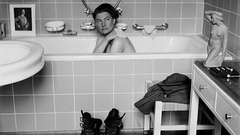
I hadn’t really been aware of Lee Miller before I went to see the film Lee, in which Kate Winslet plays her. At the end of the film, you see a selection of some of her most famous photographs including the one of her bathing in Hitler’s bath taken by her colleague, David E Scherman, as well as the scenes she witnessed at Buchenwald and Dachau, the mud of which is still on her boots which she has purposefully placed in front of the bath. Seeing them in the flesh, in a small side room, was incredibly moving. Not surprisingly, photography was not permitted in this part of the exhibition.

Available at http://www.bbc.co.uk

British Vogue was reluctant to publish her photos of the concentration camps, on the basis that people wanted to move on from the war, and whilst they published a few, American Vogue published a comprehensive spread of them in the June 1945 issue, including the most harrowing, under the title ‘Believe It’. Her work, particularly her war photography, was not widely known about until after her death when her son found her collection of photographs. She had given up photography, too traumatised by what she had experienced during the war, and taken up gourmet cooking.

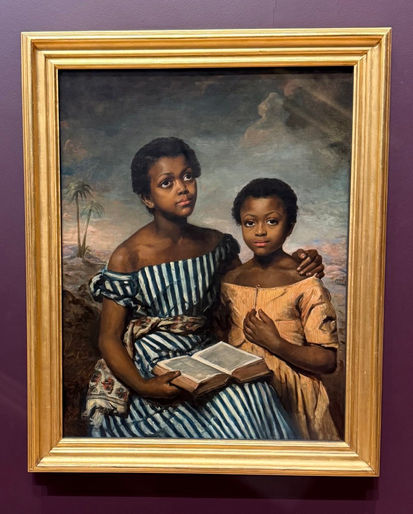
I finished off the day by having a look around the general exhibition and came across the subject of one of my favourite Fake or Fortune episodes (other than Frink’s Warrior found at an Essex car boot sale), Emma Soyer’s Two Children with a Book.

One-to-One No 2

I had my second session with Janet yesterday to discuss the my current draft research paper.

It was a relief. I’ve been battling for a lot of the summer, mainly in my head, trying to get to grips with how I could incorporate all the aspects which I’m interested in, trying to find something to latch on to. I’ve been doubting whether there is anything there at all, whether it is actually saying anything, so it was a relief to hear Janet’s feedback.

Her general view is that I’m doing well, and that she found it really interesting. She can see that it is immensely valuable for my own practice – it is, and the process itself, irrespective of the end result, has opened up other areas of exploration. I reflected that when we last met, I was thinking in general terms about selfhood, mapping and memory and that I’ve have been struggling to find a direction to go in. Since then the common thread of ontogenesis has made me think about it in terms of practice : how can an artist capture something which is forever changing particularly when the very processes being used to do it are themselves in a state of flux? She commented that this gives a contextual understanding which is important in art; there is an intensity about art, something to do with the resistance in it, resisting the chaos by ordering the thinking and the work. There’s a need to be able to perceive the depth of the attempt of trying. When an artist makes work there has to be some kind of structure, but that the use of thought is poetic.

She commented that the draft is comprehensive and well researched, and that the themes are coherent. She particularly liked the conclusion. The draft navigates complex ideas in an accessible way, although I need to refine and tighten the argumentative flow. In particular, the conclusion should ordinarily consolidate the argument rather than reopening it, but she actually likes how it reopens it.

She thought that the Dylan quote as a way in was effective, but that I need to define what I mean by ‘ontogenesis’ – it is a motif word which needs to be shaped from the beginning. I could look towards biology, developmental psychology or even etymology.

We then went through the draft in detail – see Research Paper page.

I came away feeling a lot more positive and reinvigorated than I did before the session – I would even say that I had been feeling anxious about it.