Is It Time To Come In Yet?

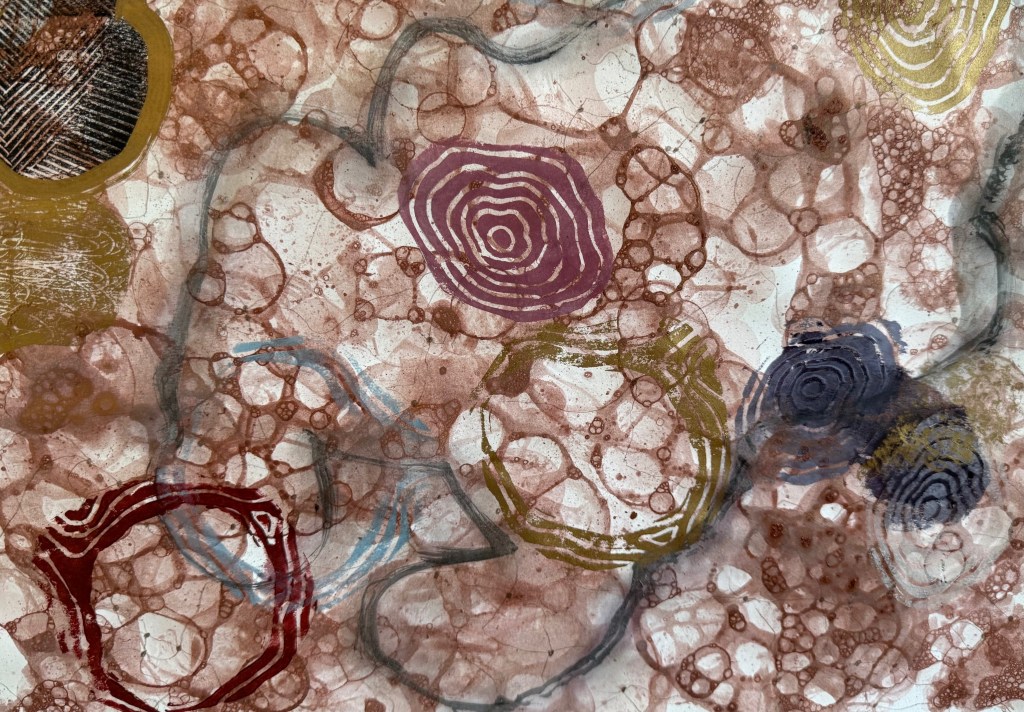
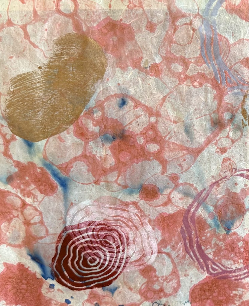
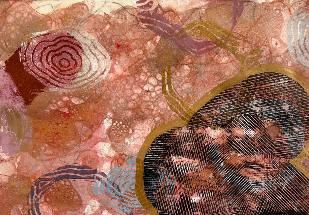
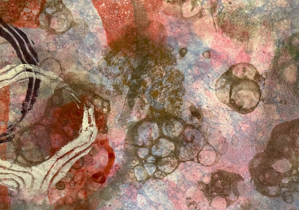
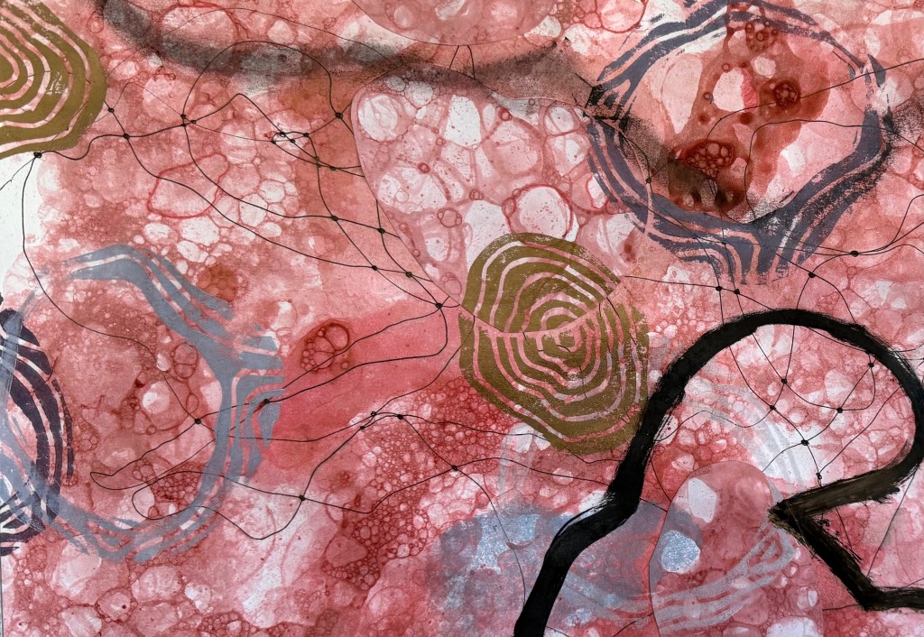
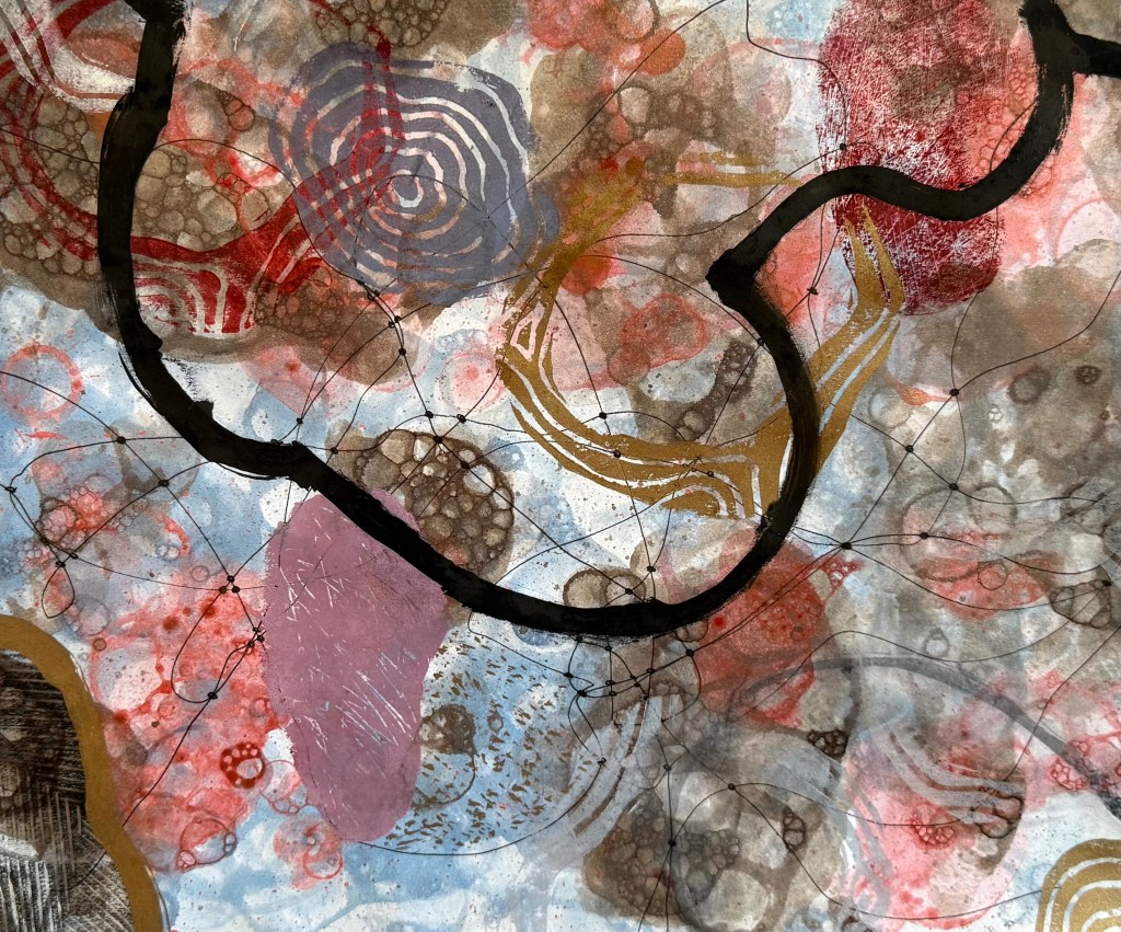
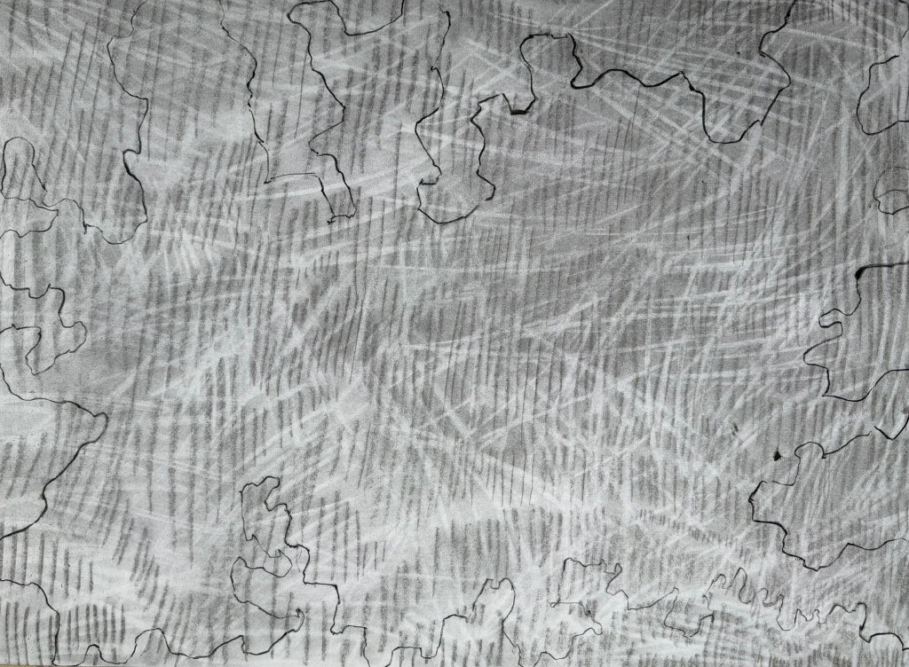
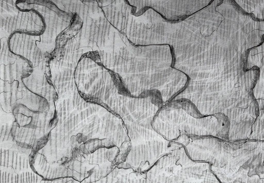
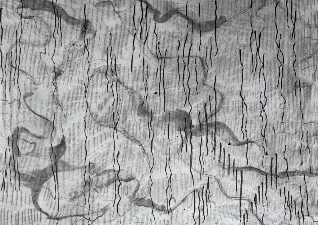
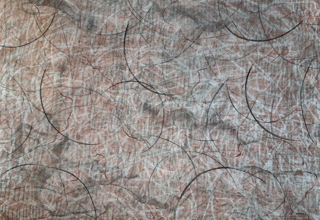
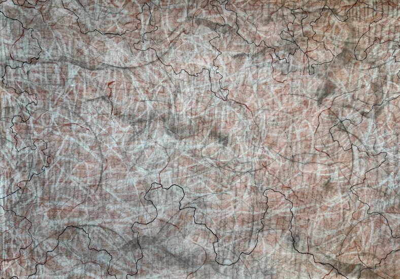
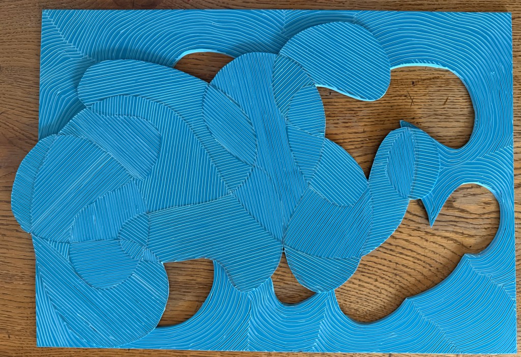
So, having taped all of the test sheets togther into what I called my ‘play sheet’, I let rip with the small pieces of linocut I had found. I also used the lino of the shape that I’m not intending to use, although I still really like the shape of it. The full print of it doesn’t fit with the background, although I do like the way the background disrupts it. I experimented with just using the outline which I think is effective, experimenting with the quality of the outline by using a bold line painted on with printing ink, some thinned down ink and some charcoal. I also added to some other areas with a brush as well as coloured pencils. I think that I need to sit with it for a while to identify those elements that work – it’s got everything but the kitchin sink in it. Hopefully, some clarity will emerge from the chaos.
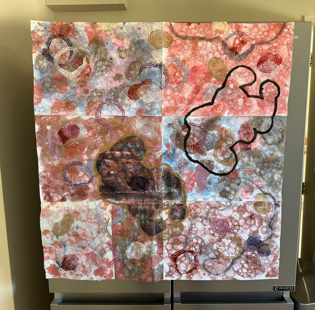
I have some initial thoughts.

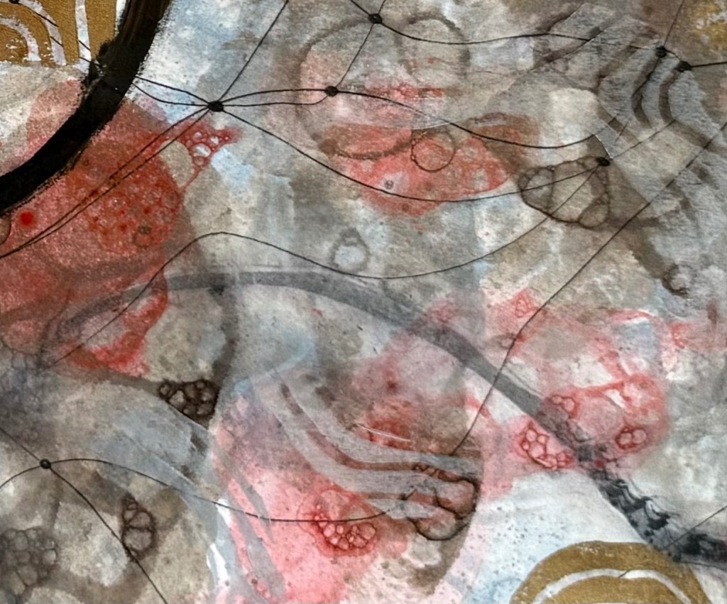
Printing the solid shapes of lino wasn’t very effective but I do like those bits where I scratched away some of ink from the surface before printing. I also like the muted contour lines in a light grey. The darker colours definitely need greater transparency (I was thinking about the shadow cast by the stone).

It’s a starting point and the next step is to work on a slightly larger piece of paper trying to get the transparency of ink right, adding in some masked areas, and to work out a colour palette. I’ll keep using the lino offcuts for now.

I was a bit disappointed about the lined shape – I really love the effect you get when they overlap and the lines distort. Maybe I need to try something separately but incorporating elements of today’s experimenting, perhaps even including elements of collage. Maybe I could try using mulberry paper, or try sticking with monochrome – it felt a bit strange using so much colour, but I think that I was feeling in a celebratory mood.

That said, there are some areas that I like.
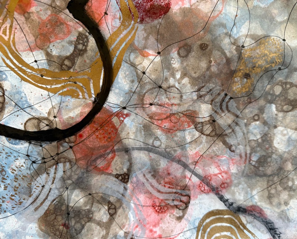
As I was experimenting I thought that what I really want is to achieve some thin veils of colour between the bubble layer and the print – like the effect you get when you glaze in oil painting. I’ve questioned recently whether I should try oil painting again. I haven’t done any for so long as I haven’t been going to my classes. It would be like meeting up with an old friend who I haven’t seen for a long time and during which time I have changed considerably. Would I get sucked into being my old self, or would they be happy to accept me as I am now?
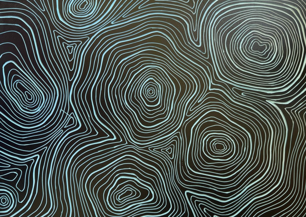
The Book II

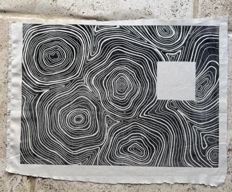
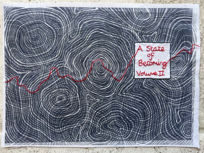
I’ve been making the book cloth for the second book. This time I lino printed onto a sheer fabric and a plain cotton.

I need to sharpen my cutting tools – there was slip on the left side. I’ll be able to cover it up with the mask for the title block.

Overprinting on paper

Print on sheer fabric

Print on cotton fabric

Fabrics bonded together and backed with mulberry paper and addition of title.

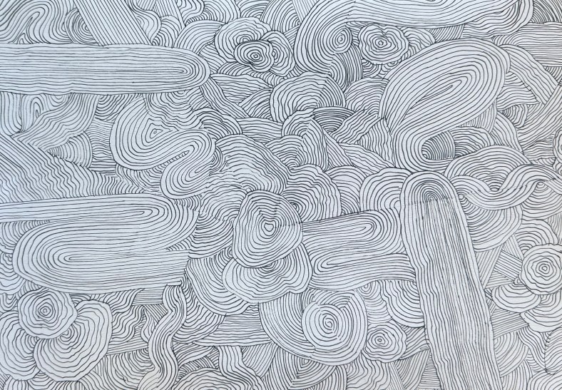
For the end papers I asked my husband and daughter to draw some more outlines for me to fill. I’d been experimenting with not using straight lines.

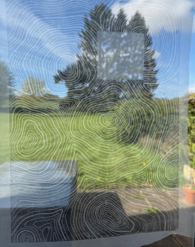
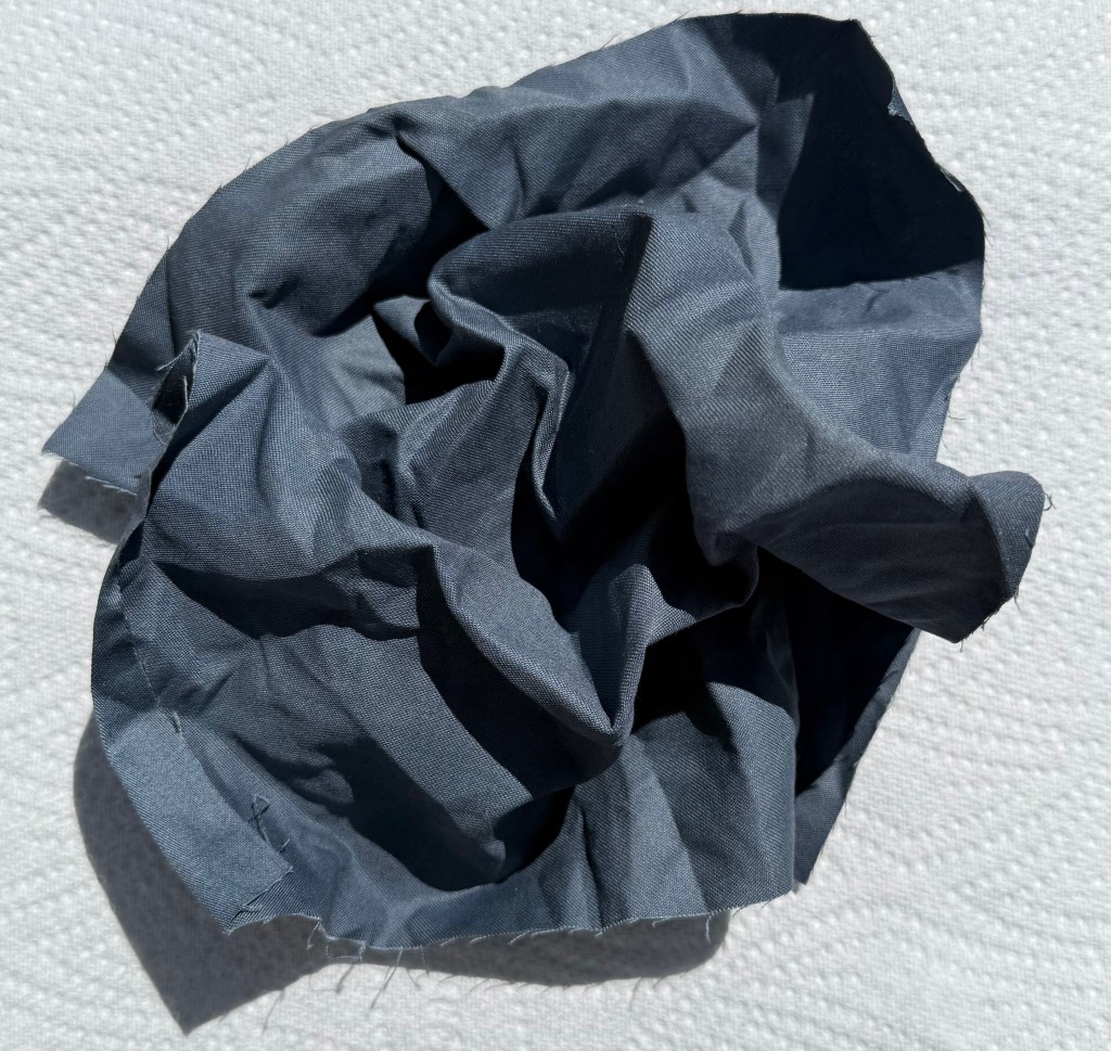
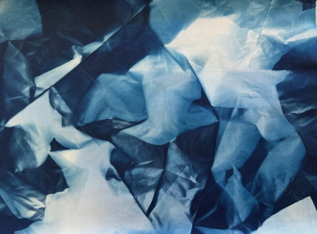
I then redid the cyantotype for the remake of Volume I. Whilst I was waiting for it to develop, I scrunched a piece of fabric up and left it outside. I was pleasantly surprised by the result.

The Accidental and the Incidental

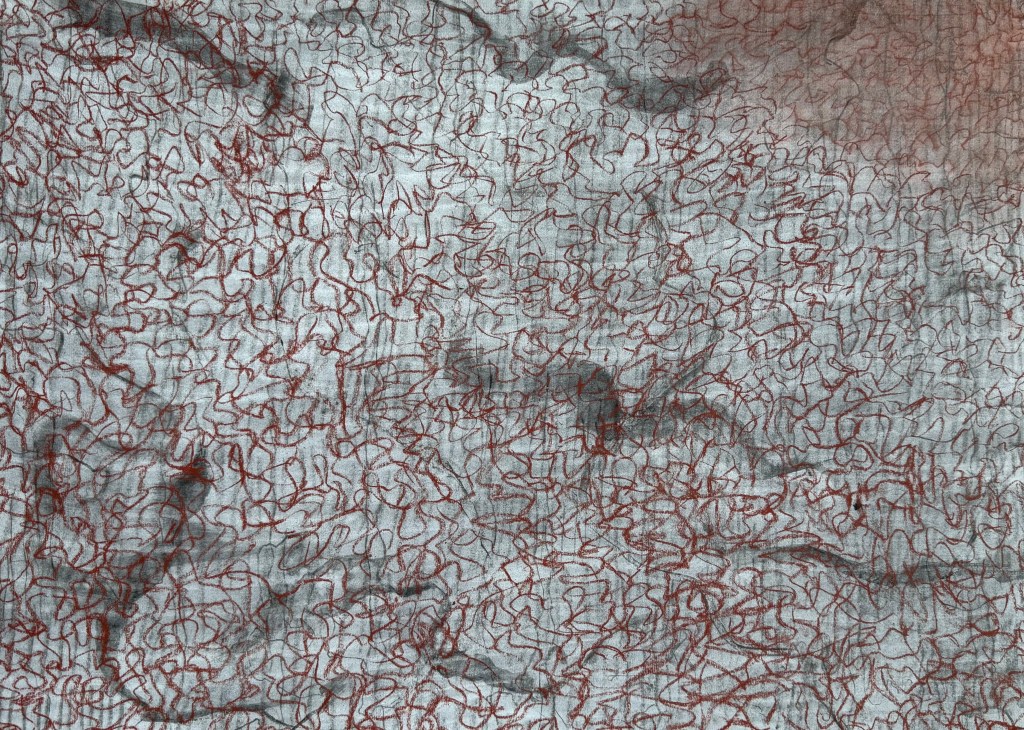
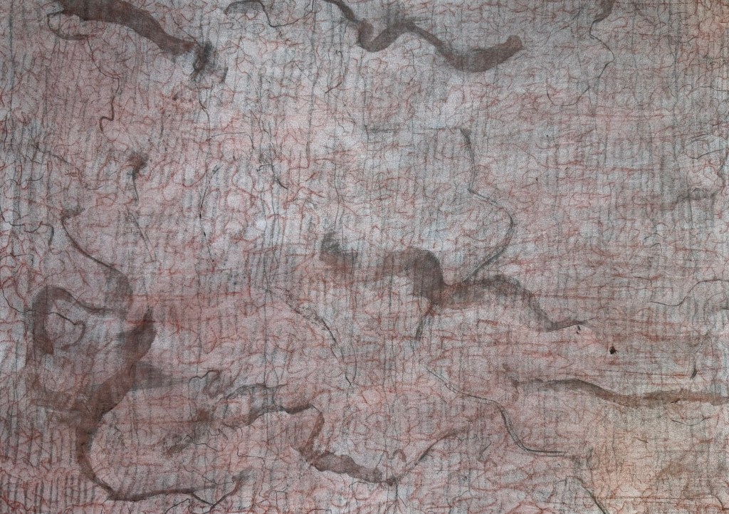
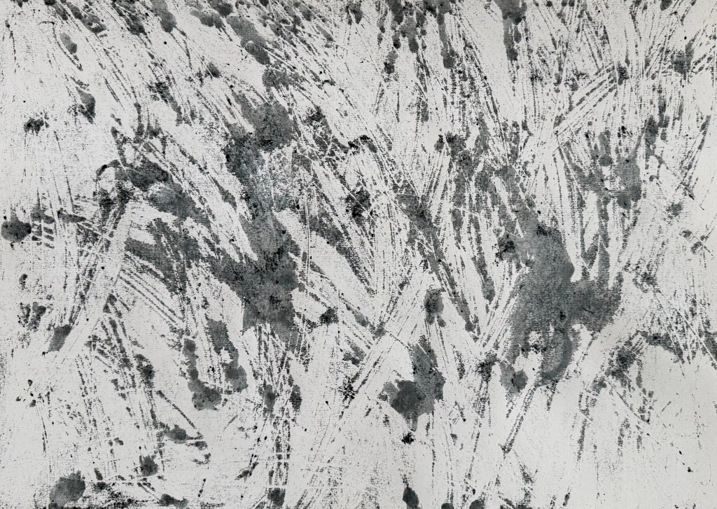
I wanted to make some marks – layers of marks – and so I took some A2 paper and used charcoal, pastel, an eraser and a pen.

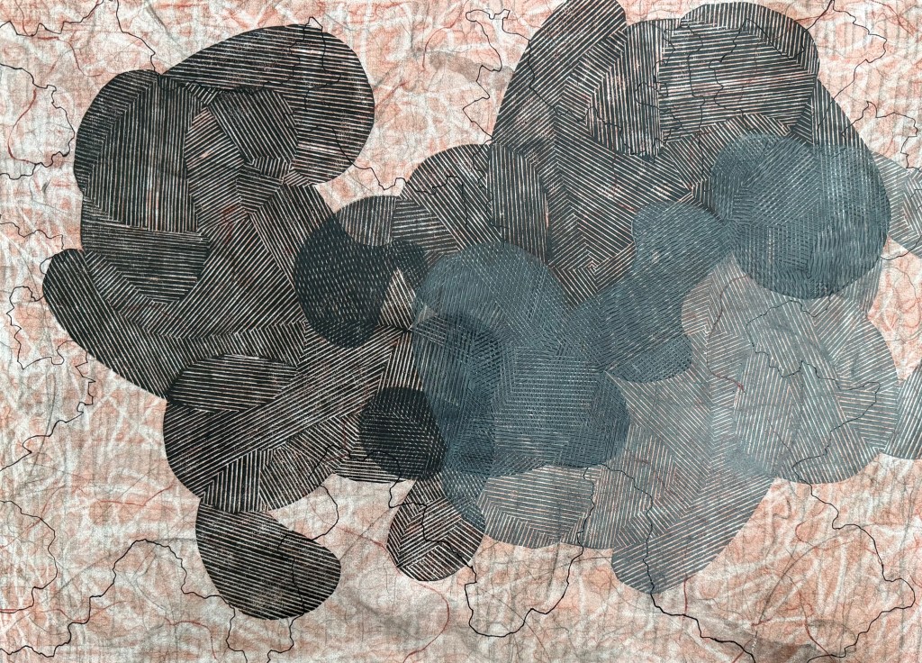
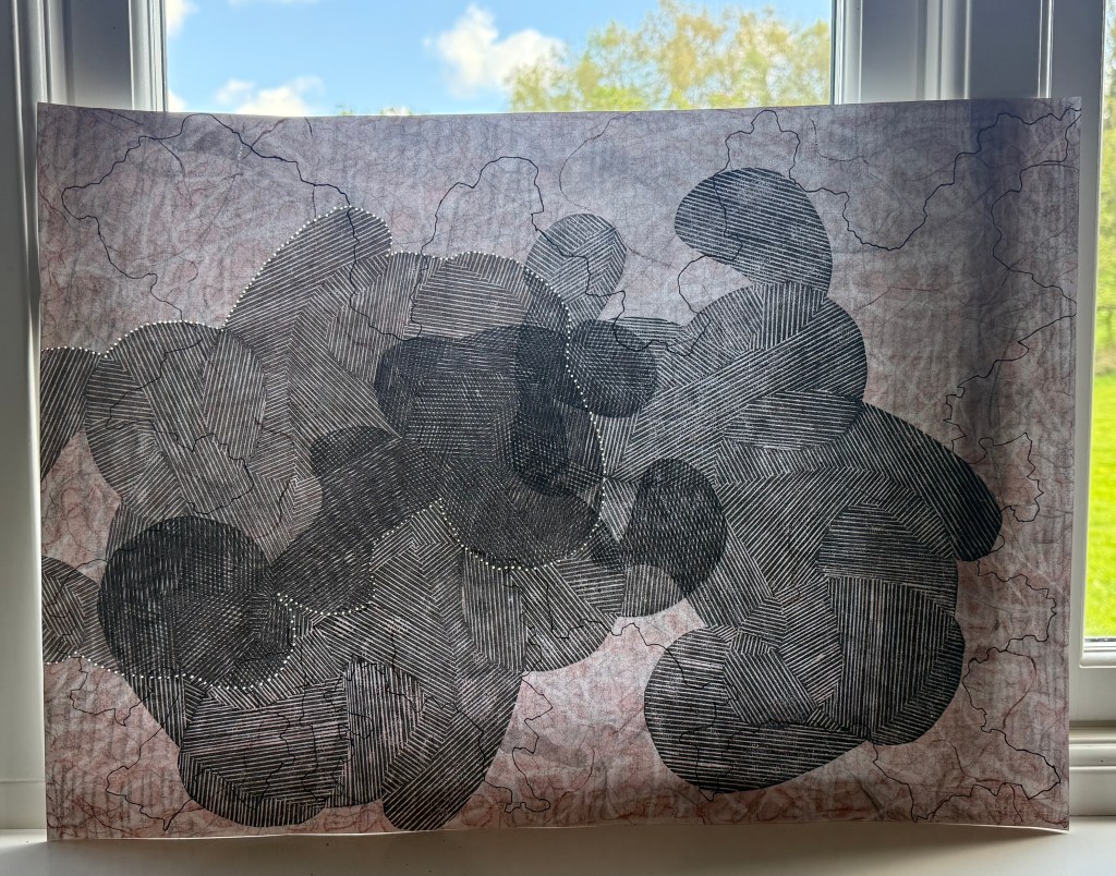
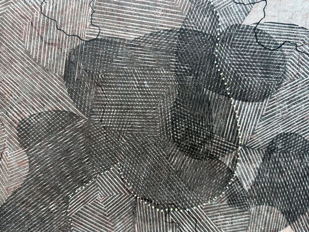
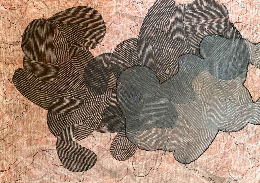
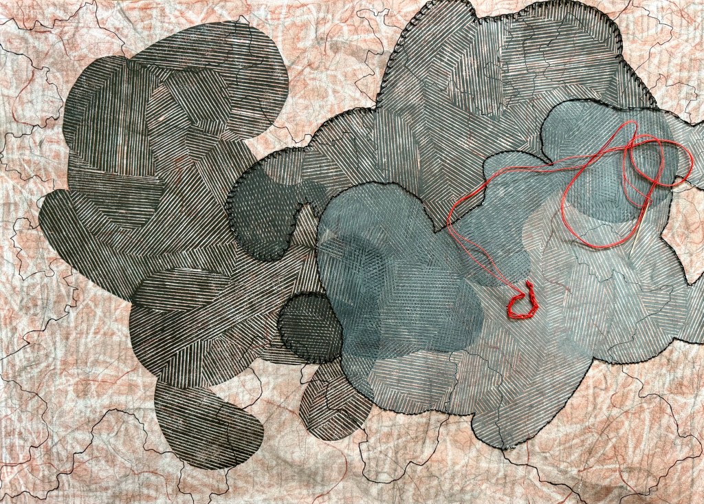
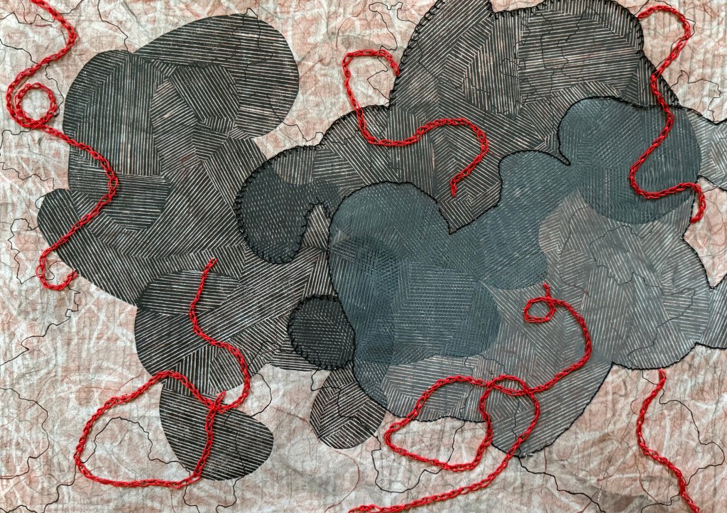
It wasn’t meant to be anything. I thought that I might use it as a base for something else. I had been wanting to have another go at overprinting the linocut image from Never Say Never. In that post I comment that the shapes look like crouching figures – in retrospect they are foetal-like. The subject of microchimerism has come back to my mind recently and I thought that the idea of making the ink more transparent with each print could touch on that. Also, the marks underneath would also become increasingly visible. I gave it a go but I made a hash of the ratio of ink to extender, and I couldn’t find the new tube of extender so I just added some white which, of course, made the print totally opaque, which wasn’t the original intention.

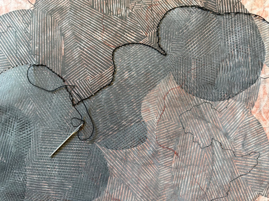
I left it for a while and got on with other tasks relating to the book and when I revisited it I thought about umbilical cords (something I have referenced previously in Sisters). I thought I might use some of the red thread that I had for my paper experiments to sew some kind of twisting cords which then made me think of using black stitching to delineate between the three shapes. I used a blanket stitch on the second shape as I’d seen at her Tate Modern exhibition that Tracey Emin had used it on her blankets to give a less defined line.

I’m really chuffed. I was thinking as I was sewing that maybe I should have planned where I was going to go, but then decided that, no, I liked the spontaneity of it all. Would I have done anything differently? No. How did I feel as I was making it? I felt pleasure, at all stages. I enjoyed the making of it and I like how it turned out. In fact, over the last few months (Summer Exhibition aside) I have really enjoyed making. That’s not to say that I haven’t enjoyed the process of making before then – I have, particularly the experimenting and and the wandering, it’s just that recently I have felt contented, as if some things have fallen into place. I particularly enjoyed the experiments with lino cuttings and packaging, and I’m really happy with the video that I made.
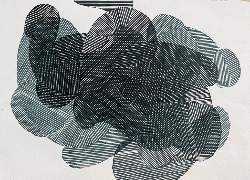
I think that it comes down to the accidental and the incidental; the unexpected that happens in the process and the small things I notice within the process which then lead to something else.

Never Say Never

And I was right. And I wish that I had thought about doing this sooner.

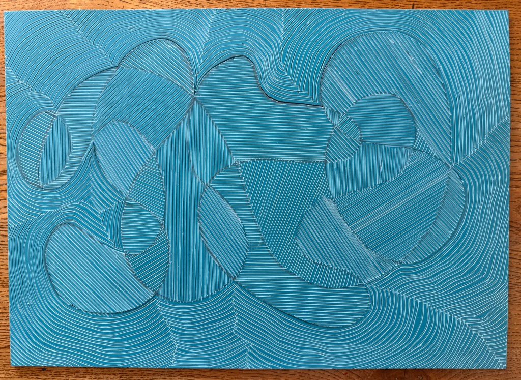
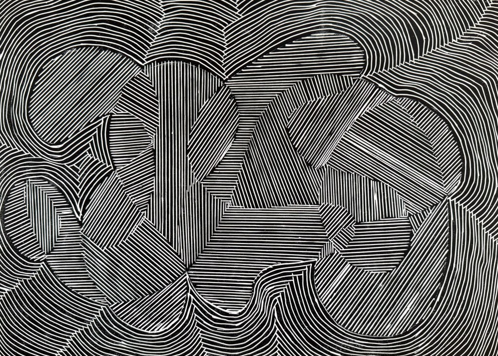
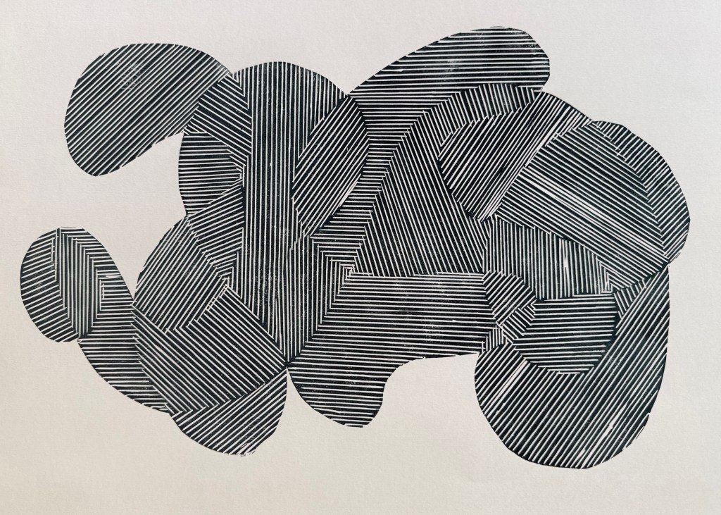
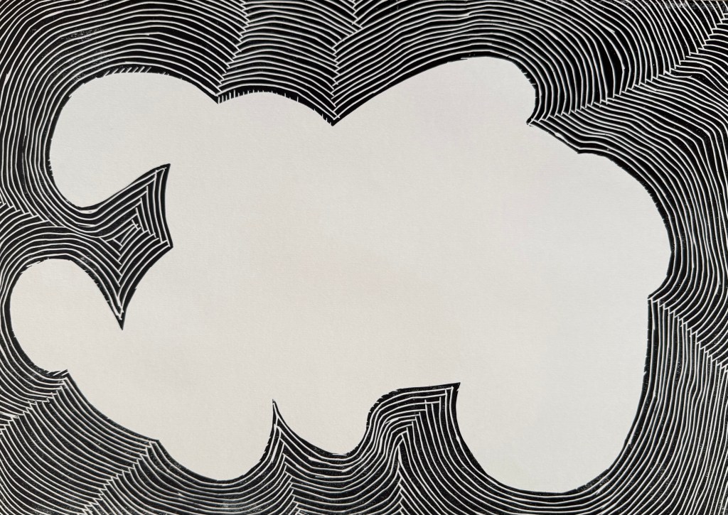
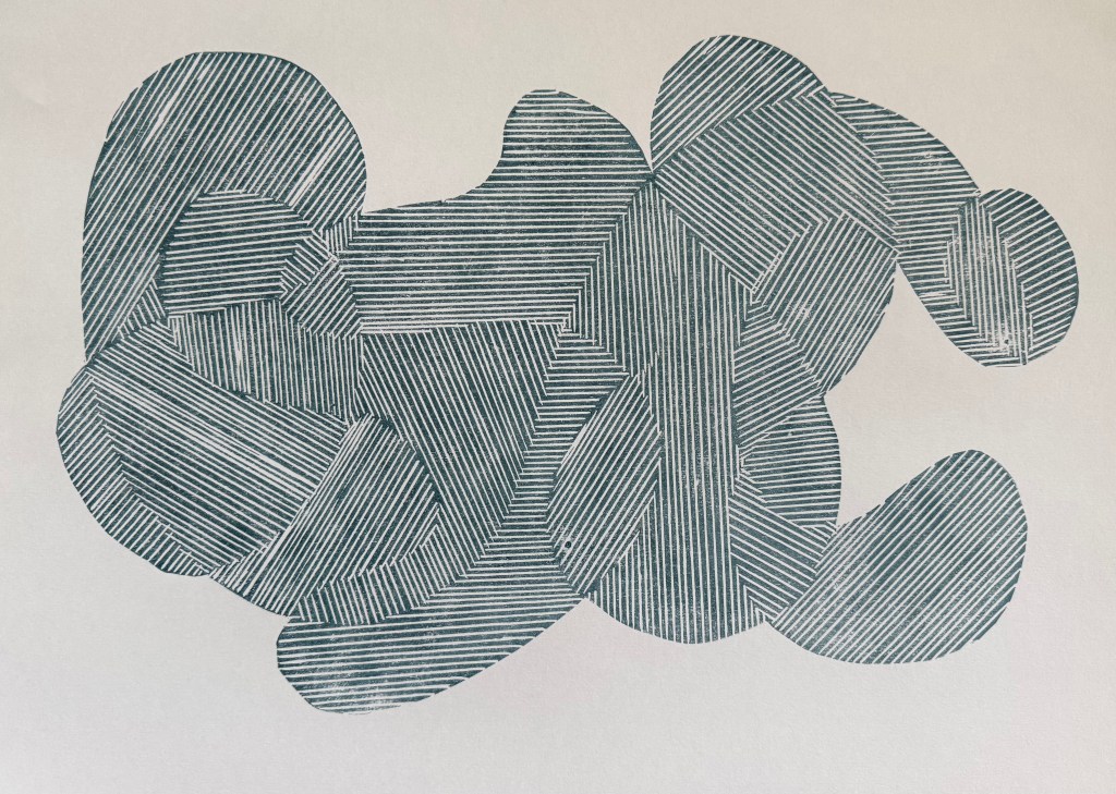
I dusted off my printing box and experimented with printing a line drawing. I used an A3 piece of soft cut Lino as I didn’t want to be shooting off all over the place, and have bits crumbling away. I used my smallest tool. The good thing about soft cut is that you can easily use a craft knife to cut out sections.

I started by tinting black with some blue, and printing the whole block:

I like.

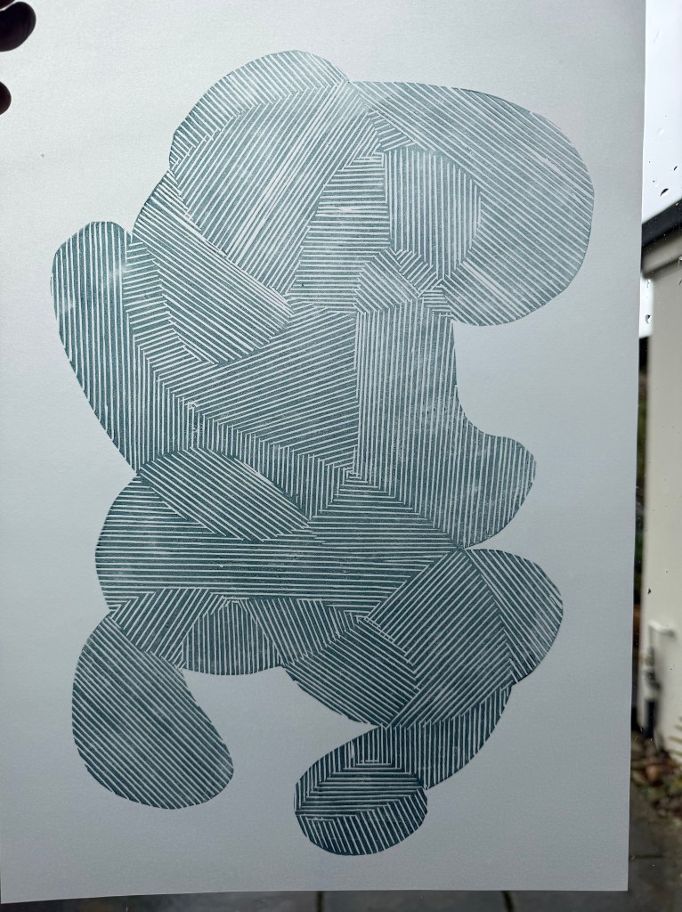
Then the two separate sections:

I also like. This way around, it reminds me of a figure, curled up, cowering, face protected by hands.

Then I added in some extender to make a lighter, more transparent colour:

Nice.

Printing on tracing paper:

Interesting. Possibilities.

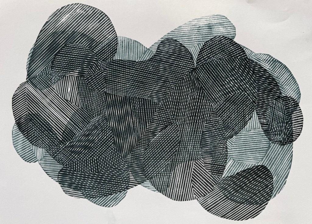
I then experimented with overprinting:

Absolutely love.

I’ve noticed that I’ve been using that word a lot more recently.

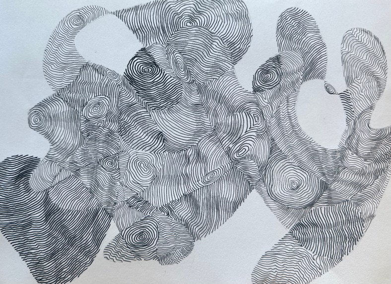
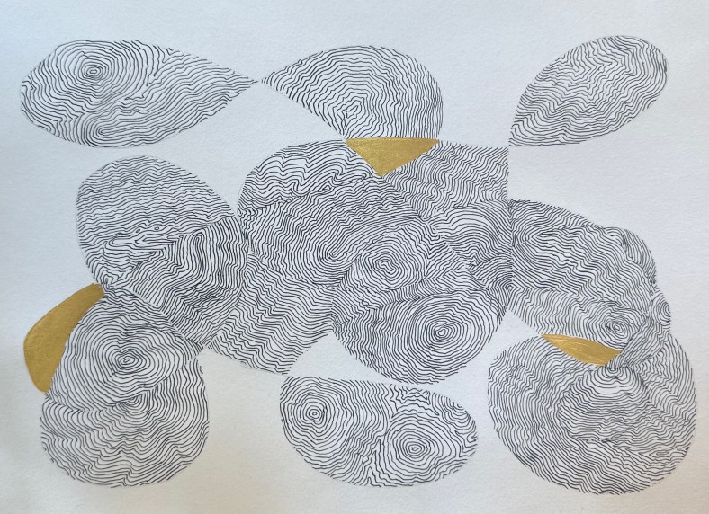
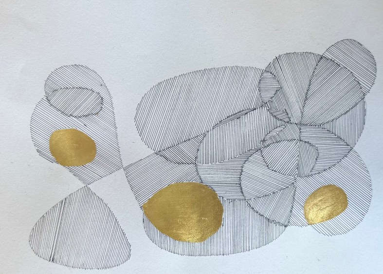
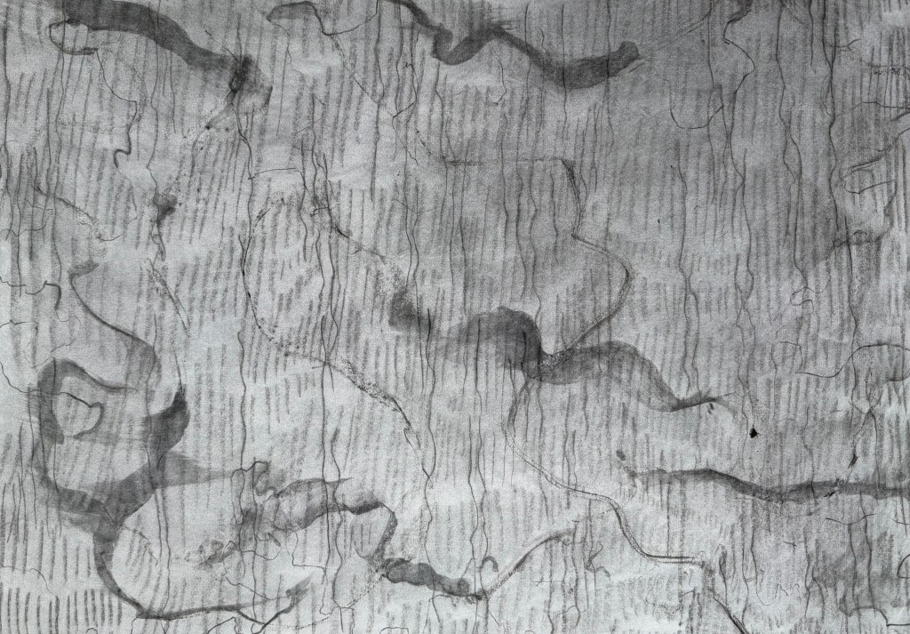
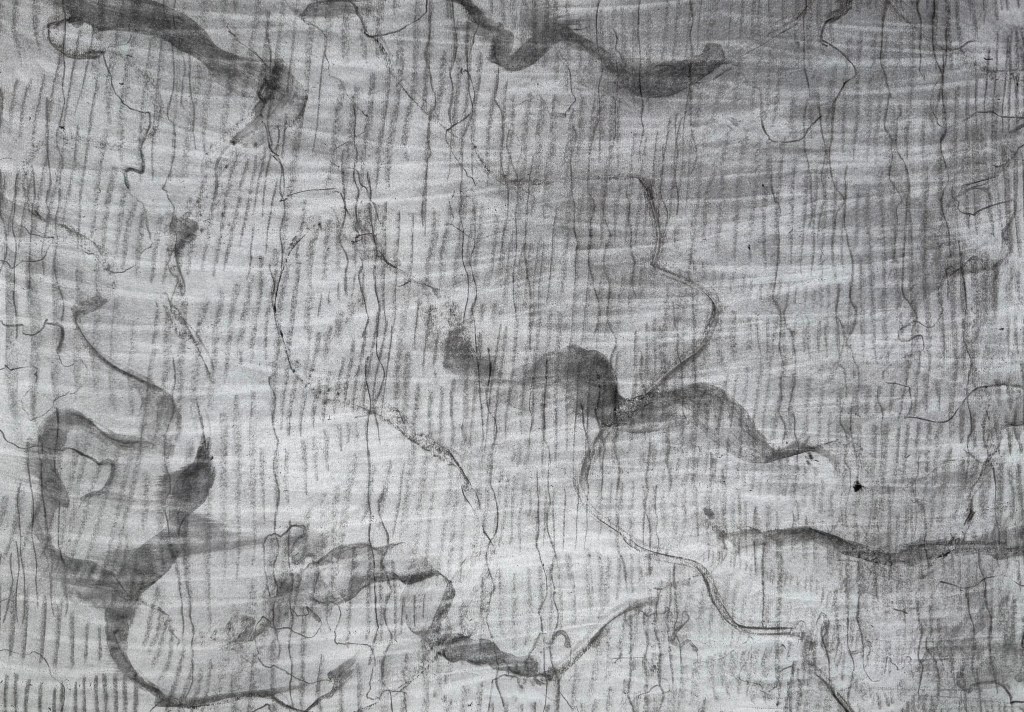
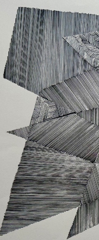
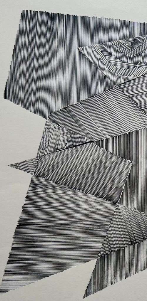
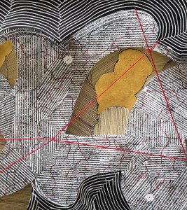
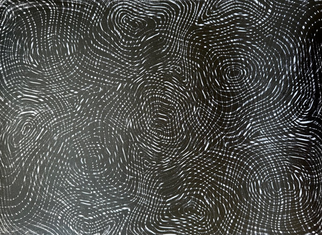
It’s fascinating that by overlapping the prints I’ve recreated some of the mark-making I was experimenting with using the Micron pens (Pushing Paper III) and also the strange effects created when I photographed the pen drawings. It was almost as if the camera couldn’t quite work out what was going on. For example, when the image is displayed on my phone normally it looks like the first image below. It is only when I zoom in, that I can see that the lines look as they do in the second image.

Anyway, I think that it was a very productive session and has given me lots to thinks about. I’ve decided that I’m warming to linocut. It used to bug me before, because it can be quite patchy in places (probably my ineptitude), but since using the fineliners to make line drawings, and noticing the texture created when the ink dried up a bit and the effect of mistakes, I’ve noticed that Lino has the same qualities. They both evidence the process of making which I’ve recently been embracing, rather than a perfect print.

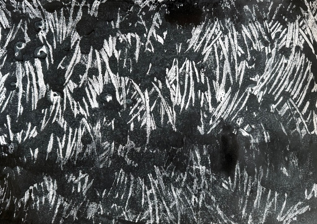
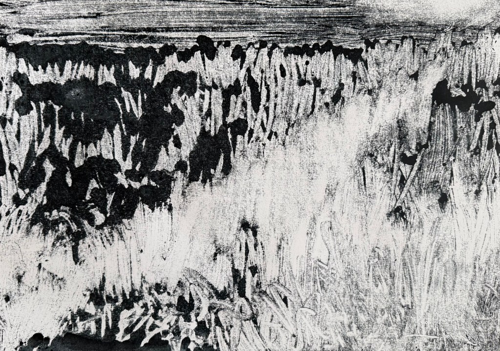
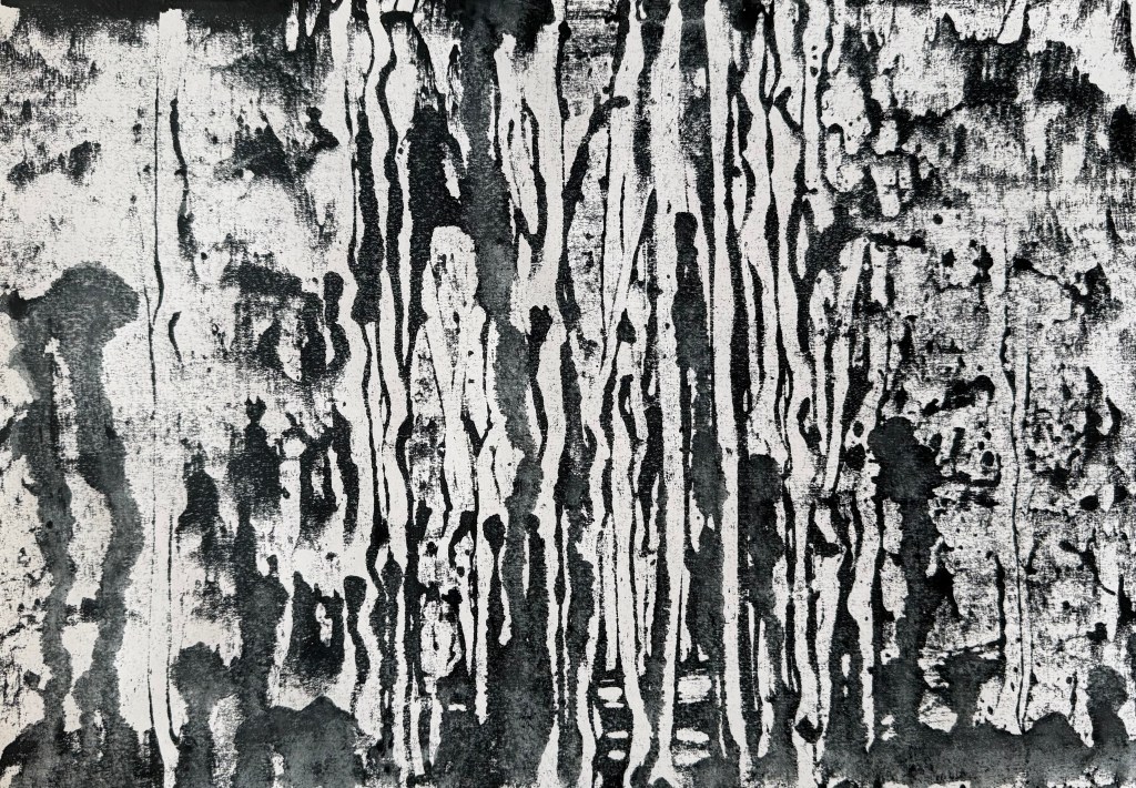
I used up the leftover ink to make some mono prints. The inks are safe wash – they are oil-based but soluble in water. I like the effect of spraying the ink with water, and running the brayer over it. These could maybe form the basis of something else.